Melanie Martinez k-12 vinyl cover contextual research


The k-12 album by Melanie Martinez was released on September the 6th 2019 alongside her film which was released on the 5th of September 2019 that she created and directed. Melanie typically uses a lot of 3D animation in her work merged with recorded film, Alongside her music videos however the album k-12 was based on a vintage theme of pastel colours. something that looks like a different take or representational style on high school and a story concept abit different from the normal. Her genre of music being pop- elec pop, alternative rock and indie pop.
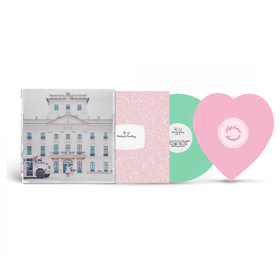
This vinyl cover for Melanie Martinez album suits the theme rather well the stylistic choice of pastel colours show Melanie’s personality and music style compared to her CD album release. Her vinyl print for the cover fits in with the vintage concept.
The vinyl itself references her video greatly and the mood/tone was met to the standard desired towards what the vinyl represents that being of what the songs are about in her album. The vinyl is more thought upon in design as the print is bigger and it slightly resembles an old school picture or a polaroid photograph.
The entire scene of the photograph was set exactly as so nothing blended in too much because of the pastel colours everything was framed in order to achieve a well lit contrast and balance between the similar colours. Particular things in the movie is hinted at or at least described in the cover. This is too add interest for example the pink school bus and of course Melanie Martinez herself overall creates what she tries to represent – a dull version of a school in reference too a prison perhaps.
The picture itself keeps the windows a fresh colour to look at in the buildings structural detail. The old building leads the viewers eye peacefully to the albums name k-12. The shot itself has a compositional layout of a long shot however framed so that the building seems large and overwhelming. definitely incorporated into the cover from one song is called “wheels on the bus” most of what is included in the music its references heavily in the photograph.
The back of the vinyl itself leads the viewers away almost like an ending or an end credits scene in a movie. the colours and mood/tonal feeling that the back of the vinyl creates is a contrast between the calm. The back cover of the vinyl has the shot sharper compared to the washy feeling that the front creates. The back photographs colours have more impact with greater detail. for example the bushes leading the viewers eye away down into the mist that represents and almost eyrie uncomfortable felling and tone this allows the credits to be framed slightly above the mist. The one thing kept similar between both sides is how the sky keeps the same pastel light pink grey mood or calmness held in the image to imply it is still the same vinyl. However there is slight difference and the cover makes this clear by the front having a silver border to divide the back from the front.
Overall she keeps in style and theme with her other vinyl releases this ensures who music as a brand. The other albums in difference having more broader and stronger pastels but in comparison each album has a different theme and in a way this photograph for the vinyl creates an old sinse of the high school days when we were children thus being everything kept vintage and rustic.