Design and illustration contextual research- ROUGH DRAFT progress spelling needs edited
Task: one talk and two illustrators or designers
RESEARCH TALK ANALYSIS
1st illsutrator
Fran Meneses
Fran menses also known as Frannard across the media, her real name being Francisca. Fran Meneses is a cartoon styled illustrator known for her freelance business and popularity across YouTube. She was born in Chile and during her development with her career she has travelled across Europe. She has lived in Europe as a freelance illustrator however She now takes residence in new York city alongside her boyfriend who is a writer.
Together they are both working on an illustrated book. Along her artistic journey Fran Meneses studied graphic design and later became a full time illustrator, launching her own business and social media presence across Instagram and youtube. She has worked with clients for publishing magazines and blogs however she mainly focuses towards her own business on her website, Instagram, Patreon and YouTube channel. here are some examples.


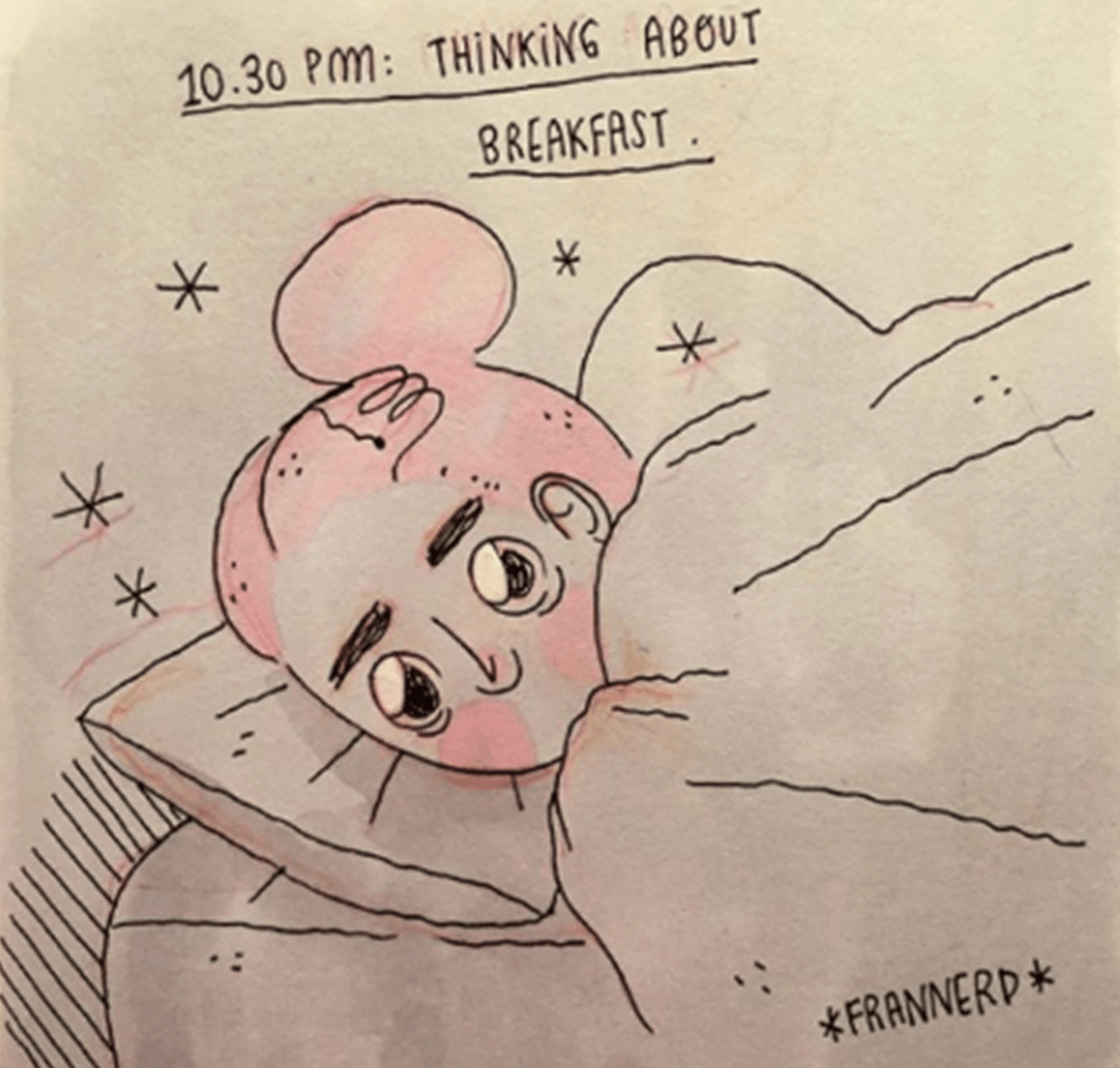
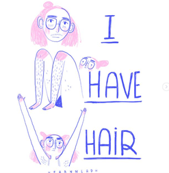
Fran menses is a full time illustrator who creates artworks and illustrations based on everyday scenarios and experiences. Her illustrations are colourful simple and relatable works of expression and everyday life. Fran menses loves to share her support, ideas and concepts towards her audience and always conveys some soft of message. Weather that is to cheer people up with a laugh or relate to people going through tough times. She is commonly known for her art work being relatable towards her main fanbase of women. Expressing through her illustrations that the human body is weird and beautiful. She likes to show that people do not need to follow all these difficult beauty trends. Fran Meneses does this by telling little day to day illustrative stories about her life and how no one is perfect. This has helped her artwork connect to her audience well.
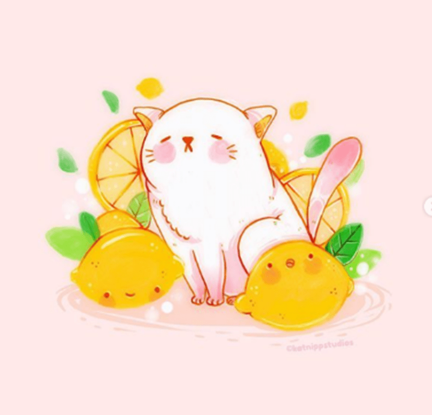
Her style is very illustrative using a lot of lines and unique fonts, her colour pellets play a huge part in her work and specifically make her recognisable. These colours being pastels mainly the colour pink.
During this talk/interview Fran Menseses talks about her past and her childhood. She elaborates lightly on her artistic journey and what lead her to art.
Through her journey in this talk Fran menses elaborates on how illustration was not a clear path for her from the start and that she studied graphic design for many years before considering where she wanted to go. Although she never changed to illustration because she was scared of taking that step forward, later in her career and her learning with graphic design she went through her own path and decided to study illustration herself without the need of a course. In the talk Fran Meneses explains that constructive criticism and trying new things is good as it helped her develop her style and colour choice. This lead to her confidence becoming stronger and because of that she took a step forward with launching her own business and focusing on what she wants to say as an artist.


ILLUSTRATOR RESEARCH ANALYSIS
KATNIPP- Cathrine
2nd illustrator contextual research katnipp illustrations- cathrine
Cathrine also known as katnipp illustrations across media is an illustrator who runs her own illustration business based in north east England. Cathrine has illustrated children’s books in Scotland and sells her own artwork with merchandise, designing everything even her own packaging products.
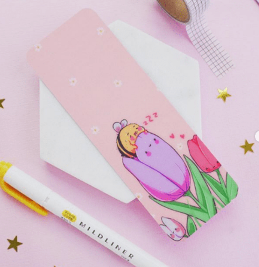
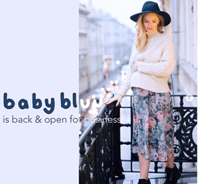
Katnipp sells products like enamel pins and art prints. She manages two of her illustrational businesses, baby blue and her main brand katnipp. She is very productive alongside the help of her husband and family who help cater to her business. along Cathrines artistic journey she worked for other people when trying to find illustrational jobs however she realised she was following someone else’s vision in art rather than her own. She later took the reigns in her own life with her creativity and started her won work. creating everything herself in her own studio using her favourite colours and a theme of cute illustrations based on anime, coffee, books and animals.
Cathrine studied graphic design graduating in 2012 with a BA HONS at Teesside university. She found her illustrative style through experimenting in the things that make her happy gaining her own knowledge and research towards cute pastel art.
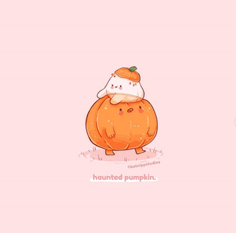

Her illustrations are designed in specific ways to mainly outreach into different types of products so format is widely considered alongside simplicity. Most of her work is cute and happy. her art being cheerfully based around silly and adorable characters that say little quotes and can be taken across different platforms and merchandise. Katnipp uses a lot of pastel pink for her backgrounds or any cllear colour that gives of a happy relaxing feeling towards her art. in place she typically uses alongside the pastel pink pastel yellow or orange. Something that mainly frames her work. Katnipp works with different fonts in her work. Rather than mainly just posting her illustrations across media she takes in consideration the presentation of her merchandise and puts together a lovely matching set background used with a good camera in order to properly display her products and the amazing quality of art that they are.
Unlike Fran Meneses an artist who creates illustrations and comics based on relatable topics and real life stories. katnipp illustrations branches her work towards a selling point mainly expanding her illustrations into products and things people want to collect. a similarity is that they both use pastel colours however in very different ways katnipp creates characters and motivational phrases around object based characters and animals where as Frannard draws the persona of herself and her pets.
Every piece of cathrines art is attractive when looking at her art its simply put and easy to read but looking into the illustration more there is a lot more detail such as small patterns or lines that represent hair


3rd illustrator/artist contextual research kelogsloops Hieu
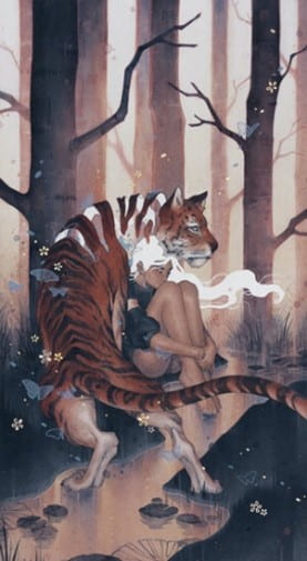
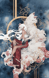
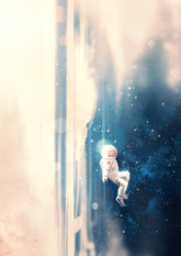

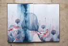
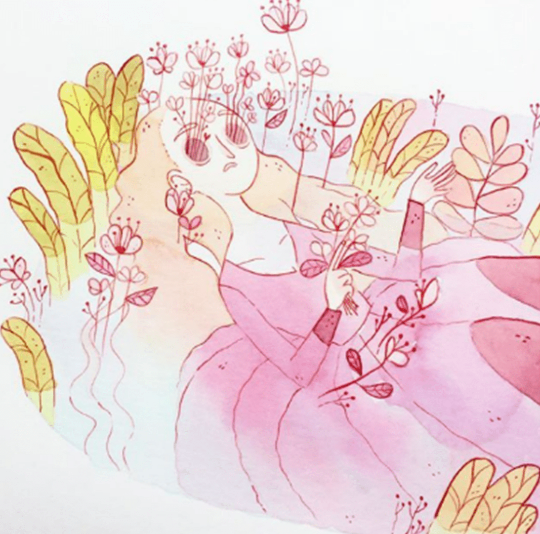
Kelogsloops is an artist/illustrator known across media and throughout galleries in the art community. He is very popular for his traditional style of art but also alongside his digital art. He creates luminescent artworks and illustrations around women and a spectrum of the unreal possibly somewhere in your mind or in space. His style is Whimsical with watercolours, he uses a techniques of gold leaf a thin piece of paper which is actual gold. the paper itself can be melted too the paper and he uses this to create cool attractive designs and contrast to his work. He uses separate contrast that are clear with no paint such as using white spaces to his advantage.
This adds more appeal to his work as the completely white space against his usually array of vibrant galaxy based colours creates a bright and colourful concept with a shine. his design purpose is to attract doing so everything is compassioned well. kelogsloops uses a lot of feminine attributes or women portraits and poses. alongside them he typically adds sharp and aggressive animals to frame independent and strong women- koi and tigers are typically used alongside the dark deep blue with a bright orange in tonal saturation.
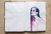
kelogsloops real name is Hieu. Having a bachelors degree in design (animation and interactive media) Hieu is an Australian traditional artist and illustrator. He creates a lot of surreal and abstract portraits. He paints with mostly watercolours creating his artworks to capture beauty with fleeting and intangible feelings. His influences and inspiration being anime, He immerses his characters suspended in time. overall keloggloops is a watercolour and digital illustrator.
In his artistic journey in high school he started off with digital art but furthering research with watercolours and paints he decided on his favourite medium of Winsor and newton watercolours in combination with cold pressed watercolour paper and gold leaf paper.
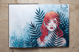
Through his journey he broke his art into themes of underlining meanings that formed his work. He has definitely incorporated the main concepts into his artworks and illustrations developing everything overtime until now. his artwork creates that of visual symbolism human and nature the final concepts being mind, imagination, conciseness, sea, limitless, senses and innocence.
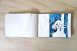
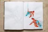
He developed these main techniques in his high school with traditional media overall later studying at RMIT University studying animation and interactive media. During this time his art took a more streamline of graphic design and digital art. His development headed into illustrations here are some examples of his illustrations in sketchbooks after going through the whole journey of starting at digital art and going traditional to illustrative.
He settle in illustrative artwork that over time became main pieces of artwork incorporating his unique style. He has done client work as a head designer on beautiful bizarre magazine 2015 print and has held many galleries of his artwork
Here is a referenced list of SOME OF his awards:
Next Level Competition, 2017
Wacom Australia & NZ
- Finalist & People’s Choice Prize
Start Your Studio Scholarship, 2017
Winsor & Newton
- Recipient of Scholarship
Matchbox Design – 2013
Redheads Australia
- People’s Choice Prize
- Matchbox design distributed nationally