Month: February 2021
Week 4 – Texturing
This week for the weekly Modelling Challenges we looked over texturing. Texturing is the placement of material, colour or pattern onto an object or model. We were required to test out a program called Substance Painter along with working in Maya. Substance Painter is known as the place to build and structure textures onto already-made models.
Source: Week 04 – Texturing – Substance painter intro.mp4, Breaking maps for smart materials.mp4, export maps from substance to maya or sketchfab.mp4
First off, we were given a UV mapped hard surface model ready to texture. We jumped onto Substance painter during class to get used to the program and then attempted to place texture onto our object.
Source: Substance Painter

Before I do anything else, we bake our ID maps. I scroll down at the right column of menus to find texture set settings-bake mesh maps, change mesh size and tick ‘Use low poly mesh as high poly mesh’, to help keep the mesh the same. Then change the ID setting ‘Colour source’ to ‘Mesh ID/Polygroup’ To help generate an ID map based on the seperate models in the one file.
 Once ‘Bake selected textures’ is clicked, we get multiple mesh
informations, and each one helps determines a seperate feature e.g. shadows, edges, each model, thickness.
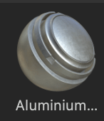
Now I could pick a smart material to place onto the model. I chose ‘Aluminium Brushed Worn’ to test out first, and just left click and dragged onto the model to place.
 what I could also do is place other materials. I did this by dragging
 another material onto the model (Chrome Blue Tint) , right click the layer it comes from, select add mask with colour selection, turn in ID map and click the parts of the model I want this model to have.
![]()


I also added a stencil from the right menu in a yellow colour to add detail. I could then save this texture in a folder and bring it into Maya, with the blank object open, or else straight into sketchfab, where textures can be easily uploaded.


< Source: Sketchfab
Monty Rig – Inspiration
Here I will be completing my second assignment of my Animated Narratives module – The Monty rig. During this assignment I will be producing two separate animations of a rig we have been given. One scene should convey weight of motion / action / mechanics of the character. And another scene should convey emotion / personality of the character.
To start off, I want to explore the world of 3D animation – exploring and studying other artists / animators techniques and styles will give me a sense of inspiration.

The first animator I found was Jamaal Bradley. Jamaal is an animator, artist, storyteller, & director. He has worked for Dreamworks, Disney, Sony ImageWorks and also runs PopWilly Productions LLC. Jamaal has a website/porfolio showcasing his creations and progression.
Source: https://www.jamaalbradley.com/
One of his challenges shown on his website that was interesting to me is ‘Progression of an Animated Shot: Mother Gothel & Rapunzel‘. Throughout the video you can see the progress of creating this shot from ‘Tangled’ from the Layout, 2D Showing, life reference, blocking passes, and many more polishes until the final render. This was amazing to watch and seeing how life reference can be used so effectively actually encourages me to try it out too. Jamaal effectively captures the confused daze on Rapunzel and the effect Mother Gothel has on her as she spins around the dark room unexpectedly.
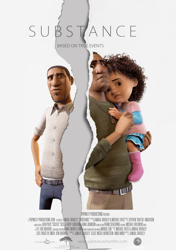 I’ve also been watching his short film ‘SUBSTANCE’. I’ve seen the way Jamaal creates emotion in the characters through their expressive physical and emotional actions, all without dialogue or sounds from the characters: only the music is present. There is contrast between the two brothers playfully fighting at the start and the real fight that the substances cause. This is easily highlighted and expresses their relationship and their different intentions to help the future of the family. In the end, the presence and heart of the child was able to change this situation for the better. This film highlights the realness of the substance situation as it can happen regularly in real life.

This short film gave me inspiration because of its overflowing range of emotion captured in 3-4 minutes. The way the body and face is positioned in each character to always convey a sense of emotion, makes it seem so real and genuine. I hope to capture this level of emotion some day. Source: https://youtu.be/c650yL4X7Wk

Another animator I have found is called Nathan Engelhardt. Nathan is a Supervising Animator at Walt Disney Animation Studios has worked on many films such as Frozen 2, Ralph breaks the internet, Moana and Zootopia. Nathan regularly posts on his Instagram page his previous works and progression. Source: https://www.instagram.com/nathan.engelhardt/
There are two posts of his that stood out to me. One is about the blocking passes he created for a scene in Ralph Breaks the Internet with the character Vanellope. I love the description Nathan provides explaining his process and thoughts on the action he is trying to achieve.
Instagram post quoted below.
‘..In both blocking versions You can see I had a section where I lifted the hands off the car hood for an additional gesture. One was more of a powerful fist pose to show the energy of how she felt when she thought about racing in that new game. The other was using two hands as if on a steering wheel, pretending she was racing again in the game for brief moment. In the end, we all thought it was cleaner to not lift the hands at all in that section while she was reminiscing about the new racing game and only lift them off the car hood when she moved to her next main internal thought, which was a sort of a summation or assessment of her experience. this was just another great reminder for me to only move the character (or pieces of the character) when I have to. Typically when the internal thought changes.’
Source: https://www.instagram.com/p/CMQhPmHj1ys/?utm_source=ig_web_copy_link
This is one out of the three videos featured in the instagram post.
I love the thought process of linking personal traits to the actions of a characters body. The idea that Nathan had in mind that her moving hands would symbolise how she would be holding a steering wheel, would have been great to see. It just adds so much detail, personality and meaning to her actions. Although progression of the characters thoughts matter more, I would love to learn from this good idea.
Another post is about how Nathan adds drivers to his progression to help him understand what constraints he needs to work on in a shot. he talks about the importance of planning from this shot in Frozen 2.
‘Planning is key to making your shots (and life) easier. The times I don’t, I struggle way more. So when
thinking about constraints in this long scene, I tried really hard to think about the anatomical dependencies and what pieces of each body drove the other pieces.’
He goes on to say that he’d much rather use life reference to capture the scene between Olaf and Anna.
‘After I did this thought experiment, it became clear that there was no clear constraint solution that could support everything I wanted to do, so I didn’t use any constraints. That setup (or lack there of) was a pain with the hand contact, but I usually babysit hand contact stuff per frame anyway; plus it kept me free to push things around without a ton of counter animating…
…It’s usually around this time I simultaneously look for inspiration in art or life. My son happened to get pretty sick that winter I was animating this shot, and I managed to capture some sweet inspiration. I love the way my son plays with my wife’s hair. So stinkin adorable! I ended up trying to use some of that “hand wandering” in Olaf as he’s talking to Anna.’
Source: https://www.instagram.com/p/CCZA7UhjpG3/?utm_source=ig_web_copy_link
Although planning with drivers may be a good tool to use in other cases, Nathan proves that impactful references can help out just as good, maybe even better. Nathans thought process and detail to work inspires me to do as best I can in my assignment and structure my work well.
3D Animation Practice Part 1
During week 4 we took on some animation practices on Maya to improve our skills, learn about the techniques and functions, and be prepared to animate for projects in the future.
Source: Week 4 – 3D Animation, Class exercises, Exercise 01 Ball rig, Exercise 02 Forward kinematic and Inverse kinematic animation systems, Exercise 03 Curious character jump, Exercise 04 Blog rig.
First we looked at the ball rig, which we completed in class. We were tasked to animate the ball bouncing off the red wall and create some kind of post-bounce movement afterwards.
I attempted this with the use of the controls on the objects provided, and the graph editor, that guided where my movement was positioned in each axis.
I tried the use of squash and stretch when the ball falls to the ground/off the wall, and when the ball hits a surface. I also added movement on the wall when the ball bounces off it to make it a more engaging scene.
I was given feedback from my tutor during this class. They liked my approach, and pointed out I should keep the ball consistency throughout the whole action. Etc. As the ball fell to the ground, it would be stretched, but as it reached the ground it would return to the normal ball shape, then it would squash onto the floor.
All I need to do to improve for next time is to keep the shape consistency to give it a proper squash/stretch look.
Next we looked at forward kinematic and inverse kinematic animation systems. These are two different processes of object animation displayed as two robotic arms.
Forward kinematic animation is how each object down the chain follows along with what was moved above. So if the shoulder of an arm moves to the side, the elbow down moves along with it.
Inverse kinematic animation is where either the top or the bottom of an object is the main command for movement – the objects from the opposite place will stay in their place. This is like when you move your leg around when standing but your foot stays in one place.
I completed some simple movements of the two robotic arms paying attention to how I used each animation system.
I had a bit of trouble trying to produce a playblast video of the animation. I was following a Youtube video to help set up the settings however it has caused parts of both objects to disappear, and therefore not show up on playblast.
However, I came back to the files after a few days and they seemed to have fixed themselves, so I was able to produce playblast videos for the two animations again. Now they look much better. It was fun working with these objects apart from the difficulty.
Next I looked at the curious character jump rig. I followed my tutors tutorial and animated my character looking around them, then doing the worm move.
I mostly used the dope sheet to help me out with this step by step animation. It allowed me to move around the frames easily.
The controls were also interesting to use as only two were available, it was a challenge to work from the limited movements. However, I managed okay and I’m happy with the outcome.
Production
Now that we have a finalised, structured story, with plenty of concept work and visuals to help our progress, we can move onto the 3D production of the animation! During week 7-8 we have been practicing our use of 3D modelling in both Maya and Blender, and have been making simple assets to use in our 3D previs.
The previs is the 3D version of a storyboard. Not much in a previs should be too detailed or textured, all there needs to be is the use of camera shots, timing and 3D character/scene assets. Great benefits of working on a previs is that you can build the entire environment all in one scene, you can move your camera wherever you like with distance, focal length etc. included, and you can add in your model all ready to start animating.
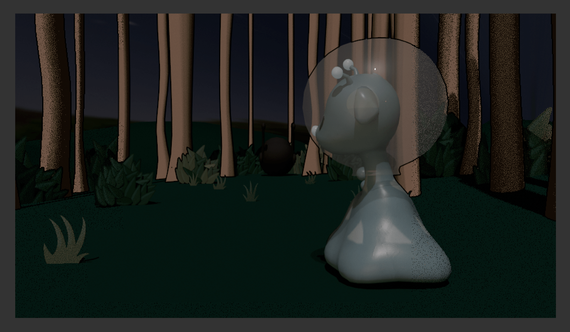
To start, I had been working on simple 3D assets of our two characters, the Alien and the Giraffe. I made use of the combine features while being wary of certain vertices and faces. I also included a rig for the tail in the Alien asset to practice its movements and how it’ll respond to emotion. They were quite fun to make and I feel I would be ready to help out with the more finalised assets of these characters when we get to that part in the future. As a result, we all used these same assets of the characters to keep the same look for everyones shot.


Last week we decided on our shots and who would be animating which shot. I went for shot 4 and shot 5. I made a new file in Maya and built a quick and easy asset of the environment. I made a group of tree trunks as cubes stretched high, I used spheres for the tree leaves and bushes and smoothed them out. And I also placed down a plane surface, added vertices to create an irregular-ground look, and also smoothed it out. Lastly I placed my character asset in through reference editor. I did make my previs shots firstly as all greyscale, however my group were going for colour in their shots so I quickly assigned each shape a material (lambert etc.) then I changed their colour to something suitable.

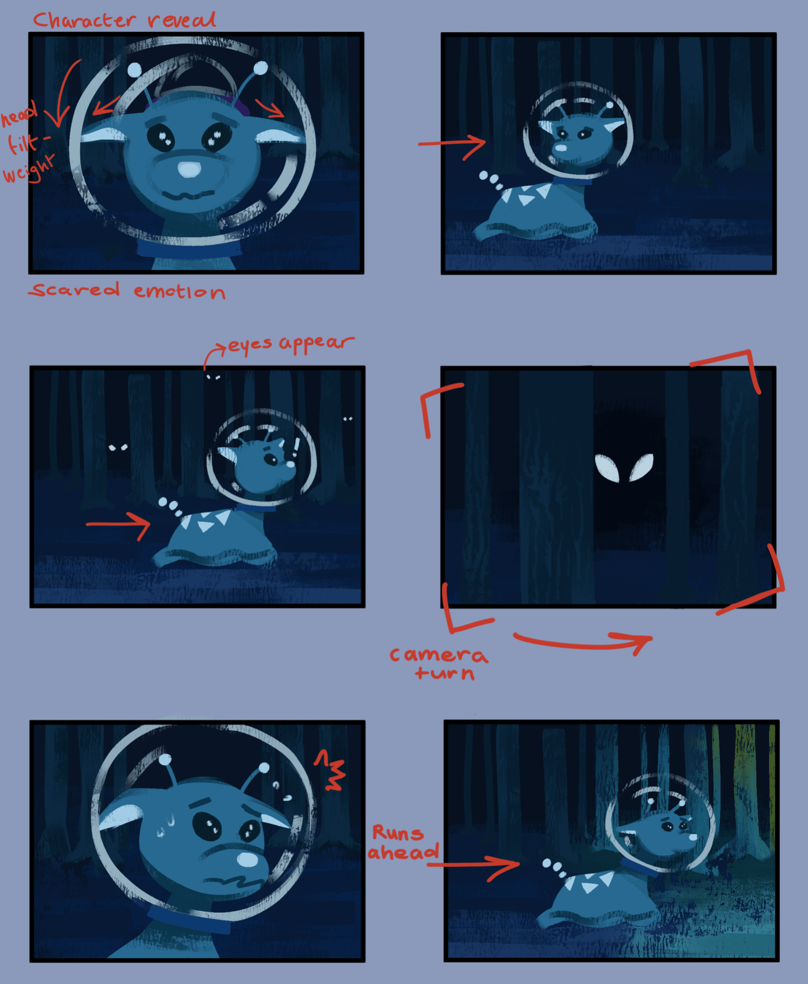
Next was the camera work. In the first shot I wanted to create the dolly effect as that was what the group and I decided would look good. I zoomed the camera from a high place, and low down towards the character where it ends. This created a nice effect when I animated the character moving forward later on. In addition to the character, I made it so the alien would subtly swerve to the right and left as it provided a snail-like movement.

We also wanted to add butterflies to the story, so In my part, the butterfly flies into the forest in a quick pace, which indicates the alien to go in and follow it.
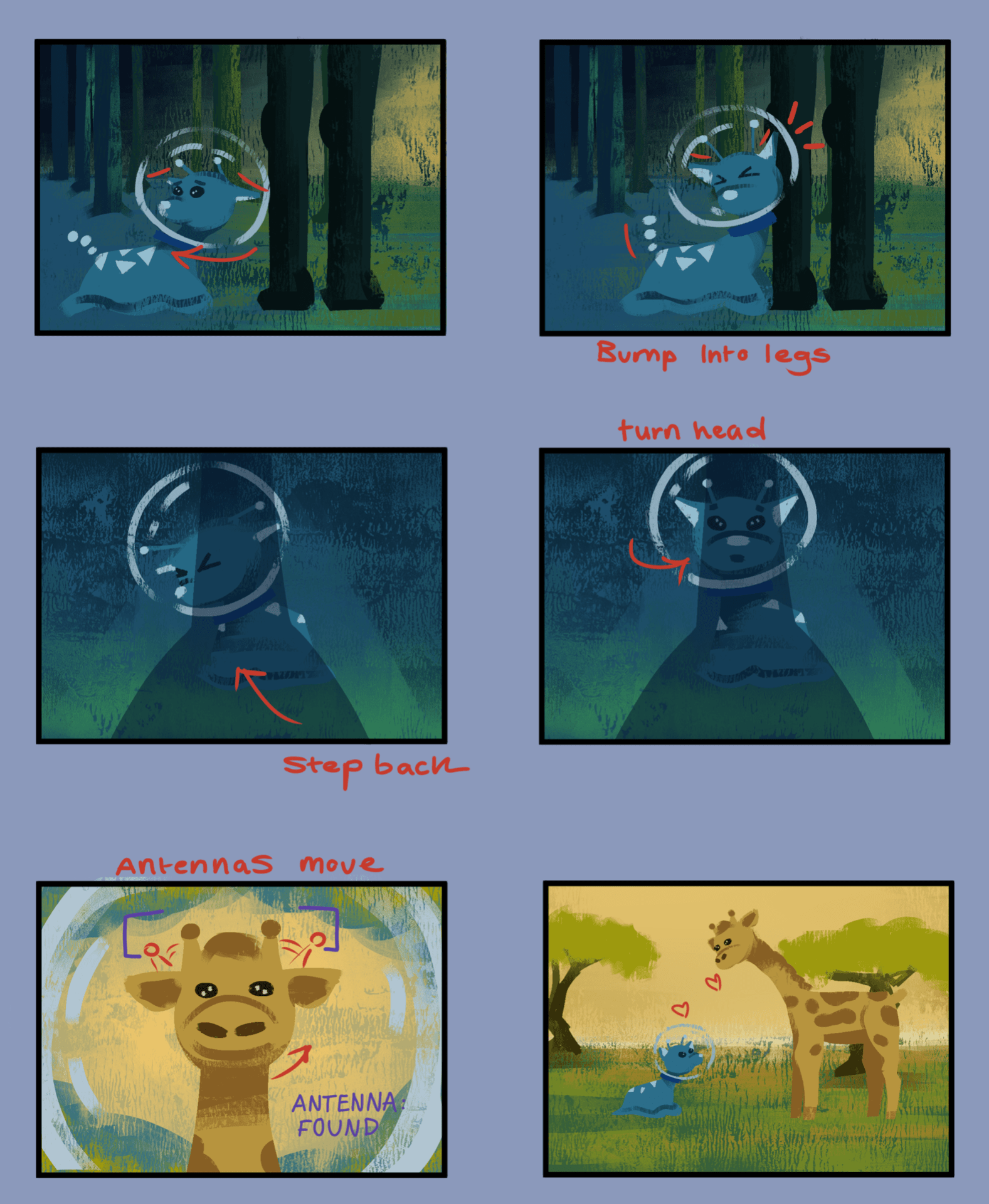
For the next shot, I made a similar scene using the same assets I had before (just in a different position) I set the scene for a side view and for the camera to track the alien moving to the right. I animated the alien looking around and inspecting where the butterfly went. In the actual animation we will make the alien expression a little more scared and hesitant. I added a touch to the background for where the alien moved, a silhouette (butterflies that look like evil eyes) would appear behind it – this would add a little more scary tone to the animation in the future. I placed a tree at the end in the foreground so that I could link it to the next group members previs shot, as theres would start where mine ended. The character asset does have a tail and is shown in the others work. Unfortunately the tail was corrupt and I could not get it fixed, so I had to hide the constraint in the scene.

Here are my previs shots below.
After we got this done, we made a presentation showcasing our work so far and what position we are in right now. This helped us keep on track and with the feedback we got, we can improve on what we do next. This included our progress with the story, our additional designs, our assets and our animatics/previs video. During this time we had also decided on the name of our animated short – “Antenna Met You” !


Source: https://docs.google.com/presentation/d/16QGO9ELaHXy8dKOL80pEt9TUMPmRGPncY30U_h3wZuE/edit?usp=sharing
During our easter break, we have been planning out job roles for our next step of progress. We set up this project management website called Trello to help us write down our essential to do list (for assets) and to assign each member of the group a role to complete. We discussed this through a call. We first decided me and Alisa should finish off some last-minute concepts we still needed such as the final colour palette, and a turnaround of each character. We also assigned roles to Matthew and Alisa to test out modelling these characters properly, and see how it goes. As well as this, we assigned Jennifer and Ben the role to test out background and texture painting to see how our sky environment could look and our assets textures could look like.

On our week back to uni, week 10, we started to take actions in our jobs to continue our project. Matthew and Alisa has been working hard on the proper models of our two characters and testing out other assets, I have been testing out tree assets and making plane images for small details such as grass, Jennifer and Ben are producing some texturing work for the backgrounds and other assets.
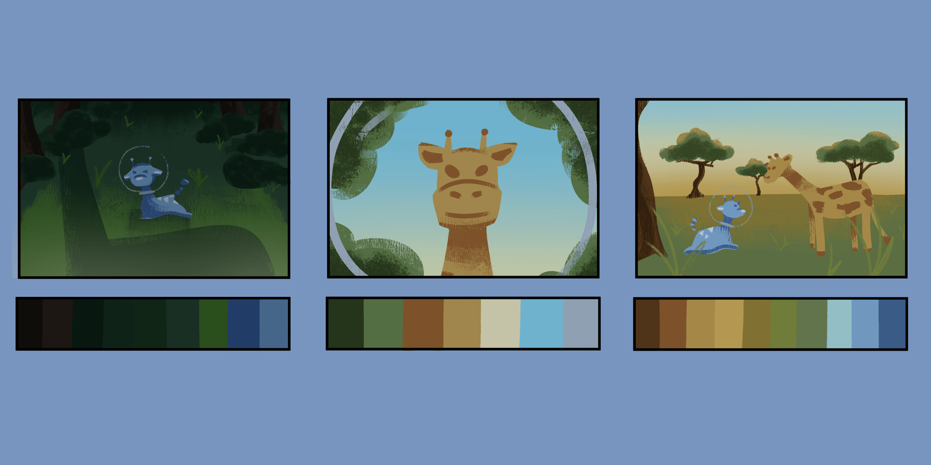
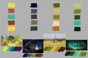
I made my colour palette simple but vibrant – I was going for a sequence of colours that flow from the blues and purples of space, to the dark greens of the forest, to the oranges and yellows of the savannah. I made sure to include at least six shots that resembled the four-five main scenes we will be making for the animation, so that each scene has a clear colour scheme to follow.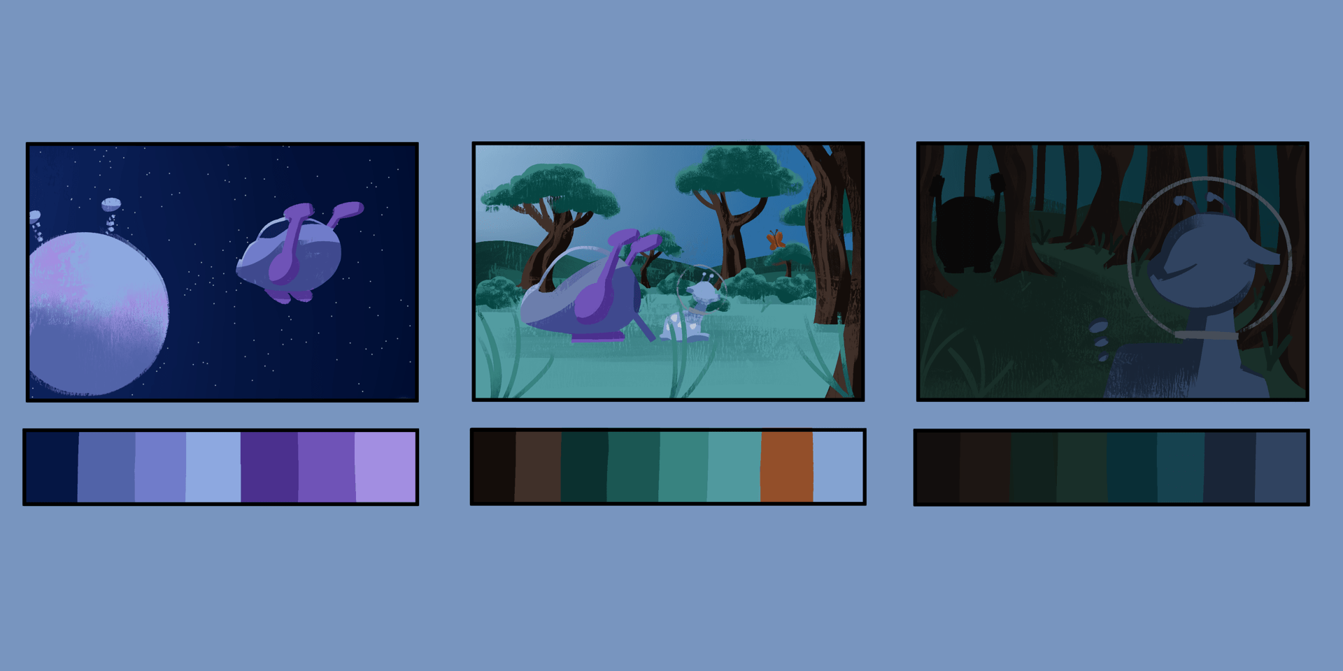
I was working with a savannah tree asset this week and was testing out toon shader concepts on both Blender and Maya to see how they would look. I first followed this video called ‘How to Create Ghibli Trees in 3D – Blender Tutorial’ It was a very interesting process and my first result is below. I think its a great look however the look we were going for was to look more toon like – with more simple tones in the colour value of the tree.

Source: https://youtu.be/DEgzuMmJtu8
I then followed this video called ‘Maya Toon Shader Tutorial’ for making a tree on Maya. I first made my simple shapes in the position I wanted then I followed this tutorial for the toon shader settings and how they work. I feel as though this was a much better result and made a second one in case we required another one for our scene. This look was what we were imagining and looks a lot like some of our references we collected. The tone and shader placing was a little weird to look at at first but it looks cool as the tree alltogether.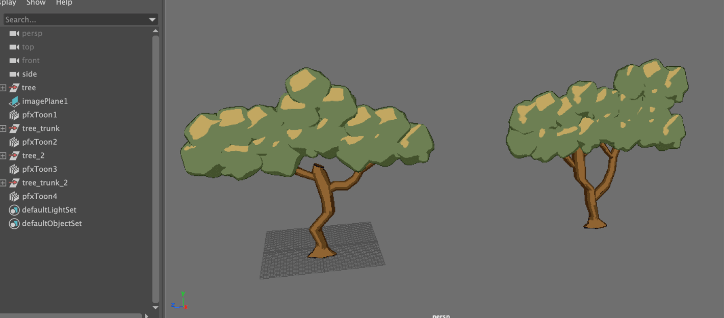


Source: https://youtu.be/QNywO1AUtEA
During our Thursday class we got great feedback and some questions answered for what we have made so far and what we will do next. We talked about the rigging of our characters, the use of the bend tool, how we will apply both textures of our own and the toon shader to assets, the use of an Arnold plane material to place down sky painting we will make, and so on.
Next our group will keep working on our 3D assets and plane assets for the end of this week, then we will be ready to set everything into the animation scenes files and start recording the camera.
 During our call in week 11, we had polished up our organising for starting out animation process. During this week we are each starting to build up the different scenes in separate Maya scenes. Then we will be placing in our characters, assets and textures when they’re ready. Before this, we will organise the environment, place down the lighting, and structure the camera shot, so that the assets are ready to be animated to the camera movements.
From this screenshot above, Jennifer is building the space scene, Matthew and I are building the two forest scenes, Alisa and Ben will build the savannah scene. We have organised our own deadline dates so we can stay on track for the next and last presentation.
We decided a few things before going to decide on finished designs on our assets. We all agreed to follow the colour palatte of each scene that I made a while ago to define the colour scheme for our work. We were also concerned about the transferring of files and how textures and materials may be lost in the process. After the call we had made a Maya workspace placed in our google drive folder so we can add our Maya scenes and source images onto there when we are done, and it will hopefully help connect all the imports and references we make in the end.
Alisa and Matthew during this week are finishing up the rigging of the characters, (also Alisa has made plane images of bushes / Matthew made a Planet asset), Jennifer is working on some texturing for the sky and other assets, Ben is working on the ship asset and other texturing, and I have been working on some forest tree assets, and working the toon shader material. – As we are doing these tasks were also building the scenes.
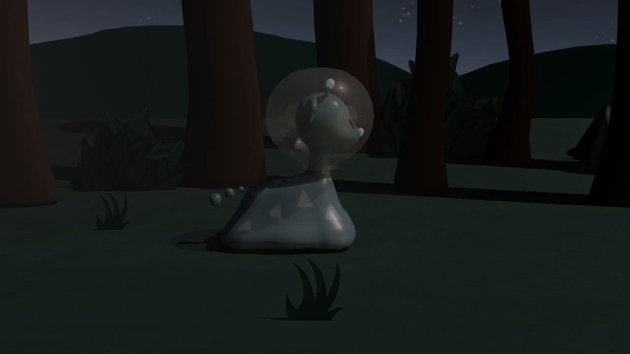
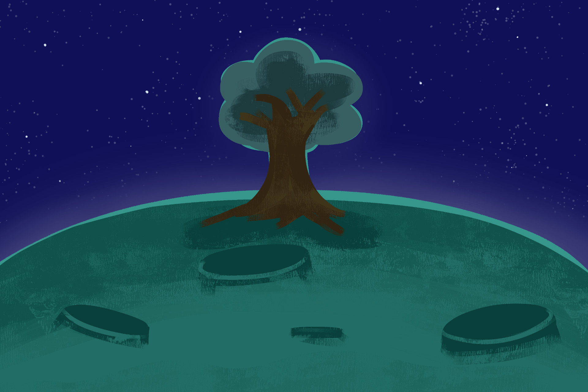
So far I have been working on the second forest scene, which is featured in shots 5, 6 and 7. I placed down a plane floor and used the Bend tool that our tutor taught us in class, that allows me to bend the side of the plane up so it can cover most of the camera shot. I placed down the dirt ground path, some tree assets, and a Skydome light and directional light. I also placed down slim polygon planes with my grass assets attached to them. They work well on the viewport however they appear with a black background on the render view. This is something I am currently trying to fix.
I also placed in a temporary made ship from our previs for the silhouette shot, until the actual ship asset is finished, then I’ll replace it. I have added toon shader onto the trees and they seem to work well, but I needed to add the directional light to help the shades appear, as the Skydome light couldn’t do this as light is projected all around the scene, rather than one side.
Below is how the render view is looking through the camera shot at the moment. Next I will be able to gather the textures for the sky, trees, bushes, fix the grass, and I’ll add the character in very soon.
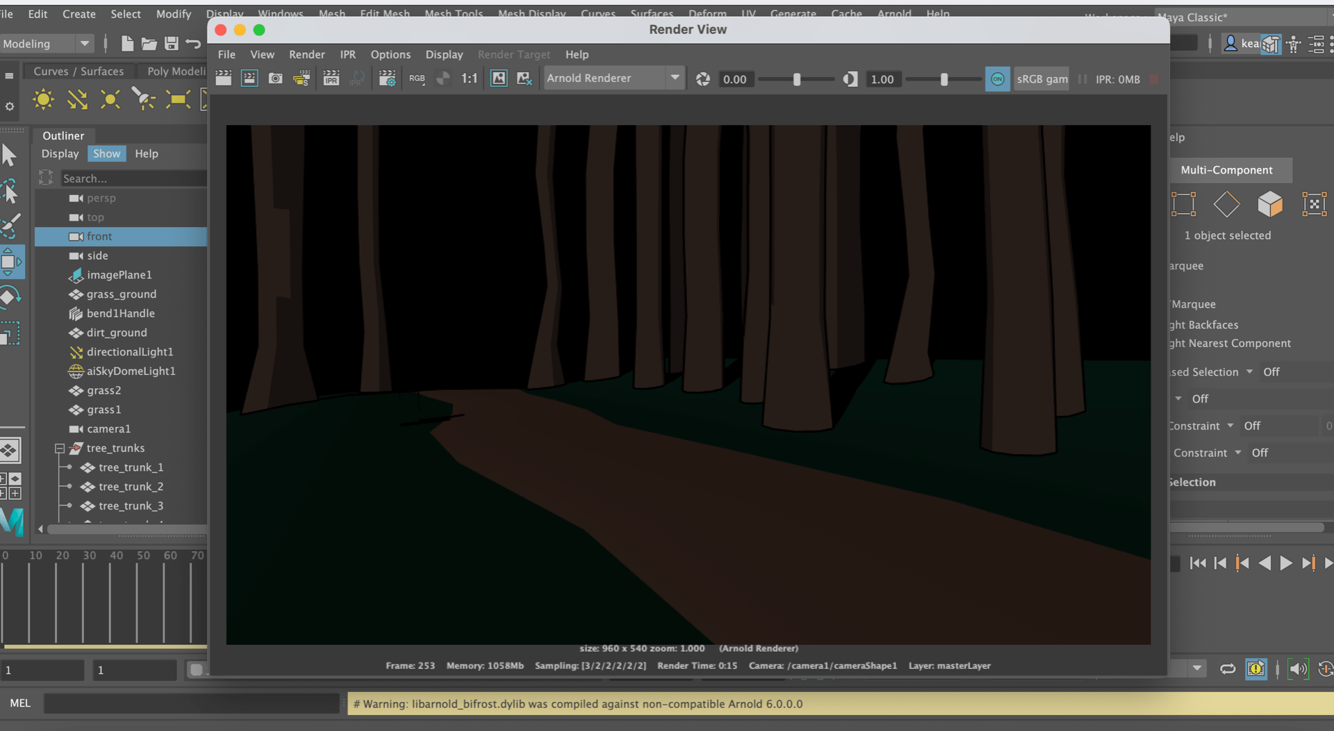
During our week 11 class, we asked a few more questions about some problems we were coming across. One was about how Arnold render was appearing as hardly anything while we could get some better result through Maya hardware. All we really had to sort out was the format of file image I wanted to save a render view as if I wanted it, or else if I want to view the scene, to always go with render sequence – as this will have a better outcome.

Arnold renderer preview on the left, Maya hardware on the right
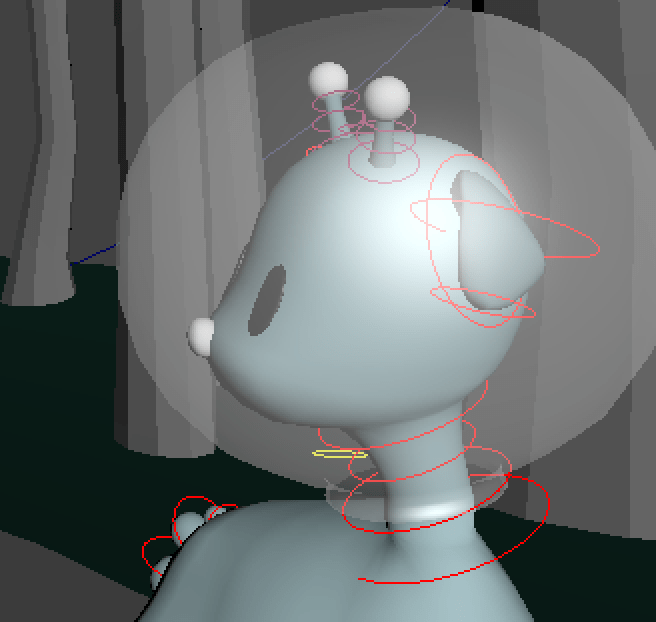
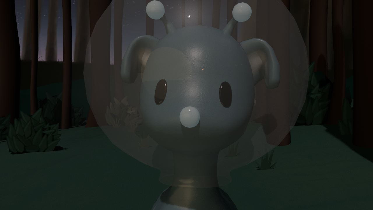
Another little problem was for the head-turn of the alien character to look behind them, but the neck became distorted and skinny. We handled this by just slightly adjusting each neck control softly, also turning around the body for more effect, and also turning the head, so that the neck wouldn’t look as bad but we could get the result we wanted.

Matthews video showing us a better way to turn the head
So far I have imported the ship and alien assets and have animated the main movements, and structured the scene a little better for whatever made it look better. I also showed my progress during our class on week 11 and my tutor suggested that the turn-back camera shot could be adjusted a little better, and showed me a nicer outcome that I tried out later that day.

The next day of animating, I managed to fix the problem with the plane image/transparency and applied my grass textures to the scene. I followed this YouTube video called ‘Maya Arnold Opacity (transparent texture background)’ that helped us with the process of adding a colour base material, and an alpha material to the plane that allows the image to work as we intended.
Source: https://youtu.be/82Vgd0E3p2w


I also applied the textures of the alien rig this day as Matthew had just finished them. Matthew also provided the rest of the group with little tutorials for the alien rig and how to apply its textures. This is how my scene is looking at this stage.
After this stage, I had done a little more animation on the walk cycle and the head movements. I was prepared to add in the giraffe asset as it was completed by Alisa.


Images that Alisa had sent to us of the Giraffe asset and Textures
Unfortunately, something went wrong with Maya. As soon as I were to go press the ‘Import’ option to add in the giraffe asset, the program freezes, and gives me no other option than to force quit it. For a long time I have had no luck with fixing this situation. I had even tested this on a different computer, and it gave me the same frozen reaction to me clicking on ‘import’. I plan to contact a technician from my class if the problem doesn’t solve, and/or hand over my file to my group, to help out with adding any assets I am missing to the file.

Most of my teammates tried out the file I was working on to see if it was different for them. However they had the same problem, when clicking on the ‘import’ button. So the problem was situated in the file I created.
We finally figured out a way to go about this (adding the last assets I needed so I can finish the scene then render it). We did this by setting a new scene, uploading the giraffe and bush assets first, then importing my file last. This eventually made it more suitable for me to work on, even if the ‘import causing freezing’ error still occurs if I press it again.
I made a new scene with everything as either a reference, or imported in. I added the giraffes textures, and the leaf textures of the bushes. I polished up the environment, the alien animation, and the last touches of the camera. For now, I am waiting on the background images and then we will be ready to render our scenes.

I worked some more on the lighting and render settings to make sure it is suitable for the process coming soon. I was making sure the lighting was not too dark but not too bright to get the idea it is the middle/end of the night – about to become sunrise, in my scene.


It took a while to get something that works, but its looking okay so far. These were previous adjustments to the intensity of light which I thought were a little too dark.
 At one point, the shadows were so strong that we couldn’t see the alien character here when she runs into the giraffe. As a result I looked up to see how I can adjust the shadows to avoid this look.

I started to work on the softness of the shadow and the temperature of the light, which made the scenes a little noticeable and nice. You can see the light shining on the trees with toon shader on, the light shining nice on the alien, and the shadows forming a lot better relating to density and softness.
After getting the right Skydome and directional lighting settings, and Jennifer finishing our painted backgrounds that we could place down as an Aiflat material, I was able to correct my scenes pictured below. Using multiple lights and working with colour temperature really helped the scenes image and how they are meant to be portrayed (first scene – scary and dull, second scene, discovery, lighter scene)


The backgrounds I used that Jennifer created
As a result of these lighting adjustments, this will hopefully connect well to the next scene that will appear that Alisa has made. I also made adjustments I thought of last minute that will follow onto the next scene, and from the last scene better; I did this by turning the giraffe legs to facing the back of us, and turning the spaceship around where the door is so it makes sense the alien came from there.
This is what the Playblast looks like just before it goes into the rendering process:
My first attempt at rendering this scene for a long period of time, didn’t go as planned. I believe a material such as toon shader, or a wrong kind of setting, had caused my render sequence to appear grey/blank with a subtle outline of the toon shader. For the rest of my group, they either had a very long process of rendering or they also had some kind of error. For our last presentation coming up, we decided to show playblasts for the scenes we were missing for showcasing and focus on the proper rendering after.
 What I was hoping for

What was appearing
For our presentation, we showcased our current production process which included the character modelling/rigging, texturing, animation tests and other assets made. We also talked about our problems and solutions as there were many to address. As a result we presented our current progress on our animation and gathered good feedback relating to a camera angle, the lighting, and symbolism for the butterfly. Overall they were happy with our work.
Source: https://docs.google.com/presentation/d/11_S-BksNa3CGSgHhSOF4xMBPFjv8JiZuzAF8LnrFOik/edit?usp=sharing
After the presentation, we reevaluated what else we had to accomplish for the final submission date. We discussed we were to fix up camera angles, lighting, and perspectives in our scenes to allow it to flow better. We also discussed how we will render our scenes and decided we could either try going back to the campus computers, or else render with our laptops at home at a reasonable time in the day, as they take a long time.
I have come back to my scene as I want to adjust it a little bit. First of all I split my scene into two files: the first two shots being the first part, and the last shot being the second part. I figured this would help my rendering progress as there is less animation in the file to process into one sequence. I also did this so I could apply different lighting to the second part, so that it will connect more smoothly with Alisa’s scene that appears straight after. Also during this time, we decided to scrap the use of the toon shader as it was giving us too many problems in mostly the Arnold renderer.


In relation to the textures, I made sure to keep everything together with my source images folder in the Maya workspace so that each file could be connected correctly through the file path option. During this time I was adding in the giraffe textures again, and I made my own ground texture on Substance Painter (same as Matthew and Alisa did) so that the ground looked a lot nicer in the render view.
Around this time I have been testing the renders to see if they are working well. Here is how each scene looks during the render process:

As a last touch, we decided to add a mesh light effect for the spaceship lights. This will act as a ‘creature with bright scary eyes’ that the alien, already very scared in this situation, thinks it is.
My teammates found this clip from Home Alone that gave us a little inspiration of how we wanted this scene to play out and the kind of emotion, and reaction I were to try and capture. This is from a YouTube video called ‘furnace fear’.
Source: https://youtu.be/kd0VdX_9ZfM
I added two cylinder shapes onto where the top two thrusters sit on the spaceship, and squashed them a little to give the illusion they are bright scary eyes. I attached a mesh light to the meshes that allowed them to shine a bright light. I adjusted the lighting until I was happy with them and included them in the final animation.
During the render process, I could see that the lights made a static effect while the animation played which I thought was a great addition even if it was not meant to happen.

And after four days of progressive rendering, here are my final rendered scenes below:
After all our rendering of the scenes done, we could move onto post-production where we will be editing everything together!
Pre-production
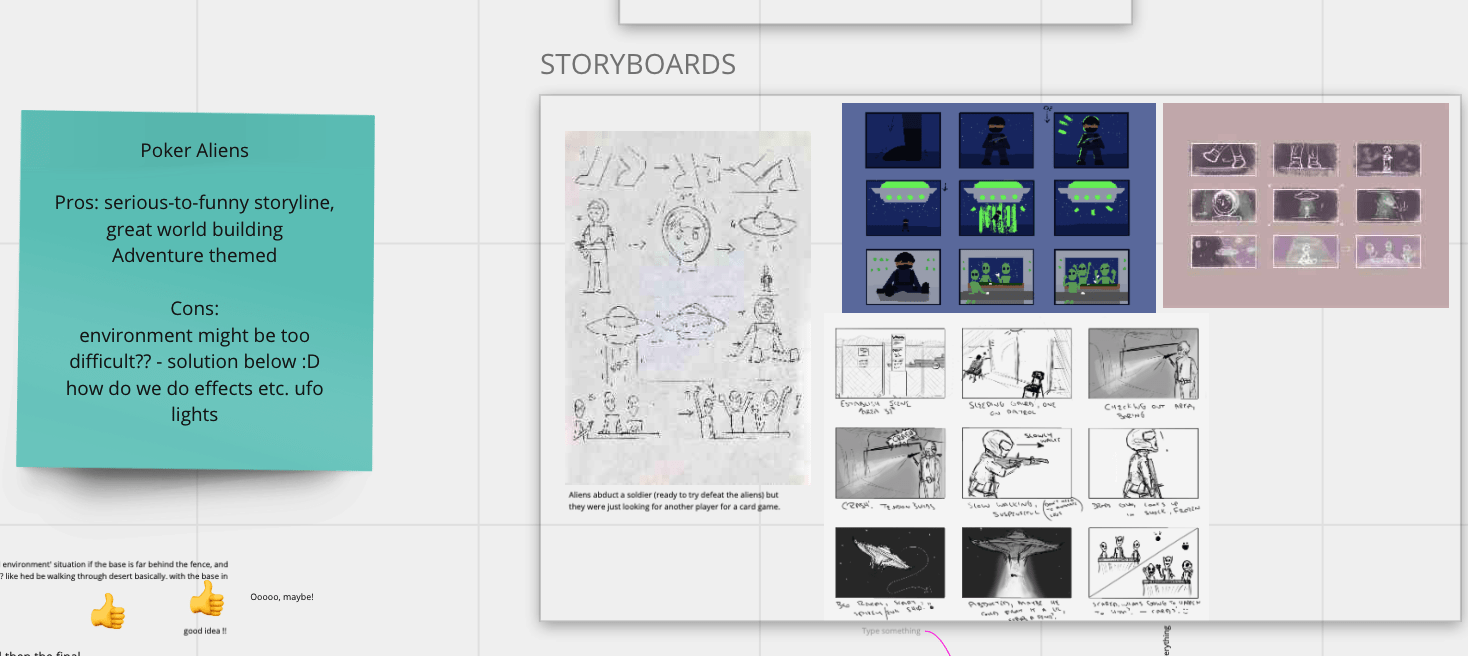
After some discussion during week 4 we chose between the Alien & Giraffe story, and the Poker Alien story. We finally decided we should work on the Alien and Giraffe story! We had started to make proper concept work and storyboards for these two ideas to build up their story and see how we should go about making them into an animation.
Again we listed the pros and cons of each story, paying close attention to the features of the story and how we should create them. We discussed the problems and made solutions however our final thoughts were that the Alien & Giraffe story would be best to create.
I made some character design sheets and a coloured storyboard for these stories to build up its visuals, storyline and production.
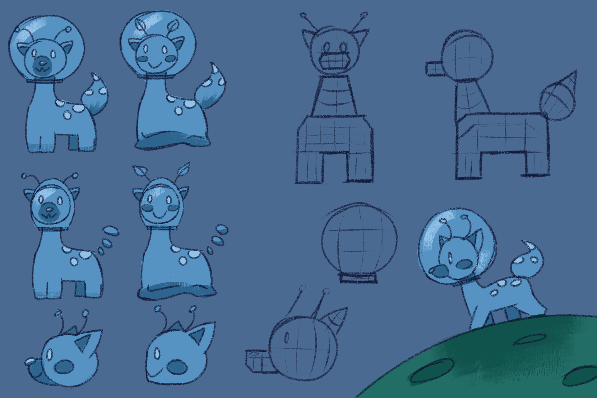
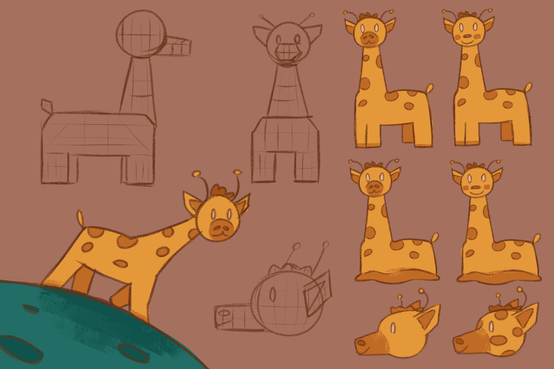
For the Alien & Giraffe story I made some character design sheets of the two main and only characters, the alien and the giraffe. My team member Alisa thought of the first looks of the characters so I attempted to revamp them and provide different styles to show variation. I also added its simple shape to help us 3D model the characters. To the left I made a quick environment study to grasp an idea of what the scene will look like.
Next, we were moving onto creating the presentation. We gathered our decision making processes, our concept work, and any thoughts about our story, to add to our presentation.
I took on the role of decision making, Matthew took on project idea, Jennifer took on references, Alisa took on storyboard/animatic and Ben took on storyboard also. We all also had our own parts describing our designs and concepts we’ve made so far.
Our presentation is below in the link. We were given good feedback from our tutors; they envisioned the story could be stronger in some parts to grasp the idea where the alien character is coming from, and what are their intentions. Brainstorming possible additions to the story will give it more build up and strengthen its high and low of the narrative.
Source: https://drive.google.com/drive/folders/1pVHk6izrGSCk-x8uX7H1JASEDjv6h356?usp=sharing
After presenting our group presentation. We got to work with the feedback we were given and to discuss more ideas we could add to our animation. We grouped up for a chat on week 5 to figure out the storyline and possible additions that could build our story. We made a script, with a stronger storyline that can guide us in our storyboards, animatics and future animation.
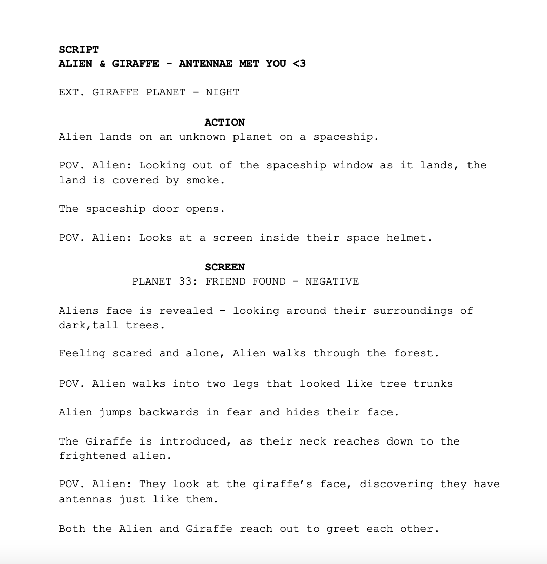
We added features such as:
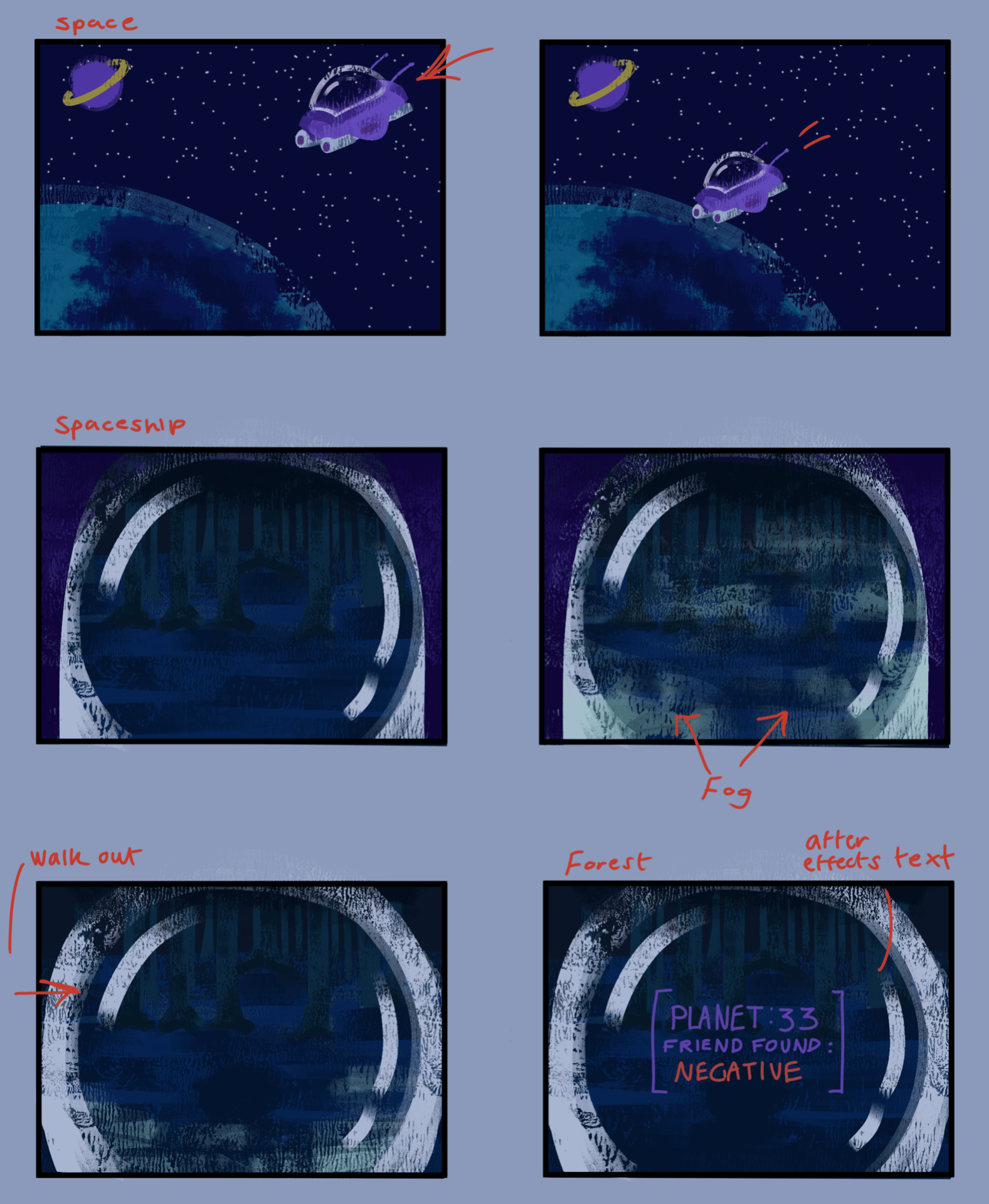
- The alien is taking trips around space by using a spaceship to land on this planet.
- The screen in their helmet telling the alien what planet they are on, and if they have found a friend yet, is showing us their objective and how long they have been working for this.
- The environment the alien has landed on shows their fear of being in a scary area alone, by the way they act and the look on their face.
- Their first interaction with the giraffe, getting spooked by them, will determine the last encounters the alien has had have not been good.
- The giraffes calm nature and interest to the alien also calms them down.
- The aliens reaction to the giraffe also having antennas determines their objective may finally be complete.
After making this, me and the group decided to work on a few more concepts for week 6 so we have a more built background to the story. We decided to take rolls of finding our colour scheme, making thumbnails of important shots, designing the spaceship, environment surroundings etc. trees, and final designs of the characters.
I’ve come up with a final storyboard design, some colour theory and thumbnails.
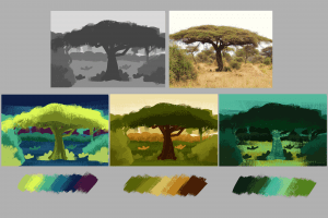
I experimented with the colour palette we could use for our work to emphasise the story and its emotion. I picked colours from some references we liked and experimented with them in a sketched scene of a savannah environment.
Here were some of my thumbnails that would enhance the visuals of the story further on in our development. I made use of the darker tones for the beginning thumbnails to see how the story would be impacted by showing a scary, dull tone, then lighter colours during the end for a heartwarming finish, where all the scary tones leave.
I had made a storyboard of how I predict this story will go relying on what concept ideas we had made so far and what we have all agreed on showing. I made use of colours and made sure to reenact the camera shots I had in my mind. The storyboards are below.
We gathered once again on week 7 to discuss our finalised storyline with the use of the storyboards we all made earlier on in the week. This will help us progress onto our production starting with the previs. We discussed in call what sections are important, how the story will flow, what little details will impact the story and what camera angles/shots we will use.
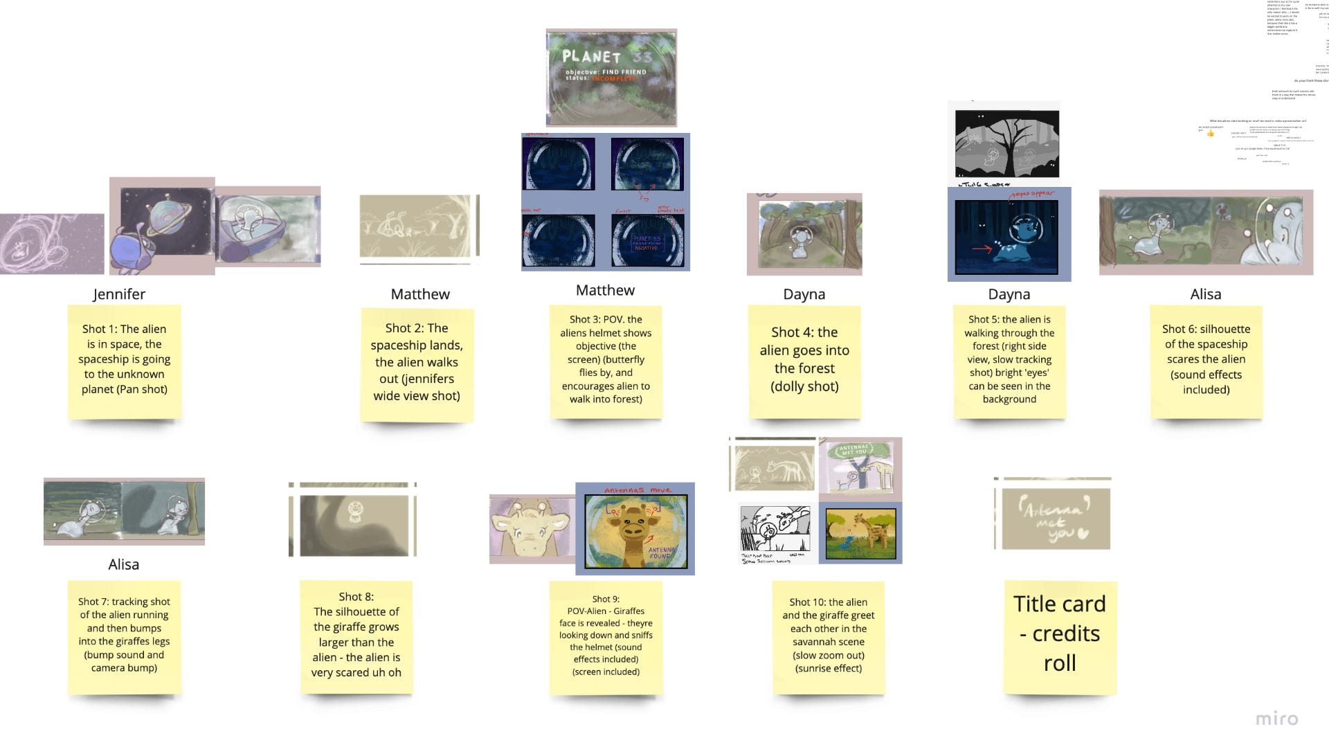
We wrote about each shot on a sticky note in Miro Board. When we were done discussing, we cut out parts of all our storyboards, and placed them to the shot that suits it best: Its overall visual.
When we were done this, we were ready to move onto our 3D modelling and previs video to capture the story in 3D!
Brainstorming
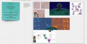
With my group: me, Jennifer, Alisa, Matthew and Ben, we started to brainstorm our possible 3D short animation ideas with the website, Miro Board.
We acknowledged we were to follow the theme of Adventure, make sure the story doesn’t go over/under 30 seconds, and is unique and simple to animate.
We discussed many ideas and what we thought about them. Eventually we ticked or crossed out which ones we did and didn’t like. Those ideas that were ticked, we discussed them more to see what story we can make out of them and how we can achieve it.
We moved onto cutting down the ideas to which ones were the strongest. We were left with five ideas by the end of our first group call. We decided to take at least two of these ideas and draw out rough storyboards of what we thought would happen and how the characters/environment would look like.
In our next group call, we gathered our rough storyboards together and examined them. We made a new table on Miro listing each of the five stories and the storyboards that were made for them underneath. We took some time to list the pros and cons of each story; thinking about how we would go about it, if the characters/environment were achievable, if we followed the theme ‘adventure’, and what kind of genre it provided etc. humour, mystery, wholesome.

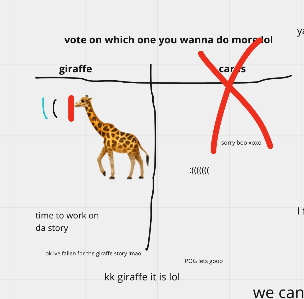
After much discussion and voting, the two different alien stories won over the final five ideas. The alien giraffe story is about an alien landing on a planet inhabited with alien giraffes, who didn’t fit anywhere else because of their antennas, but makes friends with the giraffe as they have the same antennas as them.
Source: Alisa’s take on the alien giraffe story. 

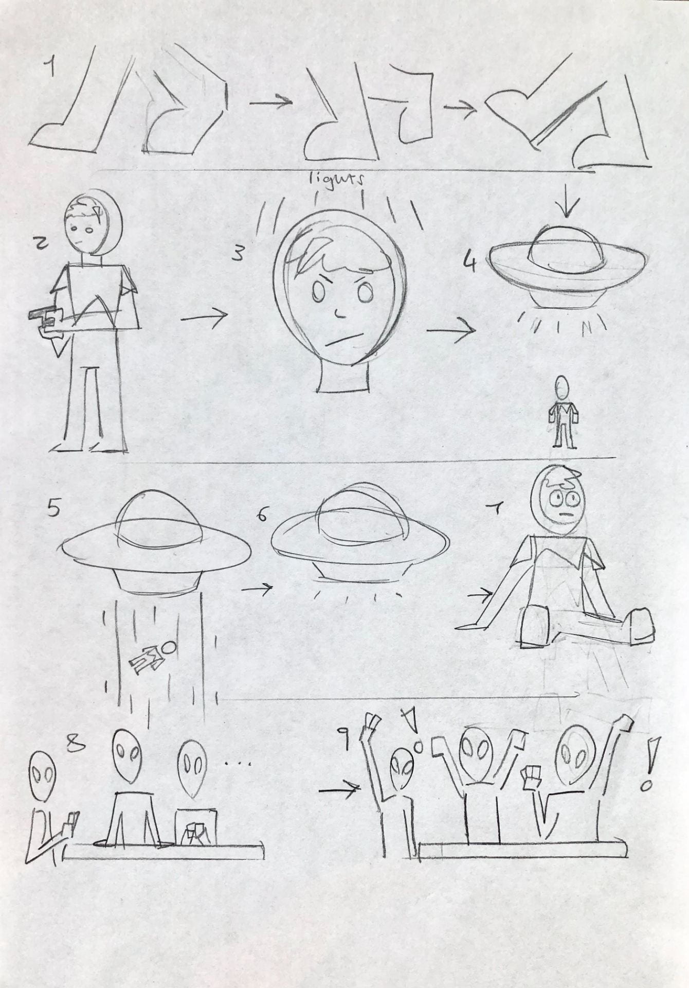
The poker alien story is about a space man ready to fight off the aliens entering earth. However he gets abducted quite easily. He enters the spaceship and the aliens cheer because they found another player to play poker with.
Source: My take on the poker alien story – rough storyboard and thumbnails

With these two ideas, we will be making concept work, and pre-production ideas to present to the class and to also decide on which one is the strongest idea to make.
Modelling, UV Mapping
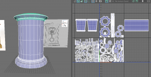
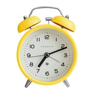
Here I will be explaining my process of modelling and UV mapping my Mantel Clock model.

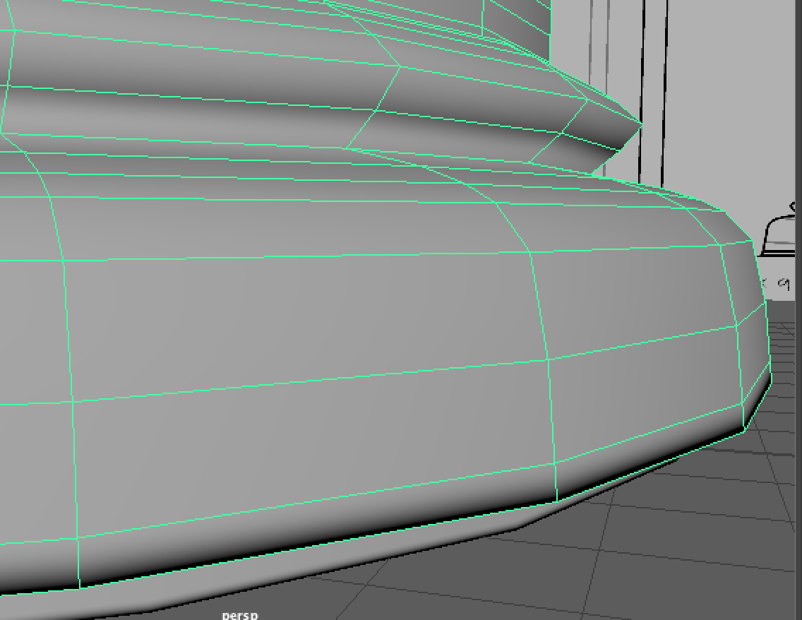
I started the model off by placing down the biggest shapes from the case of the clock, and the actual clock. At first I made these shapes with 20+ sub divisions so that I had enough edges to work with to sculpt into the shape as seen in the reference. (I would soon change these shapes later) This was the technique I used in both the vase challenge and the table challenge.
Source: Weekly Modelling Challenges – Week 1 – Vase / Jug modelling challenge, Week 2 Table modelling challenge.

As done before for the clock, I placed down a cylinder shape, copied and pasted it, made the copy smaller and clashed it with the original shape to extrude a part in the middle for the face of the clock, with the boolean – difference tool.

I made sure to try keep each object in the same position of the scene, and to follow the measurements I decided on to give the clock a natural proportion.
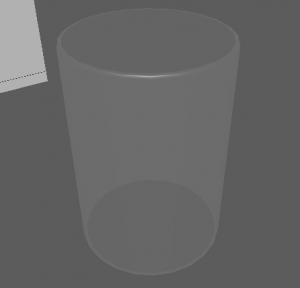
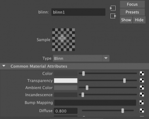
Here I added a hollow cylinder shape to create the glass pane. Immediately I assigned this cylinder a new material (blinn) so that I could work with designing a glass material. I altered the settings such as the colour, transparency and specular shading to give the glass effect.
After these, I started to add in little details. The bell on top was a simple sphere that I cut in half and placed on the top of the clock.
I added hour and minute hands in the same design as my reference, in the shape of shining diamond stars. I used a thin cube and used the mutli-cut tool that adds divisions to scale the shape.
![]()

I also made multiple roman numerals for the numbers on the clock. I followed a sheet that helped me with each numeral and I added them onto the face of the clock.
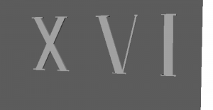
I made the 1, 5 and 10 separately and then copy – pasted how many was needed for each other number.
As I said before, I was going to restart the base shapes I made at the start. I wanted to start them with a more simpler style and it would eventually become easier to work on as it had been before hand etc. the many divisions was too much to work on, the position and scale got confusing.

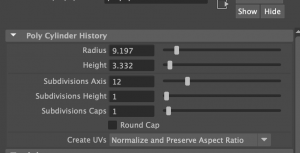
I remade them and kept the divisions at 12 each. I eventually made many more objects have 12 divisions as they fit well when positioned together etc. the rim around the glass pane, the top and bottom base, and the pillars.

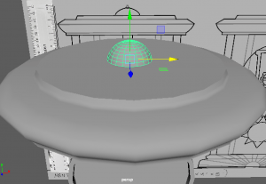
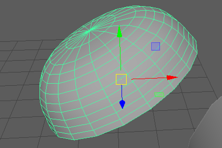
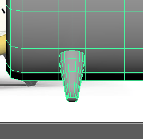
I then went on to make the sun inside the clock. This took many tries to find the right style but I found I could use a low poly sphere (shaped like an oval from the side) and added similar shaped cones around the base to make the sun rays.

It was a challenge to get the rays in perfect place from its opposite as best as I could. I made use of the translate settings on the right of my screen to determine where they are placed. I made sure the sun base was reset in the middle of the clock first, then I worked on the rays. I also worked on the degrees settings to flip the rays around when I copy – pasted them to the other side.

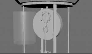
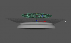
At this part, this is what my clock looks like so far, along with what is included in the outliner.
Here I was working on the back of the clock, so that in reality, the clock inside would work like a pendulum clock with the sun attached to a rod, connected to the back/middle of the clock, being run by moving gears.
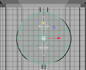
I made the cogs with the Torus shape, turned down the divisions and rotated the object to have faces pointing horizontally. I also selected faces around the side, leaving a space between each, then extruded them outwards to make the shapes of a gear.![]()

Once my shapes were made, I went onto smoothing most of the shapes to give them a nicer, finished look for the end result. As you can see beforehand, the shapes such as the hour hand is quite boxy.

Here you can see the smooth setting I clicked on to give my shapes this look. The hour hand now looks more realistic for the look of a clock.

I continued doing this with objects such as the sun, rods in the clock, the glass pane and the top and bottom base.
The sun smoothed pretty well, however for the cones, I had to add an extra edge loop on the bottom of the cone, where it sits on the sun base, to allow the smoothing feature to work better.
Before I did this, the smoothing made the cones look like a circle with two points on the top and bottom.
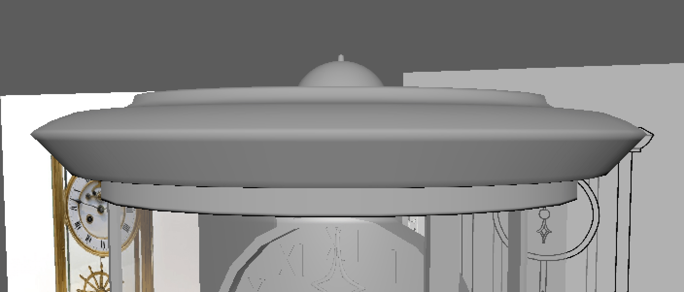
Here are the base shapes when they are smoothed.

During this time, I made sure to add a stand for the bottom of the clock like I designed in my reference. I quickly cut a cylinder shape in half,
and scaled them to the shape of the base and placed beneath the clock.
As I mentioned before for the cones, adding some more edge loops with the multi-cut tool to the edge of a face etc. like the last edge loop in the object to the left, will emphasise the edge more than it usually would when smoothed.
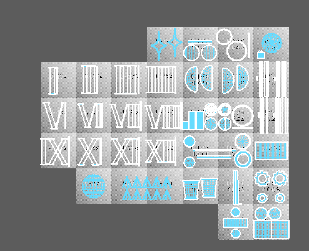
After all this, I started to UV map the clock model.

Before I got Henry’s help, which I asked for later on, I was mainly using the planar tool to plot each UV part of the object onto the UV editor. I made use of the x, y and z axis to place them down at a position that presents the parts well.
![]()

I had made sure that my UV parts were positioned well and not being stretched like I had seen on the checkered texture. However, around this time, I could have been unfolding the UVs more rather than making them perfectly straight.

I did not know this at the time, but I made the mistake of placing UVs across two UV islands which would end up confusing the UV map altogether. I would eventually fix this problem later on.
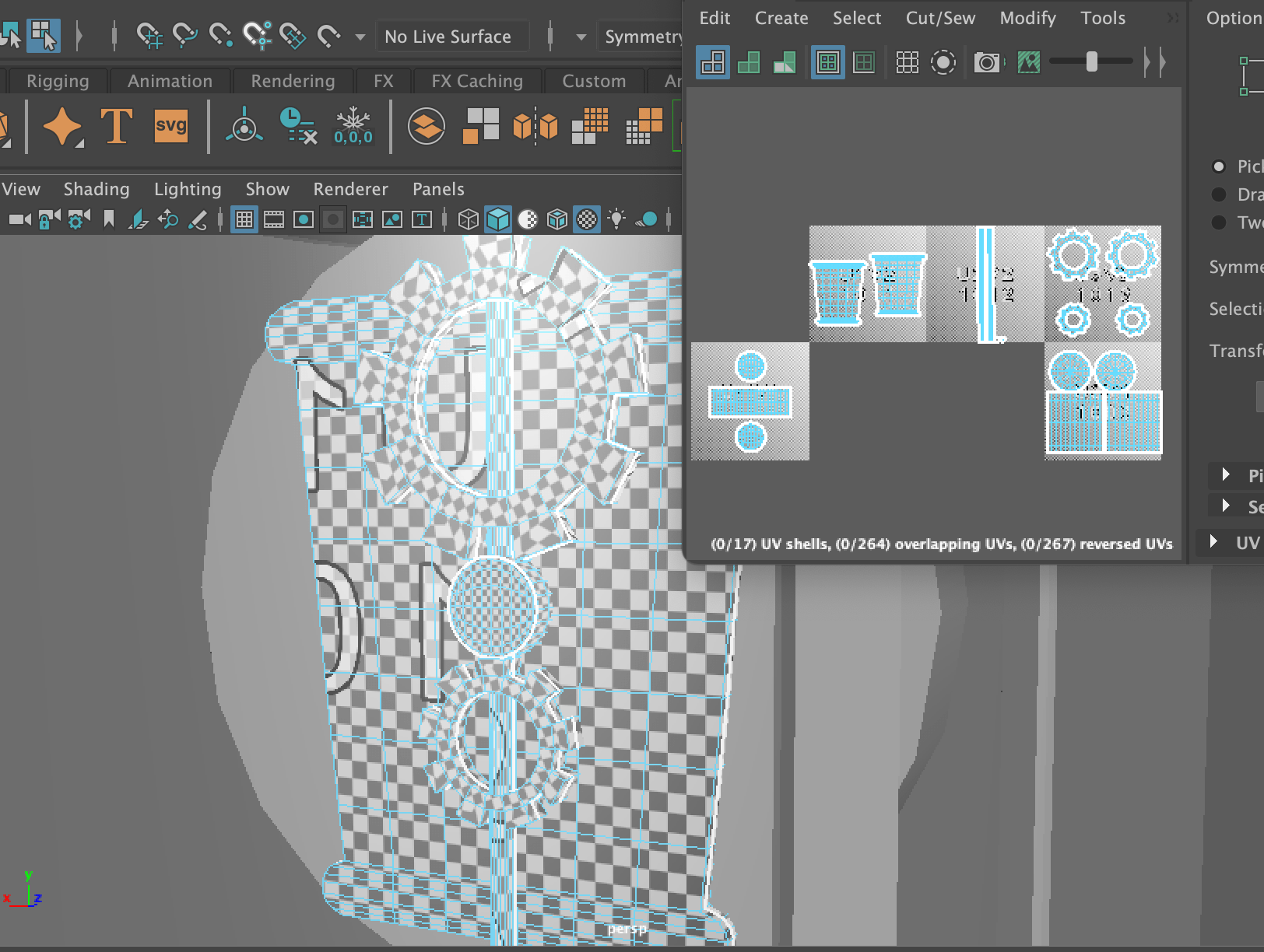
 At the time, I did think that separating each part of the model into separate UV islands was the right idea, however I learnt that we are able to group all the parts together into one UV island that will share the same material attribute.

I decided to contact my tutor Henry for some help because when I was exporting the model, It was not working properly on Substance, so I couldn’t move forward with my work. Henry was a great help and pointed out the two biggest errors in my model, that I went onto fix. They were the Mesh and the UV.
In the mesh, I had accidentally produced extra faces/edges inside the top and bottom base of the clock. They had caused non-manifold geometry. All I had to do was zoom inside the part and delete these faces and edges that were effecting the mesh.
The next error was the UV mapping. I learnt from Henry that I had not used an option that would have helped me determine which UVs were flipped, not unfolded etc. By clicking to where the arrow is pointing on the left, I would get the red and blue highlighting on the right.


Henry recommended that I use the UV editing workspace that provided me with many more options and easy access to all the UV features. I found this very helpful during the UV process.

As you can see, there were many parts highlighted in red, so there was lots to do. I noticed the sun was not UV mapped well enough so I started with it. I cut around the edge base, and both sides of the cone, to let it unfold, giving me two triangles and a circle base on the UV editor. I did this for every triangle, then I cut in half the sun base and also unfolded it.
![]()
![]()

I went back to the roman numerals as they were not unfolded properly. I selected the whole number, unfolded them and clicked layout to organise them in their UV Islands. Once I had finished them all I brought them all into one UV island as they will all share the same texture.
I had many more parts to flip, unfold and layout. However I was able to complete the UV mapping. Here you can see I organised the parts into what texture they will be sharing. Etc. the case, the clock, the sun and the hour/minute hands will all have a gold/brass material. However, this will cause a little problem again in Substance later on. I would have to group every part into the one UV island to fix the problem. (This is explained in ‘Texturing’)
Before After

 As soon as I finished all this, I cleaned up my model just in case I missed anything. I gave every group of parts a lambert material that was named after the texture look I wanted to make for it. After this I was ready to export and bring my model into Substance Painter.
Practicing
As I have been planning the design and model of my mantel clock, I have also been practicing simple clocks on Maya before I go into the real model. This is so that I have a much better understanding of what I am working with, how I can make common features of a clock and be prepared to implement my skills into the final model.
I started with this simple round clock to get a overall idea of what a clock is shaped like and how I can bring its elements into a 3D model. I gathered two perspectives of the image to insure its length and depth of the frame.


Before I started I experimented with material attributes too. I added a pink colour to the base, a white colour for the face of the clock and then a black colour for the clock hands.
To get the extruded inside I copied and pasted the same disc shape and scaled it a bit smaller, then brought it inside the bigger disc shape to then use the boolean-difference tool that extrudes the face of the disc.
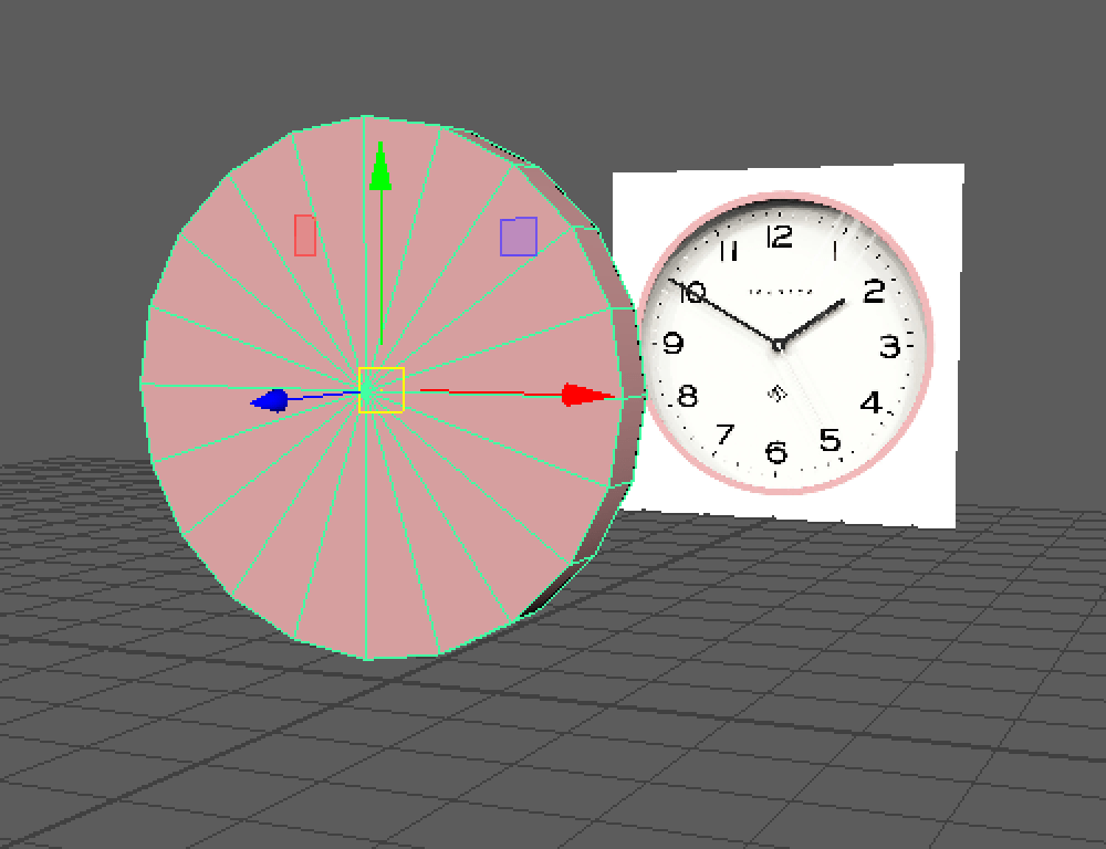


I then added a face inside the extruded part and combined the two shapes together, then created hands with the plane shapes, and followed the reference photo, to get an accurate size and proportion of the hands. And it was finished!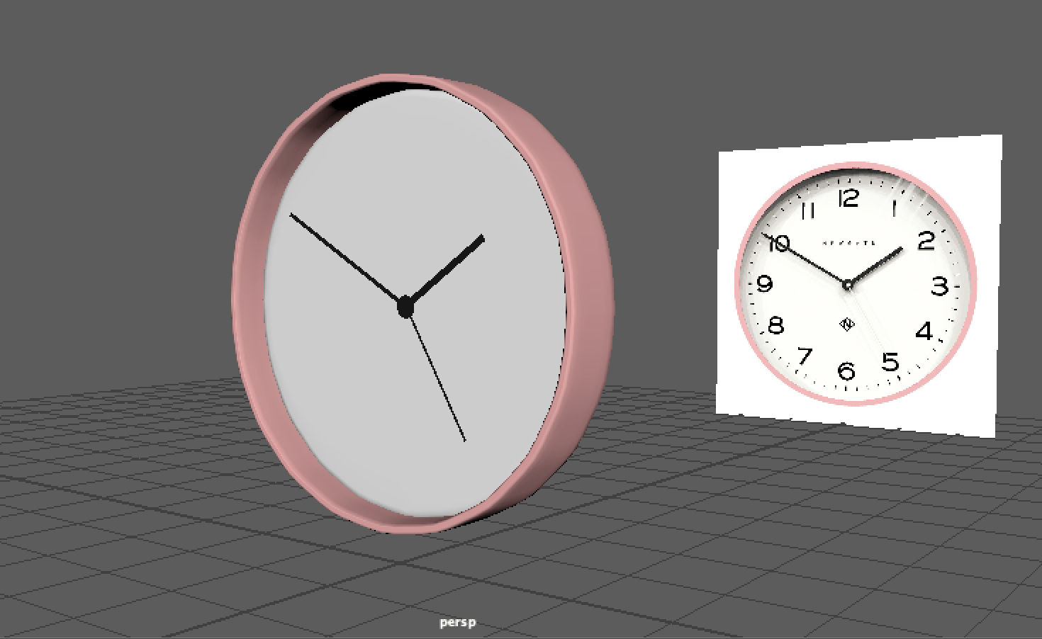
I also challenged myself with another clock design. This time it was an alarm clock. Again I picked out two perspectives of the same clock to work from.

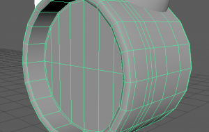
I started with the same process of using the boolean-difference tool to create the clock base and face. I used the bevel tool on the edges of the base (front) to look more rounded and smoother. I also bevelled the middle face to take out any triangles or N-GONS, and make more polygon faces for simpler mesh.
I moved onto the bell body as I figured it would take time to make. I made a sphere shape and cut it in half by deleting the bottom half, then used the fill hole tool to fix the bottom.

I used the vertex mode and used the multi-cut tool to add more vertices to the shape to scale it into how the bell looked in the reference photo. After this I added the middle bar and top part to complete the bells on each side of the clock.
Adding more details included the legs of the clock, the bell ringer, the handle etc. I made a cylinder shape to start making the leg. I used the scale tool to thin the bottom part as it was on the reference. I then connected the leg to the clock by adding additional edges to let it connect to as it keeps its initial proportion.

The handle was quite difficult to make however I htought of the idea of making a curve line and filling it in with polygon faces. This was an interesting approach although I could work on it as the shape stays in a black shade unfortunately. I’ll see for next time how I can avoid this issue.
Here is the clock finished! I don’t have lots of time to add any materials, or try out UV mapping but I have learnt how to do those in other tasks.
Hopefully with these practices I can produce a great clock design and follow the necessary steps to create a 3D model!
Planning
For my assignment, ‘Intro to 3D Modelling’ I will be tasked to model, UV unwrap, texture and real-time render one of the following:
- Windmill
- Mantel Clock
- Treasure chest & treasure
- Sword & shield
- Sci-Fi door
- Old Well
- Magic Witch / Wizard Staff
I have chosen to model a Mantel Clock for this task. From week 1 I have been researching existing mantel clocks, designing new mantel clock designs and getting familiar with Maya to practice modelling simple clocks.
First of all, I google searched some interesting mantel clock designs and brought them into one mood board. I organised them into different categories as some of their themes fit together. I picked out which ones I liked most them wrote about their features that I could point out from them.
Source: All images found through Google, Pinterest or Etsy.
On the left page I started drawing out these clocks to see how I liked the design and see if I can create a new design using their features. On the right page are some designs I made as first drafts. At this point I was focusing on what I needed to include in my clock design.


‘This clock should include:
- a story or meaning
- a stylistic design or a realistic design
- a style to fit into a certain theme or decor’
I moved onto a different approach and made three Pinterest mood-boards of three different room decor styles that I could design clocks for. This made it much easier to project where my clock would be and think of much more designs and ideas.
Shown below are the three different decor styles.
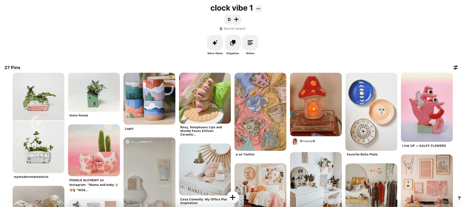
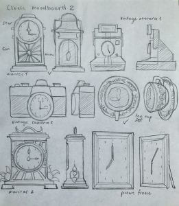
The first one consists of quirky, clay-like, bright coloured objects in a trendy, neat room.
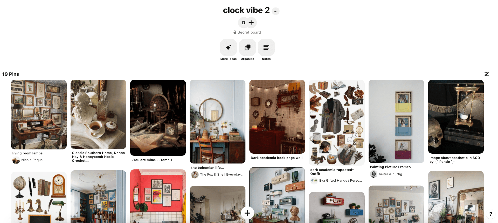
The second one consists of old-fashioned antiques and old style furniture in a dark-academia styled room.
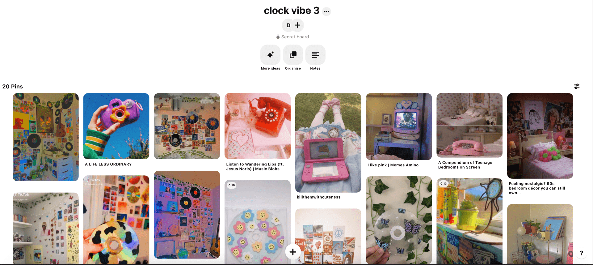
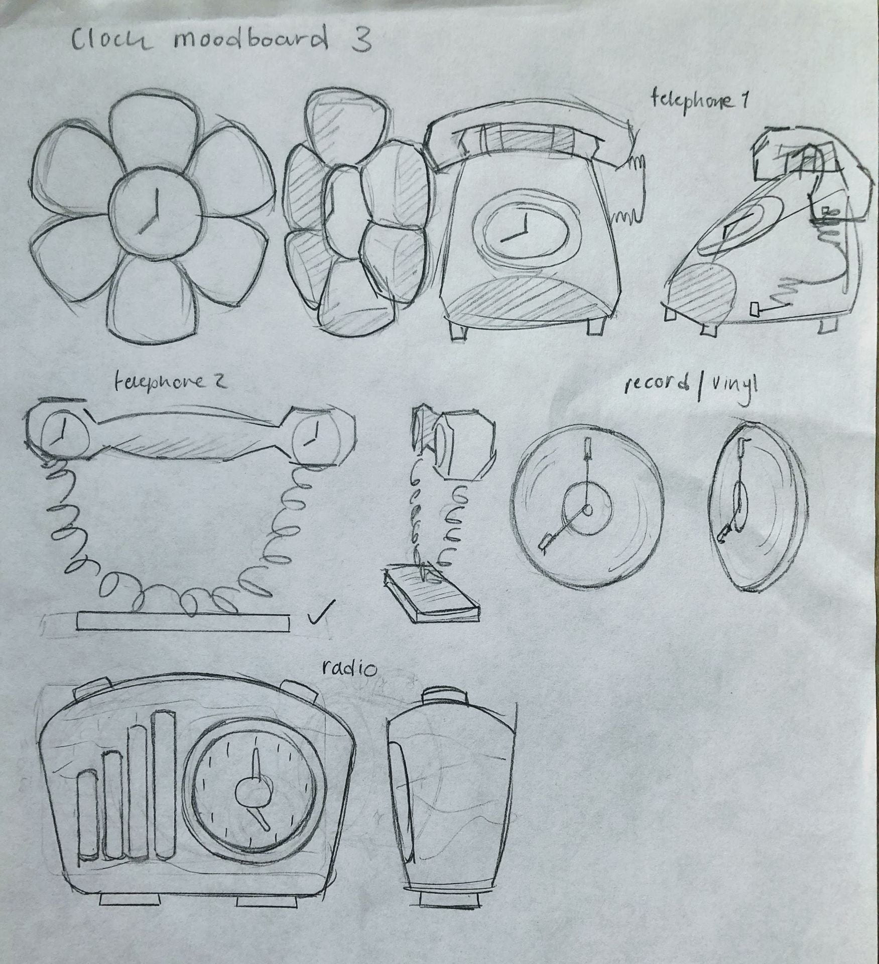
The third one consists of retro/90s themed decor, records and posters all around the walls and old electronics in a bright, filled-up room.
Website: Pinterest
From these mood-boards I created a lot more designs to gather inspiration, variety and unique ideas. I organised my designs into the different mood-board themes and picked out my favourites.
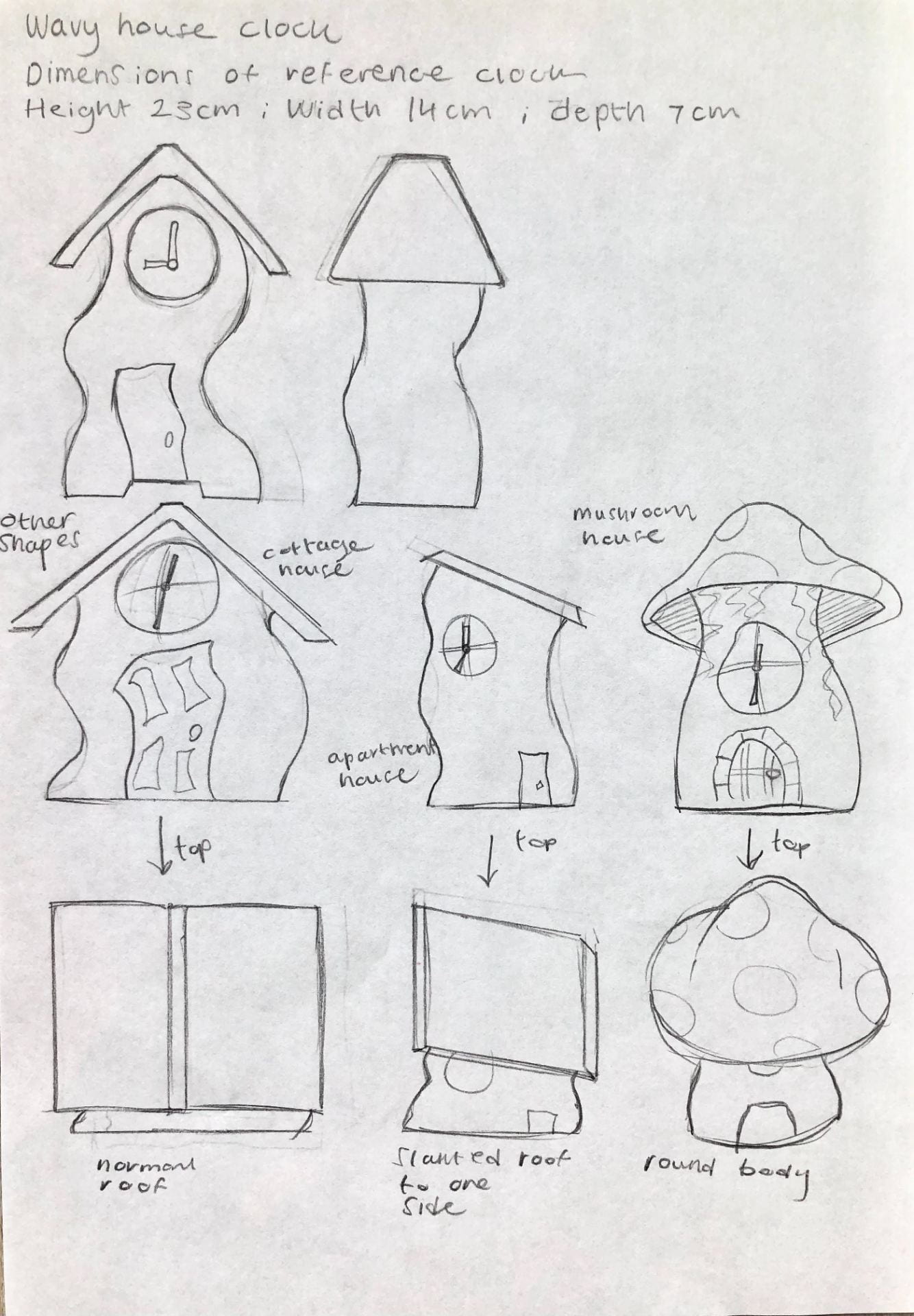
From each theme I wanted to bring out the features and things you would see in the type of room style. As well as this I took in inspiration from my first reference photos as they helped give me an idea of a realistic clock shape and how I can implement into another style. From these collection of clocks my favourites, and those I can work on to create a nice final design for, are the tower/wavy house clock and the sun/moon mantel clock.
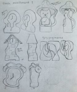
Here I made more concepts of what I could make from these two designs. I drew out a bigger scaled model and created other versions that might spark some new ideas. From doing this I favourited the sun mantel clock the most as it really fits in with the second room decor mood-board, it has a strong, realistic design, and it seems like a good challenge to 3D model.
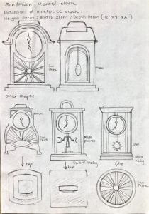

I sketched more of these designs in different perspectives to see how they looked. This is where I was choosing my final model design also. I was choosing between the two on the right, figuring which one appealed to me most.

I moved to digital drawing to help refresh my mind, and sketched out the last four designs and their silhouettes to see which stood out the best.
To me, I found the third design to be the most appealing and interesting to try 3D model.
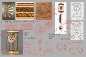
As soon as I picked my final design, I moved straight to observing the drawing and what details, mechanics and materials I can add to the clock that will help me build my clock with ease. Here I observed what carving details I could add, how to build a pendulum clock, sketching out the stand, the sun and the clock hands, and picking out materials as similar to my reference photo.
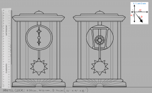
Finally, I made my final drawing of the finished mantel clock design. I made sure to focus on the measurements and the proportions of each part of the clock. This will be my most referenced image for when I get onto Maya.