This was a challenging but surprisingly fun project to take on. I think this was a successful piece of work, as we were able to produce a 3D environment of a Haunted House and present it in a cinematic short film.
I am very happy with the outcome of this project. The jump from Maya, to Unreal Engine was tough but paid off at the end. It was very interesting to see what Unreal Engine was capable of and how I could experiment with it. I was successful in using my past experience of modelling and texturing, to produce spooky assets for the environment. I made sure the group and I were on track and that we had the resources we needed to produce this work such as Miro Board, presentations and notes from discussions. I made sure to try new things and learn from my tutors lessons to produce engaging visuals of the Haunted House. There are times where I thought I could do better or improve on. I wish I could have communicated more with the other groups in the class – to see what directions they took. From this we could have found new ideas, or helped out the other teams in return.
In addition, I feel my teammates worked very hard on this project. They were always kind and helpful. They produced high quality work, and communicated very well.
In conclusion, my teammates and I successfully brought back our year 1 skills to produce a Cinematic Short film using the environment as its storytelling medium. We modelled, UV mapped and textured assets, coordinated tasks and deadlines to complete layouts and renders, spread out equal share of props, and created our own layout on Unreal Engine 4.
This is my portfolio of the work I completed during the 3D environment project. I have participated in concept art, modelling, texturing and building my environment – layout, lighting, rendering.
Once I had set up my main layout of the environment, and had set up my main source of light, I started recording some shots for the cinematic part of the project.
First of all, I brainstormed what kind of shots I was looking to achieve – from a look at our inspiration from our Miro Board, and my own initial ideas I came up with. I wrote what asset I would like to record, what kind of shot etc. close up, medium shot, and what movement will happen in the shot.
At the time I also considered what was done and what was not done. The Piano, fireplace and bookcase were still in construction. So I waited until they were made, and in the meantime, I worked on the shots that the assets were ready for.
I made some cameras and labelled them by number so they will be easy to recognise. I also made a folder for the sequences that matched each camera.
In each sequence file, I connected the camera with the shot. As the camera was in the right position, and was connected to a sequence, I was ready to start recording.
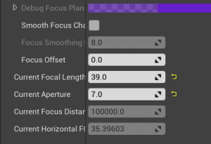
I set the camera settings as below:
Filmback: Super 35mm
Focal Length: 39
Aperture: 7
ISO: range from 100 to 600
These settings were what I mostly used throughout recording. However, to create some different kind of effects, these settings would change around. E.g. the Aperture would change if I wanted a lighter or darker setting.
This is the sequence workspace. It works as a timeline, like most animating software. So It was quite simple to get used to.
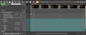
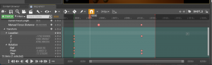
I worked with the location and rotation of the camera to create the movements of the camera. I worked with the focus distance to set which object would be the main focus, or what will be out of focus. I also used the focal length to create different styles of zoom.
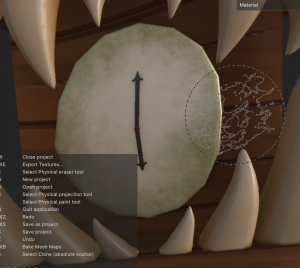
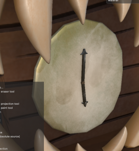
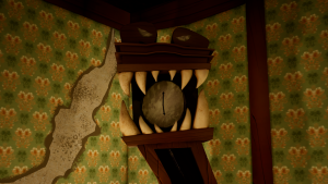
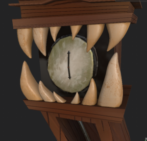
Here In the first shot of the clock, I made a lighting strike effect at the start. I turned the aperture up and down once each frame to help me achieve the look. I set a still position from the start to around frame 24 so I had a close up shot of the clock face. From frame 24, I made the camera zoom out, and roll to the left until the end. The distance between the frames allowed the movement to flow slowly and eerily. The end frame was to capture the full shot of the clock and candles.
In the second shot, I presented the entrance of the Haunted house. The camera moves backwards, while zooming out, and rolling round, giving the same effect as the first shot. I set the first frame close to the door handles, and zoomed out until the wide entrance to the house, included each asset in frame. I altered the focal length from the start and middle of the shot as the camera moves back, that it can keep focusing on the door.
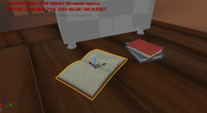
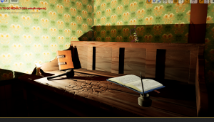
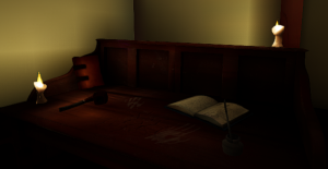
The third shot focused on the writing desk, and the objects on top of it. I framed the shot at the group of candles by the left side of the writing desk for a second or two, then I moved the camera so it frames the other side of the desk, where the ink pot and open book is. The cameras location is shifting to the right, while also rotating to better frame the objects.
The fourth shot is a short clip showcasing the books on the floor by the bookcase. I set the position and rotation at the start and a slight different position and rotation at the end, viewing around the books. I set a blurred focus at the start then a clear focused shot by the end.
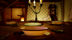
The fifth shot presented the dining table, where the candelabra, dishes and cutlery were placed. Again this was a short clip. The camera moved slightly around the table as the focus was set from the closest dish, then to a far away dish – making the closer dish out of focus.
This sixth shot was considered for the end of my cinematic. I recorded a single candle as it is lit, then being blown out, making the surroundings dark. I made use of the transitions inside UE that included a fade out feature. I used this to end the clip where the scene goes dark.
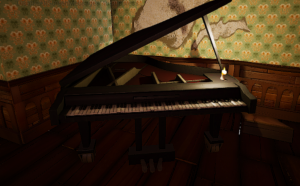
I included a few more shots that were mostly very quickly made. They were not as experimental as the other shots, as I was just looking for simple medium shots of the room. I recorded a shot of the camera looking around the entire room, one of the piano by itself, and one of going up the stairs.
After animating the camera and shooting the shot, I was ready to render the sequences. I went to windows-movie render queue to render the sequence. I clicked on +render to add the shot I wanted to render at the time, and set up the settings I preferred. I added the option to render in a PNG sequence. I added anti-aliasing, as I learnt from a video below about rendering UE sequences, that it helps to remove a ‘jagged effect observed along straight lines in the frames.’ I applied the temporal sample count to 64. This gives each frame an amount of time to be calculated to a higher quality image.
Once I set up the render options I let it run. I was using both the uni computers and my laptop during the rendering stage. The uni computers took approx 2-10 minutes rendering the shots, while my laptop took 20-50 minutes each shot :’). The preview told me the total frames that were rendered, what was to be rendered, and how long the rendering process was taking.
After a few draft shots were recorded, I brought them to After Effects to start editing the cinematic. I made sure each image sequence flowed correctly while on After Effects, then I combined them together.
My first draft was very rough. Some of my shots were cut too quick because of a setting I forgot within UE. I also had not picked out a background song yet so it was difficult for me to find a good place for each clip to go, and flow well. This draft was merely testing the clips for the first time, to see how they looked.
In my second draft I had picked out a song, I rendered out some new shots, and rendered out the shots that were cut too quick. This was a little better to grasp how I would edit my cinematic, but I ended up changing the song after this, because the song was too short, and it was not a great song to edit to.
My third draft was more suitable, and felt more interesting and spooky. I think the different choice of music fits much better aswell. At this time I am missing a few shots because they were rendering as I was editing this together. In addition one of my shots has rendered wrong, as it stops and cuts to a further frame suddenly – I plan to get this fixed in the next draft or two.
This is the fourth draft of my cinematic. Here I collected as much rendered shots as I could, while others were still rendering. I made a more structured order but it may still change by the final cinematic. The error with the paused frames on one of the shots was still occuring – I was still figuring out what the cause of it was.
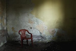
This is now my final cinematic animation. I was able to fix the frame pause problem by re-downloading the frames. I also added a fade transition to each shot so they can flow better together. This version is definitely an improvement from the drafts. I was able to add many more assets that enhanced the environment tremendously. I love the spookiness of the shots and how I was able to find interesting places to record. I also like the mystery to the visuals – such as the muddy footprints on the steps, the blown out candle, and the portraits on the wall. The group and I did a great job setting up the environments, and I feel I successfully captured the wonky, spooky, decayed Haunted Mansion that we were looking for from the start. However, if I were to complete this again, I would have spent more time crafting the camera shots, and making each shot a unique visual. I did take time to look at simple camera techniques, but I had an opportunity to go more into depth and create a more fascinating cinematic.
Around week 9 to week 10, we started gathering an idea of our plan going towards Unreal Engine to finally build our environment. We still needed some time to prepare our models, and fix some problems that we came across. However by week 11, we were all on the Unreal Engine software preparing our workspace.
We were importing out assets, ensuring they were in good shape, and cleaned up, before placing in. We gathered our textures and organised them into materials / instances. And, we started to lay out our assets in a position/visual that we individually preferred.
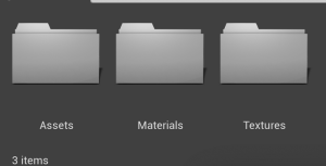
To organise my workspace, I had made individual folders for each part of this project – assets, materials and textures. This makes it so much easier to find what I am looking for once I start something new etc.
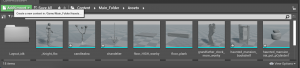
It was a long process in importing, creating nodes, and applying materials to each asset, all while organising the scene into a working environment. The images shown are the progress of adjusting the environment, making sure each material worked.
During week 11 we watched tutor videos on lighting and how to present them in an unreal engine scene. This lecture on what the lights do, how to place them in and alter their information, and to bake the lights to see the result – will help us to light our scene effectively.
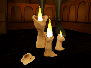
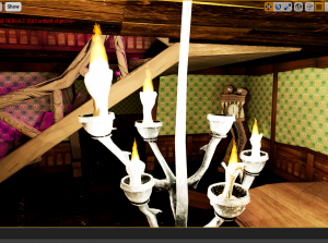
Our main source of light in the scene will be with candle lights. Our teammate Matthew was in charge of creating the particle system of a flame, and modelling the candles to go with them.
Also during the week 11 class, we learnt a lot more about unreal and how we could make our workflow a lot easier to handle. We discovered a way to share over the particle systems to everyone in the group by migrating the folder through unreal projects. Matthew made a video for us showing us how to migrate this folder, to our own files.
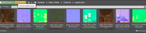
We also took note of using instances more than materials to texture our work. It makes for easier navigation, and less space taken up on the project. It works well If there were an asset with multiple textures applied to it, or to use a material for two different assets with the use of instances.
In addition; considering my walls, as they are made as a Udim, I should make use of the virtual texture support to correctly apply my textures. These bits of information are vital for us and will help us continue our Unreal engine workflow. – Aswell as this, I made a short video for my teammates on how to apply the wall textures correctly, so everyone can take on the same technique and continue on with ease.
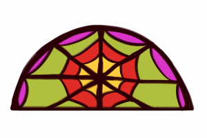
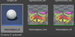
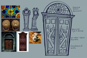
Another detail I took on was the stained glass reflection idea. I made space on my grand door for the possibility we would have stained glass in the future.
I first made a texture of stained glass, with colours that fit the visuals and mood of the Haunted mansion.
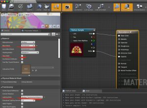
I imported the texture into Unreal, placed a plane static mesh down, and created a material, where I linked the texture to the material result node into base colour, and opacity. I also selected a few detail options on the right that would make this material translucent and emissive.
Bend mode is set to: translucent
two-sided is ticked
Lighting mode is: Surface TranslucencyVolume
After I made the material, I created a material instance to link to the plane so it appears as it is to the left. Next, I wanted to create the reflection. This process required a simple blueprint to keep the lights together.
I followed this tutorial on Youtube by DefaultSound on how to create a stained glass reflection. It was actually quite a simple tutorial to follow and helped with keeping my workspace on Unreal tidier, and helps easily move the reflection to the position I’d like.
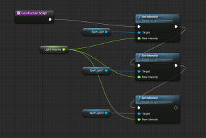
First we were to create three different light functions, all with separate colour channels etc. red, blue, green. Then we assigned these to three spot lights, and adjust their colours to the colour channel that’s plugged into it. Aligning them together at this point will create the full colour palette of the texture.
Next we created a blueprint with these spotlights. I followed the script he made which combined each spotlight, and shared the same lever to increase or decrease its light intensity.
After that it was done, I could position the spotlight to the area I wanted the stained glass to reflect onto, and it created that illusion.
Source:
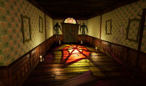
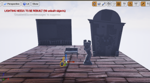
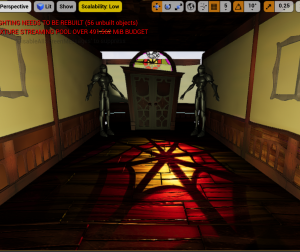
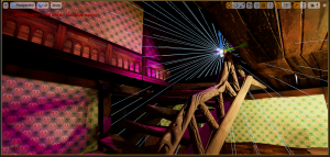
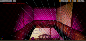
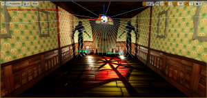
After this, I was mostly working on adjusting the lighting in the environment. It was quite difficult to handle as the whole scene is in an enclosed space, it was almost always dark and hard to create light everywhere. I worked with placing point lights around where the candles were shining, and I also placed in a spotlight up where the stairs are, to give a mysterious look to the mansion – making people wonder what could be up there.
At some places, the point lights would shine too bright, and the area around it would appear white. I would use the build lighting option to optimise the lighting to its actual view, but it still had a strong intensity to it. I turned down the intensity of the invididual point lights to help, and also added in a post-processing volume box into the scene. I used this tool to alter the world lighting, and it helped to tone down the intensity of each source of light in the scene.
With this development, my scenes lighting became stronger and more stable around the room. I made sure to experiment with the colour grading and vintage visual to make the scene appear like it was from a Haunted Mansion.
At this time, I had altered the clock design based on recent feedback. I took it out of Unreal Engine for the time being, until I had finished with the additions to the model, then brought it back in.
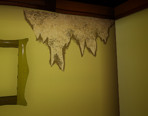
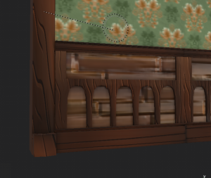
The rips on the wall textures I made work well when imported into UE as a decal. I learnt how to set up and apply decals in Unreal Engine with the use of my tutors tutorial on Blackboard. I imported the rips as textures. Made a material for decals, set the right settings for each texture to work as a decal, and made instances for each rip. They are placed on the wall to give the wallpaper a rough, torn look – further emphasising our idea to make this haunted house old and withered.
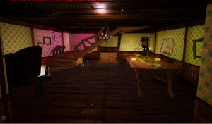
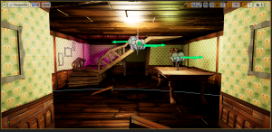
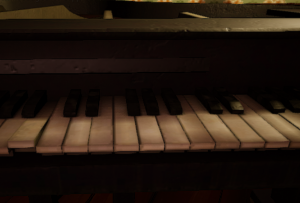
At this stage, my lighting was mostly finished, apart from places where I felt needed more candles. Other than this, I was waiting for other assets made by the group to be able to import into the scene. First to come was the piano, modelled by Caithlin and textured by Matthew. It works well in a corner in my scene where it was empty beforehand. It fits very well into the scene with its old dirty look on the keys, and the roughness in the metal base.
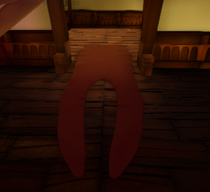
Next was the split-tongue-shaped carpet, made by Megan. This is a very nice tough to the scene. The floor is mostly wood, and It would get uninteresting to look at after a while. However the carpet fills up the room and fits well with the animal/monster theme.
Megan had also uploaded the fireplace, broom and taxidermy saw. These assets were able to fill up the second room I made very well, and they nicely suit the wonky visual we were achieving.
Now that I imported the fireplace, I was hoping to make its light source the strongest in the environment. I used a spot light to illuminate the fire colour outwards outside the door. I also used a point light to illuminate the inside of the fireplace, and cast shadows onto the floor. The guard was in-front of the point light so I could use them to create an interesting looking shadow throughout the room.
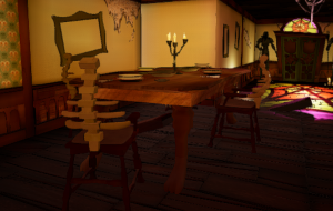
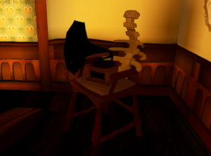
Alisa finished up the chair asset for the environment. The chairs fit well into the bones/animal theme with its spine back to the chair. I have placed it multiple times around the scene with the dining table, the writing table, and around the corner, for the gramaphone to sit onto. The chairs definitely helped to fill up the room and add to the cluttered, messy detail of the visual.
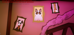
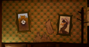
Lastly, I got to fit in the picture for the frames. Megan took some time to illustrate fun animal portraits for the mansion. These images will give so much life to the haunted mansion, that beforehand, felt like no one lived inside it. I believe hanging these pictures on the wall will invoke a mystery/story to the place – who are these animals? Are they all a family? Where are they now? These are very fun and interesting assets to add.
During this time, I started on the rendering stage of my environment build.
I also chose to make a few general assets for the Haunted Mansion. This included the wall’s wallpaper, the rips on the wall, the smoking pipe, and more.
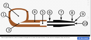
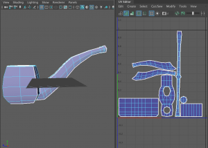
I first started with the smoking pipe.
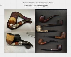
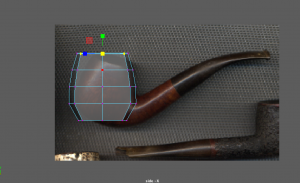
I took time gathering references for this smoking pipe – figuring out which shape to use etc.
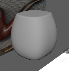
I imported some images to Maya and started blocking out the shape of the bowl of the smoking pipe.
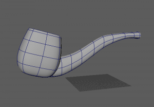
I then modelled out the stem of the smoking pipe. I used edge loops for both parts to scale the shape how they are on the references. I combined both parts, taking time to delete inside faces and merge vertices.
Because of the angle and shape of where the two parts connect, It was quite difficult to figure out but I managed to clean it up with no problems.
Next I used the boolean-difference tool to carve out the chamber inside the bowl. I then cleaned up any thing else around the model and smoothed the asset.
Lastly I UV mapped the asset and made sure the faces were present and cut neatly.
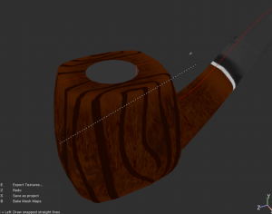
I brought the asset into Substance Painter. I placed down some materials and used the paint Layer option to paint on wood texture on this smoking pipe. I also added the metal strap between the bowl and stem like most smoking pipe designs have.
I made some shadow paint layers around the asset also. I used a fill layer and with height turned negative so I could apply some alpha shapes onto the model. I added scratches and dents all around the wood, and stains around the stem.
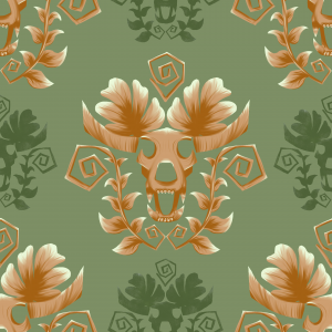
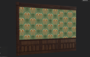
Next I started designing the wallpaper for the haunted mansion walls.
First of all I gathered many references to help me visualise what we wanted the walls to look like.
We discussed this as a group in our weekly call, and found what we liked best from our previous reference of mansion movie sets or victorian houses etc. We agreed to go back and use the colour palette page, and preferred to use a green/gold combination on the wall. We thought it would be eye-catching and also blend in with the lighting we are thinking of for later on.
With my reference I drew up three different designs for the repetitive pattern on the wall. I presented these to my group and they liked the idea of blending the first and second designs together, so I went forward with this idea.
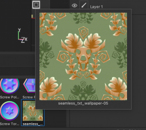
I had reference at the side of my screen as I designed and painted the final idea of the pattern. I was happy with the look when it was painted and I continued with the seamless texture pattern.
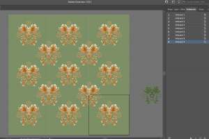
I moved over to illustrator to use the dartboard feature to complete this. I placed the main symbol in a pattern in the middle of one dartboard, and duplicated the board 8 more times. I then placed more of the symbol in the middle of the corners of four artboards.
I quickly painted a copy of the symbol in a green colour as a subsidiary in the pattern. It made the design look more full as a result.
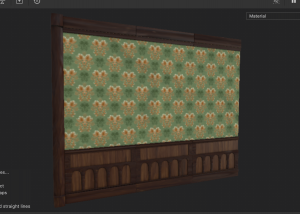
I imported the design into Substance Painter as a singular artboard. I placed the design onto the wall and it successfully repeats the pattern all around the wall.
This was my final result of the seamless wallpaper texture.
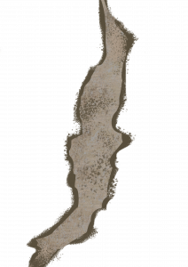
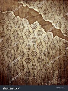
Next I made rips for the wallpaper. At first I was aiming to make cracks on the walls, and got quite far in the texturing stage, but I was stuck figuring out how to apply the texture the way I was looking for into UE. I was also not happy with the result and wanted to try something new.
I was researching what wallpaper rips look like online. This gave me a visual idea of how the rips will look.
First I picked out a material from Substance Painter that fit my visual for the rips, and applied this to a plane asset. I exported the texture as one PNG, as I didn’t need the other types of texture files. I Brought the texture onto Photoshop and painted a rip look with this material.
I made three different versions so they can vary around the Haunted Mansion, in different scale and rotations. I was able to add these images in as decals onto UE.
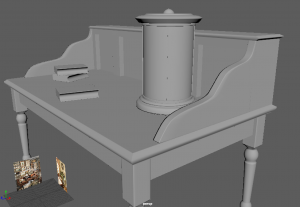
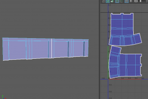
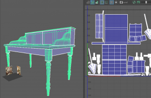
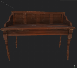
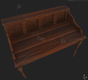
I made this writing desk quite a while ago while I was practicing how to use Maya. Since I didn’t use it for any other project, I thought it would be useful for this project. In addition, its design is great for a place like our haunted mansion, it fits into the theme well.
I made a few adjustments to the model, such as separating the whole parts, and adding/replacing faces/vertices as it was quite messy and could not UV unfold correctly.
Many parts were flipped the wrong way, not cut/sewn properly so I went through each piece and made sure its map was correct. I was able to unfold and UV map everything with ease eventually.
Here is the model UV mapped correctly. When this was done, I brought it into Substance Painter to texture.
I used our regular collection of wood materials for the desk and applied it on. I experimented with making this desk look old and withered by adding dust, wood chipping off the corners, and dirty handprints still left on it. I added on the shadows and highlights where it suited around the model, as it gives it a nicer, colourful look.
I also made the floor for the Haunted Mansion.
I used Henry’s teachings on the modular asset lesson to make this floor. I followed his process of placing blocks of polys, aligning them with the snap tool, and so on.
Source:
I made use of the video to help me make my floor base. I added the plane over the top of it as well. Later on, I also used the lattice tool to give the floor a bit of wonkiness to add to the theme we are going for.
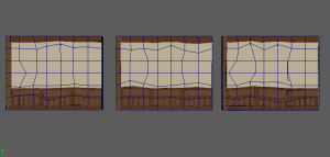
I imported the assets into Substance Painter, and made it so the high poly was combined with the low poly. I went about this technique of painting on each plank on the floor manually. – So that each wood part was positioned differently instead of all the same.
However, I had trouble with this file and it would not let me open it again. I made a new file, and avoided this process & stuck with using the high poly model.
I placed on a wood material from our collection and started adding shadow to the edges of the planks to give it depth. I was lucky as each plank was a separate model, it would vary its pattern.
I posted a work in progress screenshot to the group and asked if they liked the floor so far. They did appreciate it but they also considered that I use a different wood material as the other was a little distracting. I agreed and changed it with the Wood beams material. I think it was a good call as this one suits the floor design a lot better. It fits better with the visual of our mansion. I added last touches of shadows and vibrances onto the wood and it was finished.
I took some time to help out our teammate Caithlin to texture her model of the Gramophone.
She provided me with the fbx file and I started working on the textures. I used our wood materials to apply to the base of the gramophone. I added a dark green accent to the base to match the room walls colours. I textured the vinyl on the soundbox, and lastly I added a gold material and experimented with roughness textures to the horn of the gramophone.
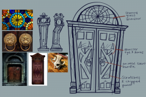
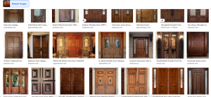
I started modelling the grand door with the use of my concept design page and a couple references to start with.
I started blocking out the shapes of the door with my reference behind. I made each part of the door in a different colour as I got confused with the model in all grey for a while.
I had been blocking in these parts in the same slanted position as the drawing, though it was difficult to line up the polys in a right diagonal line, so I rotated them back into a straight position so they can sit better together.
I added a few edge loops to the window part and the door parts. I extruded inwards the inside faces of each model by three squares so they both have some depth to them.
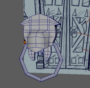
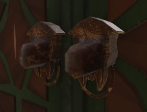
I took a break from the door and started working on the door knocker. We have a running theme of bones of animals around our haunted house, so I wanted to continue this theme with a skull door knocker. I used my image reference and my drawing reference to block out the head shape. I modelled the teeth in the similar way to my grandfather clock. Then I added a torus shape for the door handle.
I wasn’t sure how to go about the eyes and nose of the door knocker as of yet, so I brought back the door to continue working on.
Like my drawing, I tried to recreate the door design shapes onto my model. I made the door part in x-ray view so I could see the reference behind while I block out the shapes. as much as they look like the drawing, I wasn’t happy with the outcome at all. I feel as though I am missing some knowledge and visual of how to design this door. – There is no pattern, and the shapes look out of place.
I took a step back from the model, and researched more on front door designs. This will help me spark more ideas and figure out how to structure this design.
I made a new concept page with some new reference to help spark ideas. I learned that most door designs consist of simpler shapes that slide in together, like squares, diamonds, stars and rectangles. I drew them out and came up with a new pattern for the door.
I ended up redoing the model and shaping them in a regular way as its easier for me to snap each part together and go by the grid to make sure there are no gaps.
I modelled the shapes from my piece, which I had placed in my Maya scene. I gave most of them some more edge loops to create the shape I was looking for etc. the Star shape needed more vertices to be shaped the way it is.
I also extended the back edge loop of each shape outwards to give it an outwards bevelled look.
When copied and pasted to the other side, along with the skull door handle, this is what the model looks like at this point. Next I wanted to UV map the piece, then use the lattice tool later on.
It was quite easy to UV map this piece as most of the shapes were squares. the more difficult polys to UV map were the skulls. I had to plan a edge cut around the head and beak of the skull to break it into four parts.
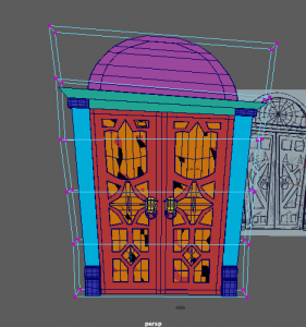
I combined the model together, froze its transformations and deleted its history. I then started using the lattice tool to warp the shape I originally wanted to capture on the door. I got the position, then I took off the lattice tool. Now the door was ready to texture.
I bake mesh the model and place a few textures on for now to see how the door would look. I showed the group and they liked how it was going so I continued with this look. I used one the wood texture ‘Wood beams’ for the door and the bone materialised material for the skull & pupils.
Much like my other assets, I placed two paint layers down, one for highlights and one for shadows. I use these palette saved colours to paint on shadows in sharp corners, and vibrance on the middle of the wood parts. This definitely makes the wood of the assets more colourful and stylised the way we were aiming for.
I had placed the bone stylised material onto the skulls and made adjustments, but I wasn’t happy with the look. I researched door handles to see if I could get colour/material inspiration and I found this image on the right. I wanted to see if I could aim for this look.
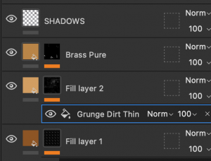
I added a copper material with a dark brown colour on, and experimented with the grunge procedural textures to add roughness and gold to the skull.
It was a challenge to aim for the look I wanted but I got a result I was happy with. I applied metal edge wear with the brass pure material, the grunge dirt thin texture, and dark shadows.
Later on I started using the blur filter (on the shadow layer) for less detailed parts such as the door shapes. This made for a softer, cleaner look.
I continued the shadow and vibrance applying all around the door where suitable. I have left the window area without a ‘stained glass’ material for now as I am unsure how to create the effect. Our team agree that we will see what we could achieve when we bring it into Unreal Engine.
And this is the finished model and texture of the Grand Door! Again, this was a challenging asset to make, especially at the modelling stage on Maya. I wasn’t sure how to start off the model, and the position on my concept page set me off track a bit, but I got back into it an started a more simpler way to help continue the process. I found the texturing interesting and fun to complete as I had more knowledge of how to design the wood, based on my past assets. Overall I’m happy with the look This will be a key asset for an interesting cinematic shot.
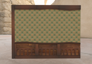
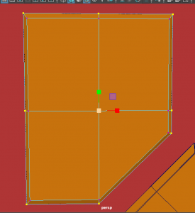
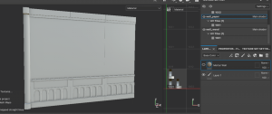
I have started modelling and planning the structure of the walls of the mansion. This is an important modular set to start with so we can build the layout of the rooms first then it will be easier to add the furniture parts after.
I placed down a human scale mannequin from Maya’s contents into the scene, and put in simple cube polygons to make a wall, the low part being the wood paneling, and the high part being wallpaper. I discussed with my team during class and we agreed we wanted to make the walls quite high for us to display lots on the wall, and produce the angular and spooky look we want.
I made three different wall modular assets. one as a singular wall, and two separate corner walls.
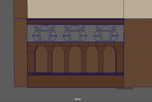
When taking reference from Alisa’s room concepts, and many housing reference such as the image below, I wanted to create some nice wood panel design to enhance the antique/victorian mansion look.
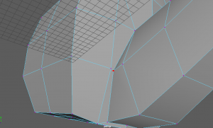
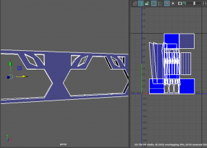
Here are a few parts I modelled. I added pillars, skirting board design, and details at the top. However, this was quite difficult to model, as I came across non-manifold geometry.
The images below show that I modelled this design separate, then used boolean – difference on a plain cube. This created non-manifold geometry, because the shapes contained more than four faces in the geometry. I tried my best to cleanup the model and add some edge loops, but it did not fix the solution.
I did try to do this again with shapes that were only four sides to try avoid the problem however I still could not find a good solution.
During this time I also assigned each part a material to keep it together. One Lambert material for the wallpaper, one for the wall wood, and one for the wood paneling.
After presenting this problem to my group we discussed this and decided I should go a different route. I decided to replace this part with a border. Matthew also suggested I could recreate the detail above for when I get to substance painter – designing the texture. I could use the height option to allow the detail to stick out like how the wood panelling is. So as of now this is what the wall looks like.
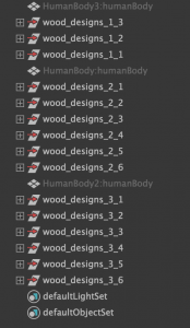
After this, I made a few more adjustments to the walls such as giving more structure and build to the side pillar of the wall. My outliner as this point, is sorted into groups. I had three separate walls, and around 3-6 wood design groups for each wall.
I started UV editing each model as I was able to optimise their maps, now that the geometry is fixed. I started with the back walls as they are the easiest to cleanup. They were cut in the right place and were simple to layout on the UV map. Next I worked on the wood details as they needed some more focus on. I made sure to cut and sew the seams in a suitable way, and optimise them in a good position. Lastly I worked on the side pillar as it was a little more complicated, but worked a similar way to the walls.
At one point I was happy with how the model was looking so I created three different versions of the walls. One on its own, and two different corner walls.
However, after week 5 I had shown my progress to tutors/teammates and I figured some more work needed to be done to make this assets structure better.
Me and the group discussed about the room walls and we decided we wanted to go for more irregular shaping in the wall itself / more wonkiness. So I went back into the Maya scene and replaced the corner wall versions with three singular walls for me to work on.
I used the lattice tool on these three walls to warp the wall in different angles. I made it different for each wall so there are variety in the pattern. As soon as I was finished with the lattice tool I selected it, then deleted its history, so that the warped part on the wall would stay as that shape.
I went back to check the hypershade to fix up the assigned materials, as there were some duplicates. I assigned back the original materials to what it was, then I deleted the other materials. I also checked on the UV maps of each of the walls. I cleaned up the detail wood mostly as some parts were flipped over/not cut right etc.
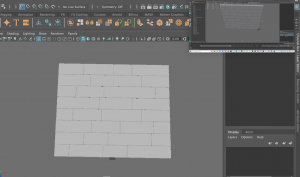
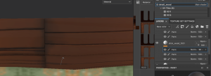
After this the models were done (apart from a few adjustments I make later). So I exported each model as an fbx. I uploaded the straight singular wall into Substance painter on 2048 resolution, and UV workflow maps turned on. Here It is as I baked the mesh maps.
I was happy with the model apart from the subtle lines that appear on the middle of the wall, where the wallpaper is being placed. I tried the wallpaper on to see if I preferred it but I did not. – The wallpaper does not overlap over the line but the line cuts it right through, so it doesn’t pattern all the way through. I went back into Maya to change this.
I separated each of the wall models and swapped the 3-split wall with a full wall – the size of there three parts combined. Here is what it looked like after I swapped these parts.
I set up a Substance painter file again and added the fbx. I placed down the wallpaper and I was much happier with this outcome. To get an idea of colours and looks I had also placed down temporary wood materials.
Since this model is a UDIM, I was able to space out the parts of the model for different materials. Here I am applying wood materials but In separate areas so that the wood material I am using will maintain its size that fits right for the shape.
Using Matthew’s wood materials I was able to add a variety to distinguish the back part of the wall, from the front. This made it look more unique and busy. I also used the same technique I did with the Grandfather clock and used paint layers to paint on contrasting colours, highlights and shadows onto the wood to give it more vibrance and depth.
I worked carefully on the edges of the wood material to give that wood look. I had collected a few references to help me with this look.
I used some reference of real wood to picture how the tones/value of the wood looks. I tried to capture how it is dark on the edges/sides of the wood, vibrant around the middle, and lighter at the top part of the wood.
I also collected existing wood materials made on substance etc. to find how other artist have gone about this. They also have that same idea I am going for with dark-edges, light-middle. They also experiment with scratches and dents in their work, which I could explore.
After going through these references, I was liking how my wood planks were looking.
After some more adjustments this would have been the finished look of the wall. I also wanted to bring this same design onto the other walls also so I combined my layers of materials/textures/paintings and made them a Smart material.
I started bringing all my smart materials onto the three wonky walls. They fit on well apart from small areas such as the shadow lines on the pillar, and the detail wood planks whens took up/down. I was able to adjust the painted parts fairly easily.
And this is the finished model and texture of the room walls! They were challenging to make especially at the start of the process, where I changed up the structure of the wall multiple times. I really liked designing the wallpaper and painting on the vibrants, highlights and shadows on the wood. This is a very important asset for the Haunted Mansion as it Is what builds the environment.
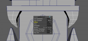
In addition to creating this model, I came across a problem relating to the degenerate tangents and almost zero bi normals in the mesh of the asset. This error came about in both Unreal Engine and Substance Painter. To tackle this problem, I visited my model back in Maya. I noticed the original pillar design was quite difficult to arrange on the UV editor. I did have a spare pillar design that was a simpler mesh, that I replaced with the original pillar, on each wall. This model was easier to UV map and still fit well with the wall.
Although, this still did not fix the problem. I asked my tutor Henry, about the situation. He inspected the model and suggested I should look about a few clean up options before I export my FBX. This included deleting the history,
This all eventually fixed the issue. I was able to redo my textures on substance Painter without the error, and import my models into Unreal Engine with ease.
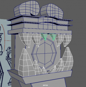
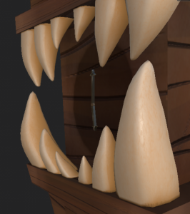
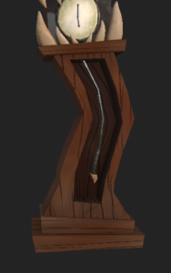
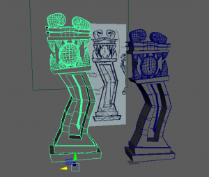
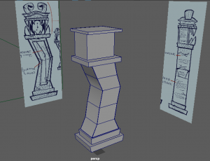
I have started modelling the Grandfather Clock design that I had made back in the concepts. I am hoping for this model to be very expressive and stand out well in this haunted mansion.
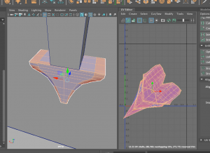
I started with bringing in my designs into the Maya scene, and blocking out the main shapes of the clock – the base and the case of the clock.
After adding a few more parts like the top of the clock and the clock face, I moved onto the teeth. I used a cube poly for the teeth and added a few edge loops. I scaled down the top part and scaled up the bottom of the tooth. I also gave them a little curve too. Since the teeth I made on one side was going to be the same on the other side, I used the mirror tool to project each tooth over on the other side In the correct place. I used the mirror place centre x input to help position them to a good place. Usually between 3.5 to 4cm away from the other tooth, worked well.
I did the same thing with the new teeth I modelled at the top of the mouth. Again I used the mirror tool to offset the position of the mirrored tooth.
After I had finished the teeth this is how they looked. I had also spent time adding more details to the top of the grandfather clock such as where the monster eyes will go, and the layered ‘crown’ of the clock.
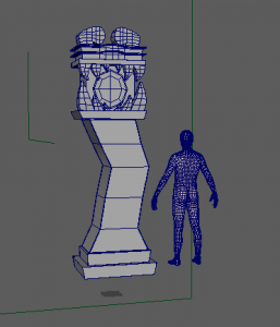
At this point I was halfway done the modelling process. I have some more details to add such as the inside of the pendulum, the clock hands, the eye detail, and so on. I referred to a mannequin model to see the scale of the clock. Although it was a little big, we decided to keep it as it is so I could contain the same scale measurements it has at the moment to keep myself on the right track. I can scale it down later on as we build the haunted house.
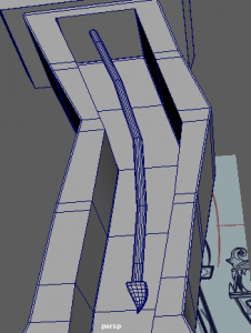
I used booleans – difference tool to cut into the inside of the clock case. So now I could add the pendulum inside.
I started to work on the little details of the clock such as the eyes at the top, the pendulum, and the clock hands. After a few more alterations, I would have finished modelling the clock here.
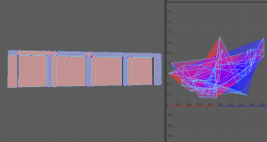
I was now able to start UV mapping the clock asset. I started with the more simple polys such as the base, as they layout into the usual cube foldout. More difficult polys to UV map were the round eye parts, the teeth, and the hour and minute hands on the clock.
For example, I had the point of the hands attached to the long body part of the hand as I thought it would be okay as a full poly, however it was difficult to unfold into a regular UV in the editor. I tried modelling the hands though this time, the point was separate from the body. This made it much easier to find a way to cut the UV and display it correctly on the UV map.
In time, I had completed UV Mapping the grandfather clock. I assorted the UVs into multiple maps, which makes the model a UDIM – since its a bigger model, I wanted to preserve the UV tile layout for each material (eg. Wood, bones) and enable painting across tiles for Substance Painter.
I made a new file in Substance Painter with resolution 2048, and turned on UV tile workflow (UDIMs). I placed in my fbx of the clock and started to bake the mesh.
I liked how the model was looking, but I felt it needed a bit more of an irregular/wonky look to it. I got back into my Maya file and looked for what I could do to capture this visual.
I remembered my tutor Michael mentioning to our group that there is a tool called Lattice, in the Deform window, that allows me to warp the model I made while keeping its regular measurements and UVs in the same place as before. It almost acts like an illusion because when you move the Lattice base away from the model, it goes back to its regular shape. I used this tool on the clock to make the sides more wonky and lopsided. I was much more happy with this shape on the clock as a result.
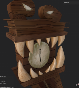
I brought back the model into Substance Painter and redid the bake mesh process. I placed down some temporary materials onto my clock to get an idea of its style and colours first of all.
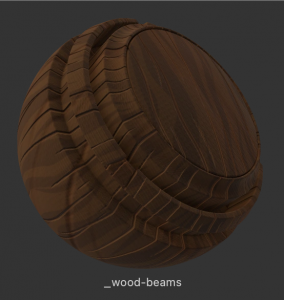
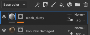
Matthew in our team gathered some wood materials and styles that we could use, so I imported them all into this project and tried them all on the clock to see which one I can develop more. I really like the material “wood_beams” it contained lots of simple details that fit well around the clock.
I started by using the paint layers and gathering colours to paint on bright contrasting browns, some highlights on the side of the wood, and dark brown shadows on each corner.
I painted the clock base with a rusty green colour, and a painty brush, to give the indication that this is an old, rusty clock. Here I also applied a dark Iron material onto the hands and gave it a grunge procedural texture on it using black mask – fill layer on the iron material.
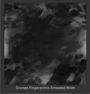
I also found a nice alpha material that created a dusty look with finger prints/marks all over it. I thought this was a great texture to place on as it enhances the idea that the clock is old but may have been touched by someone or something.
I gave the same look to the eyes of the clock. The copper material, the rusty paint, and the dusty texture.
At first I placed the Bone Stylised material onto the teeth of the clock, but decided to keep it and work more on it. I knew the teeth would be challenging to get right as its very different from the rest of the clock, but I gathered reference to help me out.
I used this image to help picture the roughness and texture on an animals pair of teeth. I tried to capture the dark rough texture on the teeth.
I used a fill layer with a darker beige colour – black mask – fill layer with a grayscale called Grunge Concrete old. I played about with the options and got this texture on the left.
I had placed a grunge texture also onto the brass pendulum of the clock using the black mask option. I also added a blur filter to the layer to blend in the texture to the material.
Lastly, I used the dusty texture again this time on the wood of the clock, to enhance the dirtiness and oldness of the clock. It isn’t as noticeable but it is a subtle touch to the model that makes it unique.
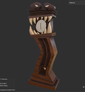
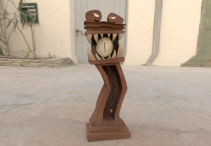
Eventually, this was my Grandfather clock finished. I enjoyed the process of making this clock! It was the first of the models I made so it could have some missing touches that I am adding to future models, when I experiment with new things. However it still stands out as it is. The clock will be an important asset to the Haunted Mansion.
Further on in the project, I made some alterations to the Grandfather clock that eventually made the piece stronger. We presented a short presentation on how our projects are coming along, and I showcased my scenes and some practice cinematic shots for the class. I got good feedback and some ideas for improvement. They suggested I could build the Grandfather clock with more structure, and alternations in the wood placing.
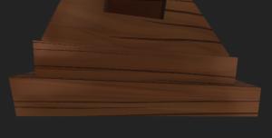
I went back into Maya to add details like a frame for the clock and a backing for the frame. I brought this new model into substance and placed my smart materials from the past model, onto this model. From here I was able to change up the wood placement on the base of the clock, from the flat, plank parts. This made the Grandfather clock look more realistic, as it includes real life logic to how a grandfather clock is built.
Before —- After
The clock is now more visually interesting and pleasing to look at, from the new iron pendulum, to the wood placement, to the frame of the clock. I mentioned beforehand the clock may have had some missing touches that I would have added to my other assets, as soon as I got used to my workflow. Now I feel the clock is more suitable among the other assets with this upgrade.
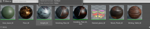
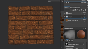
Week 5 consisted of looking at the process of texturing and its many strategies. We have many assets that require a texture. From our tasks we learnt the different ways to apply textures in UE, and the different ways to apply textures to a mesh. Overall these methods helped with our texturing stage on Substance Painter, and applying textures on UE.
Image 1: Applying Decals
Image 2: Working with materials & Instances
Image 3: Texturing with layers on Substance Painter
We also had a lecture on ‘Designing a pipeline based on an art style’ from Michael.
Art style possibilities are endless:
There is not just only‘realistic’ or ‘stylised’. There is a massive range in-between and beyond. etc. the many art styles of Link / the legend of Zelda – all can tell the mood of the storyline
Outside of games and VFX, ‘realistic’ is almost non-existent in Animation. ‘Realistic’ animations that exist to require fantastical elements to define its style.
Every artistic version is also a technical challenge
A good director is not just someone with a vision,, but someone who knows how to clearly communicate that vision to others
One person may have a style without thinking of it. However for a team it must be defined, communicated and maintained throughout a project. An Art directors role consists of this.
How do they ‘define’ an art style?
What is the shape language? sharp lines? Soft or rounded? Elongated shapes? Cluttered and busy or minimalist?
What is the colour scheme, what are the rules for creating new colour schemes within the world? Pastel colours or saturated or monochrome?
What makes our character look like they do? Design references or existing art styles. Be specific. What do they eyes look in th world? What will the hair look like? what are the Childs proportions compared to an adults or animals proportions?
Define the painted style, ink? watercolour? oil? flat colours? Is black allowed, or never? What will the lighting look like?
The more questions you answer the better you understand your art,
and easier to communicate with others.
Art directors create style guides to emphasise key do’s and don’t’s to pass the rule on to the team.
This art direction art style guide made by Eric Reimer allows their team to be aware of the preferences and stylistic approaches of the project. They have designed the mood and setting of the environment in a game perspective, included references, and breakdowns of each part of the environment to further explain the uses. This is a great way to communicate an art style to others.
It also needs to be translated step by step to reach its final form etc. concept, sculpt, model texture, rig – light. With coherency, consistency, in a technically achievable way. Figuring out how is the job of a Technical director.
How does a technical director do this?
Consists of experimentation and testing, critical evaluation and comparison.
What to evaluate?
How closely does the test render match the style?
Is the style still good/appealing after translated into 3D?
What changes can be made to make the art style suit 3D better?
What software best helps us reach the result?
was they’re technical limitations to be aware of?
How difficult was it to achieve?
Tech direction will then develop a pipeline in detail for other artists. This will encompass every aspect of producing an animated sequence that style is accurate to the project – They will provide:
Shader / material with correct setting where artists can swap textures for each asset
Animation cycles that can be loaded and edited for different shots
Light rigs for sets to serve as a starting point
Modular models
Reference models
Custom starting scenes with correct render settings
Lastly, the Lead artists will work together with the art and tech director to develop, or set starting points of models, textures and lighting guides for each team – to emphasise the particular approach needed in each department.
This was an interesting lecture to listen to – it definitely gave me and my group a second thought of how we were approaching our art style, and to find a style we can all adjust to.
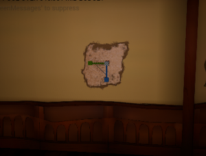
After this weeks lecture, I started on creating the texture of the wallpaper for the room walls. I was able to make this texture using the tasks from this weeks lesson on texturing – mostly grasping the idea of making a ‘Seamless Texture’ which helped create the effect of a repetitive pattern.
The explanation of the wallpaper design is on this post:
On week four, we learned about modular assets and their importance to be modelled at the start of the project, such as the walls of a room, table, fireplace – usually the major assets that determine the size/layout of the scene.
We followed tasks from our tutors to learn how to make modular assets and bring them from Maya, to Blender, to Substance, then finally to UE. As a result of this task we will be able to produce trim sheets of our modular assets to share with the team, and prepare our scene.
During this task we made modular assets for the wall of a scene. This encouraged me and my group to start thinking of the walls in our Haunted House, and start modelling it.
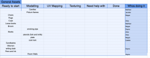
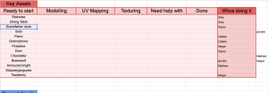
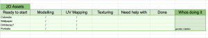
This week we had set up google sheets to create a Kanban board of our asset planning – to see what step each asset is in as we work on them, and who is working on it. We have started working on general assets so we could ease back into the Maya, Blender, Substance painter softwares and gain our knowledge back from last year. We had all put our name down for multiple assets we wanted to work on . I had put my name down for etc. the room walls, smoking pipe, writing desk, grandfather clock, grand door, and more if some need help.
So far we have started our modelling process for multiple objects from this Mondays class. We dove back into the Maya software to learn about creating modular assets.
With the knowledge of this weeks task, I chose to work on wall assets to start off the mansions build.
My blog post about modelling the room walls can be found here:


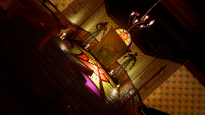


 In the second shot, I presented the entrance of the Haunted house. The camera moves backwards, while zooming out, and rolling round, giving the same effect as the first shot. I set the first frame close to the door handles, and zoomed out until the wide entrance to the house, included each asset in frame. I altered the focal length from the start and middle of the shot as the camera moves back, that it can keep focusing on the door.
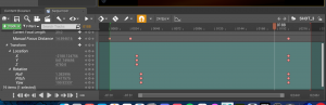


 Next we created a blueprint with these spotlights. I followed the script he made which combined each spotlight, and shared the same lever to increase or decrease its light intensity.
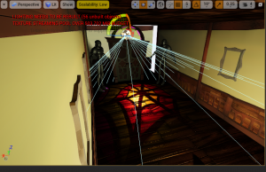


 I imported some images to Maya and started blocking out the shape of the bowl of the smoking pipe.
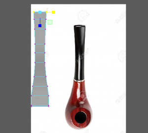


 At one point I was happy with how the model was looking so I created three different versions of the walls. One on its own, and two different corner walls.


 After this the models were done (apart from a few adjustments I make later). So I exported each model as an fbx. I uploaded the straight singular wall into Substance painter on 2048 resolution, and UV workflow maps turned on. Here It is as I baked the mesh maps.


 I started with bringing in my designs into the Maya scene, and blocking out the main shapes of the clock – the base and the case of the clock.