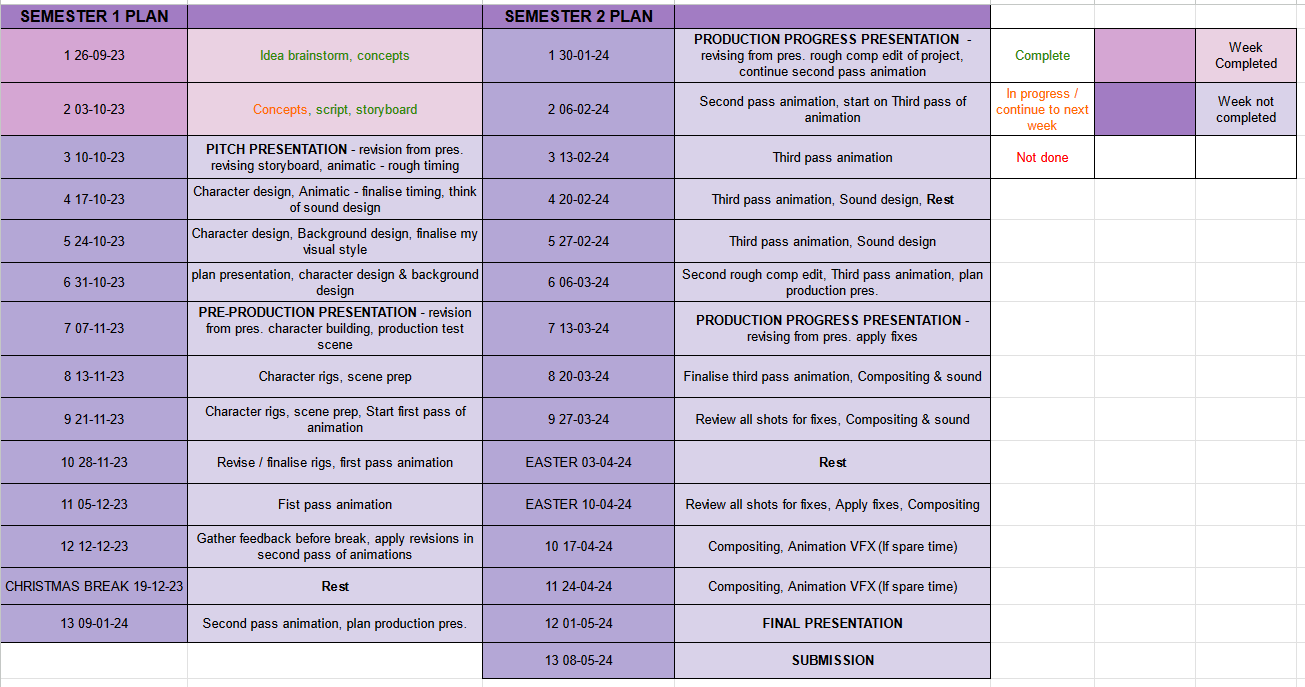
MP weekly blog
WEEK 1
Over the summer I had been developing and experimenting with this simple but fun idea, about aliens that run a theme park. I thought of the prompt randomly while exploring story ideas in my own time. When I had decided to explore this idea, I started to sketch out first concepts of what the story will consist of, then started to play around with full storyboards of the sequence.
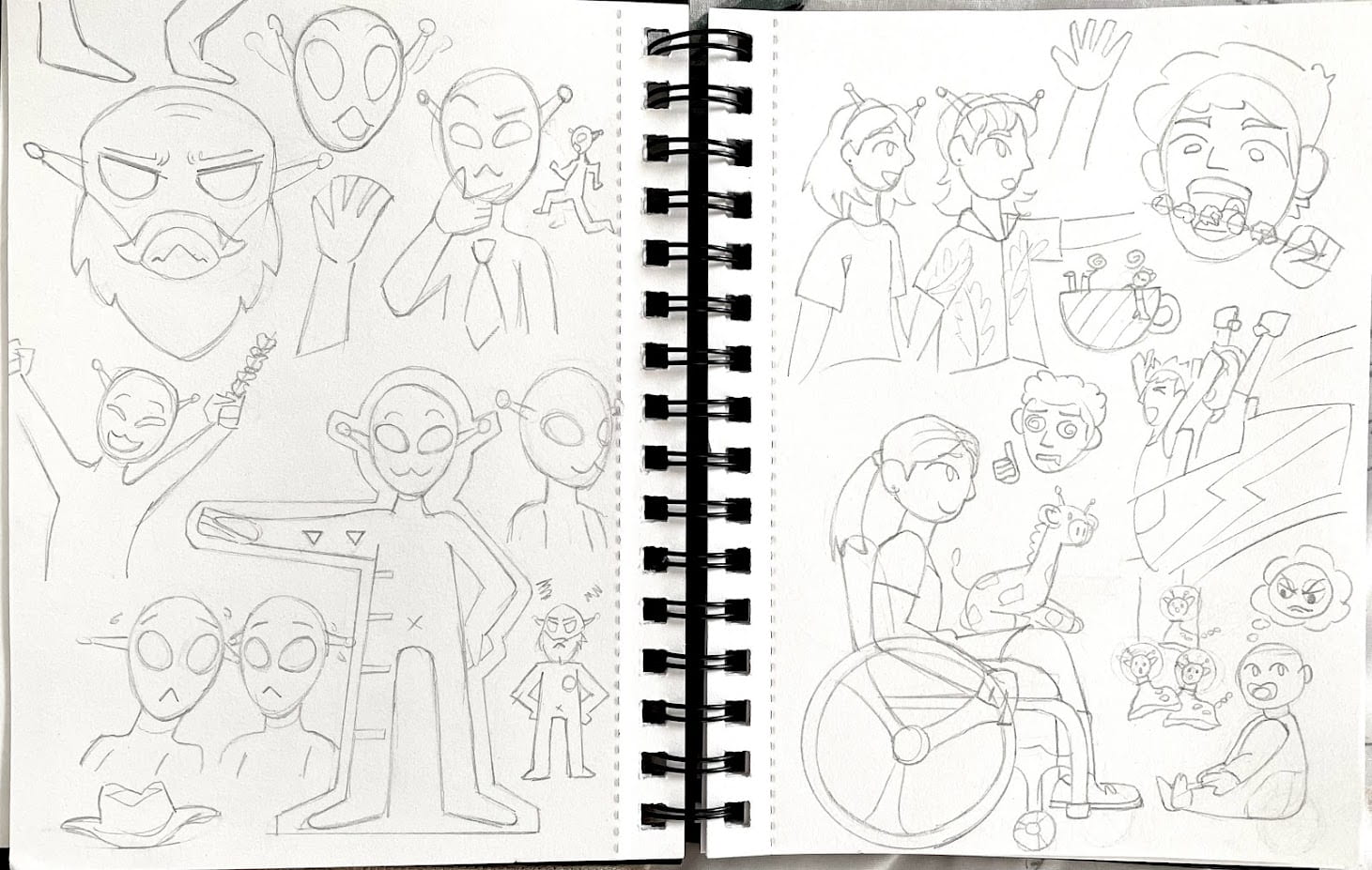
Later on I dipped in character design, to see how I can picture each alien worker, the inspector and human customers. I sketched in my notebooks, and painted digitally some other ideas.
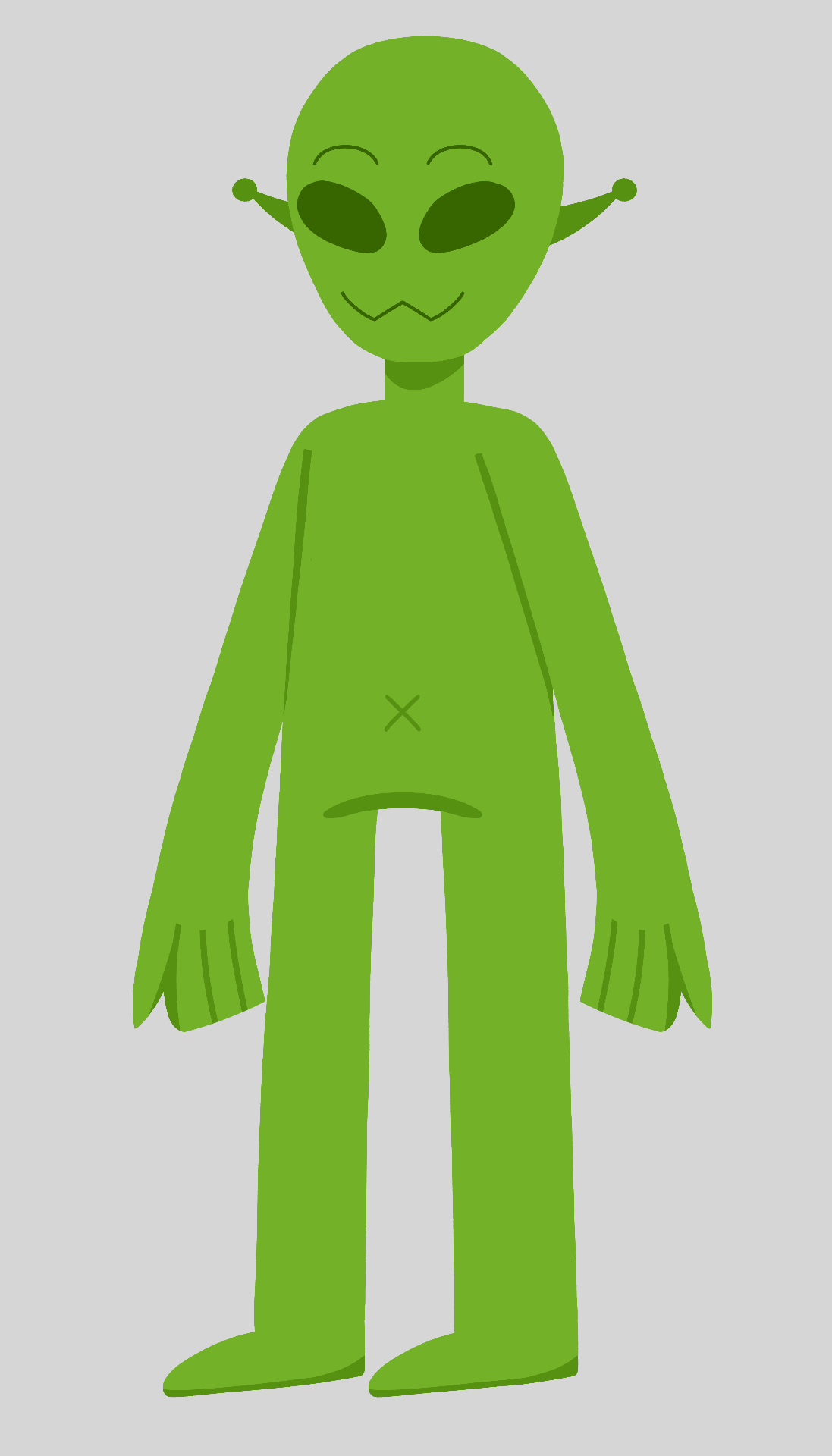
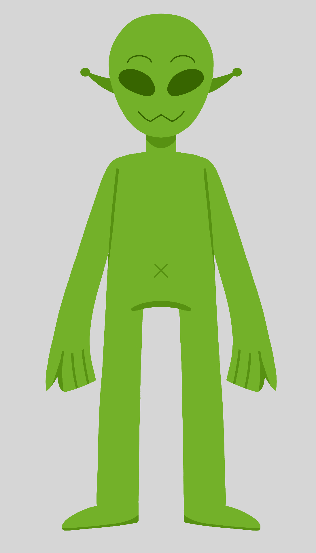
Further on I started to build a rough design of a typical alien of the story. Once I drew and arranged each body part in seperate layers on a photoshop file, I could then use this built character to import into After Effects, and quickly rig the character.
I will be using After Effects’ tools, and DUIK’s tools to build my rigs during this project.
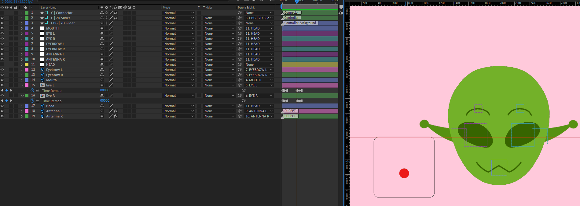
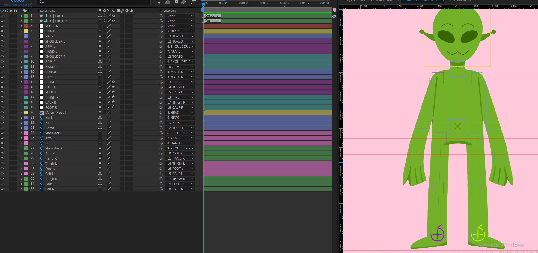
With this same process done on two other characters, I made a couple of animation tests, exploring the rig performance, character expression, and examples of how scenes could play out:
https://ulster-my.sharepoint.com/:l:/g/personal/keaney-d_ulster_ac_uk/FGP80wMUL3FOkpPVrpvp0ecBF9DxoxltKoXlHn2cgfnSNA?e=Xmxihf
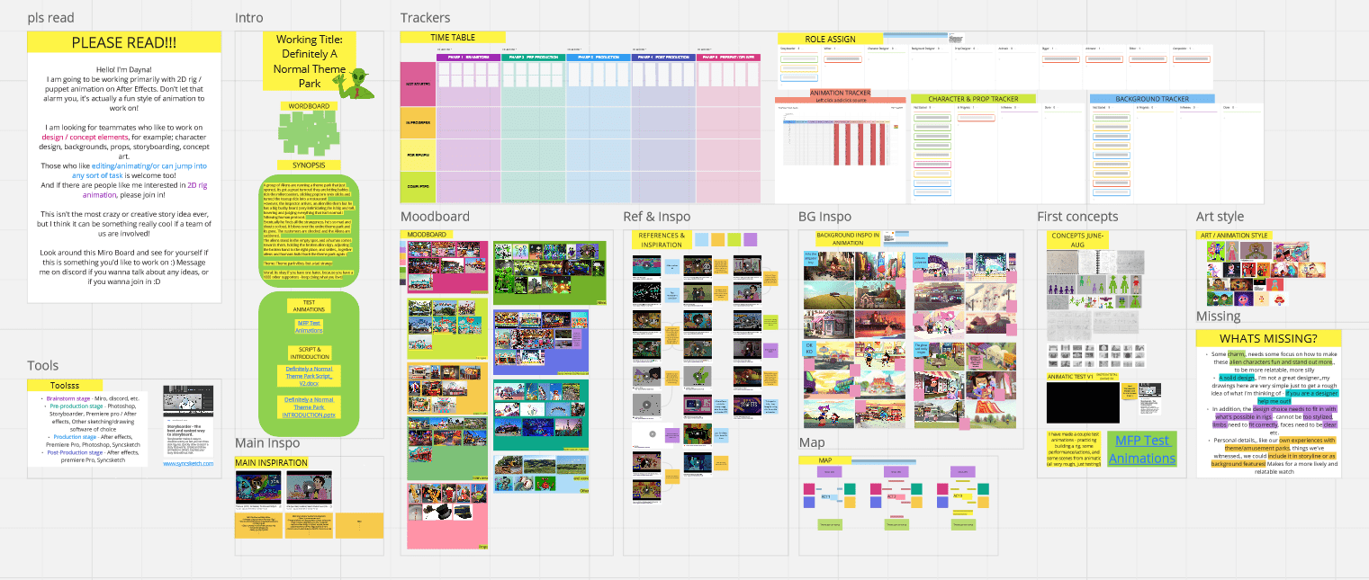
Lastly, I have put together a Miro board that includes all of my summer progress, some inspiration and reference gathered, and an overall idea of the story written down.
WEEK 2
During week 2 I have been developing the project to a better standard; finding my main inspiration and style, re-organising the miro board, developing the script and much more. In this time I was hoping to gain teammates to make this a group project, but I was not successful in this. This means I will be producing this project individually, and will continue to if it is suitable after the pitch presentation.
With this information I have been planning my workflow, schedule and workload that will work for me working individually etc. removing anything too ambitious or difficult.
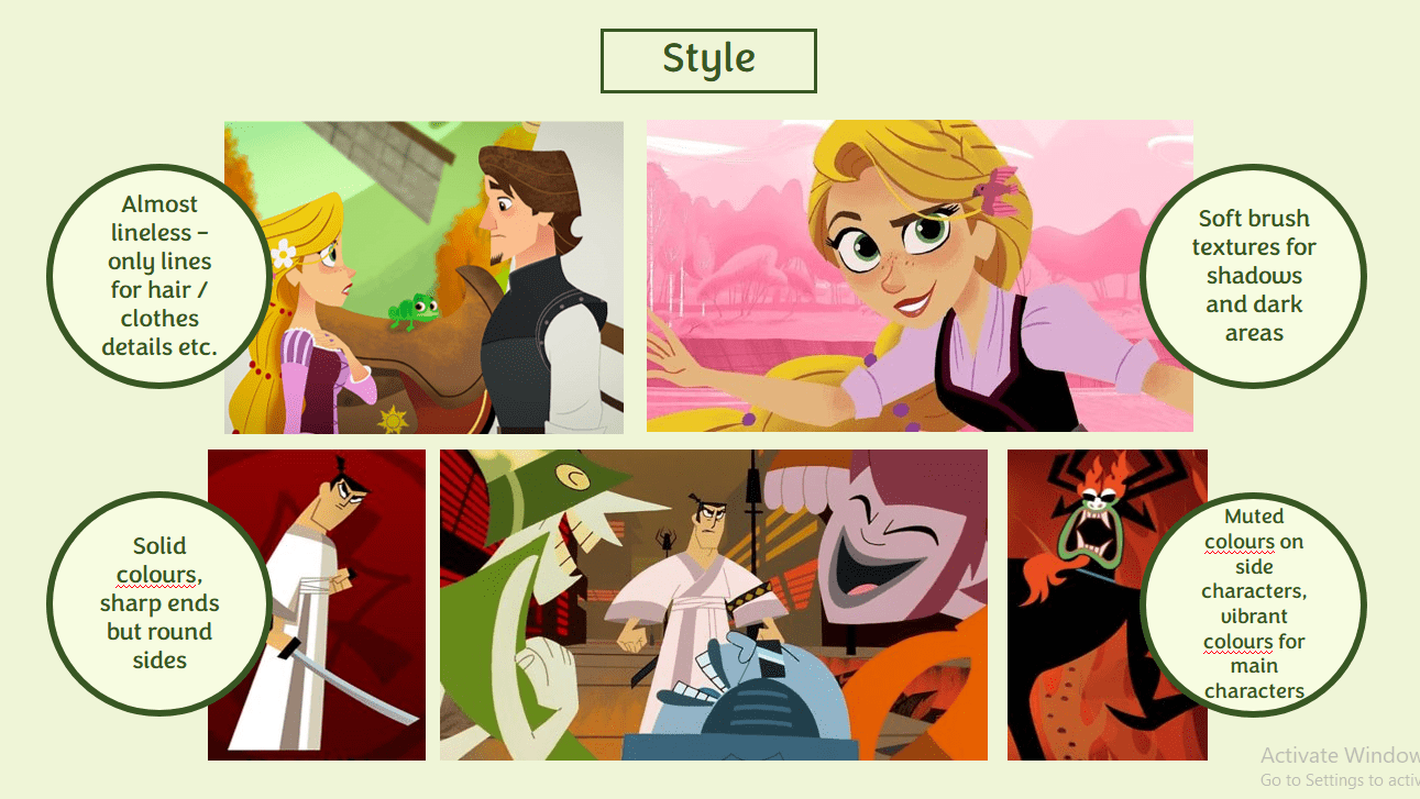
I have gathered a range of images for style and BG inspiration so I have a better visual idea for my story. For the style, shows like ‘Tangled the series’ and ‘Samuari Jack’ have good elements I may use in designing my project. This includes the lineless look, but lines to emphasise hair & clothing detail, Solid coloured shapes, and soft brush textures for shadows & dark areas.
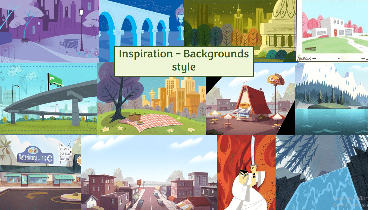
As I am not as skilled in producing backgrounds, I would like to make it a bit easier on myself, and go for a very simplistic style with depth, that also replicates the techniques from my style inspiration. The images are from an advertisement, ‘Powerpuff Girls’, ‘Star vs the Forces of Evil’ and again ‘Samuari Jack’.
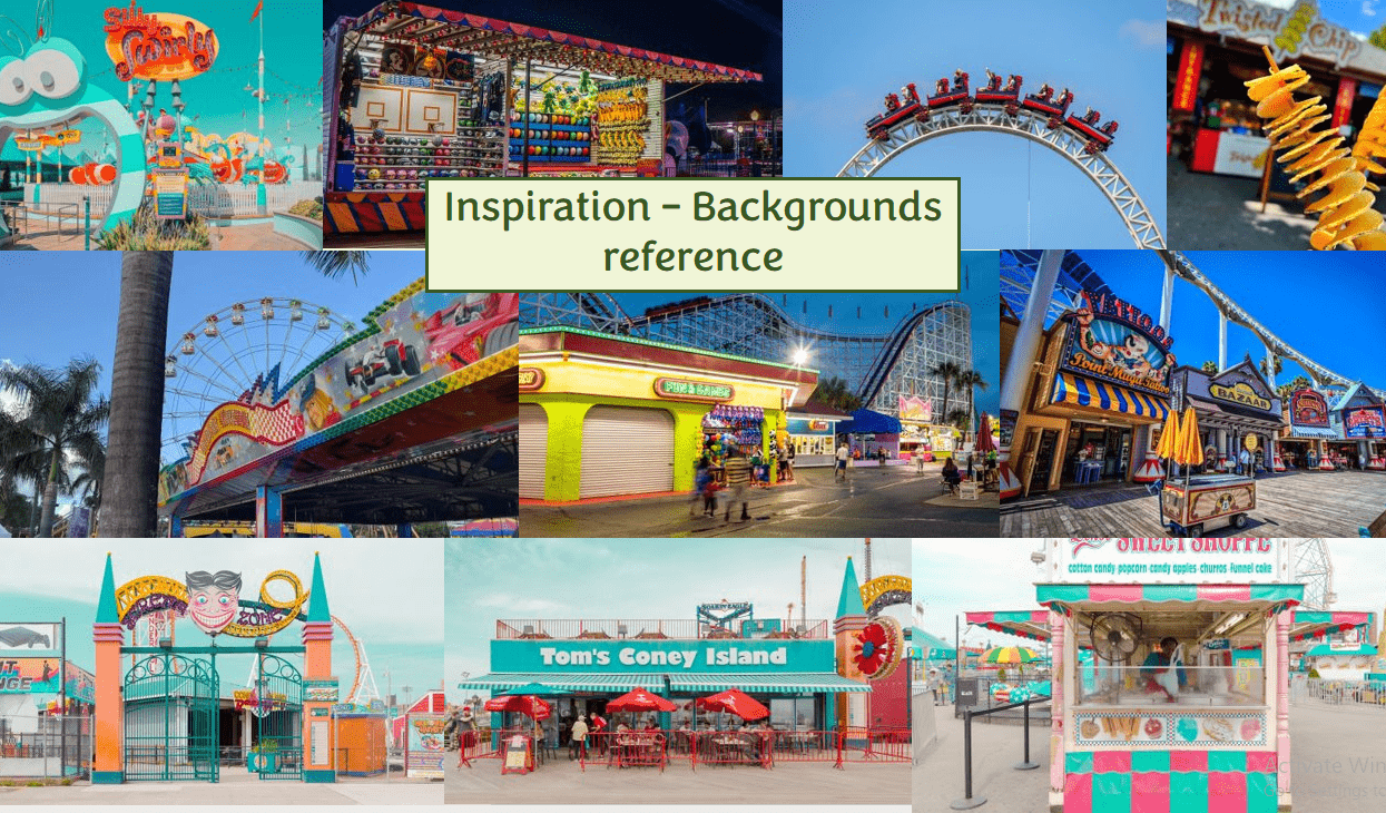
In addition, here are some real life inspiration of the type of amusement/theme park I would like this story to be set in. Not something big and vast like Disney world, but rather the typical, weird looking park that visits your local town, or one that stays in a small town.
With more consideration of my workload, and chatting to my tutors about the storyline, I revised my script for the story. The story is now more truthful and relatable to the moral I considered it to be – it applies a better vision that the human do love this park, and that the inspector is the only one who hates it.
I have attached a rough idea of sound effect descriptions in the places where I can imagine them being heard. This makes it easier for me in the production line to plan my sound design process, and collect only what I need to collect.
Definitely a Normal Theme Park Script_ V3
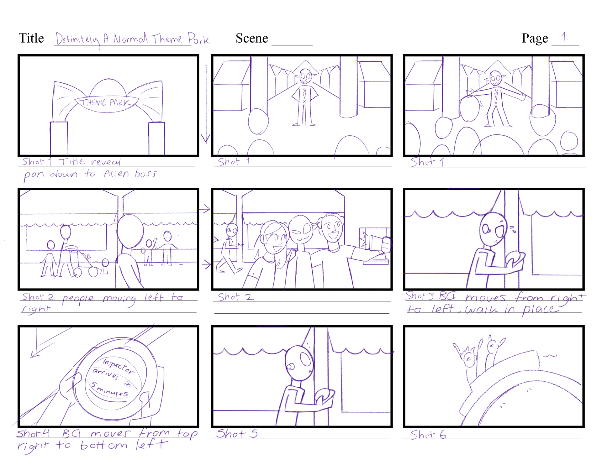
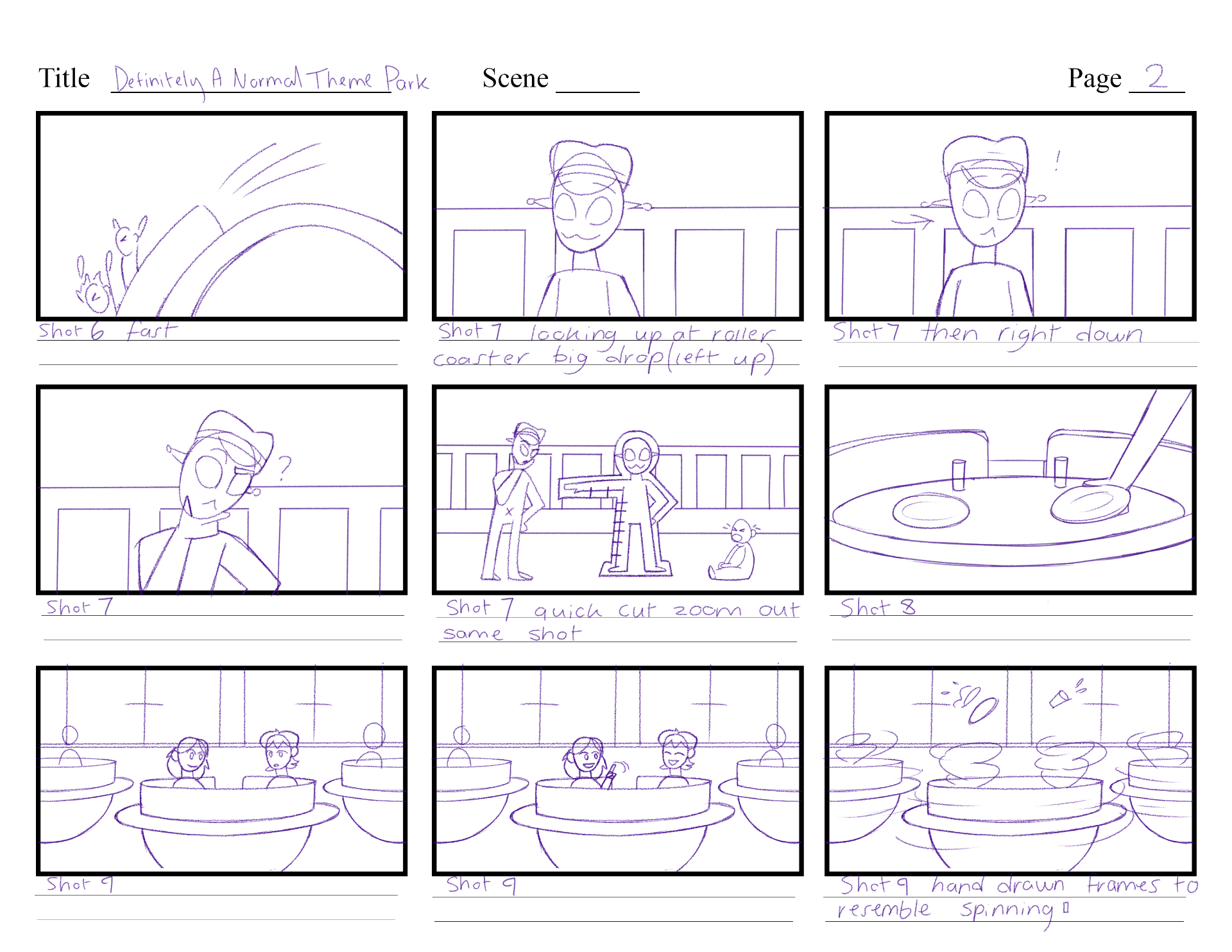
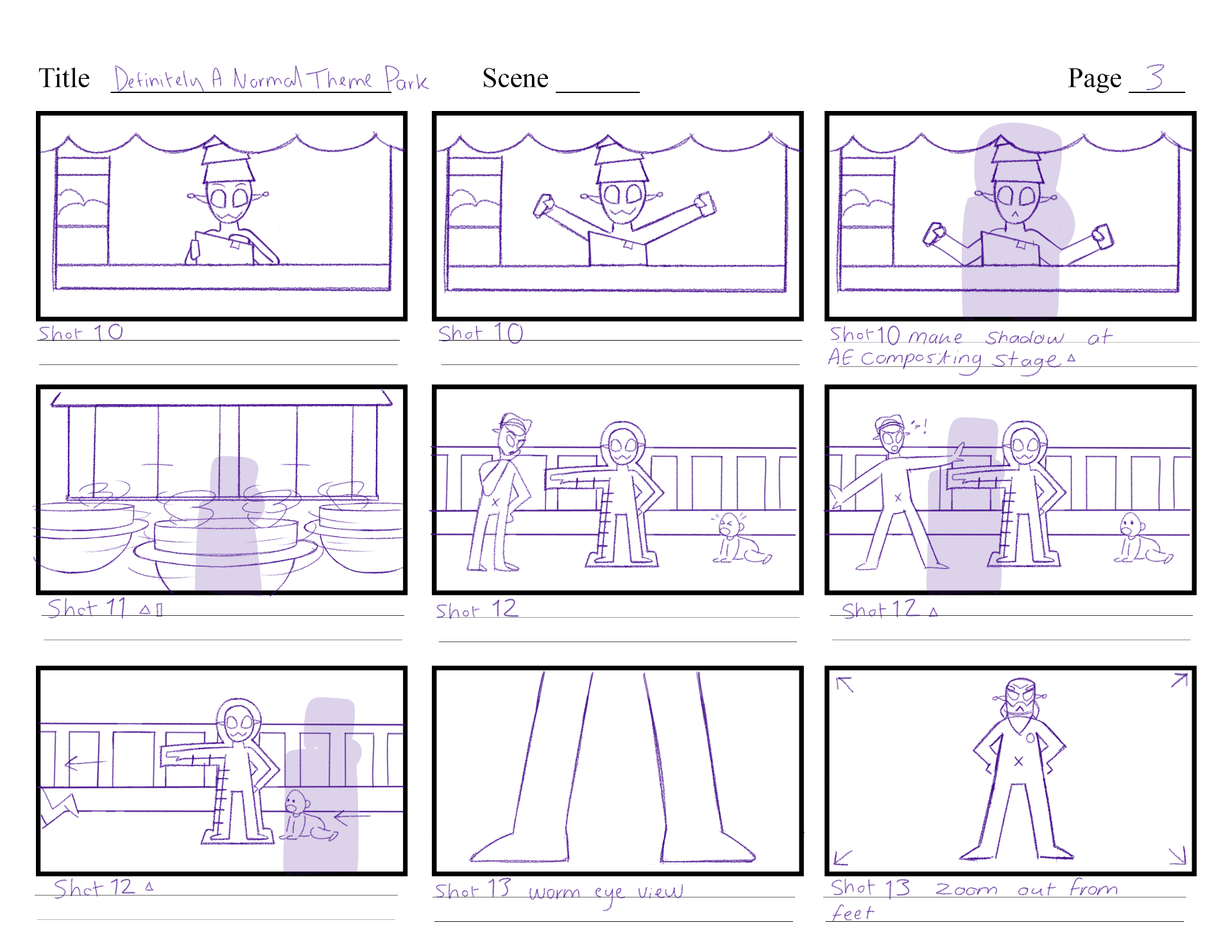
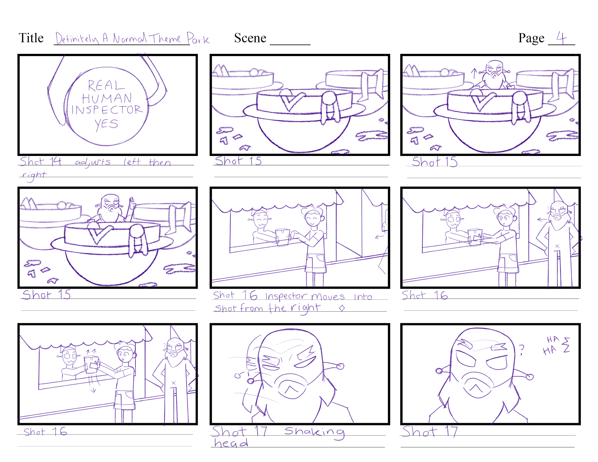
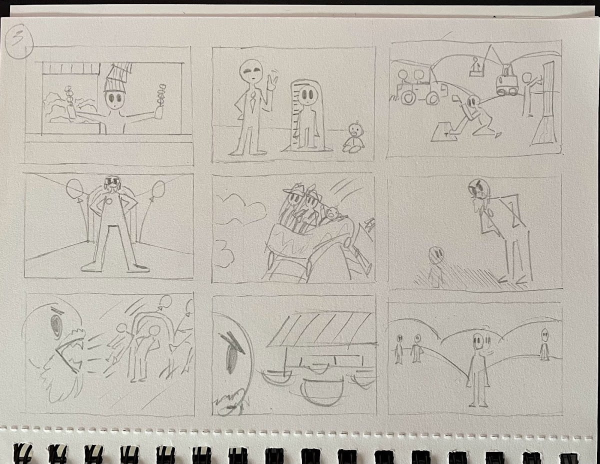
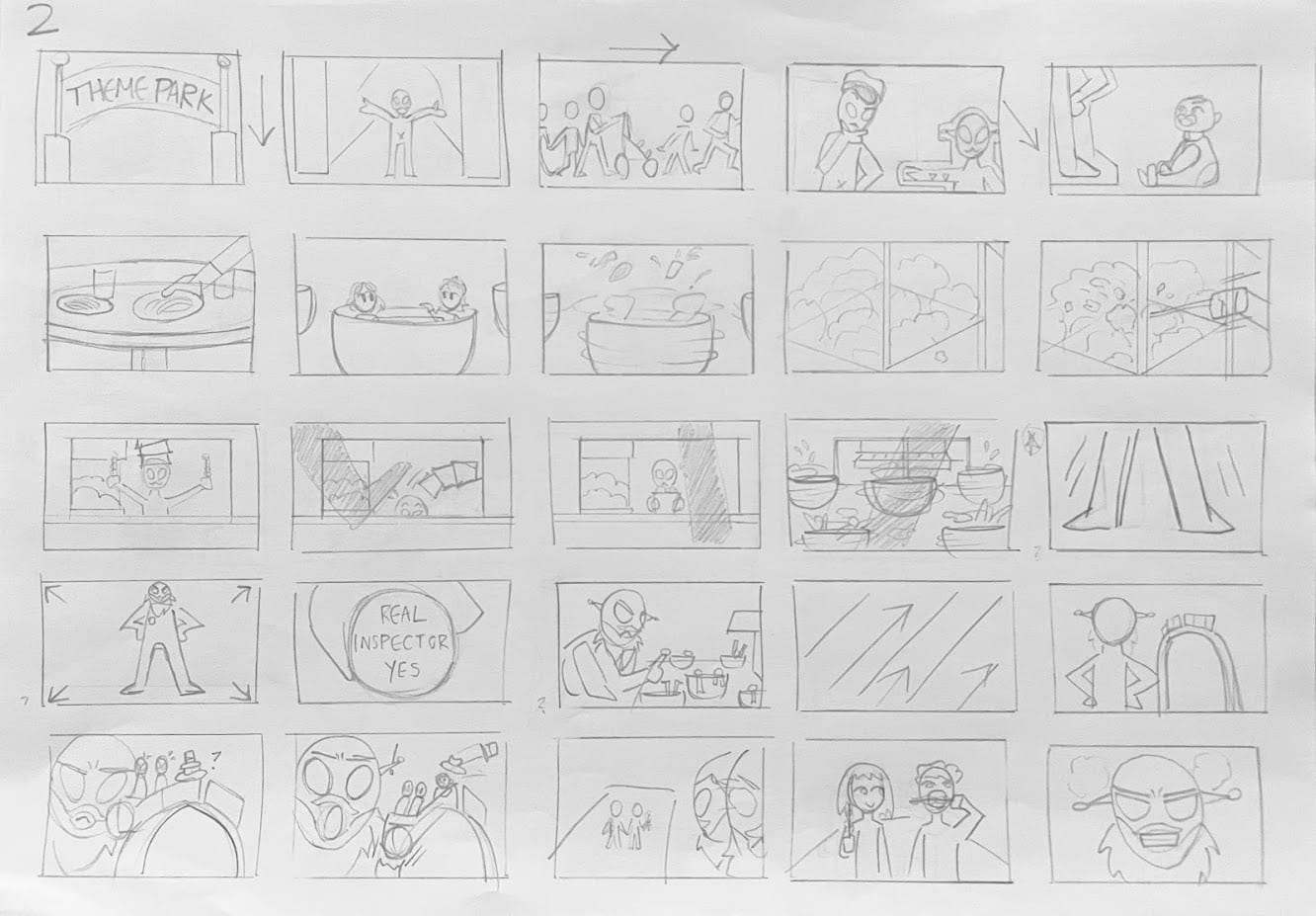
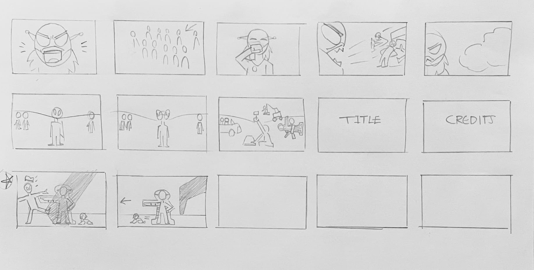
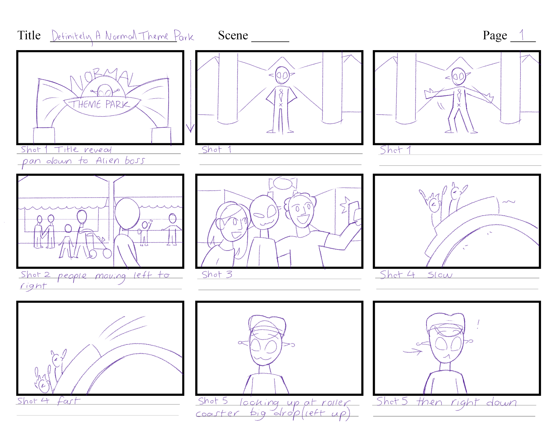
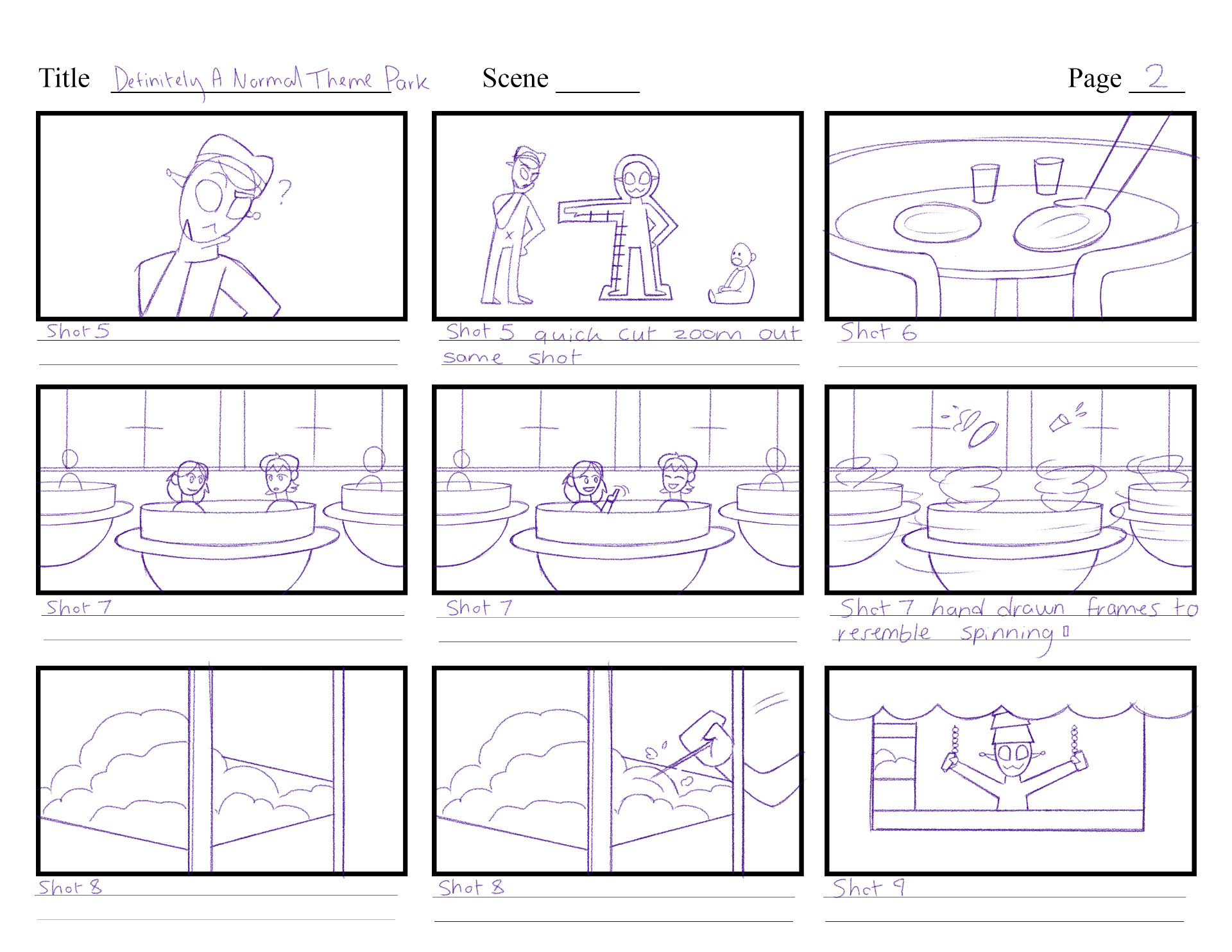
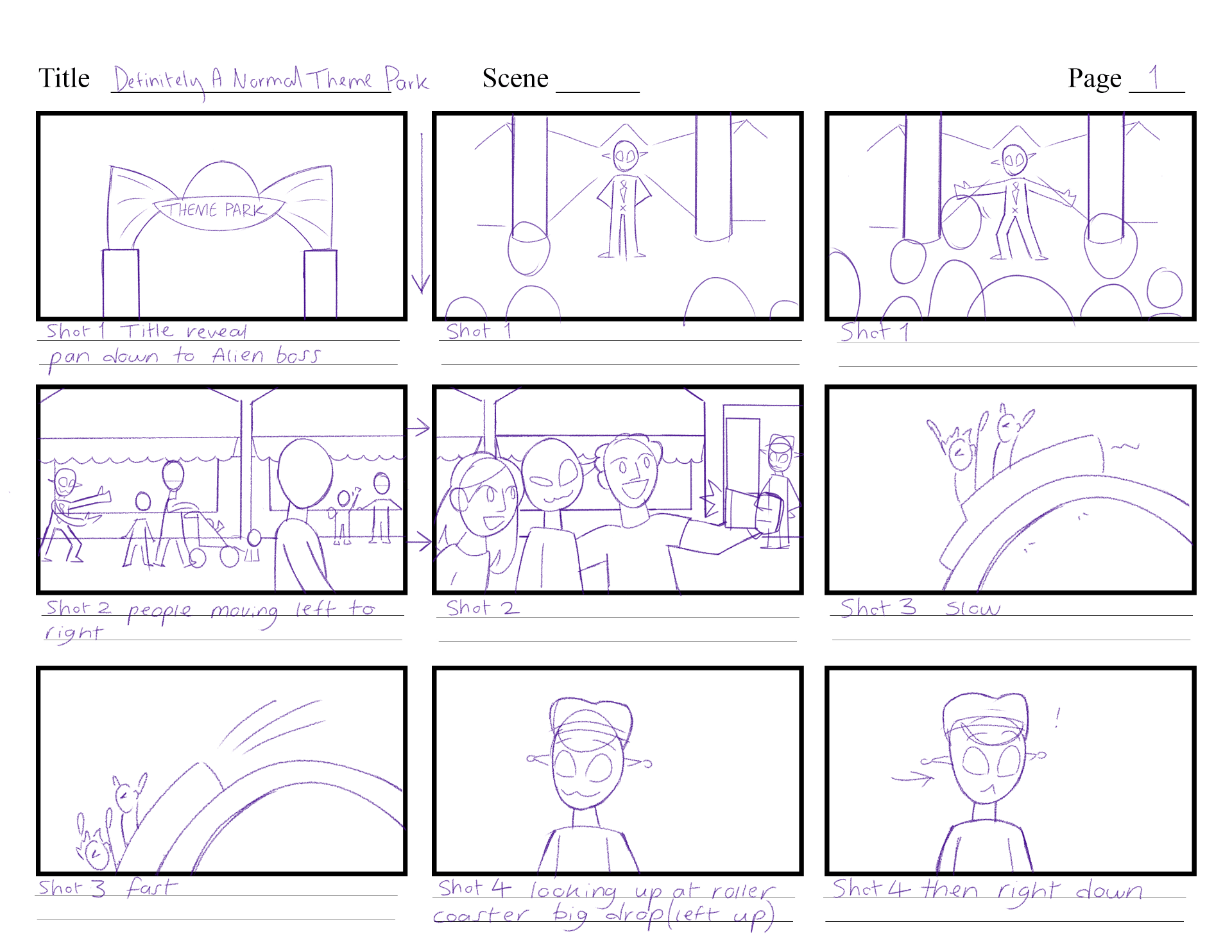
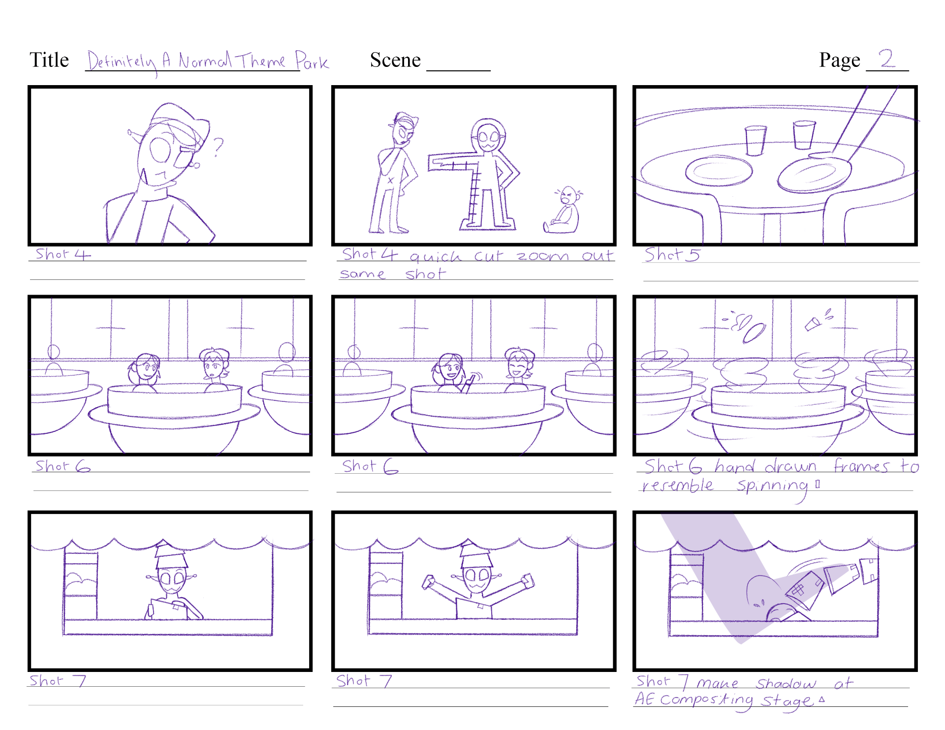
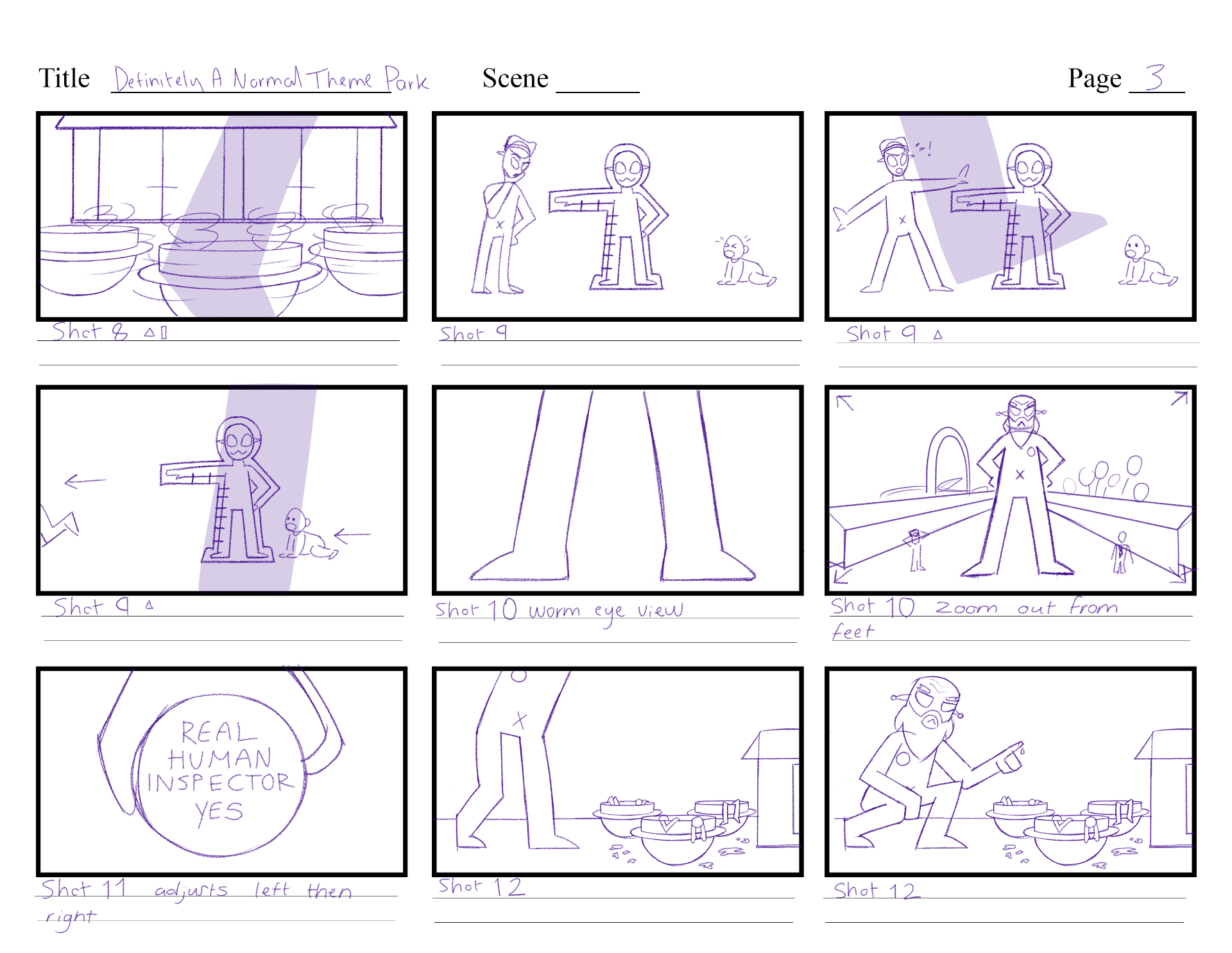
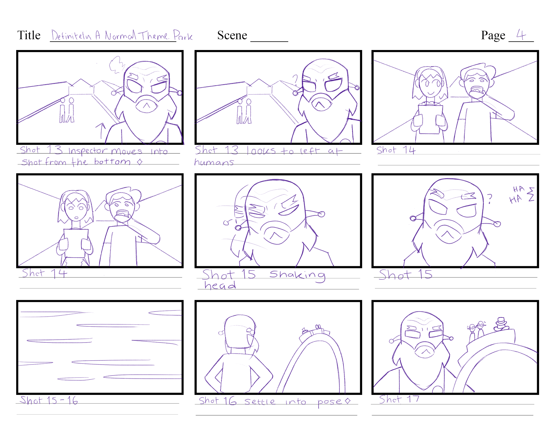
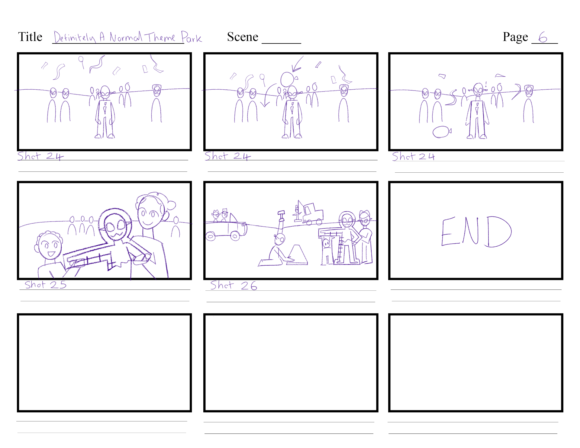
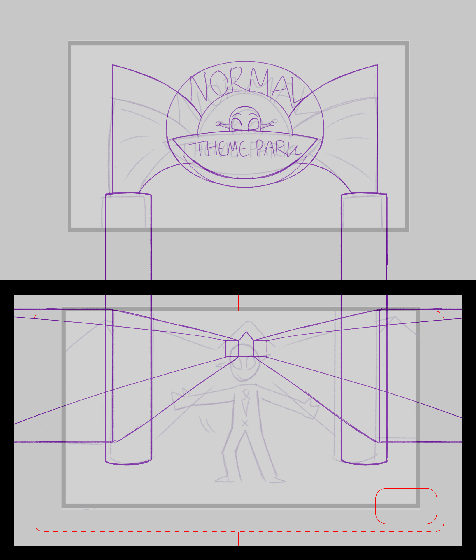
Based off the script, I am developing a better storyboard version. This storyboard is now considering the camera positions more clearly, how each character is positioned in shot, and a rough layout of backgrounds.

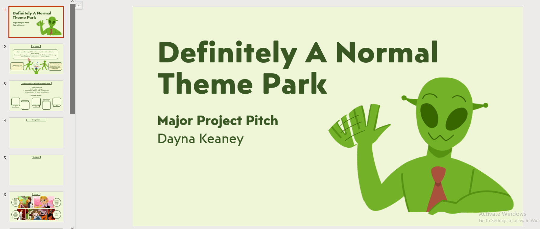
During this week I am preparing my pitch presentation for week 3. I am including the necessary details and concepts I need to show my tutors and class how my project will be made.
WEEK 3
In week 3 I presented my pitch presentation, and it went very well. I am happy with the way I presented my project, and I got good feedback to help me think more about development, and overall thoughts about my next steps.
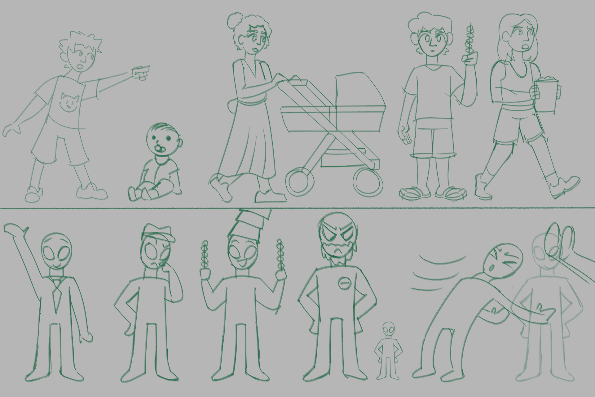
The major point I am to think about is ensuring that my character and background designs will include a right amount of contrast, both in a colour sense, and depth sense. This is to make sure my backgrounds stay separate from my characters, and that my characters do not get lost in the background, and with each other. This gives me a better idea on how to approach my character and background designs, and ensure they have this contrast implemented as soon as I can, so I wont have to make major fixes further on in the project.
I started on designing the Aliens and Alien Inspector right after the presentation day. I also updated the Asset tracker with the kind of backgrounds, props, and other character builds I may need according to the current version of my storyboard.
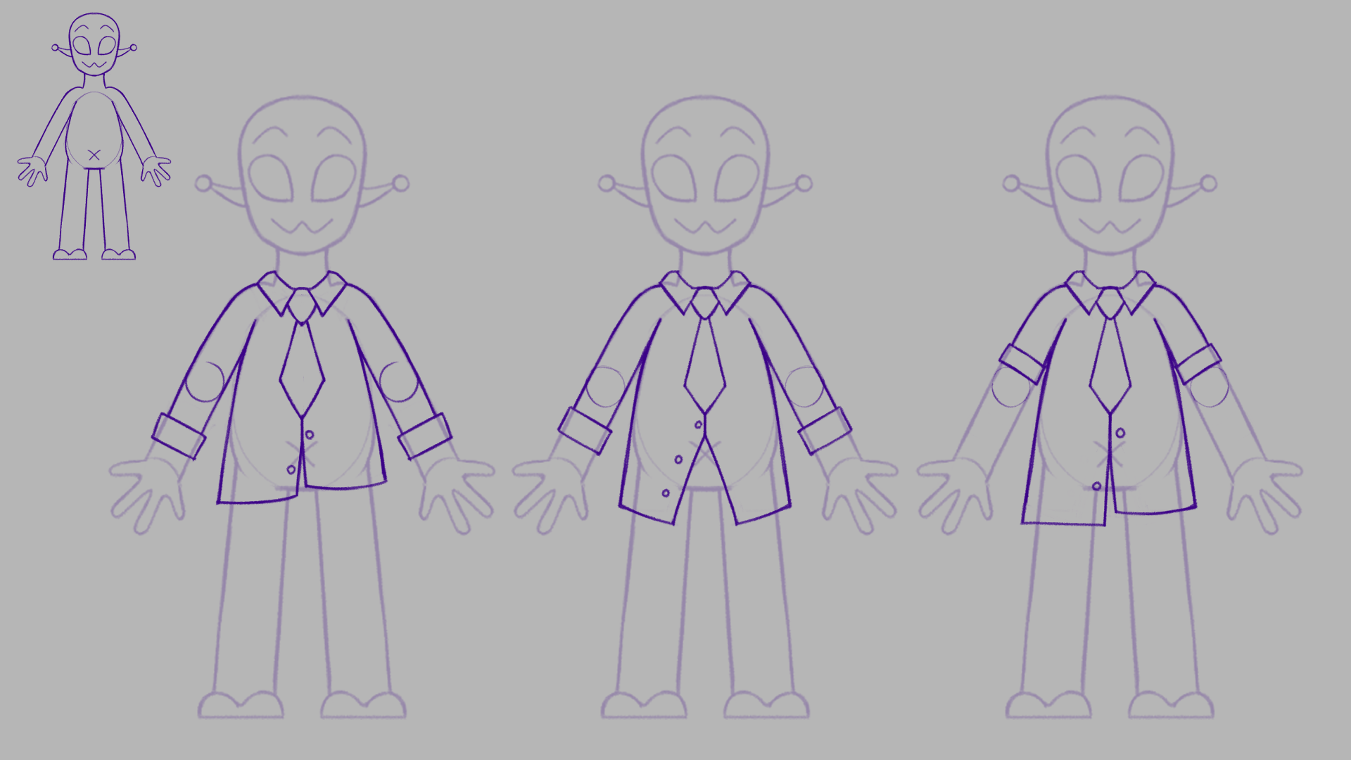
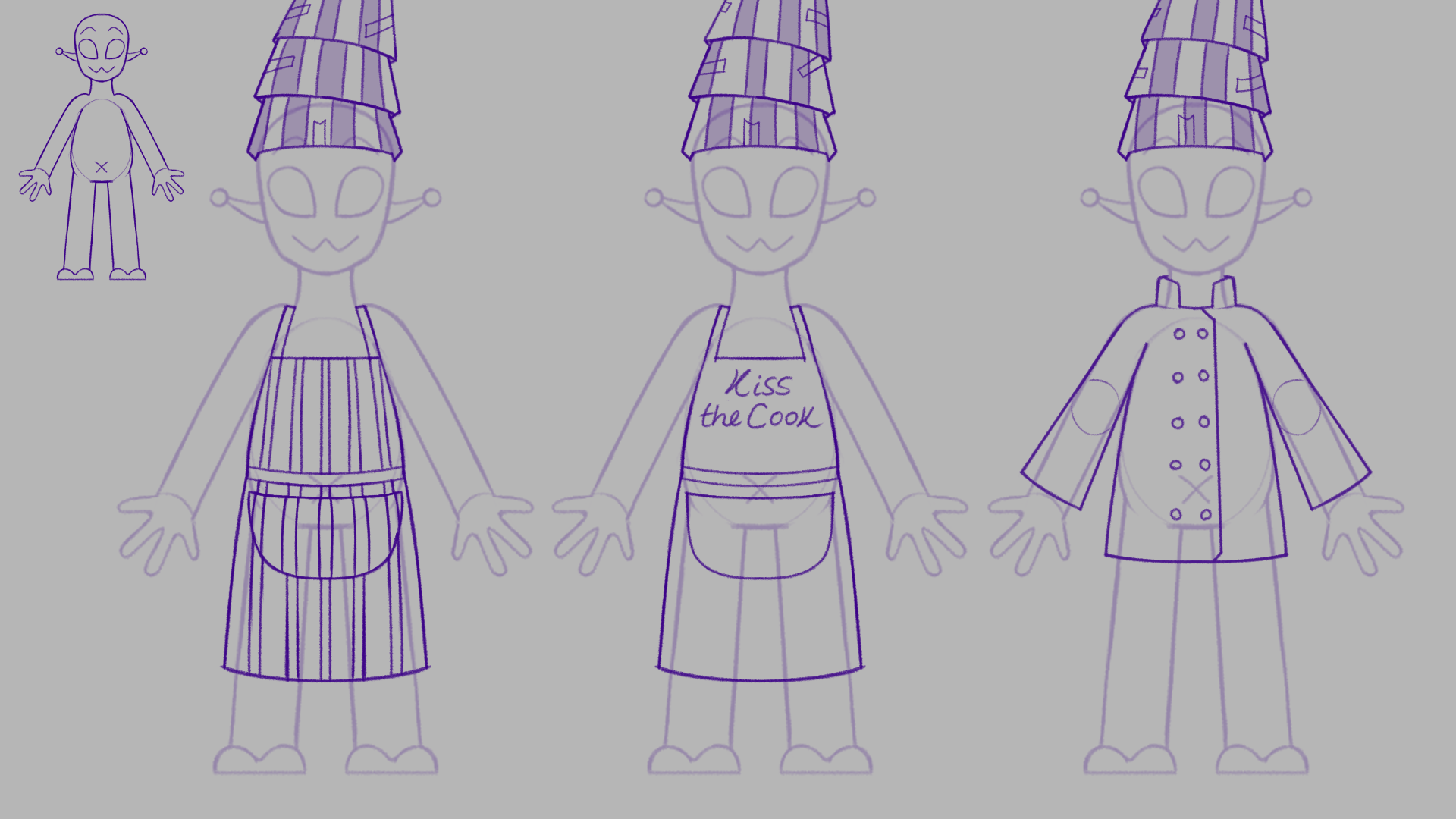
I was recommended by my tutors that the Aliens should probably wear more clothing and accessories, so the main characters can be distinguished from each other, and so that with the idea that the aliens are all green, that the limbs wont get lost in the body if they were to move past each other. It also helps to let the audience have a better idea of what jobs the Aliens have, with more detail in their outfits that link to their job.
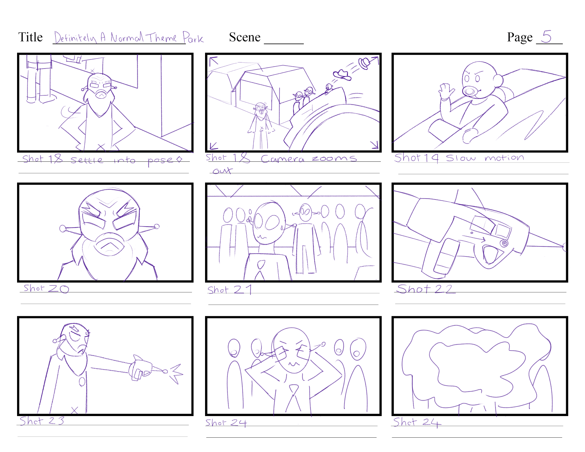
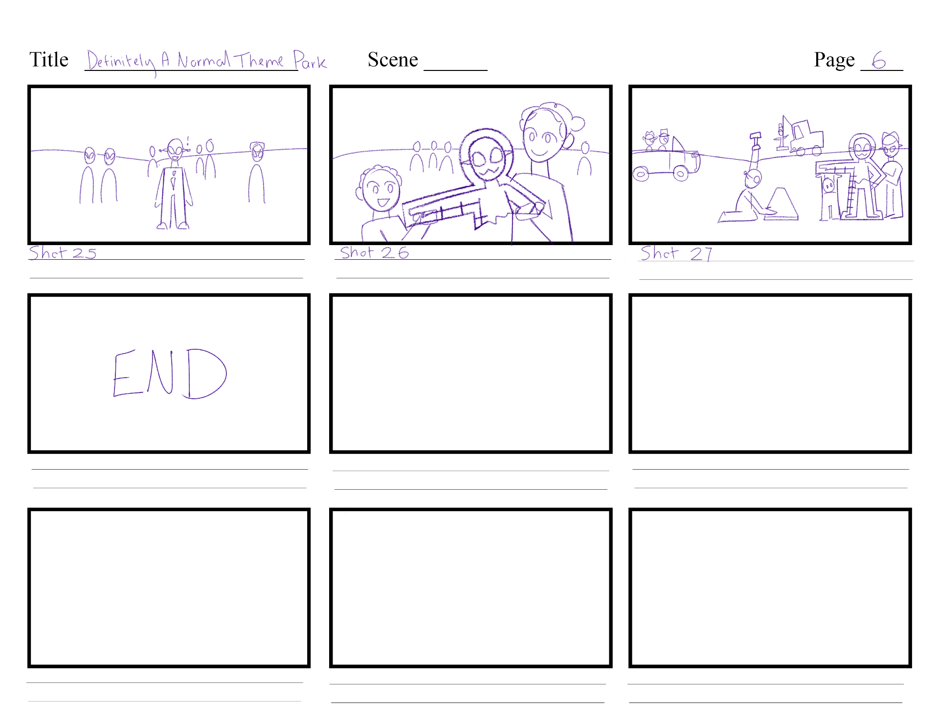
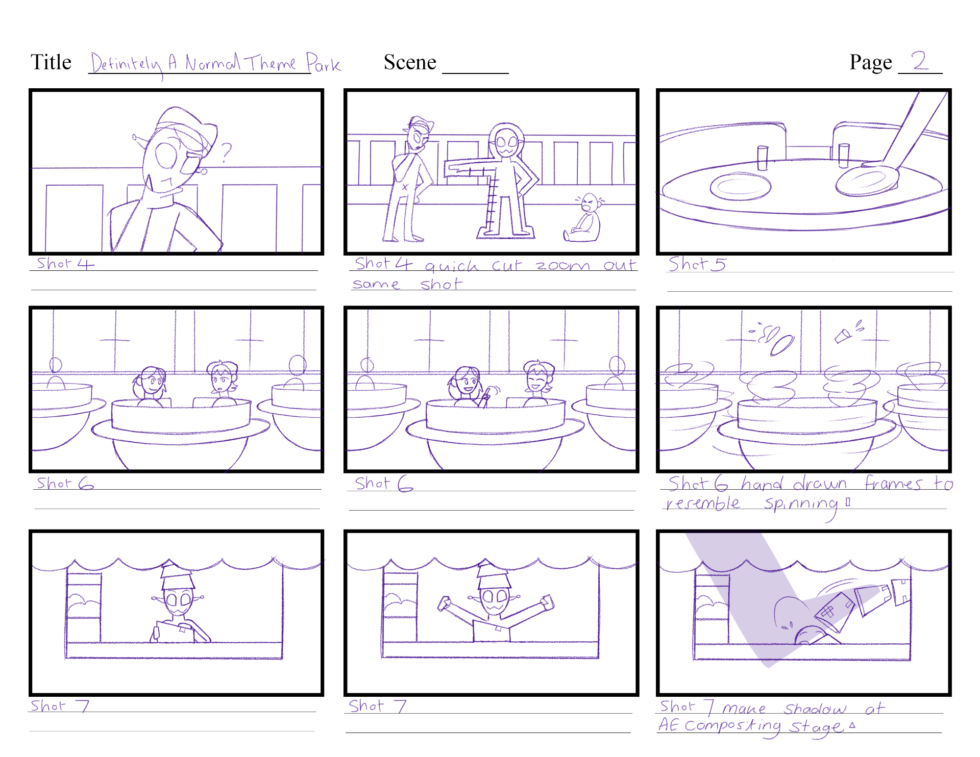
After Friday’s storyboarding class with Michael Bass, I figured that my current storyboard had a lot of cuts (just showing one scene after another with no explanation or connection) so with the notes I got from Michael, I went through my storyboard once more to create a new version. I combined some shots, for example: shot 2 and 3 in week 2 storyboard were different scenes, with different backgrounds. Now shot 2 and 3 are combined, and in a long pan shot, as they include similar scenarios and takes one less background to design.
I adjusted some storyline elements etc. the Alien cook doesn’t sell popcorn on a stick anymore, but rather likes to tape boxes together with bad tape – therefore this will cause a more impactful problem later in the story. I will also include the baby more, and make sure its the last / the worst problem that the Alien Inspector witnesses, which causes their decision to get rid of the park. Also, I will make the Alien boss more important by making them more present during the start, interacting with the customers, and establishing that they own the park.
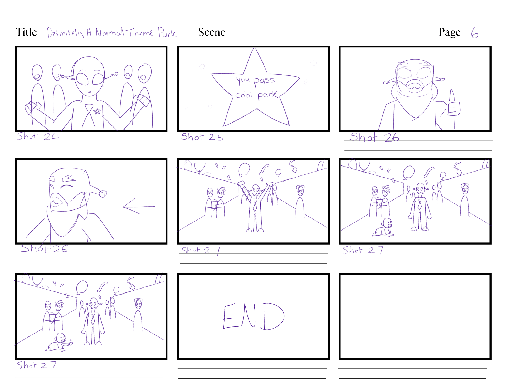
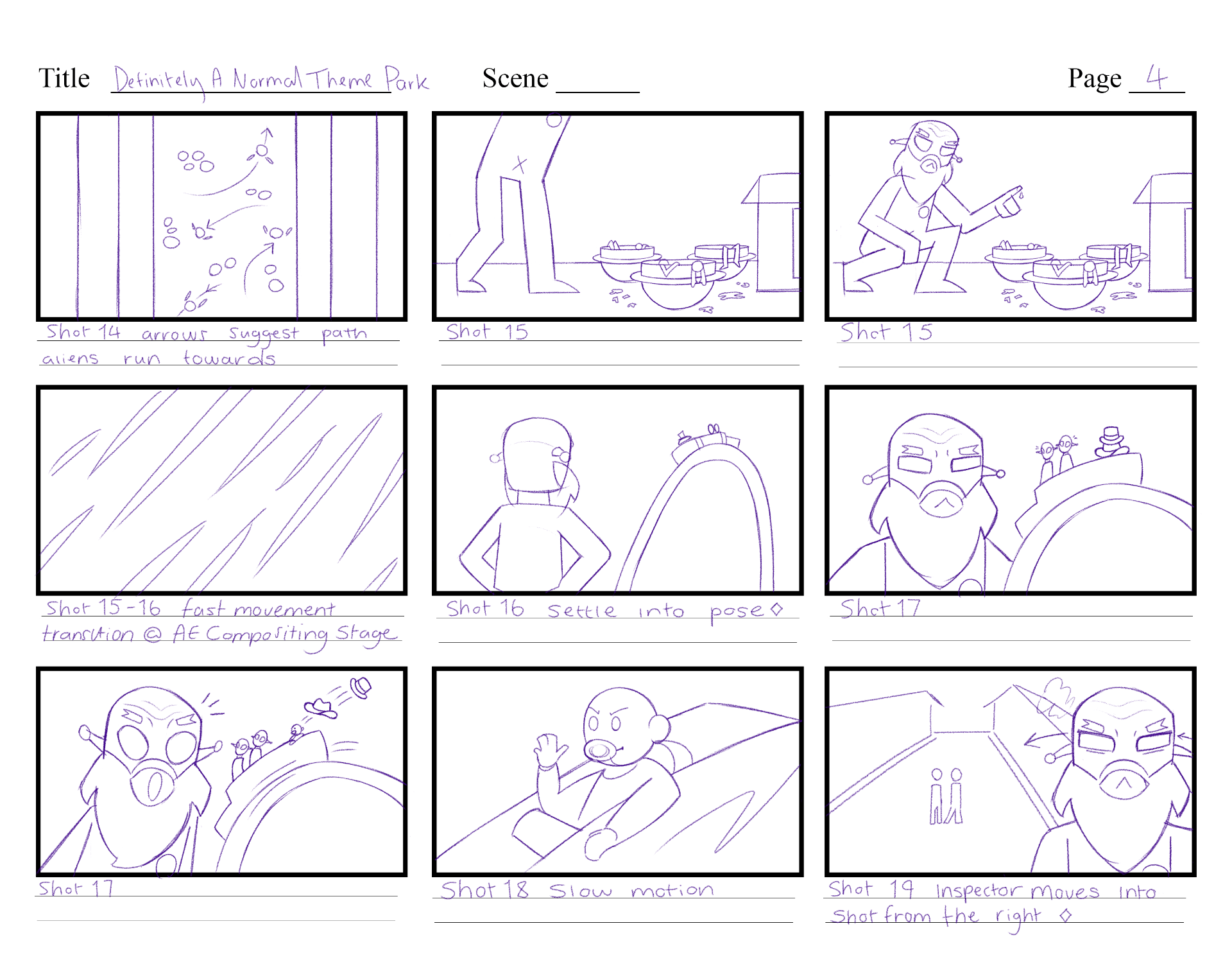
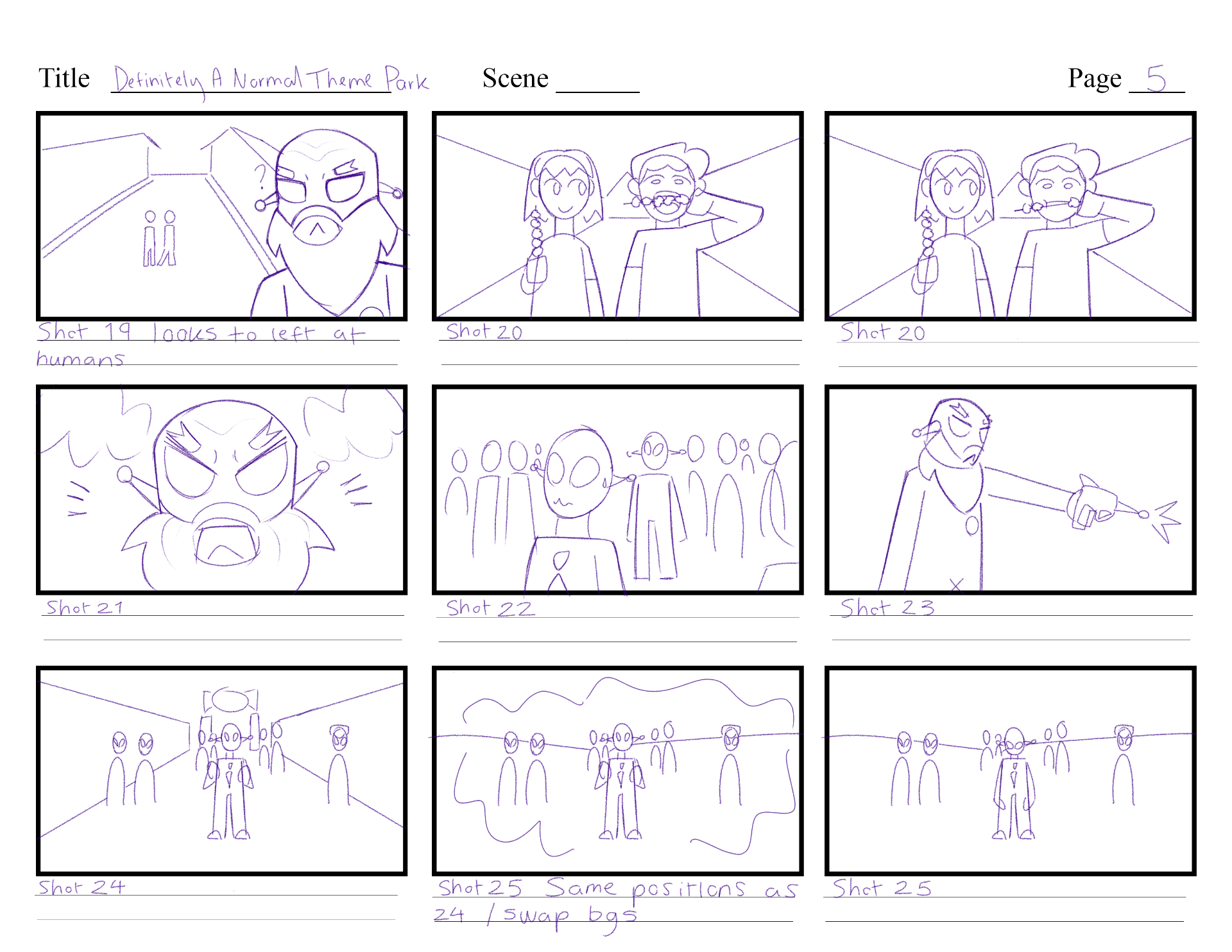
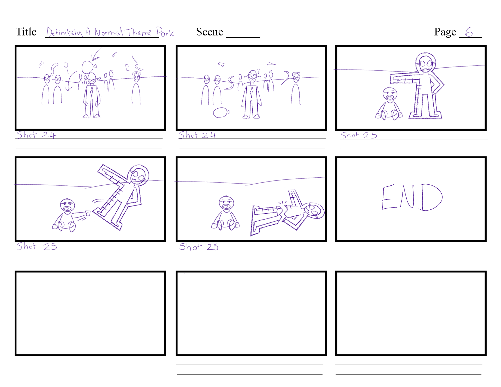
Overall I am much more happy with this storyboard layout, as it can cut down on producing backgrounds & quick lone shots, and it helps tell the story better. However, I am still unsure if I should still keep the last two shots into the story – where the humans come up to the aliens, offer to help build the park, and so the Aliens start building. I will take the next week to ask around for opinions, and finally decide on the ending of the story.

With this new storyboard version, I also updated the script, and the asset tracker again to make sure they included the right information that matches this story.
Definitely a Normal Theme Park Script_ V4
WEEK 4
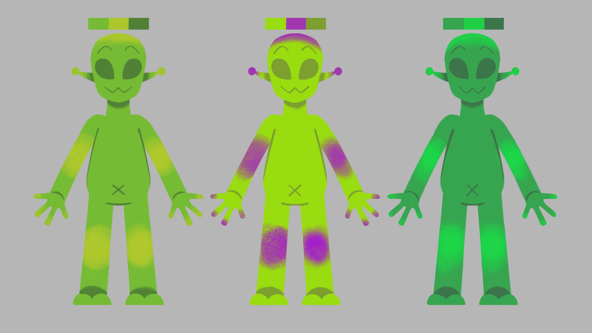
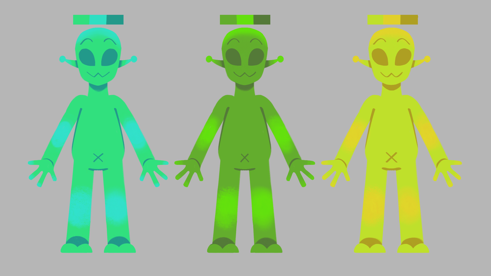
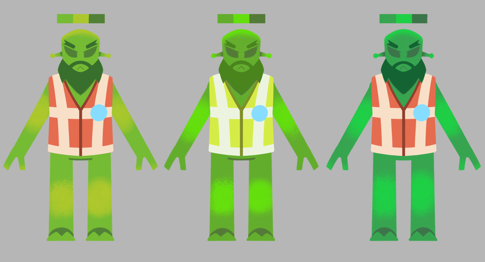
During week 4 I explored some colour design for the Alien, first of all thinking of the hues and saturations that the alien could have, and where different hues and textures can be placed. I got a good tip from Aodhan that I could save from making multiple alien rigs with different colours, and instead alter each aliens’ colours during the compositing stage – with use of adjustment layers, and adjusting the hue / saturation options. I will definitely make use of this, and therefore use these pages for reference of what to change the hues to.
During the Wednesday group tutorial, I got feedback from my tutor Aodhan in reference to what i’ve completed over the week. The main piece of feedback I was given was in relation to the end of my story, where I could either push for a more heartfelt and potent storyline for it to work, or I continue to make the storyline silly and full of jokes, continuing the vibe it already has. I will use this week to think about what I could do to tie the storyline together, and possibly make it the end on another joke.
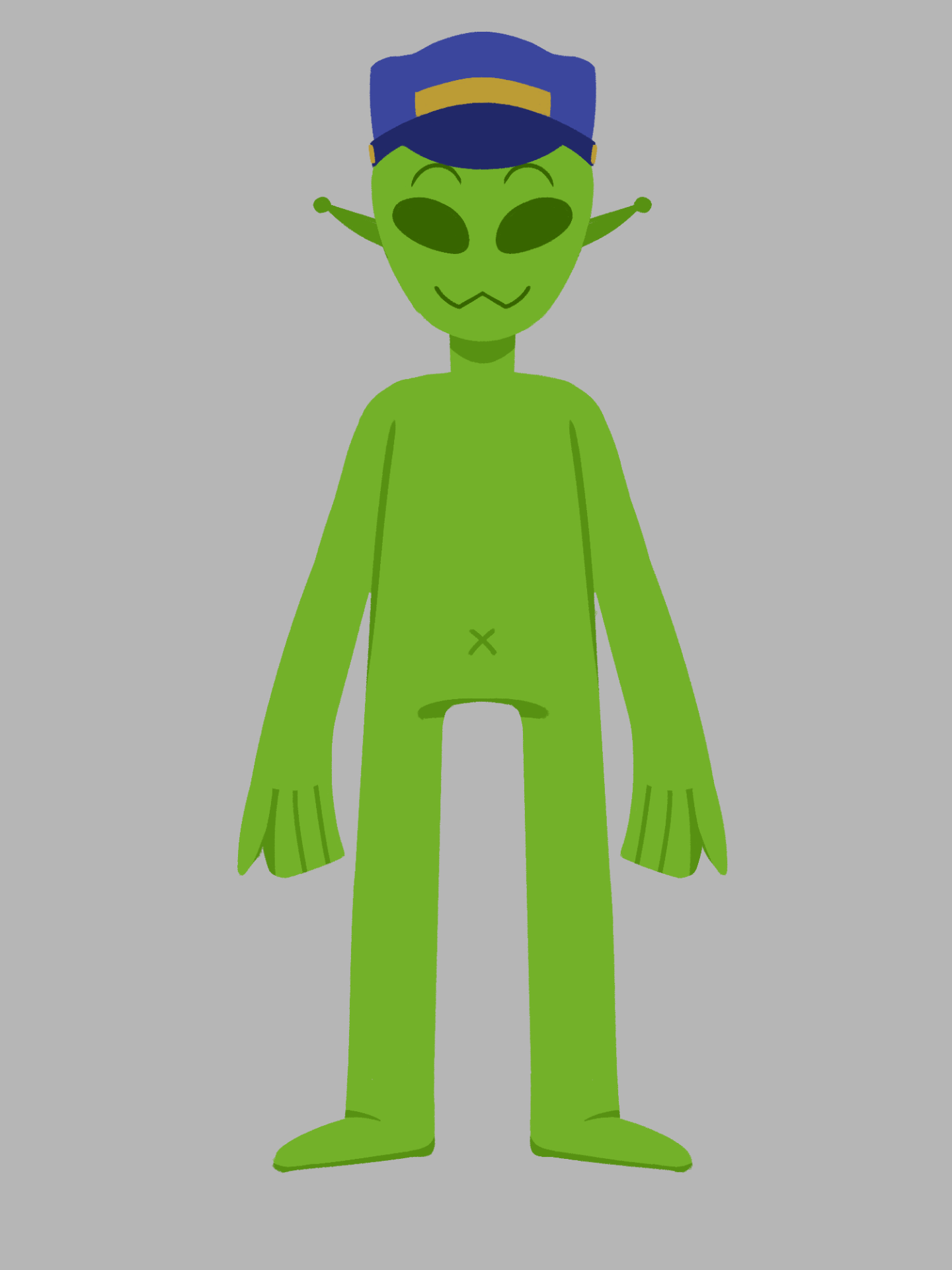
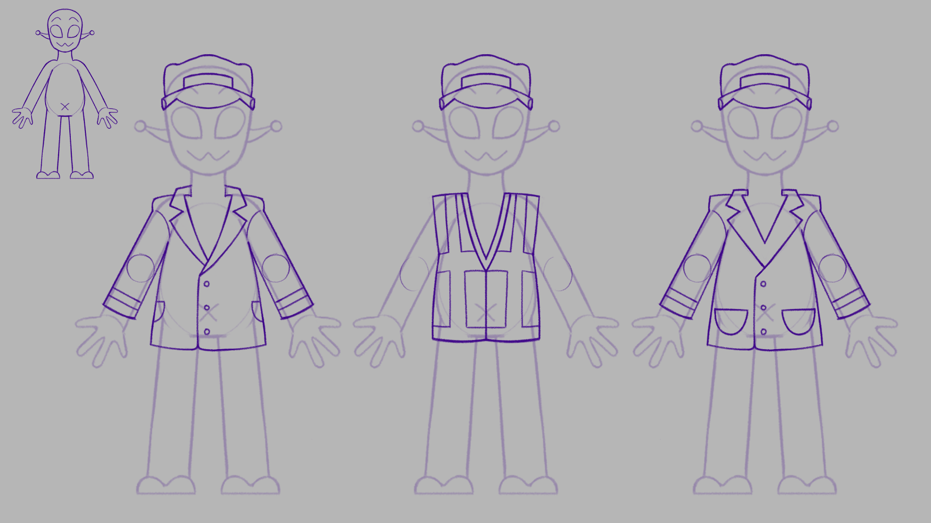
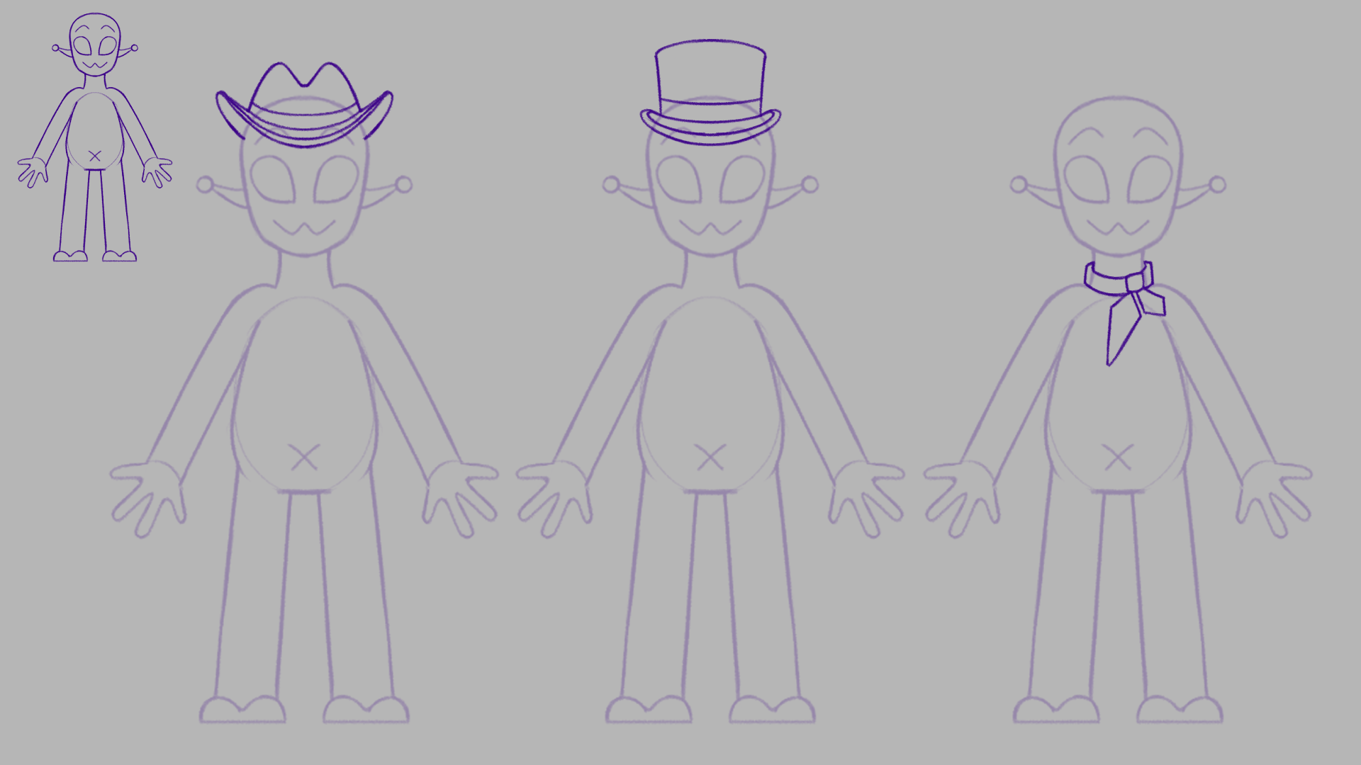
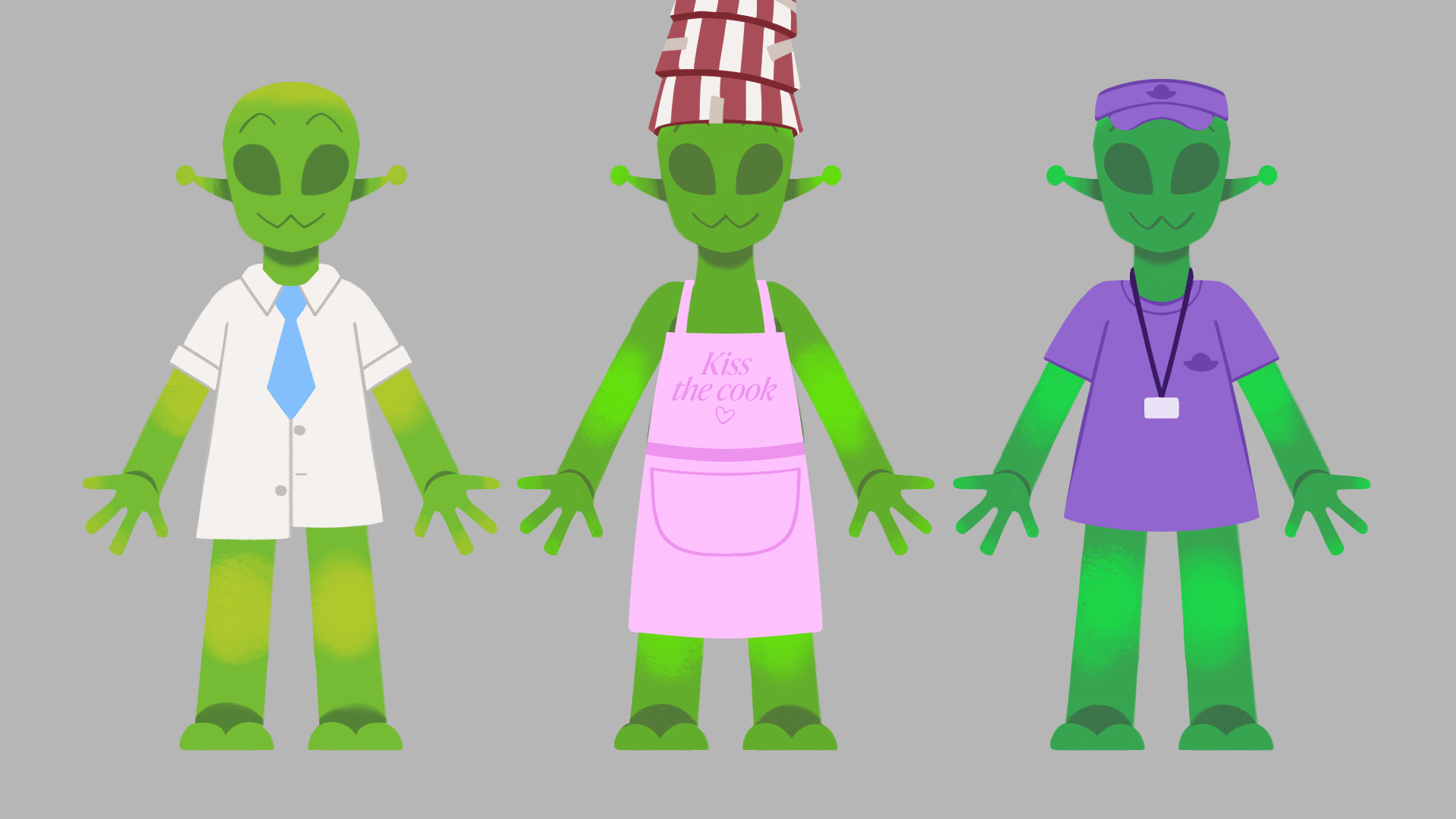
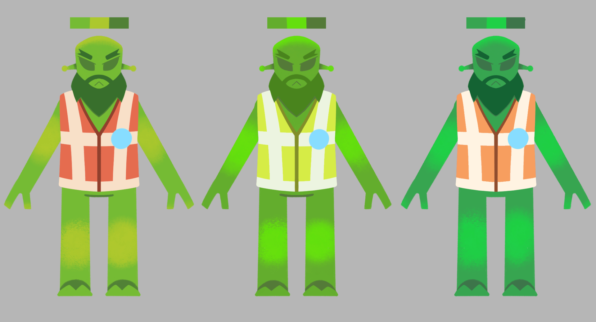
Next is a little revamp on the roller coaster alien worker, as in first glances they could be mistaken for the inspector with its uniform look. Instead of a train theme, I will go for the typical roller coaster operator. They can have accessories such as caps, ear microphones, shirts and lanyards.
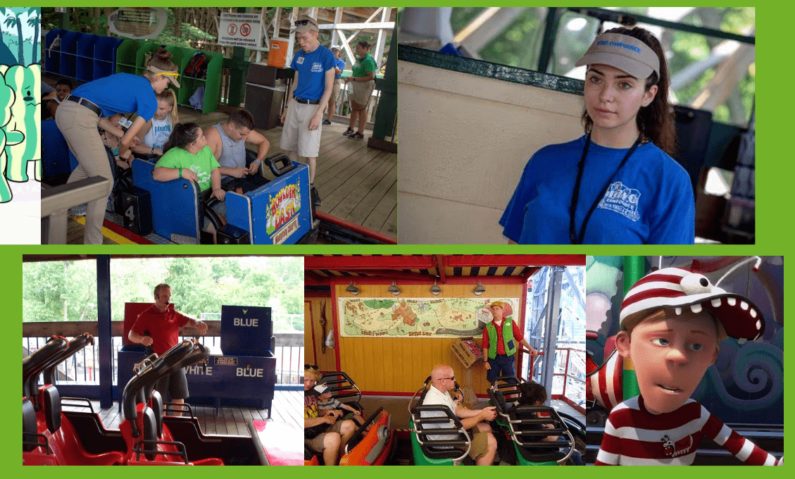
With my reference above I applied the roller coaster operator look onto the alien, with variety in accessories. I am leaning towards the first design that includes a lanyard, as I have an idea of how it could be a moving secondary action prop. It can give the character a realistic and visually pleasing look.

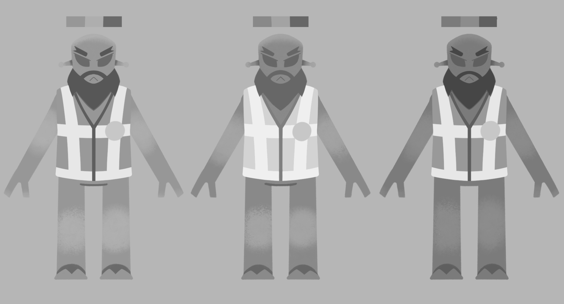
I also figured I should give the inspector a piece of clothing as well. Thinking back to the older Alien coaster operator design, I could bring back the hi-vis vest. Usually inspectors in their regular jobs wear these vests, based on the reference below.
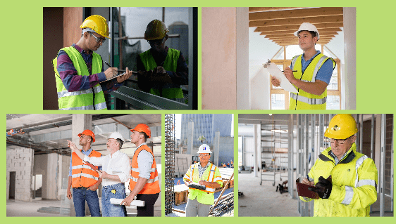
I made sure to keep the inspector badge in with the design in a suitable place, where the hi-vis lines intersect, as it reads better. I am leaning towards the first outfit with no sleeves. This is because I think it looks much more sharp and intimidating than the other designs.

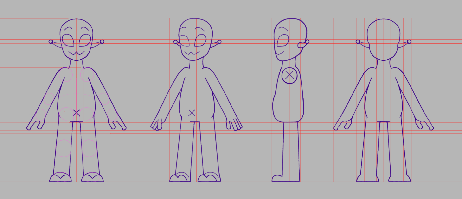
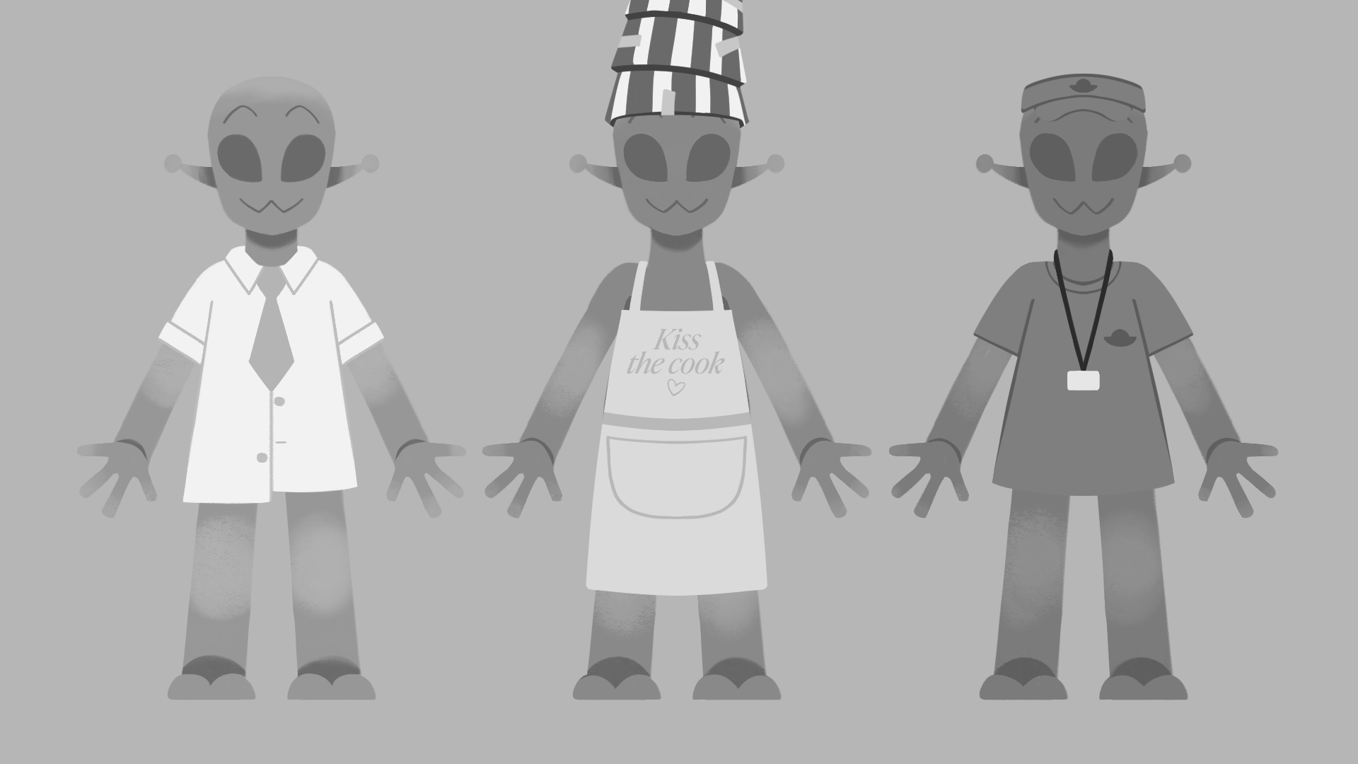
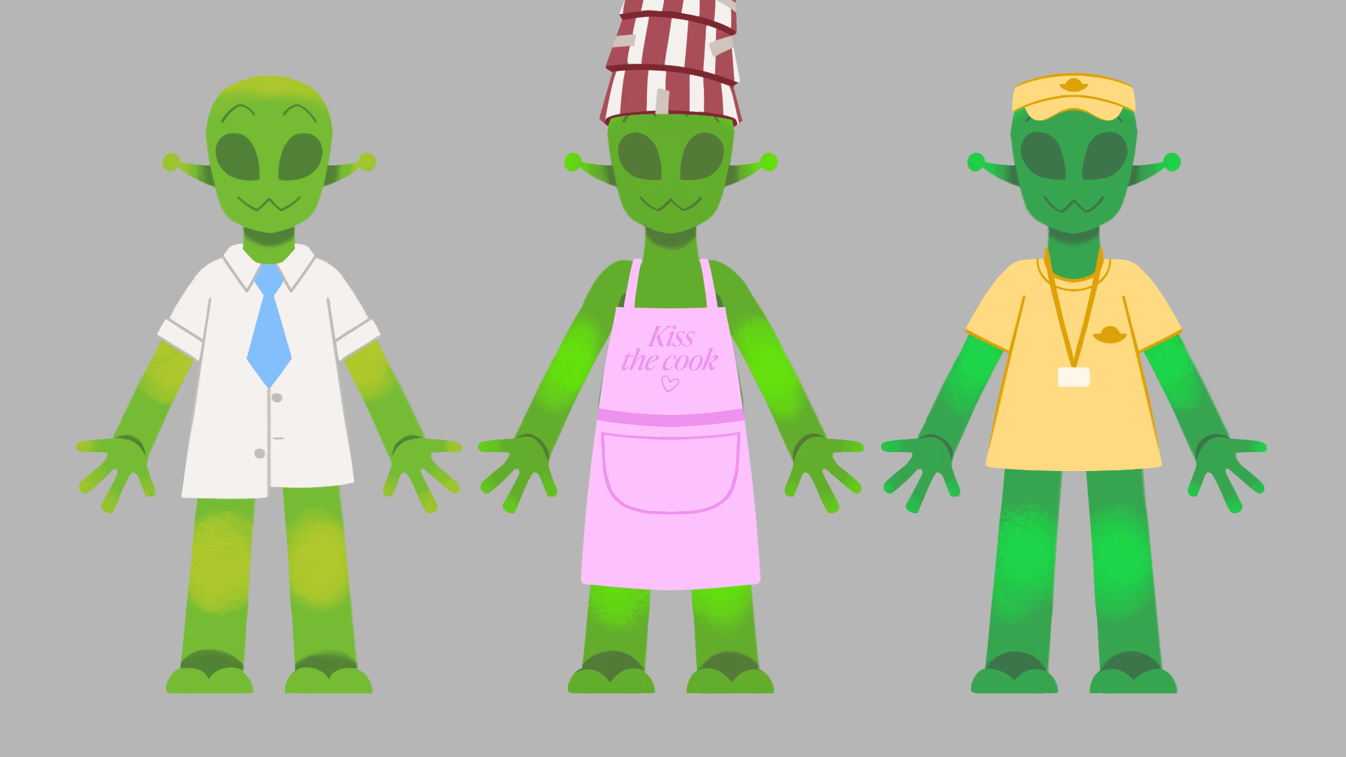
With more concepts for these characters, I developed more of my turnarounds, for better understanding of their shape, and for reference at the rig building stage. There are some alterations I will make possibly in the next week, but as of now this is how they are turning out.


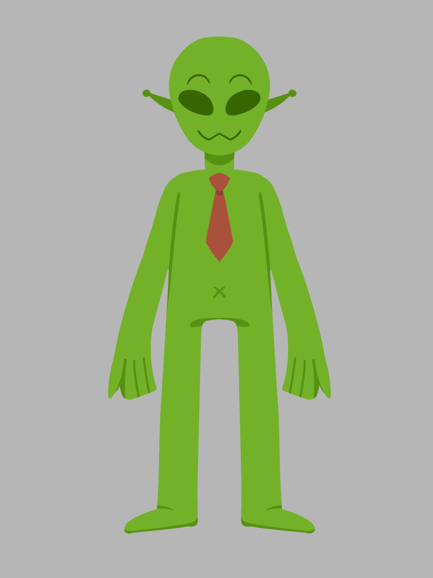
This week I have also tested some colour on the aliens outfits, for the workers, and the inspector. It would be good to give them variation in colour so each can be recognisable for their outfit, and colour scheme of outfit.
Lastly, I have made a start on planning out my backgrounds. I wanted to start by sketching some greyscale thumbnails of the backgrounds I have conceptualised throughout the storyboarding stage, for better understanding of depth and foreground / mid ground / background elements. 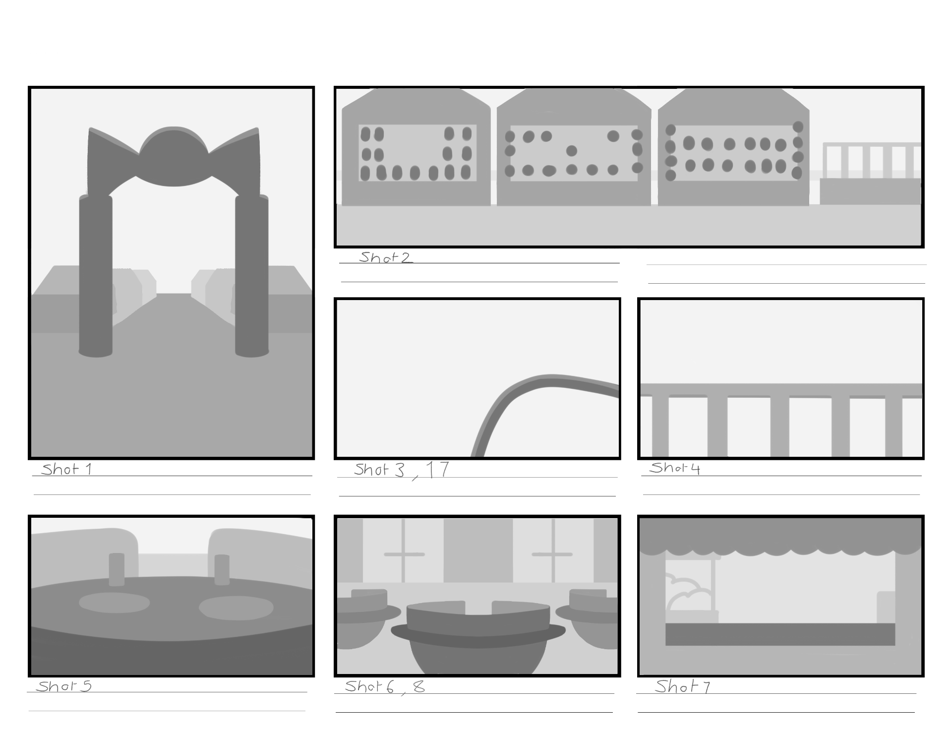
I also made a start on sketching on the PSD backgrounds files I have made, where the final backgrounds design will be made. So far I have only a couple sketched out, but during the next few weeks I will develop and alter these backgrounds to a good standard, all while following tips from my references.


At the end of this week I finished up a third version of the storyboard with the newer ideas and changes made.


WEEK 5
I presented my work again during week 5’s group tutorial, and I have some things to consider, and alterations to make to my story layout. The story at the moment was not creating a significant punch for the end, making the story quite dull. I talked through the story with Aodhan and he gave me good points to think about and add to the story.
The most major point was to make it a little more wacky! To make it an enjoyable and fun watch, I need to keep making jokes throughout, and make each scenario something silly.
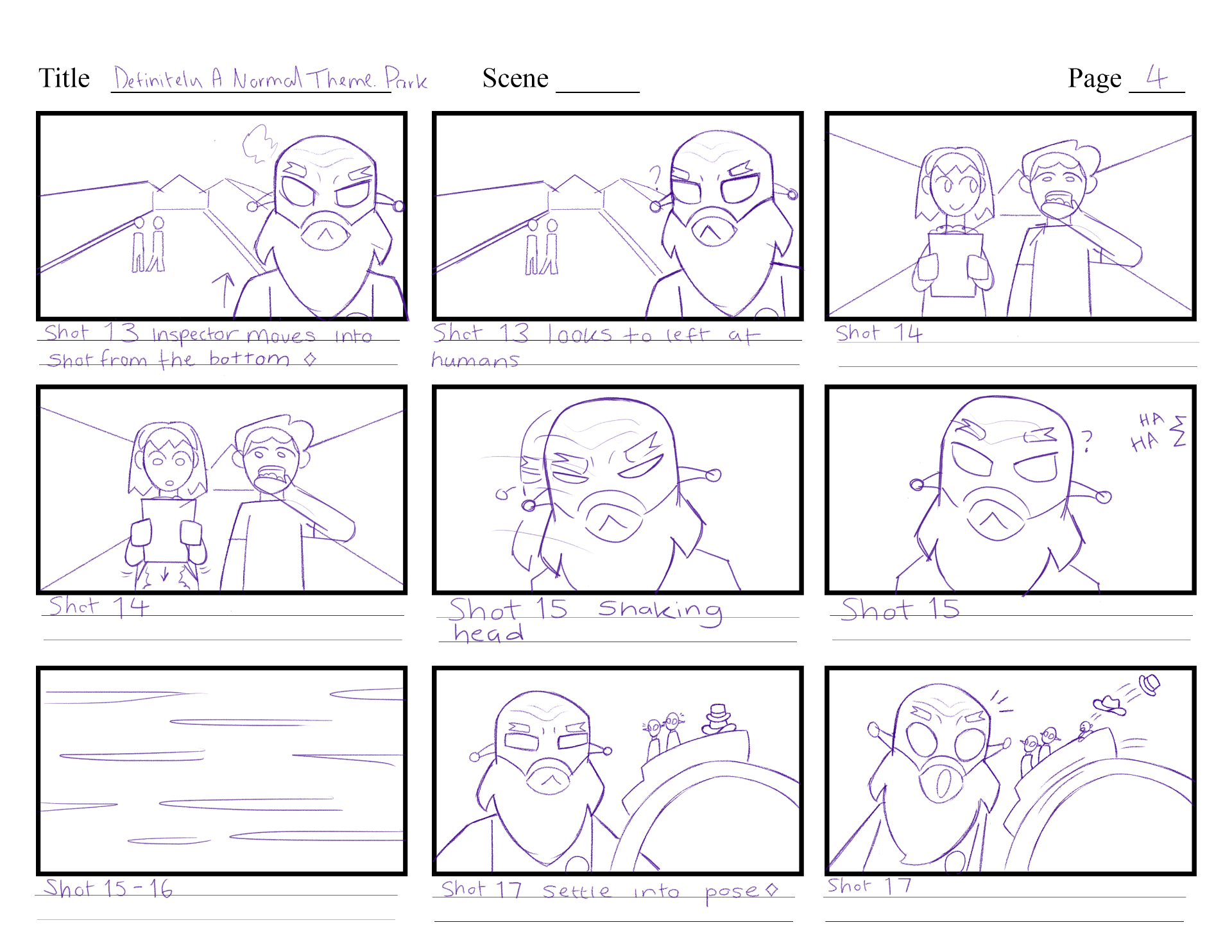
Next point was to focus more on the inspector. It would be good to let the audience know the Inspector is someone that will arrive at the start. It would also be interesting to make them scary/intimidating at the start, but actually gives the park a pass at the end with a smile – setting up a high tension moment only for it to end up okay.
One other point we discussed is that the inspector should probably stay the same size as the aliens; mainly for cutting down on strange BG design perspectives, and to cut down on uneccessary confusion.
Right after the tutorial I wrote down some new story points, and a newer layout of the story. During this week I will update and structure these points into a new script version, and try a new storyboard version too.
Apart from the story, we also discussed colours, and backgrounds. I showed Aodhan the colour studies I did in week 4, but with the black and white filter tip that Henry showed us that morning. I applied the filter settings to my studies and noticed some colours blended into each other etc. On the alien operator the purple shirt blends into the green skin. To avoid this I can turn up the brightness/hue of the purple shirt and / or change its colour. After class I went back into the colour studies and made subtle changes to the tones, so it looks better in the B&W filter.
As for the backgrounds I started sketching, Aodhan had recommended I keep in mind of the depth and perspective of the objects. I hadn’t noticed before but most of the background sketches had made the buildings and objects look very flat. So this week I am giving each background a bit more depth and thickness to it. I also need to be referring back to my main source of BG inspiration for sparking new ideas, such as the Powerpuff Girls BG designs I researched a few weeks ago.

WEEK 6
With the ideas and feedback from the lesson last week I made improvements to the fourth version of the storyboard. I presented this version in the group tutorial this week and everything looks good aart from small perspective views, and some shot cropping. This means I can continue on with my animatic development with this storyboard to guide me, and to make any smaller changes throughout the animatic if needed.