MP Pre-Production
Schedule
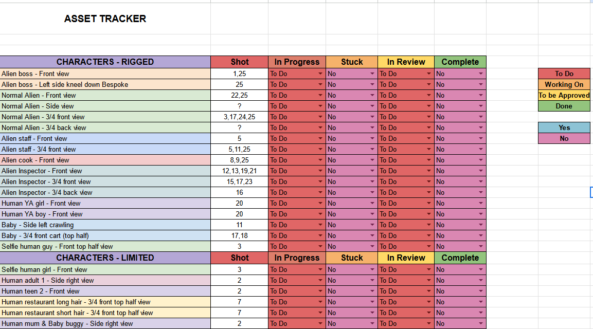
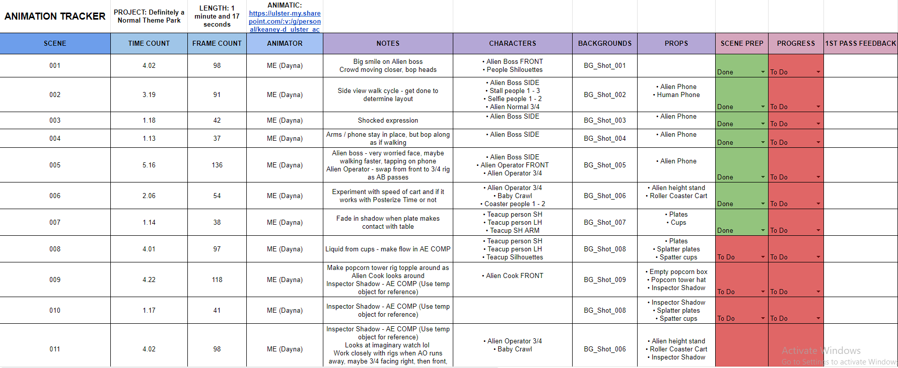
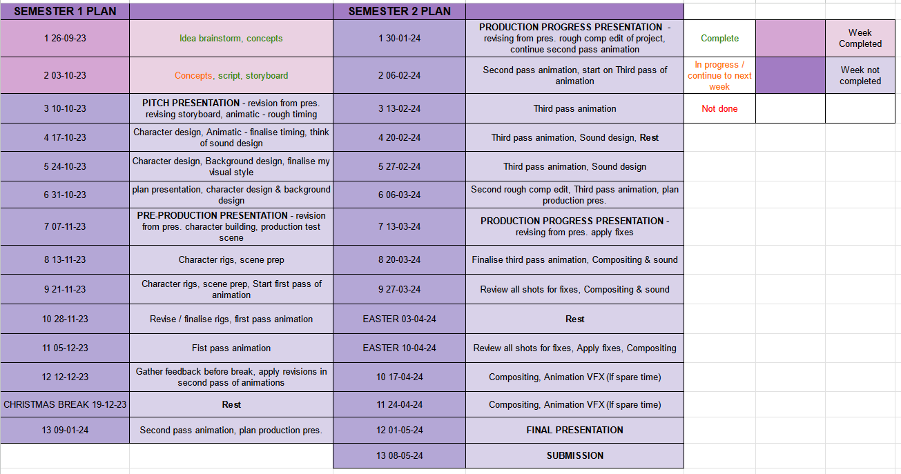
My schedule to complete this project will follow along this template I filled in on Google sheets. Tasks may change spaces depending on the position I am in each week.

Thumbnails
Painting thumbnails of key moments from my initial concepts has helped me gather a better sense of the depth, contrast and composition of each scene. They aren’t final, but the extra thumbnail pages will help if I am lost in picturing a scene.
Script
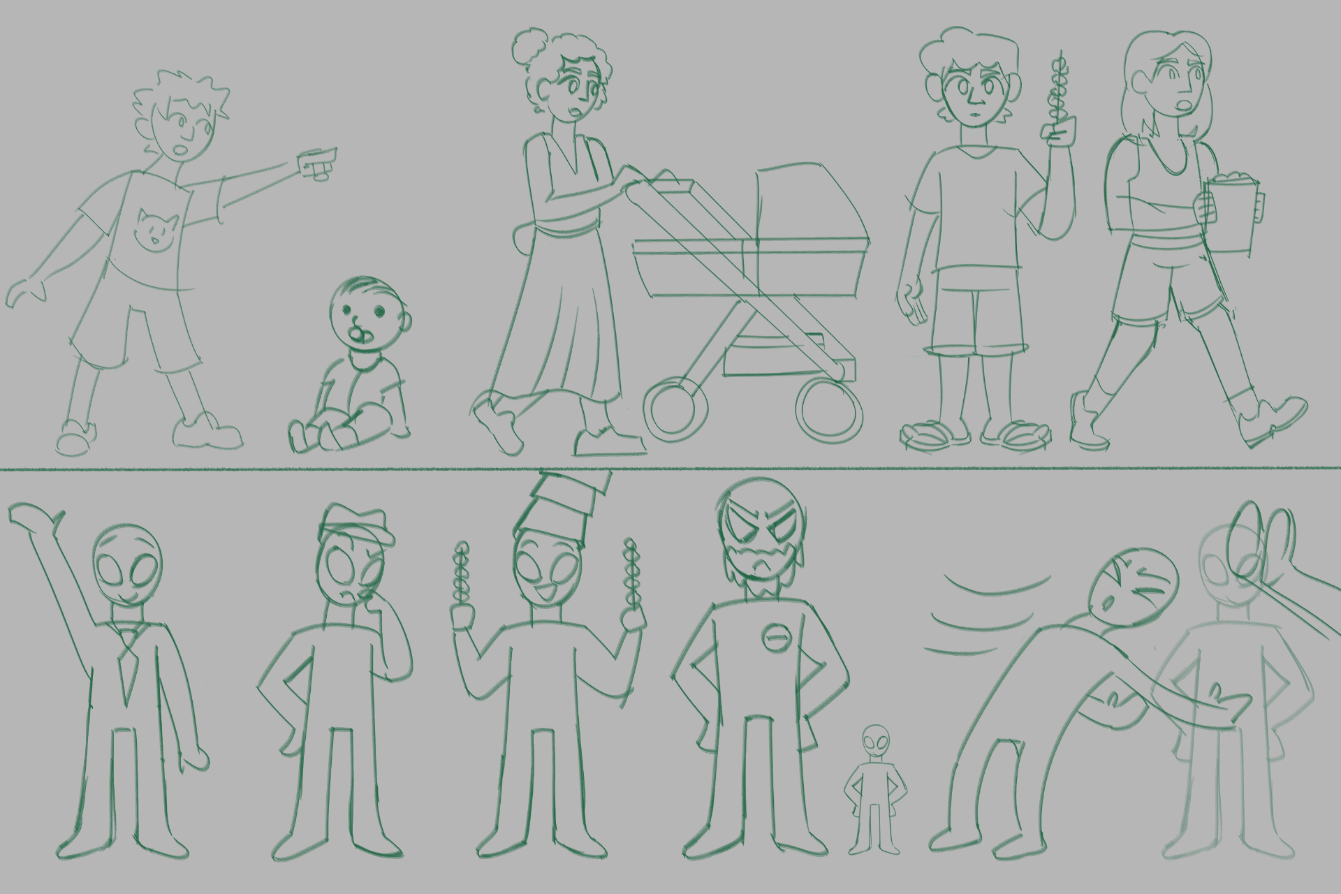
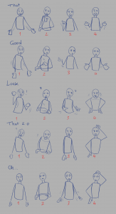
I had gone through a couple of script versions before I was happy with the final story structure. To help me visualise how it would go, I started drawing versions of my storyboards along with writing the script.
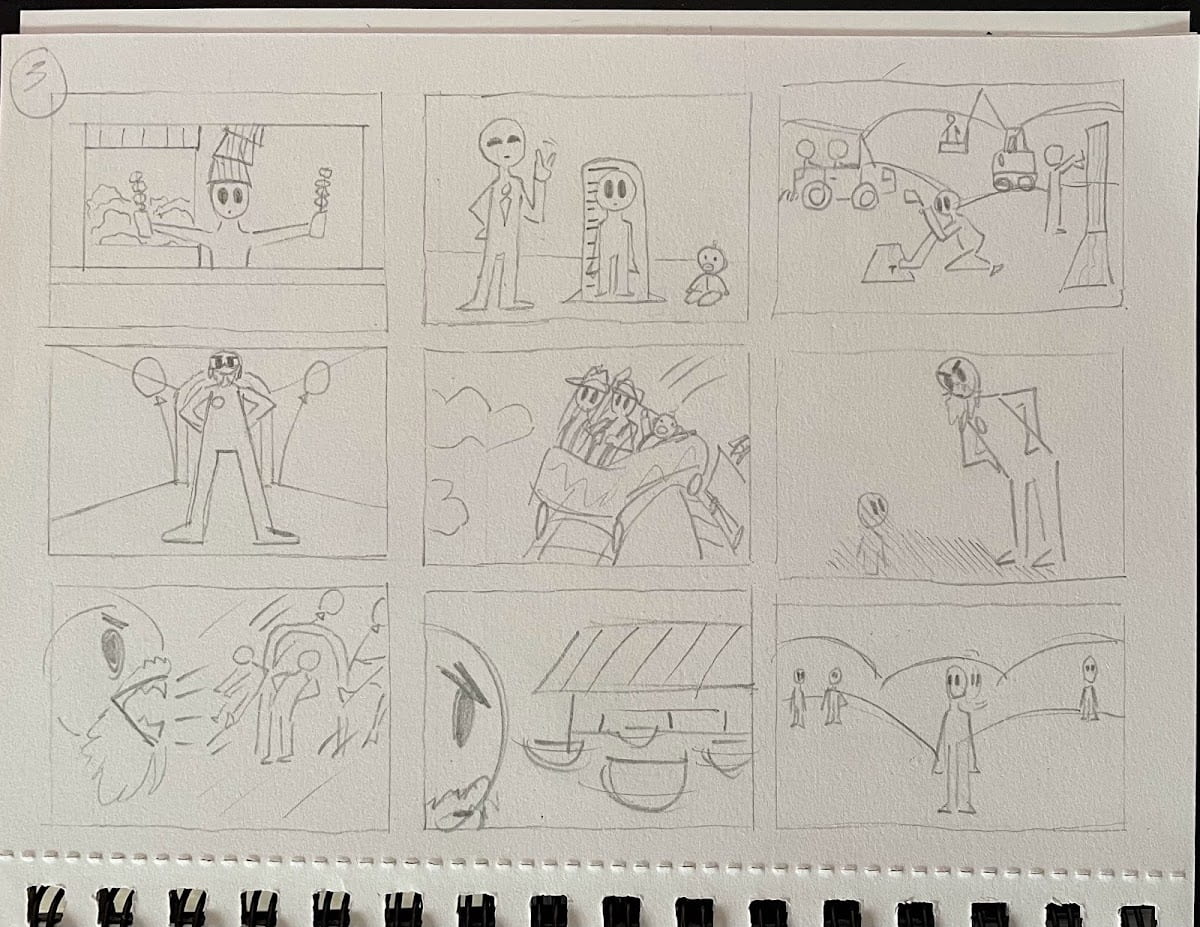
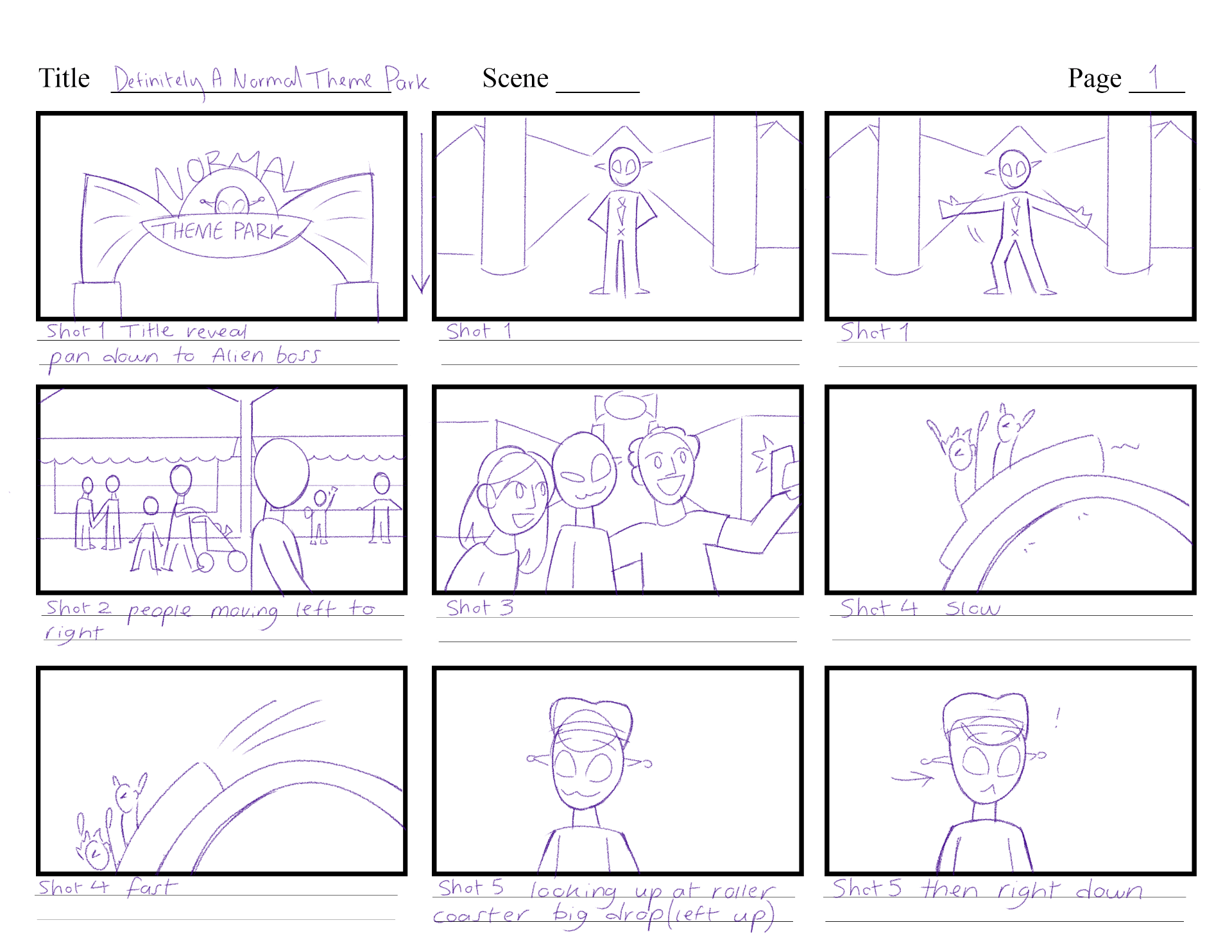
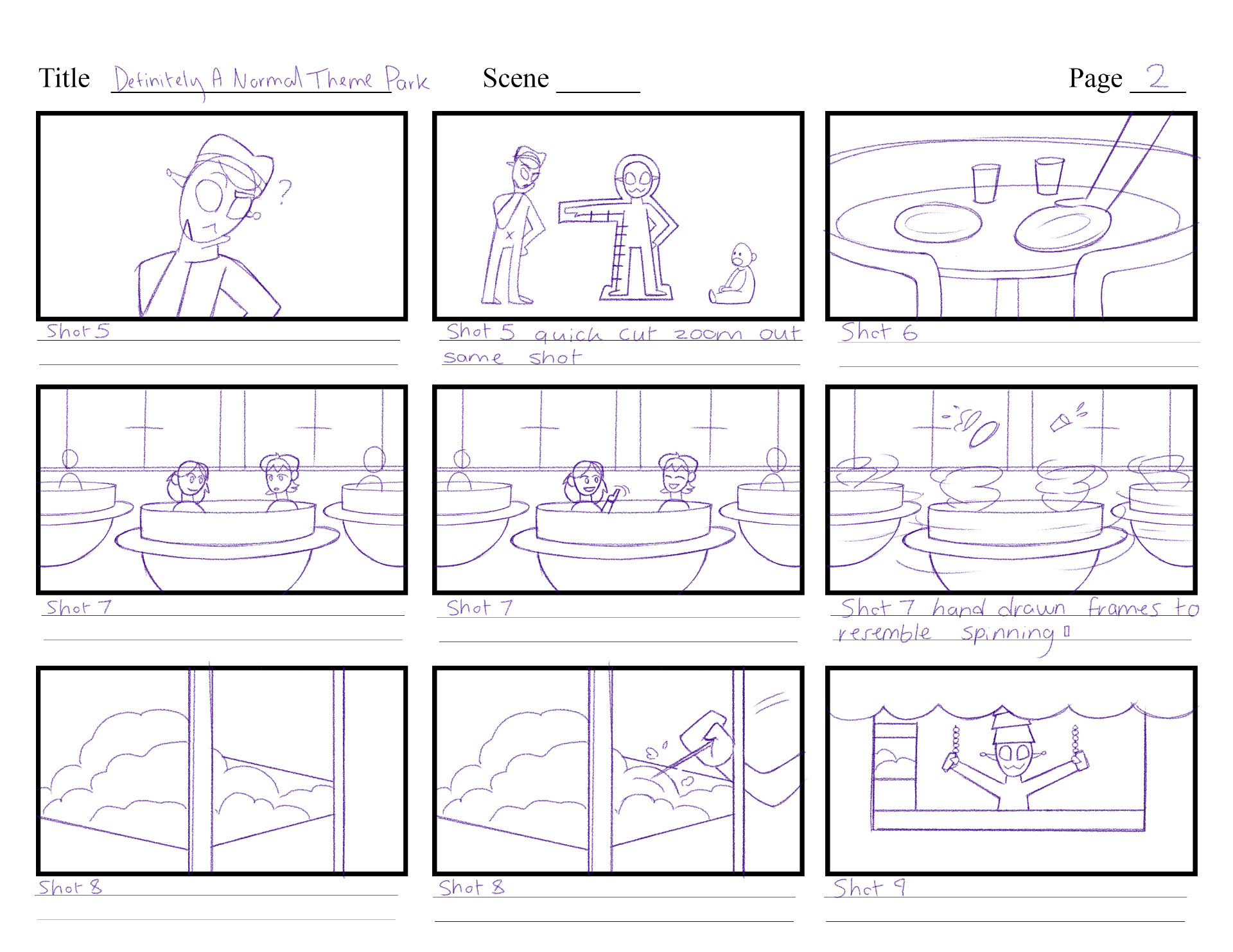
Script version 3 is visualised in storyboard version 1.
DANTP_SCRIPT_V3
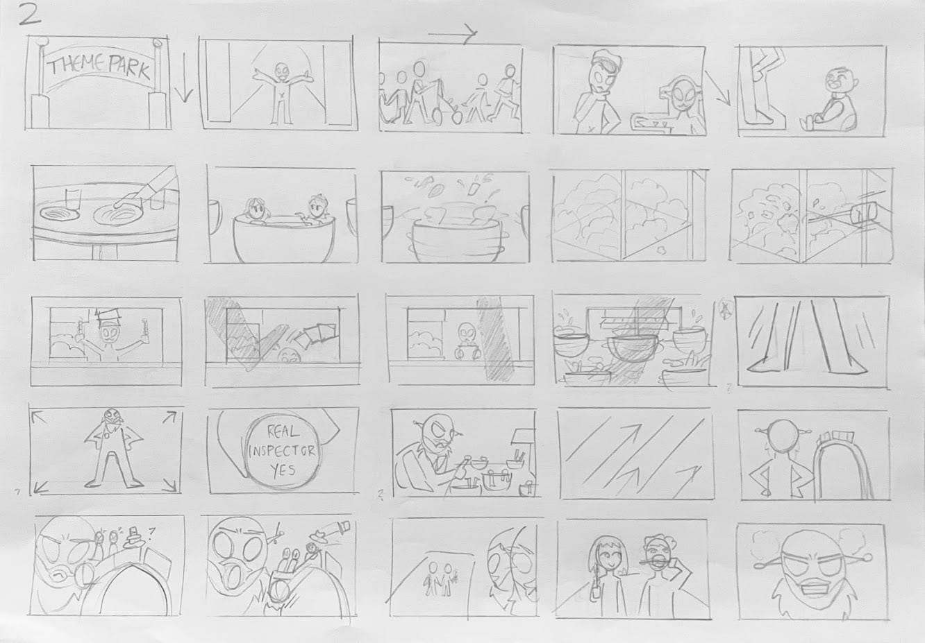
Script version 4 is visualised in storyboard version 2.
DANTP_SCRIPT_V4
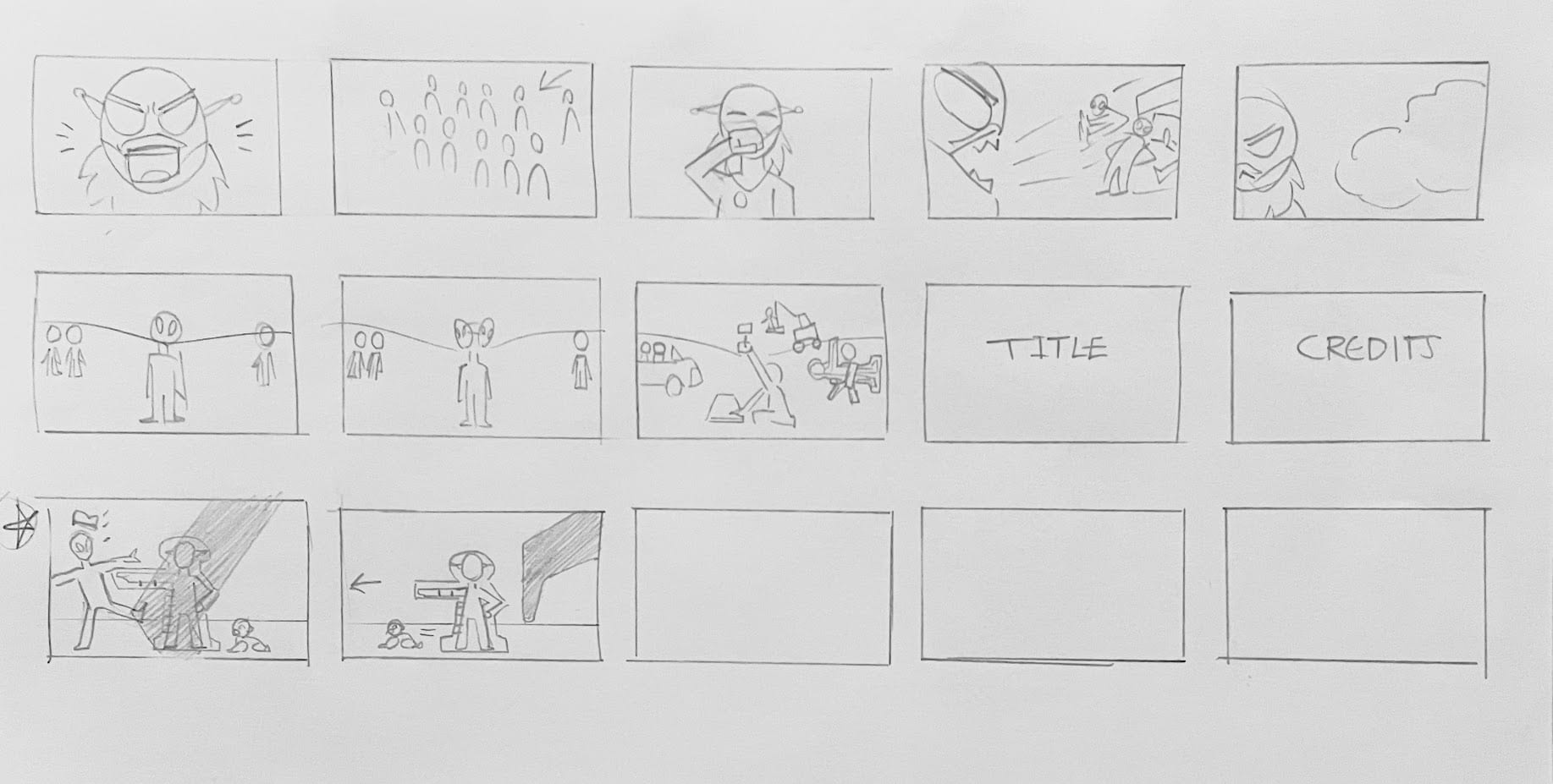
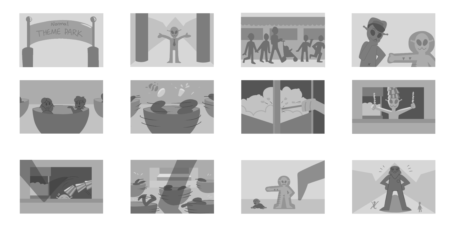
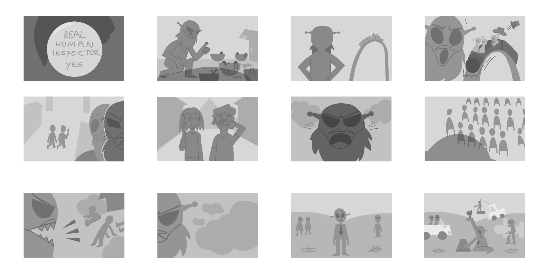
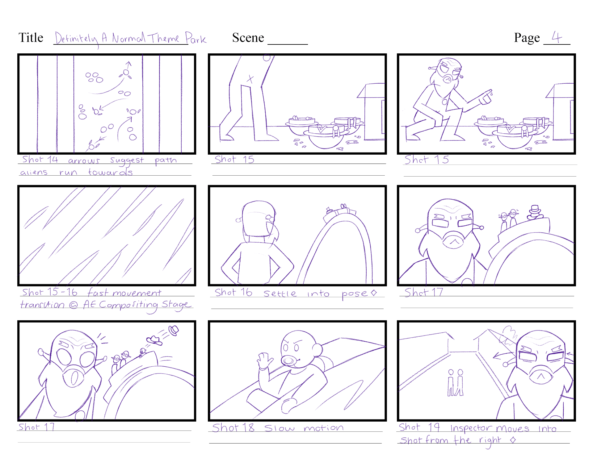
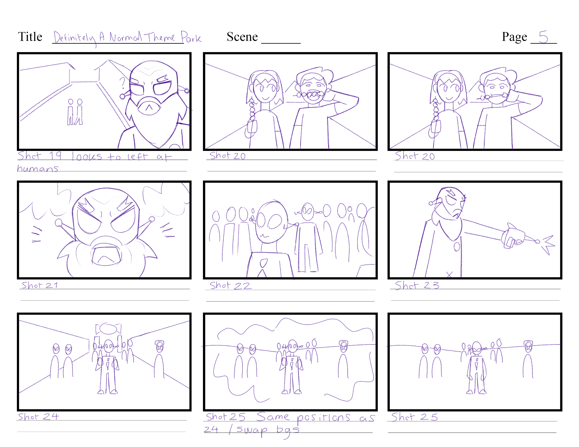
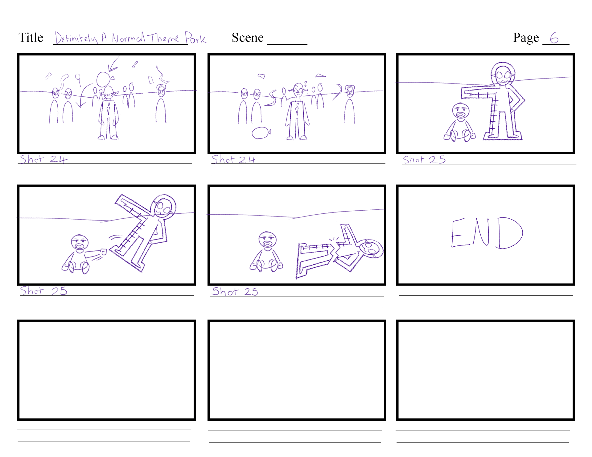
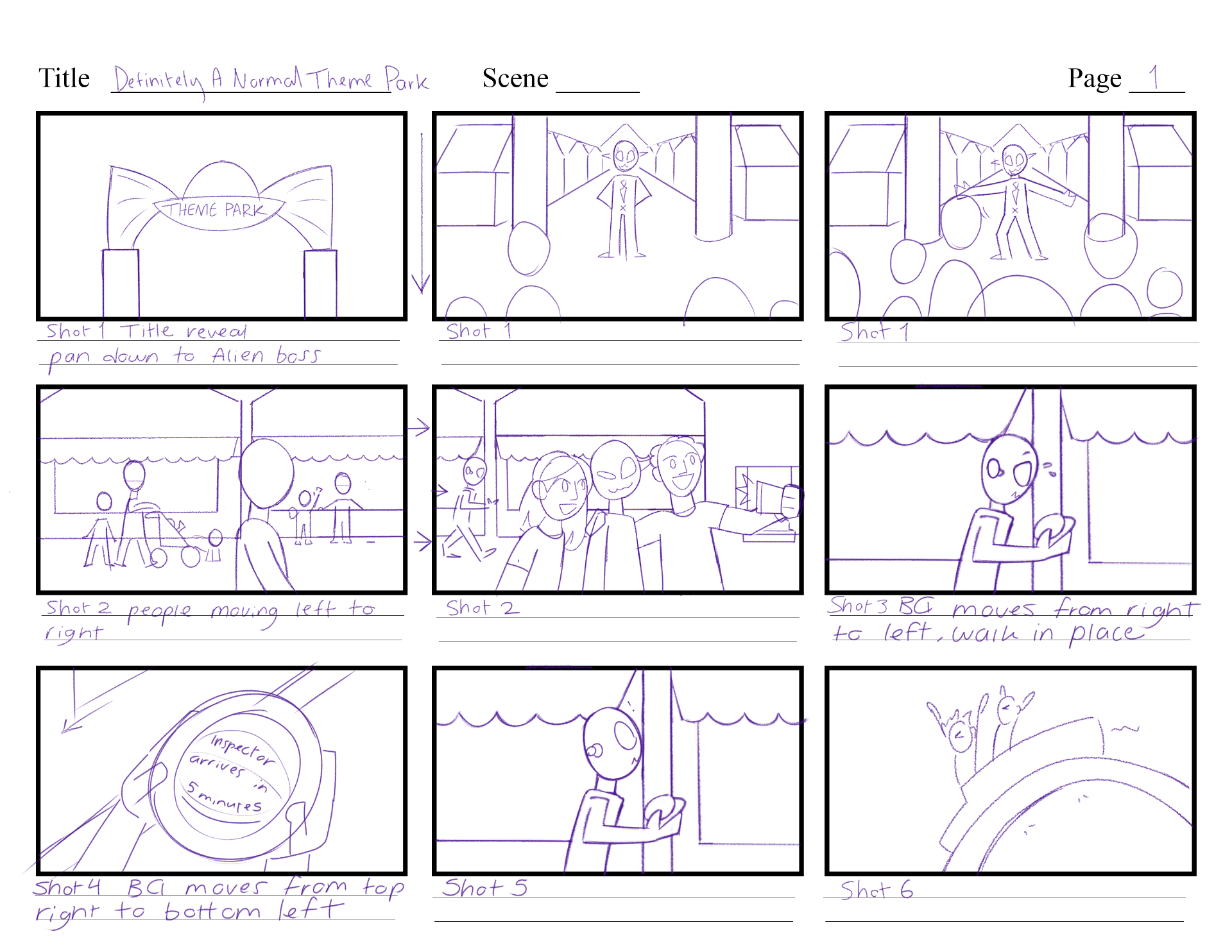
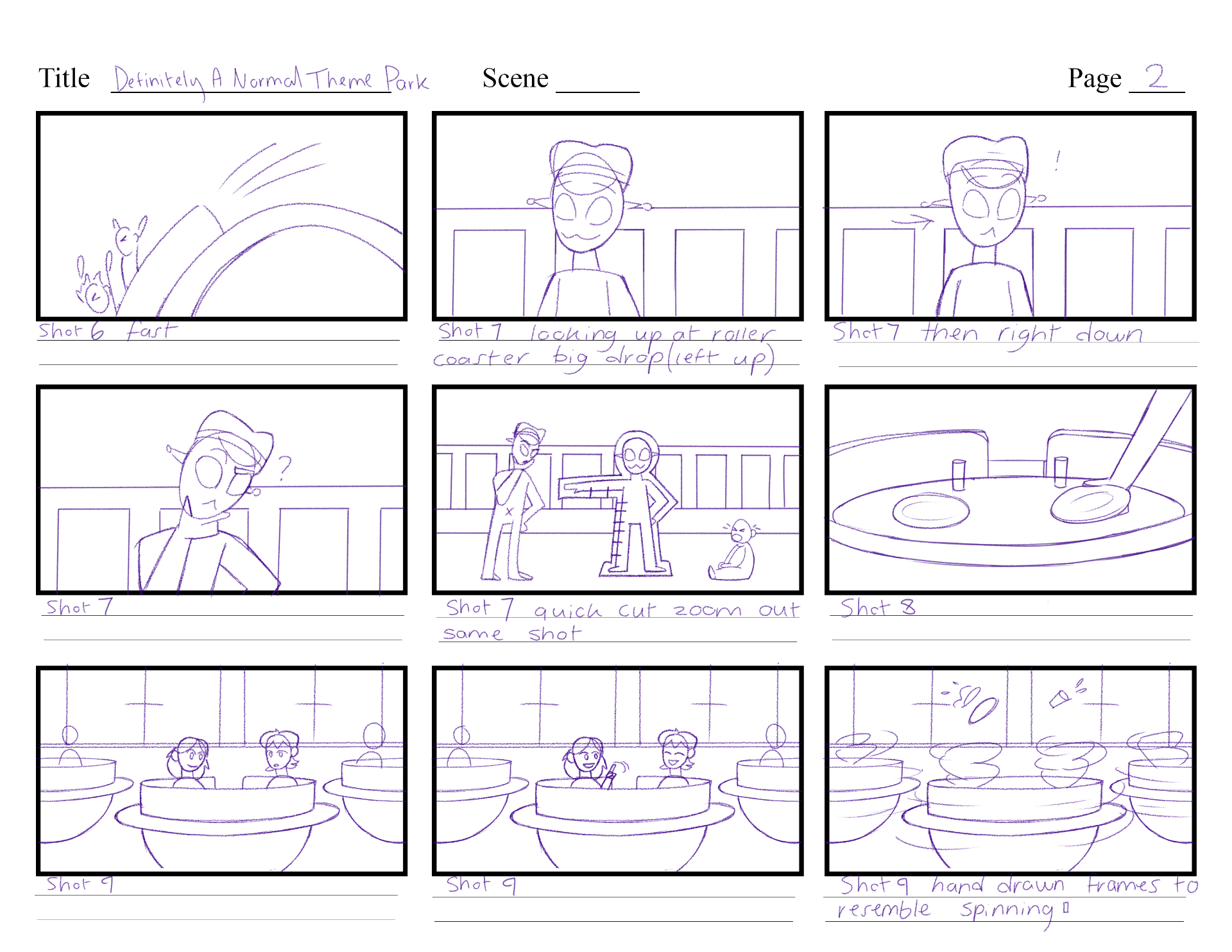
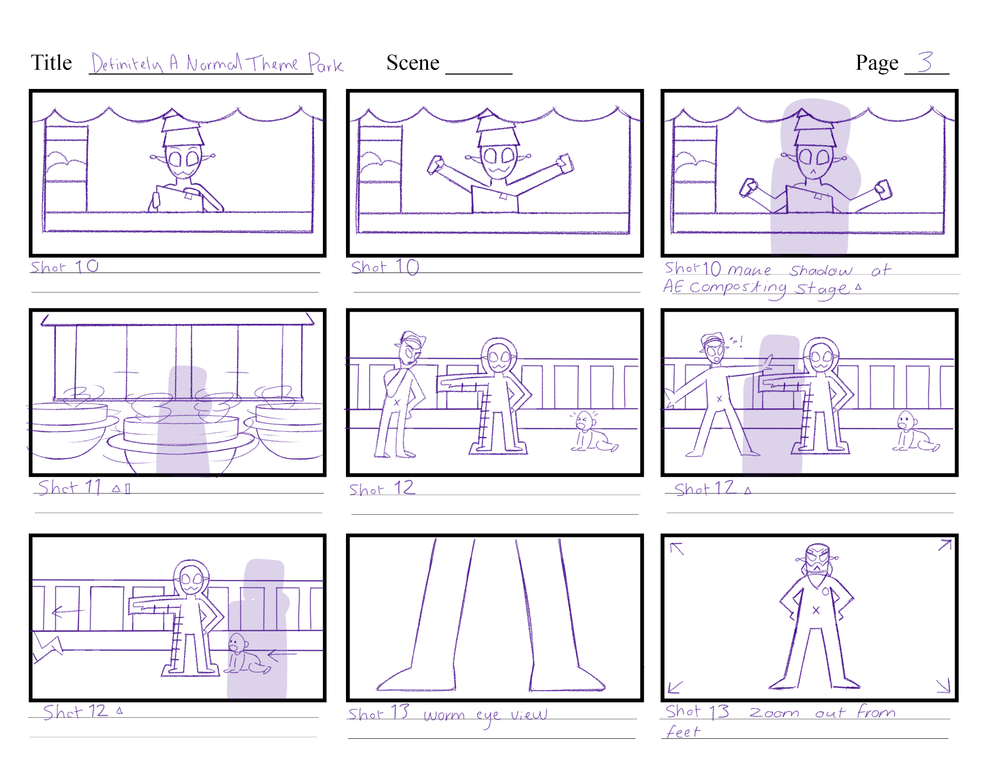
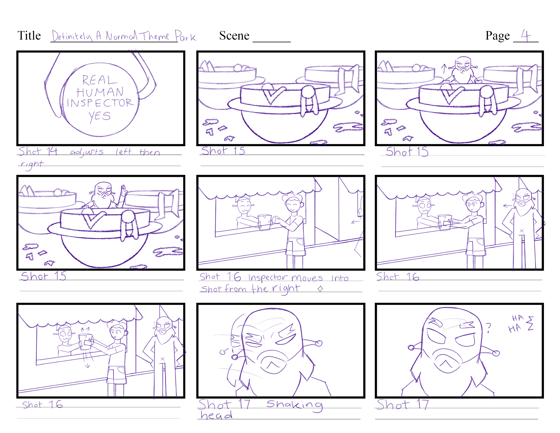
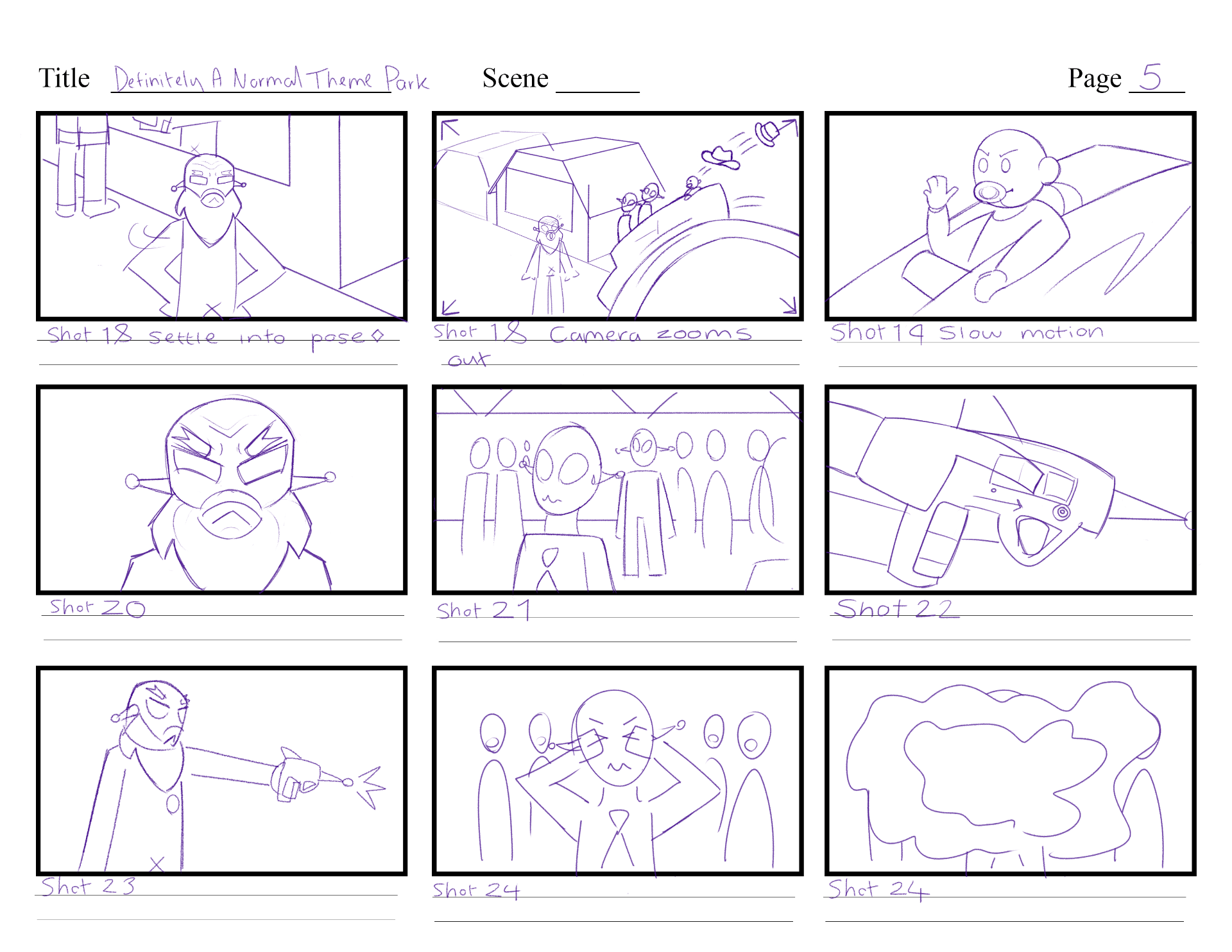
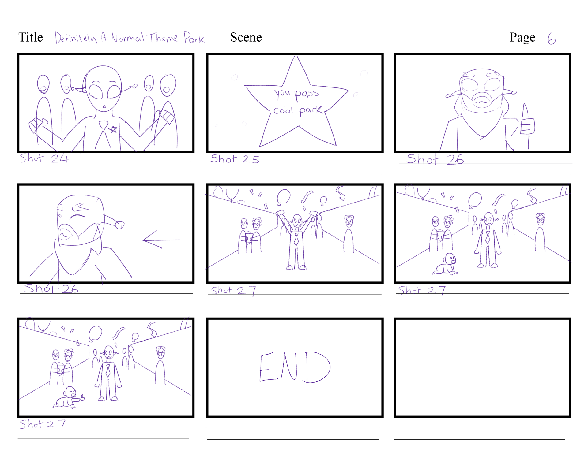
Script version 5 and 6 is visualised in storyboard version 4.
DANTP_SCRIPT_V5
DANTP_SCRIPT_V6
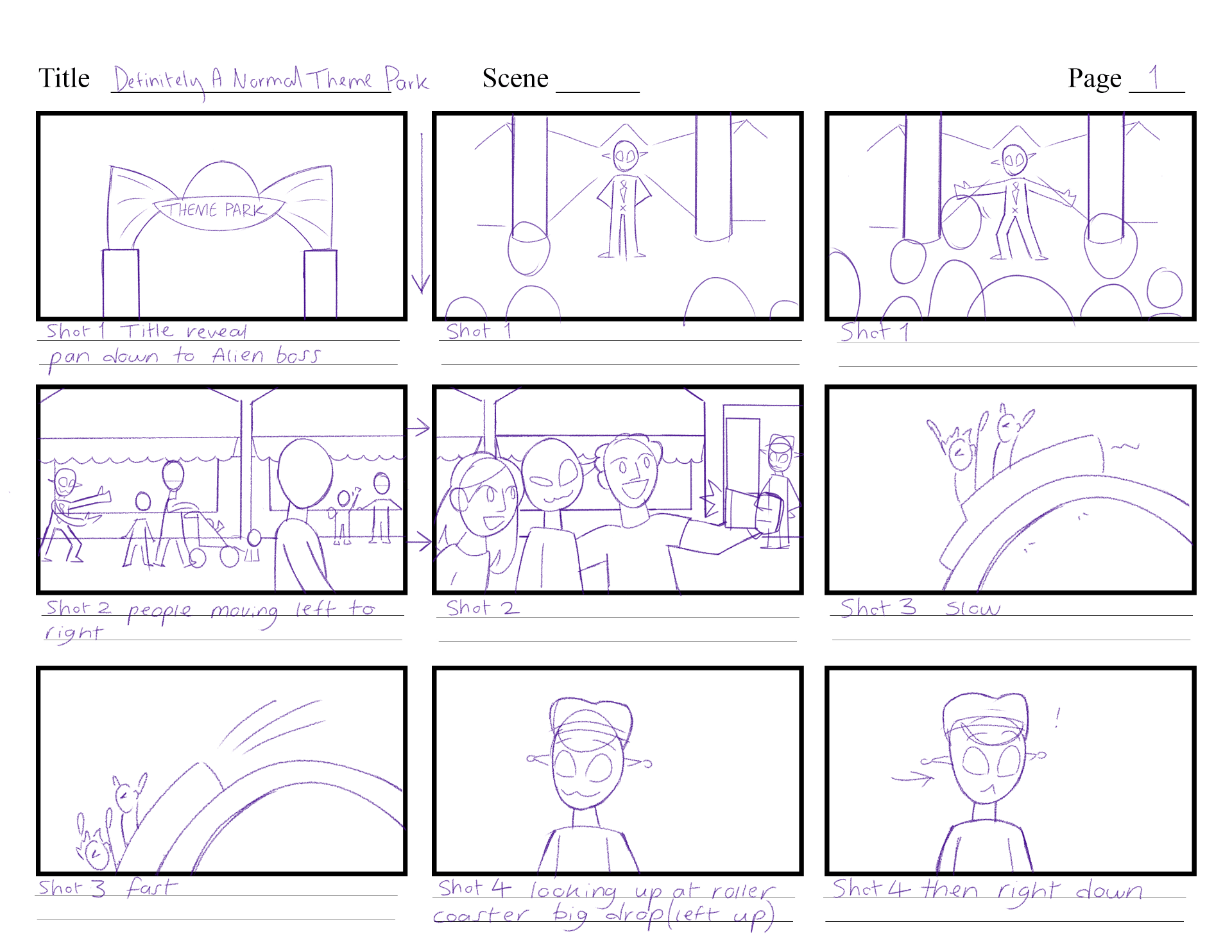
Storyboard V1
At first, I wanted my story to have a strong meaning behind it, that it is okay that one person doesn’t support you, because many other people do. It is a good idea, however I struggled with balancing the comedy along with this meaning, or if it went along with it at all.

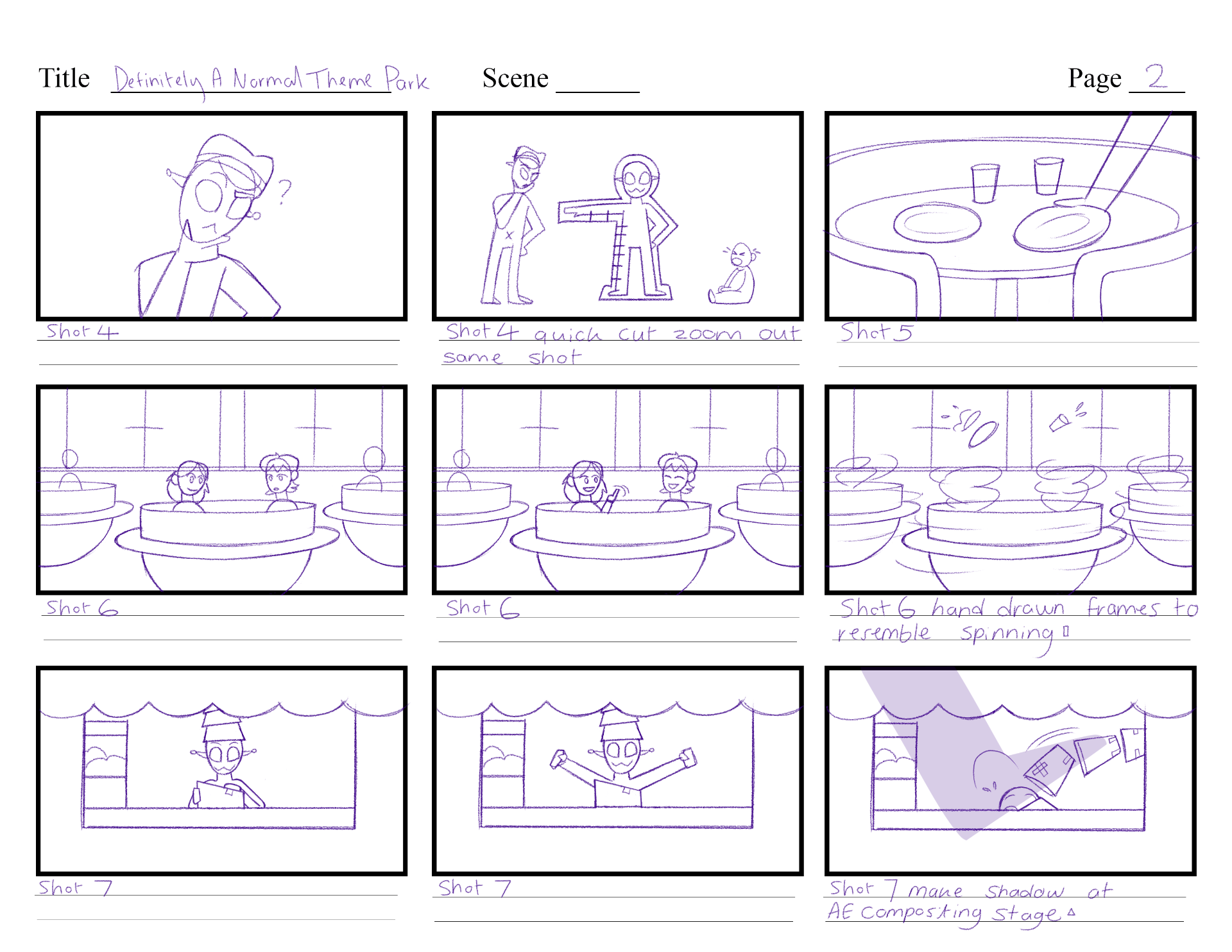
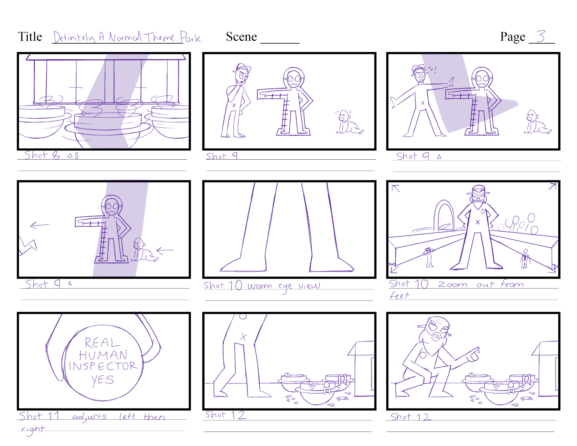
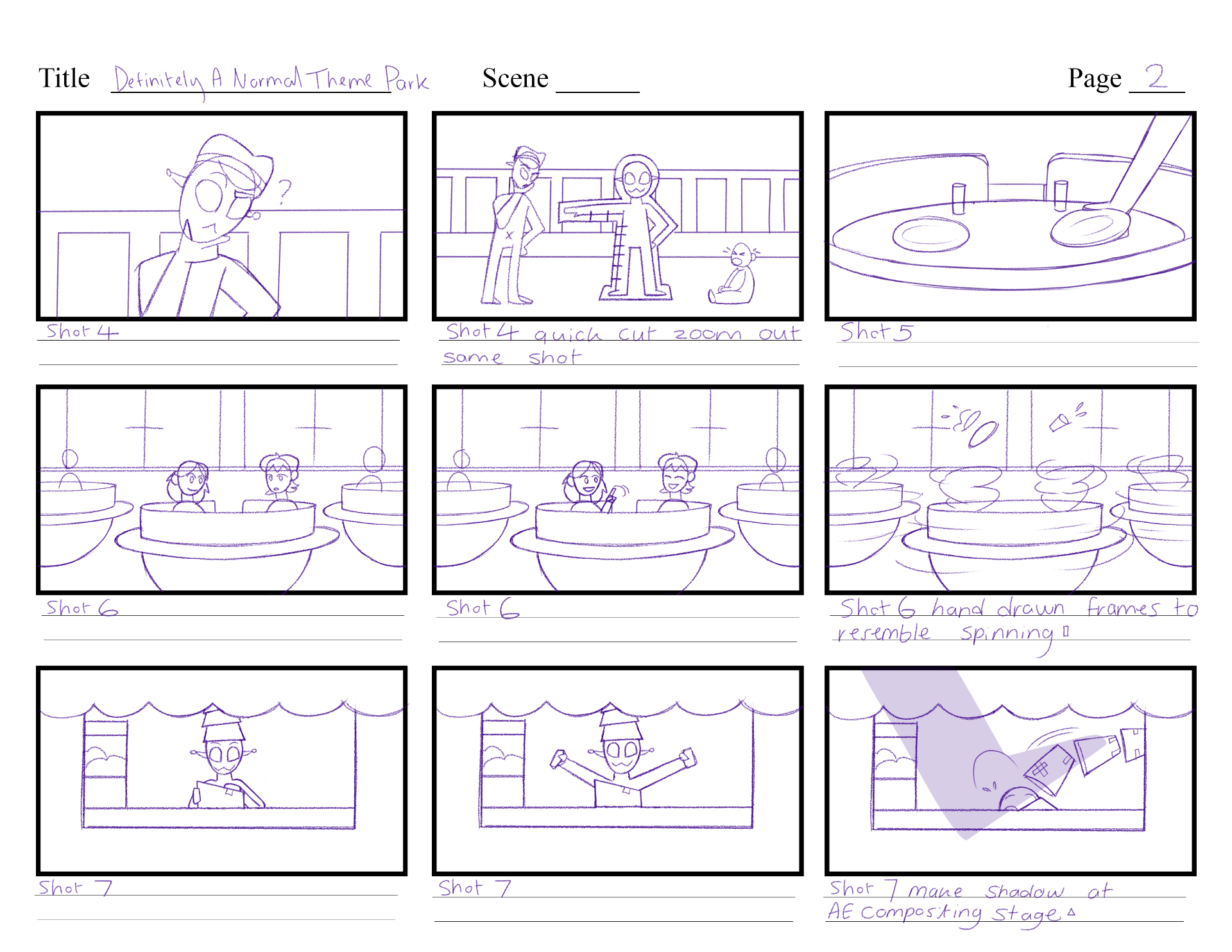
Storyboard V2
This version was more structured and lasted longer. I had a careful look through each action and made changes where necessary. I ensured the inspector had more of an appearance, reaction and importance to the story, and that the aliens had stronger reactions.

Storyboard V3
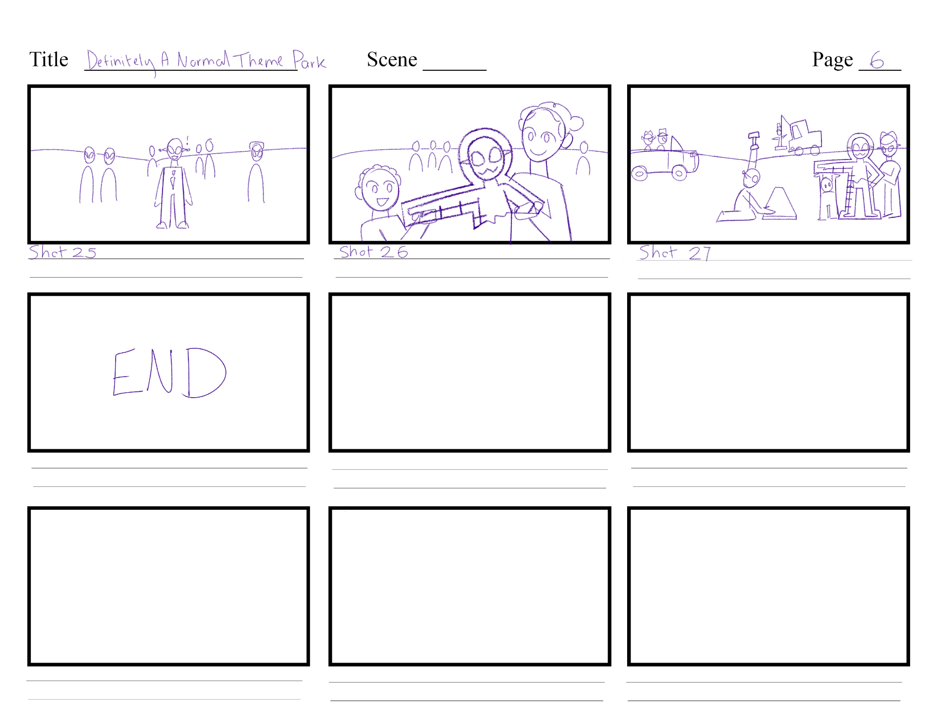
In this version I was clearing up some background elements, but also wanted to change the ending as I decided I wanted this story to include mostly comedic scenes.


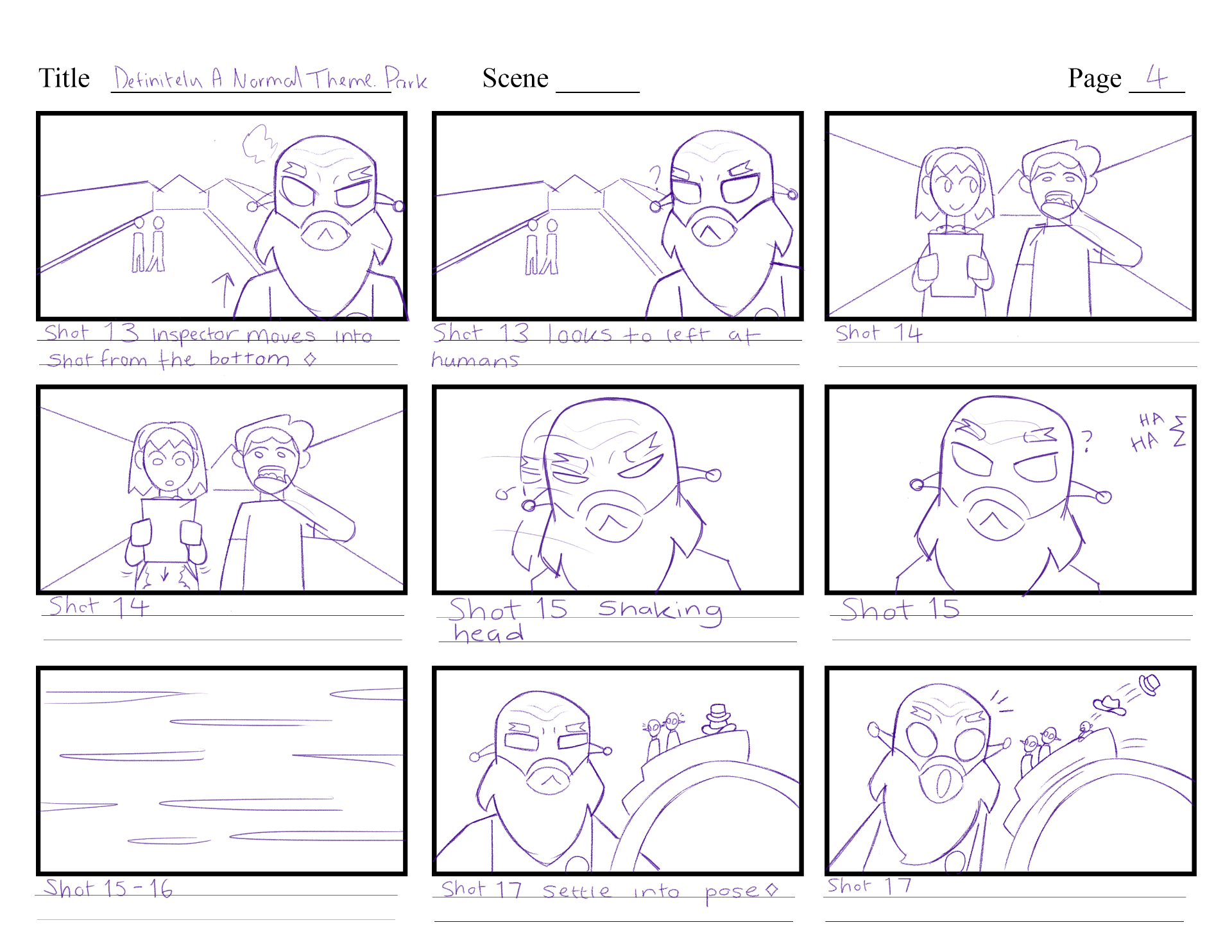

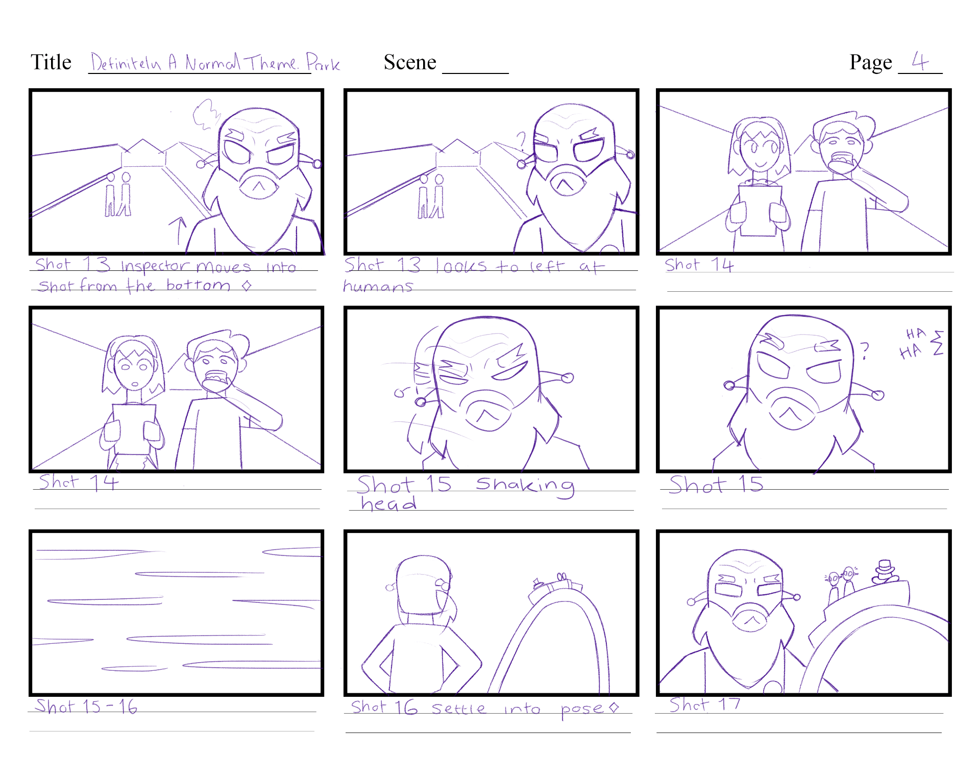
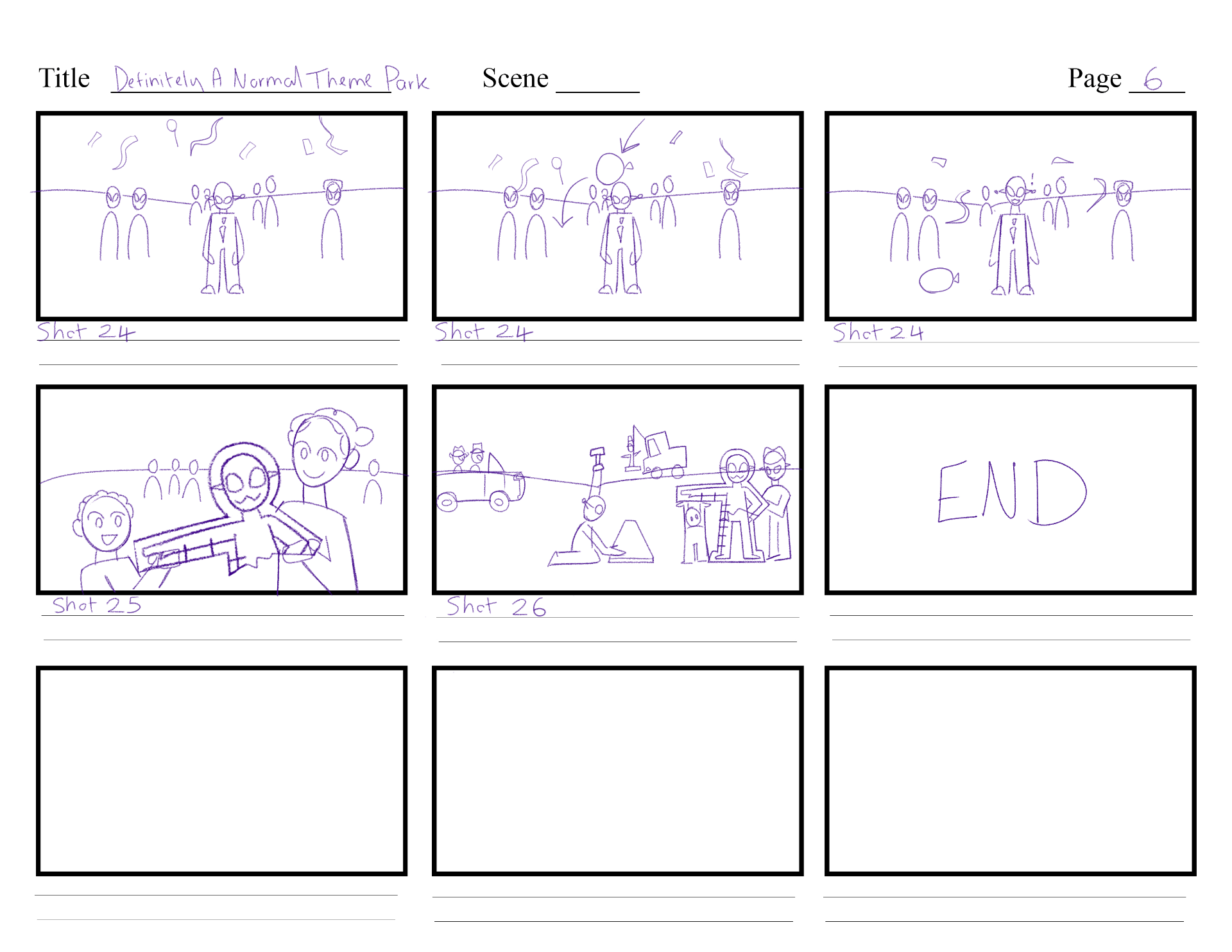
Storyboard V4
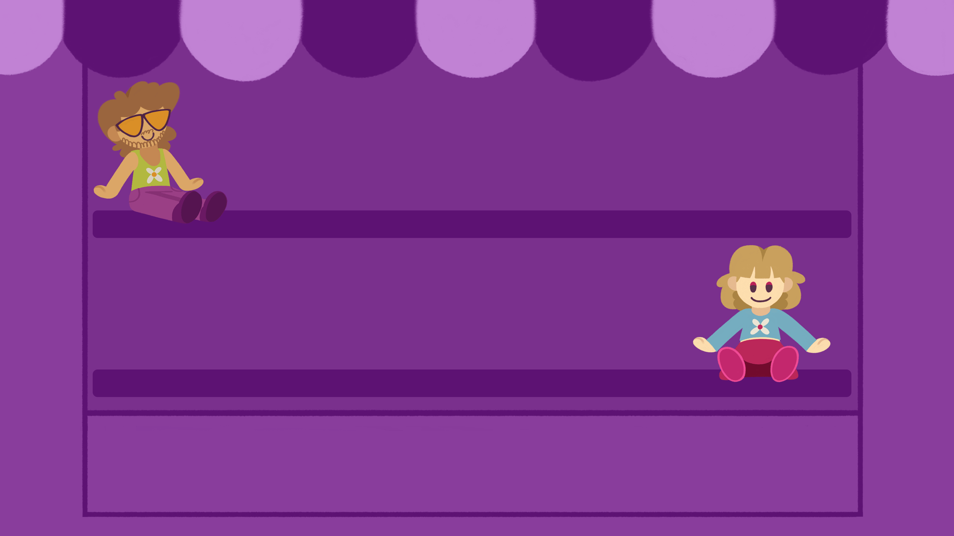
In my fourth version, many changes were made, the most noticeable one being the inspector is not giant anymore. I allowed alien boss to have a more important role at the start, and the alien cook to have a customer to interact with. The ending reveals that the inspector actually approves of the theme park and leaves happily, so the aliens celebrate. I am happy with this layout, as it has gone through many alterations to get the structure right.
Animatic
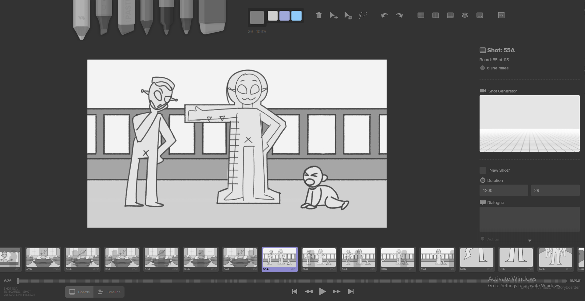
I have produced my animatic drawings and rough timing on the program Storyboarder. This was a nice program to use as I can easily edit my frames on photoshop if I needed better control of the pen tools or to move assets around.
This is the Animatic edit V1 where I have brought in the animatic from storyboarder to Premiere Pro. I added scene and time count, and placeholder music & sounds to capture the actions that are happening.
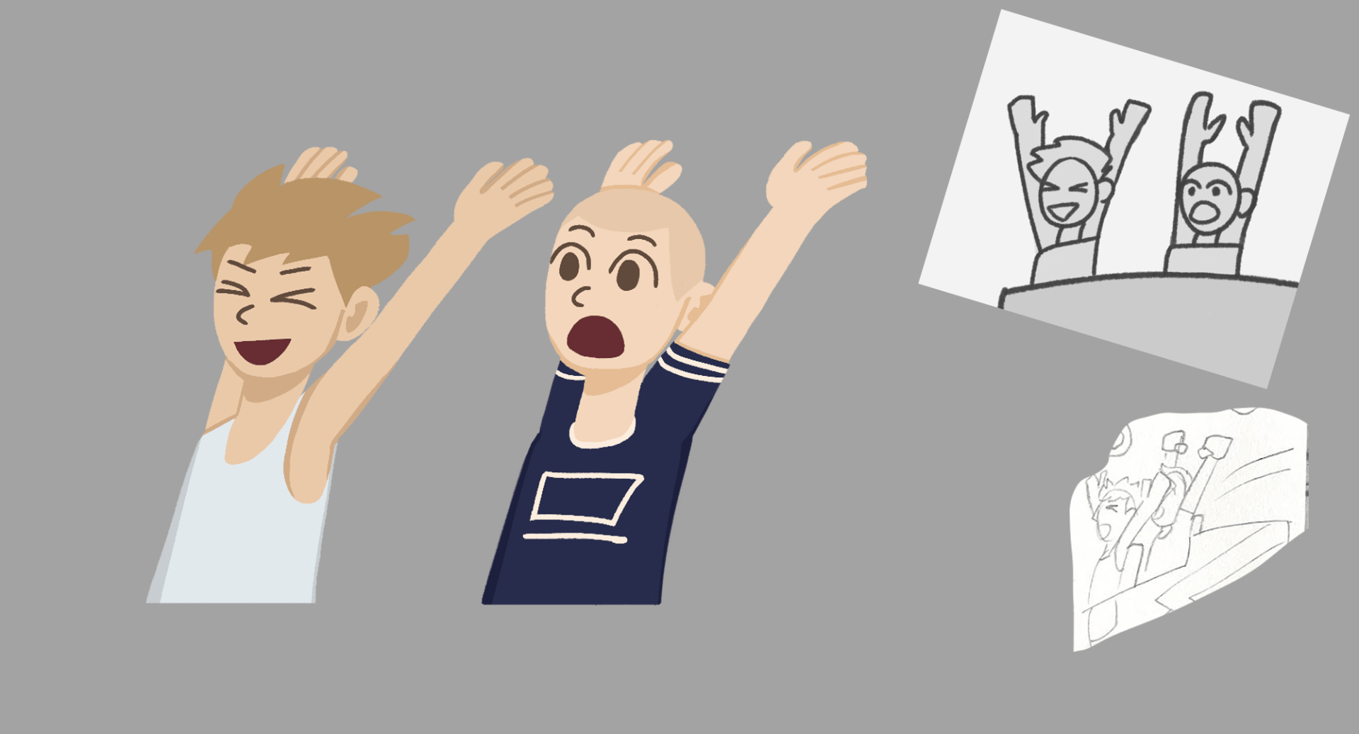
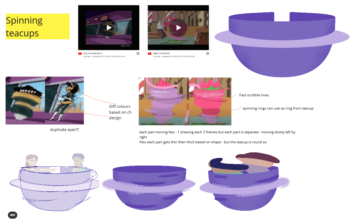
After my pre-production presentation, I got feedback to add to the 2nd version of my animatic. The main notes given were to build more tension on the inspector’s reaction to the theme park, to make the spinning teacups faster, and to adjust poses to provide variation in emotion and better direction for animation. I am happy with the feedback and how I am applying it to this version, however I need to check the timing on some shots.
In my 3rd version of my animatic I changed shots 4, 5 and 6 so that the alien boss and roller coaster cart pass through the alien operator shots. It makes more sense to witness the coaster pass where the operator and baby are. Also, it’s better to establish that Alien boss is still walking forward, so walks past the operator. I adjusted the inspectors anger expressions. I am happier with this result, and it will help with how I create actions and expressions in the animation stage.
I have updated to a 4th version of my animatic for some small details to add in, such as making a few shots last longer, and adjusting sound effects. This will be the final animatic version I will use to reference for sound design, and animation progression.
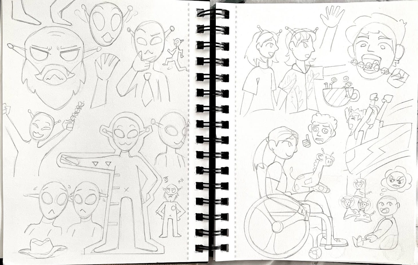
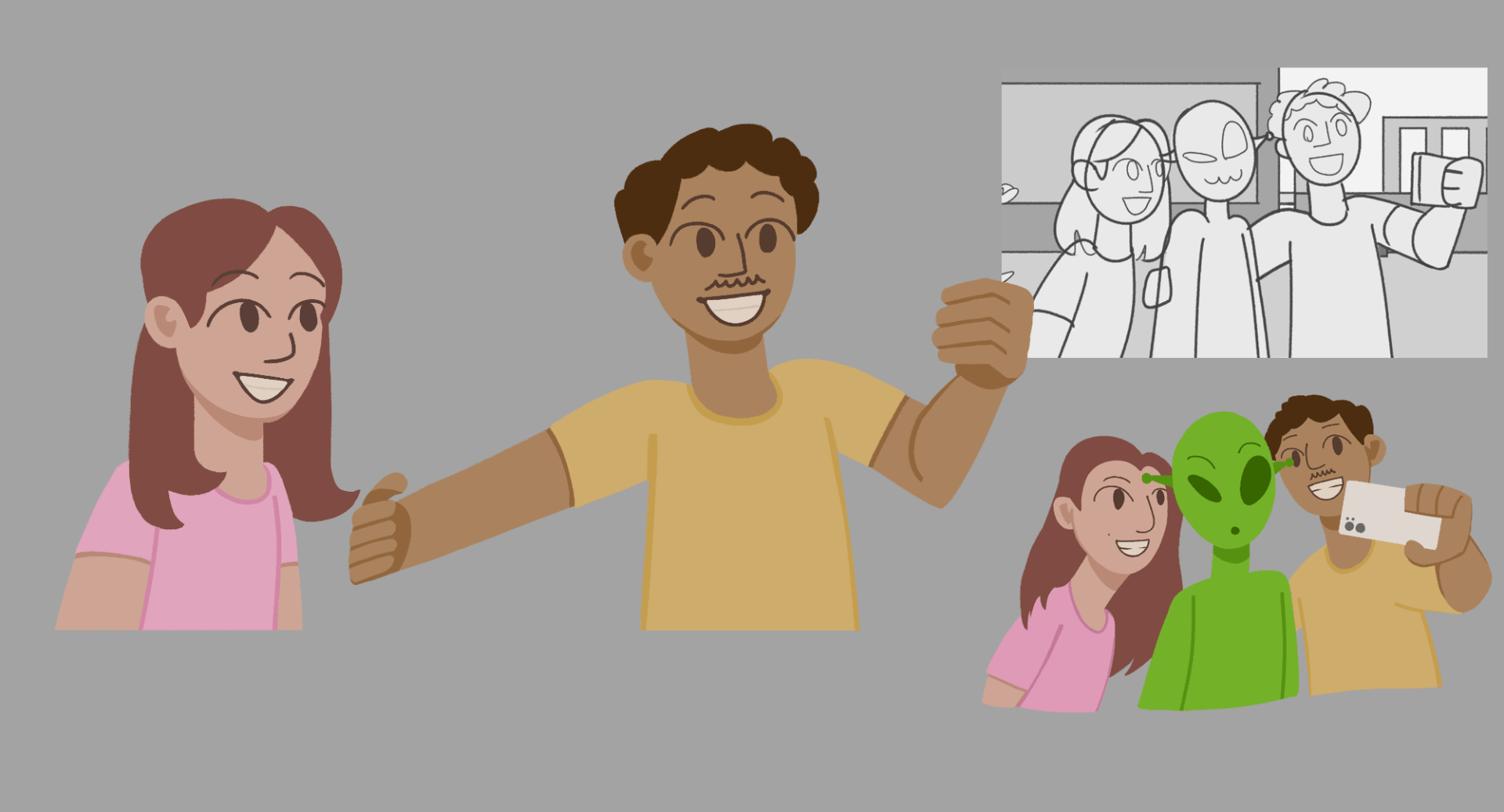
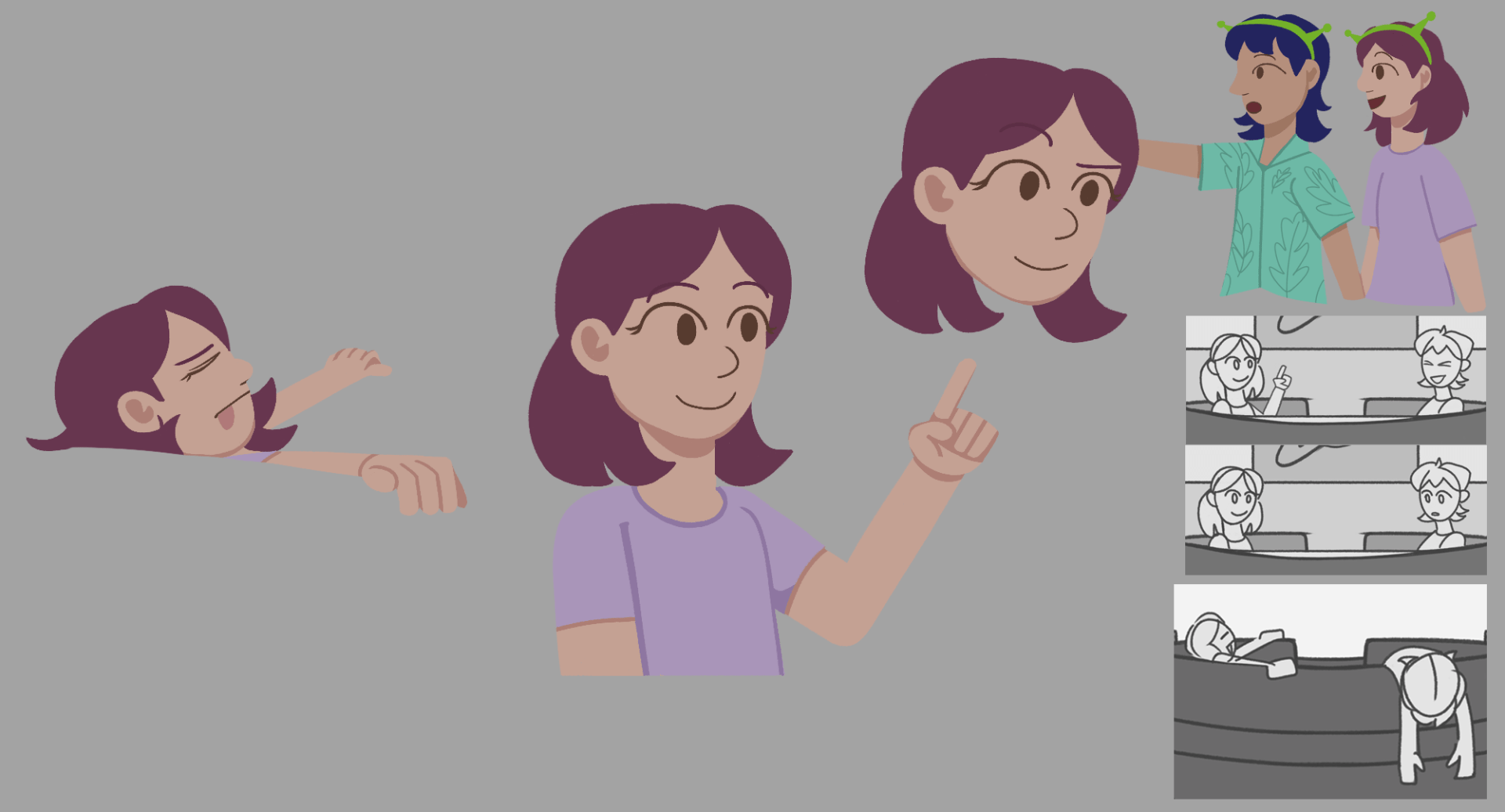
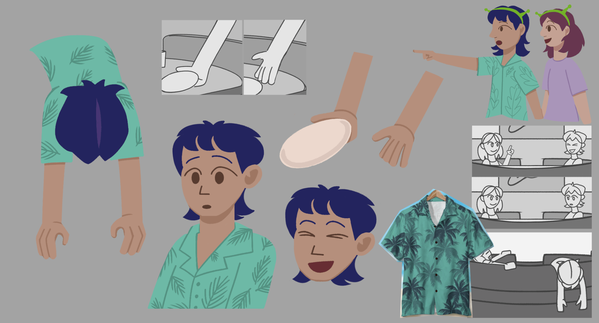
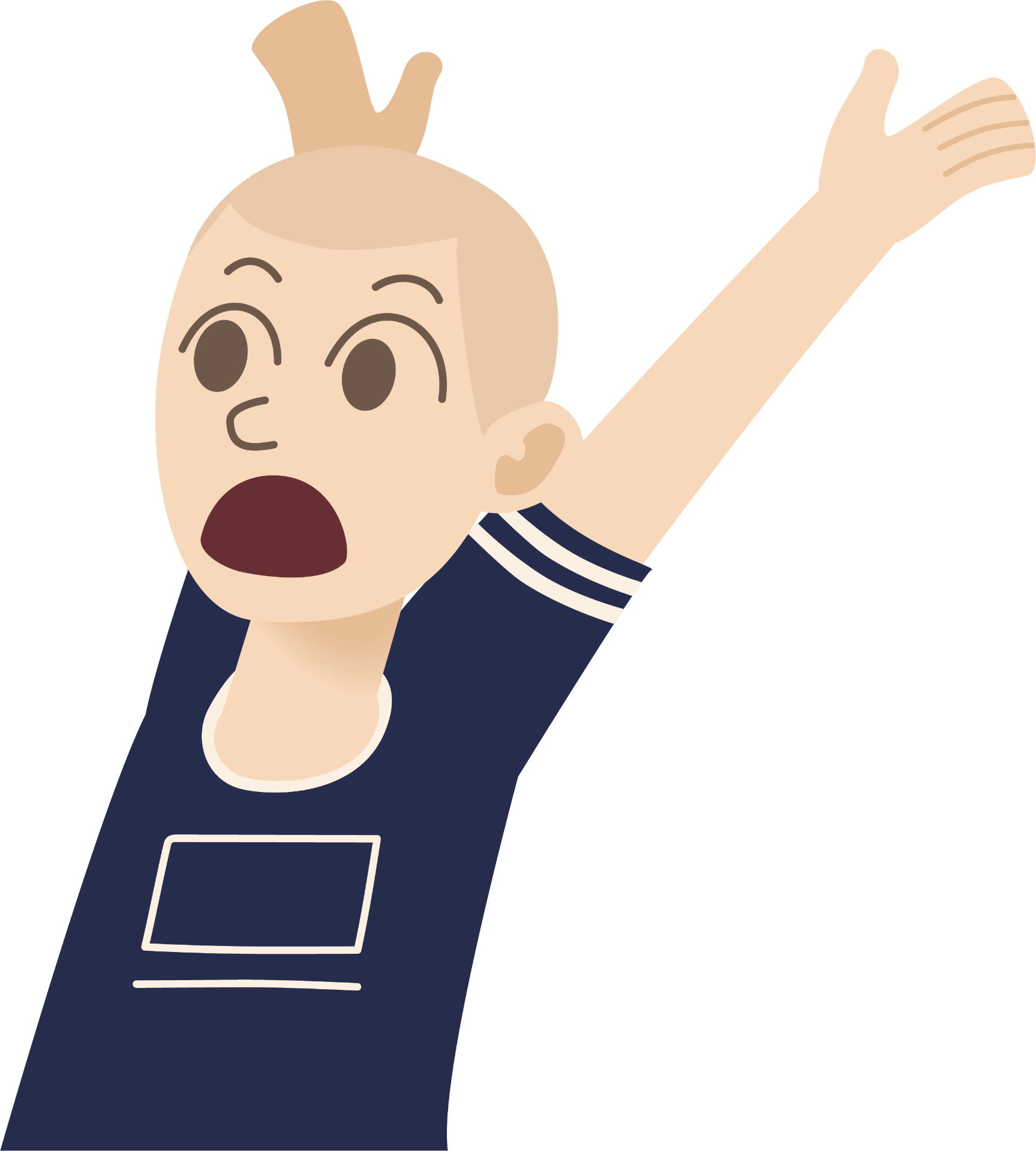
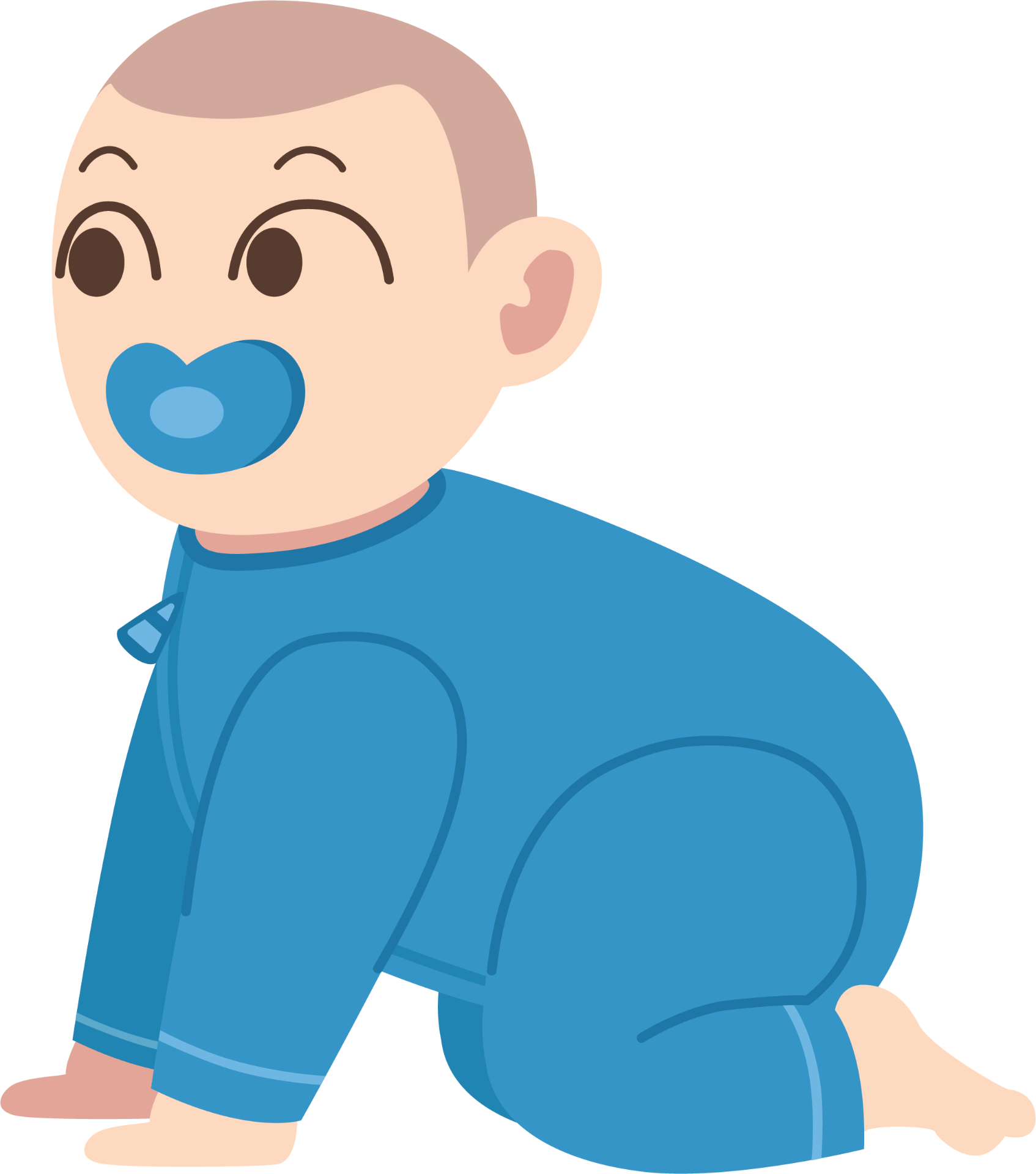
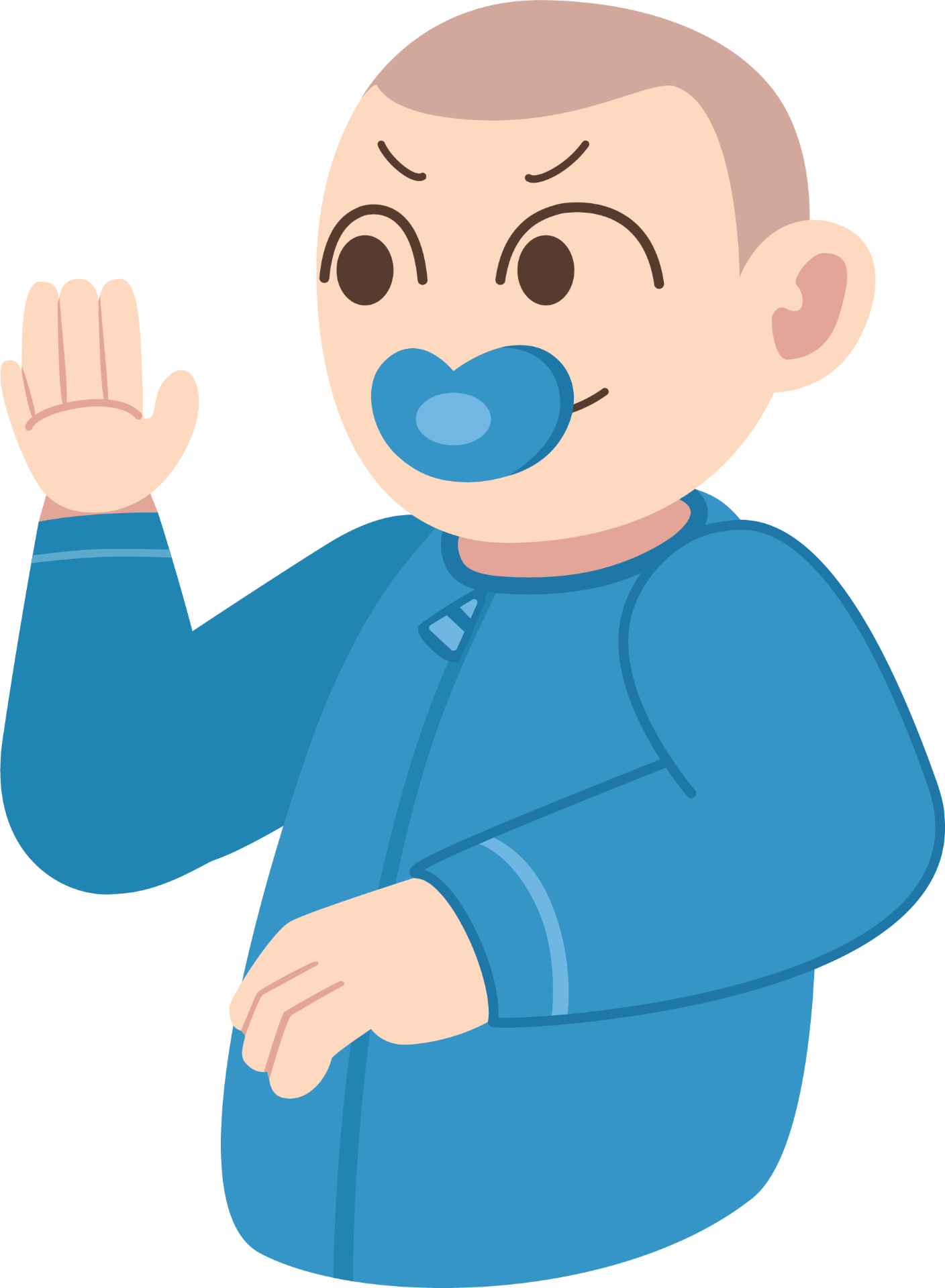
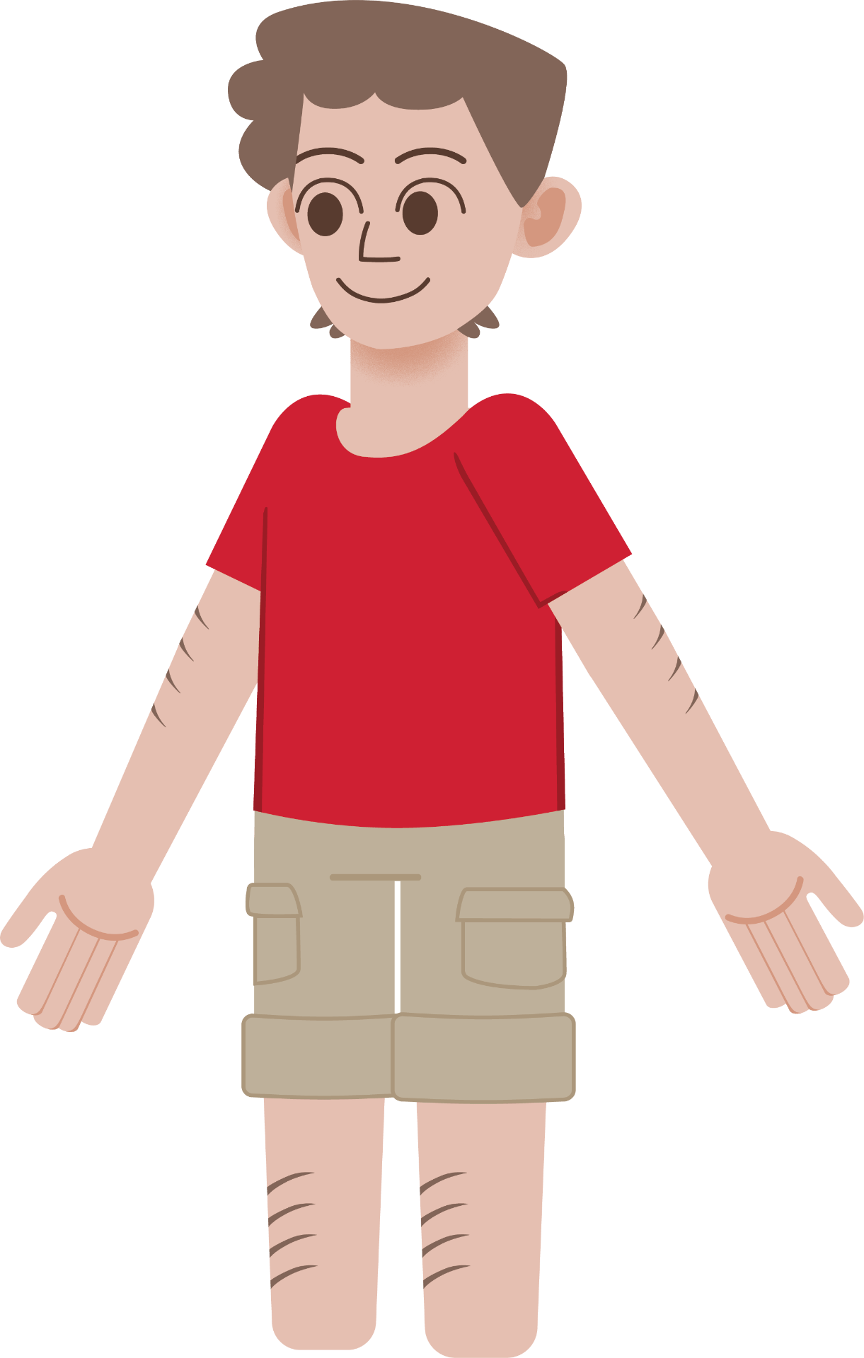
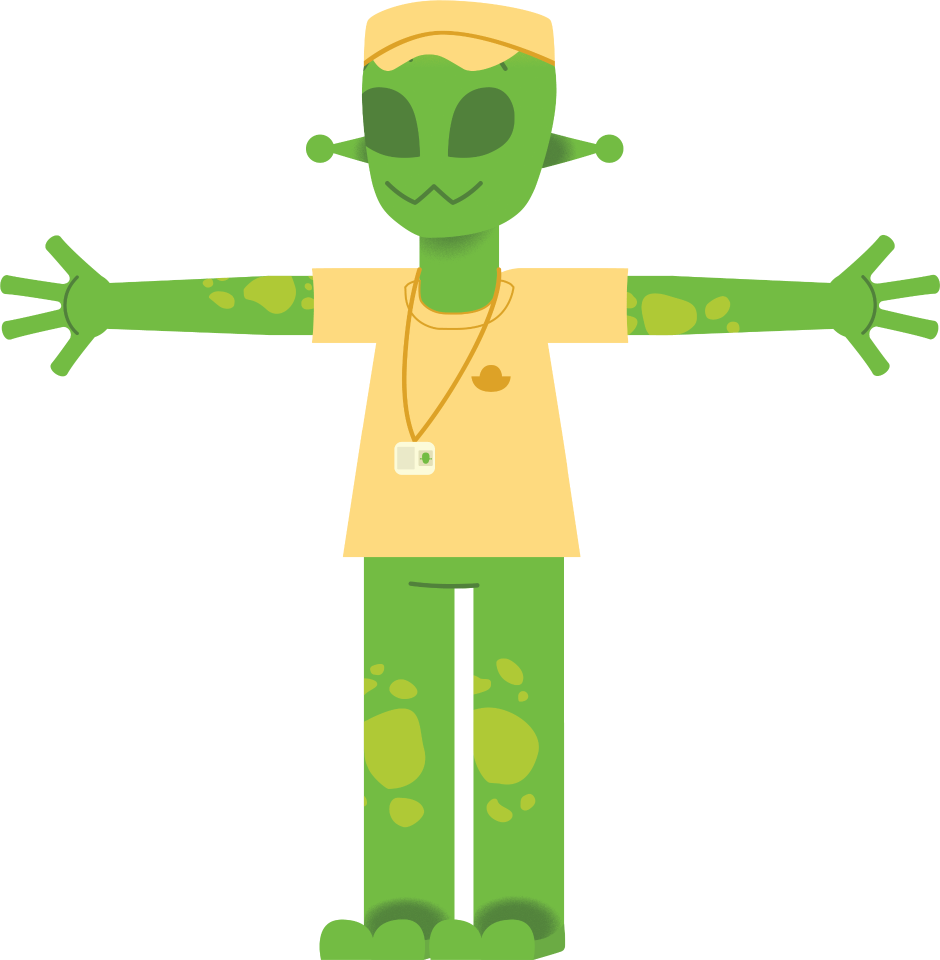
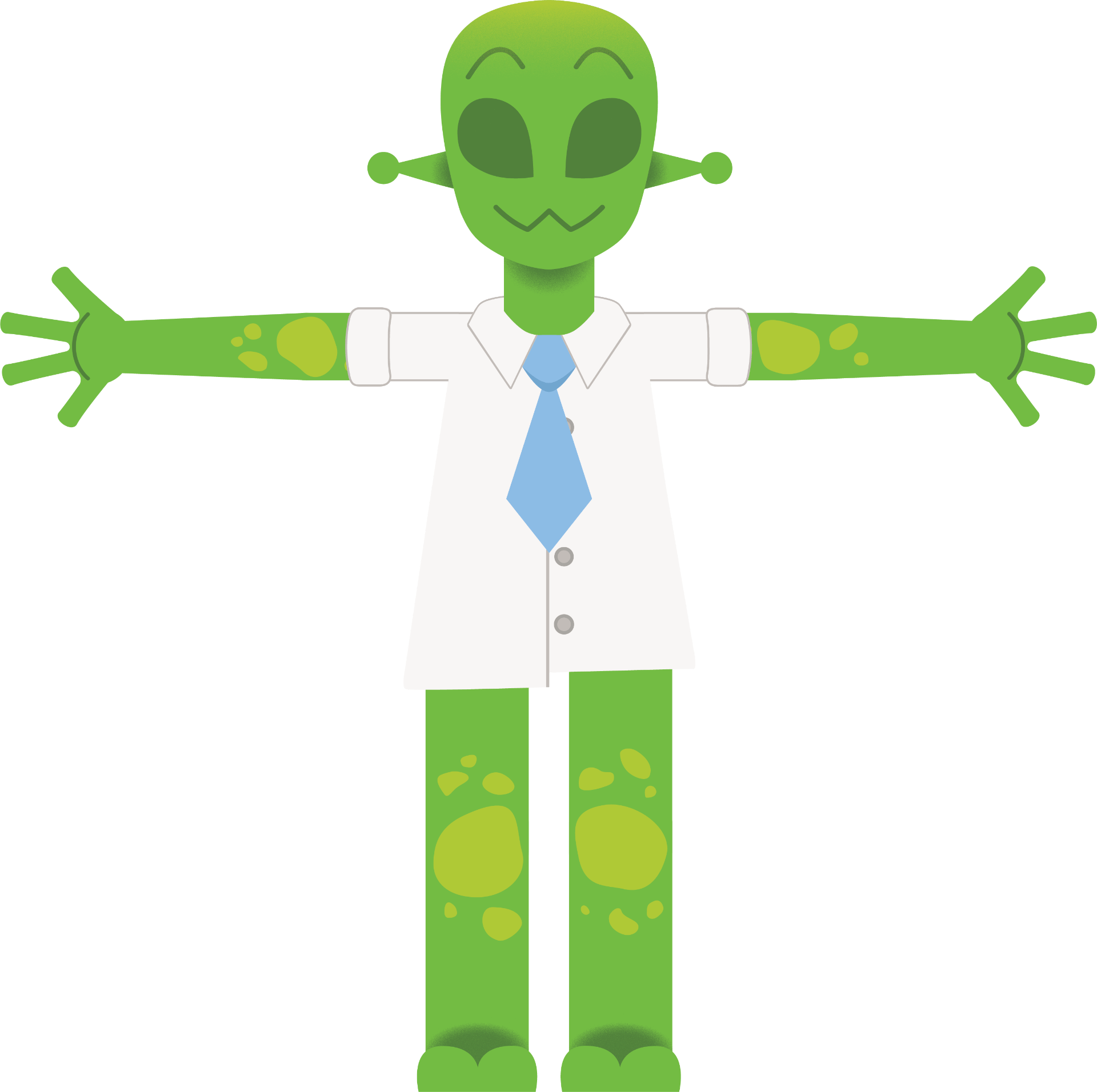
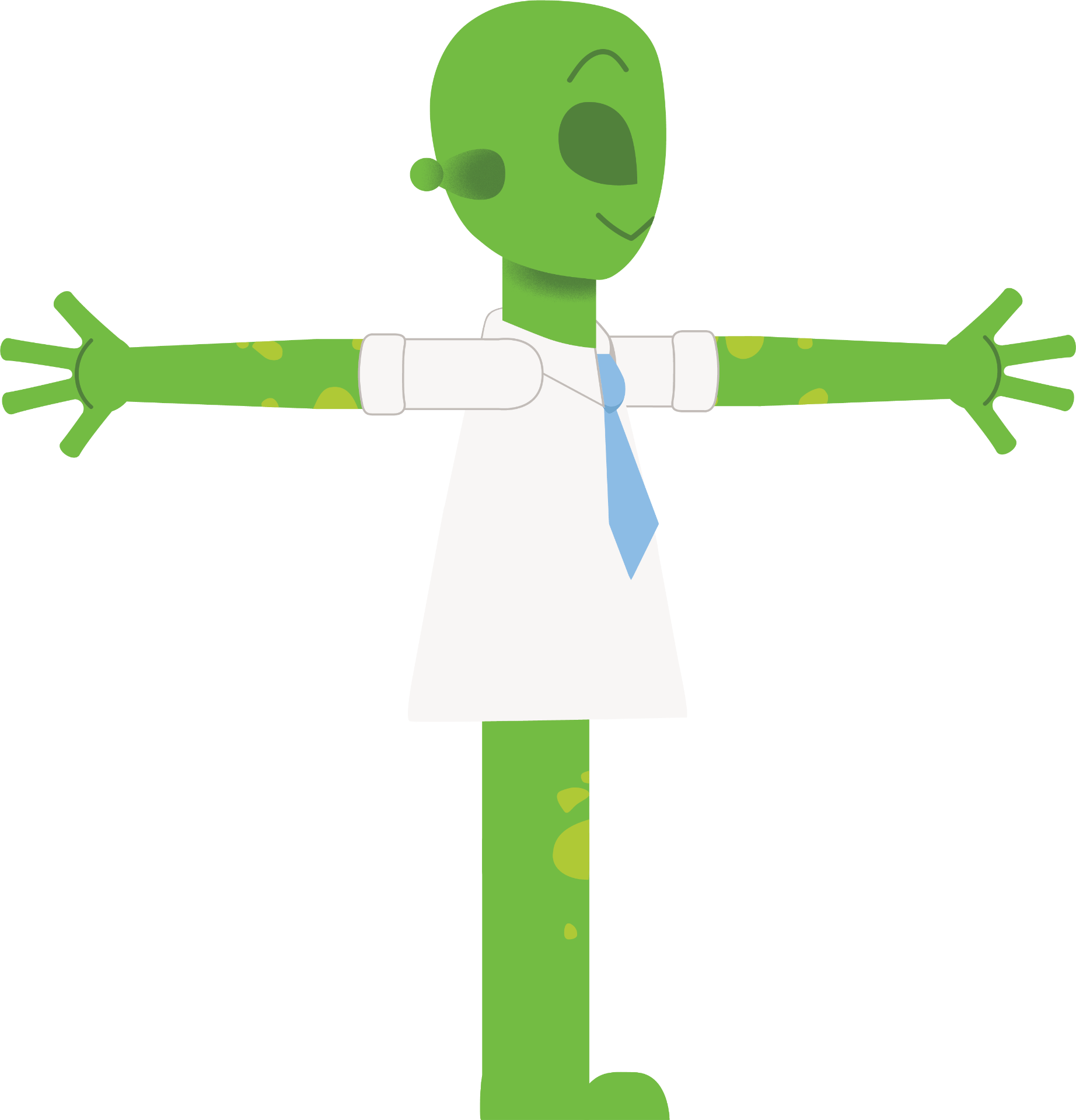
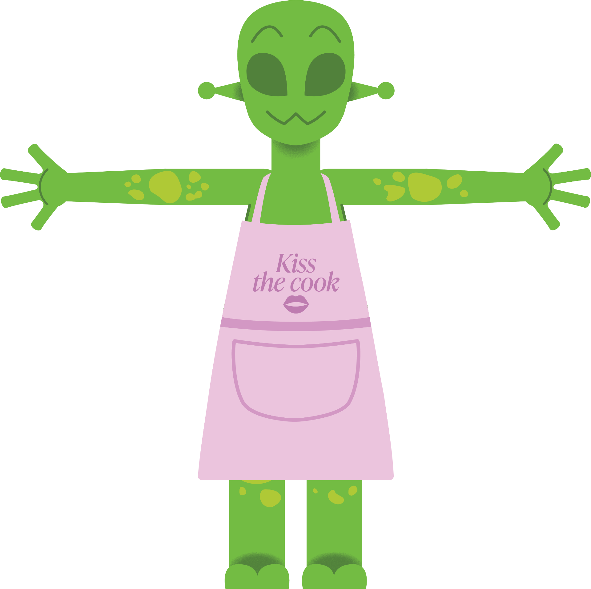
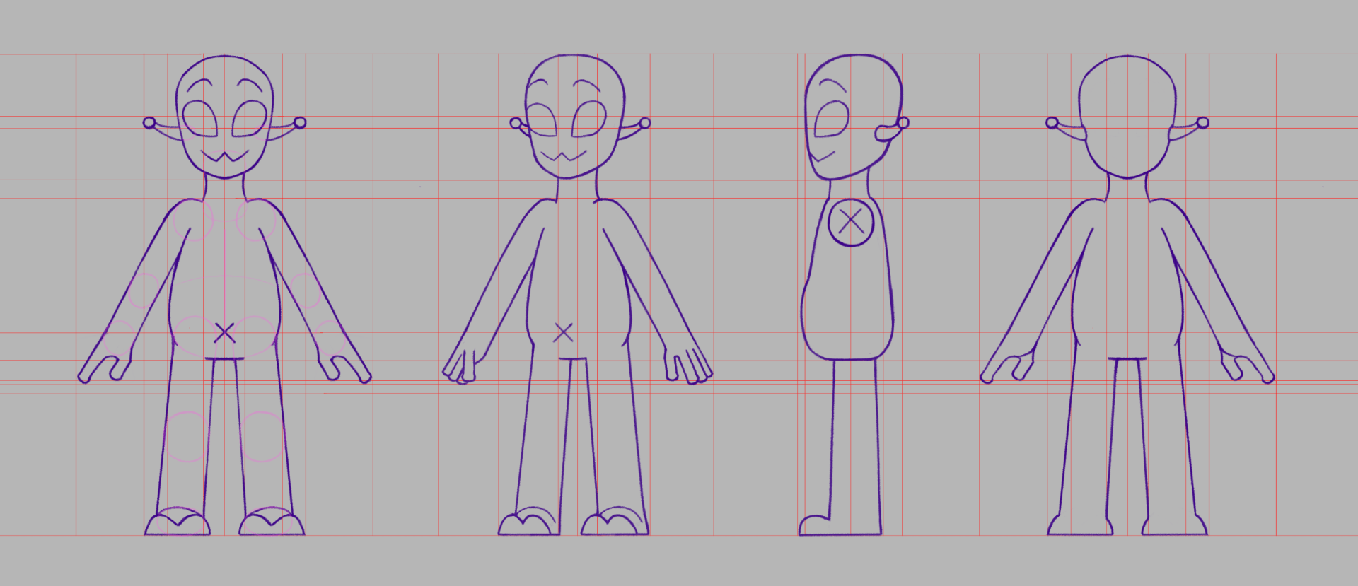
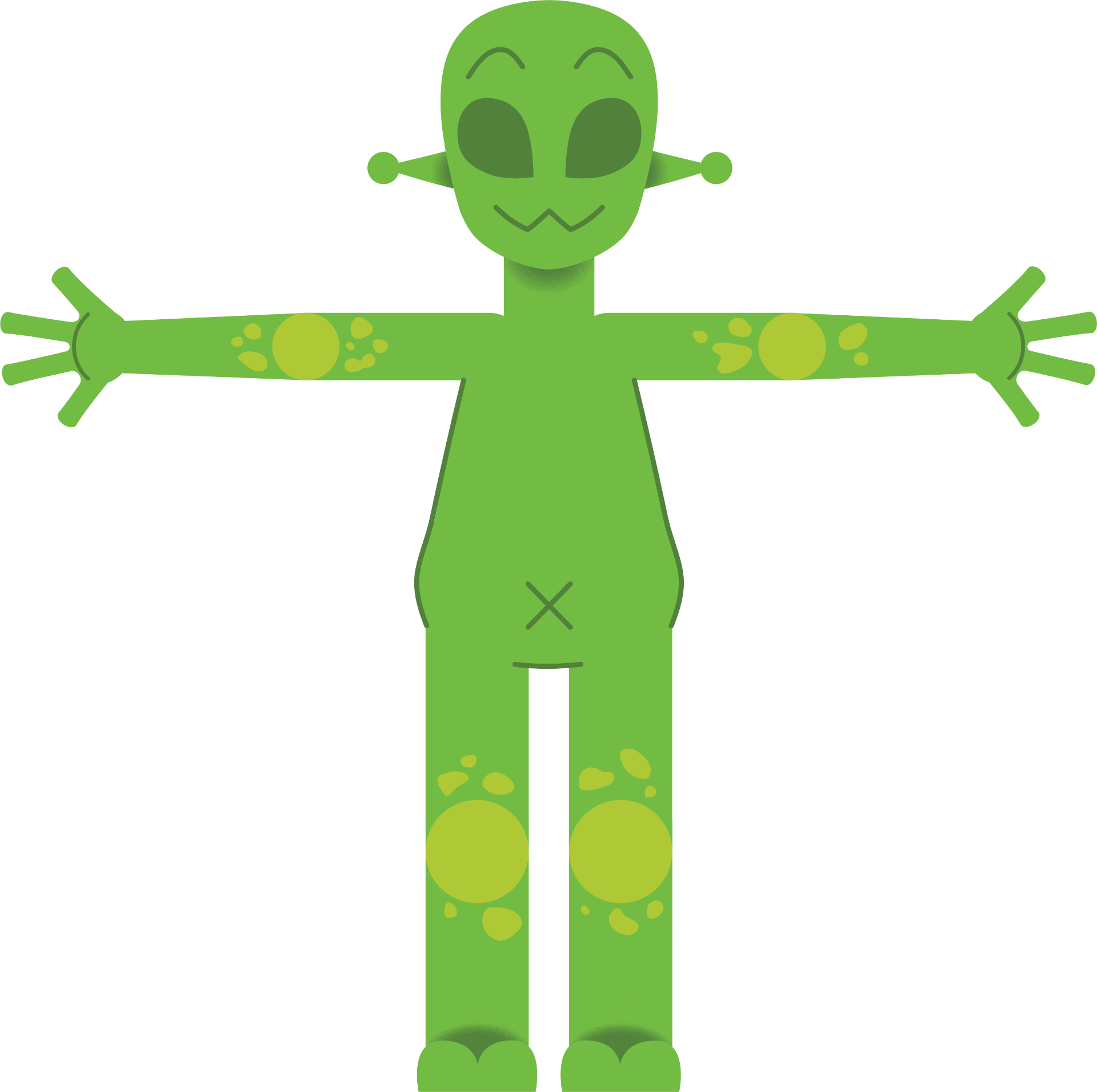
Character Design
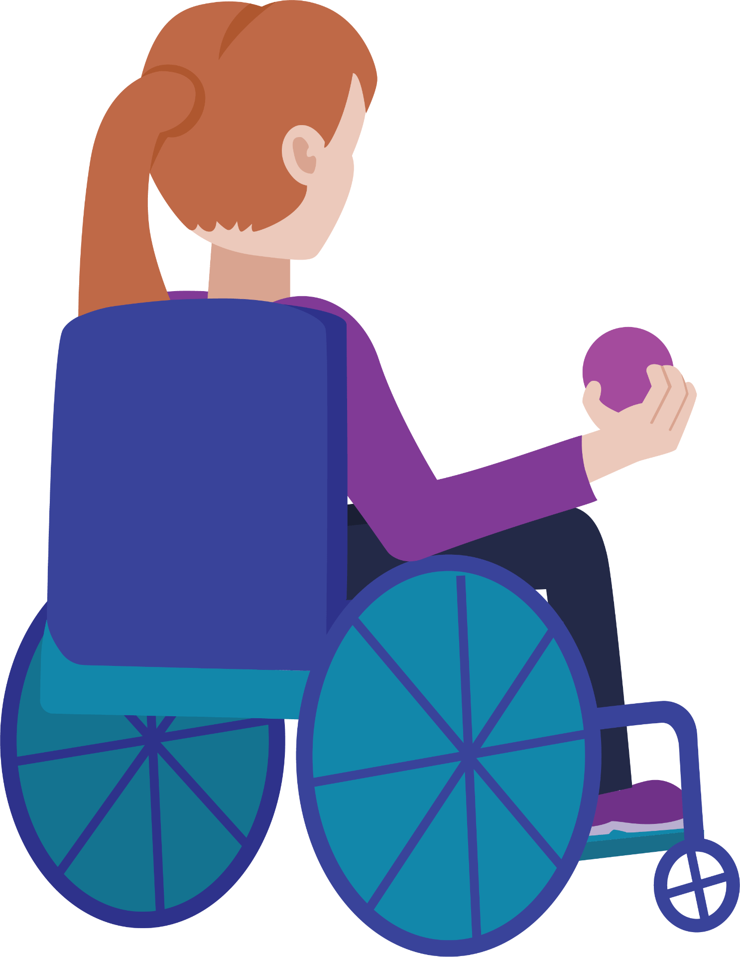
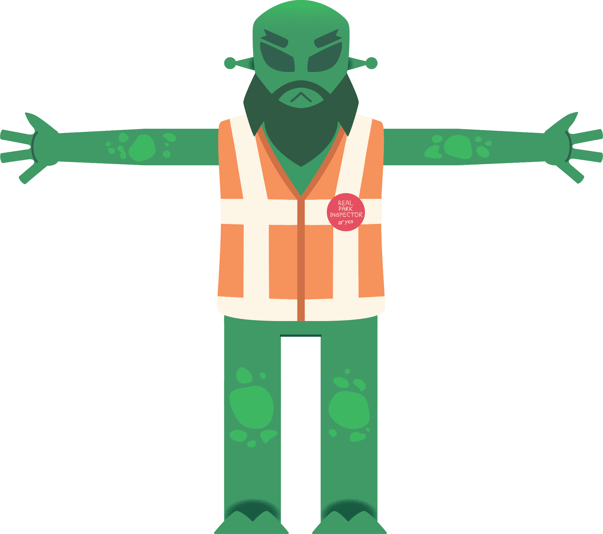
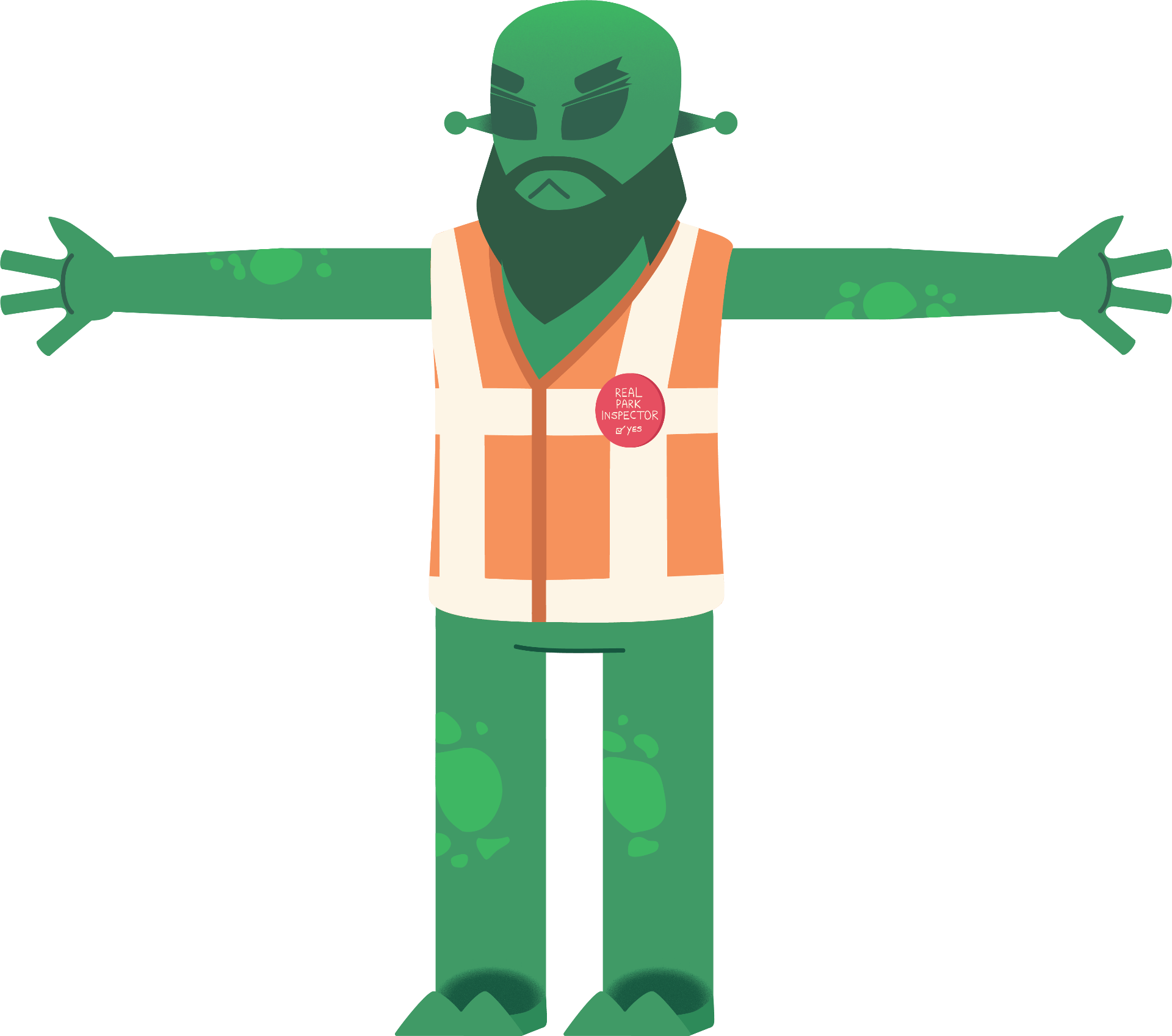
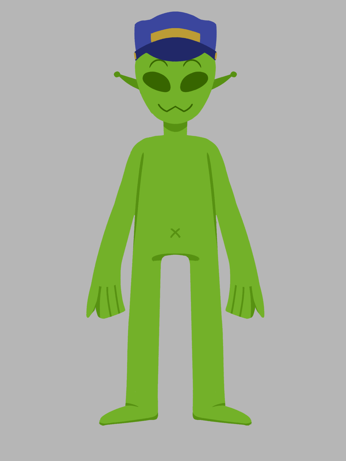
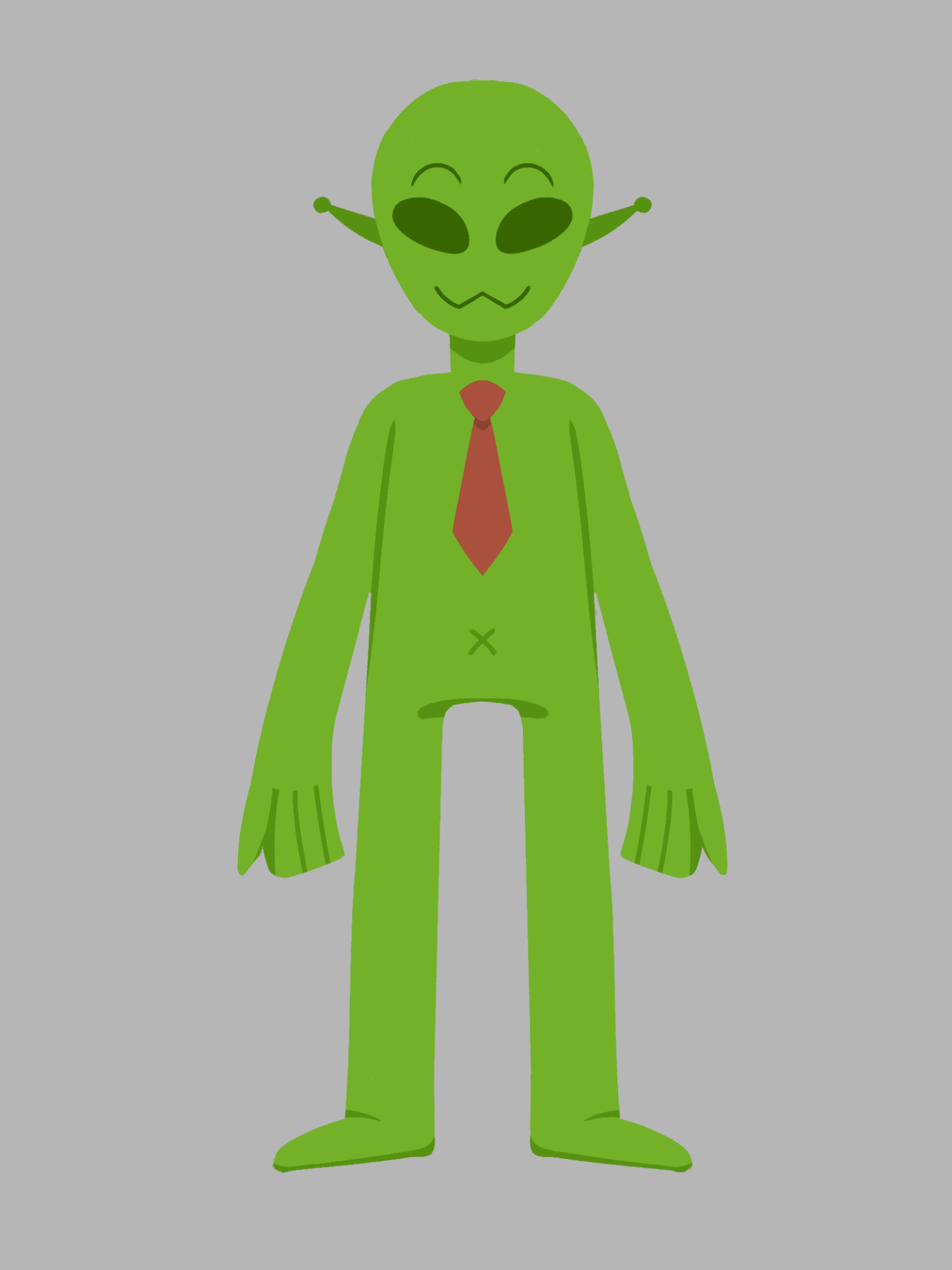
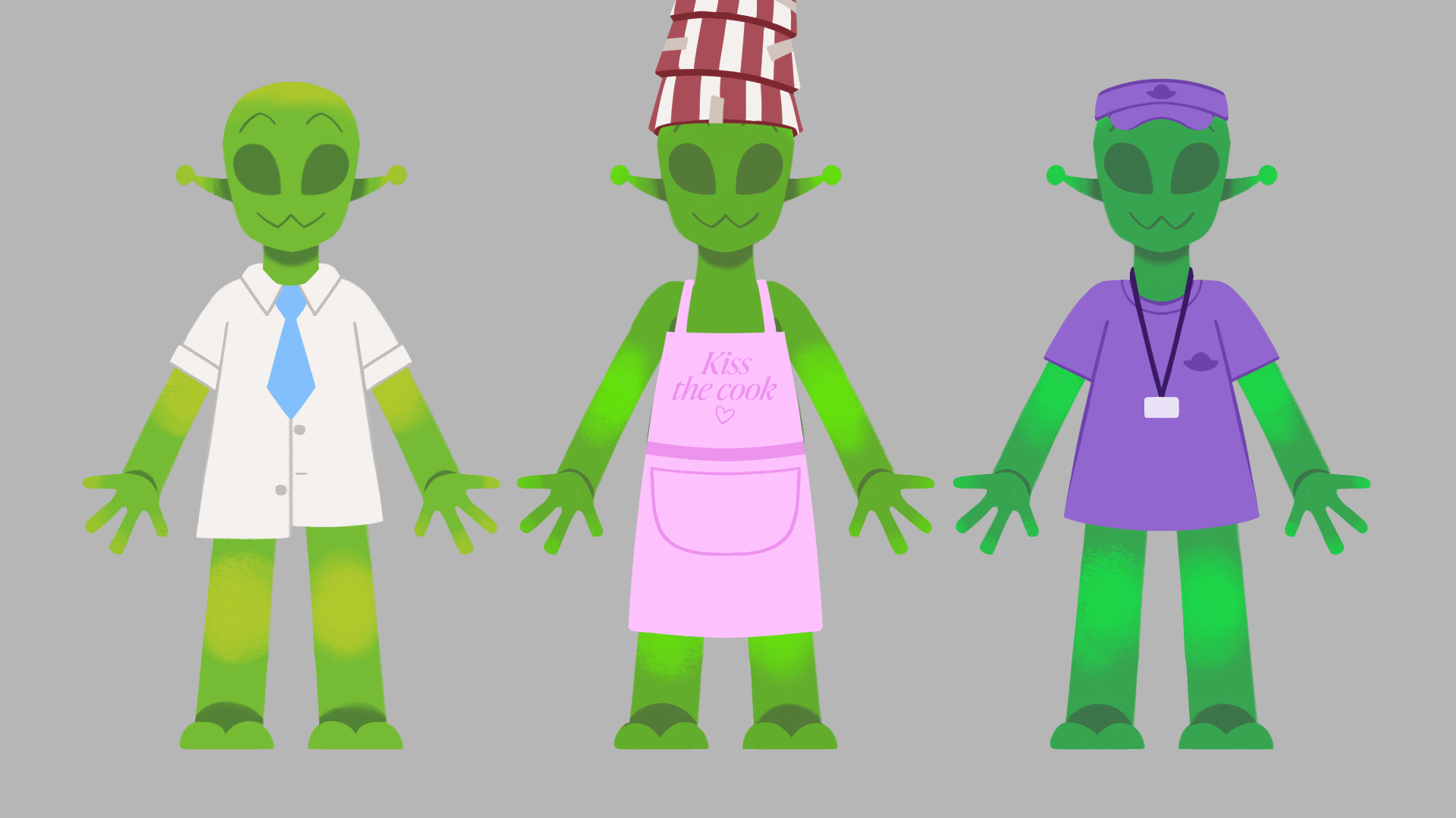
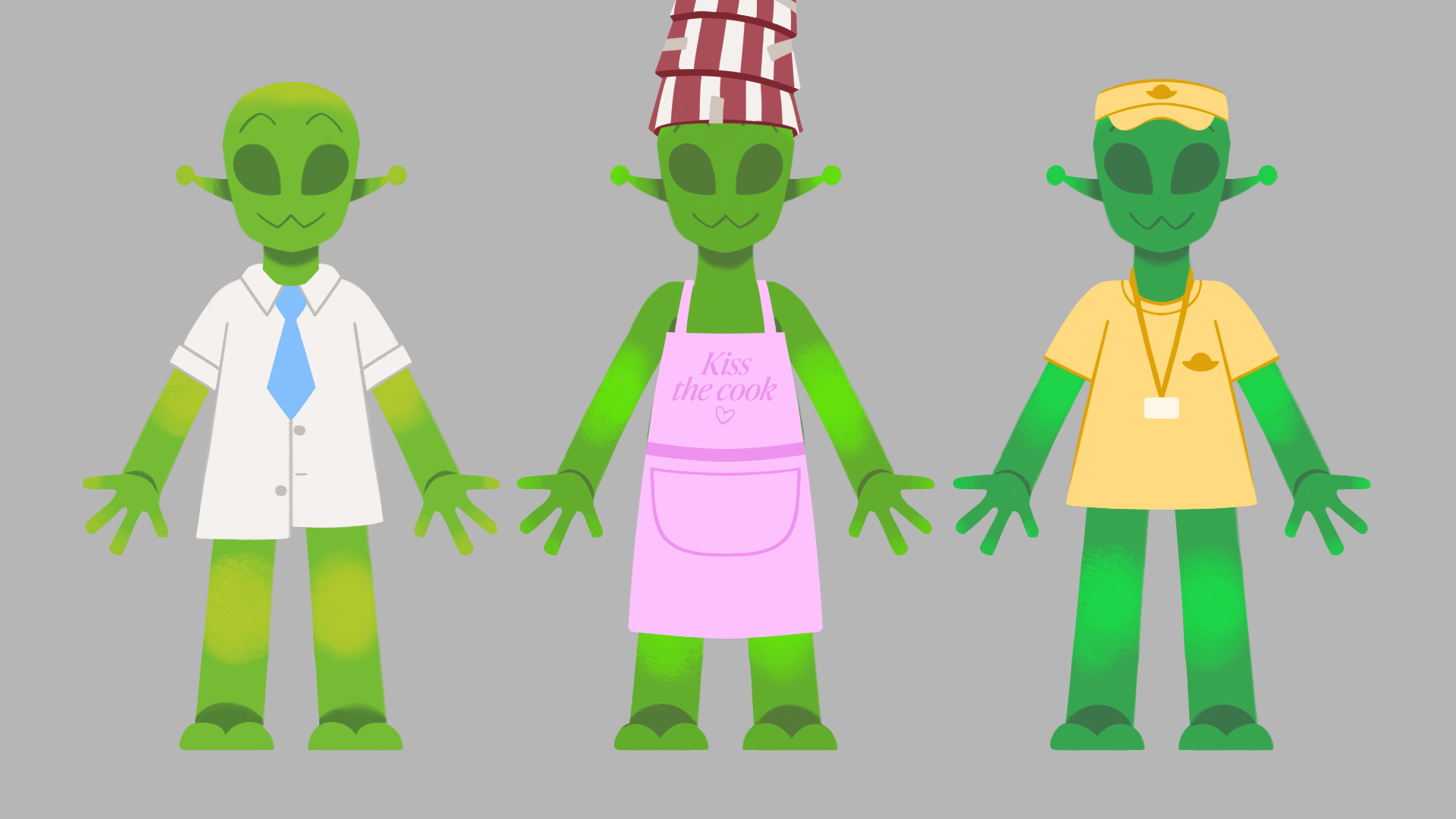
I was recommended during my pitch presentation that the Aliens should wear clothing and accessories, so the main characters can be distinguished from each other, and keeps limbs from getting lost on the body.
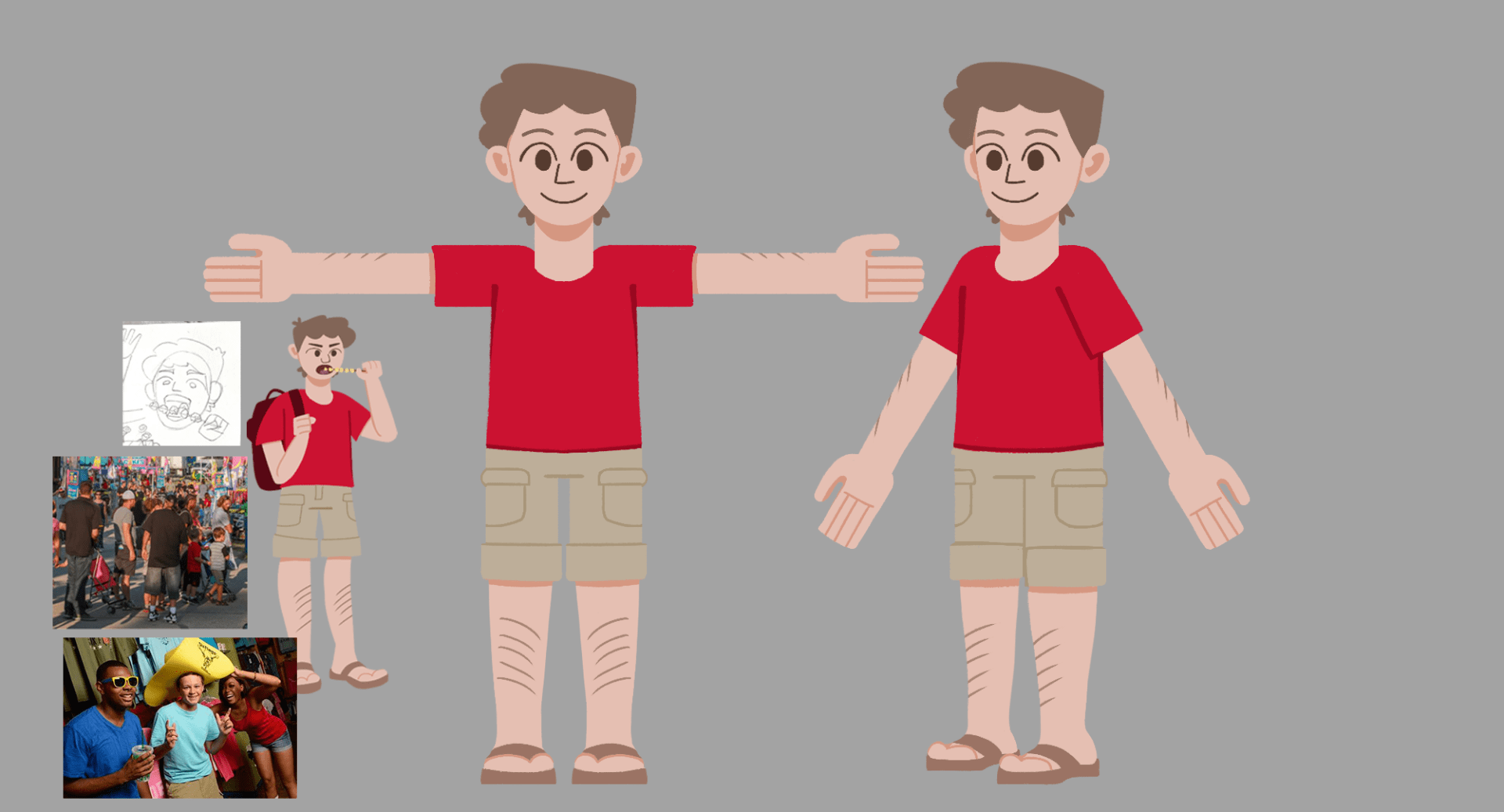
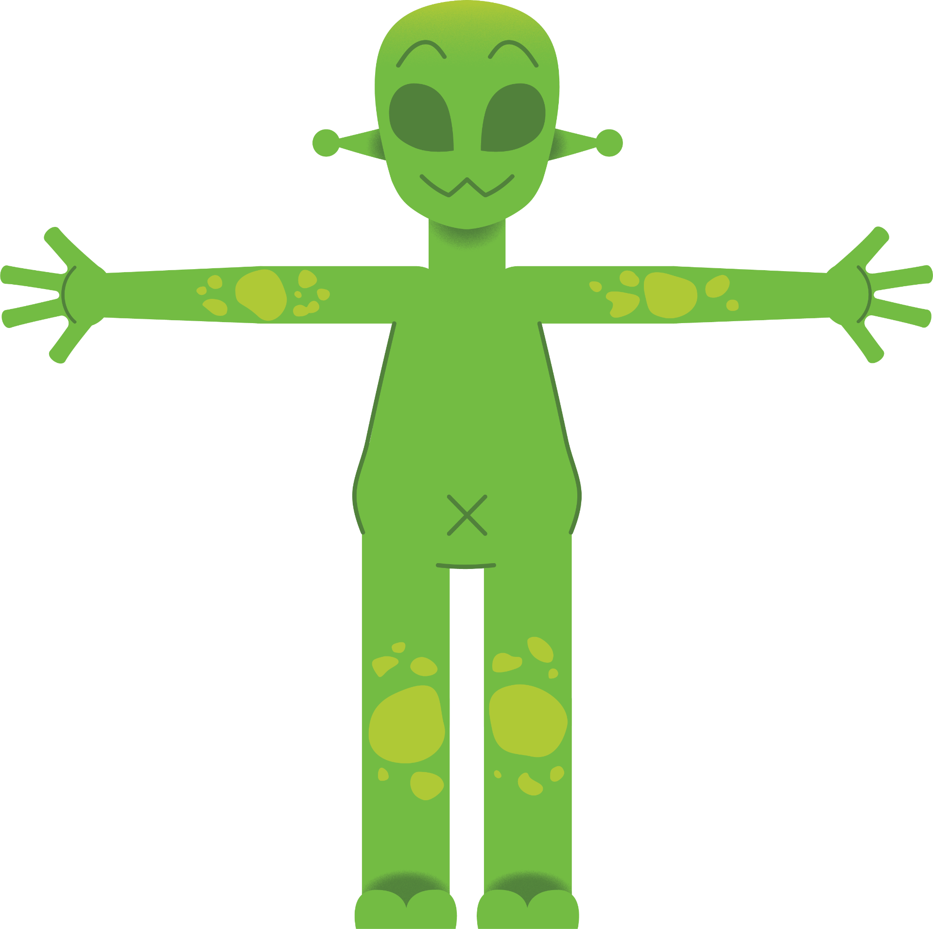
I have three alternate designs for each character for variation and speculating new ideas. This process developed the individuality of each character when initial ideas became like others, such as the old operator design, and the inspector.
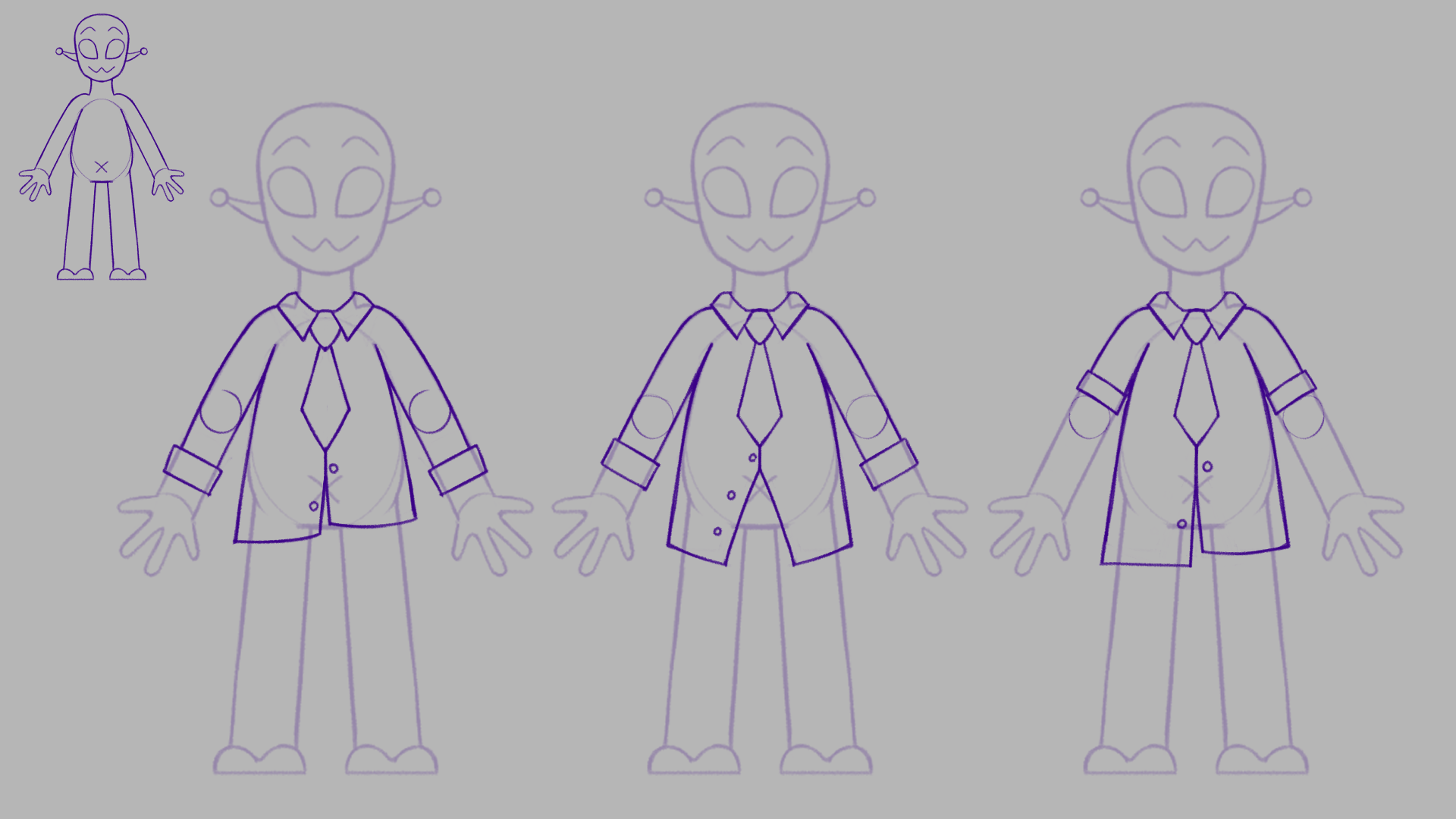
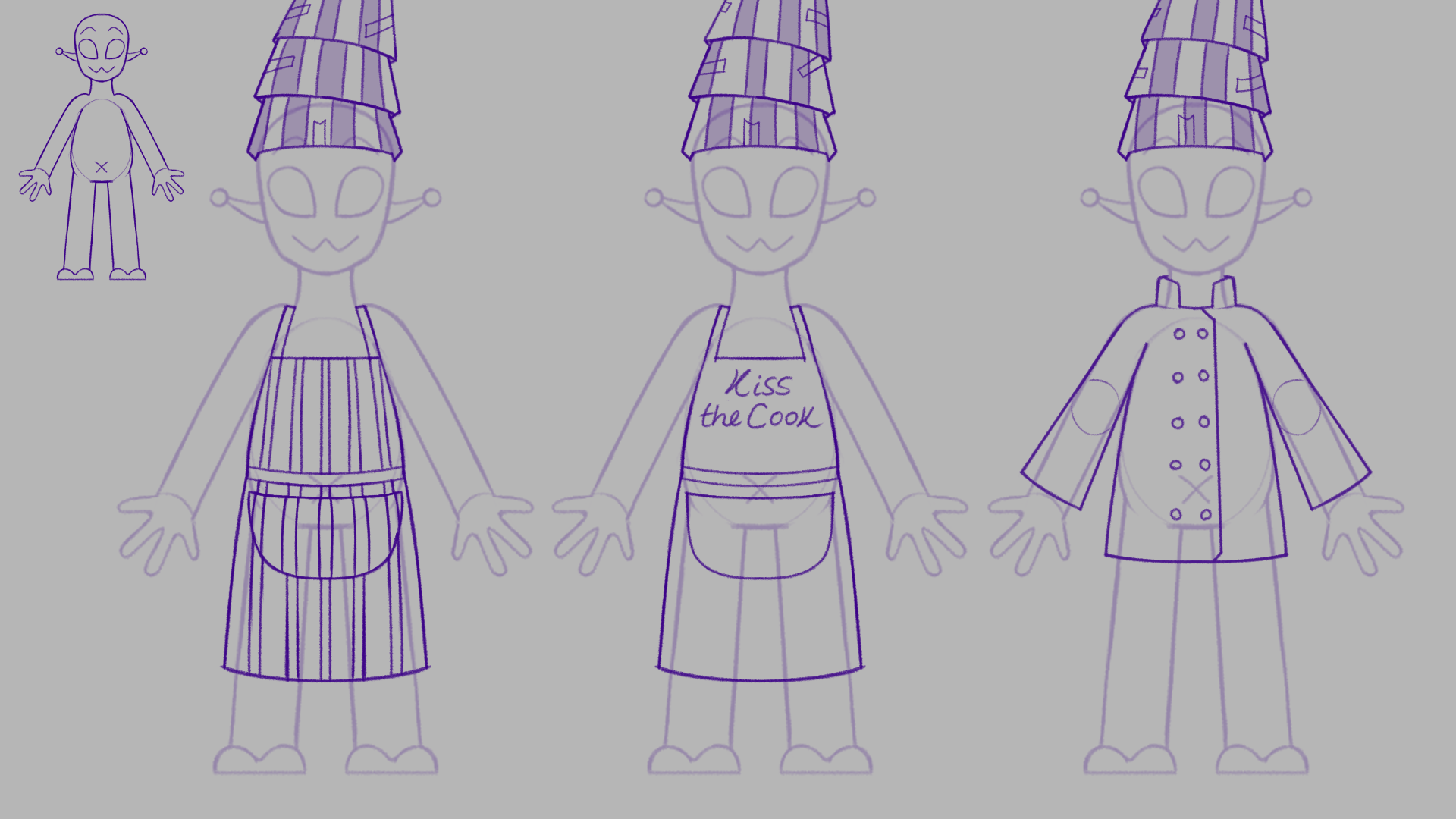
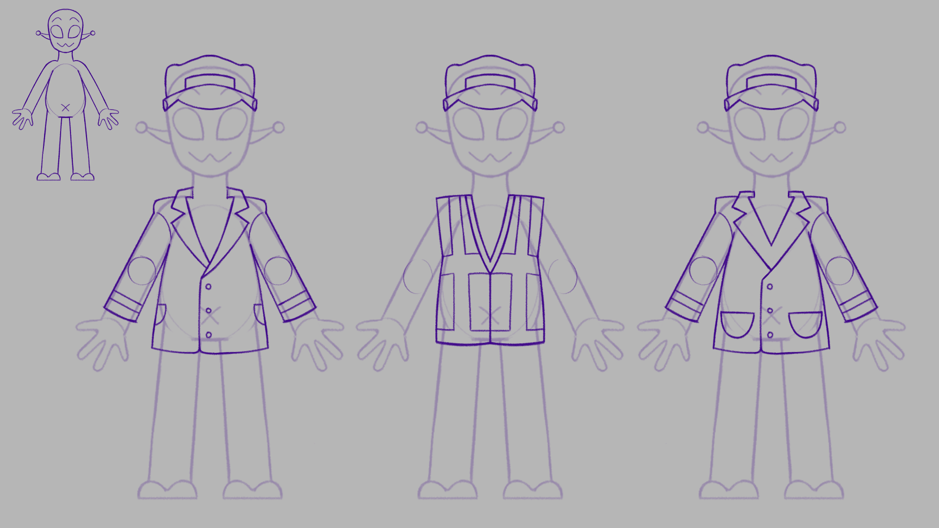

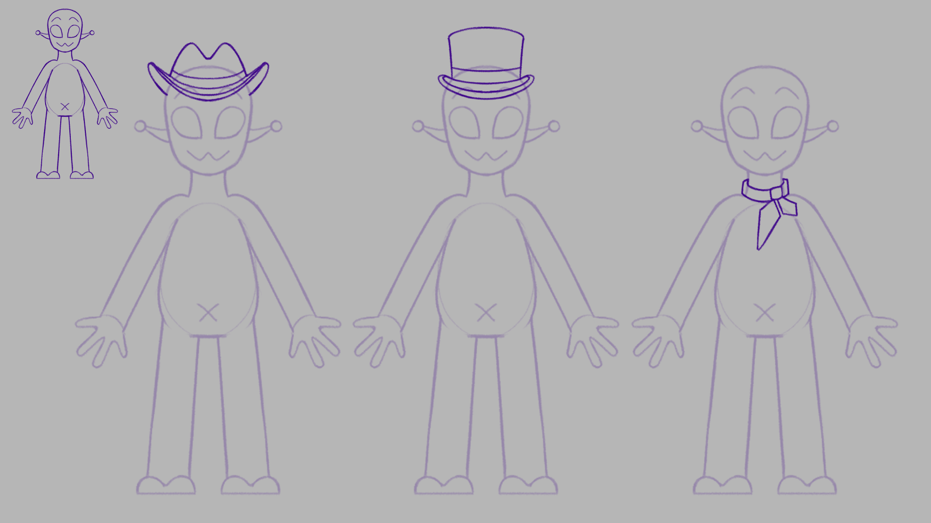

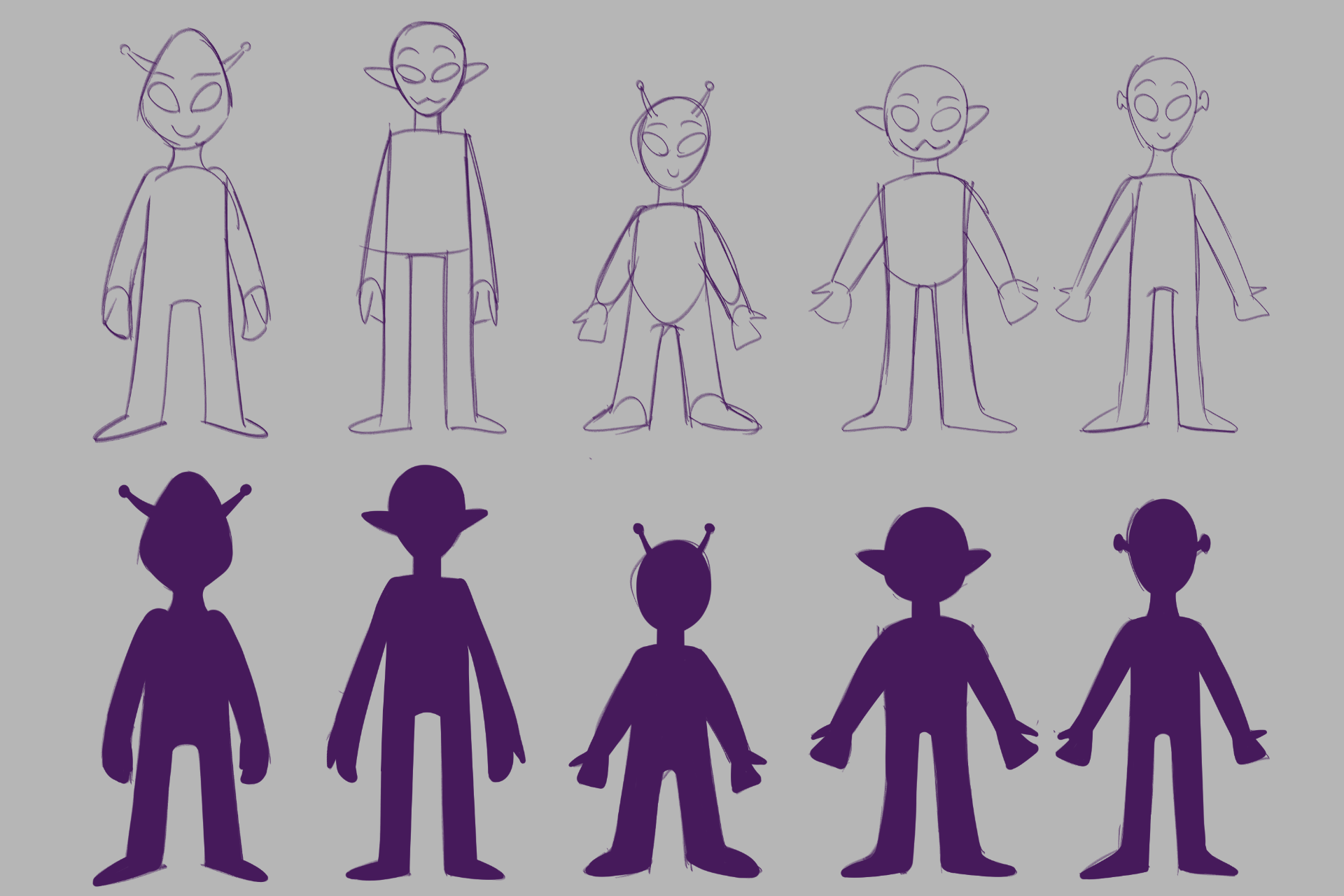
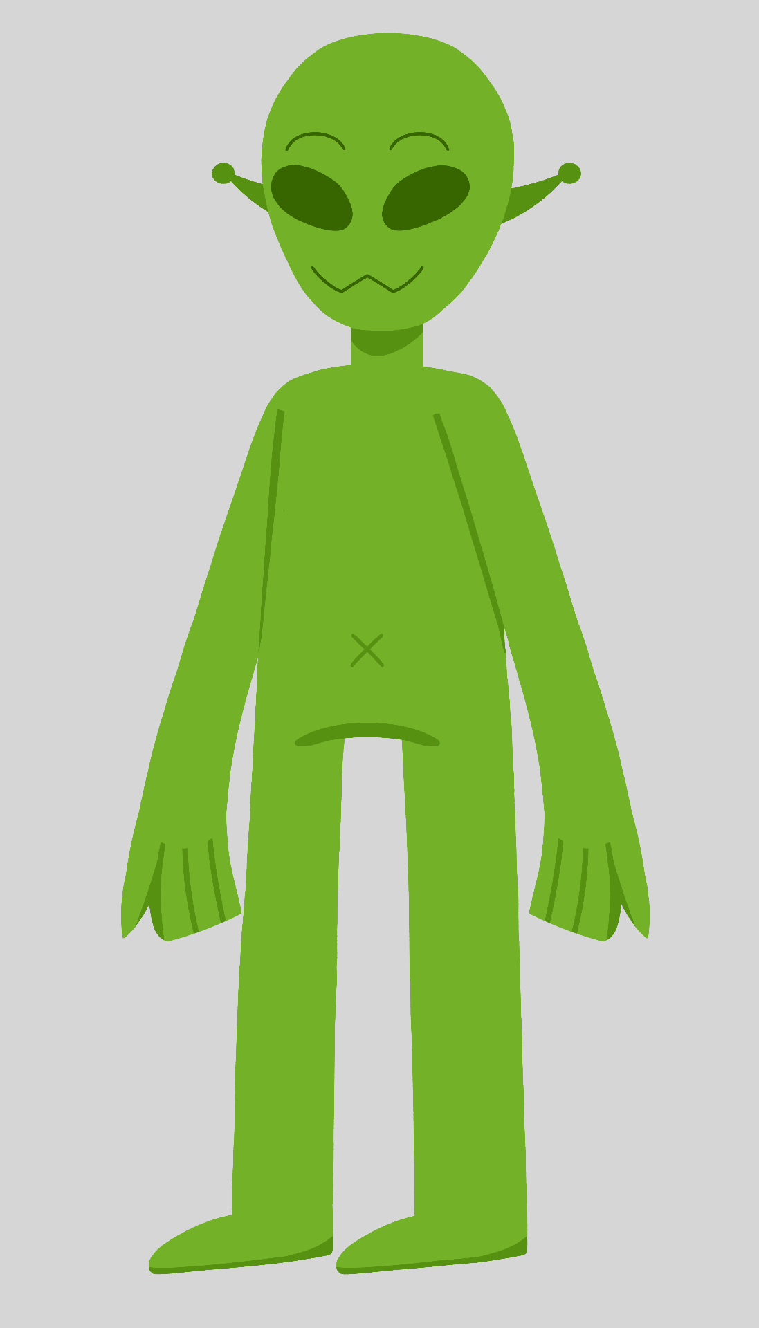
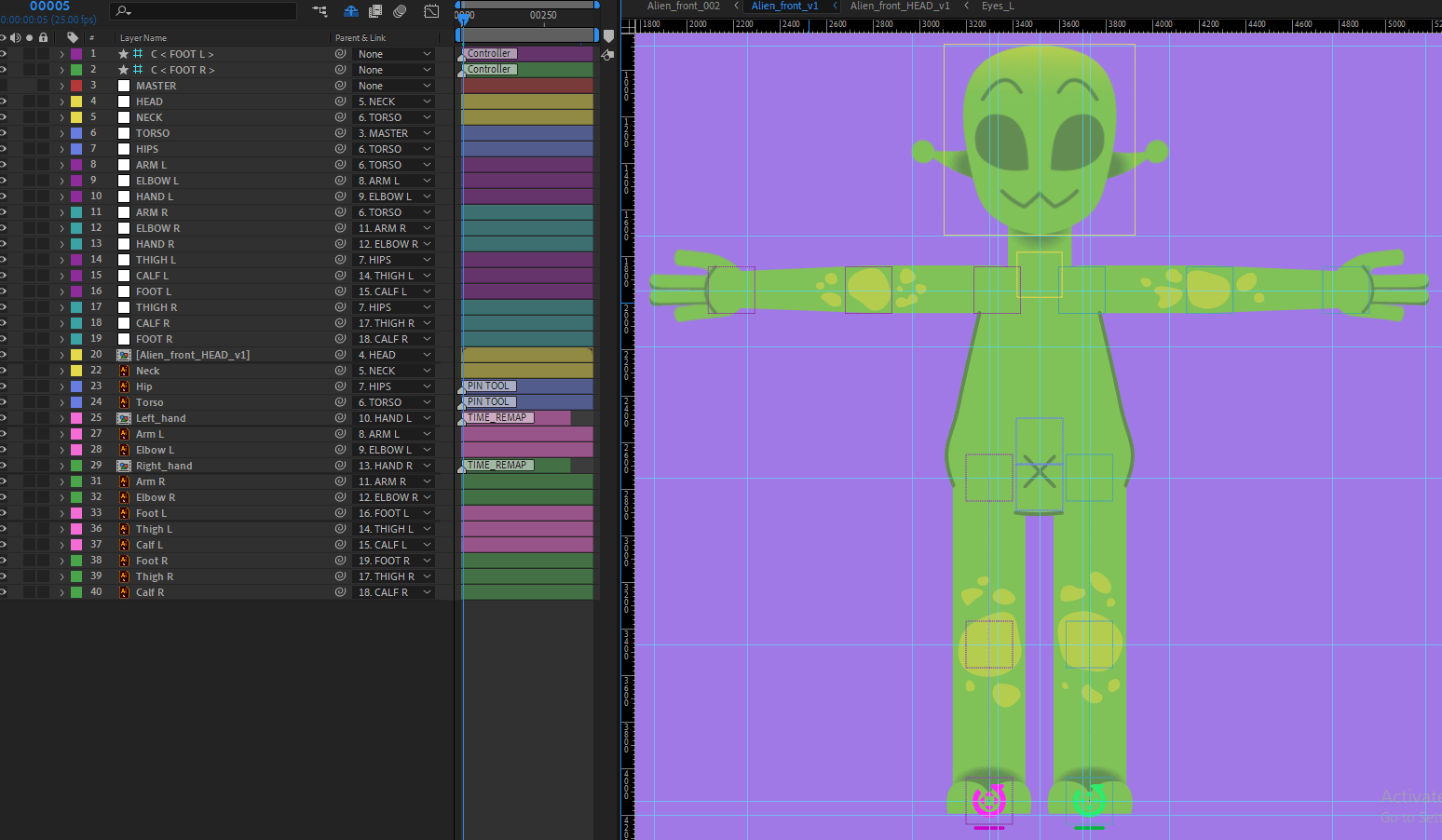
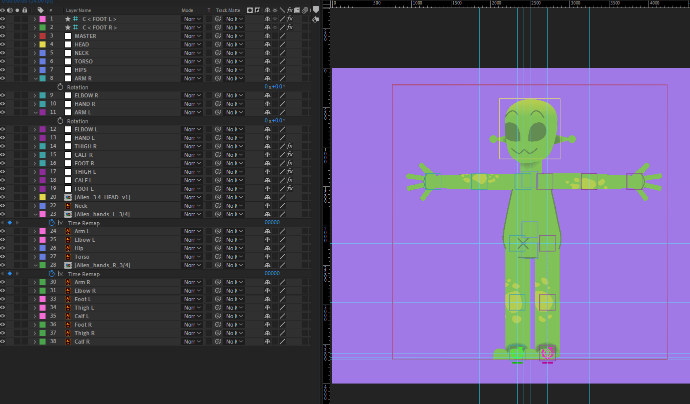
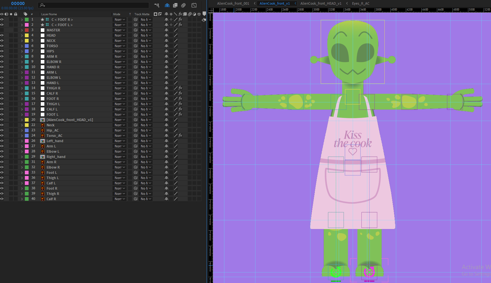
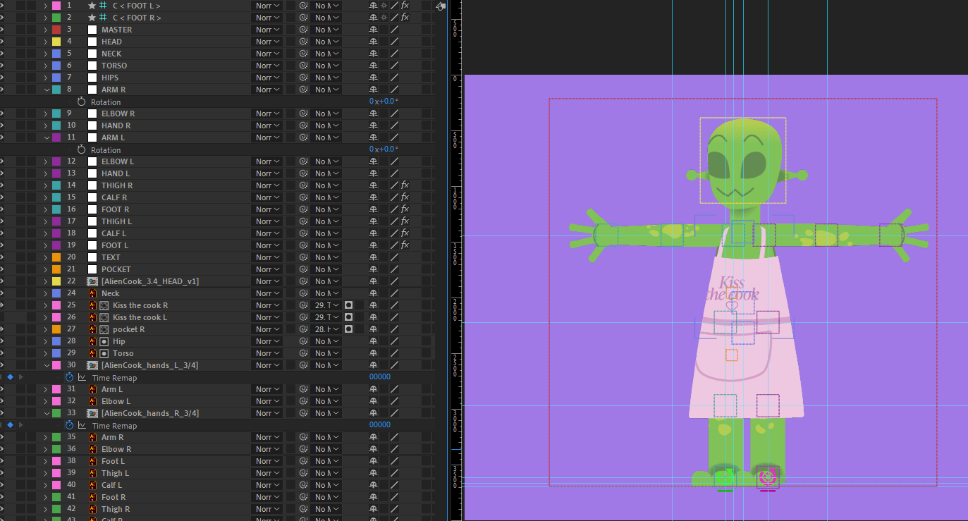
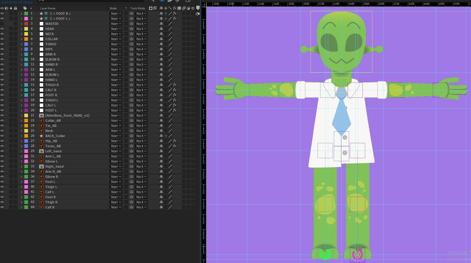
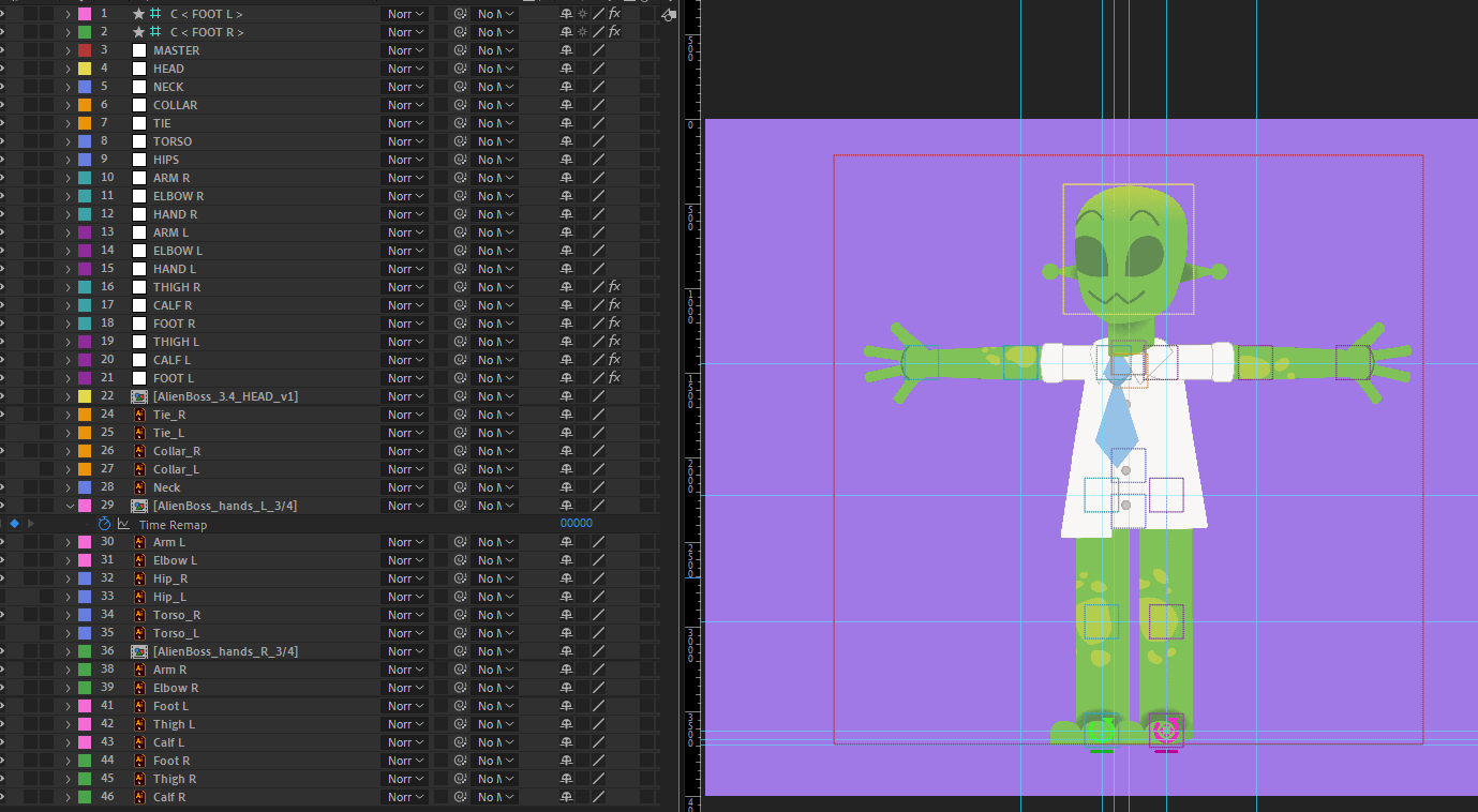
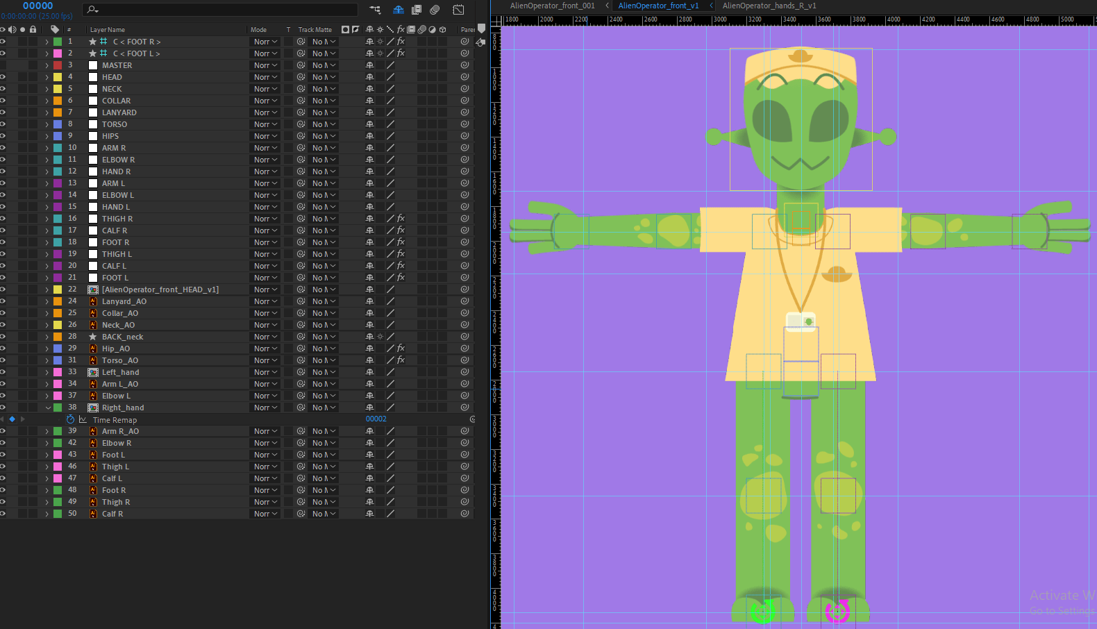
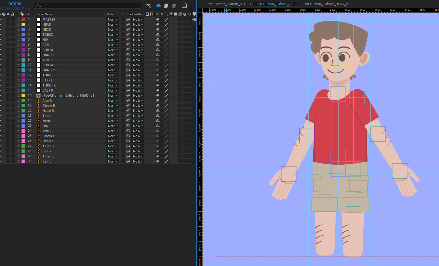
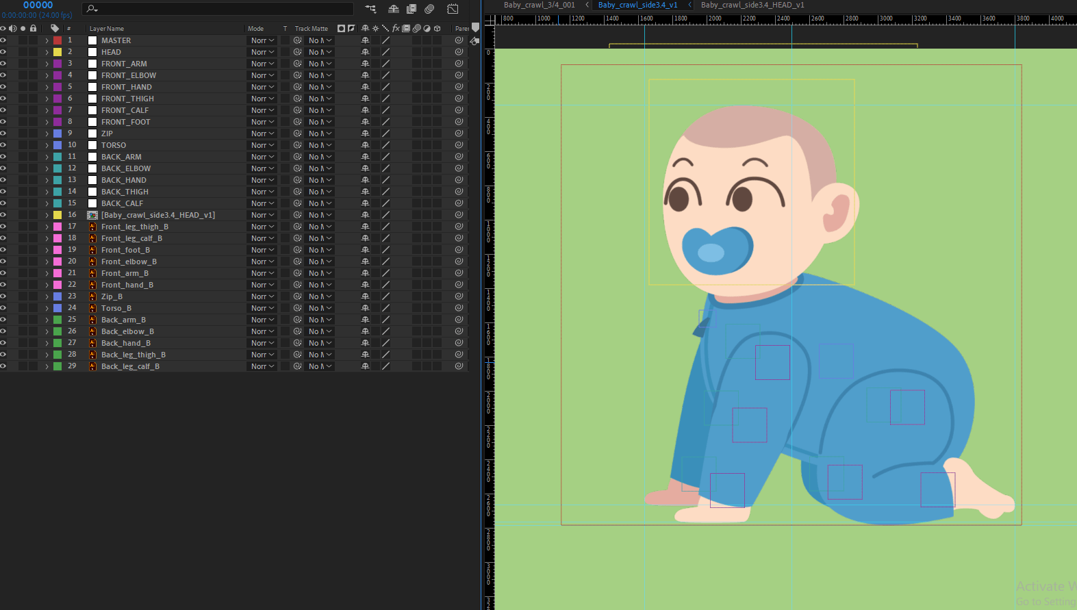
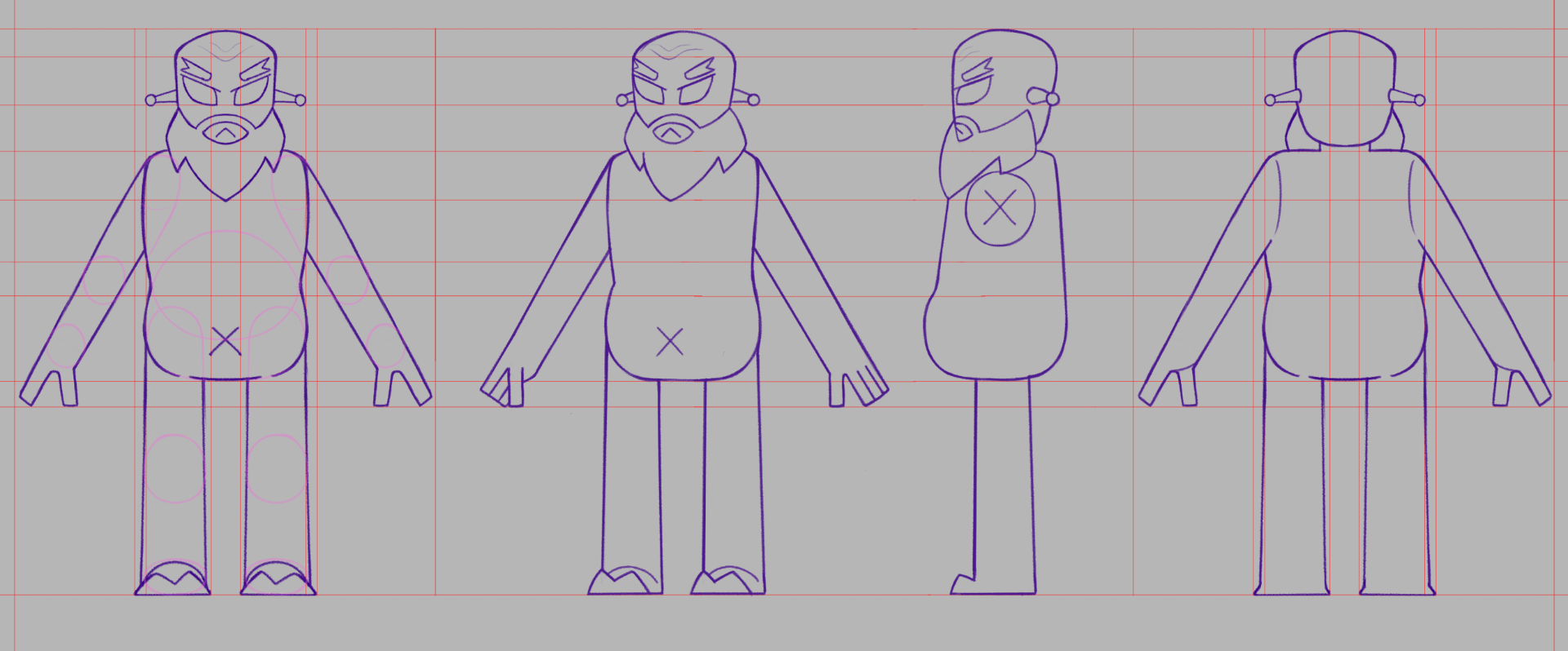
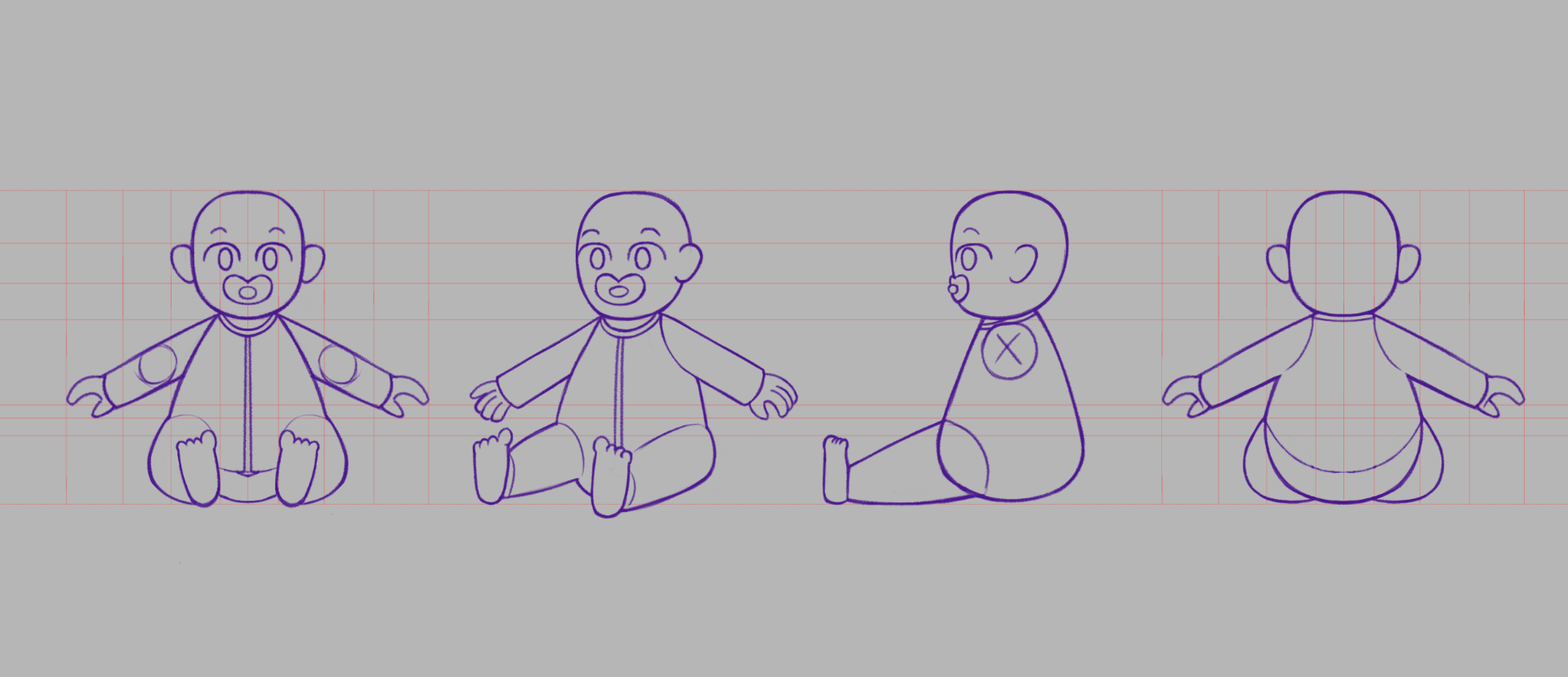
Turnarounds for each character that will be fully rigged – The Alien, the alien inspector, and the baby.

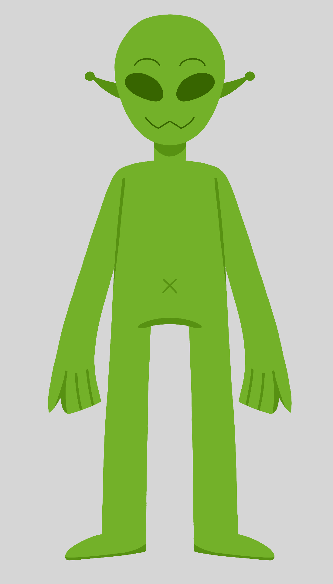
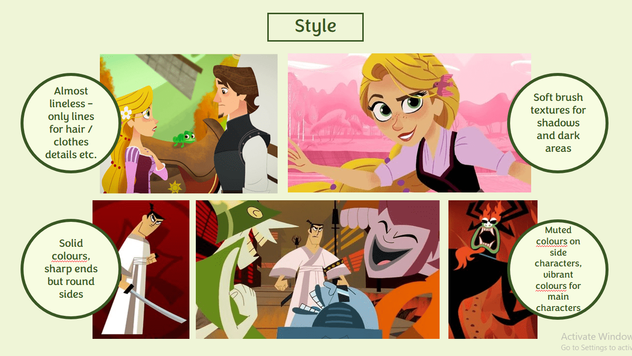
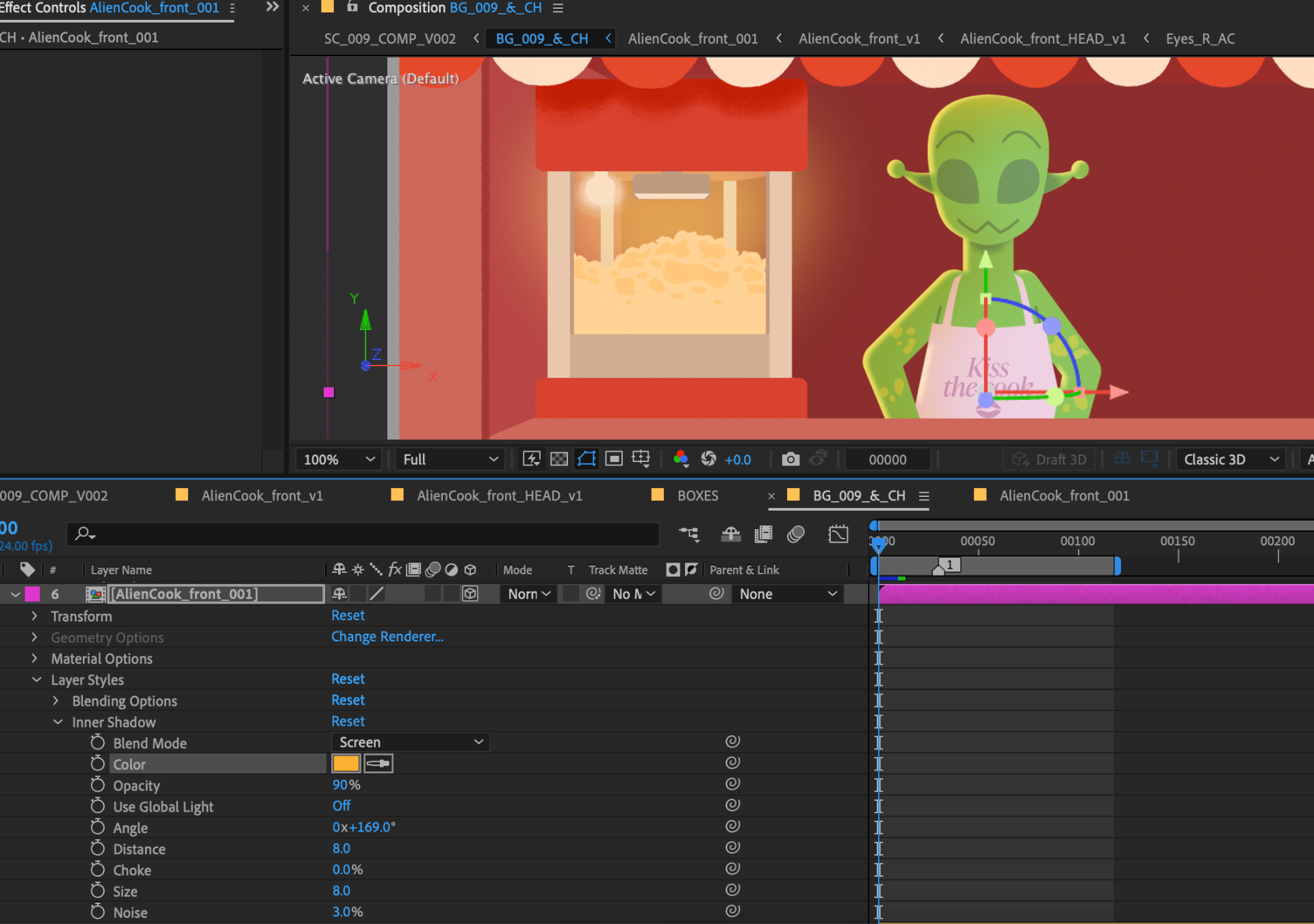
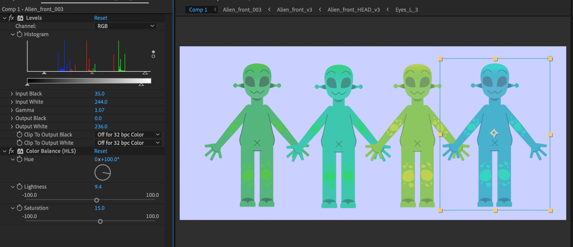
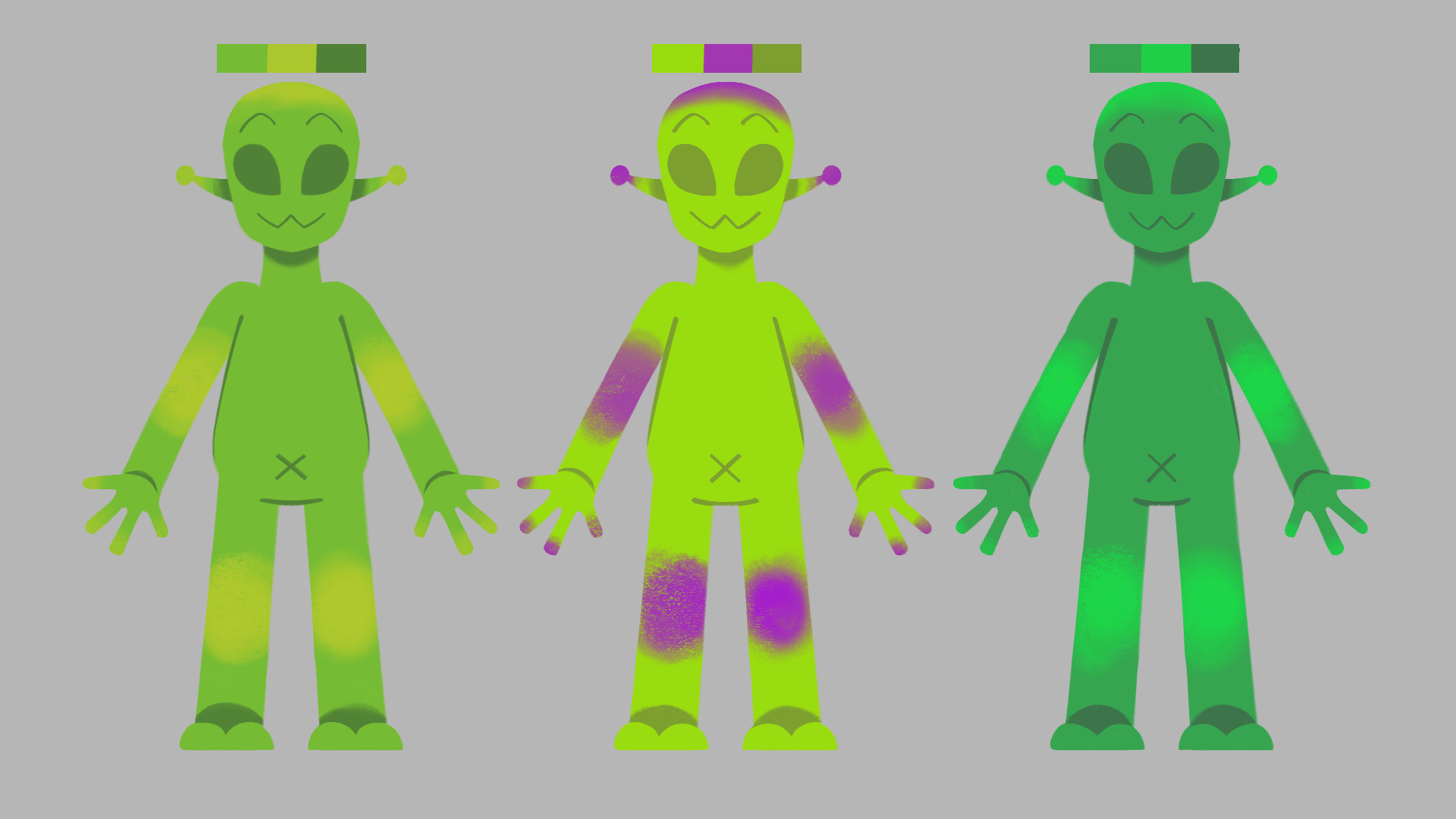
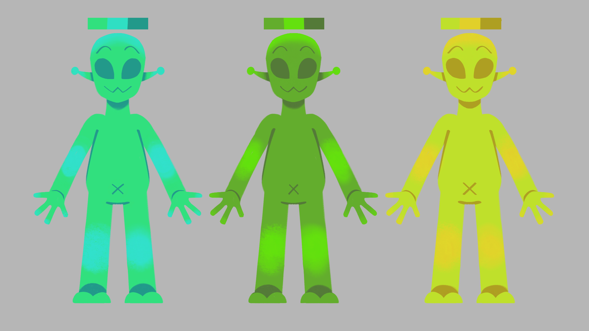
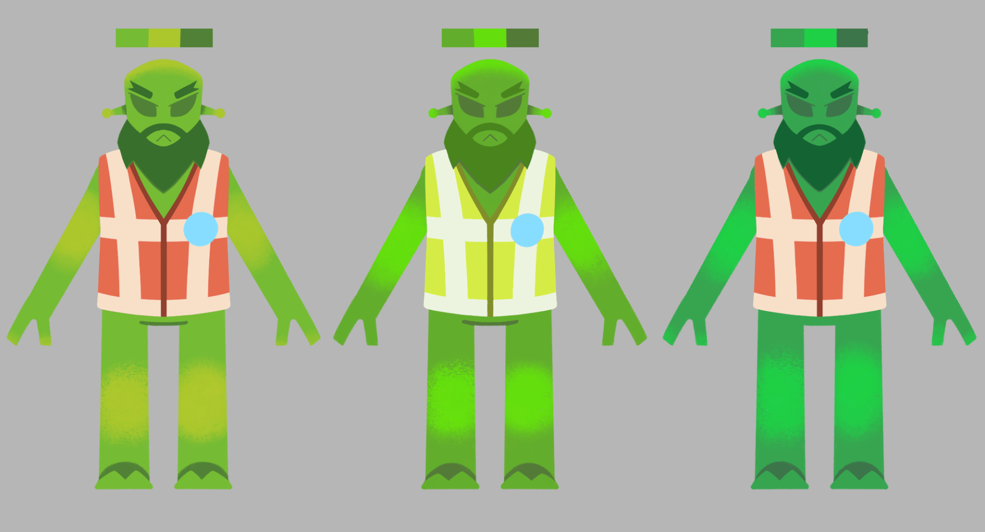
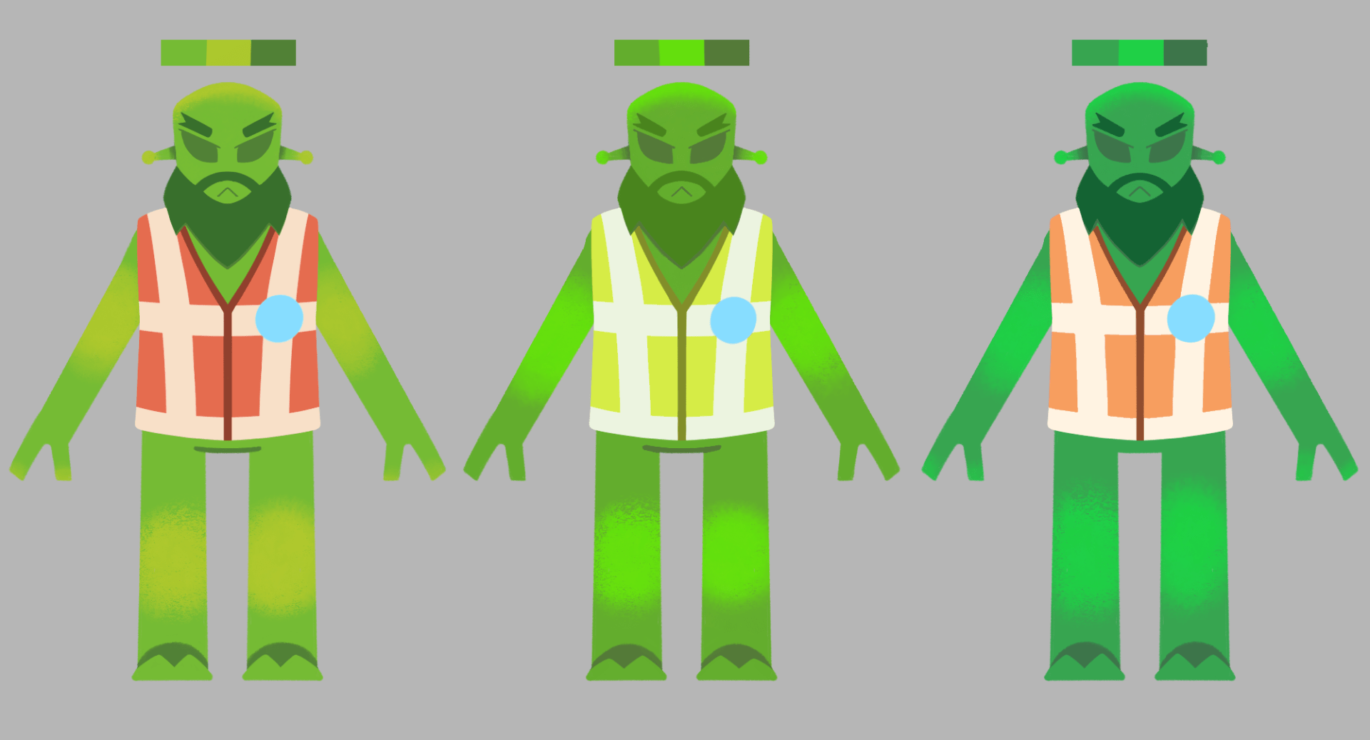
These are colour studies for the alien characters, both the skin colours, and the colours of the clothing & accessories. When building the alien rig, I decided to use one colour scheme, the first option in variation 1. I can use the rest as a palette in the compositing stage, where I can adjust rig colours with effect presets.
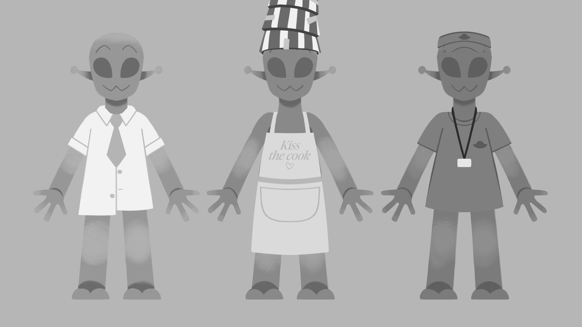
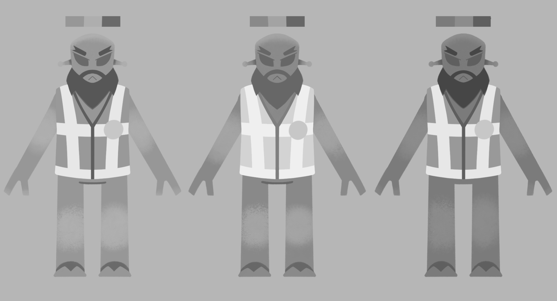
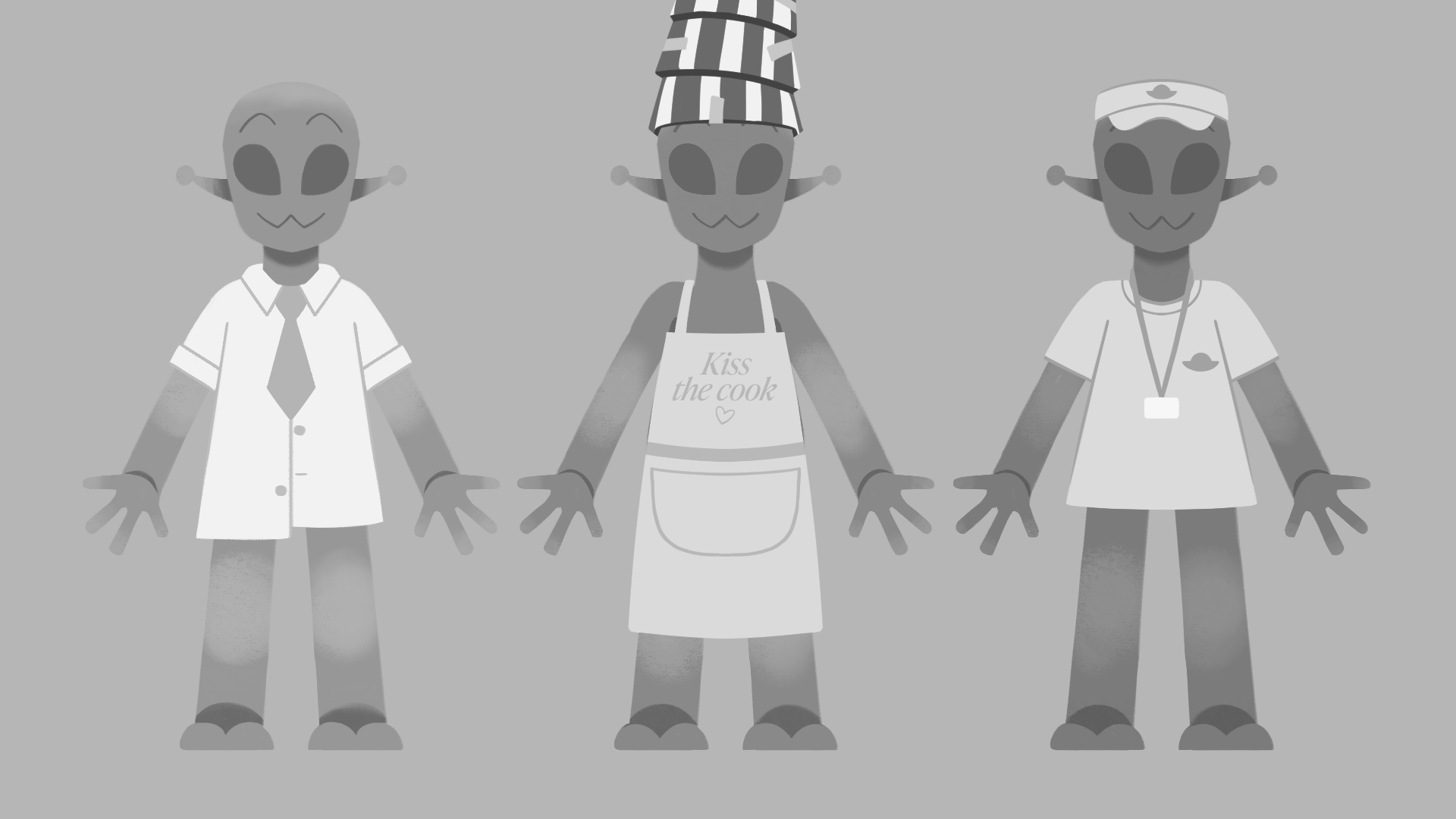
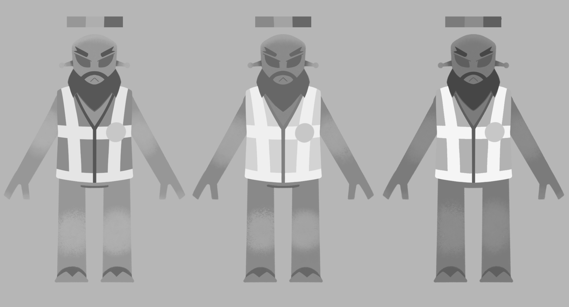
I worked with a black & white filter to determine the images values. This gave me an idea of how the contrast worked or didn’t work. For example, the purple and green in Alien Operator clashed too much, so I changed it to a light yellow.
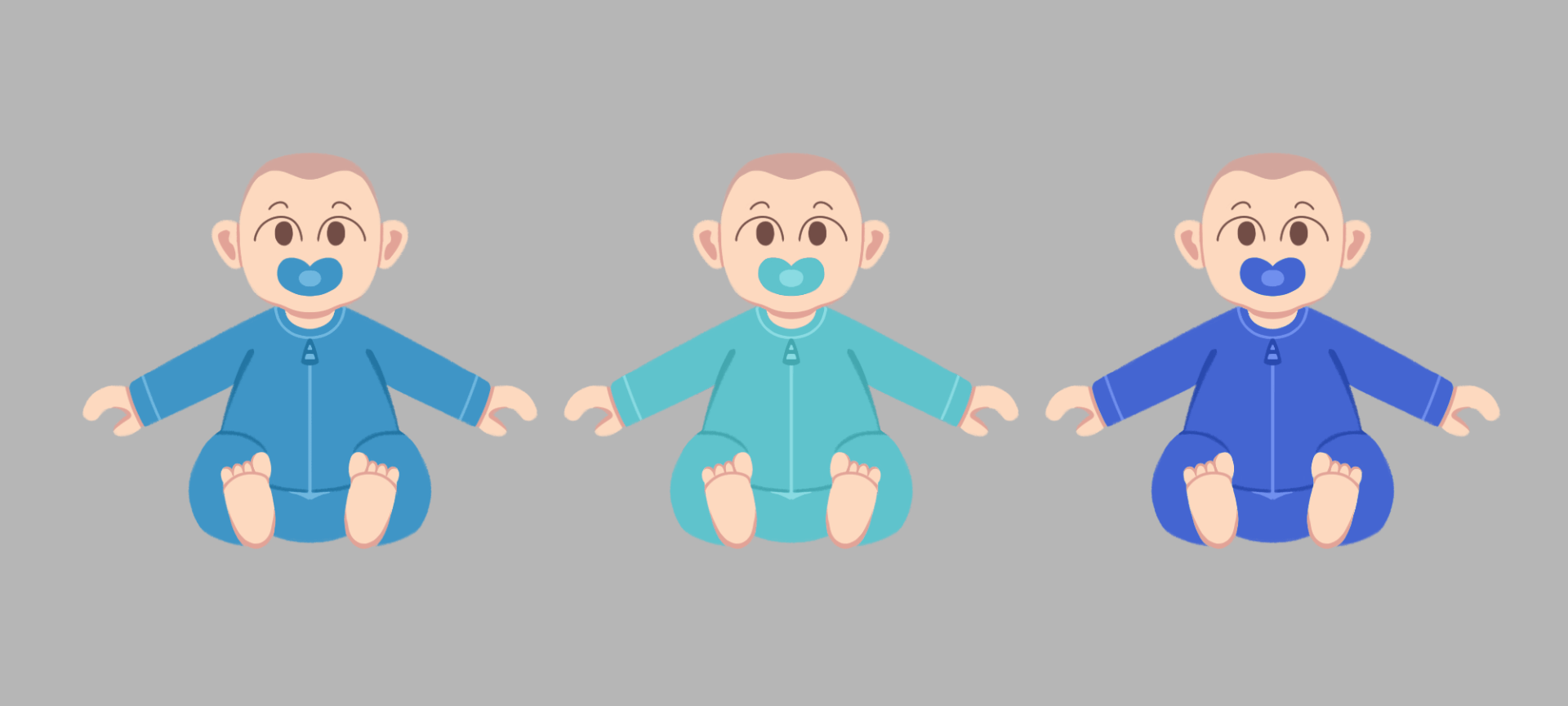
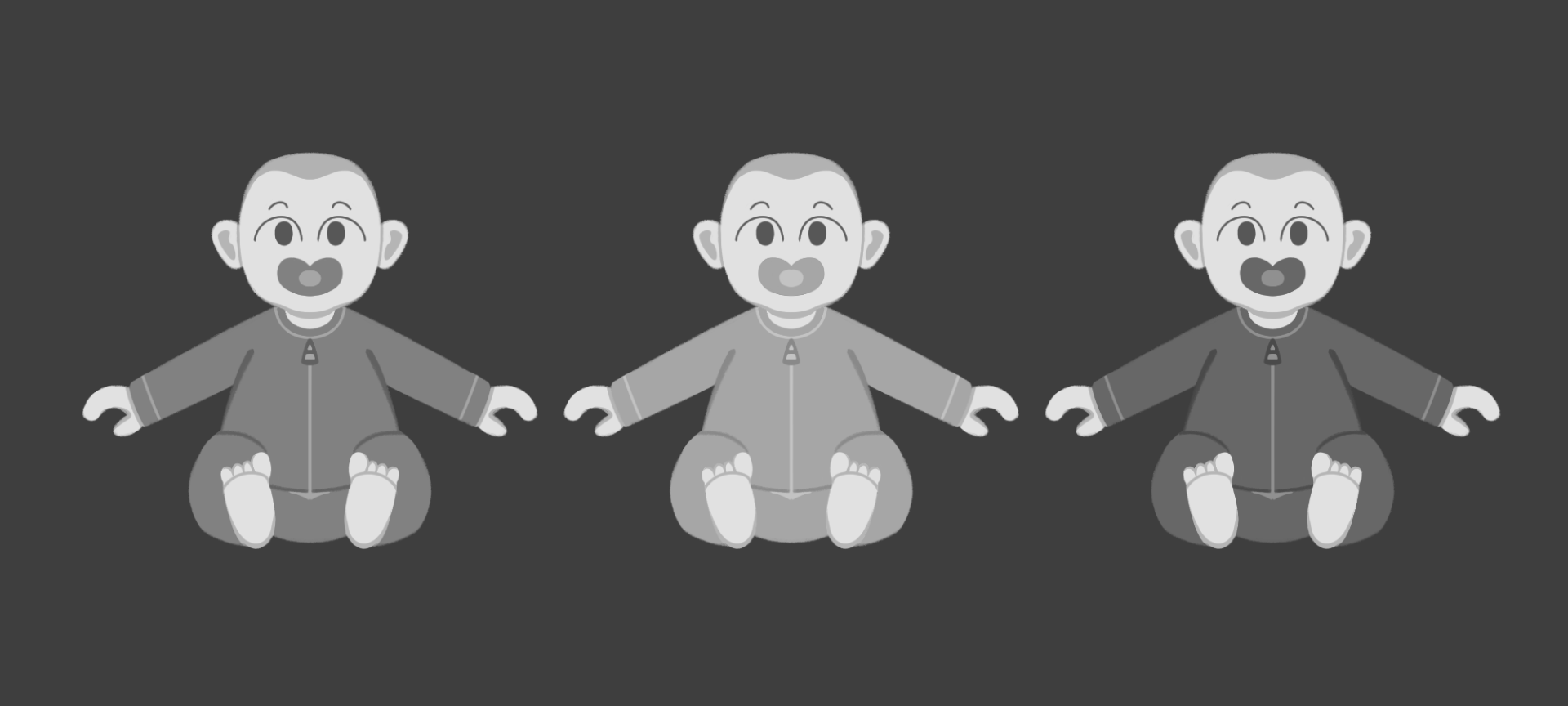
I designed the baby with a toddler onesie outfit, a colour coded dummy and some hair. I applied the black and white filter again to see its contrast, and I am favouring the first colour choice most.
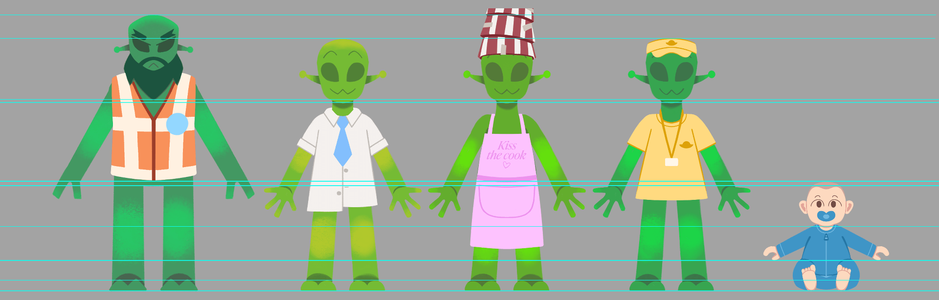
I added all the main characters into this page where I scaled the height / size of each character next to each other. I am happy with how the main characters are looking. They all differ from each other, and they have unique looks with clear idea of their personality / role in the story.
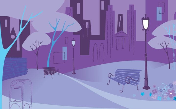
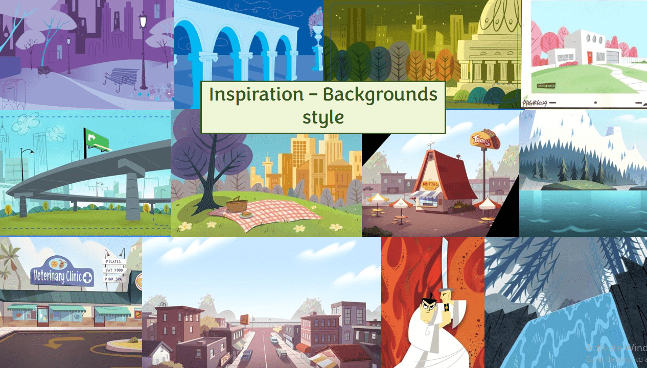
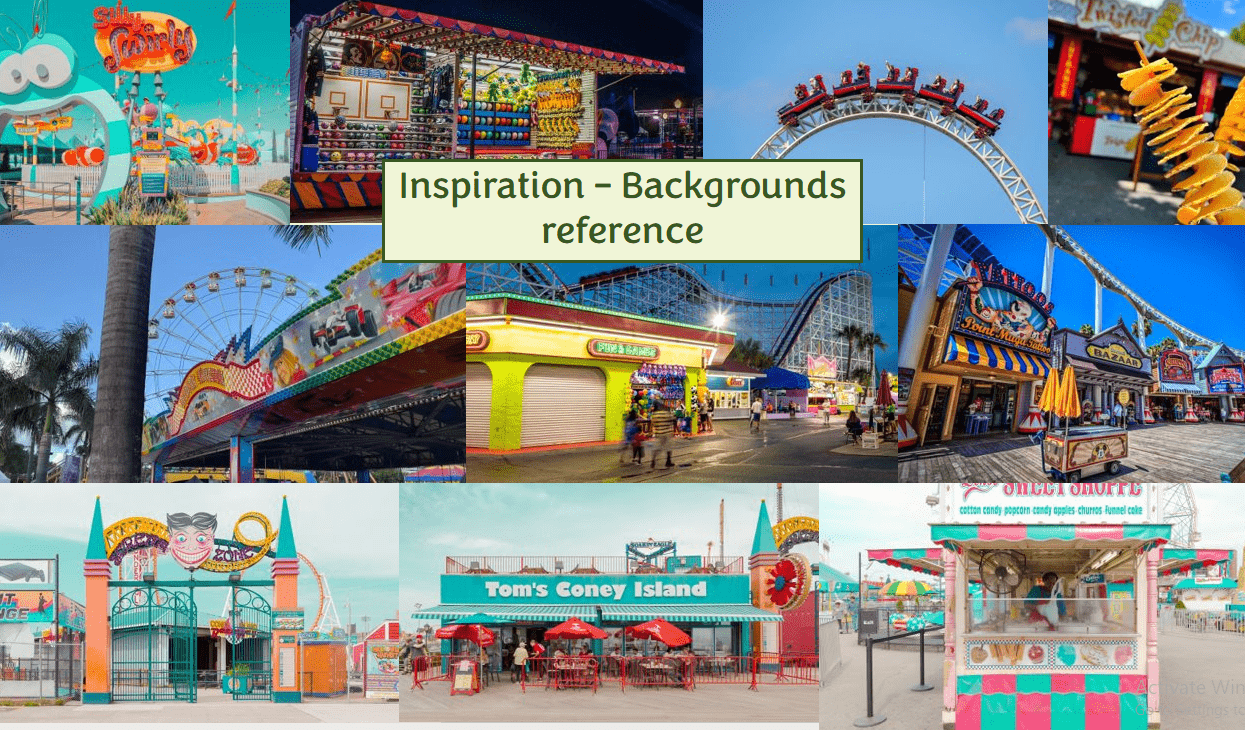
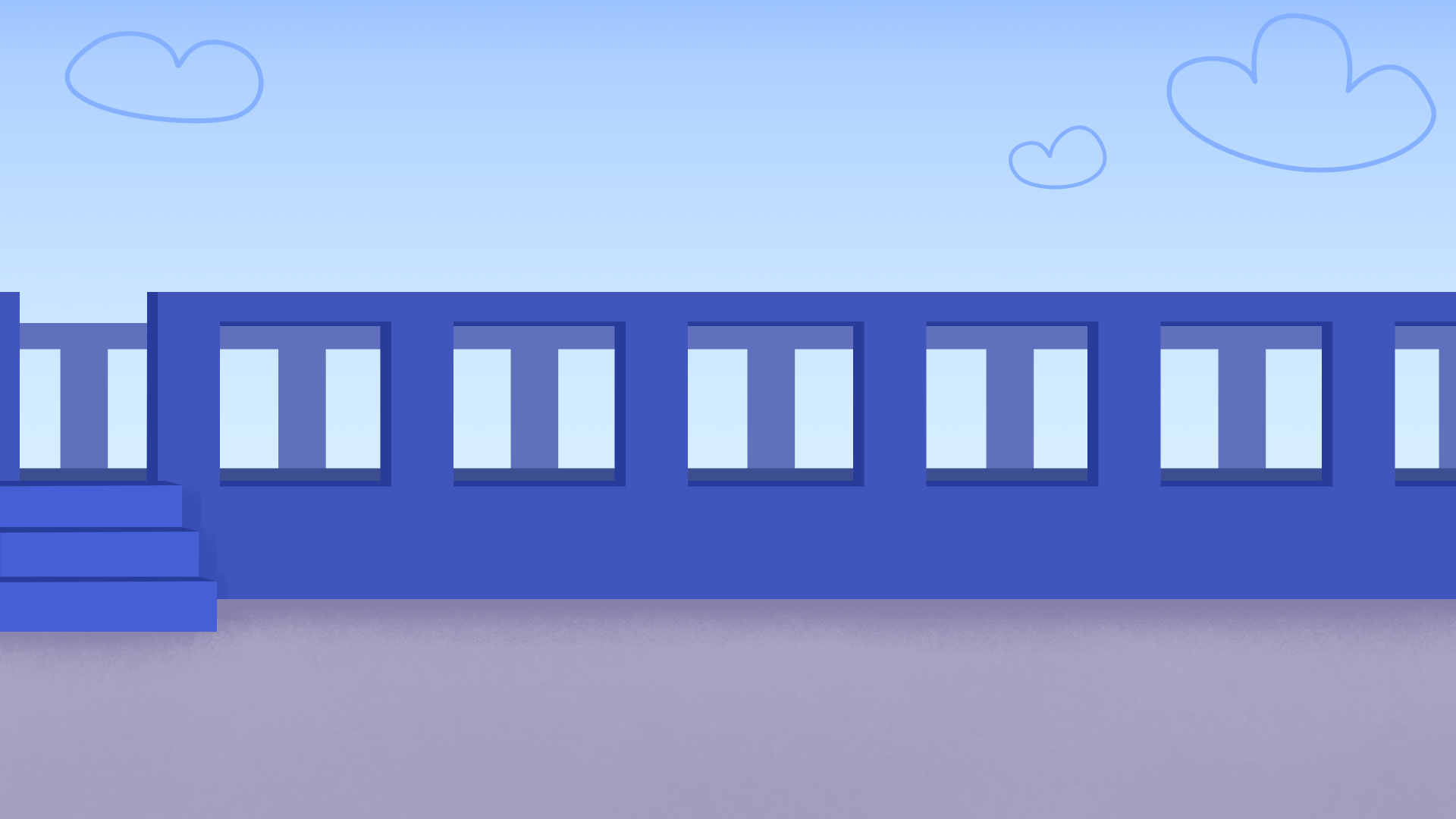
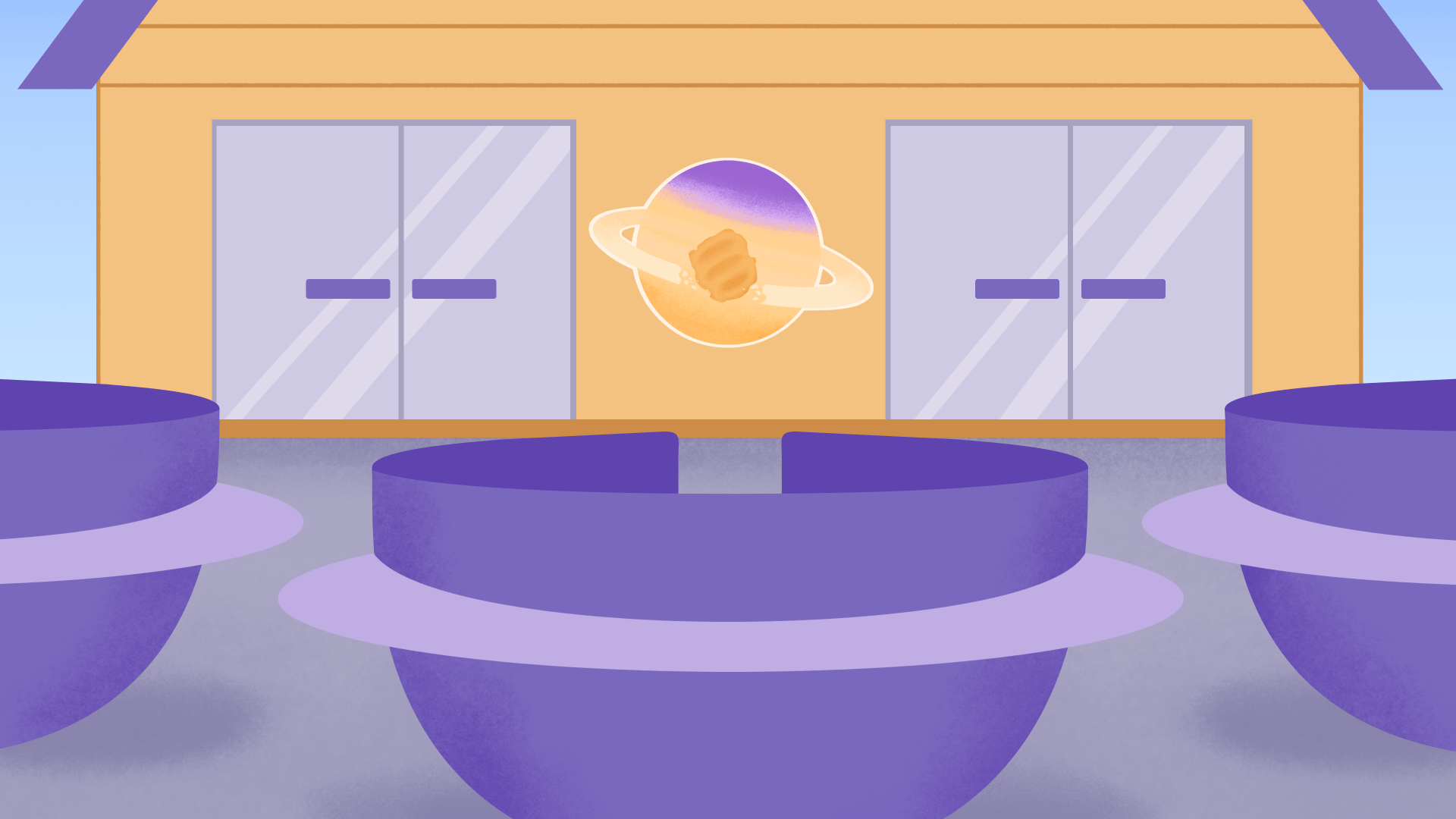
Background Design
Before designing, I tested some drawings from the storyboards into greyscale thumbnails to figure out the shapes, and depth of field. 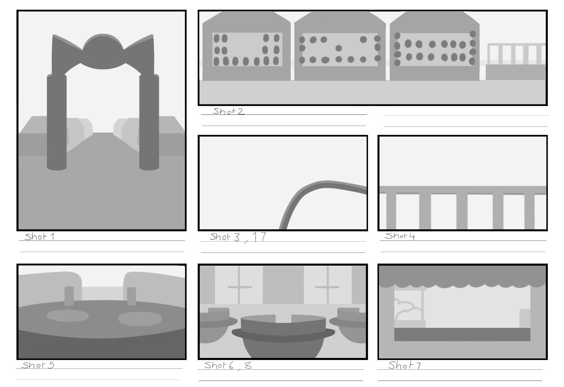
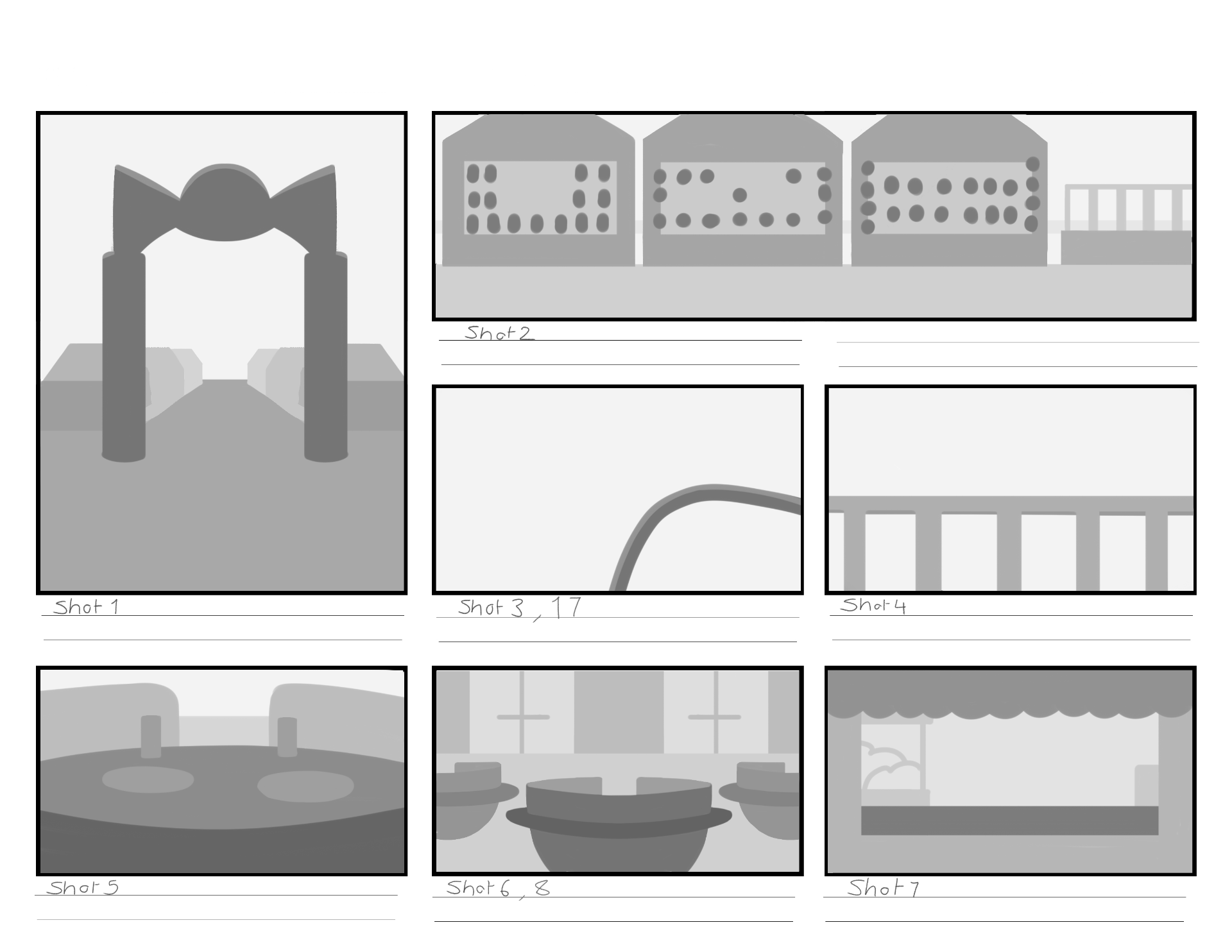
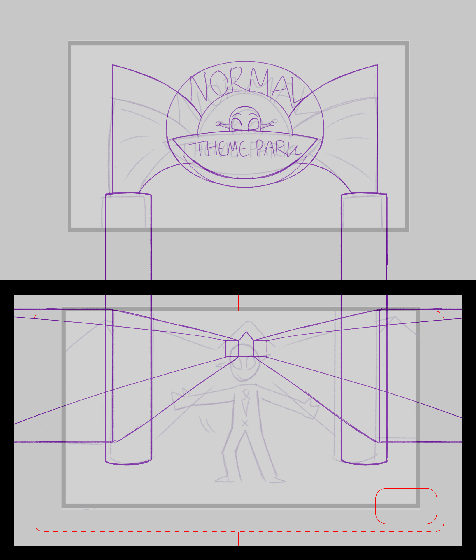
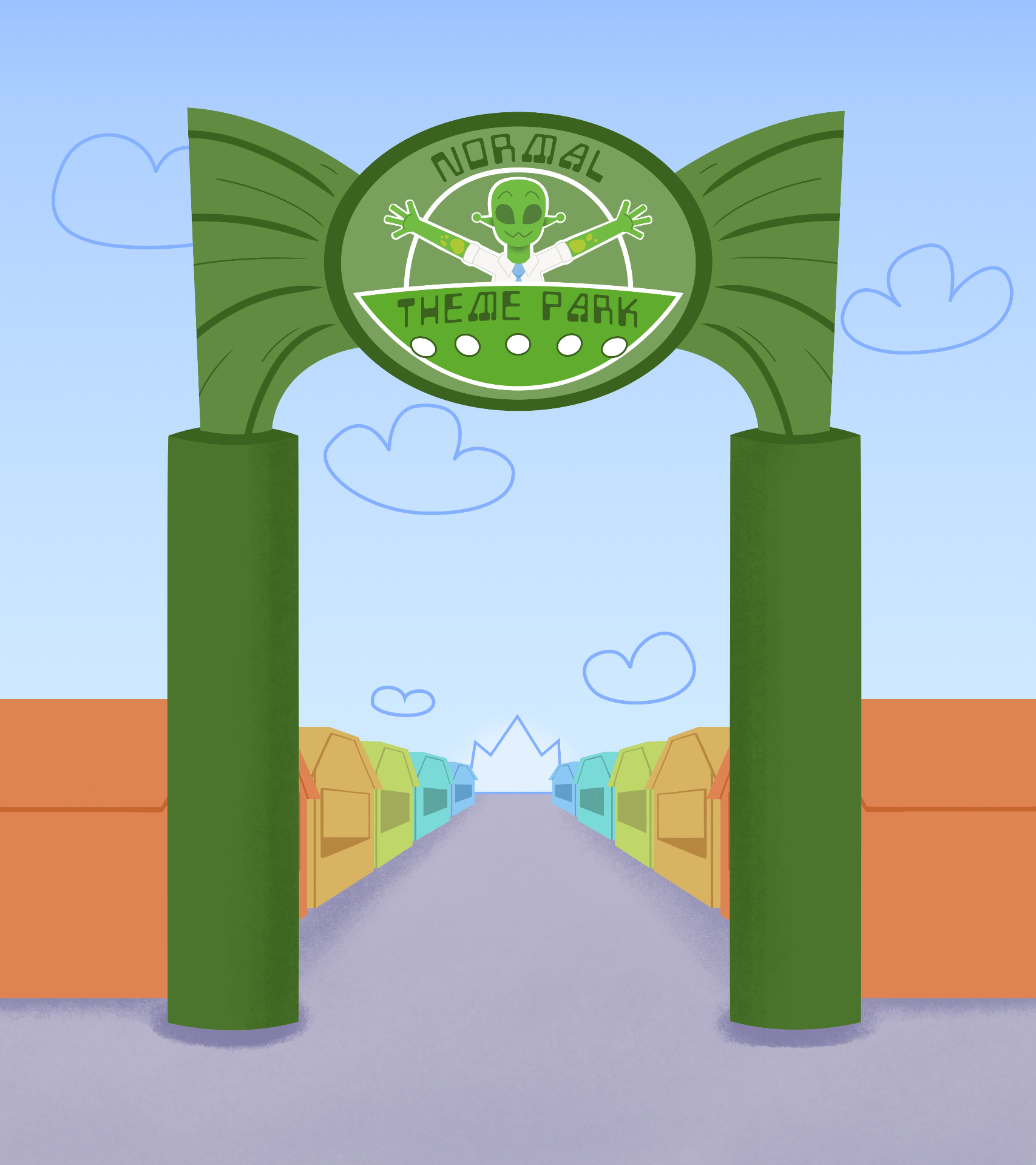
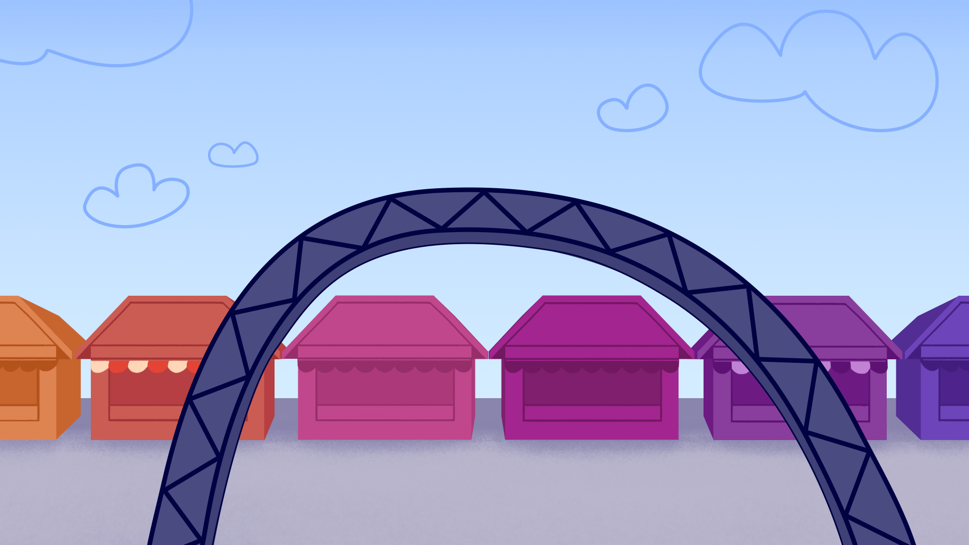
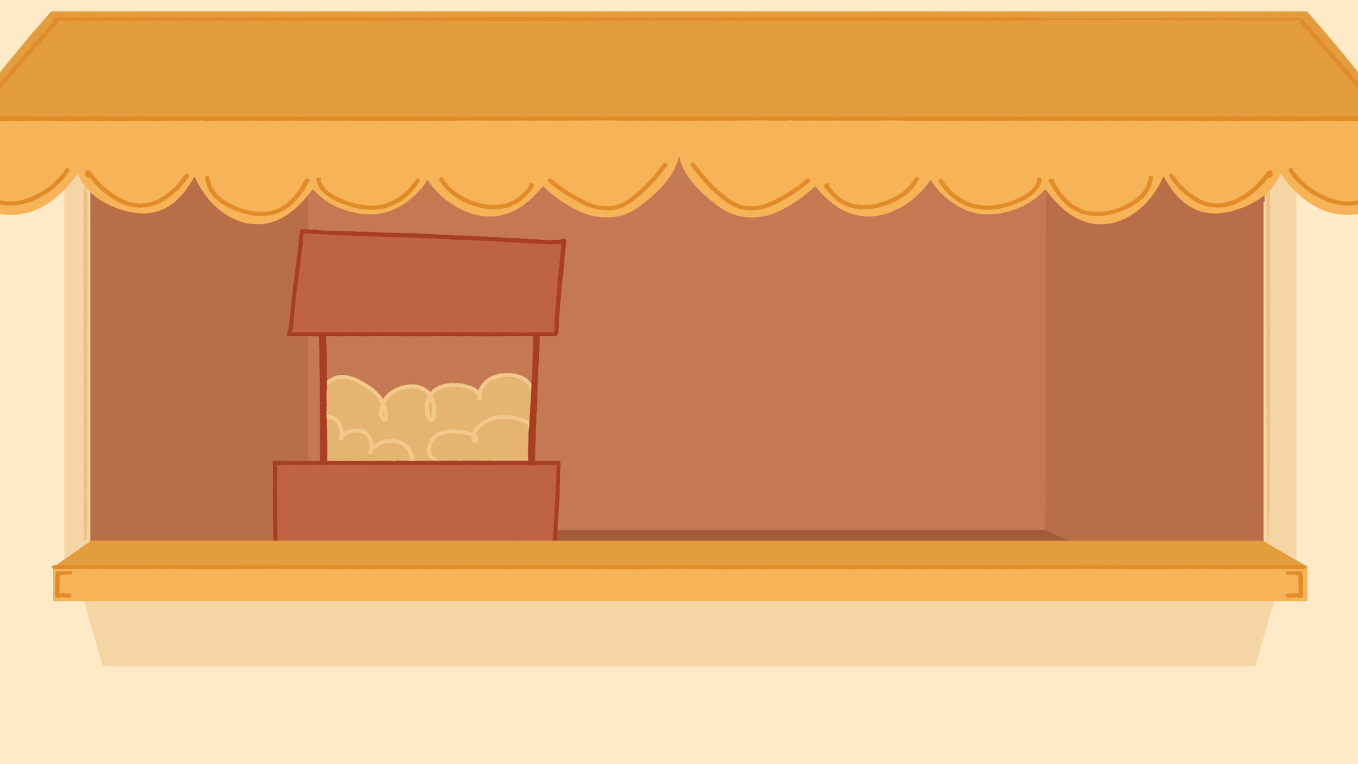
I started designing the first shot background as it requires a pan down camera move, so it needs to be longer. I blocked out simple shapes, designed the park sign, and park entrance based on my thumbnails and concepts. In the first design I struggled with blocking out shadows, the font was hard to read, and the stalls were too light in tone, it needed more contrast.
In my next drafts I applied my fixes, the font and its colour has changed, the shadows are simpler and the stalls have more contrast.


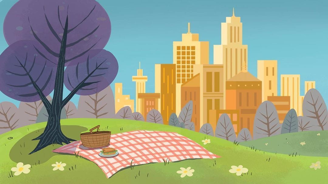
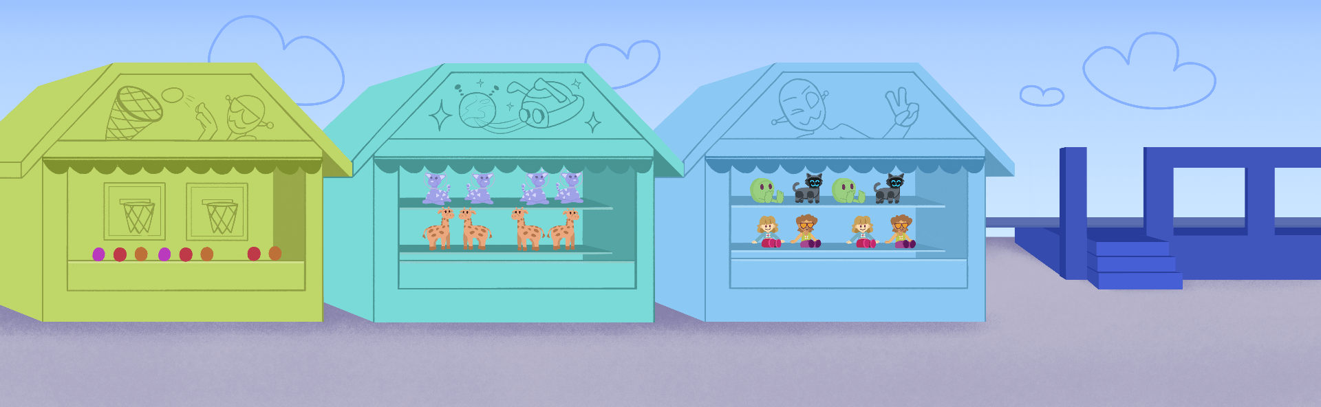
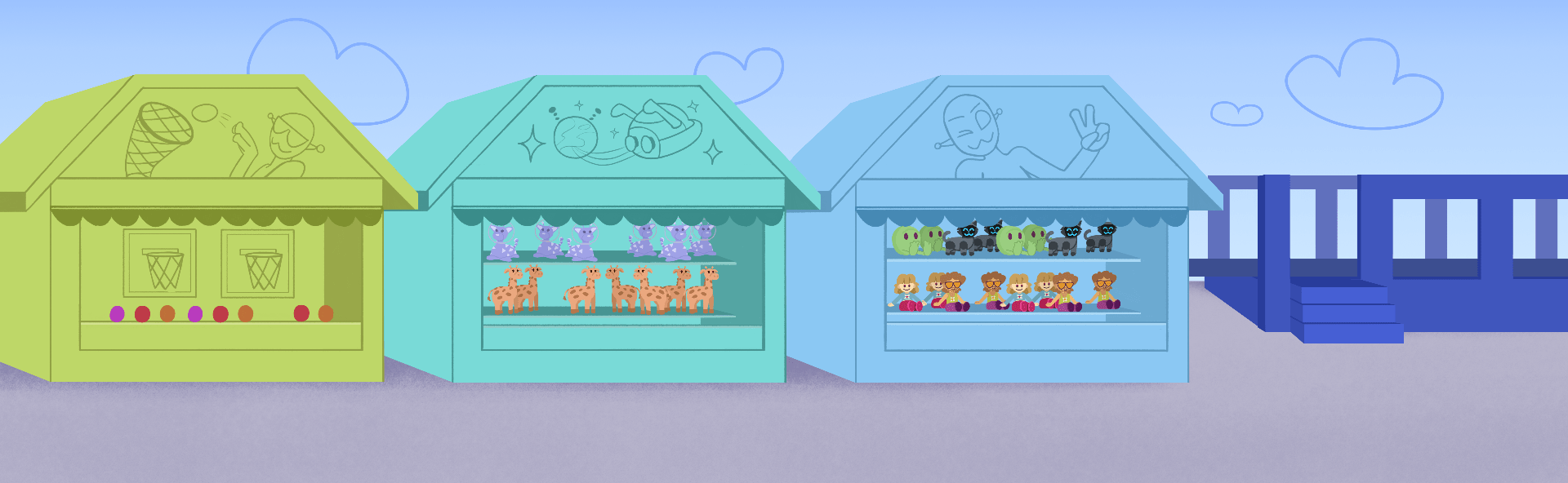
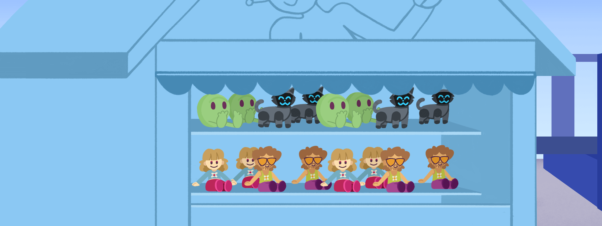
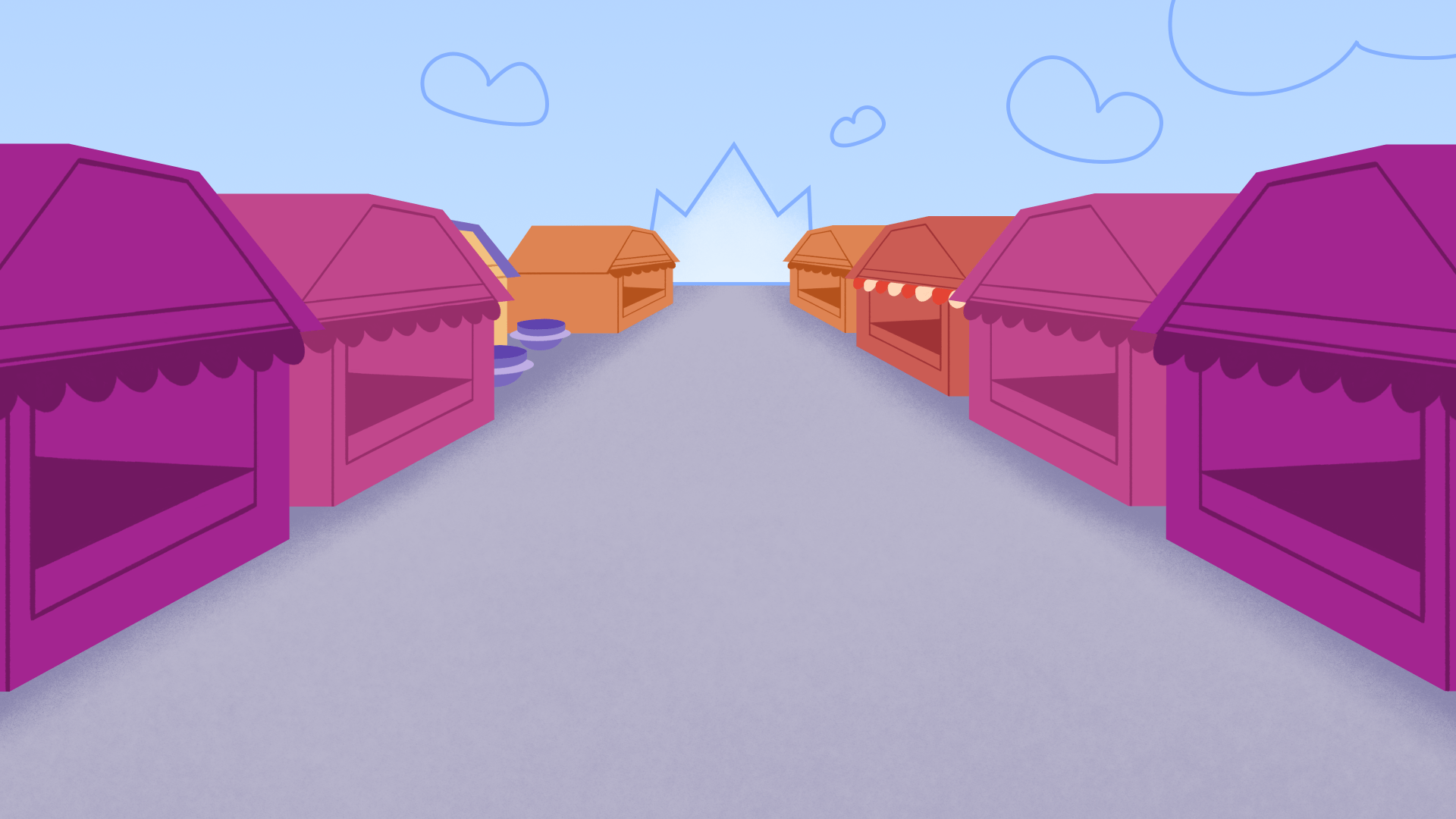
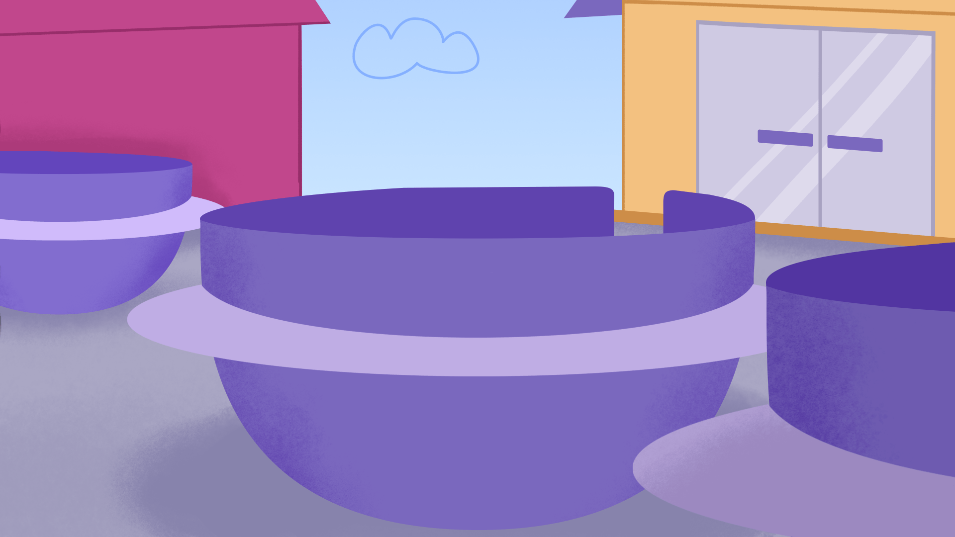
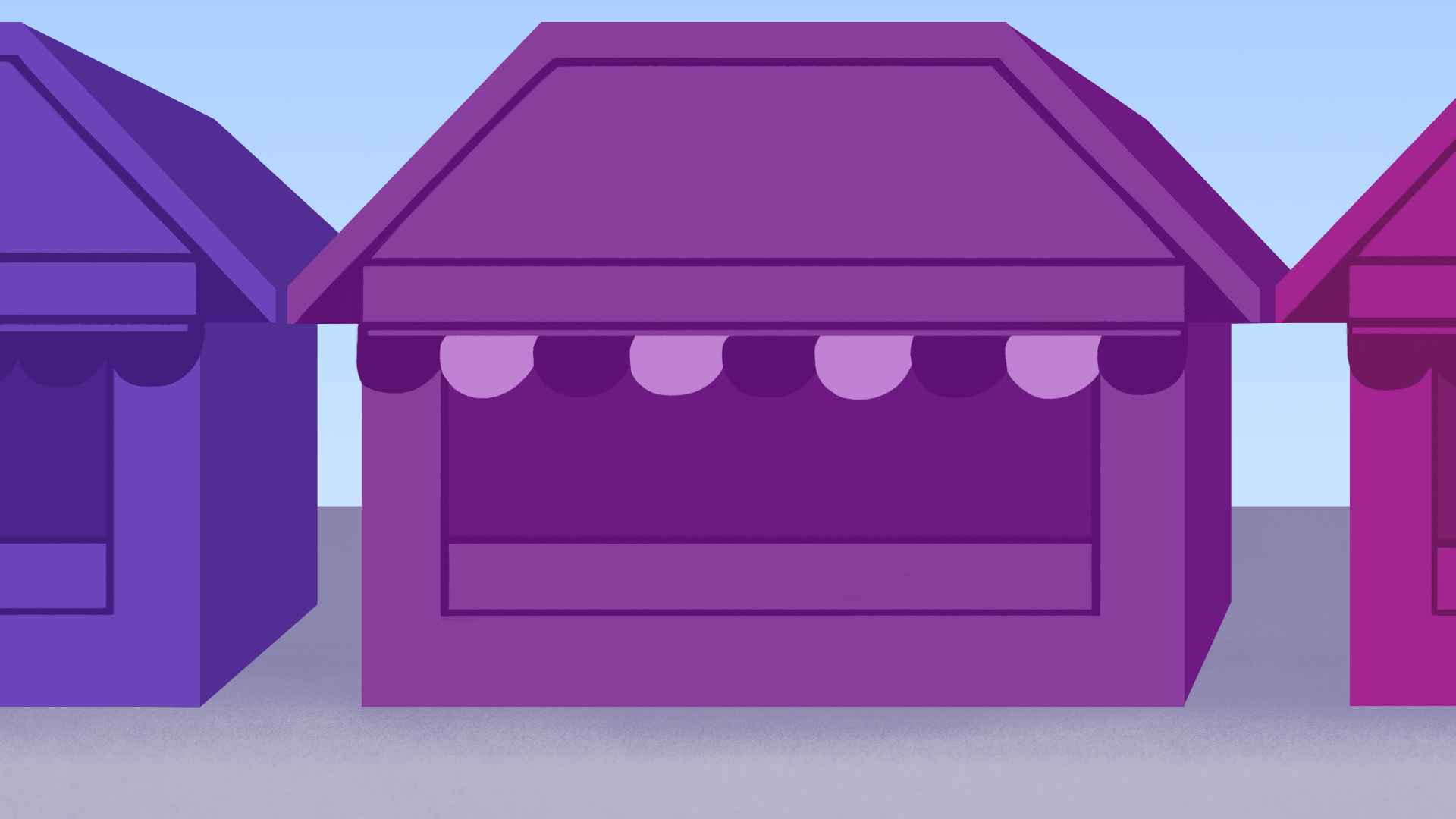
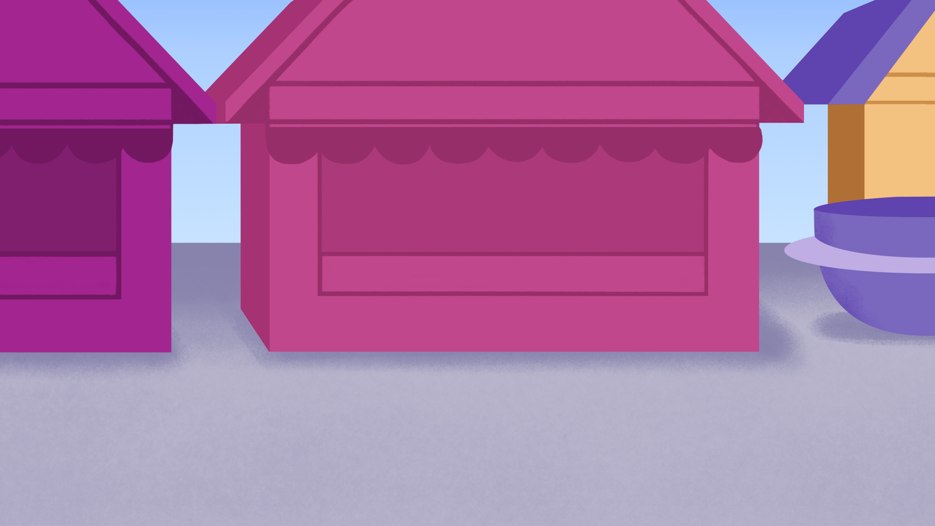
In the next two shots, they are designed to pan from left to right, so they are made wider. I aimed to include lots of detail to establish the theme park vibrance and activities – such as the ball throwing stall, and toy stalls.
It took some time to make this background as it was the first of many drawings of stalls, so I had to make sure these stalls were a good design so I could use them as reference.
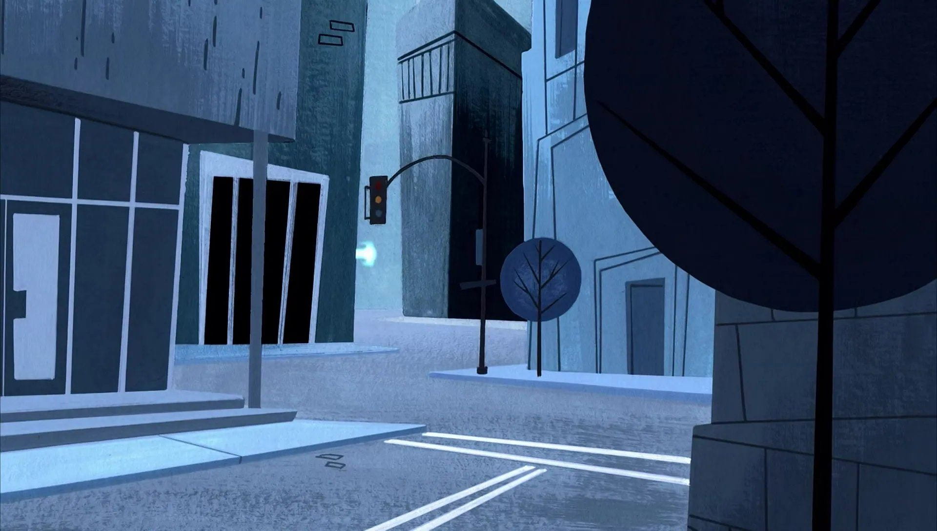
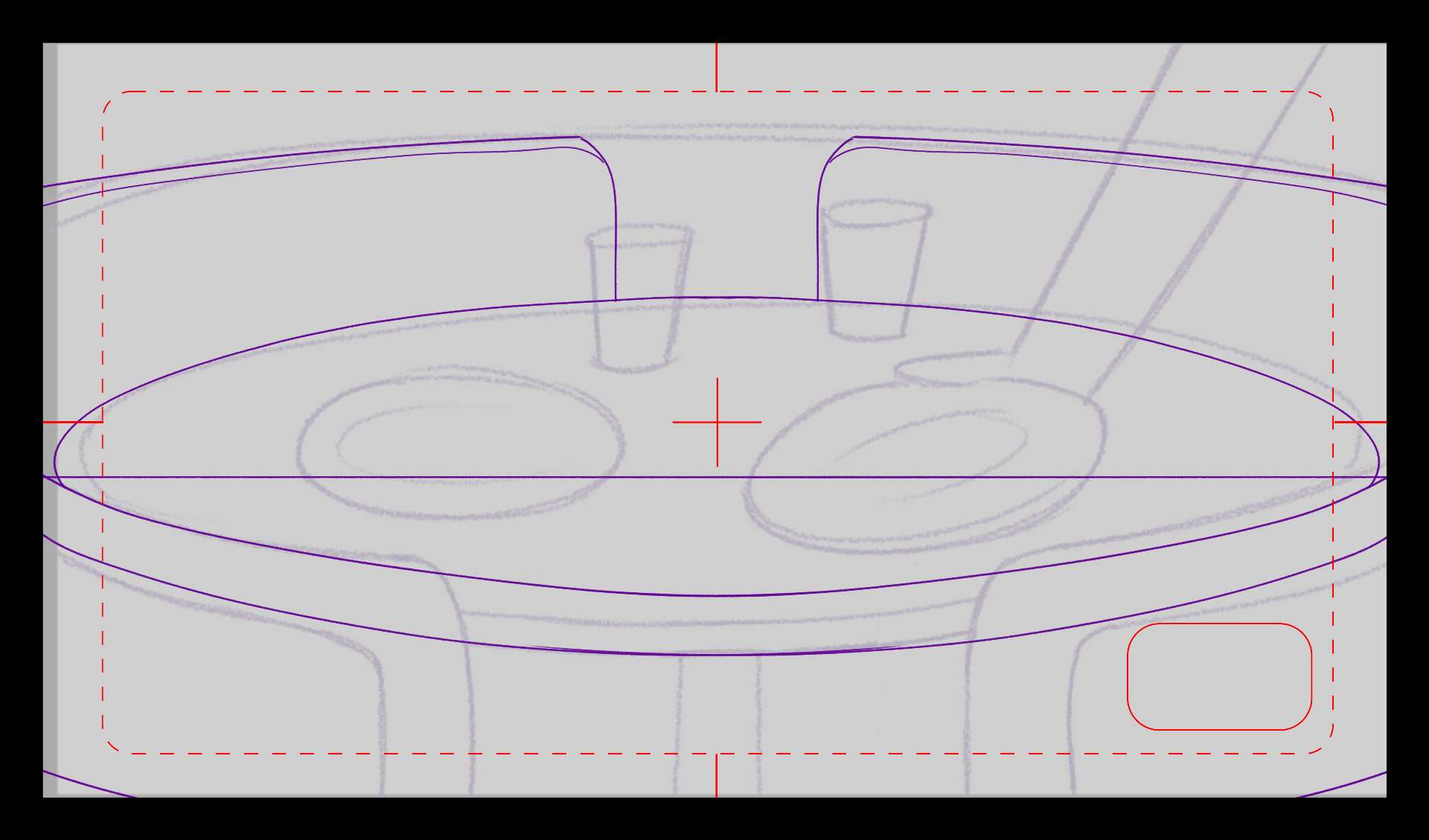
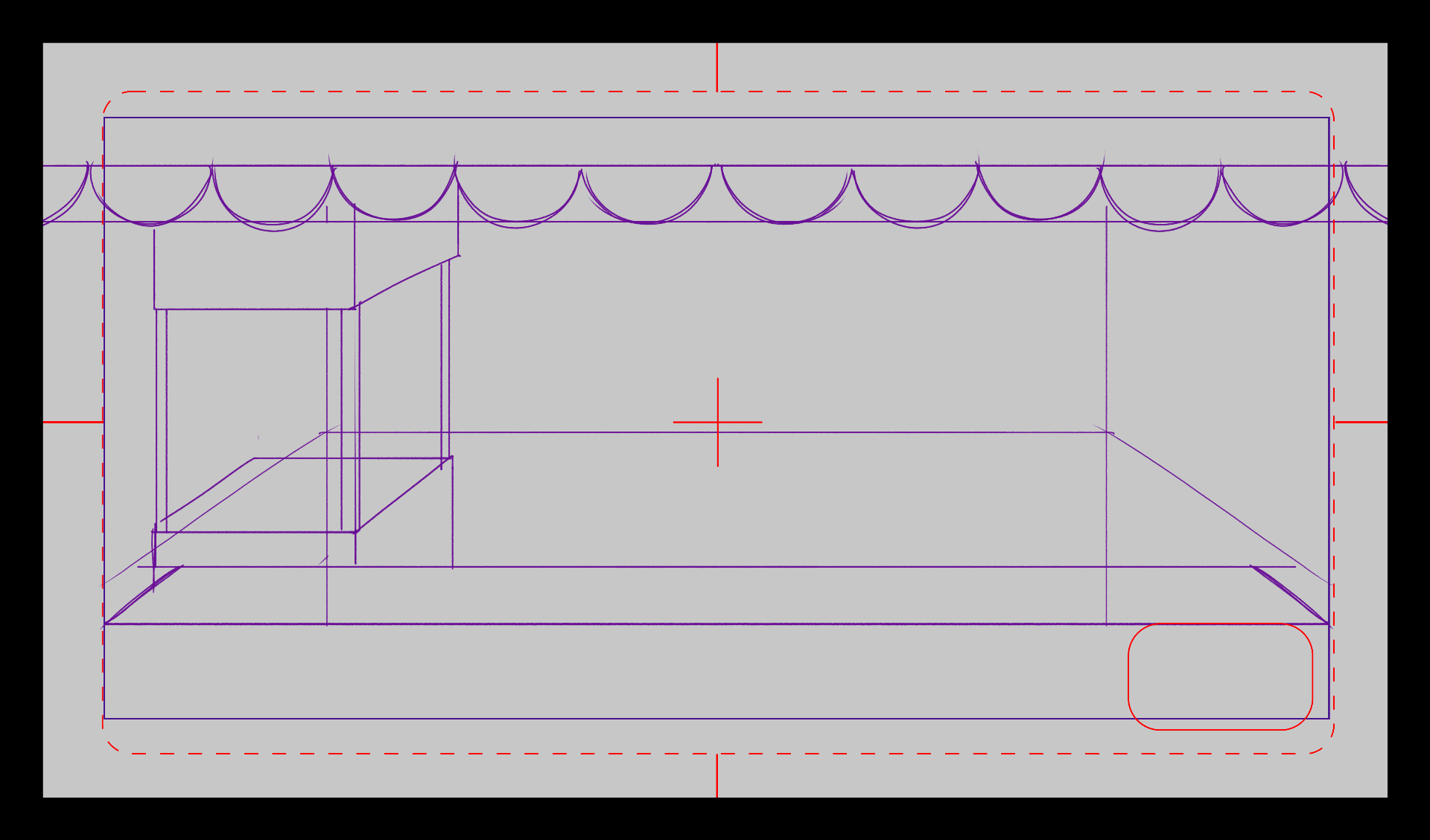
The rest of the backgrounds had the normal ratio of 1920 x 1080 as they are majorly static, or have zoom in/out camera moves. Some designs had gone through 2 versions for fixing up perspective, or from feedback from tutors.


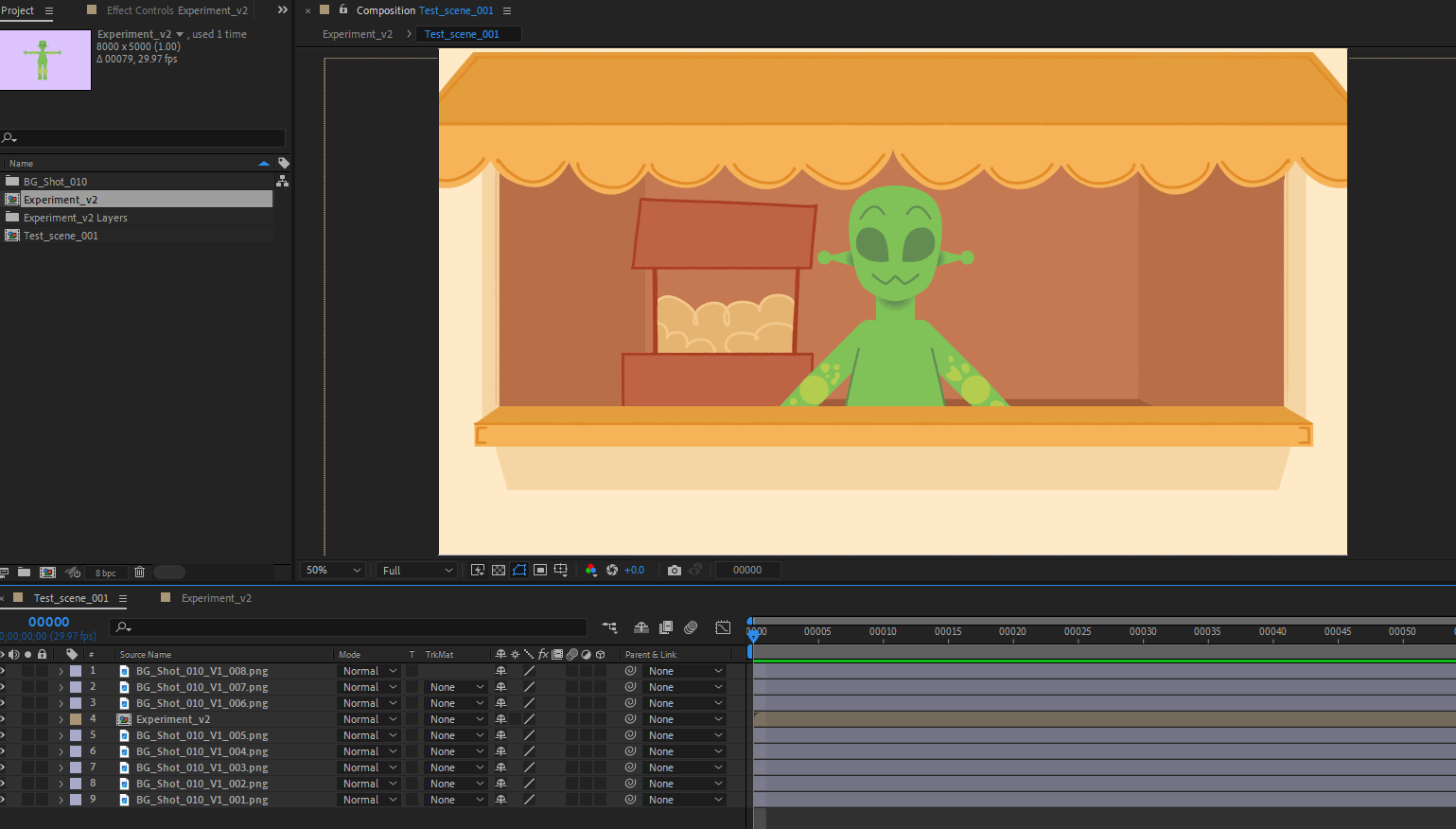
Experimentation
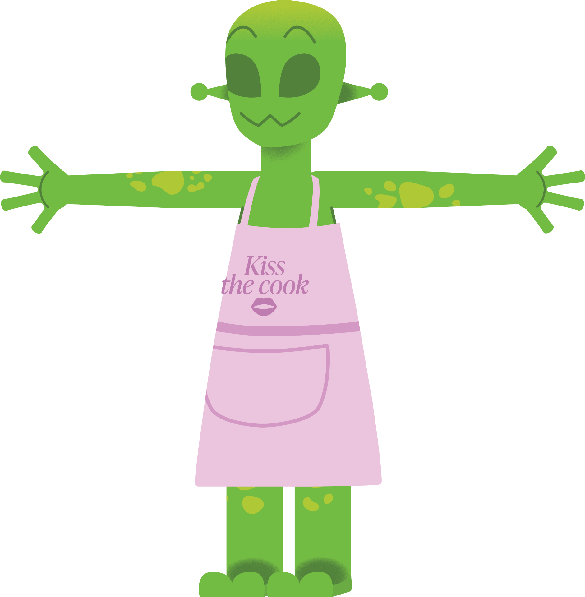
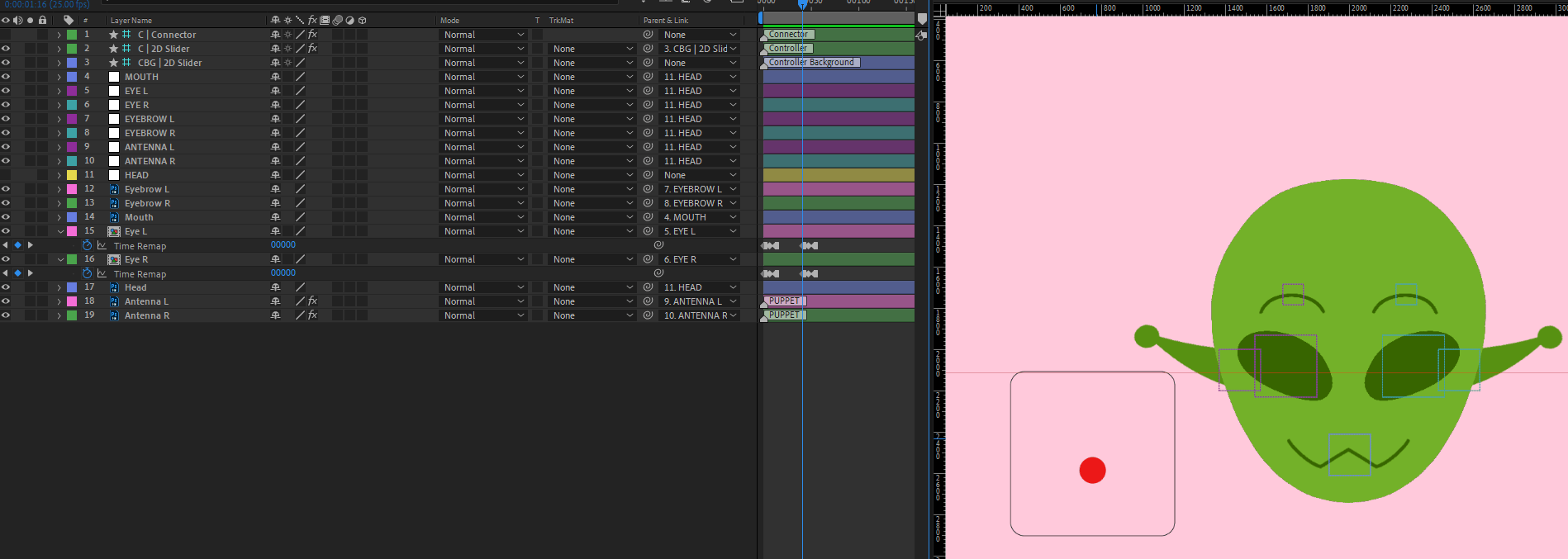
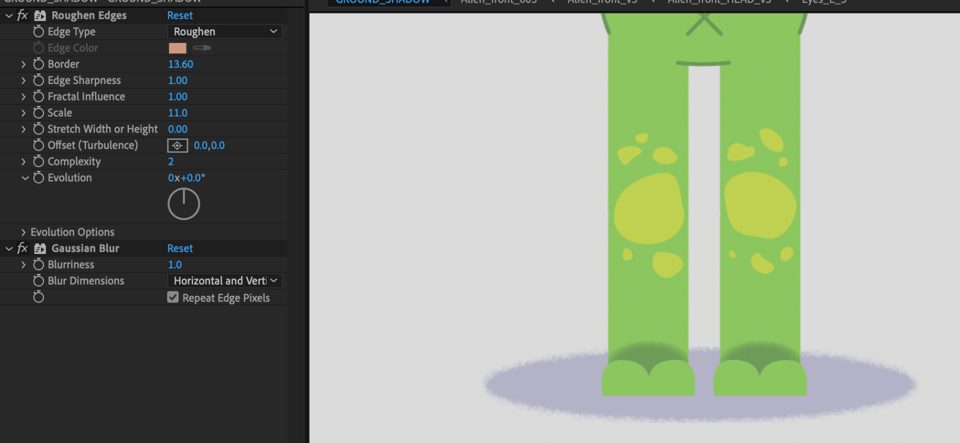
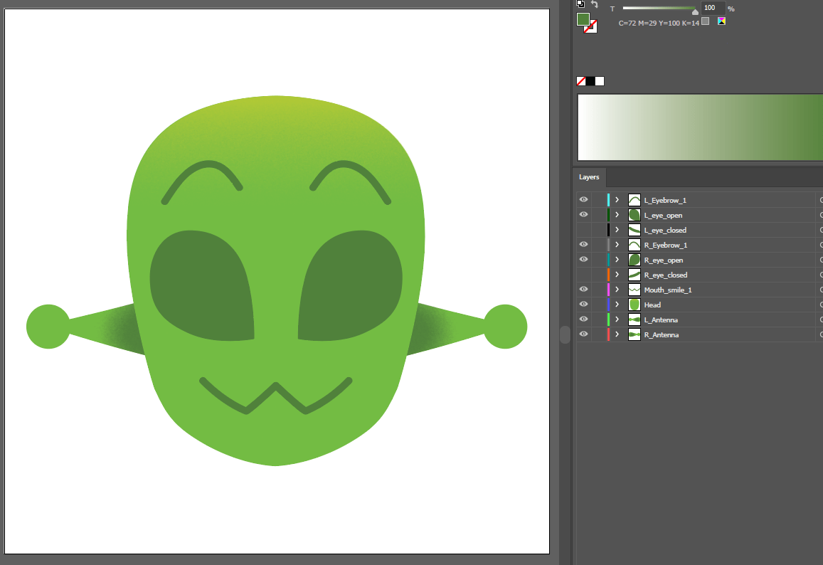
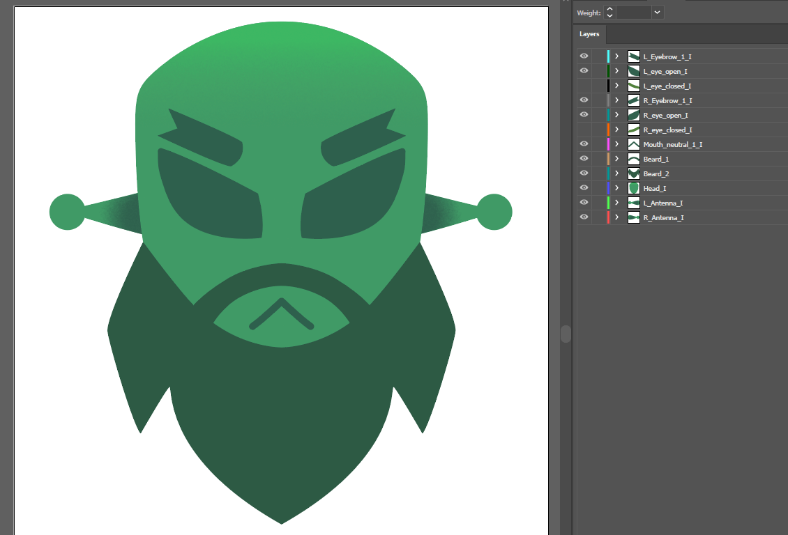
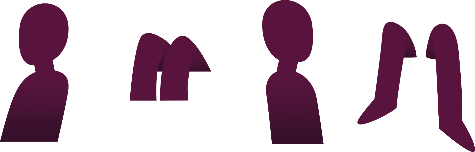
For my experimentation process, I was testing the Illustrator program, as I haven’t used it in a while. I built a test rig applying the same process as I do in Photoshop, but this time with Illustrator tools like the pen tools, masks and gradients – familiarising myself with the program as I went along. In the end I came up with this test build of the Alien.
I like how it looks far, although some parts need mending before I build the proper rig. For example, I need to better test how the torso and hips move together, and I need to make sure each element is its own layer.

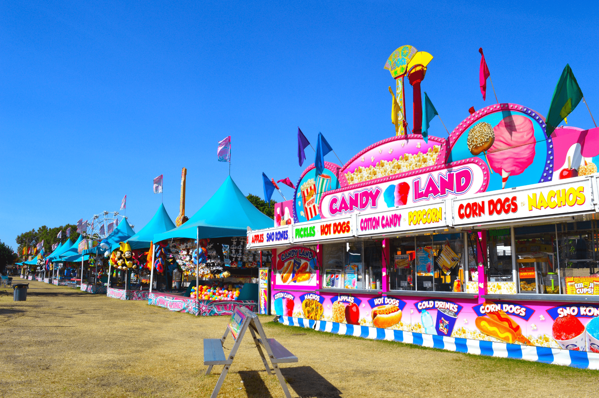
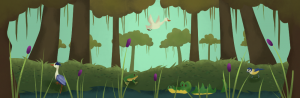
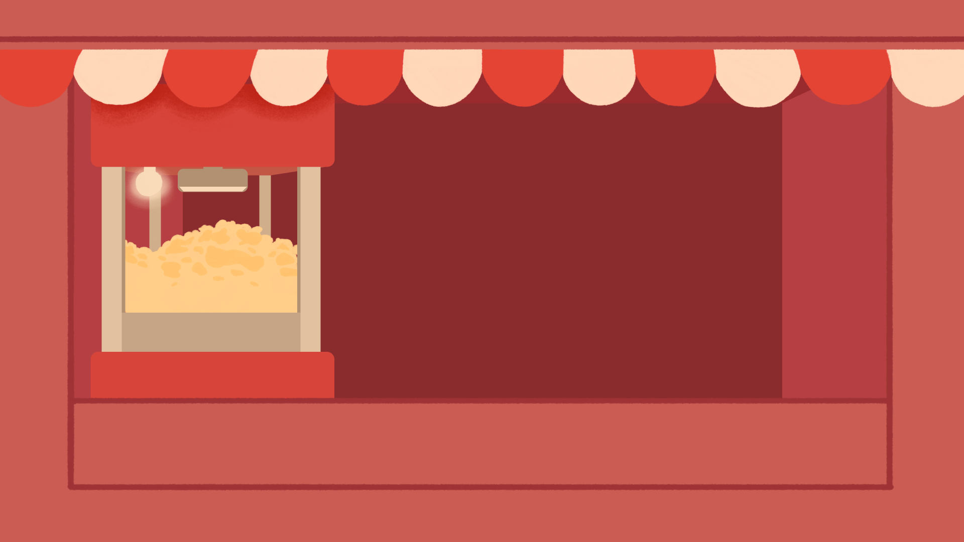
I tried building one background while referencing my inspiration, and this is the result. I am not as happy with this outcome as I think I could pick out better colours, that the popcorn machine is too flat, and I need to experiment and reference more the texture style that my inspiration has. However, I can always improve in the next attempt, and this version will work for now.
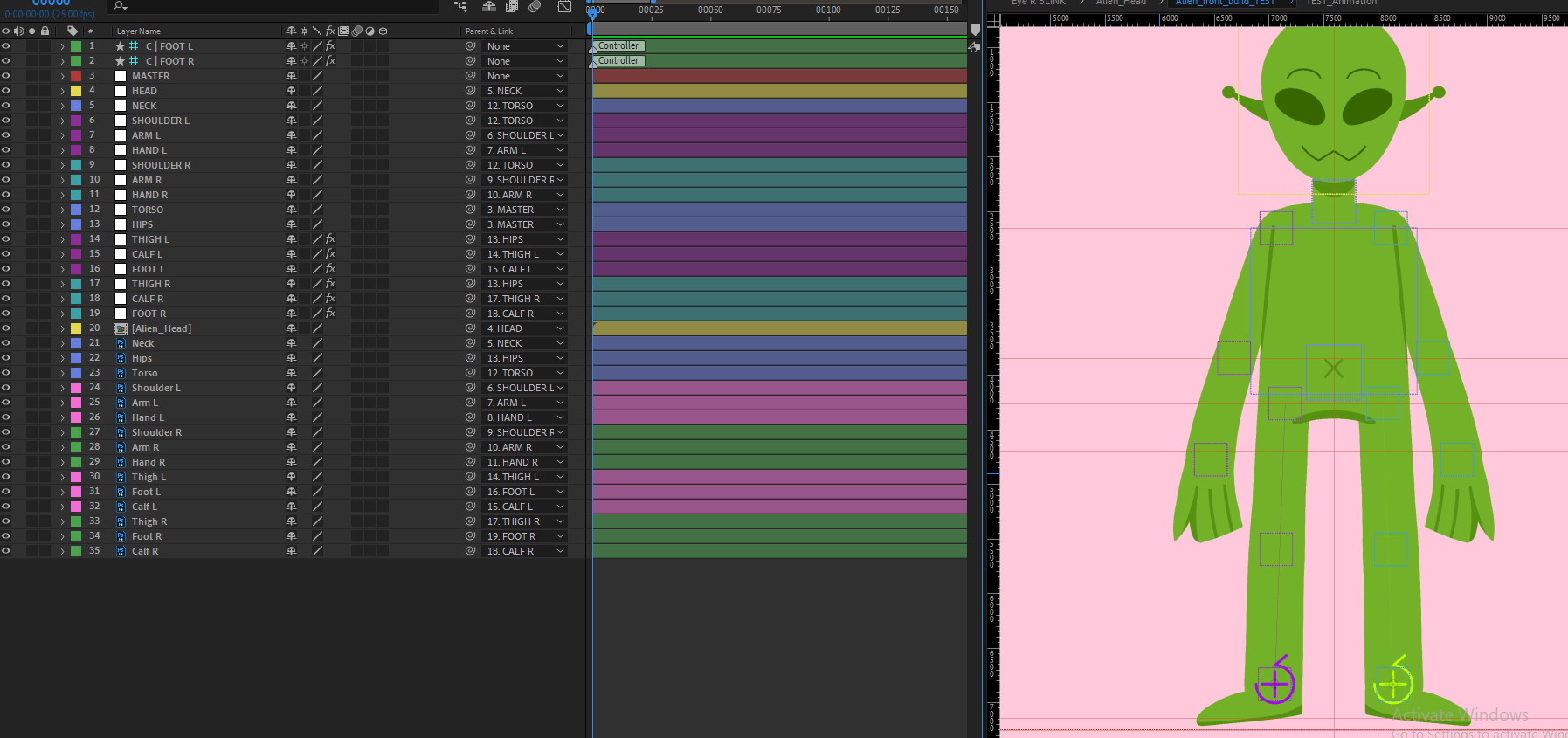
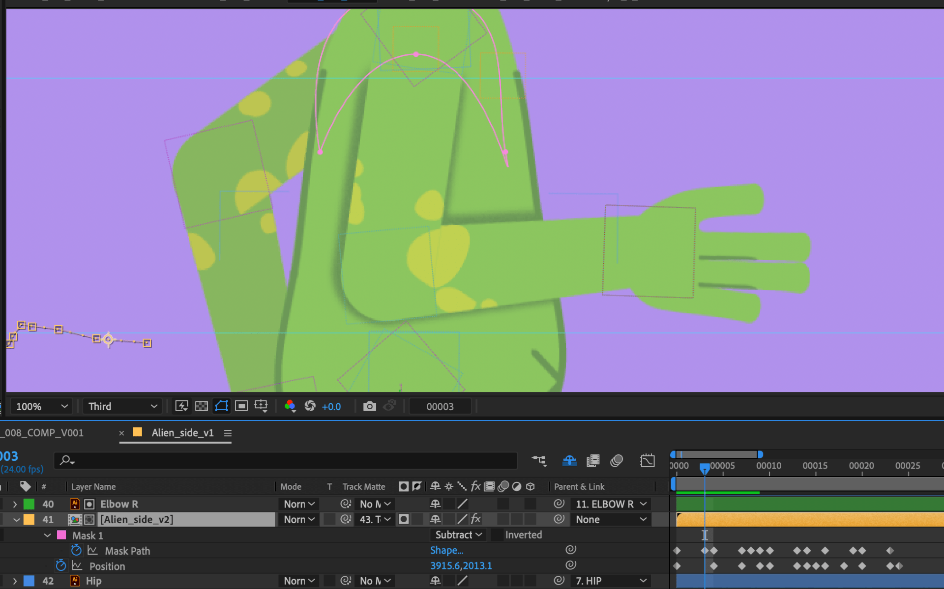
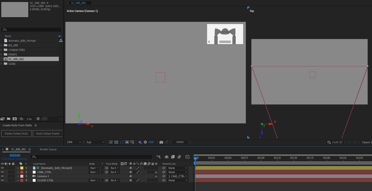
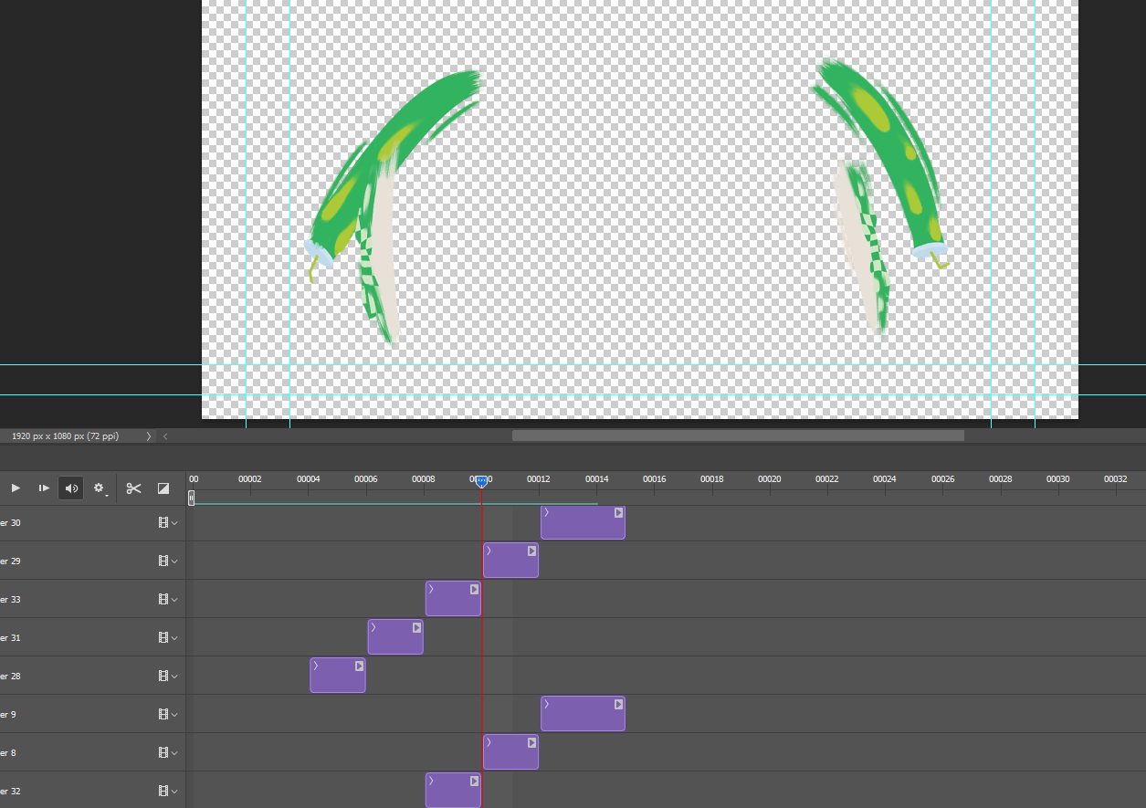
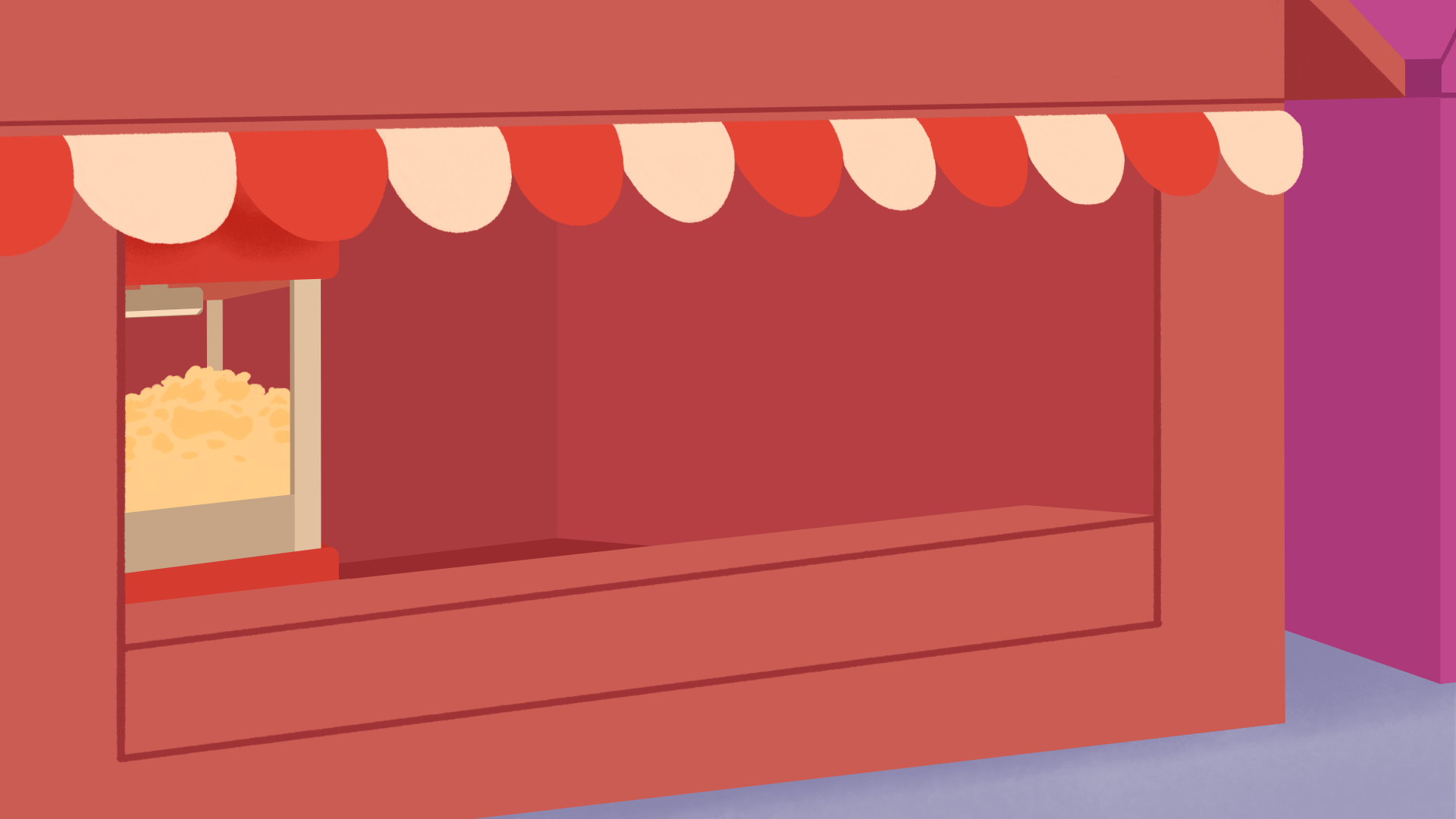
When bringing in the BG to After Effects, I made sure to export each layer as a separate PNG and correctly labelled. I added in the Illustrator rig to the scene, and quickly rigged one of the arms, and the head / neck to test its movement. I am happy with the scene prepping process and how the layout of the scene looks. Hopefully when I get on the right direction for the BG design, this visual will work even better.