Finished Model & Reflection

Here is my finished model uploaded onto Sketchfab.

https://skfb.ly/6ZwHH

200 word reflection:

At the start of this year, I had no knowledge of 3D work at all. This has been a strange challenge to take on for the first time, however I am quite surprised at how quick I managed to pick up on the basics of 3D modelling. I am moderately confident in building a simple 3D model and using skilled techniques I’ve learnt over the weeks. I really liked and feel I did well in building the model from scratch, the detail process in both Maya and Substance Painter, applying textures and altering its style. I feel like I can improve on and learn more about rendering, avoiding issues through combining/connecting shapes, and UV mapping correctly. The advice and guidance I had got from my tutors over the past few weeks had been very helpful in times I was unsure of the next step or stuck with errors. Also, seeing my class’ efforts has inspired me in my progress as most of us are starting 3D for the first time. I feel I have done quite well to produce this mantel clock with the research, reference, design, modelling, and texturing I have gathered and created.


Texturing

Here I will be explaining my process with texturing in the program Substance Painter.

The first thing I were to do after I brought my model into substance was to bake the mesh maps. This will generate each layer, or material attribute that I applied to my model in maya, with multiple mesh maps that determine the edges, curvature, separate objects, shading and more.

I learnt about the process of baking mesh maps from my tutors teachings. Source: Week 04 – Texturing – Exercise 02 – Baking maps for smart materials.mp4


I started off with placing the smart material ‘Gold Damaged’ onto the cold case/clock of my model, as I thought this would suit best. I dragged the material onto the desired place and it was generated onto it as a grouped layer.


I made a new player on the gold case material so that I could paint onto the face of the clock. I used this material ‘Plastic Matte pure’, changed the colour to light beige and turned off height, to paint the colour straight on he face. There were parts I had to erase the white as it got infront of the hour and minute hands. They were simple to erase off on the UV map view.


I wanted to create a glass pane look for around the clock, and with the help of this video I was recommended ‘Substance Glass shader’ I was able to make it quite easily. I placed the smart material, ‘Glass visor’ onto my model. It also guided me to add an opacity option in Texture set settings to get the transparent look. I changed the colour to a more light beige, and went up to the shader settings where I could pick a shader that would enhance the glass even more.

Video source: https://youtu.be/lfufwfE1rA0


I chose the pbr-metal-rough-with-alpha-bending shader, and it gave me the look I have above.


For more detail, I also added another material on top of the glass pane. I added ‘Iron Old’ because it gave a realistic look and had and old, dirty style to it that fitted my idea that this is an old antique clock.


I placed the material down and it gave me the grouped layer of additions. I turned off opacity as it was giving me an ashy, light look that I was not looking for. I also turned off height for a little less texture that there was on the default setting.


This is what the iron old material added to the glass pane. I think this makes it a lot more realistic and believable that it is an old mantel clock.


I added the ‘Steal Painted Clearcoat’ to the roman numerals on my clock. This gave a dark metal look with minimal scratches and texture. I thought this was nice because it makes it look cleaner inside as it doesn’t get as effected by dirt from being old – its more protected inside the clock.


For the silver mechanics and the back support of the clock, I dropped in the material ‘Cobalt Damaged’ to the both of them. I altered their colours, giving the mechanics a grey/silver, and the back support a dark gold colour. I also dropped in the material for both objects ‘Steel Rust Surface’ that gave them a rusty, old look to the model. 


After I brought my mesh into Substance, some objects would not allow painting of any sort to work on them. I asked my tutor Alec about the problem and suggested I should bring every part of my model into the same UV Island, so that substance did got get confused as to where the other parts were. This ended up fixing my problem however I would have had to restart from where I was. I quickly added in what I had done above and continued with my work.


The biggest challenge for my model was attempting to create this carved design onto my work. I got some advice on how to go about this, and learnt about the use of masked layers and the height feature. I made a new layer, added a fill, which I set to only view the height option, then added a black mask – so when I paint the opposite colour, white, onto the model it will alter the stroke if it goes inwards or outwards.

I was achieving for this sun shine symbol which I think turned out very well. I used the symmetry tool to help create this same design on the front and back of the model. I used the radial symmetry tool on the Y axis, with 2 count and 360 angle span, to achieve this effect.


I had also made this design on the top of my model, which also looks very nice. I used the same radial symmetry tool to achieve this effect. I used the Y axis, with 6 count and 360 angle. To erase any part, I change my paint tool to black on the greyscale. I did this to erase a ring around the bell to separate them and the design for a cleaner look.


I had added some extra detail to my model with a collection of scratch brushes. I picked a side of the clock to add some scratches around the rim and base of the clock to give it a little more backstory and realism – it could also provoke questions: Where has the clock been? Was it dragged about? etc.


Grouping all my UVs into one UV Island allowed me to create this detail. Here I used this hard surface material ‘Screw Slotted Round’ to give the idea that bolts are holding the clock together. I created it by making a new layer, selecting everything off

except for normal, and dragged the material onto the normal area, which then appeared as the paint brush symbol.


I looked at an oval mantel clock for reference of where bolts are placed on and around a clock. This gave me an overall idea and I placed some bolts where I thought worked on the back support. I also placed bolts on the top and bottom of each pillar too as similar to the reference photo.


After all this, I went in to fix up and clean up anything I could, such as the placement of layers, the position of the scratches, the volume of height, rough, and metal in some textures etc. and this is what I have as a result. I looked at render view to see how it turned out and Im quite proud of it as my first big modelling project!


To bring this model into Sketchfab, I would need to export my textures from each of the maps on every part of the object. I did this by going onto file -export textures and altering the settings. I set the output template to ‘PBR Metallic Roughness’ the file type to ‘png’ and the padding to ‘Dilation – default background colour’ with 7 pixels.


I could also go into the individual UV parts of the model and choose which maps I wanted to output. I chose all of them In case I missed any for uploading onto Sketchfab.


Now I can go onto sketchfab and upload the plain fbx file of my model I had before

 to upload onto Substance. Once it is uploaded I could edit the 3D settings. I imported all the textures onto the material settings, and placed the right ones to their parts in the model.

E.g. BaseColour textures go into the Colour section, Metallic goes into the Metalness section, Rough goes into the Roughness section, and Normal goes into theNormal/Bump map section.


I also altered a few settings on lighting to present it well and place it in an environment that suits. I turned on the 3 direction lights and placed them were I wanted, and I picked out the ‘Glazed patio by Restaurant’ environment from Sketchfab’s collection to enhance the models intensity, shadows and colours.


After this, my model was complete! It can be viewed through this link: https://skfb.ly/6ZwHH

Modelling, UV Mapping

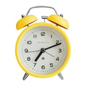
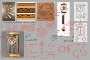
Here I will be explaining my process of modelling and UV mapping my Mantel Clock model.


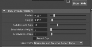
I started the model off by placing down the biggest shapes from the case of the clock, and the actual clock. At first I made these shapes with 20+ sub divisions so that I had enough edges to work with to sculpt into the shape as seen in the reference. (I would soon change these shapes later) This was the technique I used in both the vase challenge and the table challenge.

Source: Weekly Modelling Challenges – Week 1 – Vase / Jug modelling challenge, Week 2 Table modelling challenge.


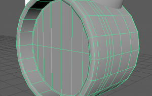
As done before for the clock, I placed down a cylinder shape, copied and pasted it, made the copy smaller and clashed it with the original shape to extrude a part in the middle for the face of the clock, with the boolean – difference tool.


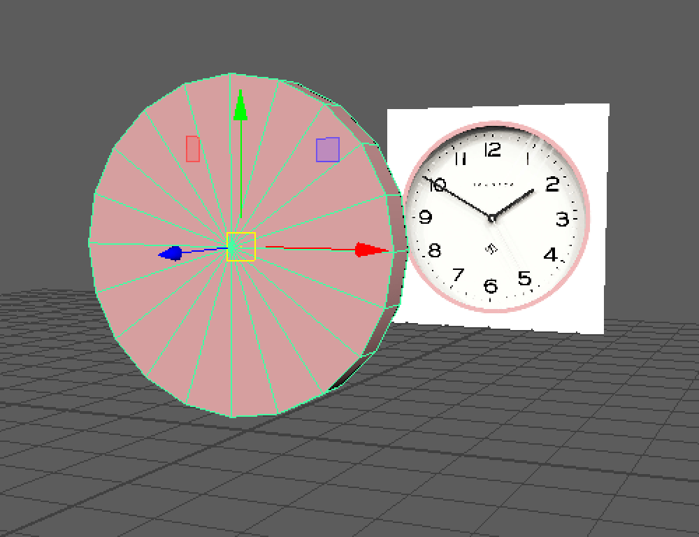
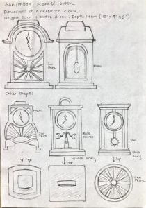
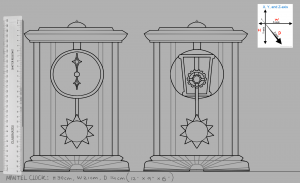
I made sure to try keep each object in the same position of the scene, and to follow the measurements I decided on to give the clock a natural proportion.


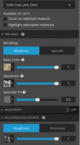
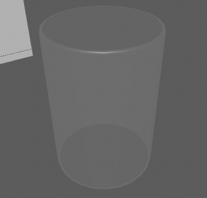
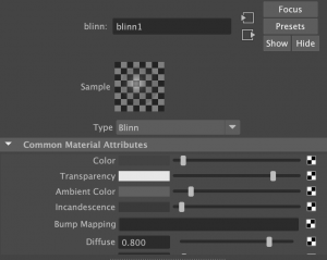
Here I added a hollow cylinder shape to create the glass pane. 
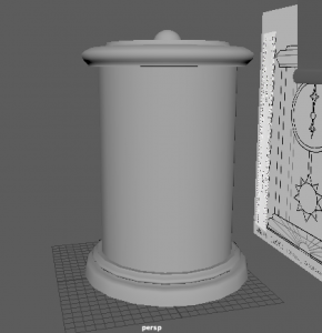
Immediately I assigned this cylinder a new material (blinn) so that I could work with designing a glass material. I altered the settings such as the colour, transparency and specular shading to give the glass effect.


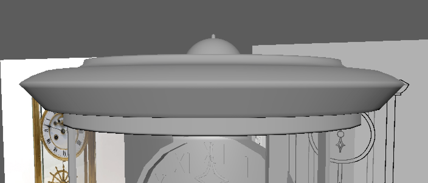
After these, I started to add in little details. The bell on top was a simple sphere that I cut in half and placed on the top of the clock.


I added hour and minute hands in the same design as my reference, in the shape of shining diamond stars. I used a thin cube and used the mutli-cut tool that adds divisions to scale the shape.


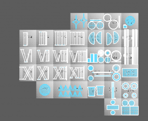
I also made multiple roman numerals for the numbers on the clock. I followed a sheet that helped me with each numeral and I added them onto the face of the clock.


I made the 1, 5 and 10 separately and then copy – pasted how many was needed for each other number.


As I said before, I was going to restart the base shapes I made at the start. I wanted to start them with a more simpler style and it would eventually become easier to work on as it had been before hand etc. the many divisions was too much to work on, the position and scale got confusing.

I remade them and kept the divisions at 12 each. I eventually made many more objects have 12 divisions as they fit well when positioned together etc. the rim around the glass pane, the top and bottom base, and the pillars.


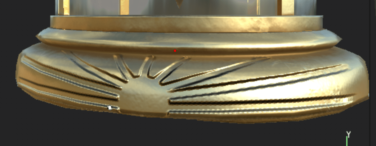
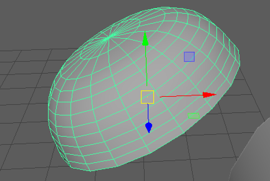
I then went on to make the sun inside the clock. This took many tries to find the right style but I found I could use a low poly sphere (shaped like an oval from the side) and added similar shaped cones around the base to make the sun rays.


It was a challenge to get the rays in perfect place from its opposite as best as I could. I made use of the translate settings on the right of my screen to determine where they are placed. I made sure the sun base was reset in the middle of the clock first, then I worked on the rays. I also worked on the degrees settings to flip the rays around when I copy – pasted them to the other side.


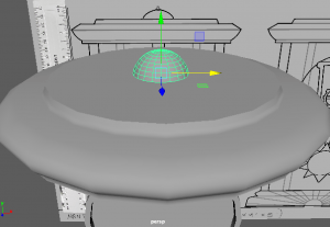
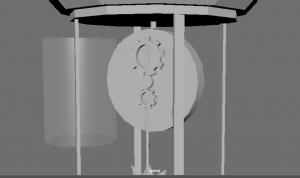
At this part, this is what my clock looks like so far, along with what is included in the outliner.


Here I was working on the back of the clock, so that in reality, the clock inside would work like a pendulum clock with the sun attached to a rod, connected to the back/middle of the clock, being run by moving gears.


I made the cogs with the Torus shape, turned down the divisions and rotated the object to have faces pointing horizontally. I also selected faces around the side, leaving a space between each, then extruded them outwards to make the shapes of a gear.


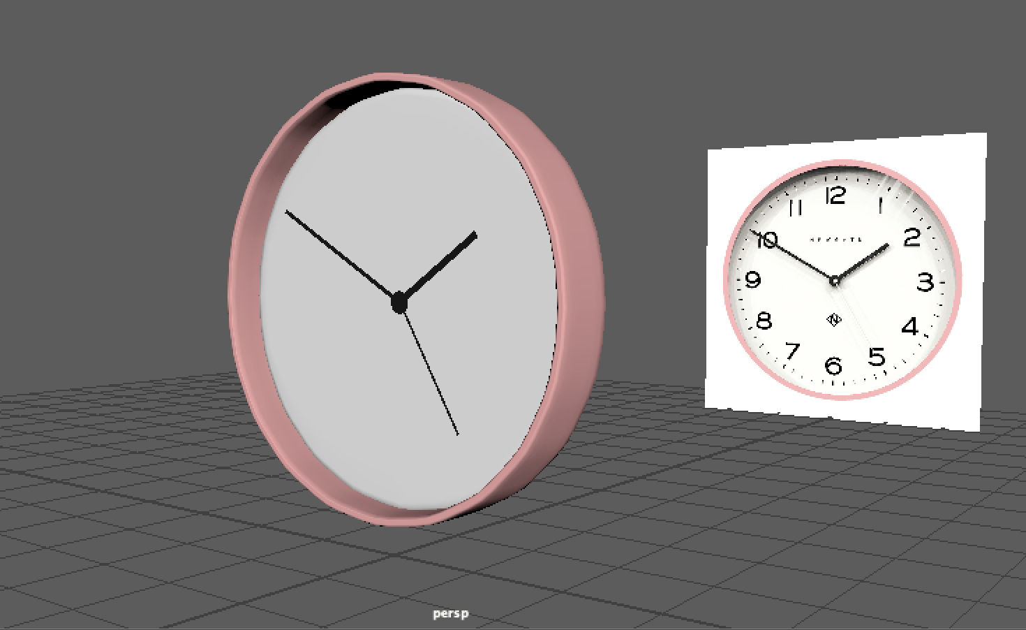
Once my shapes were made, I went onto smoothing most of the shapes to give them a nicer, finished look for the end result. As you can see beforehand, the shapes such as the hour hand is quite boxy.


Here you can see the smooth setting I clicked on to give my shapes this look. The hour hand now looks more realistic for the look of a clock.


I continued doing this with objects such as the sun, rods in the clock, the glass pane and the top and bottom base.

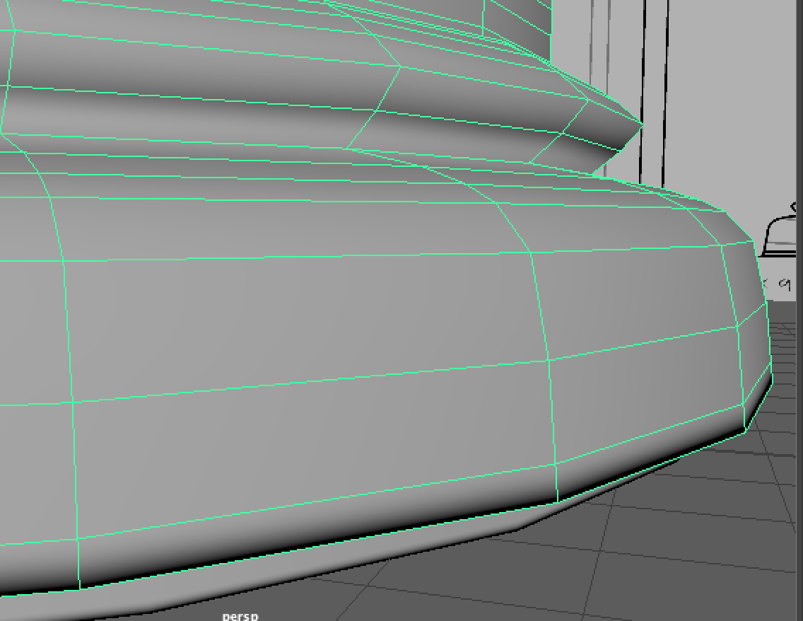
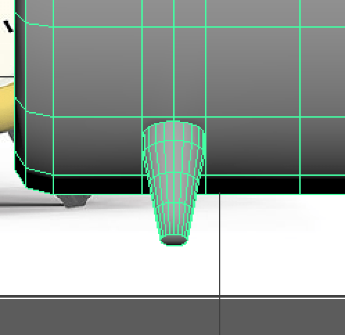
The sun smoothed pretty well, however for the cones, I had to add an extra edge loop on the bottom of the cone, where it sits on the sun base, to allow the smoothing feature to work better.

Before I did this, the smoothing made the cones look like a circle with two points on the top and bottom.


Here are the base shapes when they are smoothed.


During this time, I made sure to add a stand for the bottom of the clock like I designed in my reference. I quickly cut a cylinder shape in half,

and scaled them to the shape of the base and placed beneath the clock.


As I mentioned before for the cones, adding some more edge loops with the multi-cut tool to the edge of a face etc. like the last edge loop in the object to the left, will emphasise the edge more than it usually would when smoothed.


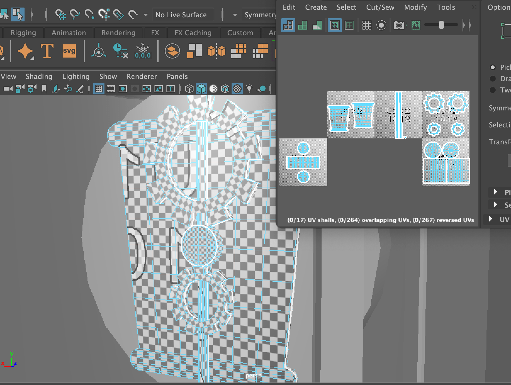
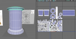
After all this, I started to UV map the clock model.

Before I got Henry’s help, which I asked for later on, I was mainly using the planar tool to plot each UV part of the object onto the UV editor. I made use of the x, y and z axis to place them down at a position that presents the parts well.


I had made sure that my UV parts were positioned well and not being stretched like I had seen on the checkered texture. However, around this time, I could have been unfolding the UVs more rather than making them perfectly straight.


I did not know this at the time, but I made the mistake of placing UVs across two UV islands which would end up confusing the UV map altogether. I would eventually fix this problem later on.


At the time, I did think that separating each part of the model into separate UV islands was the right idea, however I learnt that we are able to group all the parts together into one UV island that will share the same material attribute.


I decided to contact my tutor Henry for some help because when I was exporting the model, It was not working properly on Substance, so I couldn’t move forward with my work. Henry was a great help and pointed out the two biggest errors in my model, that I went onto fix. They were the Mesh and the UV.


In the mesh, I had accidentally produced extra faces/edges inside the top and bottom base of the clock. They had caused non-manifold geometry. All I had to do was zoom inside the part and delete these faces and edges that were effecting the mesh.


The next error was the UV mapping. I learnt from Henry that I had not used an option that would have helped me determine which UVs were flipped, not unfolded etc. By clicking to where the arrow is pointing on the left, I would get the red and blue highlighting on the right.


Henry recommended that I use the UV editing workspace that provided me with many more options and easy access to all the UV features. I found this very helpful during the UV process.


As you can see, there were many parts highlighted in red, so there was lots to do. I noticed the sun was not UV mapped well enough so I started with it. I cut around the edge base, and both sides of the cone, to let it unfold, giving me two triangles and a circle base on the UV editor. I did this for every triangle, then I cut in half the sun base and also unfolded it.


I went back to the roman numerals as they were not unfolded properly. I selected the whole number, unfolded them and clicked layout to organise them in their UV Islands. Once I had finished them all I brought them all into one UV island as they will all share the same texture.


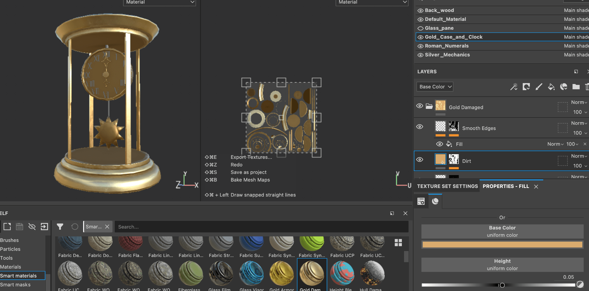
I had many more parts to flip, unfold and layout. However I was able to complete the UV mapping. Here you can see I organised the parts into what texture they will be sharing. Etc. the case, the clock, the sun and the hour/minute hands will all have a gold/brass material. However, this will cause a little problem again in Substance later on. I would have to group every part into the one UV island to fix the problem. (This is explained in ‘Texturing’)

Before                                                                                                        After


As soon as I finished all this, I cleaned up my model just in case I missed anything. I gave every group of parts a lambert material that was named after the texture look I wanted to make for it. After this I was ready to export and bring my model into Substance Painter.


Practicing

As I have been planning the design and model of my mantel clock, I have also been practicing simple clocks on Maya before I go into the real model. This is so that I have a much better understanding of what I am working with, how I can make common features of a clock and be prepared to implement my skills into the final model.


I started with this simple round clock to get a overall idea of what a clock is shaped like and how I can bring its elements into a 3D model. I gathered two perspectives of the image to insure its length and depth of the frame.


Before I started I experimented with material attributes too. I added a pink colour to the base, a white colour for the face of the clock and then a black colour for the clock hands.

To get the extruded inside I copied and pasted the same disc shape and scaled it a bit smaller, then brought it inside the bigger disc shape to then use the boolean-difference tool that extrudes the face of the disc.


I then added a face inside the extruded part and combined the two shapes together, then created hands with the plane shapes, and followed the reference photo, to get an accurate size and proportion of the hands. And it was finished!


I also challenged myself with another clock design. This time it was an alarm clock. Again I picked out two perspectives of the same clock to work from.


I started with the same process of using the boolean-difference tool to create the clock base and face. I used the bevel tool on the edges of the base (front) to look more rounded and smoother. I also bevelled the middle face to take out any triangles or N-GONS, and make more polygon faces for simpler mesh.


I moved onto the bell body as I figured it would take time to make. I made a sphere shape and cut it in half by deleting the bottom half, then used the fill hole tool to fix the bottom.


I used the vertex mode and used the multi-cut tool to add more vertices to the shape to scale it into how the bell looked in the reference photo. After this I added the middle bar and top part to complete the bells on each side of the clock.


Adding more details included the legs of the clock, the bell ringer, the handle etc. I made a cylinder shape to start making the leg. I used the scale tool to thin the bottom part as it was on the reference. I then connected the leg to the clock by adding additional edges to let it connect to as it keeps its initial proportion.


The handle was quite difficult to make however I htought of the idea of making a curve line and filling it in with polygon faces. This was an interesting approach although I could work on it as the shape stays in a black shade unfortunately. I’ll see for next time how I can avoid this issue.

Here is the clock finished! I don’t have lots of time to add any materials, or try out UV mapping but I have learnt how to do those in other tasks.

Hopefully with these practices I can produce a great clock design and follow the necessary steps to create a 3D model!


Planning

For my assignment, ‘Intro to 3D Modelling’ I will be tasked to model, UV unwrap, texture and real-time render one of the following:

  • Windmill
  • Mantel Clock
  • Treasure chest & treasure
  • Sword & shield
  • Sci-Fi door
  • Old Well
  • Magic Witch / Wizard Staff


I have chosen to model a Mantel Clock for this task. From week 1 I have been researching existing mantel clocks, designing new mantel clock designs and getting familiar with Maya to practice modelling simple clocks.


First of all, I google searched some interesting mantel clock designs and brought them into one mood board. I organised them into different categories as some of their themes fit together. I picked out which ones I liked most them wrote about their features that I could point out from them.

Source: All images found through Google, Pinterest or Etsy.


On the left page I started drawing out these clocks to see how I liked the design and see if I can create a new design using their features. On the right page are some designs I made as first drafts. At this point I was focusing on what I needed to include in my clock design.

‘This clock should include:

  • a story or meaning
  • a stylistic design or a realistic design
  • a style to fit into a certain theme or decor’


I moved onto a different approach and made three Pinterest mood-boards of three different room decor styles that I could design clocks for. This made it much easier to project where my clock would be and think of much more designs and ideas.

Shown below are the three different decor styles.

The first one consists of quirky, clay-like, bright coloured objects in a trendy, neat room.

The second one consists of old-fashioned antiques and old style furniture in a dark-academia styled room.

The third one consists of retro/90s themed decor, records and posters all around the walls and old electronics in a bright, filled-up room.

Website: Pinterest

From these mood-boards I created a lot more designs to gather inspiration, variety and unique ideas. I organised my designs into the different mood-board themes and picked out my favourites.


From each theme I wanted to bring out the features and things you would see in the type of room style. As well as this I took in inspiration from my first reference photos as they helped give me an idea of a realistic clock shape and how I can implement into another style. From these collection of clocks my favourites, and those I can work on to create a nice final design for, are the tower/wavy house clock and the sun/moon mantel clock.


Here I made more concepts of what I could make from these two designs. I drew out a bigger scaled model and created other versions that might spark some new ideas. From doing this I favourited the sun mantel clock the most as it really fits in with the second room decor mood-board, it has a strong, realistic design, and it seems like a good challenge to 3D model.


I sketched more of these designs in different perspectives to see how they looked. This is where I was choosing my final model design also. I was choosing between the two on the right, figuring which one appealed to me most.


I moved to digital drawing to help refresh my mind, and sketched out the last four designs and their silhouettes to see which stood out the best.

To me, I found the third design to be the most appealing and interesting to try 3D model.


As soon as I picked my final design, I moved straight to observing the drawing and what details, mechanics and materials I can add to the clock that will help me build my clock with ease. Here I observed what carving details I could add, how to build a pendulum clock, sketching out the stand, the sun and the clock hands, and picking out materials as similar to my reference photo.


Finally, I made my final drawing of the finished mantel clock design. I made sure to focus on the measurements and the proportions of each part of the clock. This will be my most referenced image for when I get onto Maya.


Back To Top
Skip to toolbar