Portfolio

A portfolio is a website/blog based collection of a persons work, projects and videos all in one place. A portfolio can present your work in neatly forms, and is a great place to store all you work in one area. Employers can look for portfolios so they could see what kind of projects you have taken on in the past, and the range of skills within your work.

I can build up a portfolio containing my personal and university projects so I could present myself in an efficient and unique way, and also store all my work in this one space.

When first starting to build up a portfolio, I did have a preference for a website designer such as WordPress or wix. I liked the idea of designing my page and showing more my character, and interests within the work I do. I first went to research some portfolios and find ones that will Inspire my creation.


I looked for artists that I enjoy, and researched what their portfolio look like. This gives me an idea of what pages to include, what layout to choose, how to introduce myself, and so on.


http://www.marielumart.com

The first portfolio I found was for Marie Lum (Puccanoodles). Marie has set up her website to showcase her personal and professional work as an animator, and story artist. She includes categories on her first page – for storyboards, illustrations and more. Her professional page includes her pieces from each show she has worked on – Infinity Train, Craig of the week. She includes an about page writing about herself and her contact information. In addition, she has a page showcasing her resume of her work experience. It is a very easy website to navigate and looks clean.


https://melmurk.com/work

This next portfolio is for Mel White. Mel’s first page includes all their work in categories like Illustration, animation, character design, then projects below called Cockroach girl, Elar Institute, and more. They include an About page writing about themselves and their contact details. There is a contact page for their emails, and a page showcasing their resume of their work experience. Mel’s portfolio is very simple but brings out their work in a clear, big visual to it. They also include an animated name logo that catches attention.


http://www.ashleycaswell.com

This last portfolio is for Ashley Caswell. Ashley showcases their illustrations on the first page, Comics that they have posted on media on the second page, and design projects for books etc. on the third page. They include an about page writing about themselves and their contact information. They also link their store as a separate page, which brings us to their Etsy store. Ashley’s portfolio has a neat look to it and they also include a vibrant illustrated logo.


I started making my portfolio on the website builder, Wix.com. I tried a few website builders however Wix was a lot easier to use and has more options to customise the website with.

I made an account, set up my domain, and started setting up the pages of my portfolio.


I made a Home page, an About page, an Animation page, and a Projects page. This way I was able to show each of my different kinds of projects (illustration, animation, 2D, 3D etc.), and I was able to introduce myself/provide contact details.

On the home page, I placed in my strongest illustrations to give people a first impression of my style and skills. I used a gallery feature to import all my images in, and organise them into a collage.


The wix builder was great for aligning my images and text around the page. It was easy to pick out a nice font, and a colour for each text, and made sure it was repetitive throughout the portfolio.


For my animation page, I was able to import my videos from Vimeo and they would appear in a nice format. I included my uni projects ‘Antenna met you’, ‘Cyberpunk world’ and my college project ‘Audiovisuals’.


Lastly I added in all my work pieces from university projects into the last page, as different animation roles etc. Concept art, 3D Modelling, Storyboarding. I used the same gallery feature from the first page and arranged them in an order. I used a different gallery layout to present them.


After a few adjustments and finalising, I was able to publish my portfolio and use it as a real website! I think it is a nice way to present my work, and finally having something such as this website makes me feel better about sharing my art. It is presented neatly and there’s always room to add more projects in when I can. What I could do in the future, if I’d like to stick with a website builder portfolio; that I can pay for my own custom domain, and get rid of the adverts and watermarks that appear on free accounts. It would make my page more professional and presentable.

Here is the link to the portfolio: https://daynke.wixsite.com/daynakeaney


Sources:

https://daynke.wixsite.com/daynakeaney

https://melmurk.com/work

https://melmurk.com/work

http://www.ashleycaswell.com


Aswell as this portfolio, my tutor also suggested I should present my work in Artstation.com. This is an art website for showcasing portfolio work and personal projects. It is an efficient place to interact with other artists in, and be seen in the view of studios and project organisers etc. I first looked around art station to get used to the platform and figure out what way do people showcase their work. I had a look at some peoples profiles.


Source:

https://www.artstation.com/?sort_by=trending

https://www.artstation.com/daynke

https://www.artstation.com/nomansnodead/albums/all

https://www.artstation.com/mchahin


This Artstation portfolio is by Dipo Muh, a freelance Mechanical Designer. He designs mechanical tech, gadgets and vehicles. The way he has organised his portfolio, is by assorting each project into the type of mechanic they are, for example, armed, winged and wheeled. For an artist that specifically focuses on a topic such as mechanics design, this is a great way to showcase your work; enhancing your greatest skill.


This Artstation portfolio is by Mohamed Chahin, a 3D artist/ Illustrator. Mohamed works within 3D Art and specialises in many parts of the medium. To be able to show them all, he has organised his portfolio by assorting each type of project into an album – such as all his sculpting work, his FX work, 2D characters etc. For an artist who dabbles on multiple mediums, it is great to showcase your work; presenting all you have experimented with.


I can see that some profiles, such as Mohamed Chahin’s, I can organise my work in categories like 2D, 3D, Animation, Illustration etc. I can also post individual projects with multiple images, links, and videos into one. In addition, I have seen in other portfolios they include a personal/fan art section for their own enjoyment too. This all helps to know how I can showcase my work.


I started importing all my work into Artstation in the manage portfolio menu. I added each project in separate posts that will help keep my projects organised and tidy.


My albums for what each medium my projects are listed on the right. I dragged in each project to where they fit best e.g. ‘Cyberpunk world’ – goes into ‘2D’ and ‘Animation’.


In each project, I added in each piece of work I made into the post in various ways. I could upload images, videos, links from Vimeo, links from sketchfab and more. These were simple to place in and I could reorder the work in the order I preferred.


I was able to add a thumbnail to my project from here, and I was also able to add the project to my albums from here too.


In addition, I could also categorise the project to a medium I used to make the work. I was able to choose ‘Digital 3D’ and ‘Animation’ to label my project.


Lastly, I went to edit profile, and edited any information that was needed. I was able to link my showreel, add what my skills are, and add what software I use.


I completed this with each of my projects, rearranged them on my page to the position I preferred, and Saved/published my page. Below is the final result.


Although the website builder portfolio is a nice way to showcase my art, Artstation does a lot better job in letting me categorise my work into their own projects. It has lots of options to let me present my work, and has options to add in contact information too. It is a nice website to look around, and I am excited to discover more artists here. One thing I wish I could do, is add some more details like my CV, or a customisable portfolio site. However, that is for an upgraded version of Artstation that requires a subscription. If I am more drawn towards Artstation in the future, I could possibly look into upgrading so I could showcase myself in a better form.


Link: https://www.artstation.com/daynke


Showreel

A showreel is a collection of videos, of projects and creations a person has made, that can be shown to a future employer. A showreel is made to present all your work, and prove your experience and skills in an engaging way.

There are important aspects of a showreel; like keeping it under 60 seconds, including your best work at the start and end, and picking music first, so you can edit to the beat of the song. There are also wrong ways to present your showreel, like not including your contact details, going over 60 seconds, or including work in progress work that doesn’t support a finished project.


To start, I wanted to research other artists’ showreels and learn from how these people present themselves. It was nice to see these artists’ work and their unique ways to showcase them.

I started with this Animation demo reel by Michelle Cheng (Lemoncholy). What I love about their showreel the most is their opening animation. It is composed nicely in the frame, while clearly showing their name and contact details. I love the detail that the door opening represents the opening to their showreel. I love the projects they have included too. The first and last clips are definitely stronger, but the clips in-between also show their workflow, and their animation skills clearly. Lastly, I do enjoy the more calming music of choice, it suits the visuals of the work, and represents itself well.


Next was a 2D showreel by Ella Moffatt. I love how they show a wide range of 2D animation mediums such as typography, traditional pen on paper, and digital animation on a range of software like Toon Boom, Clip studio and Adobe Animate. This shows how experienced their skills in 2D Animation are. I also like how they labelled each clip with what medium they used, and when it was created e.g. ‘Clip studio paint, 2020’ It gives a clear indication of how long they have been creating such projects, and again the range of knowledge in mediums they use. However, I think they could have included an opening to their reel, and added some contact details so clients know where to find them.


Lastly I found this 2D Animation showreel by Henry He. They have a great opening animation, showcasing their contact details, and even their portfolio website. Henry’s work greatly presents the principles of animation, such as squash and stretch, secondary action, and anticipation. It shows they have great understanding of the principles, and has lots of experience. I also like how they included audio from the actual clips along with the background music. It makes the showreel more engaging and might encourage you to go find and watch the whole project. However, for Henry’s projects and visuals, I feel like a more upbeat background song would fit in better to the showreel.


With this information I started to gather all the clips of animation that I have, and compile them into an After Effects file. Before I went into clipping each video, I went to find a suitable background song.

I made a playlist on YouTube of the songs that I found. I made sure I was looking at copyright free songs while searching. I collected a few but picked out one I liked the most.


I chose the song below called Better Days. It is more chill than upbeat, but has a good sequence of beats.

https://youtu.be/xEKZwQF3BL8


Clips:

First of all, I dragged in the song I picked out. I listened to the whole song and cropped it to a suitable time limit of 1 minute. I listened to the song through After Effects, and when I head a beat coming, I pressed CTRL + 8 to place down a marker on the timeline. This marker will help me indicate where all the beats are, so I can adjust my clips to the in-between parts, and it will eventually sync well to the song.


Here I placed in all my animation clips, and adjusted their length to the best scene. I brought all my clips into a pre-composition to keep them altogether. Once I cropped all my clips, I assorted them to the markers on the main composition and they synced well.


In addition, I added text for each clip to label their name, and what medium it is. This allows for easy understanding and ability to recognise my projects by their name. Again I made a pre-composition for all the text layers to keep them all together. I wrote down the names of each clip, and aligned them to where they are positioned in the clip composition.


Seeing both the clip and the text together worked very well, and placing them all on the left corner fit well for the whole sequence. For just one clip, I had to make the colour of the text to black, as the clips background was in white.


Next, I adjusted the music a little more since now I know from my clips roughly how long the reel will be. I made keyframes to adjust the audio levels so the music will fade in and fade out of the showreel.


Opening:

For the opening, I wanted an engaging typography animation to attract the audience in the first seconds of my showreel. I took inspiration from Sorcha’s typography lesson, and this tutorial below, to help me make a nice introduction to my showreel.

I added a coloured background, my name and my contact details aligned in the middle of the scene. I chose a bold font for my name, and the same font as the caption texts, to make the reel consistent.


I followed the tutorial which included key framing the position, offset and ease high settings within After Effects animate option.


Below is how the typography animation turned out. I think its a nice touch to the showreel, and its an addition to my ability to 2D animate by adding this feature.


Ending:

For the end clip I reused the same background, title and caption as the opening scene. This is useful to remind the viewer of who the person is and is easier/faster access to their contact details if needed. I brought them over to the end of the timeline, but took out the animations from the opening, and made it a little simpler.

I started with each of the text with low opacity, then set higher opacity keyframe further In the timeline. I also adjusted the offset setting so that the text would come in from the left in a horizontal path. This made for a simpler transition and makes it easier to read after.


Below is the animation typography for the ending clip. I think it wraps up the showreel well, and clearly shows the information needed.


I went through a few versions of the showreel, as there was a lot to fix up, and changes to be made.

In my first version, It was still quite rough. There were still a few clips to add at this point, and more accurate positioning of the clips was needed too. I didn’t get as far as the ending sequence here, and the opening was a lot longer than the final version. However, I did have a good, concrete layout of how I wanted each clip to go to the beat.


In my second version, I had made a lot more adjustments to make sure everything played smoothly. I added another clip to the reel, and made the ending sequence at this point. This was a lot better in terms of the editing, but more could be done.


I took a tutorial with my tutor Alec and he gave me some feedback on the showreel clip above. He was happy with how everything was flowing, but suggested I should switch up my clips to make sure I had a strong clip first. I did notice that the first audiovisual clip did not have much movements or animation skills that I could have presented first. Rather my clip of the Cyberpunk world had a better presentation of my 2D animation skills considering the walk cycle in it. I moved it first, moved another audiovisual clip upwards, and pushed back the first audiovisual clip to the middle of the reel. I made a few more adjustments to the length of the music as my tutor suggested the opening was just a little bit long. I made sure it fit well and still had a few seconds to read the text.

After that, my final version was complete. I am happy with the outcome! I appreciate finally having a showreel to show off my work with and it was a fun process to make. If I were to make this showreel next time I would have liked to make a strictly 2D based reel. At this moment I don’t have as much projects to show. But later on, when I start some animation project ideas I have, and complete some university assignments, I will have much more to showcase.


I have also created a Vimeo account to post my videos on. My showreel can be found there too.

Cover E-mail

A cover e-mail is a letter of introduction, sent to an employer, accompanying a resume or CV. This e-mail is structured to speak more into detail of your CV, and express why you are applying for this job, and what you can offer to the role. This is what an employer would read before considering you for application, so it should be presented professionally. I will be creating a cover e-mail applying for a company or studio that I am interested in.

First of all, a cover e-mail is a small page long document to describe who you are, why you are applying for this job, and what you can offer. It is vital to first of all research the studio before writing to them, for example, searching for the recruiting managers details, researching the history of the studio, the projects they have produced and more. A cover e-mail is made to confidently explain your skills and qualities that are essential for the job role you’re applying for. Lastly, it is respectable to thank the employer for considering you for the role.


The website indeed.com offers examples of cover letters to express how each job role would be presented in a cover letter. I had a look at a few examples choosing different job roles – to see what ideas I can get from them, and see how a cover letter is structured.

Graphic Designer

Here we have the Graphic Designer cover letter. First they clearly label what position they are applying for and the name of the company. They express their admiration to the company and suggests how they would fit right into the team. In the next paragraph it is about a previous graphic design role. They explain their main duties in the role and how it has benefitted the past company – making them look like a hard worker. Their next paragraph goes into detail about their extended skills such as digital marketing and animation. They express how they work on their own projects and as a result is more experienced in multiple mediums. Lastly they thank the employer and summarise how they can be a good candidate. This is a cover letter suited for an experienced Graphic Designer, one that has work experience, and personal experience. This is an effective cover letter with the great contents of experience included, and the passion for the specific company they are applying for.


Artist

Here we have the Artist cover letter. It starts with what position they are applying for and the name of the company. They suggest that with their experience and education, they are a well-suited applicant. In the next paragraph, they tell a story about their art journey, from an early age. They talk about high school as art being their high achievement, and then goes on to explain their studies at a college. They list the mediums they studied, the topics they made projects on, and their most favourite thing about being an artist. Lastly they thank the employer and summarise how they can be a good candidate. This cover letter is more situated for a graduate, looking for an art industry job. The passion in the story and their detail into their skills is effective too. Also, their list of achievements are a sign that they are a great worker and artist too.


Sources:

https://www.indeed.com/career-advice/cover-letter-samples

https://www.indeed.com/career-advice/cover-letter-samples/graphic-designer

https://www.indeed.com/career-advice/cover-letter-samples/artist


I picked to write about the studio Sixteen South, and apply for a 2D animator role. Their website is linked here:

https://sixteensouth.tv


Firstly, we worked on a task during class practicing how to write a cover e-mail for applying for a job. We chose between four job applications that we were interested in. I chose the 2D Animation role for this task. We took some time to figure out the structure of our cover e-mail, and find information that we could write about ourselves – our skills and qualities. I was not able to write down much information, but I learnt what structure I could go for, and later on I would find the right contents to talk about.


I started up a photoshop document containing my title name and my contact information. I wanted to follow the same design style as my CV so I copy and pasted the same title from my CV, and changed the colour. I copy and pasted the type font also and used it for my text and paragraphs.


From our lecture on cover e-mails, I followed the section prompts to help me write out my information. For section 1, it says ‘Why are you applying?’ ‘What position are you applying for?’ and ‘Where did you hear about the Job advertisement?’ I wrote that I was a passionate artist, interested in the studios 2D animation projects. That I am applying for the role of a 2D Animator, and I had heard of the job advertisement from their own website jobs portal, where they will post available job roles to apply for. I also added a sentence that I would be ‘a valuable contribution to the team‘ as this leads onto section 2.


For section 2, it says ‘What do you have to offer?’ ‘Outline specific qualifications that make you a good candidate’ and ‘show what you have to offer’. I wrote that I am an animation student at Ulster University, so I am constantly learning, and have experience of animation techniques like concept art, storyboarding, video editing, on software like After effects, Photoshop, and Premiere Pro. I also explained what current project I am working on at the moment, that includes aspects and techniques for 2D animation. This can let the employer know I am interested in the role as I work on projects that contain the role duties.


Lastly in section 3, it says ‘Thank your employer for considering you for the position’ ‘Summarise in a sentence why you are a good candidate’ and ‘Mention that you look forward to hearing back from your employer’. I wrote about the studios slogan ‘Impatiently believing in more’ and wrote how it inspires me and how I relate to the phrase. I concluded that I would love to follow in their path, and work with them. I stated where they could find my portfolio for easy access, and lastly thanked them for taking the time to consider me, and that I look forward to hearing from them. As an addition for the sign off, I added my signature to be seen more professional.


This is my final cover e-mail / letter to the right. I am happy with the outcome. I was able to write just under 300 words describing my skills, and explaining why I was suitable for the role. I am a lot more confident in working on this kind of industry material than I was before, as I took time to figure out what contents I should be writing about. However if I were to do this again, I would possibly layout the document as more of an e-mail format, but it is still effective as a document format I believe. Also, next time, when I am writing up a cover e-mail for an application. I will make sure I can find the name and details of their recruiting manager/management.


Link: Cover_Letter


Sources:

https://learning.ulster.ac.uk/bbcswebdav/pid-6293987-dt-content-rid-23744491_1/courses/17898_2122/Cover%20Letters%20%26%20Emails%282%29.pdf

https://sixteensouth.tv

C.V.

A CV is a vital piece of industry material that we must show to future employers. They provide necessary information about the experience a person has, and what they can provide for the job application. I will create a new CV to present myself and my skills in the form of an animation based job role.

I stated by finding inspiration for tailoring my CV and designing my CV. I mostly looked through the CV examples provided to us on blackboard. They were great to take inspiration from and to figure out a specific job role for my CV, as they had made before, for example 3D modeller, 2D animator, or generalist.


One example I liked was by Chloe Hughes. Chloe presented her CV in a clear and neat way with a pink colour scheme. I was interested in how she used software logos to represent what software she has experience with. Her CV is stylised around becoming a 3D artist, as she states her skills and roles within her projects. She also includes her experience and qualifications which enhance her professionalism and skills. I also like the layout of this CV, and how she designed her unique logo. It brings out a visual personality and makes her material well known for its look.

Chloe Hughes CV


One more example I liked was by Rebecca Blair. Rebecca has a creative and cute looking CV with an effective layout design. In this CV and in Chloe’s as well, It is effective to add the longer parts of information in the middle of the CV and the smaller parts of information on one side or another of the CV. They both achieve this very well. Rebecca has a charming logo of a character waving outside its frame – it makes for a creative look. The duties that Rebecca lists on each of her work experience roles is informative and professional – it lets the employer understand what their role entailed, and what skills they learnt. Lastly, the list of soft skills enhances their presentation, as employers would want to find out if they contain those skills.

CV – RebeccaBlair

Source:

https://learning.ulster.ac.uk/webapps/blackboard/content/listContent.jsp?course_id=_323029_1&content_id=_6251896_1


I started writing up my CV content on a document first of all, so I could gather all the information I need and see which would be suitable to add. I had an older version of a CV from college that also helped in adding in my information – like my work experience, and my school attendance.


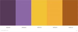
I visited the color.adobe.com website to find a suitable colour palette for my CV design. I associate my style with the colour purple, so I was hoping to add a few purple tones to the piece. I found these two settings above that inspired my progress with the palette I settled with. I mostly stuck to the template of the first palette, but later changed the colours around to more purple tones.


After I picked out my colours, I used one of the colours to help me design logos for software that I use. This included logos for Clip studio paint, Blender, Photoshop, After effects, Autodesk Maya, and Substance Painter. I used a painty brush on photoshop and drew out the logo of each software. I will present these on my CV to show that I have experience in the software.


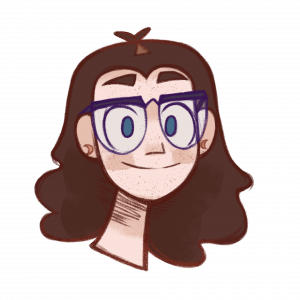
Next, I brought in my portrait illustration that I use on media accounts as my profile picture. I can use this to show how I look, but also my illustration style.


I experimented with a few font styles and combinations to see what I liked best. I downloaded a few new fonts from the web and tried them all out on a photoshop file.


Once I picked my fonts (that change later on) I added a few coloured rectangles from the colour palette I made. I made subtitle squares and titles for each topic that will be shown on my CV


I used the grid feature on photoshop to accurately align everything on the page to a suitable position.


This is my first draft of my CV. I had added my content into the CV in a suitable place, and my software logos at the bottom. There were still a few parts I needed to add such as the link to my showreel, adjustments to my profile paragraph, and more information for my experience.


In my second draft of my CV, I adjusted the profile paragraph so it works a little better. I added my job roles from the work experience I have, so its more clear what skills I learnt and how I took on my jobs. I also adjusted the text in the CV to containing more textboxes, rather than singular text layers. This helped to align each text in a better position e.g. In the ares soft / technical skills, each of the words were separate beforehand, but now they are all in a textbox.

This was the version I had shown my tutor in my tutorial. He suggested I could push to the right the job roles bullet points, as it is cluttered in this version, and hard to read. I also was encouraged to add my portrait illustration at the top left of the CV to add a bit of personality and personal touch.


Lastly, this is my final version of my CV. I added my portrait illustration at the top, added my showreel link as it was finally finished and posted, and right aligned the job roles. In addition I also adjusted the colours of the boarder as I thought before hand they were too dark for the CV. Now I believe everything works well in the CV and it accurately highlights my skills, what I have done and what I can offer.


Link to the PDF: CV_Dayna_Keaney


Back To Top
Skip to toolbar