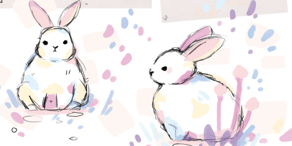
CREATIVE FUTURES END OF YEAR SHOW For this moduel, devlopment and personal branding played a huge role in my decisions to best represent my Animation. My goal was to create a professional looking display that would match the criteria and best present all the physical copies and styles of my work to be displayed. I stuck mainly with my typical style a cute atsthetic with pastel colours the 3 main ones blue, pink and purple. POSTER: IDEA The concept for my poster originated from the idea of having the main highlight and joke of the animation be the focal point of the display. ham hamster the main plot the hamster in the over on a ham cheese toasty a play on words. The hamster is cooked alive and is now ham. I wanted to portray this in a doodley funny way that would be cute also concerning to provoke a reaction but also create a narrative concept/trailer for people to get engaged with the posters concept. Overal i decided taking the small sketch i had made of the hamster dead on a piece of toast would be the best option to portray this but i needed to make it less grim and more enmtertainingas the animation is a lightweight comedy. Taking reference from the everything is fine meme i managed to create a concept i rather liked. The hamster on a toast, less dead more scribbly and goofy to portay the characters personality it presented as a well rounded cute piece of art that would be easy for me to also develop into stickers saving time on creating multiple designs. Thinking more on the design i also needed to put a catchy heading or subtitle a spoiler/blurb to the story to create a teaser. I settled ont he words ” a lost hamster a ham cheese toasty a crime and the weirdest rescue” summerising briefly the hamster getting lost (scene 1) in the oven while ham cheese toastys were being cooked (scene3) the crime part comparing to accidental animal abuse and finally the weirdest rescue (end scene) the hamster being recued only to realise he was untouched and happy eating wires. Translating all of this into a sticker allowed me to finalise the art and clean it up to be more presentable. I wanted the toasty to be the focal point so i coloured it and gave it paper textures to fit with the style of my animation being uncoloured and sketchy which is why i also left the hamster uncoloured. To elaboraate on how hes not realistic to avoid making the whole animal cooked alive seem less realistic and more cartoony and goofy i believe it also just made him adorable and seemed very stupid which was the personality i was trtying to convey . i was given feedback around why i chose to levae him uncoloured i imagine this as a style choice. DEVELOPMENT The final design After taking feedback on the artwork with some text being too small i decided i needed to make the poster match the rest of my branding this resulted in dimming the colours and making the whole mood and colours of the piece be more in theme with pastel, to present a more lighthearted theme alongside my idea for a pink setup for my display. i wanted to create my poster themed more like a wall poster in a room rather than an actual movie poster so i based the design fonts and framing on pusheen posters my biggest influence in all my designs. The feedback included creating a bleed so the size so the art piece would print properly. iseemd to focus more on the dimensions of my work in a rush rather than specific details that i had made mistakes with. upon hanging up my poster i have realised a small colour missprint had happened in the final print unfortunately it is to late to send back and fix. The fault was all mine to not correctly check my colours across platforms and software even those in the same software group such as adobe. I learnt my lesson from this and continueing my work i have made sure to specifically keep colours correct. i was however in a time crunch to submit my poster to be printed as i was not included in the initial printing forum and fundraiser and had to pay from my own pocket for the poster. Going forwards i will always Defffinetly check colour corrections and take the colours by code and name rather than eyedrop tool the colours. i plan to also be more involved with events and keep up to date with thinsg in order to better have time to complete my work so i can proof check everything as i wastn left with much time to do so. DISPLAY: IDEAS My idea centred around pastel so all over i searched around for objects that were pastel in shops and that fit my already made buisiness concepts. I mainly compared everything i found to my original buisiness desIgns and brand themes so i didnt create a concept layout for the table itself only small table ideas that i could make pastel. Sostrene Grene was the main place where i sourced most my items, Guinnys is where i had found the fabric for the table cloth and i got lots of arts and craft materials from the Works. many of the items i did have myself as i regularly collect pastel and art materials. Overall not having much time left i put together what i had found by colour coding what would help exentuate items on display highlight specific pieces on the table and create a prefessional layout/ design that matched the presentation of the table. everythihng i got for the table: TABLE CLOTHs STICKERS STICKER HOLDER WALLPAPER FOR DECOR CAT TAIL PLANTS PASTEL TABLE PROPS SMALL – MAGNETS METAL FRAMES OF SOME SORT- PURPLE METAL STORAGE BOXS FRAMING THE FIGURES MADE OF CLAY – STAND AND BOX PASTEL WASHI TAPE BLUE TACK PRINTED ART ON WALLS A5 PRINTS A4 POLY POCKET FOLDERS= ARTBOOK/PORTFOLIO BUISINESS CARDS PRINTER CV FOLDER HOLDER FLOWER POTS LED LIGHTS DISPLAY CARDS AND LABELS POSCA PENS PASTEL CHOPPING BOARD CHALK BOARD CANVAS HOLDER IDEAS: presentations development From reseearching many artists in this field of work i gathered my ideas of stalls and the types of things i would like to sell starting my own business. the direction of where this has taken me is entreprenuer positions aswell as managment roles. i enjoy creating things from sctratch and organising items/art related to animation and companies i like to create work that has a personal touch. stall ideas: products with my ideas i recieved feedback which was to gateher more market research and to cut down the amount of items i would want to create for my display. I did this and honed down specifics of what i wanted to do. I wanted to specifically delve into this avenue in the creative field of a personal buisiness in a direct and percise manner so i picked a handful of items i would make that would best put forward my artwork suhc as cv, stickers and buisiness cards. artist refrences: goals: chalk board on canvas concept to act as a small board to present the brand name logo and buisiness using characters from my portfolio. BUISINESS CARD After updating my logo design i was able to finaly piece together a porfessional business card and re brand my buisiness porayal. this also allowed me to explore updating my linktree and to also create a qr code. The finaly designs implemented resulted in taking advantage of white areas on paper. I wanted to use the colour white to save on ink costs in the future while also using it to my advantage to make a pastel coloured logo softer but more striking in a frame to allow the overall font to be presented more professional. The development and re design of the logo and font took the longest. the fonts i decided would carry further in my branding and matched best my designs and style are: verviene providence sans amotic sc bold picky retro chantal light heyoo creyon The deigns took alot of devlopment, feedback and exploration to arrive at a final version. old: new design: Through feedback i decided the rabbit logo from the old versions did not translate well in a cute manner that displayed it was a rabbit. i wanted it to be clear it was a rabbit as i had designed my logo after my pet rabbit marshmallo. I explored some veriants of the design to make the bunny more dimensional and less flat the main L that represents my name and the branding of my work didnt represent or implement the rabbit deSign well in my older works. I seeked to improve this and make a logo more recognisable. The lettering overall wasnt structured in a manner that was easily read i tried and explored many fonts to create a more readable text and style that would better represent my profession and present my personality of loving cute things but being professional. FINAL DESIGN BORDER DESIGN FINAL LOGO AND QR CODE After creating buisiness cards and an effective logo i focused on creating some stickers that i could have on my displaY to represent the character i feature in many of my designs and to also keep every design consitent with the same character spresent in my stickers as on my cards. cottontail cat taxolotl bun bun marshy moo flick ham hamster Qr code logo L From gatehring and creating all my materials i realised i needed labels to direct my tables structure elaborate on questions and introduce characters i also thought it would make the display more interactive. CV UPDATE: I believed my cv was rather out dated and i felt it could be better. I had also gained more experience in the working field and believed it was essential to add so through trail and error i deleted many thinsg after lots of feedback on removing certain aspects such as plder work experience, skills list, some awards and overall direct teh CV aimed more towards animation rather than pther fields of work. I also did this to create more room and make the cv less compact and squashed. I removed some small icons re arranged and re sized everything into a better more professional readable format that also stayed consistant with my original concepts and versions. 1st draft update if cv and cover letter final versions After i had finalised everything i started printing and framing everything for the display. I spent alot of time constructing my display. I initially bought a small amount of decor and later returned to add to my display untill i no longer felt it was missing parts and felt like it best represents everything i create. 1 SETUP 2ND SETUP FINAL SETUP For my display to better show the specifics of what i wish to do in the animation or creative industry. I had through out the year created clay figures made by hand to showcase all i can offer to spectators from the industry coming to view the displays. I overall wanted my display to show my talents, personality and best works by using sculpture, graphic design , managment, concept art , organisation, hardwork and professional abilities. SHOWREEL LINKTREE: https://linktr.ee/loopylooarts PORTFOLIO ARTBOOK For the artbook i was unable to order an actual book and instead gathered an A4 poly pocket folder that was pastel and would fit in well with my display better than an actual book i believe the pastel folders work best and match the display well. This system allowed removable pages, saved time and saved money. I believed where i currently am with my art finalising a proper hardcover book would solidify art i am still improving at. To create my 61 page artbook i inserted all my work leading up to this projecct since i started university the folder showcases the development of my logo, colours, characters and the overall leadup to my final project the devlopment of ham hamster my final year film that took more than a year alone a project that has alot of production i think best shows my devlopmental capabilities of improving productions along a timeframe.I also believe it highlights how hard i worked on this intire project. ANIMATION PORTFOLIO I originally kept the same art in my portfolio but updated the tittle and end pages with the new logo and frames. i also included some new pieces of my art and removed the weaker art in the portfolio. REFLECTION: I unfortunetely was not able to make eveyrthing i would have liked to for this moduel such a A5 art prints and to order proper buisiness cards. I believe i had neglegted the time i had overall to properly order items for my display and fell behind because i focused to greatly on things that were not neeeded alongside aiming to have way to many things done. Although i am very pleased and proud with how the display has turned out in the way i intended. I think i could have done better by having created the easier designs first to be ordered and then focused on the more complicated pieces after. I have made many mistakes during this module such as learning how colours transfer from software to software and will not stay consitant throught the eyedropper tool only i now know to properly check the code of the colour. another mistake which was made overall is not that problematic but abit of a nuissance. when creating my layouts in adobe to export my portfolio and artbook pdfs i did not think to put the pdf images in order start to finish with the correct labelling as i was in a rush to get everything printed and i was too focused on the final print order in the actual folder, i forgot the digital version also needed to be in order hopefully this will not effect my grade. i unfortunately had no choice but to submit what i have and hope for the best in confidence i believe i have alot of good strong work and it shows my indepanance as a creator. I also wish i had of partaken in more of the fundraising events however i was busy but i am please that i had tried my best and made sure to interact an the discord alot. i believe i did what i could when i could for this module and overall i am satisfied. Post navigation Animation for the Creative Industries – Assignment 1 – Vertical Slice Project DevelopmentMAJOR PROJECT BLOG: HAM HAMSTER Leave a Reply Cancel replyYour email address will not be published. Required fields are marked *Comment * Name * Email * Save my name, email, and website in this browser for the next time I comment.