Vertical Slice – Week 15-16

During these two weeks is mostly finishing all the tasks that we have, structure the game to the way we have planned, and to play test the game to see what else may need fixed or changed.


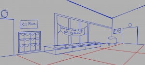
During week 15 I had prepared my seat textures, and remaining banner textures to add to the game.

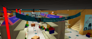
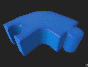
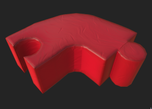
I placed in the two fbx’s and scaled them up. I placed them all around the room connecting to each other, then set up the textures – the blue was the main material, and the yellow and red were made as instances.

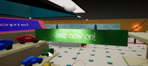
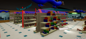
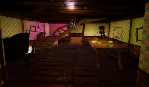
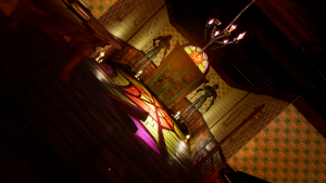
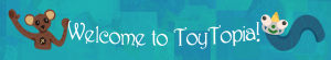
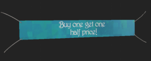
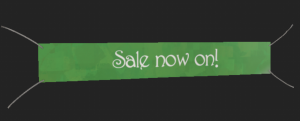
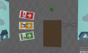
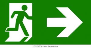
I added in the new second and third banner fbx’s into the project. I added in the three signs for the second banner / two signs for the third banner into the folder and assorted them into materials and instances. I placed them downwards through the isles of the toy store hanging from the ceiling, and they look great.

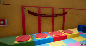
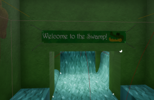
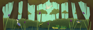
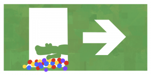
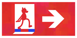
In addition, the block sign is placed In the maze puzzle area, and the swamp sign is placed in the entrance to the swamp room.

I was asked between the group to model a few more assets for the game. We have developed a concept that the ‘mother’ of Benjamin would be guiding him through the store, talking to him through the speaker microphone. We have voice acting of the mother from the sound designers.

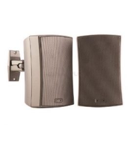
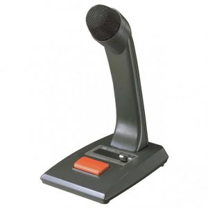
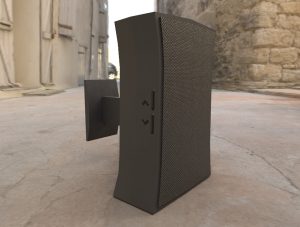
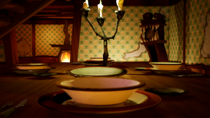
The team asked if I could make a speaker microphone and a wall speaker for the store. I collected these references and started modelling.

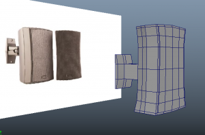
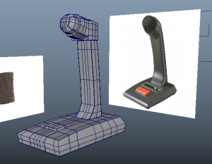
These models were quick to produce, although the microphone had some complicated geometry to fix, though was solved fairly quick. I UV mapped them and brought them to Substance Painter.

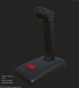
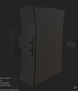
I designed these assets with similar materials so they stay consistent. Both have an iron rough body with a dark colour. The mic/speaker parts are made from a fabric material – I turned the colour dark and turned down the roughness to become more specular. For additional details I placed down alpha shapes to act as volume buttons with heightness, and a red button to turn on the microphone.

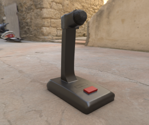
As a result they came out very well and the team are happy with the look. They have already been added to the project at this stage.

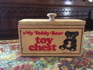
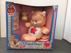
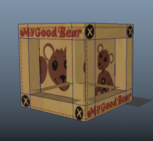
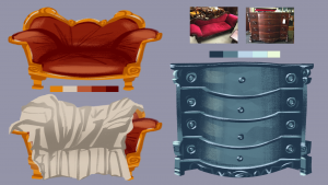
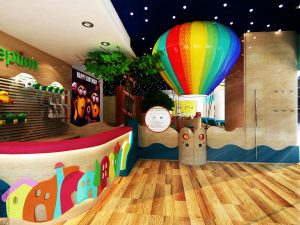
Next I was asked if I could design the toy box for the good bear, an asset for the start of the game. I first researched the style of toy boxes in the 80s and how they are presented, and looked into our good bear design to see how I can incorporate the bear into this style.

References:

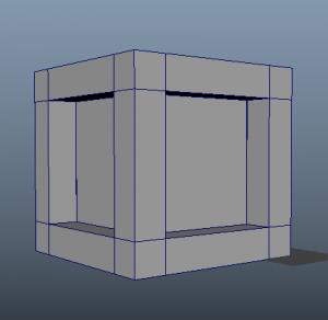
I modelled a simple box with the middle faces extruded inwards to replicate the same shape of box that is already in the game. I exported an image of the UV map of the box and decided to paint my texture on my painting software.

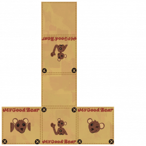
I mostly took inspiration from the toy chest image for the colour of the box and the font style. I designed the bears face all around the box, along with the buttons on the corners. I showed the team and we are happy with the result.

I went back into Maya to see how the texture looked on the box however it would display very weirdly. Although the texture fits perfectly, the actual cube is clipping the inside as it rotate it around. I will test this on Substance painter to see if there is the same problem.

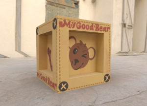
Fortunately the texture and model are working fine on Substance Painter, so it could be brought into the UE project.


On week 16 we have been preparing our game with our tasks to finally finish it up. The animators have finished their characters animations, the art assets and textures have been implemented, and lastly the game designers are working hard to fix up the last details of objectives, AI behaviours, sound effects and jumpscare cutscenes.

Most of us have been joining into call meetings almost everyday to check on our progress and help each other out to add work into the project.

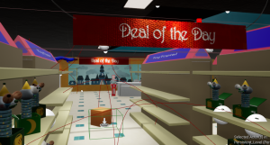
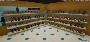
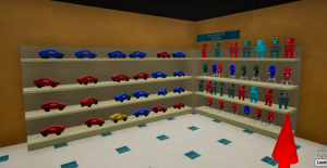
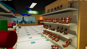
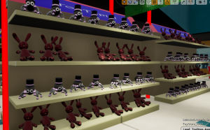
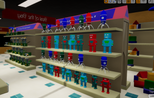
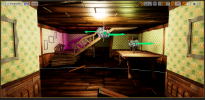
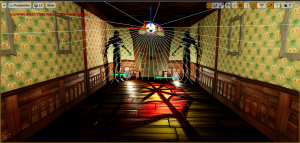
The last touches I made to the project were to place the toys all around the shelves in the toy store. I organised them by max two toys per shelf and placed them on with irregular rotations and positions, so it looks more natural. Patrick’s blueprint to randomise colour variation of some toys helped to give some variety on the shelves too. After this I had finished all I could do for the project.


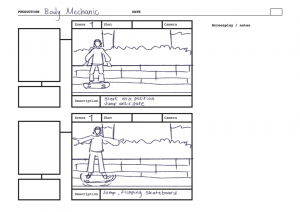
During the last day the final touches were made to the game. Here is a game play through that teammate Patrick recorded:

Personal Development – Reflection

Final animation:

Audio from Jenna Marbles YouTube video – I Gave Myself A Claire’s Makeover: https://youtu.be/wLVMrpByb_Q

https://vimeo.com/707352421


Reflection:

This was a refreshing and fun project to work on. I was able to develop my 2D animation skills by bringing in performance, lip-sync, audio and principles into one 8 second animation.

I am very happy with the outcome of this project. I was determined to try my new and old skills in one project and it combined well. My style of animation was inspired by how animators are able to produce traditional looking sequences that look sketchy and fluid. I enjoyed researching peoples approaches such as entries from the 11 Second Club website, show-reels of work from a variety of artists, and studio projects from the likes of Studio Meala. These inspirations helped me grasp a look, a setting and a unique approach to my chosen audio.


Both my reference of study and my reference of performance helped tremendously. From the YouTube videos by Bam animation and Toniko Pantoja, to the linked-in course on photoshop animation, I learnt lots of skills to produce good 2D animation throughout this project. I attempted to make use of anticipation, overshooting and squash & stretch (smear frames), based on my previous experience and from what I learnt in these videos.


The reference I recorded was super helpful in grasping the motions and expressions that I was looking to show. it was definitely beneficial to use my own reference, as It would have been difficult to find reference that fit what I was looking for.

What I like most about this animation is the natural and casual motion/expression I was able to capture in these two characters. I am happy that I was able to create a scenario that fits in context with this audio, as it makes it more fun to watch. I am also proud of pushing myself to be able to handle two characters to animate.

If I were to complete this assignment again, I would have spent more time on the motions to look more fluid, or worked on my ease ins and outs more. What I wish I could have done better was the flower placement on the characters shirts – they are animated differently to the rest of the animation and look slightly off along side them. I would have also worked to make the hands look better than they do right now – I feel during the production I may have neglected the hands quite a bit, just so I could keep going to further stages. Overall, I am still very proud of the work I made and am excited to show it around.

In conclusion, I enjoyed making, and successfully produced a 2D animation highlighting development on lip-sync and performance.

Personal Development Project – Post-Production

Once my line-art pass was finished, I started to think about the visual and colours for the scene. I also made sure I had different versions on my work saved on multiple files so If I lose anything I can go backwards.

For example, my first photoshop file has only the line-art final animation. My second file will include this and my colouring, and my third file has my rough sequences and thumbnails. This helps to ensure I have saved my work multiple times, and my files won’t become too big to work on or download.

File 1

File 2

File 3

After this, I wanted to design a simple background. Like before, I imagined this audio is something that could take place in a dressing room, trying on wacky clothes. So I looked for a simple dressing room reference to go from, that also fit the same perspective as how my characters are standing.

These references worked very well and in this specific perspective. I also liked the yellowish tone of the images as seen in most dressing rooms, giving that sense of familiarity.

With the reference I painted this dressing room. After this I ended up adding small details to the back like a hanger and some slippers, then added into the Photoshop file.

This is how the background looks with the image sequence of my line-art animation applied.

In my own time, I painted a piece of the two characters, I decided I could use this to reference my colour scheme in the animation.

I painted the animation on a separate video layer for each character. I went over them in one solid colour then coloured them same as the reference drawing.

I wanted to give them their flower prints on their shirts so I went back to animate them on. While doing this I went over the colouring one more time to see if it was neat and in the line-art.

Since the mouths are in a different pace than the rest of the animation, I had to make a new video layer to paint them.

I added some more touches and polishes to the animation such as cleaning up any off-looking line-art, some colour alterations, and to the flowers on the shirts as I animated them differently to the original animation.


After all this, I had finished my animation. The result is below.

Year 2 – Semester 2

Semester 2 of second year

Modules – Vertical Slice, Personal Development

Vertical Slice – Texture design, Logo design

Vertical Slice – Texture concepts


Vertical Slice – Substance Designer practice

Vertical Slice – Environment Layout

Vertical Slice – Substance Designer textures

Vertical Slice – Photoshop texture decals

Vertical Slice – Texturing and 3D Modelling

Vertical Slice – Game Screenshots


Vertical Slice – Final Game

https://gamedevpaddy.itch.io/toytopia


Personal Development – Experiments with acting

Personal Development – Storyboard

Personal Development – Character Design


Personal Development – Animation progression

Personal Development – Lip-sync development

Personal Development – Background design

Personal Development – Colouring animation


Personal Development – Promotion Image

Personal Development – Final Animation

https://vimeo.com/707352421

Year 2 – Semester 1

Semester 1 of Second Year

Modules – 3D Environment, Animation Cycle/mechanics

3D Environment – Furniture and environment concepts

3D Environment – Furniture/model designs

Animation cycles/mechanics – Character design

3D Environment – Texture design, 3D Modelling

Animation cycles/mechanics – Background design

Animation cycles/mechanics – storyboarding


3D Environment – Texture design, Unreal Engine environment Layout


3D Environment – Decal design


3D Environment – Unreal Engine environment Layout

3D Environment – Final video

Animation cycles/mechanics – Photoshop rigs

Animation cycles/mechanics – Prop design

Animation cycles/mechanics – Final Videos


Vertical Slice – Week 14

On week 14 of the project I altered some of my art assets, make some quick models for urgency/filling space, and attending meetings to discuss our current progression.

First of all this week Patrick asked me if I could model and texture a screwdriver for a section in the game where the player unscrews the vent cover to go through it.

Reference:


I got started by gathering a good reference photo, and placing them in the Maya project. I added in James’ arm so I could scale the screwdriver to the right size and shape it correctly so it fits around the hand.

I modelled the screwdriver in the similar shape as my reference in parts, then combined the parts together in the end, making it one mesh. I UV mapped the model and gave it a material.

As usual I brought my model into Substance Painter and set up the file. I added a light metal material to the screw rod, then masked the layer so I could place on a red plastic material for the grip. I added an additional material to the back as similar to the reference for added detail. I added a rough / metallic grunge to the model, and our group logo on the back.

Once that was done, I sent it to Patrick and he was able to add the model into the engine for me, while watching his stream on discord as I couldn’t open the project at the time. It fit well and acts as a similar object as the torches in the game.

While in the call, we realised there was no good area to place one of the banner designs without it covering something behind it. We decided a longer string to the banner would work well so it could hang from the ceiling in the toy store, it wouldn’t be too high, and it would not cover anything around it.

I went back to Simas’ model and adjusted the string length, and saved it as a new banner (banner 3). I textured the banner the same was as the others on Substance Painter and exported the three versions with the right name.

For the second banner I wanted to make a new design, the same that I made in the ‘play area reception’ layout page. It says ‘Can you find the missing blocks?’ above where you are meant to place blocks found in the maze – this makes for easier understanding of the objective and clear navigation to the source.

Lastly I decided to a banner would be good to introduce the swamp ball pit room as its a big jump coming from the puzzle room, just to give it more indication of what room the player is heading towards. I also illustrated the croocodile from this room, similarly to the ‘welcome to toytopia’ sign.

This week I also started to make soft seats for around the play area reception room as I designed a few weeks ago. I sent thew references to the group and they liked the idea of the puzzle seats so I used them as my main reference.

References:


It was quite a simple task to create these shapes. I started with a cube shape and a cylinder shape. I used the Boolean tool to cut the same cylinder shape on the other side to cut out from the left. I made a small cube stand below the model too for it to levitate it slightly. I added edge loops where needed, combined the shapes, and smoothed the model. I copied over the straight model over and rotated the edges around to get the corner shape.

I UV mapped the shapes, and tested how they sit together when connected in its puzzle shape. They work well so I cleaned them up and exported them.

I brought my models over to substance painter to texture. I made some attempts to recreate a soft mat texture but decided to bring in my designer material of the same type of object. I used a plastic PVC material with a curvature generator on to create that seam look as it is in the reference. I gave it a darker colour for the edges. I made three colours, and placed them in a folder to convert it into a smart material, so I can easily place this on the corner seat too.

Here are the corner versions with the same type of texture transferred over. I am happy with these and the group likes them too. I will soon add these models to the project.


For now I will be present for others in my group if they require some help to get assets made quicker, or to assist or look over the animations for the game.

Vertical Slice – Week 13

On week 13 of our vertical slice project, we have been focusing on bringing in the enemy’s into the game, developing the animations/puzzles/AI mechanics. I have been finalising some art assets and helping out with discussions when possible.


This week I started designing the banners. I wanted them to have a similar design to the door signs I created, and using the same Harrington font we are using throughout the game to make this. Simas provided me with the model of two banners and I took the role to texture them.

I wrote out a variety of slogans that suit the setting of a toy store, like ‘deal of the day’, ‘sale now on’ and ‘buy one get one half price’. I stuck with a similar colour scheme and the same paint brush style for the background. These will be placed around the shelves of the toy store, possibly above the display toys.

I made a design for the second banner design that will present a welcome note for the customers. I added the faces of our main enemy characters for additional entertainment and attraction to the store.

I brought the model into Substance Painter and placed in three layers for each version into the same project for compressed workload. I added an embroidered fabric material to the sign strings of the banner, and added the images in as a texture – adjusting it to the size of the model.

There has been great progress inside the game from my teammates shown in the screenshots below:

A collection of models have been placed in the toy collectors room and the bathrooms. In addition the lighting has made good progress with the use of the ceiling lights, and the rect light mechanic to light up the areas. Light flickers also work too.

The good bear rig has been added to the game with some animations coming along. The UI for the main menu has also been implemented and fits our theme very well.

Again this week I spent time to focus on my other modules on top of this. My role as of now in this project is to ensure the art assets are working ok, and helping out others when they need. I am still making sure I am attending group meetings with teammates to see how the mechanics/AI/animations are coming along.

Vertical Slice – Week 12

This week we presented our last major presentation of our game, and i’m continuing to add in my textures and help others in the group where needed.


We got good feedback from all the tutors this week on our presentation. They are ok with the progress but would like to see the enemies present in the game very soon. Having the three enemies in will greatly benefit the horror aspects we are looking for. We also need time to alter how the AI functions, our bugs within the arm push and puzzles, and giving the play area room more ‘identity’. Otherwise we are in a good position and will keep working hard the next few weeks to polish our game well.


From the feedback, I wanted to look back on the play area hallway room and see what we can add to the room to give it more purpose and functionality. I made some rough sketches after class of what could possibly be inside it.

I gathered reference for conceptualising a play area reception type of room. I was fond to use the shoe rack that’s in most indoor play areas as I thought that would suit the type of activity that is going on in each room – its typical for kids to take shoes off when going in a play room/game room/adventure room etc.

I also thought about the models we have yet to use like the banners, the candy machine and the lollipop stand, so I added them here. It would also be nice to add some sort of seating around the area for the parents to sit somewhere while their children play. Lastly, I made sure the pressure plate puzzle machine fit in with this, and gave it a banner so it feels like an objective for kids to play even when the store is open, and not just for Benjamin (the player).


Play area room at the moment:


Reference:


I opened the project this week to add in the signs and arrows to the game, placing them where I think would suit. Before I opened it, I made a second variation of each door sign that points to the left instead of right so we could have signs placed on each side of the door / wall if needed.


Here I placed a staff only sign hanging above the toy collectors room, giving it a rough state as it is one of the more dangerous rooms in the game. I placed each puzzle room sign towards the door to get to them also.


Here I placed these same puzzle signs pointing to their respective entrances.


In the maze room I placed my arrow decals around the area, some pointing towards the object to be collected in the puzzle, to help navigate around.


During the rest of this week I took some time to work on another module, however my next plans is to texture and fix up the banners for the toy store As for the team, most of us are still keeping in contact as much as we can, and continuing to develop on our tasks.

Vertical Slice – Week 11

This week we got good feedback from our play-testing session, and spent this week going through the issues and missing parts of the game – pushing boxes, puzzle progression, lighting, enemy’s and animations.


We spent this Monday playing through the classes games and set up our game Aswell for other to play. I had fun playing everyones game that I got to, and they’re progressing very well. We got around eight responses from our feedback google doc and we were able to review what people had to say.


Most people had trouble with the pushing mechanic, or the order of how the puzzle should be completed. We will try our best to fix the push to something more suitable, stabilise the boxes, and organise the puzzle direction.


Players were content with the player movement apart from the pushing mechanic, and climbing up the ladder. This week we will adjust the ladders and again look over the push.


The bugs and glitches people experienced were more of the same mentioned above, like the arms, and the boxes. Players also experienced a glitch in going down the slide where you can’t move after it, the pressure plates broke for someone, and players fell out of the world.


Players have rated the game mostly a 4, some a 3 and some 2. We understand as a group the game is at an overall 3 for experience, however we hope it will become a better game once we go through these problems and fix them.


Players wrote down what they would like to see next week. They would like to see hopefully a couple more puzzles to play, some more art assets, better lighting structure and brighter light on the torch. Also, optimisation on the pushing mechanic, and more assets around the game. We hope to see much more assets soon, I will be working on more art assets and the game students will help build the puzzles.


Last of all people have overall enjoyed exploring our game which is great. We see some more feedback that will help us out. One player would like to see AI being implemented more around the area, and have more actions instead of just patrolling. A player also suggested to add more direction in the maze room, and apply a message to areas already discovered so you wouldn’t get lost in the maze. This all sounds good and we will try our best to work on these ideas.


I opened the project this week to add some of the last textures to the game that had been missing – the balcony and stairs for the toy store, and the metal walls for the vents. I took some screenshots of how the game looks so far with my textures/models added in.


First I looked around while playing the game. The rooms look more lively now with the different style of floors/walls, and the spooky decals around the area.


When I played the game at this time the blocks had their own physics so they had fallen from the shelves and scattered about. This has already been fixed just by turning off the physics in most of the models.


The play area room that leads to all the activities looks well too. The light still requires to be built by this time however we are still waiting on some more models before we do so. James’ ceiling lights work well around the game too.


Patrick helped to bring in two models I made as I didn’t have the chance beforehand. The wooden blocks are displayed on the shelves of the store, and my Toy Topia sign is up by the entrance, and also upstairs displaying the toy of the year.


Lastly I added the cyan texture for the arch and balcony for upstairs. It looks much better now in terms of visuals in the game. At this point I will keep helping to texture other models, and add more art assets.


After our feedback I got a few art asset ideas to make. First I wanted to design a label for each room so people know where they’re walking into. I wanted to design it the way Exit signs are made to add to the idea that you are escaping from the evil in the toy store.

Reference:

I have designed each room with a certain colour and a toy that we have created. First I did the ball pit room with our crocodile peaking out with some ball pit balls.


Next I did the Maze room, where the jack in the box points towards the tunnels to go through.


Next was the puzzle room – I drew the bear walking on the mats, avoiding the red mat.


Then I made the toy store sign. This has the porcelain doll on it carrying toys to bring back to the store.


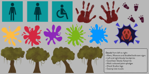
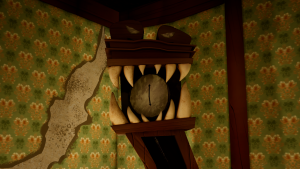
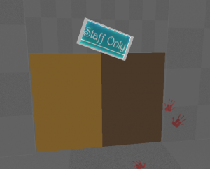
Last, I did the staff only sign, using the Harrington font that’s used throughout the game. This will be in places such as the storage room, the warehouse, the collectors room and basement doors.


After this was done, we figured that the Maze puzzle in our game was quite tricky to navigate around, as what players said too during the play-testing. I decided to make some direction arrows to place around the maze so it would be easier to get around. It would also be good to include a sign that pops up if you have already explored a certain way in the maze so you aren’t in there for too long, however is not a big priority at the minute.

I made two versions of a red, blue and green sign that points in a direction labelled ‘this way’ or ‘that way’. This will benefit the navigation around the maze and help people get across it quicker so they can try out the other puzzles in the game in a reasonable time.


Daniel requested some art assets for designing the doors of the game. He gave me some starting ideas and I helped design the concepts he needed. First, I designed some colour splodges made for the play area door. I used this reference to think about the shape of the splodges.


Here I drew 5 different colours of colour splodges in different variations for Daniel to choose from. I made use of the same colour palette that I used for the wooden blocks.


He also requested some bathroom signs for the bathroom doors. This would help just for detail to the environment. I made three different versions for the three stalls in the bathroom.


For this Monday we have to present our last presentation to the rest of the class. We will be presenting the state of our game so far, what each teammate is working on and what we have left to do.

Vertical Slice – Week 10

During week 10 I took on some final texture additions, new texturing & modelling tasks, and mainly we started building the lighting of the game.

Our feedback from this weeks presentation was to build a working play-through as soon as possible. This means adding any animations and rigged characters into the game, adding working puzzle mechanics, planning our player direction and adding narrative. 

The next day I opened the project to add in my decals. I placed them in suitable areas, and where it would be best to tell a story from, or where it can guide you.

I placed my trees around the ball-pit room to give the walls some variety and to enhance the swamp theme.

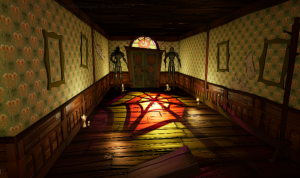
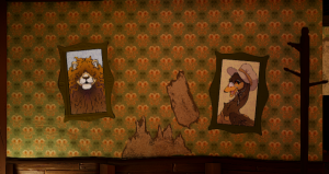
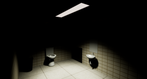
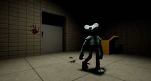
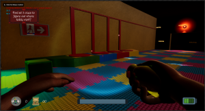
I placed the hand prints and the bear footprints in specific places where the bear and another person may have met before – hinting that something goes wrong, or becomes dangerous, every time they meet.

I chose to place the footprints in areas that the bear character will be able to walk around – the basement, the warehouse, the vents and the bathroom.

The hand prints in the first image are placed on a box to indicate you need to push it. In the second picture, it indicates that it could be dangerous walking into that room. In the third picture, it indicated you can hide in the stalls of the bathroom.

I also took note of what else still needs textured in the project. I will need a texture for the balcony and stairs around the first floor of the toy store. I will keep them quite simplistic, and consistent with the colour scheme. I also need to continue with the vent metal material that I was once working on, as the vent ideas has been brought back into the game.

For this part of the toy store I made a simple looking material with slight grunge on it for rough effects. I made it cyan to fit in with the cyan tiles on the floor.


Lastly I finished up my metal material. I worked a lot with the grunge on the metal but toned them down as looking through the vent references we have, they are usually quite clean and shiny.

References:

Since a team-member has been inactive, I took on the role of preparing some more models for the game. I wanted to model and texture the Toy store sign as there is only a placeholder in the game at the moment. I used my design from the environment layout as reference, as I thought it was a good fitting design.

I started by modelling the shape of the letters ‘TOY’ with cubes or cylinders. I combined them and merged vertices/deleted faces where needed. I bevelled the shape to give the edges a rounder look.

  I then made the base of the sign and used the same options for the bevel. I edited the UV’s manually using the cut/sew tool and unfold tool. Lastly I assigned a material for each of the letters and for the base for easier texturing in Substance Painter.

I brought the object into Substance Painter next. I made use of the separated assigned materials and added a fill layer for each of the letters. I gave them a soft grunge texture, and added a gradient filter so I could apply colour to the letters – One as red, one blue and one yellow. After that I made a similar effect on the base of the sign, instead the texture I applied was a dusty/messy texture. 

I moved over to photoshop to add the text for the next part of the name ‘Topia’. Since we have a chosen font used for the UI and more across the game, I downloaded it and used it in photoshop. I experimented with the kerning and size of the font to get something I liked.


Lastly I imported the image as a texture, and placed it In the area I wanted. I also made a second image of text for upstairs, where it displays the toy of the year.

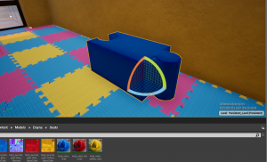
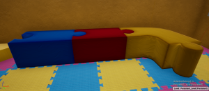
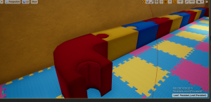
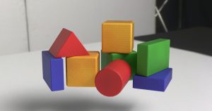
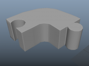
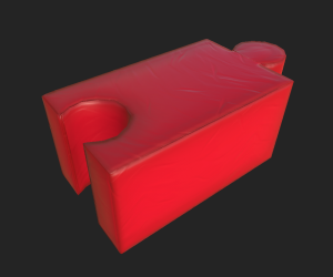
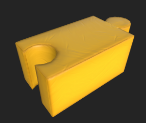
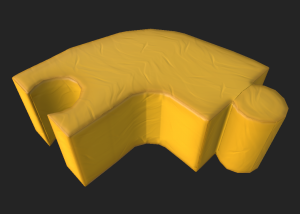
Next I started with the toy blocks that will be displayed on the toy store shelves. I used reference to figure out the shapes to use, what way to display them, and additions detail of wooden stripes along the shape. I quickly made shapes in Maya, and bevelled the sides for a softer look.

Once I brought them into substance, I set four colours for a group of blocks each etc. the triangle and circular blocks are red.


Next I found a wood pattern texture within Substance Painter and added it into a fill layer using a black mask. This way I could take out parameters like colour, roughness and metallic, and keep in height and normal into the texture. This gave me the embedded look of wood on each of the blocks. I separated the blocks into the type of shape they are etc. cube as a copy of the wood texture just in case I needed to adjust any options for them separately.

Lastly I painted on some rough paint just for discolouration and rough patches on the wooden blocks, then switched on overlay filter and I was finished.

After this, I started on the punching bag that goes along with the play area room. We made a new once since the one that was blocked out in UE was not applying textures correctly. I used reference of a play area with punching bags to grasp the overall shape of it, and the way it is attached to the rope.

Once in Substance Painter, I imported my soft mat texture as a punching bag in this type of area would be made with that same type of material.

I applied the texture, then added a crosshatch fabric material to the rope to create that strong fabric type that would be used around a play area.

I had to disable the height of the punching bag material as it was causing distortion on the seams of the model, however the folds still shows when using the normal map.

Lastly, I am helping with one of James’ models, the ceiling light, and texturing it.

I used James’ reference images to figure out the type of material these lights would be made from, and how to recreate a similar look for the light part of the model to look like a source for light.


I applied a dark metal material onto the base and bars of the ceiling light. I then applied a triangular pattern with an emissive channel onto the light source of the model.

For next Monday we will be setting up another play-testing for the class so we can test out each others games. This will be helpful for us to get some feedback and determine what needs improved, and what to work on next.

Back To Top
Skip to toolbar