Body Mechanics
Here I will be documenting about my progress to animate a body mechanic with fundamental principles for each of the cycles, and with unique and experimental characteristics and style in the animations.
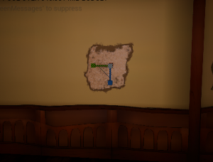
To start my brainstorming and organizing for each animation, I used Miro Board. I decided I wanted to use a video of a friend/relative to help me reference the body mechanic animation, and I set down my idea of a character skateboarding. (info in green)


I did brainstorm and think about casual, physical motions that we would do. I thought of building a snowman – like lifting the head of the snowman onto the body, or cleaning a room – reaching a high place, riding a skateboard and riding a scooter.
My sister agreed to help me out with video reference as I try out these ideas.
We filmed a few takes of some of these ideas and we decided the skateboarding idea was the best out of them all. My sister has experience with skating and owns her own skateboard, so we were able to film these shots pretty easily. She helped me out with tricks ideas she could do which enhanced my original idea.
I got a shot of her doing a trick and a shot of her skating out of frame. Here are the videos below:
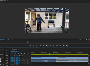
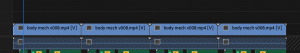
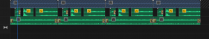
I also thought it would be very helpful for me to combine these videos so I could view both of the body mechanics at the same time. I used Premiere Pro to put these videos together. I made sure the the first video lined up with the second by adjusting the size/shape of the video – I lined up the last position on the first video, to the first position of the second video. Here it is below:
I also tried collecting other pieces of reference to help me perfect this body mechanic. I researched for more skateboarding videos that I could study the body movements & the skateboard positioning.
This was one of many videos I looked at that more or less replicated the trick that my sister did in my reference video. I combined the clips from the “older school kick flip” trick – this helps me picture how the skateboard is positioned as it flips, and how a persons body anticipates the jump and lands.
In addition to this motion reference, I was also looking for style/animation inspiration. I was very inspired by Sorcha McGlinchey’s class with us where she used Photoshop/Illustrator/After Effects to create 2D animation. I’d like to produce my animations in this way.
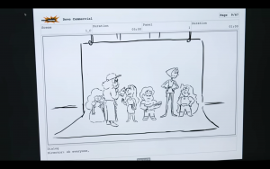
I also took inspiration from this advert series for the ‘Dove Self-Esteem Project’ based on the show ‘Steven Universe’. They have this shape-layer-rigging style in the animation that I could take inspiration/reference from. It is filled with beautiful colours/lighting and showcases many different shapes. Below is one of the videos that I enjoy, and I also found a short Behind the scenes video about the project.
In this behind the scenes video you could get a glimpse of how the project was made though the screens of the creators/artists. They show their blocking out/line-art stage, their storyboard/animatic stage, and their painted concept pieces. Seeing these parts of the project help me understand their process and how familiar these steps are to me already – that I could achieve them for my project too.

This short animation called Kaeru, made by students from the San Jose State University, is also a nice visual inspiration. From the variety of analogous colour palettes, to the subtle textured look that gives the story more life and realness. They also portray strong emotions such as self doubt, rage and joy.
I also looked for more in depth tutorials on After Effects so I could refresh myself for using After effects, and learn some new tricks.
This After effects animation tutorial has a little bit of a different approach to what I know of, as they make all their layered shapes on after effects directly instead of importing them from photoshop. This is still quite an informative video as it provides options in After Effects I didn’t know about before, such as the ‘Set Matte’ tool – to clip one shape layer onto another shape layer, and the ‘parenting’ tool – to make shape layers follow another shape layer when positioned.
This approach is also really good to know because in my body mechanics move, the characters body may turn slightly to the right to go from the trick to the skate away. This video helps me to understand how I could try to achieve that action.
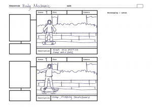
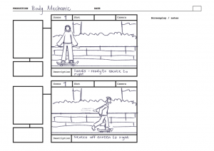
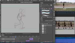
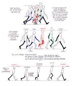
At this point, after gathering my reference, I am ready to start the body mechanics animation. I will start by thumb-nailing my main key poses.
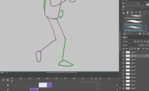
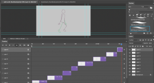
I used Adobe Photoshops video sequence timeline tool to complete this thumbnail sequence. I drew in a rough character model and drew out the main key frames that I picked up from the video reference I made.

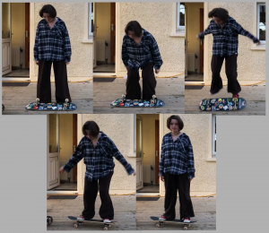
To help me point these out, I made a collage of the key poses in a picture, one for the trick, and one for the skating away.
I can see in both sequences of images that there are hints of anticipation – bending of body & knees, and squash & stretch – in the jump and skate. The use of these animation principles will help to enhance my body mechanic animation.
These still images were really helpful in posing the character in the way I hoped for. This was a similar process that our tutor Alec taught us – how he prepared his reference in the jump animation tutorial.
Source
Blackboard -Jump Animation – Blocking to Spline Video Tutorial – 01 – Jump – Blocking – Start.mp4

Here I had my reference on the side as I drew in my poses in the animation timeline. I placed a layer for each pose and timed them at one frame long to start with.
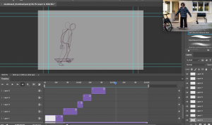
I then used the video I edited together to figure out a rough timing set up. I made selected layers longer or shorter depending on how slow or fast an action occurs.
After a few adjustments I finished off the first, rough thumbnails of my body mechanics animation:
I am quite happy with the poses in this mechanic. It definitely looks like a skateboard trick so I know it translates well, and it will help for the animating stage later on.
Next, I want to design my character and background in preparation for the storyboard, and for the final scene buildup.


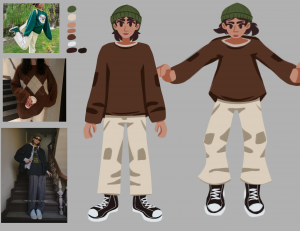
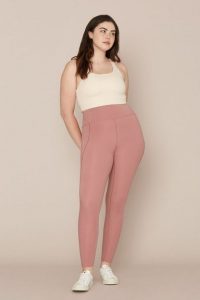
I gathered reference from Pinterest to find images of a casual skating girl. These will help me design my character, inspire new ideas, and pick my colour scheme.
I was inspired by the art style look of the Steven universe x Dove videos, and combined my style, and theirs to make this. I think this style is very appealing, and it will also help during my rig/animating stage with its line-less look.
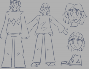
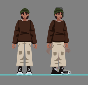
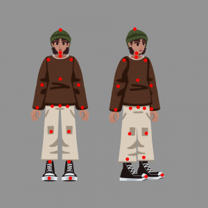
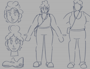
I made some first initial sketches, and then designed my body mechanics character below. I illustrated a standing pose to highlight each aspect of the design, and also positioned them in one of the poses I collected previously, to see how it would work. I like the accessories on this character and how the outfit is quite easy to draw.
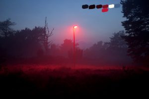
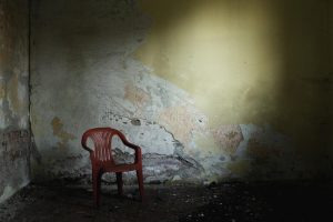
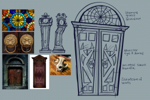
From my brainstorm beforehand, I had a visual of what setting I wanted to achieve for the scene. I wanted to capture the darkish fall evenings in a quiet neighbourhood. I found some reference images to the right that help visualise this for me.

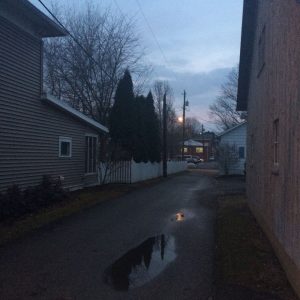
With these reference images, I picked out the main pieces of each setting that I wanted to capture etc. the brick wall with bushes, the small houses, the rough footpath. I also used these images to pick out my colours as I thought they fit well. The preview of the background with my character, is below. This was quite fun to draw especially creating the leaves, and adding the textured look.

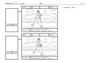
Right after my design process, I started capturing how the scene will play out in a storyboard. I added a rough sketch of the designed character, and a rough sketch of the background. I also added descriptions on each shot to explain what will happen, and what reaction I want to capture from them.
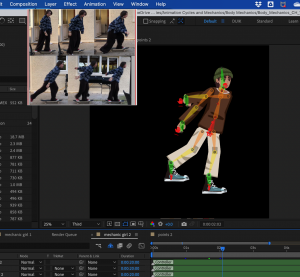
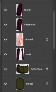
Soon enough, I started building the character rig on Photoshop. I drew out the character model, each part of the body in separate layers. I made two rigs, One facing the front, and one turned to the right. This is because the character will be positioned in two poses throughout the scene. I added sphere shapes around the body where the joints are, or where the skeleton pins will be within the rigging stage.
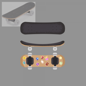
This scene also contains a major prop. I designed a skateboard in photoshop in three different poses: the back, side and top of the skateboard.
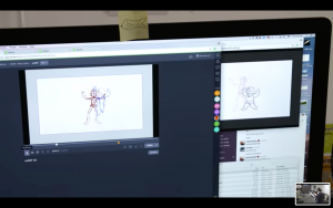
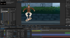
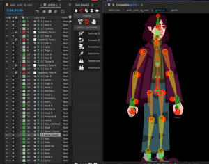
Once this rig was finished, I was ready to bring my work into After effects. I brought over my background, the thumbnail walk cycle to reference from, the skateboard, and the character rig/layers.
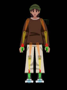
Again to start rigging the character, I set up the DUIK skeleton on both versions of the characters. I went through the same process as the other animations when setting up DUIK, which was: pinning each skeleton part to the body, parenting the parts to the skeletons, auto-rigged these skeletons and assorted the controls.
I made sure to continuously refer back to my reference images and videos to accurately capture the poses and positions I was aiming for. I especially needed reference for this animation as it is quite difficult to predict this uncommon kind of body mechanic.
I started animating the limbs and skeletons of the rig to make the body mechanic. My first draft is below:
In this first draft I was focusing on the first rig of the character first. I make blockout poses of the jump, and also the flip of the skateboard. It looks quite slow and floaty as the moment, however more concentration to the positions will help the visual.
Draft 2:
In my second draft I worked on the jump again, focusing on the impact, and lifting from the ground. I also took time to align what parts of the body were moving out of place, and figuring a way to position them. The landing looks off at the moment, and the jump overall is quite stiff. I will soon look within the graph editor to clean up and smooth the motion.
Draft 3:
On my third draft I focused on starting the second rig of the character, looking to the side that will skate off frame. I referred back to my references to capture the pose in this second part, however it is still at a rough blocking stage.
To be able to find ways to improve my work, I asked my peer for feedback on my animations. Although an early draft was shown of this animation, they still could see what it will become, but suggested to keep focusing on the timing/pace of the scene, as it will be important. I appreciate another person viewing my work for a different perspective and thought about the visual. This will help me improve what I couldn’t see.
Draft 4:
Here I was making progress with the graph editor. I took some time to work on the first motion again to detail its values and speed. It does need some more work later on. I added a closed eye illustration to give the idea the character is blinking, which gives it more life.
Draft 5:
I made much more progress with this draft. I made details with the animation of the skateboard: I had taken out one layer that was not needed, I adjusted the scale to make the skateboard look like its lying on the feet and spinning, and rotated it the same way it was in the reference. I made more progress with the positions on the first rig, after looking more into my reference for extra help in finalising it. I still need more progress on the second rig of the character, and a little more progress on the jump – as it still looks floaty in my opinion.
Draft 6:
Here I started on the transition from the first rig to the second, and working on details of the second rig movements. The transition looks quite quick right now, but I made some more progress with the video below.
I focused a lot on altering the positions and movements of each rig to better finalise them. The jump now looks less floaty this time, and the landing works well. I also changed the position of the arms in the second rig, as before hand the left arm looked out of place. I was mostly adjusting the neck and head around this time as I had trouble with its position – the neck would slip down too far down the torso during the jump. I continue to fix this with this next part below.
The jump works a lot better now with the detail adjustments, and work on the graph editor. I also slowed down the transition between the rigs just a slight touch.
Draft 7:
In this draft I started working on animating the second rig and skateboard moving off to the right of the scene. Right now it looks a bit slow and does not fit with the impact of the skate of the leg. I could try editing the graph on the skate so that it could go a touch faster. I am also not sure about how the legs move as the first rig lands from the jump. It slightly snaps up then down, making it look like it shakes. I was not sure where or how this was animated, but I will look into this next.
Draft 8:
In this draft I took time to view each movement I thought looked off, e.g. the shaking legs, and finally polish/finishing them up. I found the source of how the legs were shaking and I redid the keyframes in a simpler way.
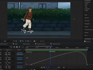
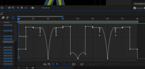
I used the graph editor to edit the path of the second rig/skateboard skating out of frame. I was able to achieve a nicer ease in / ease out look. The speed works well too. (Image on the left: screenshot of the graph editor path for the skate)
I animated the hands rotating based on the impact of the jump, and I sped up the jump overall. I am happy with the outcome of this draft and feel as though the animation is just about done.
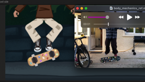
Now that I finished the animation, I brought the final video into Premiere pro to create a looped video and add sound.
I gathered some sounds to suit the scene. I cropped skateboard sounds from my main video reference with my sister, into a sound effect. I also made use of a copyright free neighbourhood ambience sound effect.
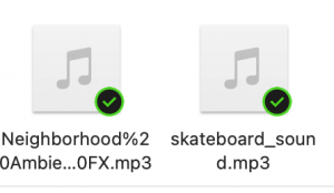
I uploaded my video and these sounds onto a Premiere Pro file.

I duplicated my video four times to make a longer video of the animation play in loop.
I also cropped and cut the skateboard sounds apart to fit with when the skateboard flips, and when the character lands on the skateboard. I added the neighbourhood ambience sound below it.
After this the edited version of my animation was done, and overall the body mechanics animation was complete. Here it is below:
I am very happy with the outcome of this body mechanic. It definitely was the more difficult animation to complete out of all the cycles, but it was a challenge I had fun tackling. I like the environment and how the motions came together, I feel as though I did great in recreating the motion of skating on a skateboard. However I could have improved in the timing of the jump/the jump motion in general. I feel like I could have studied more on how to accurately replicate a jump. Other than this I am happy with the result.


 For the phone, I added it to the main composition for the character, just underneath the right hand. I parented the phone to the right hand control, and the phone successfully moved along with the arm, with the hand holding onto it.


 In this draft I made some additional touches to the expression and personality to the cycle. I mentioned before I wanted this character to be tired and unbothered to the world around her. After the feedback I realised I did not add this idea in sooner. I made a few more lip shapes, and animated the chest going up then down – suggesting that they are taking a deep breath and sighing. This adds a lot more personality to the character and visualises what they are feeling at the moment. (Image to left: process of adding lip shapes)


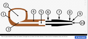
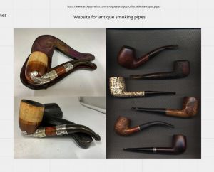
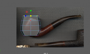
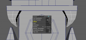
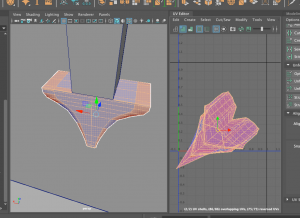
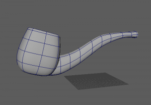
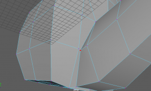
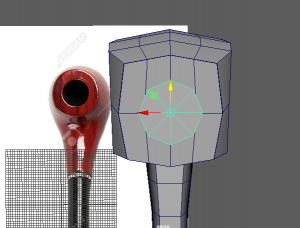
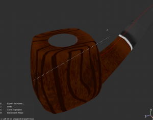
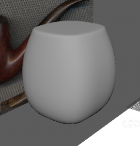 I imported some images to Maya and started blocking out the shape of the bowl of the smoking pipe.
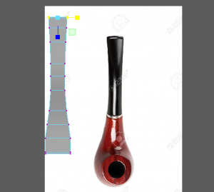


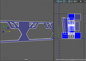


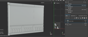
 At one point I was happy with how the model was looking so I created three different versions of the walls. One on its own, and two different corner walls.


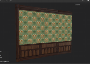
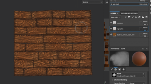
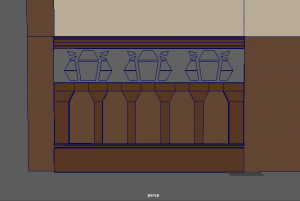
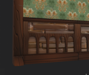
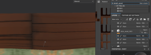
 After this the models were done (apart from a few adjustments I make later). So I exported each model as an fbx. I uploaded the straight singular wall into Substance painter on 2048 resolution, and UV workflow maps turned on. Here It is as I baked the mesh maps.
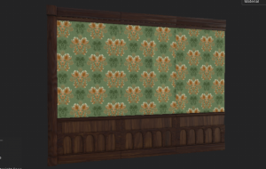


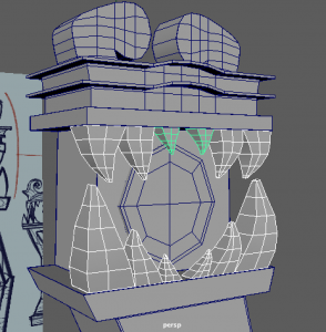
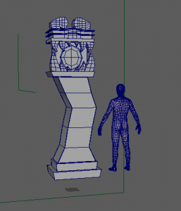
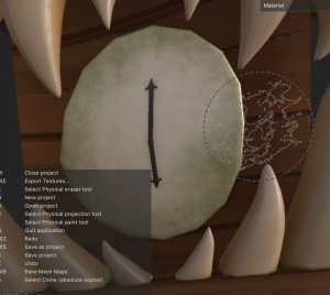
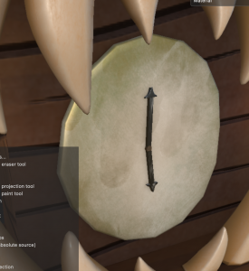
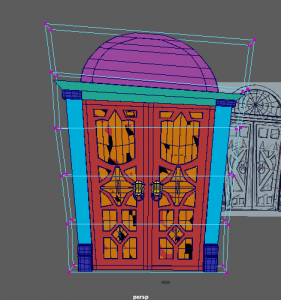
 I started with bringing in my designs into the Maya scene, and blocking out the main shapes of the clock – the base and the case of the clock.