Reflecting first year

Reflecting first year

This past year attending university through my computer screen wasn’t the way I thought I would be attending, but it was definitely something new and interesting to do. I really did enjoy learning animation this year. I have learnt lots from the basics of drawing, to producing 2D animation, and from learning new software, to 3D modelling and animating.

 The people in this class have been so lovely and friendly to me and I hope I appear nice to them too. Although we haven’t all met in person yet, I still appreciate the time I have spent with them so far. 

I will admit this year has been tough for us all to carefully focus on work from home, to be isolated for a long time, not getting the full university experience and to try to connect with others. Apart from all that, I still really enjoyed the year! We had many class calls that turned out fun. The modules were very interesting and I have made projects I never thought I’d be able to make!

Thank you to the staff for working hard especially this year to teach us animation. I am excited for next year and what is to come next 🙂

Cute Character – Reflection

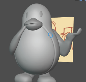
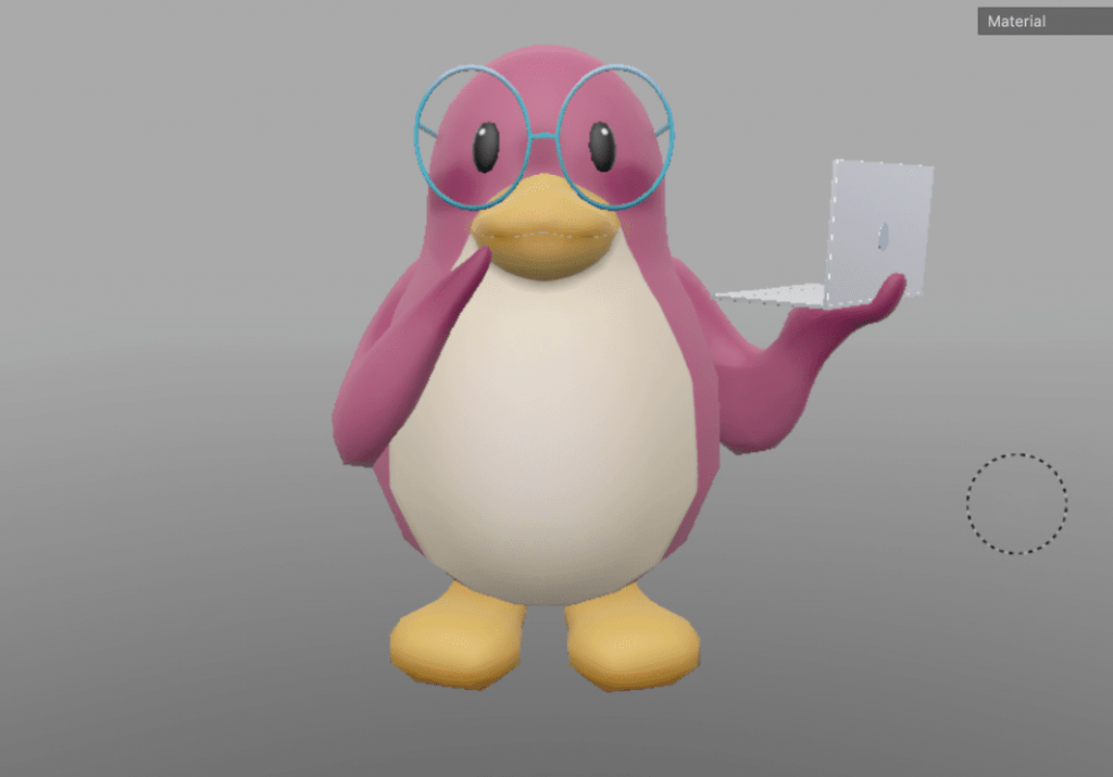
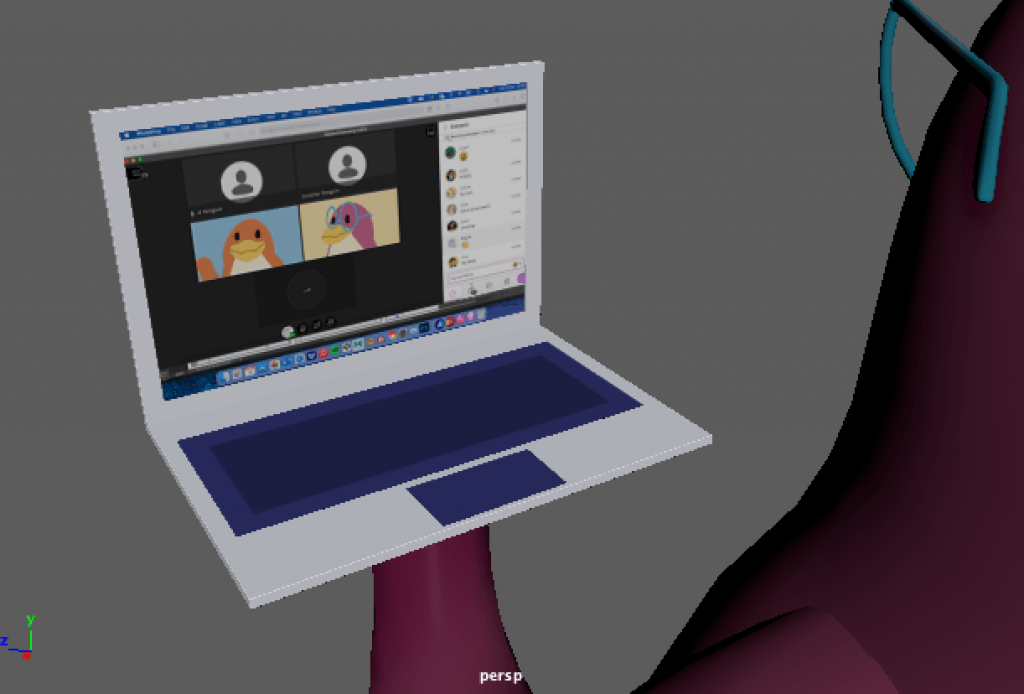
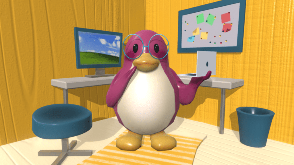
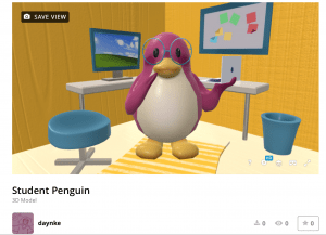
Here is my finished Cute character model uploaded onto sketchfab.


Model on its own: https://skfb.ly/o6oqy

Model with scene: https://skfb.ly/o6rp6


Reflection: 

This was a fun assignment to work on, and one of the many assignments that taught me a lot about 3D. I had only started 3D (for the first time) in January, and I am surprised at how much I have learnt and improved since then. etc. modelling/sculpting, Maya/blender tools and settings, texturing, and more.

I am happy with the outcome of this project. I feel I did great in providing a context/purpose for the character I created, and added accessories, posing and expression to enhance the purpose and presentation. I also feel I did great during the modelling process. I made sure I went through each task and did them the best I could. Lastly, I appreciate the time I took to add a nice scene as it looks a lot more interesting and unique. However, there are also parts I could have done better in. I should have checked through the scene UV maps once more as they gave me a small problem. I could have experimented more with texture design and shading if I had more time to learn about it. Lastly, a part of me thinks I could have been more original in my character design.

Other than this, I had a great experience with this project and I now know how to model a character, texture a character, and present it in a nice way.


Year 1 – Semester 2

Semester 2 of first year

Vase – Weekly Modelling Challenge


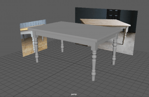
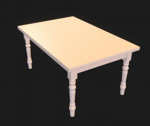
Table – Weekly Modelling Challenge

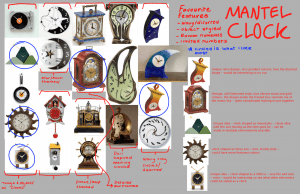
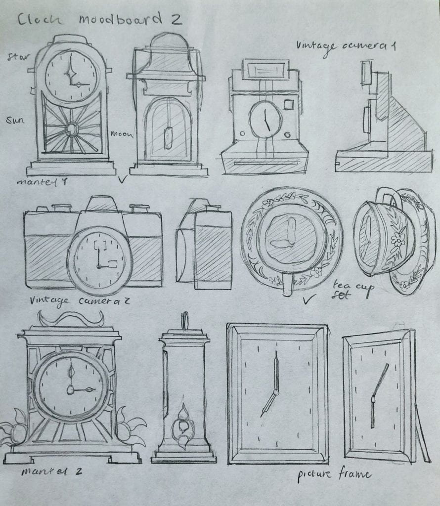
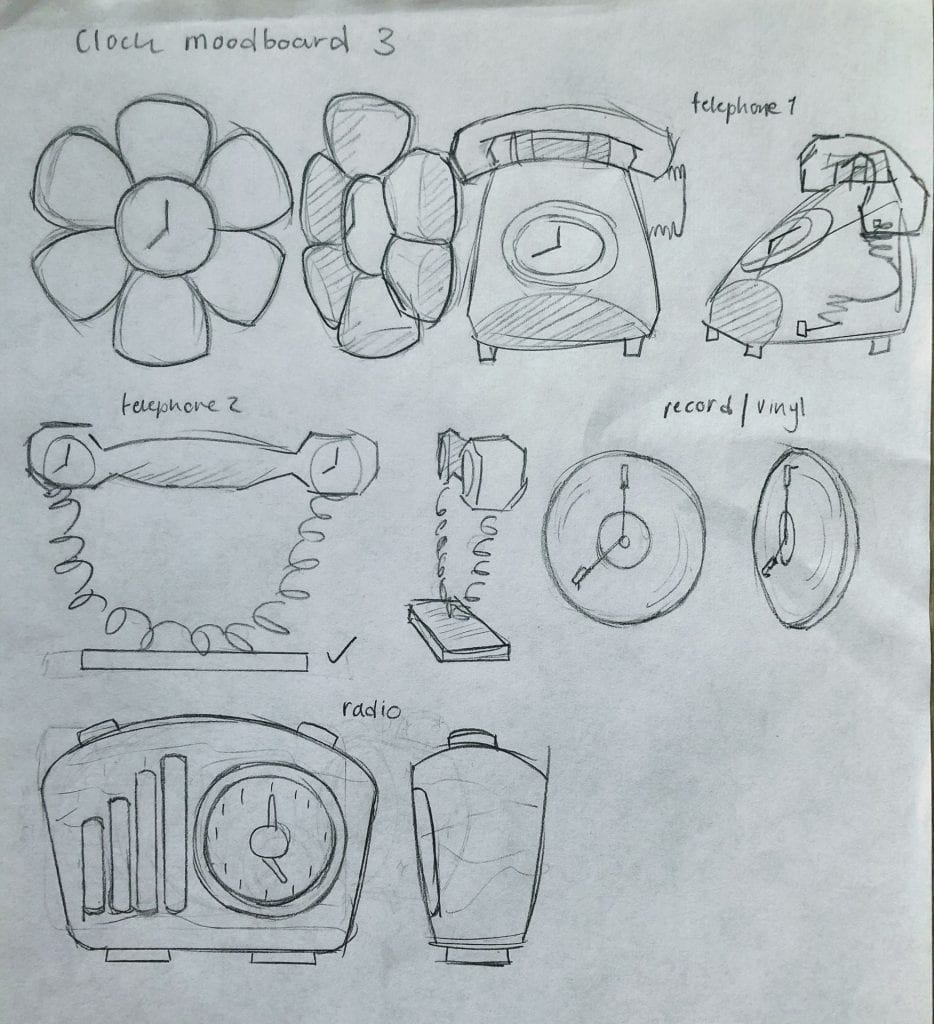
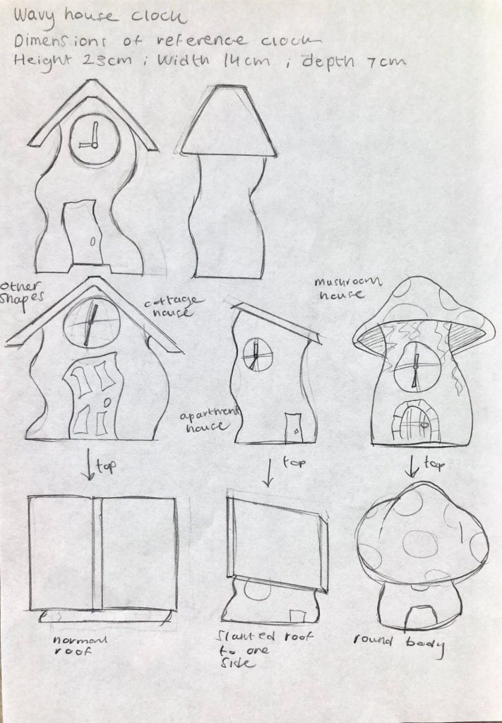
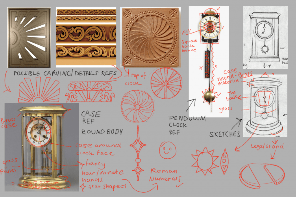
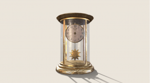
Mantel Clock references – Intro to 3D Modelling

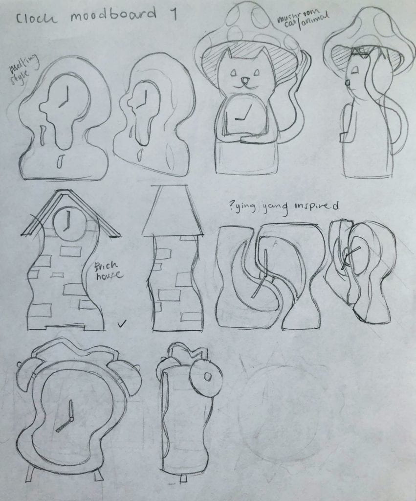
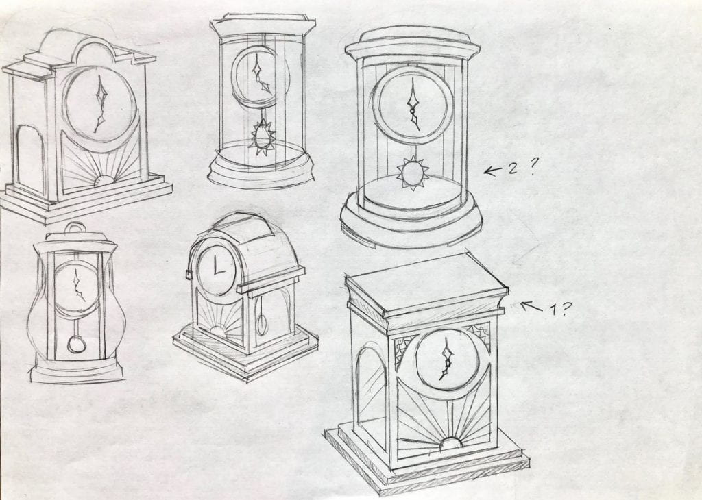
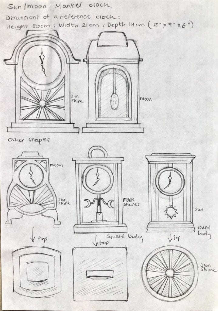
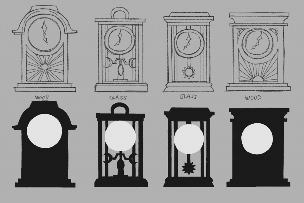
Mantel Clock concept designs – Intro to 3D Modelling

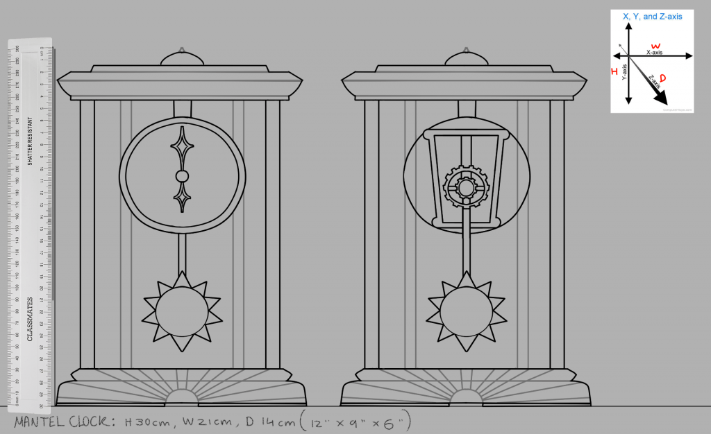
Mantel Clock final design – Intro to 3D Modelling

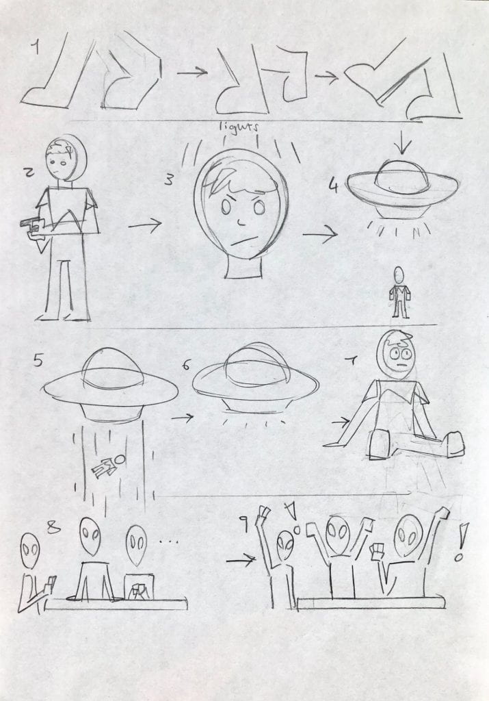
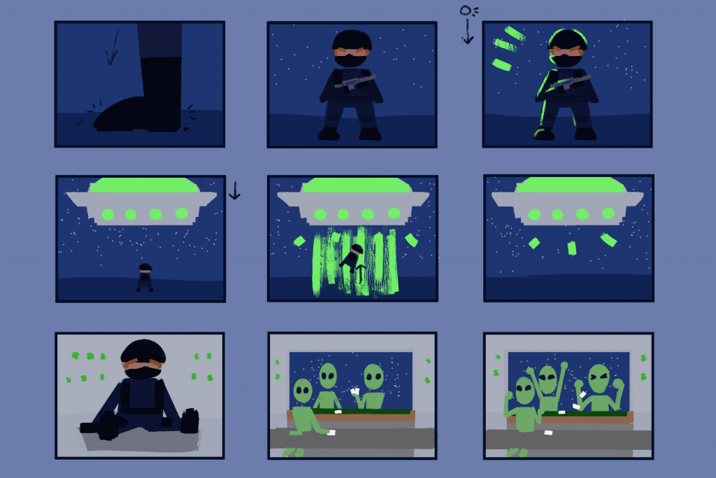
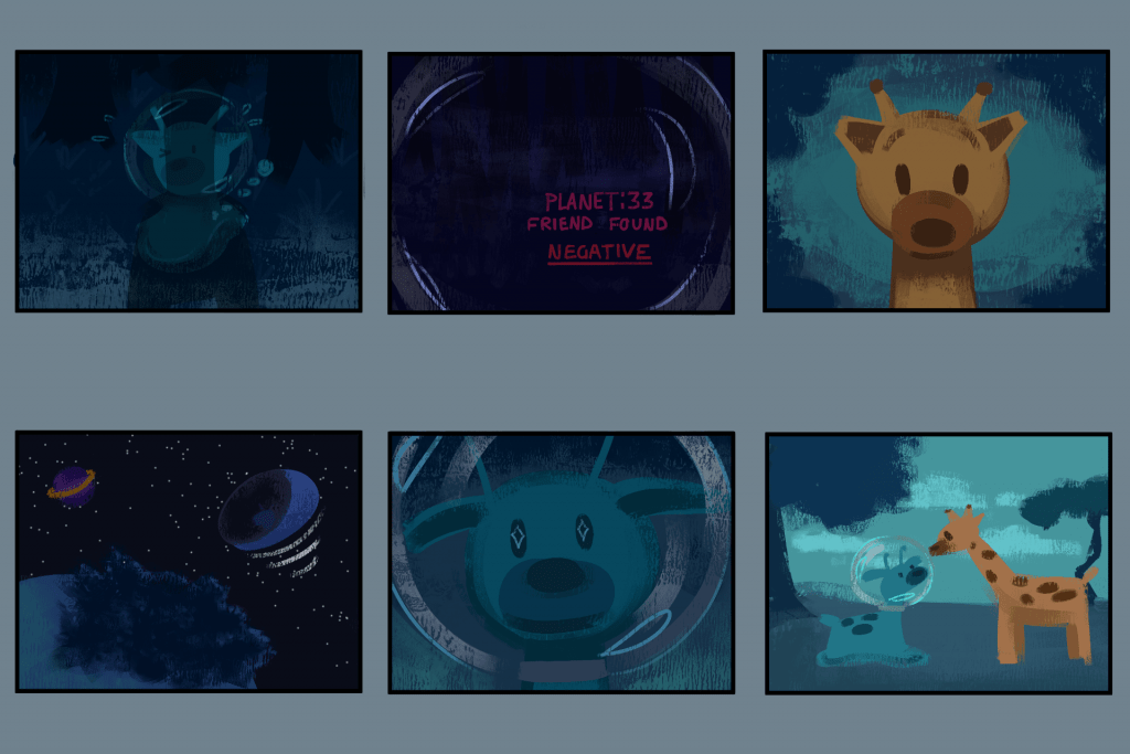
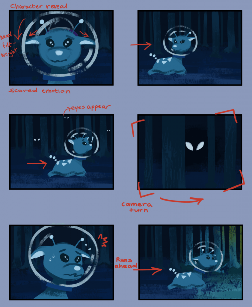
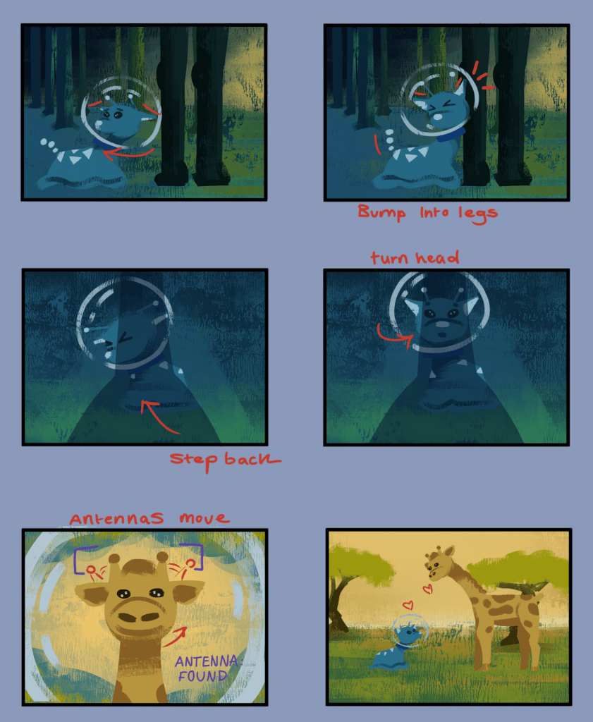
Alien Poker story idea – storyboards and thumbnails – Second Animation Short

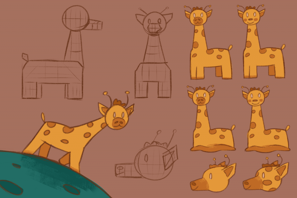
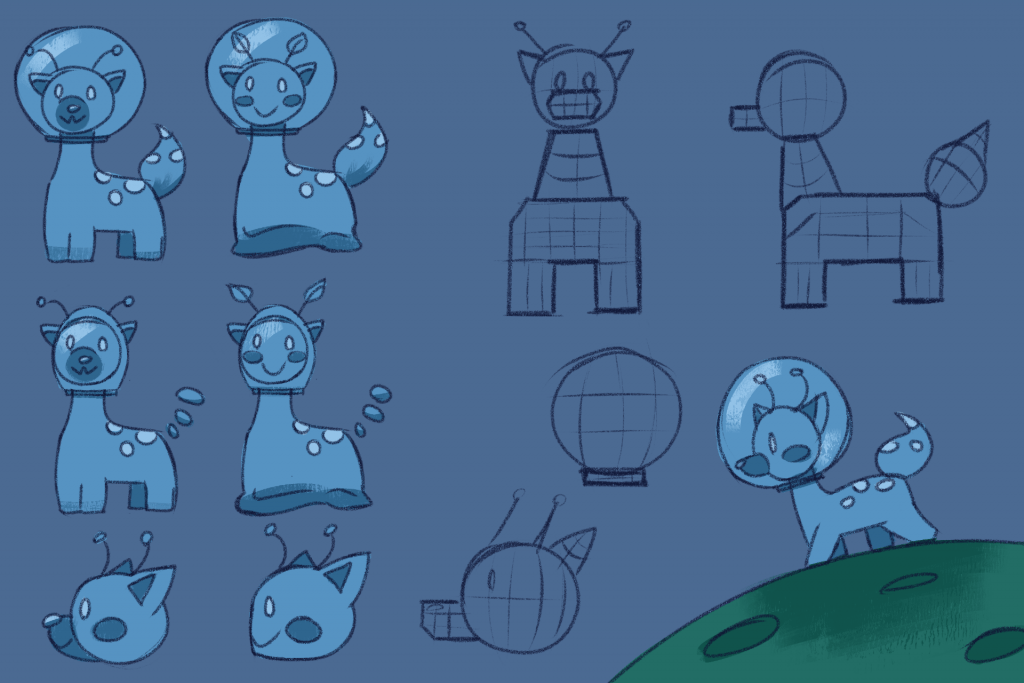
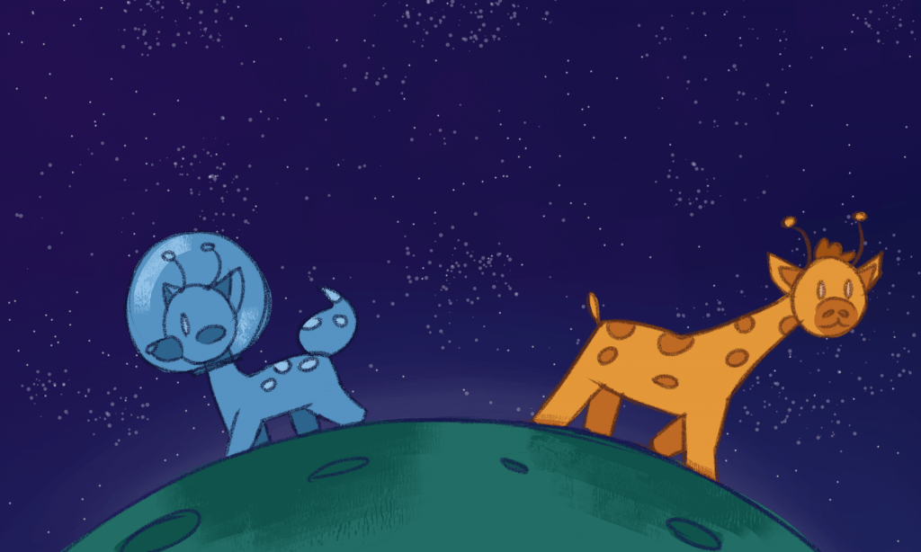
Alien Giraffe story idea – Character design – Second Animation Short

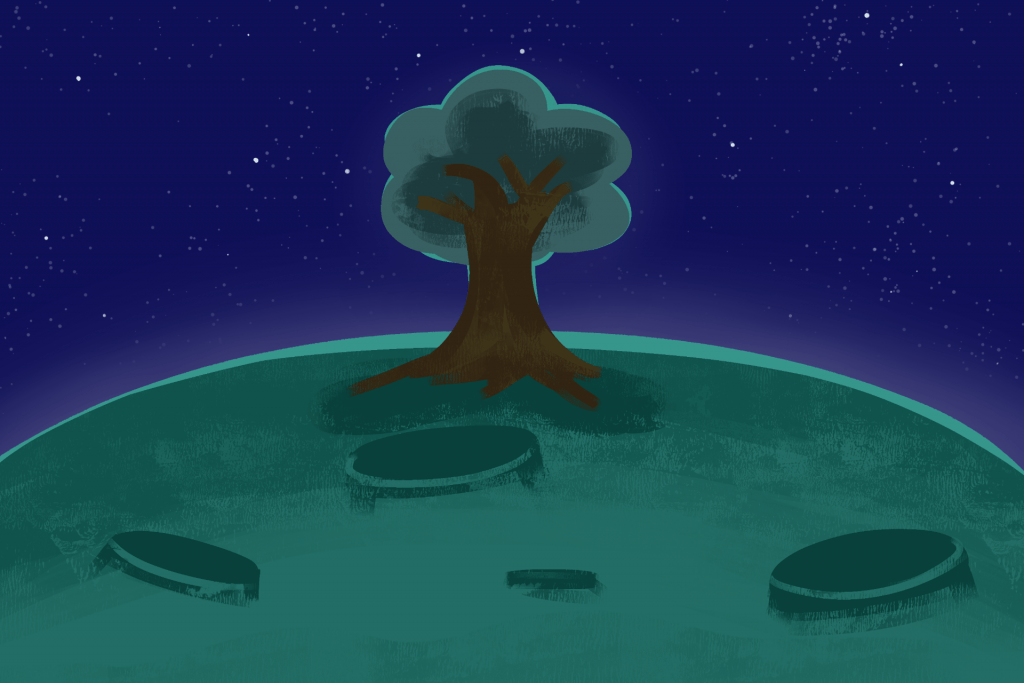
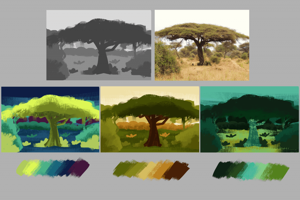
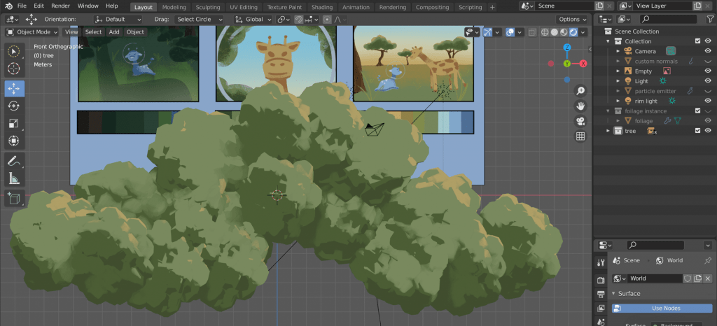
Alien Giraffe story idea – environment concepts – Second Animation Short

Anticipation jump – Animation Studies

Squash and Stretch bounce – Animation Studies

IK and FK rigging – Animation Studies

IK and FK rigging – Animation Studies

Mantel Clock 3D Modelling, Texturing and Presentation – Intro to 3D Modelling

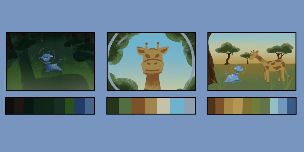
Thumbnails and colour studies – Second Animation Short

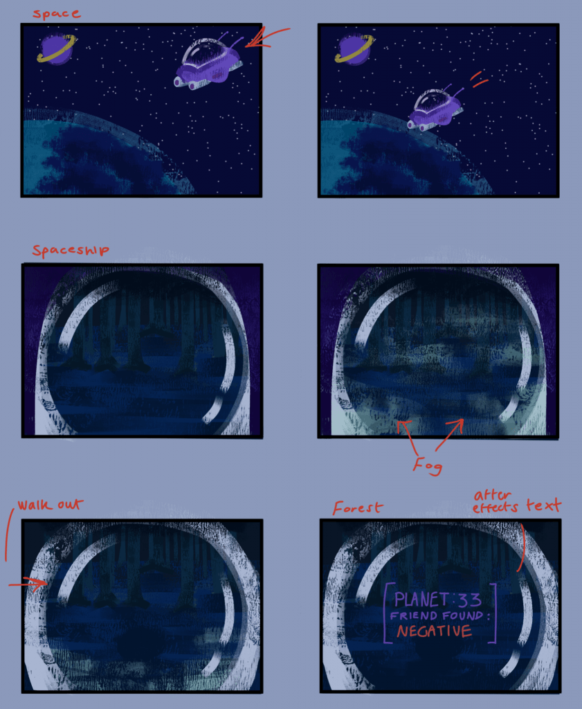
Storyboards – Second Animation Short

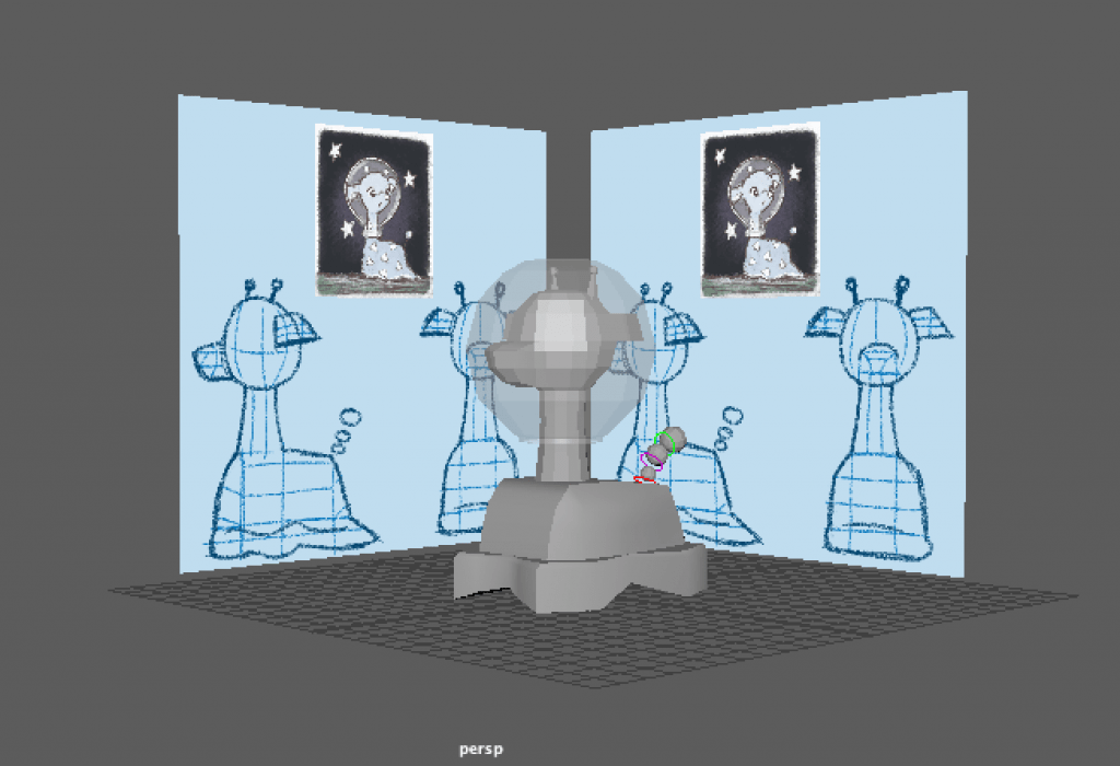
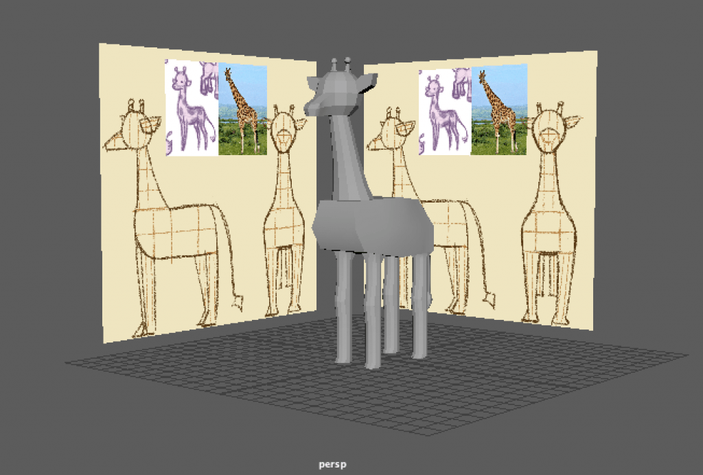
3D Previs character assets and reference – Second Animation Short

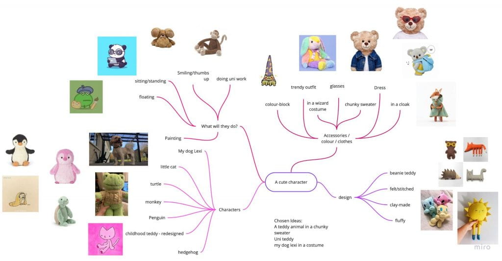
Brainstorm and first concepts – Organic Modelling Cute character

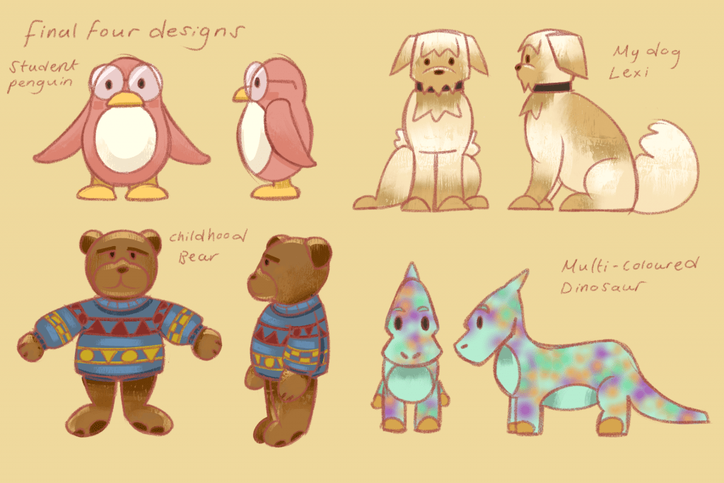
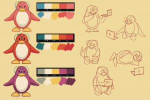
Concepts and final designs – Organic Modelling Cute character

Monty Rig jump practice – Animation Studies

Anticipation Jump & camera work practice – Animation Studies

Ultimate Walker Jump reference practice – Animation Studies

Final colour study – Second Animation Short

Storyboards – Animation Studies Monty rig

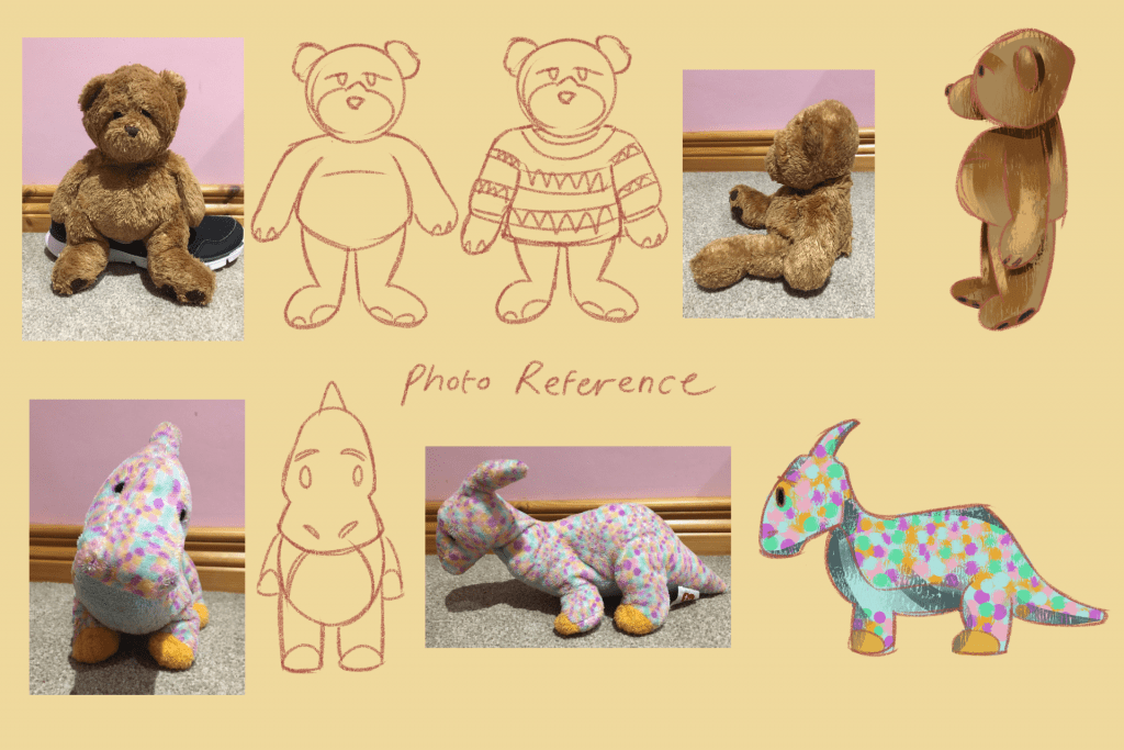
Further concept work and Turnaround – Organic Modelling Cute character

Final Monty rig Study – Animation Studies Monty rig

Final Monty rig Study – Animation Studies Monty rig

3D Previs shot 4 – Second Animation Short

3D Previs shot 5 – Second Animation Short

Toon shader experiments – Second Animation Short

Environment sketch – Organic Modelling Cute character

Final Model and accessories (Blender and Maya) – Organic Modelling Cute character

Texturing (Substance Painter) – Organic Modelling Cute character

Final rendered animation shot 5 & 6 – Second Animation Short

Final rendered animation shot 7 – Second Animation Short

Circle loading animation – Second Animation Short

Final Animation – Second Animation Short

Source: https://drive.google.com/file/d/1YSqn5RoCed4nl4jCd0GEZ-a1zl5dDCea/view?usp=sharing

Painting for texturing – Organic Modelling Cute Character

Modelling and Texturing scene – Organic Modelling Cute Character

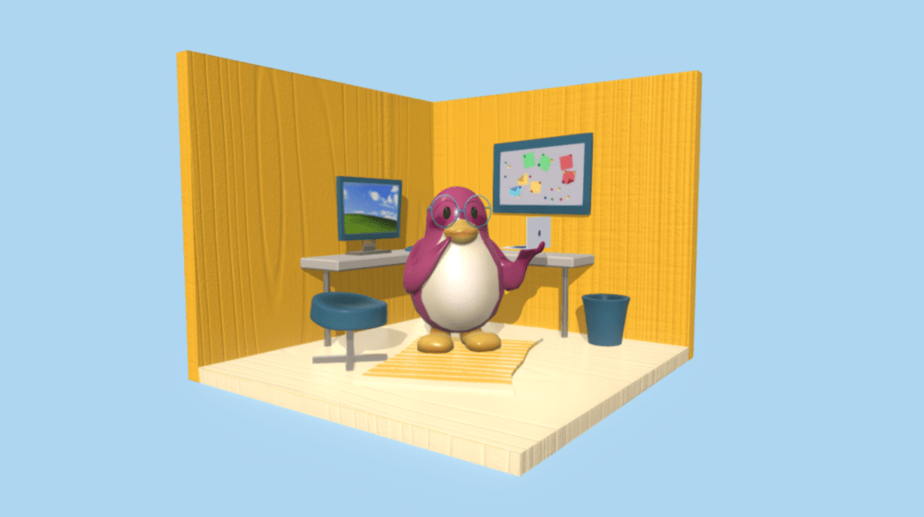
Final Cute Character model on Sketchfab – Organic Modelling Cute Character

Source: https://skfb.ly/o6rp6


Cute Character – Presentation

After modelling and texturing my organic model, I decided I wanted to make a nice scene to present my model in on Sketchfab. Before I go into attempting this, I wanted to gather inspiration and research on how other 3D artists have done this. First I looked through sketchfab of peoples cute characters’ look, and how they presented them in the website.

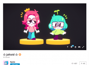
Here is a few that stood out to me:


I could go for a simple solid colour style like these two set ups for characters by ‘Demidog’ and ‘Tsayuriw’ I also like their simple scenes – the sofa, the bath – it connects to the style and also gives the characters a purpose /an activity to do.

I could also go for the toon shader look that these scenes have made by ‘Kyuta’ and ‘jdinutella’. I like the shade style and the outline style as it could go well with my penguin. Along with the penguin, like these scenes, I could add tiny designs around the model to make it stand out more.

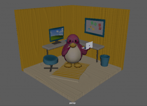
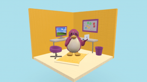
I wanted to try out a scene much like Tsayuriw’s modelling of the ‘Ofuro Cat’. I liked the square room scene and how the objects are rounded and stylistic. It would be fun to see how I can achieve a look for a little office room with a desk.

Here I made a few sketches with the ideas I had in mind. I knew I wanted some sort of office/desk furniture in. I also thought the pinboard was a cute idea but it also contains a lot more detail to make it seem interesting. I also wanted the scene to have a little carpet to fill up the room more. In addition I could possibly add a chair, a window or posters on the wall, If I have time.

I am mostly using life reference from my own flat room. This is where I got the idea of the yellow walls, the carpet, the desk and the big pinboard from.

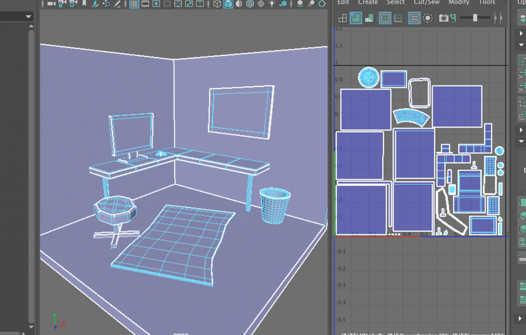
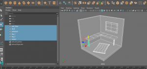
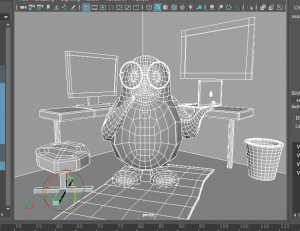
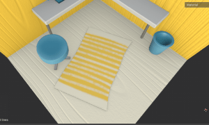
I got back onto Maya and started to mess around with these ideas and see what could work. At this point I had the square room shape placed down. I made a desk, the pinboard and a carpet shape.

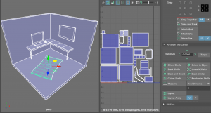
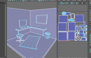
I made sure going through this that all my meshes had correct UVs by going into the UV editor and unfolding each object. I also made sure they fit in this UV map, and that they were straightened any laid down properly. This made my process a lot quicker and easier to go through.

I also imported my penguin model to compare the sizing of the scene to the model. This was helpful in keeping a consistent size of each object in the scene with the size of the penguin.

Here I had added a few more bits of decor/furniture such as a bin, a seat and a mouse for the computer. After I modelled everything I UV mapped the rest of the mesh to clean up and make sure they work for texturing.

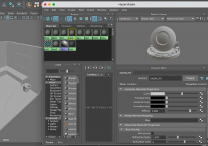
Here I assigned each part a Lambert material so they can be separated from each other on Substance Painter for texturing. I named each one what they were and kept each object with multiple meshes together, such as the table and the monitor.

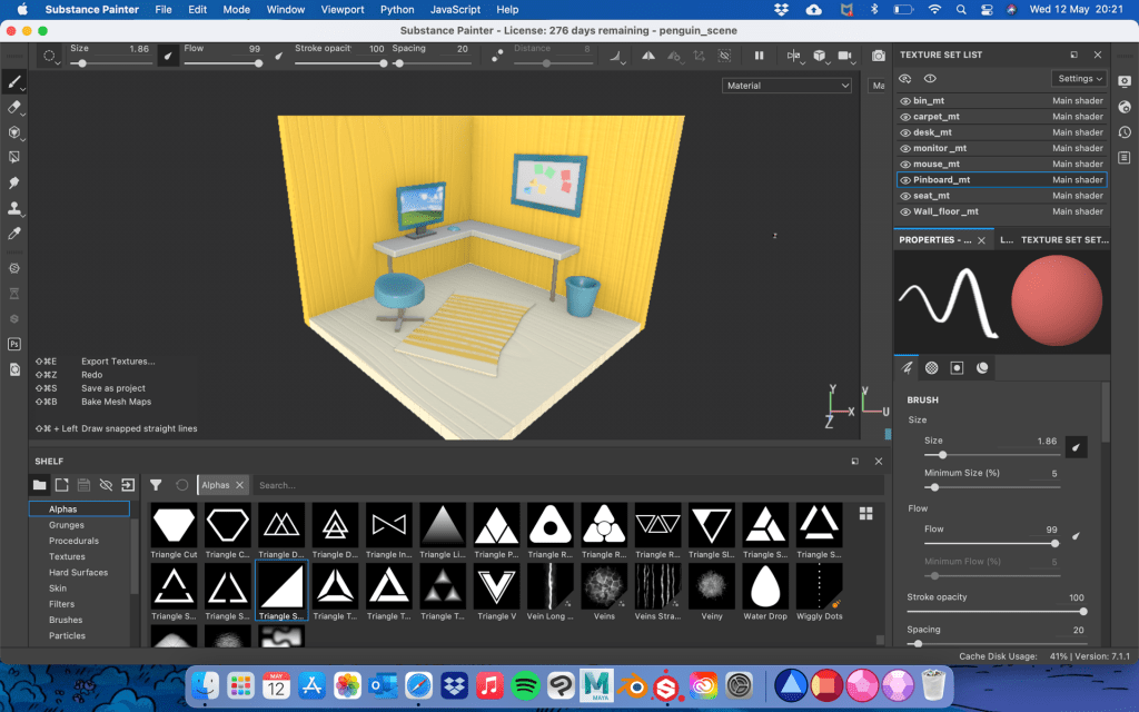
I brought my scene into Substance painter by exporting it as an FBX file, and as soon as I go on, I baked the textures so they could be painted on and have textures placed on them.

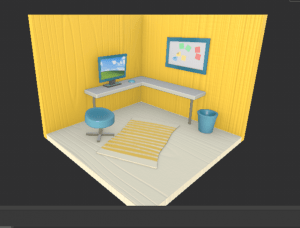
Here I had experimented with the colour assorting and design. First I painted the walls and floor a yellow colour and a cream colour. I then experimented with a wood smart material and placed it underneath the colour layers, so that the colours would show on top and the wood line texture shows through. I also used a secondary colour to clash with the yellow, a teal blue. I painted it on the seat, the bin, the pinboard, monitor and mouse. For metal parts like the seat stand, monitor stand and the desk legs, I painted on Metalness and low roughness to get a shiny metal look. In addition, I experimented with the pinboard and the monitor screen with the use of images and alpha shapes. I used square and triangle alpha shapes with a colour to create sticky notes. I dragged in a desktop background image onto Substance and used it like the alpha shapes, to place down on the monitor screen. Lastly, I painted on stripes on the carpet to give it a pattern.

Similarly to how I painted the penguin, I added lighter and darker tones of the teal blue colour around the seat, bin etc. to give it more vibrance instead of just a single colour on it.

I liked how this was going however I did want to add and change a few things for this scene. I moved on to test out the textures and presentation anyway just to see if it works, then I would make my changes after.

First of all, it worked well when brought back into Maya. All the textures were working and the penguin fit well in the scene. I made a new FBX export Including both the penguin and the scene so its an easier process in Sketchfab.

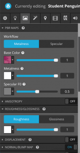
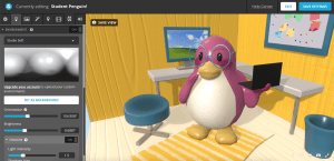
Working on Sketchfab was a straightforward process where I would slot in each texture to their PBR maps etc. Base colour, Metalness, Normals. I also added in a lighting environment (Studio Soft) and made sure the intensity was correct before publishing.

This is how the scene looked after publishing. It was a little tricky to get a good angle of lighting as the walls block it, but the scene lights up okay anyway. The textures are all on and work well, and the models look clean. After publishing this test I would like to go back to the Substance Painter stage and add a few changes and details to make this scene a little better.

At first I wanted to try out a different colour to replace the teal blue to see how that would look. I painted on a purple/pink colour but soon realised it blends in too much with the colour of the penguin, so I switched back to a teal blue colour.

I also wanted to add detail to the pinboard tomake it seem more like a pinboard. I worked with a height fill layer and a black mask (with the fill layer in different colours) to create dots around the board which makes it look like pins holding up the sticky notes. This was tricky to find a way to recreate but I think this works well in the background.

And here are screenshots of an updated version of my Cute character scene. I followed the same process of adding textures onto Sketchfab and adjusting the lighting of the scene to present the model well.

Overall I think this looks really nice and although I could have experimented more with texturing and materials, I think this looks appealing and cute as it is. The Sketchfab link is below.

Source: https://skfb.ly/o6rp6

Reflection

Here is the final animation my group have produced for our 15-30 second Animated short Assignment.

https://drive.google.com/file/d/1YSqn5RoCed4nl4jCd0GEZ-a1zl5dDCea/view?usp=sharing


Reflection:

This assignment has been the most challenging project so far, however I did enjoy the process more than I expected. Going into this, with only the experience of Maya through my previous modelling assignment, I was quite nervous to end up producing a whole animated short. As a result me and my group have made an adventure themed animated short about an alien and a giraffe.

I am very proud of this project! Before this I could never imagine myself producing 3D animation, but now that I have it would be great to try it out more. I feel I did great in organising myself and the group in preparing for each task of the project, I was able to animate the scene well, I made sure to experiment and try new things to see if they would work, I would always try to find a solution to a problem and made sure I was keeping in contact throughout the project. However there are also parts where I thought I could do better such as getting used to the character rigs and using them properly, making sure my files are okay before I proceed to avoid wasting time, and I could have learned to organise textures/materials better in a Maya file.

Other than this, this was a great experience. My teammates were amazing and worked hard on this project. They were kind, they voiced their opinions and they made this project very fun the times we were chatting and hanging out.

Overall, my teammates and I did very well in creating a genre, narrative and character concept, using design thinking processes to overcome problems, using 3D pipeline workflow to prepare for animation, and communicating with each other / working together.

Post-Production

Again, here are my rendered scenes below.


I was able to put together all my PNG frames by adding them into after effects, and processing them as an image sequence. This would help the images play as Maya intended in the right frame rate and pace.


After our rendering process, once everyone was finished, we were able to start editing everything together. During the production stage we had already collected many sound effects to help tell the story, though we went looking for some more or some to swap with others, as our story has changed slightly between the last time we picked our sounds to now. We had both a collection of sounds from a YouTube playlist and a folder in the Google Drive.


Jennifer was in charge of the editing process and the rest of us were there to offer help when it was needed. Here is the full animation edited all together along with the credits. This excludes the After Effects last touches we want for the helmets tech screen (to be added soon).

Source: https://drive.google.com/file/d/1elvPuLA-AXdHrF1Ghe9Vh_Ef3g7CVEir/view?usp=sharing


We split up little jobs we can do to help add to the After Effects touches. I chose to make a little circle loading/tracking animated symbol that we vision would appear through the POV of the alien on the helmet. It will appear in both of these scenes below.


I drew the individual frames on Clip studio, exported them into PNGS, then went through the same process as before adding them into After Effects as an image sequence, then rendering it out as a video file.


Alisa produced the text for the helmet that points out the aliens objective, what she is looking for, and how long she has been looking. This provides context to the story and will inform the viewer of what is going on. Matthew produced the vignette effect for the helmet that will determine when we are looking through the Aliens POV. And Jennifer is adding all our little bits together and presenting them in the same file to render out the final edited animation!


And here it is: This is Antenna Met You!


https://drive.google.com/file/d/1YSqn5RoCed4nl4jCd0GEZ-a1zl5dDCea/view?usp=sharing

Monty Rig – Final playblasts & Reflection

Below are the final playblasts of my Monty rig animations reflecting studies of weight in motion / body mechanics, and of conveying emotion / personality.

Here are my playblasts displayed in SyncSketch:

Motion: https://syncsketch.com/sketch/981db0adfa61/

Emotion: https://syncsketch.com/sketch/8f3249476ba9/

Motion View 1:


Motion View 2:


Emotion View 1:


Emotion View 2:


Reflection

Going into this assignment was quite nerve-wracking for me as I had not touched Maya, or Maya’s animation tools to be exact at all before this year. It has been quite a lot to wrap my head around but after completing this assignment I feel much more confident and more aware of what I am working with now. The tutorials I watched from both my tutors and youtube videos, the reference videos I found, the use of the 12 principles of animation, and inspiration from animators and classmates have all helped me throughout this assignment.

I feel as though I did well in structuring my plan and the research I have done – I made sure I wanted to gather great understanding and knowledge before I got into this. I also think I did well in creating something appealing in both the motion and emotion animations; capturing the motion of pushing and jumping, and the emotion of feeling tired. Aswell as this, I also surprised myself at using the animation editors the best I could. This included the Dope sheet, the Tweenmachine and the Graph editor.

I tried my best to convey weight in motion, focusing on body mechanics, and conveying personality. However, I feel as though I could do better in preparing the keyframes and positioning the monty rig so that it looks more appealing and realistic, rather than stiff with little weight etc, the legs, the box movement. I know for next time I have to be careful of where the rig parts are positioned as they may move to a wrong place during the process etc. the knee constraints and the bottom circle move tool.

Overall I think I did a good job in making these animations. I have gained better understanding of 3D animation, I have improved greatly from my first few attempts, and I am excited to bring these skills into the Second Animated Short assignment.


Monty Rig – Animating

First I will be completing my action animation ‘Pushing box then jumping onto box’. I started off my new scene by using the reference editor to bring in the monty rig. This provides me a fresh, new rig to work with and excludes any other touches It may have included in the actual file it comes from.

I used my reference of my legs as picture in picture at the top corner of my screen so I could clearly see the video while also seeing my Maya workspace.

I started blocking out my keyframes, also following my storyboard, to where important key poses are placed. As soon as I added in a few frames I went back to add some more to enhance each keyframe. This provided me with a blocked animation. At this stage no timing, or in-betweens are figured out yet, just simply the overall poses in the action. Here is a quick playblast of how it looks at this stage.

I think so far I’m definitely achieving the look i’m looking for so far, but there so much more to work on and polish up before its properly animated.


Further on, I used the tweenmachine to help me place in-betweens down to smooth out the action. As I first went through the frames and turned off stepped preview to see how it looked, there was lots to fix. Below you can see a lot of errors with the legs and the timing is off too.


Here is the result of looking back on the frames on stepped preview and seeing what went wrong. Below is two versions of the in-betweening process and timing structuring with the use of the dope sheet. The first video is with stepped preview off, the second is with it on.


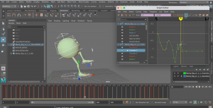
Next, I moved onto polishing up the movements with the use of the graph editor, and added squash and stretch frames for the body. I usually get a little stuck at this part because some of the things I do on the graph editor, don’t usually turn out good. I’ve had some experience before and I feel like I did a little better at handling the graph editor this time around. I also added squash and stretch features just after using the graph editor. This is because that function is what I mess up most in the graph editor. I wanted to make sure I avoided any complications I might have run into. In the end I added the squash and stretch with little problems and it came out looking good.

I also added some more touches to how the monty rig pushes the box, a wobble after it jumps, and the subtle movements of the legs after it jumps. This is to add more realism and spark to the animation instead of solid movements. 

Here is a preview so far. At this point I can now look over the animation one more time, and now plan the position to where the monty rig will move across the screen, and where the box will be pushed to.


I have been working on the feet placement as I thought they were quite off from key-framing I had done beforehand. This is how it looks now. At some points, the left legs knee would stick outwards too far that I thought didn’t look right. I was able to fix this by going through the frames again and pushing up the knee control towards where the box is so that it would straighten out more. However I left in a bit of outwards bend all on a same level of translation because I thought it would add realism to the leg movement. It also fits in with the right leg, where they both stick out a little.


I have now also worked on the positioning of the Monty rig. I could say that this animation is done however I still am not happy with how the feet almost ‘slip‘ as it moves forward. I have been trying to fix this but this is as far as I’ve gotten.


Here is a closer look at the feet movement. As you can see, sometimes when one of the feet is on the ground, it can slip upwards or downwards. I have been trying to fix this by setting their translate positions regularly the same as the last frame but It doesn’t always work. I will need to look back on some tutorial videos to see if this problem can be solved.


I’ve come back to this action after a while and with more experience with the graph editor, I can figure out the feet placement and the circle tool placement and fix them up as best I can. It was tough to find the key frames on the graph editor a good place to sit when the monty rig is moving forward, but I worked with it until it looked right.

As soon as I got through this, I did one more look through the Monty rig to see where I could improve. I added some eye movements such as a blink, stretching when its jumping, and a wink at the end. I also reset the box translations and did them again so they could line up with the feet again. All of this was done using the graph editor.


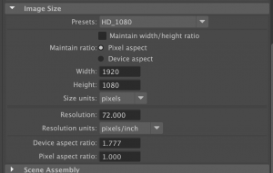
Before I wanted to make a proper render of my animation, I wanted to change the settings. I went into the render settings and set the preset to HD_1080 in the Image size option. This allows my previews to appear more clear and better quality. Then I went over to the playblast settings to change the display size to ‘from render settings’ so it will follow the same preset. Since I am on MacOS, my only format option is to go with avfoundation, instead of having the option to go with qt for QuickTime. I searched this up and found out that avfoundation is another name to represent Quicktime so the settings will come out normally anyway.

By setting up my render settings for a better quality playblast video, this is the finished result of the Monty rig Action!


Now, I will be completing my emotion animation ‘Feeling Tired’. I started off my new scene again by using the reference editor to bring in the monty rig, providing me with a fresh scene to work on. I got my reference videos ready to switch between on picture in picture to start working!

I started off with blocking out the major keyframes that will structure out my animation taken from the reference I was using and the thumbnail video/storyboard I made. Again, no timing, or in-betweens are figured out yet, just the overall poses in the action. Below is a quick playblast of how it looks at this stage.


Further on, I used the tweenmachine to help me place in-betweens down to smooth out the action. I also timed out the action at this stage. Here is what it looks like so far in stepped preview. There is still a lot to fix considering the walk cycle, and the fall.


Below is what i’ve achieved in the in-betweening process and timing structuring with the use of the dope sheet. In this preview, I had stepped preview turned off and fixed up a little movement from where the monty rig lifts up the legs as it falls. There still needs more work on especially for the wobble, the fall etc.


Here is a little more work on the in-betweens, the timing and just the translation of parts to fix up any other motion I thought needed adjusting. I slowed down the pace of the walk which made it easier to adjust the legs, the fall works a lot better and I added additional movement to when monty is on the ground – the head bounce and leg bounce. I am thinking of going back to adjust the head a little more at the beginning and fix a little bit of the step up to where the monty rig loses its balance.  I can polish up these parts with the graph editor.


This is the result of going through the animation with the graph editor to polish up. During this time I also added in some more touches such as the left to right wobble at the walk cycle, and a squash action as the monty rig hits the floor. I do want to look over this squash though as it looks a little off (stretches too far to the left) but overall the animation is coming along great. The timing is good now, the leg positioning is at a better place now and the roll to the front finishes off the animation well. I will go through the animation one last time and fix up what I can, and make it a little more appealing.


Heres a little more alteration i’ve made for this emotion action. I almost forgot about the eye function so I added them opening and closing, trying to stay awake. I have also been working lots on the feet placement and overall little touches with the use of the graph editor. During this time I feel like i’m getting better use of the graph editor than I have before so this is good progress.


I took one more look through of this Monty rig emotion to see what can be adjusted. I used the graph editor the majority of the time to alter the feet placement when the monty rig walks forward. Again it was challenging to configure in the graph editor but I’ve become more familiar with it. I also worked on the legs where the monty rig struggles to balance, and when the legs hit the floor, just to enhance the action a little more.

By setting up my render settings for a better quality playblast video, here is the finished result of the Monty rig Emotion!


Monty Rig – Planning

For planning my Monty Rig, I will be taking in the inspiration I researched, looking over the 12 principles of Animation, and going over what techniques I will use, and in what way. Here I will also produce thumbnails and a storyboard to help my progression to the animating stage.

I have implemented a few of the 12 principles of animation into my practice work already. From these I can learn how to achieve said principles and how I can improve them to feature in my Monty rig assignment.


First off I have attempted squash & stretch in this monty rig practice. From the monty rig jumping side to side, I could add a squash and stretch feature into the jump by squashing the head at its anticipation stance, and stretch the head when it is reaching up in the air.

This squash and stretch feature is good to enhance the action and gets the point across that the monty rig is jumping. However, I feel I could improve in this animation overall. I could have left a few more frames for the anticipation and therefore give the jump more of a punch to it. I can see where I tried to achieve this but I feel it could be enhanced more. This way I could get more squash and stretch seen in the action – I would have more time to squash the head etc.

Overall I did a good job, but next time I could focus on the timing of the jump that will allow more space to provide squash and stretch.


I have also attempted anticipation in this Character rig. In this next jump action, I could focus more on the anticipation as I only had the body to work with. I could squash down the head every few frames then made it jump with a stretched head, and land it back with a follow through action. (squashing then returning to normal)

Anticipation is beneficial to start an action before going straight into it, it allows for thinking time and a better-looking outcome for the action executed. I think I did pretty well attempting an anticipation action. This was a very simple task so I could achieve more in many other practices to come.

All I would say is there could be more realness to the movement, I can see in my attempt that the anticipation pose just goes straight down. To add more to the pose there could be a little wobble, a tilt of the head eg. just to make it a little more loose and expressive.


I attempted a follow through/overlapping action with this rig. In this expressive jump, either side of the body would overlap the other as it goes up and then down. There is also follow through when the body lands and the ‘head’ still reacts to the jump until it returns to normal.

Follow through/overlapping action is excellent in adding realism to a character or object. I think this attempt was pretty good in terms of the timing, the additional action at the start and the follow through at the end.

I think overlapping action/follow through will be easier to tackle with a more complex character rather than this shape here. So in the future, I’ll have a better idea of how to go about follow through/overlapping action once I test out a different kind of character.


To help with my knowledge and find more inspiration, I wanted to find examples of the principles of animation (for action and emotion) in any films I could find. This will help me spot them out more clearly and I can also see what kind of scenes they used these principles for.

I know I will be using squash and stretch, so I wanted to find an example of that first. I found this youtube video called ‘How to animate like Disney: Squash and Stretch’ The clip below, from Tangled, is what they used as an example. This is an action performed by Eugene, where he slams into a part of the dam structure. The use of the stretch technique (on his head, neck and limbs) as he hits the surface intensifies how fast he flew there, and how hard he hit it. It also could make the audience feel how Eugene feels too because of how intense the action is.

Source: https://youtu.be/L7okQED-8nM


I also looked for a good anticipation example and found this video called ‘Spider Man: The Anticipation Principle of Animation’. This was a really interesting video analysing the actions of spider-man from multiple films, shows and games the character comes from. As similarly explained in the caption of the video, many actions from spider-man and others constantly use anticipation to build onto what he does etc. punch, jump etc. The first example of Miles pulling back his arm for a more impactful punch adds realism and strength. And the second example of Noir webbing a car, and doing a spinning-jump to throw it to the bad guy, is also a symbol of strength.

Source: https://youtu.be/0MD2jHSYvTc


What popped in my mind was one scene that I love from the film ‘Moana’ where Moana convinces Maui to join her. Here we see a follow through technique made with Moana turning too fast that her hair flies past her face. I clipped this from a Youtube video called ‘Moana – All movie clips‘ Although this is a simple action from Moana as she just turns around, it could also pass as emotion. This is because in this situation, she is frustrated with Maui and desperately wants to get her point across. She turns around quickly with an angry expression, resulting in her hair flying across her face. As a result she becomes frustrated.

Source: https://youtu.be/0ydAYENu1RM


I can now move onto deciding on the actions I want to create! These were quite difficult to choose as I couldn’t find any clear ideas, or any good references to help out for a long time. I had a list of what I could possibly do written down in my notes:

Action and physical motion:

  • Ballet Twirl
  • Running in air Scooby doo style
  • Banana peel fall
  • Pushing box with foot
  • Sitting down on the floor


Type of emotion:

  • Joyous
  • Laughing
  • A wink
  • tired
  • Laughing then straight face


My final thoughts were to go with a combination of ‘pushing foot with box’ and ‘ sitting down’ for the action, and ‘tired’ for emotion.

As i’ve said before it was difficult to find references for what I hoped to do, especially for the action one. I decided I could do a few life references of myself to bring to life the idea I was thinking of.

I don’t have a lot of stuff, or space in my flat, but I made use of what I had. Unfortunately, I don’t have a box to work with.. So I filled up my washing basket with my cushions and that made it easier to push (I needed more weight for the action to work) I recorded myself pushing the basket with my feet similar to how the Monty rig will end up doing so. Again, I didn’t have much space in this room so that is why the camera is quite close to my legs. Though I still think I could work with this to focus on the feet movement.


I also made another video with a better shot of my legs – this time I can see clearly how each leg will react to the push and what will happen in-between the action. These references will really help me out to determine how this animation will play out.


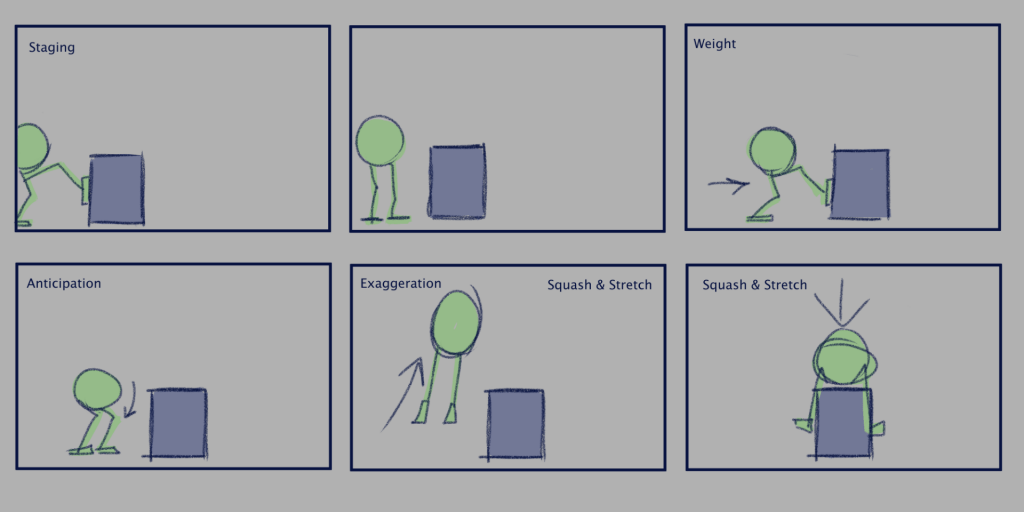
Here is a quick storyboard/thumbnail of keyframes i’ve made of what my action idea looks like and how I will achieve it.
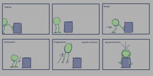
I want to capture the monty rig pushing the box into frame around two times to grasp the idea it is pushing the box. Then I would like it to jump onto this box, spinning around a bit so it faces the camera, and land with their legs in follow through movement.

Aswell as attempting to capture what I was thinking of, I also wrote down the principles that I may use in that certain part of the animation. I write down principles such as Staging, Anticipation, and Squash & Stretch. I added another  feature such as weight. Weight will be a big factor in this animation as the monty rig pushes the box.

I have also made a quick thumbnail video to time out the action and picture how the body and legs will perform.

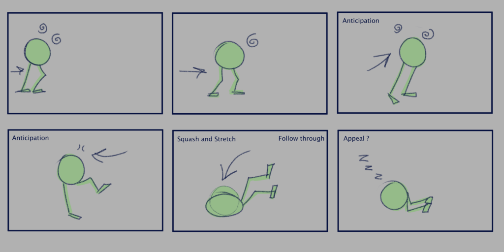
For the tired emotion, I was thinking of a tired walk into the frame, then the monty rig might fall to the ground to sleep. I found this great reference video of a person walking in a dazed walk cycle with two camera views. This will help me achieve the ‘tired’ feeling to the monty rig and will also help with referencing a walk cycle.

Source: https://youtu.be/Xjg1GijjazE
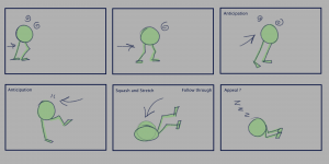
 

Here is the emotion storyboard I made, also highlighting the major keyframes and how I will achieve it. I was going for a dazed, tired walk. Then the monty rig will loose balance, fall onto the floor and start sleeping. Again I added in the principles to where I might implement them. I added anticipation, Squash, follow through, and possibly appeal for the last scene.

Again I made a quick thumbnail video to time out the action and picture how the body and legs will perform.

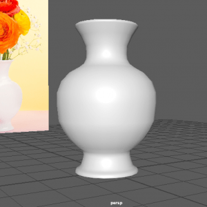
3D Animation Practice Part 3

During week 8 we took some time in class to work with a simple jump animation with the Monty Rig, and using our new knowledge of rigging, and the use of an extension for in-betweening. This exercise would help us out with our Assignment with the Monty rig, and help us think about the blocking process, inbetweening, and the polish process using the dope sheet and graph editor.
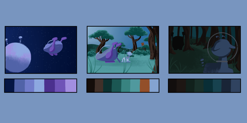
Source: Week 8 – Animation Practice & Rigging continued, Morning Animation Exercise, Monty Animation – Blocking.mp4, Monty Animation – Inbetweens.mp4, Monty Animation – Polish.mp4


We followed, and used the same joy action that our tutor used in these videos to create the animation.

Back To Top
Skip to toolbar