During the third week, we were given feedback from our presentation. We were told the project is going in a good direction, and what we should focus on this week/next week is a strong sense of art style, and a list of roles for everyone to complete. We had a discussion that class about our feedback and prepared to make our list.
We have been finalising how our style is implemented into our work by making concepts for our key assets such as the Grandfather clock, Armoured Knight, Gramophone, Piano etc.
I have been working on the Grandfather clock, and the Main door.
I referred back to my clock sketches and decided on combining both of the monster themed designs to create the final design. I also used the reference from before to help guide me again. I made a small turnaround to help me model this asset later on. I made sure to add the key descriptions to emphasise this design. For example, I thought about the wonky/warped style – the clock is broken/tilted to the side a bit, and I thought about the decay of the mansion – the clock is scratched and work out.

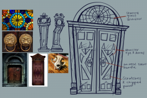
I also came up with a design for the main door. I found some useful references to help my idea such as the stained glass window and the door handles. I also referred back to my clocks to implement the same monster theme in the door design.

My grandfather clock and grand door progress can be found through these links:
As a group we also experimented and discussed how we will block out our haunted mansion. We visualised a layout from sketches, to Unreal Engine projects.

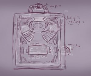
Jennifer’s Layout sketch

Alisa’s layout sketch

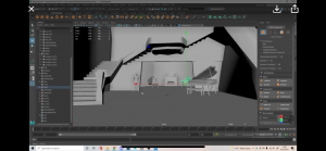
Matthew’s Maya blockout

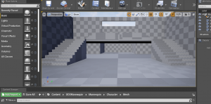
My Unreal Engine blockout
With our layout ideas on screen, from here we decided we would all take the same one layout idea but incorporate it into our own environment individually. This way we can all have a bit of freedom to layout and position each asset the way we would like to. This also can encourage us to be more creative in how we present our scenes.