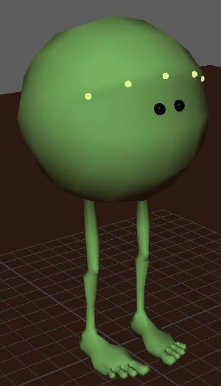
For this assignment, we were told to take our choice of two rigs, the Monty rig or the ultimate walker rig. I chose the Monty rig because it has eyes which gives me more to work with along with the fact i just liked its shape and feel overall.
To begin, I imported the rig file into Maya 2020, my 3D software where i can animate and model in 3D. This rig I’m using was provided by the tutors this time, but i don’t know if in the future we have to make our own rigs and models. Once i got the rig imported, i had to turn my camera the right way round as it was defaulted to staring at the bottom of the rigs feet, and then switch to perspective mode to add in my ground and wall the rig was going to jump on and fall off. My ground is made from a plane that i then extruded to give a 3D surface, though i realise now it would’ve been quicker to just use a cube and scale it up like i did with the wall.
Research
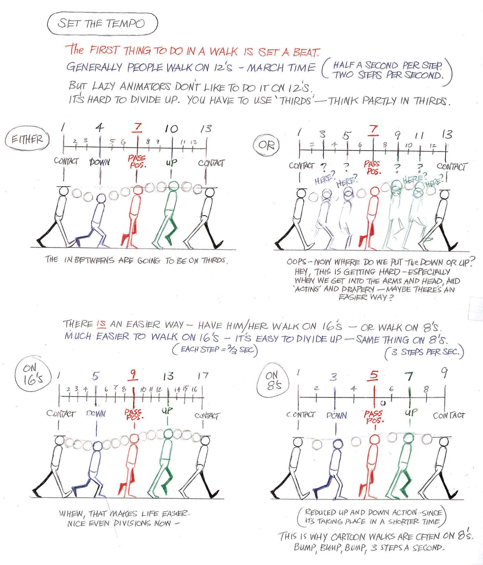
Before getting into the animation, i need to know what exactly I’m trying to create, how to do so and gather some references to understand movement believability and how to convey weight appropriately in animation. Keeping all this in mind, i first went to google to help me find walking references in the form of images and video, these are some of the things i found most helpful. The image helped give me a good insight into the movement of a professional animator and how to use timing properly whilst the video gave me a real life reference of all sorts of different walk styles, helping me understand how secondary movement worked and how emotions can have an impact on how much or how little the rest of the body moved and in what way.
The image above came from “the animators survival kit” by Richard E. Williams
With these references now at hand, I hopped onto my iPad to start thumbnailing my animation in Procreate, a drawing and animation app for apple. Here i used my favourite brush, the Studio pen as it has tapering and pressure sensitivity which helps me achieve smoother and cleaner linework, helping me stay focused on my work rather than fussing over small mistakes. I used the references i gathered to help me create an animation of my character walking up to the brick wall, falling over it’s own weight then getting back up to hop onto the top of the wall, just to topple over and fall off onto the ground. From my thumbnailing this already seemed pretty complicated for my first time animating a rig and showing weight but i was happy with the challenge and decided it was time to take my idea into Maya and make it a fleshed out animation.
Animating
Starting to animate, I had to bring up the walking reference of both my thumbnails and the original image i referenced to help give myself a better understanding of the action. Grabbing the foot controller, i moved it forward and rotated it up a little as if the foot were about to lift of the ground to start off my animation. I took this process frame by frame, positioning all the joints and controls in the appropriate place for each movement before pressing S on my keyboard to create a keyframe. I followed the reference i had created and the already existing references to help me create a walk cycle from a stand still, so of course along with making the feet move i had to also take the body into account. I noticed that when we walk, we tend to “bob” up and down as we take each step and our body moves forward along with the actions, i now had to animate these movements so my character would actually be moving and not just simply walking on the spot. To do this i took the very bottom controller that controls the position of the entire model and moved it slightly forward by about half a square on the grid for each keyframe of the walk cycle, up until he reaches his stand still beside the wall.
Moving on from the walking, my character trips over his own weight whilst looking up too far and falls on the ground. I wanted to show the weight in this action and did so by delaying the fall of his legs slightly to look like his body was the heaviest weight that pulled him down, and the impact caused his legs to fly up before coming back down and hitting the ground. I also wanted to give the legs themselves a bit of life so I timed them slightly apart, letting one fall faster than the other as this also made the animation less static and more interesting to look at.
After the fall, the character jumps back up again as i tried to recreate a technique I use in real life to get up off the floor since my back hurts. I try to lay curled in a loose ball then roll back and use my leg to kick at the air, propelling myself forward into a squat which i can then just stand up from, and I’m hoping this has been achieved in my animation. To me it looks about the same and I’m pretty happy with it as it took a lot of correcting and redoing and fixing the pace and posing to get it to look similar to what I was after. Following this action was another two steps up to the wall before the character shows anticipation in a “wiggle” action as it crouches down ready to jump, before actually jumping.
The jumping part of this animation was honestly very challenging for me, as a lot of the time my character just felt as if it were floating and with the only references i could find being about parkour, I was quickly getting fed up and ready to give up. I tried looking for simple ball animations at first, seeing how they react with squash and stretch when jumping and making an impact, then animated characters with legs, and at my wits end i started looking for real human reference. The parkour would be ok if it weren’t for the fact my animation isn’t possible in the real world and that most parkour tends to be jumping off of other objects to then climb to get to their destination, which to me at that point didn’t seem like something i was going to animate. This guy doesn’t even have arms so how would he climb in the first place? Eventually I found a video with a 5 second section which helped me immensely when trying to solve my “floating” problem: https://youtu.be/tn0lqMuGguw. This video showed me how the man tucks his legs up, preparing for the impact, then quickly setting them down on his object before standing up, and I’d say this video is what helped ground my character and make my animation more believable. With this information now at hand, i was able to correct my jump. I started by easing the rig into a jump stance with his toes just touching the ground to look like he’s springing up and spaced it evenly with a keyframe of the character now in the air, with another frame following of the character mid-air before he starts his descend to land. Before moving onto the decent, i had to fix the legs as they awkwardly crossed over one another and made the action confusing. I took the left leg of the character and chose that as the “leading” leg in the jump, meaning at all points this leg would be higher than the other to show character in the jump and keep everything fluid and continuous. Now moving onto the descent, I led this time with the right leg as it was the closest to the ground and tried give the rig a little bounce of impact as it landed by using the squash technique.
Now comes the wobble and the fall. After landing, the character is meant to show as unbalanced and struggling to stay on the wall. I tried doing this by slightly moving the position of the characters body forwards and back, slowly moving the positioning of its feet as if it were rocking from its heel to its toes in an attempt to correct itself, this was done by using the rotation tool and rotating the foot to an angle where it was grounded by one part whilst the rest was in the air. When the character trips I wanted his foot to slip off the edge rather than just losing balance and tumbling backwards as this was a more interesting pose with his leg leading the start of his fall, followed by the rest of his body as it quickly turns round and takes lead, followed by the feet. This action helped me again shoe that his body was the heavy weight and his legs were lighter, therefore sticking out and catching wind as he fell. I made this fall look more believable by spacing out the keyframes at the start of his descent to ease him into it, quickly picking up speed as he fell toward the ground which was done by gradually moving the keyframes closer to one another and having less keyframes to seem like a faster movement.
Finally, he hits off the ground with impact shown using squash and stretch before his feet fall onto the wall and slowly slide down it, pushing his body away from the wall as his legs straighten out, ending up with a comedic effect of defeat. To get the legs to look right there was a lot of messing about with the knee controller, i had to keep dragging it back in front of the knee and rotating the foot the right way round then setting a keyframe so the leg wouldn’t contort out of shape and mess up my animation. I did this for every keyframe of the feet as I’d somehow messed them up when i tried to show the character falling. It was a bit tedious but once i realised how to do it and why i had to, it wasn’t so bad. Moving on to the legs, I gave them another slight bit of delay as they slumped down on the wall as well as when they’re sliding, as nothing naturally happens in exact symmetry. The only time the feet resemble symmetry is when they’ve finishing falling and the character is pushed away from the wall for a final time, as both feet have now come to rest under their natural body weight.
Looking back on this animation, I’m pretty happy with it and I think I’ve done a good job at showing the weight of the character and the comedic effect in my story, though if I were to go back and change anything I think I’d make the walk a little more interesting and give it emotion rather than just a regular walk. Maybe something happy and joyful as he walks along only to then have his path blocked by a huge wall, as that would then further emphasise the defeat he feels at the end as we see all his happiness fade as he just gives up and lays there.
Below you will find a link to my sketchfab 3D model inspired by the content creators Dream and Ranboo, and the lore behind their roleplay server on Minecraft.
Personally, to go from making a simple vase with a real-life already generated reference, to drawing out my own concepts and using that as reference for a staff with techniques that I’ve never used before, I think I did quite well. Obviously there’s some things in my model am not too happy with that I want to go back and change or fix such as the mask and the leather straps, but I’m really happy with the overall shape and how well put together it looks. There were quite a lot of techniques used in the beginning models at the start of the year that i revisited to help make my workflow faster such as using the marking menus to get to different views and modes such as “vertex” “object” and “edges” which I used all the time but also the general scaling of vertices and edges to help get more accurate shapes, alongside using the edge loops to refine those shapes and make everything smoother. I also learned a lot of new things such as how to extrude along a curve and how to make an object “live” so as to neatly trace another shape onto it.
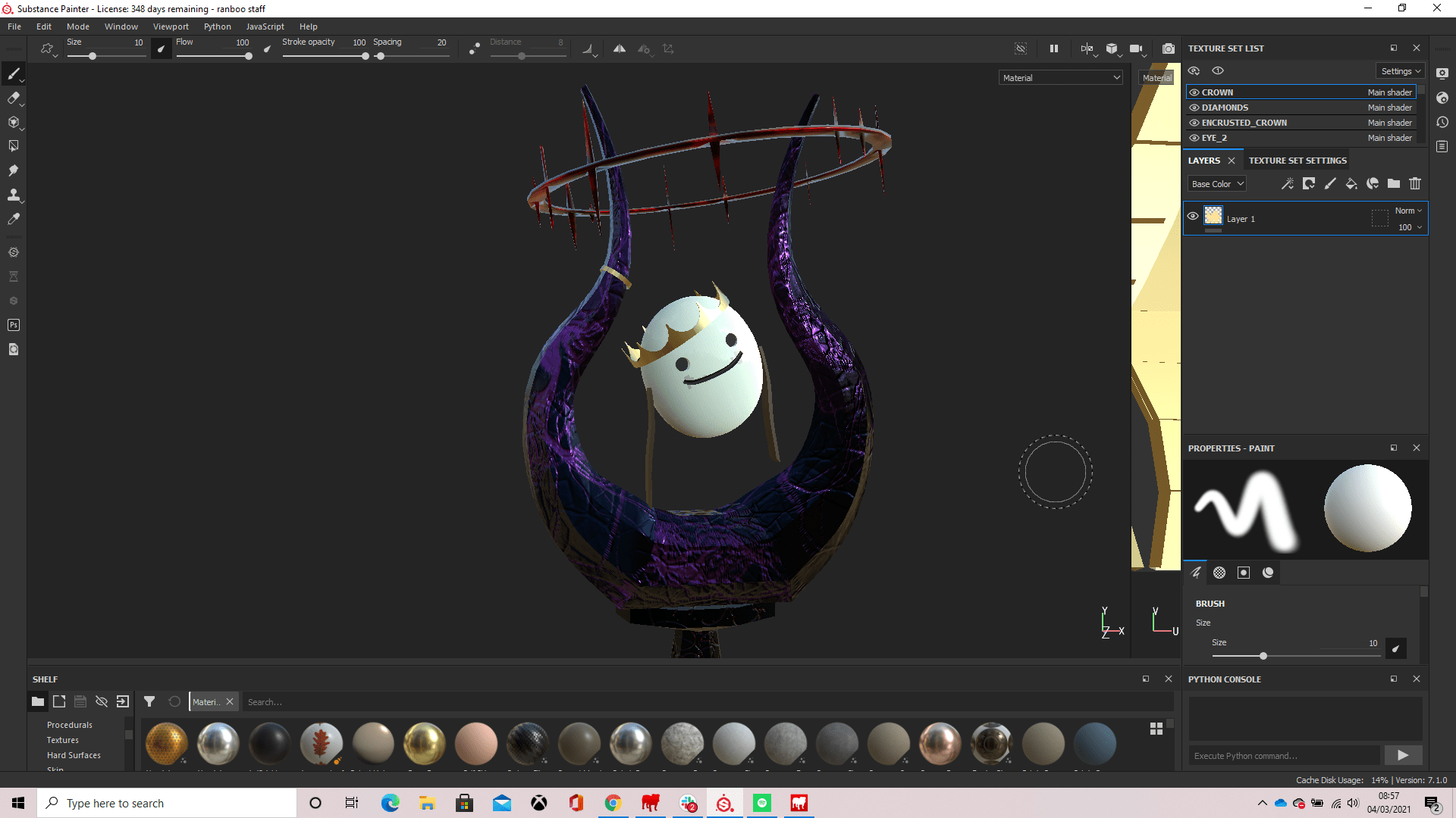
For our first assignment in 3D digital literacy, we had to pick from a list of objects to model in 3D in a 3D software called “Maya” created by Autodesk. I chose to go with a wizards staff and base it off of a streamer i watch often called “Ranboo” he mainly streams Minecraft and is in a roleplay on a server with other big content creators. I used the events of this roleplay as inspiration for my model.
Below is Ranboo’s actual skin in minecraft, helping inspire his fanart designs, as well as the actual lore behind his character.
Coming back to my staff, since Ranboo’s design is two halves of two entities, he is thought to have horns, inspiring the horns on top of my model as seen here:
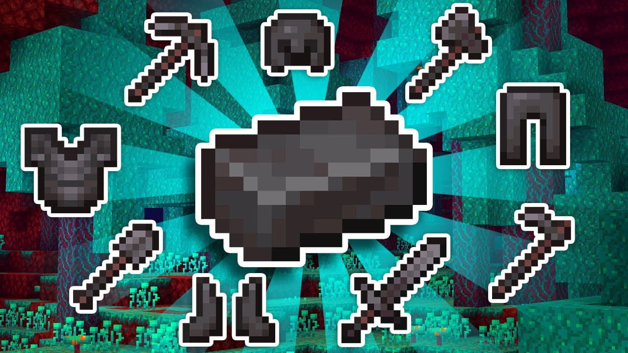
The main material of my staff is inspired by the strongest material in Minecraft called “Netherite”. I tried doing some research into what Netherite was based off of in real life, and found that its closest relation would be a man made material developed by scientists called “Carbyne” which is shiny and black in colour. I found this material on a Quora post (https://qr.ae/pNdu60)
I thought black would be too dark and boring for the colouration of my staff and since enchanted weapons made in Minecraft with Netherite are a colour of purply-grey, I decided to take inspiration and make my staff a dark shade of purple to keep it dark but give it colour. My material for my staff was also inspired by the real life crystal of obsidian, as its a smooth, shiny black stone but whenever it hits light it reflects in purple.
The persona of Ranboo’s character is half Enderman, a passive creature which can become hostile if you look it in the eyes or attack it. Endermen have small purple particles emitting from them, which gave me the idea of the purple spread through the horns of my model, being a representative of the corruption of the Enderman gene.
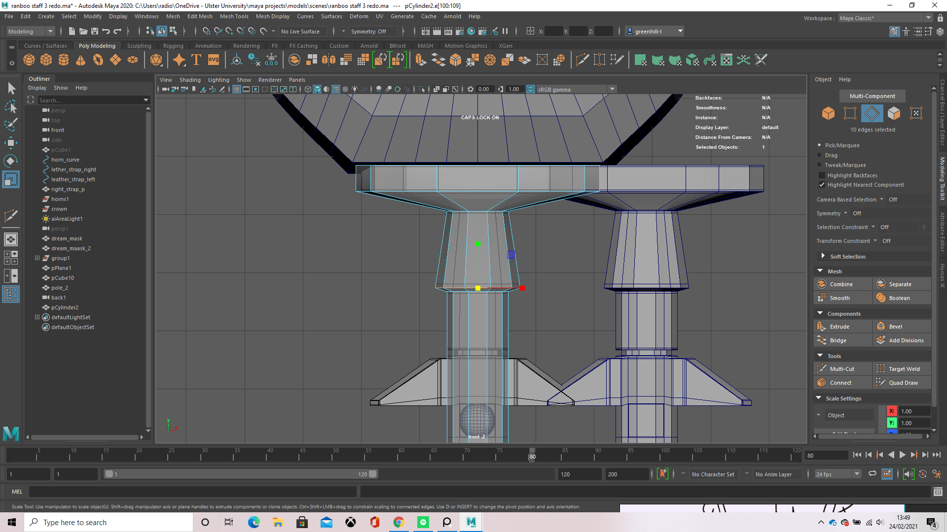
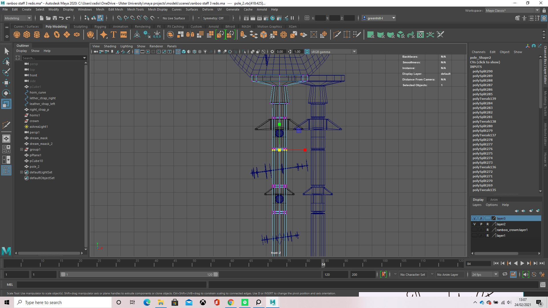
Since the actual staff itself was already purple, I couldn’t really put another purple running through it, as that wouldn’t look like corruption and I thought would just look like a mess, so instead I used the organic spread in substance painter and gave it a red colouration, clicking random points of the staff to make sure it was covered in what I hoped would look like a corrupted spread like in the horns. The staff pole was made from a cylinder with 9 height segments, which I then scaled up in the Z axis, scaling it down in both the X and Y axis by using the little box connected to both axis. This makes the length and width of the staff pole, adjusted until its proportions fit well with the horns.
To actually make the model, I used an extrusion along a curve for the horns then mirrored it and placed it further away, bridging the edges together to make one solid object, these horns would represent the mutation of Ranboo’s character and his bravery. The staff pole itself is one whole model, with a lot of extrusions, and bevels for the indentations where the eyes sit. I first made the pole from a cylinder as stated above and then grabbed an edge near the top after placing a edge loop and extruded it, this created the top part of the staff which I call the “mantle” as the horns rest on it. From there I had to further scale it so it was in proportion with the horns and looked like it was supporting them, for this i used the scale tool and scaled it in the x and y axis to make it longer and wider, afterwards, placing another edge loop and creating the side of the mantle so it looked smoother.
Carrying on further down the staff to the very bottom, I made a spike which would be connected to the blue coloured parts of the obsidian, being weld together to create a strongly enforced weapon at the end of the pole. I did this by creating edge loops and scaling the faces outwards in the x and y axis and pushing the edge in at the middle to give it a chamfer effect. To make the spike I firstly made two edge loops, bringing on down near the middle and scaling the vertices out on all axis, scaling down the z axis if need be, and the adding more edge loops in other places that were vital such as the very bottom to support the point of the spike and up near the top to give it a classic arrowhead shape. After all these edge loops were placed, I used my middle mouse button on the multi-cut tool to go through and add more loops to smooth everything out.
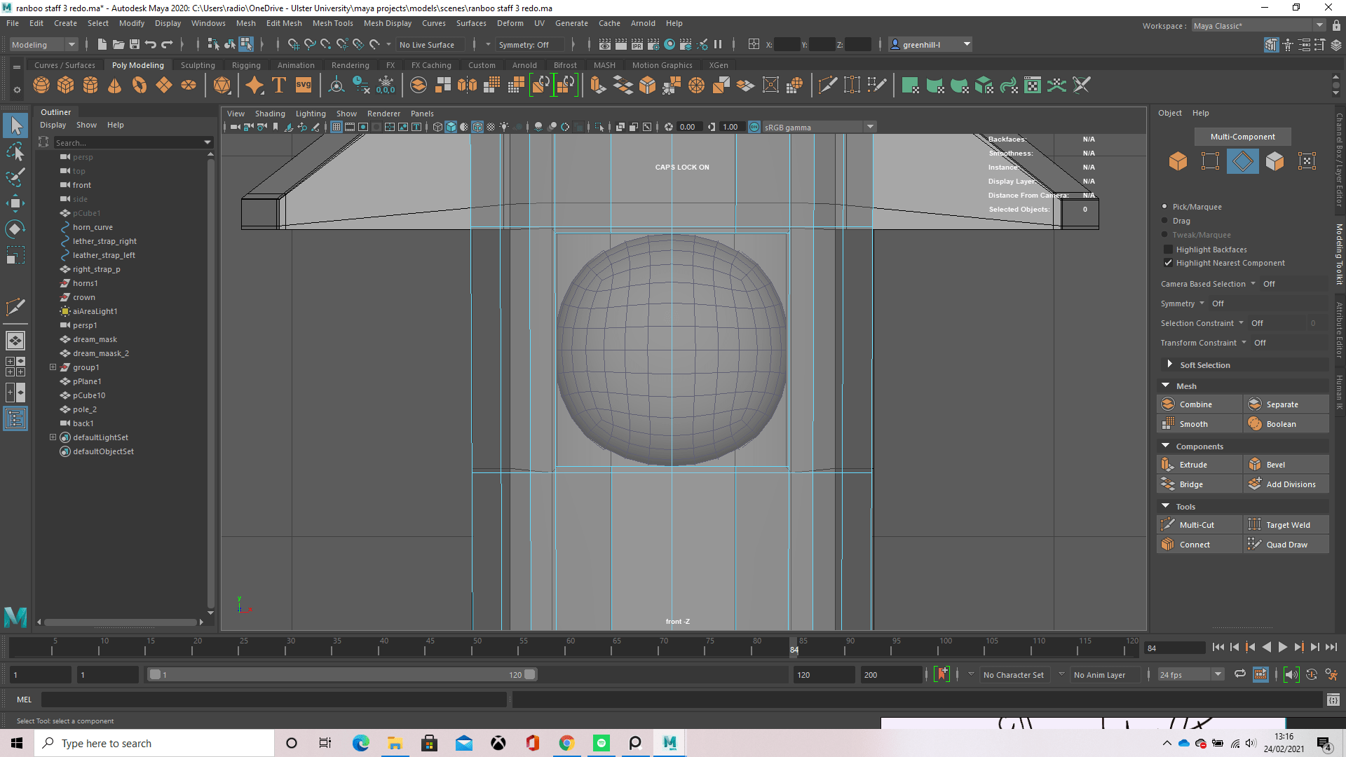
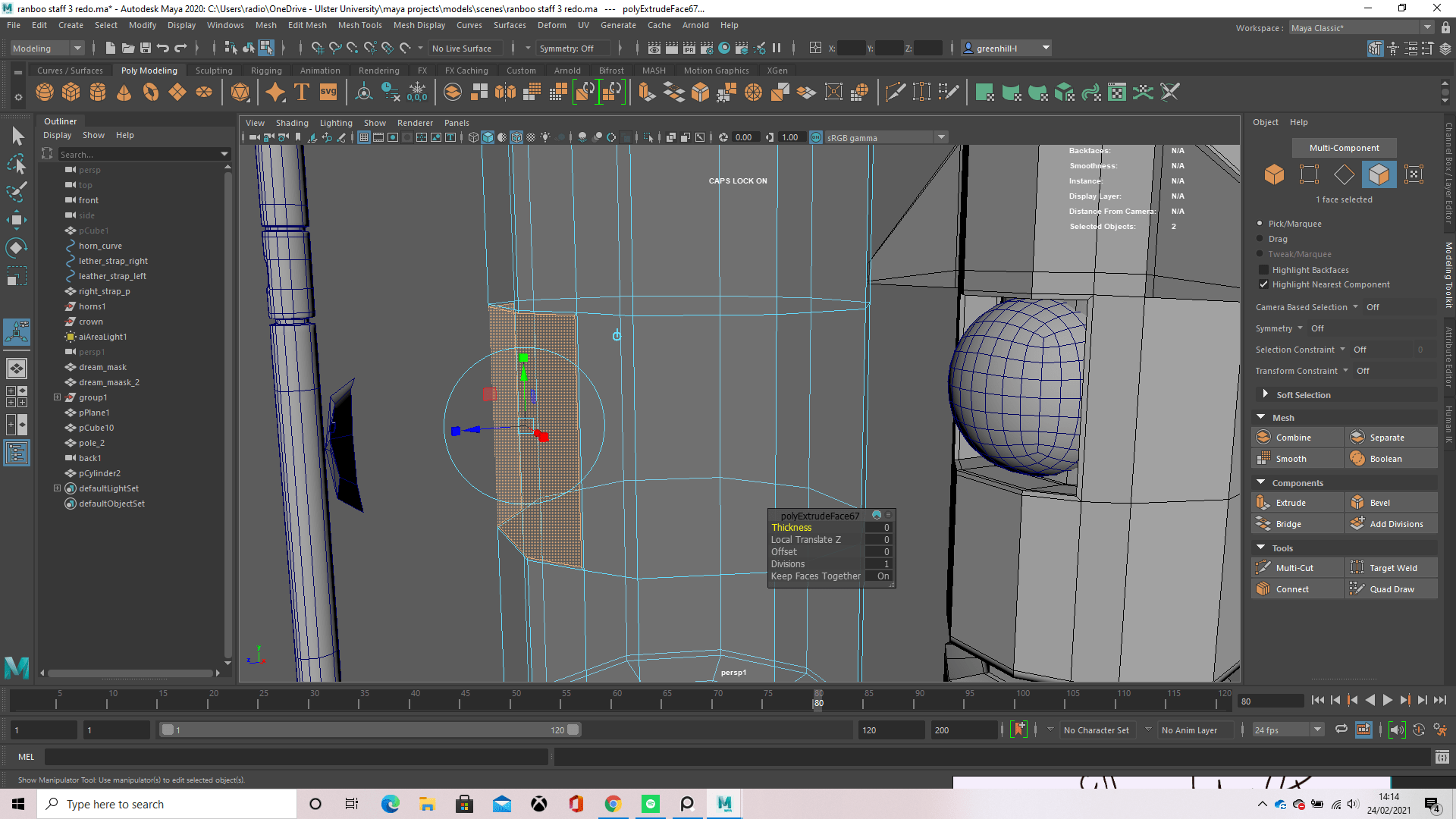
The indents in my opinion were the parts of this model I struggled most with, as this was my first time doing anything like it, and the first couple YouTube videos I followed made my entire model freak out and gave me concaved faces all around the hole. I fixed this by putting together some general rule of thumbs id learnt from the videos and putting them into practise, for example, the main one was the extrude then place an edge loop, this made sure whenever I wanted to smooth out my model by pressing 3, the indent I made would still be there and in the shape I created. Another helpful part to this was when we had our one to ones with Michael and he showed me how to do the eyes on my mask, I was able to take this information and input it into my staff pole. So how I ended up doing it was creating an edge loop at the top and bottom of the object I wanted to set in the indent (in this case it was the eyes), then deleting the rest of the edge loop aside from the three edges at the front (taking away unnecessary geometry from my model) then repeating this for the side of the object (my edges were already there so I just had to delete the two inside my square), select the face in the middle and bevel it to about 0.01 to create a very thin edge then extruding the face and pushing it back to where I wanted my indent depth. After that, all that was left to do was place an edge loop at the top and bottom of my indent by using shift and the right mouse button then navigating down to “insert edge loop”. Once I pressed 3 to smooth my model, the pole looked fine and the indent was now a rounded square where I could neatly slot the eye.
The spikes on the sides of the staff were made by creating an edge loop at the top and bottom of where I wanted the spike to start and end, selecting the 3 faces I wanted then extruding them out with ctrl + E on the keyboard and using the scale tool to move them both at the same time to get equal length and width apart by first scaling outwards on the x axis and then pulling their end vertices in on the y axis to form a blunt spike. In relevancy to the staff, these are purely for intimidation points and can’t be used to attack or deal damage.
Moving onto the spiked halos that are seen floating around the staff, these were once cylinders believe it or not. Before giving them flattened look, I had to first bevel the top and bottom faces of the cylinder to get one whole face in the middle and a little thickness for the edge. I deleted the top an bottom faces then selected an edge on the inside and holding shift then double clicking on another edge, selected the entire ring, did the same for the top ring, and then bridged all the edges together. This gave me a nice round ring-like shape (this is also exactly how I made the ring that sits on the left horn) which I then went back into object mode (right click hold on the object then dragging my mouse over to “object” in the marking menu) and used the scale tool to push my object down in the z axis, squishing it into the thin ring it is now. To make the spikes, i selected a face then extruded it in on the x and y axis to make a smaller square before selecting that face and extruding that in the z axis (+ or – depending on if the spike was at the top of bottom of the halo) then repeated this for every single spike (yes it was a tiring process). To finish off, i scaled it down to fit my model then duplicated if with shift + D and dragged the other two down to their spots, scaling them down so they got smaller as they went.
The final assets of the staff pole itself are the diamonds and crown at the bottom. These were made as separate objects then moved over and scaled down to fit the model. To make the diamonds I literally just made a cube, went into vertex mode and grabbed its vertices, moving them to the shape of a diamond then duplicating the object after freezing its transformations. To make the crown I took another cube, deleted all faces but the front, (this was to make sure I was only working with one face so I couldn’t mess up) and used the multi-cut tool to cut the shape of a crown onto it. The faces that weren’t in the crowns shape, I selected and deleted, leaving me with a flat crown. Grabbing the front face again, I extruded it outwards on the y axis and gave it a little thickness so it could pop out from the staff.
Finally, we get to the mask. I did do this wrong, but learned how to correct it in the future thanks to help from Michael, Alec and Daryl (basically everyone who viewed my model, so thank you!) Firstly I’ll explain how I did it (the incorrect way) then I’ll explain how I should go about making things like this in the future (the correct and cleaner way in way of geometry and topology.)
How I did it
To make the mask I first thought taking a sphere and cutting it in half would work- soon found the very opposite, didn’t work at all- so instead I used a cube to make a quad sphere which is done by taking a cube and smoothing it to give it subdivisions. From here I cut half of the sphere off and scaled the mask’s length, width and height a little to make it more suited to what I wanted. Once this was done, I made two cylinders and scaled them down to size, move them over and into the mask then used a Boolean difference to cut holes in he mask for the eyes. This didn’t work first time and kept deleting my model, but i fixed this by going into the Boolean settings and ticking “legacy”. To make the mouth, i extruded the front face of a cylinder along a curved line I made with the Curve NERBs tool, froze the transformations, then moved and scaled it down, rotating the ends a little to better fit the mask, and made another Boolean. For the back of the mask, i selected the loop of edges around the back of the mask and extruded them, scaling them in on all axis to make a face, then pressed g to repeat my last action and kept doing this until I reached the middle. To fill this hole in, I simply used shift right click then went down to “fill hole” and a polygon was created in the shape of the hole. I then went over this with the multi-cut tool the fix the topology by creating edges from the vertices opposite each other.
How I will do it in the future
I want to start off by saying I did try doing this method, but I didn’t think it looked as good as my current mask, so I asked my tutor and he told me for this assignment I could use the mask, but to practice for the future doing it more efficiently without Booleans.
For any future projects I have, instead of using Booleans, I’ve been taught its better for topology and animation if I use the multi-cut tool and the tool kit in general to make my shapes, as using Booleans gives messy geometry which is hard and frustrating to clean up as they leave Ngons, concaved faces, extra vertices and all sorts of nuisances behind. For this project in specific, id make the quad sphere again and select the face where i want to place the eye, extrude it then scale it in on the x and y axis, then extrude that new face inwards, placing edge loops at the top and bottom to make sure it keeps its shape whilst smoothed. To give it a circular shape, id have to line the vertices up into a square before extruding. Making the mouse was rather similar, although using the multi-cut tool to continue on where the extrusion left off for the rest of the mouth. Myself personally, I didn’t like the way this came out as the smile wasn’t stretched out enough and looked too much like a regular smiley face, but that’ll come with practice. It could also be because I used a mirror projection for the other half of the face to make everything symmetrical.
To make the straps that accompany the mask, i just used a NERBs curve and extruded the face of a cube along it, adding an edge loop through the middle then using shift + d to duplicate the strap after freezing its transformations, moving and rotating it to fit the other side of the mask.
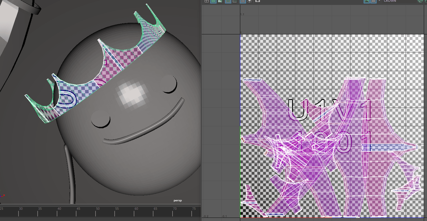
The crown on top of the mask was made following a YouTube tutorial, though after further inspection from a tutor, I found it was either a bad tutorial or I’d missed a step because the topology was all over the place and there were edges coming from nowhere and faces on top of faces, though at this point there wasn’t really any time to fix it and retexture everything as id already got halfway through texturing, so those errors are unfortunately still in my model. The way I’d tried to layout the UVs also left me nowhere to texture in jewels, so its a plain gold crown.
So now I’ve walked you through the 3D modelling process of my model, I’d like to point out the reason it took me around 4 tries. Apparently at some point when in settings, I’d messed with the amount of divisions made when extruding, without knowing this I competed my first model but when Michael took a look at it, the faces he pulled just had faces upon faces, it was honestly like watching a magic trick and gave us a good laugh, we didn’t find out what was causing it though and just agreed i needed to remake my model. So jump forward to about the 3rd model, id FINALLY found out what was wrong… My divisions were set too 100 per extrusion. So that didn’t go down well, but making it easier on myself I just used x-ray and traced the edges and vertex line-ups on my model, adjusting them until they looked ok and called it a day. The joys of 3D modelling.
UV mapping:
After modelling everything, i had to start thinking about texturing. This is done first by creating what is called a UV which allows you to cut and unfold your models shape in a UV editor to help you lay them out neatly and fit textures appropriately.
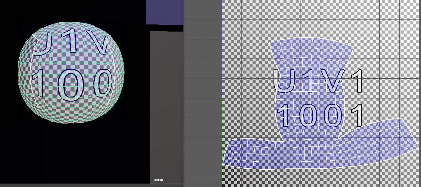
Above is a screenshot from when I was starting to use the UV editor to UV map my model, obviously it’s not correct yet because at that stage I’d only done a small section.
For the rest of this section, I had a problem with my one drive, so my laptop wasn’t allowing me to take screenshots as it had nowhere to save them. I only figured out how to bypass this problem whilst writing this blog, so from here I only have the post production screen clippings, sorry.
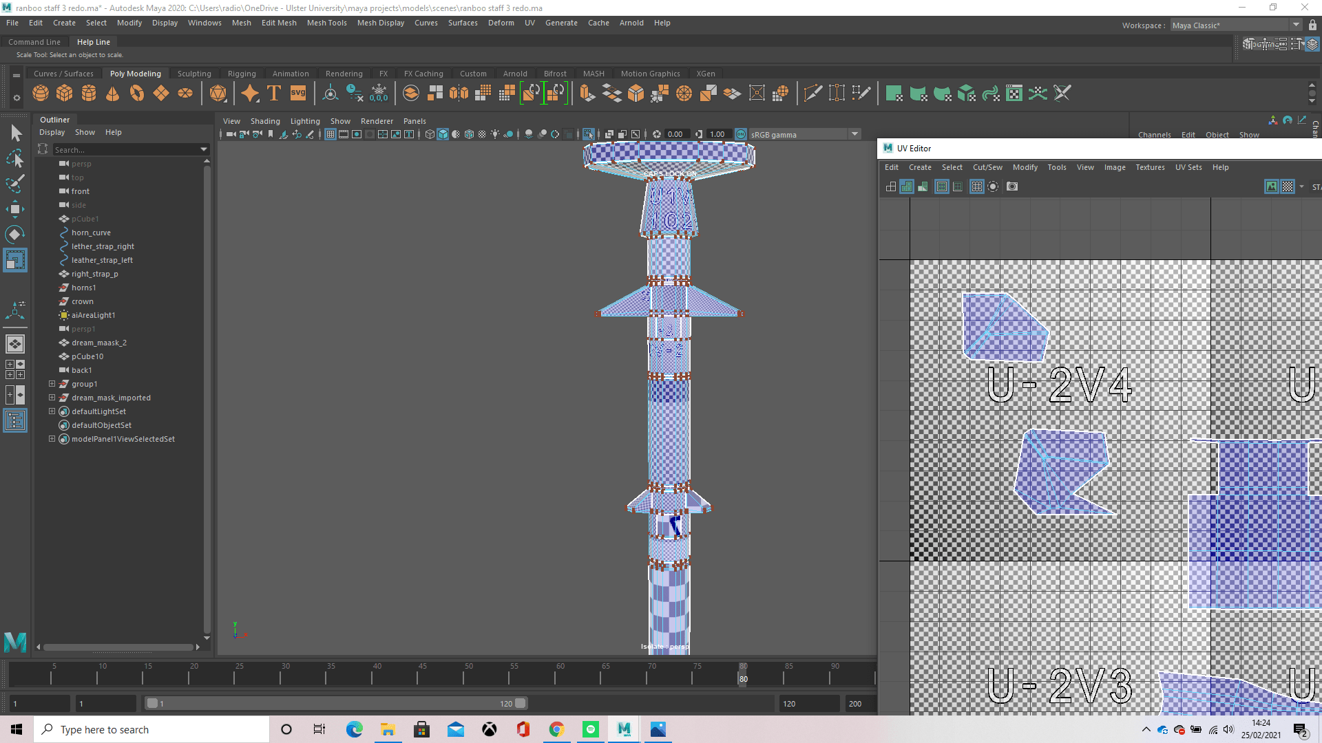
Above, you will find the whole UV mapping for my staff pole. There were many different sections that had to be cut, such as the spikes which also had to be cut down the middle so the UVs could balance out. I made a cut down both sides of the staff pole, giving the UVs a front and back, making it easier in some places to deal with, whilst it made other parts more confusing, but i found a way to do it al in the end. I had to go through the process first though of laying out the whole staff in a planar projection on the y axis, allowing me to view my whole staff from the side and make cuts from there, dragging them off to the side to be ready to unfold later.
The eyes weren’t too hard to unwrap, I just had to open the UV editor then unfold them and it gave me this shape. I did try to straighten the UVs with “straighten along” but the curve needs to be there to make it more realistic, as a straight UV didn’t let the texture curve around the sphere and instead lay flat and looked odd.
For the horns, I used a video tutorial which I will credit at the end of this blog. I did have it on my own the first time by just cutting a seam down the side of the horns separately and going from there but once I bridged the two horns together, it messed up and I needed a tutorial to help me. What I had to do in the end was leave the seam there but then unfold each horn’s UVs separately, cutting another seam along the bottom of each horn. I later realised when writing this, I should have also cut a seam along the bridging of the horns, but forgot about this.
The spiked halo, I cut seams alongside the top and bottom edges on the inside and outside, then made a vertical cut along the side edge. I moved the UVs off to the side and unfolded them all, and this is what i ended up with. Honestly, looking now, I see Ii probably should have made cuts around each spike too and unfolded them to make it a lot neater.
The ring was done in a similar manner to the spiked halo, making cuts along the inside and outside edges of the top and bottom edge loops, then selecting those UVs and moving them off to the side and unfolding them. I then took the remaining UVs and creating a cut along the side edge, as you can see in the left of the image, then unfolded that and used “layout” to lay all my UVs out neatly, as with every UV map I created.
This is just showing the bottom half of my staff and how the UVs are fitted around it. You can see the two seams along each side where I made the cuts, along with the cuts i made for each face on the pointy out bits. When there was a surface that wasn’t flat and stuck out, I made another cut to make sure that UV would fit that shape of the model.
Here is the diamonds UV. All i had to do for this was project a planar on the Y axis and unfold the UVs.
The mask was a bit more complicated than i thought it’d be, as the topology was a mess and there were a lot of Ngons. I had to first project a planar on the y axis, the make a cut around the edge to separate the back face from the front. I then moved the front face off to the side and unfolded it and that was done. Now i had to work on the back. I made several cuts along the edges that were extruded and scaled down in the hollow of the mask, pulling each of them out and then unfolding them separately. The UVs in the middle of the mask were easy to unfold as they just unfolded into a neat oval.
The crown, I was completely lost and confused in how to unwrap it but still gave it a shot. I later was told by my tutor Daryl how to properly unwrap it, but unfortunately I didn’t have time and had already started texturing everything. The proper way to do it was to make a planar projection in any axis and cut along the sides of each face then unfold them. Unfortunately with this current model, that wouldn’t even be possible without fixing the geometry first, as there were faces on top of faces and edges that led to nowhere.
Inspiration
Here is my concept design and a more improved version down in the bottom right of the page. The mask is inspired and in relation to the popular youtuber “Dream”, who alongside Ranboo, is also a Minecraft youtuber and is owner of the roleplay server they play on called the “Dream SMP” (SMP in Minecraft stands for Survival Multiplayer)
The image following is another concept I had but with an eye instead of a mask, though I thought the mask would have more impact as it’s less repetitive and for people who know the reason behind the Dream mask, more impactful.
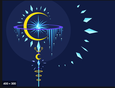
And below is the spiked halo concept
Some little details I threw in are the crown and the ring, along with the mask itself. Knowing the lore of the roleplay, I know Ranboo is rich (hence the golden ring on the horn) and his character wears a crown. The reason the crown is on the mask of Dream is to represent the power Dream has over Ranboo -as in the roleplay, Dream’s character is an antagonist and commits murder, starts wars and manipulates people to turn against each other-.
Some looking around on the internet at other magical staffs gave me inspiration for my staff, for example this staff gave me the idea for the spiked halos around my staff
Other inspirations were things such as animal horns and how they curve, more staffs for a general idea of a staff, the crown shape and colour and this ring which helped me figure out how to make the spiked halos.
Goat skull isolated on the white background
Improvements
In the future, if I was able to come back to this staff or even try remaking it when I’ve gained more knowledge on 3D, I’d add the straps so there was a clear way the staff pole and horns were being held together, I’d add animated particles around the staff making it look like it were emitting them, and I’d want to try my hand at animation. I’d love for the staff to float on the spot along with the mask and halos, though a little out of sync, and the halos possibly slowly and subtly turning? A ring of light on the ground that fades in and out relevant to the staffs distance from the ground would also look pretty cool.
Overall, I really enjoyed this task and look forward to working more with 3D in the future!
Here is the sketchfab link to my model, sound warning for creepy ambience 🙂