Week 11 and 12 – colouring and finalising

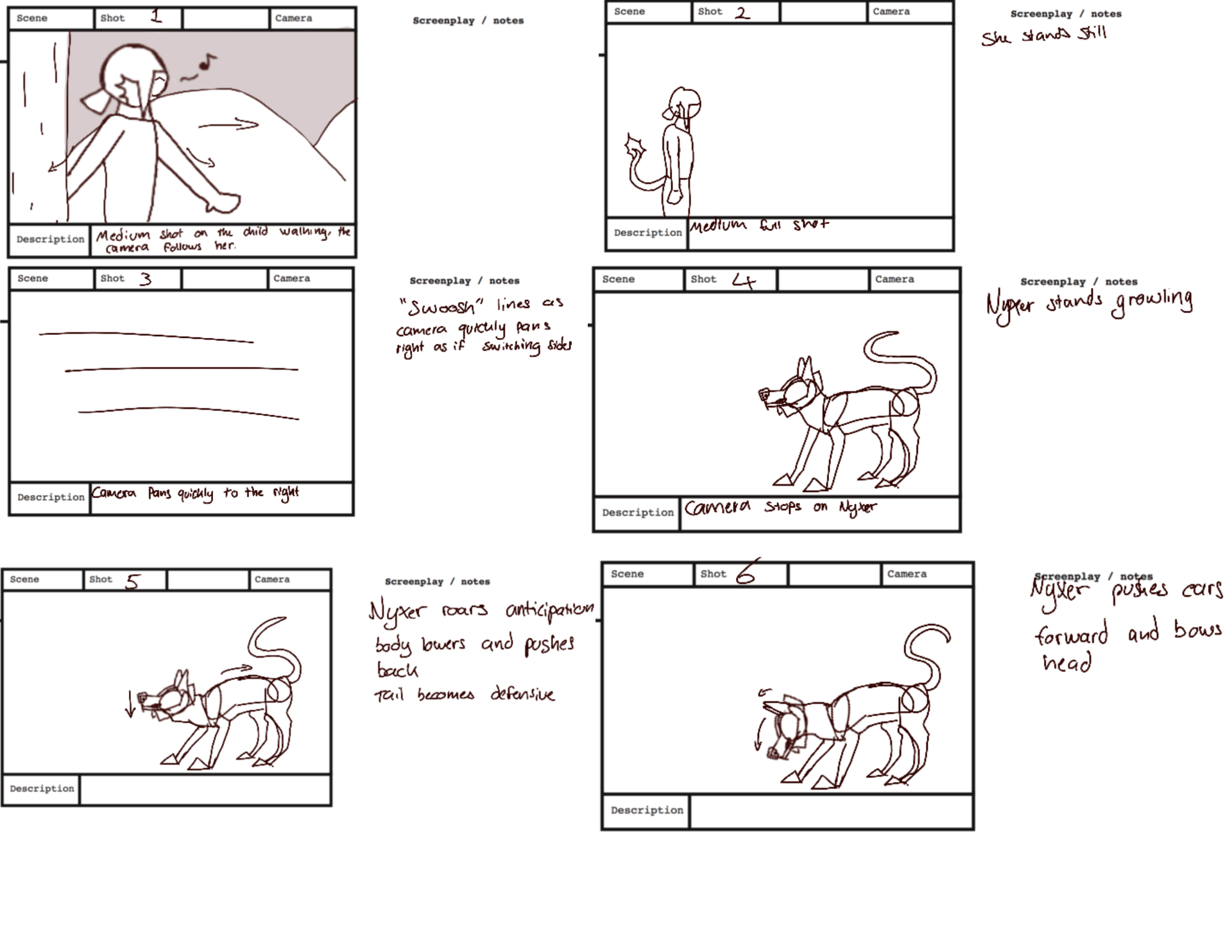
Throughout these two weeks, with everything lined and fixed up, i started colouring my drawings and adding small bits of details such as the hair bobble on the child and the gradients on the Nyxer.

To make things easier on myself, i wanted to get down the flat base colours on everything before diving into the detail.  This meant i could at least have everything coloured if i started running out of time and wouldn’t have half finished, half still being a work in progress which would result in a horrible discontinuous and strange animation, ruining the believability.

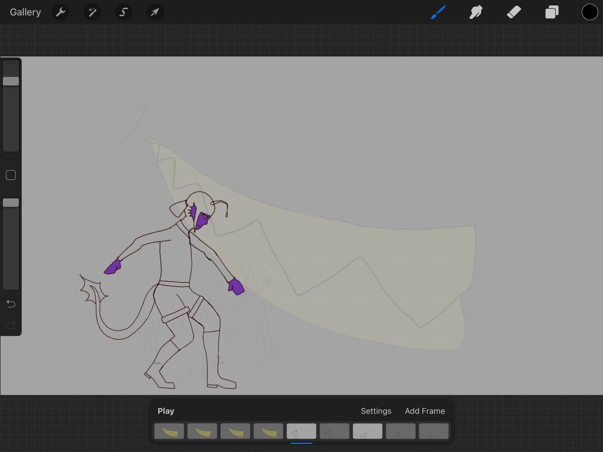
After the base colours were down, i coloured in the orange dye in the fringe and loose hair parting of the Anglerfish child, smudging it a few times to give it more of a “dye” effect rather than just a straight line blatantly separating the two hair colours. The freckles and little fin ear also had detail added at this stage, it was easy enough to just draw every frame rather than copy and pasting it as each fin was slightly different and it would’ve looked strange.

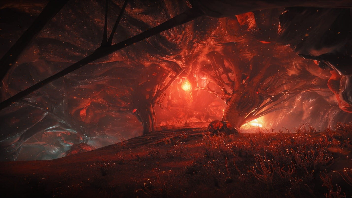
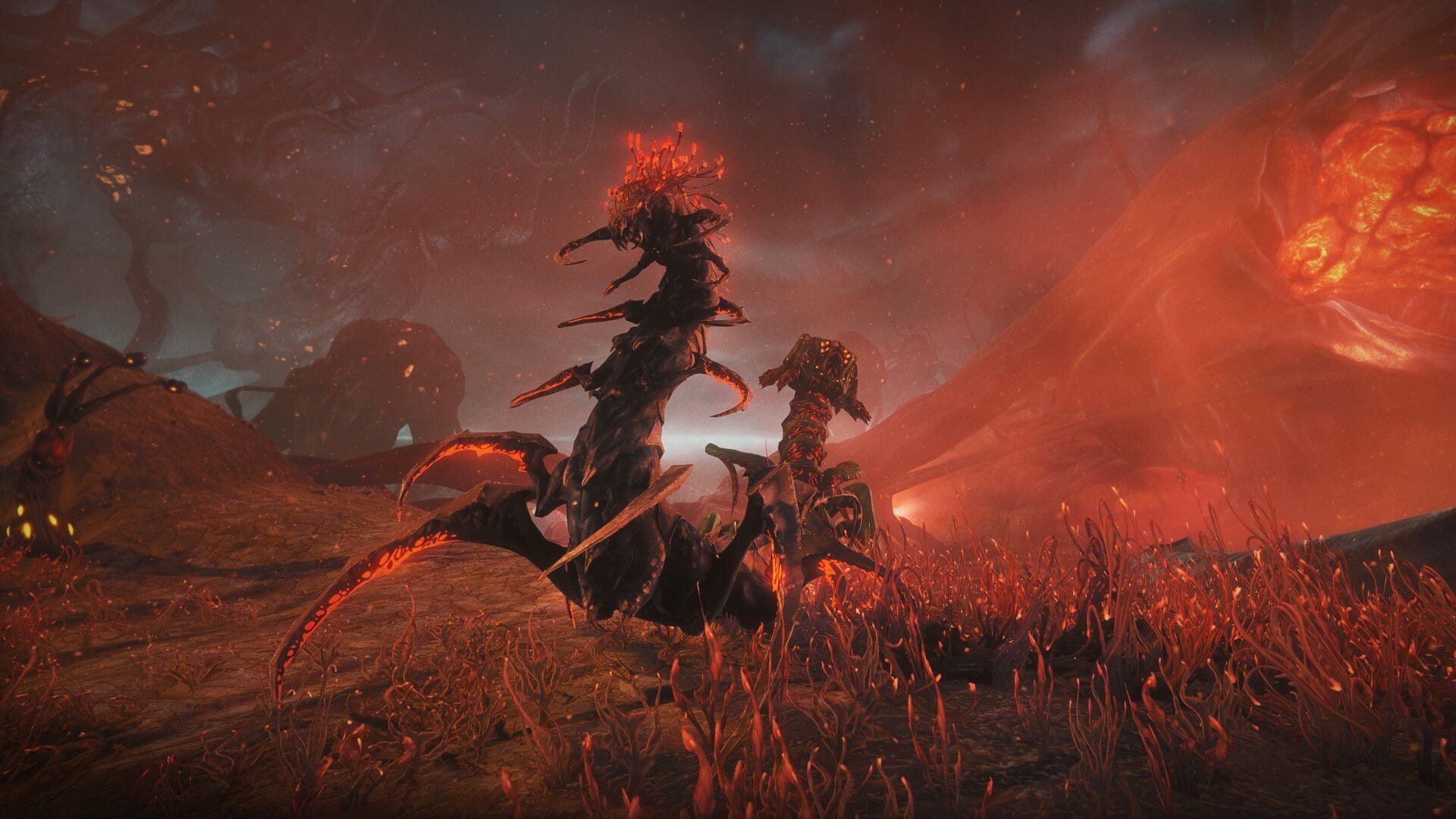
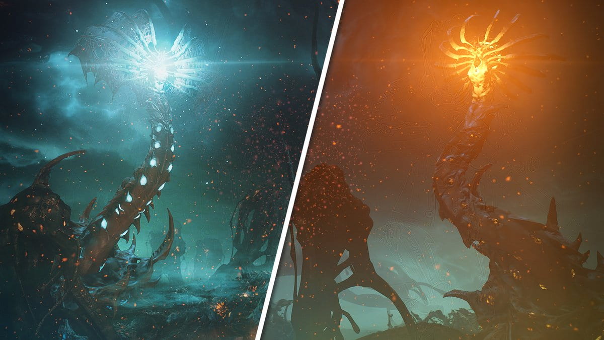
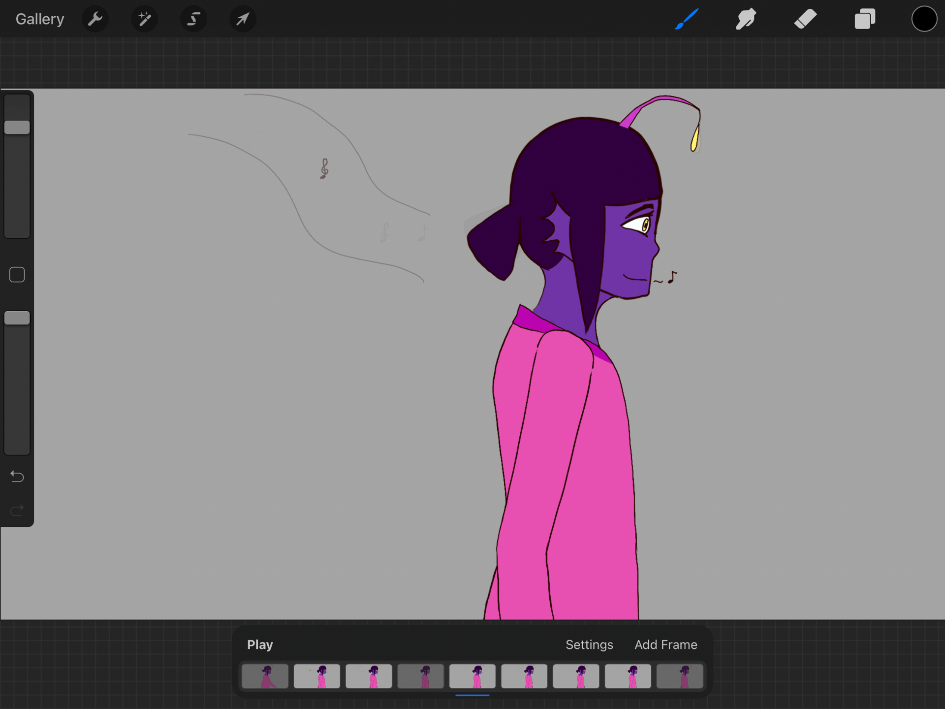
After detailing the Anglerfish child, i then moved on to the Nyxer. I honestly found this a nightmare because I didn’t think it’d be such a pain to draw the gradients every frame whenever I was making the character design. The teeth and claws were easy so I decided to do those first, then the eyes and nose before finally getting onto the body gradients. I also chose the wrong colour for the bottom layer of the gradient, but by the time I realised I was about 3 frames in and I didn’t think I’d have enough time or the will to go and change everything, as it was all on one layer.

I had the idea to give the Nyxer’s glow an extra layer of glow by adding small highlights of colour onto each frame in the areas i wanted to glow brighter for when he roared to make it seem more threatening. I built this effect up from around the 4th frame of the creature as it started to growl and let it shine fully as it roared, although it’s barely visible but at least i can say i tried. I also wasn’t able to find the same brush i used previously in the original design file for its markings but I think what i used suffices.

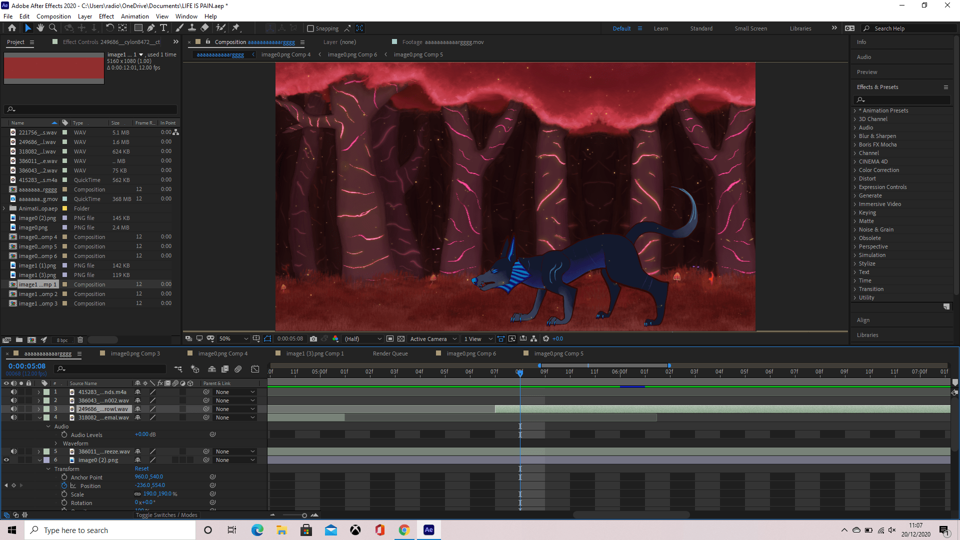
Now finished with the colouring and the details and happy with my outcome, I had to import my layers into Photoshop from procreate then make the layers into frames there before exporting it as an MP4 and importing that into Adobe After Effects.  Unfortunately none of this went as smooth as I would have hoped so I spent quite a lot of time just trying to download the animation from Google drive as Photoshop just wouldn’t co-operate with me. Eventually though when everything was uploaded, downloaded and actually just working I was able to start animating in After Effects. Or.. so I thought, but it appears I used the wrong formatting when exporting my animation and I almost lost my head trying to figure out why I couldn’t add a background to my video. It’s because the video wasn’t transparent at all so it was an easy enough fix, but very frustrating to figure out what was wrong.

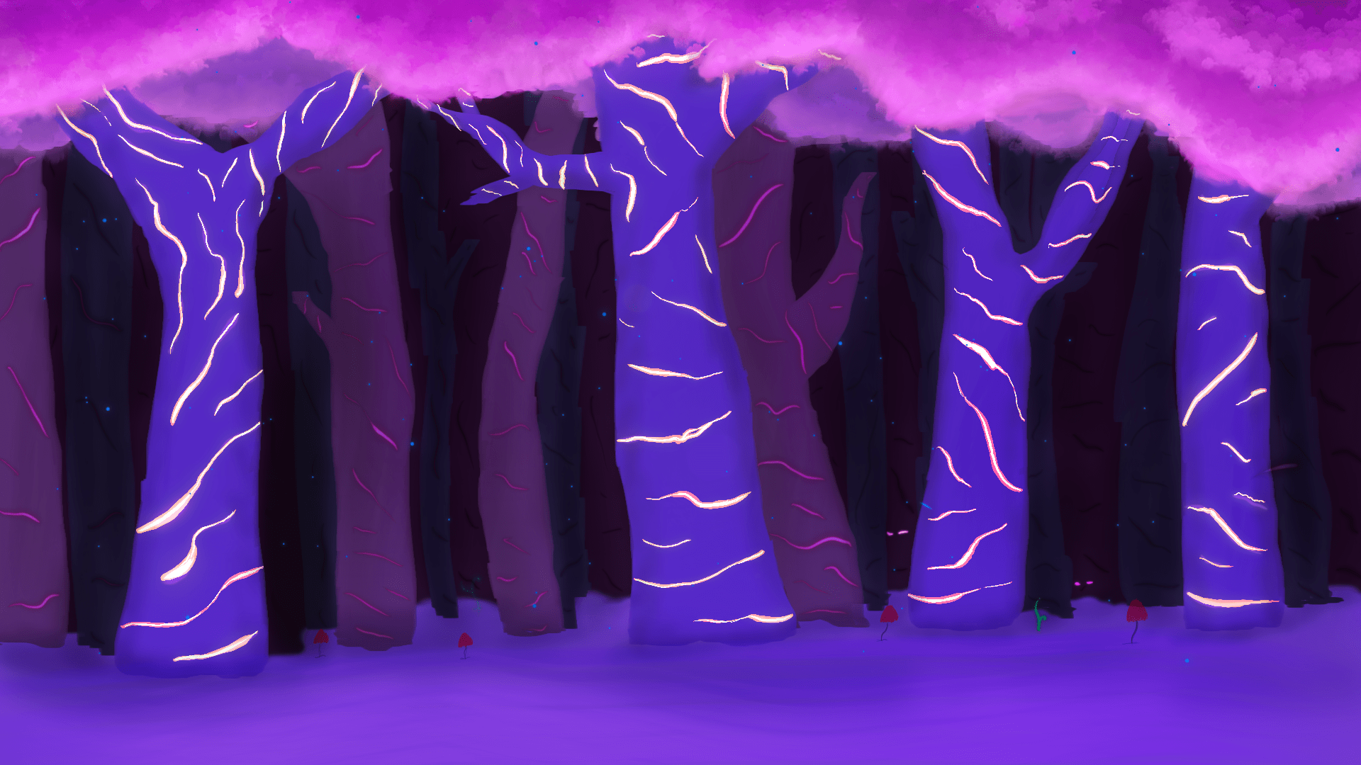
With my transparent background now acquired, I started my journey of adding keyframes to things such as the position of the background. I followed a tutorial listed below to help get my background moving and long enough so it could loop without any noticeable jumps, however I had to change up the dimensions to fit my drawing 3 times in succession, I also didn’t actually loop it as it wasn’t necessary.

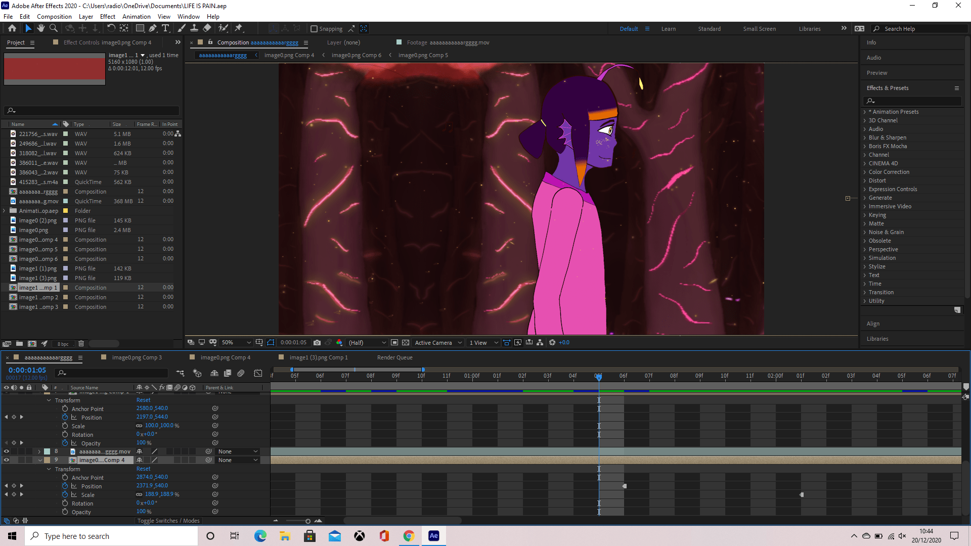
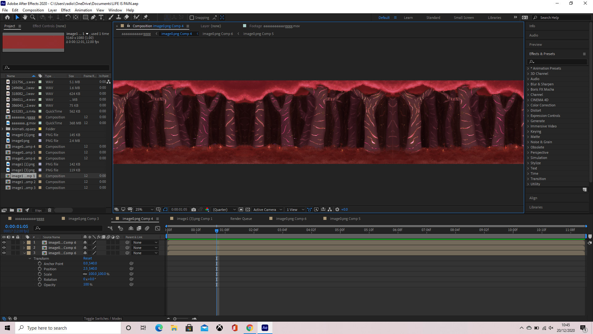
After getting the background and main animation down, I began adding little details in the foreground such as the tree at the start that moves across to the left, making it seem as though the girl walks out from behind it, and the little yellow particles that flow throughout the whole animation. These both needed opacity and position keyframes which by doing this I found an option called “toggle hold keyframe” and i found very useful.

At this point in time, I had no sound but I did have an idea of what I wanted to add, so I hopped onto Google and searched up “royalty free sound effects” for a website with sounds I could use. Finding a good one, I started searching key words of sounds I wanted and went through sampling each until I found one I deemed appropriate, downloading the file and dragging it into my composition then playing it back to make sure it fits.

Once everything was in place and I was happy with my animation, I saved and exported my video as an MP4 then played it back to make sure it ran smoothly. You can find my animation below.

Above is my individual contribution to the animation and below is where you can find the group animation, with everyone’s piece put together.

If I had more time to work on my animation, I would have loved to add a camera shake effect for when the Nyxer growls and a few more sound effects that i forgot to add such as the humming and a surprised gasp whenever the Anglerfish child sees the Nyxer creature.

Tutorials used:


Week 10 – Starting to line

Following up on the sketches from last week, I was now taking the animatic and starting to do my line work to make it appear more clear and smooth to the audience.

I started using a schedule at this point in time, as it’s never too late for improvements, and felt it helped me organise and manage my time easier resulting in more efficient work progress. See below for my work schedules and how I felt keeping them simple would help me keep a straight head and focus on my work.

I used a lot of this time to fix the Nyxer creature design and make it look more believable in anatomy, also taking my time to taper off the edges of the legs and shoulders, realising at this point I was most likely doing things wrong as I’d been too ambitious and done too much to handle. However, i persevered and fixed the creature, then moving onto the Anglerfish Child’s lines and adding the detail of her clothing.

Above is an example of how it looked whenever I took my feedback into consideration and changed the anatomy and posing of the Nyxer creature in my animation, arching its back more and making it actually bend down low to the ground as it growls, giving it a much more exaggerated and dangerous effect than the below example of before when I first animated the creature and only bent its head down a little. In the video above, as you can see I also made small notes and sketches to help me get the posing correct in a less detailed manner.

In this example above of my “before” animation, you can see how much less effective and confusing it is to the example prior. The tail moves in a confusing way instead of in an arc, the back appears to want to rip through the skin as the front legs bend and the head dips and the body unexpectantly elongates, pushing it back legs back and its front legs forward, making no sense in anatomy and believability.

I also took this time to completely erase the drawings of her eye and fix them using appropriate references, resulting in a more believable and better looking eye, though i still struggled with the eyelashes as i wanted to keep it simple yet also realistic to a point. See below for the references I gathered, noticing how the eye slants down at the top and goes up along the bottom to then meet at an acute angle and make the eyelids, which I found by taking video reference of my own eye, seems to close over on the eye whenever you look down. For this part I also took a video reference of myself progressing from a neutral face to frowning, as I needed to see how the eyebrows worked alongside the eyelids whenever someone frowns.

695-03383040
© Masterfile Royalty Free
Model Release: Yes
Property Release: No
Woman’s hazel eye, view from the side.

Week 9 – fixing the animatic

My animatic was created and I took this week to try fix it up and give it more shots to smooth everything out and fix the timing, as mine was very off and you could tell straight away something wasn’t right.

To fix the timing, i added in even more shots, such as a side view of the Anglerfish Child’s eye at the start of the animation, looking down at the creature infront of her, before cutting to her reaction to the creature.

above is my animatic fixed a little and below is just a random test i wanted to do with fire

i also drew a background, but had to change its colour pallet to a warmer tone as my first attempt was using too many cold colours and didnt fit the pallet of the animation


In the image below, I added grass, textured glowing mushrooms and other little details, as well as starting on a tree in the foreground that the character will come from behind into the scene.

My background like my Nyxer was also inspired by Warframe’s Deimos update with the infested and glowy look of the environment. I’d played a lot of this game since the new update so it was my first choice of inspiration when I heard the word “bioluminescent” as everything in this update glows and gives good examples of how to stick to a limited colour pallet.

Week 8 – rough storyboard animatic

After getting all our storyboards sorted out and everyone was on the same track, we started to rough out our animations with a storyboard animatic. This included sound effects, movements of the characters and/or environment and starting to piece the whole story together with your group.

My group, the bioluminescence world, decided we’d use a side angle shot so it’d be easier to transition into everybody’s animatics. We all used a “fancy” transition of something either falling, swiping or just blocking the camera lens in general to transition to the next person’s scene, done by adding a greenscreen at the end of each animatic and adding them together in after effects, chroma keying the next scene onto the green screen and adding an opacity timer.

For my personal storyboard, i had to change it quite a bit as when Alec and Sarah jumped in to give us feedback, i was made aware that my initial storyboard was too long and complicated and it’d be a hard task to draw out all the frames necessary for it to work. I took this feedback and changed the story to a more simplistic and interesting storyline, where the child is no longer scared of the creature and her sharp teeth are incorporated.

I used procreate on my iPad to draw everything out, but since we’ve been advised to invest in something like “Rough Animator” I’m going to look into it. I do however have it on my phone, so I know a little bit about how to navigate it.

Above is my animatic followed by my revamped storyboard.

Week 7 – storyboards and flour sack animation

Above is my storyboard draft for our group world animation project. I wanted to try and go for something that would be interesting and make sense, so i thought since the character I’ve chosen to animate is a child, why not express that through her curiosity and fear of the creature.

I wrote notes alongside each shot as i went to keep things easier for me to remember and to describe the important details to whoever was reading.

Below is my flour sack animation that we were tasked with as a warm up for next week. We had to take a flour sack and try to animate it with weight and form in mind.

My flour sack was initially too small, so instead of erasing it i let it add to the animation and made it bigger through the use of “growth” from a super Mario like mushroom. The flour sack then gets eaten at the end to represent my hatred for the shape and form of the sack, because i find it very difficult to draw and maintain and thought it’d be an interesting way to end the animation but also let me get my sort of revenge on it.

Week 6 – Animating different weighted balls

This week we started moving away from the fundamentals and began to touch on animation. To start with, we were told to animate 3 different weighted balls bouncing and given advice to animate a bowling ball, tennis ball and a ping pong ball as they vary greatly in weight, giving each their own unique bounce.

I did my animation on my iPad in Procreate, using the animation tool to enable onion skin and to be able to play back my animation so as to edit the frames. During this task i found that each ball varied greatly in number of bounces, movement and the time it took to fall. The heavier balls were quicker to hit the ground and the heavier the ball, the less bounce it had though it did still actually bounce. The lighter balls were a lot more sporadic in their bounces, for example the ping pong ball went crazy whereas the tennis ball was more controlled in its movement.

I found the bowling ball and tennis ball easy enough to animate but I couldn’t get the ping pong ball to look right so i thought it would’ve suited a more lively appearance and gave it a tail, making it seem like the ball was alive and actually hopping forward to move.

I looked up a reference for each ball on YouTube, and surprisingly there’s quite a lot of people who upload references just for animators to follow, which I really appreciate.

Below is my animation.

Week 5 – Character Design

This week, we were taking a look at character design and how to come up with multiple concepts to work toward the final product. We were taught in blackboard lectures the essentials of building a good character and everything we had to think about to describe and explain how our character looks and works.

For me, character design has always been a huge challenge and ive never been able to create designs i feel happy or comfortable with. It took me a good four days to even think of types of characters i could make for this task, giving me quite a small window of time to finish it all.

My first character i came up with was a Ladybug mount. Since it was a mount, I decided to give it the behaviour of a horse as I later decided it was also going to be the steed of a warrior, so since horses are able to be ridden into battle, it’d fit well with the ladybug.

Whilst drawing and designing this character, like the rest, i did quite a lot of research. I wanted to first find out if there was a difference between the two genders, male and female, which there was, but i wouldn’t have been able to implement it in my design as they were microscopic differences. The only difference i could add was the paler and lighter colours on the male.  I used a site called Sciencing.com for this information – https://sciencing.com/difference-between-male-female-ladybugs-5978072.html

I also had to look up references of what a real ladybug looks like, subjecting myself to some images that made me highly uncomfortable like the underside of the ladybug. These images helped me with the overall form, colours and simple anatomy of a ladybug so i could better understand and express my character.


Seven Spot Ladybird (Coccinella septempunctata) with wing-case open, taking off from a Daffodil leaf. Suburban garden, Ashby de la Zouch, Leicestershire, UK, March.

For the posing, I also had to look up photos of a rearing horse so i could get as accurate a pose as possible. I tried using real horses, but they didn’t feel dramatic enough, so i used this stock image.

side view silhouette mustang design


My next character was the rider of the Ladybug. He’s got quite a lot of ties to Japanese and Chinese culture, as his weapons are based off historical weapons from these cultures. I also wanted to give him light armour with leaves as a blanket between him and the metal, keeping him warm, comfortable and to keep the armour from chafing his skin. This unintentionally gave him the light armoured look of Japanese warriors, tying back to the Japanese culture.

Since he had such a big part of Japanese culture in him, I decided to give him a Japanese name, pronounced Yuo-koh.

His head has a Toadstool mushroom growing from it, able to regrow if broken or damaged. Since Toadstools are usually flat, i decided to give it a bit more character and make it more of a triangular shape.

An interesting fact about him is that he is one of the few who are left handed.

WIP of Yuko’s expression sheet

My last character i designed was more so a companion character for the scientist. For this reason i wanted to give it a cat-like personality, making him curious, playful and always excited yet easily frightened or startled.

For his design I wanted to use a Crocus flower, as they look really pretty and i thought they looked quite playful too. They also have long stems, perfect for being able to fit a long body with two leaves for loose arms.

I  named him Wiggler as because he’s so happy and loves to wiggle, which came from a random doodle idea but i thought really fit his character. His method of movement is bouncing as he has no actual legs, but he can use his arms (leaves) and petals to communicate his emotions.

 Crocus flower bulbs

I also wanted to further touch on Yuko’s weapons and explain how they’re used and which is which. I haven’t given them names yet but the left weapon is based off of a Glaive and a Guandao, two very similar weapons. For the blade on top of the pole, i used a praying mantis as inspiration for the shape and type of blades, with the left side being a razor sharp blade used for slashing, and the right edge serrated blades with a serrated hook on the end. The overall colour of the weapon was also inspired by praying mantis colours.


As for the weapon on the right, it’s inspired from a Japanese Tanto knife, a knife which looks and acts like a mini katana in battle, as well as a grass-leaf (blade of grass) to fit the worlds theme. I decided to go with glass for the blade as it seemed to fit the world more, as they could find old bits of glass in the grass and refine it to forge new weapons from. The cloth would also be easily accessible too.


Week 4 – Colour pallet work

This week, we were told to go off and study colour pallets, themes and scripts.

For our first task, we had to take a thumbnail previously drawn from last weeks work and use a colour script to give it an emotional feel. I chose my thumbnail of a data farm, as i felt it suited the cyberpunk world and the story at the time. For colours I decided to go with a blue analogous colour pallet, as i felt it suited the mystery of my piece.


I was later given feedback about how I could improve this piece to give it more of the emotion i was trying to achieve. I was advised to make the lights glow more and the fluorescent lights on the ceiling to give off more of a glow effect themselves too.

Inspiration for my thumbnail:

Another task was to take 3 screenshots from animations and pick out their colour scripts. I was a little confused at first, even after listening to the lectures that were put up on blackboard, but soon got the hang of it.

I chose scenes from Disney movies, as they always have really well thought out colours that work well with each other, making it easier for me to understand and pick out the striking colours that are helping to tell the story and emotion of the scene and characters.

We also had to take a PNG of some line work that one of the lecturers had done and fill it in with a colour pallet to create a certain atmosphere.

For my first piece I went with a natural colour pallet for a sunset, giving a calming and welcoming look. Giving the rocks a more brown colour helped keep to a certain colour pallet and made the piece look softer and more welcoming. I tried to stick with blues, green, orange and yellows for this piece, topping it all off with an orange tint done by creating a layer above the rest, setting it to overlay and turning the opacity down.


For my second piece, i decided to go with something more sinister and give it an eerie atmosphere. I drew a monster peering over the horizon as if it were looking down on the planet. I gave it menacing red eyes to highlight the fact its a dangerous creature, and kept the colour pallet to a more vibrant set of pinks, blues and purples.

Week 3- tonal value

For our third week, we were moved to new groups and told to help them work on concepts and more thumbnails for their world. Me and Simas from group 6 got moved to group 7, where they’re planning on making a cyberpunk world. With this in mind, I straight away thought of bright lit city structures and Oni masks so I added them into my work.

A concept for the backstory of the world was a thief with a heart of gold who either steals food for the poor or steals a game cartridge for their younger brother who wants the game but cant find it anywhere. This is where my final thumbnail of the data farm came from. You can see the thief dimly lit in the back of the room at a console taking the game for their brother.

These thumbnails had to be done in black and white, as we were working on tonal values this week with black being the closest object and white being the farthest. Black also helps focus on the white which can help give a major focus point in the image.

A full illustration was also required for this homework, so I took the thumbnail which I thought was the most interesting and closely tied to the worlds backstory.

The image is a little messed up because the cropping didn’t work, but on the top image I added a layer of black over everything to make it seem more mysterious and interesting. But I put both of them here so you can see and compare the differences.

Inspirations:

Perspective and composition

This week, we had to draw 12 thumbnails thinking of composition with our current world in mind. I drew thumbnails relating to the Bioluminescence world i was currently in, trying to think of which creatures and features in the environment would be best suited off glowing and what the houses would look like in the different settlements.

It was a bit hard to continuously think of environments to draw out and how the tones would work, though sadly i forgot to do any lighting to show what was actually glowing, so i’d like to change this and remember it in the future.

For the second part of our work, we had to get 6 pictures from animations and find 3 one point perspectives and 3 2 point perspectives, then draw over the top of them to show the perspective lines.

for the 1 points, i mainly chose shots where the character was the main focus, and for 2 point, it was easiest to find either a room or a building which had a clear point from where to start and find the vanishing point.