Week 8

In week 8 we studied the building of storyboards. Storyboards are hand-drawn sequences of a scene or action. They serve as the blueprint to animation. The aim of a storyboard is to grasp the feeling of how the story can fit into a sequence. Storyboards are used for many projects such as films, animation, games and adverts. There are important principles in storyboarding: these are Staging and Anticipation. Staging is the pose or action that a character makes that conveys a clear intention. Good staging is determined by its clear silhouette shape, and the direction of the line of action. Anticipation is the preparation of an action like a jump or punch. Anticipation is used to emphasise a main action for a more dramatic scene for the viewer. Anticipation relies on exaggeration, and timing to be successful. Storyboarding is important in animation as it can convey how your story will flow. the use of Staging and Anticipation will allow the audience to grasp what is happening with precise timing and emotion.

Source: Week 8 – Storyboarding & Animating with forms, Week 8 video lectures, storyboarding.mp4, staging.mp4, anticipation.mp4


For homework each of us in our world group had to complete a storyboard on what kind of scene we want to animate. Also for homework we worked on Animating with forms.

I followed Alecs’ lectures on the software Krita to successfully complete a piece of animation using keyframes,adding in-betweens and working with frame rates. We were asked to animate a flour sack in any way we’d like to. I was inspired by a drawing I did of a flour sack on stairs in week 1, to animate a flour sack falling down a couple of steps.

Source: krita floursack animation Part 1, 2, 3.mp4

I started thinking of my approach with a storyboard. It includes the major key frame points that I want to create back in Krita. This really helped me get straight into animating the sequence with just these five drawings.


This was my first time using Krita, so it took awhile to get used to. I added a background of the stairs and locked the layer. Then I got started with drawing my keyframes in the right places. At this point I changed the frame rate to 24fps, and Spread out the keyframes to add in in-betweens next. I then drew in my in-betweens so that the flour sack would fall down the stairs with variety in how it falls, and exaggeration in the jumps from one step to another. As a result, I completed a sketched, full frame animation. Video below.

After showing this to my Lecturers, I was able to take in some advice and feedback. I realise that I could make the flour-sack a little bigger as it goes down the stairs given that the stairs grow bigger as they go down also. I can also work on the tassels to make them fall a little more realistically. Otherwise, I was told it was good work. I plan to come back to this and rework it using the advice I got.

Cyberpunk World – Week 6/7/8

Cyberpunk World week 6 -7 was during our mid-term so we took this time to focus on our other work. In week 8 we were told to choose our favourite world to work on for the rest of the project. I chose to stay on the Cyberpunk world. In this group we had myself, Ben, John and Rachael. These new teammates were part of the original group so it was easy for me to explain on what they missed.

We started to discuss what we could animate in our world; how it correlates to the story, what actions it will have etc. We settled for a scene where the main character is being chased by the police of the cyberpunk city. I wrote this paragraph to help me with the structure of the story, to develop into drawings in my storyboard.

‘The thief and his cat peeks out then crawls out of a pothole (where he goes to hide) he is noticed by the police and blue lights start flashing. He picks up his cat and starts to run. He sprints around a corner of a building to cut off the police authority from chasing them. Both the thief and the cat jump onto a downwards escalator and slide down to the lower ground. This gives them plenty of time to jump back into another pothole, back in contact with his hiding spot, not to be seen again.’

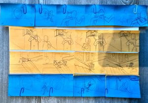
Here is my storyboard take. I made sure that each scene and key frame is clear and understandable for me and my group if we choose to use a storyboard like this. I made sure to add a note of what frame rate we can make this into (12fps). each row is made for each of us in the group as there are four of us. Also, using post-it notes to complete this was more efficient and fun for me to make the storyboard with.


After some feedback from my lecturers and more discussion with my teammates, I updated my storyboard to show ideas from my teammates that when put together, flows a lot better.

Week 7

In week 7 we studied Animation basics. We looked more specifically at timing and spacing. These features are apart of the 12 principles of animation. Timing refers to the number of drawings or frames for an action, which translates to the speed of said action. It is how long something takes to happen or not happen. Spacing refers to where that object is at each frame of the animation. The distance of each space in each frame gives the illusion of movement.

Frame rates consist of how many drawings are displayed in motion every second. Here are some examples:

          • 1’s, 24 images in 24fps (fast, fluid)
          • 2’s, 12 images in 24fps (a little choppy)
          • 3’s, 8 images in 24fps (choppy, limited)
          • Can go higher (4’s, 5’s) can mix frame rates above

Source: Week 7 – Animation Introduction, Lecture & tutorial videos, Animation 101 lecture.mp4

Timing and spacing is important in animation because they determine how action can move in any kind of way. I completed some activities trying out timing and spacing. I used Adobe Animate to complete these activities.

At first I tried out an experiment Alec had shown in the lecture video to practice timing and spacing in different frame rates with a ball shape.

Source: Week 7 – Animation introduction, Bouncing Ball – Animation tutorial.mp4

My homework was to animate 3 bouncing balls of different weights, such as a tennis ball, or a bowling ball. Before I attempted this homework I made a practice run with the help of this diagram my tutor provided. Source: Week 7 – Ball bounce timing & Adobe Animate hotkeys.pdf

The first ball I animated was a volley ball. I figured this kind of ball would be quite neutral but has a bounce to it. I used this video as reference: https://youtu.be/Rq3kErnT-oE?list=LL

The second ball I animated was a ping pong ball. This kind of ball would bounce vertically unlike other balls; it is also quite small and light which can be seen when it bounces. I used this video as reference: https://youtu.be/-aTibaqEwl8

The last ball I animated was a bowling ball. This ball is very different from the rest as it carries much more weight. A bowling ball bounces very little compared to others. I used this video as reference: https://youtu.be/8eejc0p7nCM

Week 6

Week 6 was the mid-term of our first semester. We took this time to finish off our activities we may have missed and build up our blogs to this date. We also took one-to-one sessions with our tutors to talk about how we were doing, what struggles were going through, what we enjoy doing and how well were doing in the course. I received good feedback from my tutor and plan to keep working well.

During this time I fixed up my character design homework. I had some work done before talking to my lecturer and they gave me advice on now to improve my character design technique by using silhouettes, shape and form, and experimentation with multiple costumes. I took this advice and completed a set of two concept designs for two possible characters.

Cyberpunk World – Week 5

In week 5, I did not change groups so I had more time to work on the Cyberpunk World. In this group we had myself, Simas, Dan and Jodie. With our new teammates, we discussed to them the overview of the world and showed our miro board. As a result we developed our ideas with the teammates that just joined.


This week we worked on Character Design. This gave us the opportunity to really work on our characters in this world. We had many ideas we wanted to produce. Etc. Cyborg animals, Elite/gang bosses, protagonists from poor side of city. I decided to work on two possible protagonists from the poor side of the city. Last week I already made some ideas for what they could look like but now I got the opportunity to really build on each character. Like who they are, what their name is, what do they do, how do they act etc. I filled in some character info templates to build on these characters before I start designing them. This will prompt me on how their design/clothes/features will resemble the actual person and what they do.


After this, I collected a few reference images of what I found suited the aesthetic, features and styles of the characters Im working on. This immensely helped when designing clothes and facial features. Picking out these reference photos also helped to think about important features that would tie the characters personality together etc. Lilith likes crafting, so she would wear a work belt to put her tools in.

I started off with Lilith. Here I worked on the silhouette of the character and find her distinguishing shapes and forms that stand out. I sketched out these forms and added in ideas for clothing for her to wear. I also did some facial experiments with the help of the references of peoples faces. I tried out different emotions and reactions to see how it would fit the style I drew in.

Finally I completed some detailed experiments of the finished character. I designed her in three different outfits. This part helped me find what colours suited her personality and what little details and touches would enhance her personality. This included the dirt on her face and clothes, the goggles to keep her safe when crafting, her work belt to store tools, little bits of bright colours to represent her bright personality, etc.


I moved onto the next character, again making silhouettes to find the distinctive shapes and forms, moving on to finding different clothes for them to wear. Then I experimented with emotions and reactions in this style I created to see what fits.

Here I finished some detailed experiments of my second character. Again this helped me find what colours suited his personality and what little details and touches would enhance his personality. This included the casual, dark clothes, the bag, the wrist bands to protect him while he climbs buildings, the hints of yellow to add to his ambitious emotion etc.

Again, these are possible character designs and may or may not be used. However, the process of being able to design characters anyway is a fun challenge and from doing this task, it will help me out a lot the next time I tackle character design.

Week 5

In week 5 we studied Character design. Character design is an essential part of bringing life to a story/scene. ‘Character is what drives the story and breathes life into a film’ – PixarThere are many character design steps that will help develop your character in the best possible way, such as:

        • Figure out your target audience
        • study other designs
        • make your character unique – body shape, face shape
        • add personality
        • add exaggeration
        • give your character a background, goals, dreams, wants
        • research real subjects etc. props, clothing, species


When it comes to creating your character there are initial considerations you can take to improve your work. These are:

        • Silhouette – is the characters shape distinguishable
        • Shape – round, square, triangular
        • Appeal – what feature is most appealing – hair, eyes, shape
        • Structure – head, chest, torso, limbs
        • Animate-ability –  is it simple enough to animate?
        • Colour – palettes/colour schemes
        • Variation – in multiple character designing


Character design is very important in animation as characters are a main part of any story. Characters can carry the story from the start right to the end. I completed a quick exercise on character design and drawing from real subjects.

Source: Week 5, Lecture video and slides, Character design Intro video.mp4/Character design lecture part 2.mp4


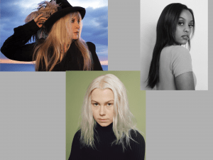
In the video, Character design lecture part 2, I tried out the experiment Aodhan had did himself where he found images of celebrities or known people and took 20 minutes of each person to draw them out in a cartoonish, exaggerated style. This took a while for me to get used to but I pulled through and drew three of my favourite artists. Reference Image Below.


As I were drawing these, I tried to find the overall emotion or personality from each artist. This helped me to make  their personality and emotion more visual and exaggerated.

Week 4

In week 4 we studied colour theory. The terminology of colour consists of the hue (the colour itself), saturation (intensity of the colour), and value (lightness and darkness of the colour). This terminology applies to any kind of scene, piece or shot that colour is included in. Combining colours together can also make emotion. Colour theory is very important in animation as colour can determine how a scene is portrayed just by the hue, saturation and value. I completed a few exercises on colour theory; about colour schemes, colour emotions and colour palettes.

Source: Week 4, Colour, Lecture video and slides, Lecture – colour-theory Part 1.mp4


In one exercise we were to use colour to portray this particular landscape (Image attached below) in two different emotions. To prepare for this I had to choose two emotions, and think about what colour do they portray; what colour resonates with this feeling. I picked the emotions, ‘Despair’, and ‘Hope’.

Source: https://imgur.com/h1HtIp1

This is Despair. For this piece I picked out dark, gloomy hues. I wanted to include the sense of losing all last hope, which is the redness in the sky being covered by the gloominess of the clouds. The sadness and failure feeling of despair is represented by the darkness of the scene and the subtle blue hues.

This is Hope. For this piece I picked out multiple colours that portray a positive feeling like success, freedom and joy. So I used deep yellow hues, blue hues and green hues. I wanted to picture the scene as a sunset afternoon as if its looking forward to the future with all hope. The yellow is for the joy of having hope, the green is for the freedom it leads to, and the blue is for the uncertainty/possible outcomes for the future.

For this exercise we were to use one of the thumbnails we have drawn the past few weeks, and use one of the four colour schemes to colour the simple environment. I was to think about the colour scheme I wanted to work with, and pick out colours that reflects this environment and its emotion.

I chose to work with the complementary colour scheme. Although reds and blues are quite close to each other I thought their contrast would suit the environment I was going for. It is an environment from another world based on the Constellation world, so it was meant to have a distinguishing, vibrant look to it.

My last task was to pick out images/stills from films or animations I like and create a basic colour script using block colours and discuss what kind of colour scheme was used and what emotion it conveys. I completed this in a PNG below.

Still from ‘kipo and The Age of Wonderbeasts’

Still from ‘Steven Universe’

Still from ‘Gravity Falls’


Cyberpunk World – Week 4

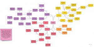
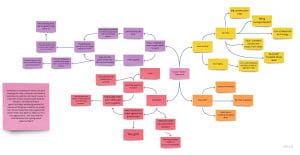
During week 4, I got switched to the next group, Cyberpunk world. In this group we had myself, Jennifer, Lucy, and Simas. We were paired up with this group to discuss the overall idea of how this Cyberpunk world. Since all the original teamates of this world had moved away, none of us really knew what the world was about. We planned out our own take on the world with the information we could find from their group chat. We started a Miro board and put down all our ideas.

After doing this we had a solid idea for the Cyberpunk world while trying to stick to what the past teammates had first planned also. We wrote an overview of the world so new teammates for next week can understand clearly our world idea. 


As a group we discussed a lot about the design such as the characters, the cyborg animals and the antagonists. I chose to focus on possible main/side protagonist characters to see what I could come up with. Since this week we were working on colour theory, I added colour into my pieces to experiment with how the world would look in colour. This development of the characters really helped to find where we were and continue with the rest of the world.

I also did some extra colour thumbnails to grasp the overall feel of the world, what colours would we see most, what scenes may occur, what emotion it gives etc.

Week 3

In week 3 we looked at Tone / Value. Tone / Value refers to the lightness and darkness of an area captured in an element. There are multiple value changes in this fundamental, such as depth (objects appear further away/blend in with the sky etc.), range (the band between light and dark colours), and texture (detail in a scene/cross-hatching, black-white tone, line-work). This aspect is very important in animation as it has the opportunity to change the form of a scene or element. This can make a scene look believable in many ways depending on the light and dark sources. I was given exercises to practice this fundamental before I continue with my world project. I was to make use of the cross-hatching and two-tonal techniques to practice with.

Source: Week 3, Video lecture – Value/Tone, Value lecture Part 1, 2.mp4

I used the example given in my lecture to help grasp the idea of making cross-hatching and two-tonal studies. picked out three interesting parts of the piece and made my studies. These were interesting to do especially the two-tone study. I have a fair idea of how the tone works in different views of a single setting; where the light shines in front and where the dark forms in behind.

Source: Atmospheric perspective – quick technique.mp4            Source of Image: https://youtu.be/VIPx-81Ll28

I tried out some more studies this time using the campus as a reference. I attempted both cross-hatch and two-tonal studies. These were fun to experiment with and really improved my skill in tone/value looking at a real life setting instead of from a drawing.

Bioluminescence World – Week 3

During week 3, I got switched into another group. This group developed the idea of a Bioluminescence world. In this group we had myself, Alex, Jennifer, Jodie and Nathan. When me and Nathan switched, we immediately got paired up with the next group and started talking about what their world was about to us. We discussed our own ideas and takes on the world and discussed what we can develop on. We went back to brainstorm and helped this group develop their plot and motive of their world. As a result, we gathered ideas for main characters, a solid storyline of how this world began, and little touches on the bioluminescence creatures the group first designed.

This world is based on the aftermath of how humans had used too many radioactive resources to destroy the earth, killing off most humans. Aliens had entered this world and plans to restore it to full health. The world is dark and gloomy but bioluminescent colours shine through the mutated nature, plants and creatures. One stranded alien meets a group of human survivors that offer to help them get back home.

Our group met for another discussion to talk more about the overall idea and what the story should focus on. As a result we came up with an overview paragraph that will help newcomers switching to this group to grasp the idea of this world easily and bring their ideas and concepts in. This really helped me and Nathan familiarise ourselves with this world concept.


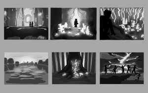
For week 3 homework, we were set to create 6 thumbnail studies of our world focusing on what we just learnt – tone/value. We were to consider implementing the value change aspects into our work etc. the range of colours, the texture, the depth of field.


After this, we were to choose our favourite thumbnail and illustrate a larger / longer focus study combining composition and tone. I picked out the sixth thumbnail as I thought it would best suit the overall theme of the world. It includes the main characters and specks of their personalities showing through, the bioluminescent plants in the background shining through, and the dull and dying land and tree that represents how the world had been affected.

Back To Top
Skip to toolbar