I also chose to make a few general assets for the Haunted Mansion. This included the wall’s wallpaper, the rips on the wall, the smoking pipe, and more.
I first started with the smoking pipe.
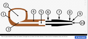
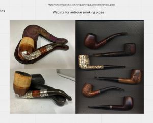
I took time gathering references for this smoking pipe – figuring out which shape to use etc.
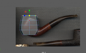
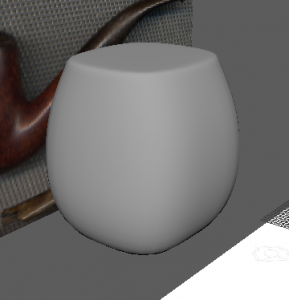 I imported some images to Maya and started blocking out the shape of the bowl of the smoking pipe.
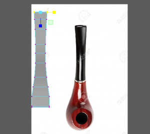
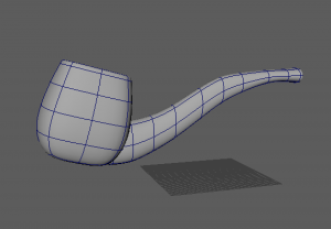
I then modelled out the stem of the smoking pipe. I used edge loops for both parts to scale the shape how they are on the references. I combined both parts, taking time to delete inside faces and merge vertices.
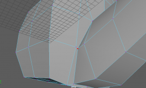

Because of the angle and shape of where the two parts connect, It was quite difficult to figure out but I managed to clean it up with no problems.
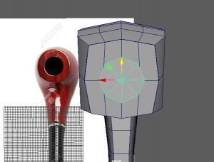

Next I used the boolean-difference tool to carve out the chamber inside the bowl. I then cleaned up any thing else around the model and smoothed the asset.
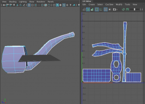
Lastly I UV mapped the asset and made sure the faces were present and cut neatly.
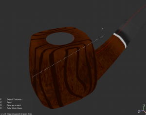
I brought the asset into Substance Painter. I placed down some materials and used the paint Layer option to paint on wood texture on this smoking pipe. I also added the metal strap between the bowl and stem like most smoking pipe designs have.

I made some shadow paint layers around the asset also. I used a fill layer and with height turned negative so I could apply some alpha shapes onto the model. I added scratches and dents all around the wood, and stains around the stem.
Next I started designing the wallpaper for the haunted mansion walls.

First of all I gathered many references to help me visualise what we wanted the walls to look like.
We discussed this as a group in our weekly call, and found what we liked best from our previous reference of mansion movie sets or victorian houses etc. We agreed to go back and use the colour palette page, and preferred to use a green/gold combination on the wall. We thought it would be eye-catching and also blend in with the lighting we are thinking of for later on.
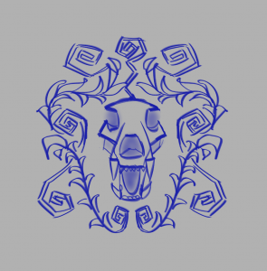
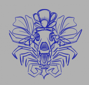
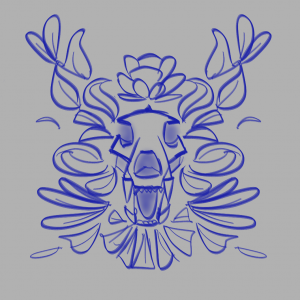
With my reference I drew up three different designs for the repetitive pattern on the wall. I presented these to my group and they liked the idea of blending the first and second designs together, so I went forward with this idea.
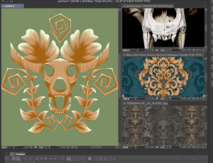
I had reference at the side of my screen as I designed and painted the final idea of the pattern. I was happy with the look when it was painted and I continued with the seamless texture pattern.
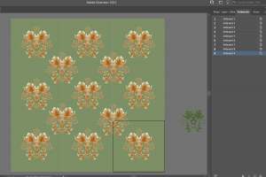
I moved over to illustrator to use the dartboard feature to complete this. I placed the main symbol in a pattern in the middle of one dartboard, and duplicated the board 8 more times. I then placed more of the symbol in the middle of the corners of four artboards.

I quickly painted a copy of the symbol in a green colour as a subsidiary in the pattern. It made the design look more full as a result.
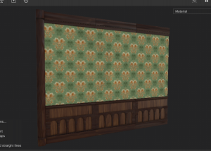
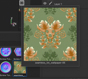
I imported the design into Substance Painter as a singular artboard. I placed the design onto the wall and it successfully repeats the pattern all around the wall.
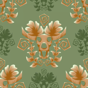
This was my final result of the seamless wallpaper texture.
Next I made rips for the wallpaper. At first I was aiming to make cracks on the walls, and got quite far in the texturing stage, but I was stuck figuring out how to apply the texture the way I was looking for into UE. I was also not happy with the result and wanted to try something new.
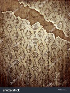

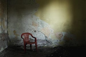
I was researching what wallpaper rips look like online. This gave me a visual idea of how the rips will look.
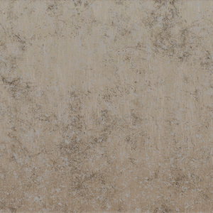
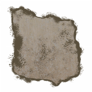
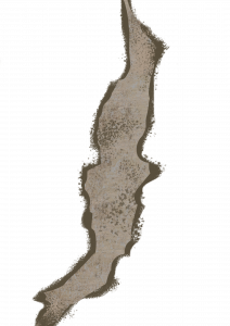
First I picked out a material from Substance Painter that fit my visual for the rips, and applied this to a plane asset. I exported the texture as one PNG, as I didn’t need the other types of texture files. I Brought the texture onto Photoshop and painted a rip look with this material.
I made three different versions so they can vary around the Haunted Mansion, in different scale and rotations. I was able to add these images in as decals onto UE.

I made this writing desk quite a while ago while I was practicing how to use Maya. Since I didn’t use it for any other project, I thought it would be useful for this project. In addition, its design is great for a place like our haunted mansion, it fits into the theme well.

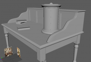
I made a few adjustments to the model, such as separating the whole parts, and adding/replacing faces/vertices as it was quite messy and could not UV unfold correctly.
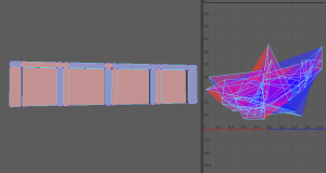
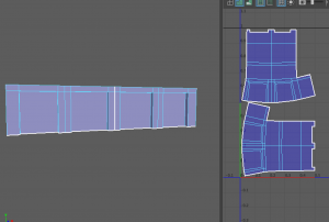
Many parts were flipped the wrong way, not cut/sewn properly so I went through each piece and made sure its map was correct. I was able to unfold and UV map everything with ease eventually.
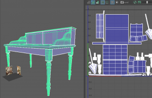
Here is the model UV mapped correctly. When this was done, I brought it into Substance Painter to texture.
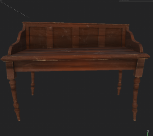
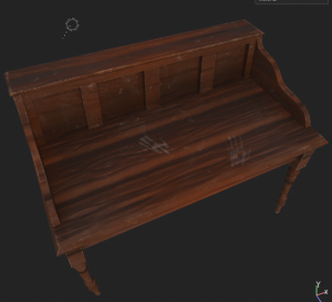

I used our regular collection of wood materials for the desk and applied it on. I experimented with making this desk look old and withered by adding dust, wood chipping off the corners, and dirty handprints still left on it. I added on the shadows and highlights where it suited around the model, as it gives it a nicer, colourful look.
I also made the floor for the Haunted Mansion.
I used Henry’s teachings on the modular asset lesson to make this floor. I followed his process of placing blocks of polys, aligning them with the snap tool, and so on.
Source:
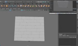
I made use of the video to help me make my floor base. I added the plane over the top of it as well. Later on, I also used the lattice tool to give the floor a bit of wonkiness to add to the theme we are going for.

I imported the assets into Substance Painter, and made it so the high poly was combined with the low poly. I went about this technique of painting on each plank on the floor manually. – So that each wood part was positioned differently instead of all the same.
However, I had trouble with this file and it would not let me open it again. I made a new file, and avoided this process & stuck with using the high poly model.
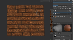
I placed on a wood material from our collection and started adding shadow to the edges of the planks to give it depth. I was lucky as each plank was a separate model, it would vary its pattern.

I posted a work in progress screenshot to the group and asked if they liked the floor so far. They did appreciate it but they also considered that I use a different wood material as the other was a little distracting. I agreed and changed it with the Wood beams material. I think it was a good call as this one suits the floor design a lot better. It fits better with the visual of our mansion. I added last touches of shadows and vibrances onto the wood and it was finished.

I took some time to help out our teammate Caithlin to texture her model of the Gramophone.

She provided me with the fbx file and I started working on the textures. I used our wood materials to apply to the base of the gramophone. I added a dark green accent to the base to match the room walls colours. I textured the vinyl on the soundbox, and lastly I added a gold material and experimented with roughness textures to the horn of the gramophone.

