In week 4 we studied colour theory. The terminology of colour consists of the hue (the colour itself), saturation (intensity of the colour), and value (lightness and darkness of the colour). This terminology applies to any kind of scene, piece or shot that colour is included in. Combining colours together can also make emotion. Colour theory is very important in animation as colour can determine how a scene is portrayed just by the hue, saturation and value. I completed a few exercises on colour theory; about colour schemes, colour emotions and colour palettes.
Source: Week 4, Colour, Lecture video and slides, Lecture – colour-theory Part 1.mp4
In one exercise we were to use colour to portray this particular landscape (Image attached below) in two different emotions. To prepare for this I had to choose two emotions, and think about what colour do they portray; what colour resonates with this feeling. I picked the emotions, ‘Despair’, and ‘Hope’.
Source: https://imgur.com/h1HtIp1
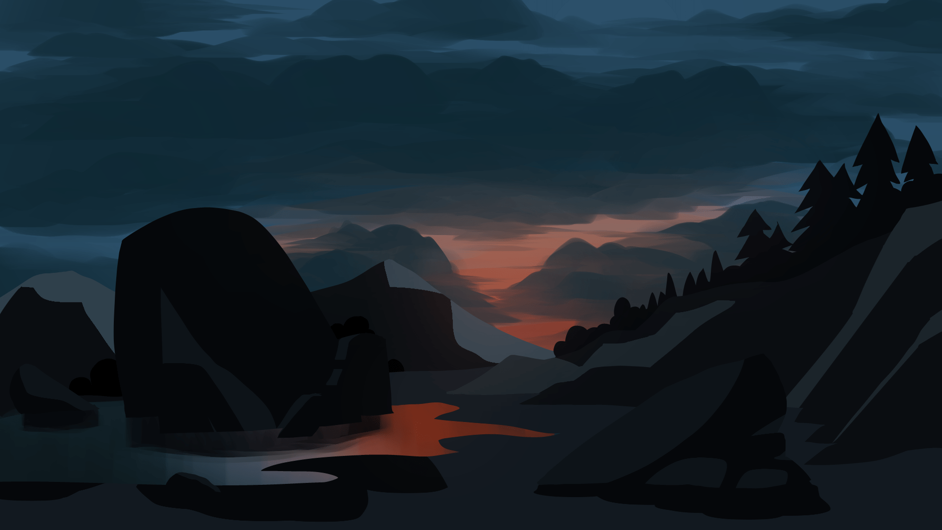
This is Despair. For this piece I picked out dark, gloomy hues. I wanted to include the sense of losing all last hope, which is the redness in the sky being covered by the gloominess of the clouds. The sadness and failure feeling of despair is represented by the darkness of the scene and the subtle blue hues.
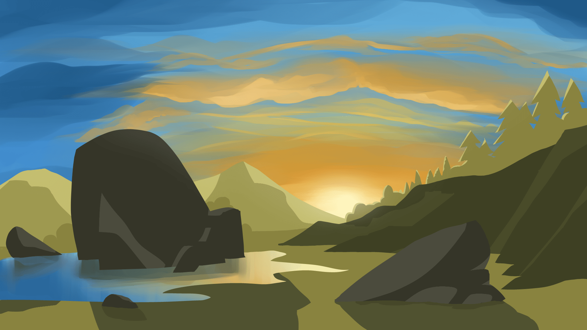 This is Hope. For this piece I picked out multiple colours that portray a positive feeling like success, freedom and joy. So I used deep yellow hues, blue hues and green hues. I wanted to picture the scene as a sunset afternoon as if its looking forward to the future with all hope. The yellow is for the joy of having hope, the green is for the freedom it leads to, and the blue is for the uncertainty/possible outcomes for the future.
For this exercise we were to use one of the thumbnails we have drawn the past few weeks, and use one of the four colour schemes to colour the simple environment. I was to think about the colour scheme I wanted to work with, and pick out colours that reflects this environment and its emotion.
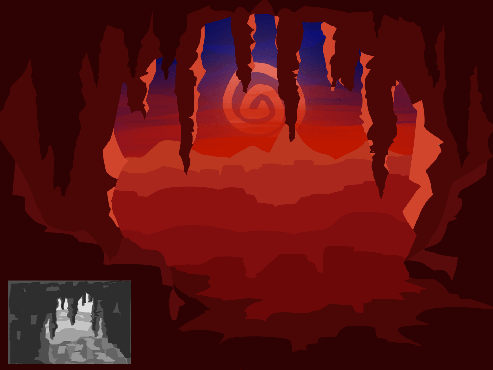
I chose to work with the complementary colour scheme. Although reds and blues are quite close to each other I thought their contrast would suit the environment I was going for. It is an environment from another world based on the Constellation world, so it was meant to have a distinguishing, vibrant look to it.
My last task was to pick out images/stills from films or animations I like and create a basic colour script using block colours and discuss what kind of colour scheme was used and what emotion it conveys. I completed this in a PNG below.

Still from ‘kipo and The Age of Wonderbeasts’
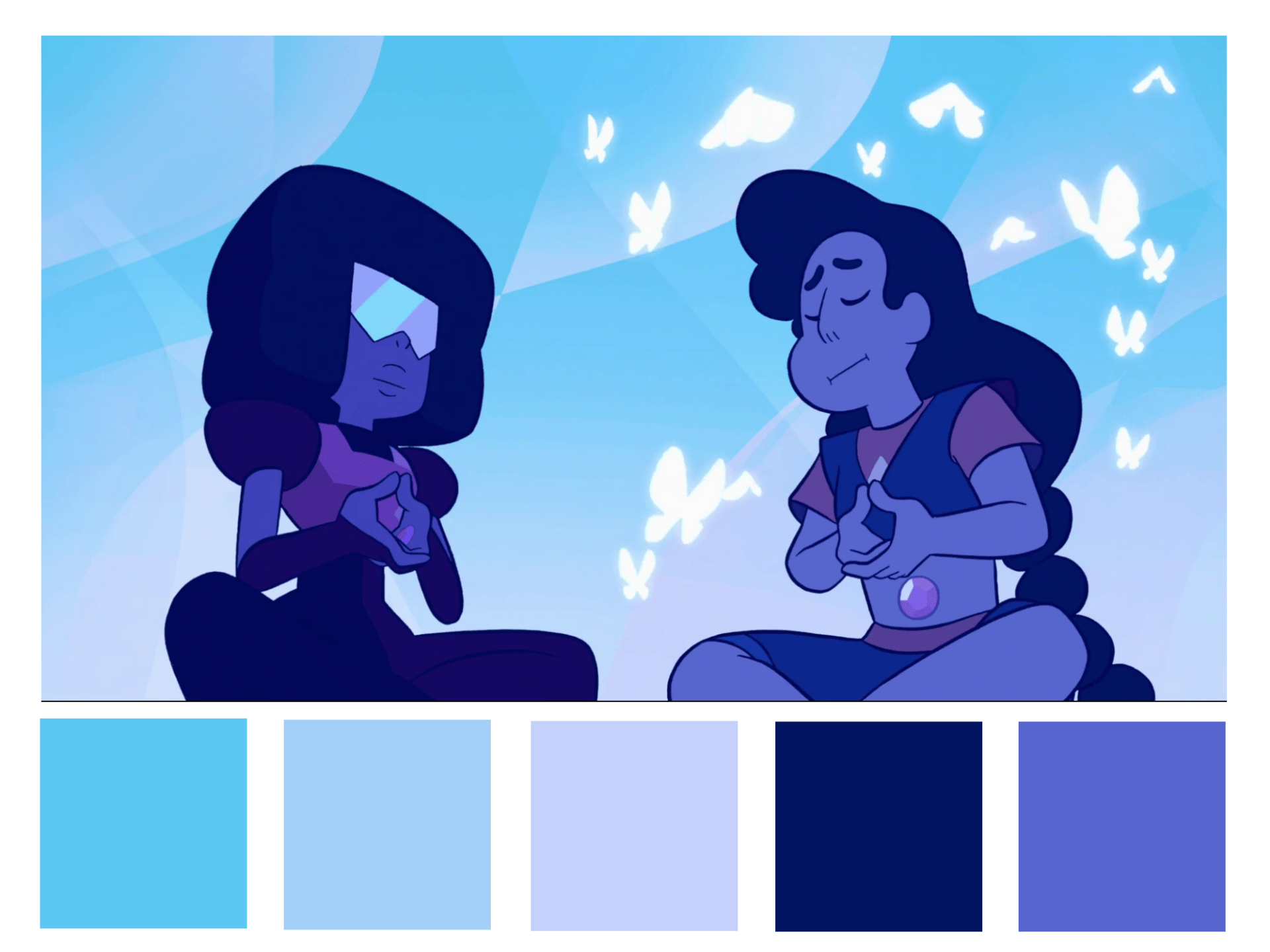
Still from ‘Steven Universe’
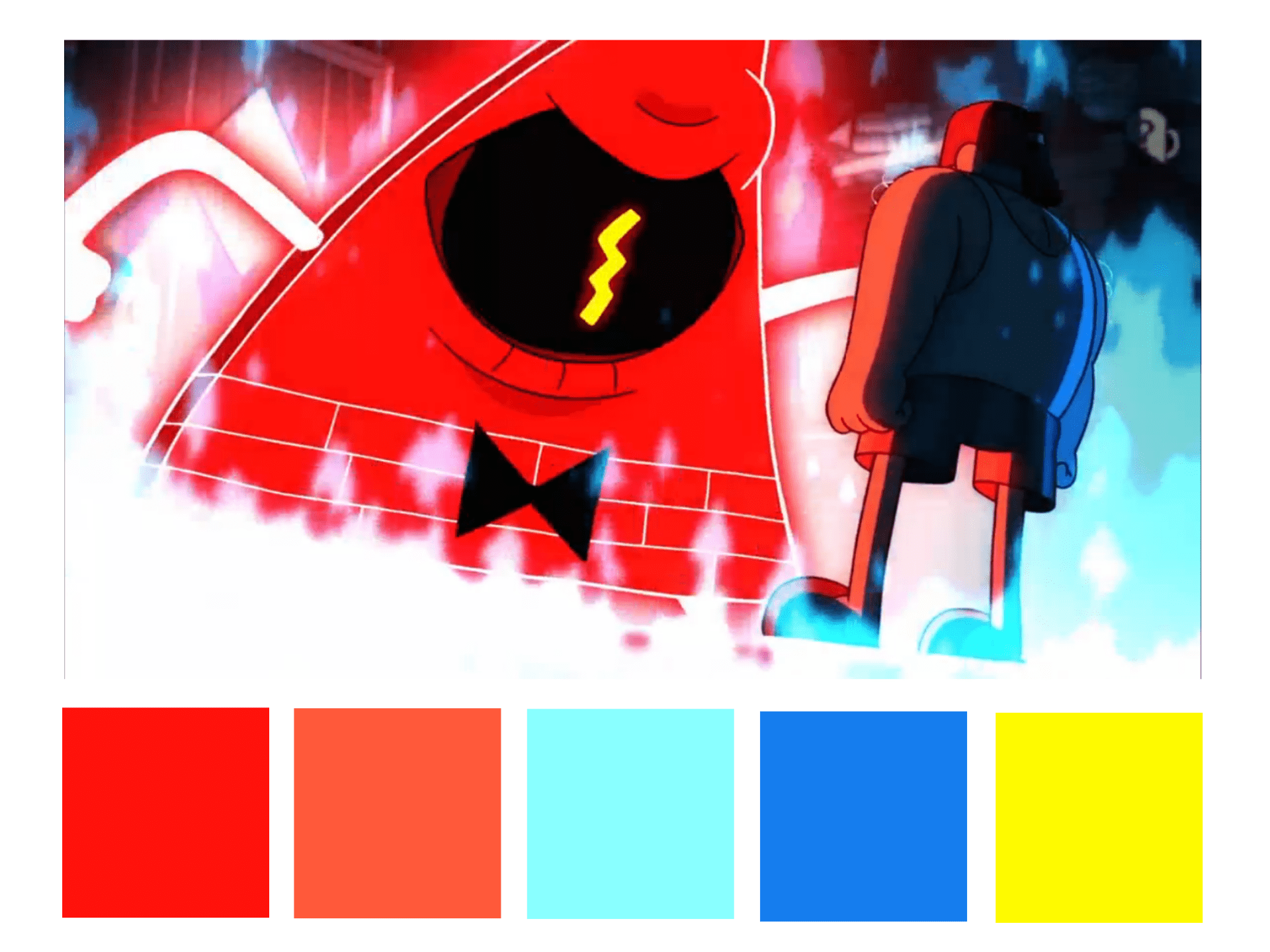
Still from ‘Gravity Falls’
