Planning and Pre-Production
This assignment simulates a studio-like scenario where we are required to produce a Cinematic Short film using the environment as its storytelling medium. Building film sets and digital environments for film and animation involves multi-disciplinary team efforts. However, the director’s vision gives the final output its unique and creative aesthetic. We are required, as a group, to develop and share the main concept and key assets for a Haunted Mansion. Once these are developed, you are then required to use the assets to develop your own interpretation of the environment.


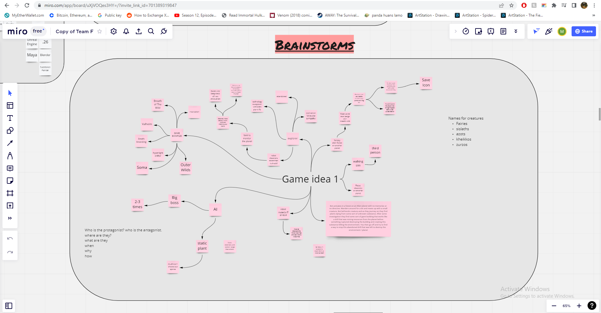
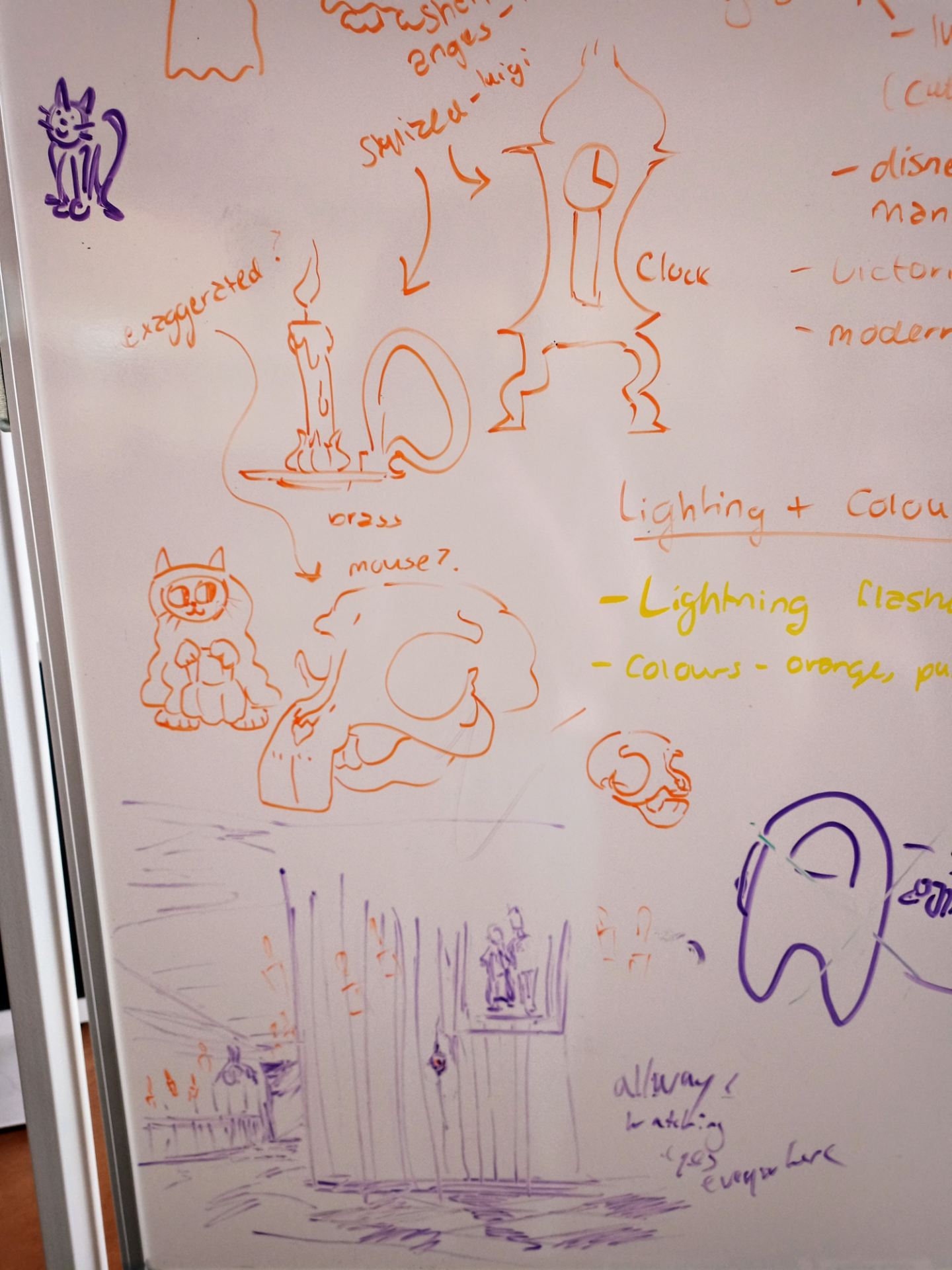
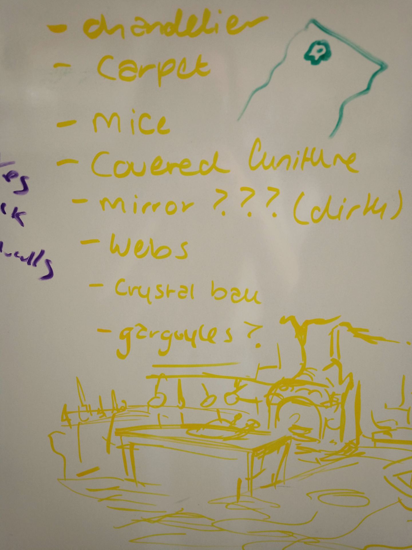
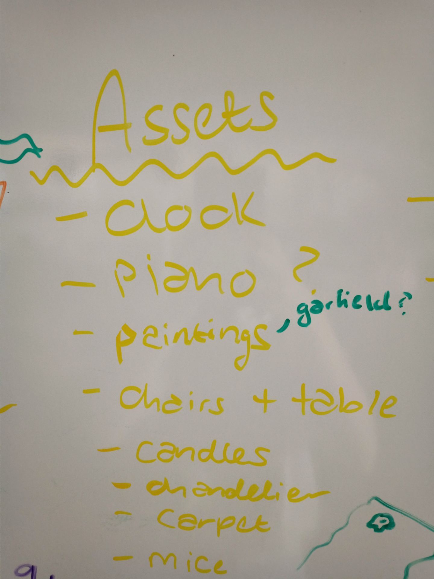
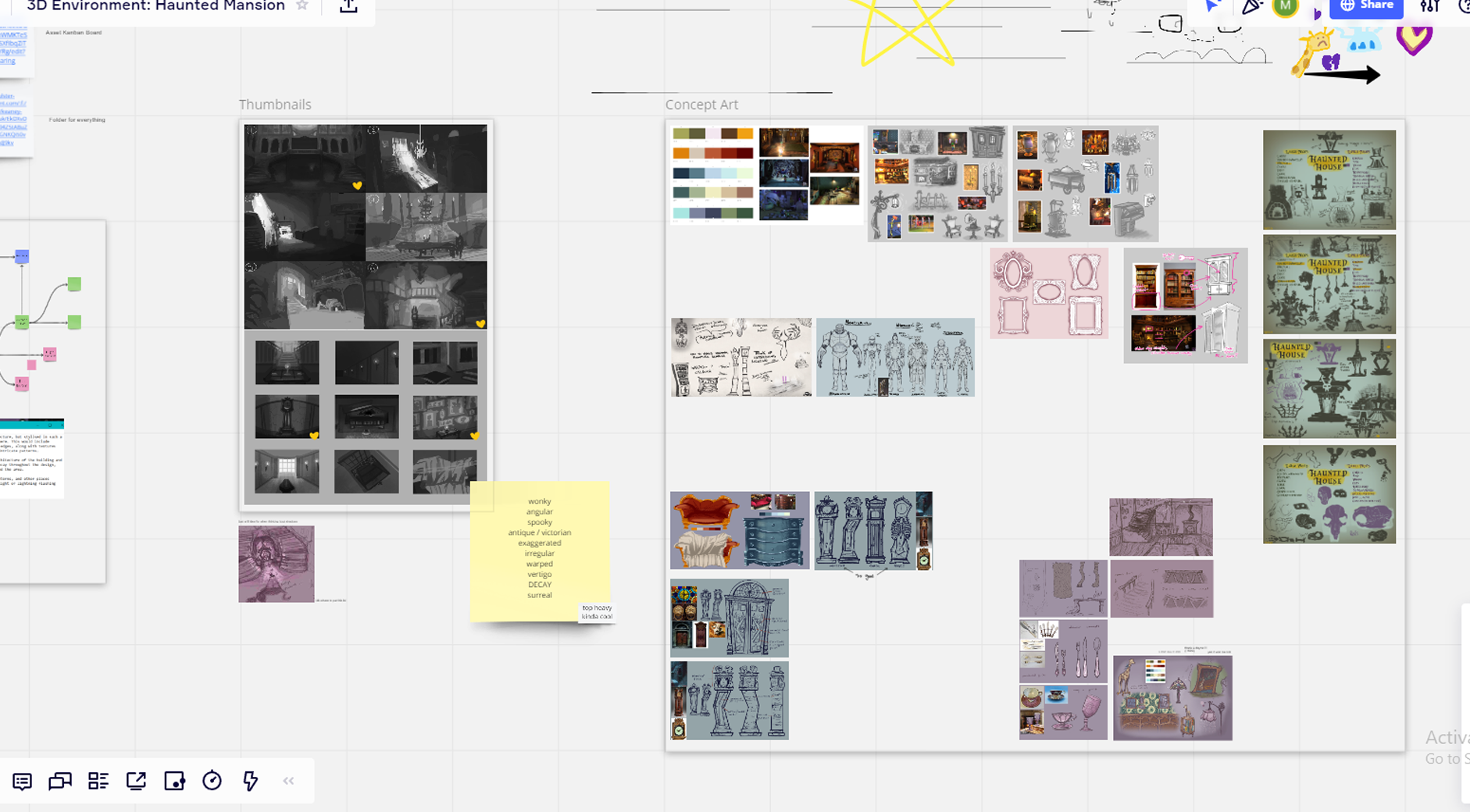
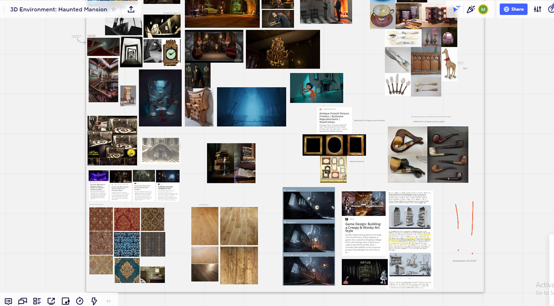
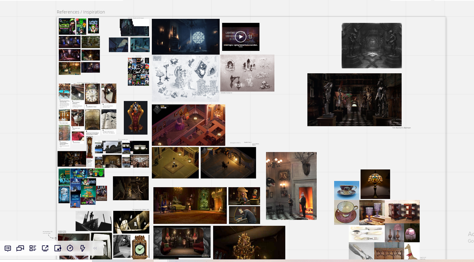
We started off this project by brainstorming in class, listing and sketching the assets we could make, the different rooms, different sources we could use for inspiration. Most of the group were interested in a Lugi’s Mansion vibe, for both the mood and the artstyle. We used Miro to organise and plan further. Throughout the weeks this is where we’d post references, articles, plans and our own concepts.

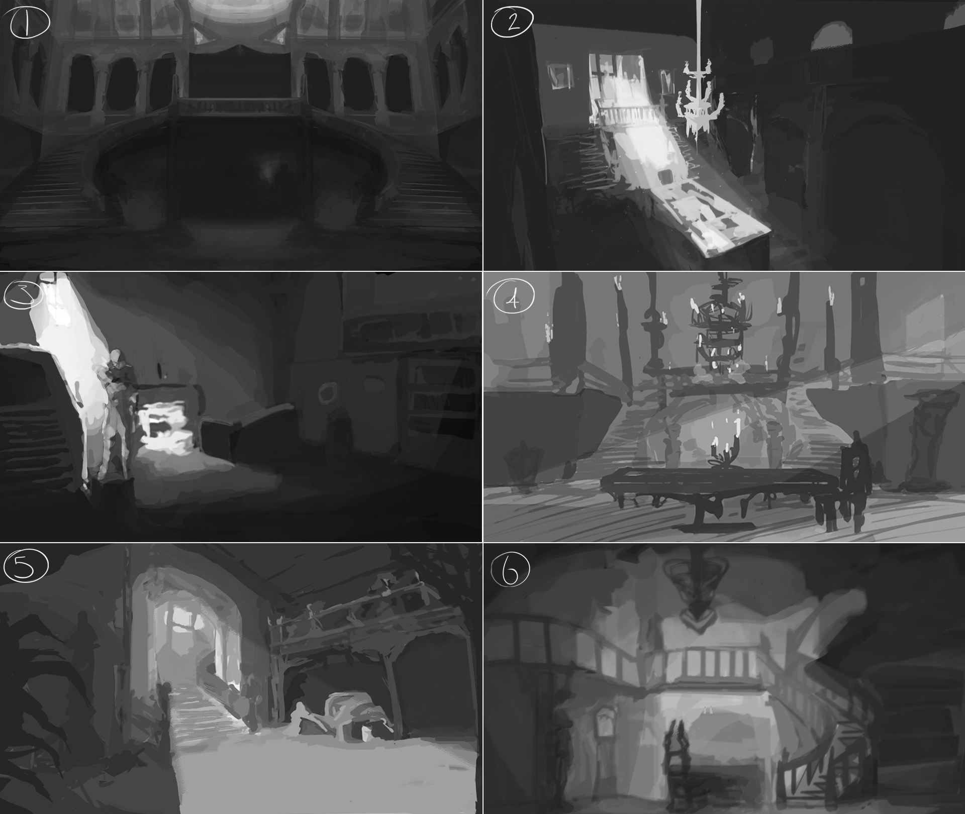
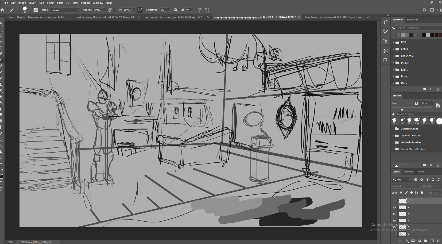
I got started on thumbnail sketches pretty quickly, still not confident with these, always spend too much time or too little time on them. Here you can see some of my process, which kind of turned more into digital painting than quick thumbnail sketches. I was focusing on different layouts of the room and mostly the composition and lighting, using candles to highlight areas and having a main focus be lit from a window by moonlight. I also decorated the room using the props we previously mentioned.


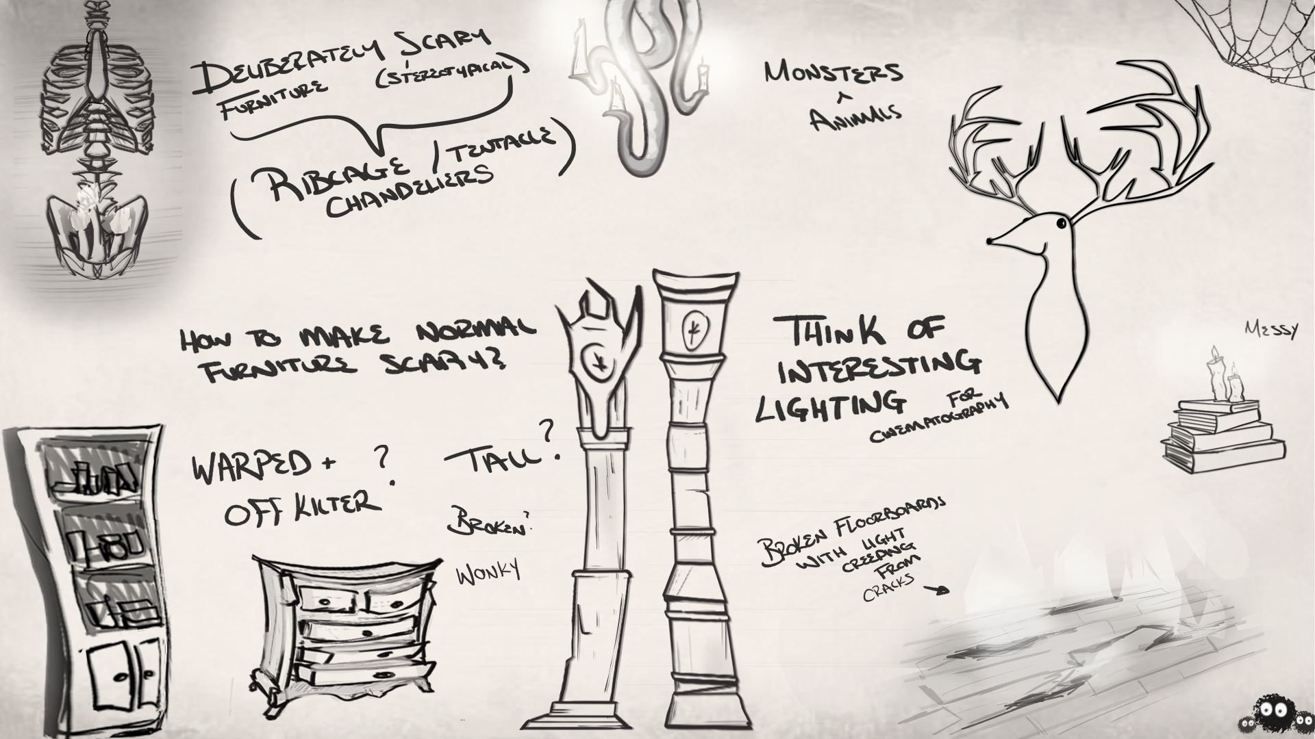
This is what I ended up with at the end of the first week. I think the compositional thumbnails came out well, it gave us a good idea of what sort of room layout we could go for, as well as how we would light these rooms. I particularly like number 4 and 6 both because I like the ideas and they were very rough and free, just trying to get ideas across. I also came up with this page of asset concepts, it wasn’t anything in particular it was more just trying to come up with a style and direction to go in, as well as get some ideas down that I liked. I wanted the furniture to be tall and off kilter, as well as deliberately scary. This is also where I came up with the idea of broken floorboards allowing light in, and messy disorganised books and candles laying about.


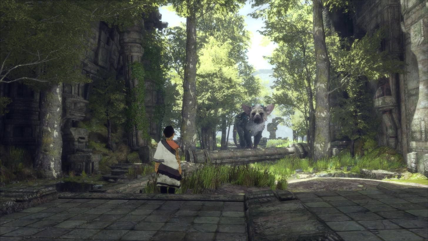
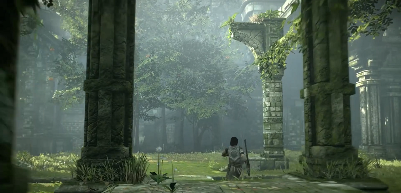
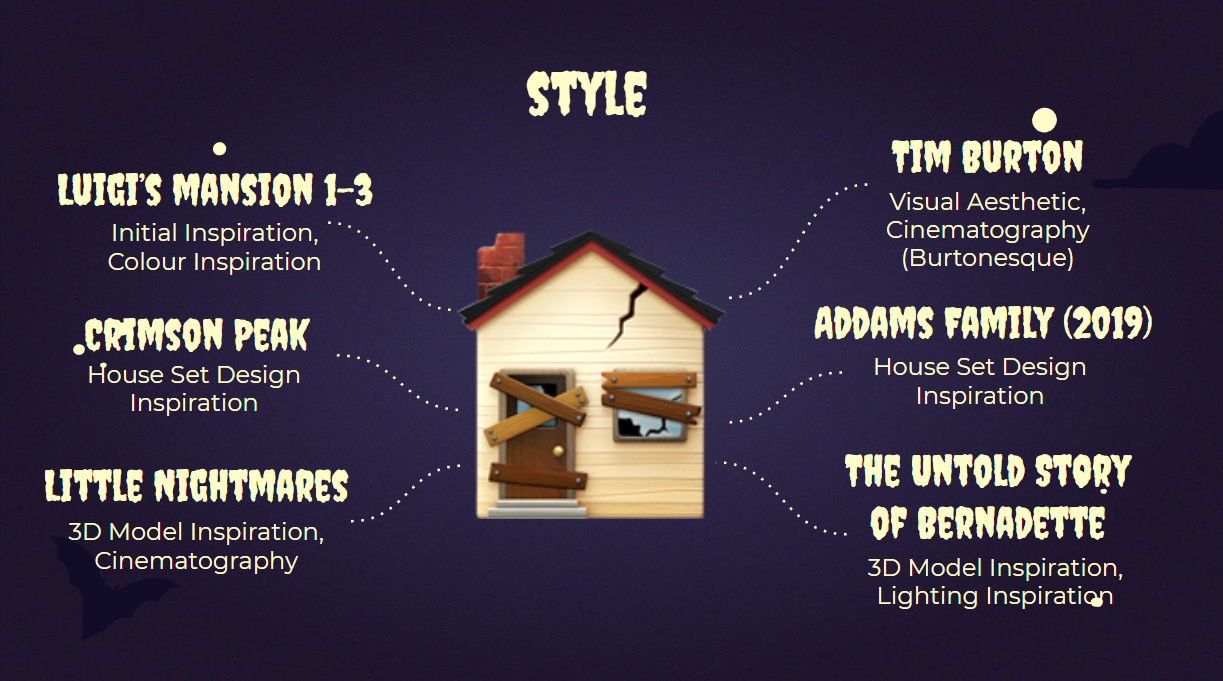
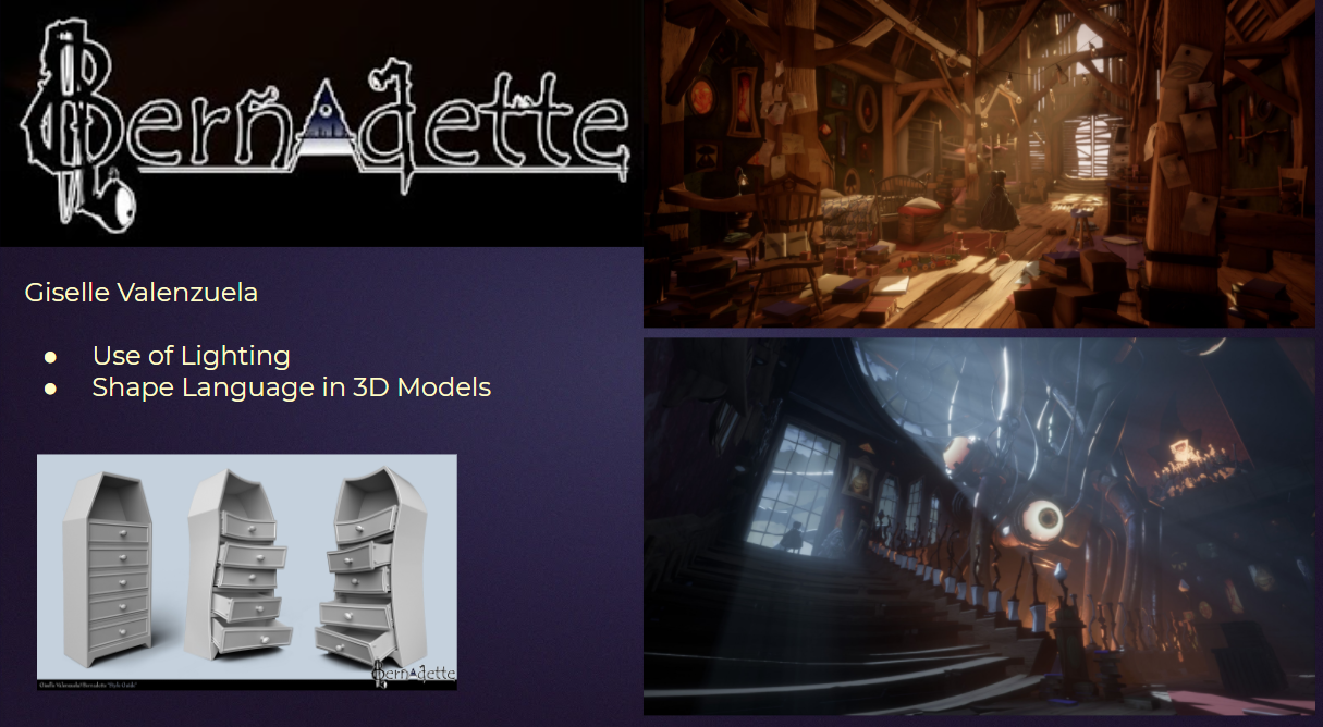
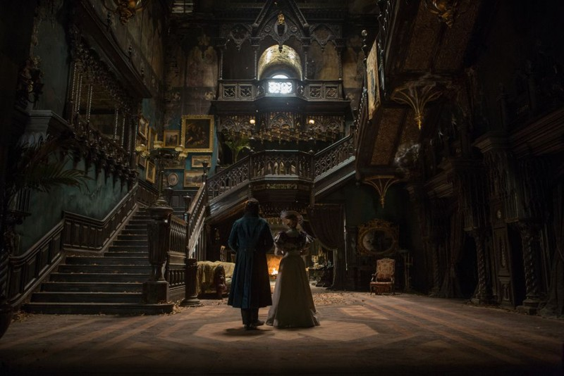
Luigi’s Mansion was our initial inspiration when deciding on the theme of our environment. Films like Tim Burton’s The Nightmare Before Christmas, and Beetlejuice, contain visuals and cinematography techniques that will influence our work when we get to the layout stage. We also looked at examples of German expressionism as this was something that influenced Burton’s work. The Addam’s family, and Crimson peak, have inspired our house set design, our 3d model ideas, and the lighting of the environment. Having both live-action and animated film references has been helpful to us. We were inspired by the use of warped objects and surroundings to create an unsettling atmosphere in the game Little nightmares. The student game ‘The Untold Story of Bernadette’ made by Giselle Valenzuela, has written a blog about the art of the game. We read about her techniques in creating lighting and the 3d models for the game. She also explains her challenge to implement shape language into her work. ‘the exaggeration in shape language to represent madness and discord’

We hopped in a call following the feedback from our presentations to somewhat make a style guide to follow, more just buzzwords that each concept/prop should meet. Jennifer typed up a few sentences so we could get our ideas across clearly to the lecturer’s and to make sure everyone was on the same page/clear up any confusion.

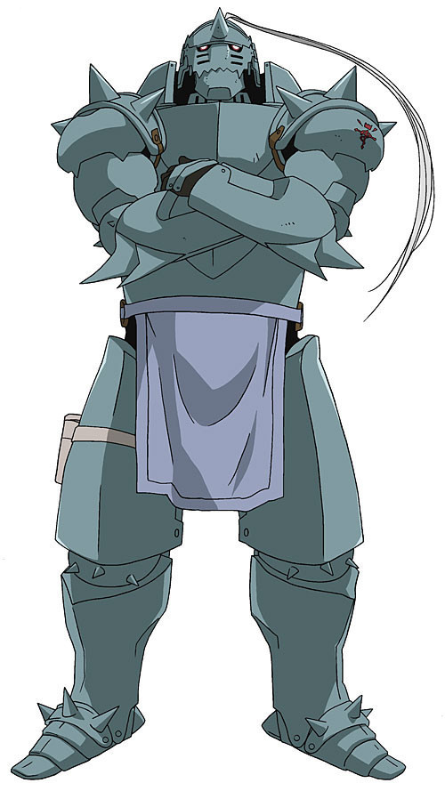
We each picked one ‘hero’ asset that we wanted to make in the future and I chose a haunted suit of armour. I looked online for inspiration and different adaptations of this, and these are two I found very cool and implemented into my concepts – Alphonse from FMAB and a knight from A. Shipwright on Artstation. I particularly liked the concept of drawing from skeletons/bone from Shipwright, and the silhouette from Alphonse.
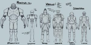
These are the different concepts I came up with, trying to vary them as much as possible. I like to come up with contrasting designs in group work just to get as many ideas across as possible and to let the members vote for their favourite concept/ pick and choose which aspects they like from each one.
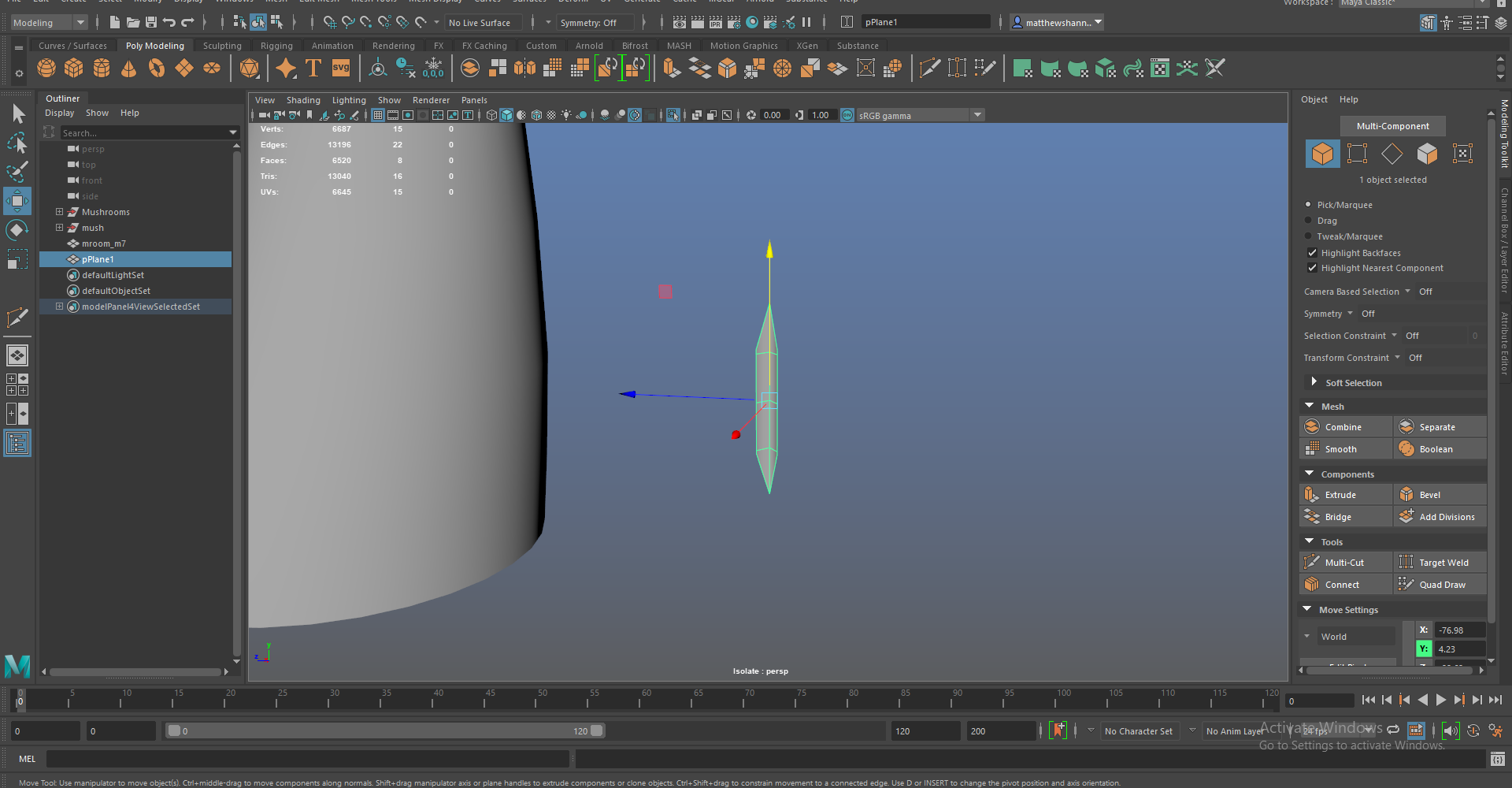
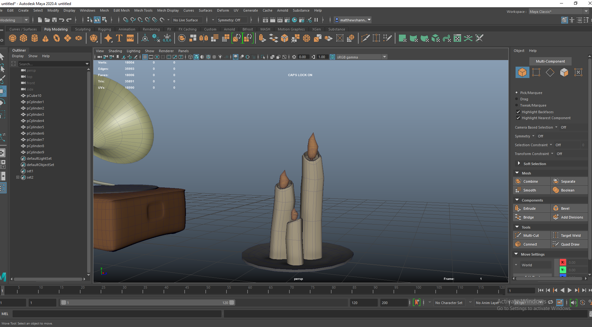
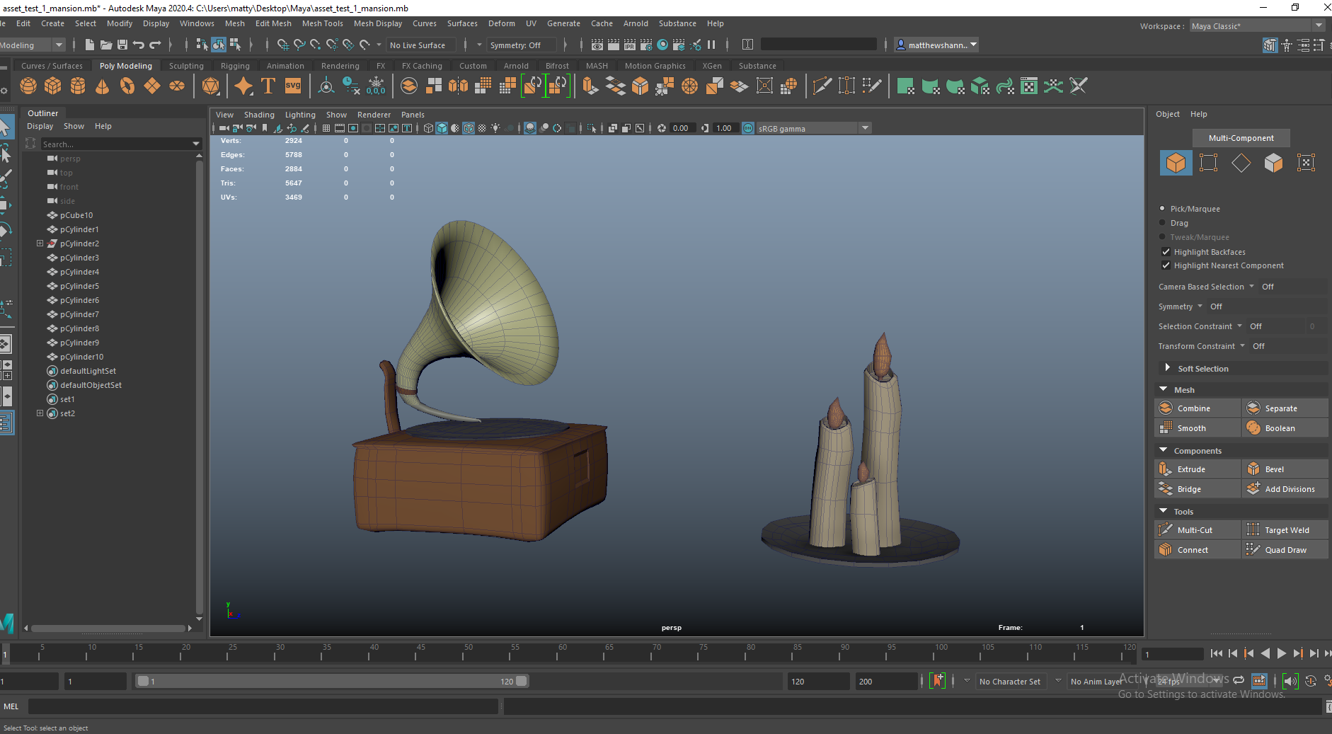
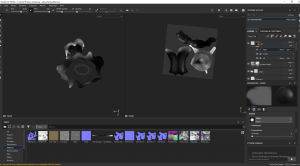
This was just me kind of playing around blocking out shapes and testing things out in Maya, very early on. I wasn’t assigned these props or anything I just wanted to get my hands on Maya again early and get used to the workspace again, as well as test out what super simple assets might look like in 3D. I did end up working on the candles and helping with the phonogram in the future though.
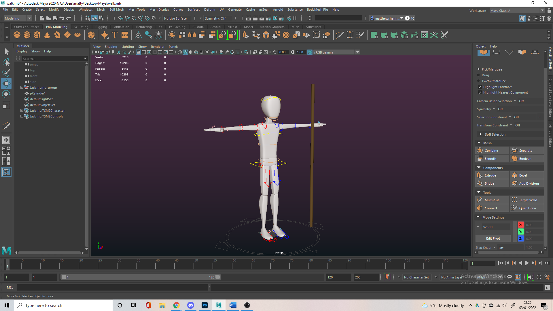
The lecturer’s wanted a block out of our environments to show in the presentation, so I looked into this in unreal and how to go about it. I didn’t end up doing it in unreal, I tried but I didn’t have a lot of experience in the software and moved to Maya just to get something done for feedback, but I would come back to these videos.
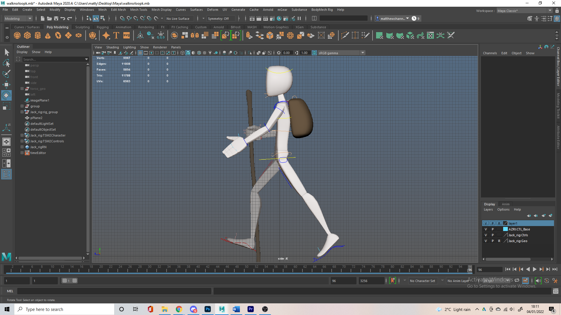
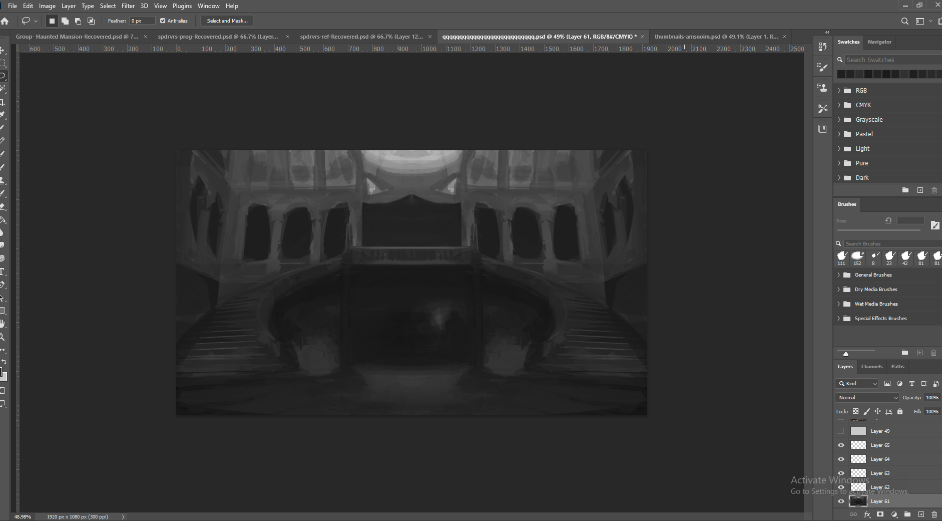
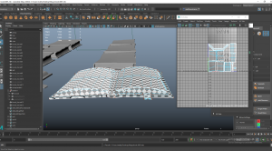
I based my layout on the set from Crimson Peak, a great reference I found for gothic architecture and a haunted manor. I liked the tall ceilings and huge open plan staircase, this would allow me to have the moonlight I wanted from a skylight above. Having a room under these stairs in another, more enclosed room would allow me to have the fire lit room, contrasting the blue from the moonlit room. I used Maya, built a bunch more blockout props and sketched over this in photoshop for a potential second floor, which was probably too ambitious. I like how the block out came out but I definitely deviated from this since it wasn’t amazing.
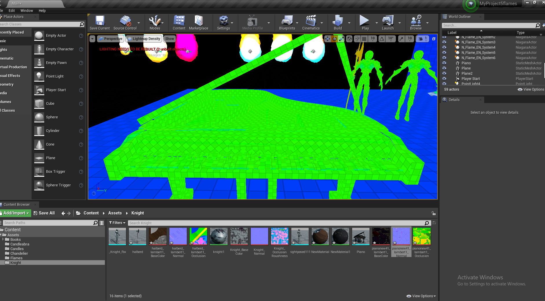
Above is a video in Maya and a video in Unreal showcasing this, made for our presentation that week. In hindsight this is not a great blockout but it was good to get something done. The lighting in Unreal is pretty bad though, I had no idea what I was doing it was kind of rushed just placing coloured spotlights about. I liked the coloured aspect and the backlit piano, but the intensity and mood, as well as actual light sources are all wrong.
https://www.architecturaldigest.com/story/set-designer-david-korins-beetlejuice-on-broadway – environment artist ref
https://80.lv/articles/creating-a-haunted-house-animation-project/ – environment artist ref
https://80.lv/articles/crafting-haunted-chateau-in-ue4/ – environment artist ref
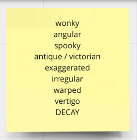
https://80.lv/articles/game-design-building-a-creepy-wonky-art-style/ – building an artstyle/modeling ref
These are some links I posted to the Miro at this time that I found useful, mostly from a site called 80.lv which is great for full in depth breakdowns of different 3D projects. One that was particularly interesting was this game design student’s wonky art style and how she went about achieving this., it was kind of perfect for our project.
Modelling and Texturing


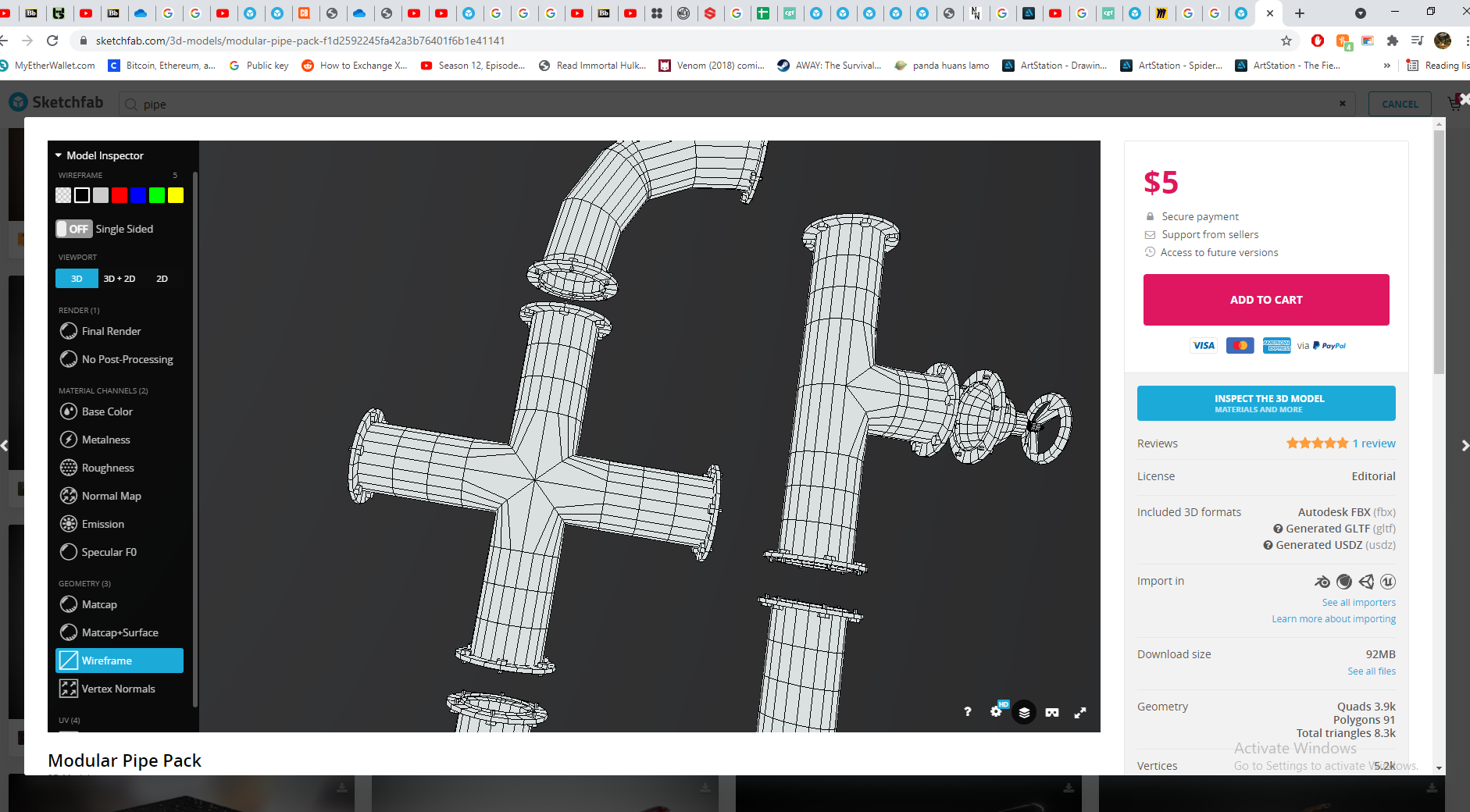
I had created a sketchfab collection called Haunted Mansion, my source of different 3D modeling techniques used for similar assets to what I was making as well as models with good topology/topology references, this was useful for things like the knights armour and candles. Some references I used aren’t in this collection, like the pipes I used as reference when making the candleabra. There are about 50 assets in here so I had a lot of variety, Sketchfab is useful because you can go in and look at the individual maps and wireframe, so I could use it as texture reference too. https://skfb.ly/o86JT
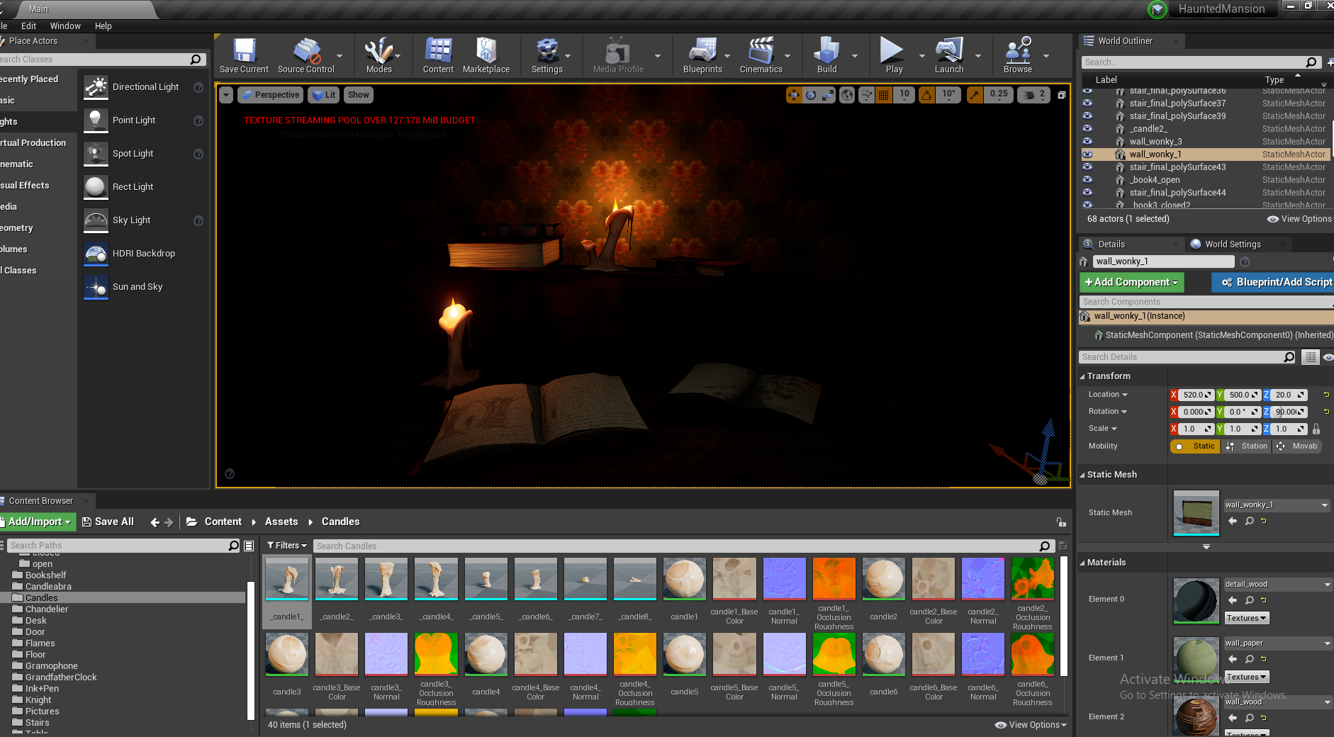
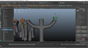
Candles
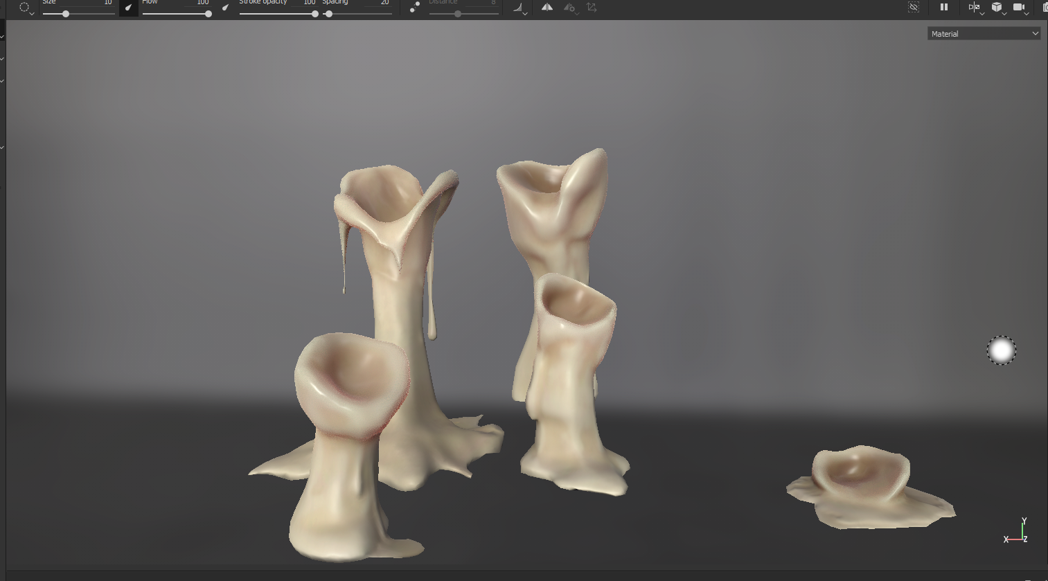
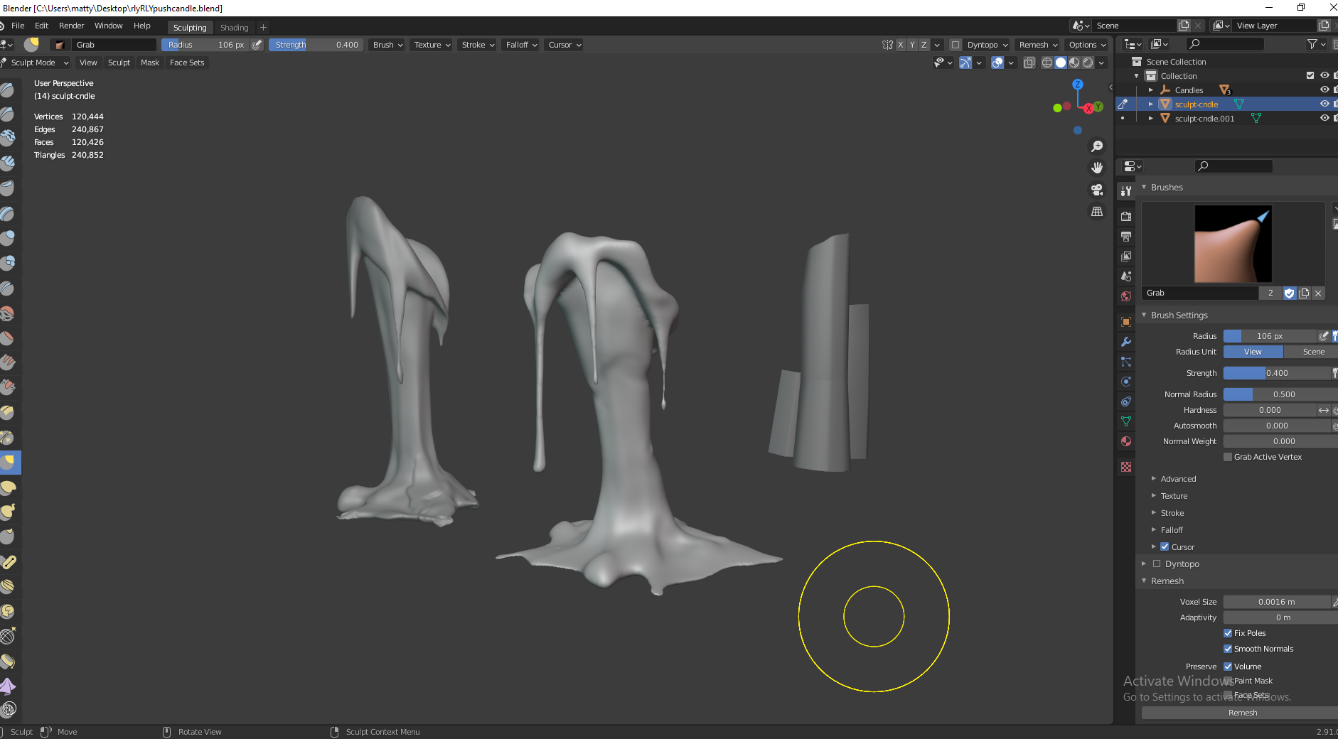
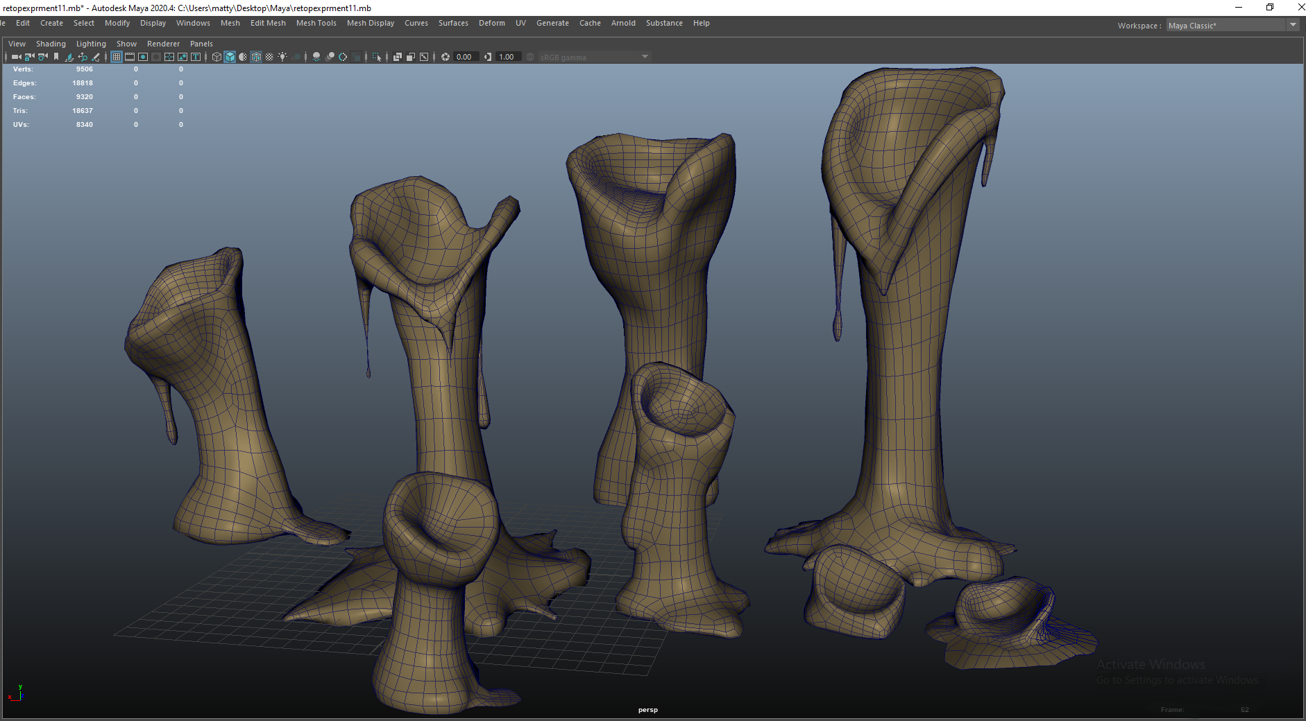
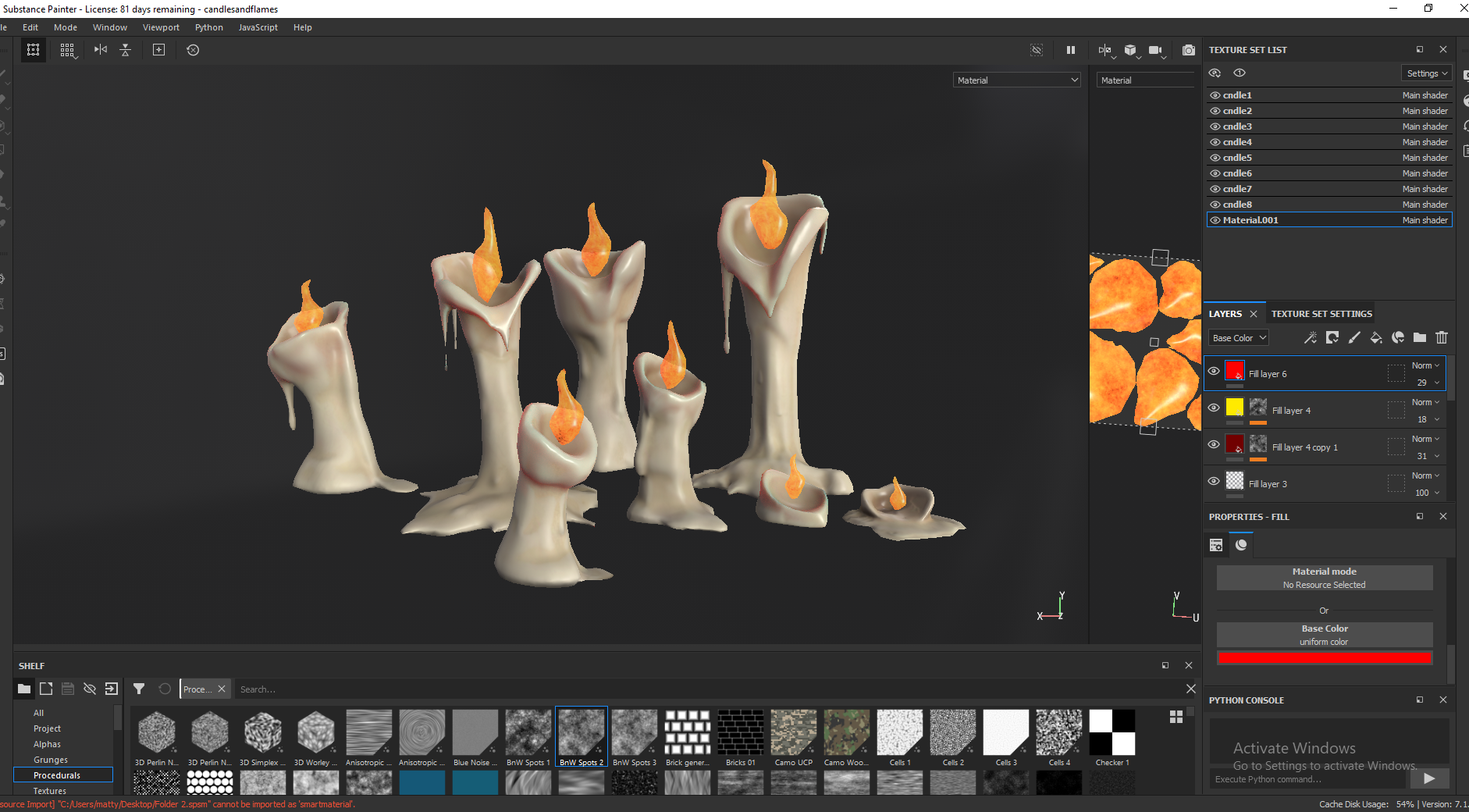
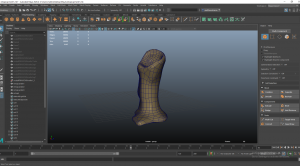
I first made a bunch of candles but I’ll try and focus on just one to save space on the blog, since I used the same workflow for each one and my blog posts always end up so long. I started by sculpting the candles in Blender just from cylinders, using dynotopo to add more topology to work from. I have practice sculpting in blender over the summer and knew I wanted to candles to have cool organic shapes and silhouettes so I thought sculpting was the way the best way to go about this.


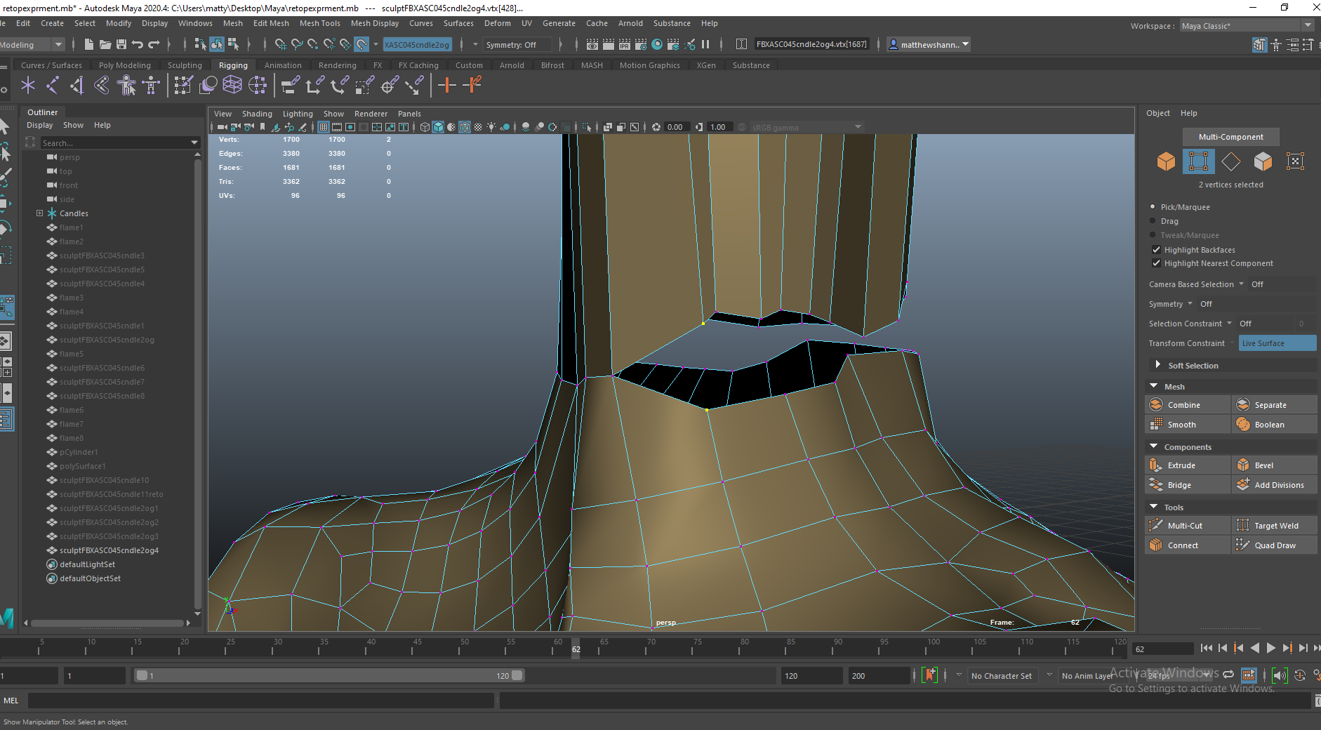
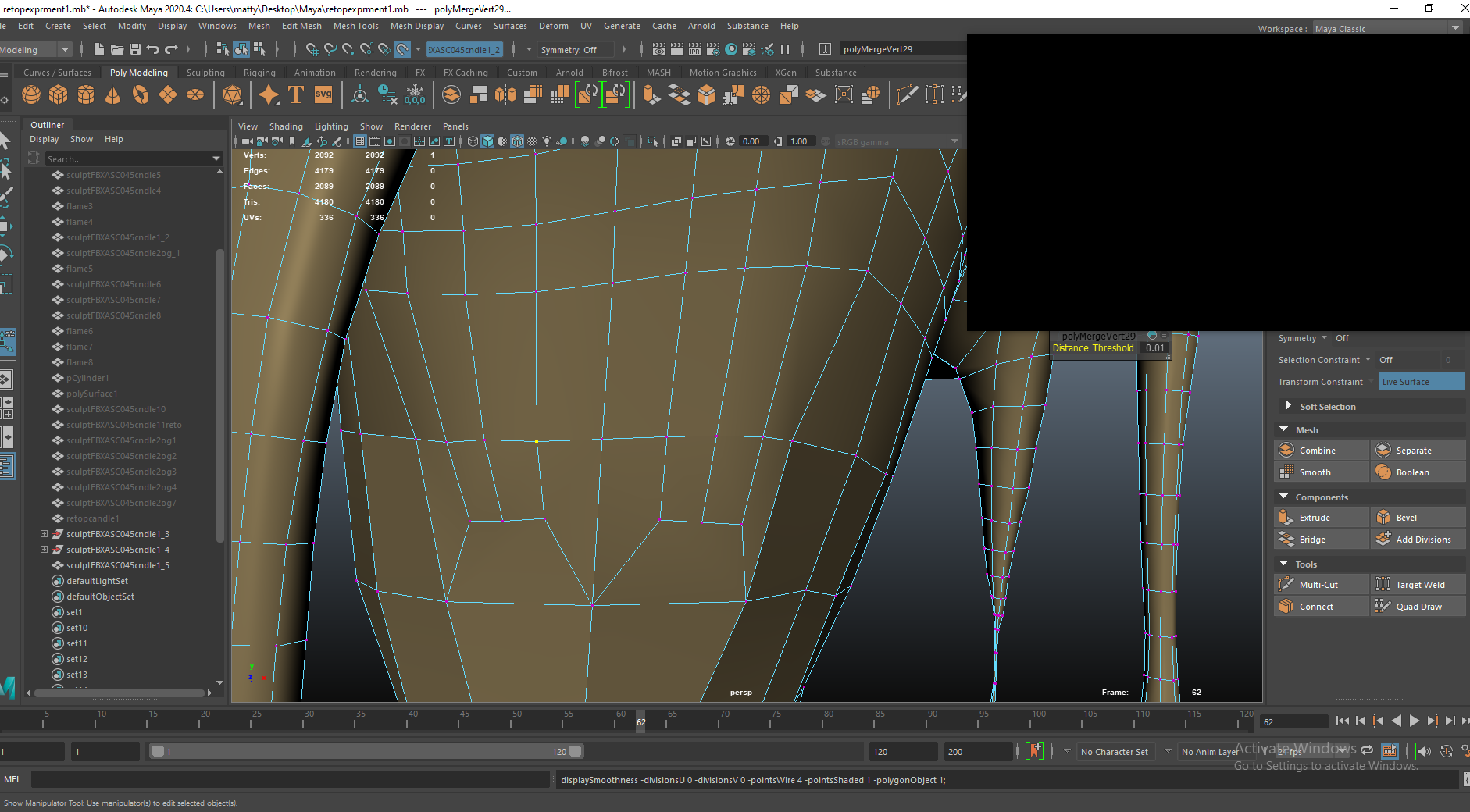
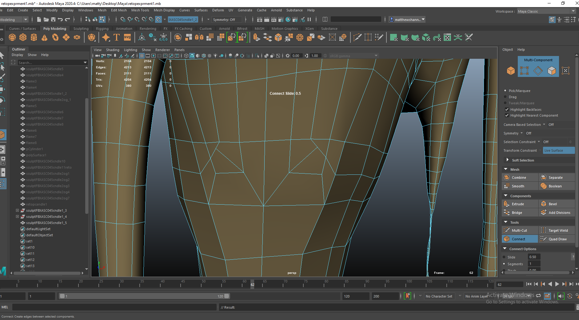
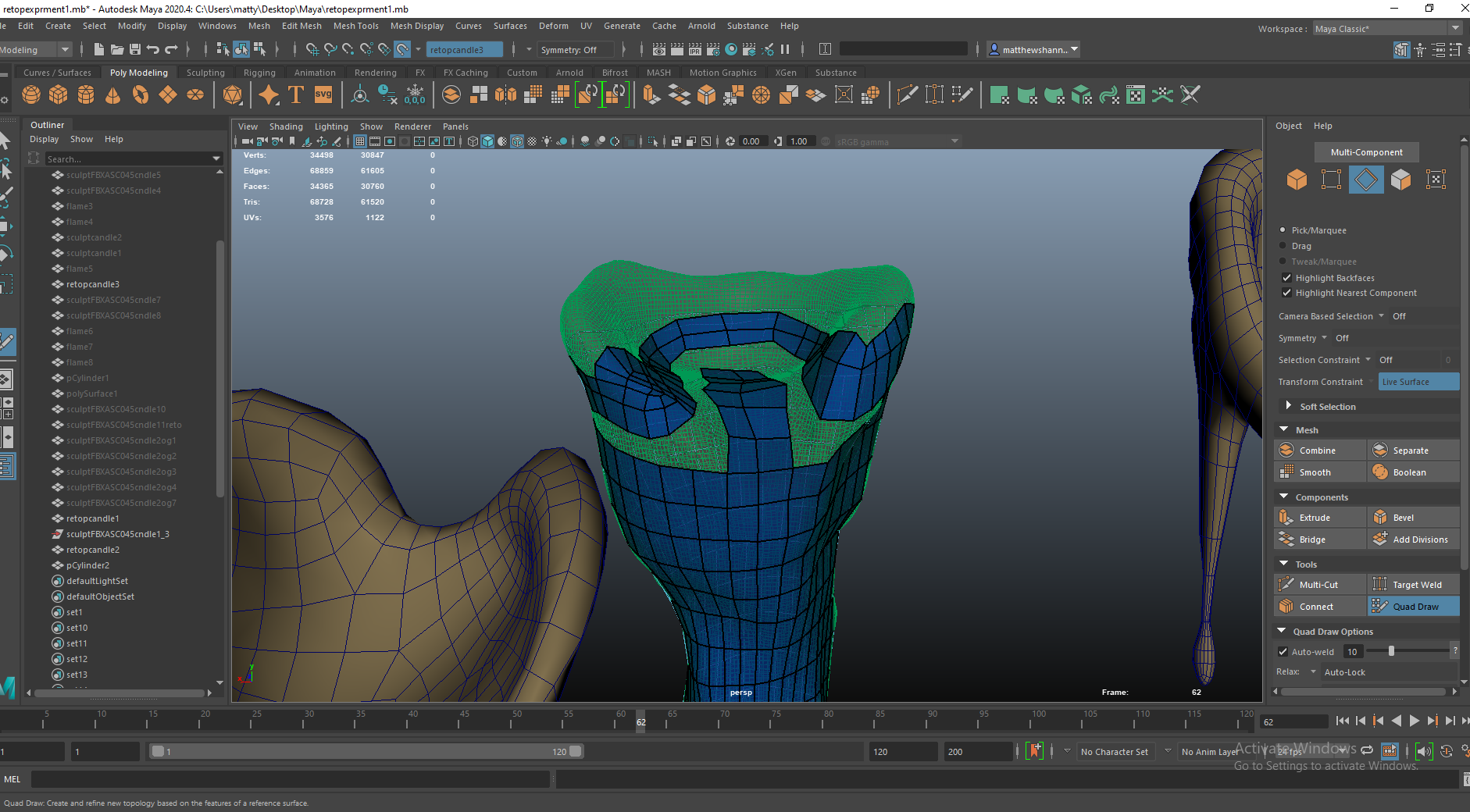
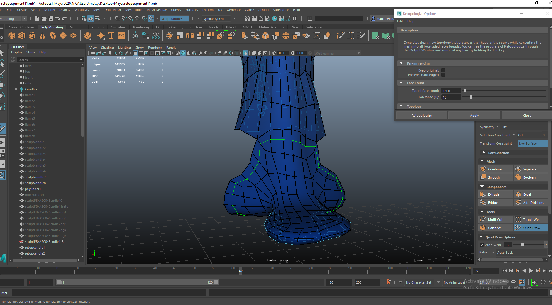
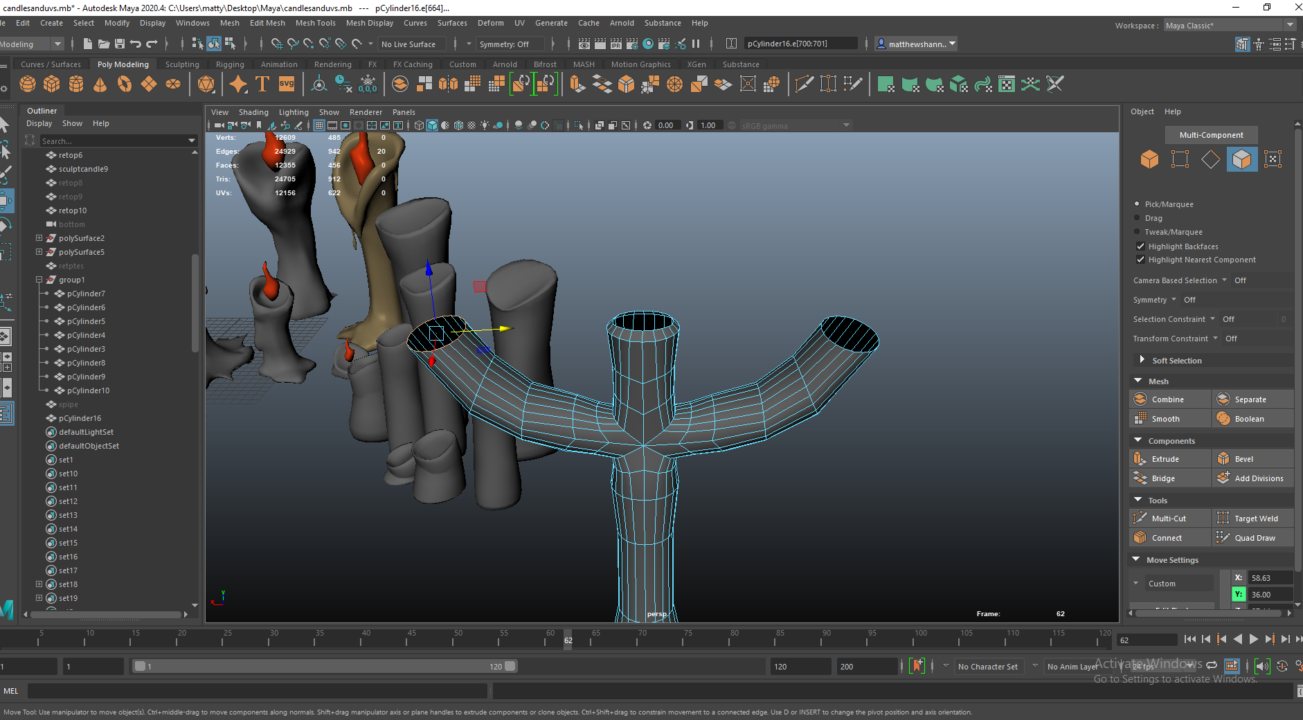
After sculpting I looked in the different retopology methods online I find using the quad draw tool in Maya to be kind of slow and boring. I learned about the auto retopology feature which wasn’t as useful a I hoped and did end up using the quad draw tool for the majority of the candles, the automatic retopology didn’t have the best edge flow and would complicate my uvs.


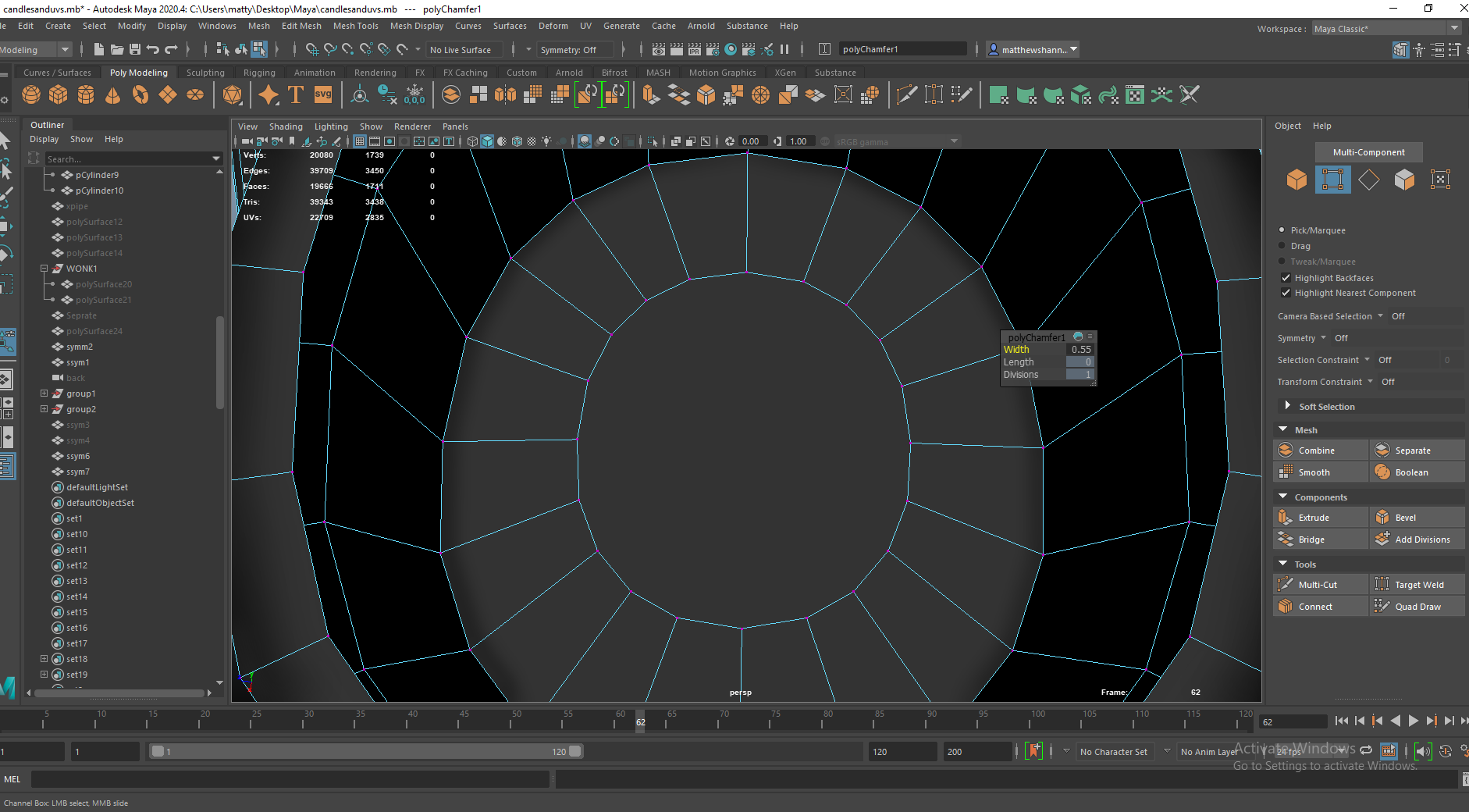
The top and bottoms of the candles had a lot more detail and curves than the middle, so I started with them. The bottom was more simple since I could delete the unseen faces and I approached the top of this one with similar edge flow to a hand with fingers coming out. When connecting the more detailed sections to the middle I had to redirect the edge flow using junctions as can be seen above. This wasn’t necessary but since candles would be so abundant in our scenes I wanted to minimise the poly count to be more efficient for UE4.


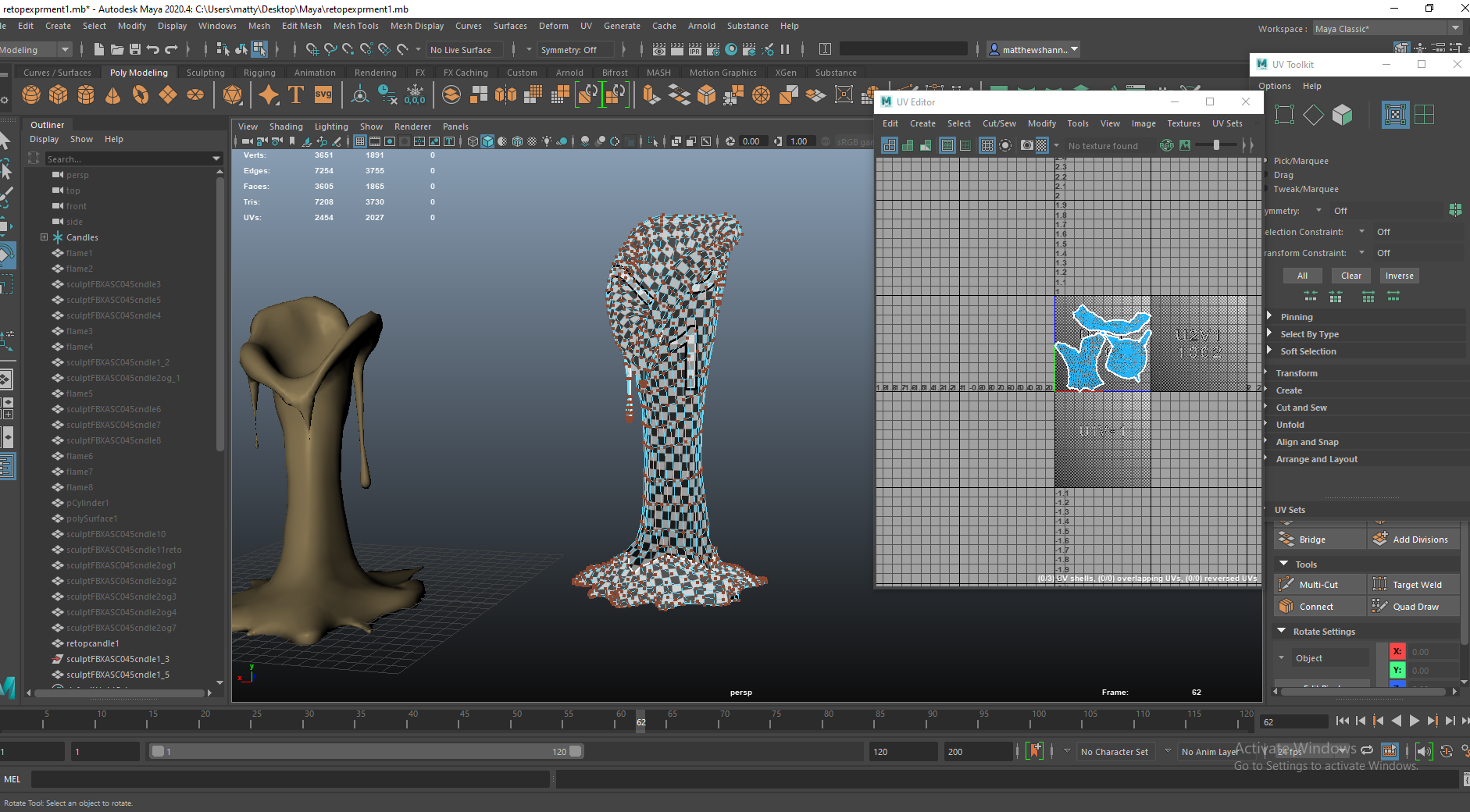
I am super happy with how the topology came out on this candle, I’m not even too sure if its the best way to approach a shape like this but it worked well for me and looked really clean. I thought the UVs were simple too however this would come back to cause me issues when it comes to texel density in UE4.


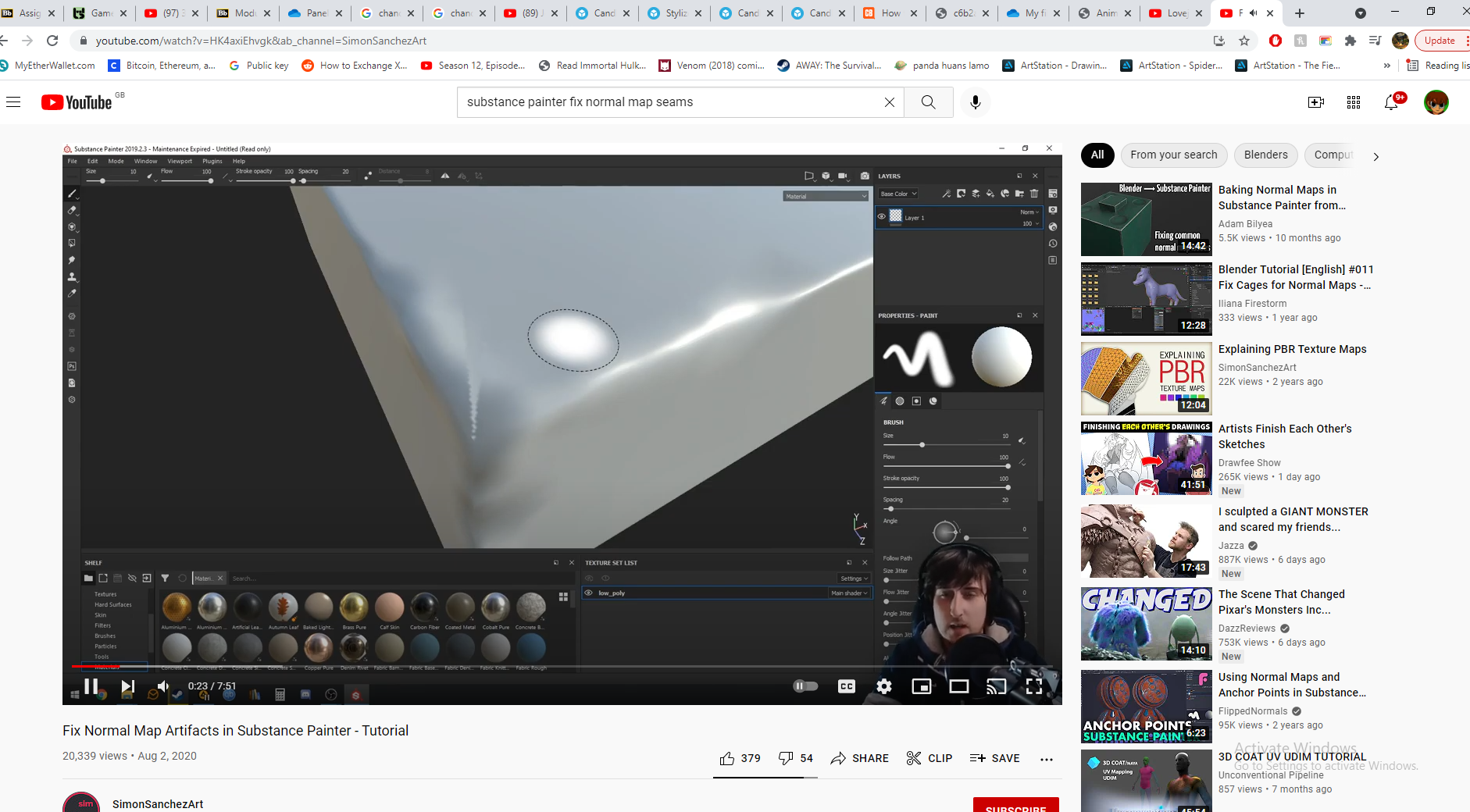
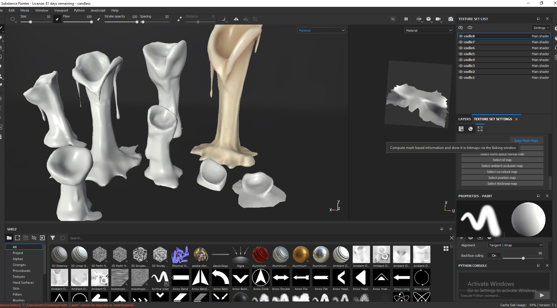
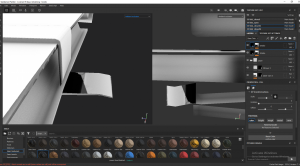
I baked details onto the candles from the high poly sculpts, which made the models look more detailed than they really were, but this caused some artefacts in complicated areas like the top underside. I looked online on how to fix this, tried anti-aliasing during the bake but ended up just bringing the baked maps into photoshop to clean them up manually. This method I found on Youtube off overriding the maps within Substance Painter was cool but didn’t work as well as just bringing them into photoshop.


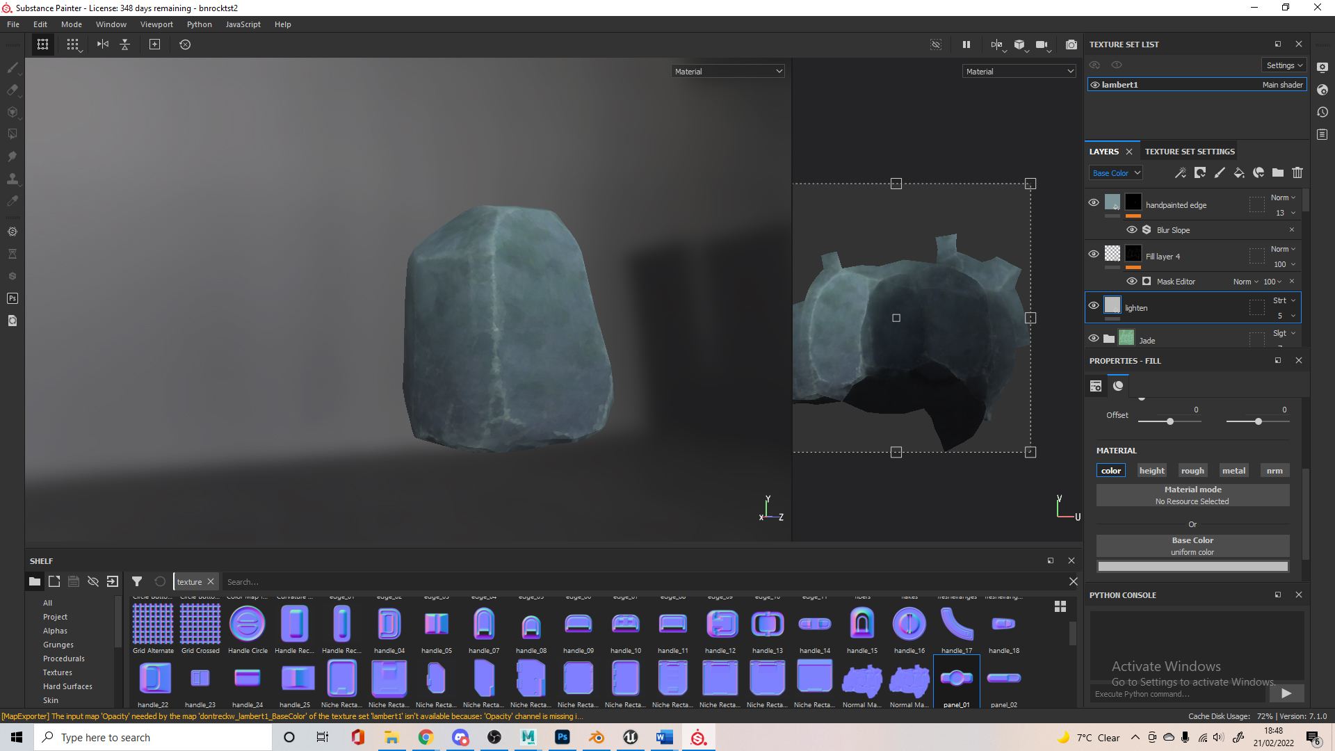
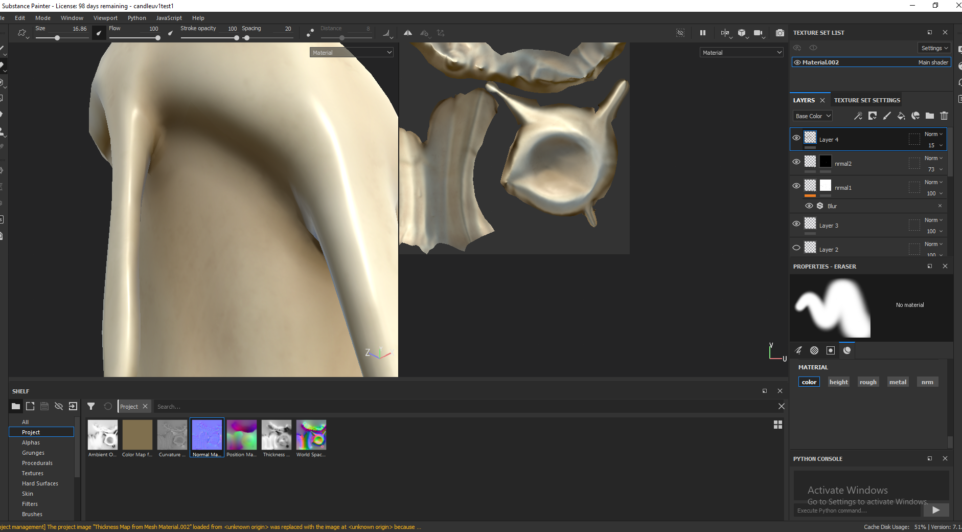
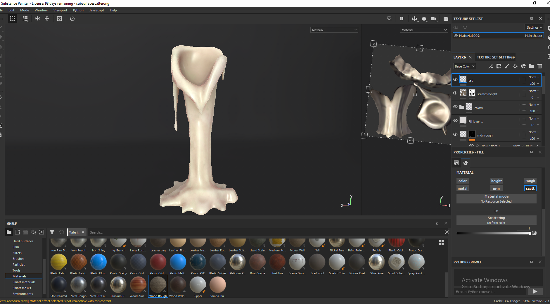
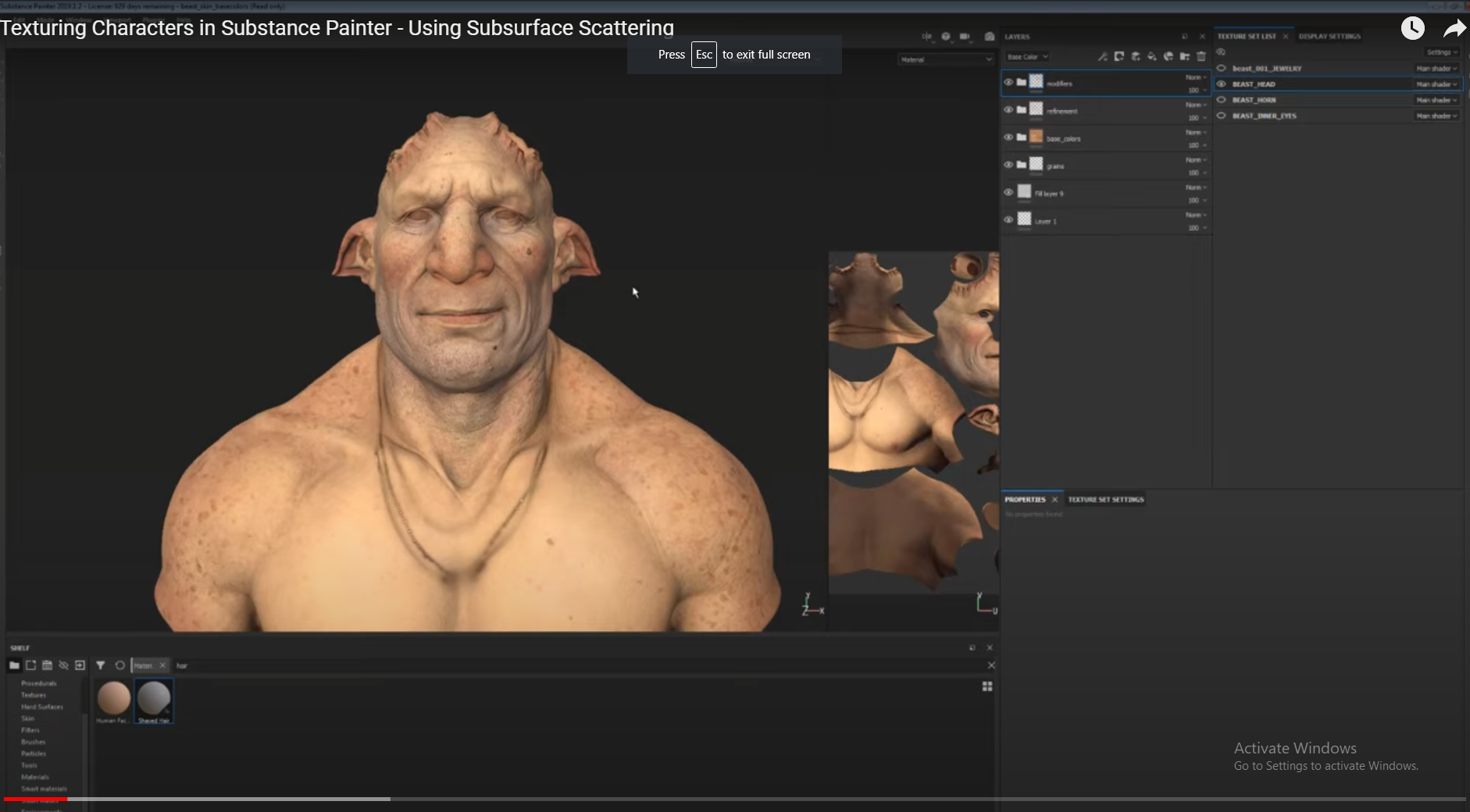
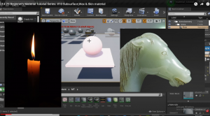
I’ve used this method in the past but I like using black masks with procedurals and filters to create some randomness, I’ve highlighted this in red to demonstrate but it was actually for roughness variation. I normally use the black and white spot procedurals in conjunction with the blur slop and blur directional filters. Henry also mentioned Sub Surface Scattering since I was doing candles, the middle picture shows this – where the light scatters through the candle where the flame is.

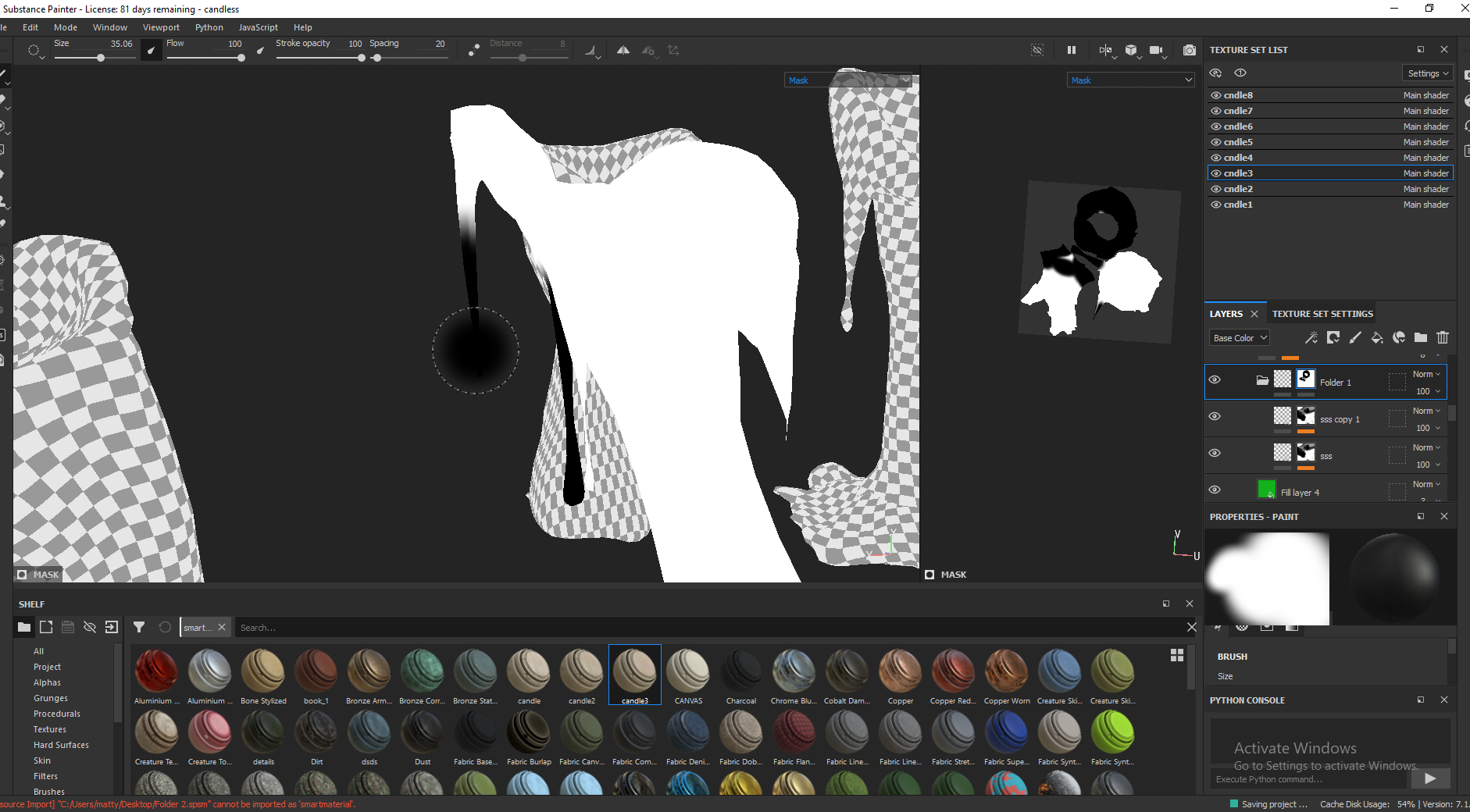
I normally don’t move on to texturing so fast but if I get one candle textured how I want I could replicate this for all the others easily. eventually created a smart material for the candle wax texture I made to allow me to easily add this to the other candles. I got started on masks for the sub surface scattering since it only would be needed at the top of the candle, this had to be done manually for each candle. Here’s some more examples of the retopology for the candles – this 3rd candle comes out really well after texturing.


Some further research for working on the candles. Looking more into subsurface scattering in substance painter and in unreal engine, again it seemed pretty easy to implement. To save time on retopology I would use the conform tool like how this picture shows, or even on a cylinder with increased subdivisions to cover a whole, more simple, candle.


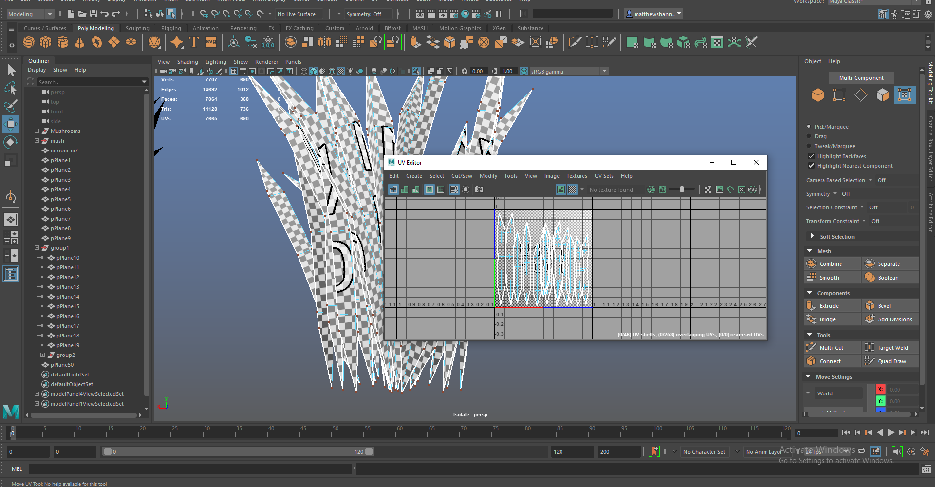
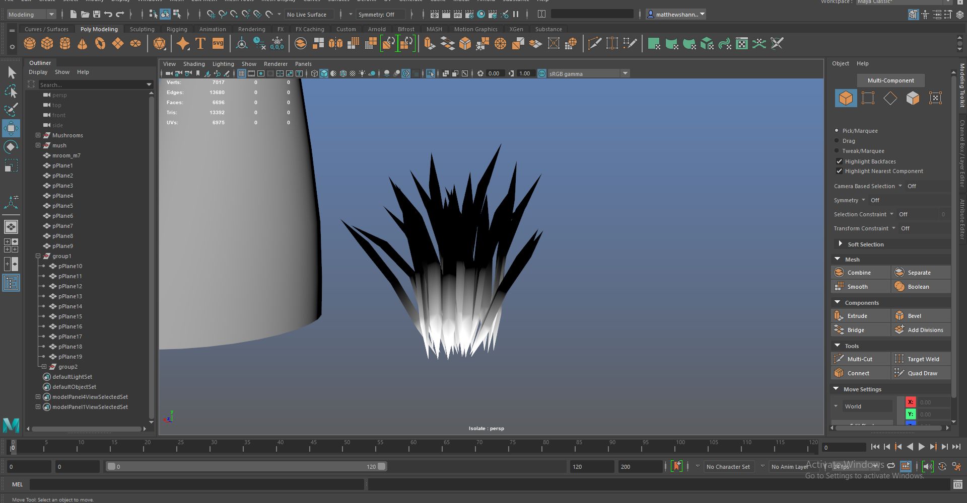
Some more retopology, this took up the majority of the time with the candles probably, since it was individual to each one – I could just texture one candle and replicate this. Showcasing the edgeflow for different parts, trying to keep it as clean and simple as possible since I didn’t want any issues with UVs or in unreal engine.

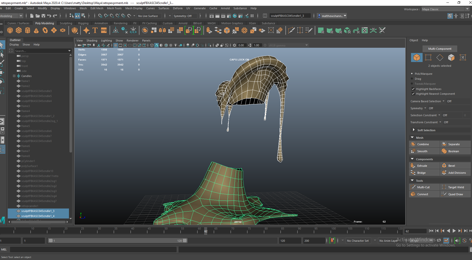
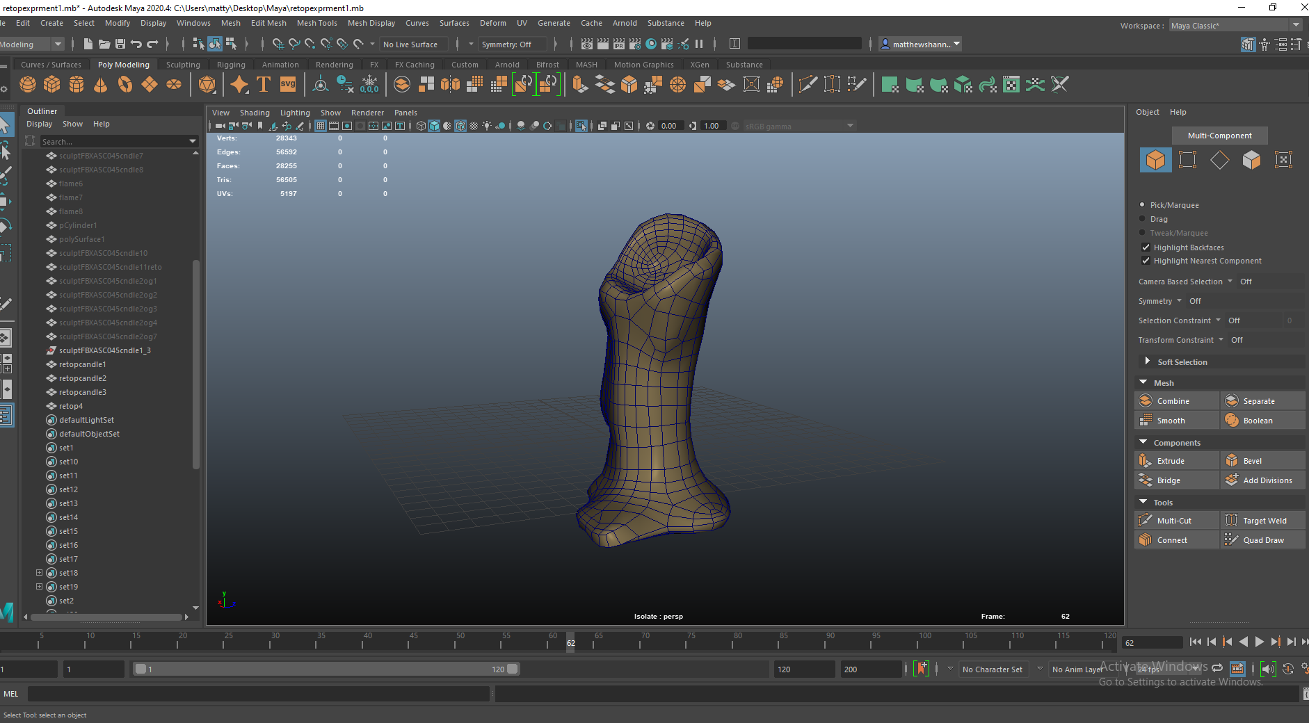
Here you can see the topology comparing the sculpt to the retopologised version – I managed to preserve a lot of detail but decrease the polycount by a significant amount.
The candles were definitely a challenge but I think they were worth it and came out very nice. Got some experience with ‘complicated’ topology with different extrusions and curves to deal with – using essential topology junctions for increasing resolution while maintaining quads, I saw people online refer to the techniques I used as ‘The Diamond’ and the ‘U-turn’.


I brought all the candles in and got to work on them, as you can see more artefacts in the Normal and Ambient Occlusion baked maps to deal with, just fixing in photoshop again. Then I started making the final masks for Sub Surface Scattering.


This is what I ended up with before I moved on to the books, I wasn’t sure how to handle the flames at this point. Michael mentioned exporting a simple animation in Maya as an allembic to UE4, but I looked into this a little and saw some people having issues with allembic animations, I also wasn’t sure if an animated mesh would work well or if you’d notice the looping/repetitive animation among the candles.


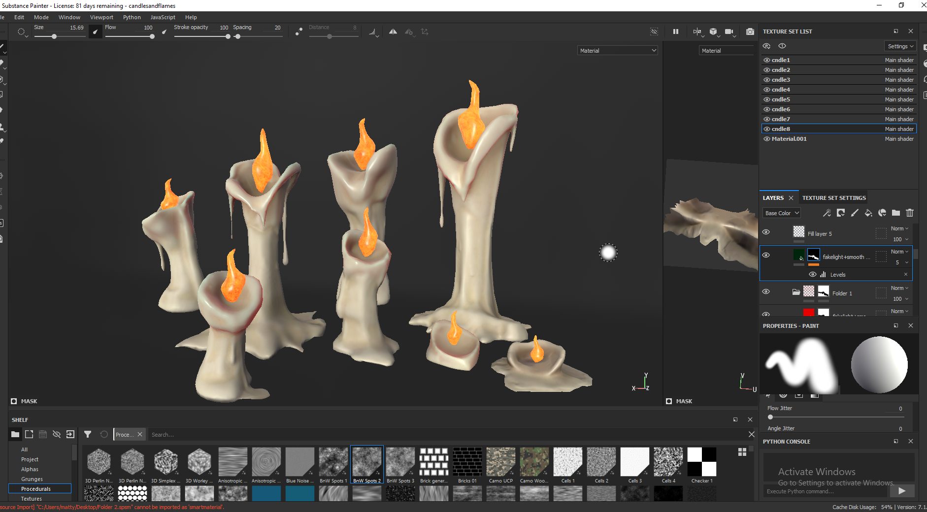
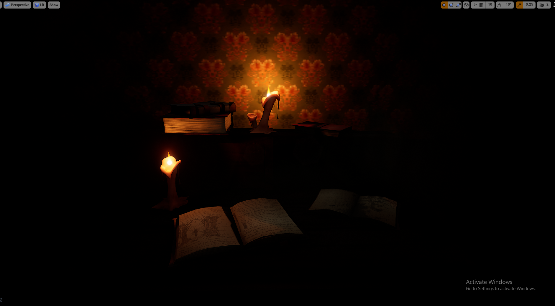
This is what the textures looked like before importing them to unreal. I’m happy with how they came out, there’s a bunch of cool height, roughness and colour variation as well as all the detail from the sculpts. I had a gradient from top to bottom, going from smooth to rough since the top part would be melting while the bottom is more solid. I had height scratches and little extra details in the surface, and yellow shadows with white highlights, using the generators for ambient occlusion. I really like how they came out with the long drops of wax, makes for cool silhouettes, but if I knew the complications they’d cause in unreal engine I might’ve went a little more simple with them. The Subs surface scattering is also super subtle but that’ll be different in UE4.
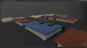
Books
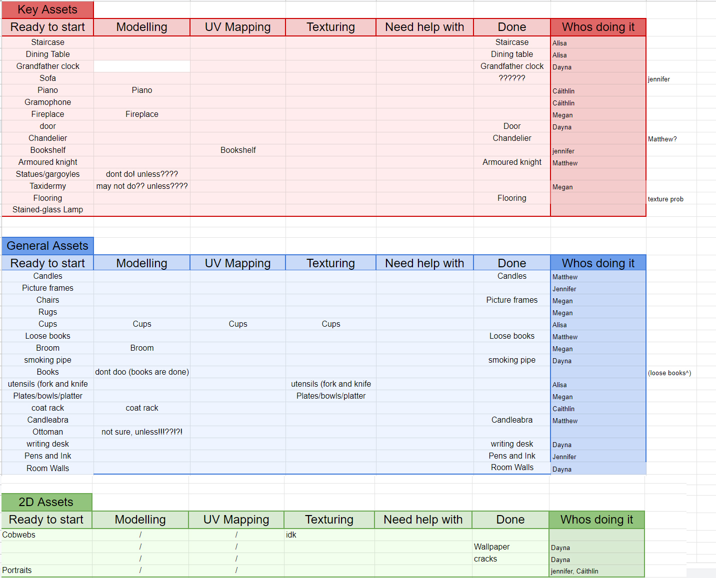
 Next I wanted to work on the books, we were starting with our simple assets important to the scenes, then we’d do as many assets as we could from the ‘Key assets’. We had an asset kanban set up to organise this and to keep everyone on the same page, it was a little disorganised but it helped. You can see there were some blank spaces and question marks beside assets, these were mostly assets we cut or didn’t get made in time.


As well as using references from Sketchfab I would also look at real life examples, although this helped more with the texturing. I did take some aspects from these though, like the sloping books seen in the 2nd picture and the general silhouettes.


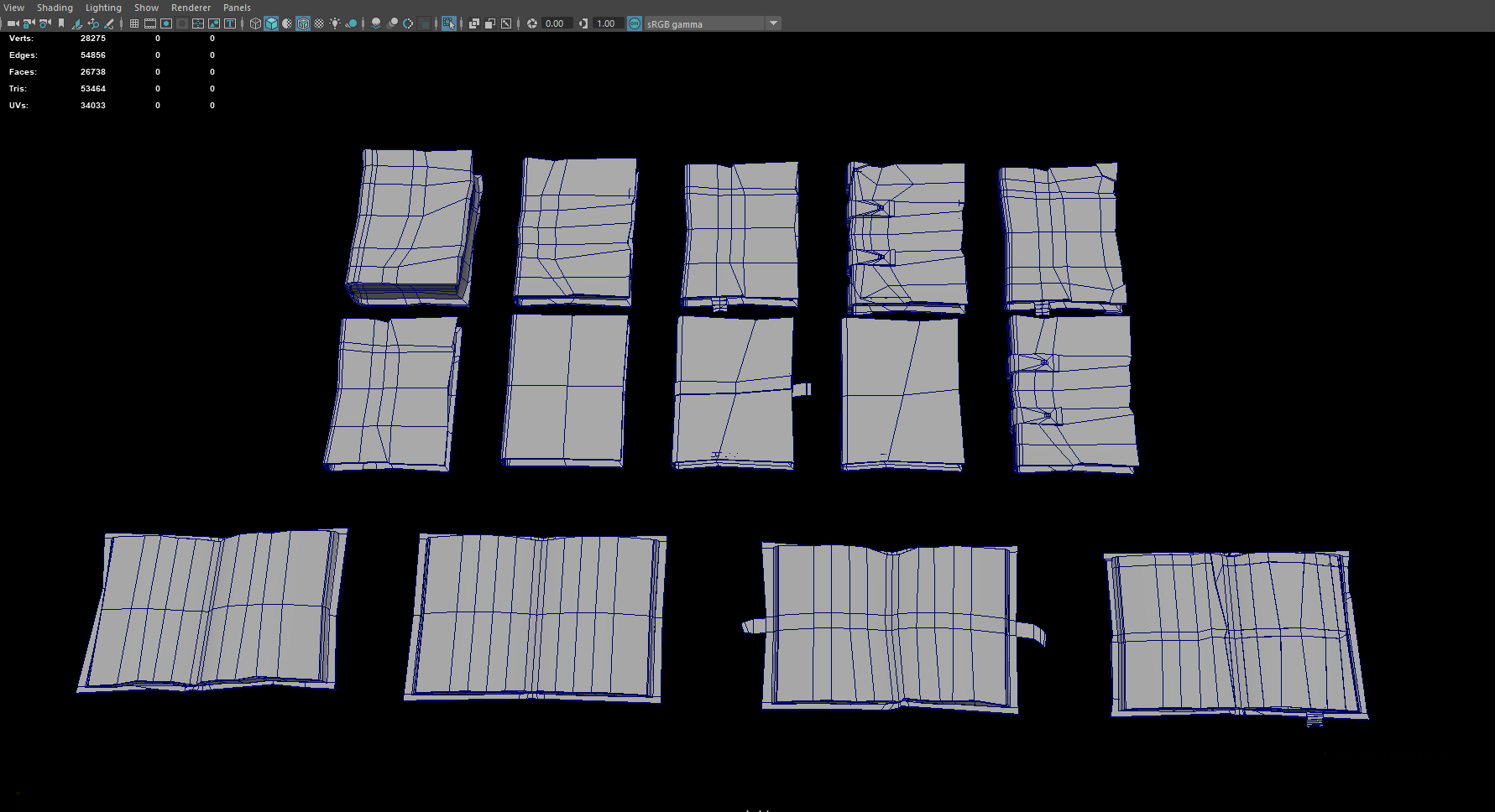
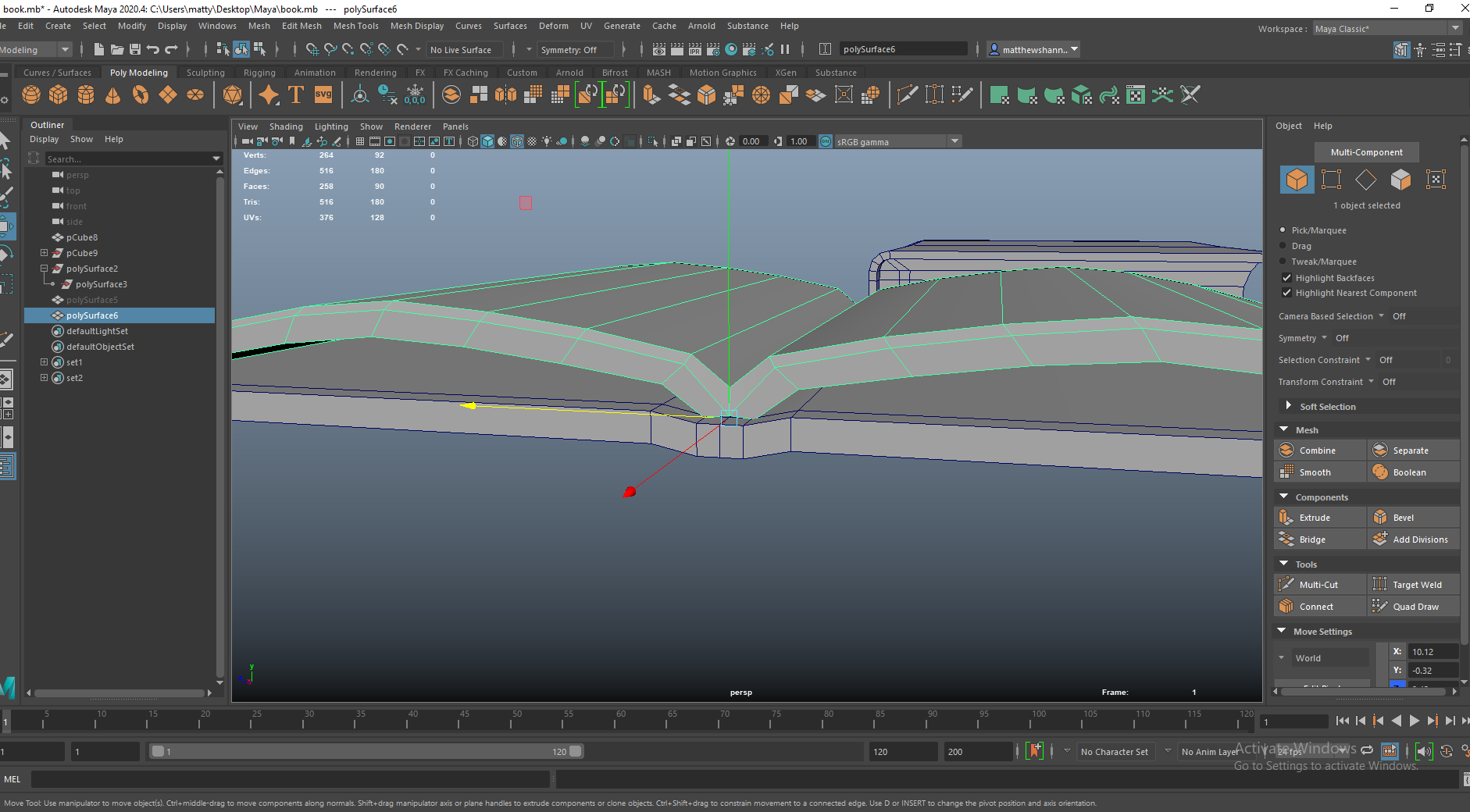
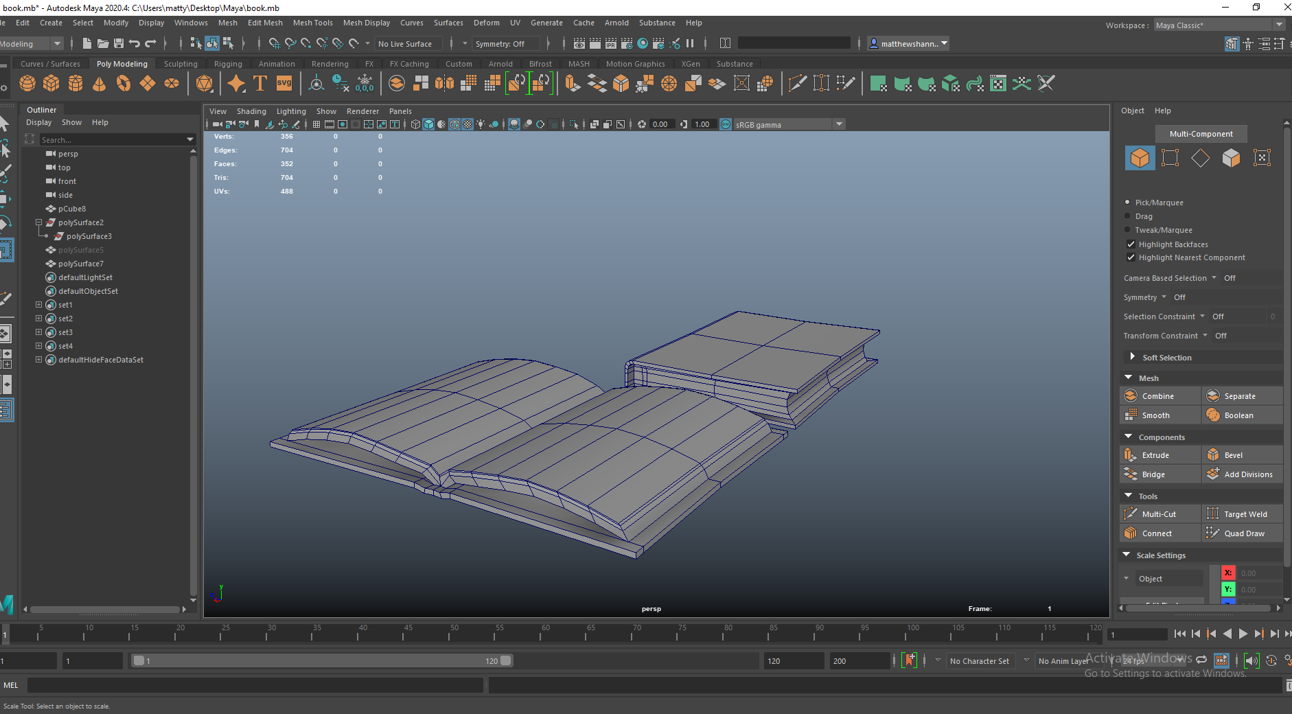
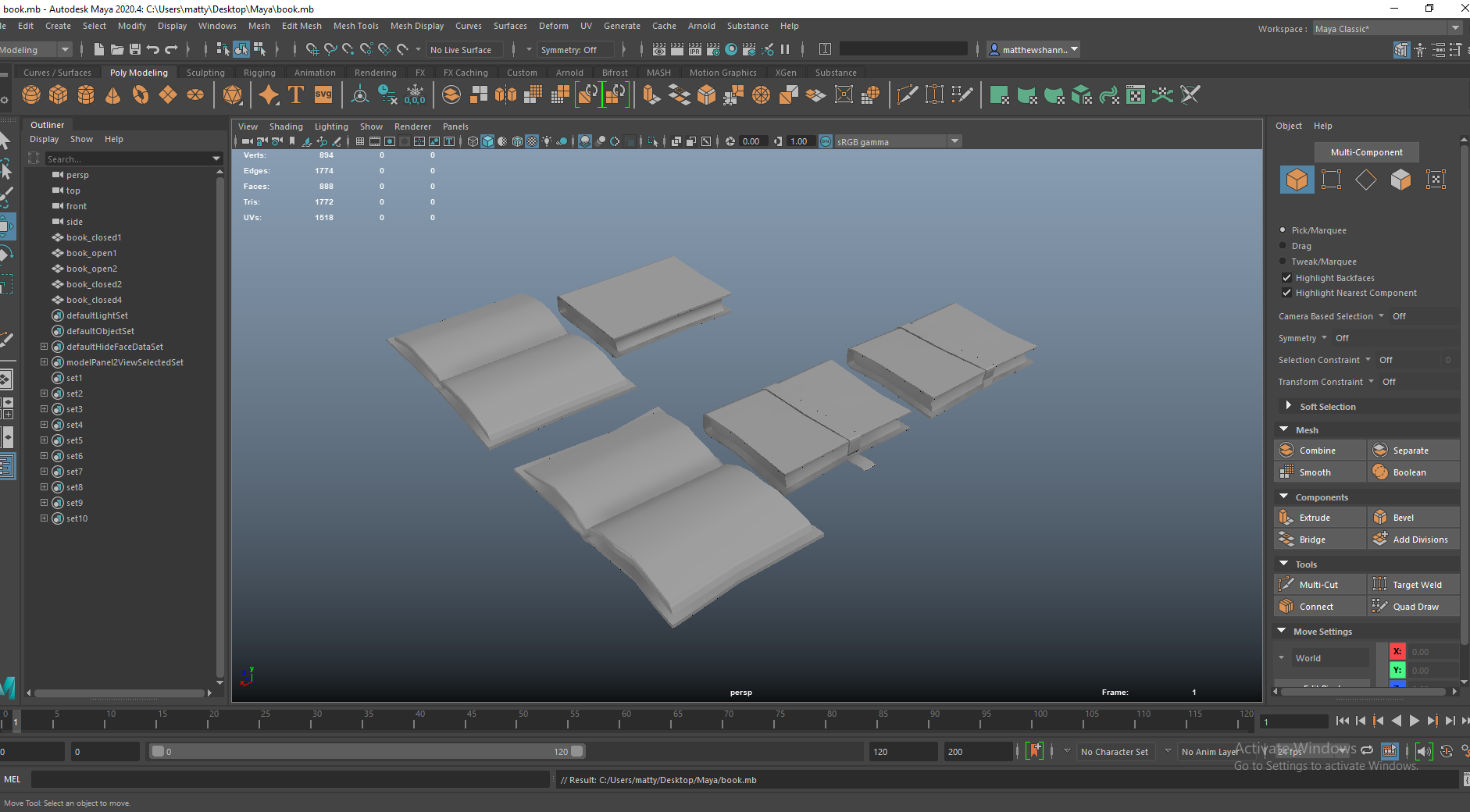
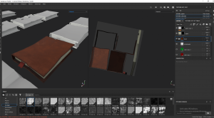
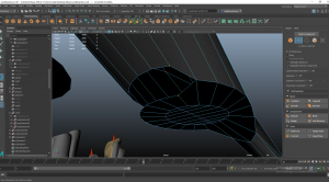
I started by modelling these two symmetrical simple books, fairly standard stuff just starting with a normal cube, adding some subdivisions, extruding faces. They were simple but they’re pretty solid books and a great place to work from.


I then duplicated these and made some changes, just having fun. Our art style is wonky and non photo realistic, so I played into this adding large buckles and imperfections, sloping to one direction etc. I’m super happy with how the book with buckles came out, even though its so simple I think once textured it looked really nice.


Here I tested some ideas with the candle, I really like the aesthetic of candle wax dripping over it and makes these two assets seem connected. In order to add a split to the book mark I did some simple junctions, I replicated this for the ripped out page too.


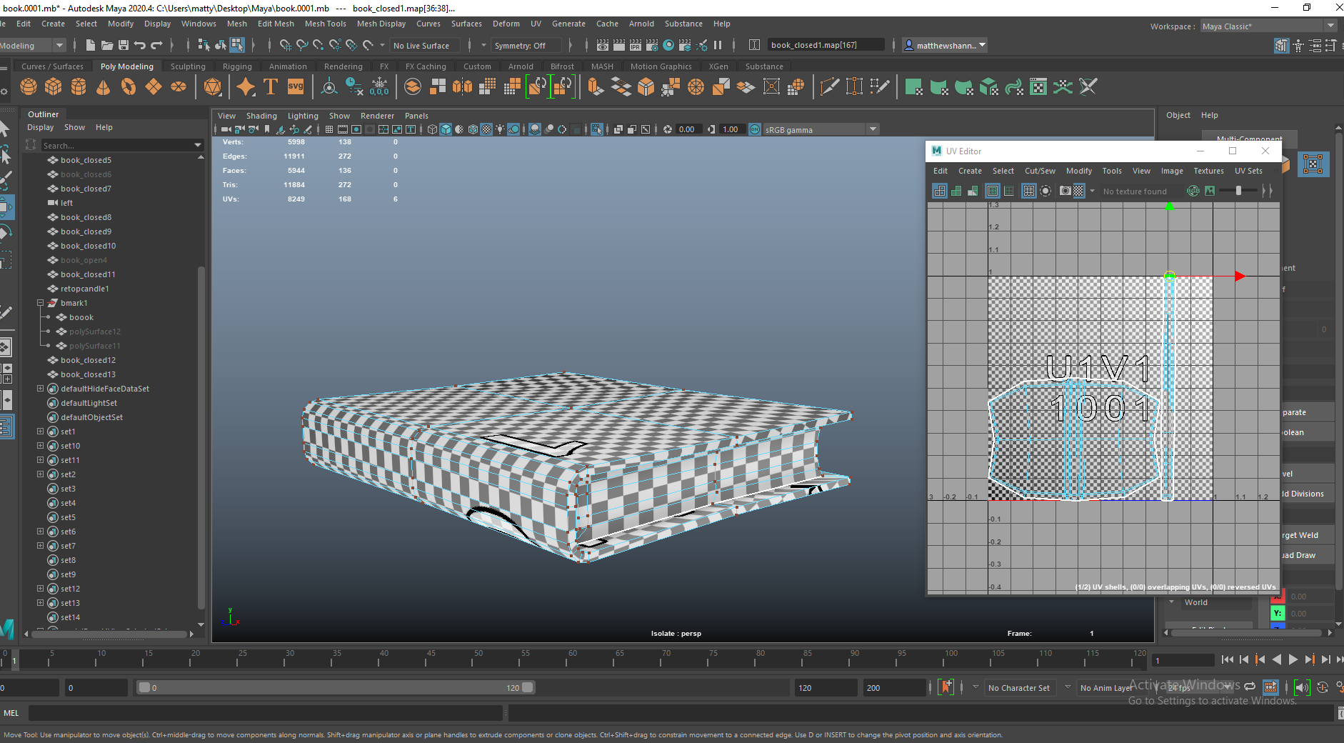
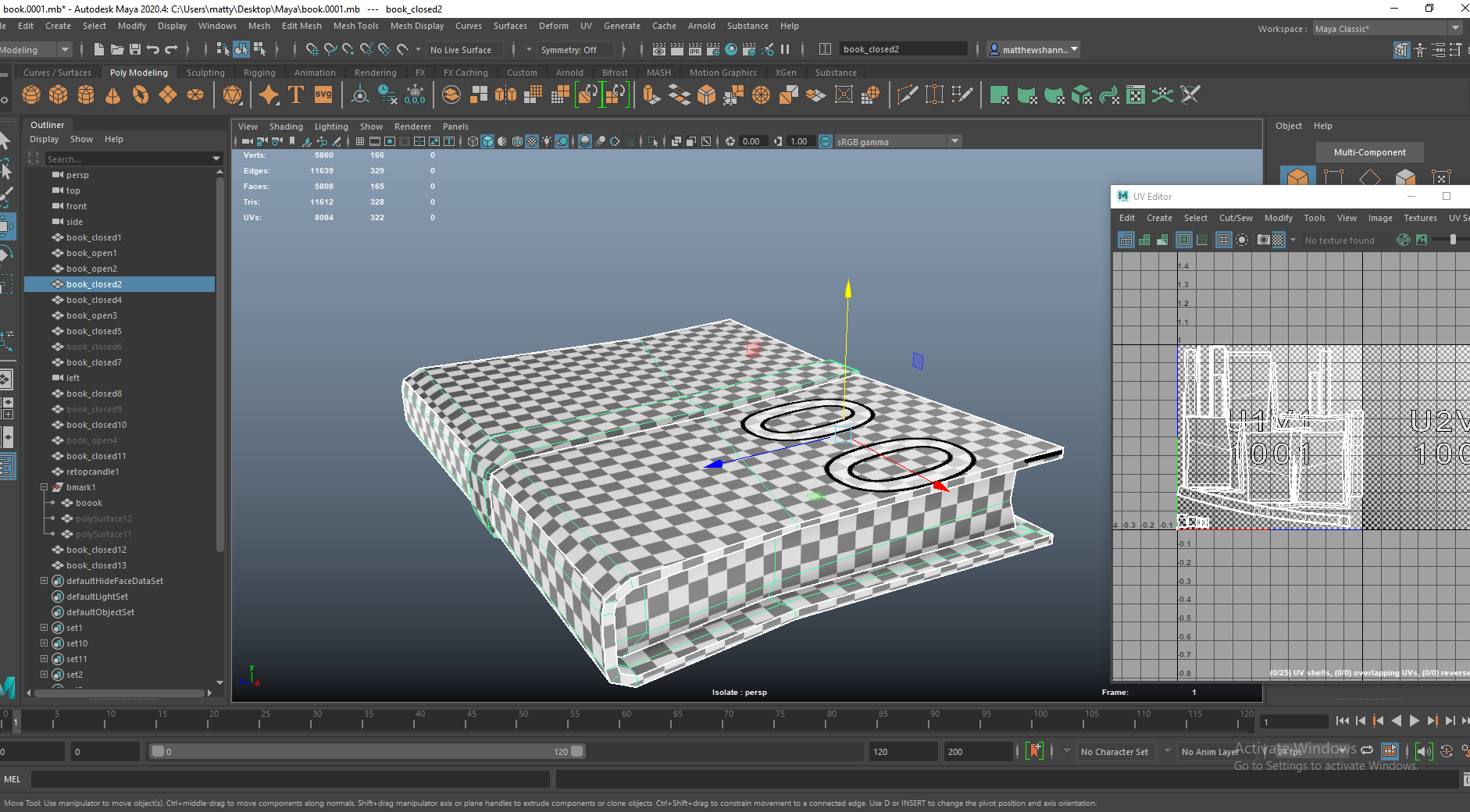
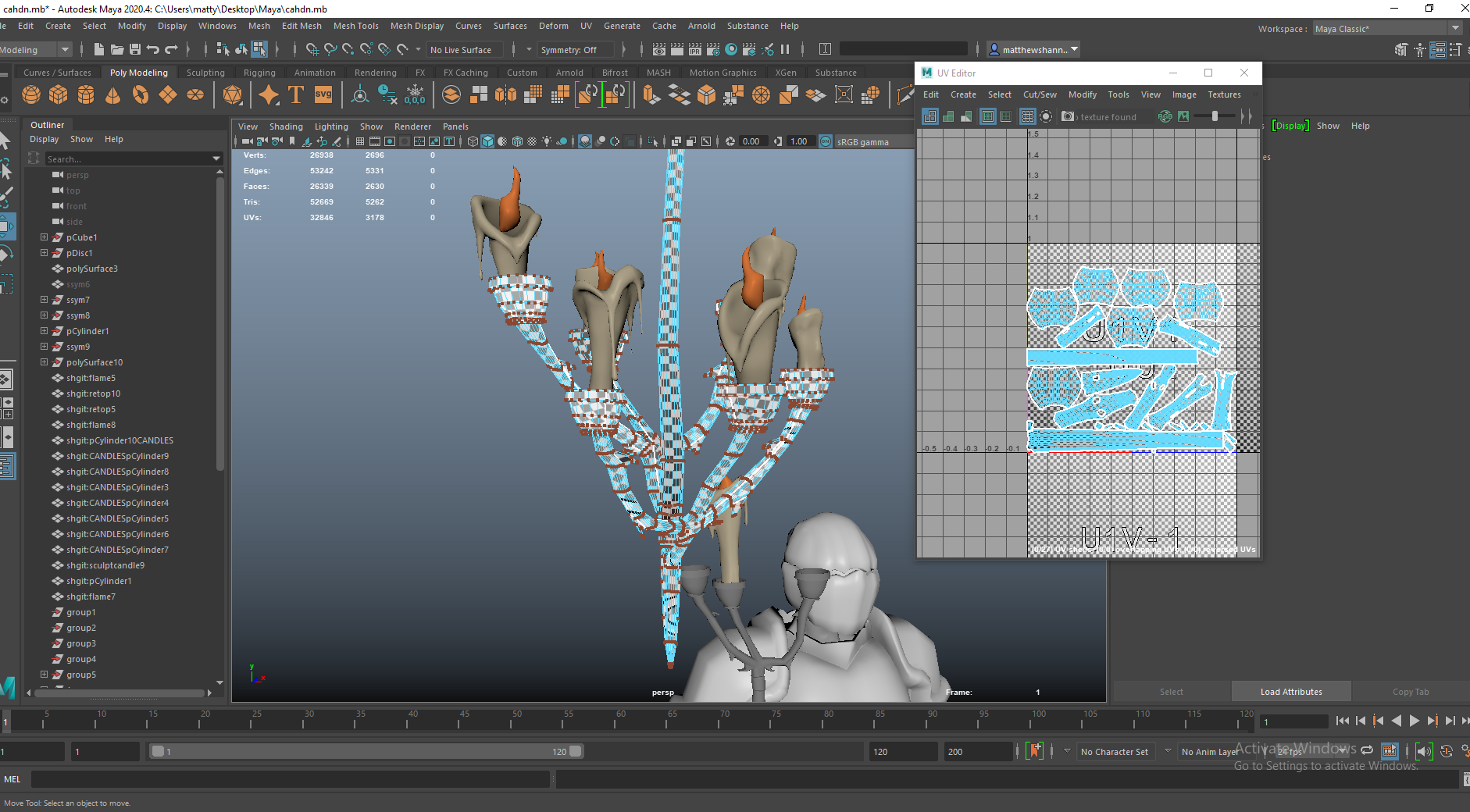
I used the same method to UV them all. I wanted the pages uv to be one long strip as this would make the pages flow around the corner well, so if I drew a straight line it would all travel the whole way around.

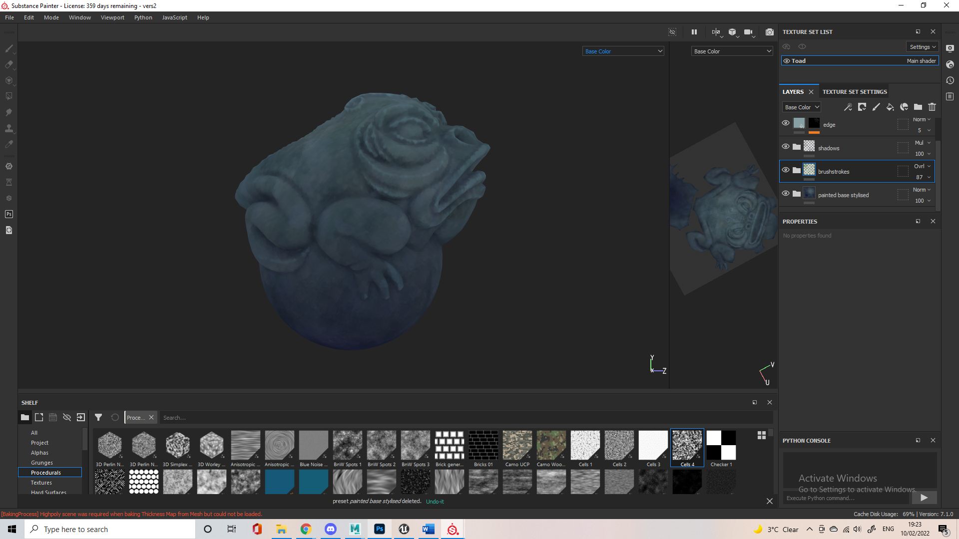
Just going to throw this in here since around this time Dayna was asking about wood textures and how we wanted to approach this. I previously had stylised wood in one of my past objects which I provided, as well as a bunch of stylised woods from online. This was me testing one of the online woods out on the substance jade frog to send to the group incase they liked it.

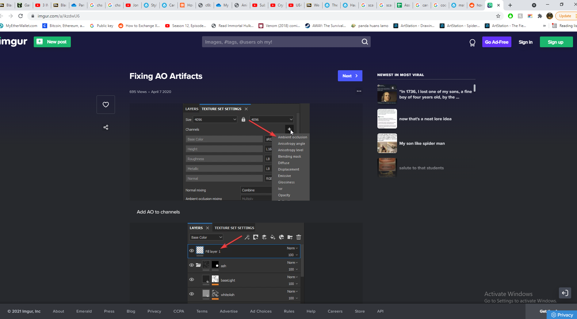
 Some more research into AO artefacts, I ended up just fixing this in photoshop as always – every online method I use seems to be less effective than this.


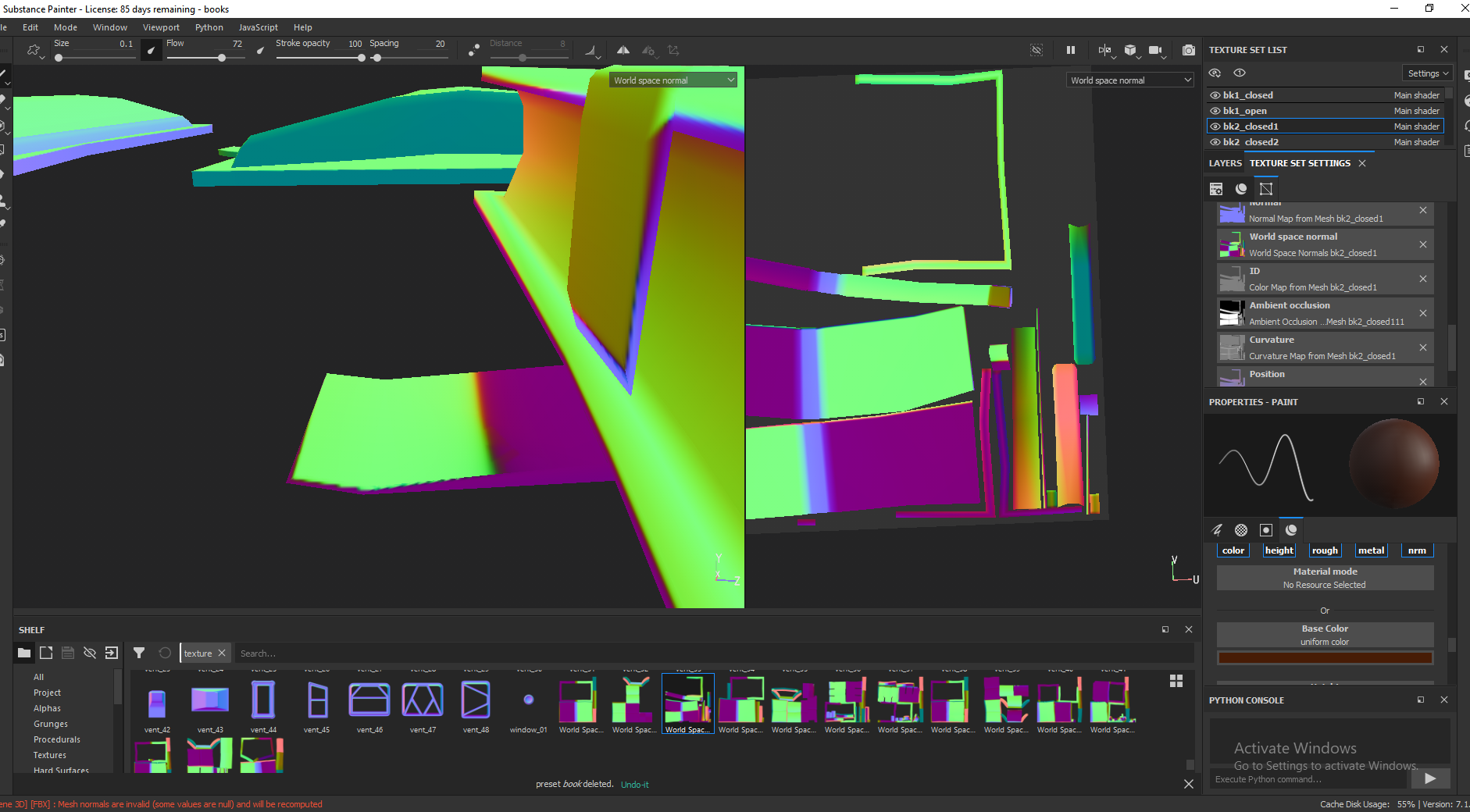
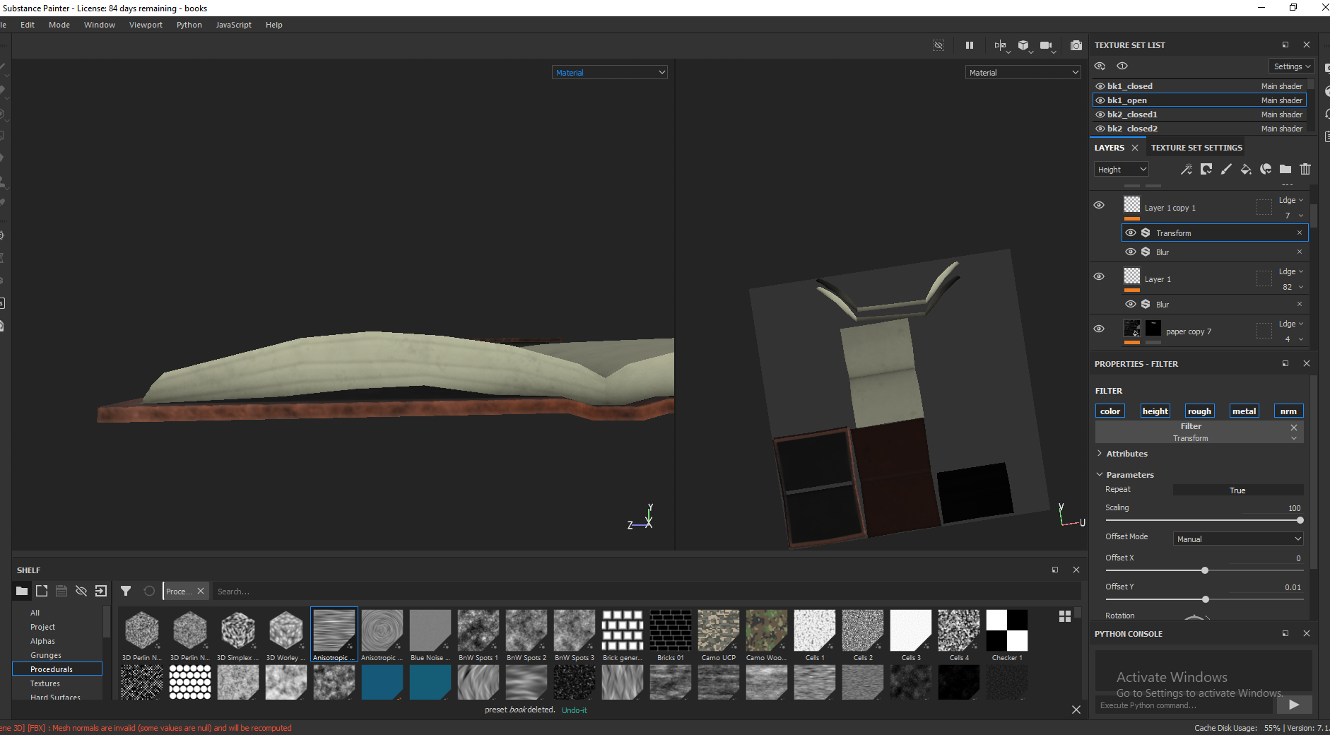
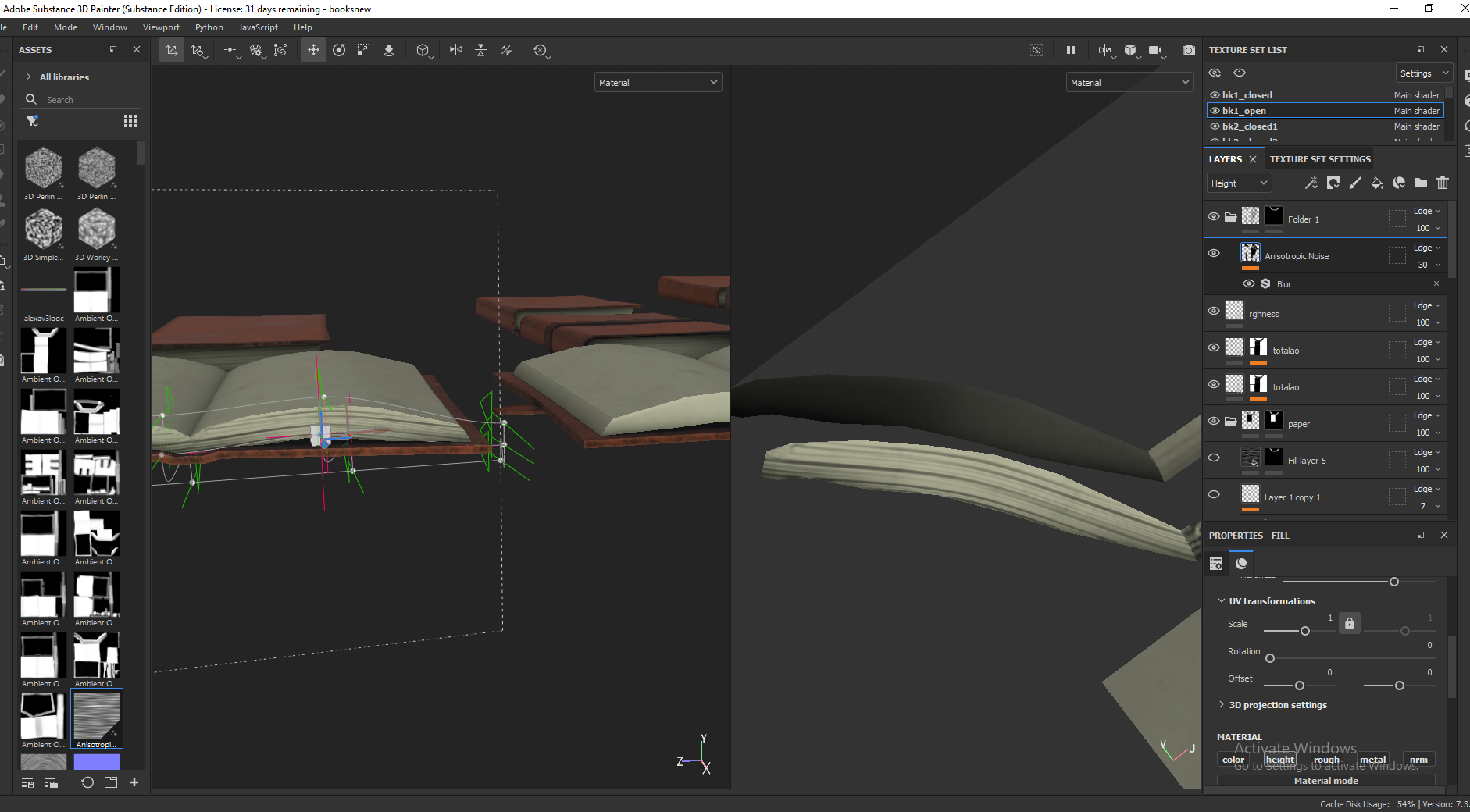
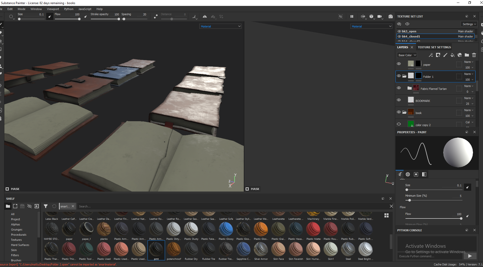
I love how the leather came out, using the same methods as always (mentioned earlier) I got loads of great variation. I used the metal edges generator and edited this to add wear and tear to the spine and edges of the book, adding roughness and darker colours as well as subtle height changes. I used a fill layer with a black mask of the anisotropy texture in substance to create a bunch of straight lines for pages, and made this be a decrease in height and slightly darker. You can see above how the UVs helped with the pages flow around the corners.


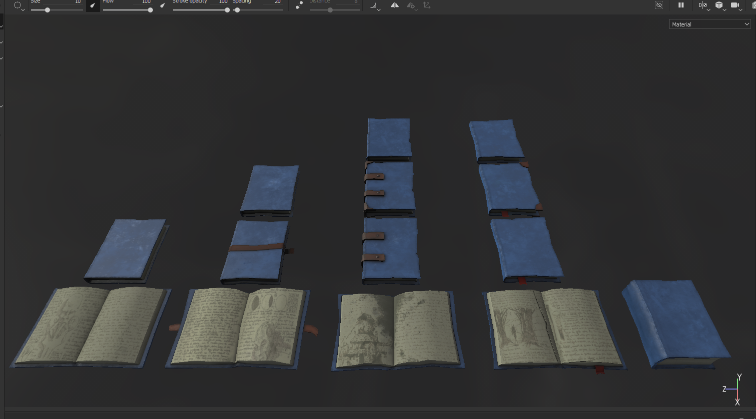
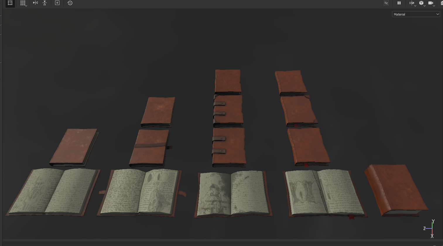
I added some metal to the accessories that needed them. Once I textured one book fully I just created smart materials to add to each book. I think I made a mistake here to be honest, I should’ve had maybe 4 books per UV tile since they didn’t need to be this detailed, and applying the textures was long and laborious both in substance and afterwards in unreal. I love using ambient occlusion as a mask on a fill layer adding further shadows, it makes these props have a lot more depth and I always thought heavy ambient occlusion looks better on stylised assets. This blue book is my favourite, reminds me of Fable for some reason I really love how it came out with the buckles and the brown leather top and bottom, as well as the metal detail on the buckles, super happy with this.


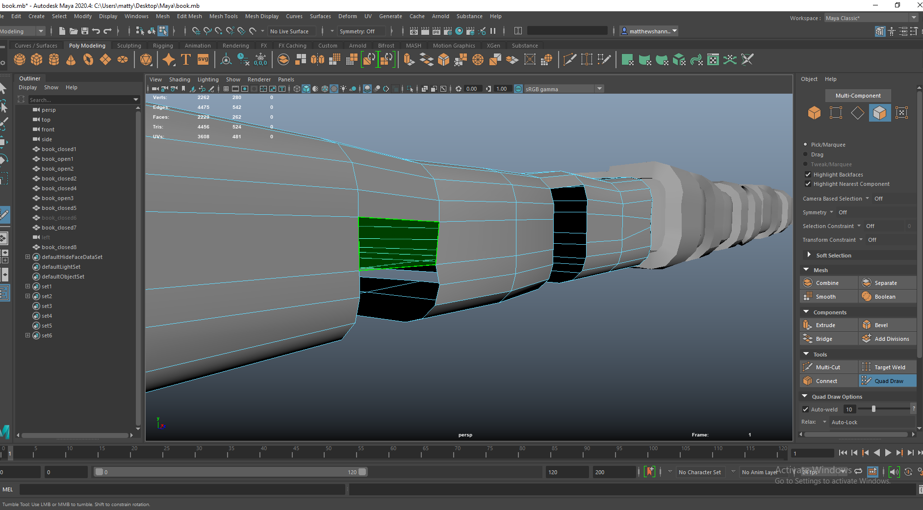
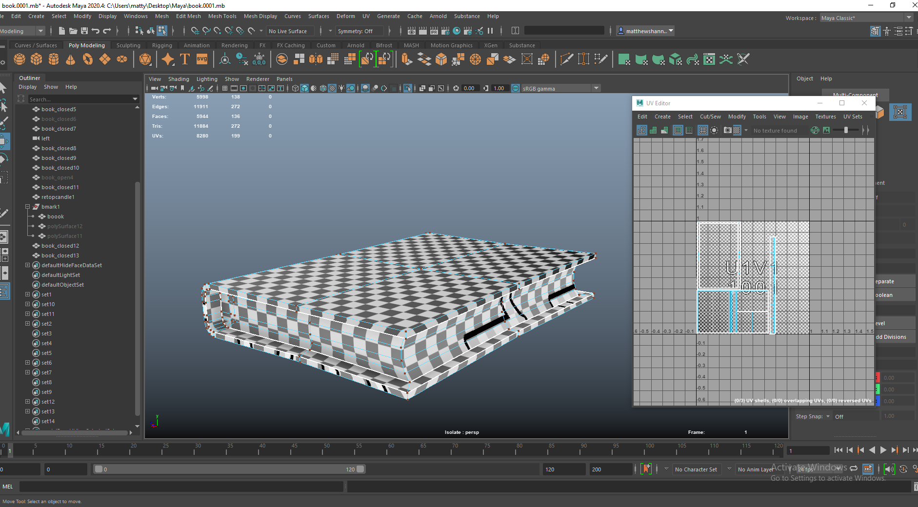
Some books with a lot of wonkiness and chips missing etc. couldn’t have the pages be one long straight UV. The same issue came up with the open books pages, meaning the method I had been using for the pages didn’t work on the more detailed books. My solution to this was to upgrade substance painter as I read online about their new warp projection tool, exactly what I was looking for. This didn’t pan out though, I hated the new workspace layout and the software kept crashing for me so I downgraded back to what I’m used to and did these pages manually.


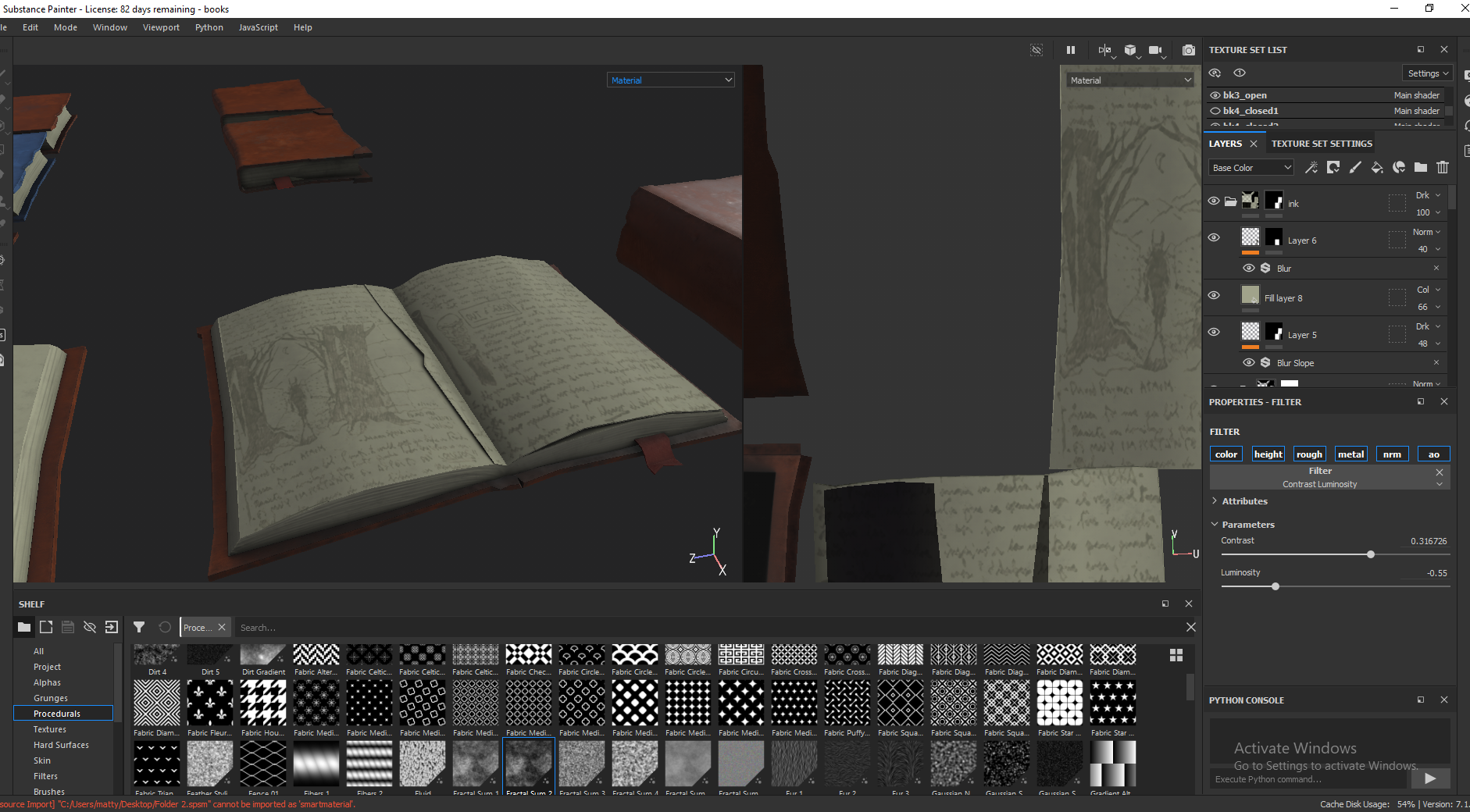
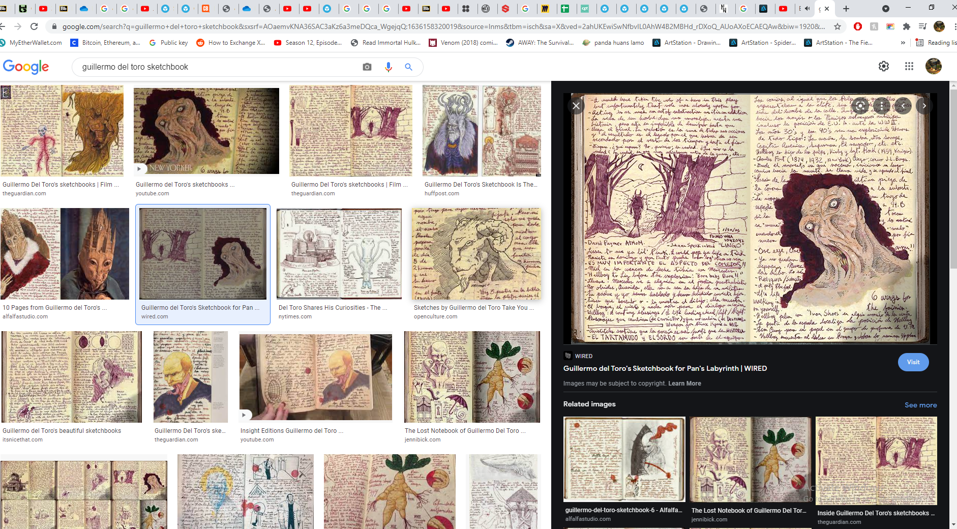
I loved this final touch, during my research of old haunted books and sketchbooks, I came across sketches from Guillermo Del Toro’s sketchbook – mostly for Pan’s Labyrinth. I made sure to check with Henry if it was cool for me to use these in my books as I really loved them and I thought it was a cool little homage. I brought them in and added a blur filter, as well as going in with a paint layer to add some/ remove some from them. I didn’t want them to be that readable or detailed as I thought it would take away from the books and the style but still it had to resemble the original, I think what I came up with worked really well.


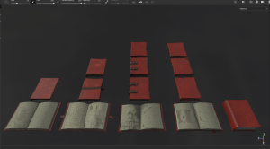
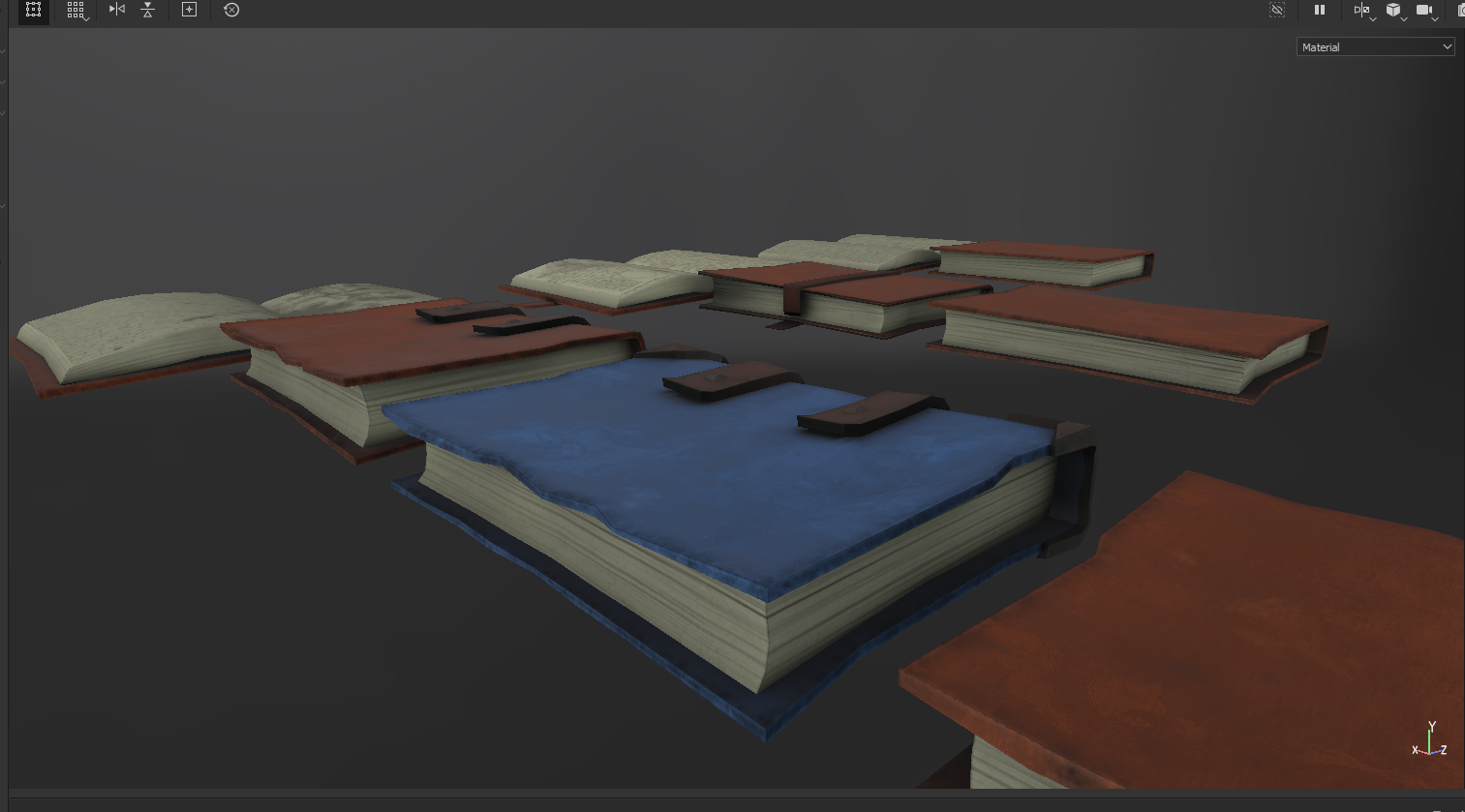
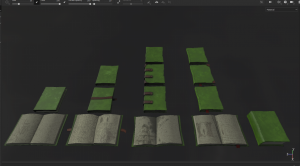 I created four colours, these are the final textures before bringing them into Unreal. I included a close up of my favourite book. I made so many books as well as variations in texture since we all planned on decorating generously with them.
I’m super pleased with how these came out and think they fit into our style really well, I maybe could’ve pushed the wonkiness and imperfections a bit more? but I think they came out good and fit well with the candles too. I was a lot happier with them following one of the later presentations as both Henry and Mike liked them and used them as an example on what to do for another person in the class working on books.
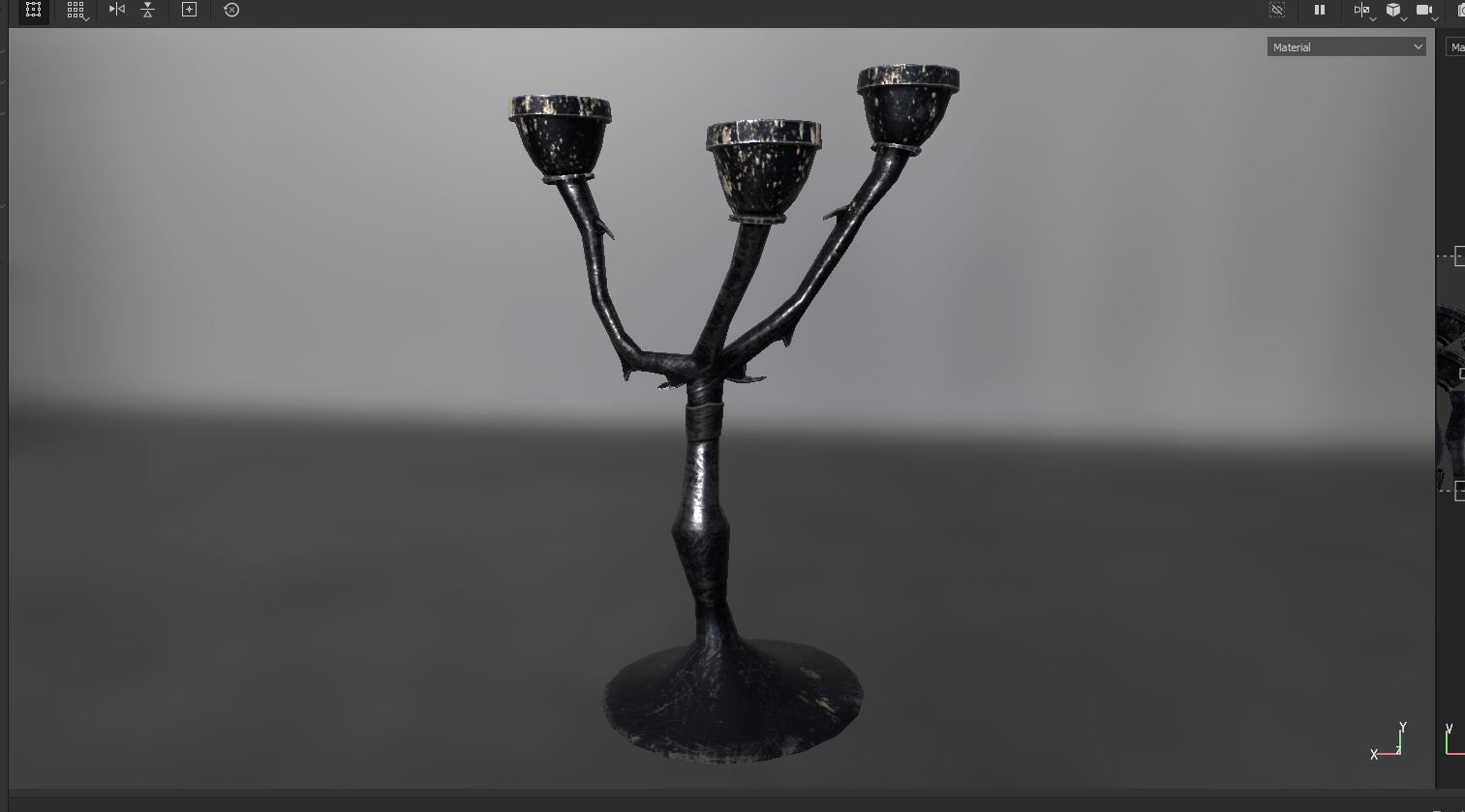
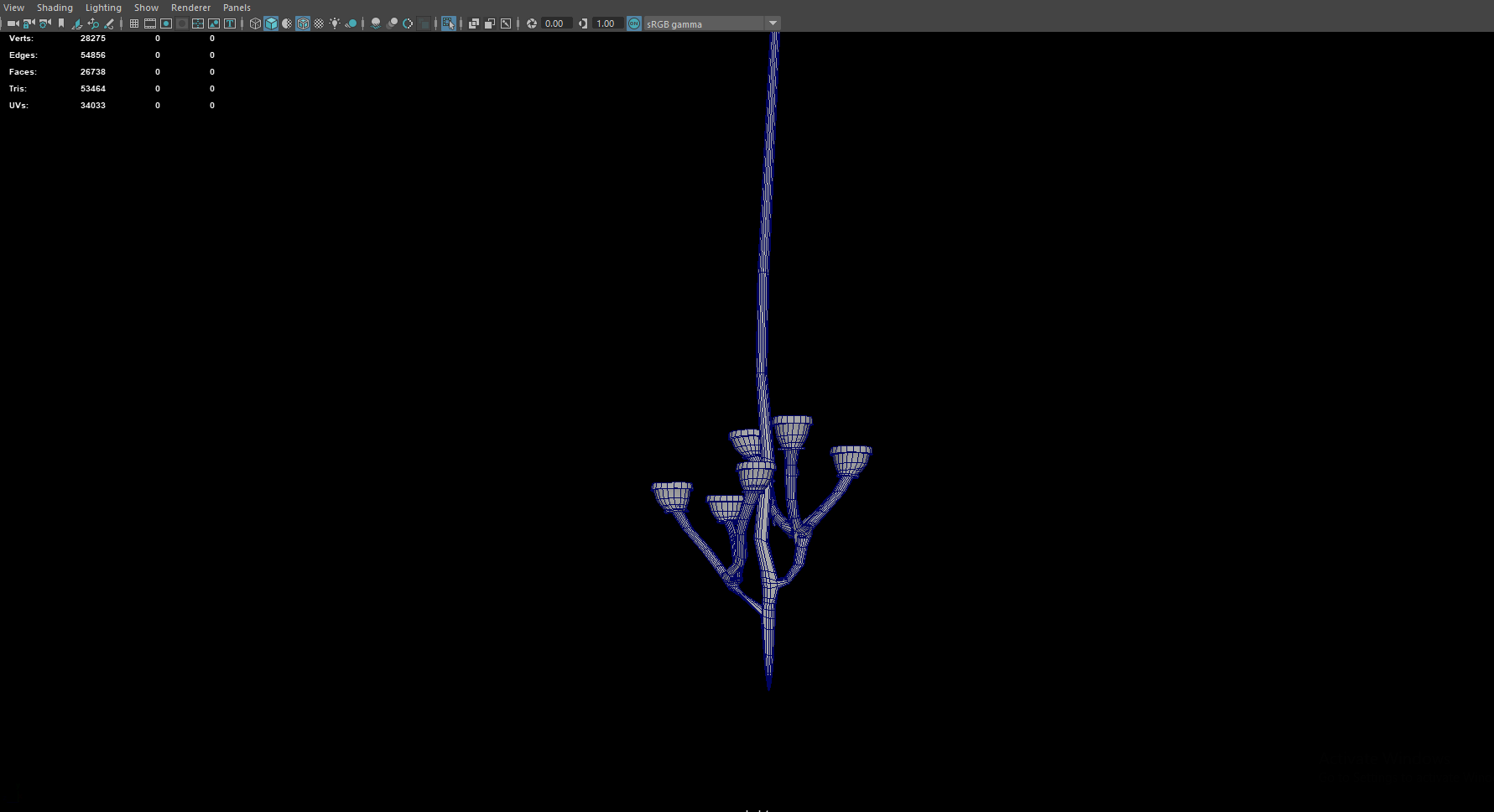
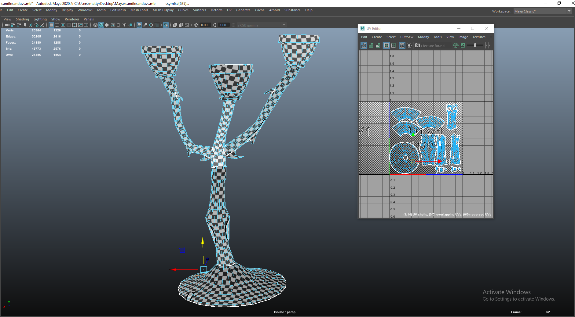
Candelabra
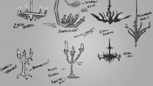


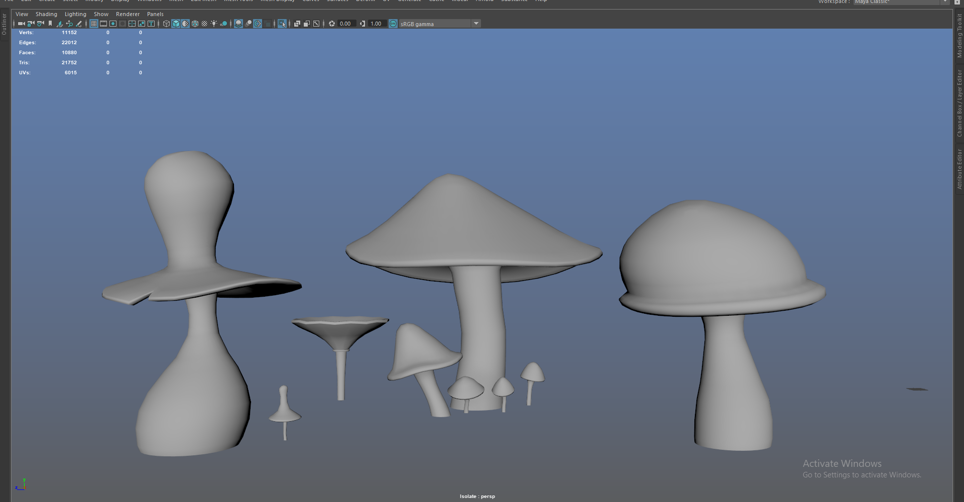
I ended up with the candelabra and chandelier assets since no one put their names down to model them – I chose the candles, books and armour and purposely waited to take on whatever assets we needed that no one specifically wanted to model. I was a little lost for direction with these props though so I did some concepts, I wasn’t sure what the group would like in their scenes so I did a bunch of stuff and let them choose the chandelier, then based the candelabra on this.
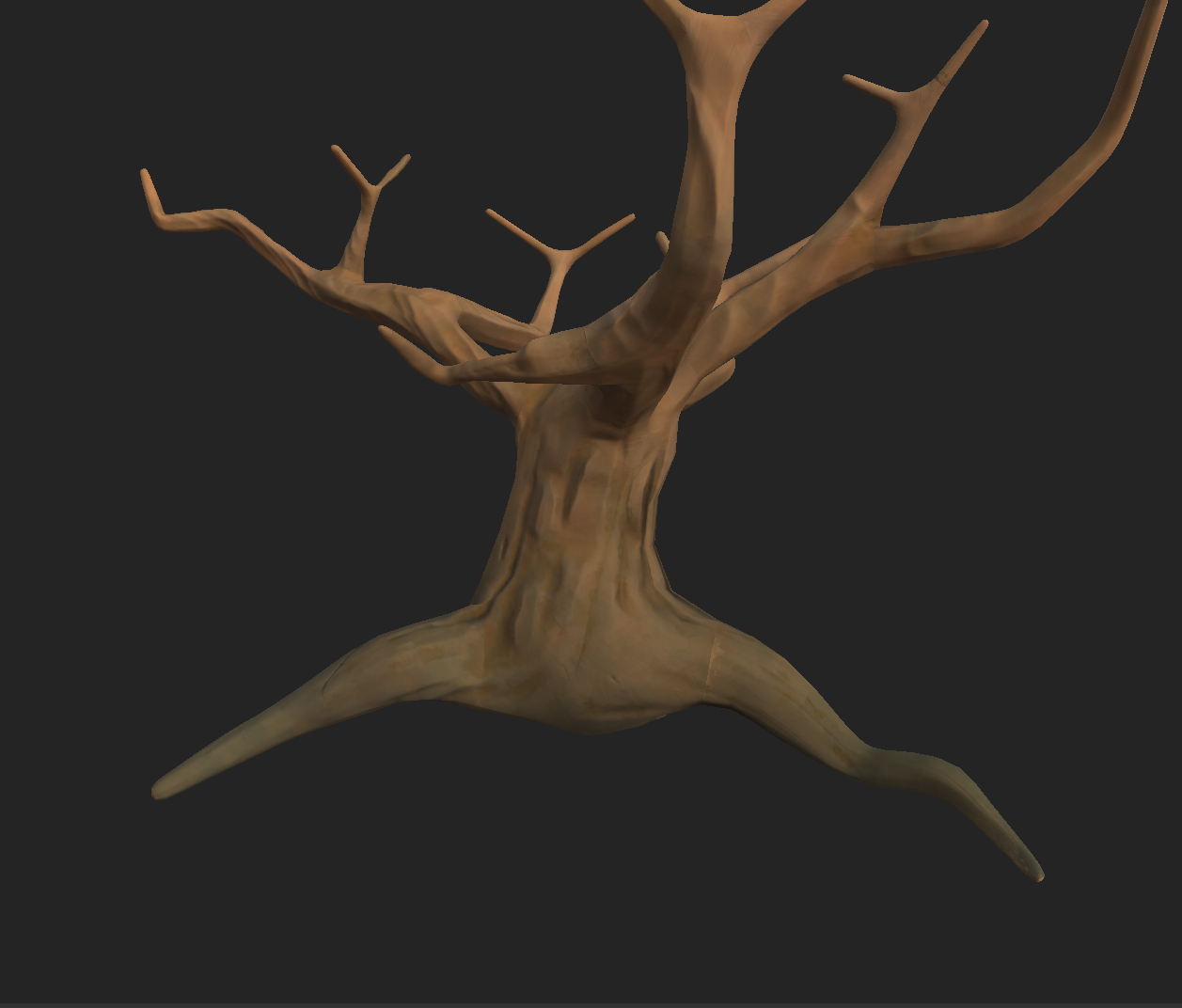
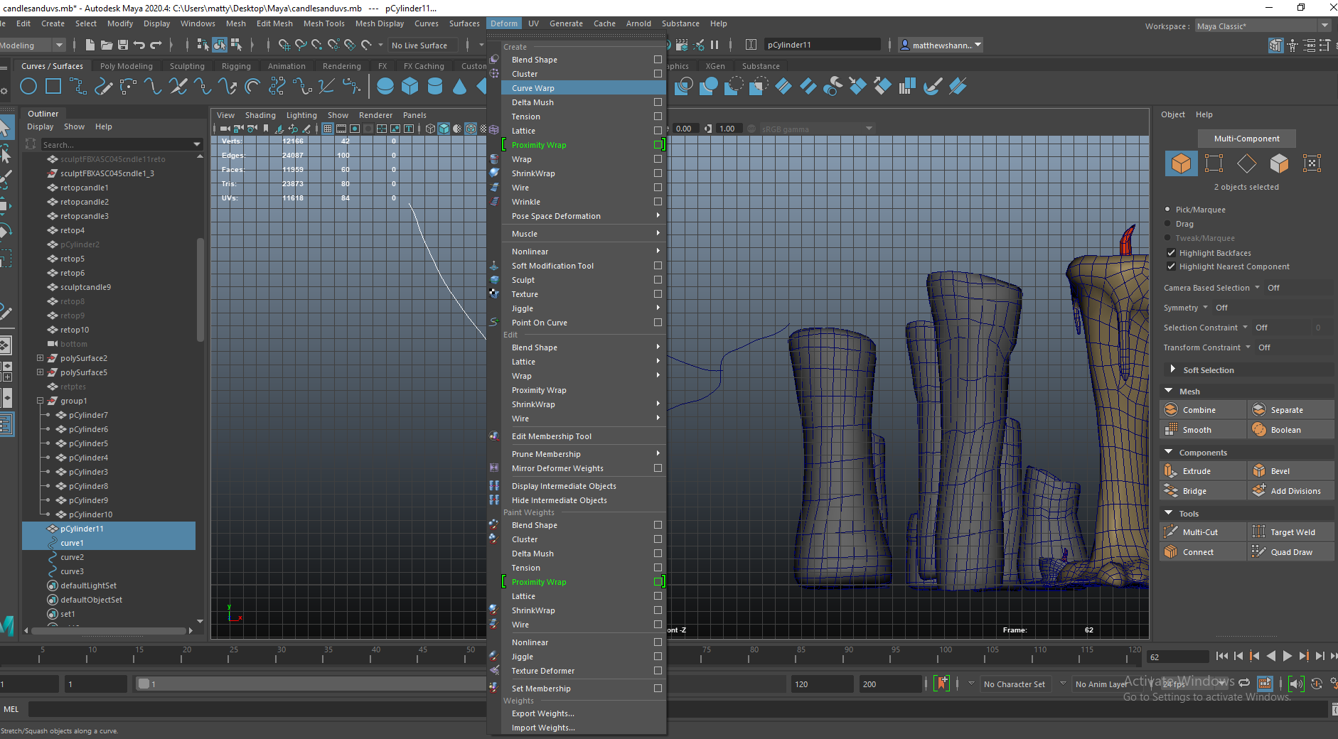
I attempted to use the curves in Maya to create a cool shape then extrude the cylinder along this, a similar method was shown to me last year for trees. I gave up on this pretty quick though since it was too organic? The shape didn’t seem right.


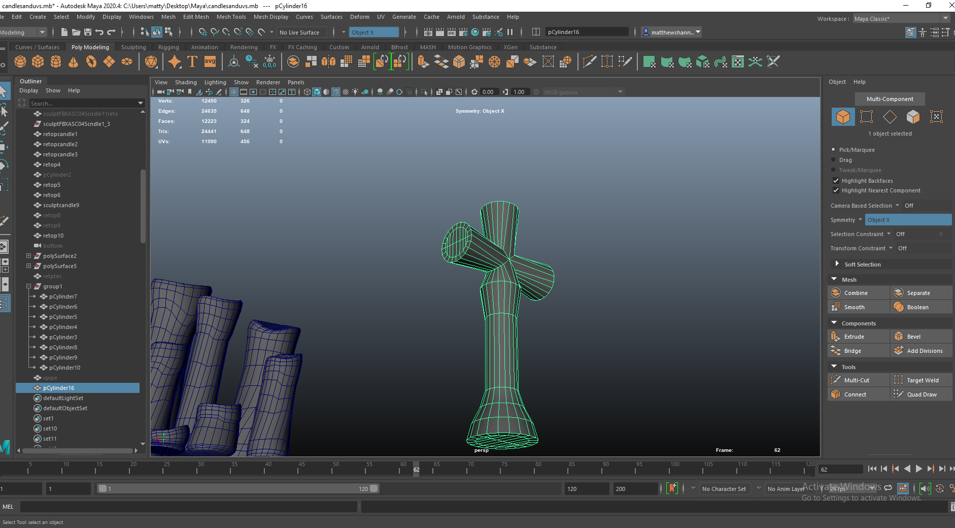
I was a little confused on how 3 cylinders would intercept and combine in terms of edgeflow, so I looked about on sketchfab for an example of this. I managed to find this pipe model and I used the same methods they used.


I wanted to use a similar method I used for the books, modelling it symmetrically then afterwards I could use this as a base to build my wonky version. You can see me begin to experiment with the wonky versions above.


I tested out trying to do a claw/talons at the bottom instead of a conventional stand – seen in my concept art, we wanted some props to have animalistic qualities to them so I attempted this for the candelabra, but didn’t like it at all. I extruded some faces to add spikes along the ‘arms’ of the candle holder then placed a candle in to see how this looked in terms of proportions and was happy with the outcome.

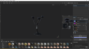


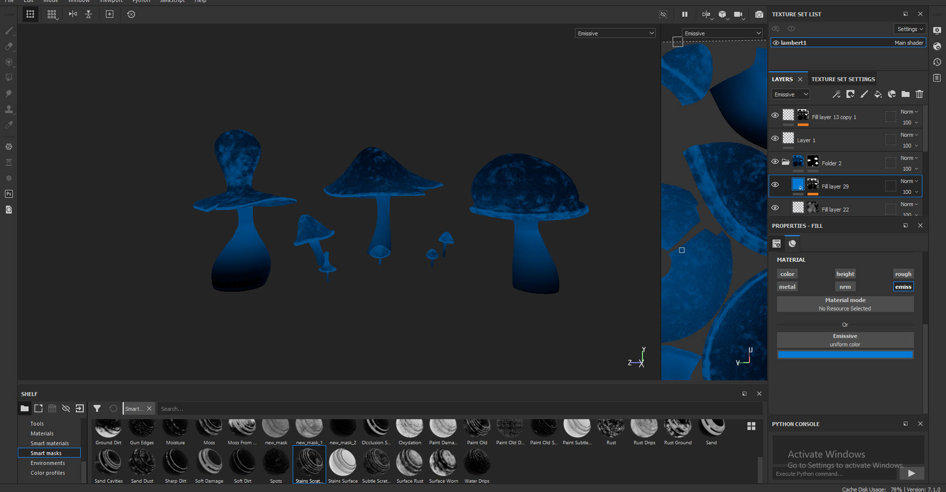
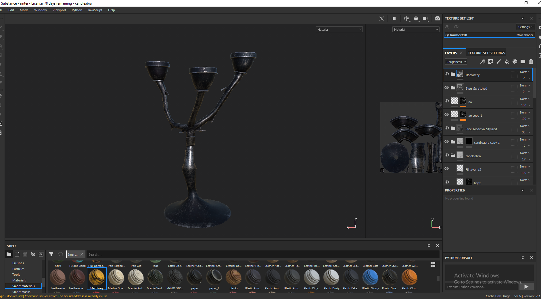
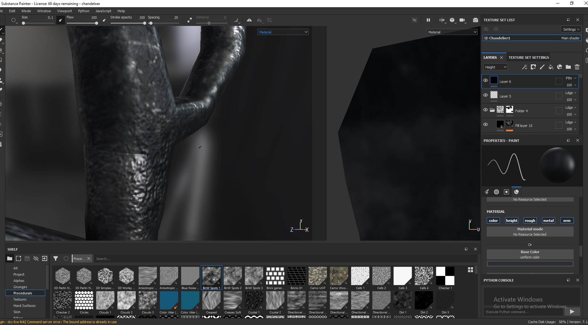
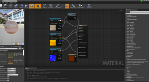
Super happy with the texture job on this asset, I took a bunch off smart materials such as medieval steel stylised and steel painted rough damaged. I didn’t like any of these materials by themselves, so I took the height information from one, roughness from another, did my own colours etc. It ended up a combination of about 5 smart materials and a bunch of my own masked fill layers. I had the idea to the my candle wax smart material and apply this to the top/ rim of the candelabra with some height information. I used a mask for dirt/splatter then a black max on this to paint on the areas I wanted to have this effect.
Overall I was happy with how this came out, but Mike mentioned he wasn’t a fan of the design of this/the chandelier during our latest presentation. I was going for a gothic dark spiky sort of thing but I guess it missed the mark a little and going into this asset I was definitely lacking some direction so I guess the design itself might be a little weak. He mentioned something with antlers which would’ve been a very nice idea for the chandelier, especially since the taxidermy deer wall mount we wanted didn’t end up in the final project. Despite this though I’m happy with the asset itself, proud of both the topology and the textures.
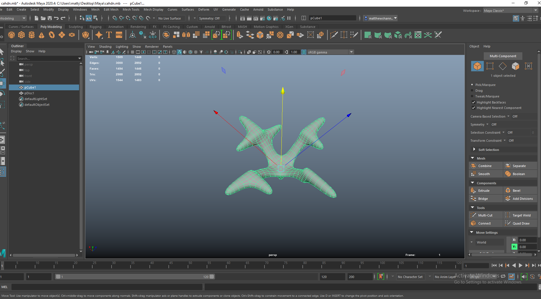
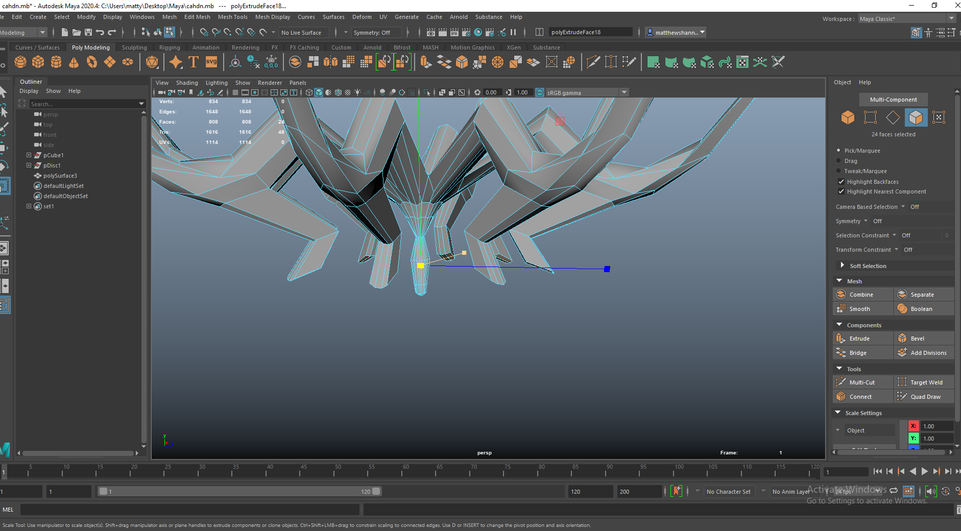
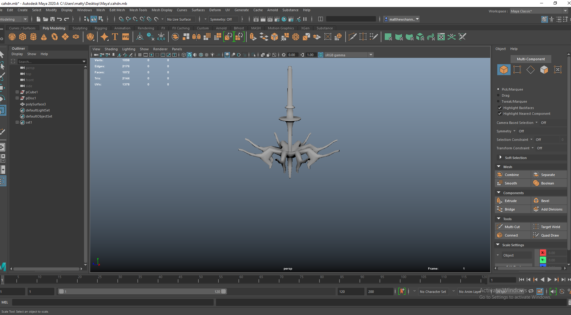
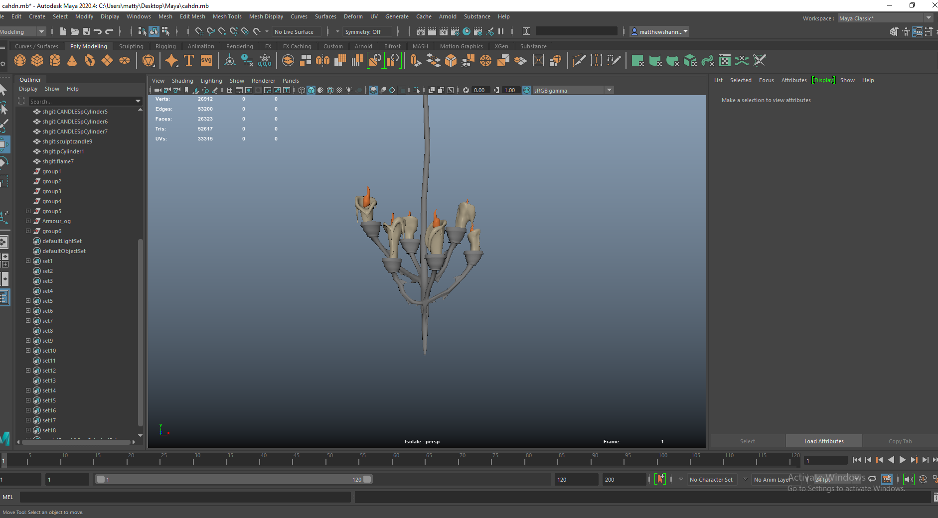
Chandelier


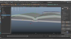
I started out with a different shape from the concept I ended up using, I wanted to experiment with a more conventional chandelier shape inspired by spider legs. I was trying to see how this would work topology wise and if it was a viable option.


This was more experimentation with modelling techniques and different silhouettes. During my organic modelling assignment I had problems before with topology with many cylinders coming together and meeting at the same source, so I wanted to make sure this was all super clean.
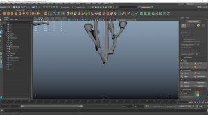


This was the concept closest to the candelabra’s design, if we wanted some consistency among the candle holding assets. I sent the three block outs of these to the group and they all preferred the 3rd one , closest in style to the candelabra. They thought it was cool to have an unconventional design for a chandelier like this.
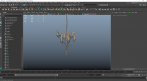


I tested out my candles in these too to make sure they fit together and the chandelier had the right proportions. I was happy with how this turned out, I could’ve went more fun with the design but I thought it created a nice sharp silhouettes and could cast cool shadows, which would tie in with the German expressionism influence we were looking at earlier on.


The texturing was just the same as the candelabra, created a smart material from that then I had to go in with a paint layer to fix up some parts, like in this picture where the uv seams were a bit visible. I used the same candle wax dripping method on this too.
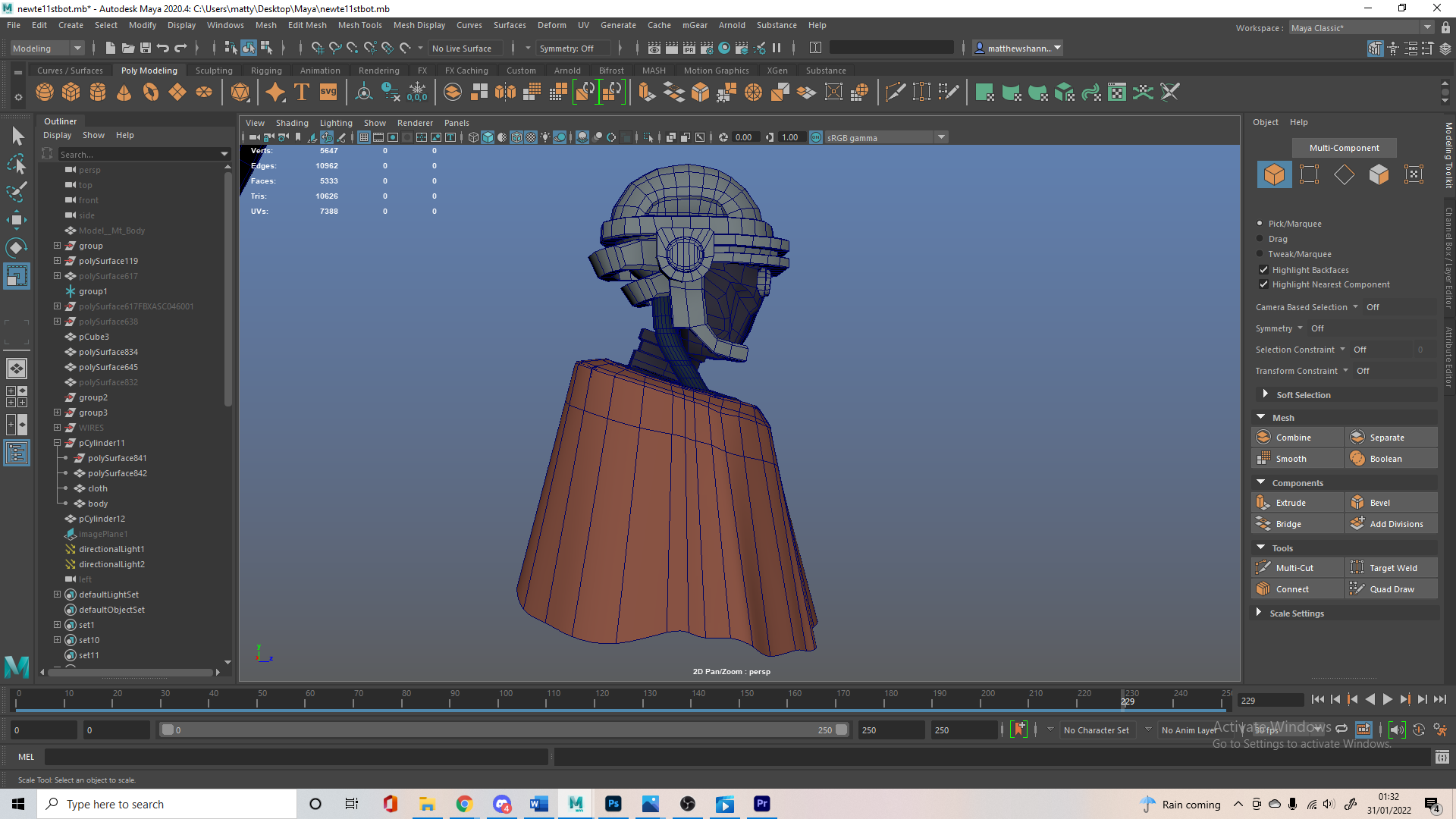
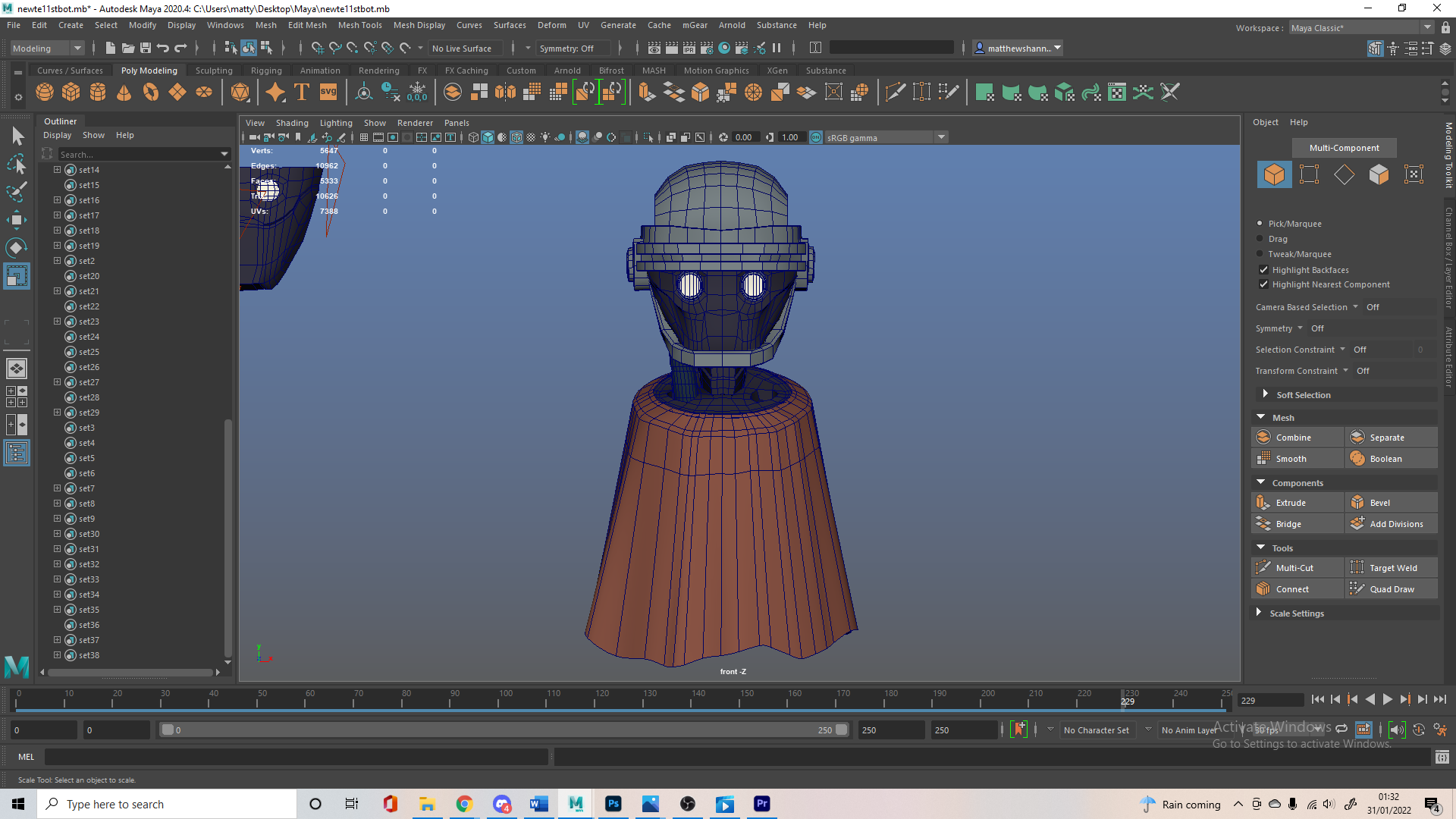
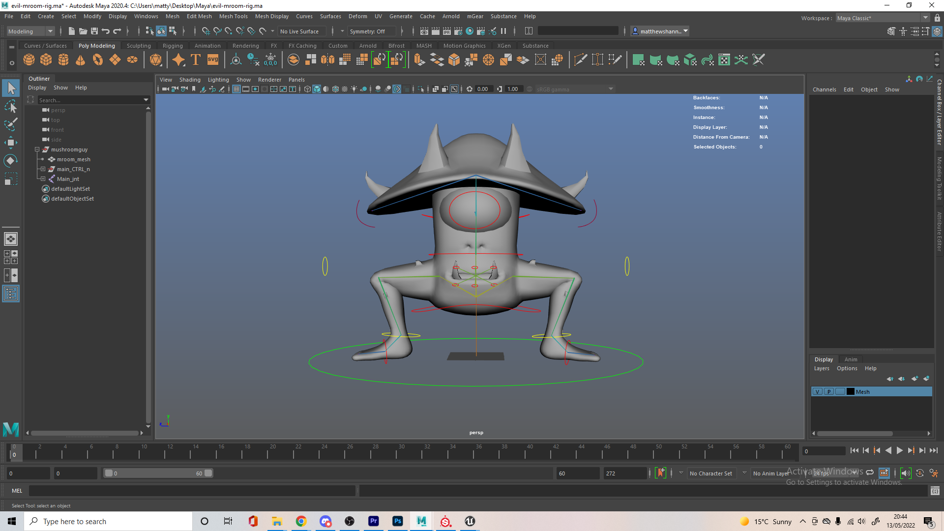
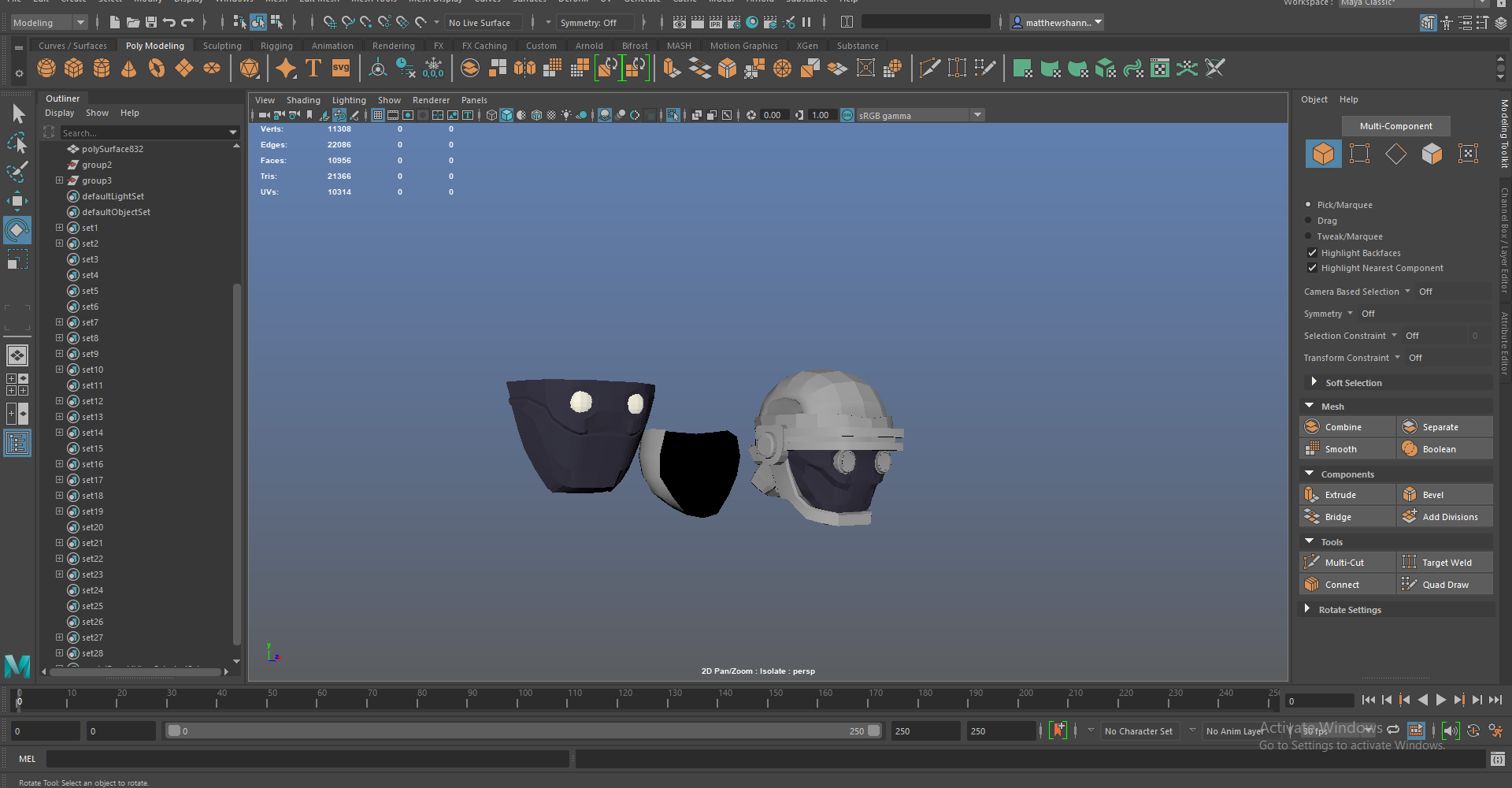
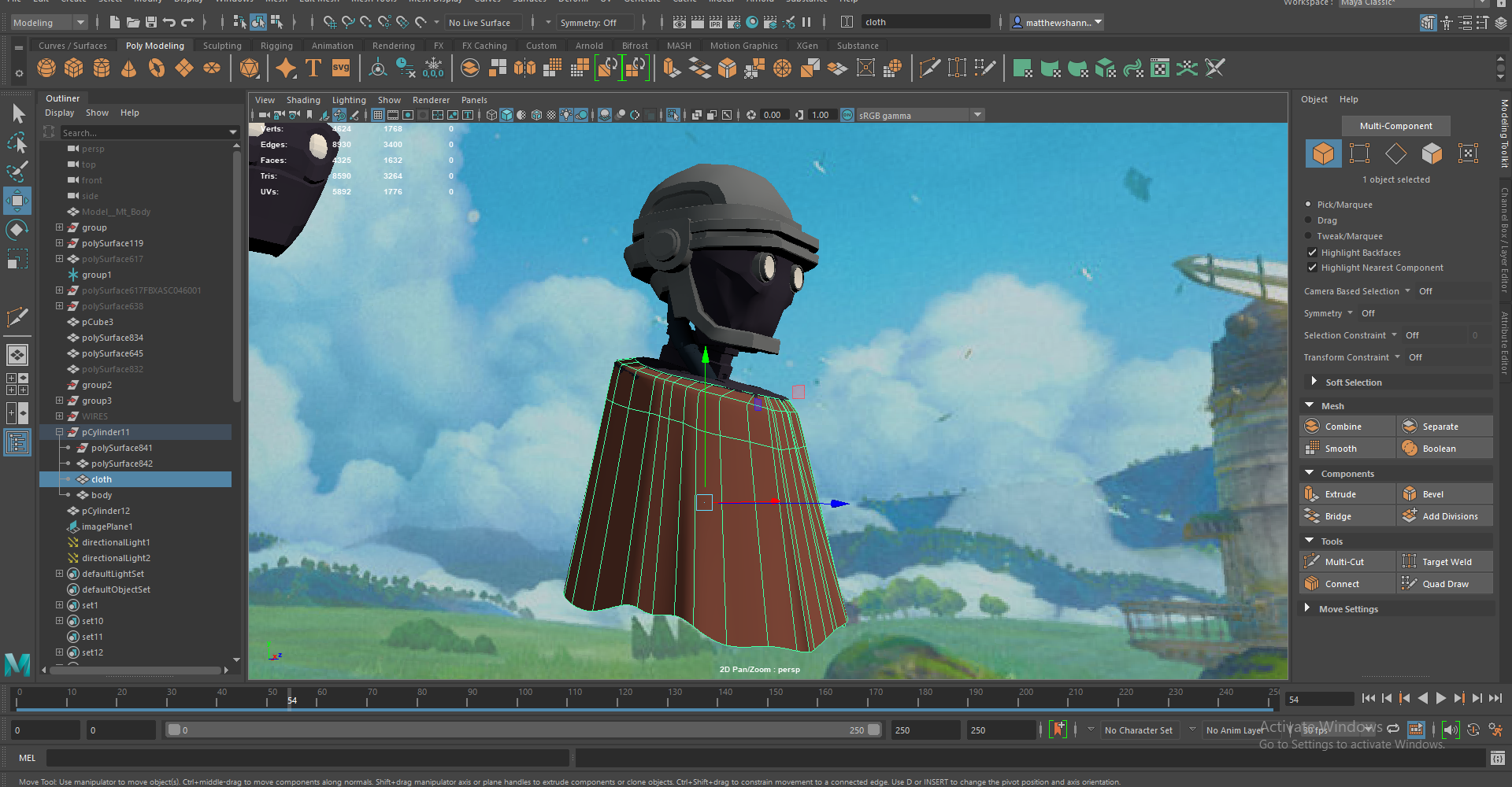
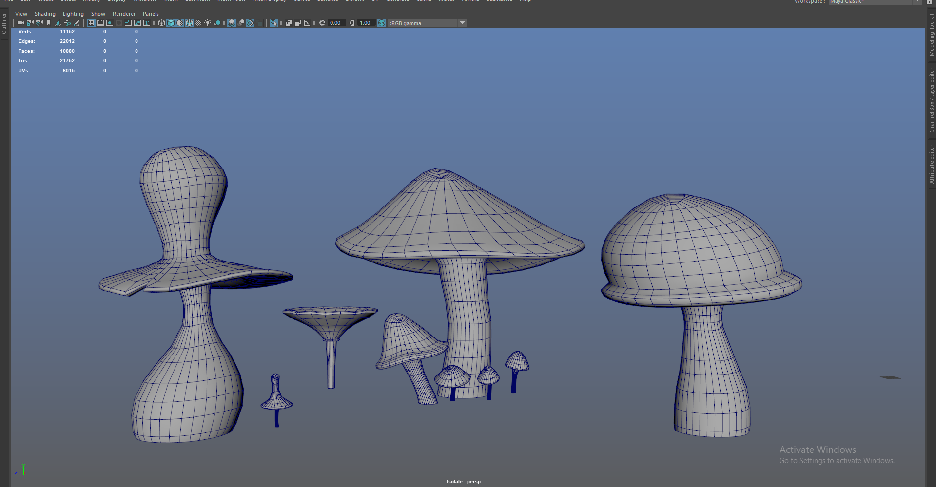
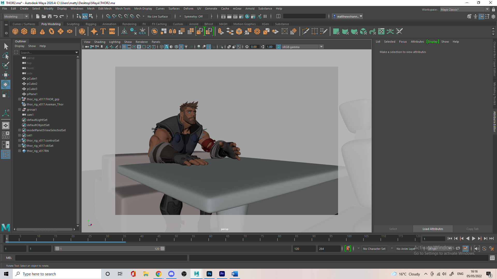
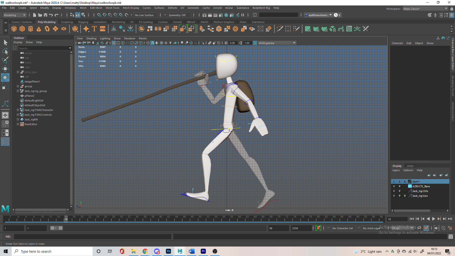
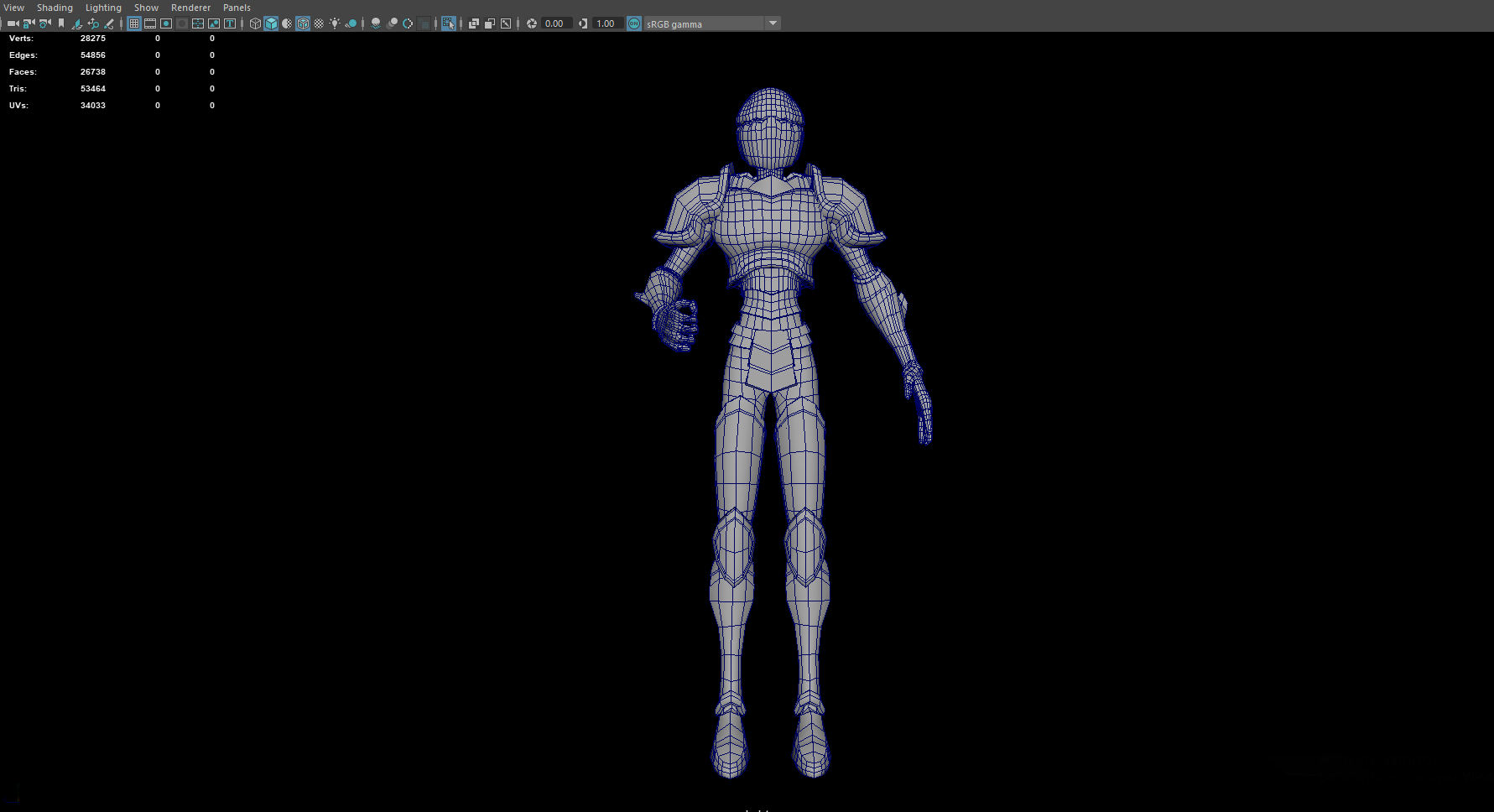
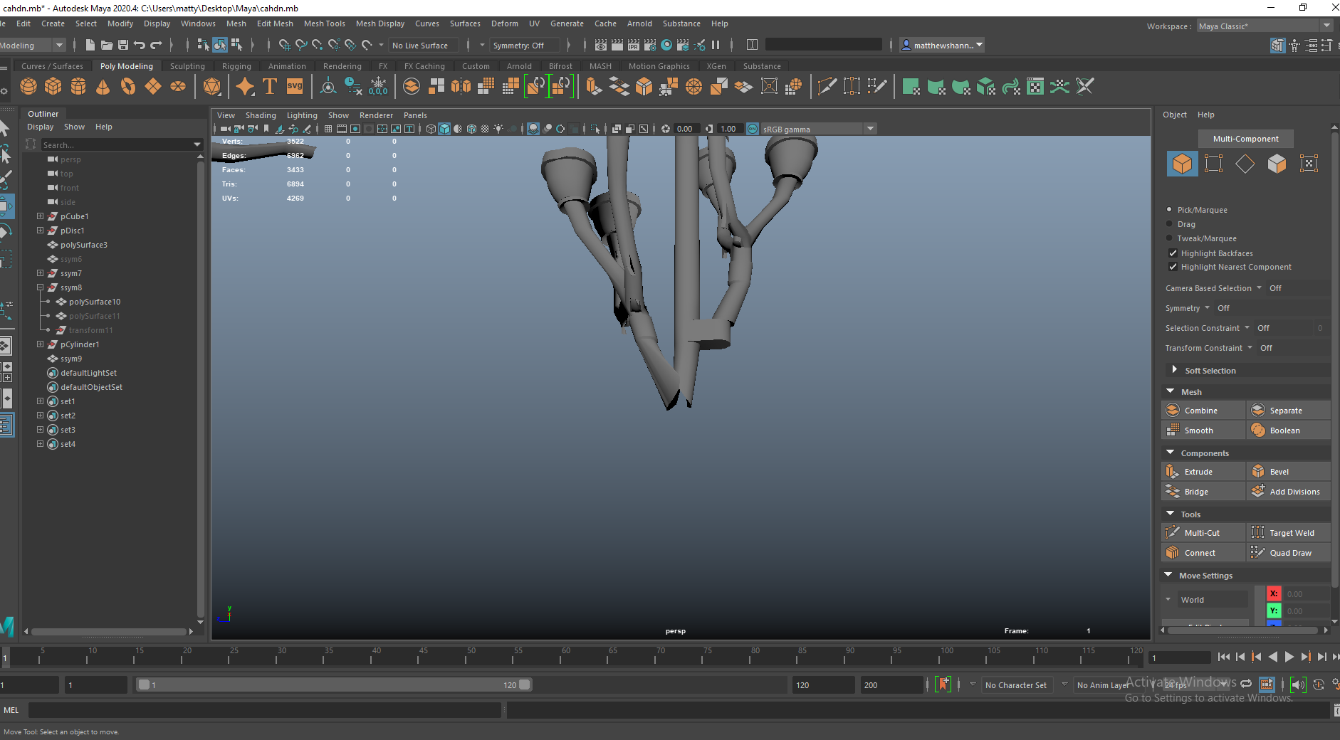
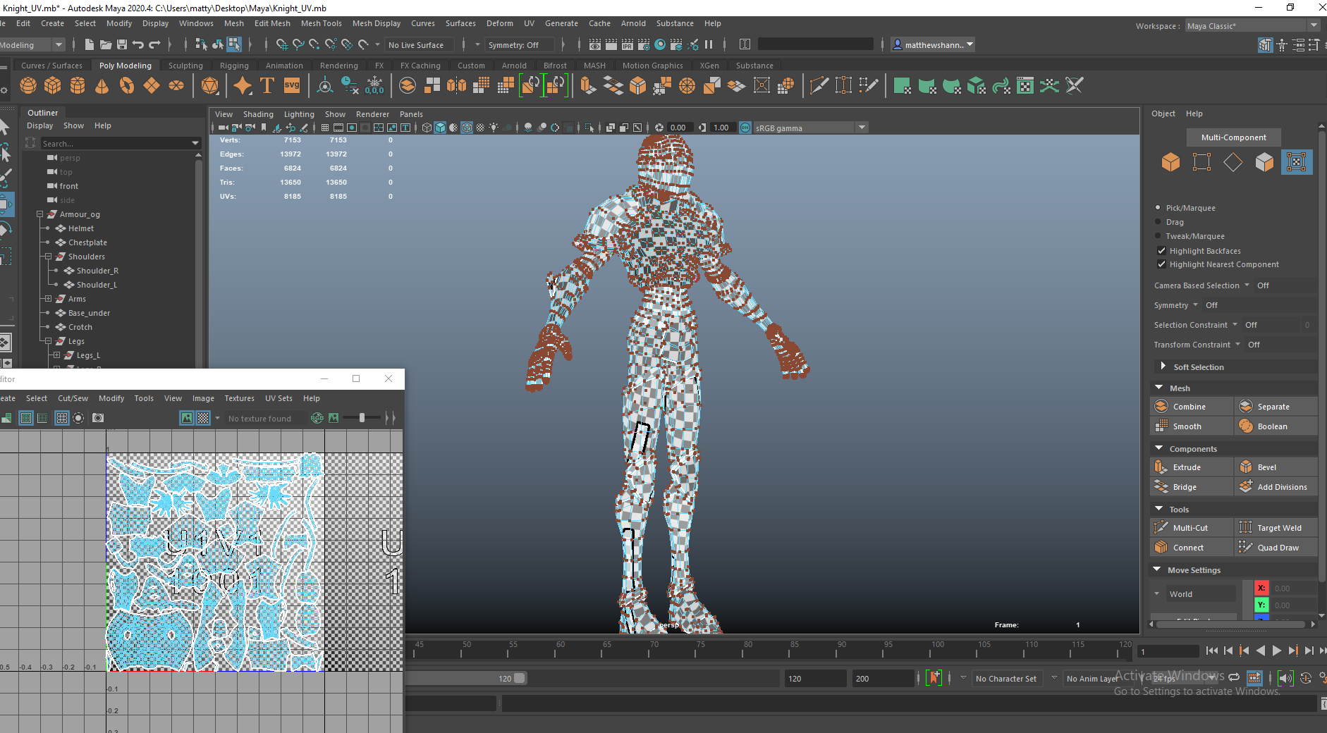
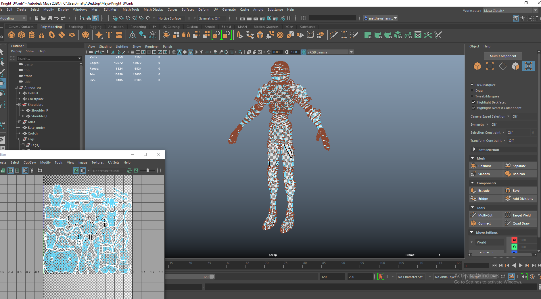
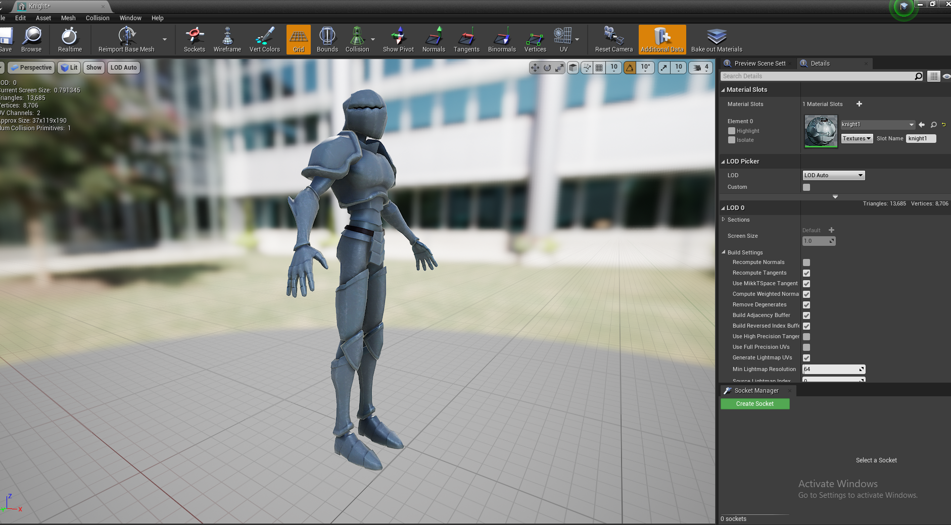
Knight Armour (+weapon)


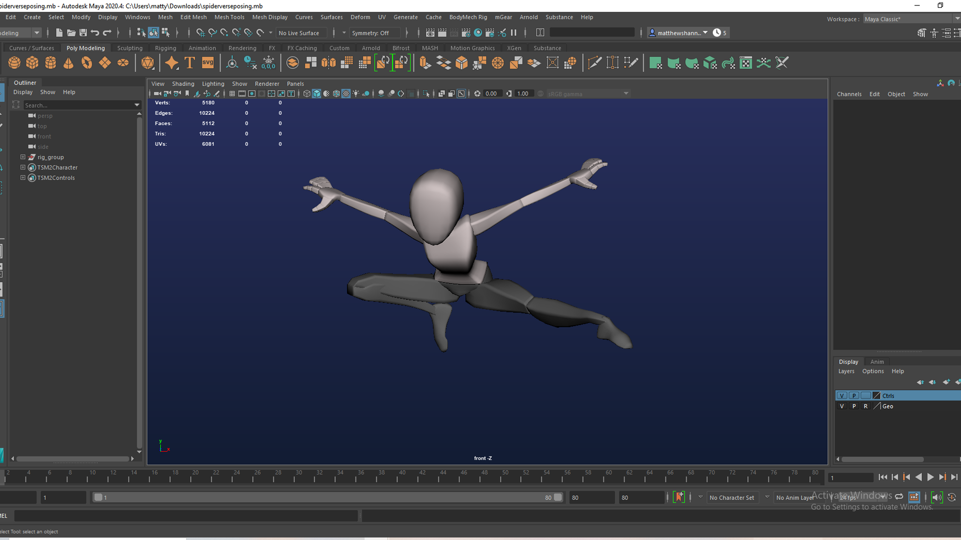
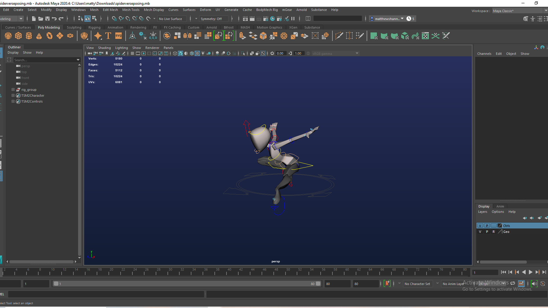
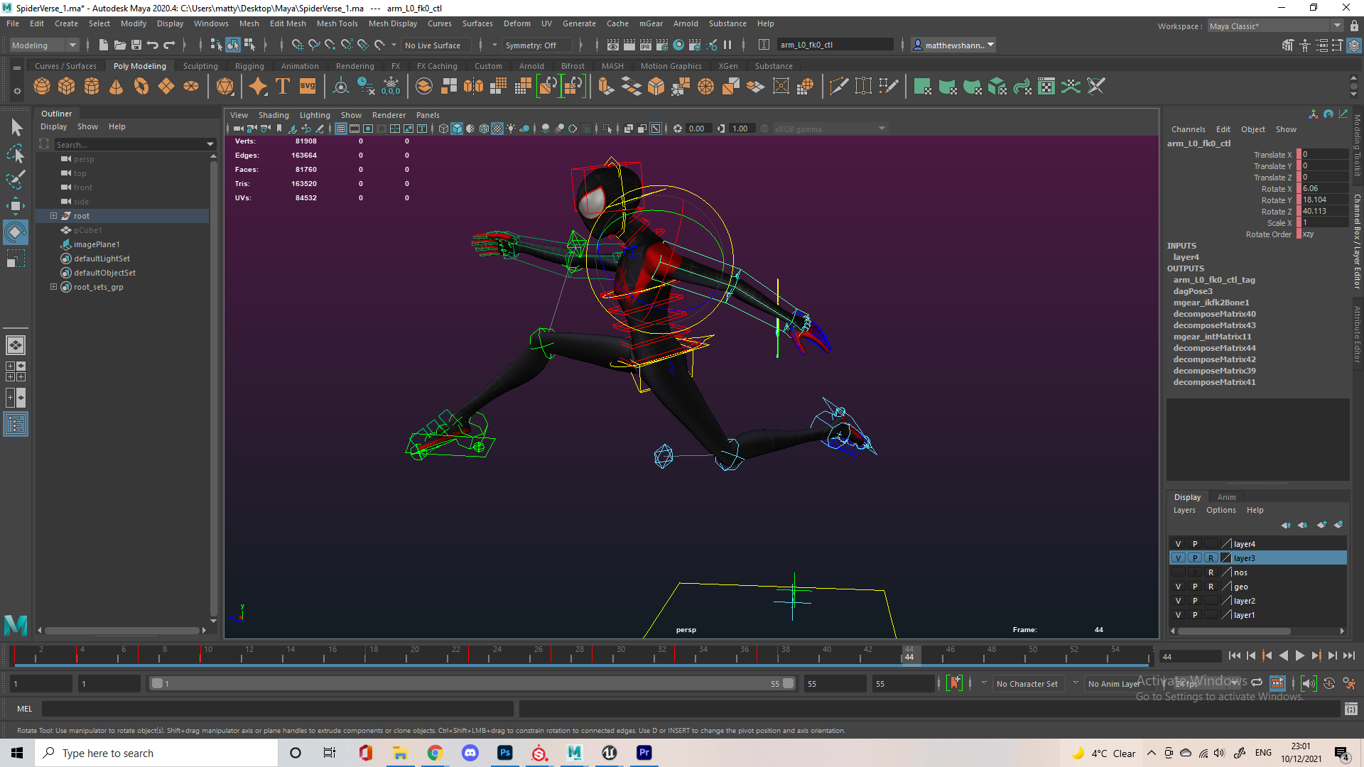
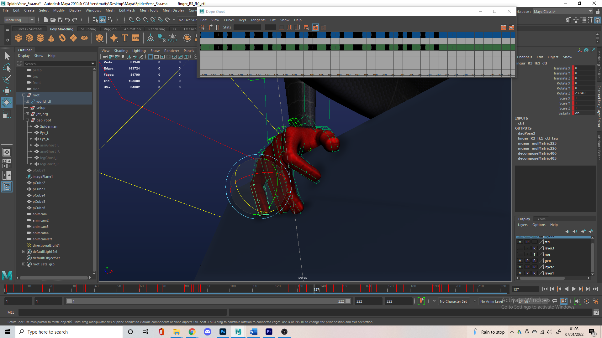
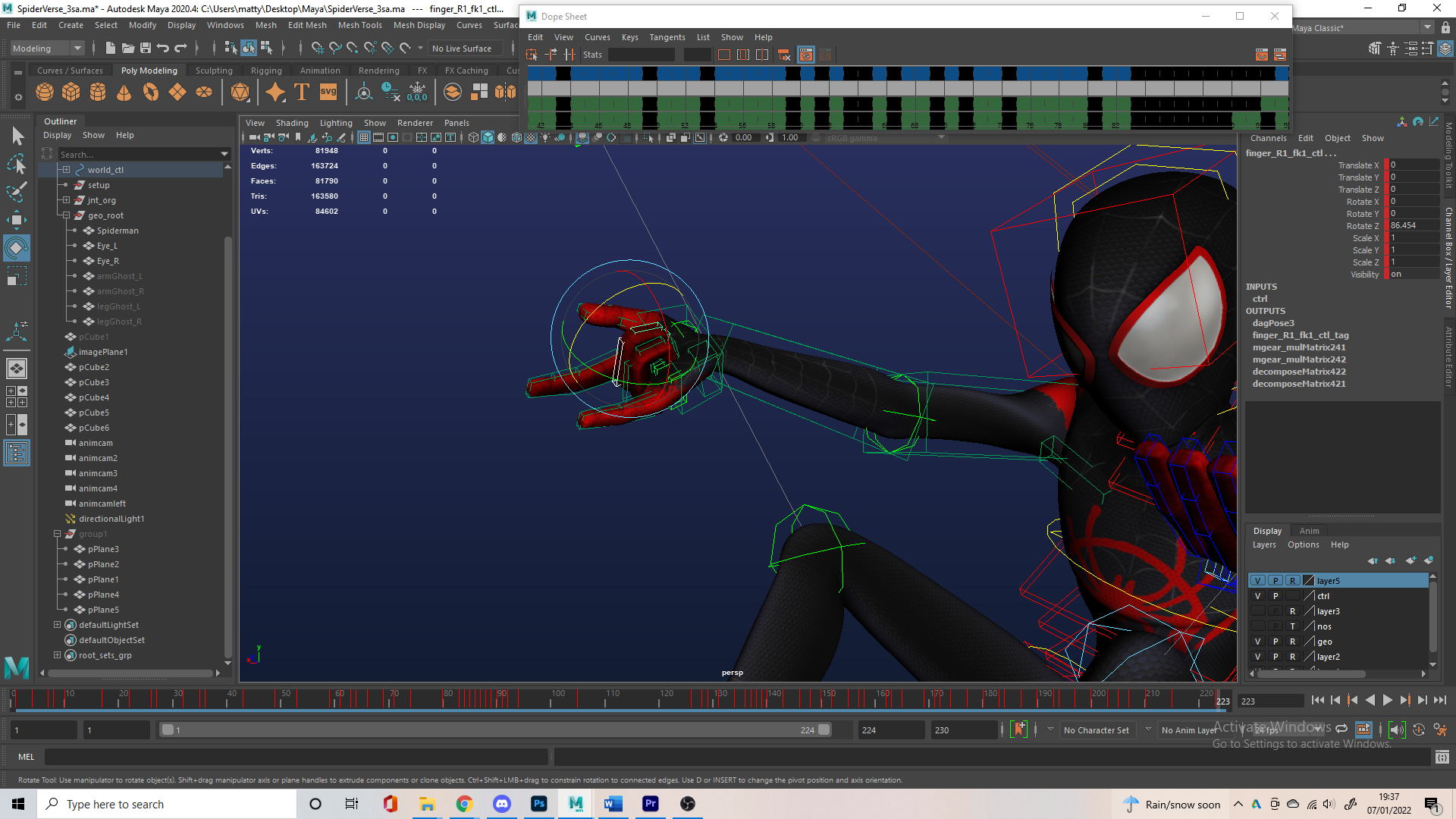
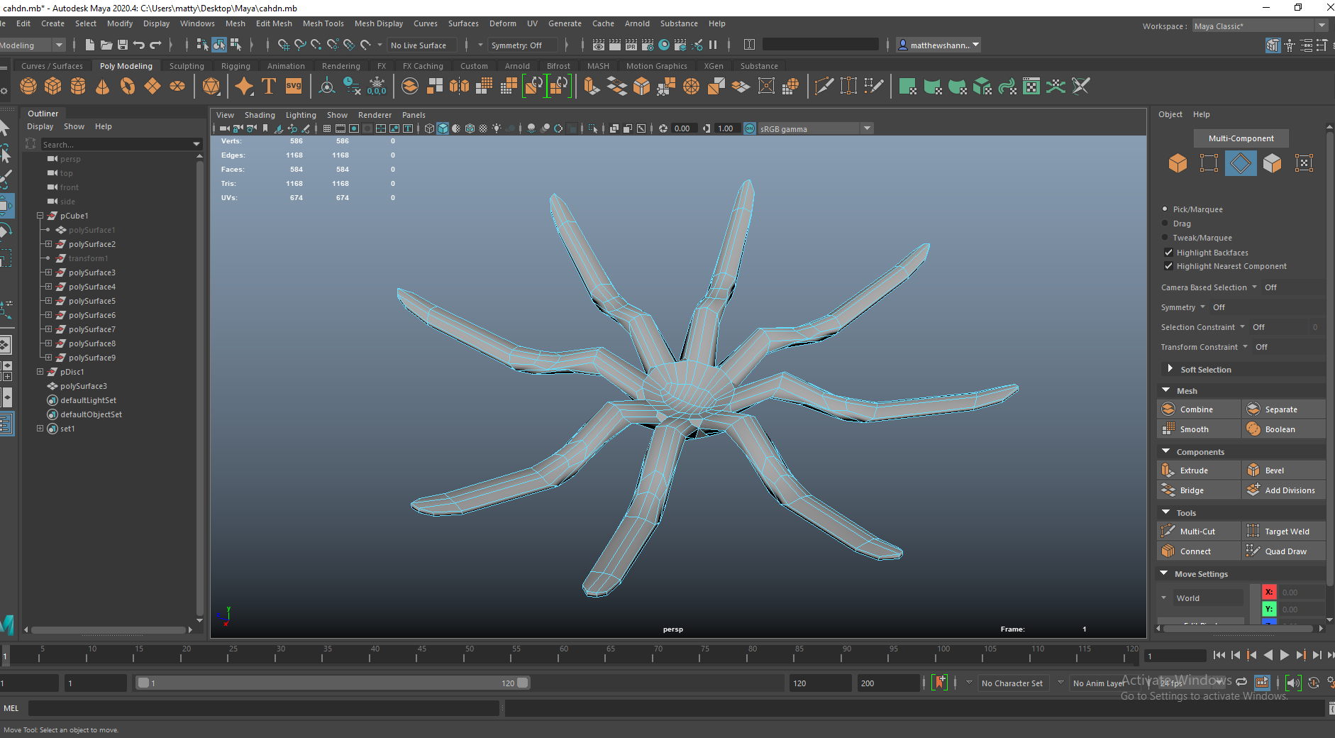
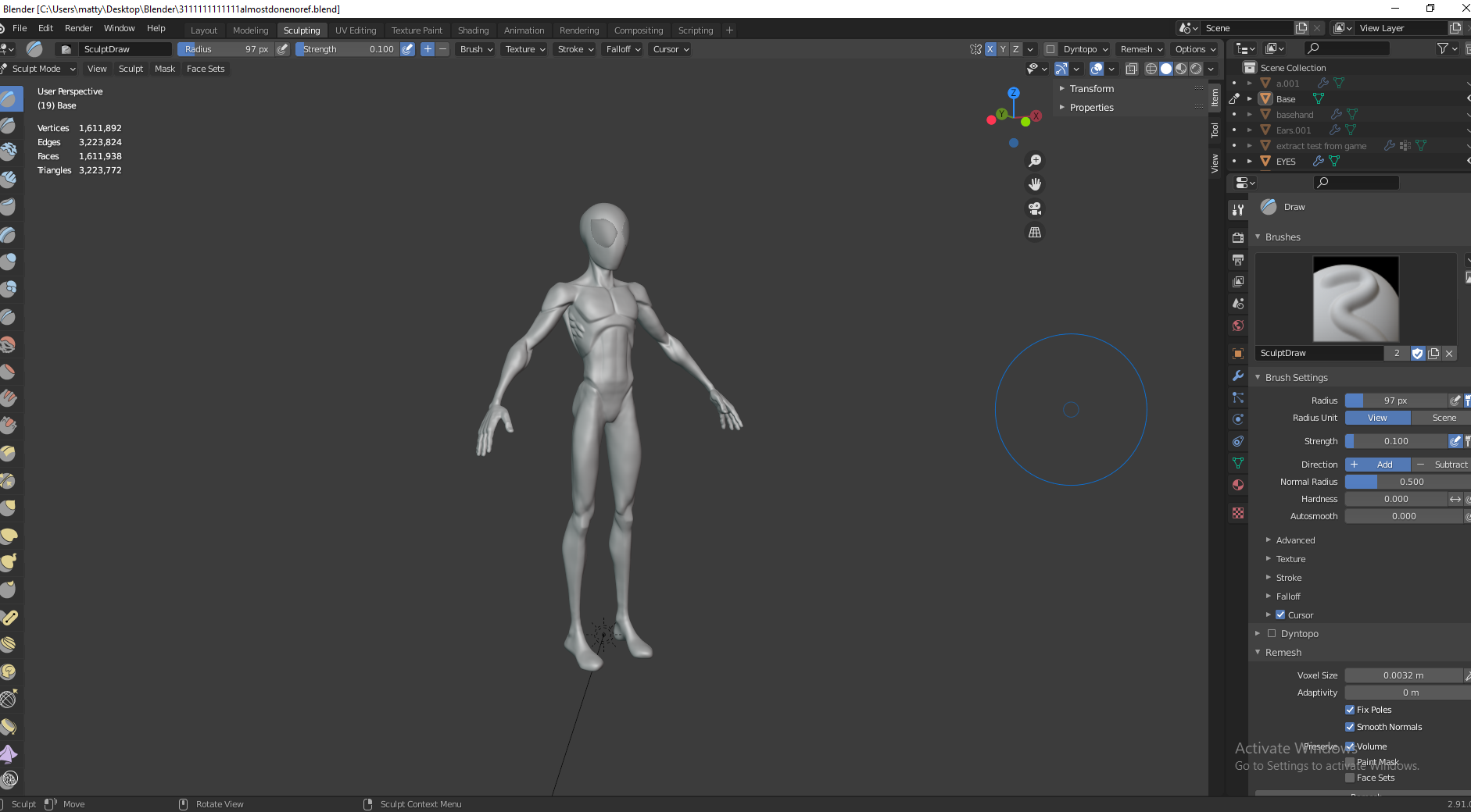
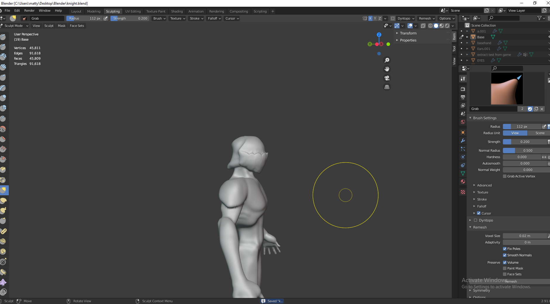
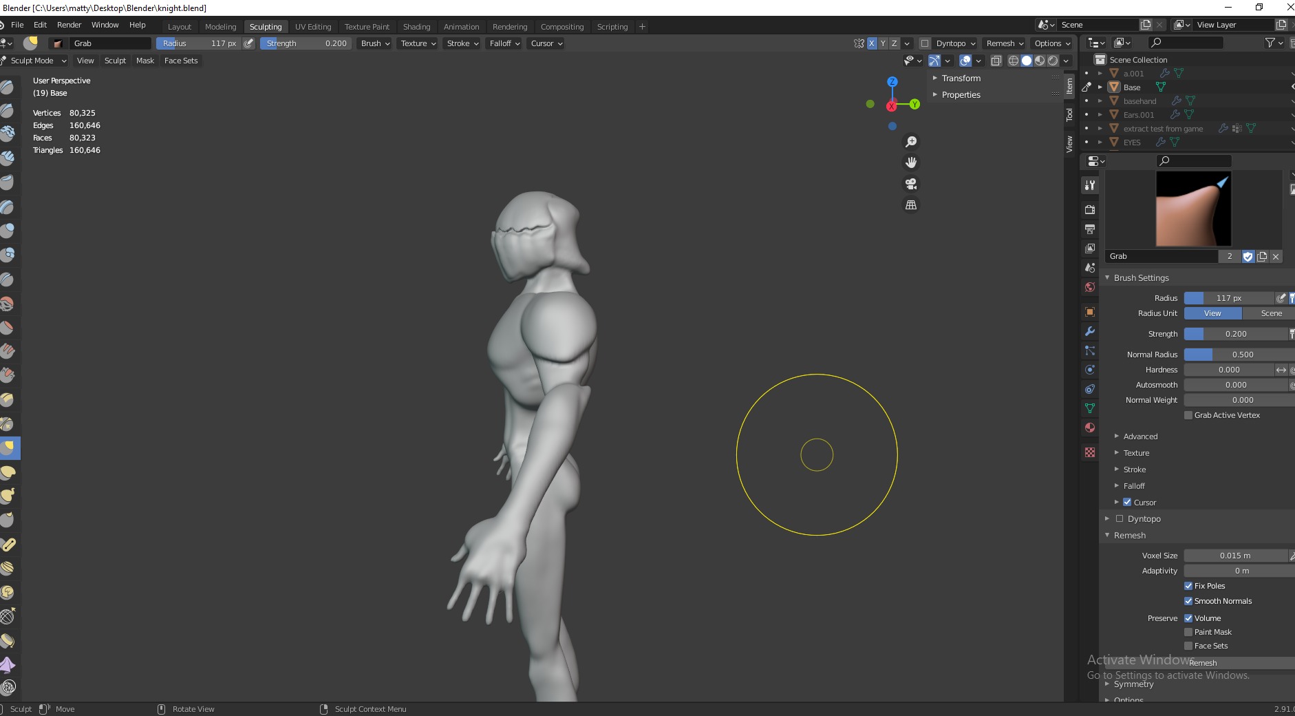
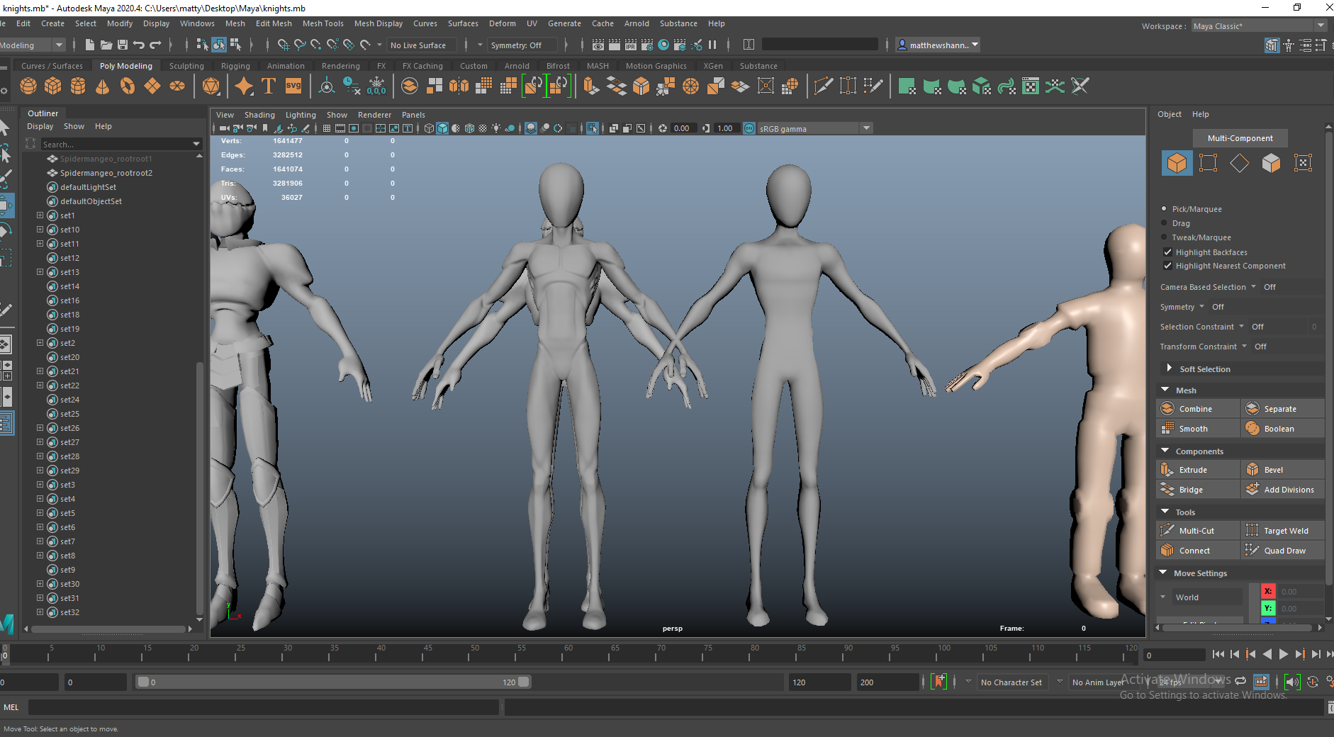
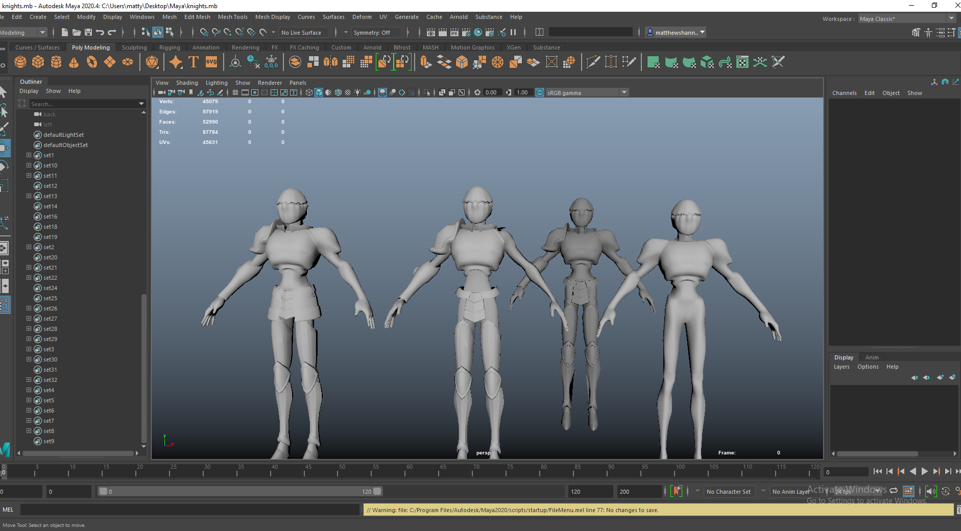
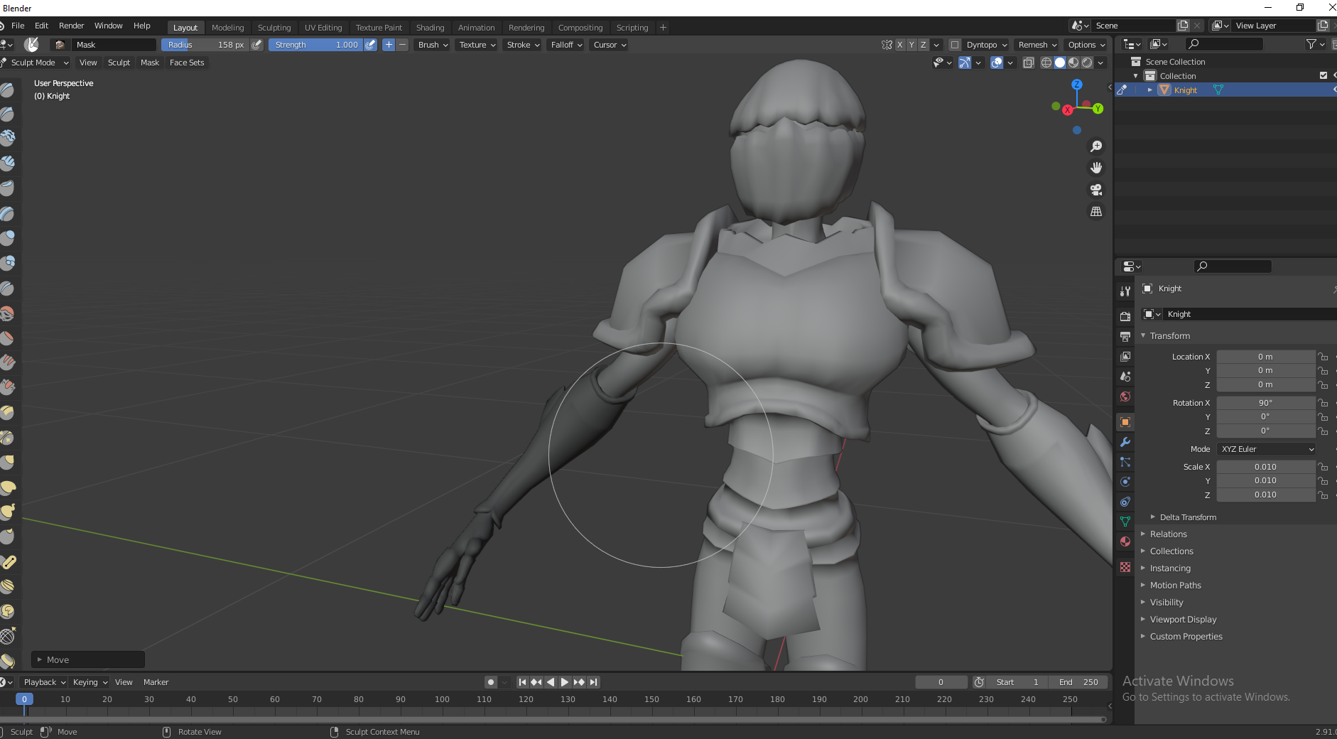
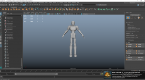
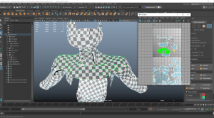
Over the summer I was working on a Spider-man character model so I used this as a base for the knight. I didn’t want to sculpt a full character, I was using this to kind of block out the shapes and I would build the armour pieces ontop/from this. Once I was generally happy with the shapes I imported this into Maya.


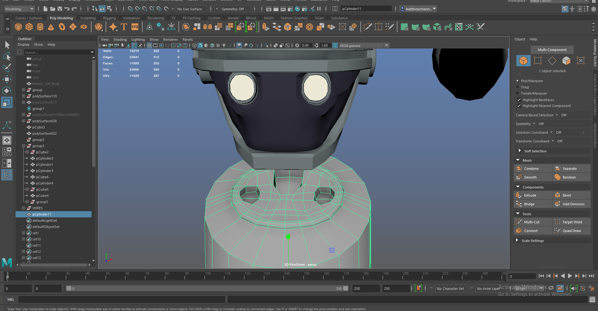
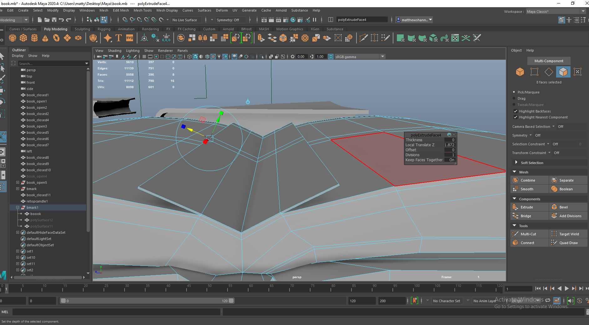
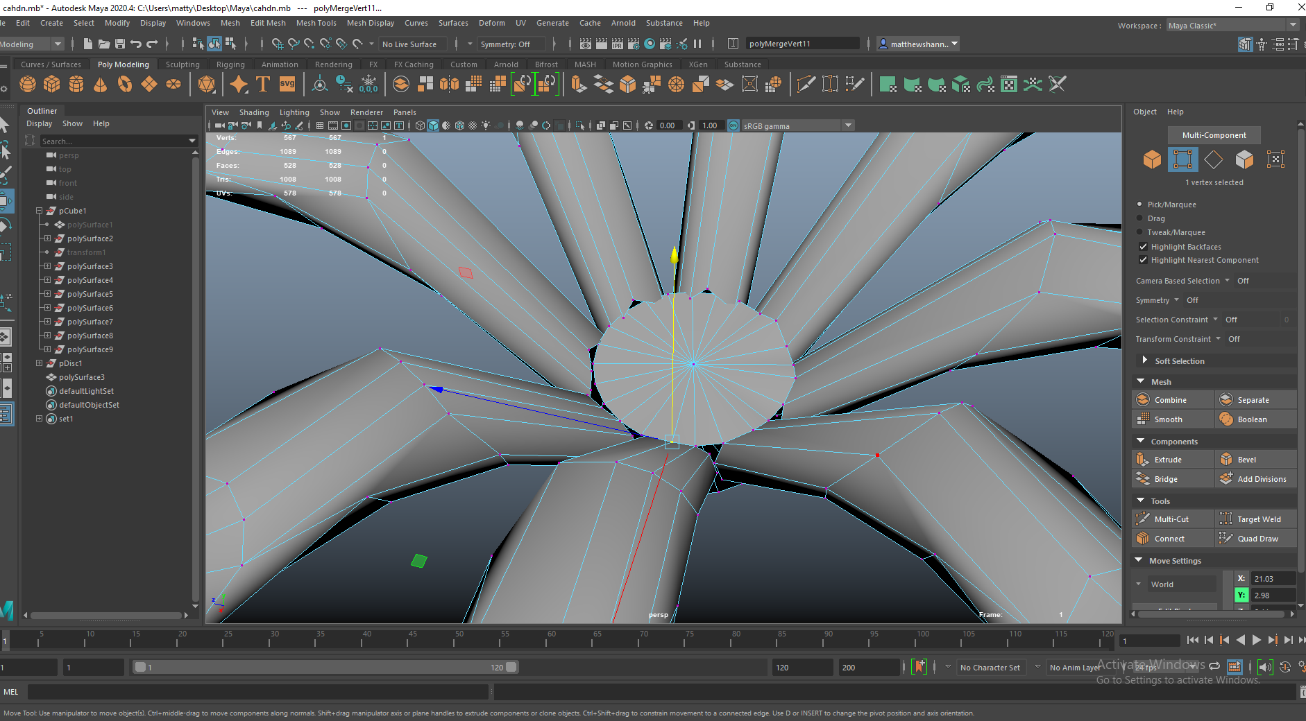
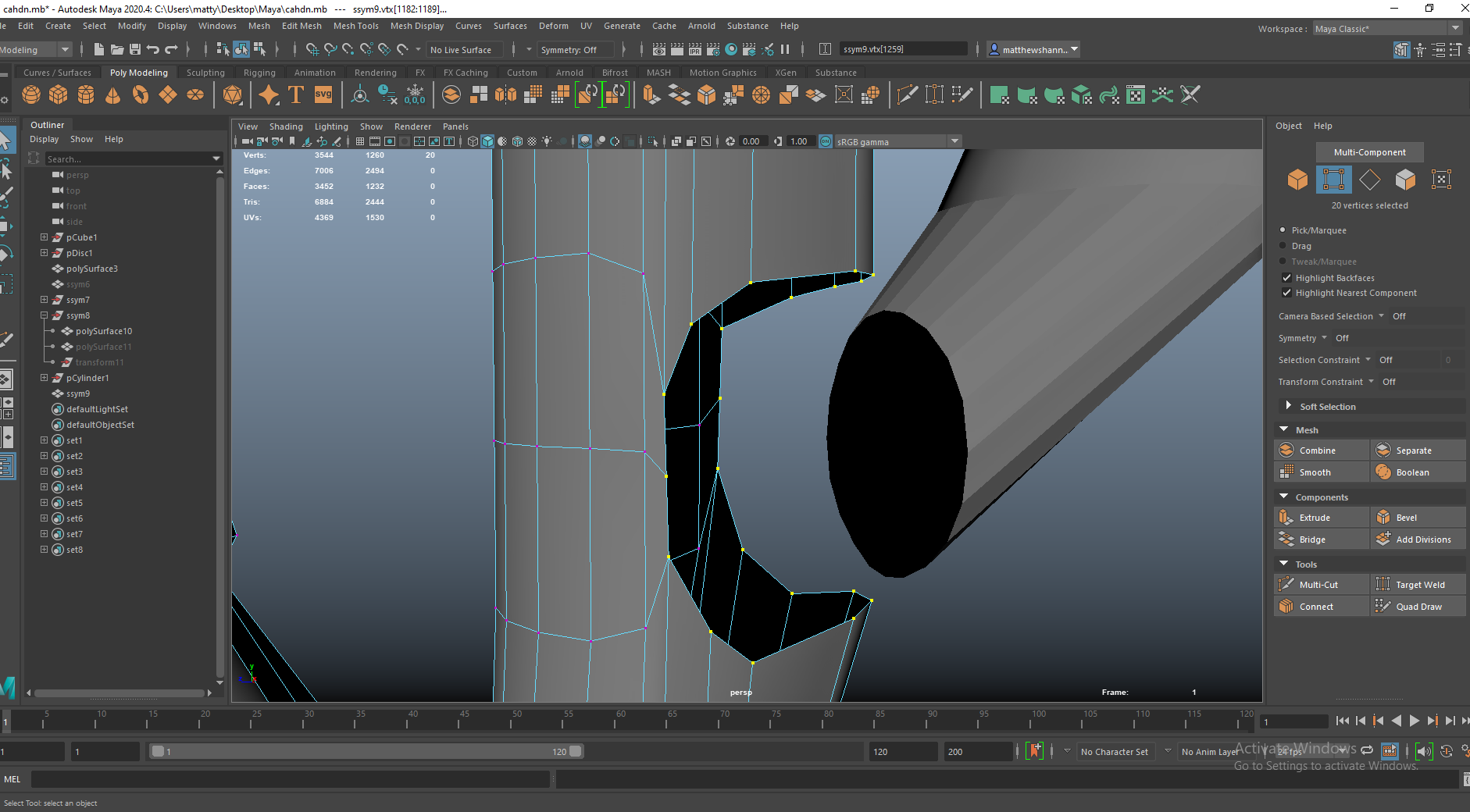
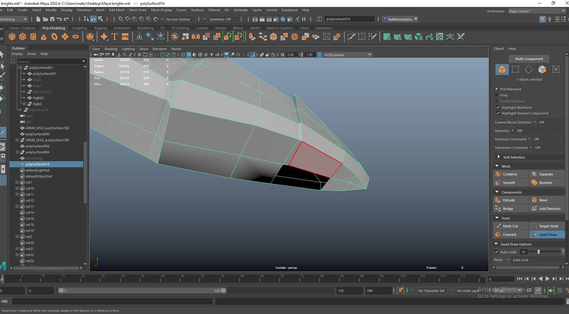
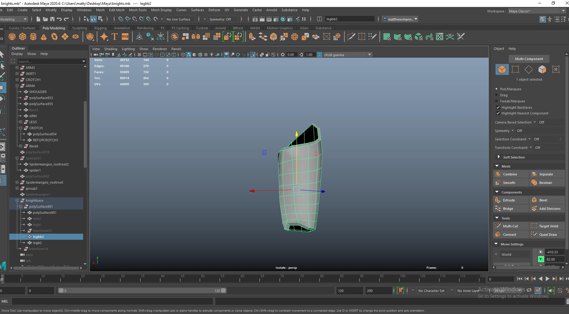
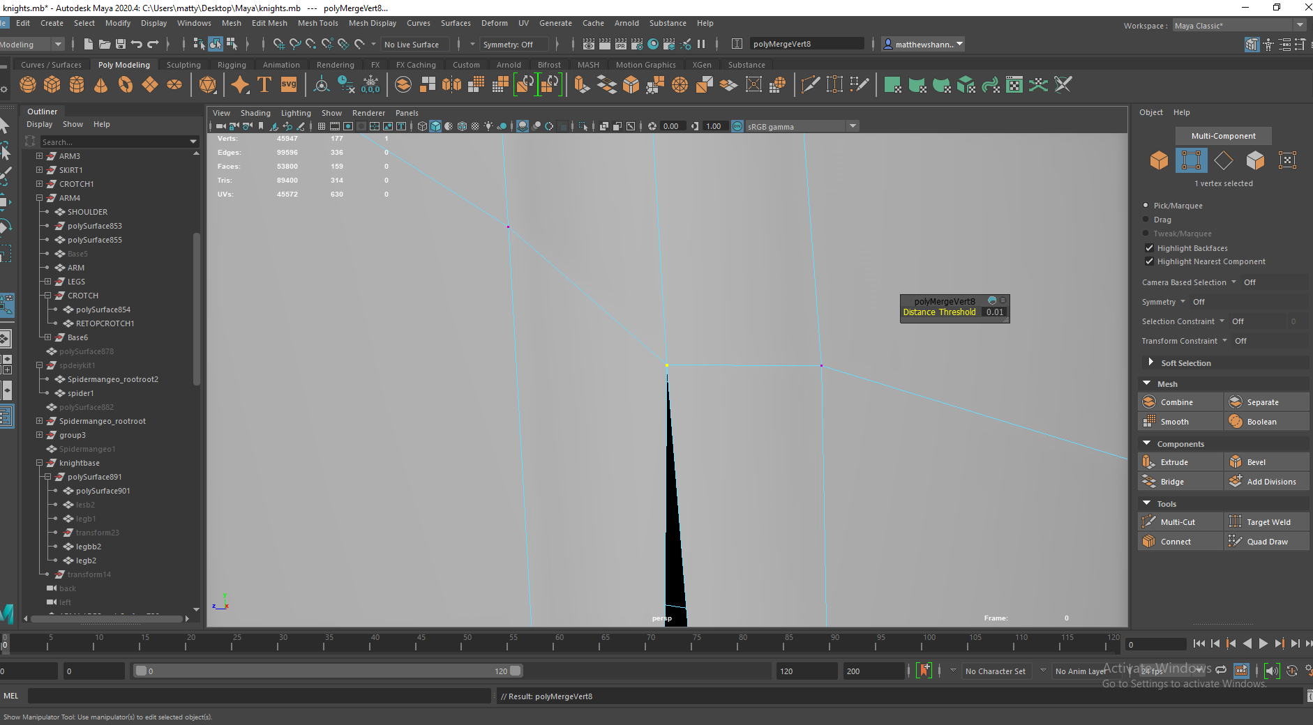
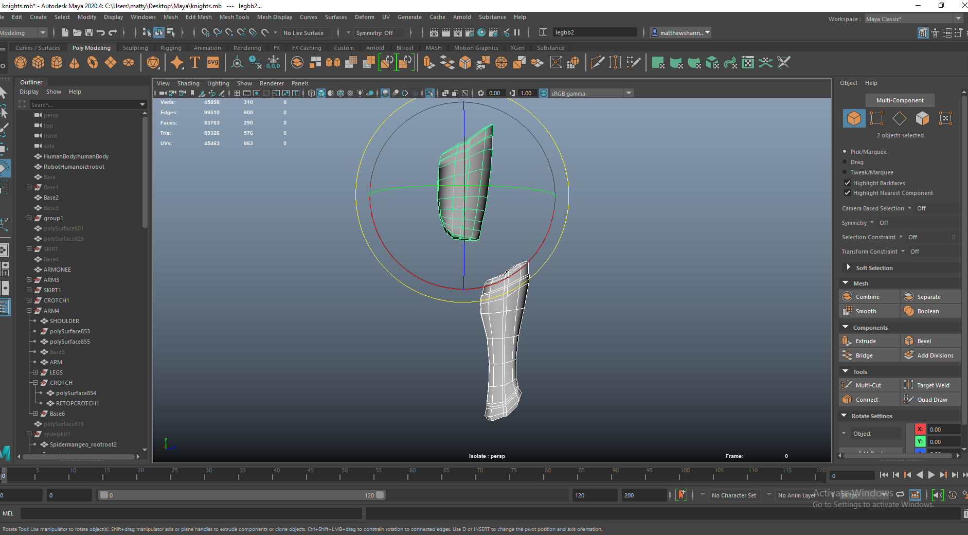
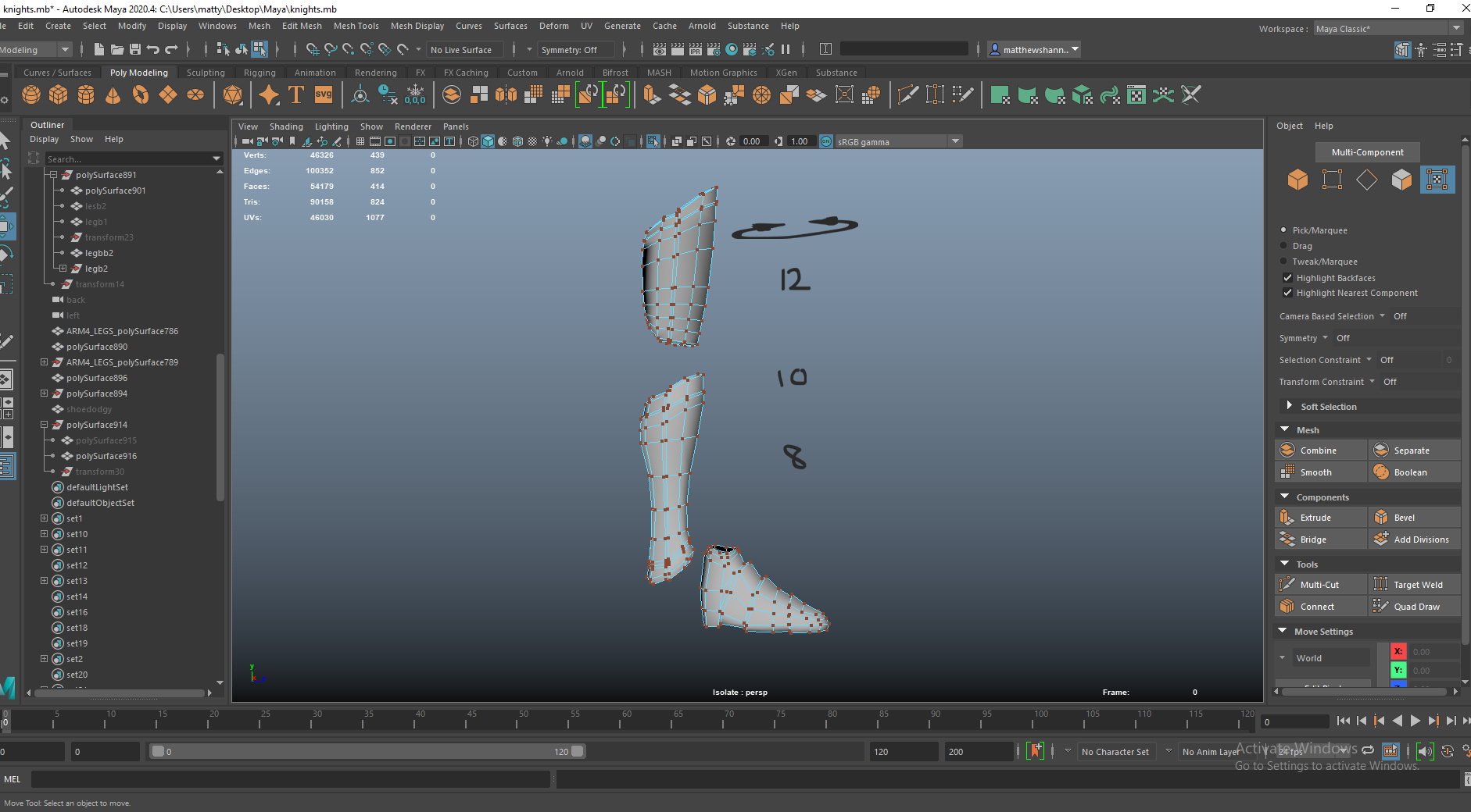
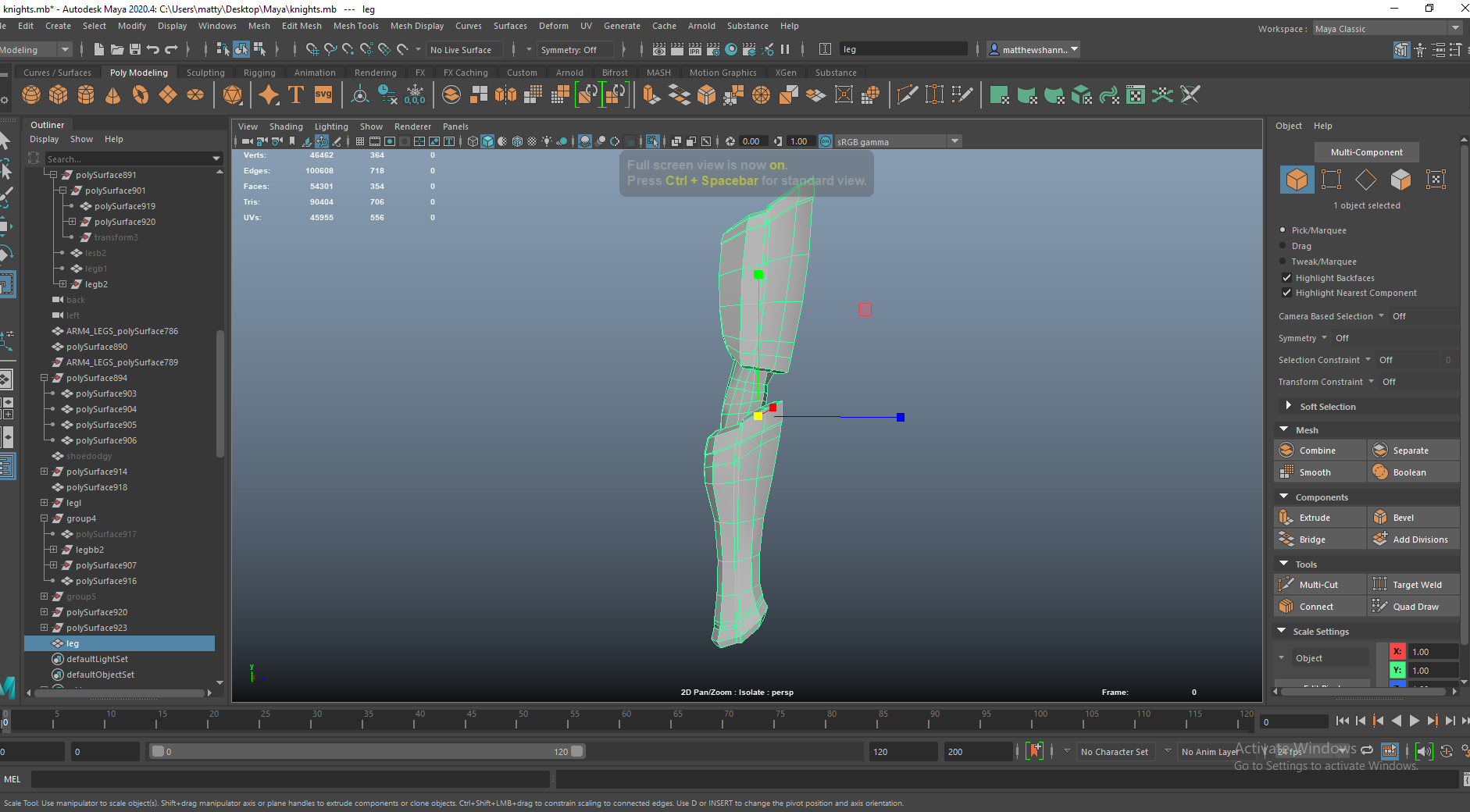
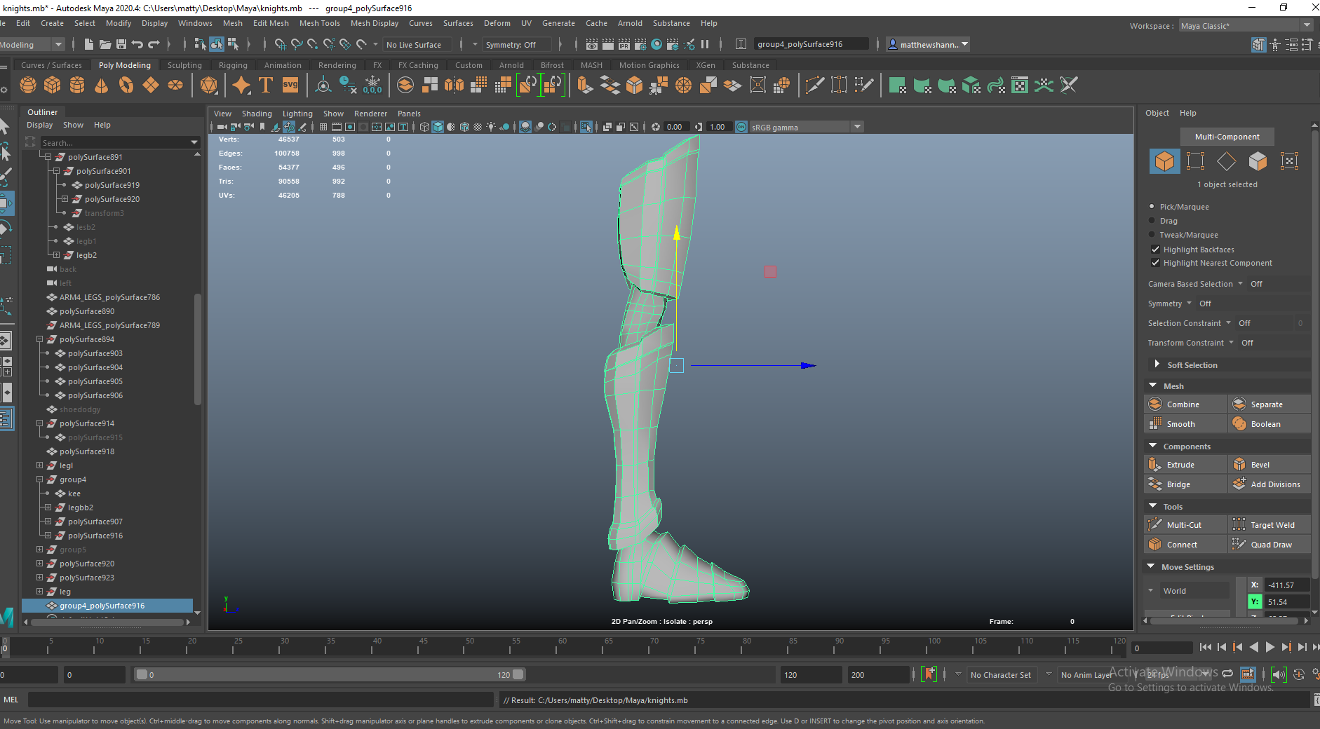
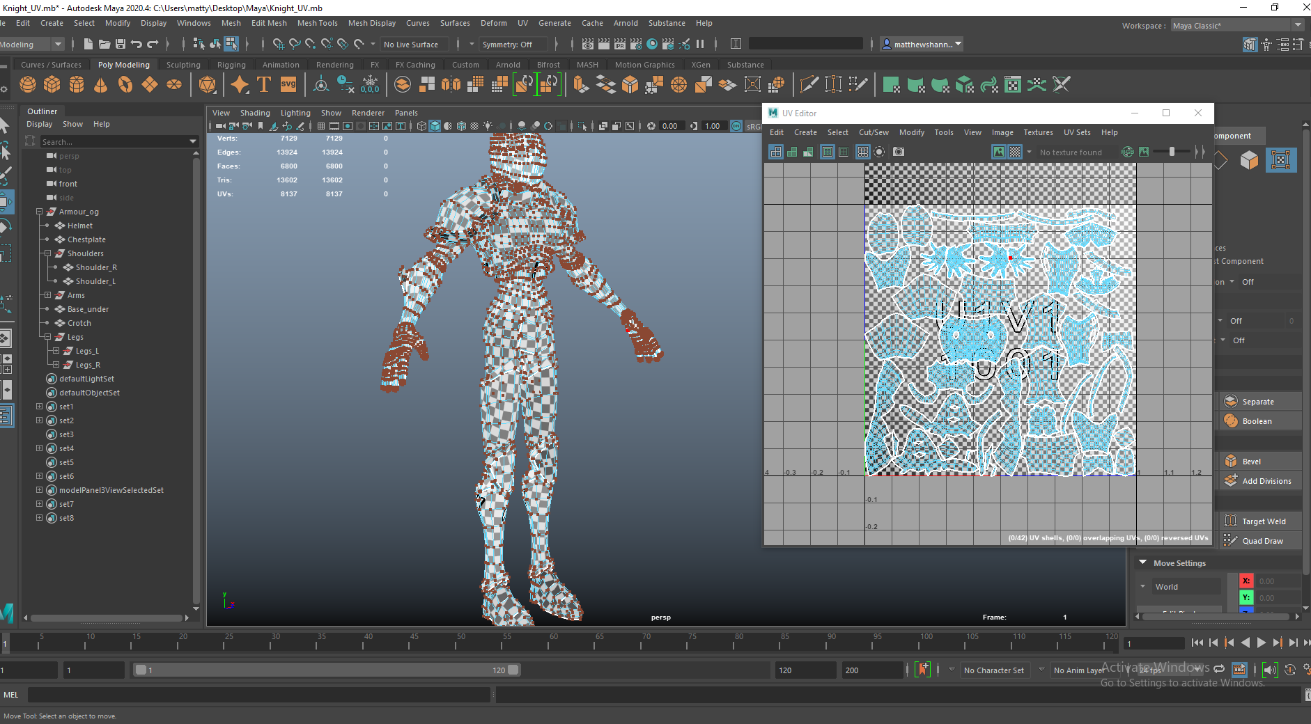
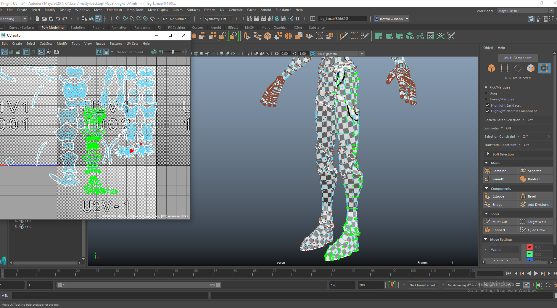
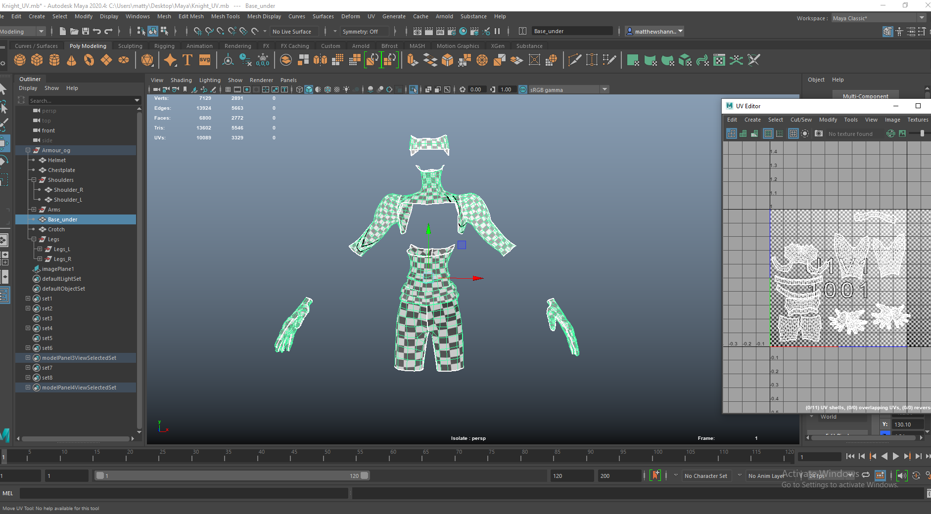
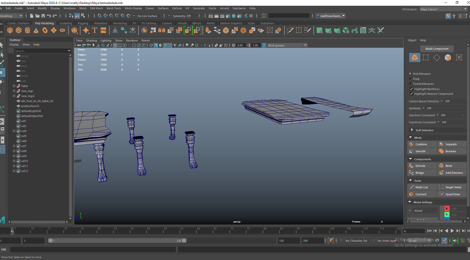
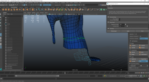
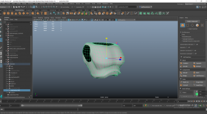
I modelled the leg armour pieces separately then connected the topology up afterwards. I built them using the quad draw tool in Maya over the sculpts legs, then adjusted these into the shapes I wanted. I really like how the leg armour came out and I think the topology was very clean. I used the bevel tool on an edge at the top and extruded this to add a rim to the armour, and some vertical edge loops to add chips in the armour. The top part had 12 subdivisions, the lower had 10 and the shoe had 8 around the circumference so there were so I had to connect these up by using some junctions and adding subdivisions on the shoe.


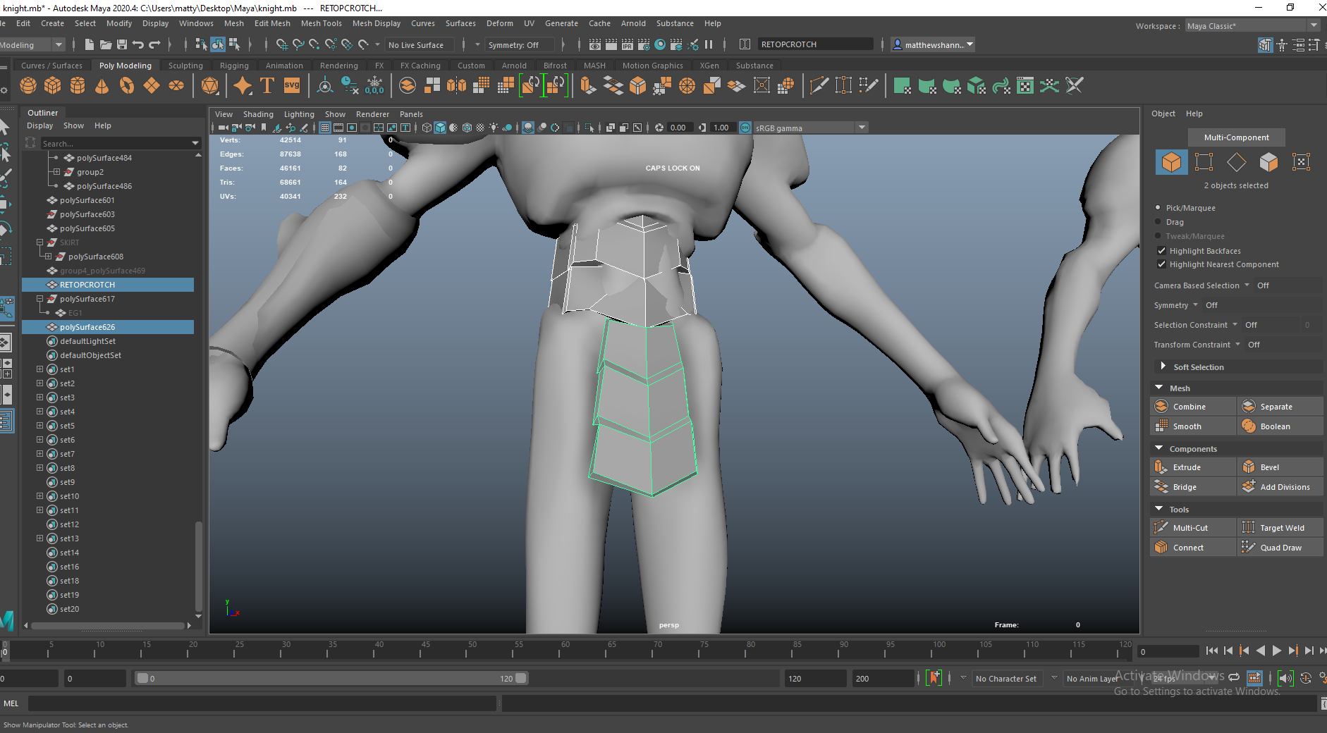
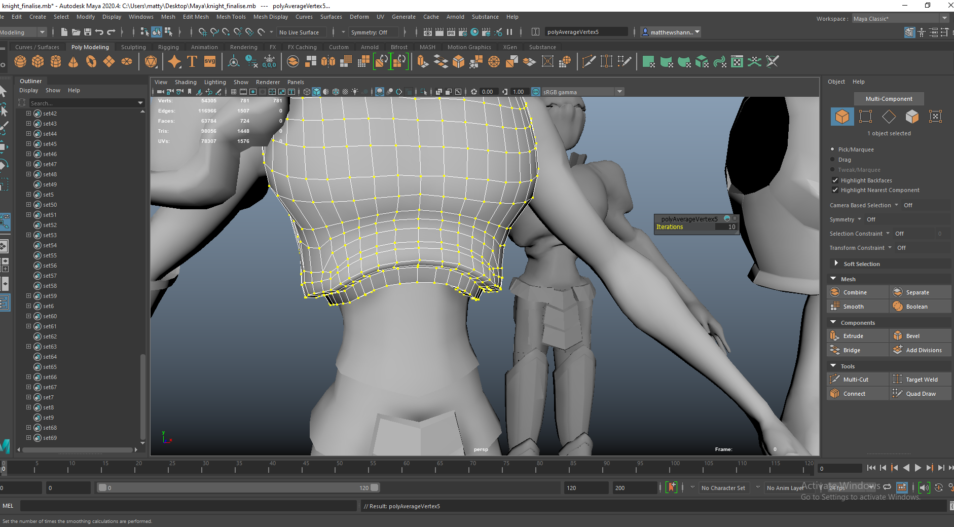
I built the shoulder pads from the sculpt and modelled these armour plates around the torso separately. I added this skirt thing at the crotch because it looked weird where the legs met the armour at the torso. I was a little unsure with what to actually do here but I think it came out alright and looks good by the end.

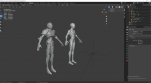


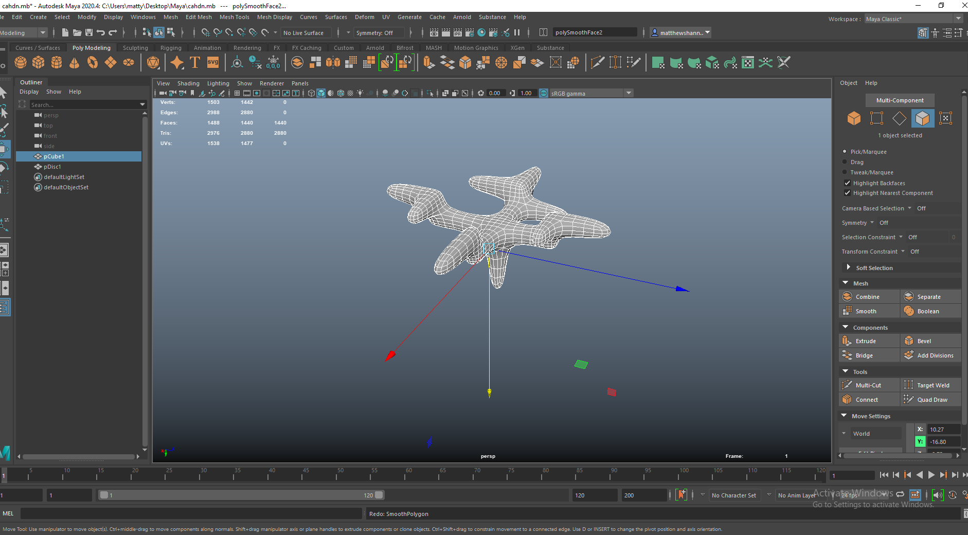
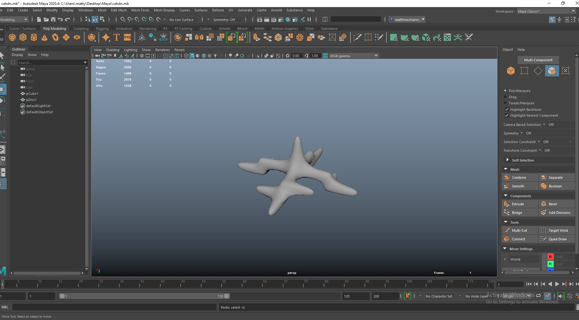
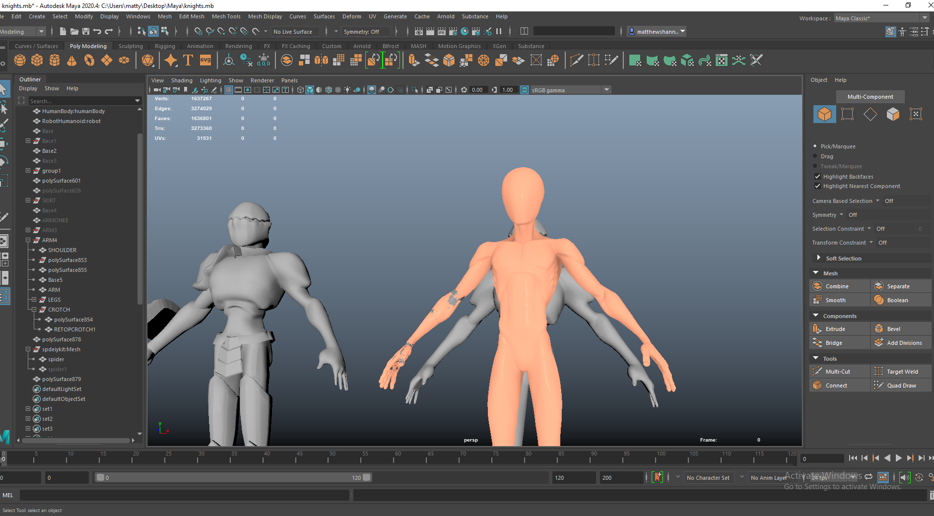
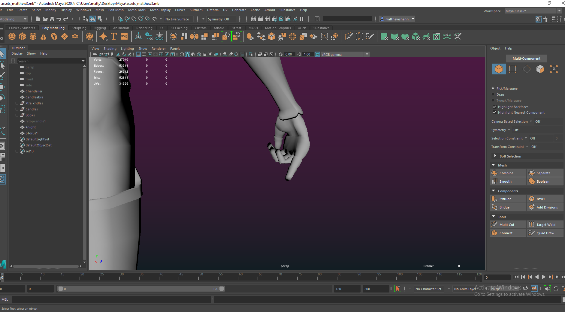
I took the knight back into blender and made some adjustments using the sculpt tools, without changing the level of detail in the topology. I then brought my retopologised spider-man in and simplified this down to place the armour over top and connect up all the pieces. I extracted the chest and used this to build up the chestplate. You can see I had a bunch of various knights in the scene at this point – I was still figuring out what looked best and would make a duplicate when I was making a big change.


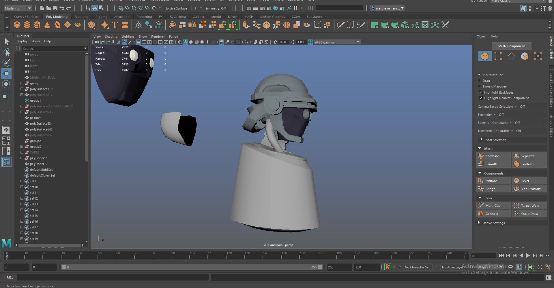
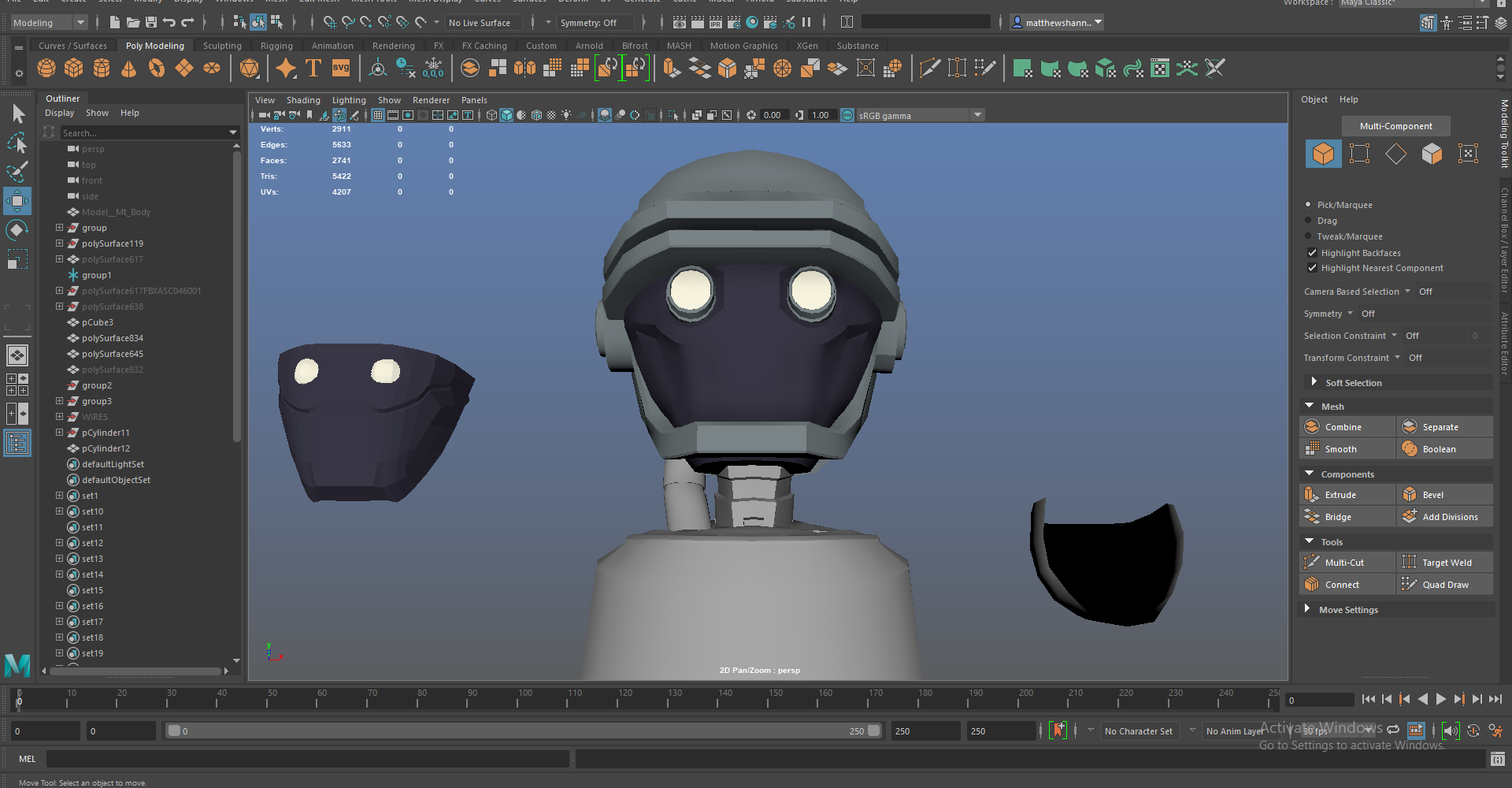
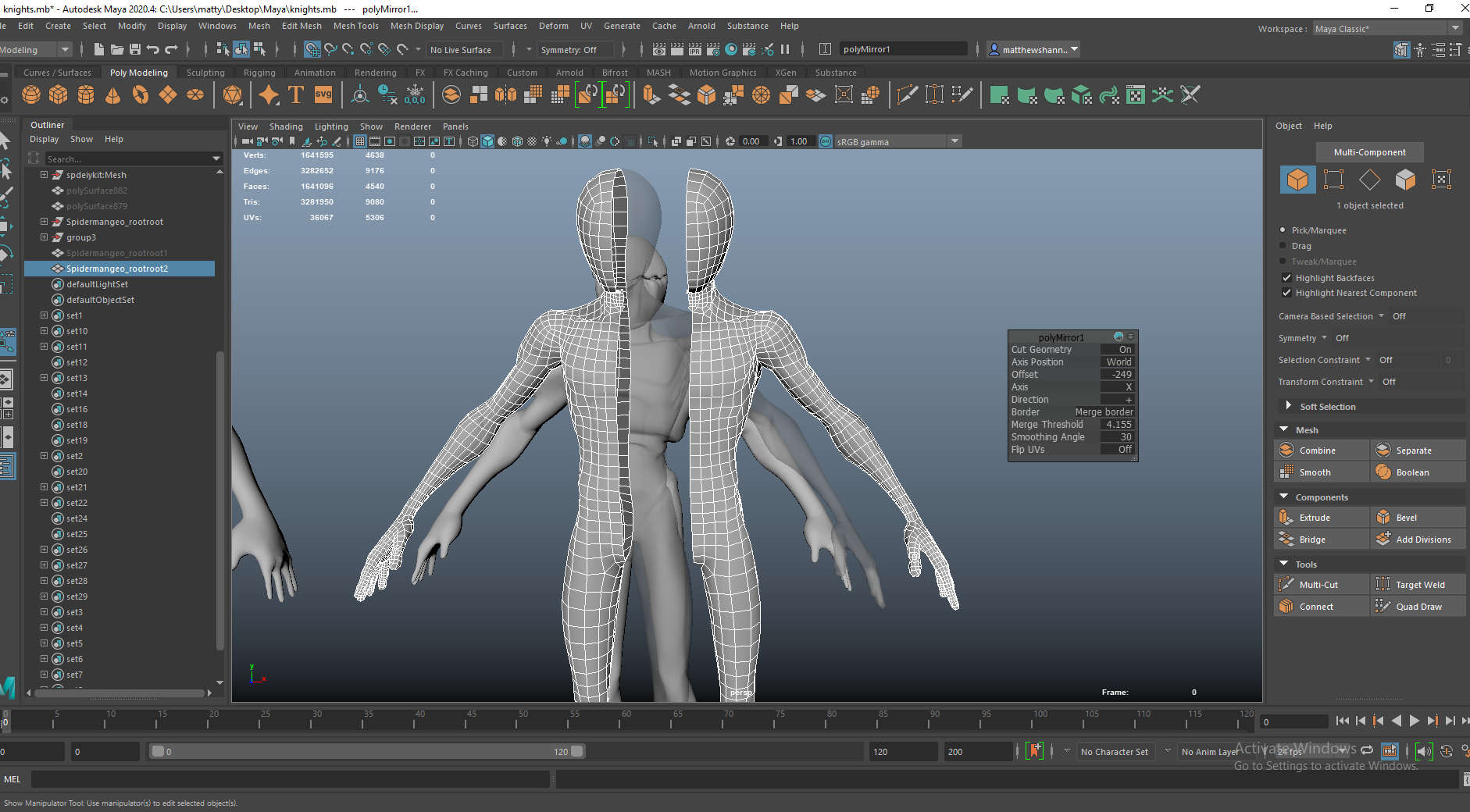
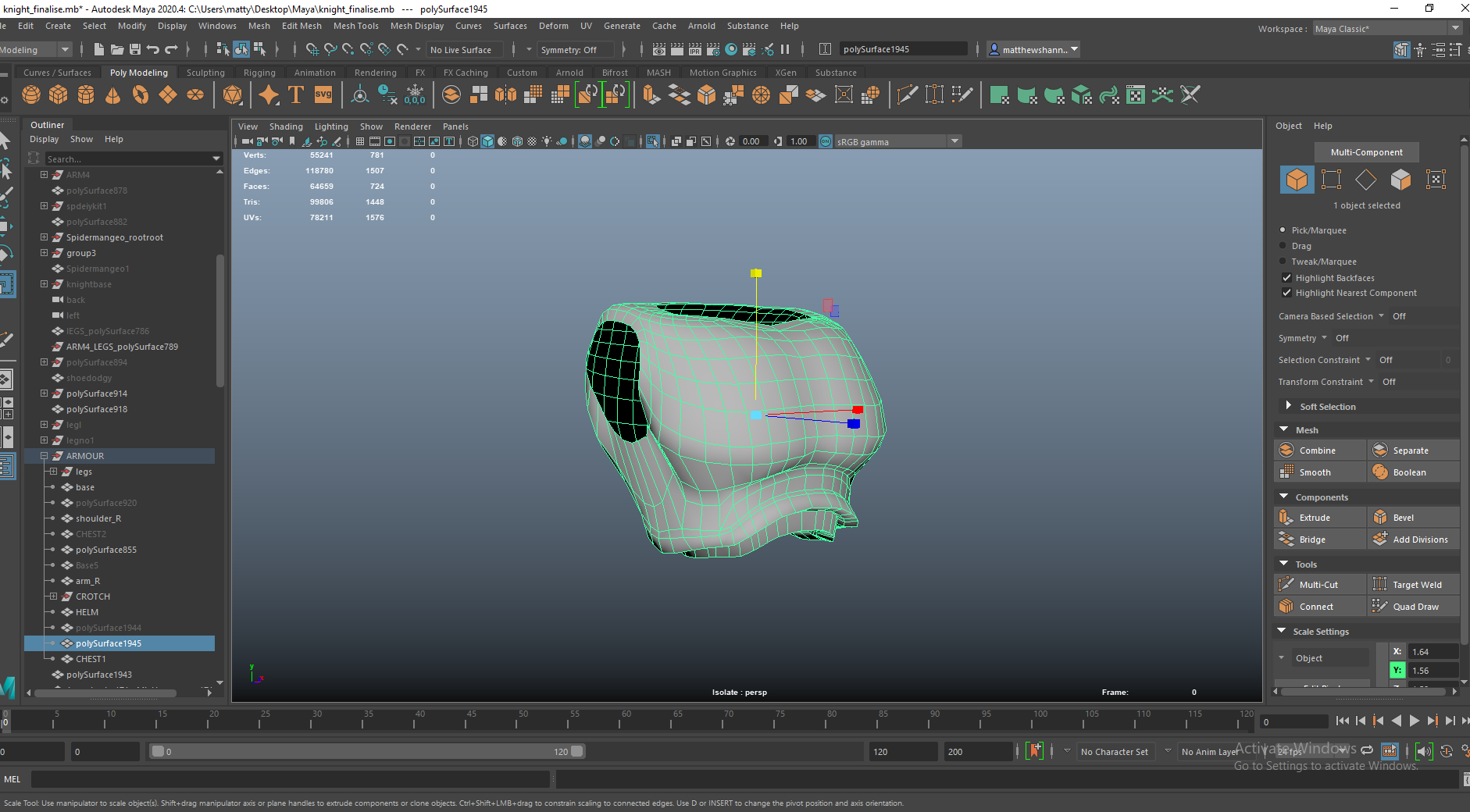
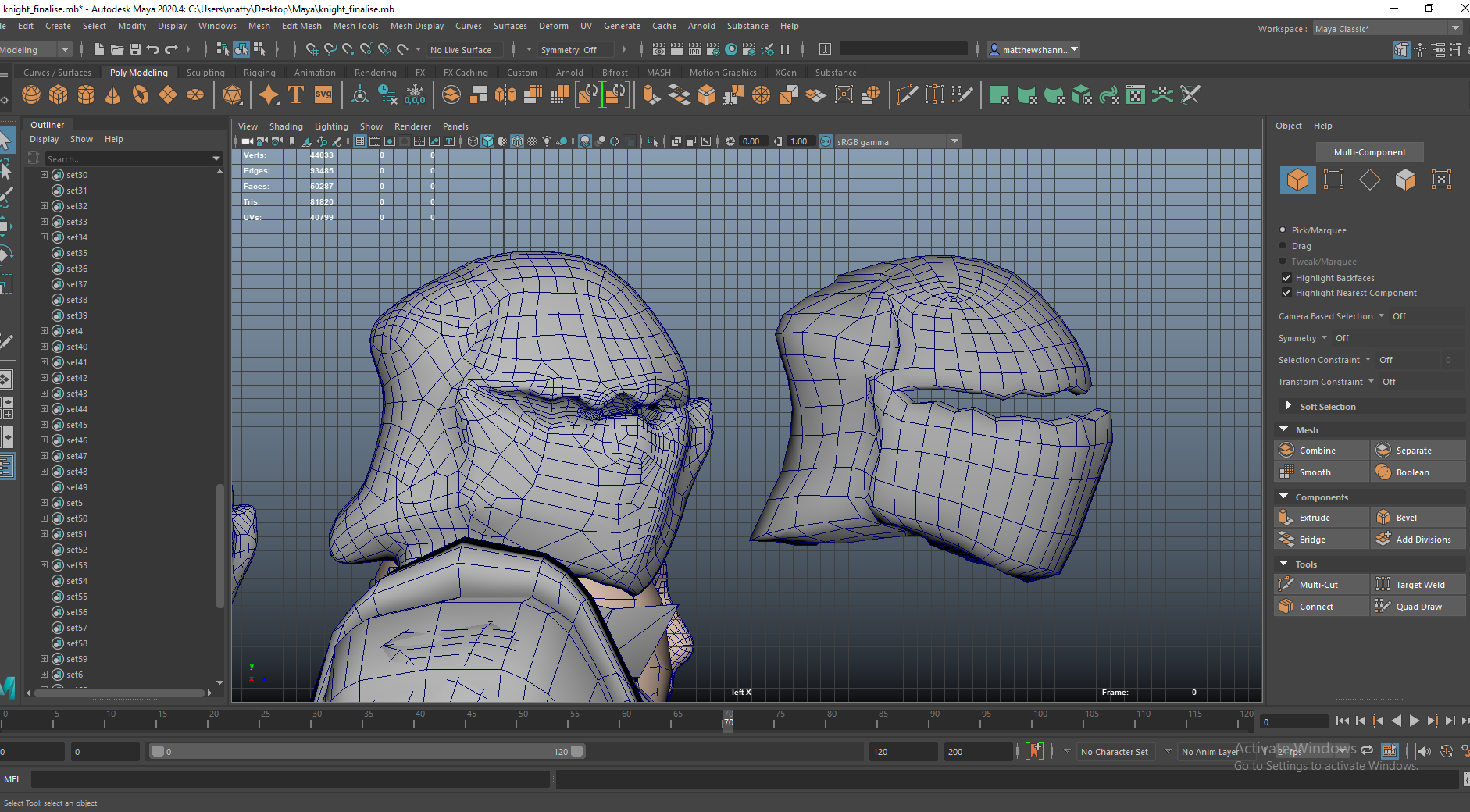
I like how the chestplate ended up, I think its pretty solid. Overall the pieces came together really well and I think the topology was all looking well. I made the helmet from the sculpt, retopologising then making some adjustments to this. I wasn’t using the sculpt to bake from since it wasn’t a finished sculpt just the basic shapes I was going for and something I could work from, so making changes like this was fine. I’m not sure if it would’ve been better to do the ‘jaw’, upper part and the back of the helmet separately and just combining the objects after but I was trying to keep most of the knight as one object except the shoulder pads. The last picture shows how the topology ended up looking, trying to keep it as efficient as possible.


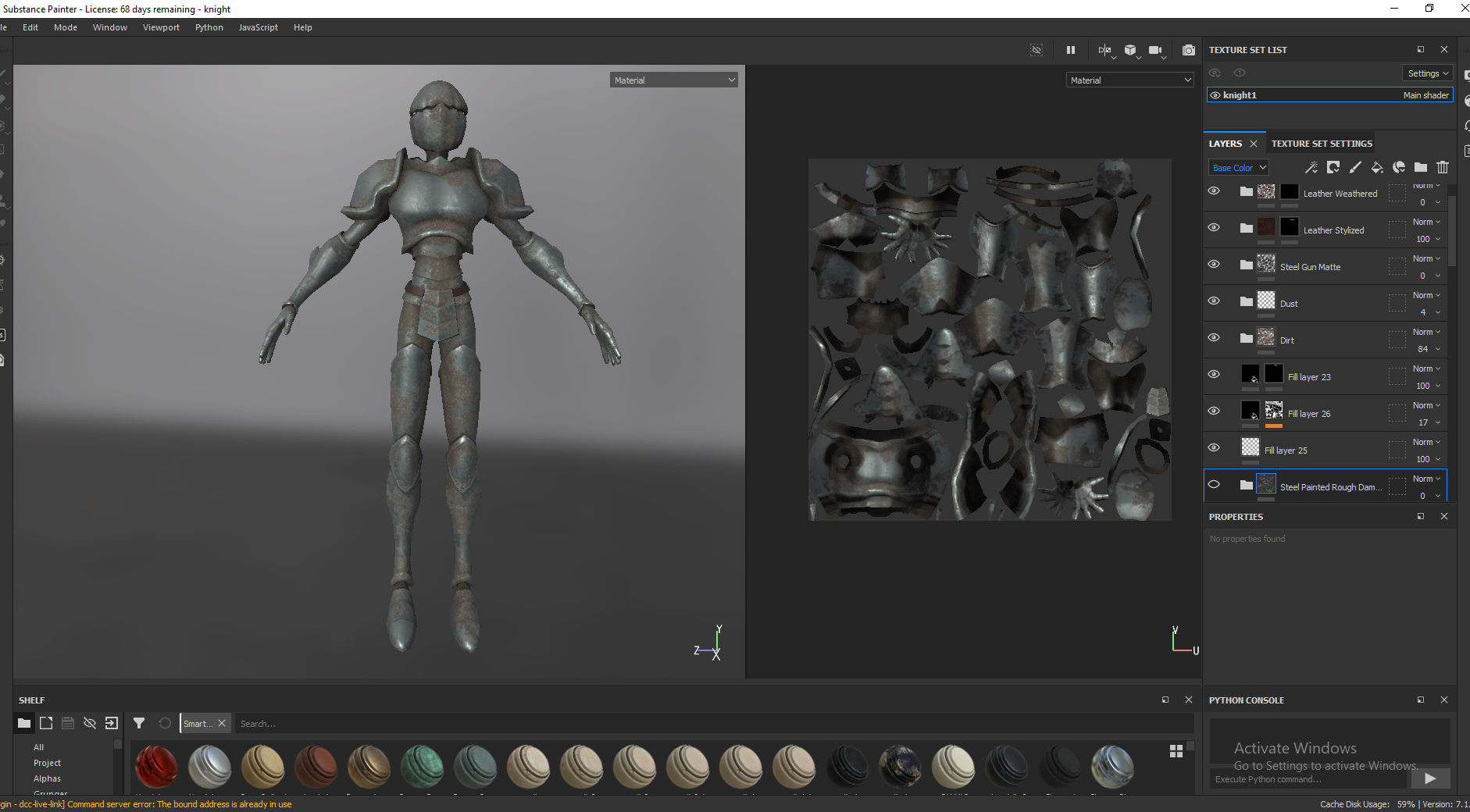
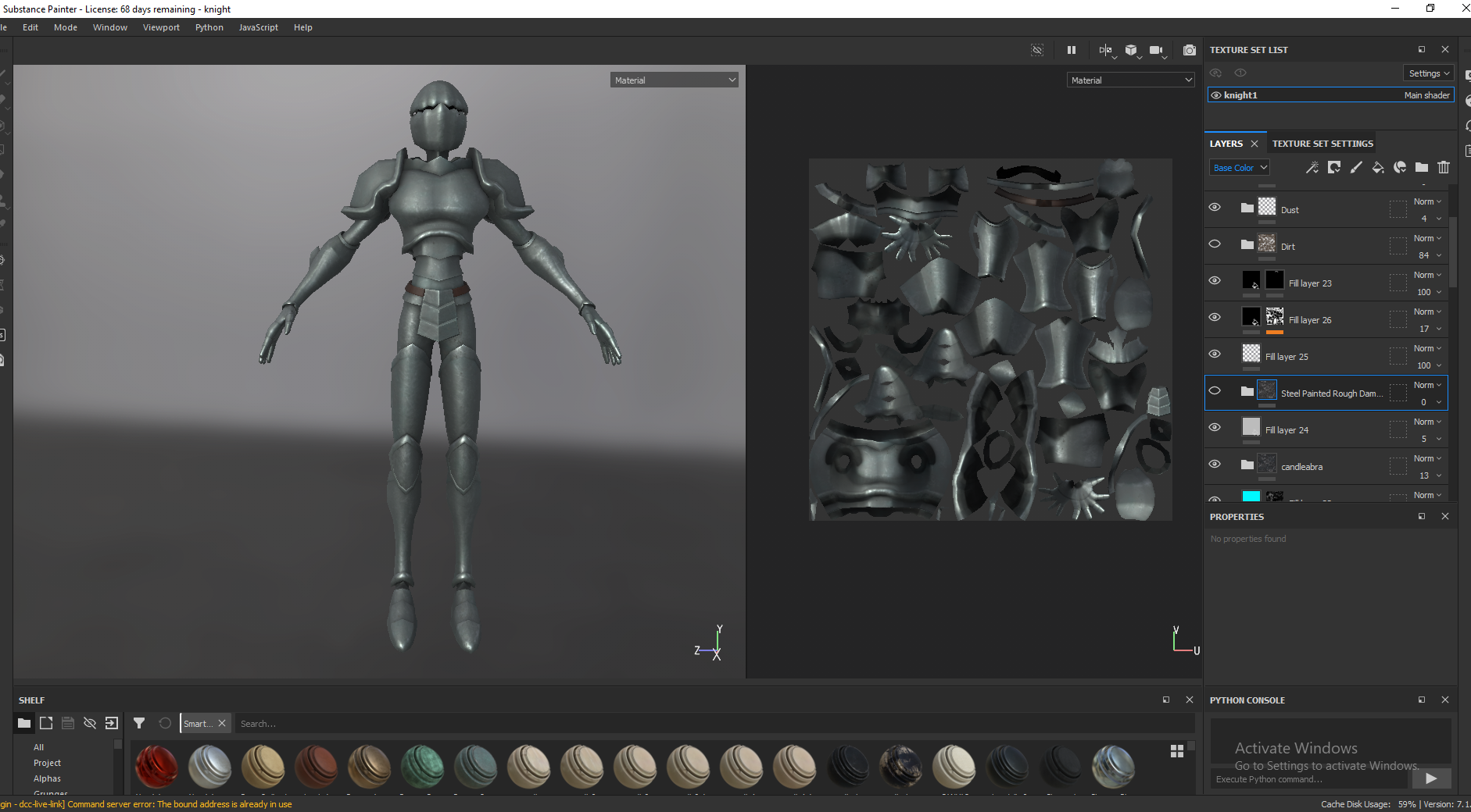
I used the smart material steel painted rough damaged as a base to work from and added various aspects from other materials that I liked. I imported the candelabra metal and used everything from that except colour at 50% opacity, to have some consistency among metal assets. I added some dust that was slightly discoloured, raised in height and rougher than the metal. For some variation I made the belt leather holding up the armour at the crotch, quite similar to the book’s leather. You can see I tried experimenting with a version covered in dirt but decided I preferred the cleaner version, the dirt was a bit too much. Following feedback from the presentations, I made the highlights of the armour, like at the shoulder pads and knee pads, a slightly lighter and less rough metal. I made the faces under the mask pure black to simulate very dark shadows and added some extra overall ambient occlusion.


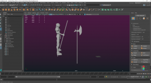


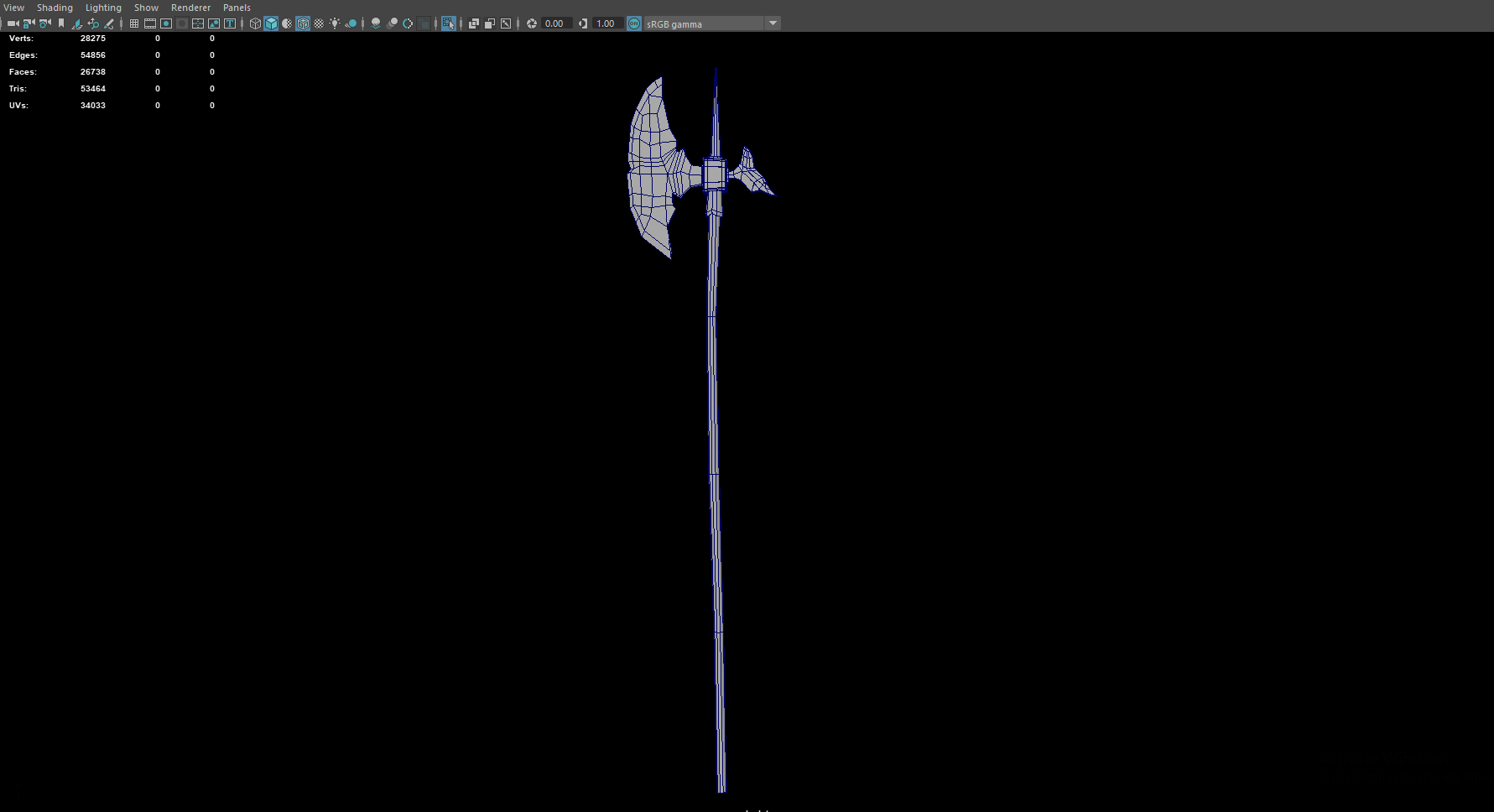
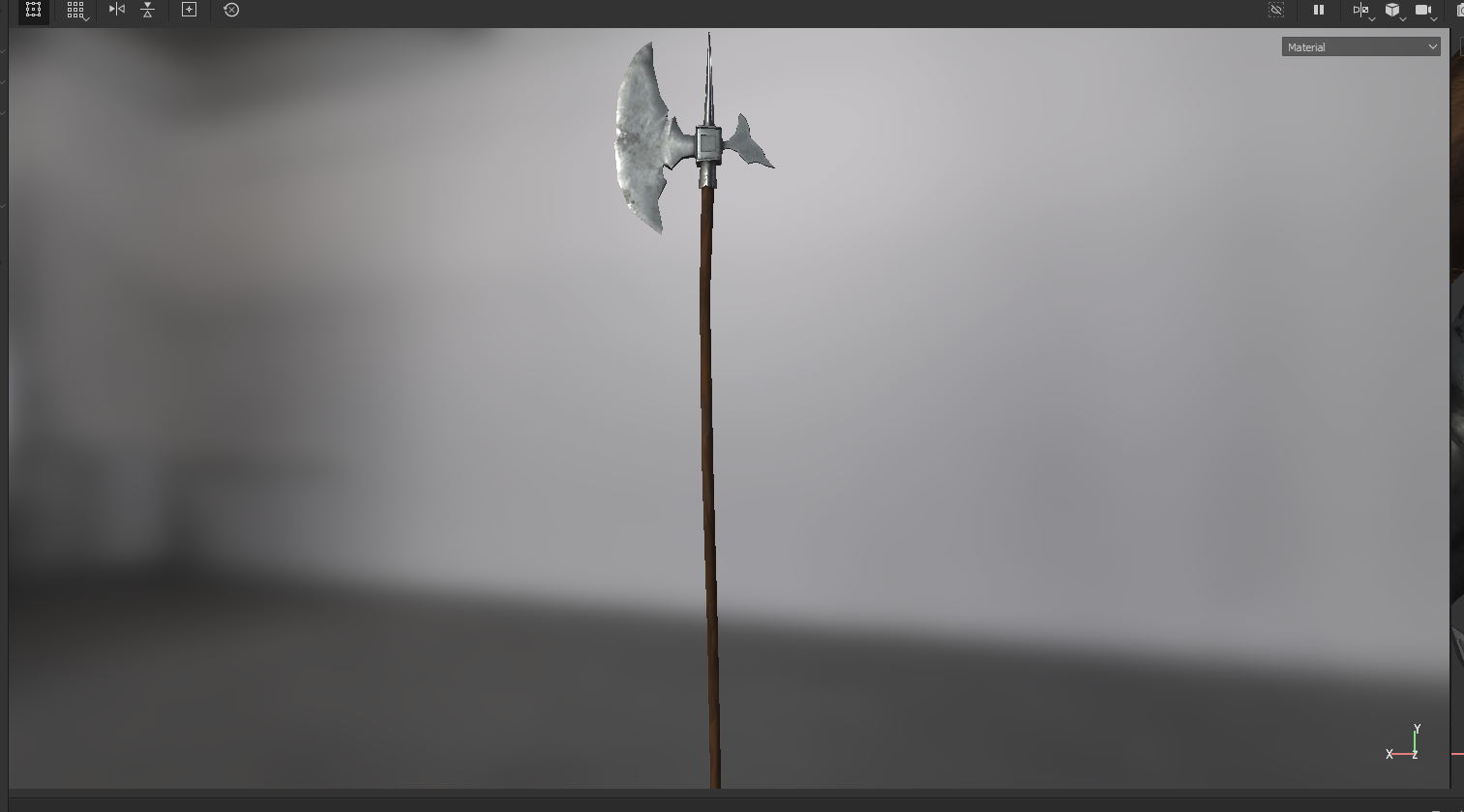
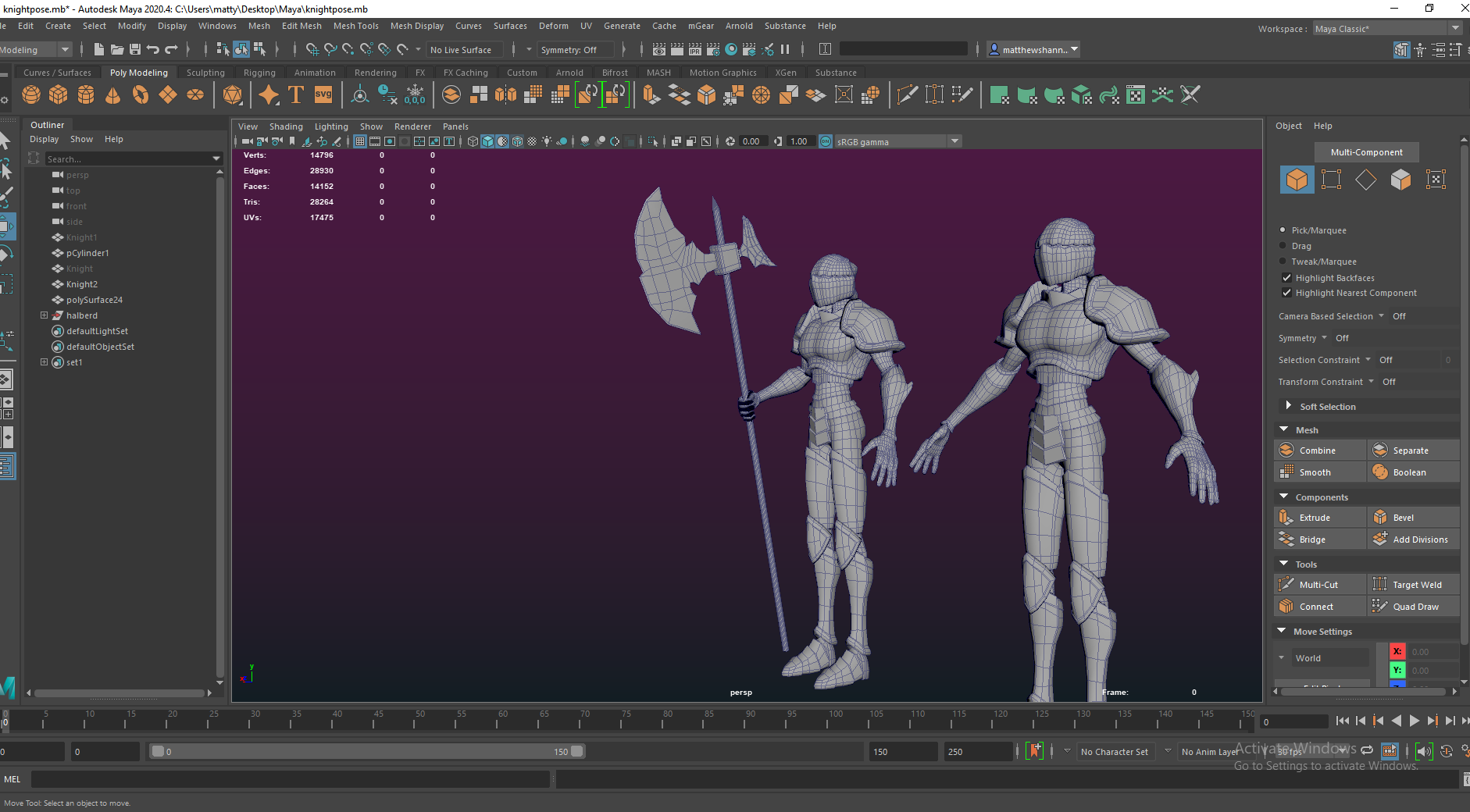
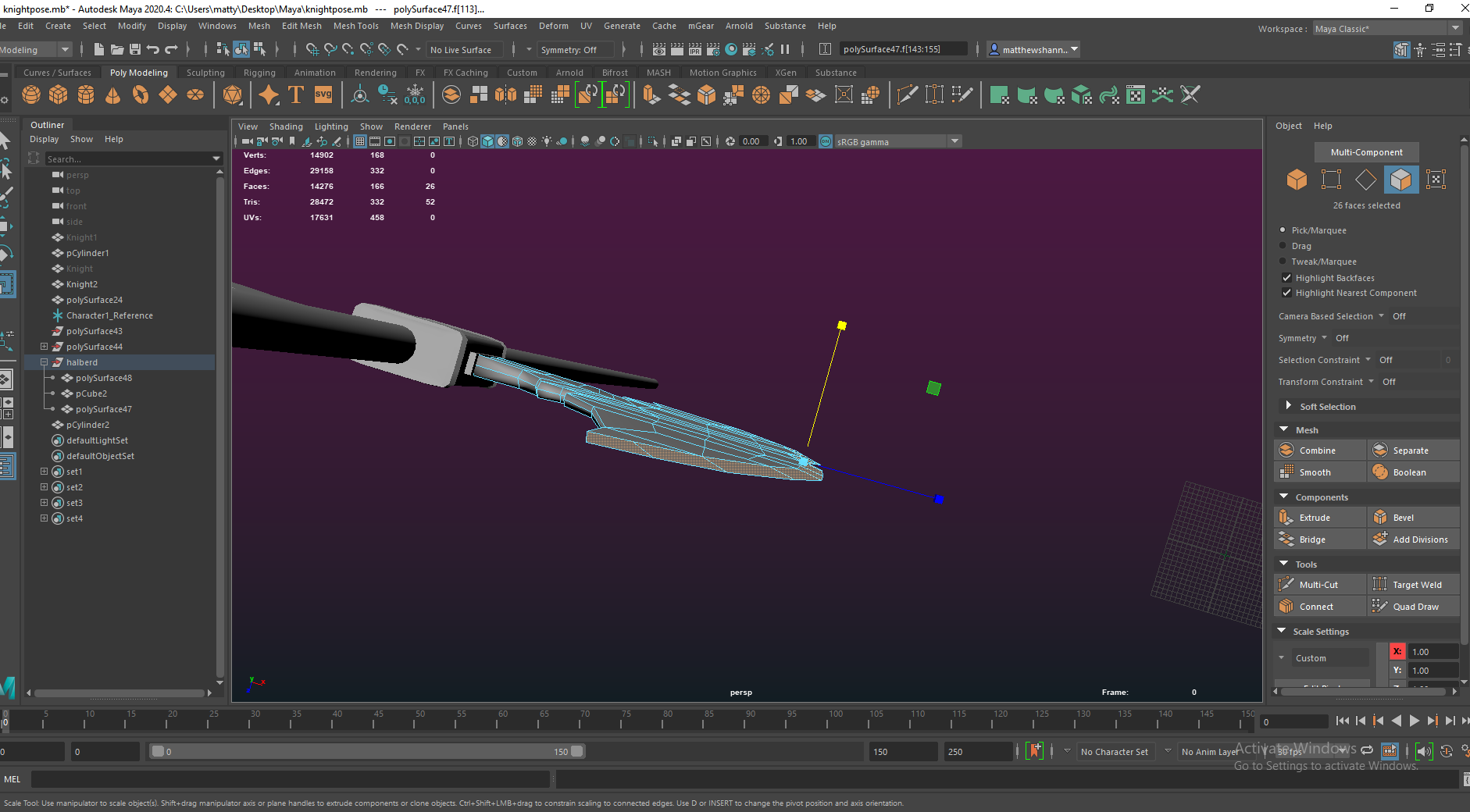
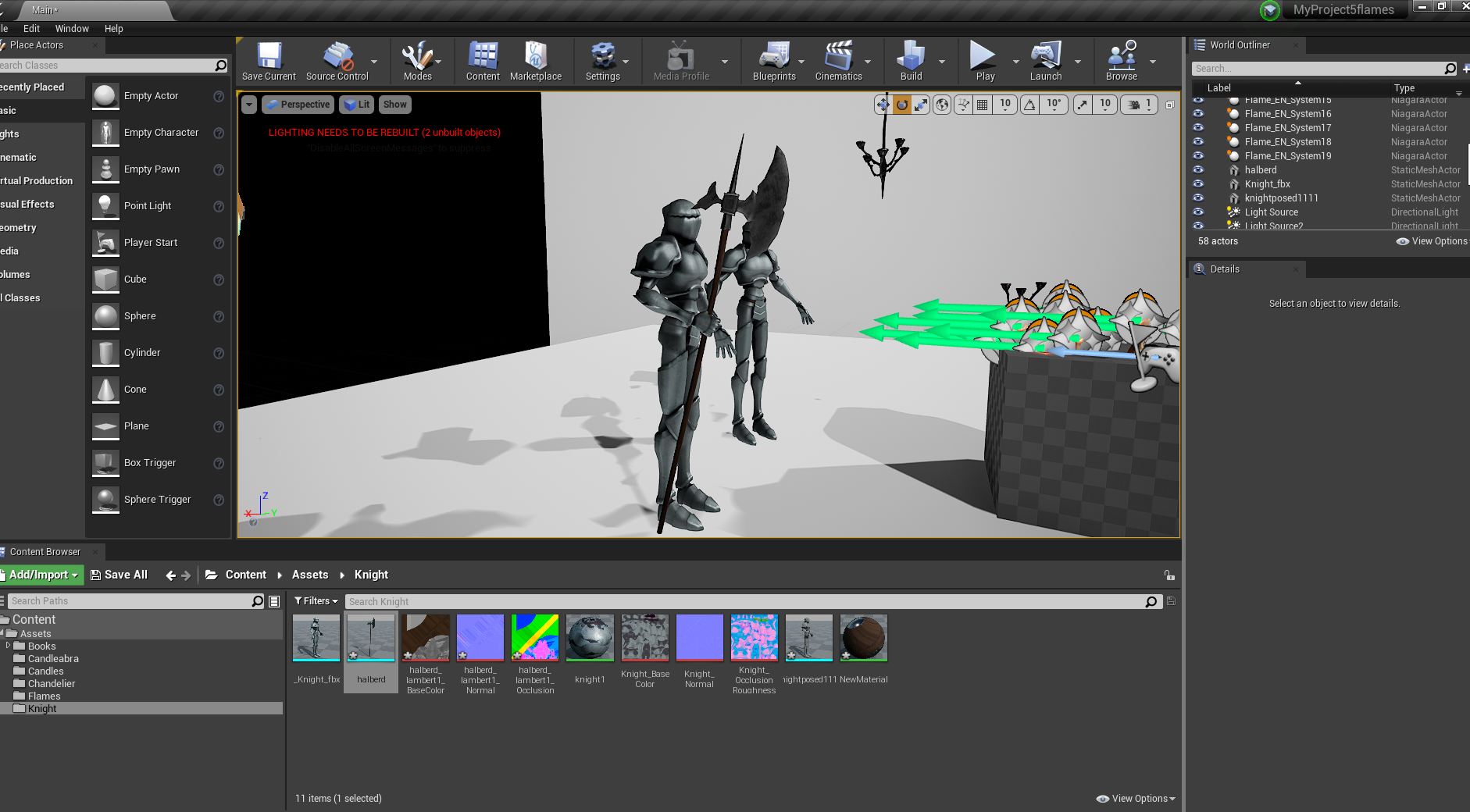
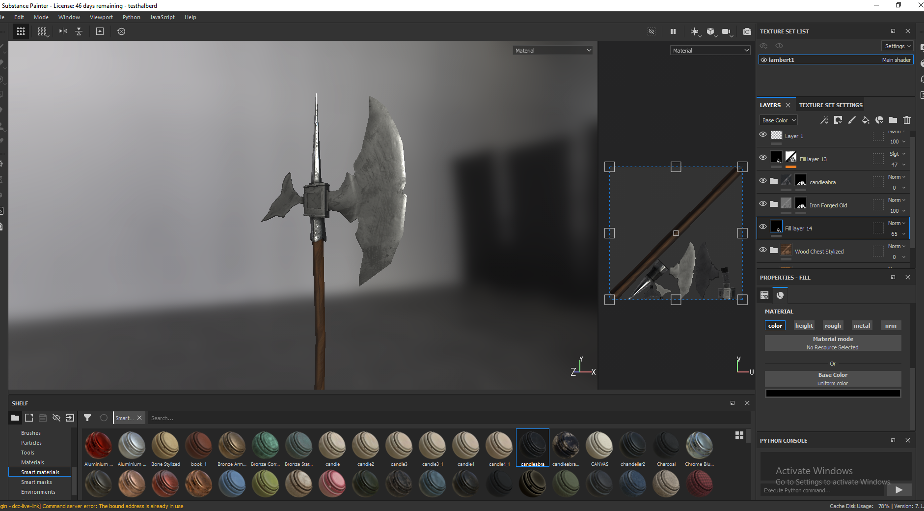
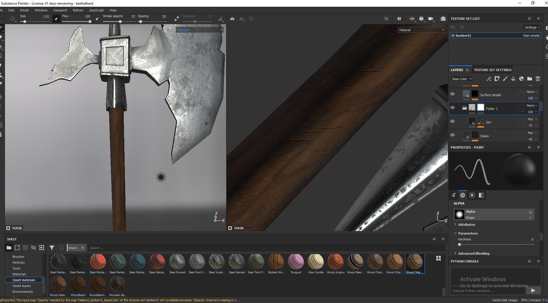
I also posed the knight since the lecturer’s didn’t like the A-pose he was in. so as they suggested I posed him to be holding a weapon, and modelled a simple halberd for him to hold. I posed him roughly using masks in blender sculpt mode, then cleaned this up manually – selecting edge loops in Maya and adjusting them. To make the blade I modelled a plane into the shape I wanted in orthographic view then I extruded this to make it 3D. The blades and the part where the metal and wood meet are separate objects just combined. I think the halberd turned out well, I started by making it way too big trying to make it fit in and be pretty stylised but eventually I figured out proportions I was happy with.


I like how the textures ended up, the wood had nice colour variations and some cracks and scratches for added detail. The metal is a combination of the smart material iron forged old and a smart material of the knights armour, as well as the usual masks and procedurals I use for adding variation, baking from the lowpoly mesh actually provided some cool detail I liked at the centre of the metal part.
Extra bits


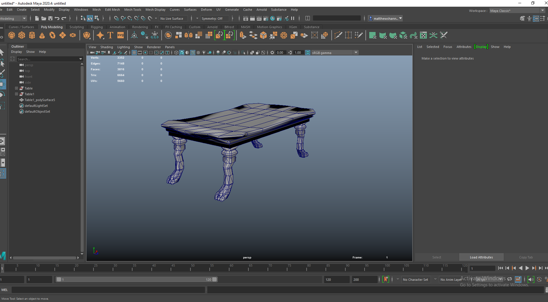
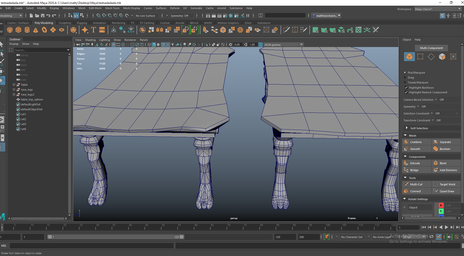
Alisa said she was having some issues with her table’s UVs so I checked out her model and it had a bunch of triangles and a few Ngons, so the topology was pretty messy to work with for doing UVs – this might also cause some issues in UE4 with lighting. I basically just did some retopology for her and show her how she could set up the UVs. It was simple enough just took a little figuring out with the paws of the table legs.
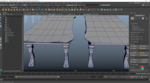

Here you can see the differences in topology a bit better, I managed to reduce the polycount and keep the silhouettes the same so its a little more efficient and I got rid of any triangles and ngons it had, as well as send some Uvs she could use if she wanted. I kept the legs and top separate in case she had adjustments to make.


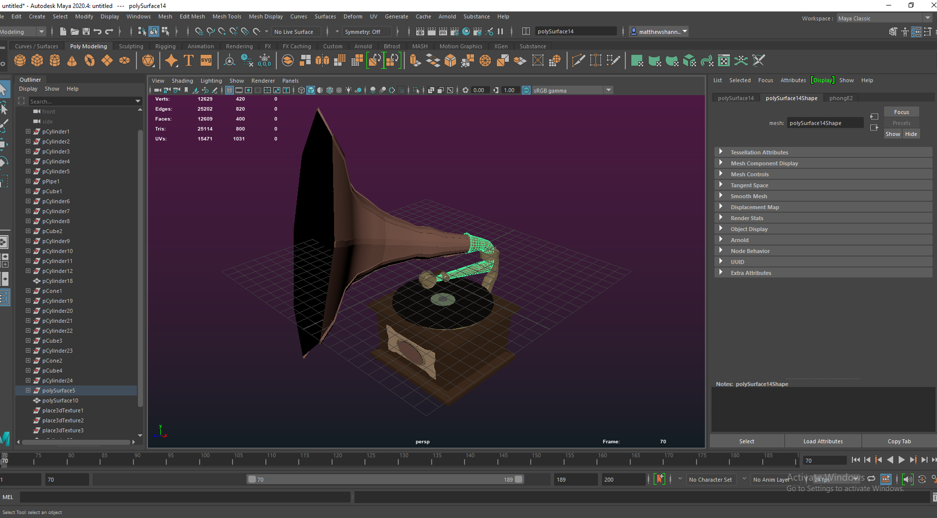
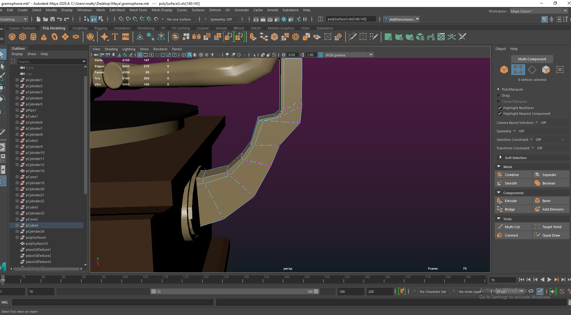
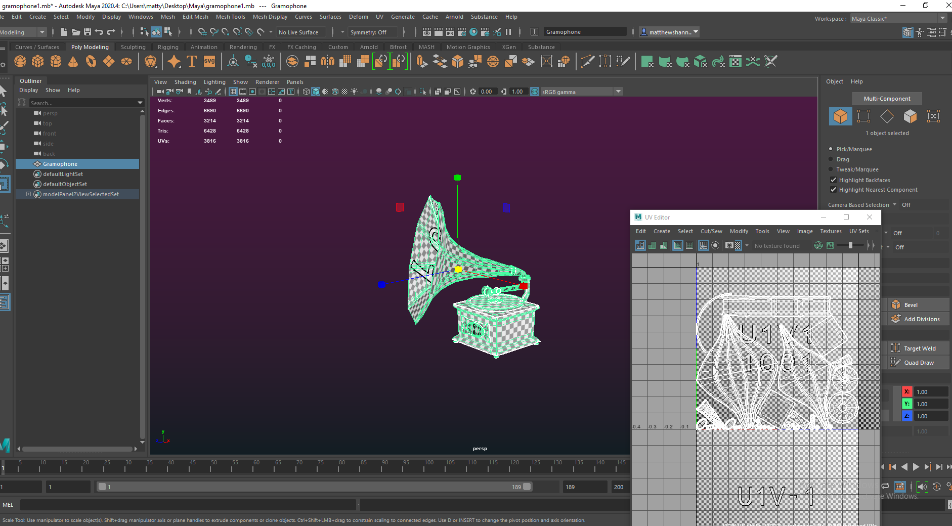
I helped Caithlin out with her gramophone since she was new to 3D and didn’t get the Uvs and topology part too much. Again I just cleaned up some loose vertices, Ngons and triangles. I also reduced the detail on some of the smaller parts and deleted all the unseen faces to make it a bit more efficient and give some more resolution to work with. I set up these UV’s and did a little texture test showing Dayna how I set up the masks to separate the materials. since she normally likes to separate materials with different Uv tiles. I sent it over to Dayna to texture while Caithlin textured her other props, and I got to work on the Piano.
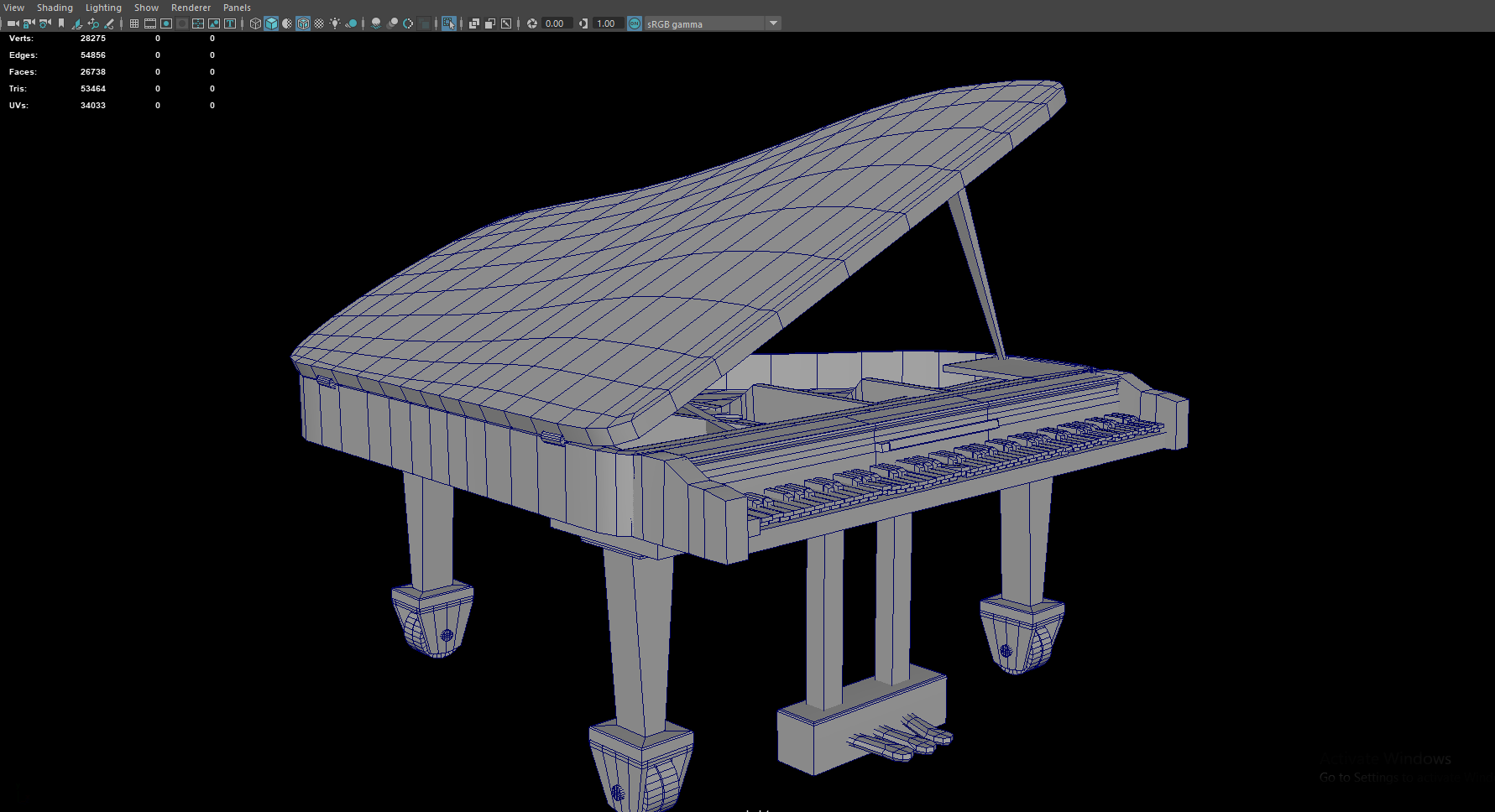
Piano


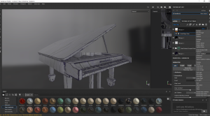


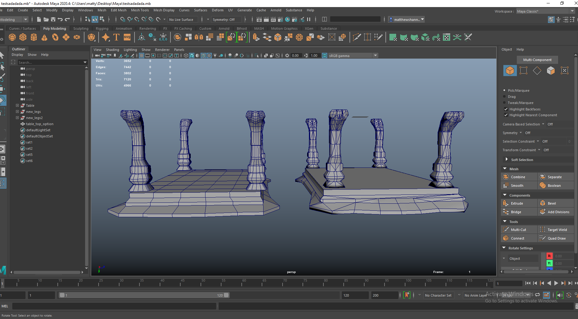
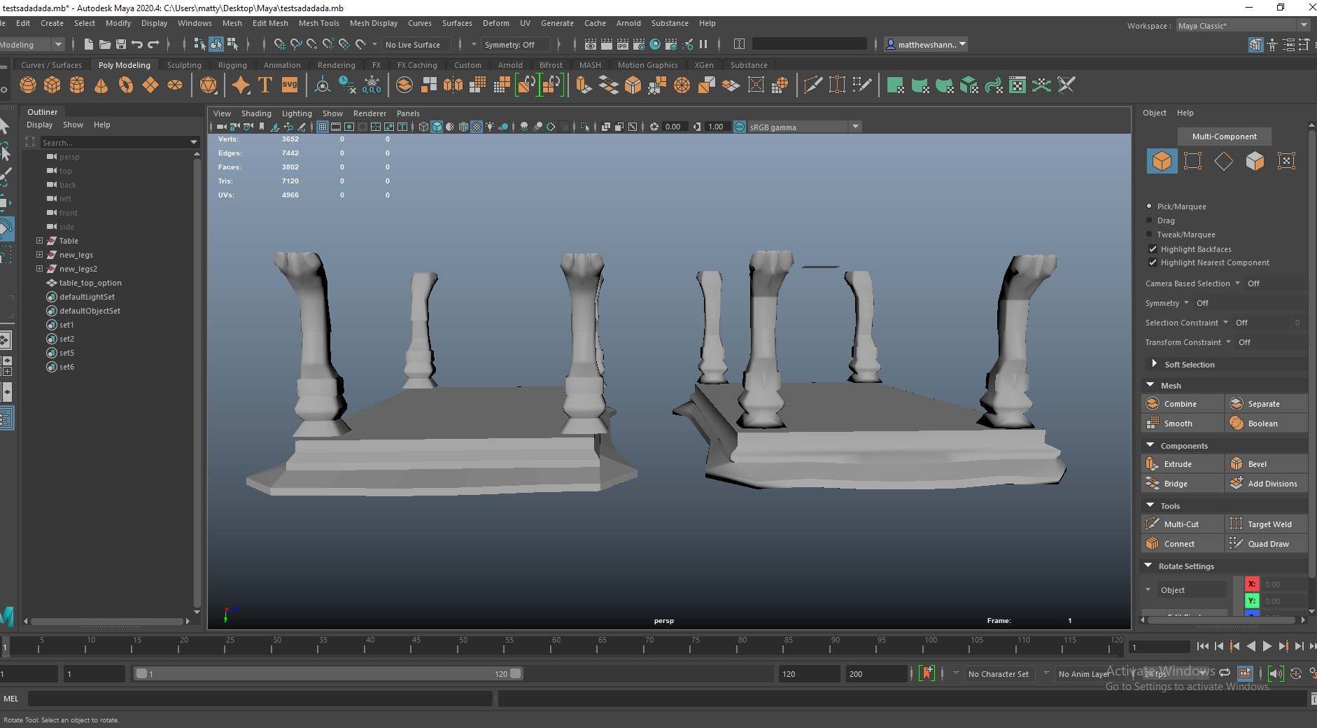
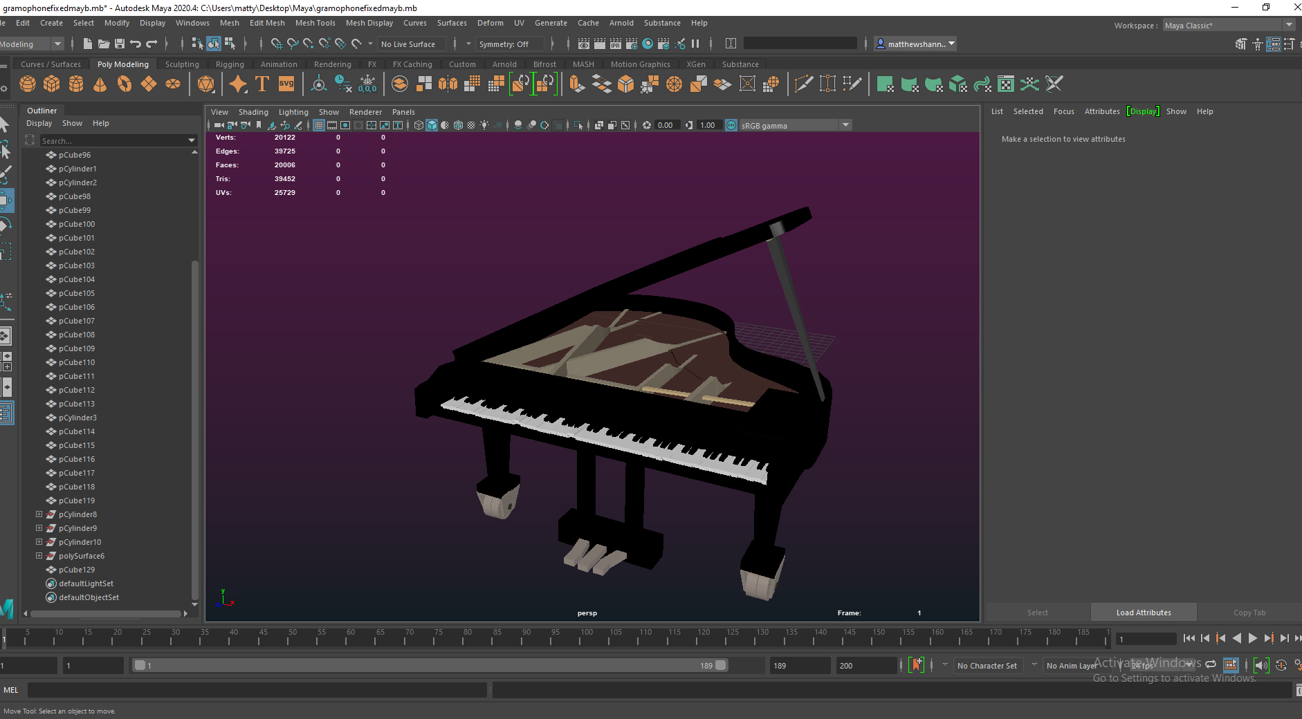
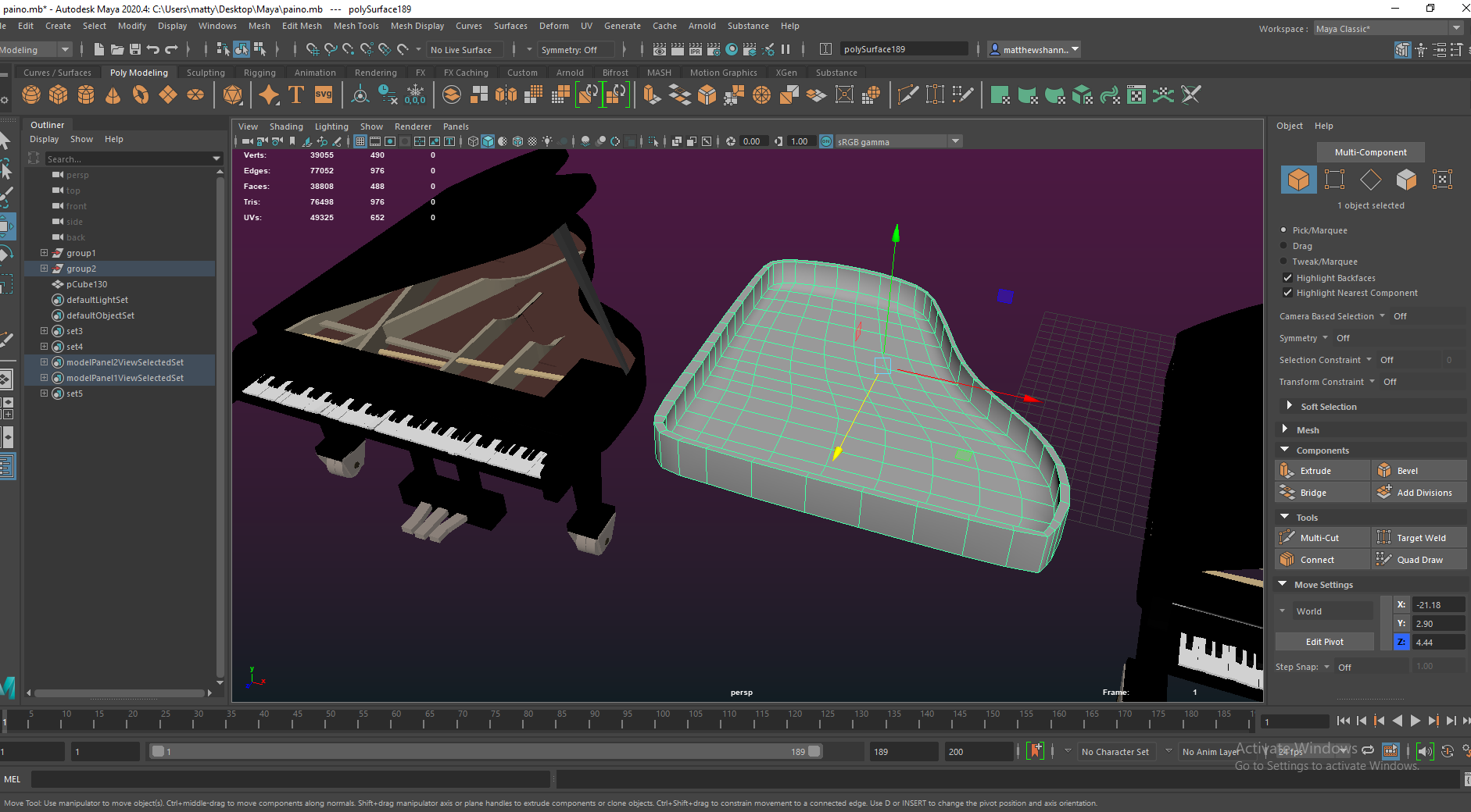
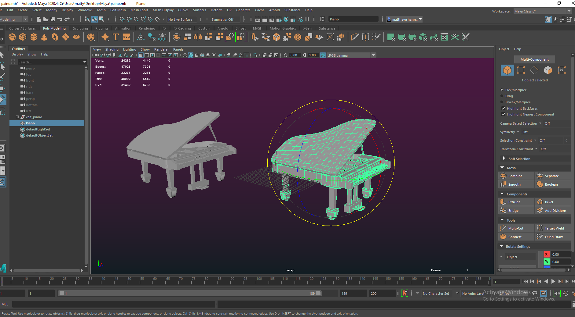
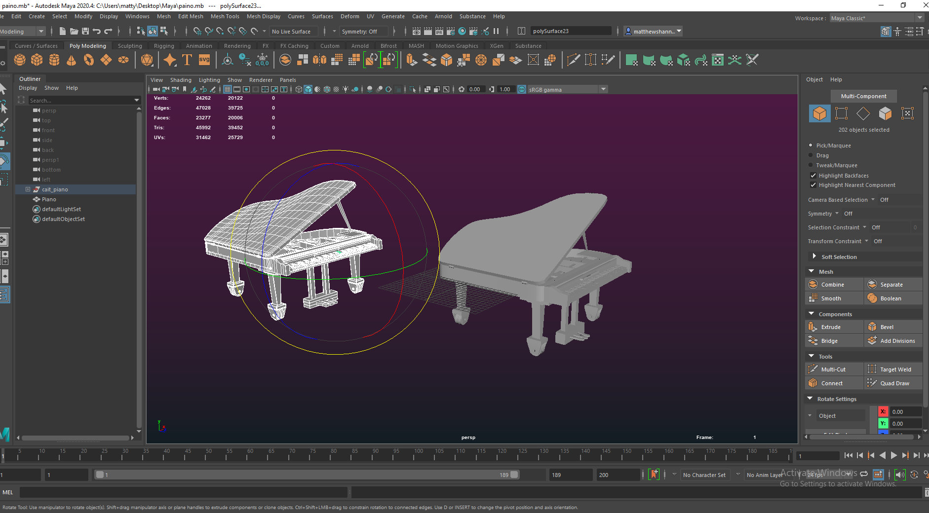
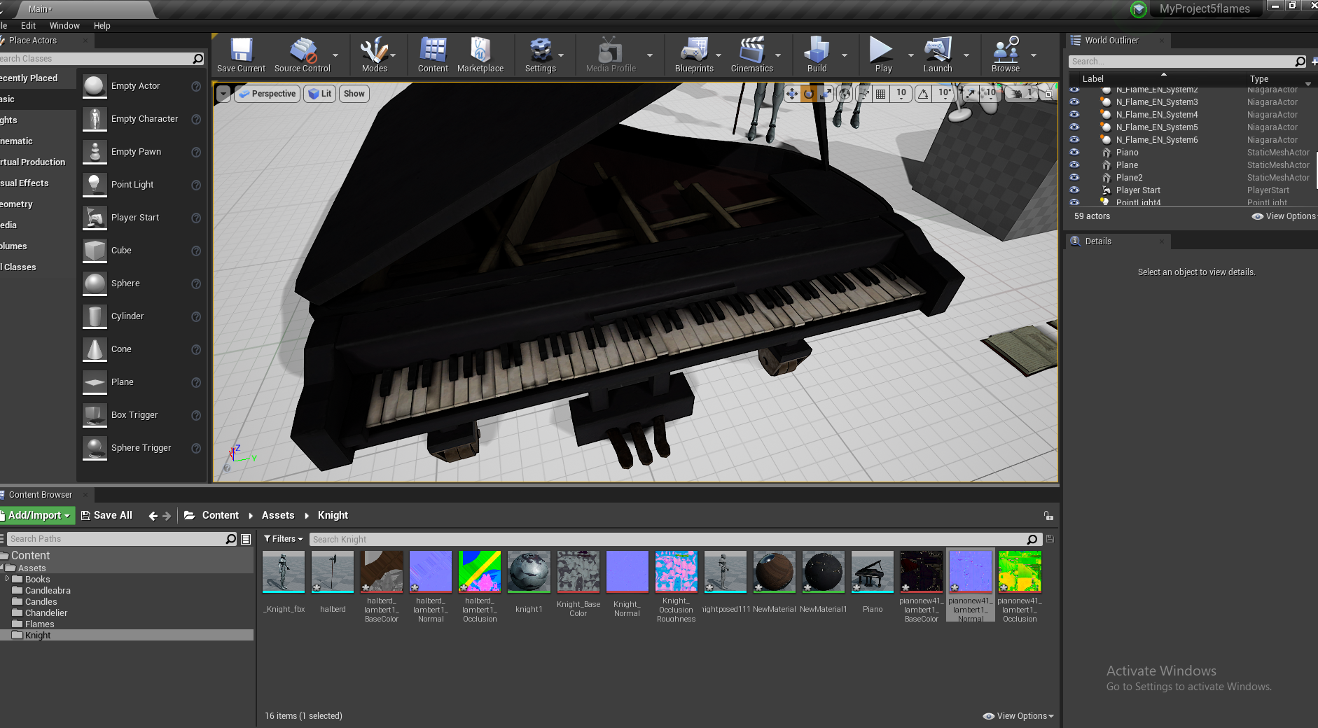
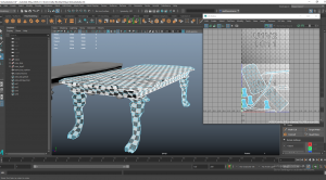
I added this into a separate section because it took a lot more work and changes, almost completely remodelling it. Caithlin worked on the piano early on and sent us some images of it rendered and it looked good, but then we realised at the end it wasn’t uploaded anywhere, and when we looked at it – it hadn’t been textured and had a lot of topology issues.
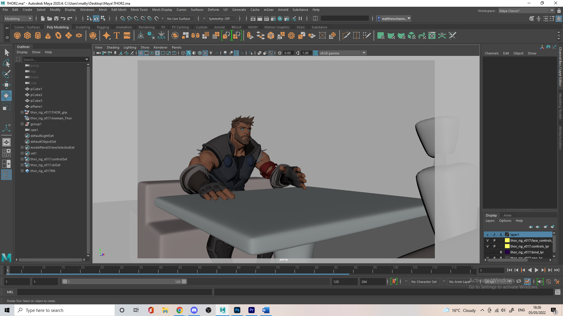
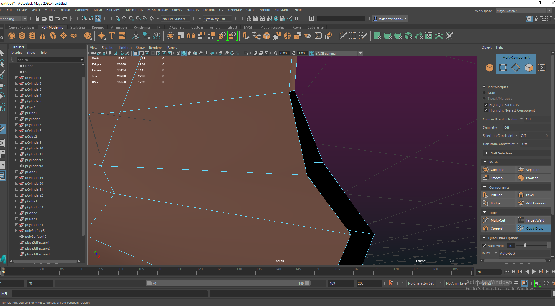
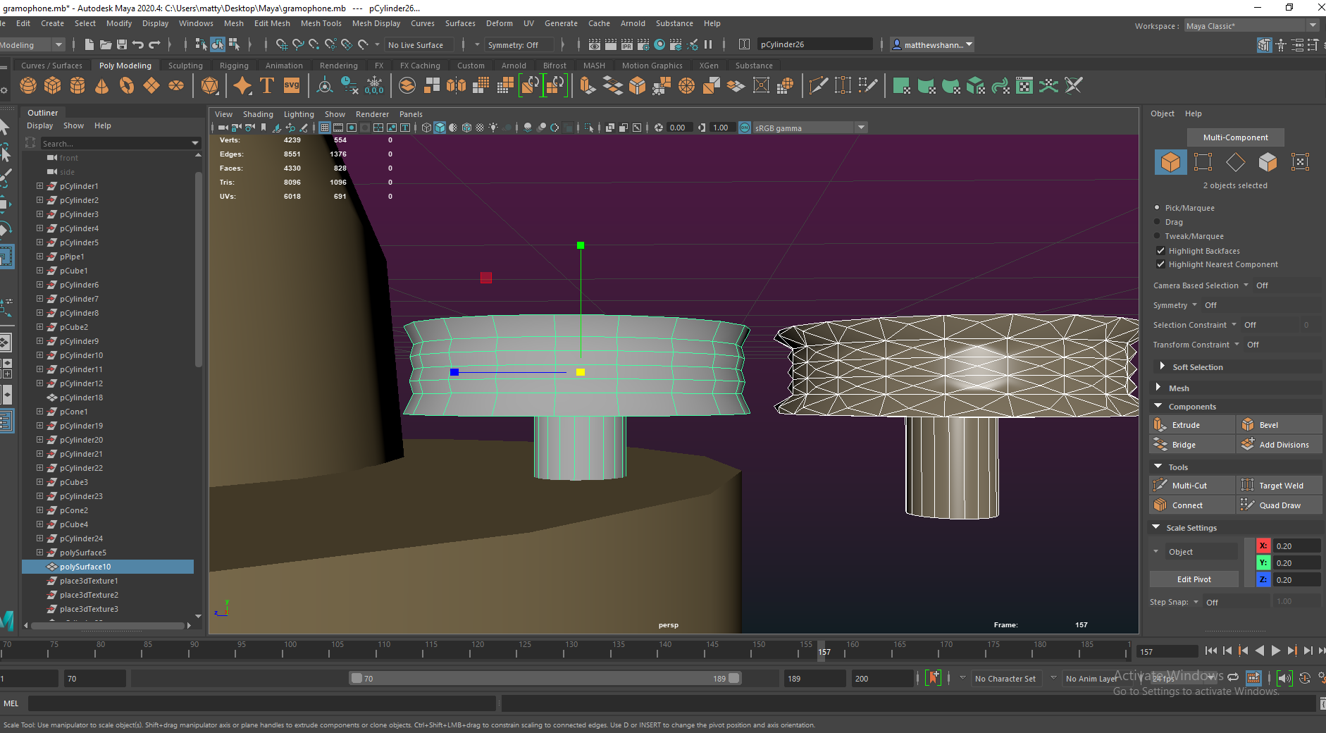
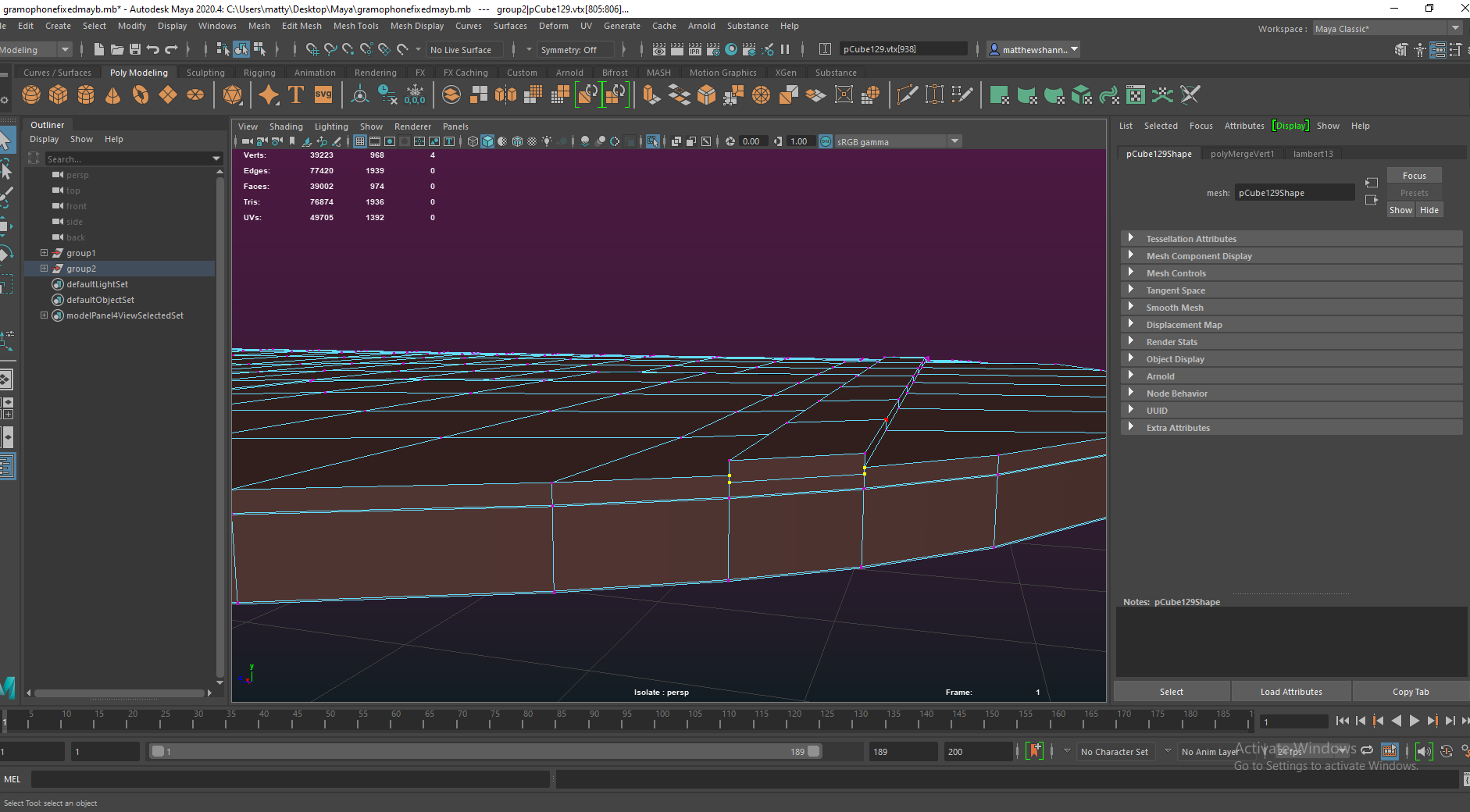
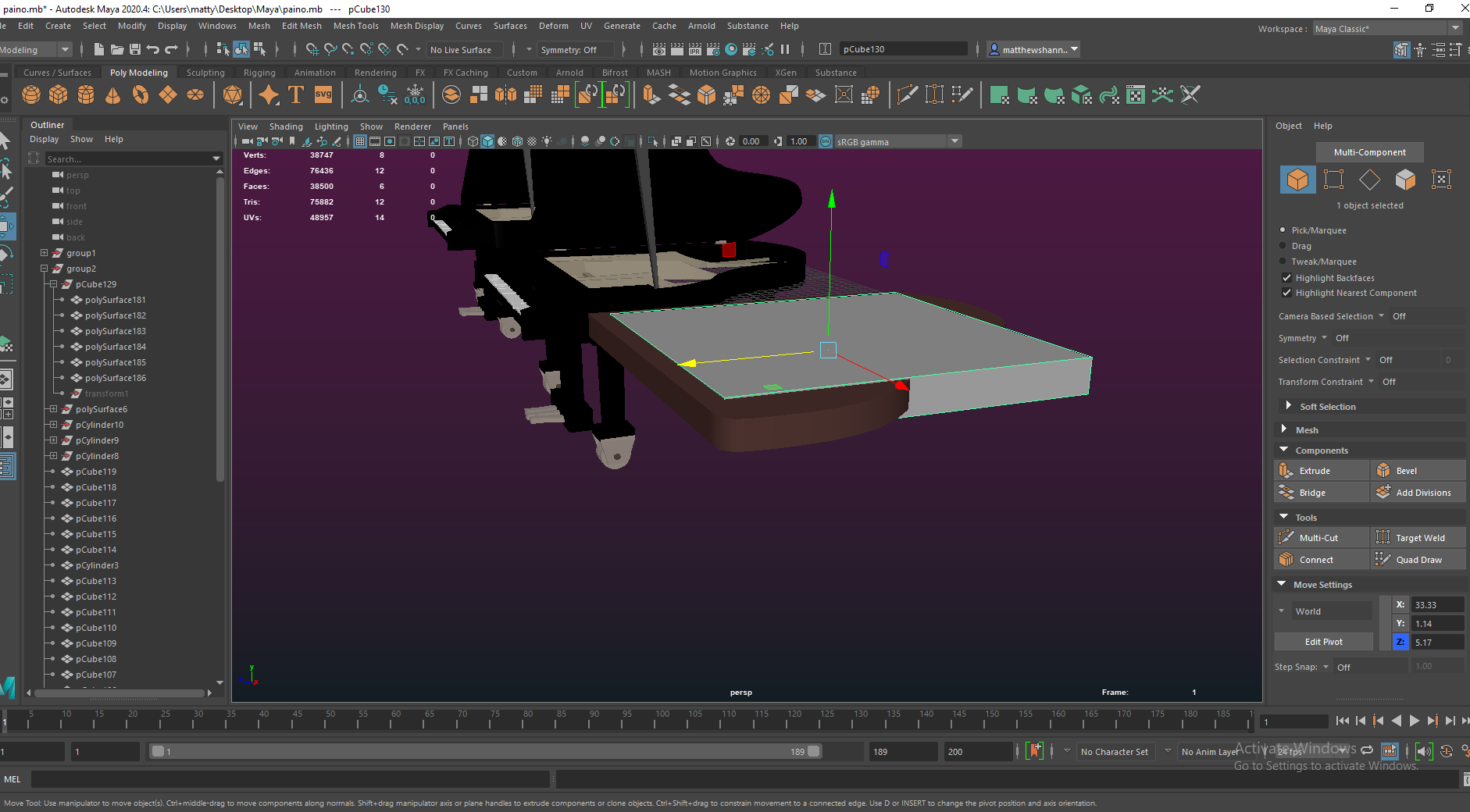
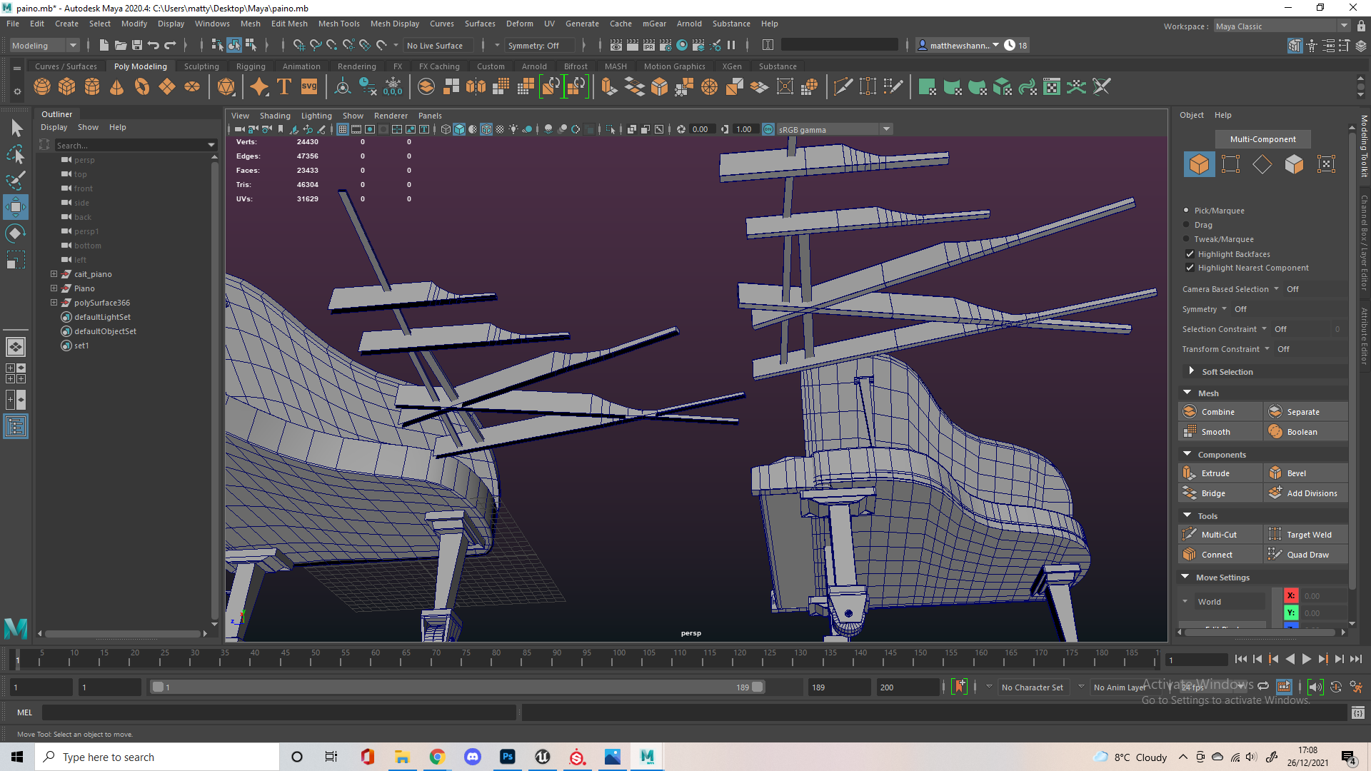
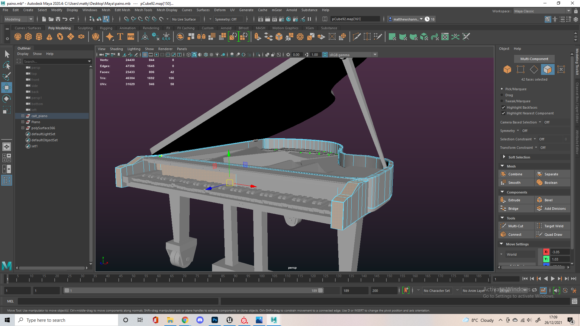
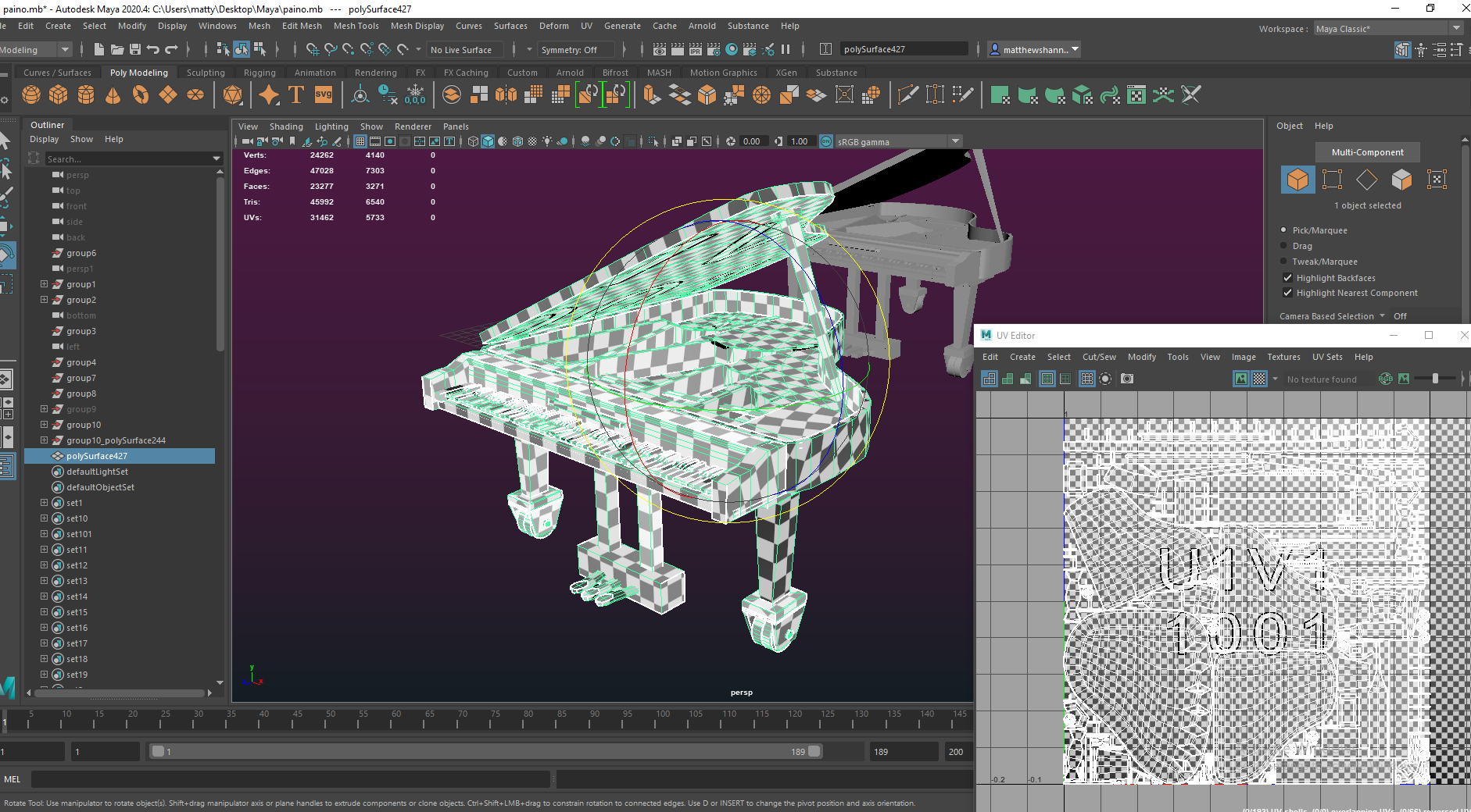
It was modelled as a lot of objects split up in many different pieces so I started by removing any unnecessary pieces (that could be replaced by extruding a face etc). Then I went piece by piece and remodelled these so the topology was cleaner. It ended up as a full remodel and if you look through the images we went from 20000 to 3000 faces while keeping the exact same silhouette. It’s not documented here but I attempted to reduce the number of individual keys and replace this with texture information but it didn’t work too well so I kept them as individual objects.
I kept the textures very similar to what Caithlin had created originally with lambert materials so the piano still matched her original concept, I just added some dust and scratches as well as some colour variation and metal edge wear – so it better fit the decay of the haunted mansion. I think it came out really well and matched Caithlins original piano pretty accurately. The UVs were definitely the messiest of all my assets just because of all the different pieces, I considered splitting it up into multiple UV tiles since it might be a little low resolution, but this wasn’t an issue except for our lightmaps in Unreal, which we could manually override anyways.
Unreal Engine
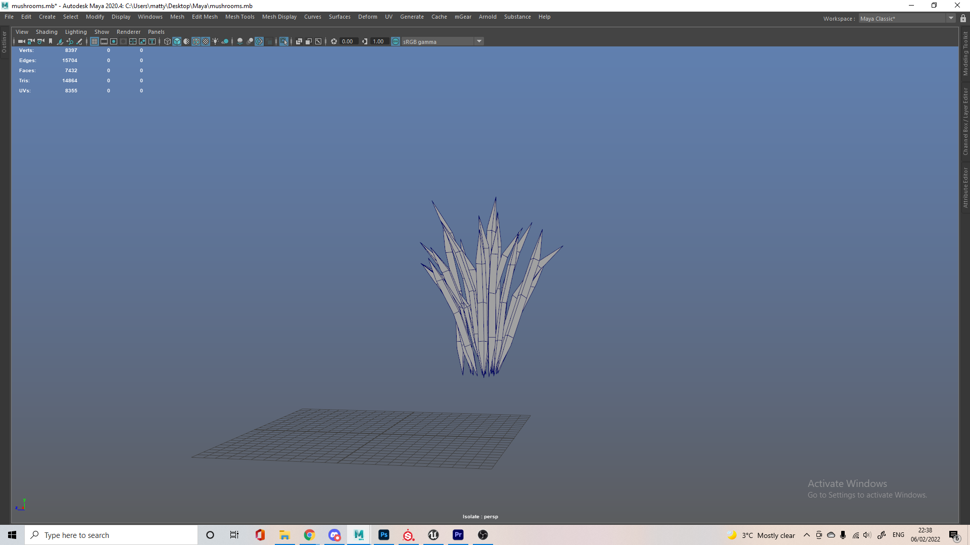
Flames
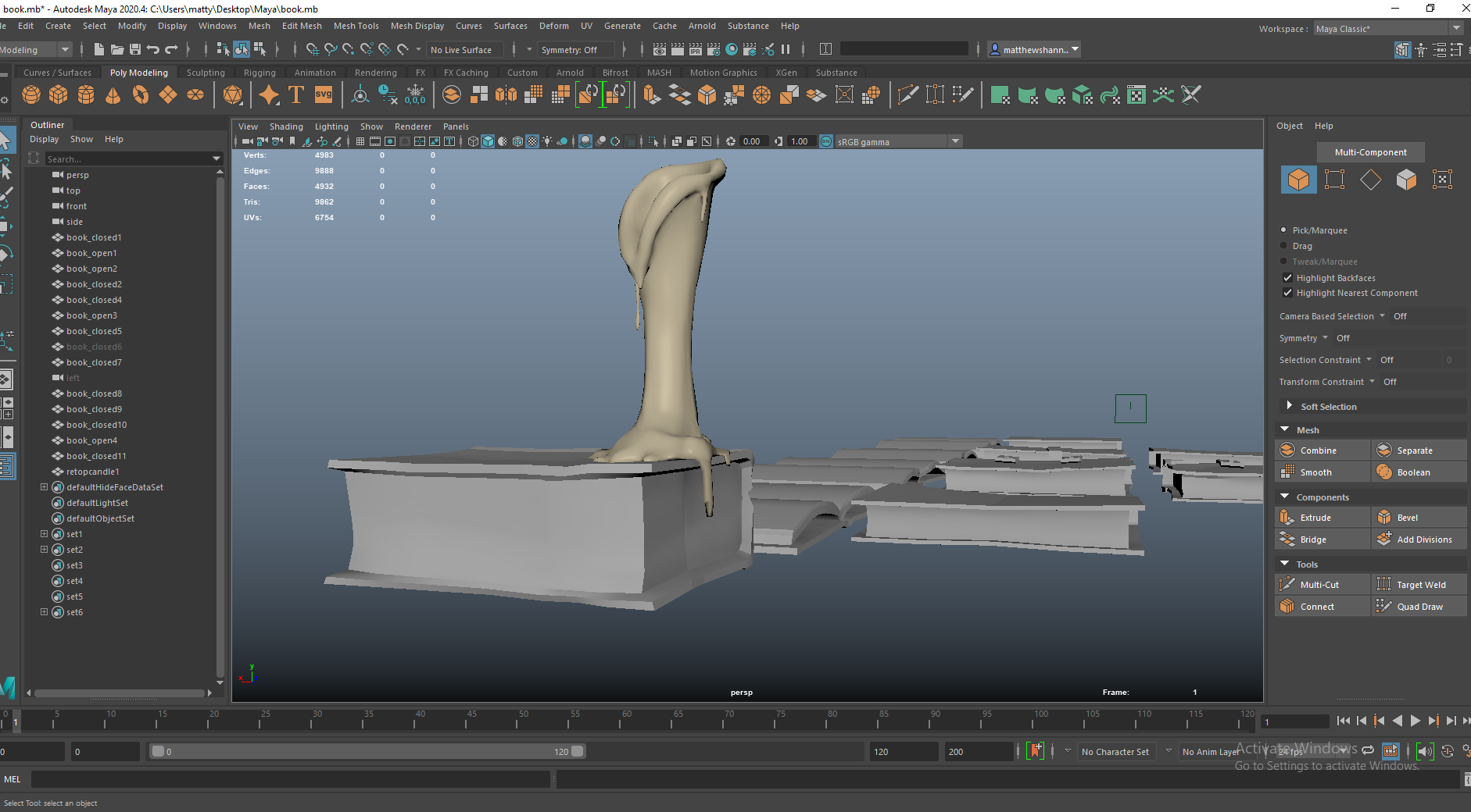
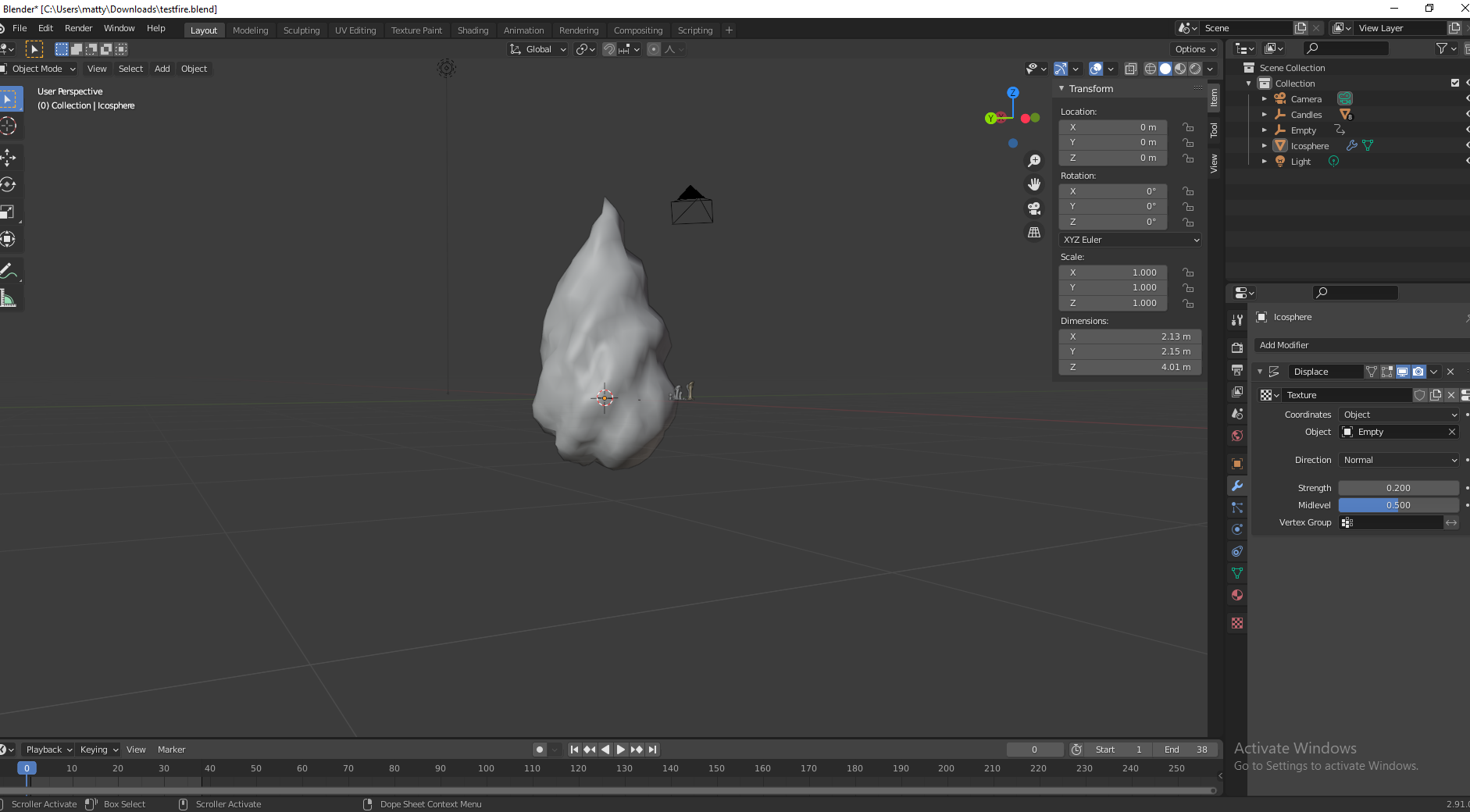
Before going into Unreal I attempted making the flames in Blender, I wasn’t sure what would work best so I tried out a bunch of different techniques. This video shows me testing the lighting technique in Blender and the animation in Maya, but I realised this wouldn’t transfer easily to UE4 with the same results and I wasn’t that happy with how the flames looked.


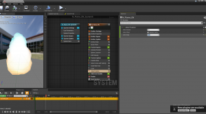
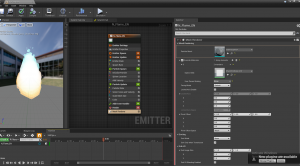


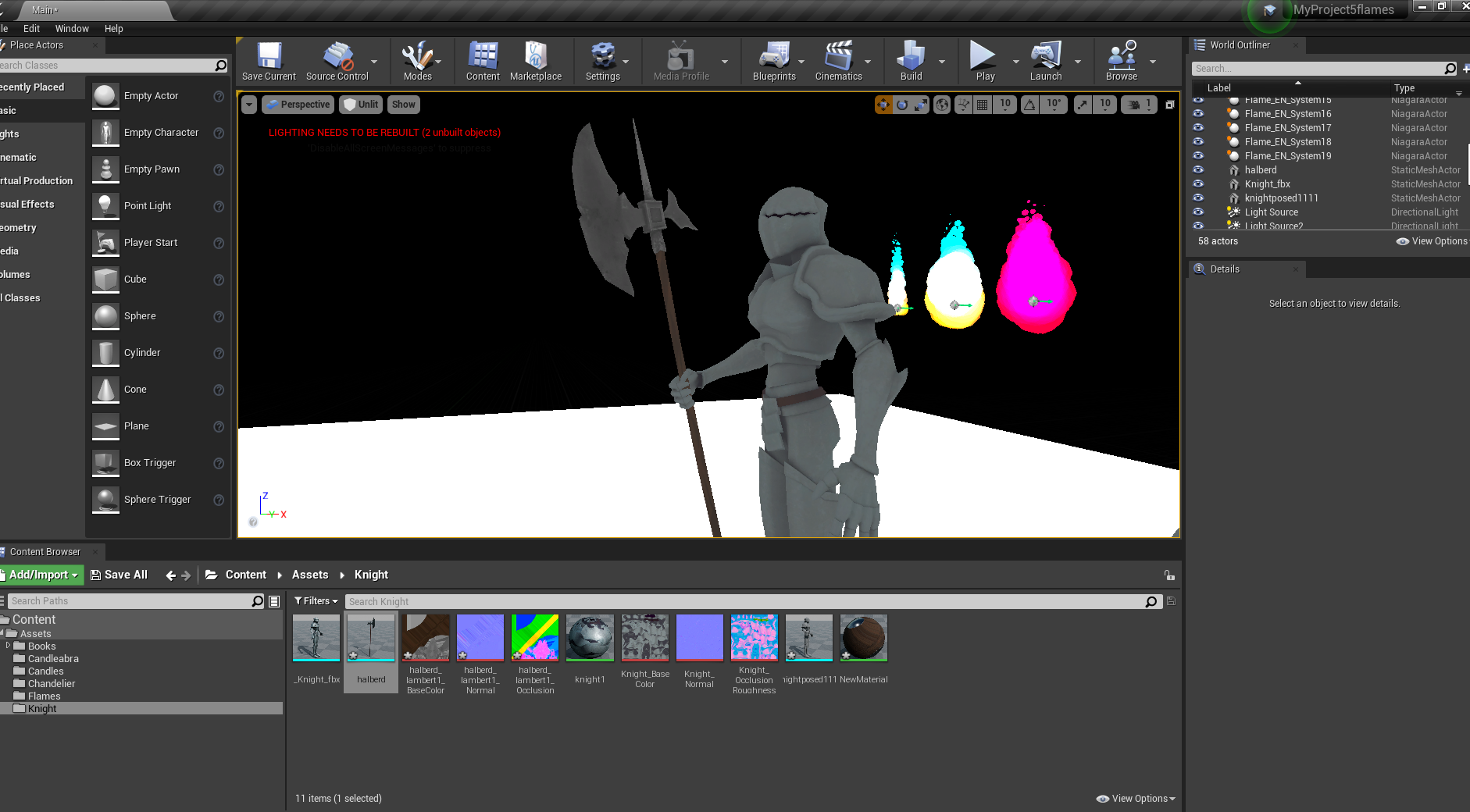
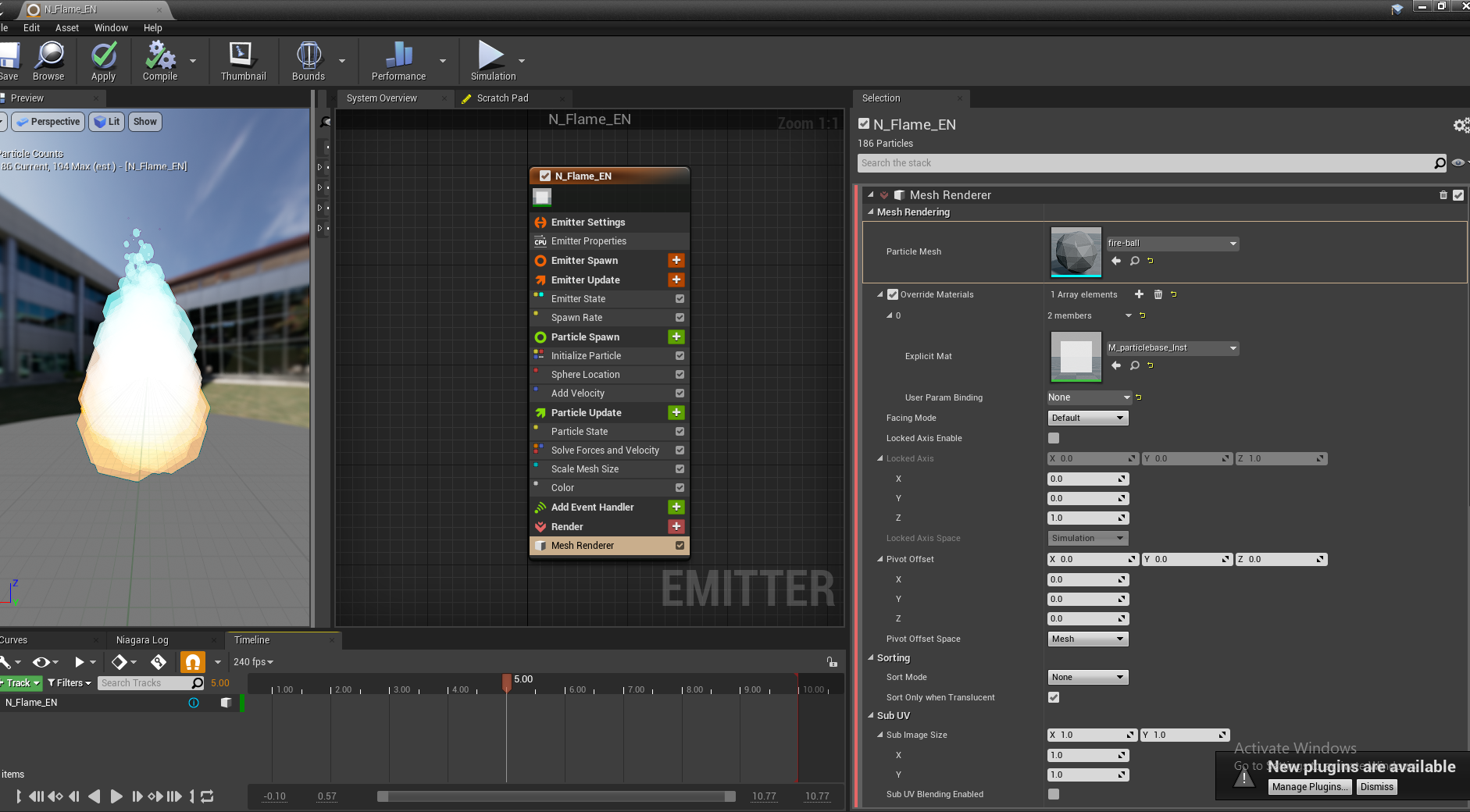
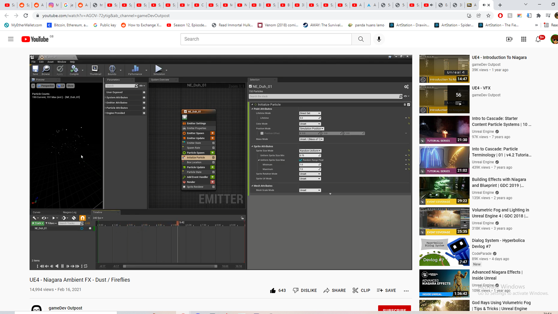
I tried making the flames by animating a mesh fire using a displacement modifier in Blender, but I read about people having issues with allembic files which is how I was planning on importing this to UE4 so I looked into Unreal’s Niagara systems. It was pretty easy to get the hang off, the node system was surprisingly intuitive. I followed this tutorial to learn about the different techniques used to make fire, then made my own flame from this by modifying the velocity, spawn rate and colours, as well as adding a jitter effect.
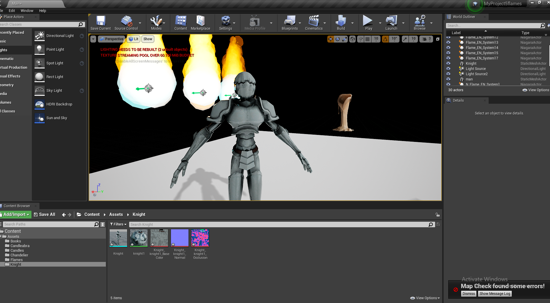
You can see I had 5 or 6 versions of the flames before the final one, I wanted to test out a bunch of variations and send this to the group so they had as much input as possible on what they liked. I was super pleased with how the flames looked and tested them out with the candles. They don’t emit light so I added a point light with an orange colour to have the flame actually give off light, then tested out how this interacted with an early version of the candles subsurface scattering. I realised you cant export this as an fbx which was annoying since my group all needed flames in their scenes, but Henry showed us how to share this easily using UE4’s migrate feature.
Setting up Scene


These are some of the videos I watched/listened to in the background while working, covering what 3D artists think is important in environments, all focused on unreal engine. Its useful to see their workflow and techniques used, giving me more insight in how to create and structure my environment.
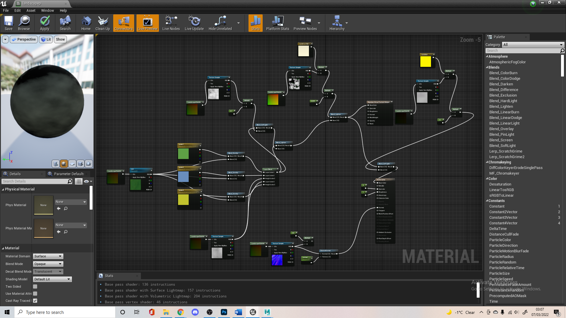
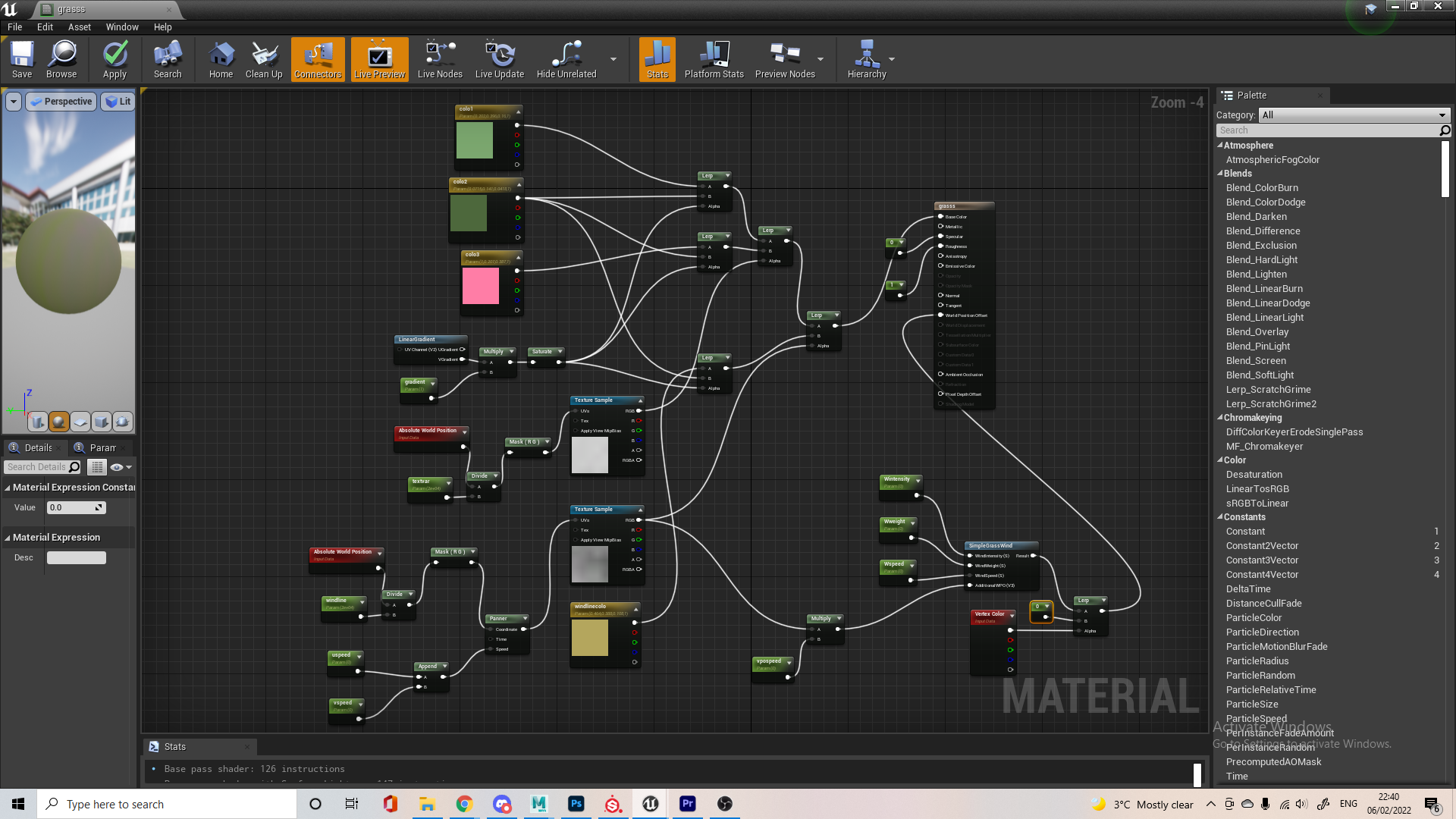
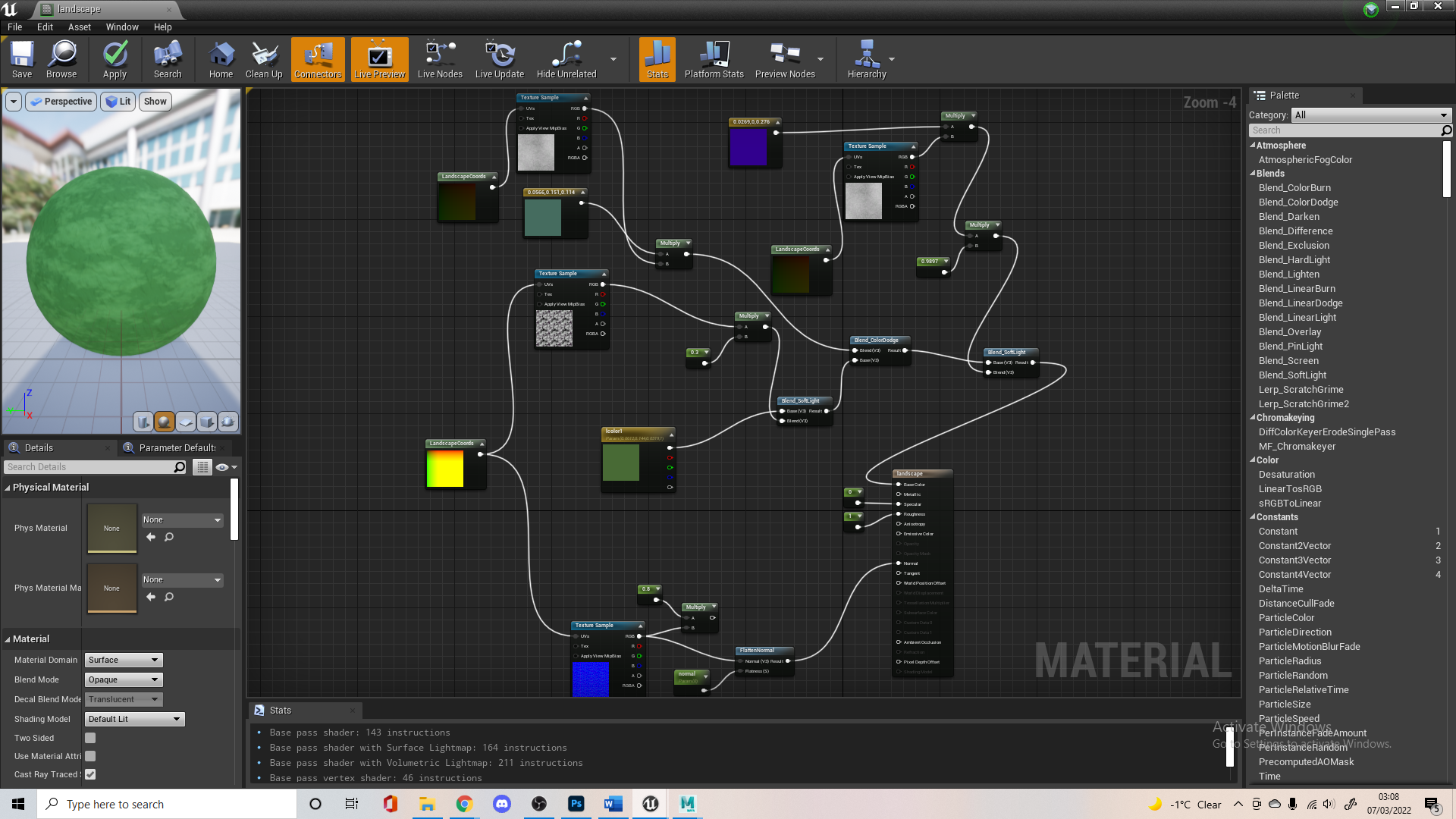
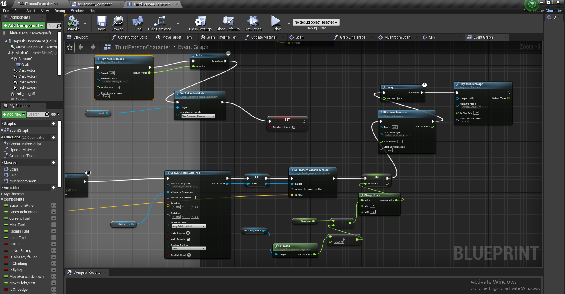
I’ll just cover any issues I had with assets or anything I had to learn about in order to set up my scene, since most of the setting up is just setting up material/ instances and connecting up nodes.


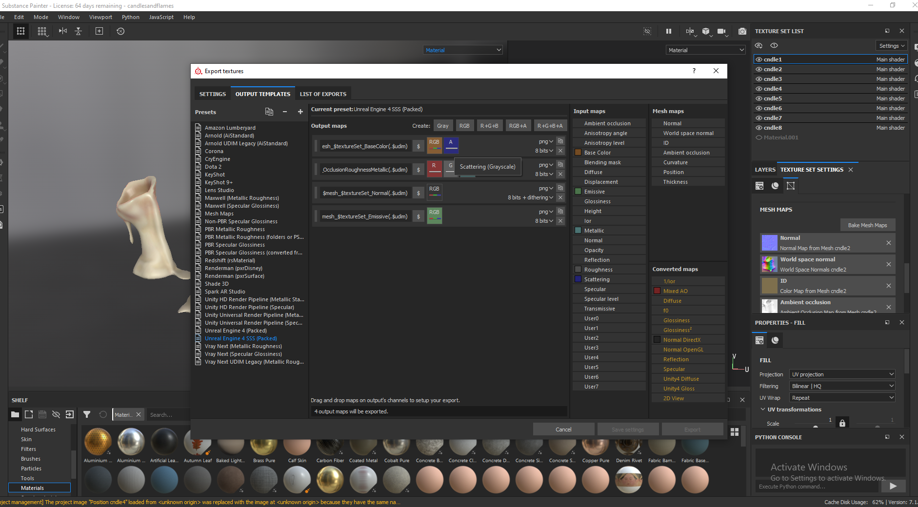
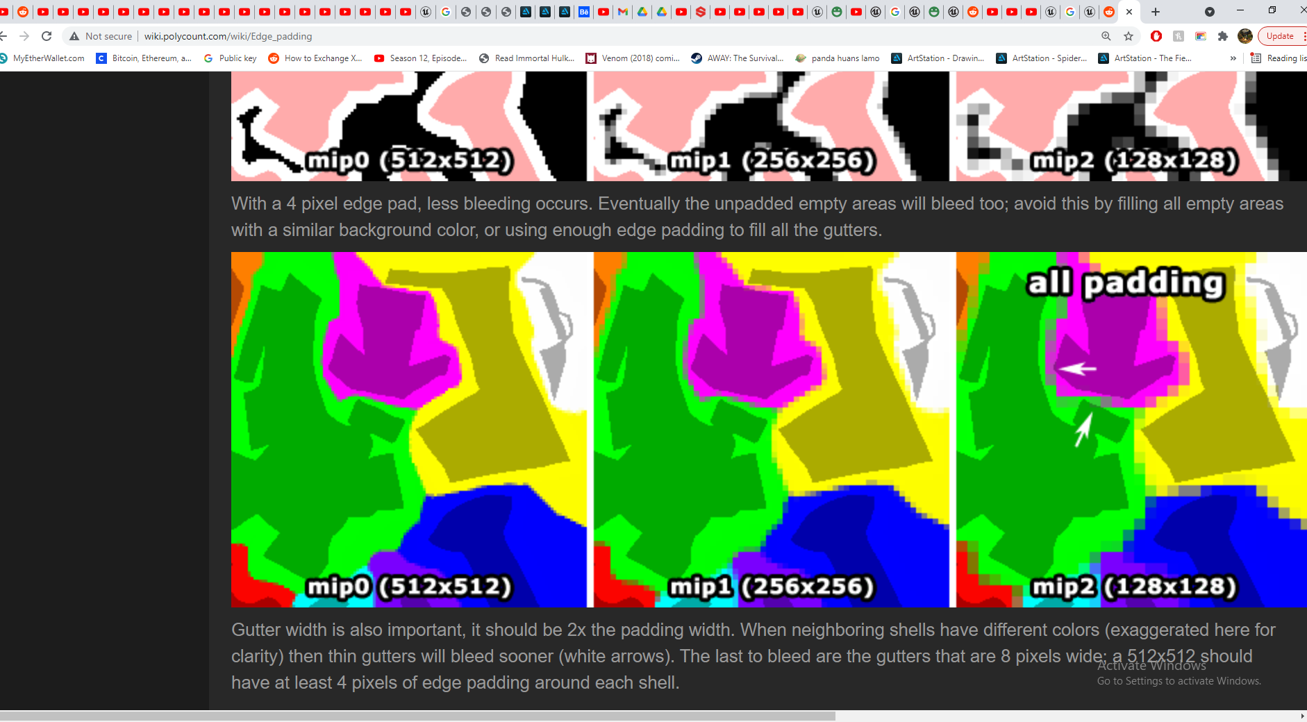
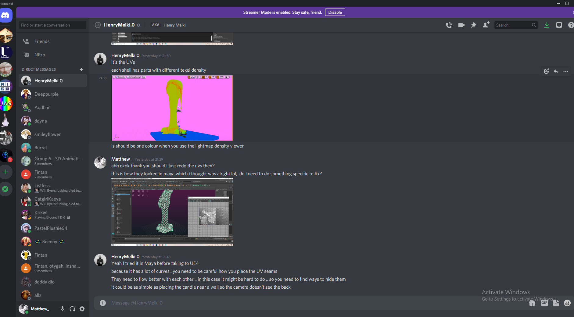
I had some trouble with my candles for a while. First I had to see where the Sub Surface Scattering details were stored when exporting from Substance for Unreal. Then I had to figure out how UE4 deals with SSS and I noticed once I finally figured all that out that there were visible artefacts/seams when I baked my lighting and wasn’t sure why since they weren’t visible in substance or the material preview in ue4.

I sent this over to Henry for some help and he figured out that it was an issue with the lightmap’s texel density, due to how I set up the UVs for the candle. He sent back the candle with new UV maps for me, but since I set the UVs up the same way for each candle most of them had this issue, so I had to go back and redo them all which was a little annoying, since it all seemed fine in Maya back when I did them. I based each UV on how Henry did it, hiding the seams in similar ways and keeping it as one shell.


I had a little issue with how the metal looked in UE4. but eventually figured out it was an easy fix, UE4 was importing my OclussionRoughness map as a normal map automatically, Alisa had this same issue too. Still not sure why this was happening but it was an easy fix.


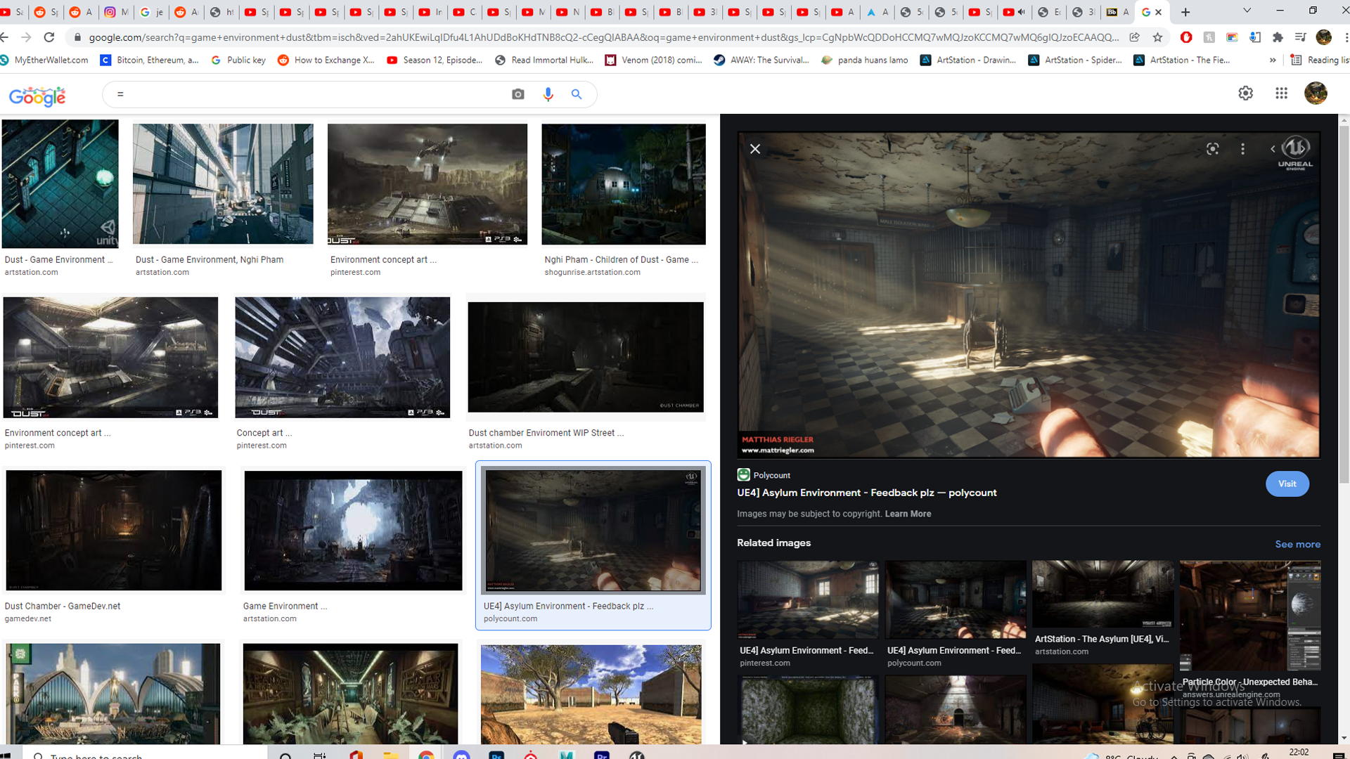
It was a little harder to find interior lighting examples un UE4, especially stylised ones, but I found these 3 videos super helpful. I would also refer back to the 80.lv articles i linked on our Miro board a while ago, breaking down moody/horror lighting in interior environments, having a blog going into detail behind the techniques and thoughts behind these environments was useful.


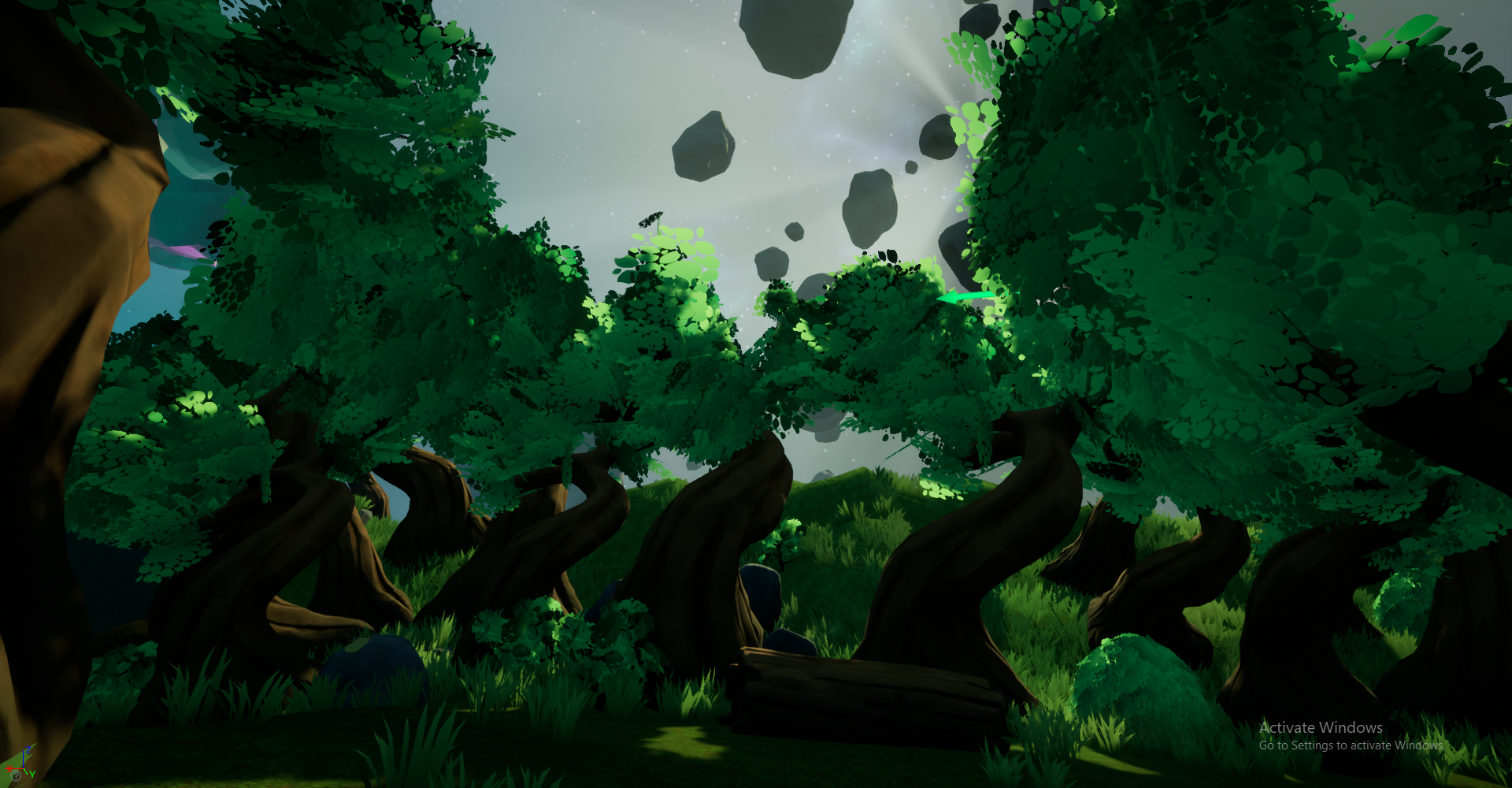
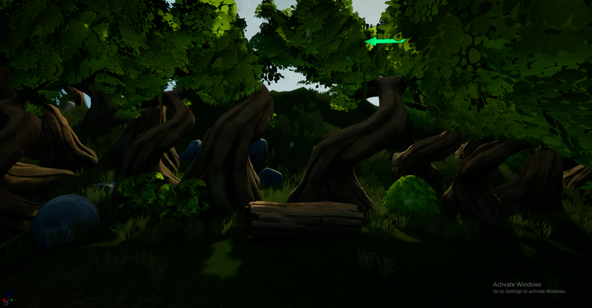
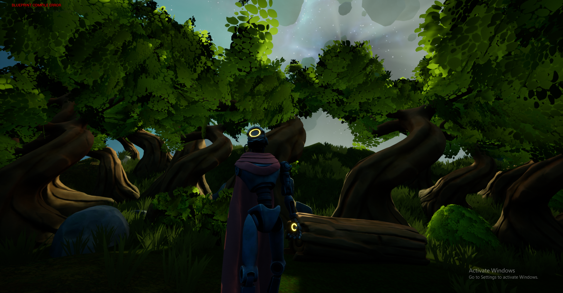
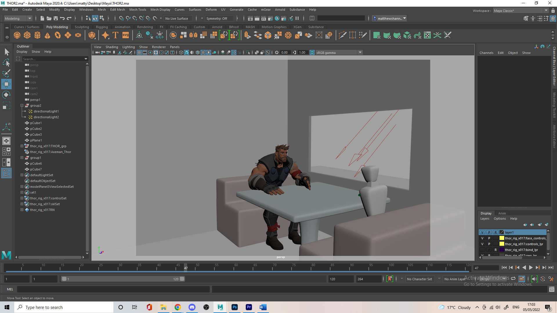
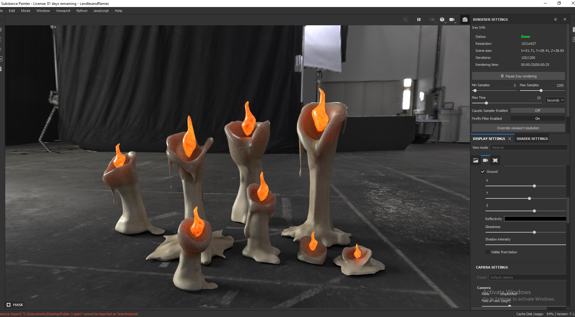
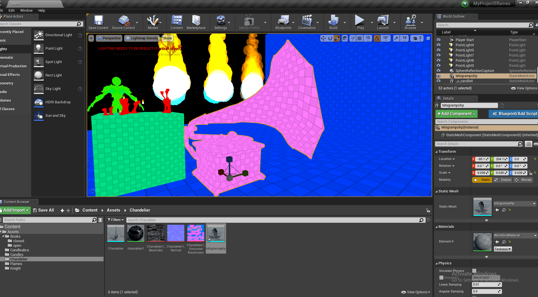
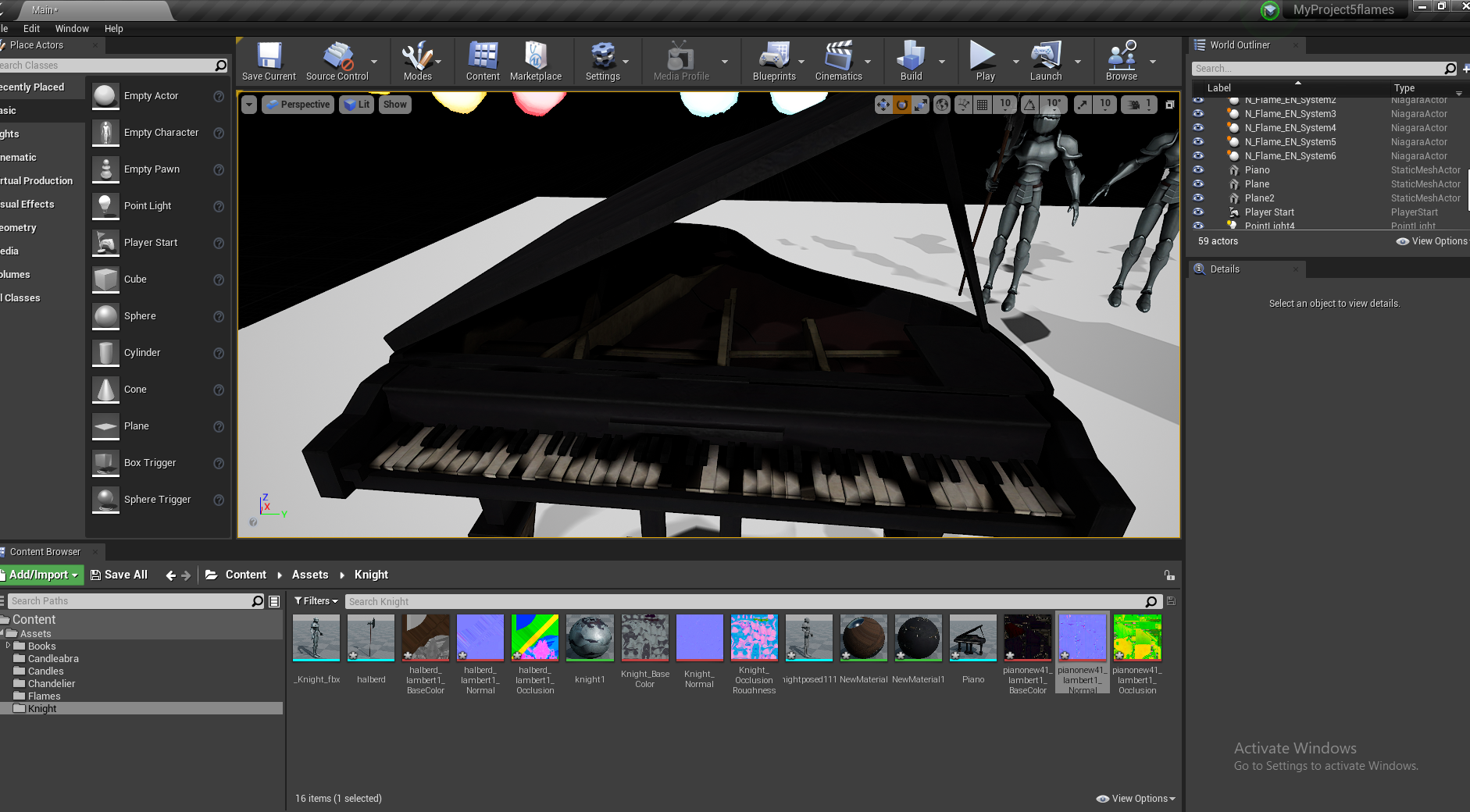
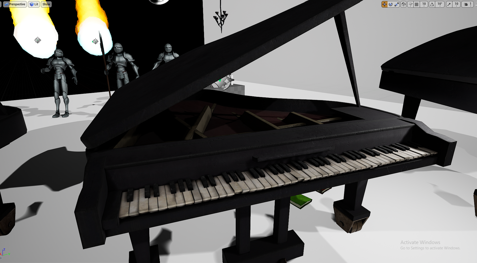
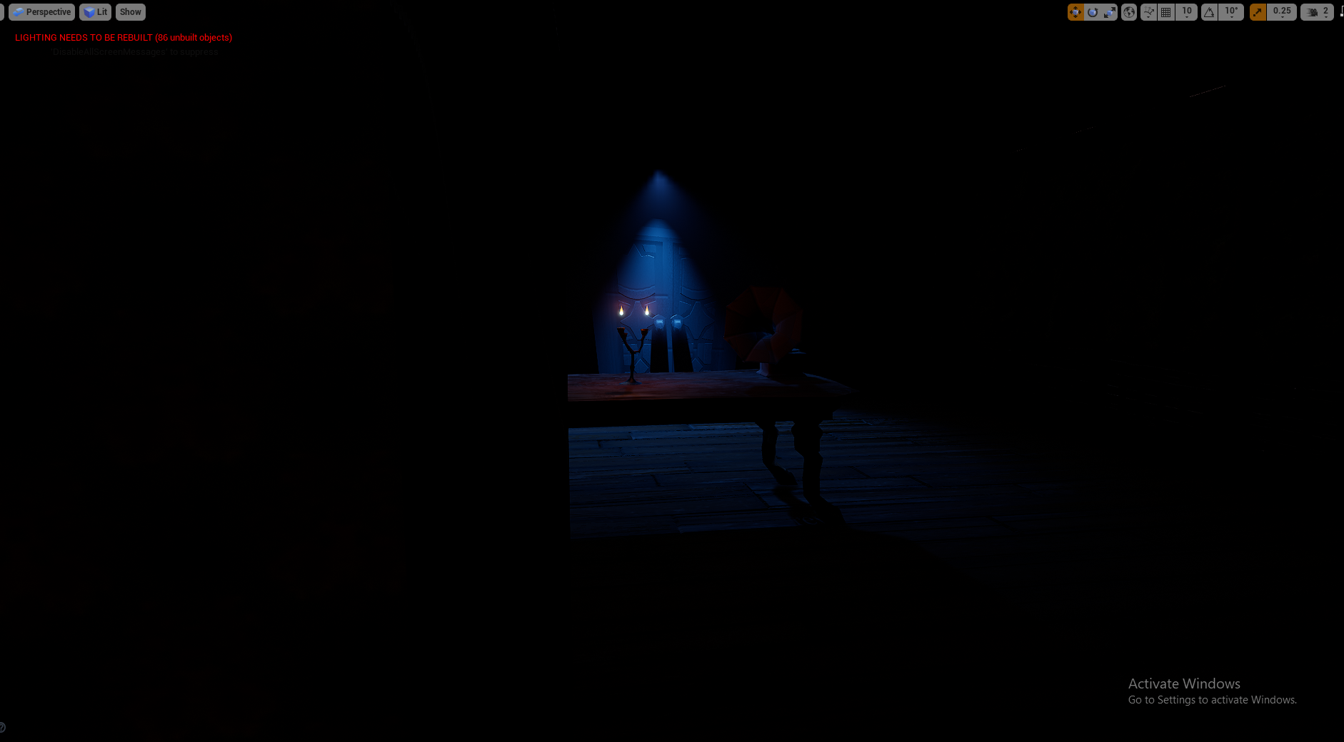
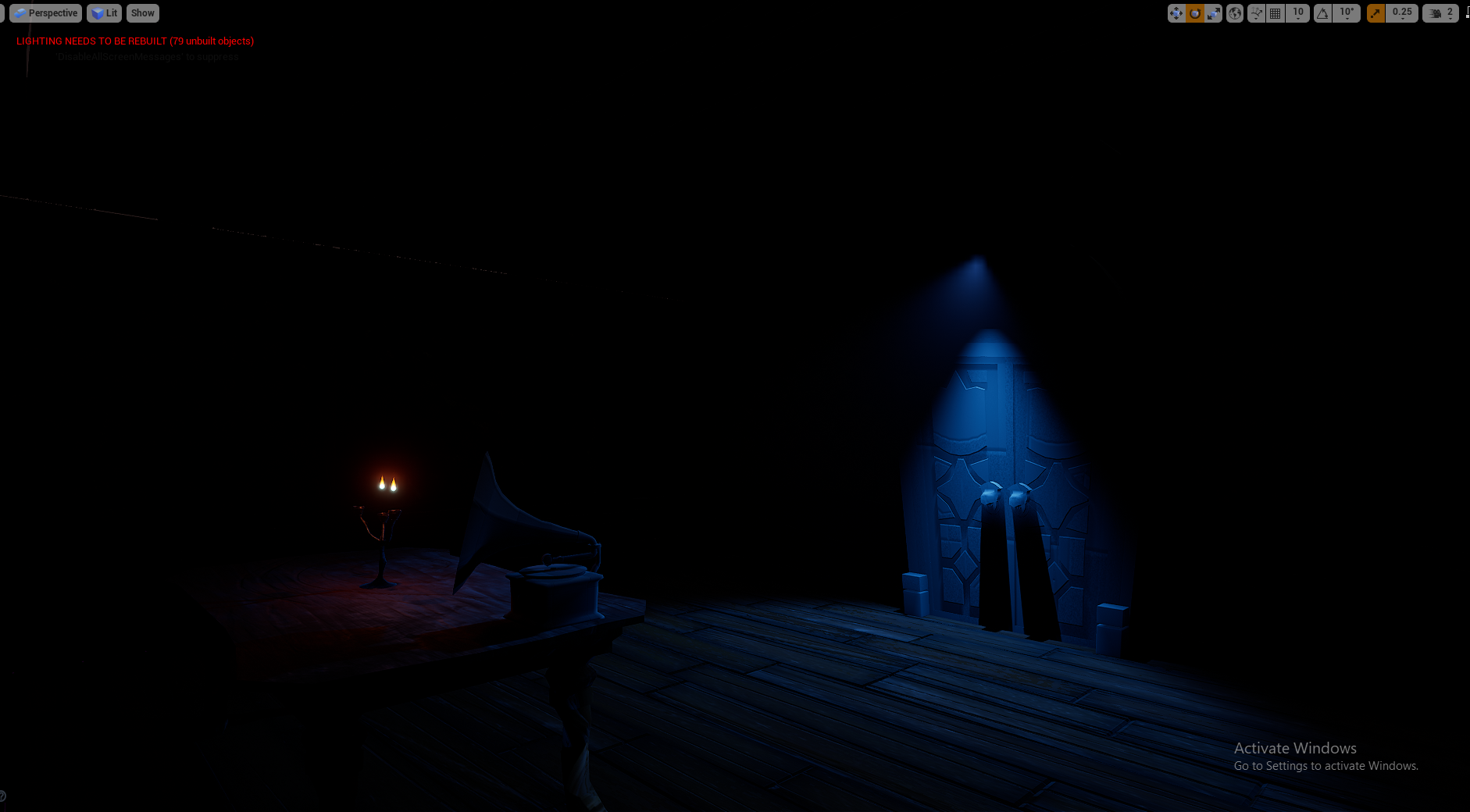
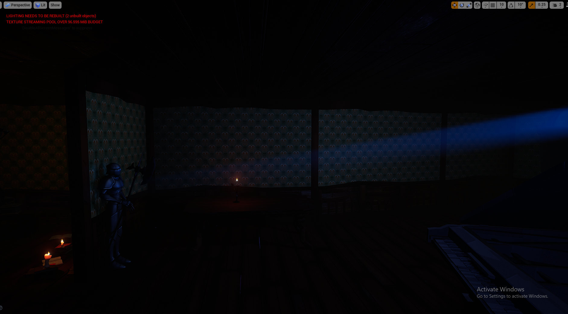
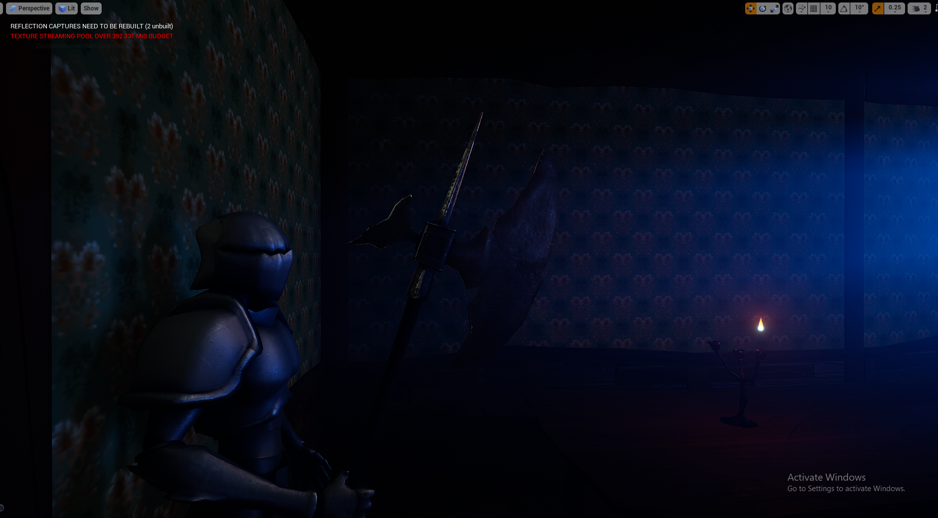
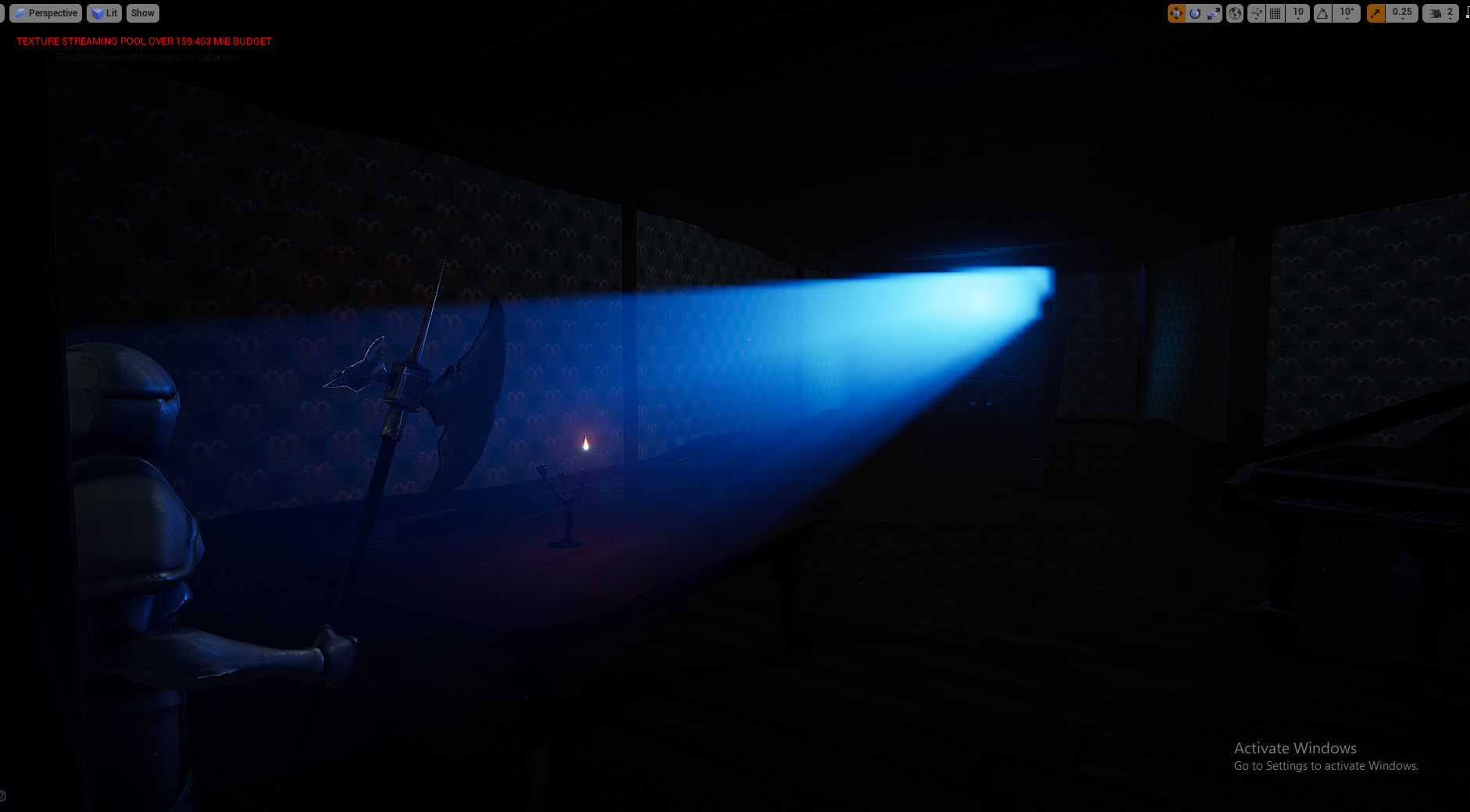
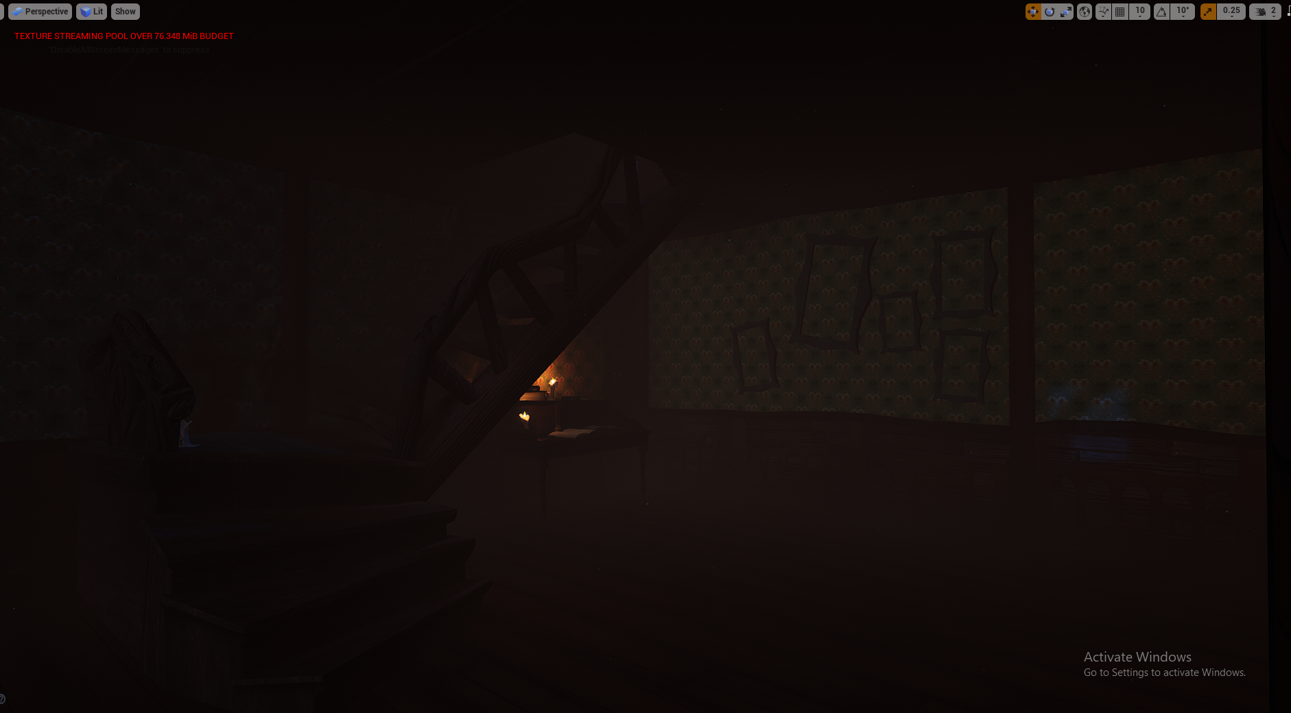
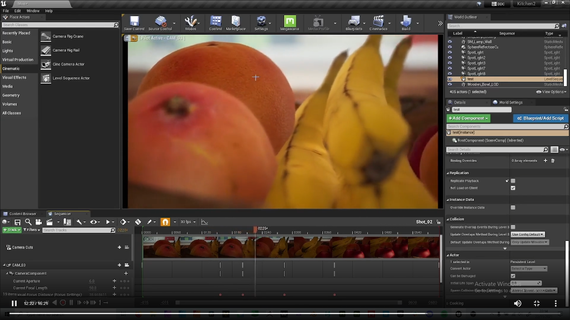
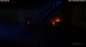
I started by importing the assets needed to build two contrasting scenes I know I wanted to showcase, the cosy study lit by candles. and the cold and spooky door lit by moonlight. I knew since very early on I wanted to have this theme throughout, with reds and blues contrasting each other, creating some purple hues were they meet. The red areas would be conveying comfort and warmth, while the blues would be the haunted aspect of the mansion, cold and scary. I wondered if I was going too moody and dark with my lighting for showcasing an environment, but Henry and Michael both liked this level of lighting with the candles that I included in the presentations, and used it as an example of the amount of light candles would give off since a lot of other groups wanted candles in their scenes.


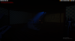
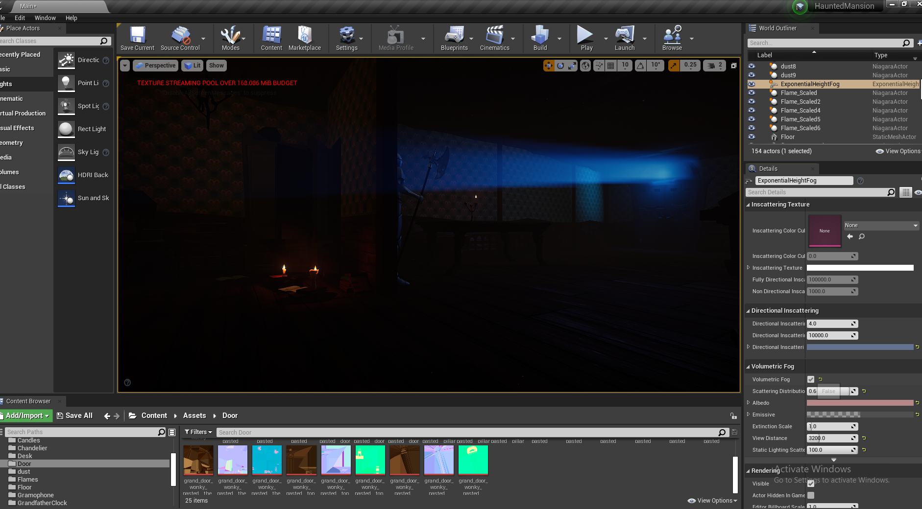
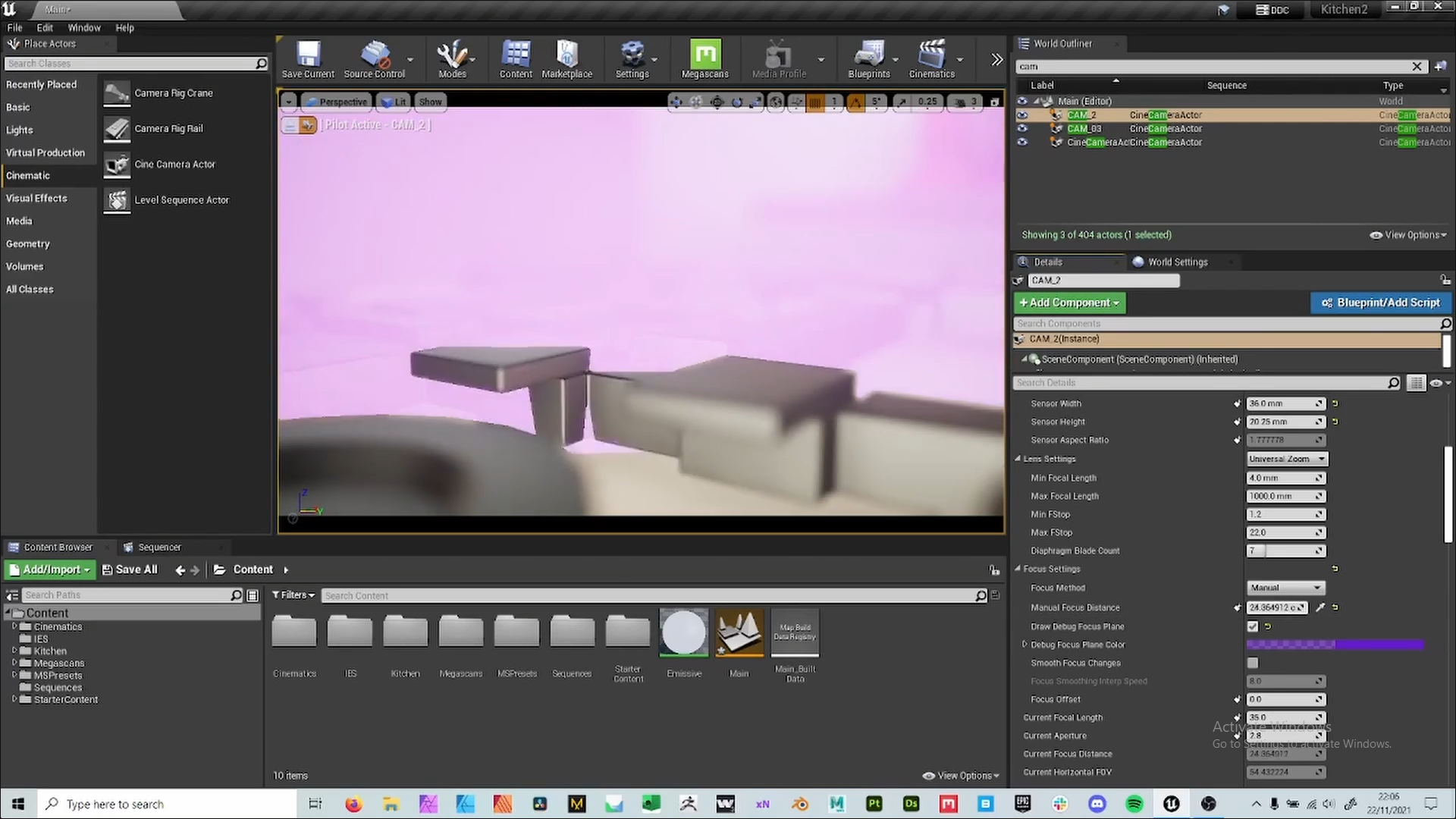
I wanted god rays to be cast in from the window to match my original thumbnail composition studies, It was useful in leading the audiences eye and loved the effect it gave. This was easy enough to set up using volumetric fog, but I had to swap from using directional lights to spotlights, as the directional lights to pop in and out of existence depending on the angle, while the the spotlight was constant – this might not be as realistic but it matched the style I was going for.


Having a fully interior scene with moody lighting and areas consumed by shadows made assets hard to see, so instead of setting up 100s of lights I used reflection captures to showcase the assets better, especially those that would reflect light stronger like the metallic assets.


This was just me saving angles I liked so I could recreate them when it came to rendering as well as keeping a record of me developing my lighting, as you can see it starts out much darker than it ended up. I experimented with a more obvious ambient orange fog about halfway through but preferred the more contrasting and saturated colours of the deep blues and red/oranges.
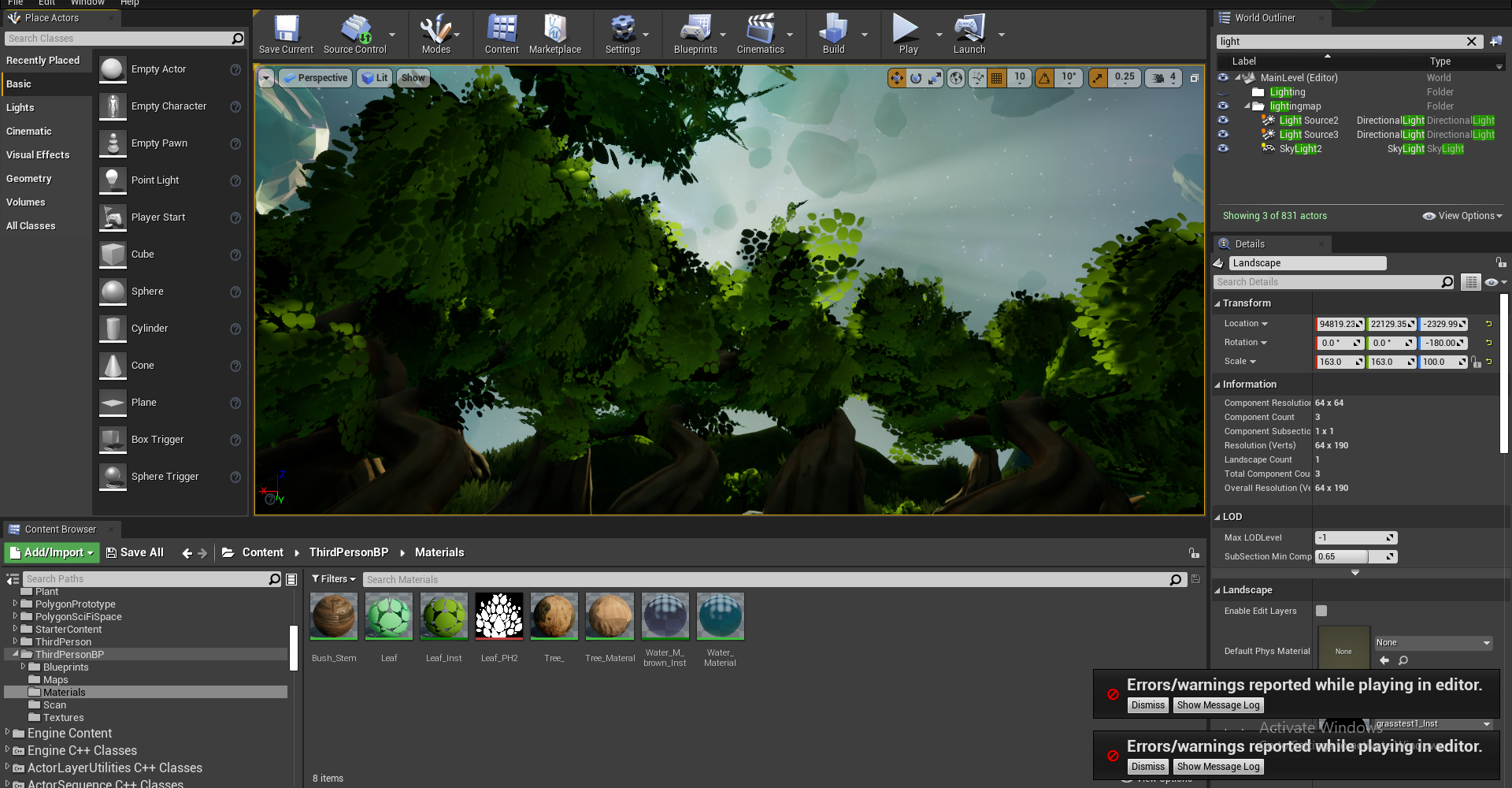
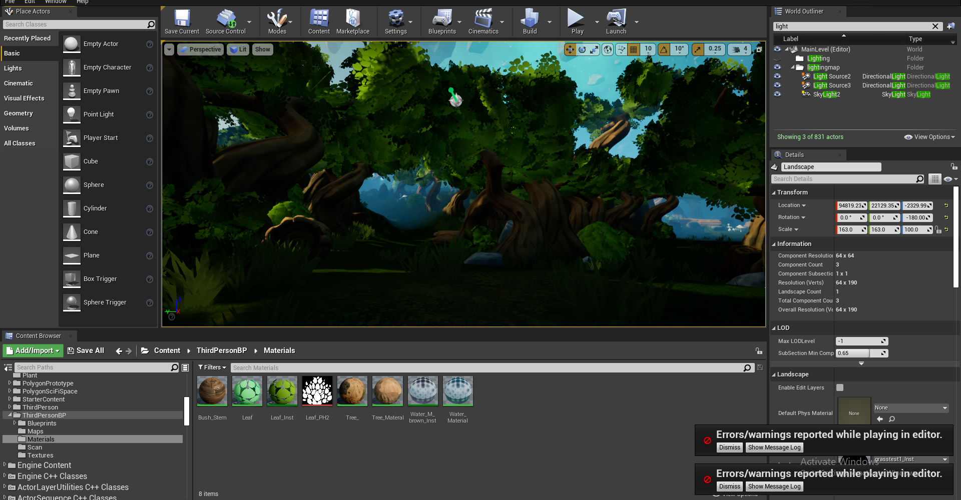
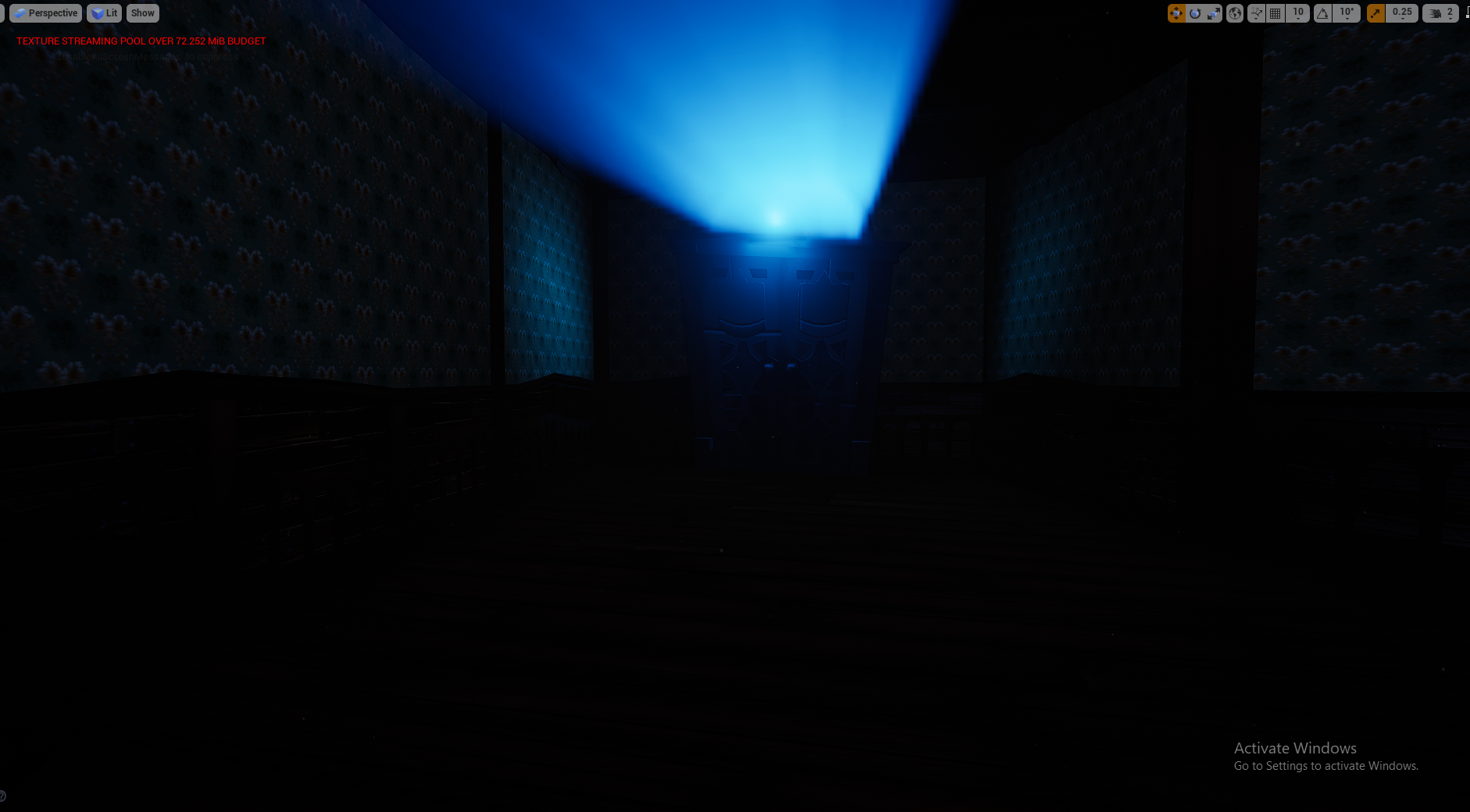
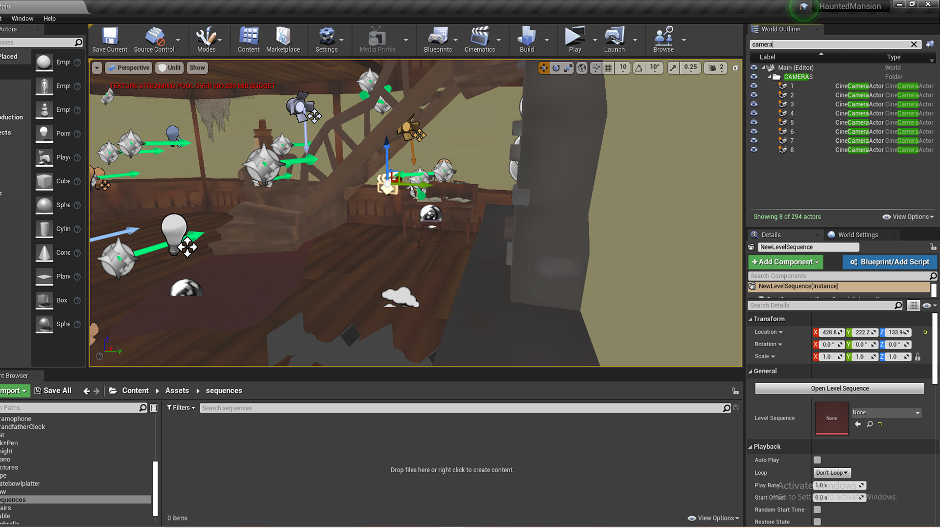
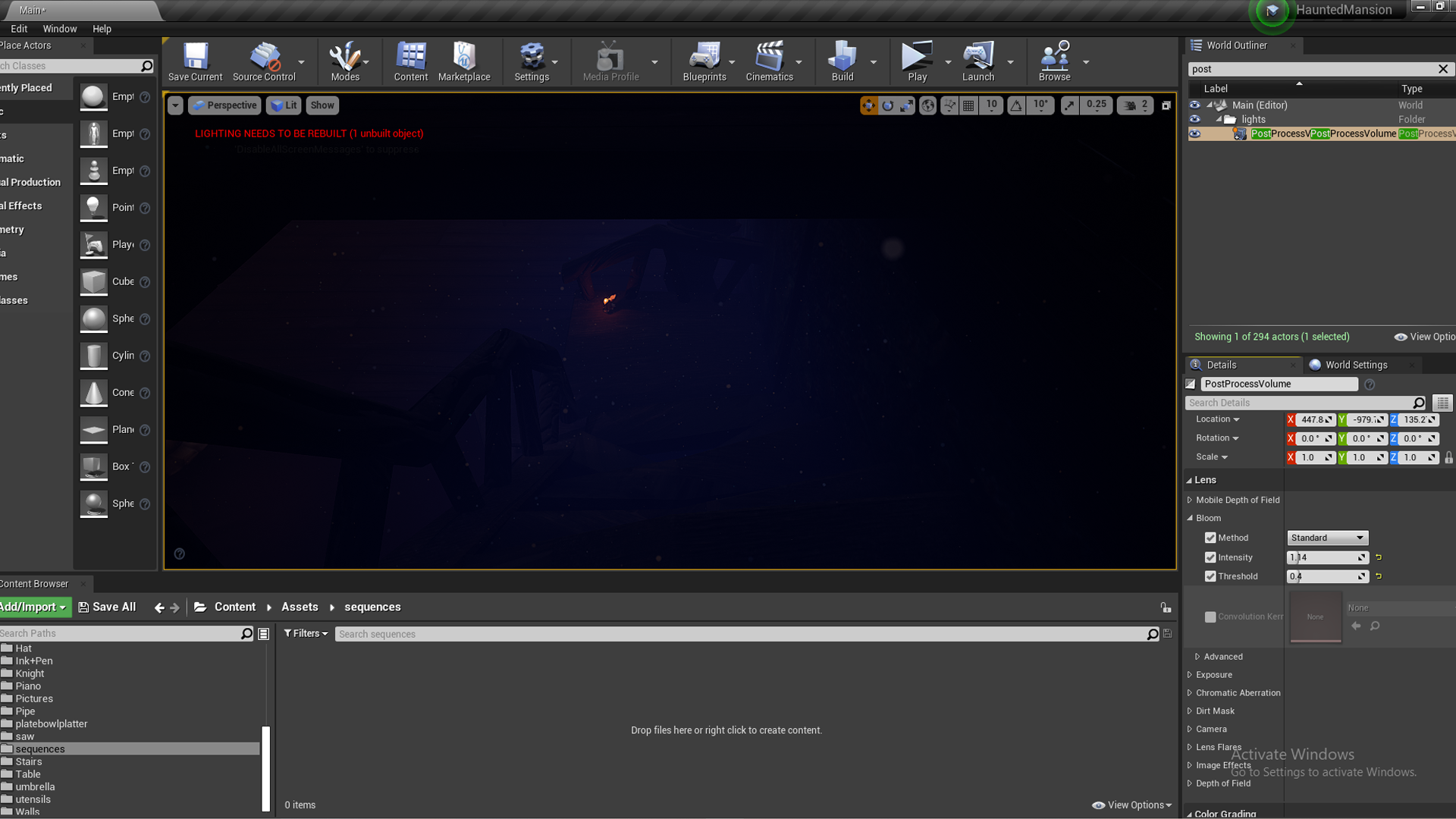
Pretty chaotic when its all selected like this but this is my final lighting set up, I set up a bunch of fake bounce lights using spot lights, and had spot lights with low lighting highlighting the different areas that my cinematic would focus on, adding rim lights or just ambient light. I had a general reflection capture covering the whole scene, with smaller reflection spheres for the things that needed to reflect a little more like the piano which was very dark, the knight and the gramophone. I added a lightmasss for my whole scene since there were messages appearing telling me to, as well as a lighting portal for the spotlights casting god rays since they were looking a little pixelated. I added a bloom to all my lights using a post process volume and the god rays come from volumetric scattering within the spotlights, as well as an exponential height fog. I’m really happy with the lighting as it’s what I had in my head from the start with the foggy and moody lighting and saturated blues and reds. Despite it being quite dark, every asset is visible, but the further away they are the more silhouetted they become.
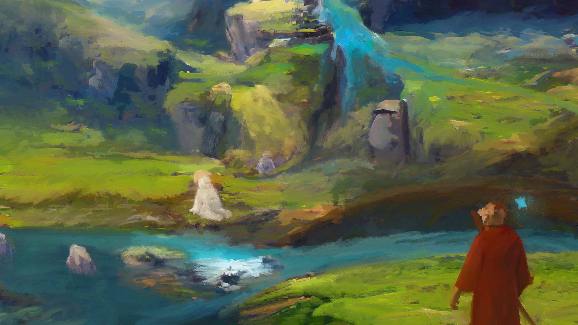
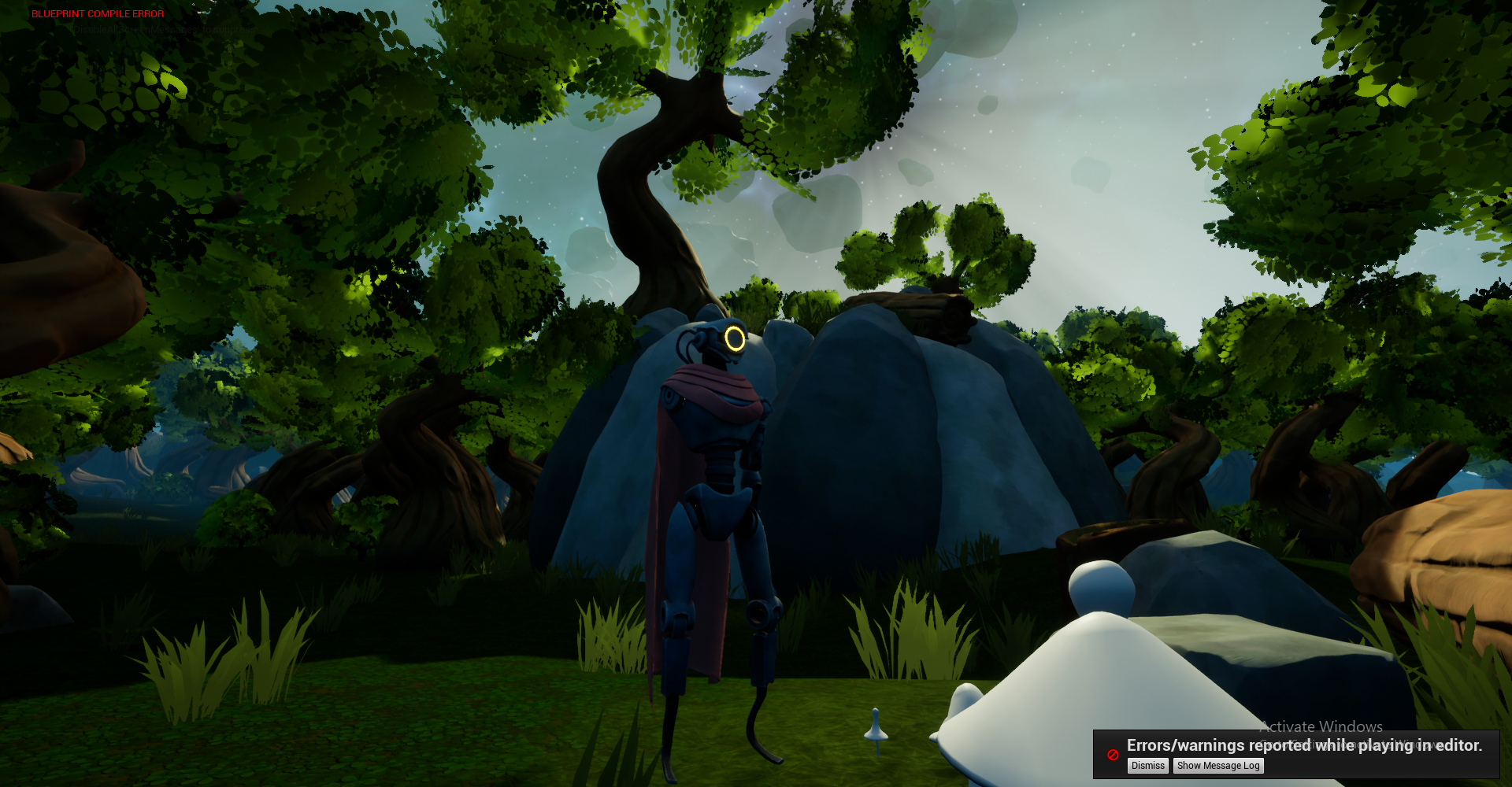
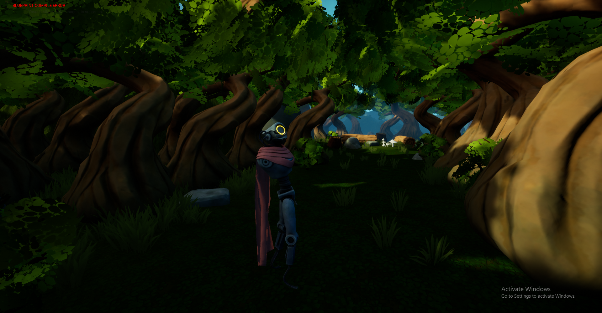
I think my final scene came out really well, unlit you can see the actual set up of the scene more clearly. I played into that basement comment Michael made about the stairs and set the scene up as if it was a basement/back exit of a mansion, so its a lot cosier than I originally planned with the thumbnails. I wanted to convey the feeling you get when playing Dark Souls, when you are in a dangerous and scary place but you actually feel safe in the bonfire room sitting next to the bonfire, the only resting place in that dangerous world. I really like the contrast of that feeling of stress and danger vs comfort and relaxation, so I tried to recreate something similar here. The sort of storyline I tried to convey in my cinematic hopefully reflects this.

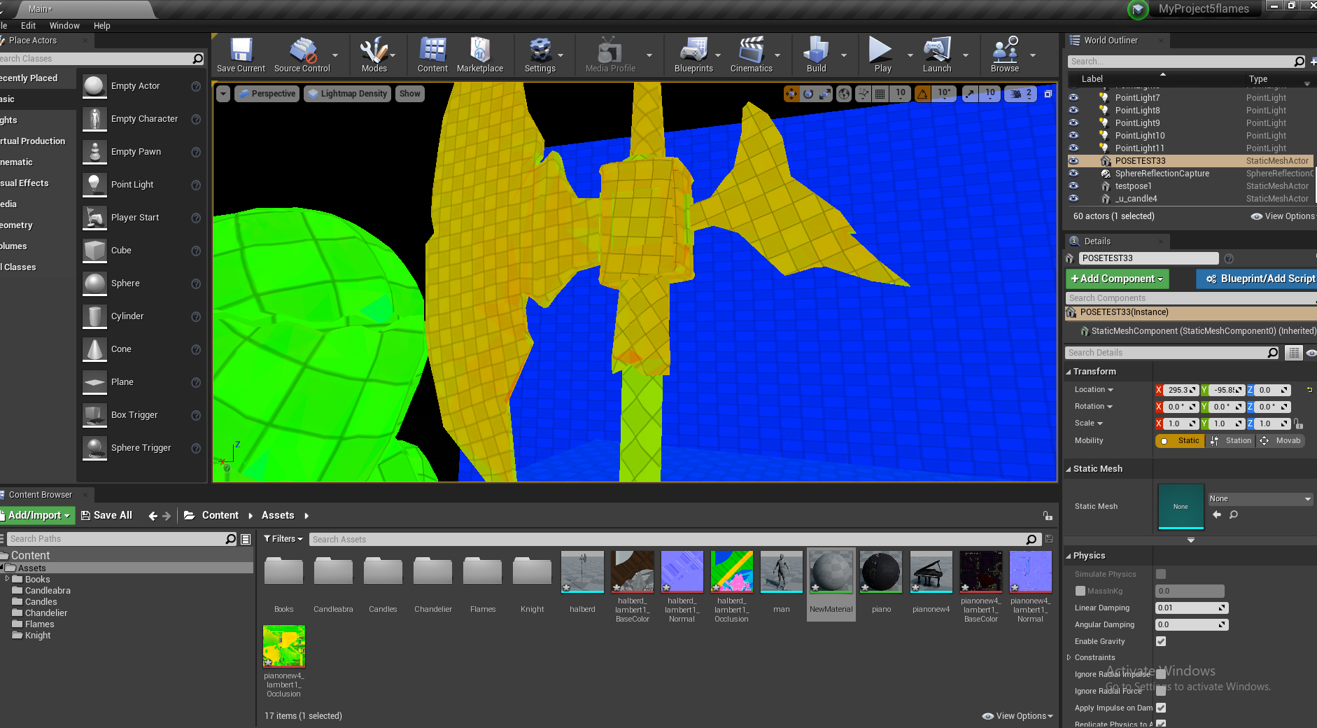
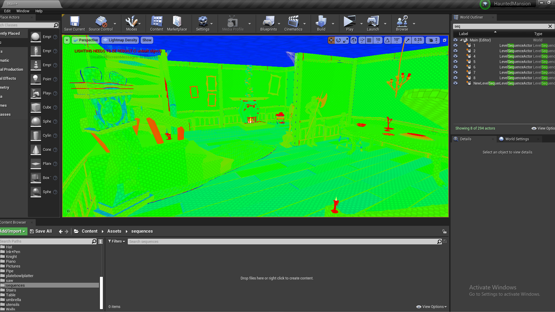
Forgot to mention I had overridden a lot of props to make sure most of the lightmaps were green (just left the red ones red). The roof is blue since its never in shot and isn’t lit up. This just made sure the shadows and lighting was detailed on these props. I wasn’t sure if going too high would make UE4 more resource intensive, so I left some blue parts like on the clock or the floor – they didn’t cause any lighting issues.
Cobwebs, Dust and Embers


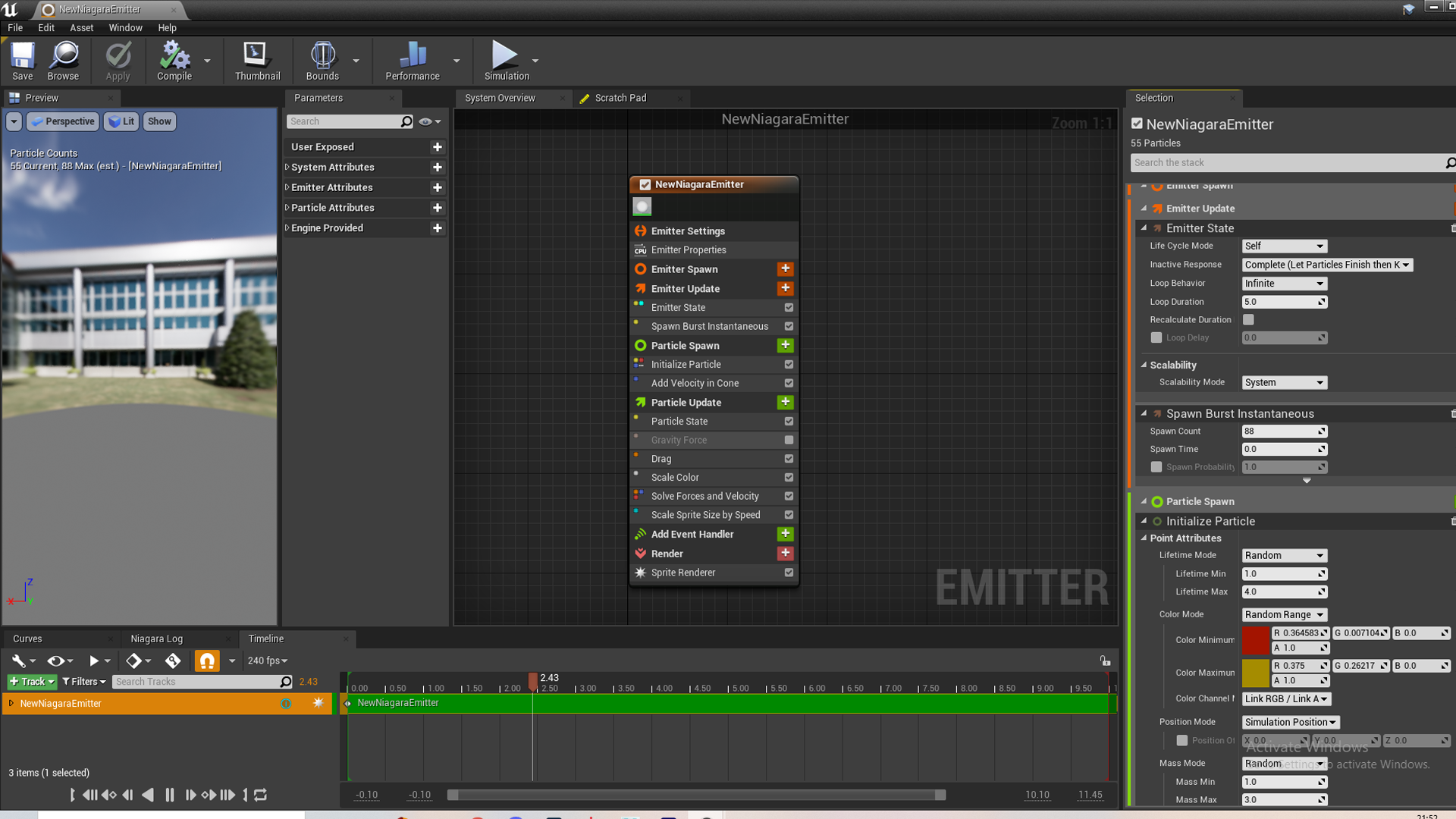
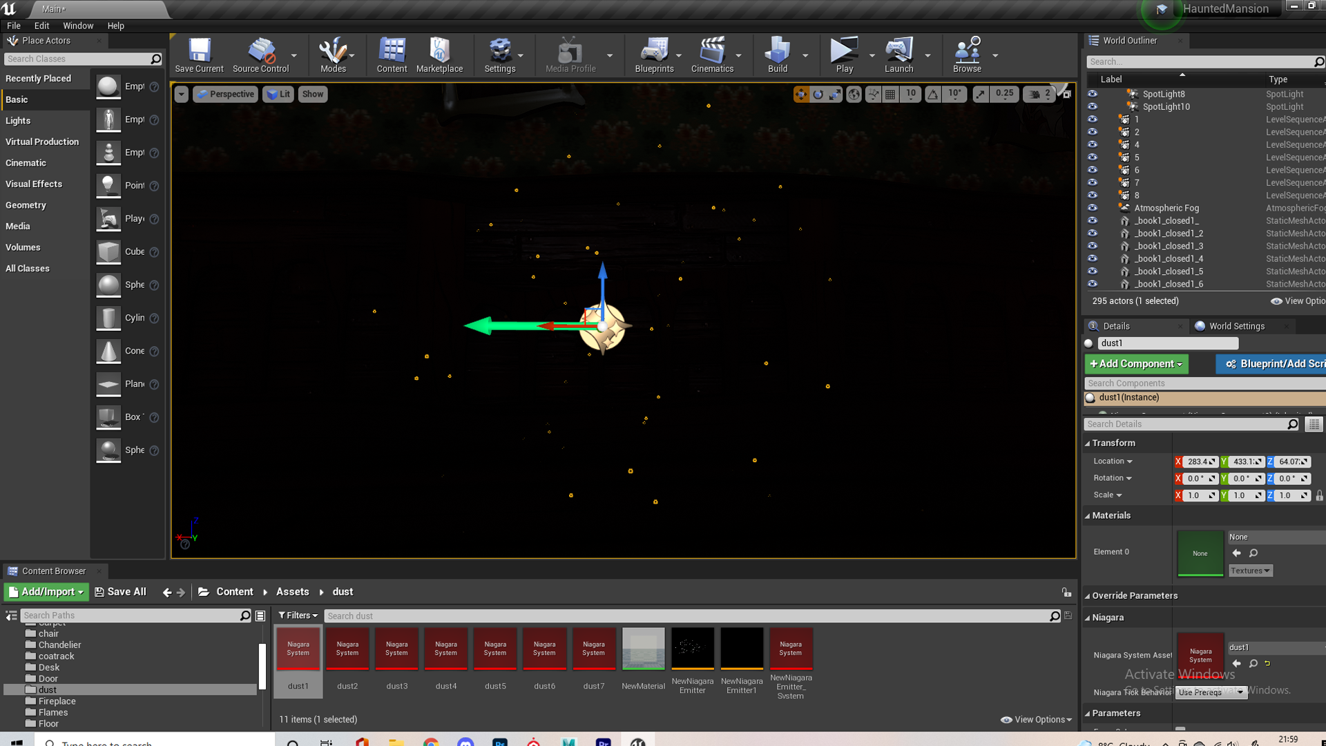
Dust wasn’t something we ever mentioned when listing our assets or anything when concepting this environment, but something I came across during my own research into environments. It’s common in video games like Horizon Zero Dawn and the Last of Us, as well as a lot of other artists environments, especially common in god rays which is something my environment had. I thought ambient dust was something so simple that added a lot to a scene and since I had some experience now in the Niagara system I knew dust would be something I could make using it.


I created a Niagara emitter from an empty template then added a spawn rate and a box location for them to randomly spawn in. Then I added random movement paths and lifespans, random colours and opacity within a range and random size within a range. I added a fade in fade out effect to make it seem more natural and a random velocity within a very low range, since dust doesn’t travel very fast. A video I found online helped me out with this but his dust had a different effect than what I was going for so I drifted from this pretty quickly. The last picture shows what my final system looked like, and from it I made 6 variations, allowing me to have more concentrated areas with dust like the godrays.
I wanted to keep it quite subtle because the render made it show up a little more obvious, and I didn’t want the dust to take away from the environment itself, since in games and other environments it is a very subtle effect. I love how it came out, not only does it add to the god rays, it adds movement to the scenes which makes it a bit more interesting when the camera is on a stationary object – a great example of this is when I focus on the chandelier in my cinematic.
The whole scene ended up full of dust, selecting it all makes it more obvious. Since it has the possibility to spawn so small and translucent though it didn’t take from the scene and came out pretty tasteful and subtle I think. I added some more concentrated pockets – areas in which the camera would move through, since the further away you are from the dust the harder it is to see.
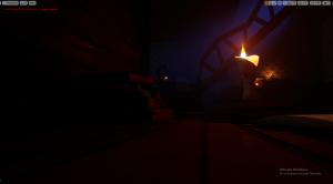
I modified my dust system with new colours, more opaque and a higher velocity and spawn rate, this was to add embers from the fire. It was missing a little something with just random movement around the fire, so I also added a new system based on the direction burst template, to have sparks that would fly out randomly in a set direction at a higher velocity – this happened at random rate between a set range. I set up my fireplace with three flames since one large flame looked a little silly, and really loved how it came out at the end with both the flames and the embers. (Megan also did a good job making such a cool fireplace)


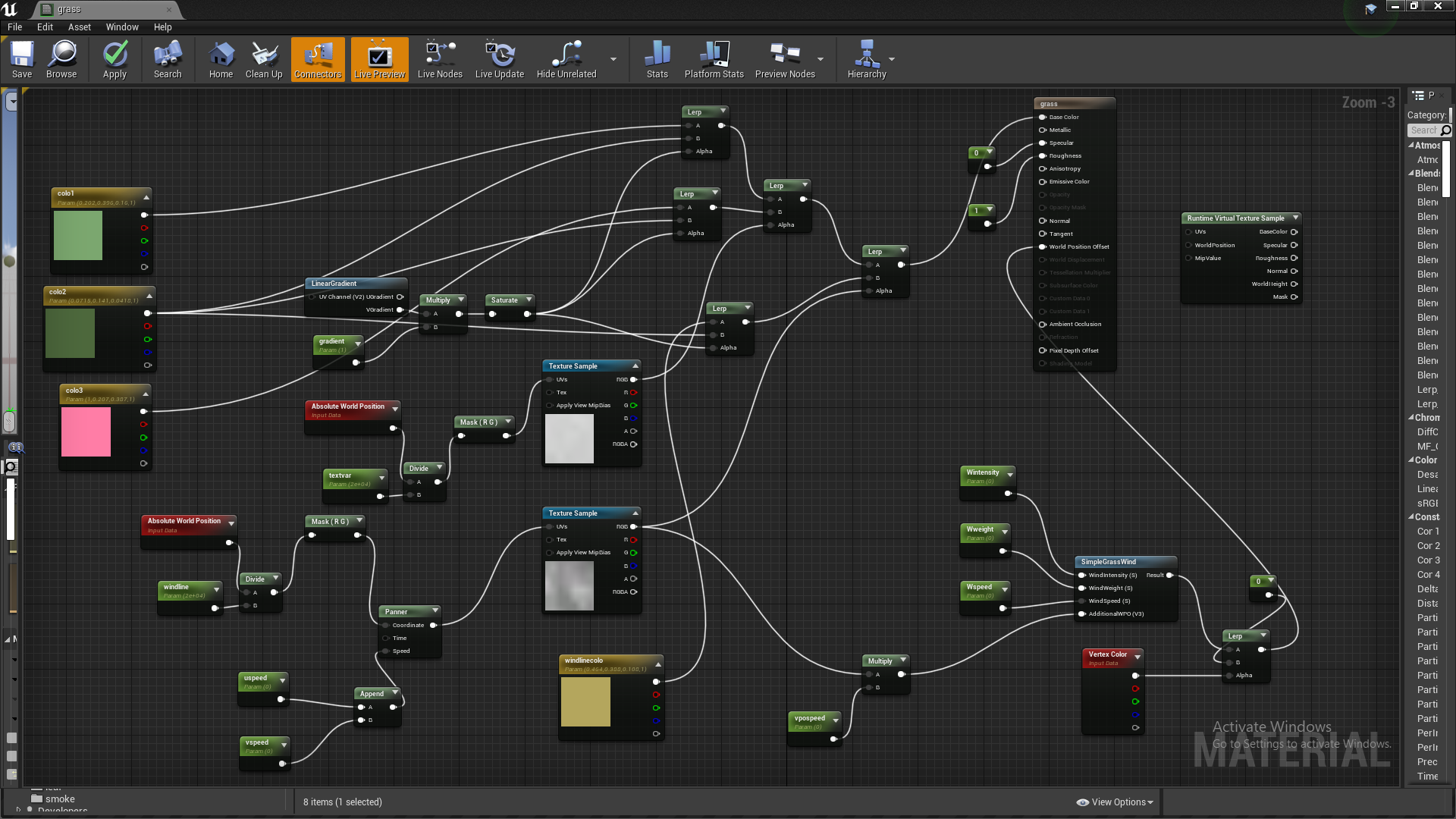
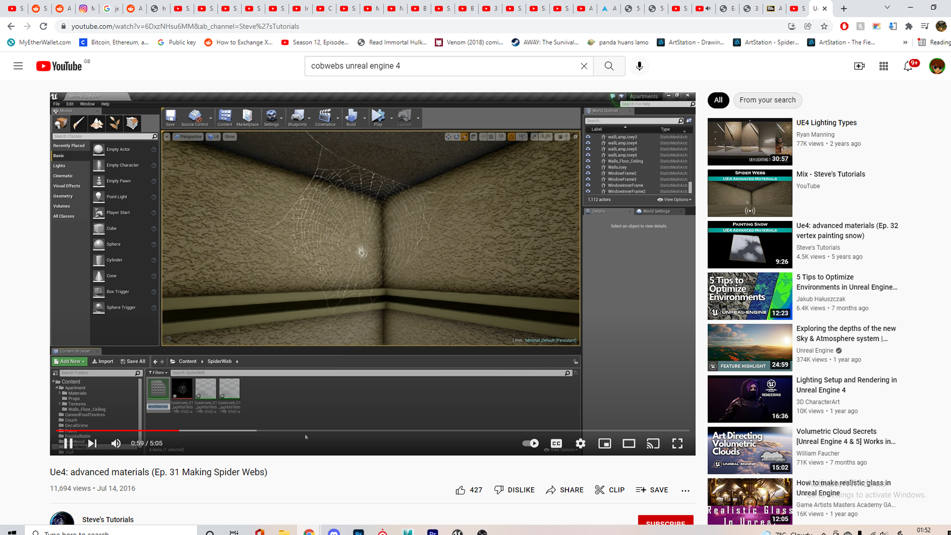
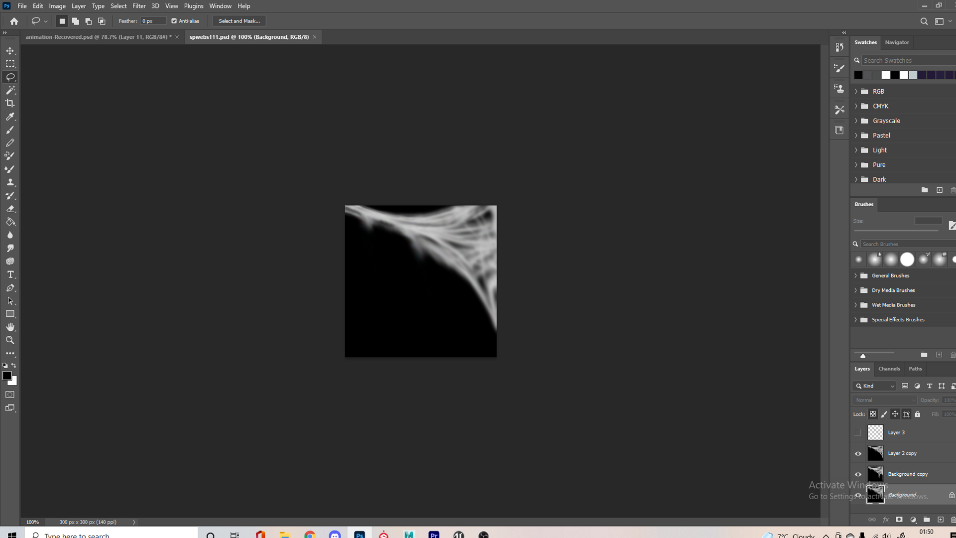
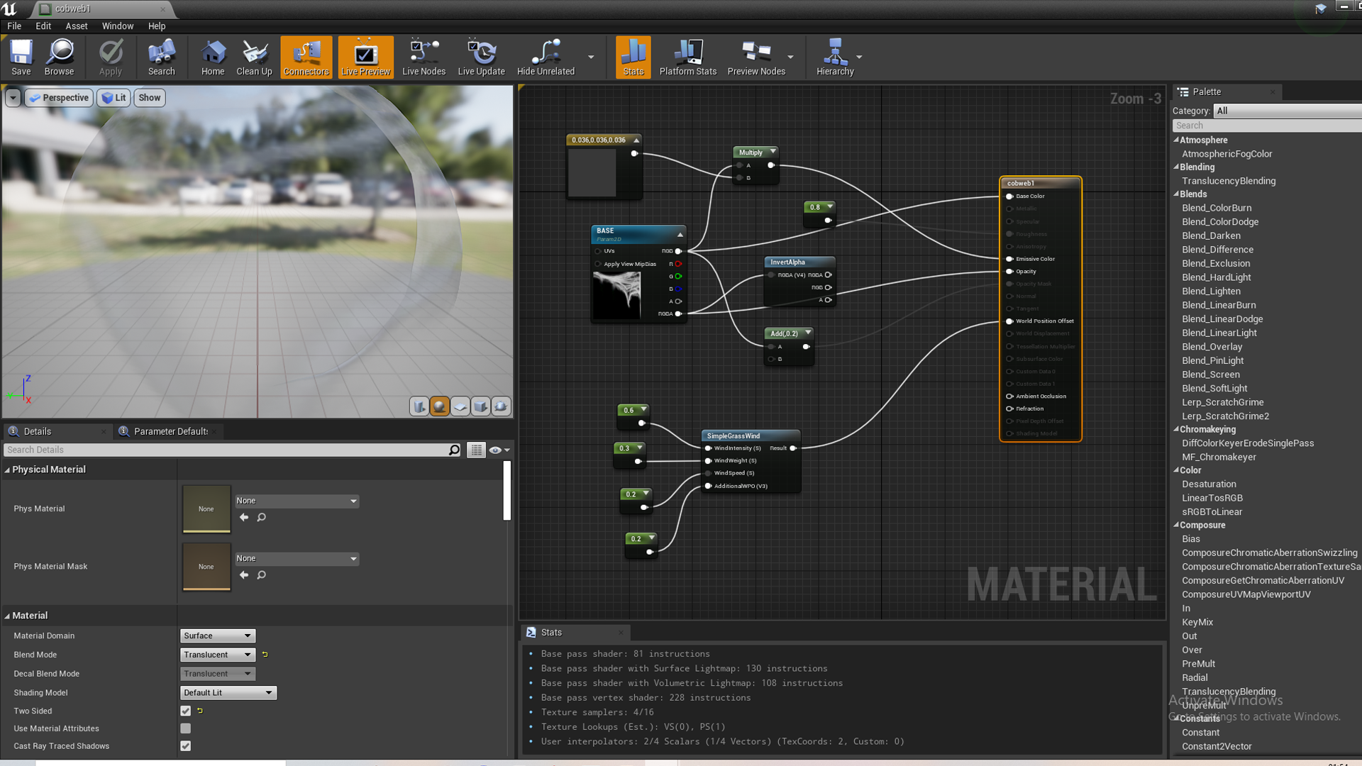
I also (very) last minute made a cobweb, I found this tutorial online but it was more realistic so I made some changes. Instead of using a texture online I drew my own in photoshop. He uses masks in his tutorial, I changed this in mine to use transparency, I thought using masks made the webs too visible and light couldn’t pass through them so if a light hit them they were very visible. I also changed my material setup to be slightly emissive since my web was transparent. I thought the grass wind part was cool though, letting it slightly wave as if there’s wind.
I’m happy with how it turned I feel like it fits in quite well and I like how it moves, it’s pretty simple but adds something extra to the scene. Since I made this the day of submission, while waiting for some assets, I wish I had more time to do variations as well as clean up the textures in photoshop though, this would also let my group members add them into their scenes, since mine was drawn to be in this corner it might not fit into their scenes too well.
Rendering

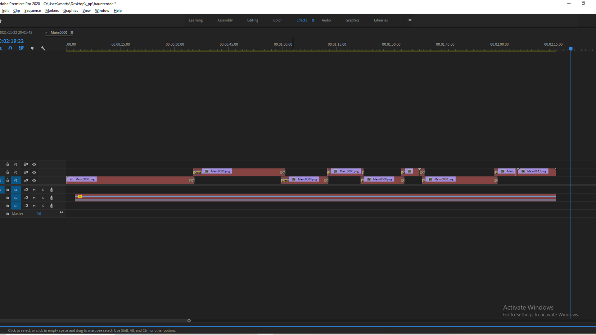
 No idea what happened but when I opened up my project again to show how I set this up, my sequences are all missing and I can’t seem to get them back (somehow deleted them?). I’ll just type up how I did this part. I found a video of me testing out camera movement but that’s all the documentation I have of the sequences.


I looked at some videos linked during to make sure my render would come out as good as possible. Just before I started rendering I added another set of lights to my flames, with a slight flicker light function following this tutorial, this is more obvious at the fireplace. I ended up rendering to PNG image sequence as it was much higher quality than everything else for me and allowed me to review each frame, I compiled this in premier.


I wanted my first shot to start by going down the stairs, as it would be going into the dust and establish that the rest of the mansion is upstairs, so this is some sort of basement/lower back door – since Mike said the stairs looked more basement like than mansion grand staircase. I used the techniques Henry showed, switching my camera to film dslr and animating using the debug focus plane to animate the focus and get some cinematic depth of field effects.
My basic methodology was going to my screenshotted camera angles from before and recreating the camera angle – I’d use that as the start or ending of that shot. You can see at the bottom in the video above I have a sequencer open, I keyframed the transform and the focus distance (manual). I animated the transforms to have some imperfections that made it feel a little handheld, I like that effect in the final cinematic. If I was trying to convey some stress I would use camera rotation, like seen in the clock shot. I tried to match up the end of one shot and the start of the second one, so the transition wouldn’t be jarring. For example if I was moving left to right at the end of one shot, I would open the next by moving left to right. I played a lot more into this with the clock, chandelier and door shots, transitioning between them with a heavy rotation (rotate left to a wall at end of shot1, rotate left from a wall at start of next shot) – I really like the transitions between these shots, I also lined them up with the music so I think it’s very satisfying.


I had saved some previous cinematic to reference when doing this part, just to see how long to hold certain shots or the camera angles used in these horror environments, one was even a haunted mansion which was very relevant. This Youtuber William Faucher has so many useful tutorials I used him a few times throughout this project.

I edited it all together using premier since I exported as image sequences and I am used to editing in Premier. I had a cross dissolve between almost every scene since it worked quite well with the slow nature of my cinematic. I added an audio track I found online called Alone In The Darkness (Sad Music Box Melody – Original) DIMD, I put this in .9 percent speed to better match the length of my cinematic. I generally cut on the beat since it adds good timing to the edit and feels satisfying when watching with audio.
Super happy with how it came out think it works really well and feels very cinematic. I thought interior environment would be a much harder than an exterior but I think it worked out good. It conveys what I was going for and feel like it will have a very different vibe to the rest of my groups cinematics. I love the slow pan shot revealing the knight, with the dust in the god rays. I really like the transitions between the clock, chandelier and door, as well as the camera movement on the clock. I definitely got more experimental and confident when working on the later shots. I feel like the piano shot could be better, and the transition to the next shot. I think the opening shot was very strong other than that though.
Something I realise when watching it not in full screen is that it’s hard to see with the white background, since its such a dark scene, so it might be harder to see on certain monitors or with the screen glare. I wasn’t able to go back in and render the shots brighter for this since I somehow lost all 8 sequences, but I adjusted the brightness in premier afterwards and didn’t like how it looked so I left it how it was. (I wonder if a better approach next time I do a lowlight/night scene is to render brighter than needed, and lower it in premier afterwards) I feel like the level of light is good if you are watching in fullscreen with the lights turned off, I watched it on my phone in case the colour and brightness is different from my monitor, and it was just as clear when I turned up my phones brightness so hopefully its all good. I don’t think this is a big issue because any low lighting cinematic or trailer is hard to see with screen glare/lights on.
Really proud of all my assets and the final cinematic though, I definitely get a similar feeling to being at a bonfire in Dark souls when I’m next to that fire showcasing the books before immediately cutting to the uncomfortable angles of the clock. I think the particle effects and god rays make it feel very stylised and atmospheric and all the props have ended up with a consistent style.
Reflection
This above paragraph was kind of me reflecting on the final cinematic so hopefully I don’t repeat myself too much here. I really liked this assignment and module. Group work is always fun because you get to work on something with a much larger scope than if you were doing it individually and I had a good group to work with. I feel like we produced a high quality assets in an cool style, and individually I produced a pretty solid cinematic. This environment assignment has definitely got me interested in Unreal Engine, after seeing the capabilities, I already want to start another project in it now that I kind of know what’s going on. The lecturer’s have been really helpful too in both assignments, Henry helping with problem’s I had with assets and Alec providing a video of recorded feedback when I asked. I can’t speak a whole lot on the other assignment because most of my focus has been on this group environment but I’m enjoying it so far too. There are definitely things I could’ve done better like not spending weeks on just candles, and leaving more time for the cinematic since it was made on the last day. I feel like I’ve improved my knowledge of topology and edge flow during this project and have developed a pretty decent workflow for texturing in substance – producing a bunch of assets I’m really happy with. Overall I think my final environment has come out super well, it feels very atmospheric and the contrast of the reds and blues gives a nice effect.
 I haven’t found much time to look at personal projects during this placement year, but I’ve had a few experiments and works in progress. I started with a likeness sculpt of Anya Taylor Joy and then decided to plug it into mesh to metahuman to see how well it translates and to play around with this software. There would need to be further adjustments made to the metahuman achieve a better likeness but I saw some similarities between the two, I thought perhaps recreating the hair in xgen would help but I didn’t get around to this.