This week we had to animate a flour sack doing an action/showing an emotion – I just chose to have it walk across the screen. It’s not perfect but I think that it gets the message across. Next time I’d probably slow it down and make the sack bigger. I looked at https://livlily.blogspot.com/ beforehand, just for general animating tips.
(Not a gif, so it doesn’t loop like I wanted. You can try Right Click – Loop while it’s playing)
Last week I did a quick storyboard, just to put my ideas onto a page. It took just a couple minutes, using pen and paper. I’ll do a more developed storyboard and update this weeks blog, focusing more on the type of shot and composition. For the mean time, here’s the sketched out one. (that might only make sense to me)
This week we finally got to start animating, with the assignment of animating 3 bouncing balls, at different weights. This was my first time animating, and my first time using adobe animate, so there was a lot to take in. I very loosely used this for help. https://www.youtube.com/watch?v=aY3TrpiUOqE&ab_channel=EleanorHazael
I started animating at 24 fps for the first ball, and it came out pretty smooth, but then I did the other two balls without watching them through, and had to lower the fps to compensate for their speed, making the final video a little choppy, but I think the final product is decent for my first time.
I probably should have read chapter 4 of Richard Williams Animator’s survival guide before finishing the animation, as there was a couple things I missed that I could’ve picked up on, but there’s always next time
Some of our group met up on a discord call on Tuesday to try and organise our animation sequence, and we kind of figured out the ending, but we are still deliberating on how linear we want to tell the story, as it limits some of the ideas. We decided it should definitely be in consecutive order though, so it isn’t too confusing. I was hoping to animate a chase/ hiding scene, but I’m not sure the best way to fit it into the sequence yet. I’ll sketch out some storyboards and see what works best.
This week we continued on working on our worlds, before being given a talk from Sean Cunningham, Animator Co-Founder and Creative Director at Studio Meala. He spoke a little about himself and we had a Q&A session with him, asking about the industry, future plans, design techniques and a bunch of other stuff.
Following the feedback on our character designs, and the stuff Sean mentioned about really pushing the silhouettes and exaggerating features on a character to make it a more interesting and distinct design, I revisited my character designs from last week, to try and make it more animation friendly and exaggerated. I’m not confident in stylized, cartoon characters so I looked at what another group member, Katie, did with her designs, as I really liked her style.
The linework was never finalised, I never really cleaned it up or anything because this week we got to choose what group we would like to work in, and I left the Nespresso Noir world.
I ended up returning back to Group 9. the dystopian submarine world. I learned about how the world had now changed since I left, with their now being two outsiders on the ship instead of just one, a male and female protagonist. As well as removed some ideas that the new group didn’t really like, it started to drift into a Scooby Doo direction, and we wanted to bring it back to its more gritty, cosmic horror origins. We settled on the themes we wanted to be conveyed in this world; fear, loneliness, hopelessness, confusion, and started to talk about the direction we wanted the story to go in. The group is now me, Cathair, Jess, Harry, EJ and Cain.
After Cathy Moore’s Virtual Collaboration talk, we jumped back into our design a world groups. This week we gained two new members and lost two others. We explained the concept of Nespresso Noir to the new members, linking the google doc (WIP) to them. We discussed the idea of giving the conflicting mafias a blue and red colour scheme, to easily differentiate between the two, which I tried to implement into this weeks assignment.
Character Design
Considering the fundamentals we’ve covered already – form and shape, colour, and this weeks character design lecture content – I designed characters to fill our world.
I used blue (green) colour scheme for all the characters, to indicate they are part of the coffee mafia, an idea I saw suggested to differentiate the rivalling groups.
6ft 78KG
Irish Coffee
This character was created to further develop the location of Cold Brew’s Bar, tying it into nefarious activity. Irish, a young bachelor who enjoys a fine whiskey, can often be spotted at Cold Brew’s, working his charm on the local patrons and will always be seen whiskey in hand.
Despite the charming, clean and suave image he’s built up for both himself and his whiskey empire, it is all a front. He makes his real money dealing in everything criminal. Extortion, manipulation, drugs but most of all, illegal gambling – often from the bar basement.
Beyond the shallow image he portrays he can be viscously violent and unpredictable, preferring to use his spoon over a firearm.
4ft11″ 65KG
Doppio
Doppio, short in stature but big in heart. Doppio and Irish grew up together, and despite their differences, have formed an unusual bond.
Whether it was Irish’s charm or his good looks, Doppio has stuck with him no matter what. It could be seen as blind, unrequited loyalty, as he is often used as a punching bag and a scapegoat.
He is caring and stupid, and when faced with danger, prefers to run and hide. He is timid and lacks self-confidence, an incompetent mobster – It’s unclear why Irish keeps him around. He does prove himself useful from time to time, whether its on accident is up for debate.
6ft4″ 110KG
Kopi Luwak
Luwak is a quiet man with a dark and mysterious past, and he likes to keep it that way. He keeps his work life and private life separated.
Luwak is a very large and very scary, towering over most of his colleagues and enemies. He is very good at what he does, and stands tall in the face of danger (although he’s not crazy, like Irish running headfirst towards it). He is Irish’s bodyguard and gunman, often standing in the shadows, coming out to begrudgingly top up his drink when required.
He is a man of few words, only speaking when important. He is often described as cold and heartless, but he seems to have a soft spot for kids and maybe even for Doppio, perhaps due to his similarities with one.
This week Harry and I got moved from Group 9 into Group 1. This group’s world is focused around a conflict between a tea mafia and a coffee mafia, with 1950’s noir vibes. This was a big change up from the dystopian, horror, submarine we were just in, so we had a lot of questions.
We discussed the world, asking about different characters and locations and generally how the world works. I noticed all the characters had either a mug of tea or coffee as a head, except one character that was a biscuit. This led to me asking about what other forms characters outside of the mafia took, civilians, journalists, police officers, etc. Where they forced into an alliance with whatever beverage they were born as? This wasn’t really developed and there weren’t any strict rules on what they could be, as long as they fit the world’s theme. I suggested having scones present, which the group seemed to agree with, and I thought it would be interesting to have assorted pastries, stemming from the idea of having a policer officer as a donut.
I wanted to further develop the tea and coffee idea, and asked about decaffeinated coffees which surprisingly hadn’t occurred to the group. I also suggested an Irish Coffee, straying away from just different strains of coffee. I thought it would be fun to have this character make his money running an illegal gambling ring in “Cold Brew’s Bar”, while making and selling whiskey as a front.
Colour
This week’s lecture went over terminology, colour systems, colour wheels, colour and emotions, colour scripts and we were set two exercises over the week to complete.
Exercise 1 – to take one of our thumbnails from previous weeks and to colour it using one of the four colour schemes we covered in the lecture; monochromatic, complementary, analogous or triadic. This was a little awkward as the only file type I had my previous thumbnails saved as were .jpg, so I had to work overtop them, unable to access the previous layers.
I used complementary colours for this task, purple and green. I wanted to make it look ethereal, kind of out of worldly, I thought this suited the cosmic mystery of the squid world. I looked to H.P Lovecraft’s ‘The Colour out of Space’ for inspiration, it made use of very vibrant and purples and blues, contrasted with the normal colours of the world. So I chose deep green (similar to seaweed) to complement the vibrant purple.
I tried another thumbnail, I started out monochromatic but thought it needed more, so this too ended up a complementary colour scheme. I used red light to signify the danger present, and it slowly fades into the cold, blue shadows, where our protagonist is hidden. This was one of my favourite thumbnails I did previously and wanted to try out some fun ideas with it. I don’t think it came out that well, but I was just experimenting with colours.
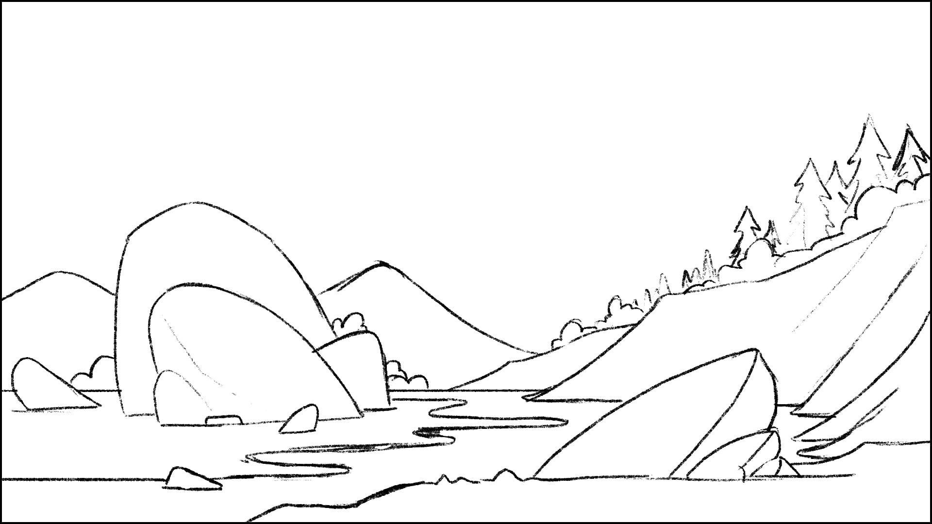
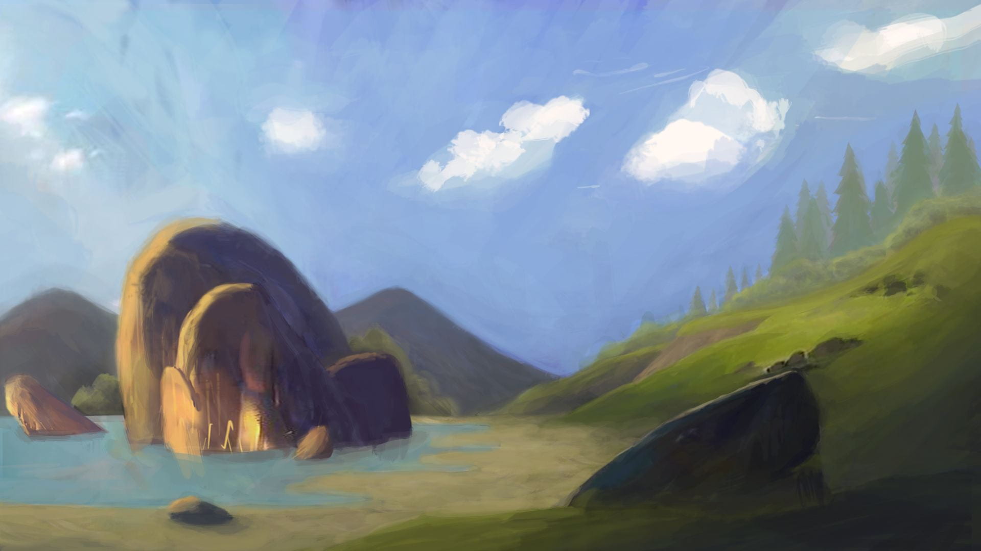
Exercise 2 – to take a the linework of a landscape provided and colour it in two different ways, conveying a different emotion in each one. Think about which emotion you are trying to convey, and select a colour palette which reflects this.
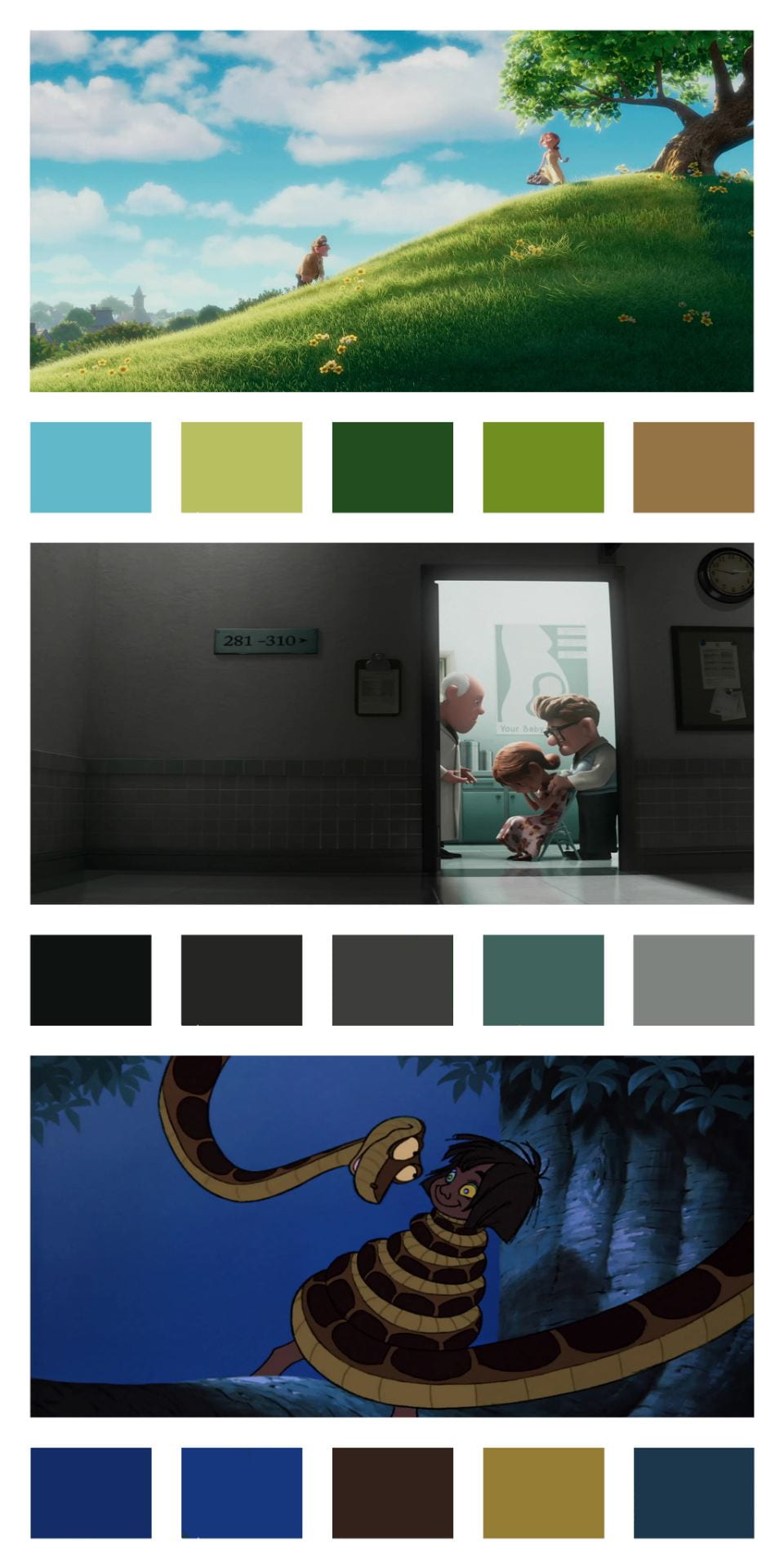
In order to warm up for this, as suggested, I looked into different artists styles of how they work with colour. I picked out stills of animations that I like and created a basic colour script using block colours, discussing what kind of colour scheme was used and what mood it conveys:
The first still is from Up, using an analogous Blue-Green colour scheme. The colours are very vibrant and warm, conveying a pleasant and happy mood. This image feels very fresh and bright – optimistic, similar to their marriage.
The second still is in the same sequence of scenes, following the diagnosis of a terminal illness to Carl’s wife, a very serious and depressing situation. The colours reflect this, the once bright, vibrant colours are now desaturated, cool, blues and greys, with an almost monochromatic colour scheme. These two scenes provide a strong contrast of moods and colours.
Finally, The Jungle Book, using complementary colours. Despite blues and yellows tending to induce a sense of calm and relaxation, this scene has very sinister undertones, conveying an anxious and scary feeling. Mowgli is in a paralysed trance, hypnotised, perhaps the reason for the use of these colours.
Original Line artPeace, Tranquillity(an accepted?) Doom, Dread, Fear
This week our design a world groups got mixed together, with two of our members being replaced by Katie and Cain from a different group! Me and Harry had to spend a lot of time catching our two new guys up to speed on our ideas and the concept of our world, they asked some questions and even gave a few suggestions to help refine our world. Katie dove in head first, drawing all kinds of sketches of the people on board, and went on to design a possible look for our protagonist. We discussed some design ideas, the style, the colour scheme and tone we wanted, I thought it would be cool if maybe it reflected our protagonists perspective of the ship, gradually becoming more attractive and saturated as he is slowly indoctrinated into life onboard (the Echo Chamber?).
We were set 6 thumbnail value studies in our world, considering the value range we use:
I found it quite difficult to think of another 6 Thumbnails, after doing 12 last week. I am happy with them overall, but I started too detailed again and No. 6 has an idea I like, but poor composition/execution.
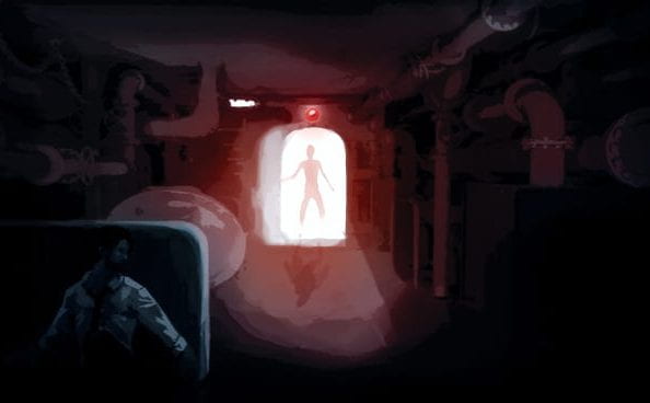
We were told to choose our favourite of the six and illustrate a larger / longer focus study combining composition & tonality, number 5 was my favourite, with a lot of potential for improvement:
I added detail to the room and character, using Katie’s protagonist sketch as reference. I kept the silhouette more or less the same, adding a shadow. I think it came out well.
I didn’t need to look much into tone and value, it seemed pretty self explanatory and the lecture content covered all that was needed. I just got stuck in and followed what we were told, things would generally be darker in the foreground, messing about with the shading on 3d objects was a little more trial and error though.
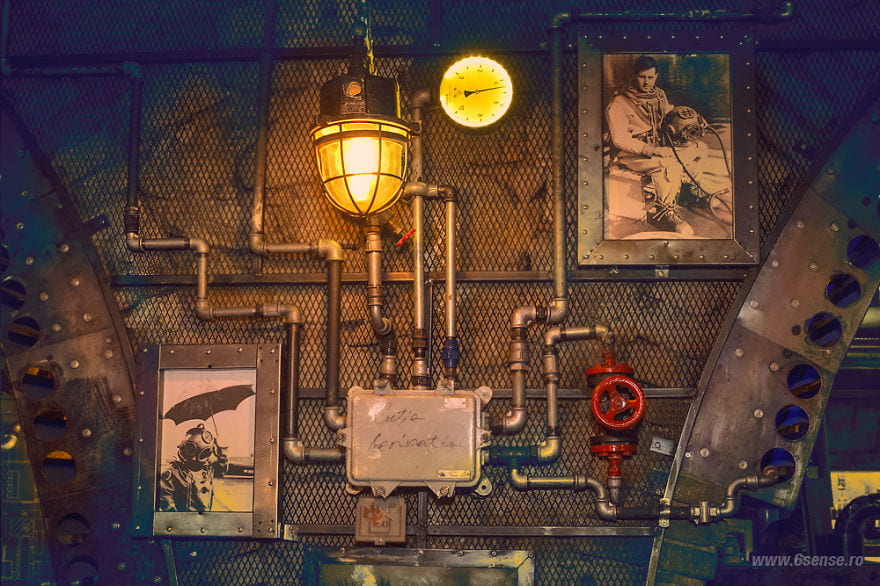
I then researched possible references that could help us improve upon our world design, using my Lovecraft graphic novels and Bioshock’s concept art to help. I also found a Submarine-Themed Pubin Romania that had a really cool aesthetic and thought it would be cool to implement, finding the valves and pipes on the walls helpful.
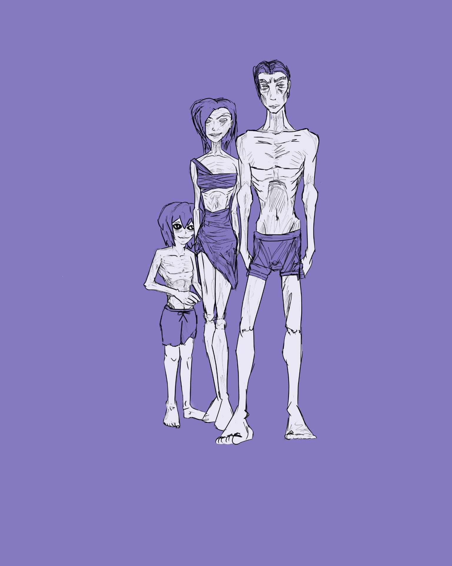
I haven’t solidified any designs for our characters yet, other than my original family onboard. I’m trying to find the right amount of realism to use, with a style that would best fit our world, as well as fit an animation. I really liked the style of Katie’s drawings and think I’ll try and use similar shapes and proportions. I’ve been thinking of interesting characters in the world that I could work on; a grotesque and oversized chef, an old and creepy (Dr Frankenstein style) surgeon or a group of ‘law’ enforcers, wearing the old metal diving suits (perhaps to hide their true forms?).
Katie’s Protagonist Concept, inspired by Robert Pattinson.
This week we got split into groups for our “Design a World” Project. We had to explore potential concepts for our world, generating 100 ideas in total. We settled on EJ’s idea focused around a sunken submarine, with a society developing inside. I drew from Lovecraftian sources for inspiration, with the society slowly descending into madness and worshipping a squid, whether it is an actual deity is left to audience interpretation. An undetermined number of generations have been born on board the submarine, with each new generation exhibiting new behaviour and adaptations, straying further from normal humanity.
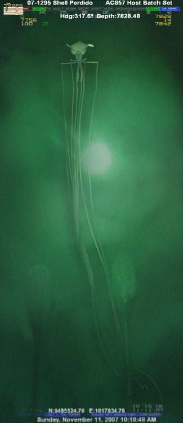
We are using a Bigfin squid as reference for our “squid god”, an elusive giant squid, found in the depths of the ocean. Its true size and origin is unknown as when it’s brought to the surface for studying, it suffers such injury and shrinkage that it doesn’t resemble its original form. This gives us a lot of room for experimentation.
We discussed what adaptations might occur from living with a lack of natural sunlight, unbalanced diets, generations of inbreeding and an unnatural atmospheric pressure. Despite evolution normally spanning thousands of generations, the society onboard seems to be evolving rapidly, some significantly more than others. We aren’t planning on outright explaining why this is happening, perhaps time passes differently onboard the submarine, and despite only being sunken for what seems like 70 years to the surface, centuries have passed onboard. Perhaps the rate of mutation is somehow linked to the level of belief and commitment to the squid god. We will offer several explanations and theories, from different members onboard. The common mutations present throughout seem to be a loss in sight, change in skin colour and texture, loss in size and varying ailments. Some characters may suffer from more rare and unnatural mutations however.
My initial sketch of a family, before establishing a style for our world.
This world will revolve around our protagonist, a normal human from the surface who has managed to wake up on board the ship, and must conform to fit in and survive, how will being on board affect him? How long will he be on board? Does he slip up and they realise he is a fraud? Does he somehow escape? Does he start to enjoy life at the bottom of the ocean?
Experiencing the world through a character allows us to play with the “unreliable narrator” trope, since we see things from his perspective, there will be a mixing of hallucinations and reality as his mental health deteriorates. Reinforcing the ambiguity of the supernatural aspects of the world, while giving us more abstract design opportunities. (I suggested this, not sure if we are going to implement it yet)
While discussing different plot points and world ideas, I realised the story could be a political commentary on the Echo Chamber Effect – a situation in which beliefs are amplified/reinforced through communication and repetition inside a closed system, insulating them from rebuttal, resulting in people amalgamating and developing tunnel vision. I suggested naming the submarine The Echo Chamber, but this might be a little obvious.
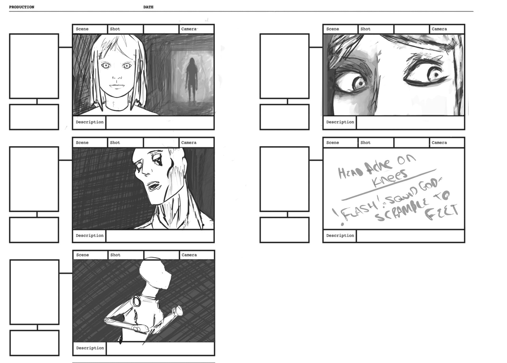
We were given the assignment of completing 12 thumbnail composition studies of the world:
The themes I wanted to convey: Horror, Dystopian, Hopelessness. (quality declines :/)
I like my initial 8 thumbnails but the last 4 were rushed, just getting the ideas down for the deadline. I drew inspiration from Robert Eggers, since all the suggestions I put forth were inspired by the lighthouse (Unreliable narrator, Lovecraftian horror) as well as Call of Cthulhu.
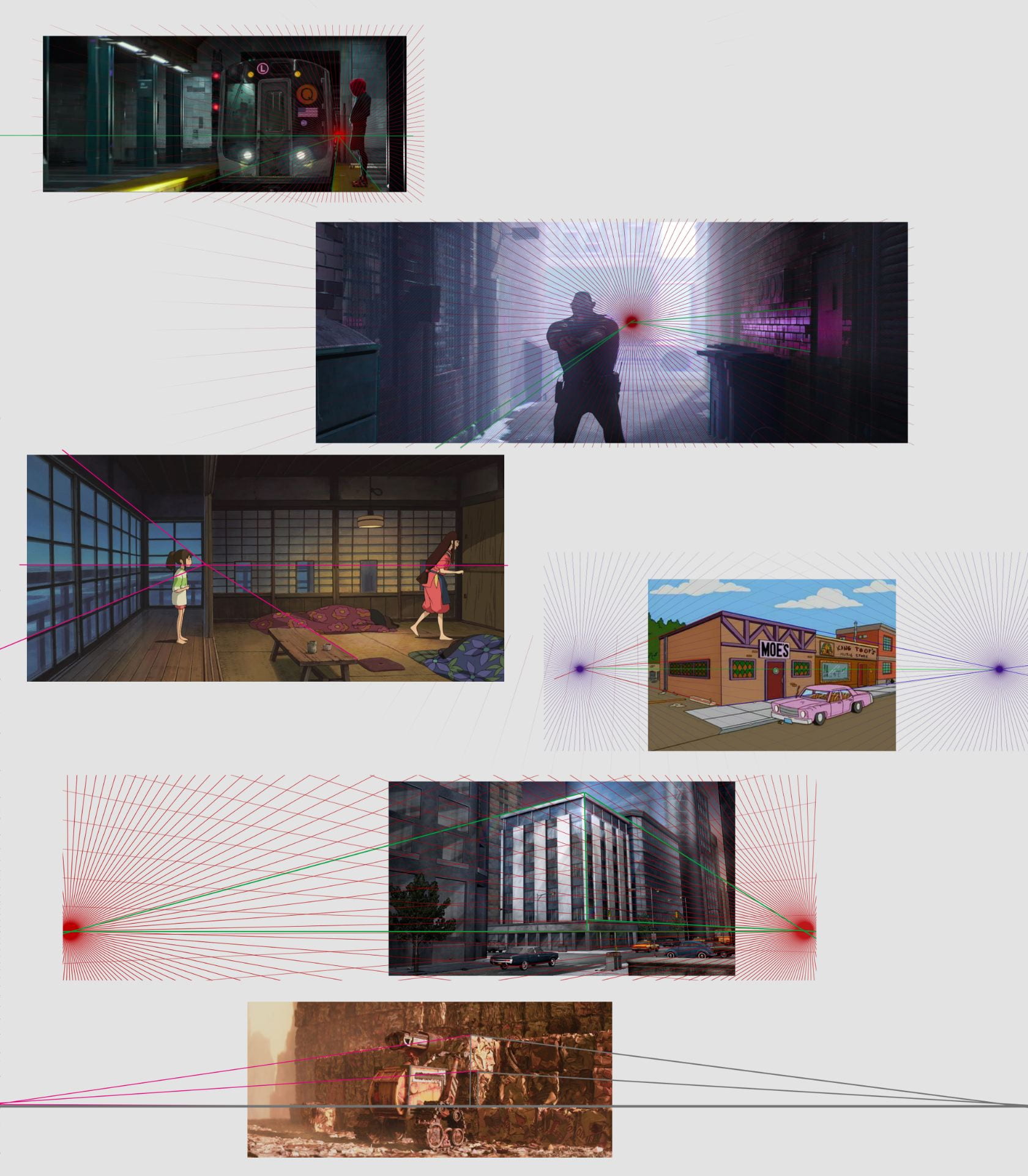
We were also set the task of doing 6 perspective studies from various animations:
This was our first week after the induction week, after some introductions and ice breaking we started to look at form and shape in character design, exploring the underlying forms that make up a character and what makes a character design good.
This weeks assignment was to practice studying & drawing underlying forms – taking our 3 favourite animated characters and studying their underlying form – tracing over and finding their construction forms. I actually found this exercise very useful, how the most popular and effective characters in animation are constructed by common basic shapes is something i never really considered – let alone broke down and analysed. Specific shapes being used to add weight to the character or to convey certain personality/traits to the audience without them even realising was very interesting to see.
As you can see I tried to choose designs that would be distinct from each other, but when broken down enough, they all shared basic shapes in common.