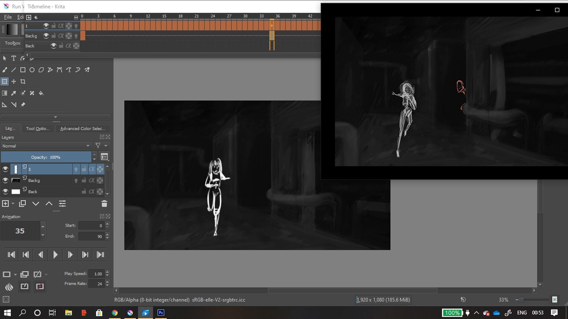
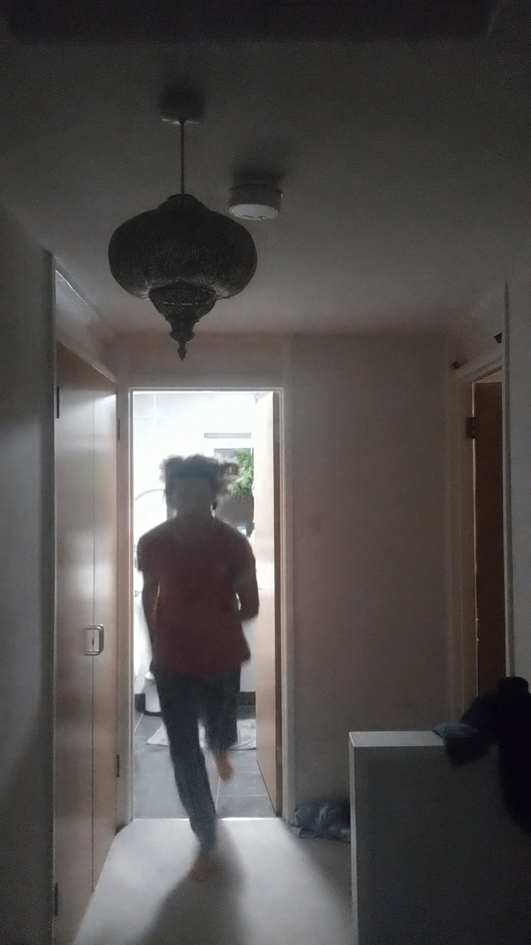
My part of the animation serves it purpose but it didn’t come out as good as I hoped it would, I think I was too ambitious for my first time, animating at 24fps and with the character running towards and then off camera. I had to cut out the cultist at the end to save on time, and my character isn’t exactly consistent with the others, she also doesn’t have much of a face. Overall, I would say its a solid attempt, and when partnered with the other parts it feels more complete.
I will change the background to better fit perspective of running, easier than changing each frame individually + 4th stride needs to cover more distance. Obviously it all need cleaned up a little, and i need to animate the hairs movement. I was planning on having the cultist character walk around the corner and dramatically look towards where she ran to, to save time – but I’m not sure how this would impact my transition to Jess.
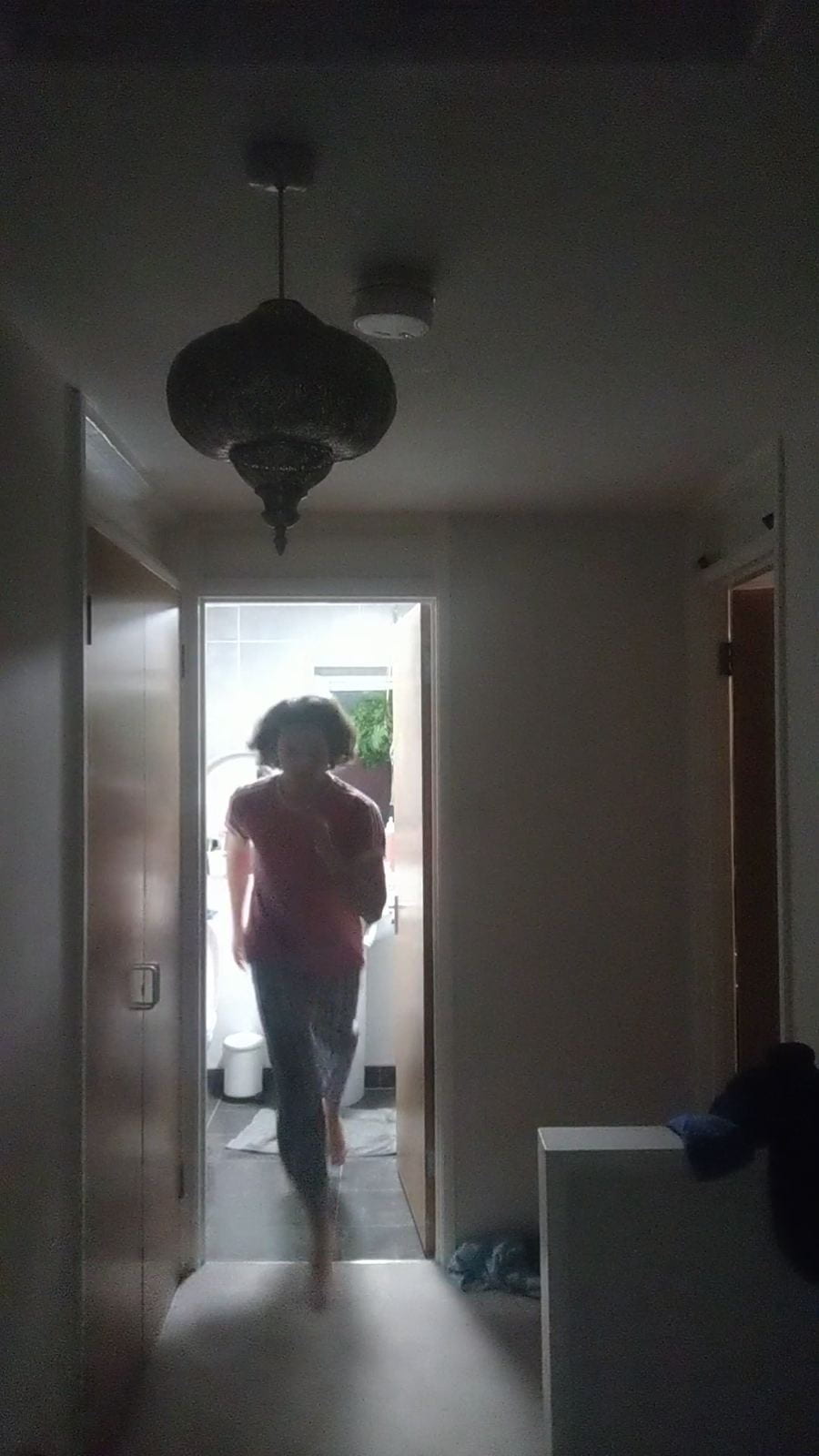
I researched a lot trying to create this run. watching YouTube videos, reading online, recording myself running about my house as feminine as I could. I have a page of ‘maths’, estimating the distance covered and how fast the average person would run it.
We’ve been unable to contact Cathair, who was animating the first 6 seconds, establishing the scene, so I guess we’re starting with me. In order to have it loop with the ending I will try to animate something at the beginning if I have time to but if not I’ll just fade from black, so it somewhat loops with Harry’s.
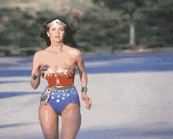
I was promised full marks if I released the embarrassing reference videos of me running about my house, but I am never posting those to the internet. Not because of how I run though, I’ve got the stride of a gazelle. A beautiful, beautiful gazelle person. My body achieves a perfect symmetry. It’s that long, lean muscle I’ve worked so hard to achieve.
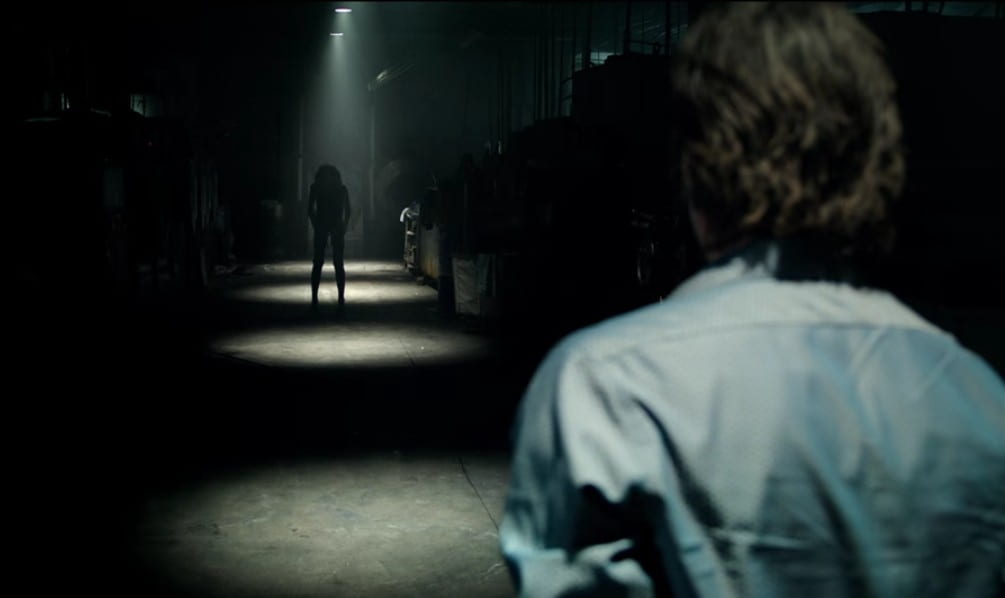
Here are a couple stills from one of them though :/
I spent a lot of time messing around with the perspective, I chose a very hard scene to animate for my first real time animating because I am stupid. I spent this week trying to figure out the correct perspective of a character running both towards and past a camera, as well as changing the background a little.
We discussed on discord and decided to stick with a monochromatic grayscale colour scheme, using my backgrounds as a reference. EJ wanted to do the audio for our animation, and link it all together, but Cain and I decided to do our individual sound effects, with EJ adding an ambient backing track to it all, so it would link together well.
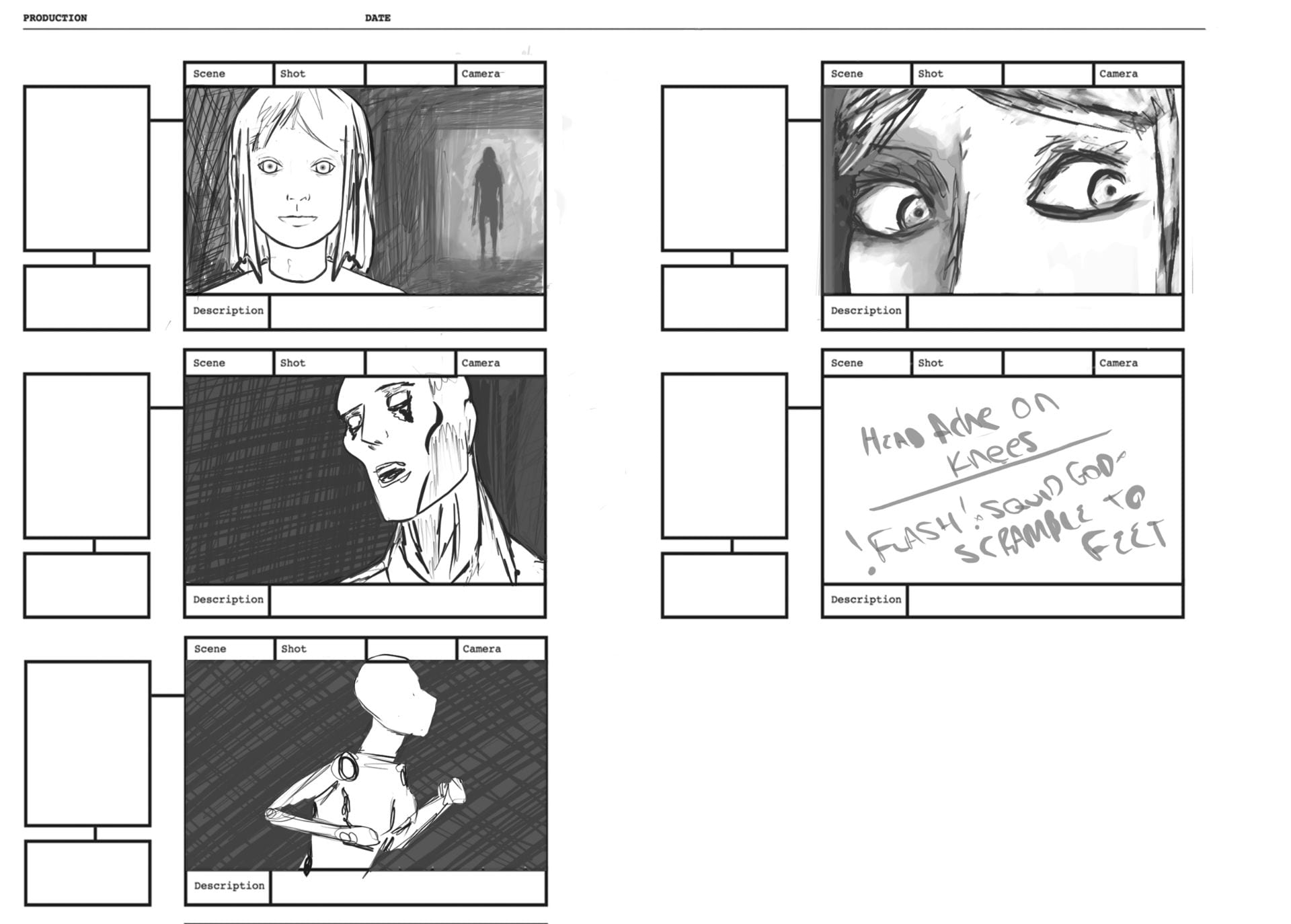
This week we made an animatic based on our storyboards, showing the key points and timing.
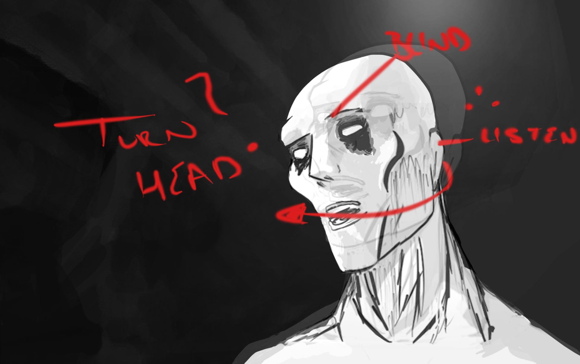
This is the 6 seconds I worked on:
I think I will slow everything down a bit, build more suspense – but i tried to shove it into the 6 second time slot. I might have the character turn his head as if he is listening to the footsteps, before running after her, as the cultists original idea had them being blind. Then again to showcase the blind cultists idea, he could run into the wall at the end instead of running off camera, adds more variety to the animations instead of having just two identical running paths.
We then combined all our pieces , to see how it would flow into one another, Cathair’s scene should be before the first scene, establishing the character and context, linking the beginning and end causing it to loop. He’s not been able to make it to class recently, so if he isn’t able to do it, I’ll try and add something at the beginning to loop with the ending,
This week we had to animate a flour sack doing an action/showing an emotion – I just chose to have it walk across the screen. It’s not perfect but I think that it gets the message across. Next time I’d probably slow it down and make the sack bigger. I looked at https://livlily.blogspot.com/ beforehand, just for general animating tips.
(Not a gif, so it doesn’t loop like I wanted. You can try Right Click – Loop while it’s playing)
Last week I did a quick storyboard, just to put my ideas onto a page. It took just a couple minutes, using pen and paper. I’ll do a more developed storyboard and update this weeks blog, focusing more on the type of shot and composition. For the mean time, here’s the sketched out one. (that might only make sense to me)
This week we finally got to start animating, with the assignment of animating 3 bouncing balls, at different weights. This was my first time animating, and my first time using adobe animate, so there was a lot to take in. I very loosely used this for help. https://www.youtube.com/watch?v=aY3TrpiUOqE&ab_channel=EleanorHazael
I started animating at 24 fps for the first ball, and it came out pretty smooth, but then I did the other two balls without watching them through, and had to lower the fps to compensate for their speed, making the final video a little choppy, but I think the final product is decent for my first time.
I probably should have read chapter 4 of Richard Williams Animator’s survival guide before finishing the animation, as there was a couple things I missed that I could’ve picked up on, but there’s always next time
Some of our group met up on a discord call on Tuesday to try and organise our animation sequence, and we kind of figured out the ending, but we are still deliberating on how linear we want to tell the story, as it limits some of the ideas. We decided it should definitely be in consecutive order though, so it isn’t too confusing. I was hoping to animate a chase/ hiding scene, but I’m not sure the best way to fit it into the sequence yet. I’ll sketch out some storyboards and see what works best.
This week we continued on working on our worlds, before being given a talk from Sean Cunningham, Animator Co-Founder and Creative Director at Studio Meala. He spoke a little about himself and we had a Q&A session with him, asking about the industry, future plans, design techniques and a bunch of other stuff.
Following the feedback on our character designs, and the stuff Sean mentioned about really pushing the silhouettes and exaggerating features on a character to make it a more interesting and distinct design, I revisited my character designs from last week, to try and make it more animation friendly and exaggerated. I’m not confident in stylized, cartoon characters so I looked at what another group member, Katie, did with her designs, as I really liked her style.
The linework was never finalised, I never really cleaned it up or anything because this week we got to choose what group we would like to work in, and I left the Nespresso Noir world.
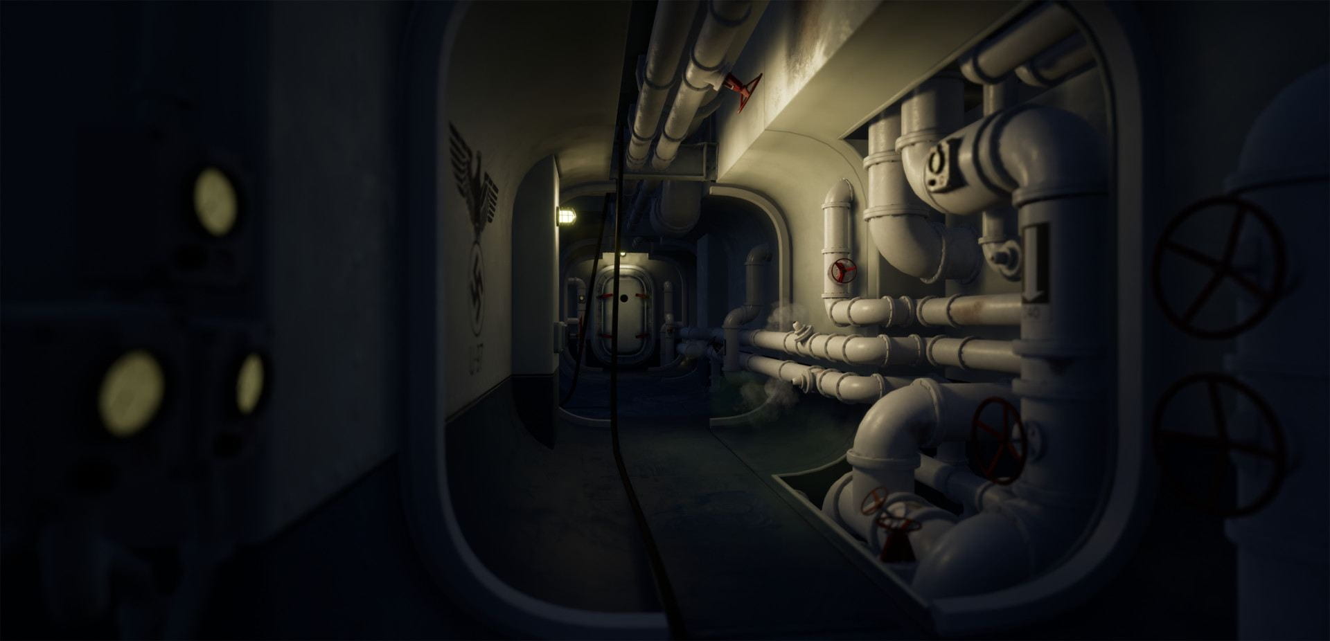
I ended up returning back to Group 9. the dystopian submarine world. I learned about how the world had now changed since I left, with their now being two outsiders on the ship instead of just one, a male and female protagonist. As well as removed some ideas that the new group didn’t really like, it started to drift into a Scooby Doo direction, and we wanted to bring it back to its more gritty, cosmic horror origins. We settled on the themes we wanted to be conveyed in this world; fear, loneliness, hopelessness, confusion, and started to talk about the direction we wanted the story to go in. The group is now me, Cathair, Jess, Harry, EJ and Cain.
After Cathy Moore’s Virtual Collaboration talk, we jumped back into our design a world groups. This week we gained two new members and lost two others. We explained the concept of Nespresso Noir to the new members, linking the google doc (WIP) to them. We discussed the idea of giving the conflicting mafias a blue and red colour scheme, to easily differentiate between the two, which I tried to implement into this weeks assignment.
Character Design
Considering the fundamentals we’ve covered already – form and shape, colour, and this weeks character design lecture content – I designed characters to fill our world.
I used blue (green) colour scheme for all the characters, to indicate they are part of the coffee mafia, an idea I saw suggested to differentiate the rivalling groups.
6ft 78KG
Irish Coffee
This character was created to further develop the location of Cold Brew’s Bar, tying it into nefarious activity. Irish, a young bachelor who enjoys a fine whiskey, can often be spotted at Cold Brew’s, working his charm on the local patrons and will always be seen whiskey in hand.
Despite the charming, clean and suave image he’s built up for both himself and his whiskey empire, it is all a front. He makes his real money dealing in everything criminal. Extortion, manipulation, drugs but most of all, illegal gambling – often from the bar basement.
Beyond the shallow image he portrays he can be viscously violent and unpredictable, preferring to use his spoon over a firearm.
4ft11″ 65KG
Doppio
Doppio, short in stature but big in heart. Doppio and Irish grew up together, and despite their differences, have formed an unusual bond.
Whether it was Irish’s charm or his good looks, Doppio has stuck with him no matter what. It could be seen as blind, unrequited loyalty, as he is often used as a punching bag and a scapegoat.
He is caring and stupid, and when faced with danger, prefers to run and hide. He is timid and lacks self-confidence, an incompetent mobster – It’s unclear why Irish keeps him around. He does prove himself useful from time to time, whether its on accident is up for debate.
6ft4″ 110KG
Kopi Luwak
Luwak is a quiet man with a dark and mysterious past, and he likes to keep it that way. He keeps his work life and private life separated.
Luwak is a very large and very scary, towering over most of his colleagues and enemies. He is very good at what he does, and stands tall in the face of danger (although he’s not crazy, like Irish running headfirst towards it). He is Irish’s bodyguard and gunman, often standing in the shadows, coming out to begrudgingly top up his drink when required.
He is a man of few words, only speaking when important. He is often described as cold and heartless, but he seems to have a soft spot for kids and maybe even for Doppio, perhaps due to his similarities with one.
This week Harry and I got moved from Group 9 into Group 1. This group’s world is focused around a conflict between a tea mafia and a coffee mafia, with 1950’s noir vibes. This was a big change up from the dystopian, horror, submarine we were just in, so we had a lot of questions.
We discussed the world, asking about different characters and locations and generally how the world works. I noticed all the characters had either a mug of tea or coffee as a head, except one character that was a biscuit. This led to me asking about what other forms characters outside of the mafia took, civilians, journalists, police officers, etc. Where they forced into an alliance with whatever beverage they were born as? This wasn’t really developed and there weren’t any strict rules on what they could be, as long as they fit the world’s theme. I suggested having scones present, which the group seemed to agree with, and I thought it would be interesting to have assorted pastries, stemming from the idea of having a policer officer as a donut.
I wanted to further develop the tea and coffee idea, and asked about decaffeinated coffees which surprisingly hadn’t occurred to the group. I also suggested an Irish Coffee, straying away from just different strains of coffee. I thought it would be fun to have this character make his money running an illegal gambling ring in “Cold Brew’s Bar”, while making and selling whiskey as a front.
Colour
This week’s lecture went over terminology, colour systems, colour wheels, colour and emotions, colour scripts and we were set two exercises over the week to complete.
Exercise 1 – to take one of our thumbnails from previous weeks and to colour it using one of the four colour schemes we covered in the lecture; monochromatic, complementary, analogous or triadic. This was a little awkward as the only file type I had my previous thumbnails saved as were .jpg, so I had to work overtop them, unable to access the previous layers.
I used complementary colours for this task, purple and green. I wanted to make it look ethereal, kind of out of worldly, I thought this suited the cosmic mystery of the squid world. I looked to H.P Lovecraft’s ‘The Colour out of Space’ for inspiration, it made use of very vibrant and purples and blues, contrasted with the normal colours of the world. So I chose deep green (similar to seaweed) to complement the vibrant purple.
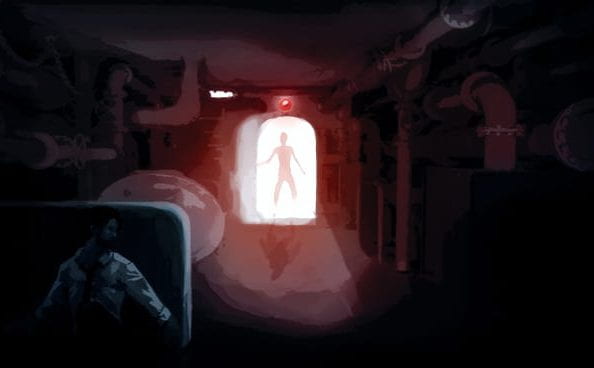
I tried another thumbnail, I started out monochromatic but thought it needed more, so this too ended up a complementary colour scheme. I used red light to signify the danger present, and it slowly fades into the cold, blue shadows, where our protagonist is hidden. This was one of my favourite thumbnails I did previously and wanted to try out some fun ideas with it. I don’t think it came out that well, but I was just experimenting with colours.
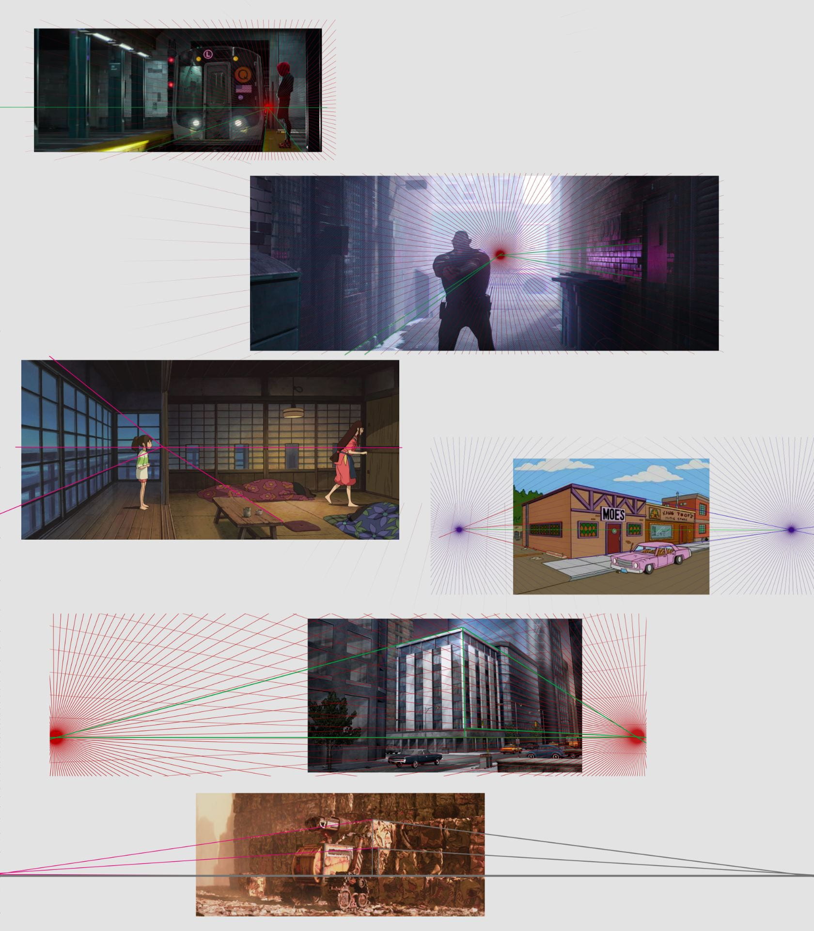
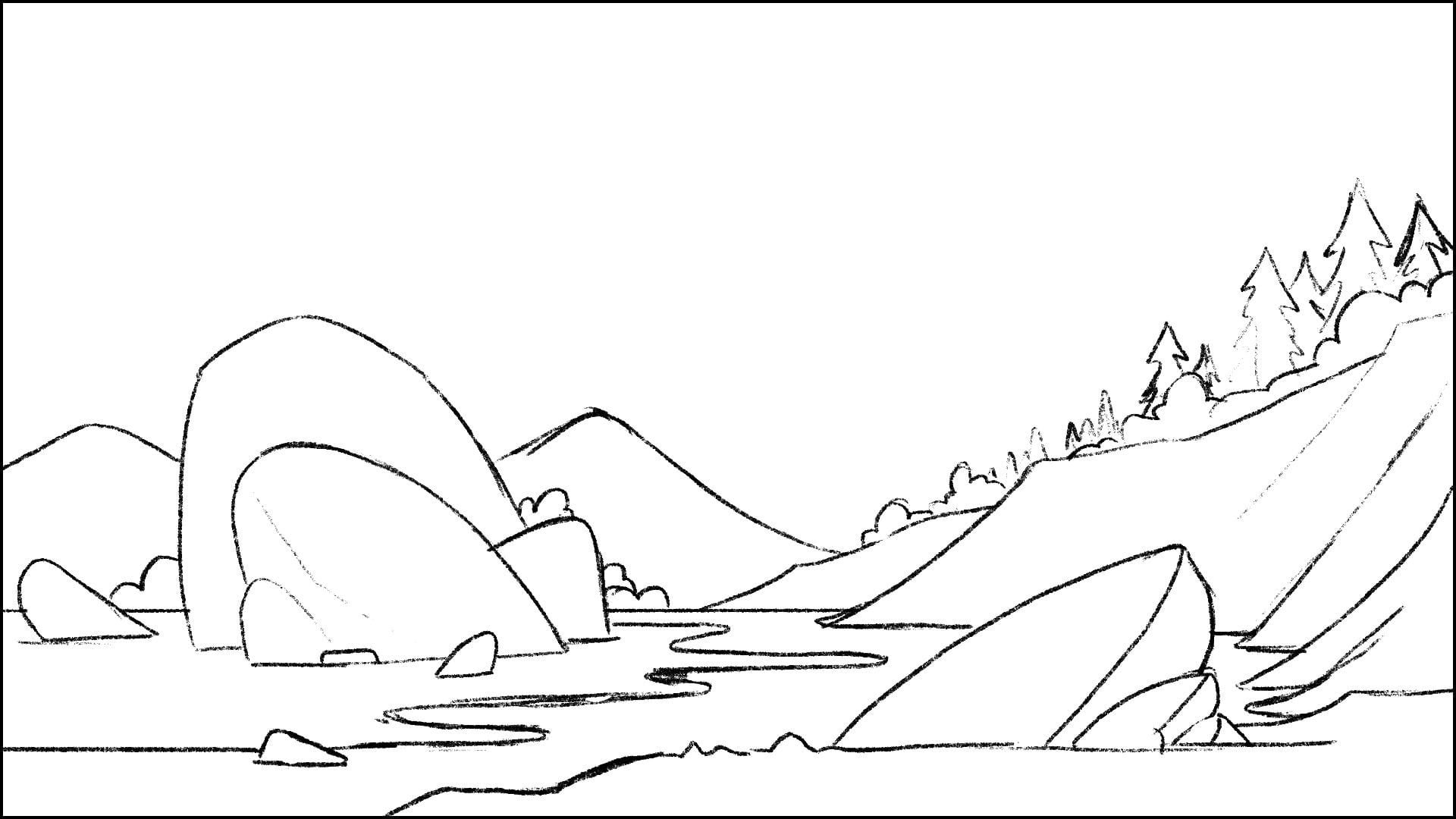
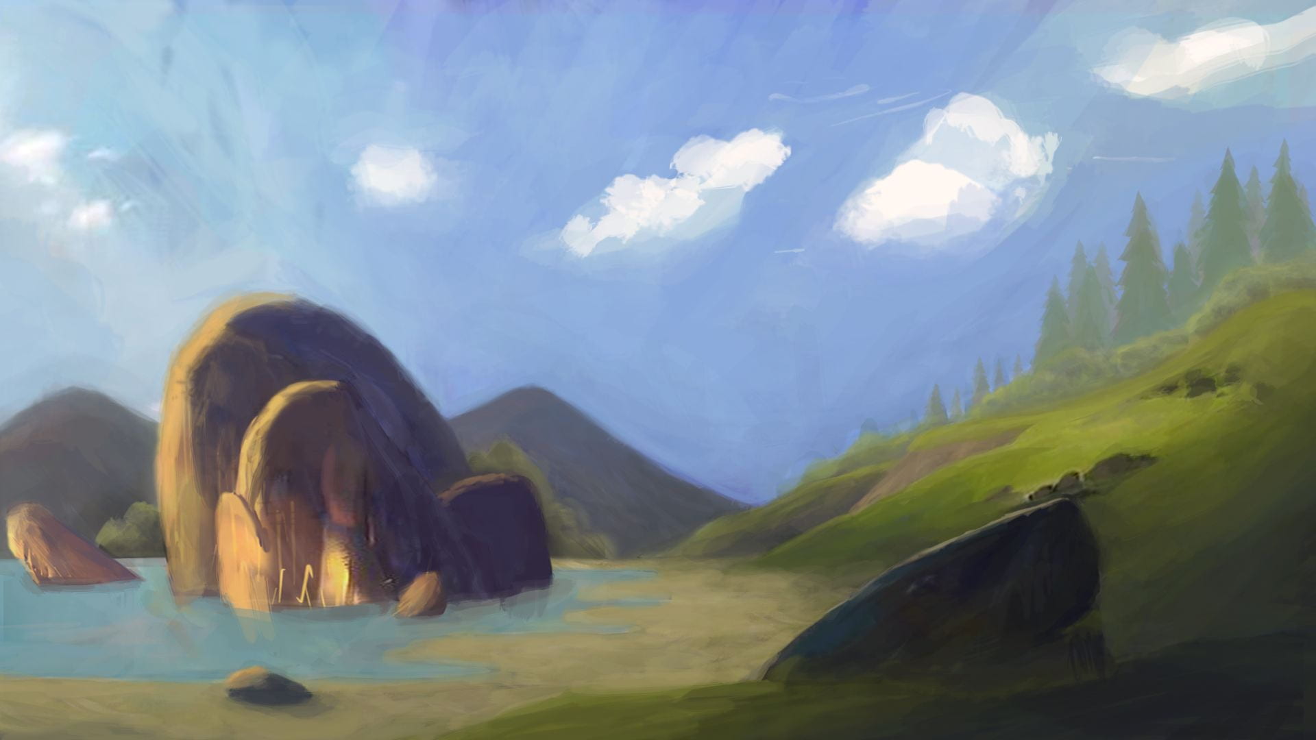
Exercise 2 – to take a the linework of a landscape provided and colour it in two different ways, conveying a different emotion in each one. Think about which emotion you are trying to convey, and select a colour palette which reflects this.
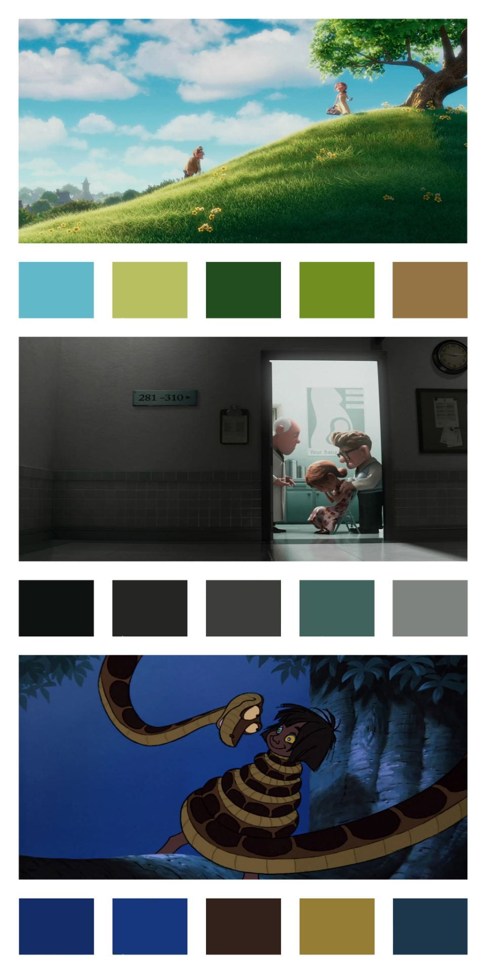
In order to warm up for this, as suggested, I looked into different artists styles of how they work with colour. I picked out stills of animations that I like and created a basic colour script using block colours, discussing what kind of colour scheme was used and what mood it conveys:
The first still is from Up, using an analogous Blue-Green colour scheme. The colours are very vibrant and warm, conveying a pleasant and happy mood. This image feels very fresh and bright – optimistic, similar to their marriage.
The second still is in the same sequence of scenes, following the diagnosis of a terminal illness to Carl’s wife, a very serious and depressing situation. The colours reflect this, the once bright, vibrant colours are now desaturated, cool, blues and greys, with an almost monochromatic colour scheme. These two scenes provide a strong contrast of moods and colours.
Finally, The Jungle Book, using complementary colours. Despite blues and yellows tending to induce a sense of calm and relaxation, this scene has very sinister undertones, conveying an anxious and scary feeling. Mowgli is in a paralysed trance, hypnotised, perhaps the reason for the use of these colours.
Original Line artPeace, Tranquillity(an accepted?) Doom, Dread, Fear