Showreel
Check out the research in my previous post where I analysed some showreels I found and identified which aspects I liked from each one, planning to implement these features in my showreel.

A lot of this research just reinforces what I’ve previously learned, stuff I’ll probably repeat throughout the blog; keep it short, put my best work at the start, present clips clearly etc. Don’t mess up the video with over the top titles, transitions and editing – keep it simple. After making a showreel you should trim the fat, and always keep it updated.
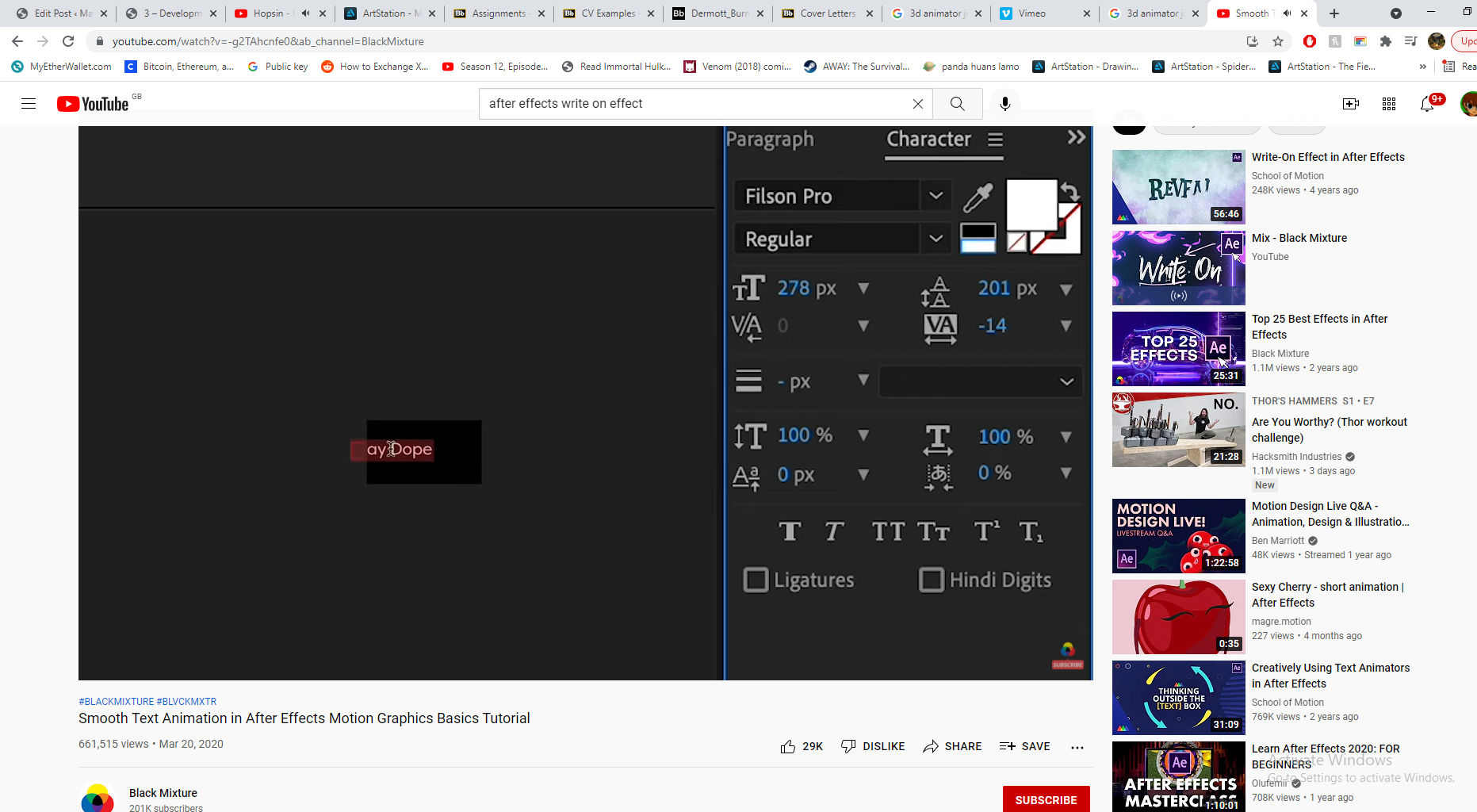
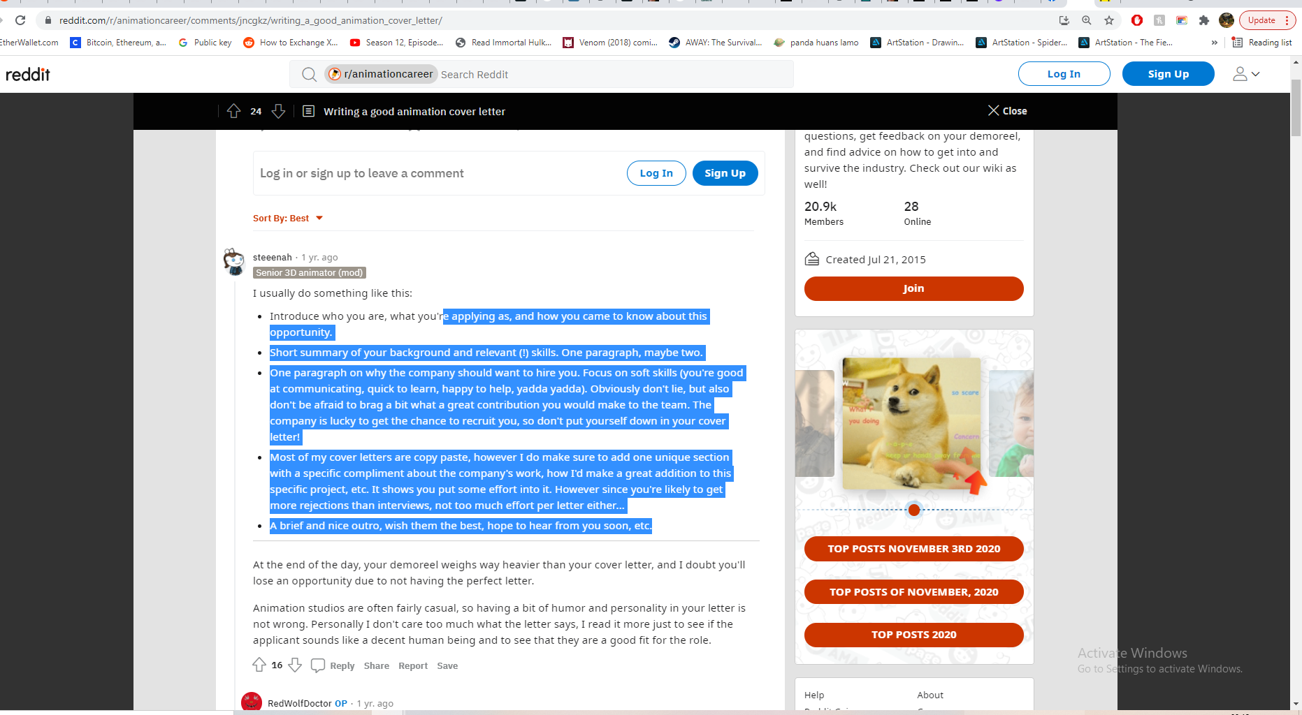
Just before I started, I watched some YouTube videos to refresh myself on what makes a good reel – starting with your strongest clips, quality over quantity, good timing etc. These were all stuff we covered in class too, during our workshop with Alec when we edited his 30s Showreel. I knew I wanted to have some kinetic typography at the start, inspired by Sorcha’s classes, I thought having the letters appear as if they were being written would force the audience to actively read the name and hopefully make me more memorable.

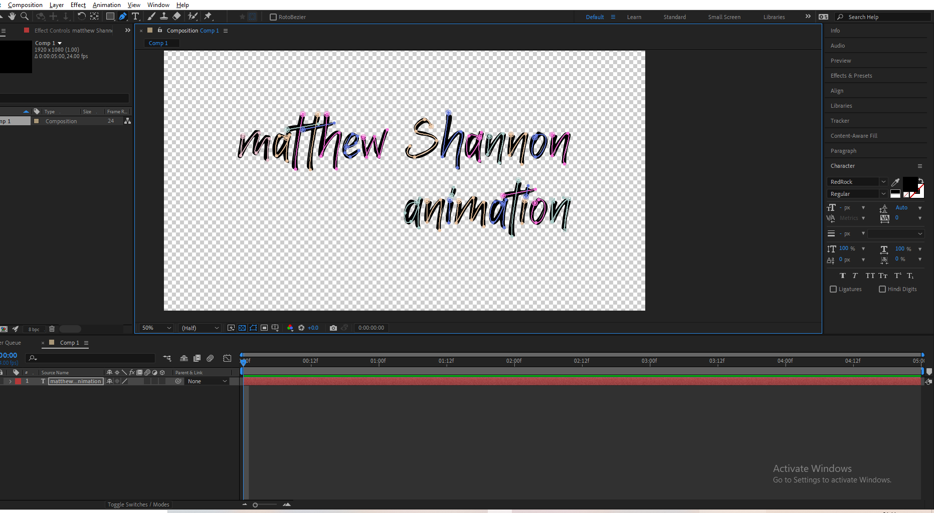
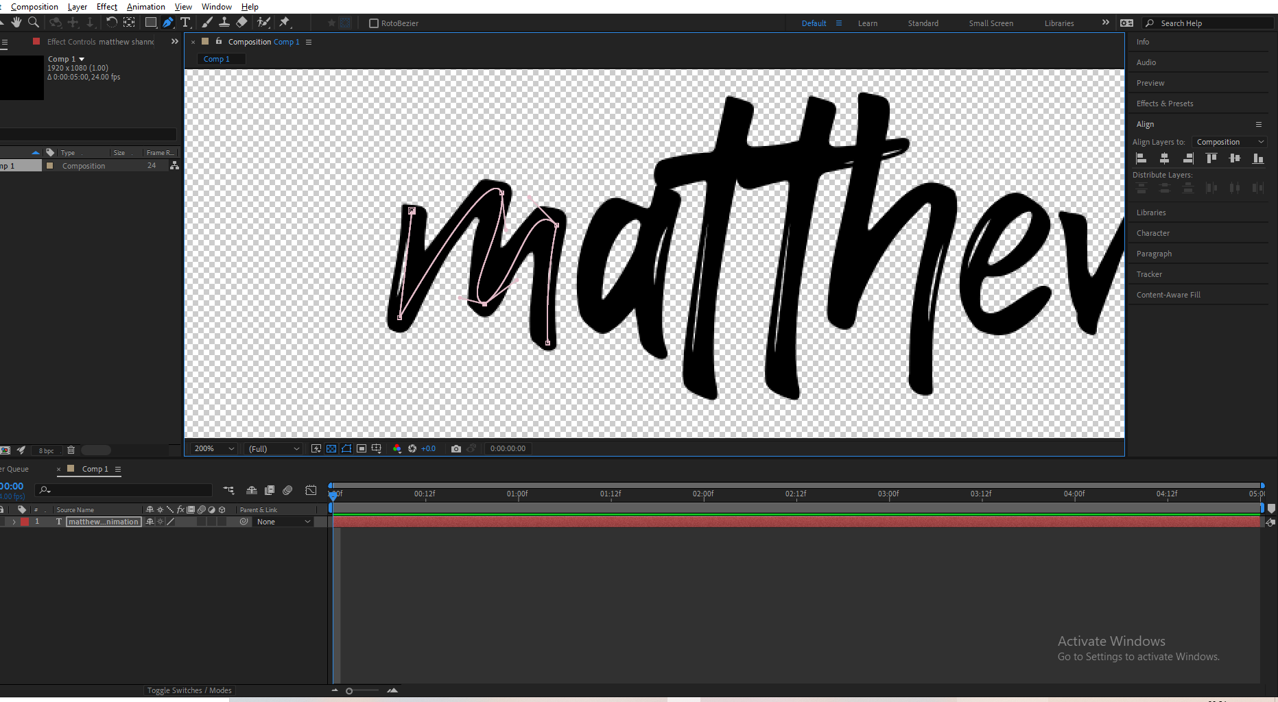
I hopped into after effects and started animating the text with a write on effect, I done this by creating a mask over the text with each point placed in the order they appear, then adding a stroke effect to this. I then keyframed the the end value of this effect as well as some subtle brush size animation.

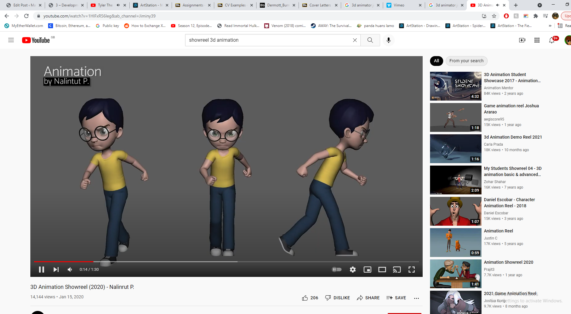
When I was happy with how this was looking, I started collecting all the clips I wanted in my showreel. I found some energetic music with a strong beat to allow me to edit with strong timing and did some further research into showreels, watching a bunch of YouTube clips before jumping into Premier Pro.

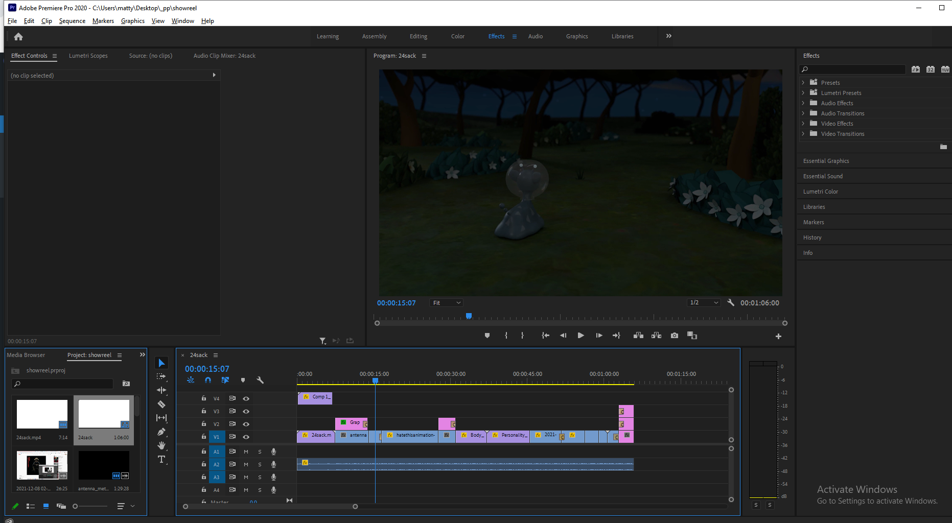

The actual editing was easy enough, I put what I thought was my best work in the first clip, it included vehicle, character and camera animation as well as a strongly rendered scene. The second scene finishes with a fade to black, which allowed me to transition to my 2D animation scene well, as that opens from black. I took some tips from Alec’s recorded videos including some advice, based on common issues he saw with my classmate’s edits -and implemented the rotation idea he showed using Sketchfab, I also added a crossfade to show my wireframe like he mentioned in the video.
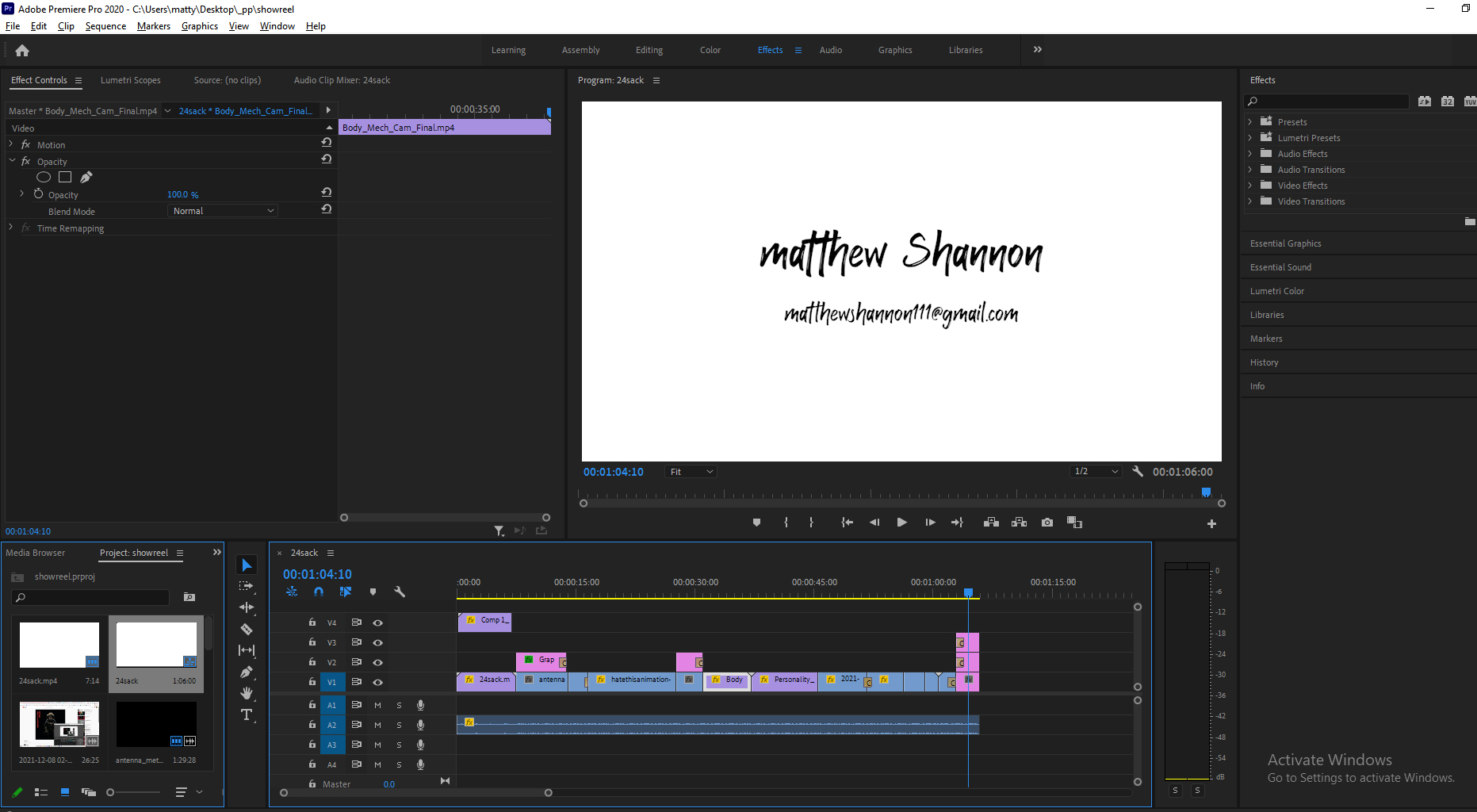

Following my feedback from Aodhan, I added my contact details to the end of the showreel, he said it wouldn’t be necessary to have it at both the start and the end, just the end’s fine since my start has a little animated sequence. It’s important to bookmark details as showreels often get passed around a lot.
He suggested I should change the text I included in the first scene where I was listing what I wasn’t responsible for, as it sounded like I was listing a bunch of work I didn’t do. Instead he said It would be easier listing what I was responsible for, but when I tried this the text took up way too much of the screen, so I stuck with what I had, and just worded it differently. Since I worded it more concisely, and added a description to my showreel stating I’m responsible for everything in each scene unless labelled otherwise it no longer sounded like I was listing things I didn’t do.
I’m happy with the final product, I was expecting a bunch of changes since I never made one before, but Aodhan said all in all it was a really nice showreel. I was a little worried about the length in case it was getting too long, but when I mentioned it he said the length felt really good to him. I would include a before and after of Aodhan’s feedback, but I only had to change the end screen and the text on the first shot, which I included in the above screenshots since there are size limits for files on the blog.
The final showreel is posted in my Industry Facing Material post.
CV
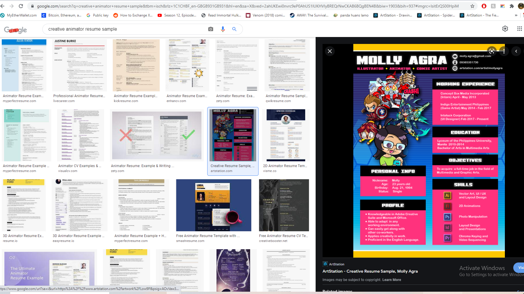
The general structure suggestions I found online were similar to the examples on blackboard; the resume header, the resume summary, employment history, skills, education. You should begin by researching the studio/job role and tailoring your CV to match this, since employers advertise exactly what they are looking for (obviously don’t lie though). Since we focused on having a strong design too, I started by planning out how I wanted to showcase my understanding of design. There are a lot of examples of these very designed and creative CVs, which look awesome but I think they come across a little unprofessional, I wanted something a little more subtle.

I honestly struggled for a while with the CV, I couldn’t figure out a design that worked for me – showcasing my design capabilities while also looking professional. I looked at the provided examples from Alec, and used this in combination with Pinterest, to create a pureref file I could work from. I knew I wanted the sleek professional look I previously referenced, but didn’t want it to just be black and white.
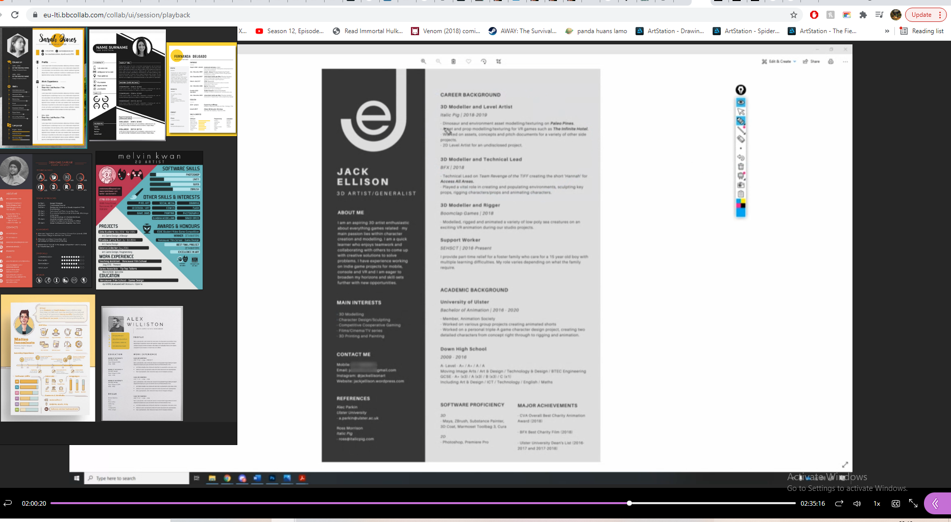


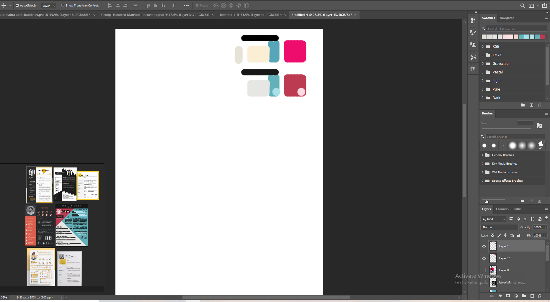
I really like Jack Ellison’s example with how he created a logo out of his initials, something I wanted to implement but really struggled with. I created a colour scheme and rough layout, keeping the colours quite desaturated, something Alec mentioned in his class. I used the grid system in photoshop to make sure it lined up well.
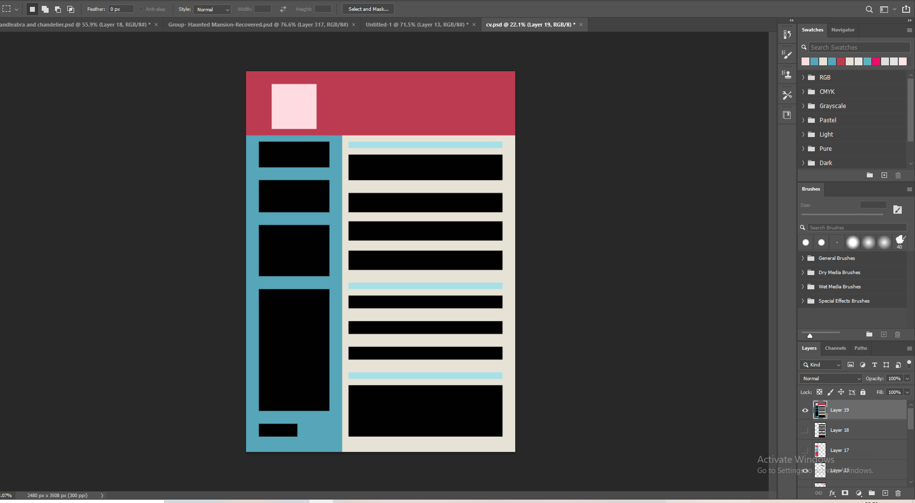
I played around with the colours and layout for a while and got something I kind of liked. You’ll see I eventually move away from this design – I thought it looked like a pizza restaurant menu or something. I wanted like a retro 80s look at first but it didn’t really work, and it was starting to feel a little over designed. It also seemed a little too mathematical and boring, with everything in perfect boxes.

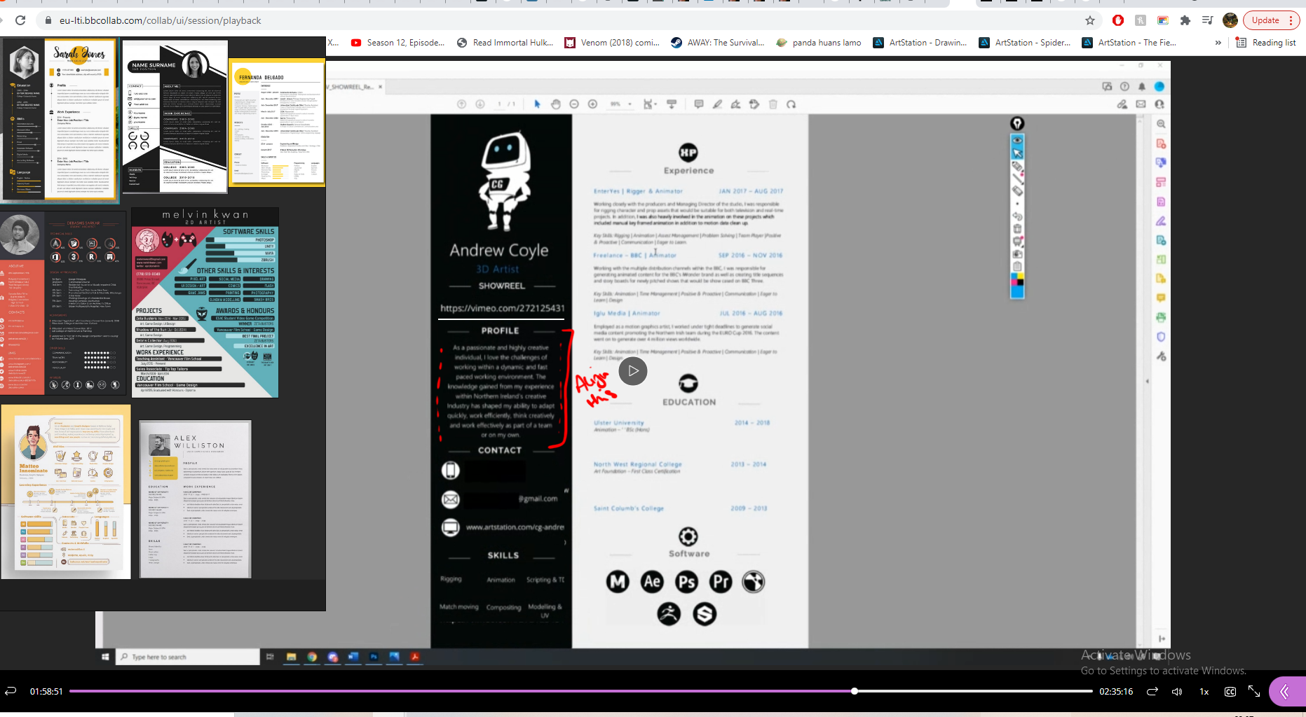
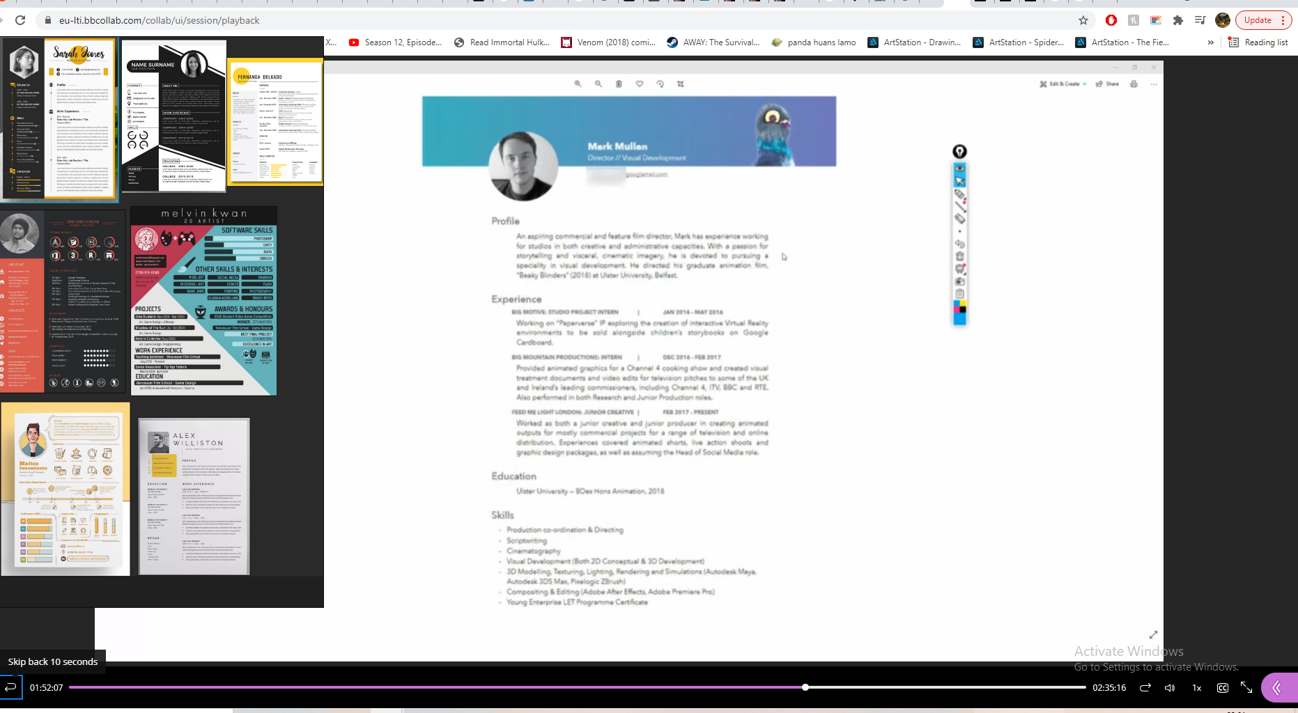
I got to work on my logo design, incorporating initials into a logo design is something I liked across all the CVs that had it. I had the idea of making a mountain from the M, and a river flowing from this in the form of an S. It was a little abstract but I liked the idea, and if done right it could also work as just a landscape scene like seen in Dermott Burns’ CV, but I am definitely not a graphic designer.
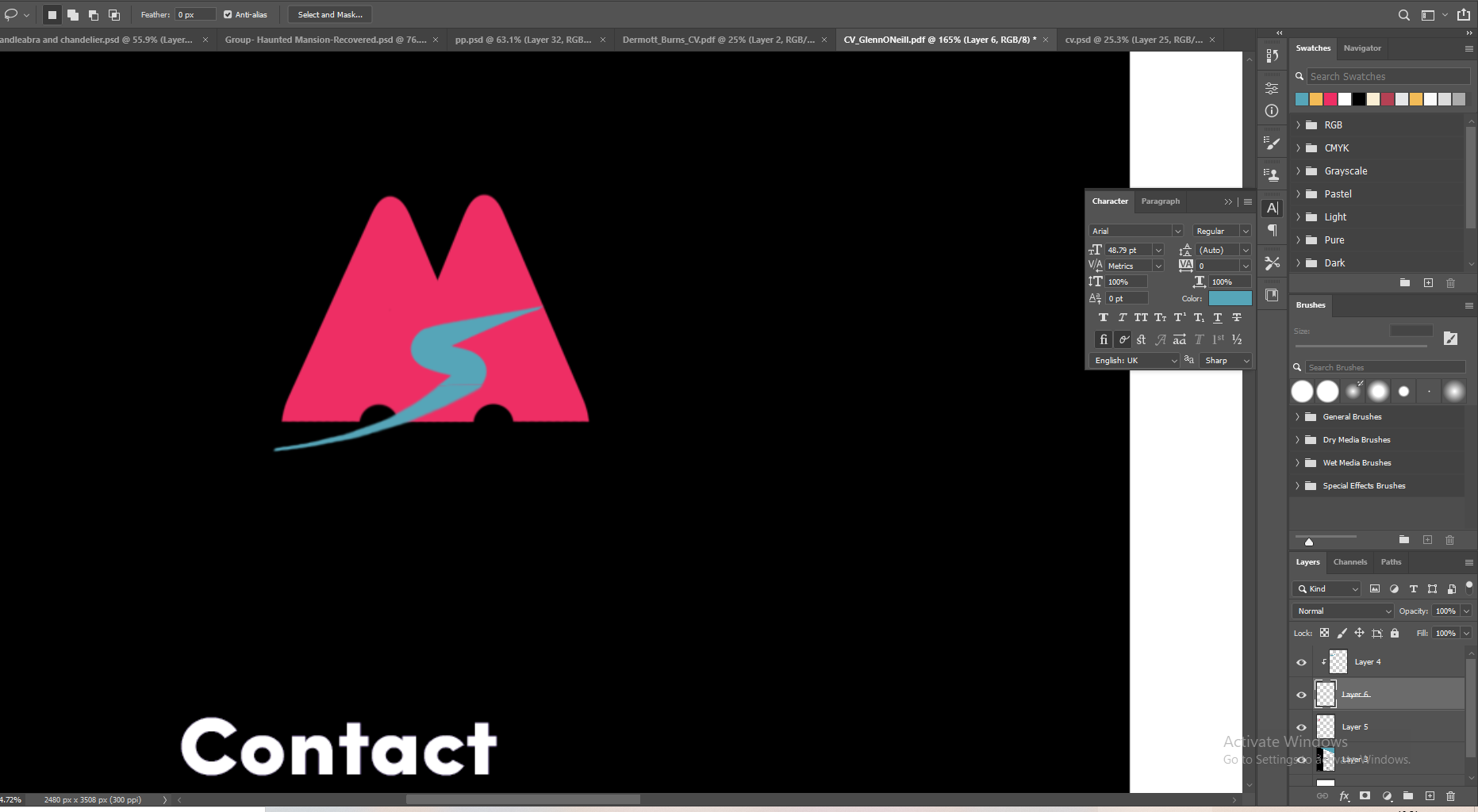
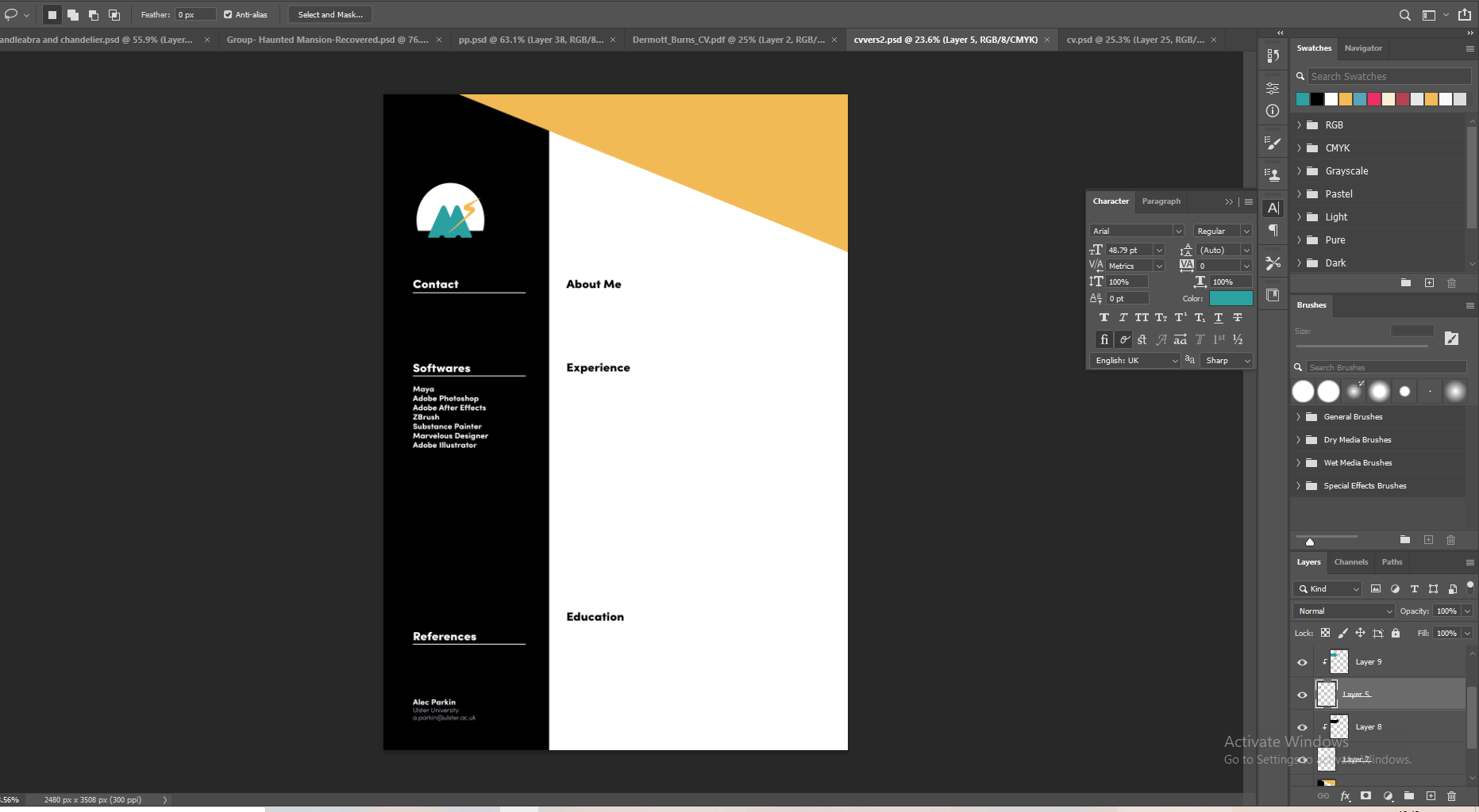
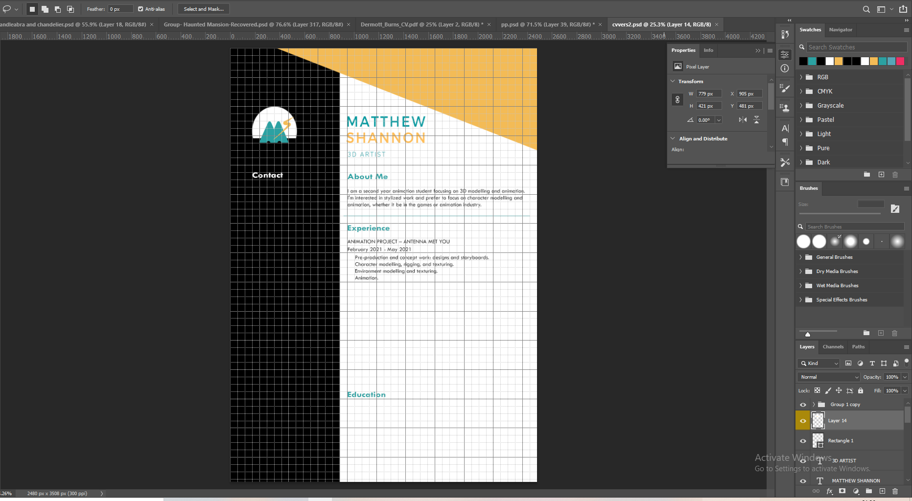
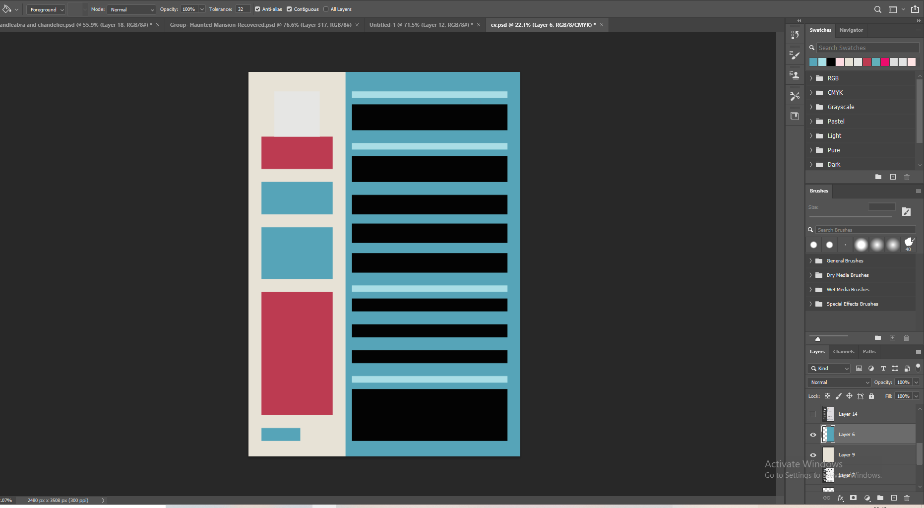
I thought the M and S wasn’t easily identifiable in this design, so I played around with different versions and ideas, before finally settling for lightning striking a mountaintop. This was also a call back to my old Halo 3 emblem which I thought was a pretty cool coincidence. I think the logo works decently well and really like the new colour scheme I came up with to match this. It seemed a lot more professional and the colours acted more as accents, I could use this to highlight key information. You can see the design of my CV really changed at this point, there was a day in-between the two designs. I just woke up really not liking what I had, and Alec mentioned using simple shapes following the design principles we know already to get a good design (since we aren’t graphic designers) so I decided to use more dynamic shapes, circular logo and triangle in the top right for contrast.
I looked into what a good cover letter should include, so I know what I shouldn’t mention in my CV, I didn’t want the two to just repeat each other. I found some more examples for the additional content I could add into my CV on the left side.
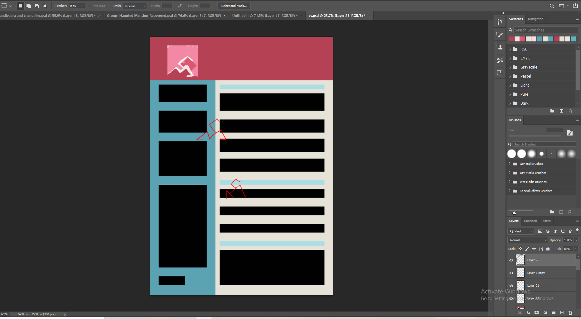
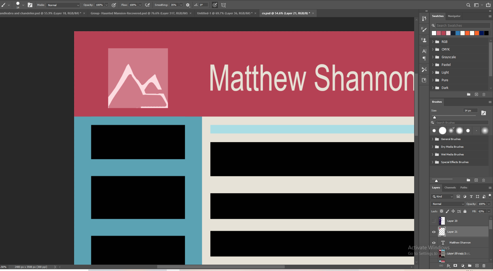
The one thing common amongst all the CV’s I like is a really strong layout, equal line spacing, words lining up well and indentation. This is something I tried to be very mindful of. Many of my screenshots have the photoshop grid system disabled only because its hard to see the CV with it on, I spent the majority of the time making sure the gaps between headings and paragraphs were equal, the logo lined up with the title and the subheadings etc. Alec said during class to be very strict with this.

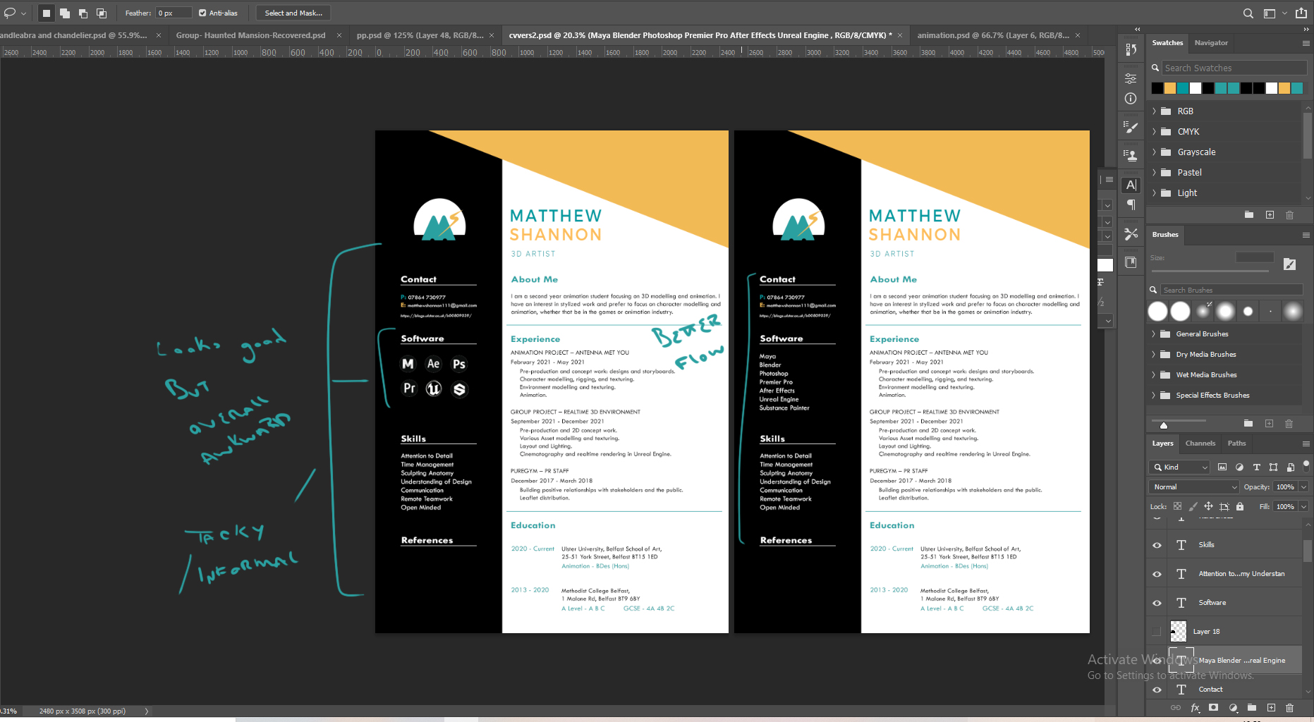
It was really starting to take shape at this point. There was some space at the bottom I couldn’t figure out what to do with but realised it would be a good place to add my references and their contact details. I played around with adding logos for the software section, but I thought it looked a little tacky and broke up the flow of the CV, listing them also made it easier to read (for people and software) and seemed more professional to me. When I sent it to Aodhan for feedback, it didn’t have the left section filled in but it had all the headings – he suggested adding a heading that could list my soft skills and make up some of the buzzwords they are looking for. He told me about ATS – software that enables the electronic handling of recruitment and hiring needs. This basically scans through for keywords, so he gave me some suggestions to add into my about me and skills section. He said he really liked the colour scheme and didn’t really say much about the logo, so I guess it wasn’t too distracting.
Here you can see the difference before and after my meeting with Aodhan. As you can see it was still unfinished when I sent him it, but I took all his suggestions on board like slightly rewording my intro to better match the job description, and adding a soft skill section.
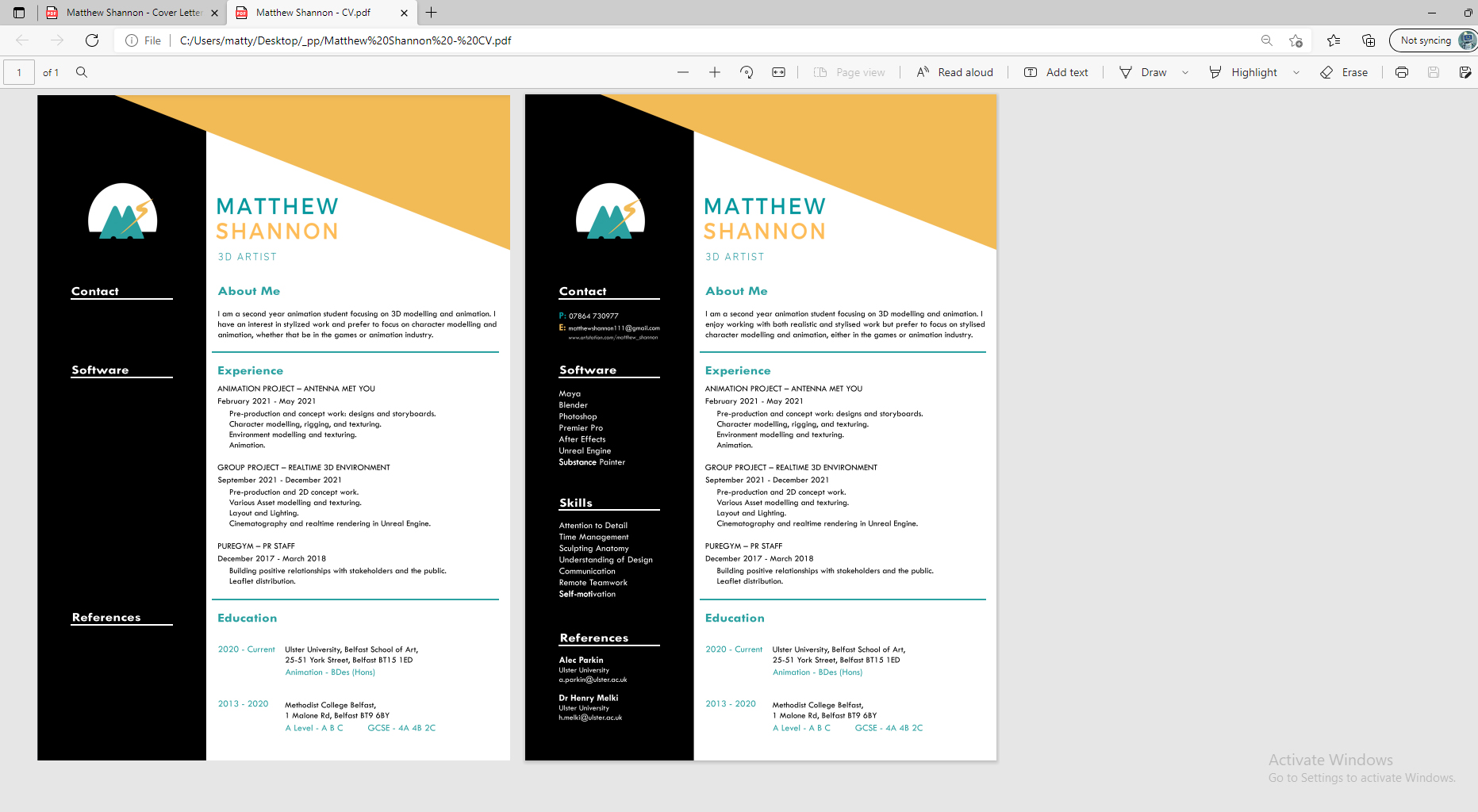
An image of my final CV, as well as a Pdf link, is featured in my Industry Facing Material post.
Cover Letter
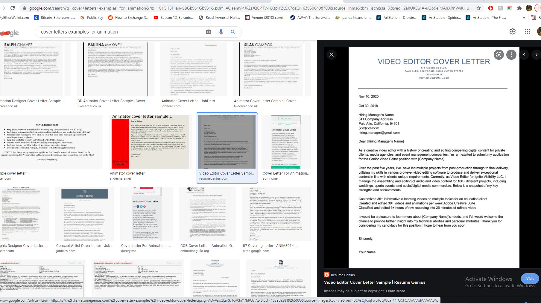
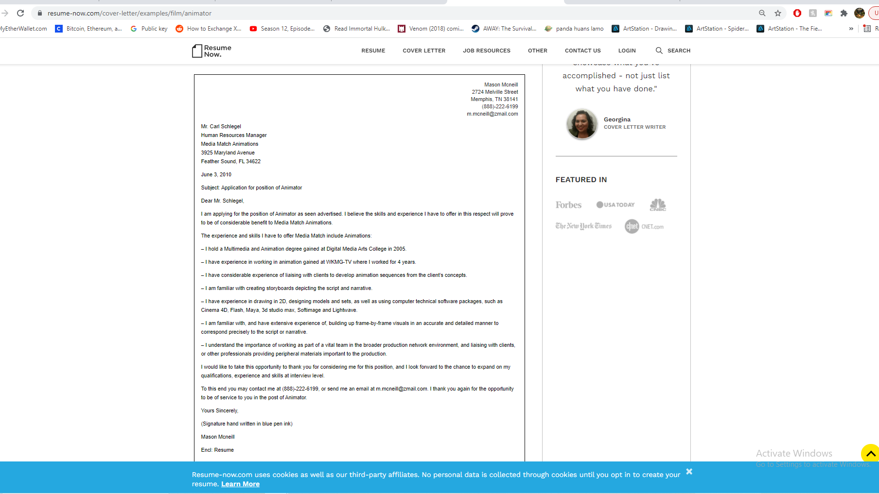

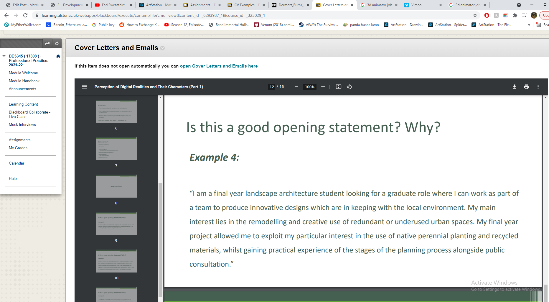
My research into cover letters led me to the AIDA Model, AIDA stands for Attention, Interest, Desire, and Action. This model was a useful guideline, but I didn’t specifically want to follow a formula, I did use it to help with my layout. The introduction is the first paragraph – who you are and what you want, then go into career experience and interests is the second paragraph – qualifications. Remember to explain how are you a good fit for their team and research the company and their work before you write the letter, make sure to express gratitude at the end. You should try to be marketing yourself, your skills, and your candidacy with your cover letter.


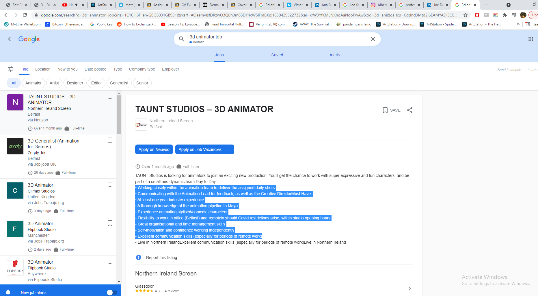
This was the job listing I was interested in a few weeks ago, it’s definitely no longer available but I’m a fan of the studio’s work so I stuck with it. Out of the local studios and job opportunities I found, Taunt had the coolest stuff. I checked out what the studio was working on currently and took notice of the requirements they listed, luckily I mentioned some of these skills in my CV already, so I used my cover letter to cover the rest of them.
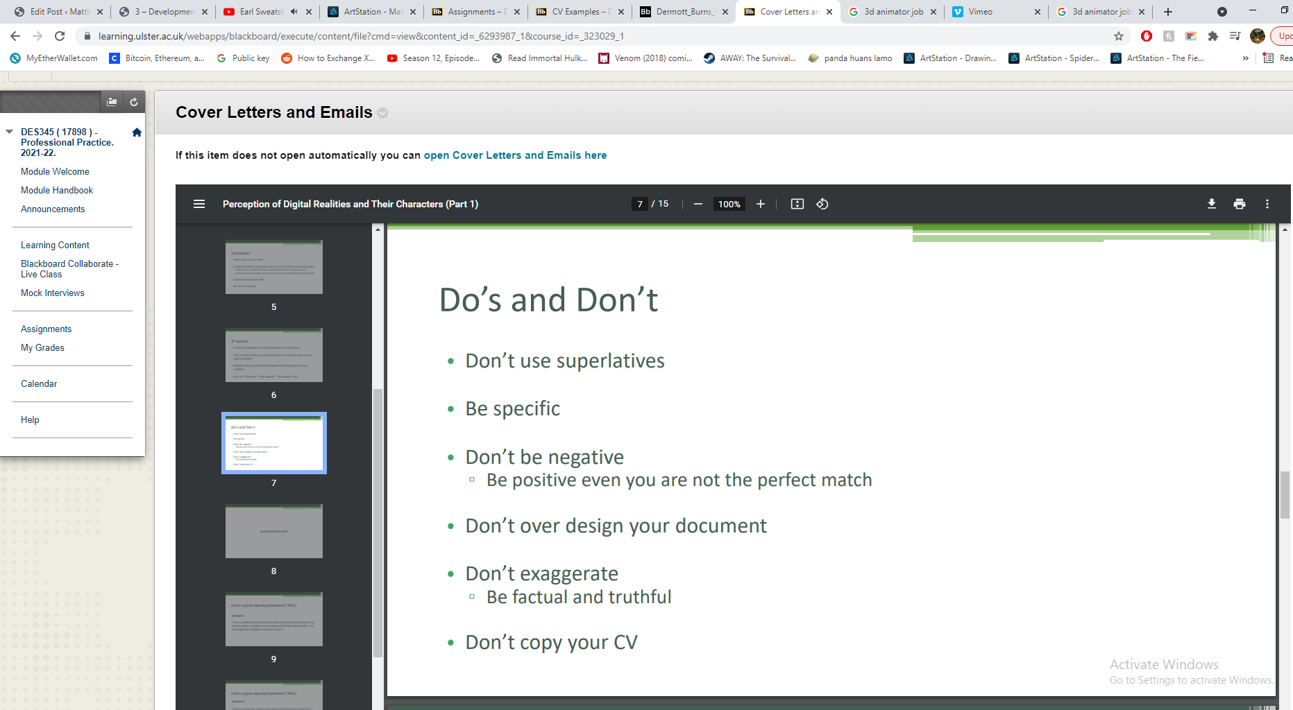

I went back to our class from Henry on cover letters as a refresher, mostly covering the language we should and shouldn’t use. I did some of my own research but it mostly repeated what Henry covered already. There’s not a whole lot to write about here since I just sat down and wrote about myself, but I made sure to follow Henry’s guidelines.
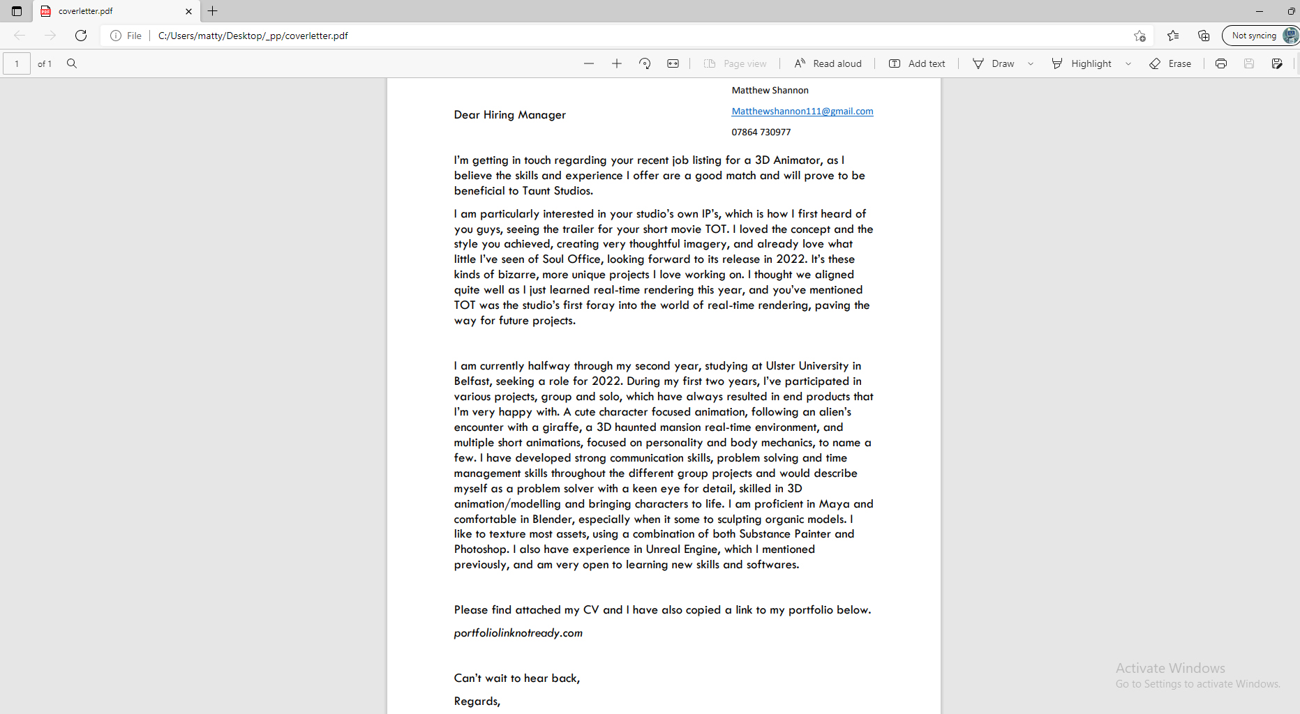
From my research into the studio I saw that they were very small scale and also employ a lot of freelancer’s to take on work. I saw in Dermott’s CV he had many different roles working with Taunt, so they seem to like someone with a wide range of skills – something I attempted to cover, while also staying focused on the 3D Animation aspect, since that was the original role I planned to apply for. This version to the left is what I sent Aodhan.
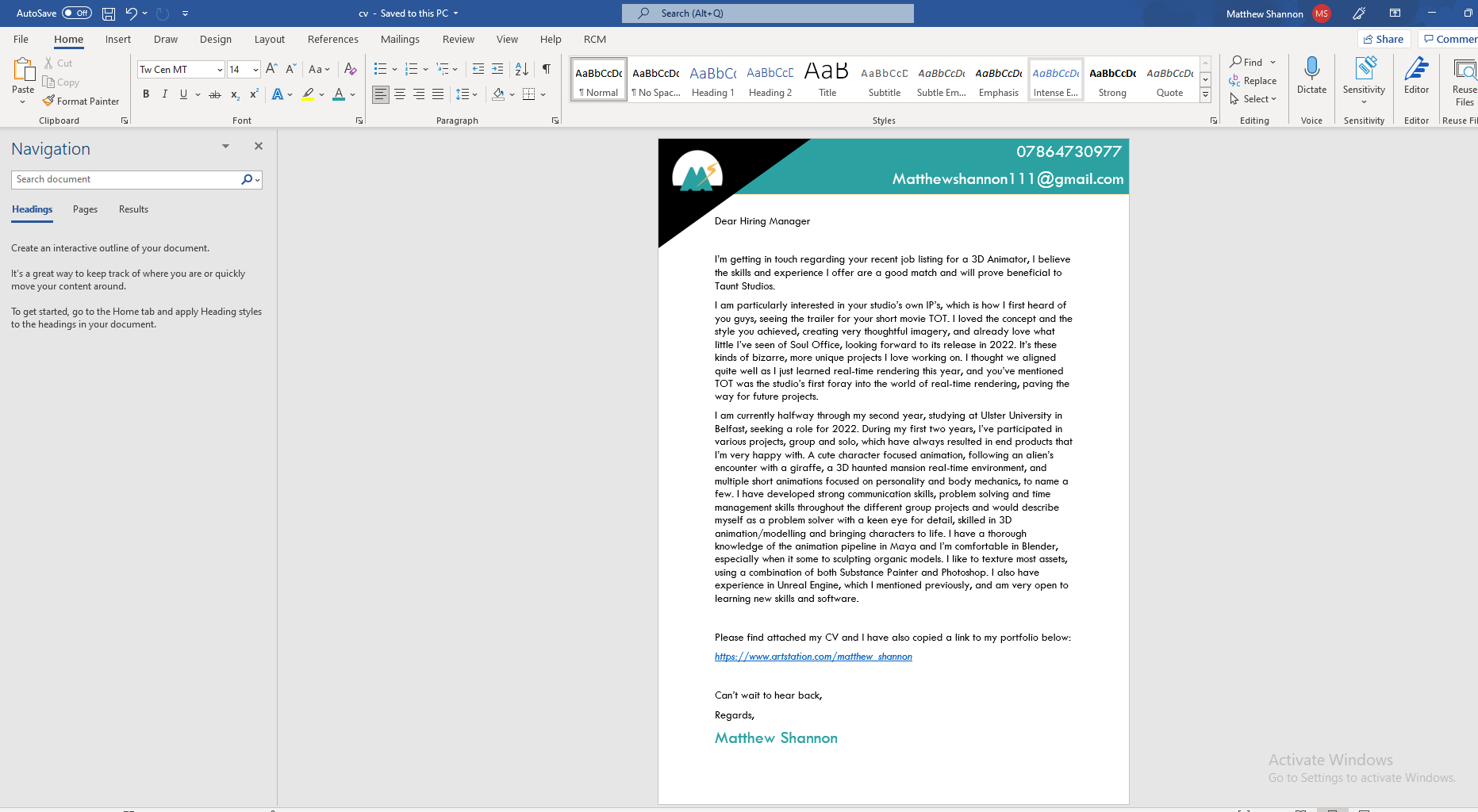
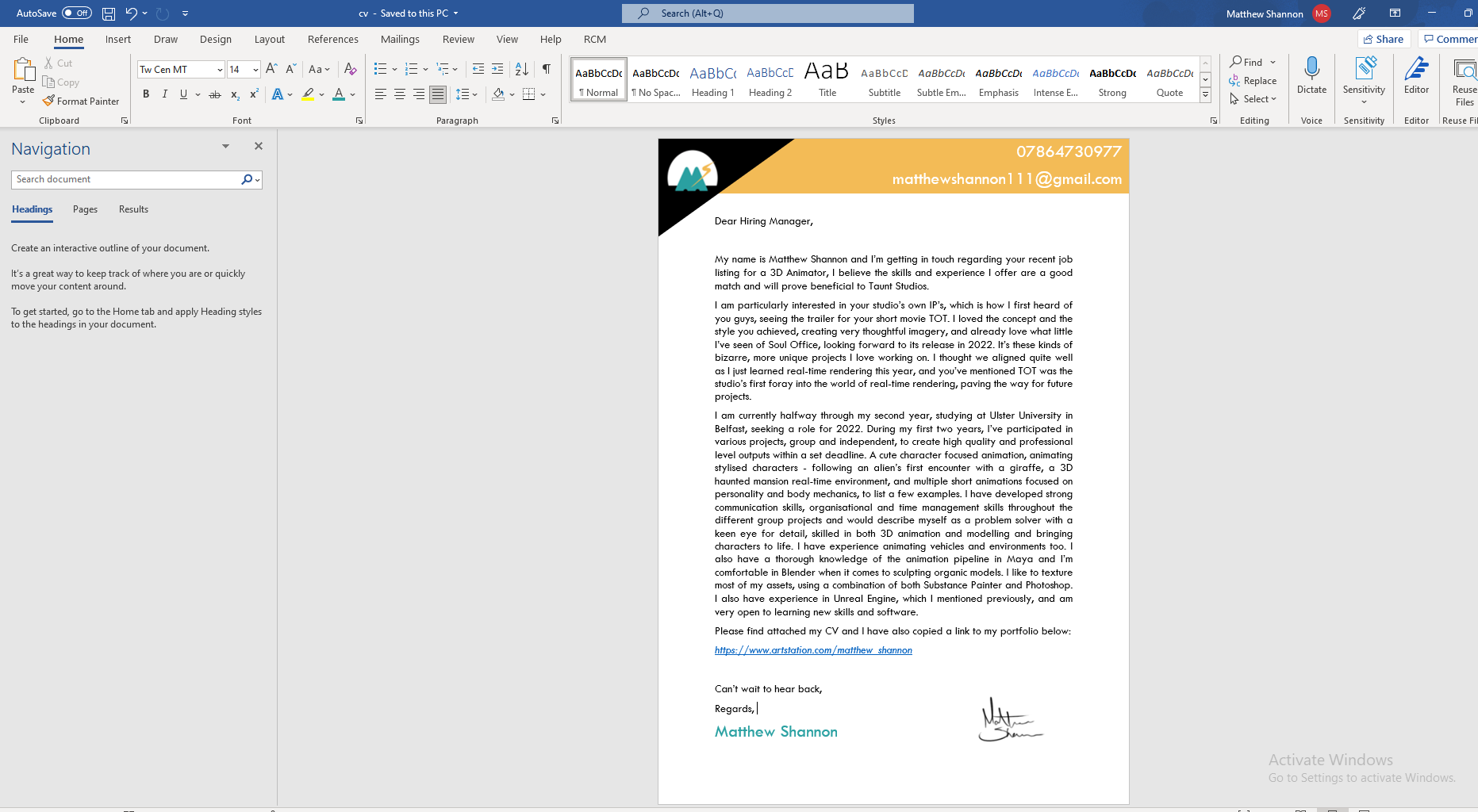
Following my meeting with Aodhan, he said I should definitely showcase some of my CV’s colour scheme in the cover letter. He was happy with all the wording and language of the letter, though some parts he had to read a few times before realising it was okay – I addressed this by making those parts have more clear language. I added some more buzzwords into it, and made some sentences a little more matter of fact, rather than opinion based. I also decided it was nice to add a signature to make it a little more personal, as well as fill that empty space and add some contrast. It also looked more formal, much cleaner and easier to read with the justified layout, rather than aligned left.
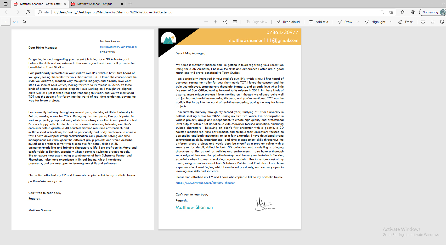
Here you can see the difference before and after meeting with Aodhan. I took all his feedback on board, again adding the buzzwords and the main thing he mentioned was adding the colour scheme from my CV, so they compliment eachother. You can also see the slight layout differences I added and the signature.
An image of my final cover letter, as well as a Pdf link, is featured in my Industry Facing Material post.
Artstation Portfolio


We also have the option to make a portfolio to showcase more of our work, suggesting we use Artstation for this. I thought it was a good idea to make one, even though I don’t have a lot of finished work/renders right now to add to this, it will give me some incentive to start documenting my work.
It also gives me something extra to link to potential employers. It seems a bit empty as of right now but hopefully I can get some more work that is a good enough level to add to this and by the time it comes to applying for jobs it will be full of work.
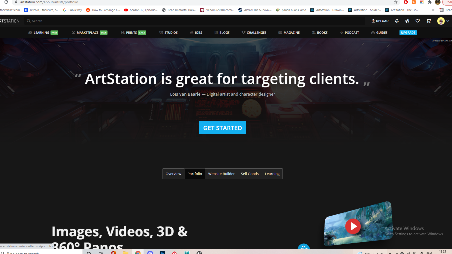
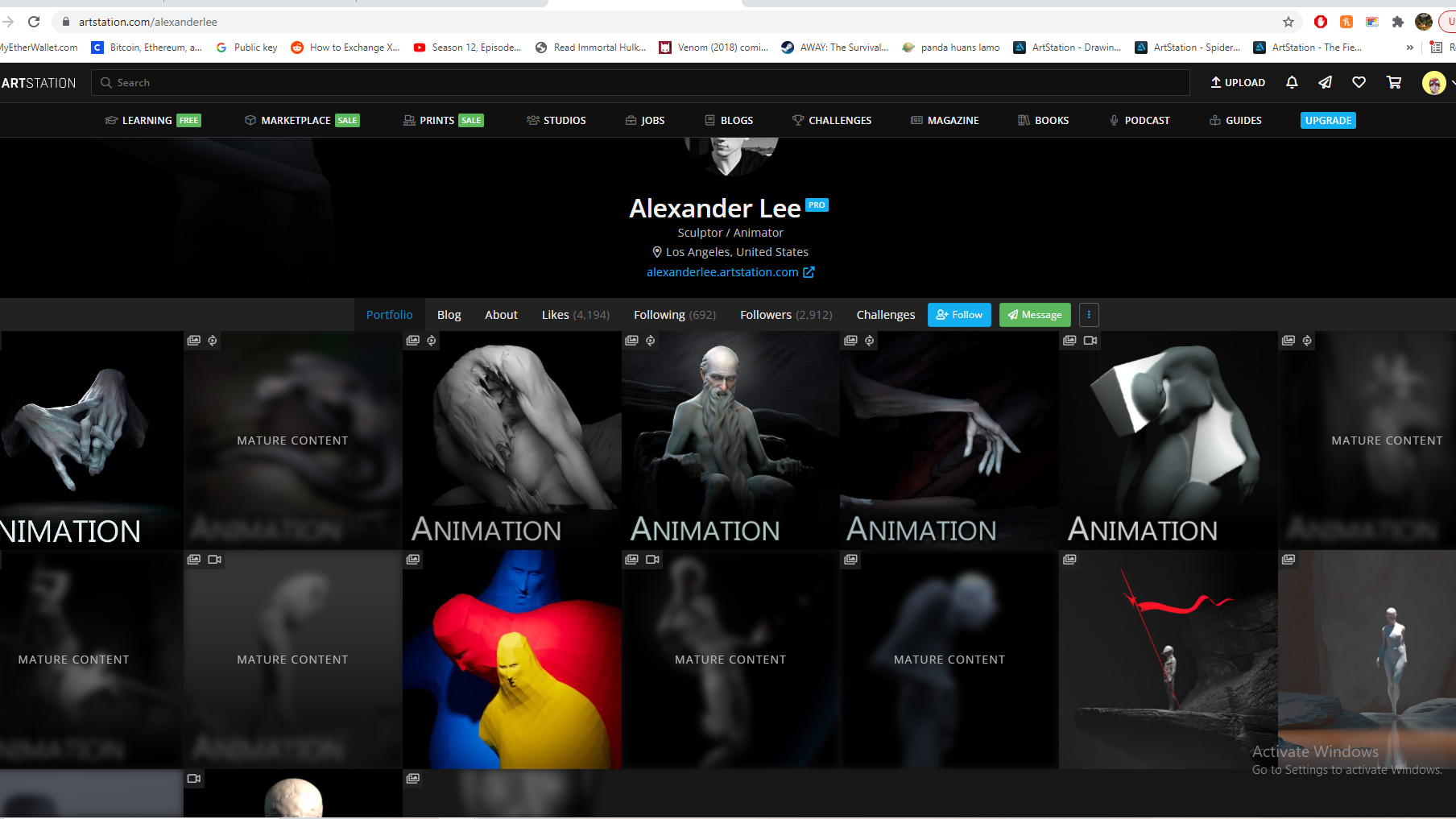
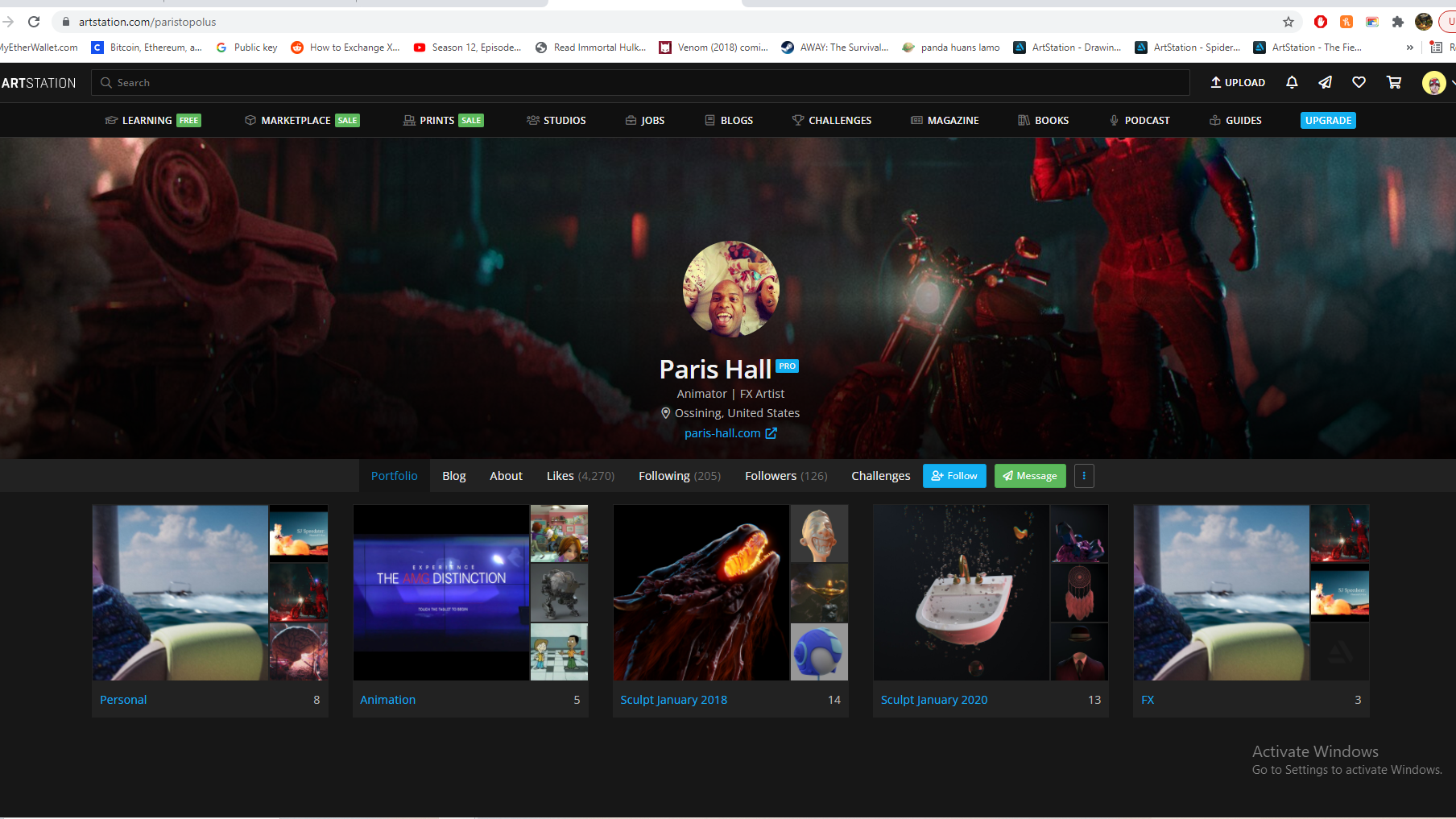
There are different options for how you present your portfolio using categories or presenting them as posts showing different projects. Here are a few examples of what a more finished animators portfolio might look like with these different layouts. Artstation also it makes it very easy for potential employers to reach you with how it showcases your details
Link to portfolio, hopefully will be less empty eventually – https://www.artstation.com/matthew_shannon
References:
https://www.linkedin.com/jobs
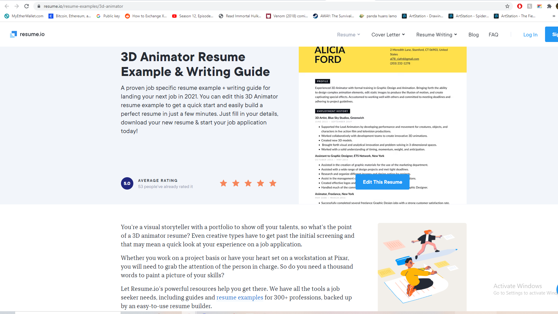
https://resume.io/resume-examples/3d-animator
https://www.artstation.com/about/artists/portfolio
https://magazine.artstation.com/category/inspiration/featured-portfolios/
https://www.tauntstudios.com/
https://www.womenfolk.co/taunt-studios
https://www.youtube.com/channel/UCOwFX-YFktXxEIX7-IPjlKQ