This week our design a world groups got mixed together, with two of our members being replaced by Katie and Cain from a different group! Me and Harry had to spend a lot of time catching our two new guys up to speed on our ideas and the concept of our world, they asked some questions and even gave a few suggestions to help refine our world. Katie dove in head first, drawing all kinds of sketches of the people on board, and went on to design a possible look for our protagonist. We discussed some design ideas, the style, the colour scheme and tone we wanted, I thought it would be cool if maybe it reflected our protagonists perspective of the ship, gradually becoming more attractive and saturated as he is slowly indoctrinated into life onboard (the Echo Chamber?).
We were set 6 thumbnail value studies in our world, considering the value range we use:

We were told to choose our favourite of the six and illustrate a larger / longer focus study combining composition & tonality, number 5 was my favourite, with a lot of potential for improvement:

I didn’t need to look much into tone and value, it seemed pretty self explanatory and the lecture content covered all that was needed. I just got stuck in and followed what we were told, things would generally be darker in the foreground, messing about with the shading on 3d objects was a little more trial and error though.
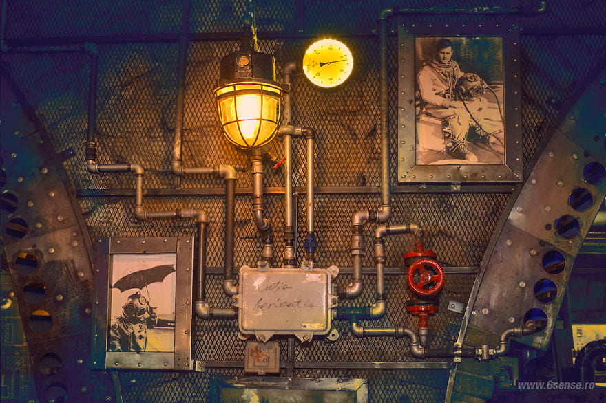
I then researched possible references that could help us improve upon our world design, using my Lovecraft graphic novels and Bioshock’s concept art to help. I also found a Submarine-Themed Pub in Romania that had a really cool aesthetic and thought it would be cool to implement, finding the valves and pipes on the walls helpful.
I haven’t solidified any designs for our characters yet, other than my original family onboard. I’m trying to find the right amount of realism to use, with a style that would best fit our world, as well as fit an animation. I really liked the style of Katie’s drawings and think I’ll try and use similar shapes and proportions. I’ve been thinking of interesting characters in the world that I could work on; a grotesque and oversized chef, an old and creepy (Dr Frankenstein style) surgeon or a group of ‘law’ enforcers, wearing the old metal diving suits (perhaps to hide their true forms?).
Katie’s Protagonist Concept, inspired by Robert Pattinson.

Visual References