3D Digital Literacy
Intro to Organic Modelling – Cute Character Assignment
As an homage to Pictoplasma’s competition last year, we were required to model/sculpt, texture, and present via Sketchfab, a Cute Character of your choice, without exceeding 40000 Polygons. I was quite late starting on this project which I’m pretty annoyed about because it was actually pretty fun. To start I collected a bunch of research on characters I thought were cute, that I wanted to recreate. I was interested in something a little unconventional from the beginning and was leaning a lot into fantasy. I first thought I wanted to do some sort of forest spirit, similar to Totoro.

You can see some notes I took here, on what style/genre I wanted to emulate as well as what type of sculpt I wanted. I thought it would be fun to do something quite fleshy and fat and didn’t think other people would do something similar to this. I also wrote what made these things cute, coming up with; chubbiness, silly faces, large, round shapes, non threatening etc.
You can also check my Sketchfab Collection to see my 3D research/references.


This was what I came up with, as you can see this character has all of those things. I was pretty ambitious, hoping to do a full forest scene with god rays, foliage and a smaller friend character, similar to Totoro and his friends. It wasn’t really that useful as a reference. In my meeting with Michael, I found out you shouldn’t sculpt the character in a pose, and he suggested I should get rid of the scene and just have the character by himself. He showed me some basic sculpting techniques and anything he thought would be useful for me, which I’ll talk about more once I get to that stage of the sculpt.
Sculpting


The first thing all these videos, as well as Michael, covered was making the base mesh (basic shape before details). Henry showed us a technique using metaballs whereas Michael wasn’t a fan of metaballs and showed how he makes them just using basic shapes. I found a method I liked online, in the last video shown here.


I used a new feature, the lasso trim tool. The main purpose is to cut geometry away, however you can also use it to create geometry, this let me draw shapes from my view, generating shapes of different depths with the thickness of my brush radius. all these shapes are added within the same object (in the tool settings I changed the trim mode to join). I enabled X symmetry, and started drawing the shapes of the major forms of the body. It’s better to sculpt in symmetry to save time.


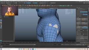
After remeshing, and using the draw and smooth brushes I ended up with something like the first picture, I wasn’t happy with these proportions at all so I went into edit mode, and scaled them to better fit what I imagined. I then used the smooth brush to fix the mesh a little. The third picture is what I ended up with, which felt a lot better.


My character was looking pretty blobby, they are a little blobby by design but that could sound like an excuse for lazy sculpting, so I added in some muscle groups, based on human anatomy. Obviously the character wont have all these muscles, they aren’t even human and muscles aren’t cute anyway, but I wanted to build up a better sense of proportions and anatomy so the character wouldn’t be so undefined. I built up the muscles then added layers of fat/made some smaller, mostly using the draw and smooth brushes but I did use the inflate brush while building the muscles.


I collected a bunch of unconventionally cute characters and looked at them. I liked the mouths from Lickitung and Toothless, I wanted an open mouth/tongue hanging out to add to the silliness of the character so they were good references. I also found a list on CartoonBrew, which worked as a good checklist.


I also got some feedback from my group in the other project, and Alisa mentioned how a bald head is kind of creepy to her which I didn’t think of, so I thought about some ways to approach this. I thought about adding the mushroom aspect from the smaller character I had in the concept, but mushroom men are kind of overdone, so I tried this sort of ponytail look, with leaves extruding the top of the head.


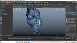
I added the mouth, which I thought would be fun to have open and smiling, using a technique Michael showed me. I first used the draw brush and held ctrl to eat away at the mesh, creating a cavity. Then I used the mask tool, masking the mouth area and inverting the selection, this let me use the grab tool to pull out a sort of jaw, since it didn’t affect the masked area. I also added the eyes, spaced low on the head and far apart. To do this I created small holes where they would go, then added a polygon mesh sphere. I added a mirror modifier to this, mirroring it on my sculpt so it stayed symmetrical. I kept this as a separate object.


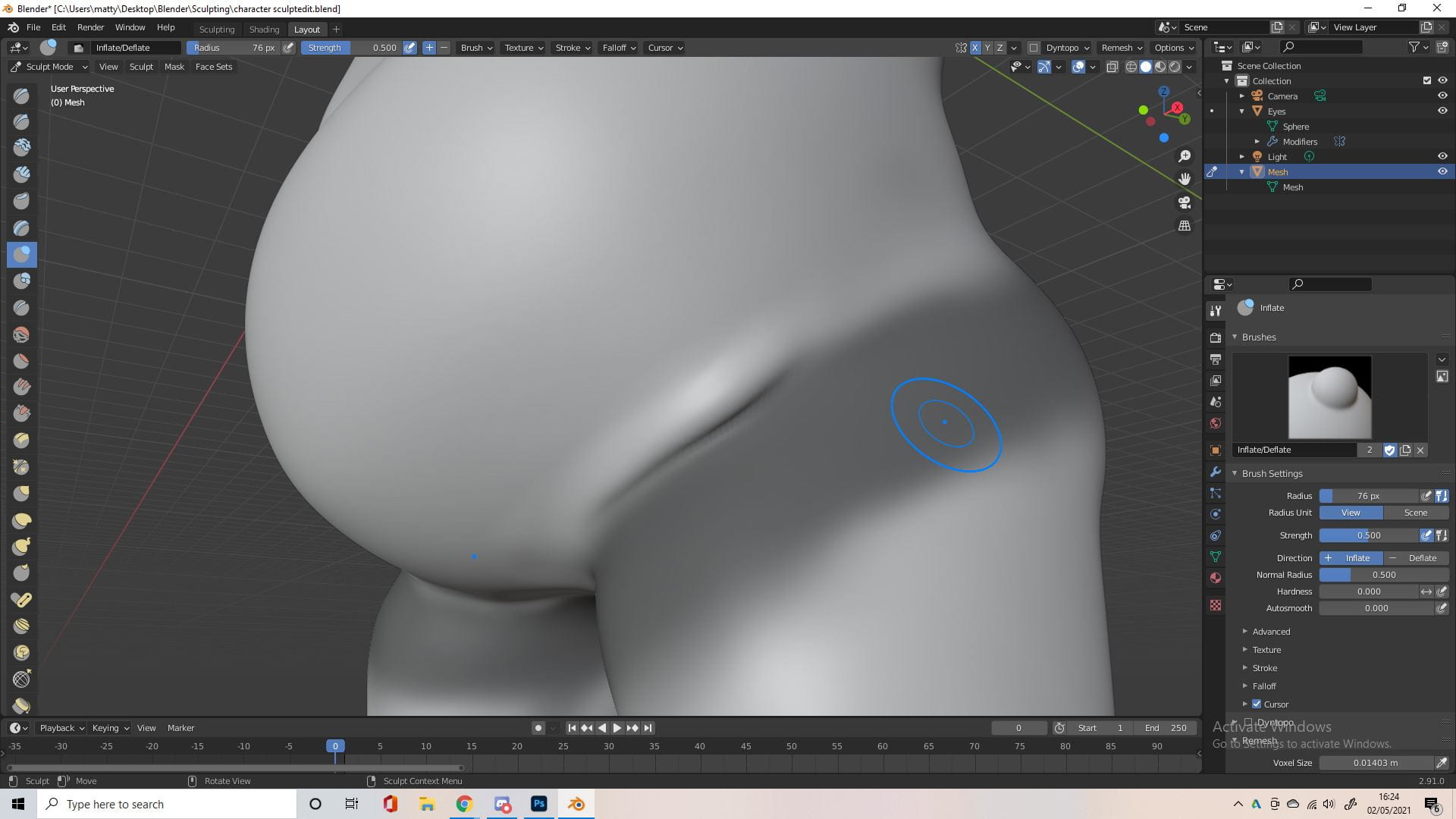
I really liked how this worked with the mask tool, so I did it in some other areas to add details/adjust proportions. I liked the effect it give for creating areas of overlapping skin, like between the legs and the belly. I then went in after with the crease tool and inflate tool to exaggerate this better, then smoothed it.


Again I added some more detail so my the sculpt wasn’t so blobby and undefined, working on the chest/shoulder and the shoulder/back.

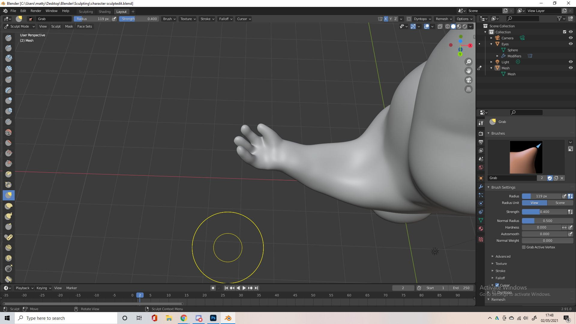

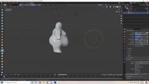
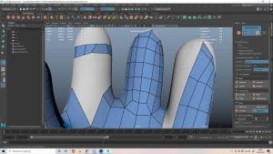
I then added fingers. To do this I used the snake hook tool, which pulls vertices along with the movement of the brush, letting me pull the fingers out of the hand. This was the first real time I had to Dynotopo, since I was pulling something out of the base mesh instead of just sculpting on it. I used a bunch of brushes and tools to make the fingers. I tried building up volume between the fingers using clay strips, but didn’t like this brush at all. since it required so much smoothing. I mostly used the crease and inflate tools, as well as the pose tool. I also found the blob brush useful to create the pads of the palm and fingertips.


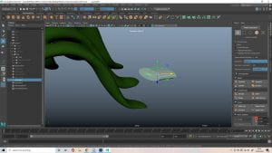
I created the toes using the same methods as above, but ended up mostly smoothing them away to be almost solid, and just to resemble the shapes of toes, detailed toes made him seem a lot creepier. At this point I had to start working on the hair, so I went onto Sketchfab to look at how this effect can be achieved and different styles of leaves I could go for.


The first pic was just me playing around with the snake hook tool, testing out some ideas and getting a better grasp of how it worked. I sculpted where the ‘hair’ would come out kind of based on the top of an onion. I didn’t really use the dynotopo throughout this project, I tried to avoid it because it would be a little unpredictable sometimes, I mostly used remesh when I needed more detail. I used the flatten brush for the first time, flattening the inside of the hole that the hair would come out of. To add those bumps and ridges I used the draw and crease tool.


I wasn’t sure on how to approach the hair at first, I tried to have thicker and stiff leaves, then floppy leaves and I ended up going for something kind of in-between, I played a lot more into the ponytail and added a bobble and really liked how it came out. I didn’t really document the specifics because it was a lot of experimenting, but I mostly used the snake hook tool, along with the crease and blob tools. I didnt need to remesh or dynotopo because I used a seperate object (sphere) to start the sculpt. and duplicated this a few times.
Retopology


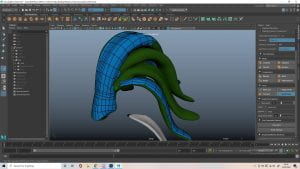
There’s not much to say about the retopology process, I was just very slowly drawing quads. I didn’t really follow what we learned with Henry doing the face retopo, because my character’s mouth was open and they didn’t have a nose or ears, also their head was so circular. I didn’t have a lot of the guidelines and markers I had before, so I kind of just winged it. I did try and separate the edge flow up a bit since some areas had to be a lot higher poly than others. I then worked on connecting these areas with different junctions to split up the high and low poly areas.


Honestly looking back I wish I could redo the retopology with what I know now, I could’ve separated the limbs and head a lot better. I needed to add a lot of divisions along the toes, and this led the whole way around the head and body, which was nice and clean but it resulted in a lot of extra polys in the torso and face. It did kind of work out since the top of the head needed a lot more faces for the ridge, and this led directly to the toes, but I definitely could’ve laid this out better.


Here’s an example of a junction point at the fingers, the hands required a lot more detail than the arms so I used junctions on the fingers based on what Henry showed us with the nose and forehead.


This was the finished retopology of the body, while it came out super clean and all the edges flowed nice, a lot of the body didn’t need so many faces, I could directed the edge flow better and used more junctions from high to low poly. It was significantly better than the sculp, I just wish I had a little more time to work out a better topology. I managed to save some time because I realised you could turn on soft selection to smooth the retopology in large areas.


The tongue was fairly simple. and I cut out the back which connected to the bottom of the mouth to decrease the faces some more. The hard part was the hair.


As you can see I was struggling with the hair, sadly a lot of people on Sketchfab used different objects phasing through each other which I wanted to avoid, I though the octopus would be a good example but it was made up of triangles. It seemed like I had to go for a more solid object, rather than separate extruding objects though.


You can see in the first pic that I made a shape to base it on, I smoothed a cube a couple times and scaled it/bent it to the shape I wanted. This was also kind of my back up plan if I failed with the quad draw, to make multiple of these objects and match the shape of the hair with them. It ended up just being used as reference for me to work from though. I started to approach it like a hand with fingers coming out which helped me visualise it a bit better. There was so many awkward camera angles and positions while working on this, and the quad draw wouldn’t add quads into spaces sometimes just because it was so awkward.


I was remined of Medusa working on it so I looked on Sketchfab for some Medusa models to see how they done it, one of them kind of helped. It was hard to transition from the leaves connecting to becoming separate, and every time I smoothed the quads it would get confused at these points and phase through each other.


Eventually I managed to get it done, I would have to go out of quad draw a lot and manually connect vertices because the angle was too awkward for quad draw to figure out, which was a very slow solution to this problem. After I had to do some clean up because there was a couple triangles and n-gons, but this was easy enough. The rest of the retopology was simple.


I used a lot of connected junctions to go from very little quads to a lot on this leaf, which was really cool but it made me realise how much polys I could’ve decreased the main body retopology by, making it a lot more efficient. I think I did a pretty good job on the retopology though, it came out pretty clean and while a little on the higher end it was still nowhere near the 40,000 polygon count. Here’s a side by side with wireframe turned on to compare.
UV and Texturing


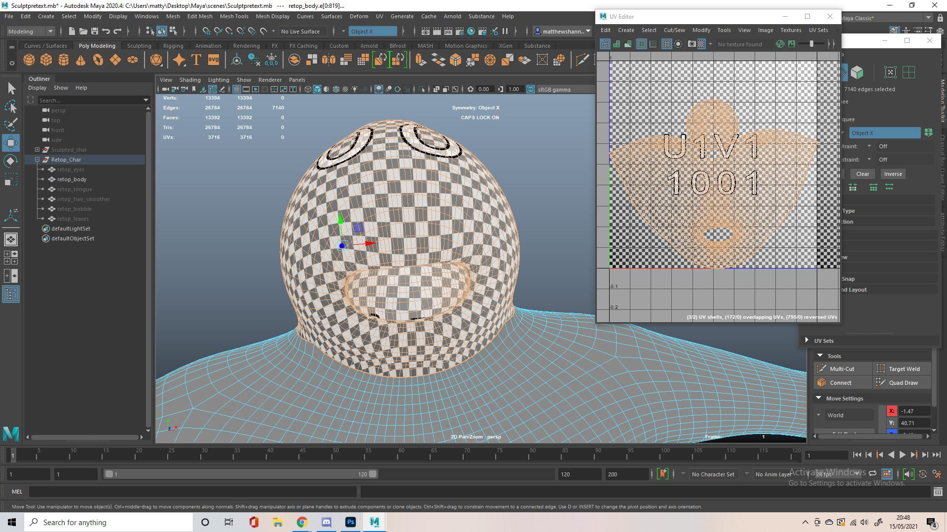


I never UV mapped a humanoid character before, and it was kind of hard since there were no clothes that could hide the seams. I found a bunch of images online and a pretty in depth guide on how to approach this though. I cut around the neck, the tongue, the arms and the legs, the base of feet and the hands to separate them all into their own UVs. I had cuts hidden through most of these, like the back of the head, armpits and the undercarriage.


The leaves and bobble were pretty basic. The hair was a little more complex, I basically UV projected this as a bunch of cylinders, separating each leaf into its own UV. I was going to stack them into symmetrical pairs but then realised it would be good to have some variations in the texture to break up the symmetrical mesh.

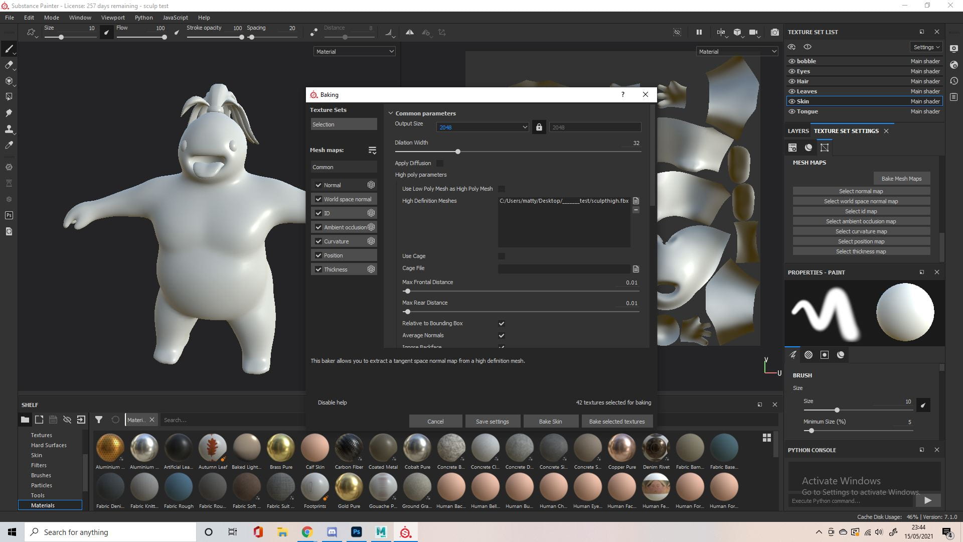
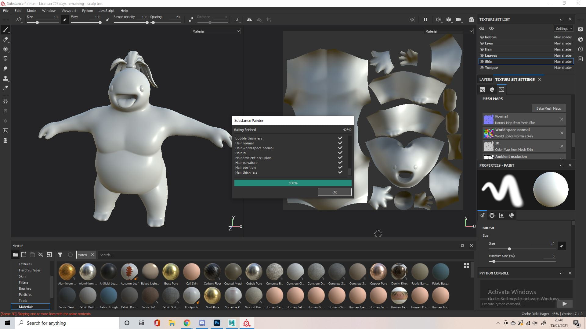
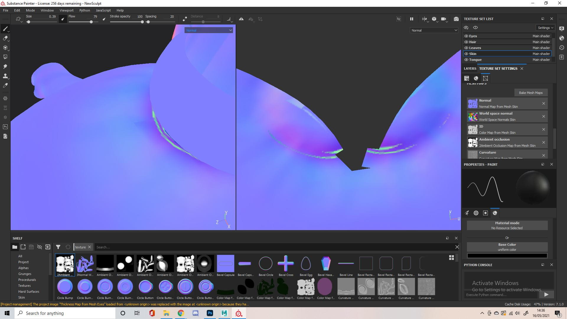
I baked my mesh maps from the high poly sculpt, I never realised this was how it was done but its a pretty cool process. They came out really well but I did run into a few issues.


I’m not surprised there were some issues with the hair, I knew the way it connected in retopology was slightly different to the sculpt, but it was how the quad draw tool worked. I left this for now and would figure out how to fix it later. I did try baking the hair from the low poly mesh instead but this lost a lot of detail I wanted to keep, so I’d come back to it.


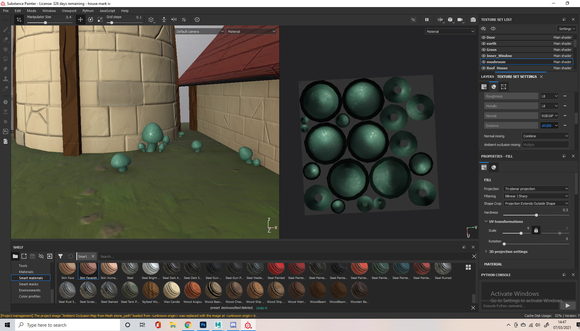
I looked online at some rendering and textures that I liked, as well as some real life materials. I was hoping to base the character on a spring onion, the colour scheme I had in mind reminded me of one and it definitely fit the character. I liked how the ‘skin’ and saturation looked on the mushroom character as well as the dirt details on the first creature.


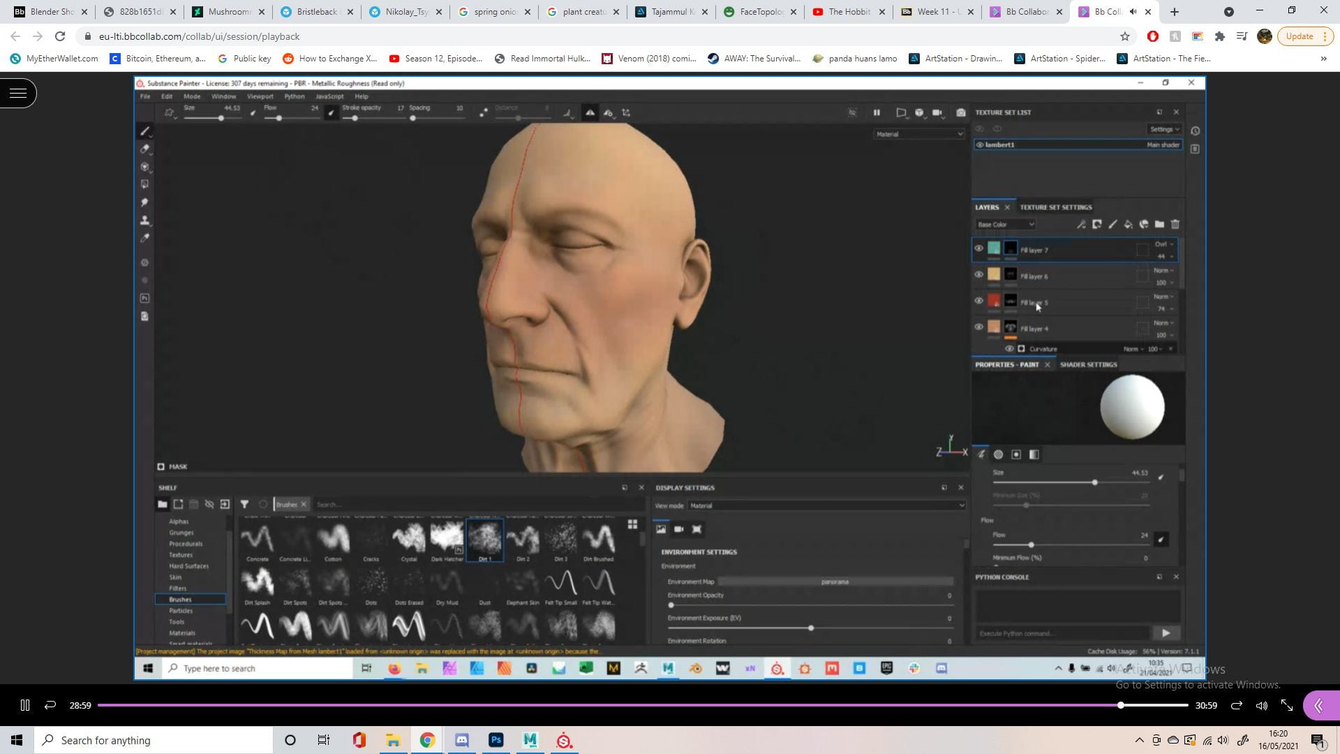
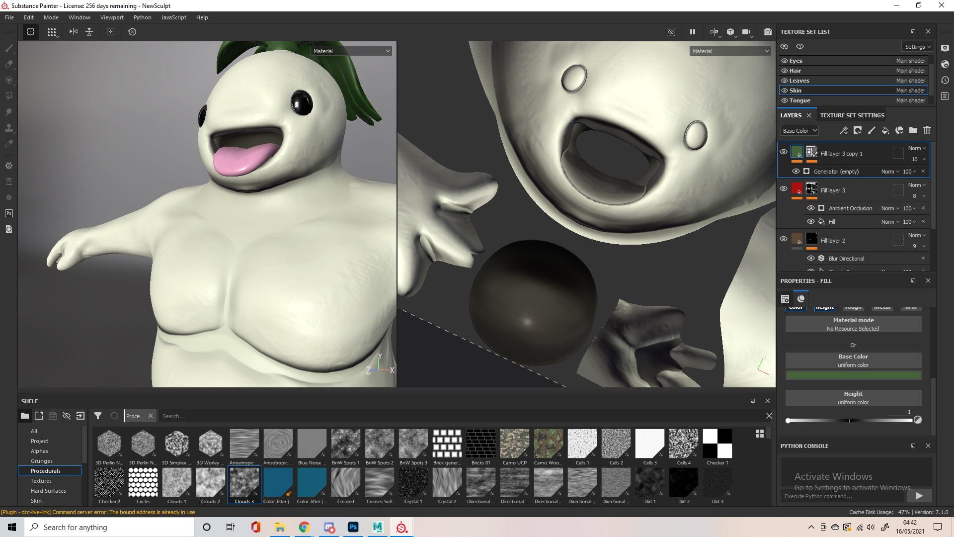
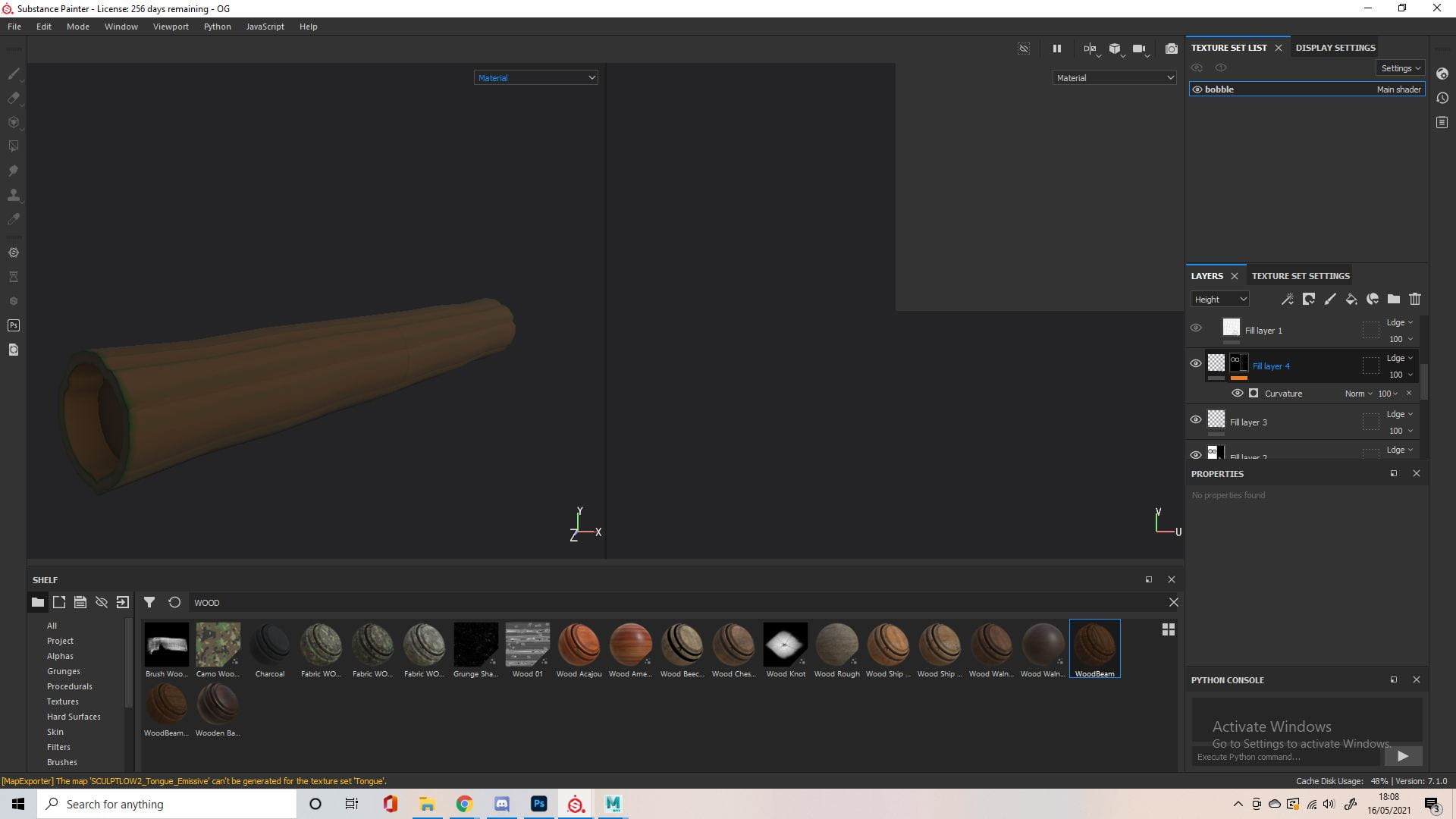
I’ve spoke about this method I use before in the previous 3D Digital Literacy Assignment, as well as in my animated Narrative Assignment. I used this throughout the different materials in different ways. I would basically add a fill layer with a black mask, then another fill layer on this which would have some sort of procedural or generator paired to it, I liked using the Cells and BnW Spots for this. I add a filter called blur slope to this, which gives it a painted/splotchy look, then I’d add other filters to achieve the desired effect, such as blur directional or sharpen. In this case it was just to add some colour variation so I only decreased the opacity. The tongue had little roughness so it would look wetter, but some areas had patches of roughness for variation.


After the tongue I came back to fix this issue, I identified it was the normal map that was causing this so I figured I could take this into photoshop to fix, which worked pretty well. I painted over these glitchy areas with the surrounding colours to fix it, I wasn’t completely sure what I was doing and there was a lot of back and forth but I got it to a point I was okay with.


This was just me identifying the areas with the issues in Substance, so I knew where to fix in Photoshop. You can see in the first picture I imported version 5 of the normal map, which I hoped was the last but there was a few more afterwards.
Before moving on to the biggest and most obvious part of the model, I looked over some stuff we covered in class, as well as a playlist that was linked. While my character doesn’t have fleshy skin like this, there was some stuff covered that helped, like the different tones in the face and the affect blending modes had.


I played around with adding detail through height but this really took away from any cute aspect the character had. Hyper realistic Pokemon and cartoon characters are normally pretty scary and grotesque, so I stuck to keeping the detail simple. I added some colour variation with the technique mentioned before, as well as dirt splotches on the lower half and the hands of the creature, like the reference from before.


Here I add further variation and discoloration. I used ambient occlusion as a generator to add yellow pigments. I noticed an issue with the top of the head and it wasn’t caused by the normal maps this time, but the ambient occlusion maps, so I took them into photoshop like before and fixed this. I added green at the top, to compliment the transition to the hair.
Final Touches – Posing and Accessories

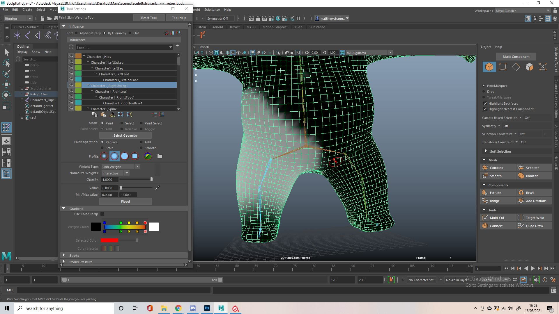

I made a quick rig based on the human rig in Maya, removing some fingers and joints to fir the character. Next I painted the skin weights to control the influence each joint had. Honestly I was running low on time at this point, I had some experience in rigging our alien character in this last assignment which came out really well, but this rig wasn’t the best, if a join moved to much it would cause issues like seen above, this is easily fixed but just time consuming. I didn’t have a lot of time so the pose can’t be anything crazy.

I quickly made a log for the background, a big part of the concept art as the character is using it to lay on. I was told to only keep the character and the log and to scrap the whole scene idea I had, since the focal point is the character. Luckily, I had a wood beam smart material created, which can be seen in the previous (windmill) project. So I added this on top of my base colour, as well as a fill layer adding green highlights along the curvature.


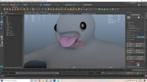
I tested few renders and liked how it looked, and had this pose in mind, like a giant toddler chasing excitedly after something. It is quite similar to the T-pose from before, with some changes, this was kind of my workaround the rig issues due to the time I had left. I had to quickly give him something to chase after, and thought a firefly/bug would be quite cute and add some of the magical/whimsical vibes I wanted to create from the concept art

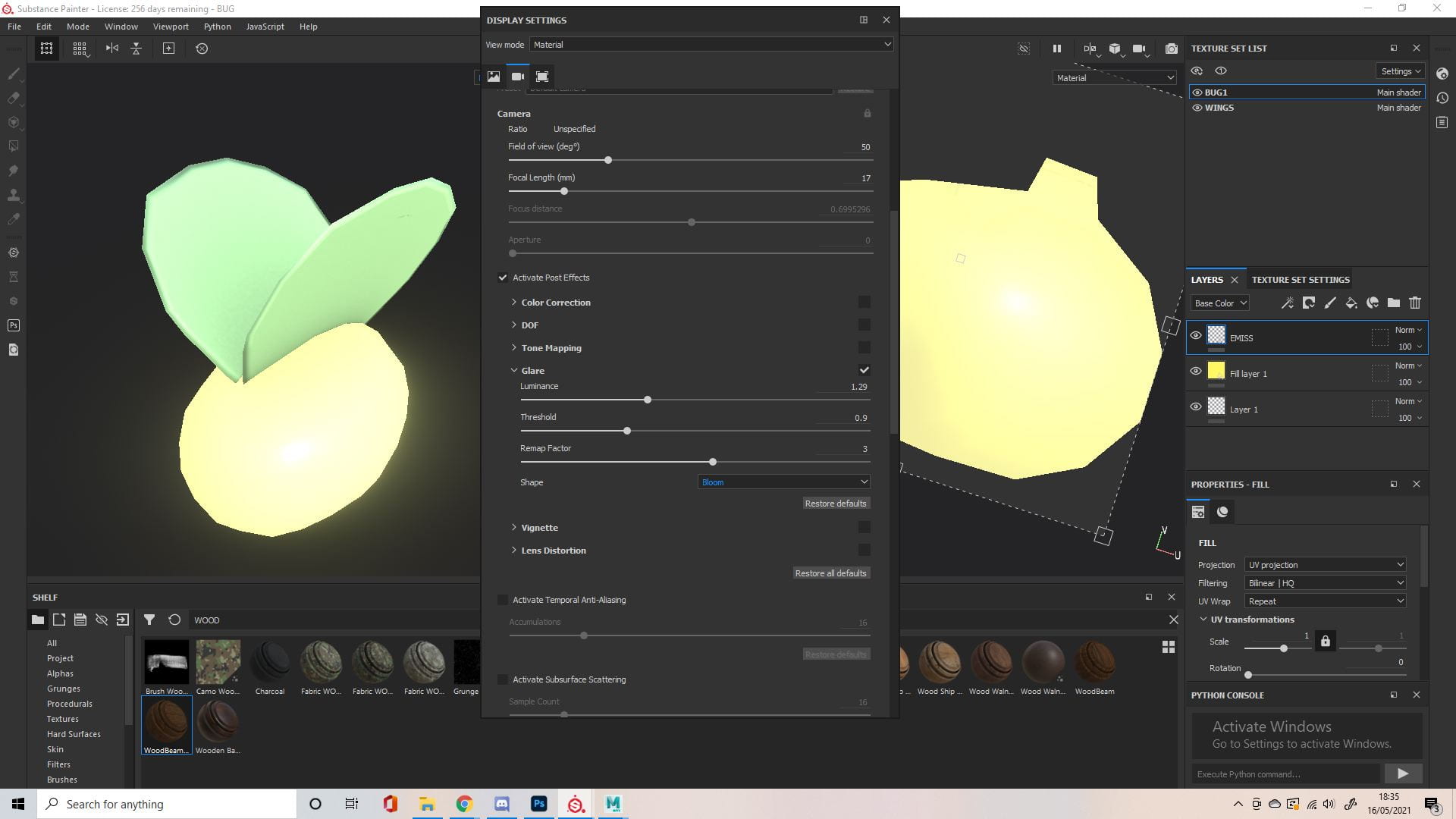

Super simple stuff, watched a quick video on emissive materials again and added a very small but bright bug to the scene. This was definitely an after thought but I think it really added to the scene and was a good workaround for the rig limitations. I also found it very cute, reminiscent of childhood innocence when a toddler would chasing after and trying to play with something interesting or new.


I did a quick test in Maya then exported my fbx to Sketchfab. I had to get rid of some of the texture maps like the height, as it would just cause issues like seen on the tongue in picture 5. I don’t think this was a big issue since my model wasn’t exactly low poly, and like I mentioned before, the height details kind of took away from the cuteness of the character anyway. The last photo is roughly what I ended up with. I might reposition things or add something in the back, it feels a bit empty. Also when the character’s in the pose it makes parts of the mesh look a little boxier or deformed which I’m not that happy with as the sculpt was very round and smooth, but I think the pose adds to the character so I’ll stick with it.
Reflection
I’m happy with how it turned out, especially since it was done in such a short time frame when compared to my other projects. The character is definitely cute, albeit a little unconventional, cute like and old man or an ugly dog. I like the expression and the posing, while not perfect, works for the context he’s in. I really think the accessories add to it a lot, a log by itself not so much but that shows it’s a forest, and excitedly chasing the fireflies like that, wide eyed, mouth open, is definitely cute. I’d love to approach this all again though, I’m not sure how I’d work around the issues with the hair yet, but I think I could definitely improve on the sculpt and the retopology and with a little more time I could build a very cool scene and rig for this guy. I’m super happy with my modelling progress so far though, I could definitely see this guy and the windmill in a video game or something, definitely not AAA but maybe a mobile game if I’m lucky. I’ve had a lot of fun in this semester and considering the time frame and context, I think I did pretty well in this project.
https://sketchfab.com/matthewshannon
Windmill Project
Modelling
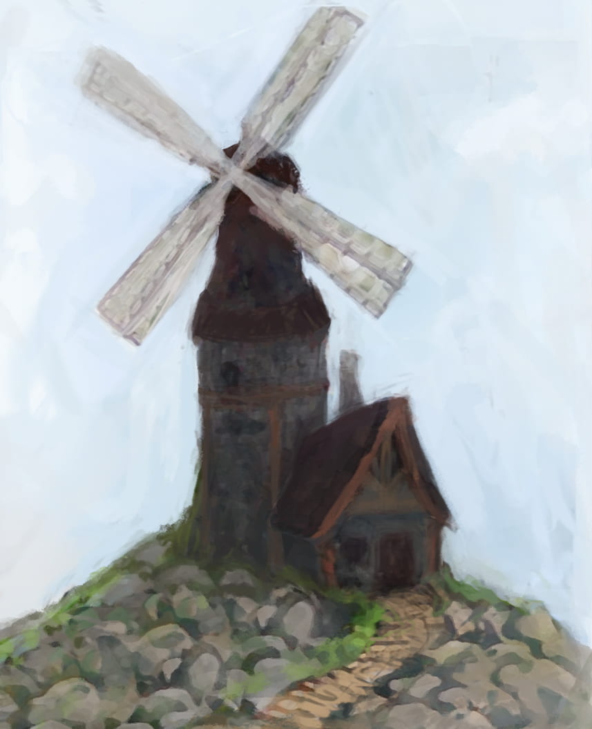
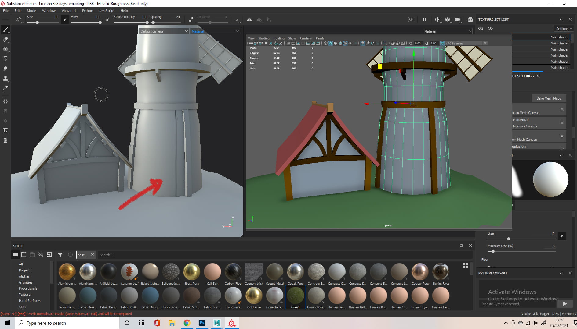
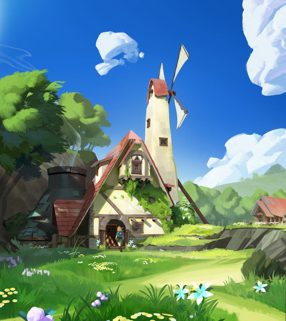
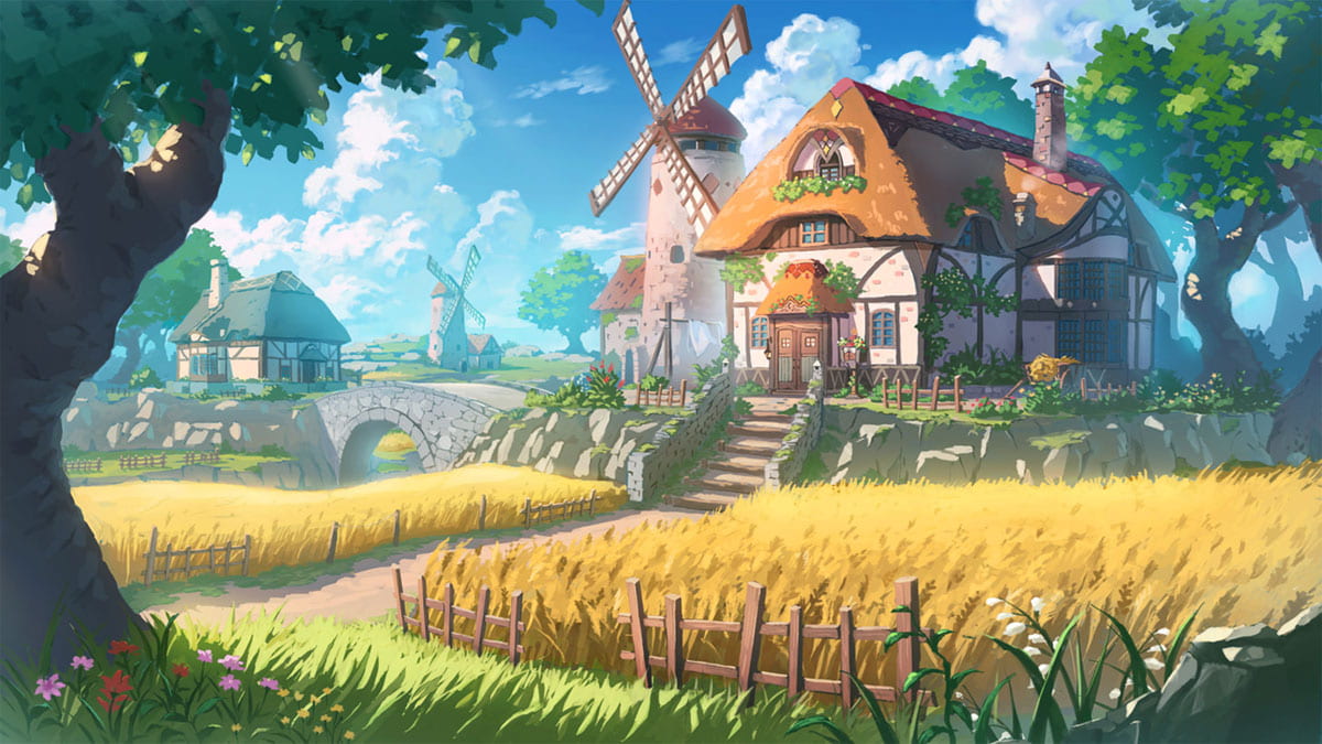
Following last weeks research, this is the rough concept I had in my head at the start, I imagined a lonesome windmill at the top of a hill, with a small house next to it. It’s pretty stereotypical, a wood frame around a stone brick structure, maybe in the countryside of a Norwegian country, quite cold and secluded.
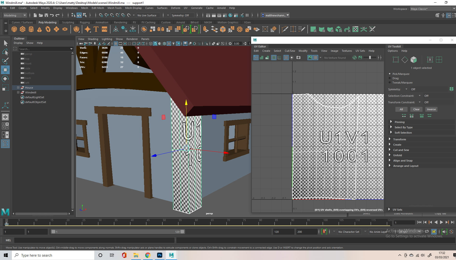
From here I started modelling the house, I’m going to gloss over some of the techniques I used, as they were mentioned in the previous weekly updates, but it pretty much consisted off the multi-cut tool and a bunch of trial and error.
House

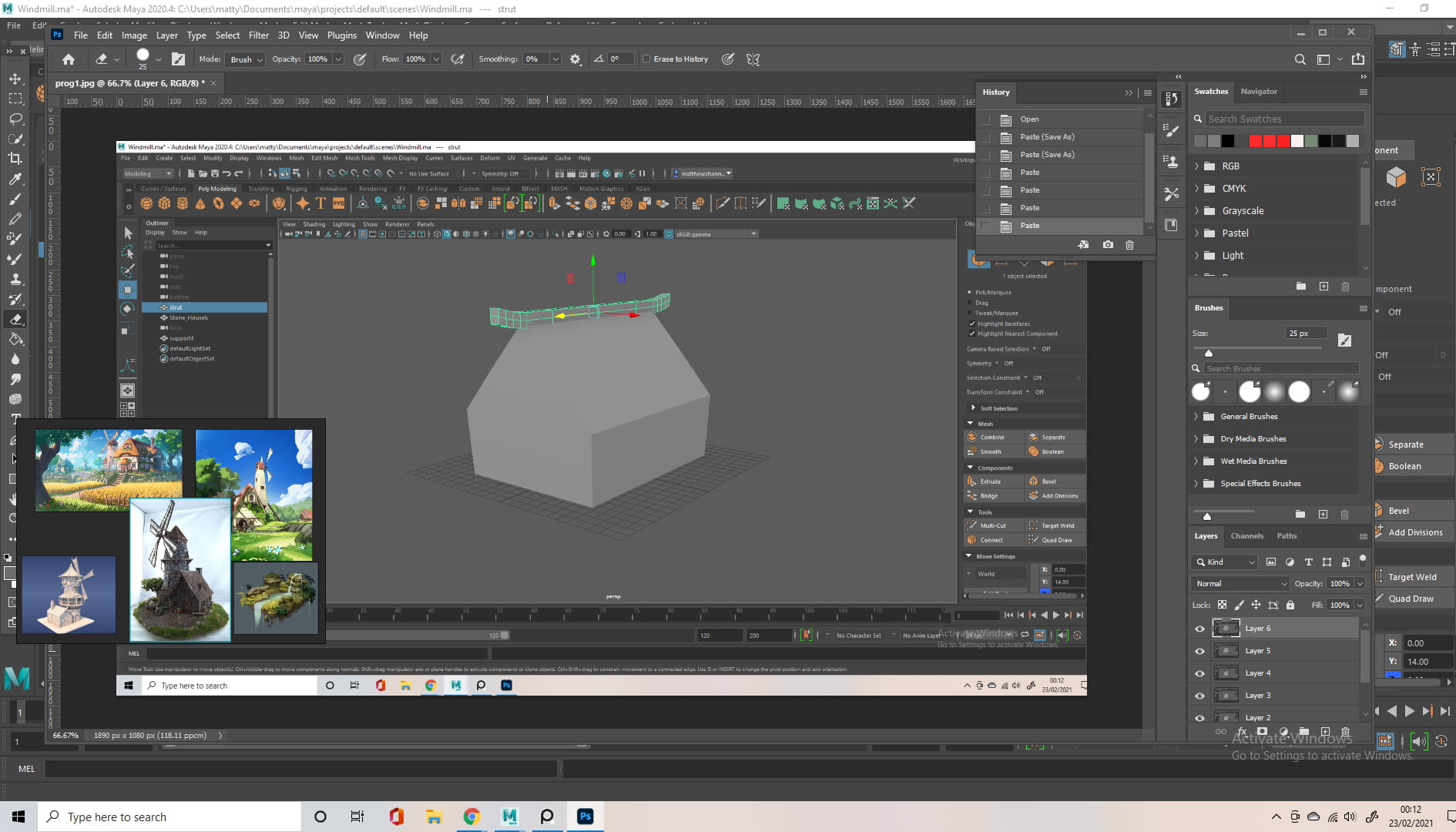
I started with a cube, scaled it to the rough dimensions I wanted and added some cuts. I pulled the vertices at the top inwards, to create the slanted top, where the roof would be. I then added a beam along the top for support. The beam is yet another cube, scaled and cut, manually creating the desired contour.


I added some other beams around the side, to support the structure further, I tried to imagine how it would be constructed in real life, and then I added the roof, using the same techniques mentioned previously.


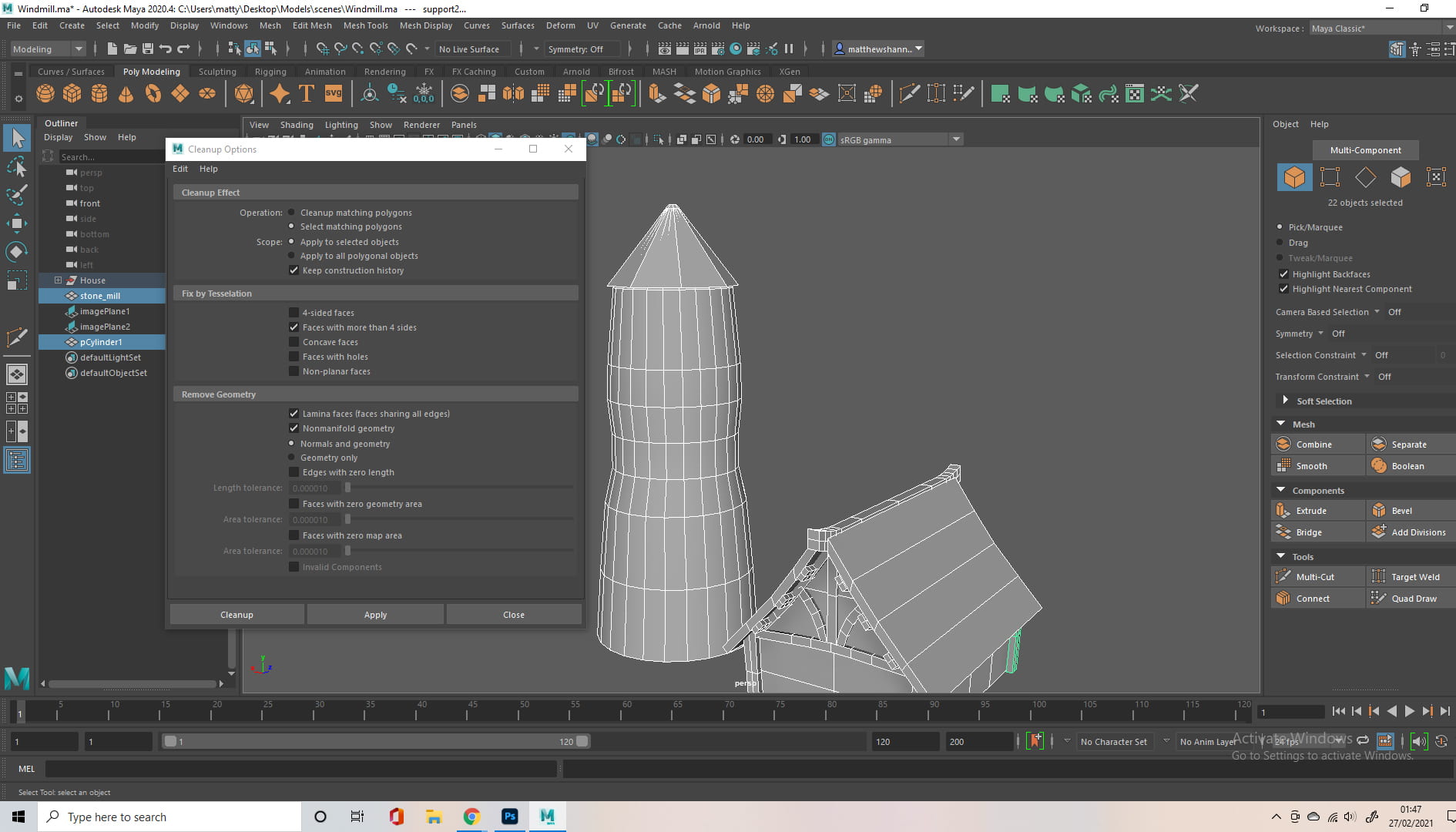
I cleaned up my mesh, checking for any n-gons or anything else that would make life difficult. I tend to do this after completing most sections, before moving on. I attempted to use the mirror tool to create the support for the roof but during clean up this brought up a bunch of messed up geometry, so I ended up doing it manually.

I was pretty happy with the general shape at this point, I made some cuts along the middle to shrink the lower half a little, to give a more stylised silhouette, but this ended up very subtle. I then grouped and named all my objects, to keep it all clean and organised for when it starts to get more crowded.
I looked at some actual 3d models, for ideas on how to approach the next part.


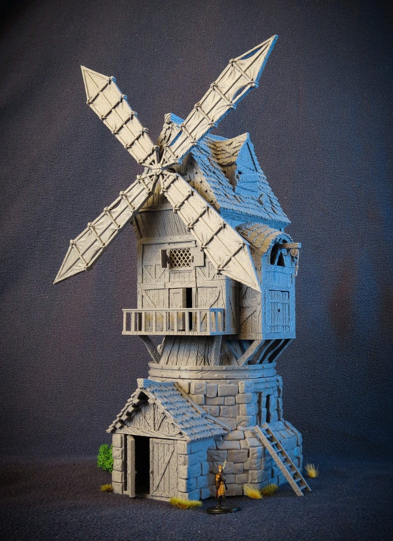
Windmill
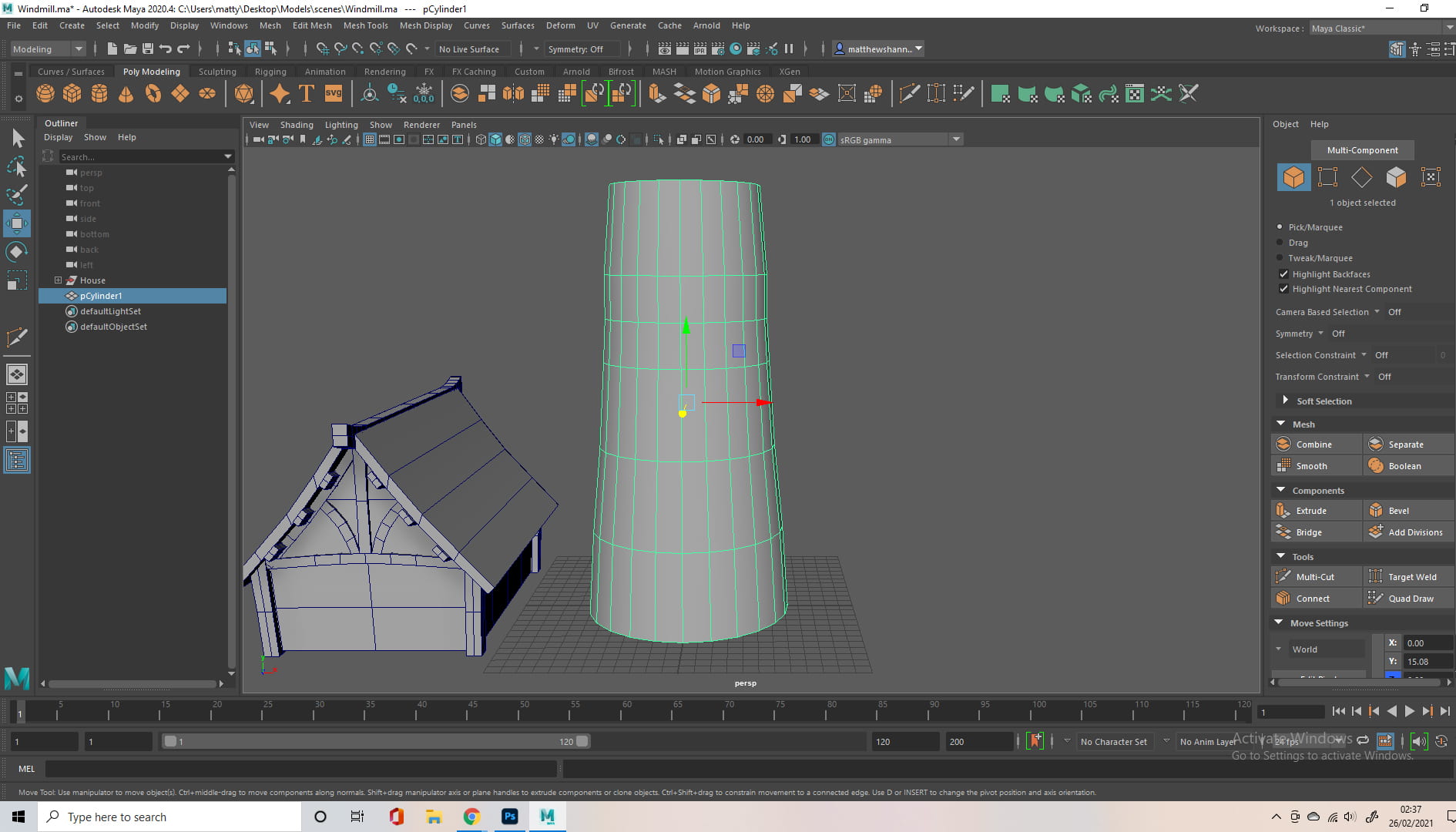
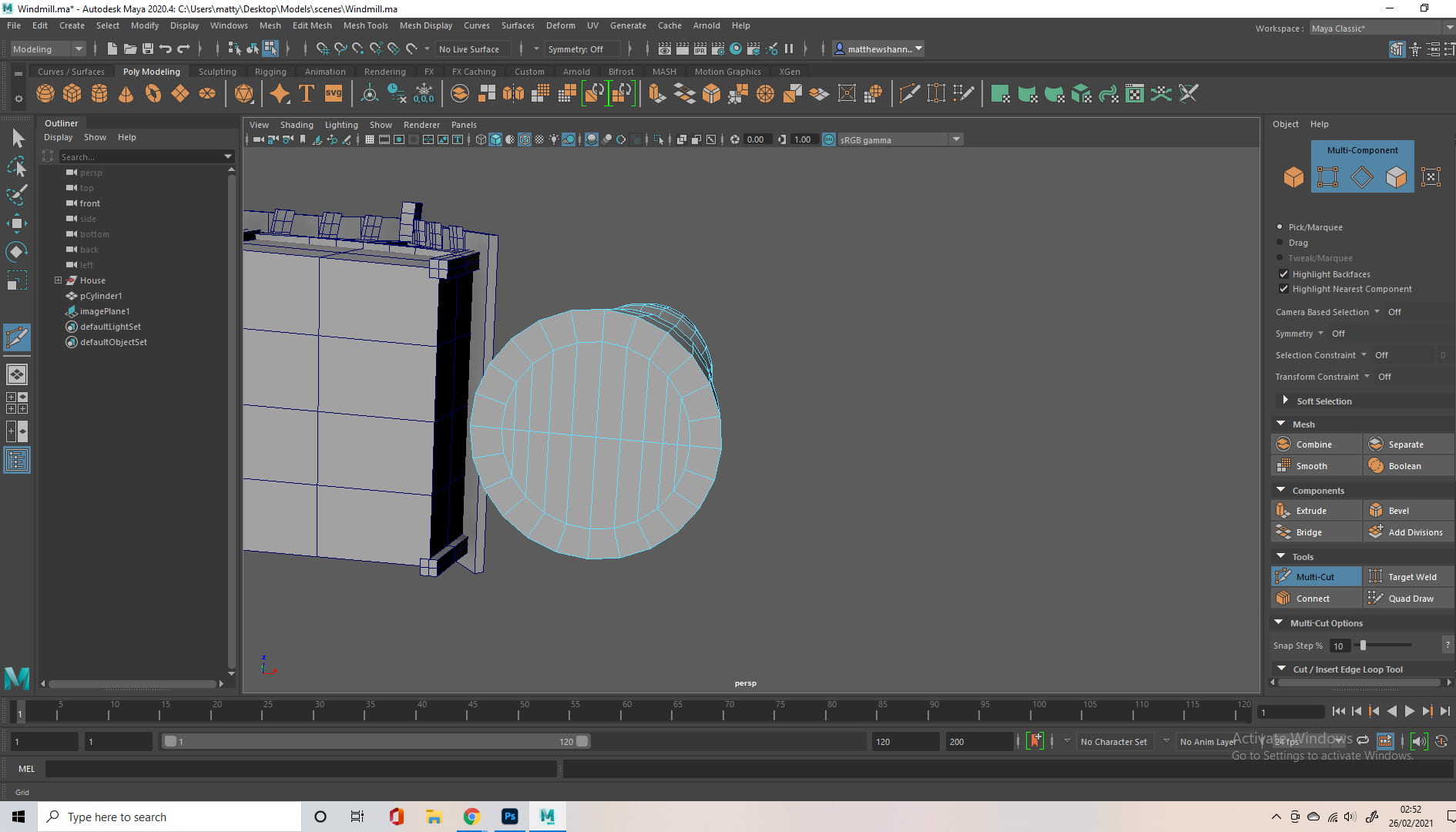
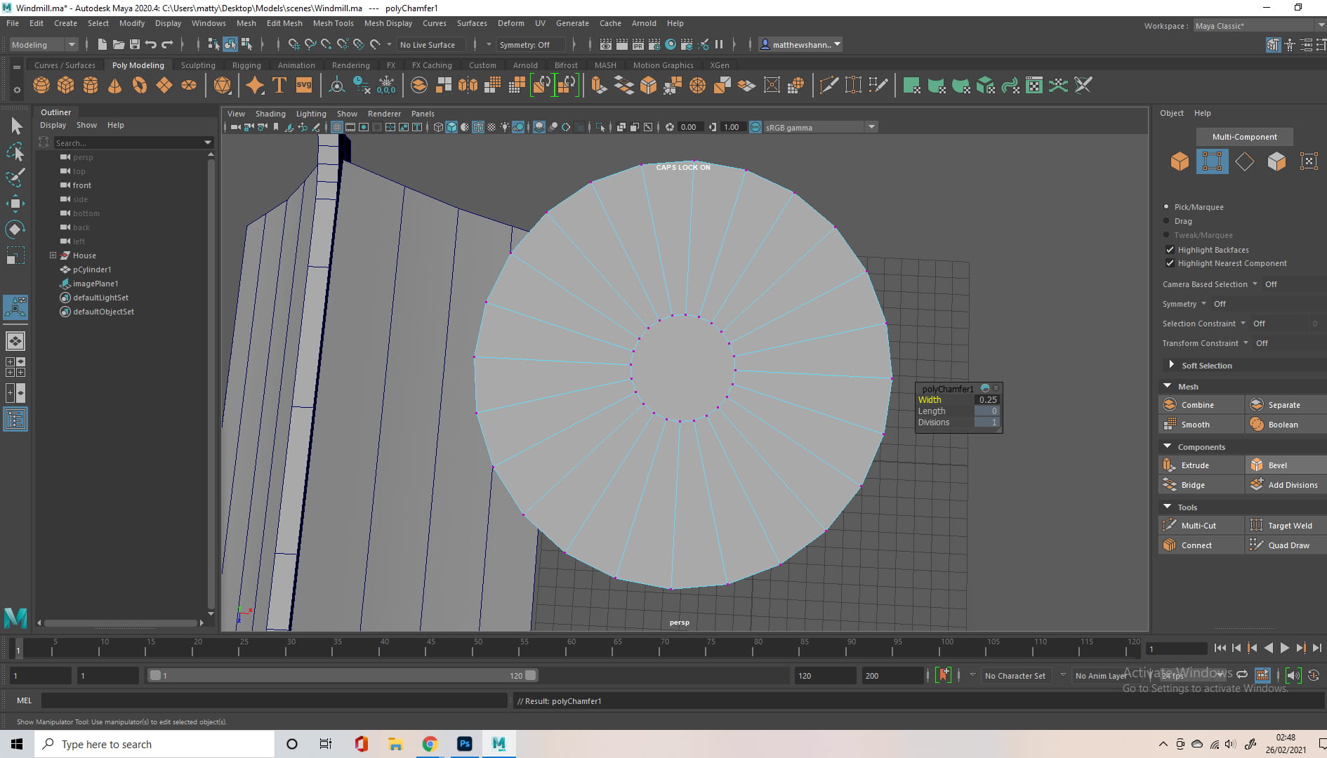
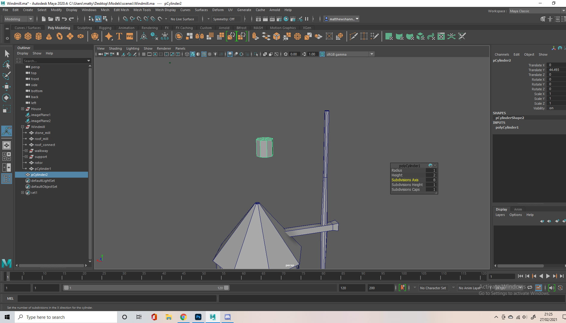
I started with a cylinder as a base, scaling it to the rough size I wanted relative to my house. Since I used the cylinder shape, to avoid mesh problems (n-gons) I had to select the top and bottom, bevel them, then use the multi-cut tool to make sure it was all polygons. (I go into more detail on this process in my previous weekly challenge posts.)


I added another cylinder with less divisions, to create a more structured look for the roof, and scaled the vertices on the top and bottom to get the desired shape, again I cleaned up any n-gons during this process.

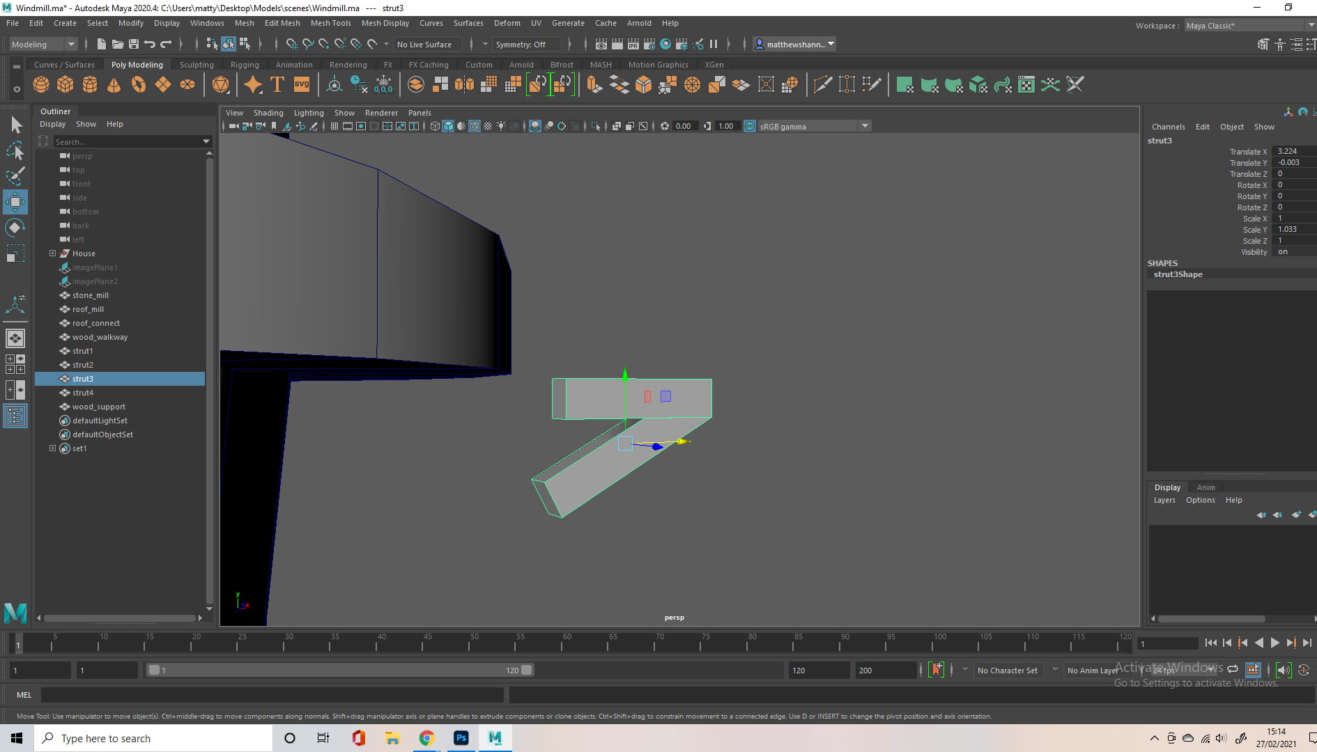
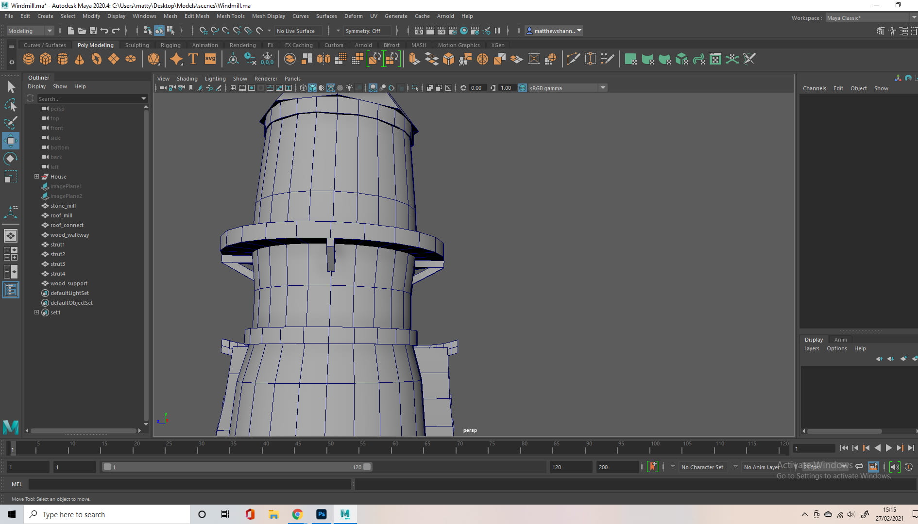
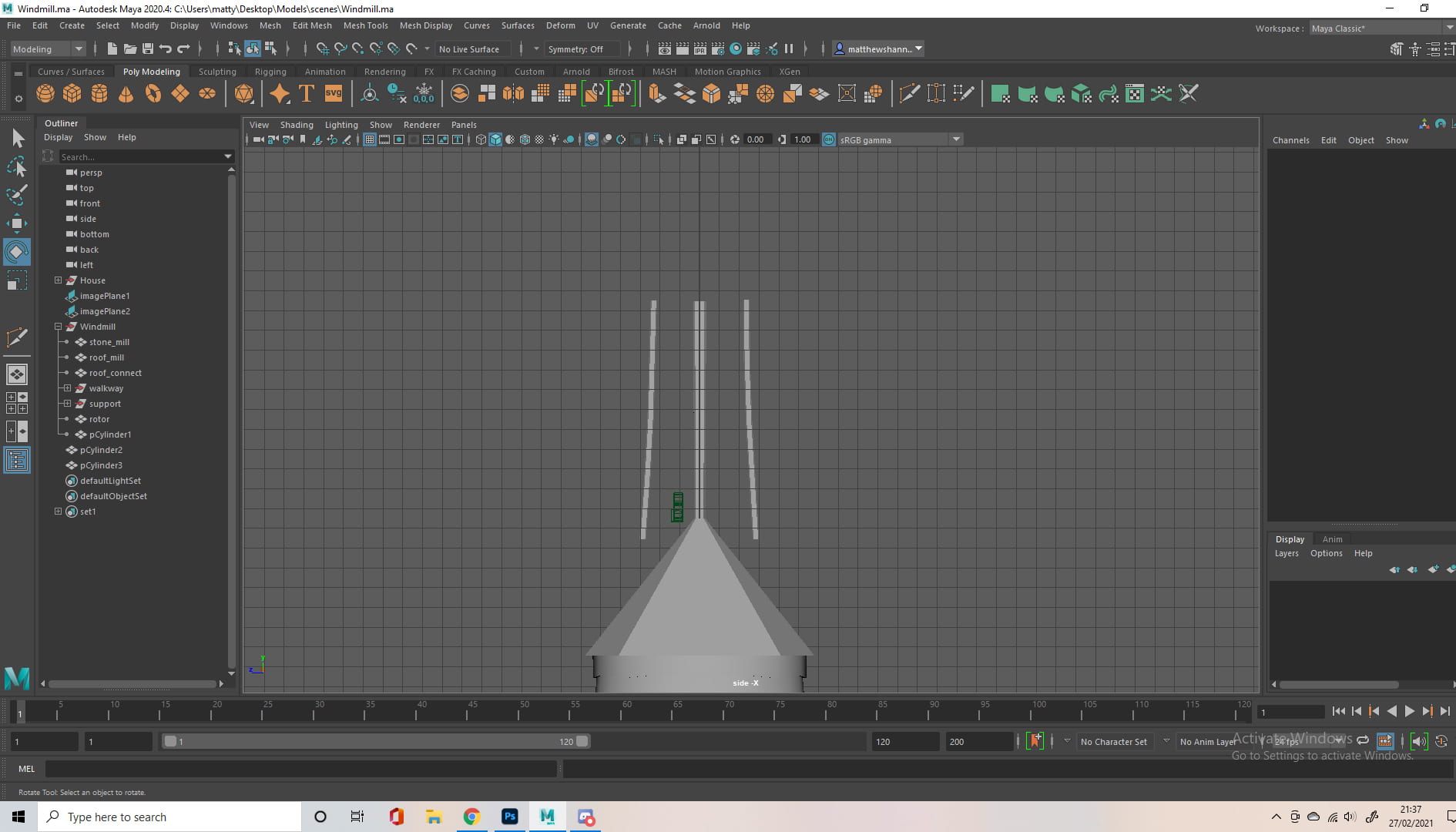
The photos aren’t the clearest on what I did here, as I was using the orthographic views. Basically I added another cylinder, bevelled and removed the faces on the top and bottom, and put this hollowed out, flattened cylinder at the centre of the windmill, to emulate a wooden walkway. I duplicated this and scaled it down at the thinnest part of the windmill, to add a wooden support. I also modelled small supports for the walkway, using angled cuboids, removing the faces that weren’t visible.

I wanted to add further supports, wooden beams from the floor to the centre support, but I found this difficult as I had to model wood along a curve. I attempted to do this with multiple rectangular objects and snapping them together, consulting the forums on how to do this, but this resulted in bunch of mesh problems for me. I then realised I could just select the face and extrude it along the contours of the windmill. I duplicated this beam and placed it three more times around the base of the windmill.


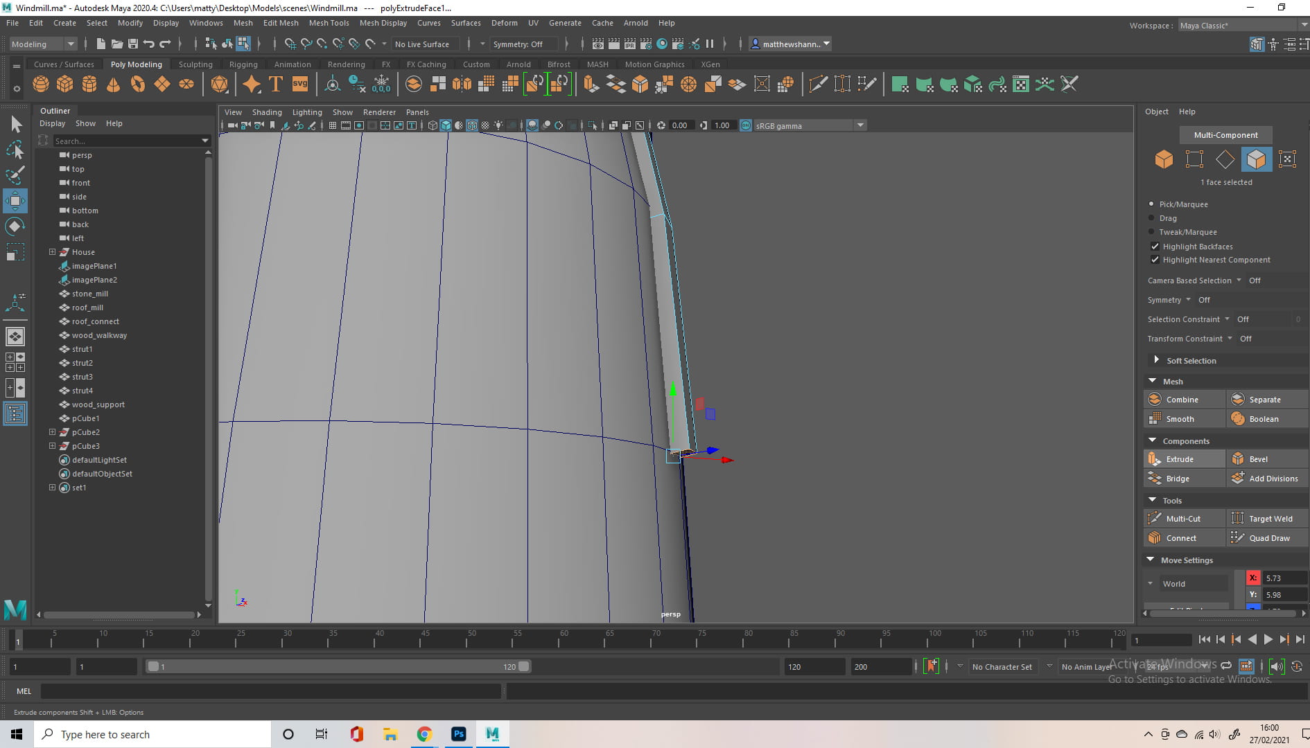
I then started on the blades, extruding a rectangle from the roof, and creating another cylinder. I used 8 divisions for the cylinder, as I thought it would give it a more wooden and stiff shape to the structure, trying to avoid perfections so you could imagine this windmill was manmade. I took the middle beam of the blade, and scaled the middle vertices on one axis, so it looks as if the wood is going through the beam from the roof. I also added some more shape to the front of rectangle, making it look like the rotor.


I used the curve tool on two more cylinders, to create a more organic shape for the outer beams of the blade, and added 7 small cylinders connecting the three wooden cylinders. Again, I ensured it was all made up of polygons.


I duplicated the blades, and started to construct what connected the blades to the windmill’s roof. This took a few tries, as it kept coming up as having more than 4 faces on certain sides, but I eventually got it to work and I came up with this mini house-shaped structure for the top of the roof. At this point, I didn’t know if I should just keep the model simple and start my UVS, or continue to add detail.


So I watched a lot of YouTube tutorials on stylised modelling, and how to UV/Texture stylised objects, and decided I would need to add more detail before I started any of the texture work.


I added some rectangular beams to the roof, using the same methods as before. To save time I did it once and duplicated it. I divided 360 by 8 to work out how much degrees I had to rotate each rectangle by when duplicating, as the roof had 8 divisions.


I considered adding roof tiles, but I thought it would take away from the style I was going for. I added further detail to the windmill, and played with the idea of having extruding bricks for added depth, something I saw on sketchfab


I watched a tutorial for clean booleans to do the house’s windows, but it kept messing up my topology, so I just added more cuts with the multi-cut tool and extruded/indented the faces. I then added some more detail to the house before starting to UV.
UV / Textures
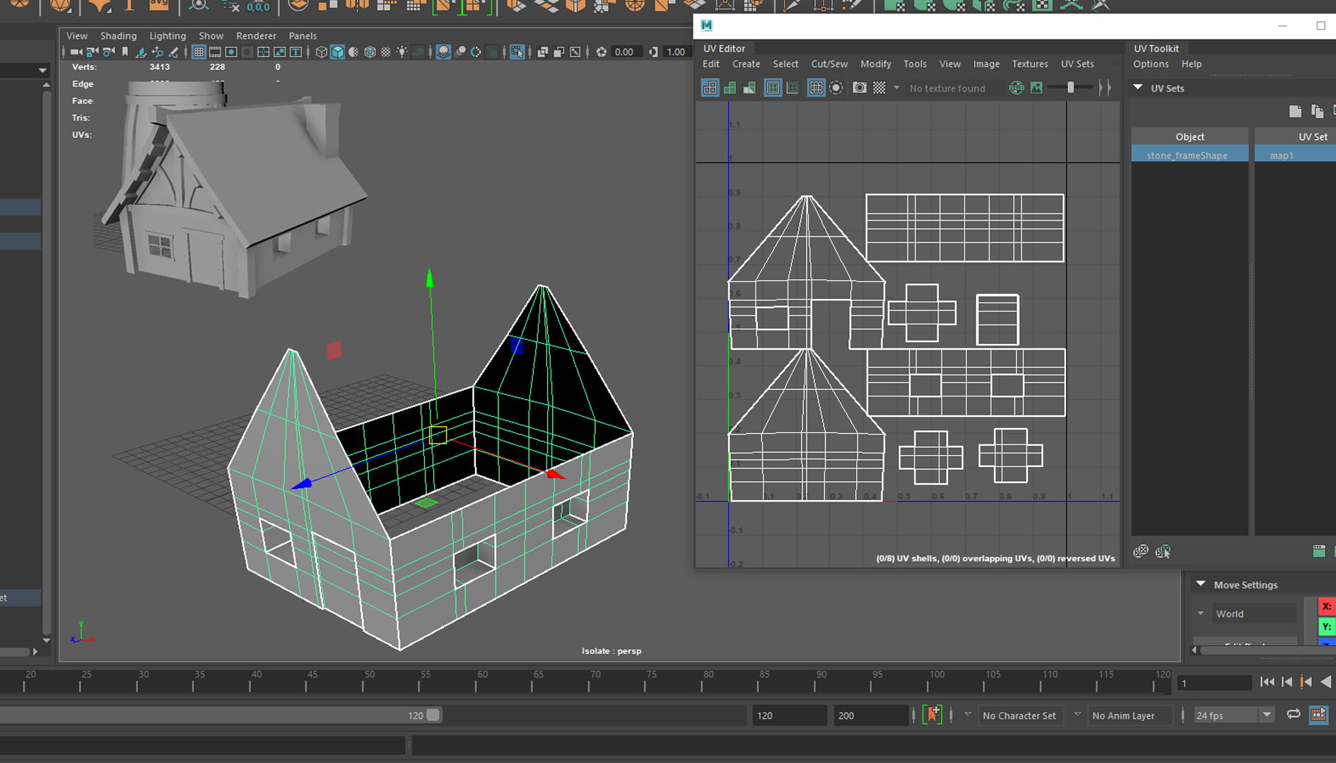


As you can see I didn’t have the best start with my UVs and texturing, I was very new to substance painter and didn’t realise you could export the whole scene, I thought it was one object at a time. So I would UV one object then work on it in substance. I spent about a day on the above, researching, running into a lot of issues with my workflow, textures and even my pc hardware at one point. This was kind of my baptism through fire, before really starting on my textures.


I assigned everything its own material, and started on the UVs, I’m not going to include them all in here as its quite repetitive, and this blog post is getting long. I would generally use planar projection when applicable but if it was a more complex shape, I would use automatic and then manually stitch/cut the edges.


I didn’t realise that the UV maps of objects within the same material would overlap. So I ended up having to redo (layout) them by material. I also didn’t realise I had to put them into the correct (relative to one another) orientation if I wanted the wood grain to travel the right way. So I had to redo it yet again.


A technique I used a lot on my textures, Inspired by a YouTube video, ‘Creating Ghibli-Style Textures in Substance Painter’ by Stylized Station. I wanted cell shaded, hand painted aesthetic to my textures. I would use fill layers with black masks, using the blur slope and blur directional filter to emulate brush strokes.

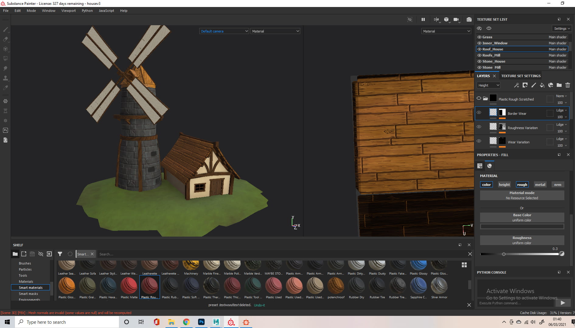
Baking always resulted in some weird Ambient Occlusion and I’m still not sure why, but I managed to find a work around later. I used a combination of hand painting, combining existing materials, and fill layers/procedurals to get the outcome I wanted on my textures. If the texture was similar to another, like the different woods, I would make my own smart material from the first group, and edit it to my liking.


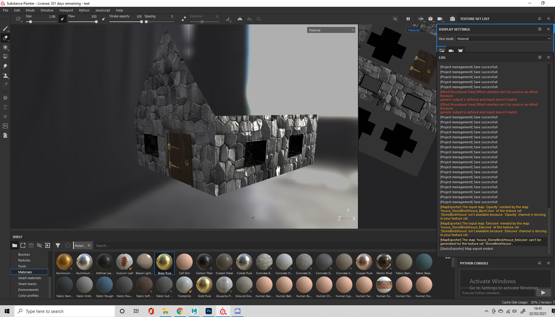
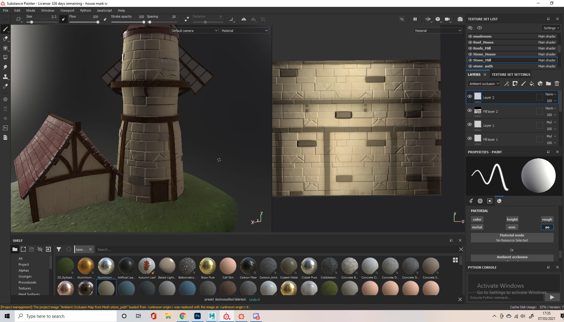
I started to venture off from my concept art, the dark stone brick and wood didn’t translate as well as I hoped. I had to go back into maya, as I wanted the extruding stone bricks from the windmill to match the stone bricks from the texture. I also felt like the scene was missing something, so I added a ground.

I made a grass texture I liked using the method I mentioned previously, but it was missing something so I added stones to it. I used fill layers with black masks, the ‘Cells 4’ procedural with the balance turned right down and a blur filter to get this effect.
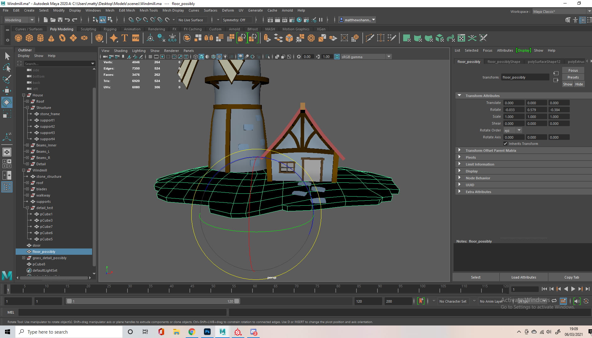
When I brought the windmill texture into Maya to further adjust my stone bricks, I kind of got carried away modelling. The grass looked empty and it was just floating, with no bottom face.


So I added some mushrooms using techniques I got from Michael and Dermott, the curve tool and the soft selection on vertices. I didn’t create a sphere, but instead made a cube and used the smooth mesh tool, something Alec mentioned a while back. I also added a door to the back of the windmill, as my sister asked how people get into it which I didn’t even consider.


I made some final adjustments, adding imperfections to the windmill and a door to the back, then brought it all back into substance. I managed to figure out how to enable emissive materials using the forums, allowing me to have objects emit light. I used this on the windows, as well as the mushrooms, inspired by the blue mushrooms from the first Fable game.


When adding the emissive materials in the texture set settings, I noticed a section to add ambient occlusion, allowing me to fix the issue I had with the back of my windmill, setting the ambient occlusion I made to replace the baked one.


I exported my mesh, messed with the lighting and, choosing to go with environment lighting, finally uploaded it to sketchfab!
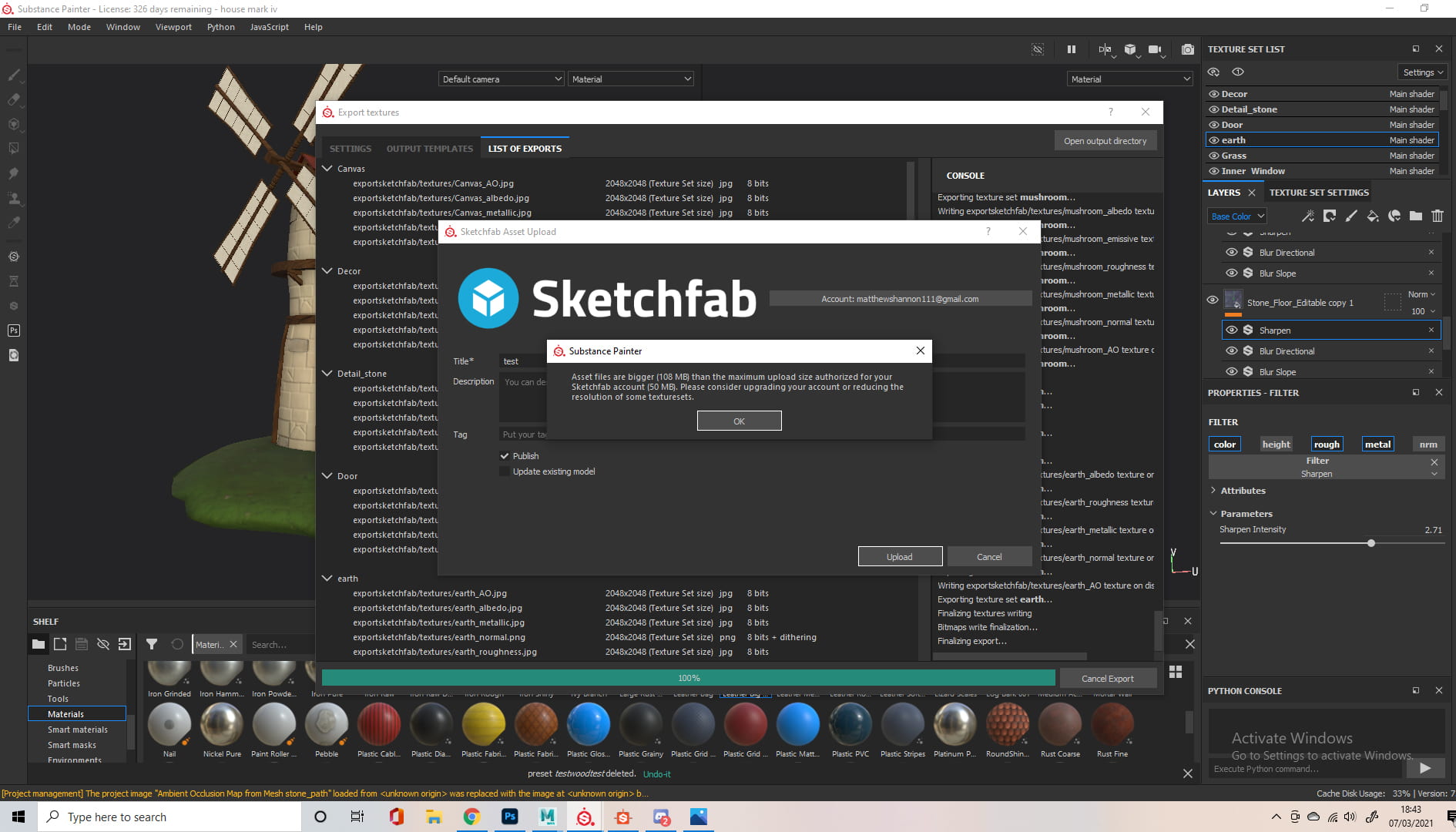
Sadly I couldn’t upload it with the full 2048 textures (file too large for free account), so I had to downscale the resolution to 1024. https://sketchfab.com/matthewshannon
Reflection
Just looking at the 3D Digital Literacy section of my blog you can see my modelling development from the start of the year. I was surprised to see the amount of crossover with even just the first two model challenges and the challenges I faced on this windmill, when all else fails the multi-cut tool is always there to save the day. I have barely scratched the surface of Maya, but using just the multi-cut and a few other basic tools I was able to create a full scene that I envisioned in my head, when previously I struggled to model a table leg from reference. The talks from experienced workers in the industry, seeing their workflow, listening to their feedback has already gave me insight into the possibilities within Maya, and the level of progression possible. I tackled numerous different challenges in this assignment and managed to overcome them all. In just a couple months, I was able to go from having no knowledge in a foreign software to modelling a full stylised fantasy scene. This assignment alone has taught me a lot of new skills and I’m excited to see how much further I can progress.
Week 03 – Last Weekly Update/Windmill Project
Windmill Project
I’m changing the format of the blog from this point on, as it makes more sense to do it per assignment instead of weekly updates, I made a start on my windmill project by scrolling through sketchfab for hours and adding cool 3d models to my collections. I also collected some reference images of windmills or styles I wanted to replicate. I knew I didn’t want to do a modern day windmill, and wanted to go for something more stylised and medieval/fantasy.

Week 02 – Modelling
Week 2 Challenge – Table
For this weeks challenge we had to model a table, using reference images taken at a more awkward position than the vase. I started this out the same way I did the vase, using a cylinder for the table leg. I bevelled the bottom/top vertices to avoid n-gons, then scaled it to the rough dimensions then I followed the contours, using the multi-cut tool to match them.

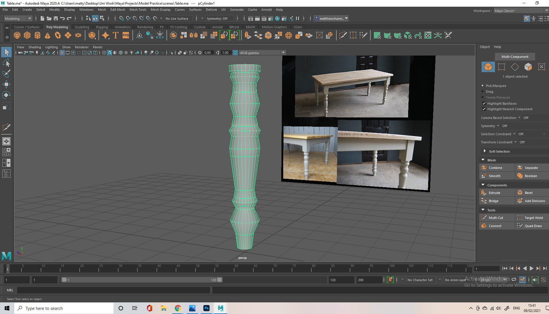


I then went back to the reference image in photoshop, to better get a grasp of the proportions, and notice the significant shapes in each leg. Using this new reference I made, I went back to my table leg, and added more divisions to get the shapes more accurate, and made some other adjustments, mostly changing where the shapes I outlined were, relative to each other.

At this point I was debating calling the leg finished, just a simplified version of the reference image, or going back and adding more detail. I decided to add the details, as my vase project was quite simple, so it would be good to get experience with something more complex. I wasn’t sure the best way to approach this part, so I just went back in with my multi-cut tool, adding more divisions for these details. I then added a cube into the scene, and scaled it up to a rectangle, to match the upper part of the leg.


I duplicated my finished legs and, using the distance tool, I placed them at a distance from each other I estimated using my own kitchen table relative to its table legs. I added another cube to the scene and put it in the centre of the legs, then scaled it to match the counter top in the reference. At this point Cathair sent a new reference image he found, which was helpful to compare my table to, and further clean it up to match this.

At this point all that was left to do was to add the underneath wood, connecting each leg. I went into top view and made cuts where I think this would come from and then I used the extrude tool on these faces.
I think my finished product pretty closely resembled the references and I’m happy with how it came out. Next time I would probably try and use less subdivisions, as the legs ended up pretty complicated.

Week 01 – 3D Digital Literacy Intro
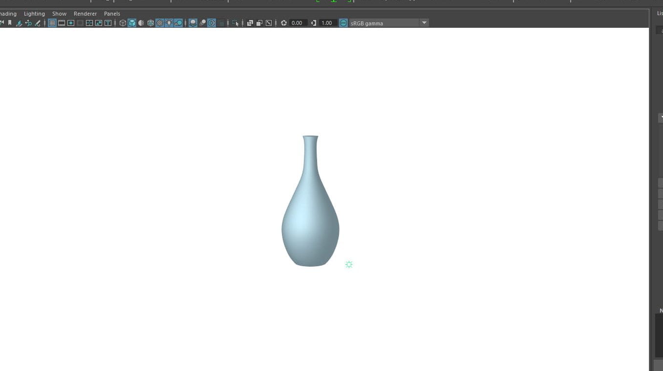
Week 1 Challenge – Vase / Jug
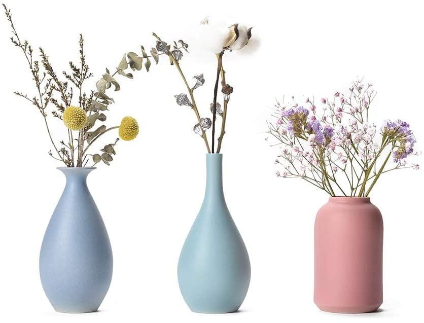
This week, we had to watch the videos provided and try to model a vase / jug of our own. Our first step was to find a vase we wanted to use as reference using https://pixabay.com/. I decided on this image because I liked the shapes, I focused on the middle one.
 After setting my project and my scene up, I set up my reference images using the orthographic views – front and side. I aligned the bottom of the vase with the grid, and put my vase in the direct centre.
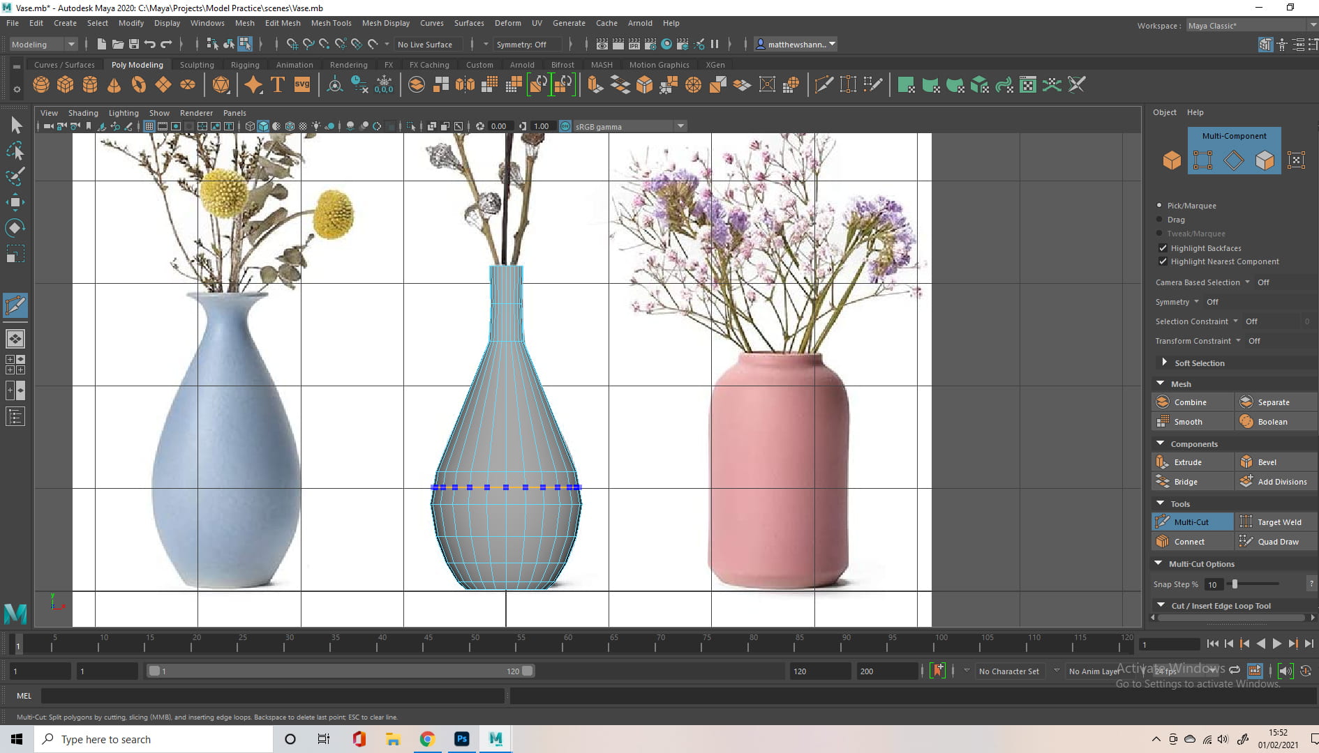
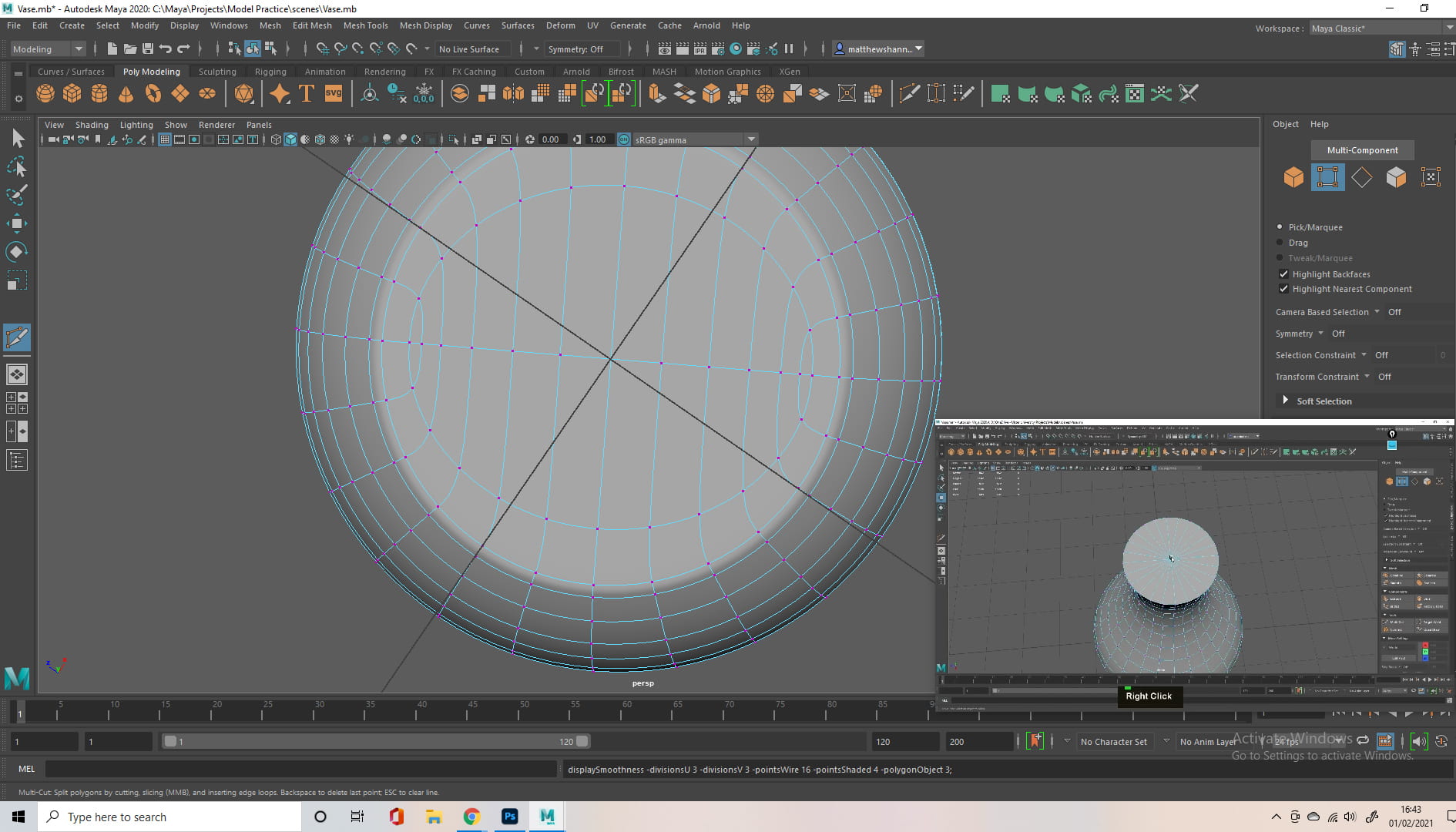
To start modelling, I inserted a cylinder and scaled it roughly to the same proportions of the vase. I was introduced to the multi cut tool, probably the most useful (or at least used) tool when modelling.
I used the mutli cut tool, adding divisions (edge loops) along the main contours of the vase, the thinnest and thickest parts, and scaled it to match my reference. From there I would add another edge loop in the middle of these points using ctrl middle click, to better match the shape of my reference image, and have a less jarring transition.
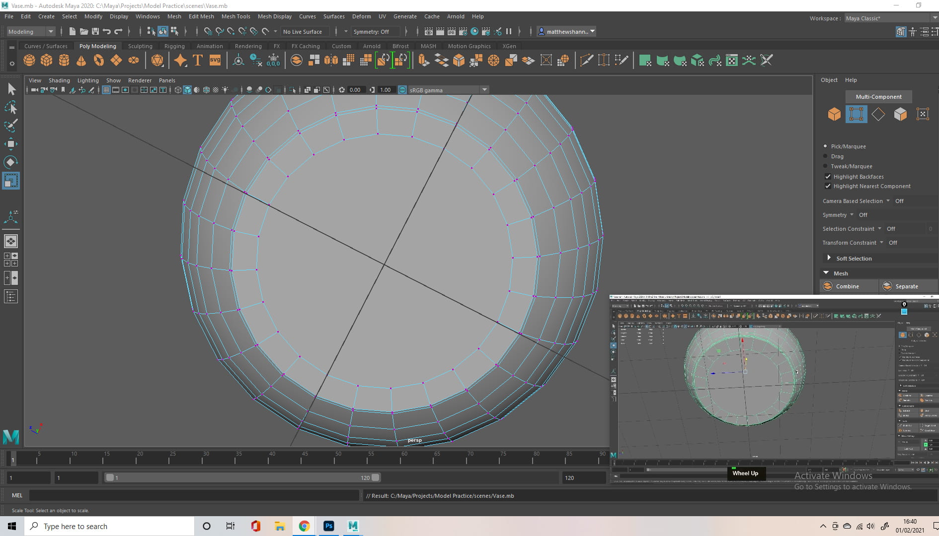
I then had to change the top and bottoms of my model. as using the cylinder as my base made this an n-gon. This is to help avoid errors with the mesh during exporting. To do this I selected the vertex in the middle of the face and bevelled it, then connected the remaining vertices alone the bottom/top in a straight line, with one horizontal line through the middle.
Then at the top we used the extrusion tool in order to hollow out our vase. The extrusion tool lets us manipulate this face, moving it down within the vase. Using G to repeat this extrusion, I moved/scaled the faces down at each major change in contour from inside.
I encountered my first problem in this section, something I did caused Maya to unexpectedly crash. I didn’t lose a lot of progress, maybe 15 minutes, but from then on I learned to save a lot more often.
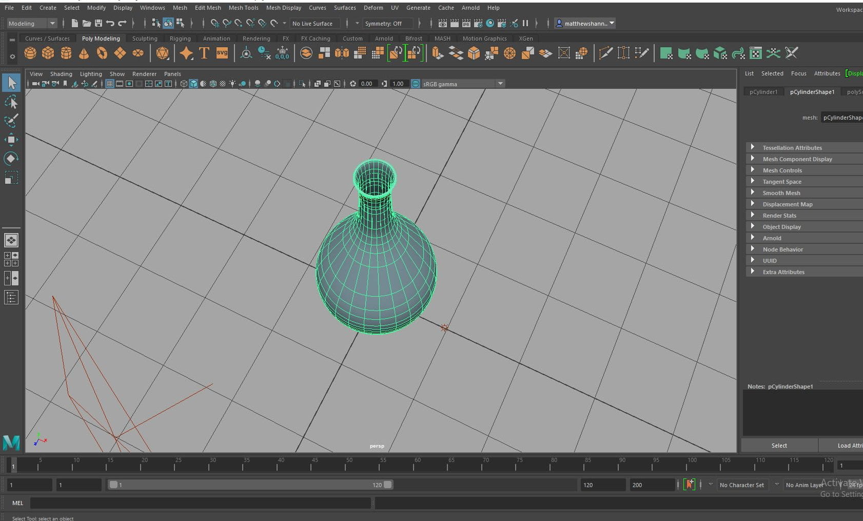
When I tried to render an image of my final vase, it made the whole scene black even after adding lights to my scene, I guess I’ll learn why in the future, for now I just took screenshots in my viewport to show how my vase ended up. Next time I would probably have chosen to do a more complex vase. I like how the vase came out but it is very simple, and without the flowers it could be hard to identify.