Check out the research in my previous post where I analysed some showreels I found and identified which aspects I liked from each one, planning to implement these features in my showreel.
A lot of this research just reinforces what I’ve previously learned, stuff I’ll probably repeat throughout the blog; keep it short, put my best work at the start, present clips clearly etc. Don’t mess up the video with over the top titles, transitions and editing – keep it simple. After making a showreel you should trim the fat, and always keep it updated.
Just before I started, I watched some YouTube videos to refresh myself on what makes a good reel – starting with your strongest clips, quality over quantity, good timing etc. These were all stuff we covered in class too, during our workshop with Alec when we edited his 30s Showreel. I knew I wanted to have some kinetic typography at the start, inspired by Sorcha’s classes, I thought having the letters appear as if they were being written would force the audience to actively read the name and hopefully make me more memorable.
I hopped into after effects and started animating the text with a write on effect, I done this by creating a mask over the text with each point placed in the order they appear, then adding a stroke effect to this. I then keyframed the the end value of this effect as well as some subtle brush size animation.
When I was happy with how this was looking, I started collecting all the clips I wanted in my showreel. I found some energetic music with a strong beat to allow me to edit with strong timing and did some further research into showreels, watching a bunch of YouTube clips before jumping into Premier Pro.
The actual editing was easy enough, I put what I thought was my best work in the first clip, it included vehicle, character and camera animation as well as a strongly rendered scene. The second scene finishes with a fade to black, which allowed me to transition to my 2D animation scene well, as that opens from black. I took some tips from Alec’s recorded videos including some advice, based on common issues he saw with my classmate’s edits -and implemented the rotation idea he showed using Sketchfab, I also added a crossfade to show my wireframe like he mentioned in the video.
Following my feedback from Aodhan, I added my contact details to the end of the showreel, he said it wouldn’t be necessary to have it at both the start and the end, just the end’s fine since my start has a little animated sequence. It’s important to bookmark details as showreels often get passed around a lot.
He suggested I should change the text I included in the first scene where I was listing what I wasn’t responsible for, as it sounded like I was listing a bunch of work I didn’t do. Instead he said It would be easier listing what I was responsible for, but when I tried this the text took up way too much of the screen, so I stuck with what I had, and just worded it differently. Since I worded it more concisely, and added a description to my showreel stating I’m responsible for everything in each scene unless labelled otherwise it no longer sounded like I was listing things I didn’t do.
I’m happy with the final product, I was expecting a bunch of changes since I never made one before, but Aodhan said all in all it was a really nice showreel. I was a little worried about the length in case it was getting too long, but when I mentioned it he said the length felt really good to him. I would include a before and after of Aodhan’s feedback, but I only had to change the end screen and the text on the first shot, which I included in the above screenshots since there are size limits for files on the blog.
The final showreel is posted in my Industry Facing Material post.
CV
The general structure suggestions I found online were similar to the examples on blackboard; the resume header, the resume summary, employment history, skills, education. You should begin by researching the studio/job role and tailoring your CV to match this, since employers advertise exactly what they are looking for (obviously don’t lie though). Since we focused on having a strong design too, I started by planning out how I wanted to showcase my understanding of design. There are a lot of examples of these very designed and creative CVs, which look awesome but I think they come across a little unprofessional, I wanted something a little more subtle.
I honestly struggled for a while with the CV, I couldn’t figure out a design that worked for me – showcasing my design capabilities while also looking professional. I looked at the provided examples from Alec, and used this in combination with Pinterest, to create a pureref file I could work from. I knew I wanted the sleek professional look I previously referenced, but didn’t want it to just be black and white.
I really like Jack Ellison’s example with how he created a logo out of his initials, something I wanted to implement but really struggled with. I created a colour scheme and rough layout, keeping the colours quite desaturated, something Alec mentioned in his class. I used the grid system in photoshop to make sure it lined up well.
I played around with the colours and layout for a while and got something I kind of liked. You’ll see I eventually move away from this design – I thought it looked like a pizza restaurant menu or something. I wanted like a retro 80s look at first but it didn’t really work, and it was starting to feel a little over designed. It also seemed a little too mathematical and boring, with everything in perfect boxes.
I got to work on my logo design, incorporating initials into a logo design is something I liked across all the CVs that had it. I had the idea of making a mountain from the M, and a river flowing from this in the form of an S. It was a little abstract but I liked the idea, and if done right it could also work as just a landscape scene like seen in Dermott Burns’ CV, but I am definitely not a graphic designer.
I thought the M and S wasn’t easily identifiable in this design, so I played around with different versions and ideas, before finally settling for lightning striking a mountaintop. This was also a call back to my old Halo 3 emblem which I thought was a pretty cool coincidence. I think the logo works decently well and really like the new colour scheme I came up with to match this. It seemed a lot more professional and the colours acted more as accents, I could use this to highlight key information. You can see the design of my CV really changed at this point, there was a day in-between the two designs. I just woke up really not liking what I had, and Alec mentioned using simple shapes following the design principles we know already to get a good design (since we aren’t graphic designers) so I decided to use more dynamic shapes, circular logo and triangle in the top right for contrast.
I looked into what a good cover letter should include, so I know what I shouldn’t mention in my CV, I didn’t want the two to just repeat each other. I found some more examples for the additional content I could add into my CV on the left side.
The one thing common amongst all the CV’s I like is a really strong layout, equal line spacing, words lining up well and indentation. This is something I tried to be very mindful of. Many of my screenshots have the photoshop grid system disabled only because its hard to see the CV with it on, I spent the majority of the time making sure the gaps between headings and paragraphs were equal, the logo lined up with the title and the subheadings etc. Alec said during class to be very strict with this.
It was really starting to take shape at this point. There was some space at the bottom I couldn’t figure out what to do with but realised it would be a good place to add my references and their contact details. I played around with adding logos for the software section, but I thought it looked a little tacky and broke up the flow of the CV, listing them also made it easier to read (for people and software) and seemed more professional to me. When I sent it to Aodhan for feedback, it didn’t have the left section filled in but it had all the headings – he suggested adding a heading that could list my soft skills and make up some of the buzzwords they are looking for. He told me about ATS – software that enables the electronic handling of recruitment and hiring needs. This basically scans through for keywords, so he gave me some suggestions to add into my about me and skills section. He said he really liked the colour scheme and didn’t really say much about the logo, so I guess it wasn’t too distracting.
Here you can see the difference before and after my meeting with Aodhan. As you can see it was still unfinished when I sent him it, but I took all his suggestions on board like slightly rewording my intro to better match the job description, and adding a soft skill section.
An image of my final CV, as well as a Pdf link, is featured in my Industry Facing Material post.
Cover Letter
My research into cover letters led me to the AIDA Model, AIDA stands for Attention, Interest, Desire, and Action. This model was a useful guideline, but I didn’t specifically want to follow a formula, I did use it to help with my layout. The introduction is the first paragraph – who you are and what you want, then go into career experience and interests is the second paragraph – qualifications. Remember to explain how are you a good fit for their team and research the company and their work before you write the letter, make sure to express gratitude at the end. You should try to be marketing yourself, your skills, and your candidacy with your cover letter.
This was the job listing I was interested in a few weeks ago, it’s definitely no longer available but I’m a fan of the studio’s work so I stuck with it. Out of the local studios and job opportunities I found, Taunt had the coolest stuff. I checked out what the studio was working on currently and took notice of the requirements they listed, luckily I mentioned some of these skills in my CV already, so I used my cover letter to cover the rest of them.
I went back to our class from Henry on cover letters as a refresher, mostly covering the language we should and shouldn’t use. I did some of my own research but it mostly repeated what Henry covered already. There’s not a whole lot to write about here since I just sat down and wrote about myself, but I made sure to follow Henry’s guidelines.
From my research into the studio I saw that they were very small scale and also employ a lot of freelancer’s to take on work. I saw in Dermott’s CV he had many different roles working with Taunt, so they seem to like someone with a wide range of skills – something I attempted to cover, while also staying focused on the 3D Animation aspect, since that was the original role I planned to apply for. This version to the left is what I sent Aodhan.
Following my meeting with Aodhan, he said I should definitely showcase some of my CV’s colour scheme in the cover letter. He was happy with all the wording and language of the letter, though some parts he had to read a few times before realising it was okay – I addressed this by making those parts have more clear language. I added some more buzzwords into it, and made some sentences a little more matter of fact, rather than opinion based. I also decided it was nice to add a signature to make it a little more personal, as well as fill that empty space and add some contrast. It also looked more formal, much cleaner and easier to read with the justified layout, rather than aligned left.
Here you can see the difference before and after meeting with Aodhan. I took all his feedback on board, again adding the buzzwords and the main thing he mentioned was adding the colour scheme from my CV, so they compliment eachother. You can also see the slight layout differences I added and the signature.
An image of my final cover letter, as well as a Pdf link, is featured in my Industry Facing Material post.
Artstation Portfolio
We also have the option to make a portfolio to showcase more of our work, suggesting we use Artstation for this. I thought it was a good idea to make one, even though I don’t have a lot of finished work/renders right now to add to this, it will give me some incentive to start documenting my work.
It also gives me something extra to link to potential employers. It seems a bit empty as of right now but hopefully I can get some more work that is a good enough level to add to this and by the time it comes to applying for jobs it will be full of work.
There are different options for how you present your portfolio using categories or presenting them as posts showing different projects. Here are a few examples of what a more finished animators portfolio might look like with these different layouts. Artstation also it makes it very easy for potential employers to reach you with how it showcases your details
We had some guest speakers, Zoe Woods and Aishling Mcelroy – 2018 graduates of UU as well as Greg Woodcock, who graduated from Swansea met uni in 2008, and made his own studio.
Zoe Woods went into the course hoping to work in the gaming industry, and bounced about from gaming to VFX and eventually did her placement in Enter Yes as an animation intern. Since graduating has worked at BBC Blackstaff, Jam Media, Blue Zoo and Framestore. She has worked in, live action, fully CG kid’s shows and visual effects, and got to work on the new Wheel of Time show announced. She gave us description of the roles she worked in and what they entail, which was a great insight into the different job roles. It was nice to hear she didn’t have anything planned or lined up when she graduated, puts a little less pressure on us. She has been a runner, data wrangler, 2d render lead, lighting and render artist all before finally becoming a layout artist.
She gave us an overview of being a layout artist, showing the differences in work between 3D animation, 2D and visual effects. She discussed the different studio sizes she’s worked in and the benefits or drawbacks of these different studios, and contrasting workflows she’s experienced, as well as reflecting on how the pandemic has changed the industry from her perspective.
Aisling McElroy also didn’t get a job straight away, working in a bar for a few months before getting a role in the games industry. Aisling worked at Sixteen South and Blackstaff Games, and has been with Italic pig now for the last 2 years. Paleo Pines, is one project she’s working on, being released very soon. Being a lead producer for the past month, producing 5 different projects, her main focus most of the time is making sure everyone is doing what they need to do when it comes to production, and supporting them. It was good to hear the differences between the game and animation industry, and how much more straightforward the animation pipeline is.
Greg Woodcock, who went to university with Alec, started his own studio Slapstick Studios . He’s worked on a lot of different stuff, console games, advertisements, mobile apps, casino games, including AAA games like Until Dawn and Call of Duty doing facial animation. He started with kind of a generalist role, modelling, rigging, texturing, animating but struggled to get a job at first since he wasn’t specialised in anything. He spoke about his first job, which he said was the most difficult to get, making a PS3 game with a start up company. He spent a few years working freelance for low pay, and eventually after he had more work and studios started to take him on. He highlighted the importance of knowing what you like, as one of his biggest issues was entering the industry with a lot of skills but no specialities. He also gave us some tips on CVs, not to over exaggerate or lie, as well as the importance of clearly showing the software we use.
I found the guest speakers really useful in finding out more about the industry, mostly the local guys. Zoe Woods highlighted current trends in the creative industries in response to the pandemic quite while, mentioning how one studio nearly tripled their employee count and experienced a lot of growth during the pandemic, when they realised employee’s could work remotely. She didn’t mention if this new trend of remote work and constant access of your computers (online) was a bad or good thing. It did benefit the studio greatly but also she noticed people would be logging in to work at 9pm etc. Even if they were just bored with nothing else to do locked at home, or really enjoyed the project they were working on, it can be unhealthy for workers and could definitely result in burnout which was one of her main concerns.
It was also interesting to hear and read about the amount of support the creative scene in Belfast receives with places like the pixel mill or the funding available from NI Screen.
Showreel Research
I liked how this showreel’s intro doesn’t just showcase their name, it also showcases their artistic skills. I feel like the music is a little much but I do like the heavy bass and beat, it really drives the editing and when muted the timing and everything flows well because of this. There is a lot going on in each clip though and they don’t mention what they are responsible for in them.
This title card also had an interesting way to showcase some animation skills, while also getting your name in. Compared to the previous example, I found myself actively reading the name this time compared to admiring the art in the first one. I feel as if the kinetic typography forced me to actively read it, which could be good to implement into my show reel. The text in the bottom left explaining the clips was also a good touch. I’m not sure about showing your software skills at the end, it seems like a good idea but it hasn’t been mentioned by any of the tutors.
I also wanted to check out a game animation reel, since I think working in games or animation would both be cool. I really liked this title card at the start, instantly showing off some animation skills. I did find this one a little long, but since its a bunch of short clips it was easy enough to watch, I did get a little bored during the longer clips though.
Interview Preparation/Further Research
We also spent some time preparing for mock interviews so we could get some practice for the future. This meant I had to choose a job role that I wanted to interview for. I don’t think I’m ready to actually specialise, I think I want to do something 3D so I went for a 3D modeller job, preferably character sculpting. I also thought 3D animation would be a suitable role but couldn’t find anything that mixed the both of them. I did like this role 3D Artist, but for the purpose of the interview I went more specific.
Before an interview you should research the job’s responsibilities and how this fits into the studio, as well as researching the studio itself. There are other suggestions like familiarising yourself with the location before the interview, and dressing professionally, but for this mock interview, I just looked at what’s expected of a 3D Modeller.
During the interview I mentioned my background and what made me qualified for the role, talking about shape language and the different characters I’ve modelled and how I approached them. I mentioned some things that showed I was aware of how I fit into the pipeline and overall it went really well. The feedback was all great and it was fun to get some practice in, I would definitely be a lot more nervous for the real thing though. I was told to maybe not to ask about the overtime situation next time.
I looked more into what people from in the industry had to say about being a 3D Artist. This channel FlippedNormals has so many great videos covering various topics, kind of as a casual conversation between two industry veterans, the only thing is they are very long and a lot is covered. They also covered getting your first job which was very useful for this module, they show and analyse their show reels that got them hired, talk about what they look for as recruiters and things to avoid. They mentioned keeping it simple and don’t try to be fancy quite often, especially when showcasing models. One bad example was an animated car which spent most of the time in shadows/low lighting followed by flashing lights – it was a very impressive render and art piece, but didn’t show off the animation or model well, which is what they were meant to be advertising for this job.
Since most the guest speakers have experience in the games industry, I checked out what options I had in Belfast. I have heard of the majority of these guys before, a lot of them are at the indie stalls at Q-con and all of them have members in the NI Game Dev Network discord channel.
I could definitely see my self working in games, despite what Greg said about his negative experiences with the games industry, since it was kind of a childhood dream at one point and the local scene has a lot of great stuff going on.
I used this animation job master to list find this opportunity at a local studio, similar to paleo pines its a super stylised wholesome art style dinosaur themed game. So now I have this job role in the games industry, and the animation role for Taunt studios to look at, although I am more biased towards Taunt at the minute as I’m more familiar with their work. The list of requirements and ‘nice to have’ is very useful though, could help me with developing my CV and cover letter.
Speaking of CVs and cover letters, I checked out some graphic designer cover letters and CVs to finish out this week, thinking they would implement some cool designs. The cover letters were very bland and formal but I found some cool CVs, they were normally very lowkey and sleek which I liked. This ZEN example had a very nice logo and simple layout, so I guess sometimes less is more.
Out of all these possible jobs within the industry, I think I’d definitely want to work in the development/ pre-production/ production stages. I’ve always liked the idea of a concept artist, coming up with the first initial ideas/looks/sketches for an animation, following the information and story made by the writer. Working with the writers, producer, and head of story to produce a style for the animation. They provide visuals and references for animators, background artists, and character designers. I like how much influence they have, but they require a lot of technical drawing/painting skills and normally in short time frames, which I’m not confident if I could manage that right now. This job probably wouldn’t have a showreel but instead a still image portfolio.
I also feel like a modeller/model maker would be cool, actually building the versions of everything that is seen on screen in an animation. I also like working from concept art, character designs and environment designs. I think I’d like to be a character modeller/sculptor, I spent the summer looking at and trying to emulate Omar Smith’s recent sculpts, a visual development artist at Sony. You would probably work from a character concept for this, from a character designer which might be what I’m more interested in. This job could have a showreel more focused on turnarounds showcasing the models, I feel like this could be made easier by just linking a Sketchfab account though, allowing employers to view models how they wanted.
What does a Character Designer do?
Character designers visualise and create the look of characters, from descriptions given by the director. These might include notes on a character’s personality and/or physical traits. Character designers take inspiration from the script and concept art to design characters and communicate the characters’ personalities through artwork.
Character designers carry out research into the anatomy of characters and relevant fashion styles to inform their work. This role relies heavily on drawing ability. Character designers create a variety of designs for a single character. They present these to the director and address any of the director’s feedback to achieve a result that they are happy with.
Once a design has been approved, character designers create ‘model sheets’ which show the character from different angles. In 3D animation, these will be used by the modellers to create the characters. In 2D animation, the animator uses the model sheets to ensure each frame of animation is “on model”.
Shiyoon Kim – Character Designer
Shiyoon Kim is a Korean-American character designer and concept artist previously at Walt Disney Animation Studios and Sony Pictures Animation, He is responsible for designing and helping bring characters to life from Tangled, Wreck It Ralph and Big Hero 6. My favourite of his work is on Big Hero 6 and Spider-Man: Into the Spider-Verse. I think a character design/ concept art job would be great to have, since you are directly responsible for creating iconic characters that the audience connects with – someone eye-catching and memorable. they must truly understand and conceptualize the character’s personality and backstory and therefore have a large influence on the project. Shiyoon Kim didn’t have a showreel to study obviously, instead he uses a website showcasing still images.
What does a Look Development Artist do?
A job I find interesting that I’ve heard of before is a look development artist, that wasn’t mentioned in the above list from screenskills for some reason.
If a concept artist draws an alien, then the look development artist works out what the skin of the alien will look like in different conditions – when it’s raining, when it’s dark, when the creature’s angry. They work with lighting TDs, texturing artists and creature TDs to establish the different looks, balancing the processes of texturing, lighting and rendering to match reference images and real footage.
As the title suggests the Look Dev Artist focuses on the development of the visual style of the animation or the game. Overseeing all elements such as layouts, environments, characters, objects, assets, etc are in line with a uniform look. This involves setting the style, color scheme, genre and execution of the artwork.
Jeffrey Thompson – Look Development Artist
This is a look dev artist I found online, Jeffrey Thompson. He contributed a variety of design work, ranging from background and character paintings, to 2-D animation for Into the Spider-Verse. It looks similar to a concept artist, probably a job role for someone with experience or seniority, since a lot of these guys I find online seem to also seem to double up as art directors and I can’t seem to find any entry level positions for it. It looks like a great job with a lot of input in the final look of the project, which is always cool.
This website cgspectrum was great for seeing the different skillsets needed for different job roles, as well as more information like responsibilities, roles, software and salarys. Of course the lists have a lot of similarities since I was looking at pretty similar job roles and most of the time jobs in animations will require similar vague skillsets anyways since they’re rooted in art/design, such as; attention to detail, team player and ability to work independently, desire to learn new technologies techniques, knowledge of the pipeline, able to produce multiple revisions of artwork as briefed, comfortable with taking constructive criticism, good communication and interpersonal skills, ability to work under pressure and consistently meet deadlines. The more specific skills can be seen above, which in the above roles were often software/tool based.
Entry Level Position for me: Animator (junior)
Animators create still images played in a rapid sequence to create the illusion of movement. They are artists, actors and storytellers. They know how characters show emotion and a have a technical understanding of the way things move. They make a believable world through the blend of realism and artistry.
Animators take a visual brief from a storyboard and a verbal brief from a director. From the brief, they create the drawings, models or computer images in a way that gives the illusion of movement.
Within that, there are different kinds of animators: 2D/traditional animators, 2D assistant animators/in-betweeners/clean-up artists, 2D puppet/rigged animators, 3D/CG animators, stop motion animators.
A lot of the jobs you find online aren’t actually in Belfast, it just says they are if they support remote work, but I managed to find a job opportunity at a local studio, Taunt. I think I’d like a 3D animation or modelling job, it seems like a fun job and you’d have more of a generalist role if you get into a small studio like Taunt, which would be good while I figure out my speciality. I’m not set on just 3D work, I would like a 2D job role too which is why I looked at concept/character design, but I don’t think my 2D skills are quite at that level yet.
This job looks good for a graduate with a year in industry, since they require at least one year experience. It seems like a great opportunity, so I’ll use this as my example. The skill set required lines up well with the skills we gain on our course, working closely with a team to deliver assigned shots, communication, knowledge of the animation pipeline in Maya, time management skills, independent work, etc.
If I was applying for a 3D Animator job like this, I would need to cater my show reel to it. I found some helpful YouTube videos covering what a show reel for this should look like and I should be able to make one out of the content I’ve produced so far in Uni. I’ll do more research into this when it comes to actually making my show reel – but this job role seems like a good idea to go ahead with.
Junior/Mid-level Artist Research:
Arielle Estrella
She graduated from the American Academy of Art in 2015 and according to her LinkedIn and resume, didn’t get any work until 2018 – Where She Designed VFX and created final Unity assets for various console and mobile games. Once she got her foot into the industry though she got a lot of amazing opportunities. She went on to work with Alberto Mielgo, modeling vehicles, street props, vehicle variants, and painting texture variants for the “Watchdogs: Legion – Tipping Point” cinematic trailer.
Since then she has worked as a generalist in various freelance and contract roles. She has also grown a pretty significant following on her twitter, this is where I first discovered her and really enjoyed her art style, both 2D and 3d. She is still pretty junior/mid level and its good to see even though she didn’t get work at first, she now has a decent social media following and a lot of great projects under her belt. It seems as if the hardest job to get, at least in her situation, is the first one. After you secure that first job though, it becomes easier to find work.
As an homage to Pictoplasma’s competition last year, we were required to model/sculpt, texture, and present via Sketchfab, a Cute Character of your choice, without exceeding 40000 Polygons. I was quite late starting on this project which I’m pretty annoyed about because it was actually pretty fun. To start I collected a bunch of research on characters I thought were cute, that I wanted to recreate. I was interested in something a little unconventional from the beginning and was leaning a lot into fantasy. I first thought I wanted to do some sort of forest spirit, similar to Totoro.
You can see some notes I took here, on what style/genre I wanted to emulate as well as what type of sculpt I wanted. I thought it would be fun to do something quite fleshy and fat and didn’t think other people would do something similar to this. I also wrote what made these things cute, coming up with; chubbiness, silly faces, large, round shapes, non threatening etc.
This was what I came up with, as you can see this character has all of those things. I was pretty ambitious, hoping to do a full forest scene with god rays, foliage and a smaller friend character, similar to Totoro and his friends. It wasn’t really that useful as a reference. In my meeting with Michael, I found out you shouldn’t sculpt the character in a pose, and he suggested I should get rid of the scene and just have the character by himself. He showed me some basic sculpting techniques and anything he thought would be useful for me, which I’ll talk about more once I get to that stage of the sculpt.
Sculpting
The first thing all these videos, as well as Michael, covered was making the base mesh (basic shape before details). Henry showed us a technique using metaballs whereas Michael wasn’t a fan of metaballs and showed how he makes them just using basic shapes. I found a method I liked online, in the last video shown here.
I used a new feature, the lasso trim tool. The main purpose is to cut geometry away, however you can also use it to create geometry, this let me draw shapes from my view, generating shapes of different depths with the thickness of my brush radius. all these shapes are added within the same object (in the tool settings I changed the trim mode to join). I enabled X symmetry, and started drawing the shapes of the major forms of the body. It’s better to sculpt in symmetry to save time.
After remeshing, and using the draw and smooth brushes I ended up with something like the first picture, I wasn’t happy with these proportions at all so I went into edit mode, and scaled them to better fit what I imagined. I then used the smooth brush to fix the mesh a little. The third picture is what I ended up with, which felt a lot better.
My character was looking pretty blobby, they are a little blobby by design but that could sound like an excuse for lazy sculpting, so I added in some muscle groups, based on human anatomy. Obviously the character wont have all these muscles, they aren’t even human and muscles aren’t cute anyway, but I wanted to build up a better sense of proportions and anatomy so the character wouldn’t be so undefined. I built up the muscles then added layers of fat/made some smaller, mostly using the draw and smooth brushes but I did use the inflate brush while building the muscles.
I collected a bunch of unconventionally cute characters and looked at them. I liked the mouths from Lickitung and Toothless, I wanted an open mouth/tongue hanging out to add to the silliness of the character so they were good references. I also found a list on CartoonBrew, which worked as a good checklist.
I also got some feedback from my group in the other project, and Alisa mentioned how a bald head is kind of creepy to her which I didn’t think of, so I thought about some ways to approach this. I thought about adding the mushroom aspect from the smaller character I had in the concept, but mushroom men are kind of overdone, so I tried this sort of ponytail look, with leaves extruding the top of the head.
I added the mouth, which I thought would be fun to have open and smiling, using a technique Michael showed me. I first used the draw brush and held ctrl to eat away at the mesh, creating a cavity. Then I used the mask tool, masking the mouth area and inverting the selection, this let me use the grab tool to pull out a sort of jaw, since it didn’t affect the masked area. I also added the eyes, spaced low on the head and far apart. To do this I created small holes where they would go, then added a polygon mesh sphere. I added a mirror modifier to this, mirroring it on my sculpt so it stayed symmetrical. I kept this as a separate object.
I really liked how this worked with the mask tool, so I did it in some other areas to add details/adjust proportions. I liked the effect it give for creating areas of overlapping skin, like between the legs and the belly. I then went in after with the crease tool and inflate tool to exaggerate this better, then smoothed it.
Again I added some more detail so my the sculpt wasn’t so blobby and undefined, working on the chest/shoulder and the shoulder/back.
I then added fingers. To do this I used the snake hook tool, which pulls vertices along with the movement of the brush, letting me pull the fingers out of the hand. This was the first real time I had to Dynotopo, since I was pulling something out of the base mesh instead of just sculpting on it. I used a bunch of brushes and tools to make the fingers. I tried building up volume between the fingers using clay strips, but didn’t like this brush at all. since it required so much smoothing. I mostly used the crease and inflate tools, as well as the pose tool. I also found the blob brush useful to create the pads of the palm and fingertips.
I created the toes using the same methods as above, but ended up mostly smoothing them away to be almost solid, and just to resemble the shapes of toes, detailed toes made him seem a lot creepier. At this point I had to start working on the hair, so I went onto Sketchfab to look at how this effect can be achieved and different styles of leaves I could go for.
The first pic was just me playing around with the snake hook tool, testing out some ideas and getting a better grasp of how it worked. I sculpted where the ‘hair’ would come out kind of based on the top of an onion. I didn’t really use the dynotopo throughout this project, I tried to avoid it because it would be a little unpredictable sometimes, I mostly used remesh when I needed more detail. I used the flatten brush for the first time, flattening the inside of the hole that the hair would come out of. To add those bumps and ridges I used the draw and crease tool.
I wasn’t sure on how to approach the hair at first, I tried to have thicker and stiff leaves, then floppy leaves and I ended up going for something kind of in-between, I played a lot more into the ponytail and added a bobble and really liked how it came out. I didn’t really document the specifics because it was a lot of experimenting, but I mostly used the snake hook tool, along with the crease and blob tools. I didnt need to remesh or dynotopo because I used a seperate object (sphere) to start the sculpt. and duplicated this a few times.
Retopology
There’s not much to say about the retopology process, I was just very slowly drawing quads. I didn’t really follow what we learned with Henry doing the face retopo, because my character’s mouth was open and they didn’t have a nose or ears, also their head was so circular. I didn’t have a lot of the guidelines and markers I had before, so I kind of just winged it. I did try and separate the edge flow up a bit since some areas had to be a lot higher poly than others. I then worked on connecting these areas with different junctions to split up the high and low poly areas.
Honestly looking back I wish I could redo the retopology with what I know now, I could’ve separated the limbs and head a lot better. I needed to add a lot of divisions along the toes, and this led the whole way around the head and body, which was nice and clean but it resulted in a lot of extra polys in the torso and face. It did kind of work out since the top of the head needed a lot more faces for the ridge, and this led directly to the toes, but I definitely could’ve laid this out better.
Here’s an example of a junction point at the fingers, the hands required a lot more detail than the arms so I used junctions on the fingers based on what Henry showed us with the nose and forehead.
This was the finished retopology of the body, while it came out super clean and all the edges flowed nice, a lot of the body didn’t need so many faces, I could directed the edge flow better and used more junctions from high to low poly. It was significantly better than the sculp, I just wish I had a little more time to work out a better topology. I managed to save some time because I realised you could turn on soft selection to smooth the retopology in large areas.
The tongue was fairly simple. and I cut out the back which connected to the bottom of the mouth to decrease the faces some more. The hard part was the hair.
As you can see I was struggling with the hair, sadly a lot of people on Sketchfab used different objects phasing through each other which I wanted to avoid, I though the octopus would be a good example but it was made up of triangles. It seemed like I had to go for a more solid object, rather than separate extruding objects though.
You can see in the first pic that I made a shape to base it on, I smoothed a cube a couple times and scaled it/bent it to the shape I wanted. This was also kind of my back up plan if I failed with the quad draw, to make multiple of these objects and match the shape of the hair with them. It ended up just being used as reference for me to work from though. I started to approach it like a hand with fingers coming out which helped me visualise it a bit better. There was so many awkward camera angles and positions while working on this, and the quad draw wouldn’t add quads into spaces sometimes just because it was so awkward.
I was remined of Medusa working on it so I looked on Sketchfab for some Medusa models to see how they done it, one of them kind of helped. It was hard to transition from the leaves connecting to becoming separate, and every time I smoothed the quads it would get confused at these points and phase through each other.
Eventually I managed to get it done, I would have to go out of quad draw a lot and manually connect vertices because the angle was too awkward for quad draw to figure out, which was a very slow solution to this problem. After I had to do some clean up because there was a couple triangles and n-gons, but this was easy enough. The rest of the retopology was simple.
I used a lot of connected junctions to go from very little quads to a lot on this leaf, which was really cool but it made me realise how much polys I could’ve decreased the main body retopology by, making it a lot more efficient. I think I did a pretty good job on the retopology though, it came out pretty clean and while a little on the higher end it was still nowhere near the 40,000 polygon count. Here’s a side by side with wireframe turned on to compare.
UV and Texturing
I never UV mapped a humanoid character before, and it was kind of hard since there were no clothes that could hide the seams. I found a bunch of images online and a pretty in depth guide on how to approach this though. I cut around the neck, the tongue, the arms and the legs, the base of feet and the hands to separate them all into their own UVs. I had cuts hidden through most of these, like the back of the head, armpits and the undercarriage.
The leaves and bobble were pretty basic. The hair was a little more complex, I basically UV projected this as a bunch of cylinders, separating each leaf into its own UV. I was going to stack them into symmetrical pairs but then realised it would be good to have some variations in the texture to break up the symmetrical mesh.
I baked my mesh maps from the high poly sculpt, I never realised this was how it was done but its a pretty cool process. They came out really well but I did run into a few issues.
I’m not surprised there were some issues with the hair, I knew the way it connected in retopology was slightly different to the sculpt, but it was how the quad draw tool worked. I left this for now and would figure out how to fix it later. I did try baking the hair from the low poly mesh instead but this lost a lot of detail I wanted to keep, so I’d come back to it.
I looked online at some rendering and textures that I liked, as well as some real life materials. I was hoping to base the character on a spring onion, the colour scheme I had in mind reminded me of one and it definitely fit the character. I liked how the ‘skin’ and saturation looked on the mushroom character as well as the dirt details on the first creature.
I’ve spoke about this method I use before in the previous 3D Digital Literacy Assignment, as well as in my animated Narrative Assignment. I used this throughout the different materials in different ways. I would basically add a fill layer with a black mask, then another fill layer on this which would have some sort of procedural or generator paired to it, I liked using the Cells and BnW Spots for this. I add a filter called blur slope to this, which gives it a painted/splotchy look, then I’d add other filters to achieve the desired effect, such as blur directional or sharpen. In this case it was just to add some colour variation so I only decreased the opacity. The tongue had little roughness so it would look wetter, but some areas had patches of roughness for variation.
After the tongue I came back to fix this issue, I identified it was the normal map that was causing this so I figured I could take this into photoshop to fix, which worked pretty well. I painted over these glitchy areas with the surrounding colours to fix it, I wasn’t completely sure what I was doing and there was a lot of back and forth but I got it to a point I was okay with.
This was just me identifying the areas with the issues in Substance, so I knew where to fix in Photoshop. You can see in the first picture I imported version 5 of the normal map, which I hoped was the last but there was a few more afterwards.
Before moving on to the biggest and most obvious part of the model, I looked over some stuff we covered in class, as well as a playlist that was linked. While my character doesn’t have fleshy skin like this, there was some stuff covered that helped, like the different tones in the face and the affect blending modes had.
I played around with adding detail through height but this really took away from any cute aspect the character had. Hyper realistic Pokemon and cartoon characters are normally pretty scary and grotesque, so I stuck to keeping the detail simple. I added some colour variation with the technique mentioned before, as well as dirt splotches on the lower half and the hands of the creature, like the reference from before.
Here I add further variation and discoloration. I used ambient occlusion as a generator to add yellow pigments. I noticed an issue with the top of the head and it wasn’t caused by the normal maps this time, but the ambient occlusion maps, so I took them into photoshop like before and fixed this. I added green at the top, to compliment the transition to the hair.
Final Touches – Posing and Accessories
I made a quick rig based on the human rig in Maya, removing some fingers and joints to fir the character. Next I painted the skin weights to control the influence each joint had. Honestly I was running low on time at this point, I had some experience in rigging our alien character in this last assignment which came out really well, but this rig wasn’t the best, if a join moved to much it would cause issues like seen above, this is easily fixed but just time consuming. I didn’t have a lot of time so the pose can’t be anything crazy.
I quickly made a log for the background, a big part of the concept art as the character is using it to lay on. I was told to only keep the character and the log and to scrap the whole scene idea I had, since the focal point is the character. Luckily, I had a wood beam smart material created, which can be seen in the previous (windmill) project. So I added this on top of my base colour, as well as a fill layer adding green highlights along the curvature.
I tested few renders and liked how it looked, and had this pose in mind, like a giant toddler chasing excitedly after something. It is quite similar to the T-pose from before, with some changes, this was kind of my workaround the rig issues due to the time I had left. I had to quickly give him something to chase after, and thought a firefly/bug would be quite cute and add some of the magical/whimsical vibes I wanted to create from the concept art
Super simple stuff, watched a quick video on emissive materials again and added a very small but bright bug to the scene. This was definitely an after thought but I think it really added to the scene and was a good workaround for the rig limitations. I also found it very cute, reminiscent of childhood innocence when a toddler would chasing after and trying to play with something interesting or new.
I did a quick test in Maya then exported my fbx to Sketchfab. I had to get rid of some of the texture maps like the height, as it would just cause issues like seen on the tongue in picture 5. I don’t think this was a big issue since my model wasn’t exactly low poly, and like I mentioned before, the height details kind of took away from the cuteness of the character anyway. The last photo is roughly what I ended up with. I might reposition things or add something in the back, it feels a bit empty. Also when the character’s in the pose it makes parts of the mesh look a little boxier or deformed which I’m not that happy with as the sculpt was very round and smooth, but I think the pose adds to the character so I’ll stick with it.
Reflection
I’m happy with how it turned out, especially since it was done in such a short time frame when compared to my other projects. The character is definitely cute, albeit a little unconventional, cute like and old man or an ugly dog. I like the expression and the posing, while not perfect, works for the context he’s in. I really think the accessories add to it a lot, a log by itself not so much but that shows it’s a forest, and excitedly chasing the fireflies like that, wide eyed, mouth open, is definitely cute. I’d love to approach this all again though, I’m not sure how I’d work around the issues with the hair yet, but I think I could definitely improve on the sculpt and the retopology and with a little more time I could build a very cool scene and rig for this guy. I’m super happy with my modelling progress so far though, I could definitely see this guy and the windmill in a video game or something, definitely not AAA but maybe a mobile game if I’m lucky. I’ve had a lot of fun in this semester and considering the time frame and context, I think I did pretty well in this project.
I’m pretty impressed with how my skills have developed. 3D animation is so daunting, so to go from knowing nothing to knowing how each stage of production operates, and how to approach a 3D animation is a big improvement. It was funny looking back at our previous conversations and worries in this recent project, the issues we had seem so trivial now and are easily solved. Before deciding on a story, we thought lighting would be a huge issue and decided against certain stories on this basis, it turned out lighting was probably the easiest part in our project.
I’ve barely scratched the surface but I think the final products in both assignments are genuinely impressive. I can now say I’m able to model, UV map, texture, rig and animate, while in week 1 I was still figuring out to traverse a 3D environment. I had a lot of fun with the Animated Short assignment, while at the time some classes seemed kind of slow/irrelevant, everything they covered came up at some point. I found myself looking back over old classes and tutorials a lot during the project, which I guess is just revision but at the time it felt like problem solving. I also like the accountability working in a group gave, you felt as if you couldn’t be slacking because you had people depending on you. I normally find myself cramming last minute with the solo projects so it was a nice change.
I had a lot of fun with my Animation Studies too, it was useful to study both emotion and body mechanics separately. They are both complicated concepts as a complete beginner, so separating them made it easier to learn about. By the time I reached the end of that project, I felt as if I had a pretty solid grasp on both, and hopefully my animations demonstrated this. I also had no idea what a graph editor or dope sheet was at the beginning but now I couldn’t work without them. I felt as working in 3D has improved my 2D work too, I know find it easier to visualise or understand certain things if I think about how it would work in Maya.
Reflecting on the year as a whole, I definitely preferred the second half. Maybe its just because I was more interested in learning the new software and how 3D animation works, or maybe its because it takes some time to settle in, but I definitely had more fun with the later assignments. I feel like it might actually be interesting to look back into 2D animation and design now, with the new knowledge from 3D animation. Not that I didn’t enjoy the first half or anything, I enjoyed the design a world task a lot and was actually very into Yuan’s module, I just felt as if we learnt a lot more animation and got a taste of the industry in the second half of the year, Obviously it’s annoying that we didn’t get to have a first year at Uni experience, and to meet everyone in the class, we’ve definitely missed out on a lot of social opportunities. I’m also annoyed we missed out on the life drawing opportunities too or things like late nights in the computer rooms, but I’m sure we’ll make up for it in 2nd year. We did get some great opportunities online too, which might never have happened if not for Covid, the industry talks were all great and managing to get John Stevenson to not only talk but to come back and ’employ’ students was awesome, it was very cool to see what all these people were up to and the projects they had.
Considering this was all done online, I look forward to seeing what can be achieved in person.
I’ll try and keep this blog brief because normally they end up very long, hopefully I don’t miss anything. In teams of four or five, we were to create a animated short based on the theme of ‘Adventure’. Our group started with discussing ideas, we decided amongst ourselves to each bring a couple ideas to the next class and we could all discuss and decide on one then.
Most of us brought one or two decent ideas to the call, but I went a little overboard and brought in a list of about ten okay ideas which definitely slowed things down a little, I took from Aodhan’s class when he broke down the structure of a joke in a storytelling context for my ideas.
Everyone hopped into a call in discord and we ended up deciding that each member should write down the three story ideas they liked most, and have a go at making storyboards for two of them.
I chose two of my own ideas to go with, that I thought wouldn’t be too difficult for our first time animating. They were both structured similar to a joke, I thought comedy would be the easiest genre to do within such a small time frame.
The chicken crossing the road was a play on the common joke, I hoped to build some suspense and have the audience expect a headless chicken joke after he appears to be hit by a truck, but the actual ‘joke’ would be revealing why he crossed the road. My reveal was a little abstract, he never made it to the other side and somehow ended up back where he started, showing he’s stuck in a loop – continuously crossing the road but never making it to the other side.
The golf animation would be a little more generic, focused on character animation and facial expressions, and the punchline was that when it looks as if he is heading for a hole in one, he’s very determined as an epic soundtrack builds, then at the last second an alligator jumps out of the water and eats him.
The next week we shared storyboards, featuring a surprise storyboard from Alisa, based on a joke we made in passing about how cute a giraffe adopting an alien would be, as they both had antennae. We discussed each story, listing the the pros and cons. Then, to narrow it down to two, everyone voted against the stories they wouldn’t want to do. There was a lot of voting and discussions but we wanted to make sure everyone’s opinions were heard and we all worked on something we liked. Then we all did storyboards/concepts for the stories.
I worked on a storyboard for Dayna’s idea, following a dramatic alien abduction on a soldier, but the end revealed he was only abducted to fill in a missing spot in a game of poker. I thought this idea had a stronger narrative structure than the other option and I liked the setup and punchline structure.
I worked on concepts for the alien and giraffe story, exploring different designs for the alien character. I leaned a lot more into the alien side of things, and tried to consider how this character would move/interact in animation.
I also worked on some concepts for the poker abduction story, exploring different designs for the soldier, from complex to very simplified (more animation friendly) as well as a ship design and an alien design. I thought we could avoid facial animation with the use of a helmet, and the aliens would only need to be animated from the waist up. For the giraffe alien story concepts. I looked at models on Sketchfab for reference. For this story, I used video game models, like from Among Us and Halo, for reference.
Most members tried to explore concepts and ideas in both stories, before coming to a final decision. During the next discord call we discussed each story as much as possible, asking questions about any aspect of the story which might prove challenging, seeing which story suited each members skill sets the best and most importantly which story was more fun to work on. After one long discussion and one final vote, we came to the decision to work on the Giraffe and Alien story.
Pre-Production
One of the weaknesses of the story we chose was the narrative structure so we started by writing a script, which eventually turned into a place for general notes; assets, sounds, special effects etc. Then we made storyboards based on this. Each of us did our own storyboards and Alisa and Jennifer, who focused more on this story previously, attempted animatics. My storyboard was quite rough and just followed our script but I added a butterfly that wasn’t previously part of our story to mine, I thought it fit the theme and gave the alien reason to enter the spooky forest, as well as a reason for the helmet POV showing her objective.
We used Miro to collect research and references, as you can see we had a large variety of references for the alien character. I mostly used the environmental references during this week, from real African grasslands to Snow White.
I tried to explore the environments and the colours the story would take place in, through the transition from the dense forest to the savannah. We were thinking of a low poly and cell shaded style, so I didn’t use a lot of different tones and tried larger shapes to see how it would look. I used mostly orange, pink and green hues, inspired by the colour scheme of The Lion King, since it also takes place in a Savannah. The forest scene was more of a thumbnail experimenting how the eyes in the forest might look.
In the next weekly Discord call we discussed everyone’s storyboards/animatics and identified what parts we like the most from each one. We combined everyone’s work into a sort of Frankensteined storyboard to give us direction for the previs. We also wrote any action/movement that happened in each scene as well as the type of shot/camera movement. We then split the scenes up, assigning people to work on certain scenes for the previs so the workload was split evenly.
Previs
Before we got started on any 3D work, we thought it would be a good idea to use Sketchfab collections to store any 3D research/ references. Alisa, Dayna and I made collections for this, and since we followed each other we could see when one of them got updated with new research. If you wanna see the specific models we collected throughout, I’ve added links on our names.
For the Previs I thought it would be good to test some potential assets too, so I started with a tree. I used a cylinder and tapered the top, then selected the horizontal divisions and moved them into an interesting shape, using the soft select tool to keep it looking organic. I then duplicated this once I was happy with the shape and added them extruding from the top, with different angles and rotations, as the branches of the tree. To make the rocks and leaves I used a smoothed cube and the soft selection tool to shape it.
I knew this wouldn’t be the final ship model so I wasn’t detailed but I did base it off Jennifer’s concept. I used similar methods to the rocks above to shape the main frame, then duplicated this for the engines. I selected the faces at the front and extracted them as their own object, so I could make the glass front. The antennae/wings of the ship were cylinders with decreased divisions, and I extruded the top to flick back. I also modelled some grass I knew would be close to the camera, based off the storyboard. Again I just used a cylinder and tapered the top, bending them with the soft selection tool. I also added planes for the ground and sky.
I used the curve tool to make another tree for variety. I knew the back of the ship had to be animated so I extracted a door for this and you can see in the next picture I added a walkway that extrudes. I also imported the previs alien model that Dayna worked on. The last picture was just adding a camera to the scene based on the establishing shot in Jennifer’s storyboard, something the group wanted as we thought it had strong composition and worked really well as the first scene on the planet. You can see the original if you scroll back to the Frankensteined storyboard.
I then modelled a quick butterfly, we knew this would be replaced so I just made it rough. I used cylinders for the body/antennae, a smoothed cube for the head and shaped planes for the wings, making sure to extrude the face on the back so it wasn’t black. I then added the wings ‘animation’ to the butterfly, I keyed in 3 frames which was just rotating the wings from a pivot point on the body, and looped this. You can see I also added bushes to the scene, which are just the leaves from the trees above, duplicated and scaled to different dimensions. These were also placeholders for the final bushes.
This montage of photos is me setting up our POV shot. I started by duplicating the scarier tree I made and building a forest scene. I reversed our helmet and added the camera inside of it, decreasing the focal range for a fisheye effect. I added physical text and brackets in front of the camera to represent what we would see in After Effects. I then ‘animated’ the butterfly again. Below is the finished previs for the two scenes I worked on.
I didn’t bother to document the ‘animation’ process because the previs is just the main movement and timing of the scene, so there wasn’t much to it. The timing of this all felt really good to me, as you can see I was pretty experimental with how the ship landed but I think it came out well and the tutors seemed think it was fun too. I also liked how I used the butterfly to guide the eye of the viewer to the entrance of the ship. We did notice some things I could improve on, like how the alien and her ship were a little far away. Below is how the final previs came together.
As you can see my scenes were in a different aspect ratio to the rest of the group, something to keep in mind for the final rendering. I think the scenes flowed surprisingly well into each other for being worked on individually, but there were definitely some areas to improve. The biggest area of concern from the tutors were the last couple scenes, the camera angles and movement confused them, caused by some difficulties Ben was having with his scenes. We had some small things we noticed too. We thought Jennifer’s scene would transition to mine better if we had my butterfly start in the middle of the screen (where your eyes end on her scene). We also thought me and Dayna’s scene could transition better, as the butterfly flew off screen on mine and was still on screen in hers. These small things all boiled down to communication on the end/start of everyone’s scenes, something we were much better at for the final animation.
Production
We decided to use Trello to organise our project a little better since people might forget/miss things during our weekly calls. We hopped into a call and set everything up, making a big to do list for the assets we needed, making roles we needed filled, setting deadlines for when we had to complete certain tasks by, etc. We added our initials to what we wanted to work on.
We thought we would need four animators, and an editor. We did separate texturing and rigging etc. but we later found it easier for everyone to work on the whole of their own assets. My first job was to make the alien as soon as possible, as we all needed to use her in our scenes. Alisa did turnarounds for the characters so they had a consistent style and we had final designs, and I used this as reference. While I worked on this, Alisa worked on the Giraffe, Dayna was looking into the colour palette of our scenes as well as using image planes to dress our scenes and Jennifer was working on backgrounds.
Before getting too deep into modelling something, I looked into some organic modelling in Maya. More importantly I looked into modelling for animation and the most important thing I saw repeated throughout was to maximise quads, something Alec has often reiterated. This is also where I found the average vertices tool, which I used quite often.
Alien – modelling, uv, textures, rigging
If I were to do this project again I would probably approach this model in Blender, after progressing in the organic modelling project, but I wasn’t that confident in Blender at this point. I started as I normally do, with a smoothed cube and the soft selection tool. I approached the whole model like this, piece by piece, using the soft selection tool and smoothed cubes or cylinders. I also used the symmetrize tool and averaging the vertices during this model which I never used before, which I found very useful. As you can see I was working from Alisa’s concept, shaping the mesh to match this, without this turnaround it would’ve been a lot more difficult.
I did actually take the model into Blender, as I found it hard to get that organic shape in Maya, but I was still very new to Blender and even more to retopology. I ended up bringing it back into Maya and approaching the body in some other ways, saving the blender sculpt as a back up (3).
You can see I took another approach to the character, having 6 legs a little more separated to the character (2). I also took more time in Maya and tried to model the body to have the rough shape of legs, but still one shape, which was more similar to what we discussed as a group previously (1). I sent a photo of the 3 models I came up with to the group for feedback because I didn’t really know what to go for and I thought everyone should have a say on our main character, we decided on option 1.
I then modelled the helmet. I went back to an old tutorial from Alec for some guidance, showing ‘junctions’ between polygons (transitioning from 2 to 1 etc. to replace triangles or n-gons). As I was having some issues with the helmet, since the bottom had to be a lot smoother than the top. I also looked at Dayna’s helmet on the previs model to see how she approached this.
Following feedback from the tutors, I connected the body, neck and head. At this point we had a class from Henry on retopology so I was alright with giving this a go. I used the quad draw tool on the neck. I then had to go in with the multi cut tool where the neck connects to both the body and the head. There honestly not a lot to talk about here, beyond the photos above showing how I did this, as it was just a bit of trial and error. I’m happy I took the time to go back and attempt this because I think it came out really well.
I did a little research into how UV maps normally look for animals, then did the UVs for our alien. I separated it into 3 materials/UV tiles so It would be easier to work with in Substance painter. The hardest part was the main body’s UV maps, I cut along the bottom which wouldn’t be visible, as well as along the back and the base of the neck, and the back of the head. The nose and top of antenna’s maps aren’t included because I just spherical projected them and cleaned up the cuts a little.
I started rigging before I applied any textures, so the group could have as much time as possible when it came to animating. Since the UV’s were done for the character, all they would have to do is apply the textures whenever I had them ready. Alec gave me some help on how to approach the rigging, recording a demonstration on an older version of the model that I sent him. Basically I set up a petty crude skeleton out of joints, then painted the skin weights to better match how I wanted the joints to influence the body. I set up blendshapes for the eyes, allowing a blink and a shocked expression. I then sent the rig to the group. along with a video explaining the rig and how to use it.
I did two variations for the textures and asked the group to decide which one they preferred. The first version was a flatter and more hand painted, storybook look and the second was meant to look slimier and more cartoony. The group preferred the second one. I was having some issues with figuring out the glass helmet in Arnold, but I figured it out after reading the forums and watching some YouTube videos on it. I actually ended up using the Maya lambert material as I thought it looked a lot better and was definitely faster when rendering.
Alien Render Test Gif
I’m happy with how the alien came out, the rig was very easy to use and I think the model itself came out great. The rig was able to do everything the group planned and the ears and tail were very useful for expressing emotion. The blendshape eyes were also very useful for this, which was good because we weren’t sure on how to approach the eyes and were considering animated textures first. I made a very quick animation during class to test how the alien would look in motion when rendered, which turned out as a good way to showcase the model.
Planet – modelling, uv
I modelled the planet and asteroids orbiting it for Jennifer’s scene and also did the UV maps. There’s no real point in breaking down the process as they are basically just smoothed cubes. I did move the vertices and faces around to make the asteroids a little bumpier, using the smooth selection tool again. I also set it up in groups, allowing all the asteroids to orbit the planet, and the smaller asteroids to rotate together, I thought this might help when it came to animating.
Butterfly – modelling, uv, textures, rigging
Modelling the butterfly wasn’t too difficult and there were a lot of great pictures to work from. I started with the body using a cylinder and the multi cut tool to shape it how I wanted. I actually just took the antennae I made for the previs and used them because I thought they were fine. For the wings I used a plane with a lot of divisions, and shaped it into the shape of wings I found online.
I did struggle with the rig for a while, trying out a lot of different positions for the joints. It took some experimenting with this as well as the skin weights to get it to look good, I wanted the top to move before the bottom because this is how it looked with real butterflies. It was hard to get the wings to bend smooth, it did look very good with a bend deformer but I couldn’t figure out how to rig a control for this so I went back to the joints. Eventually I got it to look how I wanted, and the finished rig I set up ended up pretty simple.
The Uvs were easy enough since its so flat. I textured it in substance, I added a black outline around the UVs and tried to keep it all pretty symmetrical, since butterflies are normally symmetrical.
I actually started animating before the UV and textures which was a mistake. I managed to fix this using the transfer attribute tool, transferring the UVs from an imported version of the new butterfly. There was a weird issue that made it look pixelated but I transferred the topology from the updated butterfly and it fixed it.
Animation
We split the scenes up among the group, with Jennifer taking less scenes as she would be doing the editing. The rest of us had 3 scenes to work on, which we split by the different sets/environments. I was responsible for the 2nd, 3rd and 4th scenes, which was kind of the entrance to the forest and landing area. Thankfully I had made trees, rocks and foliage for the previs which saved a lot of time in setting up the scenes. The first thing I did was make a texture for the ground, trying to emulate grass. I then added a sky dome for lighting, we used this website to download HDRIs.
The first thing I worked on animating was the butterfly in my first scene, I wanted to make sure it was good since its the first thing we see on the planet. I moved the butterfly to the middle of the screen like we decided (after the previs) and started to look at how butterflies fly and especially take off. I found some good videos in slow motion on YouTube for this.
The take off was coming along well and I pathed out where the butterfly would fly. I also replaced the previs alien with the final alien coming out of the ship. I thought the force from the butterfly flapping her wings seemed like enough to take off, but I wanted to further exaggerate and emphasise this. I wasn’t sure how to do that yet, so I’d come back to it.
I started to look into the rest of the flying animation, I would only need to keyframe a couple positions and then repeat this so it wasn’t too difficult. I did some googling to see how frequent the wings would move and how much of a bend I should add. The animation itself didn’t require too much, I just rotated the controls, with the rotation gradually decreasing as I went further from the body.
Next I animated a rough pass at the alien exiting the ship. I know this is all a fast sequence and quite far from the camera but I still wanted to make the most of the rig, so I animated her blinking and looking around wide eyed, as well as flinching when the butterfly lands. I took inspiration from cats when they get surprised, with the back arching up and I also made the ears rotate back, which looks like they’re trying to get as far from the butterfly as possible. The walking animation was still rough, but I based it off the render test I posted previously.
At this point I imported Alisa’s bushes and Dayna’s grass PNG’s seen in the first photo. The second photo shows me adding animation to the camera, rotation as the ship bounces to emphasis the weight. I was also simulating autofocus using the distance tool, depth of field and the connection editor. I wanted the camera to start focused on the butterfly, and transition to the ship as it enters. I found this YouTube tutorial very useful to figure out how to achieve this. The last photo was a render test to see how the focus looked, where you can also kind of see that I tried decorating one of my trees with the leaves from Alisa’s bushes.
This was as far as I went with this scene for now, I was waiting on the ship asset from Ben before I could do anymore animating, so I moved onto the next scene. You can see I figured out how to further emphasise the force off the wings flapping during lift off. I also animated the grass to react to her movement, which I thought was a nice touch.
I started the next scene but taking the scene I was just working on, and repositioning the assets. You can see I built the bushes up higher and added a lot more trees. I also removed the alien and ship assets since they wouldn’t be visible. Before I removed the alien I tried to do the same thing I did in the previs for this shot, to emulate the aliens reflection in the glass of her helmet, but it didn’t work the same when rendered so I scrapped this idea and thought we could do maybe try it in post production. So instead I just had the butterfly land in front of the camera. I decreased the focal length and also animated the camera to move, similar to what the alien would see while walking.
This scene didn’t take a whole lot of animating, since I already animated the butterfly flying and taking off previously, most of the time was spent trying to build up the environment. I found that to be the most difficult part, it seems quite hard to build a landscape/environment in Maya. Looking back I think the camera movement might be a little too obvious, and something more subtle might’ve been better, but other than that I was happy enough with this scene.
For the next scene I based the timing on Dayna’s previs, since she worked on this scene previously. The video above kinda shows the progression of the animation. I started with just blocking out the path, then I animated some ‘leg’ movement similar to what I did in the landing scene. I wanted this walk to be more similar to a trot, I thought the alien would be excited while chasing after the butterfly, and gradually less excited as she gets deeper into the dark forest. I was happy with the leg movement so I added some bounce, similar to squash and stretch, to the body. I later animated the head, ears and antenna to slightly bounce too.
This was the little trot I ended up with. As you can see I made the alien look around while running, with her tail wagging, looking for the butterfly. Towards the end she starts to slow and her tail also stops wagging and retreats closer to her body. Different to how Dayna did her camera, I opted for something a little closer to a 3/4 view but I kept the zoom since it was something the group liked previously. I wish this scene was longer with more animation but I wanted to stay true to the timing of the previs.
We had presentations every couple weeks showing our progress and the last one before the semester ended was coming up, so I started to render my scenes, after doing some test renders first to make sure it all looked good. This wouldn’t be the final product as we still didn’t have a final ship asset. Rendering was actually quite stressful and took a lot of time for us, so we opted for 720p halfway through to save time and even then we had to use some play blasts as it took a lot longer than expected and the toon shader we once hoped to use was messing up a bit in Dayna’s scenes.
Home Alone ref.
This was what we showed in the presentation, as you can see its a mixture of play blasts and renders of different qualities but I still think it looked great for a work in progress. We also seemed to be working really well as a group, the class and the tutors both seemed impressed with what we had so far. There were some small things they pointed out to improve on, like some camera changes in Dayna’s scene, flipping around Alisa’s first scene etc. You can see I added Jennifer’s painted backgrounds into my scenes. For my scenes they suggested making the lights a little brighter.
Hopefully Dayna mentions this in her blog, but after this class I also suggested we used a Home Alone scene (above) as reference for her scene when the alien’s startled by the ship, I thought it was a good example of how an inanimate object could appear scary.
Just before we were about to start rendering, Ben sent us his ship model. It looked good but there were some changes the group wanted to better fit the story, also so Dayna’s later scene where we see the silhouette of the ship still made sense, as it was supposed to resemble a monster. You can how it ended up after I made some changes and additions to Ben’s ship. I basically just changed the proportions as the original ship was quite long, and I also added antenna. This made the ship a lot more similar to the concept art we agreed on. I also had to add a walkway that could extrude from the back, as well as a door that could open. I did this by extracting the faces from the back of Ben’s ship and modelling a few rectangular shapes.
It was a little annoying to receive the ship so late as it left me with a lot of last minute animating to figure out. Most of the time was spent on figuring out how best to animate the door and walkway coming out, but I also had to redo my animation on the alien character. The new ship’s exit was a lot taller and the walkway was longer than what I animated the character on previously, so it took some adjusting to get it to look good again. The third image shows how it looked rendered in my scene, this is when I noticed some noise in the front window.
It was pretty stressful trying to find the cause of the noise, I didn’t really understand much about rendering beyond the basics. I turned on a bunch of AOVs to identify where it was coming from, and it seemed to only be in the transmission indirect aov. I did some research into this process and how to fix it, and I just had to increase the transmission samples by a lot. This made my render 3 times slower than it was previously, but thankfully we left a lot of time for rendering after learning from our first attempt.
Issues/problem solving
I thought it would be worth including this little extra section since I was just talking about an issue I faced. You run into a lot of problems working on a collaborative project from home and you also run into a lot of problems using new software, as well as when making a 3D animation. So I thought I should go a little into some of them and how we, as a group, dealt with them or avoided them. I did mention some stuff previously, like setting roles and deadlines with Trello or our weekly Discord calls updating each other on progress and making plans for the next week. These things helped us with staying on track, communication is a big factor in avoiding any issues.
Early on Alisa set up a Gdrive, which ended up being very useful. It was well organised into different sections of the pipeline, and within these folders it was further subdivided into concepts, assets, sounds, links, etc. I mentioned earlier recording a video for the group explaining our main rig and how to use it, well this kind of escalated into a common thing, which felt unique to this group because my previous groups never recorded tutorials for each other. I recorded videos helping with issues people were having with file paths and textures, how to approach certain animations we were having difficulty with, how to apply textures with Substance to Maya plugin, etc. Whatever issues came up that would normally be solved in person by just showing them, turned into video tutorials. Dayna also recorded videos on the Toon Shader as she spent some time researching that for us, and Alisa recorded a tutorial to help with the image sequences in after effects. Putting in this extra effort to help each other was great as it meant we often avoided conflict and any problems we faced were solved very quickly.
This is just a few examples because I probably shouldn’t leak our whole Discord. A lot of the time we would solve any issues (mostly technical) people were having as a group in the chat. Normally, if someone messaged, the other group members were quick to reply. The first photo shows a problem we encountered while sharing files, since we were all new to this we probably made a lot of mistakes but for some reason the textures wouldn’t come up on the objects. At the time we had know idea how to approach this, but you can see we figured it out as a group. One of the biggest or scariest issues we faced was when Dayna’s file would crash every time she tried to import anything, this was pretty bad because she was quite far into animating at this point and we needed the final assets in her scene. Dayna sent us her file and we all tried to import them for her, with no luck. We eventually figured out we could import her scene into the scene that had the final assets and, while it was a little messy, thankfully it worked. Then towards the end when Jennifer wanted to add the alien parented under ship, it would just disappear, again the group came together and figured this out quickly too.
I added this section just to show a little more on how we operated as a group. These things I mentioned might seem insignificant or unimportant now, but at the time they were huge issues for us. No matter how big the issue was though the group would often work together and figure it out, be it what letter in the logo a butterfly should land on or whether or not we should have an ‘e’ in our title, nothing was too small or ‘stupid’ to ask. This meant everyone would ask for help or feedback all the time, sending in designs/render tests to see if everyone liked them, sending YouTube tutorials that might help. All this communication is why working with this group was so easy, since everyone was so invested in the project/helping each other we didn’t really have any conflict and looking back, no matter how big the issues we faced seemed at the time, they didn’t cause any setbacks.
My finished scenes, before post production
This was the final renders I sent to the group for my 3 scenes, before any post production. I’m super happy with how they turned out, I love the butterfly animation at the start and how the grass reacts to her movement. I thought the animated focus was a great effect, and a good way to put more focus on the alien since she was so far from the camera. My second scene looked good too, but it needed the HUD effects to really sell the scene. I thought my third scene came out well to, the camera change from the previs definitely made it a little more dynamic/interesting and the animation of her following after the butterfly came out really well. I could see these scenes being a little dark, even though I did increase the lights like the tutors suggested, I found it difficult to make it look like it was night time while also showing off everything in the scene. I would personally like these scenes to be slower too, but I wanted to stick to the timing of the previs so the pacing felt alright.
Post-Production
At first I wasn’t planning on doing any post production stuff because Jennifer was doing the edit, but everyone ended up wanting to help out and do little parts of it. While Jennifer did most of the editing, Dayna, Alisa and I helped out with some effects for the POV shots.
I have pretty much no experience in editing beyond just cutting things together, so I had to do a lot of research first. I was planning to do the glass effect, to further emphasise it was a POV shot and we were looking through a helmet, using After Effects. In order to achieve this sort of effect most people seemed to play around with the blur filters and vignette. I also looked into overlaying an image on top of the footage for something I wanted to try later.
I opted for Premier Pro to do this effect, I didn’t feel confident in using After Effects because it’s a completely new software to me, and we had one day left. While the tutorials were useful in learning how this would be achieved in other software’s, there wasn’t a lot for Premier, so I kind of just improvised. I added an adjustment layer over the POV shots and then played around with the filters. I knew I wanted to add a vignette and a blur as this was common in most tutorials. I also added a slight blue tint, and a very subtle circular glow effect since the helmet is dome shaped, I also thought this could play into the HUD aspect a little. You can see all the filters and effects I added on the left of the photos. This effect was quite subtle and I wasn’t too sure if I liked it or not, but the group liked it which was reassuring.
Something I did in the previs was add a slight reflection of the character in the POV shot, using a flattened and transparent mesh of the character in front of the camera. I tried to achieve something similar in the post production. I rendered an image of our character in front of a green screen and removed this in Photoshop. I also used a spherize filter in photoshop to kind of distort the face in the reflection of the helmet. I then overlaid this image over the scenes, and turned the opacity down. I did end up scrapping this idea all together though, as it didn’t look as good as I hoped and we were running low on time. You can see in the last image it is very subtle, but if I increased the opacity even by a little it was way too obvious.
I guess this is also post production. We thought it would be a cute idea to add sketches to the end in the credits and it kind of fit the theme of our story. This was the sketch I drew, I’m happy enough with it because it was just a quick and rough sketch. I wanted to add the chicken from the chicken crossing the road story because it was kind of a recurring joke with the group. The other members are very talented with drawing so their sketches turned out great too, I’m a little out of practice since I haven’t done much drawing in a while, other than for this course.
A study in weight of motion / body mechanics of the character – An action that involves the whole body moving – for example jumping. I knew I wanted to do an exaggerated run and jump to demonstrate my understanding of body mechanics, not a ground-breaking idea but I hoped to put my own spin on it. The first thing I had to work out was the run cycle.
I first looked online at the main components of a run, at its most simplified I worked out about 4 poses per leg; a contact position, breaking the fall, propel, and a mid air passing position. I obviously realised it gets more complicated than that quickly, but they were the 4 key poses I wanted to work out first. Before going into Maya I did a rough animation in photoshop, just to work out the weight and timing I wanted for the run, the poses were quite rough but I was just focused on getting the right feeling.
I didn’t document as I went along as much as I hoped, as I would get carried way making tiny adjustments over and over, but the run had the vibe I was going for so I was ready to start looking at the 3D animation behind it. I looked at some tutorials on runs in Maya, and managed to find one using the same rig I was.
However, the runs in these tutorials weren’t as exaggerated as I wanted mine to look. I did find them useful as they made me think about aspects I didn’t consider beforehand, like the hips rotation with each step and how wide to make the knees at certain points.
These animations were generic in style and I wanted to go for something more exaggerated and epic for my animation. I was inspired by Monty Oum’s animation style he did for a web series back in 2012, while a little outdated now, I am still a fan of how it looks, and wanted to try and create something that give a similar feeling to his work. Here’s a scene from it:
The movement is all exaggerated and you can really feel the weight behind each step and jump, everything is quite heavy and impactful. You see this exaggerated movement more in anime nowadays but I was hoping to put some of it into my own work. So I got started on the 3D. From the exercises in class, like the jump animation, I found working in the pose to pose method best.
The first thing I did was set up my onion skinning in Maya, by going into my animation display preferences so it only showed the previous frame, and going into the visualise options in the animation panel to turn on ghosting. This allows me to see the previous frames position so it’s easier to figure out where the next one should be, and with stepped preview enabled I can work pose to pose.
I worked out my 4 poses I mentioned previously; breaking the fall, propel, and a mid air passing position, a contact position, and then recreated them for the other leg. I used my Photoshop 2D animation and the dope sheet to time these positions. I didn’t add any squash and stretch as I like to do that at the end. I just wanted to get the timing and motion right and letting the run follow a nice arc at this point.
I then worked on the in-betweens as Maya isn’t the best at filling them in how I wanted. I made sure there were more frames (or less movement) at the beginning and ending of the sequence to show the acceleration/deceleration of each stride. This was to add weight and believability to the run, so Ultimate Walker wasn’t just sliding across at a constant speed. I liked how it looked but I had to add some small details.
I added both some inward rotation and movement to the feet on each kickback, to further exaggerate the force of each stride and to add some action to compliment it, I added hip rotation as each leg came forward too, and finally, I opened up the graph editor to edit the amount of height each stride gave, and to make it more consistent. So now that I was happy with both strides, all I had to do was copy and paste these frames a few times, right? Nope.
After realising you couldn’t copy and paste the frames while maintaining the distance travelled, I did some research into Maya and progressive walk cycles. I followed a YouTube tutorial that used the graph editor and an infinity loop cycling with offset. This worked for the next stride, but then it would start to bug out. I found a method on the forums using the time editor, which worked better for me but the legs were completely wrong for some reason. I found someone on reddit who had a similar problem, and I guess you must animate the run cycle a certain way to loop it successfully, and I didn’t do it with this in mind. I ended up just copy and pasting the frames and manually adjusting the x axis of each control using the graph editor, trying to recreate the same pattern. this worked well, I just had to make a few minor tweaks every so often.
I had some trouble figuring out how to transition from a run into a jump so I had to make some reference videos. I brought the video into photoshop to look at it frame by frame and analysed some (what I thought were) key points in the transition. Mostly paying attention to the back foot and how I went from bouncing off of it into landing both feet together. This was a secondary action to the main jump, as I wanted the main jump to come from a standstill and have a lot of height in it, so this was a good way to transfer the momentum.
I ended up with the above just based on the reference footage, which kind of fell flat. It didn’t look as if the speed gathered from that run would only cover that distance and would end in a complete standstill. So I went back and tweaked it, as I only needed the reference footage to see how the back leg travelled, I could adjust everything else to fit the rest of my animation. I looked to find some reference for exaggerated jumps before making any changes.
The Animator’s Survival Kit
I was a lot happier with this result, while not perfect, it allowed me to move on to the main jump of the animation. The timing and distance felt better, there’s follow through from the momentum of the run into the impact of the hop/jump and there was now a little anticipation for the hop, crouching a little lower beforehand. I could tell this would come out really well when I added the squash and stretch.
Again, this next part wasn’t as straight forward as just the run, so I ended up having to record more reference footage. I broke this down in the same way as before, taking notes of certain poses.
Using this footage and these poses,
I started my jumping animations.
It started to take a lot more shape, I liked how each action kind of built upon the previous one. The small hop compliments the horizontal broad jump, and the horizontal jump serves to compliment the large vertical jump. The arcs were taking on better shapes as I messed with the graph editor. The graph editor was utilised a lot more often at this point, I used it to tweak the follow through/overlapping actions of each jump, the slow in and slow outs, better exaggerate the anticipation poses and I ended up using it a lot of the time to fix the timing, even though I probably should’ve used the dope sheet.
Further tweaking of the poses and timings, adding a landing and a floor. I still wasn’t happy with how it looked and spent a few hours playing with it which I didn’t bother documenting so much as it was just a lot of trial and error. A page from Richard Williams that seems to fit nicely, as the character also had no arms, ‘There’s nothing like trying it’.
This kind of shows the rough 1st pass (black background) and how it progressed to the more finalised version. Just the jump obviously, the run and smaller jumps were ‘finalised’ before even blocking out this jump. You can see that I’m adding a ‘Superhero’ landing to the end, and exaggerating the height of the jump. You can also see the anticipation, timing and slow in/out a lot clearer in the second part of the video.
Of course after getting somewhat satisfied with the jump, I looked back at my run and it somehow all messed up, I guess it must’ve been from when I was messing with the graph editor in the jump section or something, so I had to go back and fix this. So I fixed up my run and made some small tweaks here and there using the graph editor again.
I made final adjustments, looking at it from all angles and making sure it felt right, checking all the arcs in the graph editor, bouncing a ball on my worktop to get a better idea of the timing/effect of gravity during the fall, just making any final adjustments that were needed before I added squash and stretch. I brought up a list of the 12 principles of animation to check mine against, making sure I wasn’t missing anything important and noticed I didn’t really have any staging. A trademark of Monty Oum’s style is the camera movement, utilising it in a way you cant really do outside of animation, using it to add to the impact and motion. So I added and animated some camera movement, to add to the weight of the animation and I also did it to better stage my scene, presenting the animation in an attractive way, clear to the viewer.
Finally I added squash and stretch, the last of the twelve principles I never really hit, I kept it pretty subtle, just a squash at bottom of run and stretch and top. I exaggerated it progressively with each jump, eventually stretching the maximum amount during the big jump, and squashing the maximum amount during the superhero landing.
Final animation
Alternate angles
Emotion/Personality of Character
Don’t worry this section will be a bit shorter than the previous one, as I don’t have to go over research as much and it’s also just a shorter animation. In between the end of the last animation and the start of this one, I watched some YouTube videos to make sure I didn’t/will not misunderstand anything.
I guess you could describe what I was going for with the emotion/personality as a sort of happy confidence. I was heavily inspired by the scene from Spider-Man 3, after he gets the symbiote and is all off a sudden full of confidence, maybe even cockiness. (I don’t want to say swag)
I just did the two very rough steps, as I thought the slide would be better approached using reference videos and in 3D first. I wanted the steps to be slow and deliberate while in the halfway position, which would normally be the fastest part of a walk or run cycle. I thought the character should take up as much time as possible in that moment, as it’s when they take up the most space in their walk. You don’t notice it too much in the rough 2D but they kind of flick their toes up at this point, similar to how Peter Parker flicks the finger guns in a previous scene.
I may as well just add a video showing the key poses rather than photos. As you can see I’m using the pose to pose method again, I played around for a while with the poses, after already learning about walk and run cycles for the previous animation, I just got stuck into this one. You can see the amount of time I have them hold the middle pose for, before having a small adjustment and holding that again, then almost slapping the foot down into the next step. This was my take on a slow and deliberate walk with the energy of giving finger guns.
I was a lot happier with the in-betweens Maya generated for me, I only had to make a few adjustments, like fixing the toes clipping through the ground. Overall a lot less effort was needed for this walk than my previous run, as there’s a lot less, and slower motion. After turning on the ghosting effect I did notice some other small details I had to fix, but other than that Maya did a good job.
After last time, I didn’t even bother messing with the infinity loops or time editor to make a progressive walk, I just copy and pasted the keyframes and adjusted them using the graph editor again. This saved a bunch of time for me, only having to animate a few key frames and a couple in-betweens, then copy and pasting using the same method as before to make it a progressive walk cycle.
Richard William’s Animation Survival Kit had a bunch of stuff on walks I didn’t even consider though, which would’ve been useful to start with. While it’s a little different to what I was going for, the Egotist’s wobble head was quite applicable. Some of the stuff I did do correct unintentionally, such as setting the tempo. I went back to make some adjustments to my poses.
Something that I thought really put it all together was bending the body/head wobble, it added a lot of the personality I was previously lacking.
Again I used some reference footage for transition from walking to sliding, I didn’t take this one into photoshop as it was slower and not as complex, I just studied it using the timeline of the video. I noticed how the front leg would stop moving before the back leg, and the back leg would slide in to meet it before walking off. The front leg also led the slide, with a very subtle hop from off of the back leg. For what seemed like a complex thing to animate (to me), it turned out very easy, with just a few key poses.
It did take a little tweaking in the graph editor to get it to feel right though, Maya didn’t fill in with the correct build of acceleration and deceleration I wanted it to have. I also ended up changing the ending pose of the slide to rotate back more, more similar to the clip of Tobey Maguire. I debated having his heels touch the ground, but I thought it made more sense to keep him on his toes, but I’m still unsure if I’m happy with this result.
This part I was very pleased with, and I’m actually unsure how it came to be as I got carried away animating, but the small kick into the walk is one of my favourite parts, and you probably only see it for half a second. Again I had a small secondary action of turning away before the kick, as well as a moment of anticipation, both these things are very obvious here and perhaps that’s why I liked how it turned out so much. As you can see I also started to add squash and stretch, as I think it really added to the personality, and overall just added more appeal to the animation and the character.
There’s no point in repeating myself, I just did the same thing as the walk before for the walk off camera. I did attempt to copy and paste the values from the graph editor into the different direction (from z axis to x axis), but it didn’t really work. I just opened up an older version of the file that I could use as reference, and recreated each keyframe in the new file, going in a different direction.
Finally I went in and really pushed the squash and stretch at certain points, something I didn’t do as exaggerated in the previous animation, I also finalised the camera animation, based on the Spider-Man clip.
This animation went really smooth and came out well, right until end. When it came to play blasting with QT, apparently there are issues with the CPU I have and play blasting at high quality, so apologies if the quality isn’t the best. They also had to be converted to mp4 to upload them onto the blog so that might impact their quality too. These issues set me back quite a bit, but thankfully I made it. Overall I’m happy with how both animations came out. while the personality one isn’t as complex, sometimes less is more.

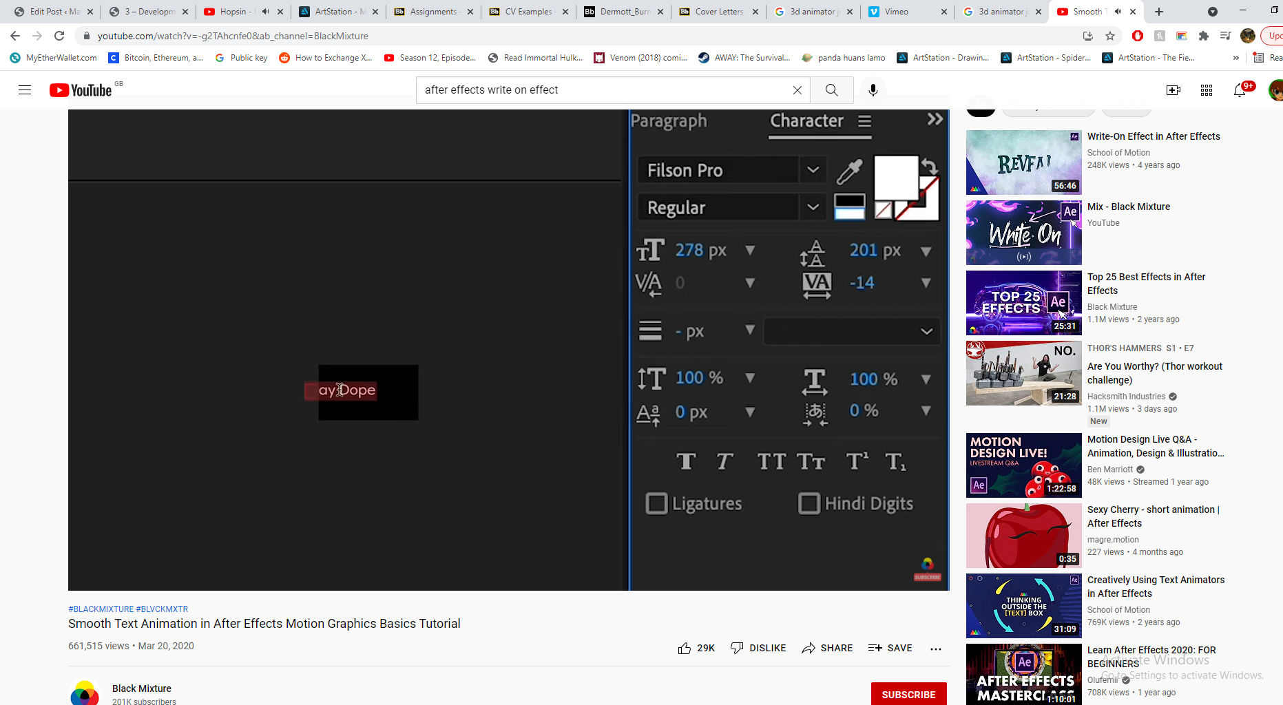

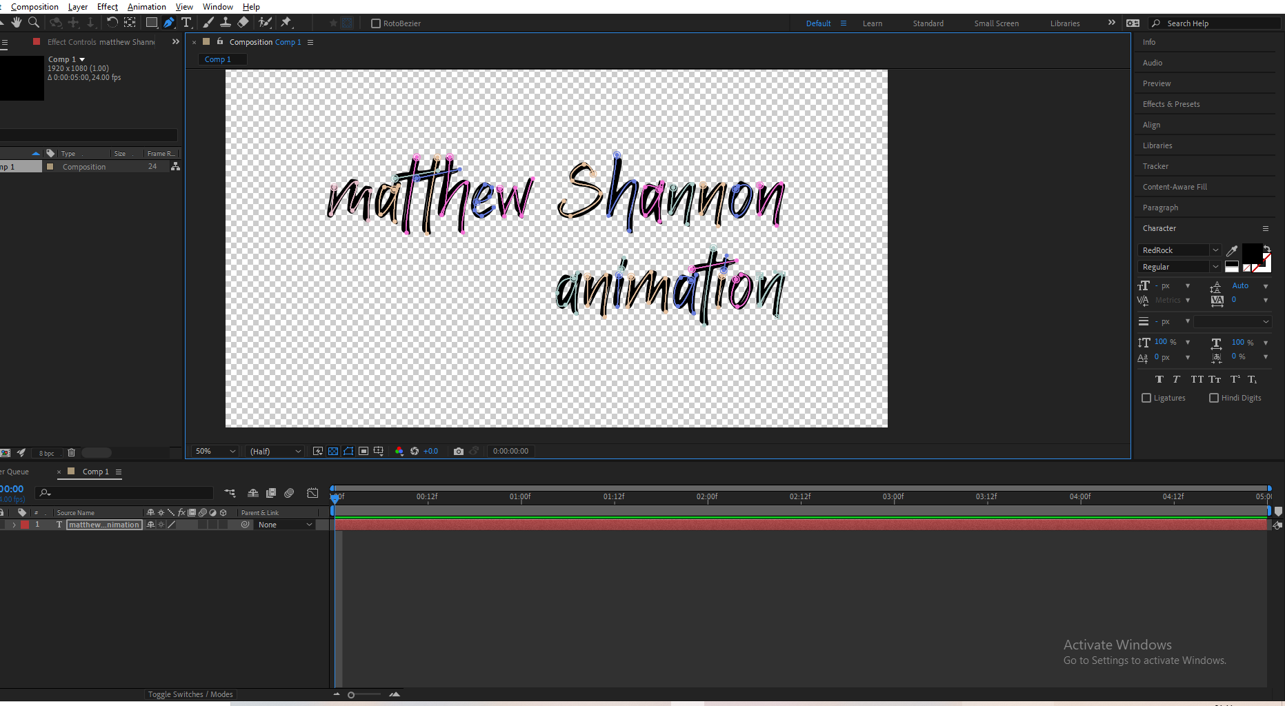
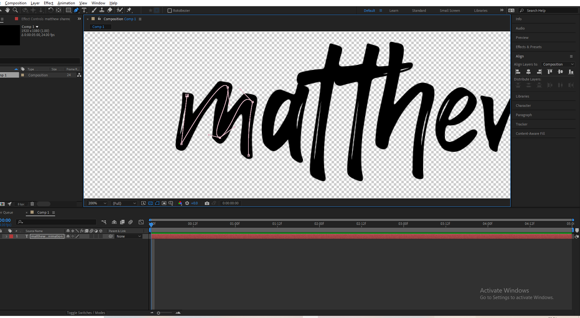

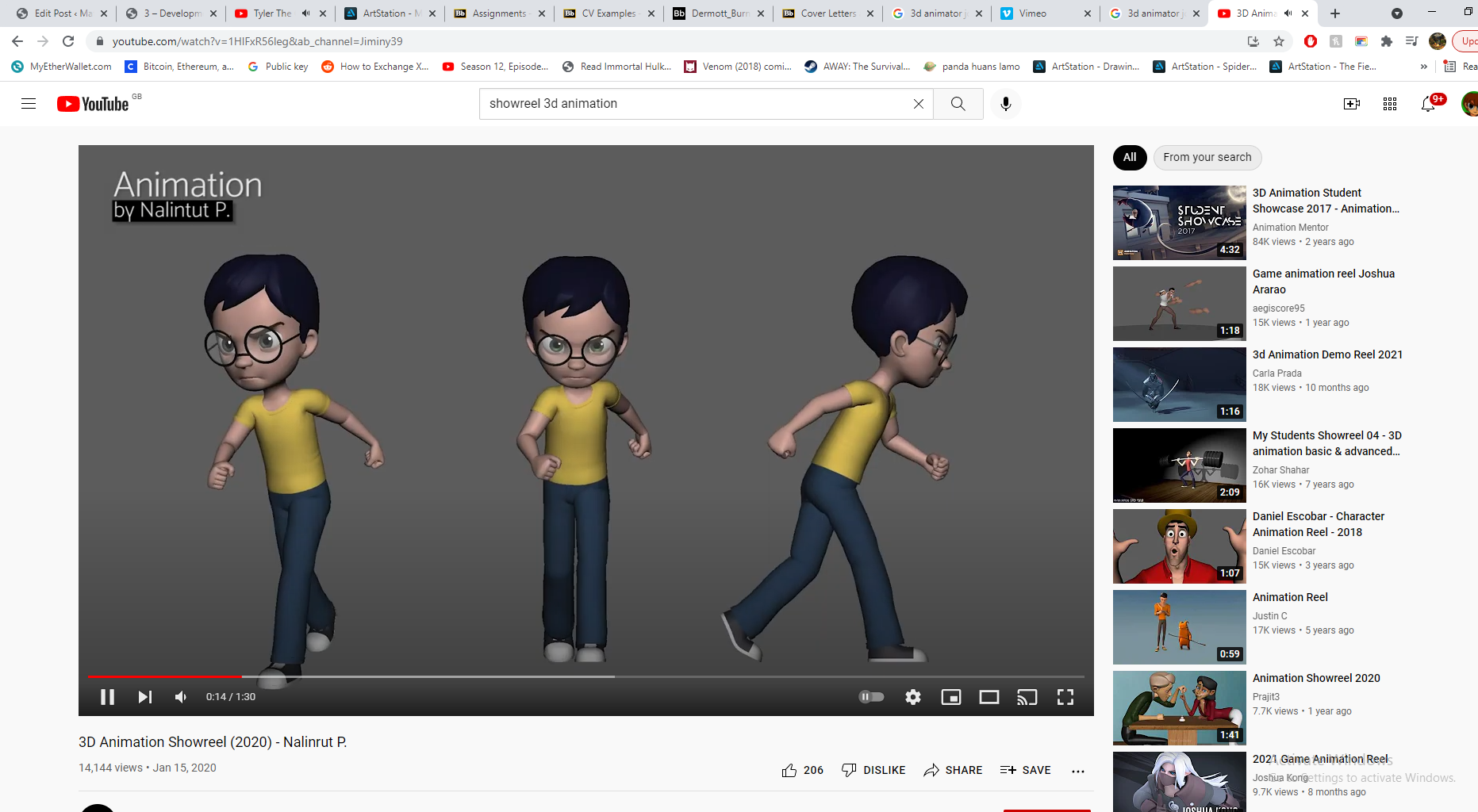

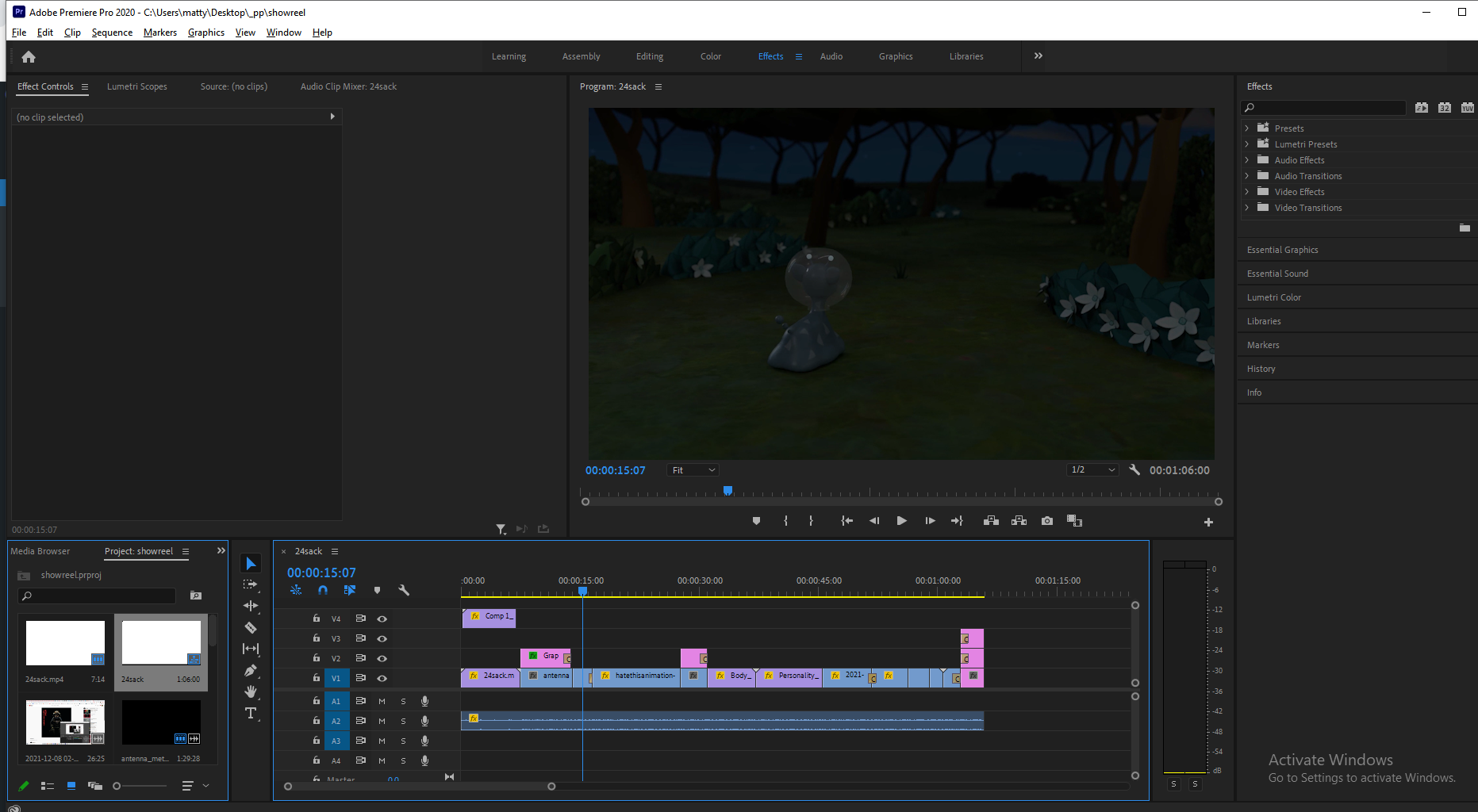

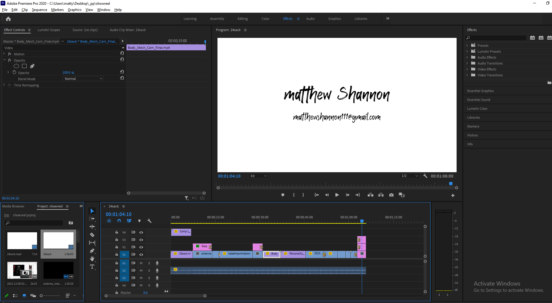

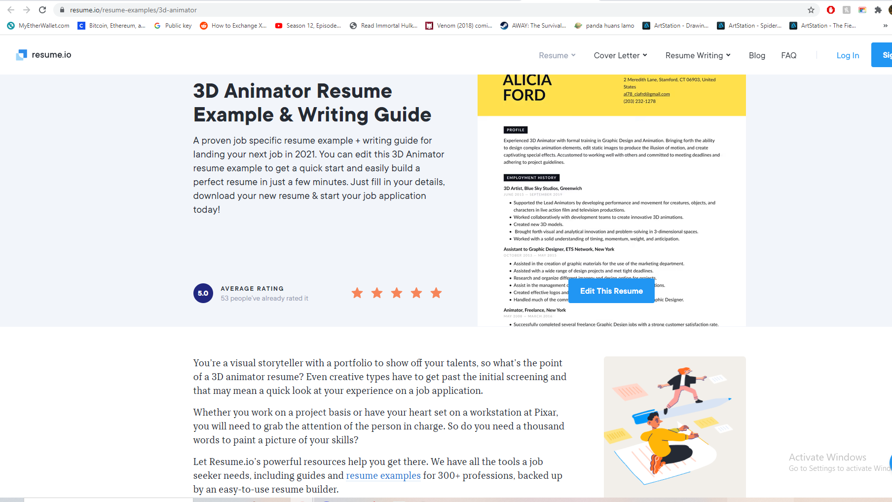

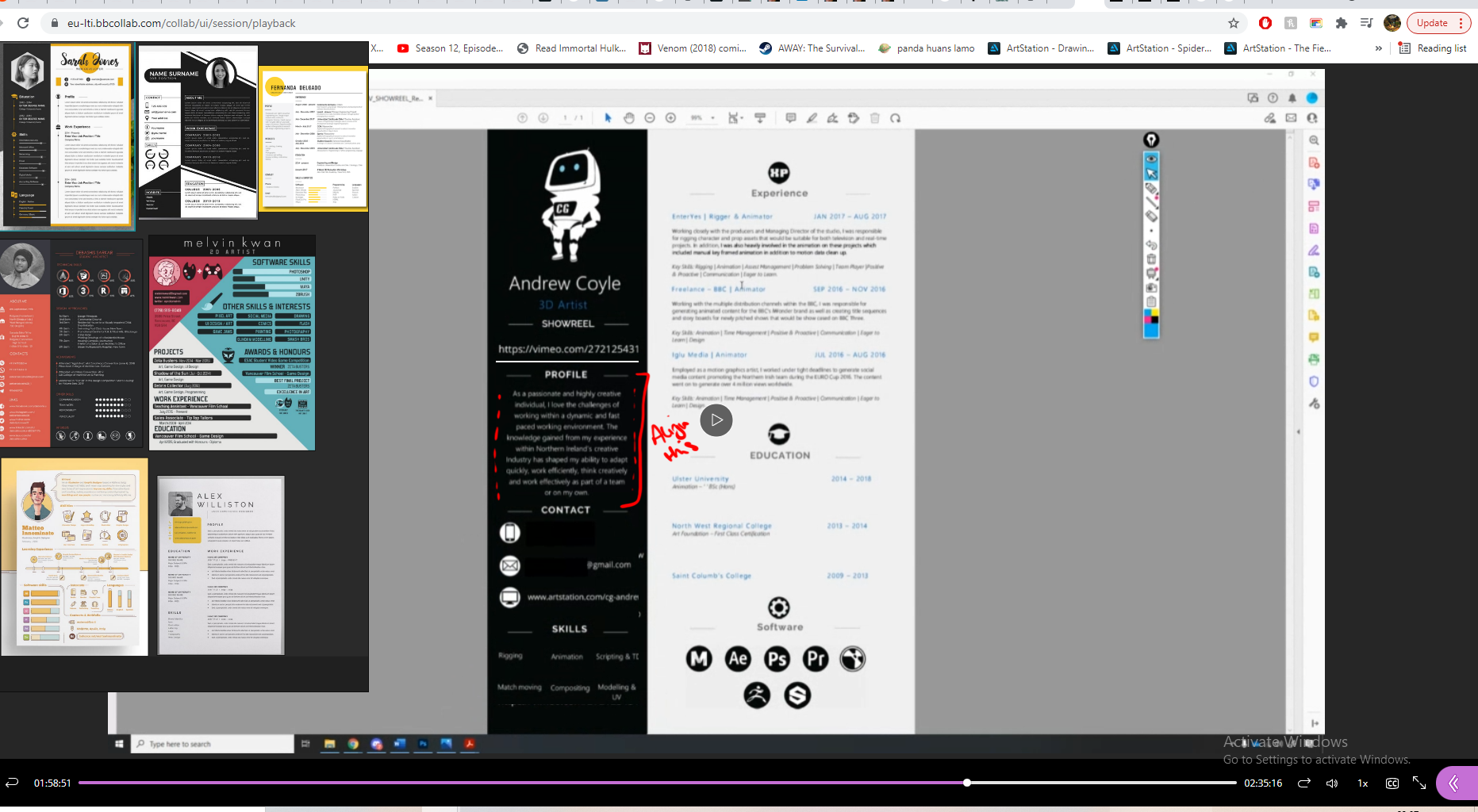
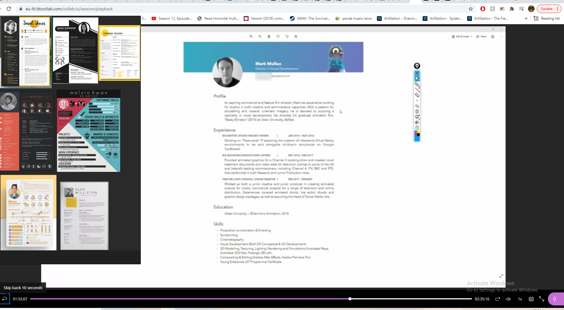
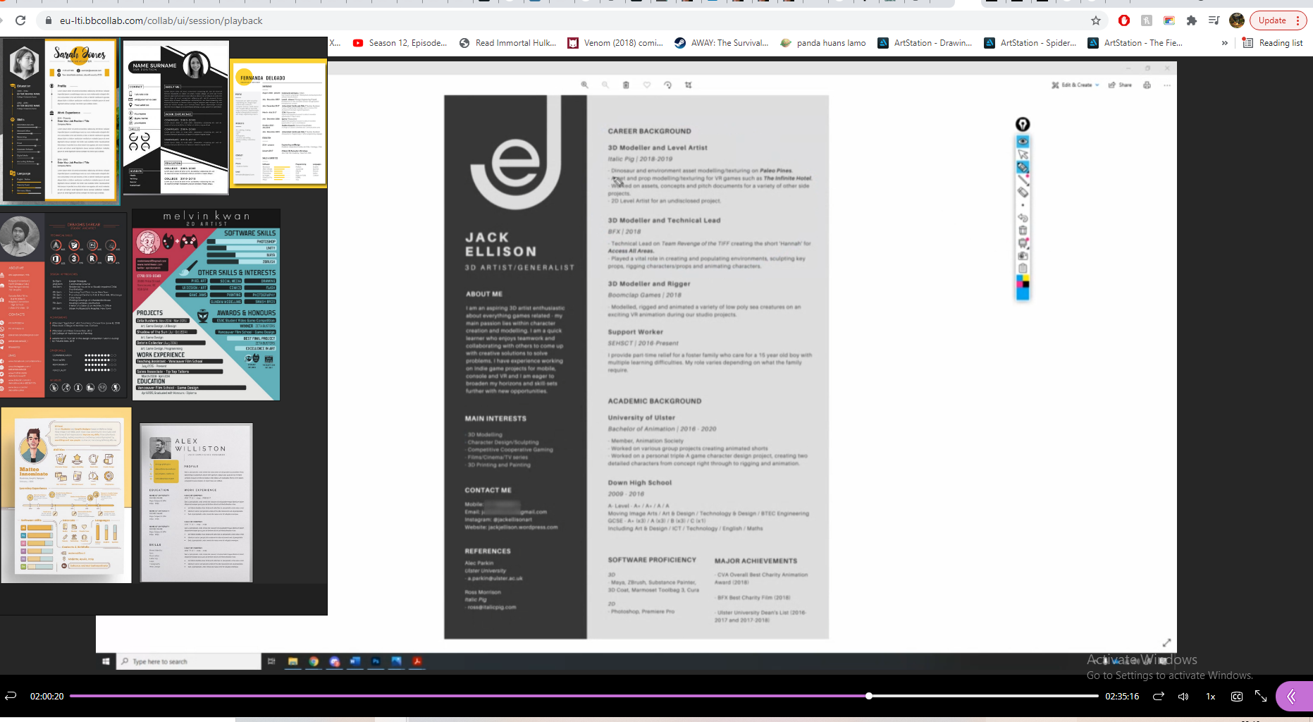


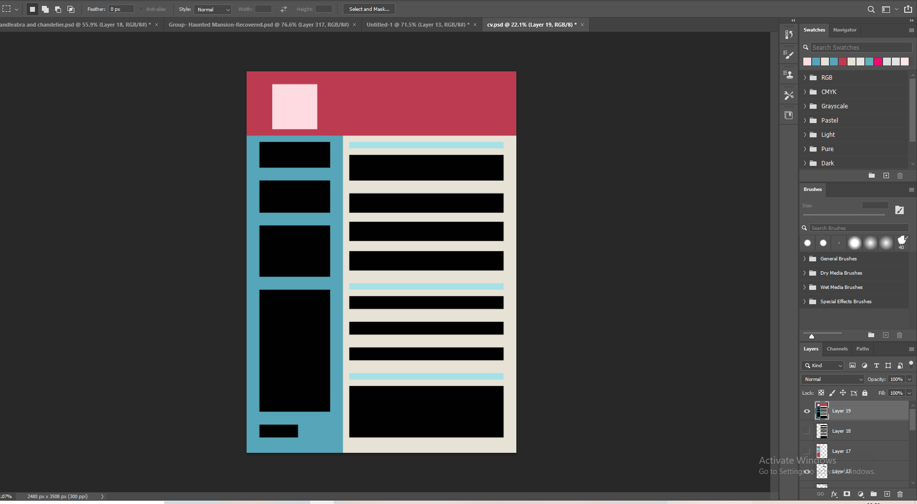
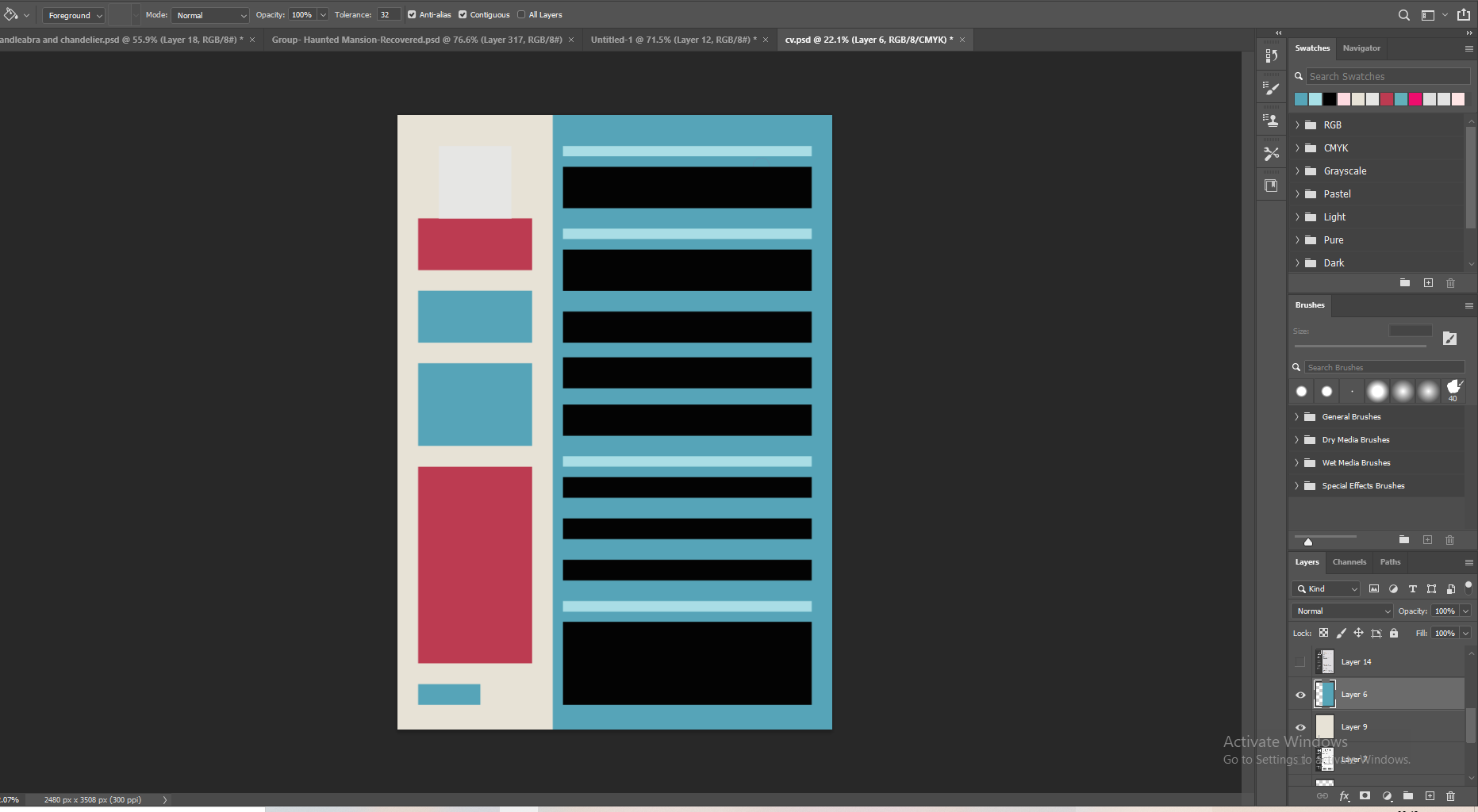

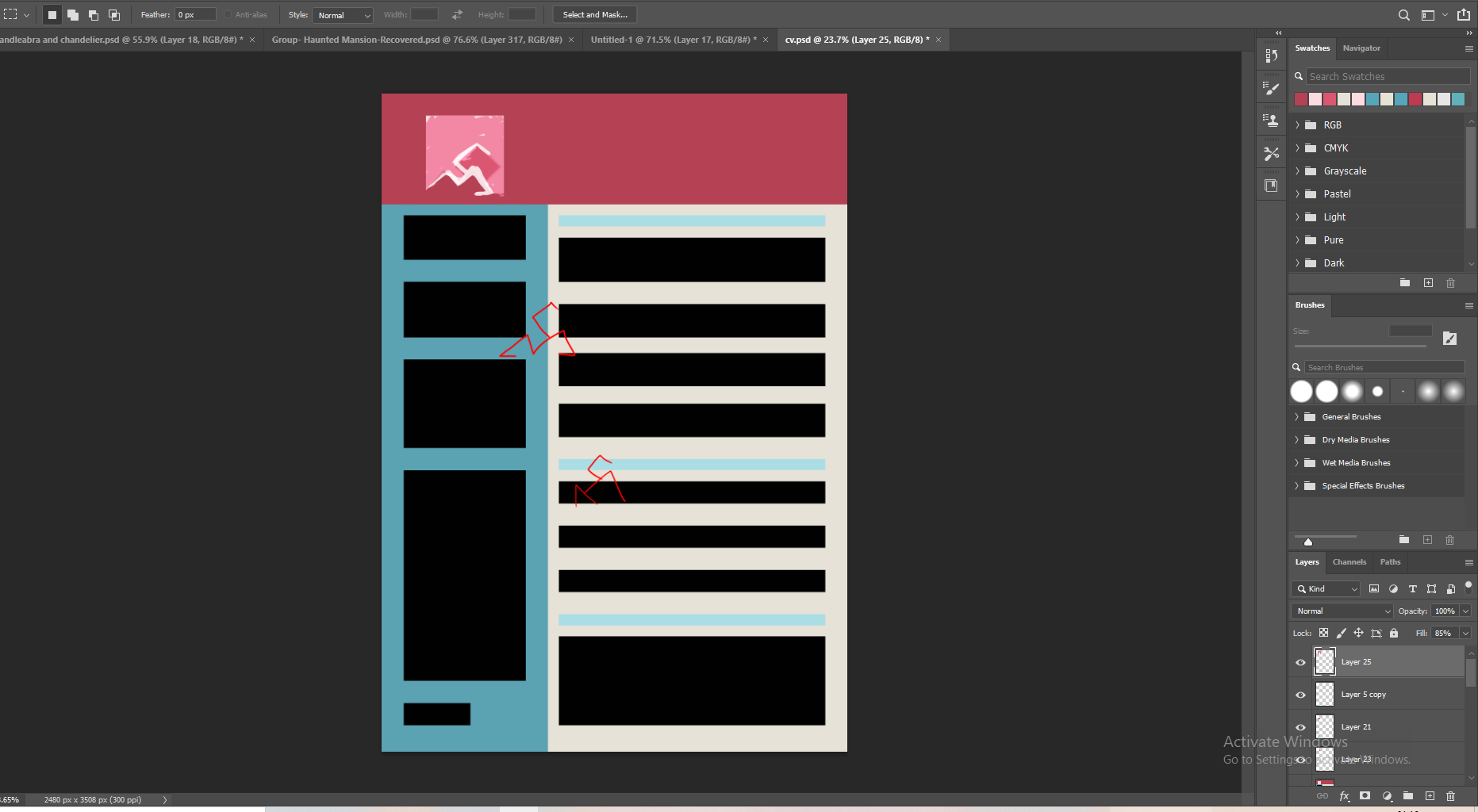
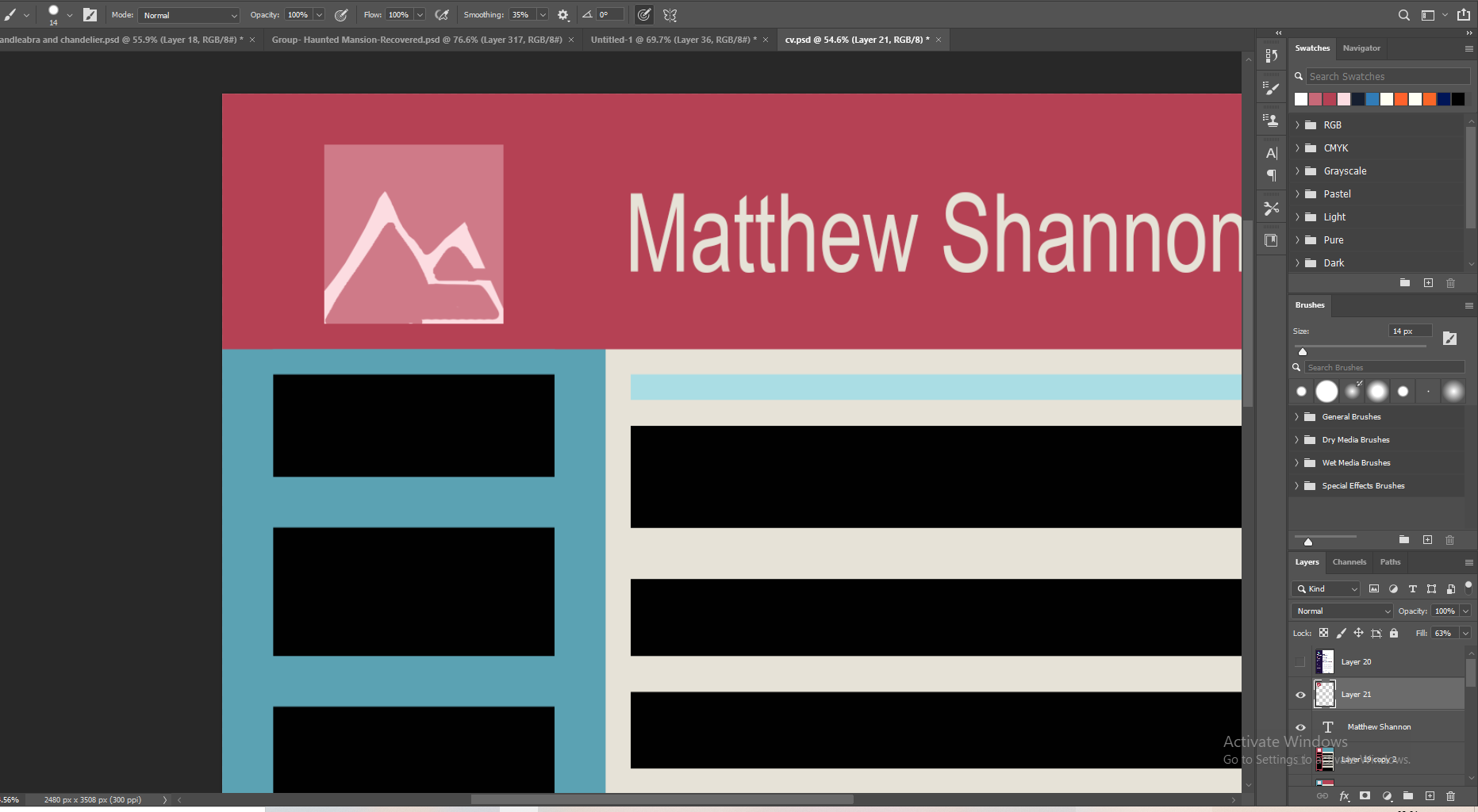
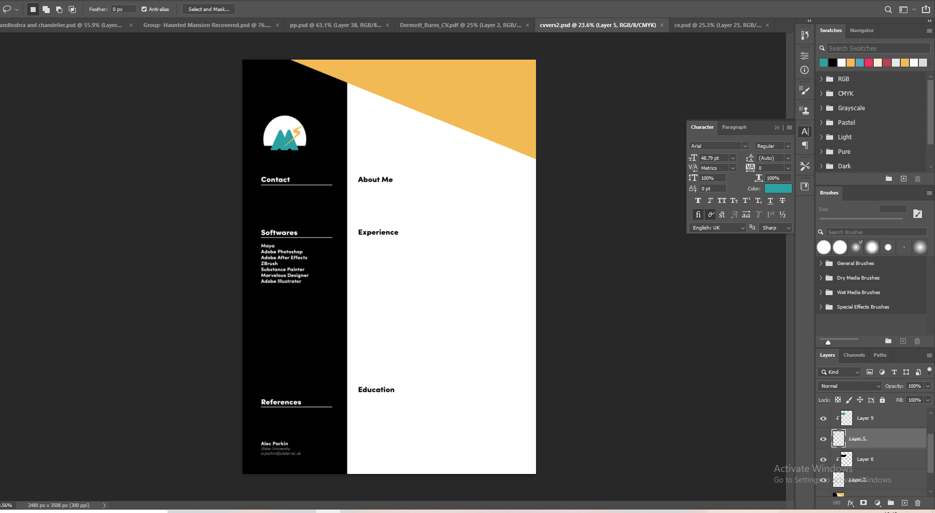
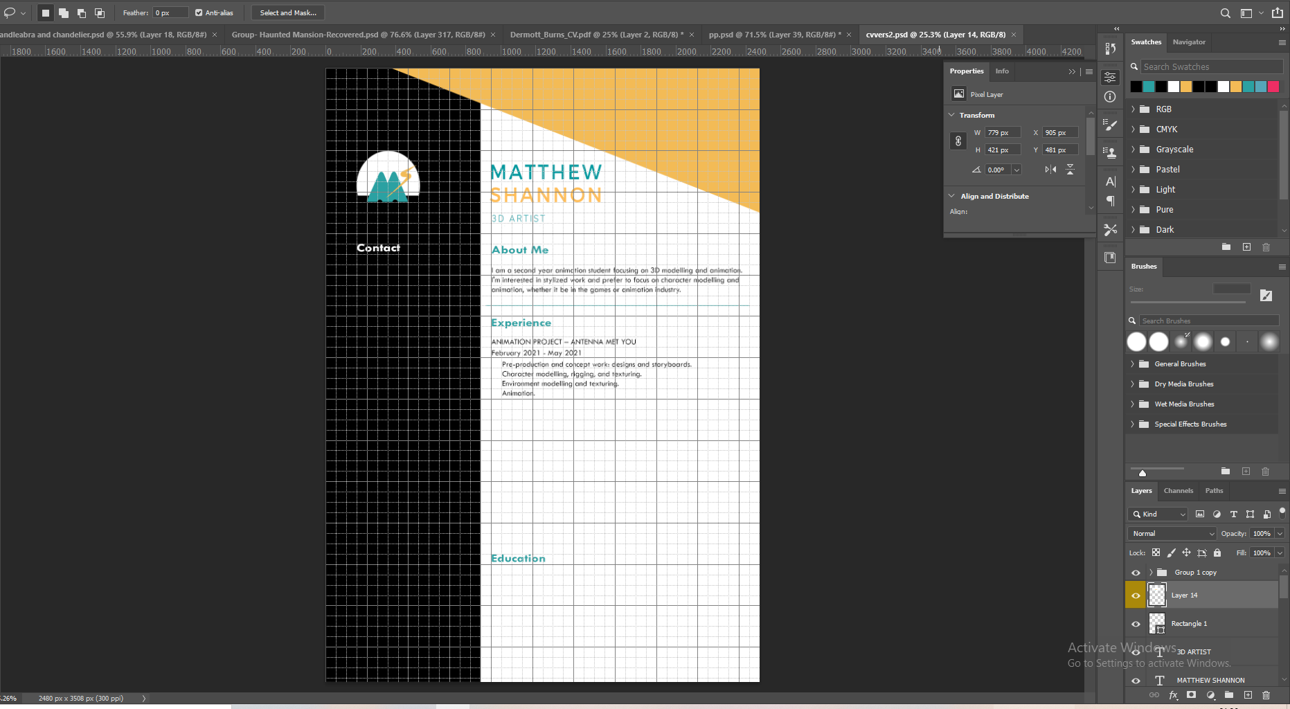
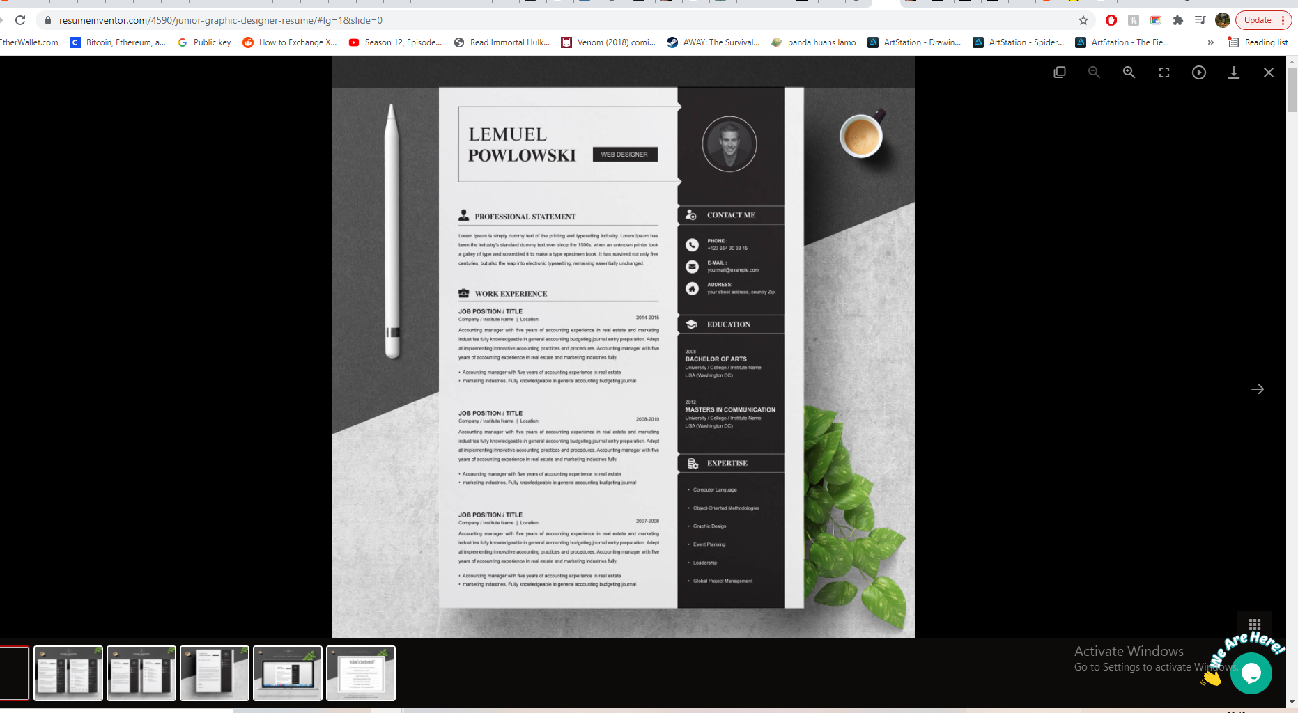

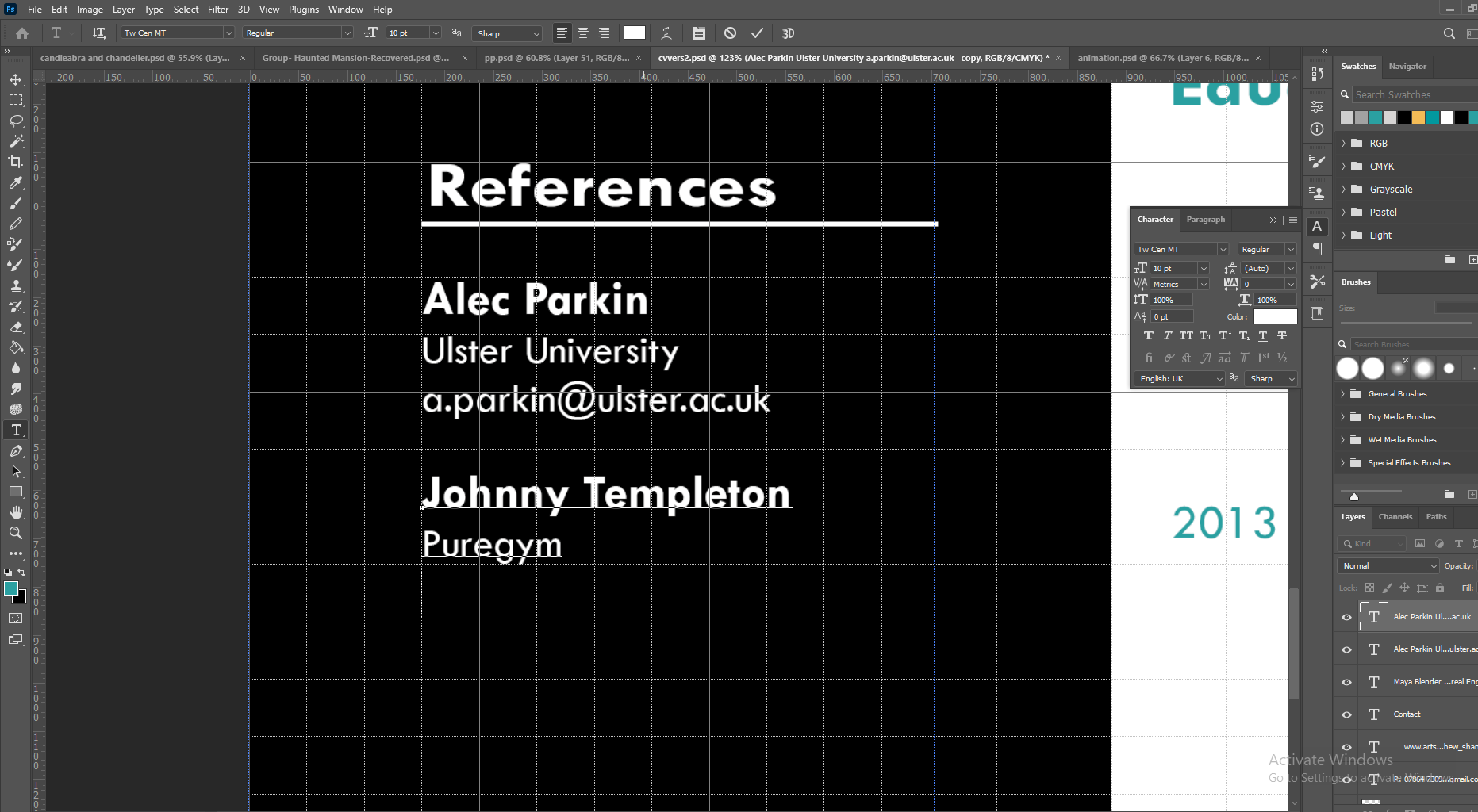
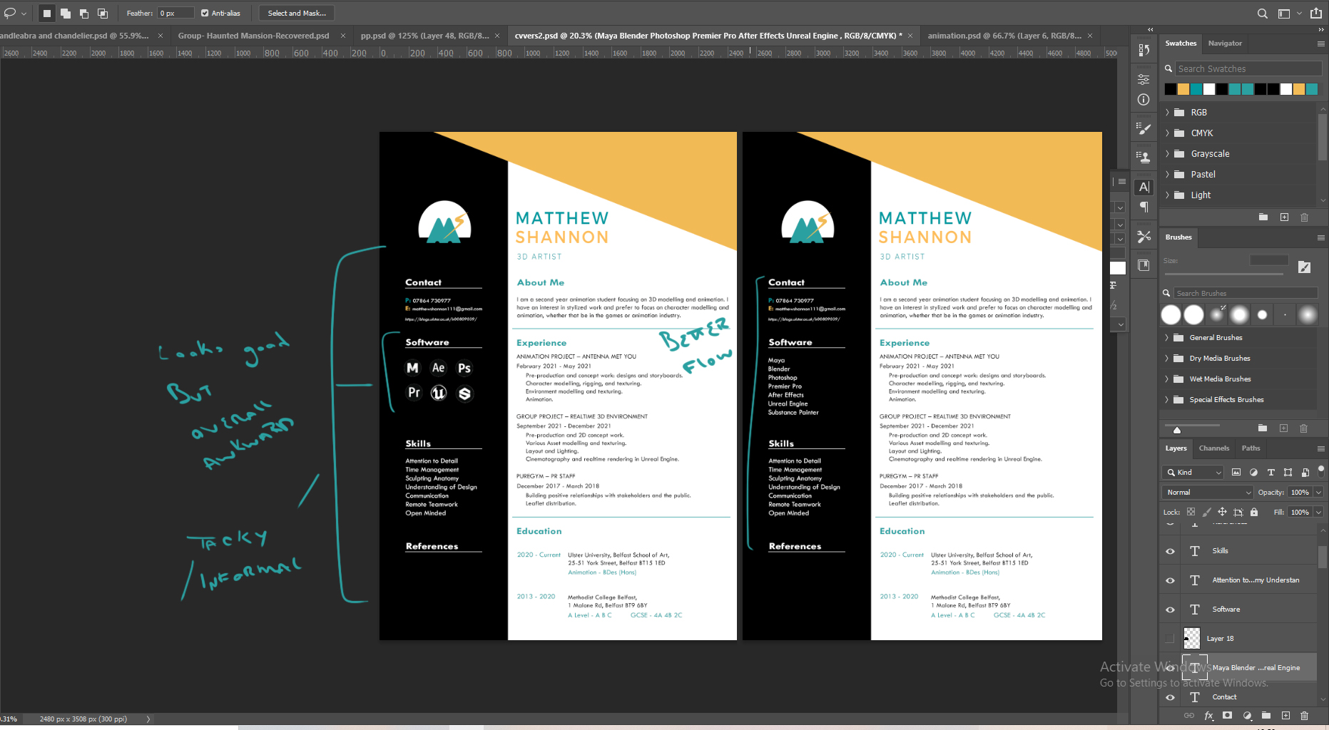
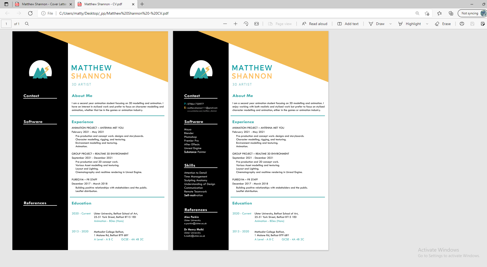
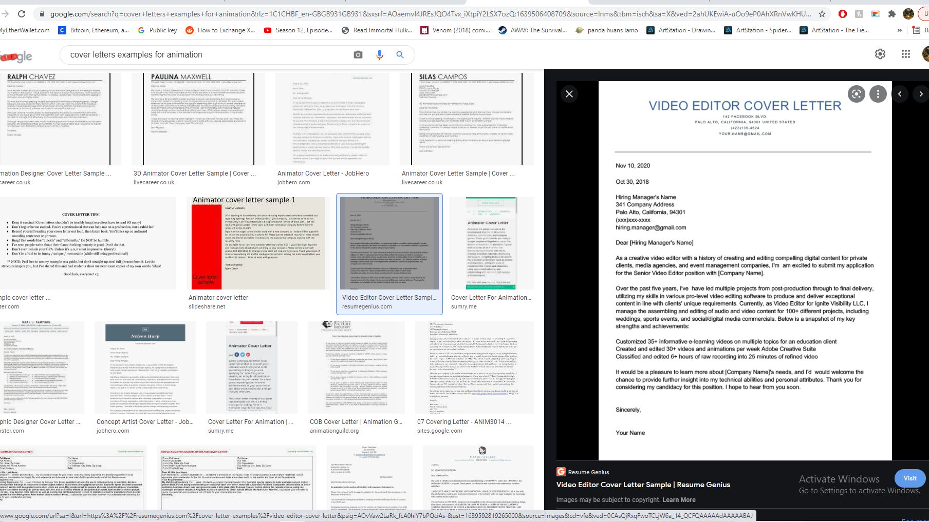
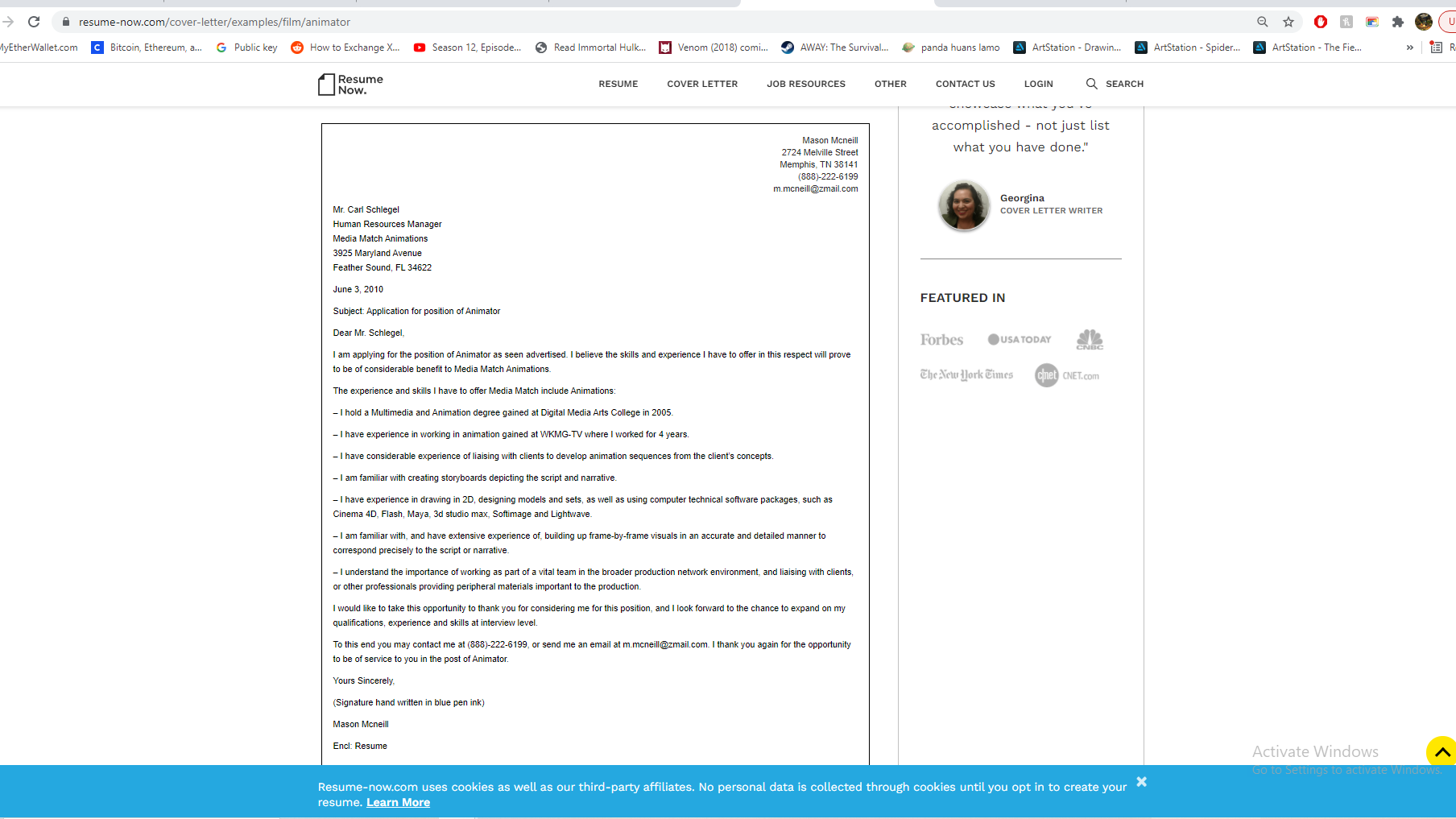


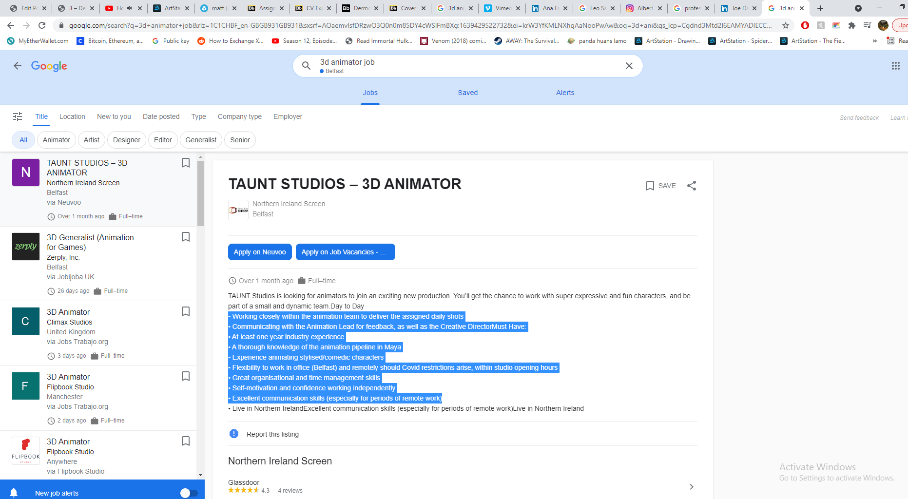
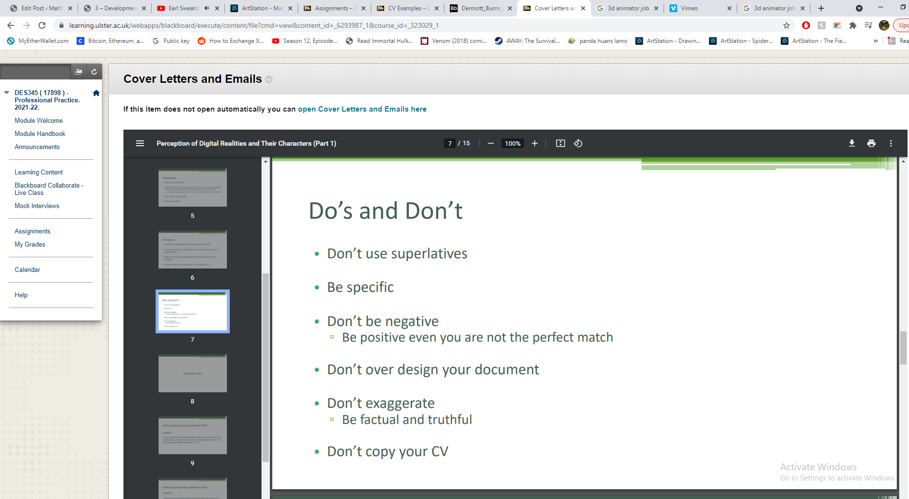

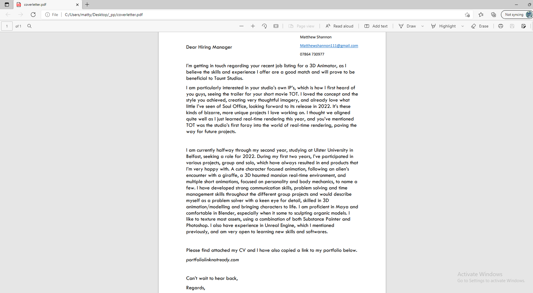
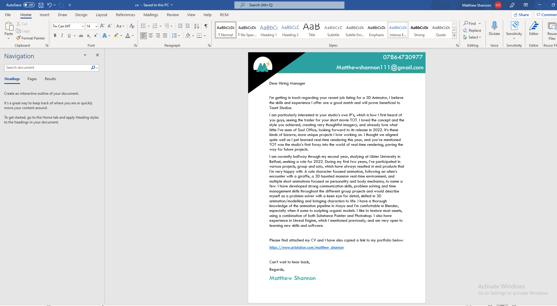
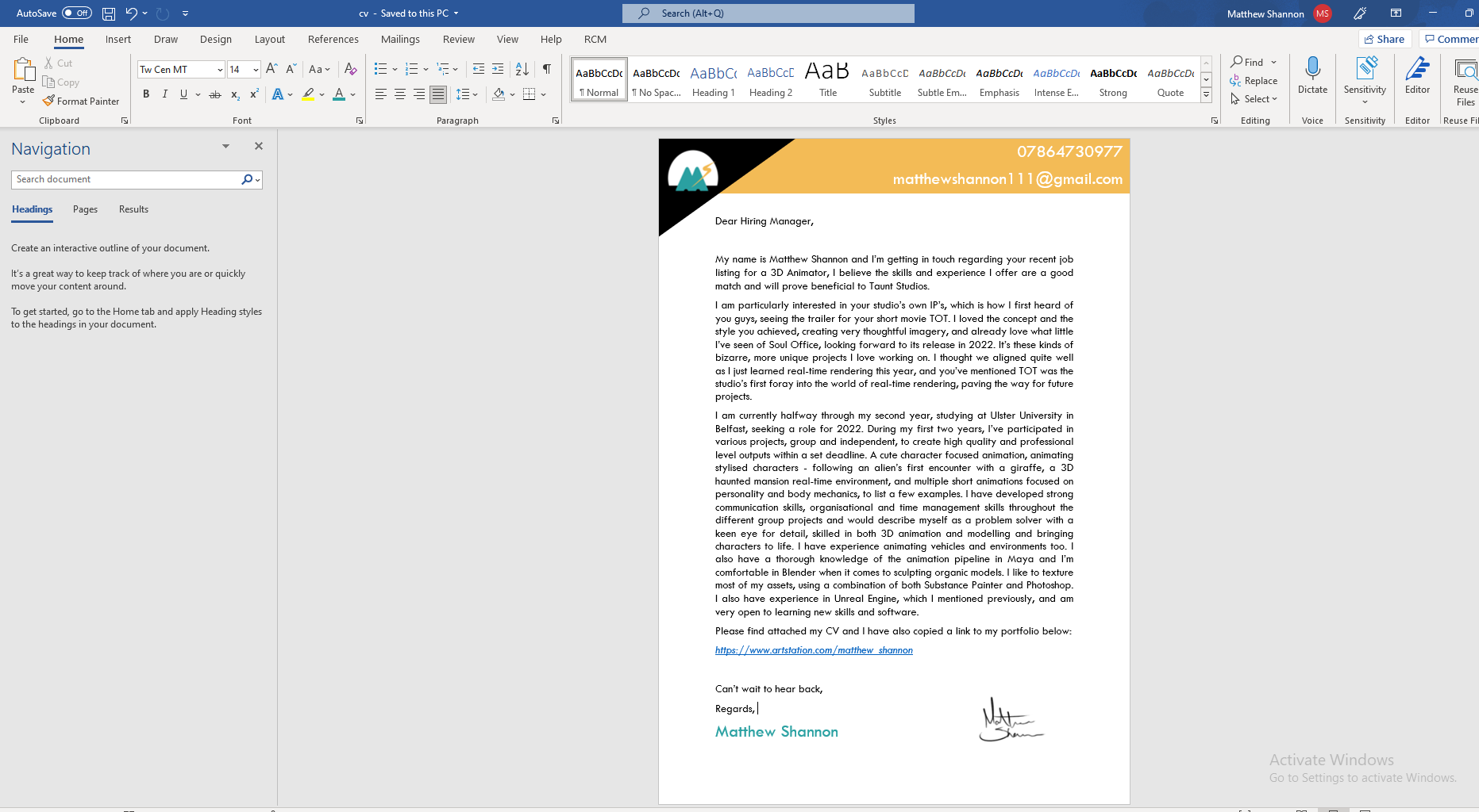
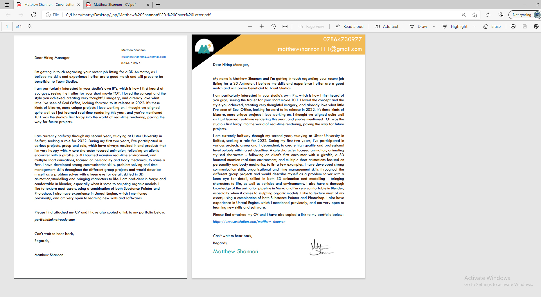


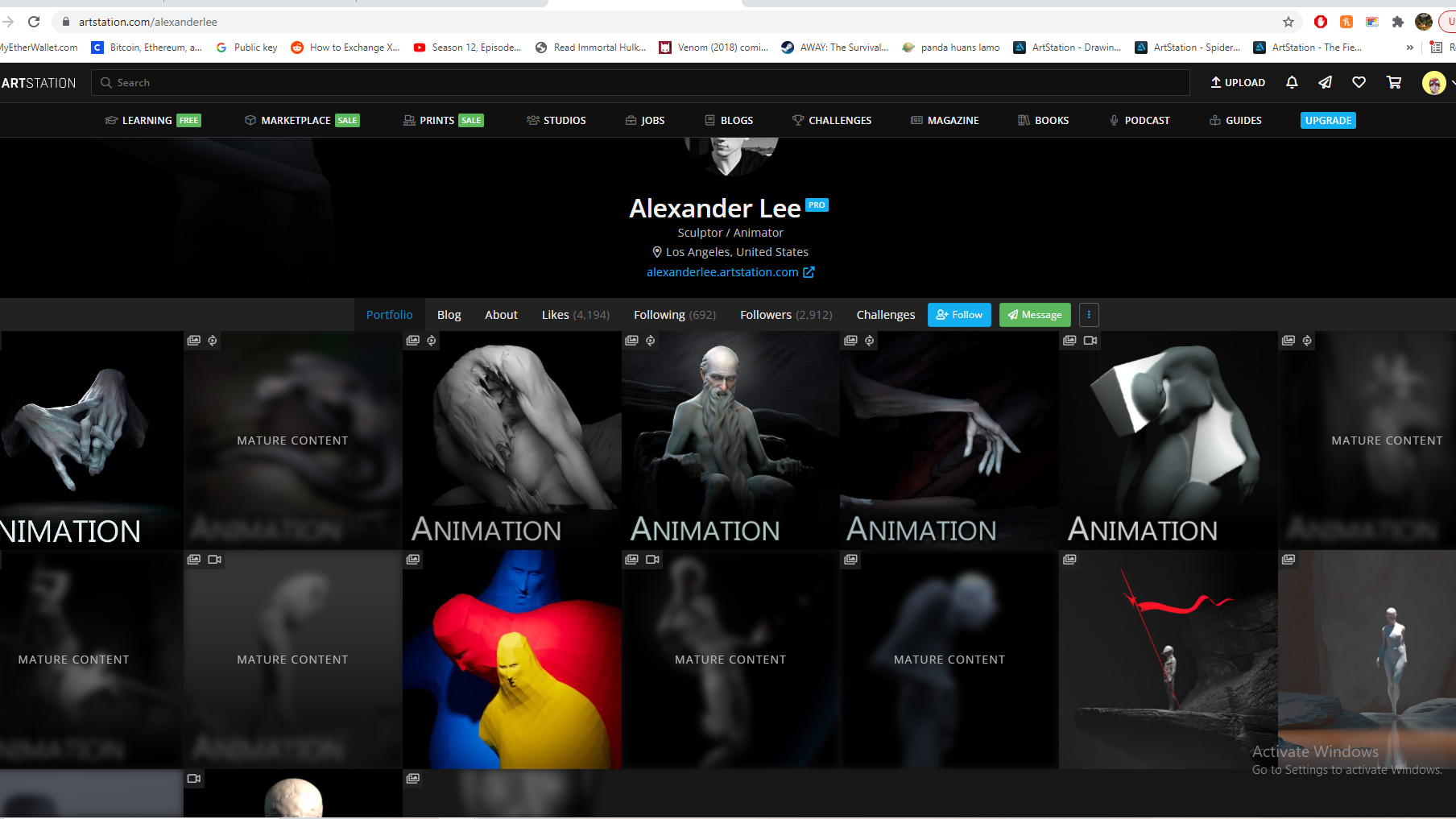
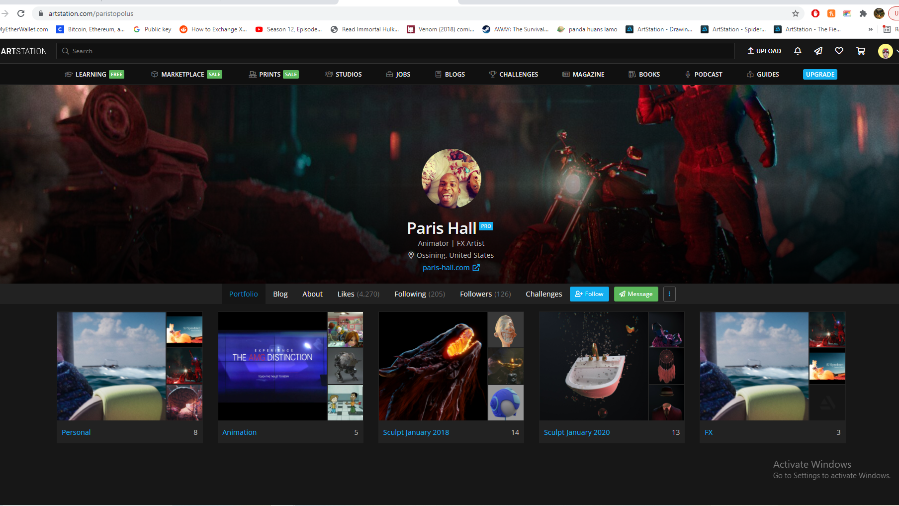
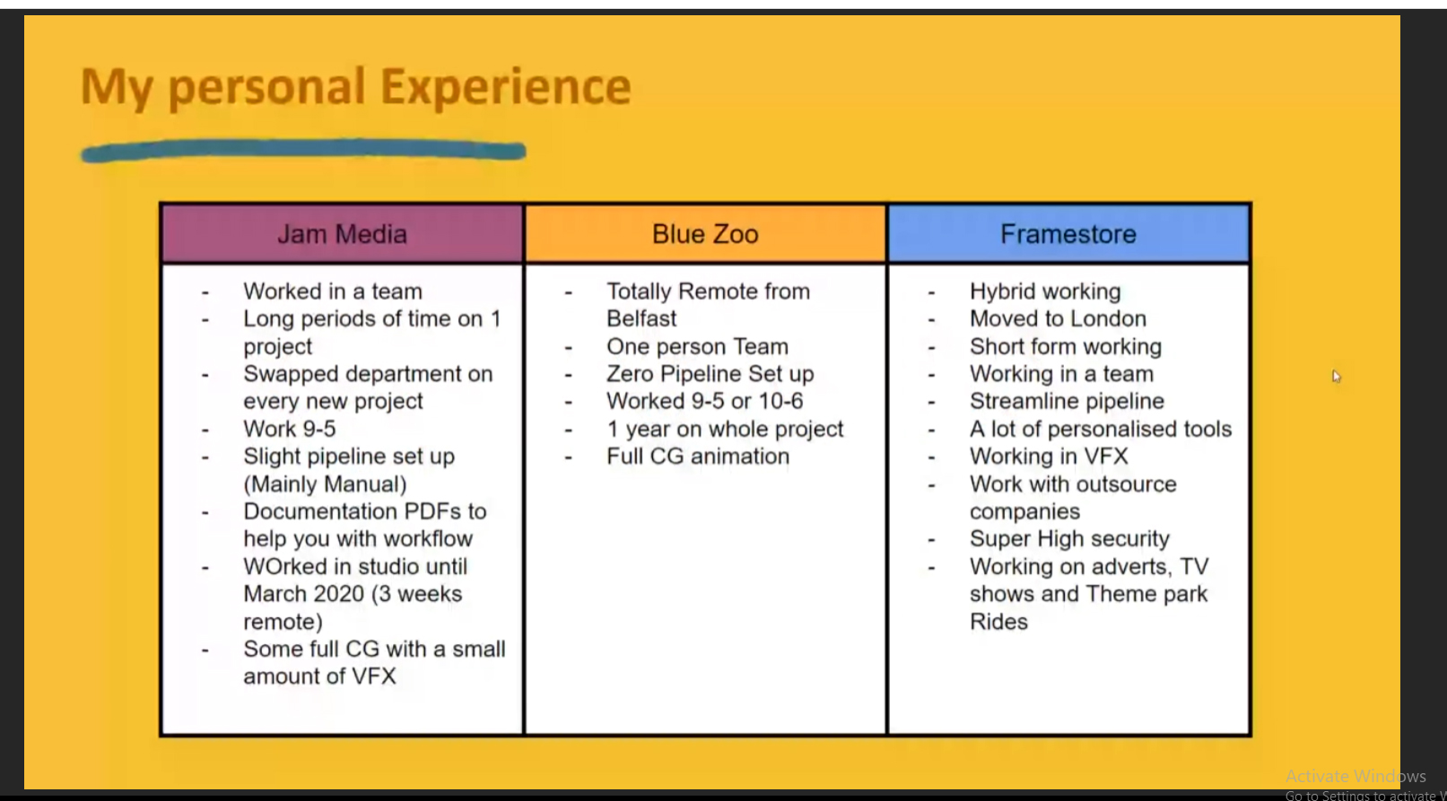

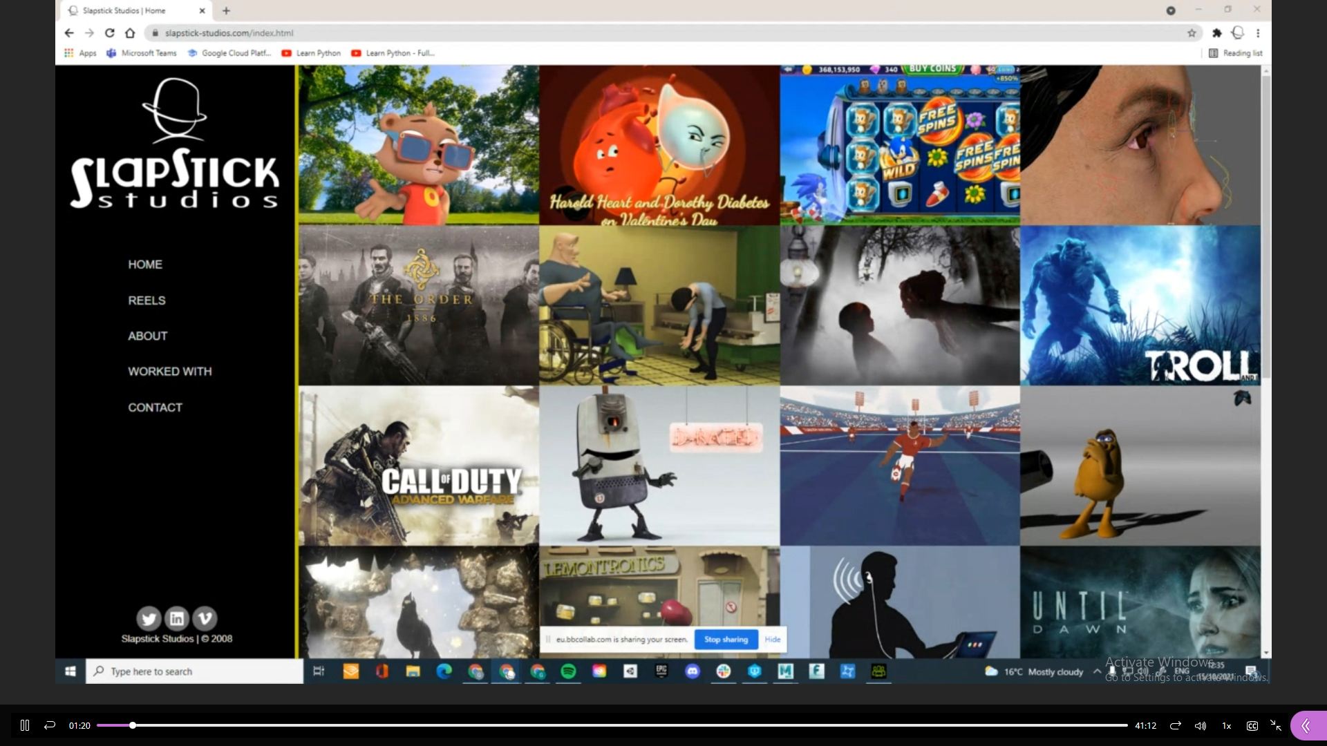
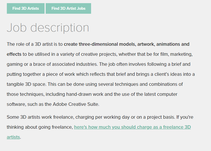

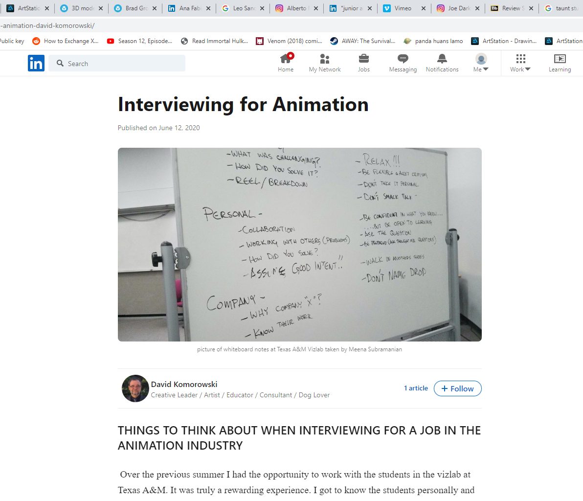


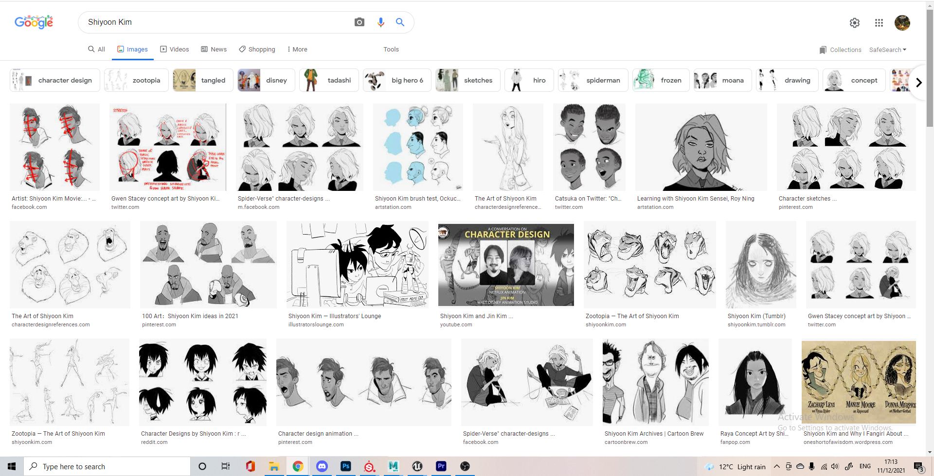


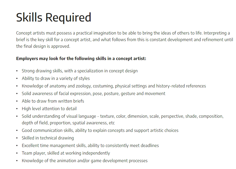


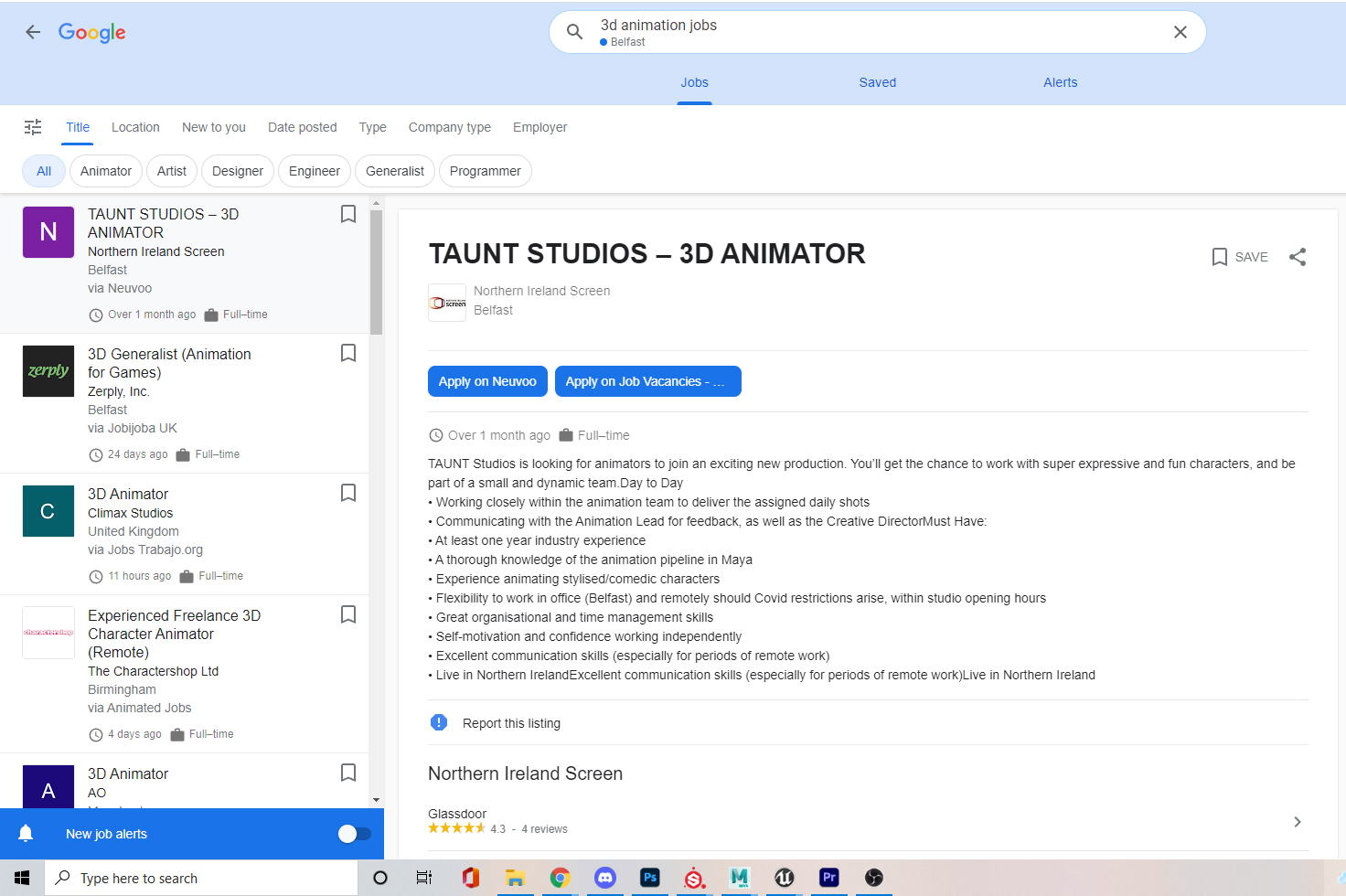

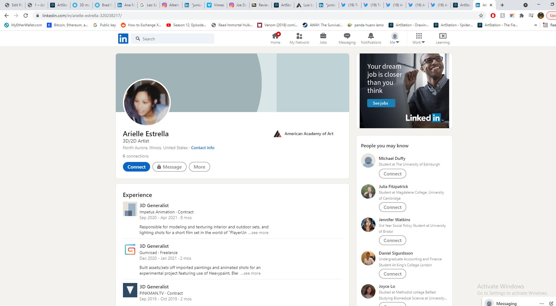


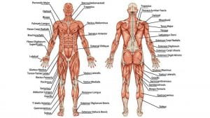


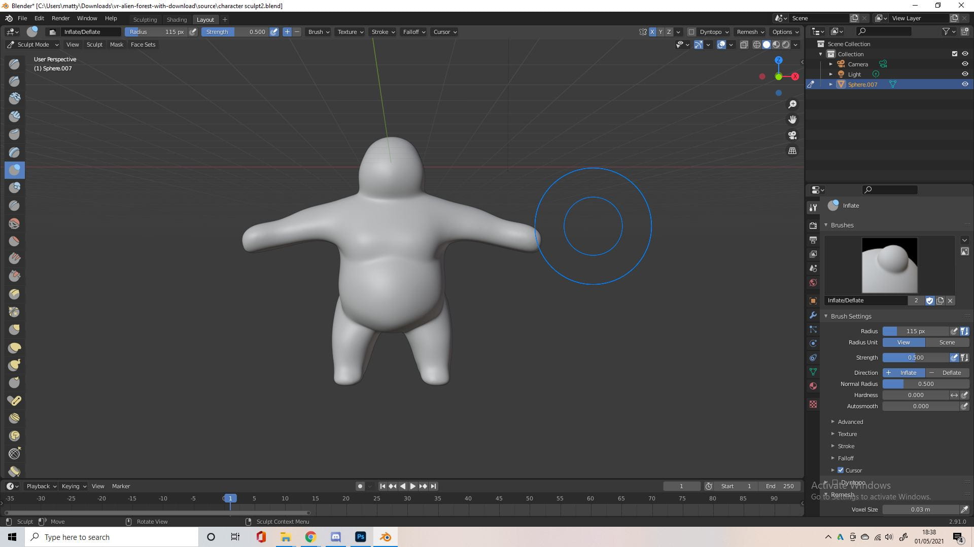


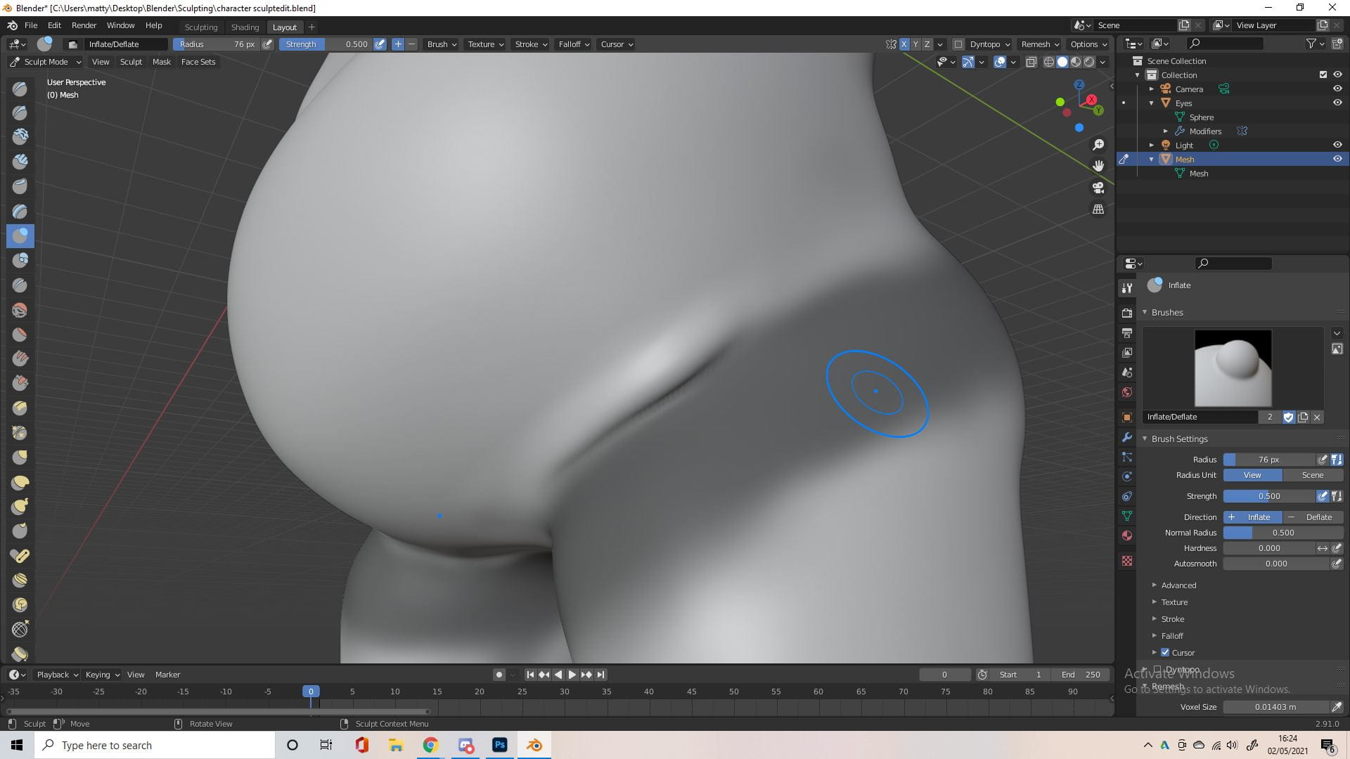


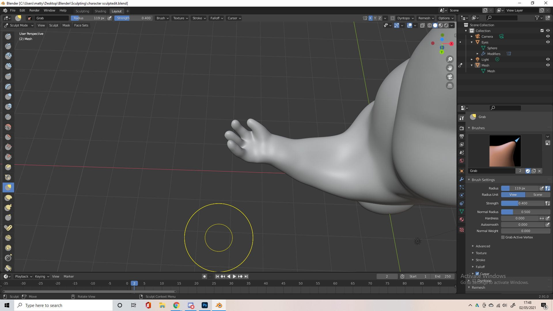


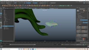

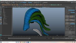


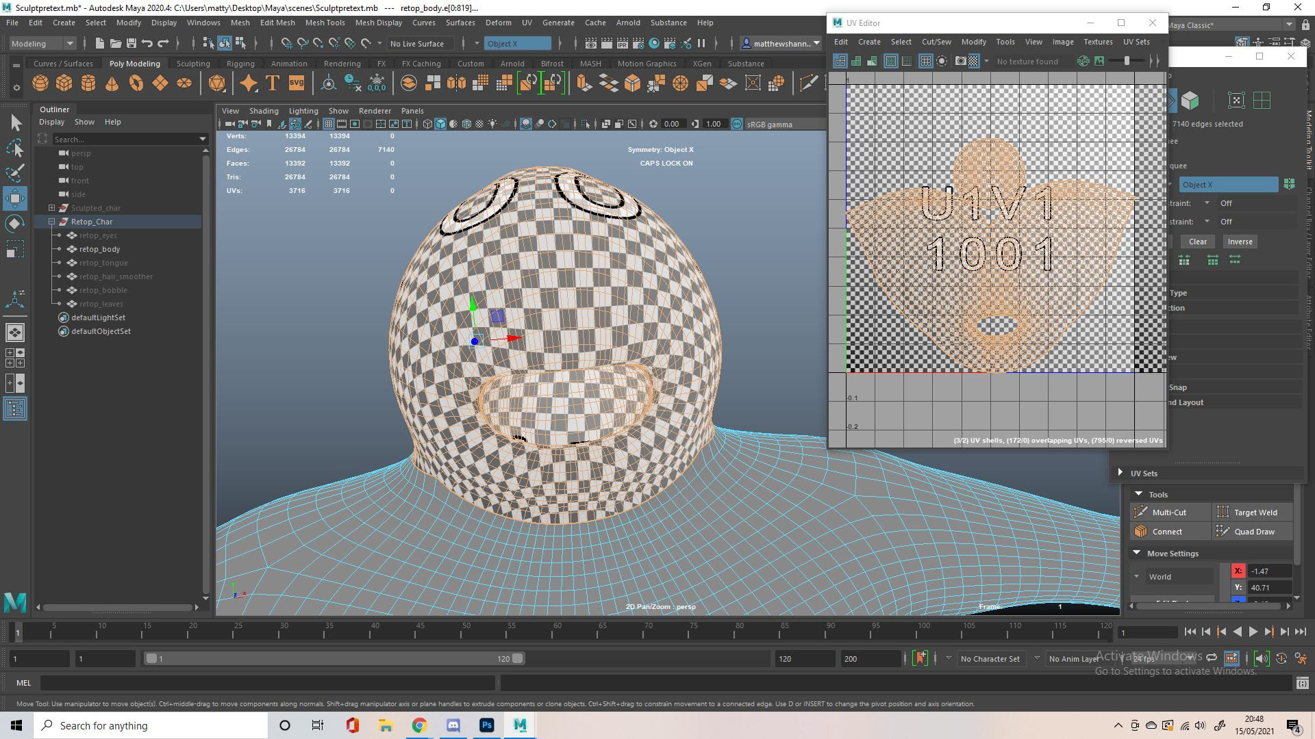


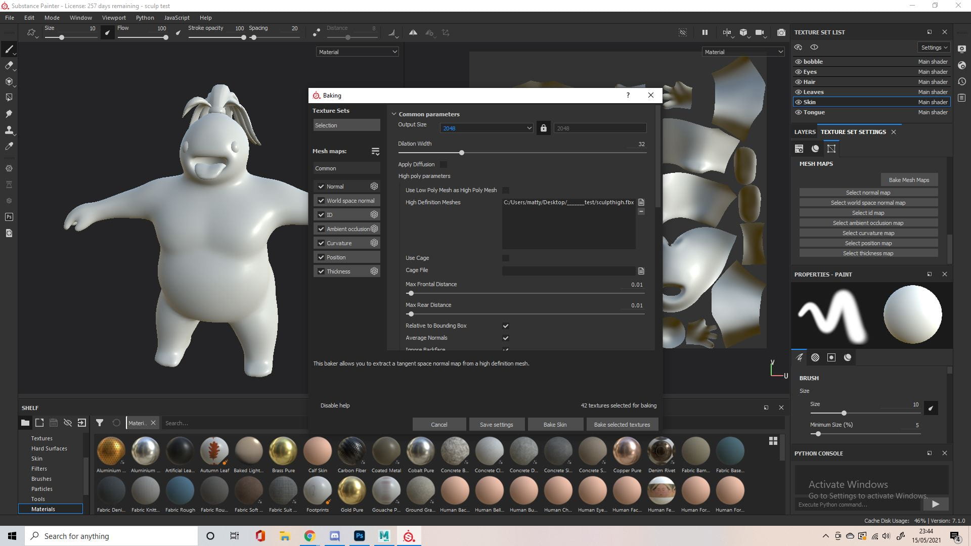
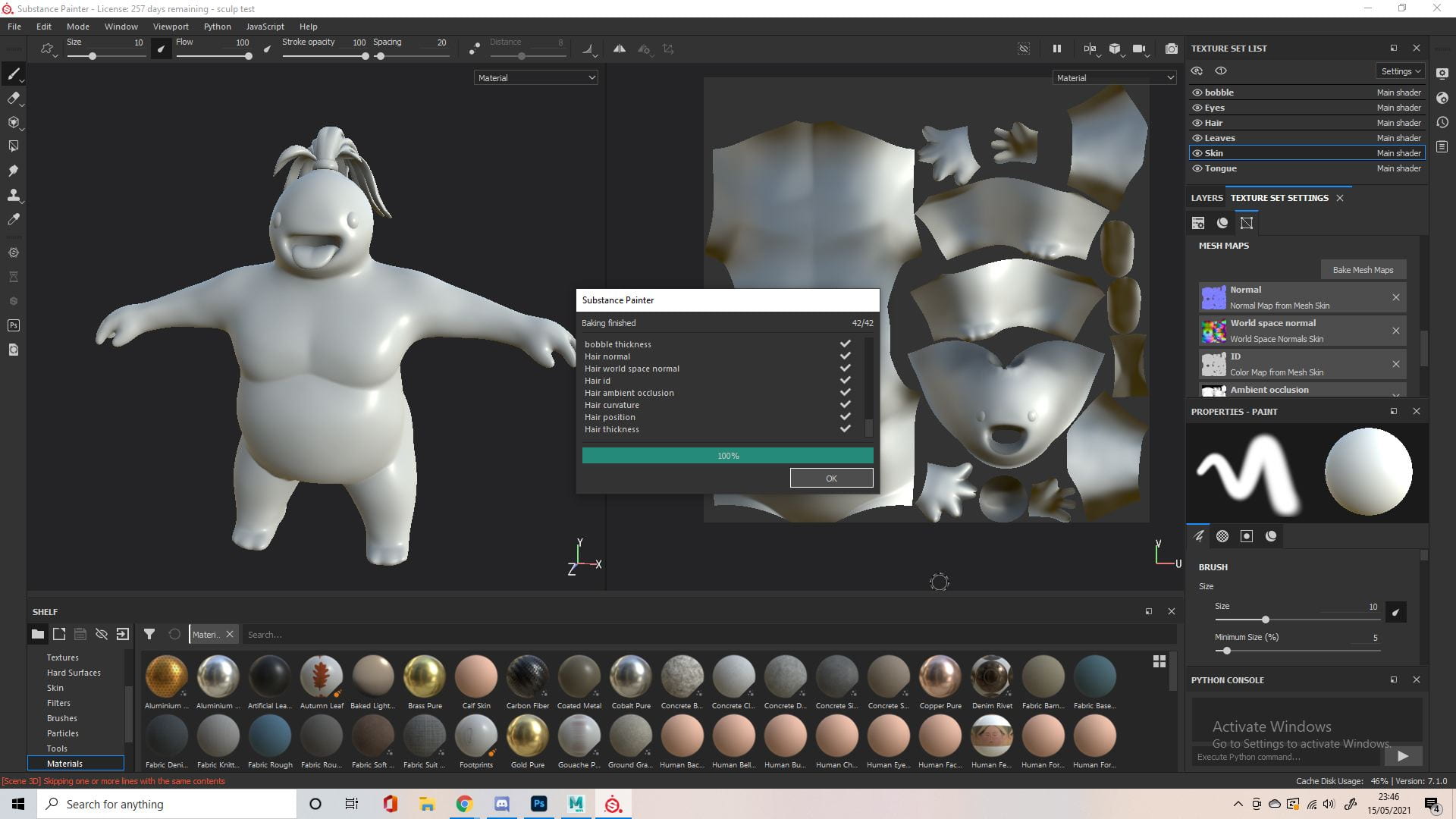


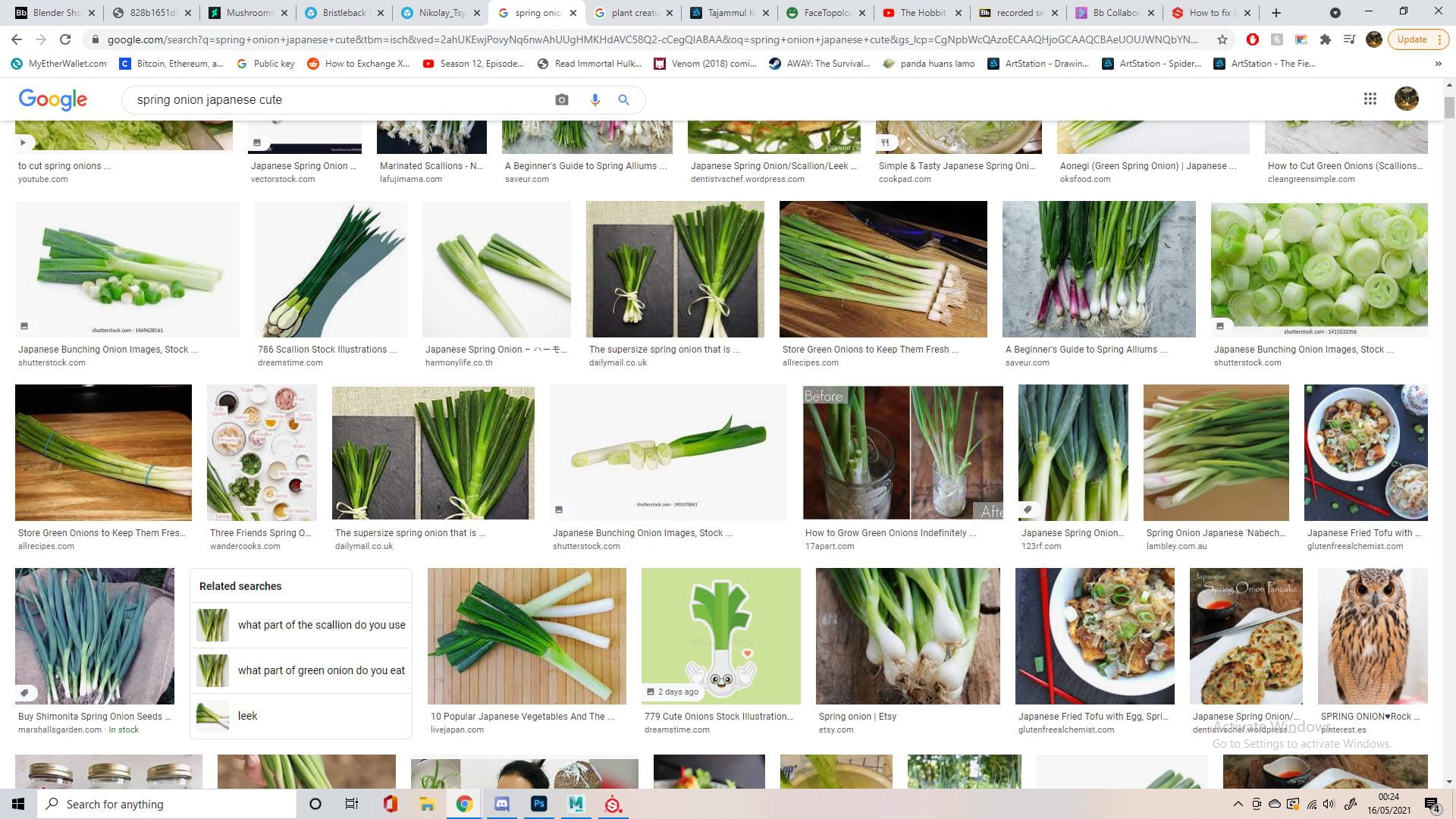


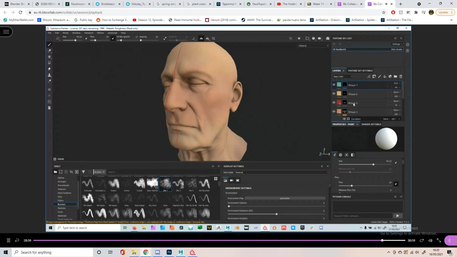
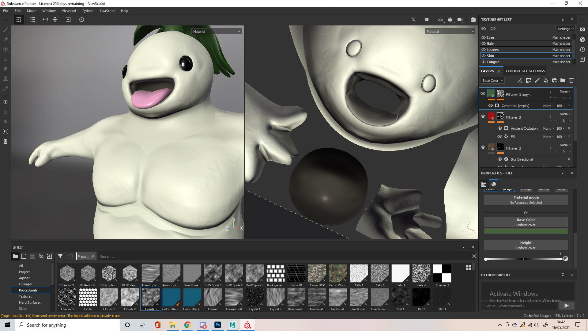


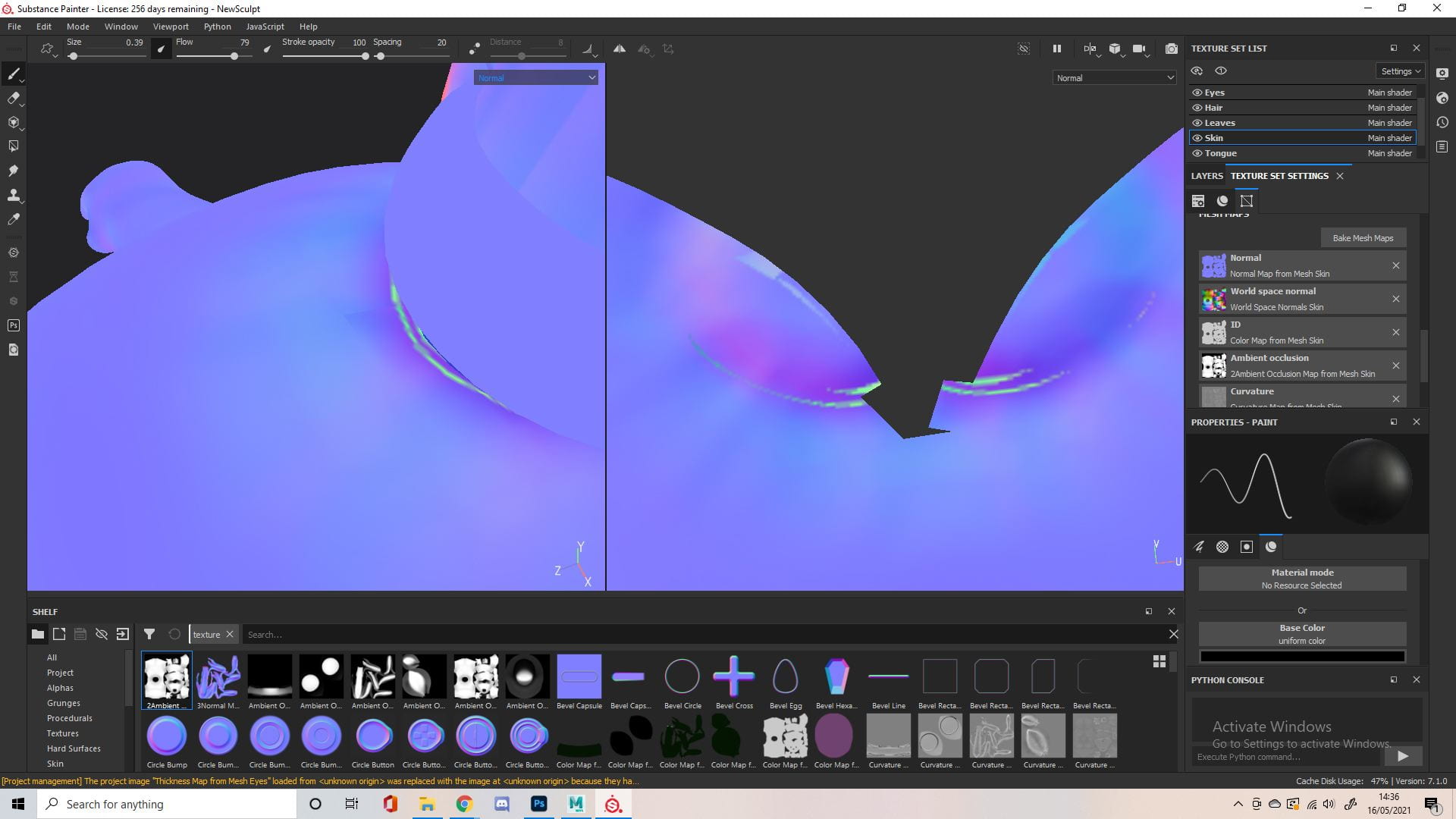


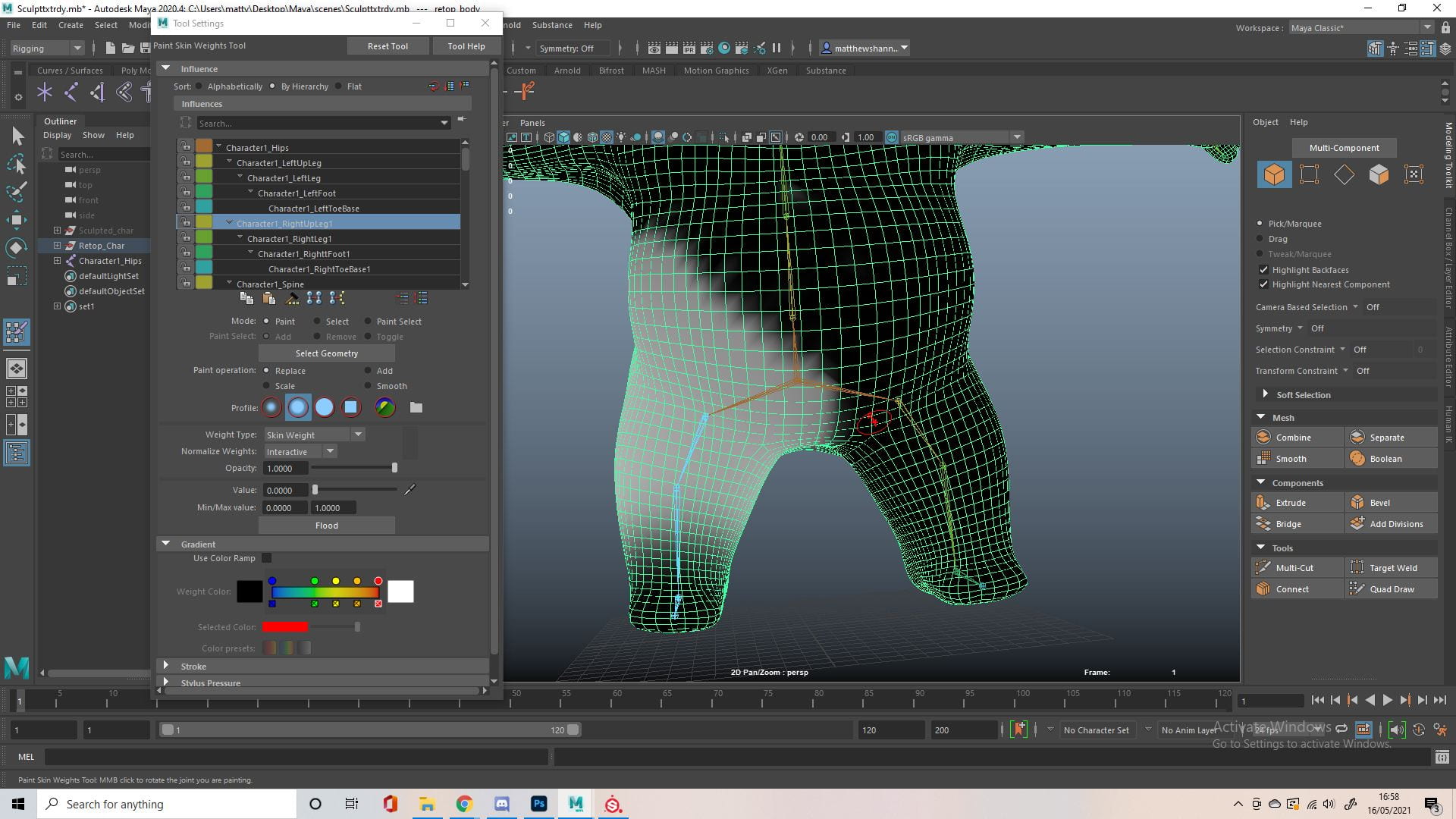

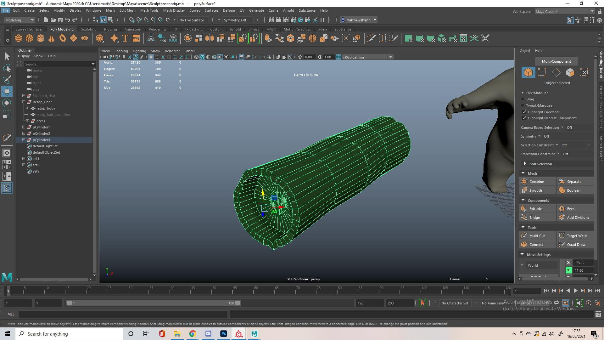
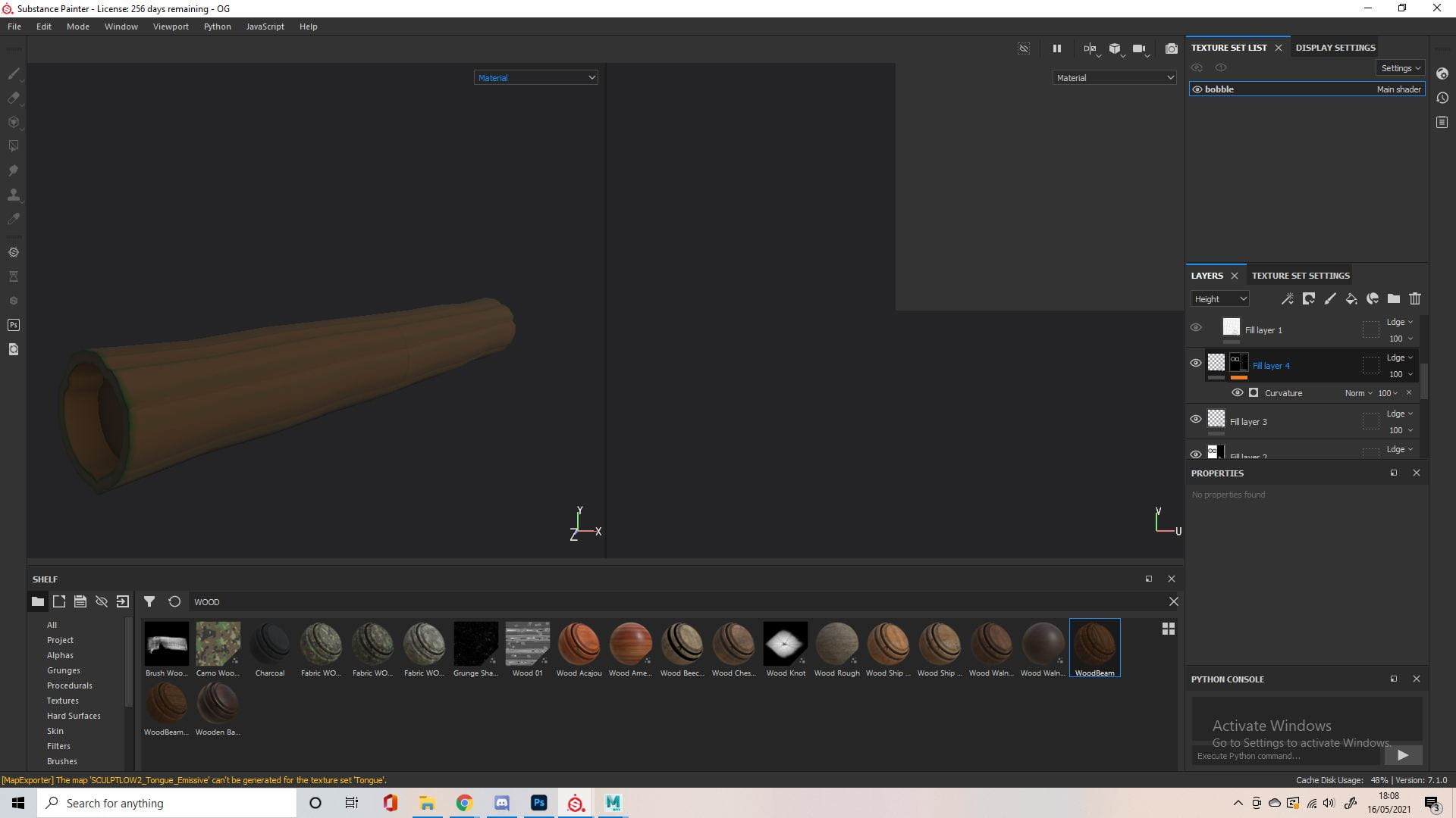


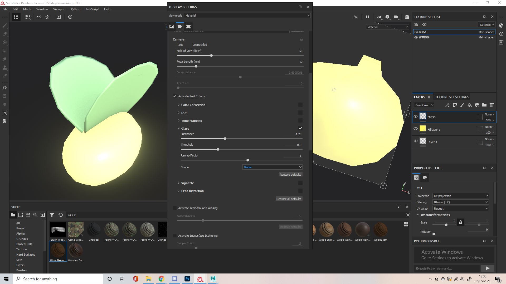


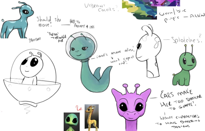


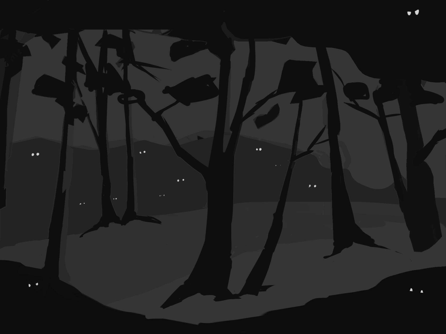


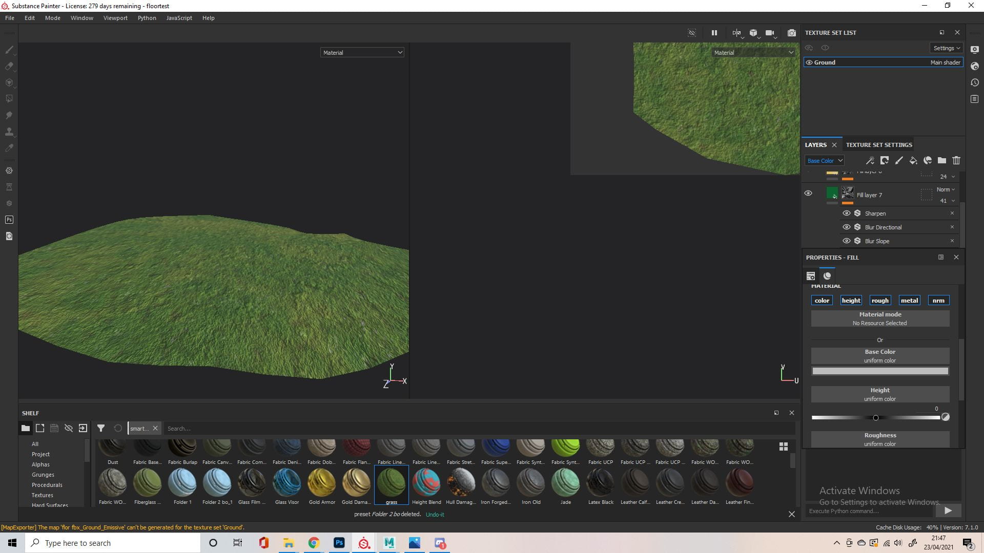

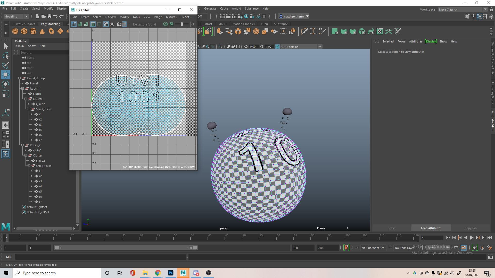


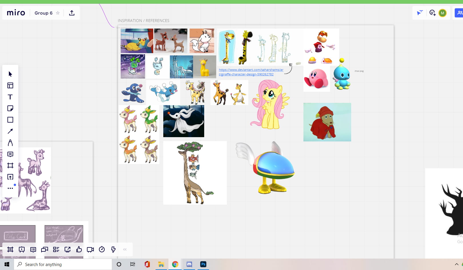


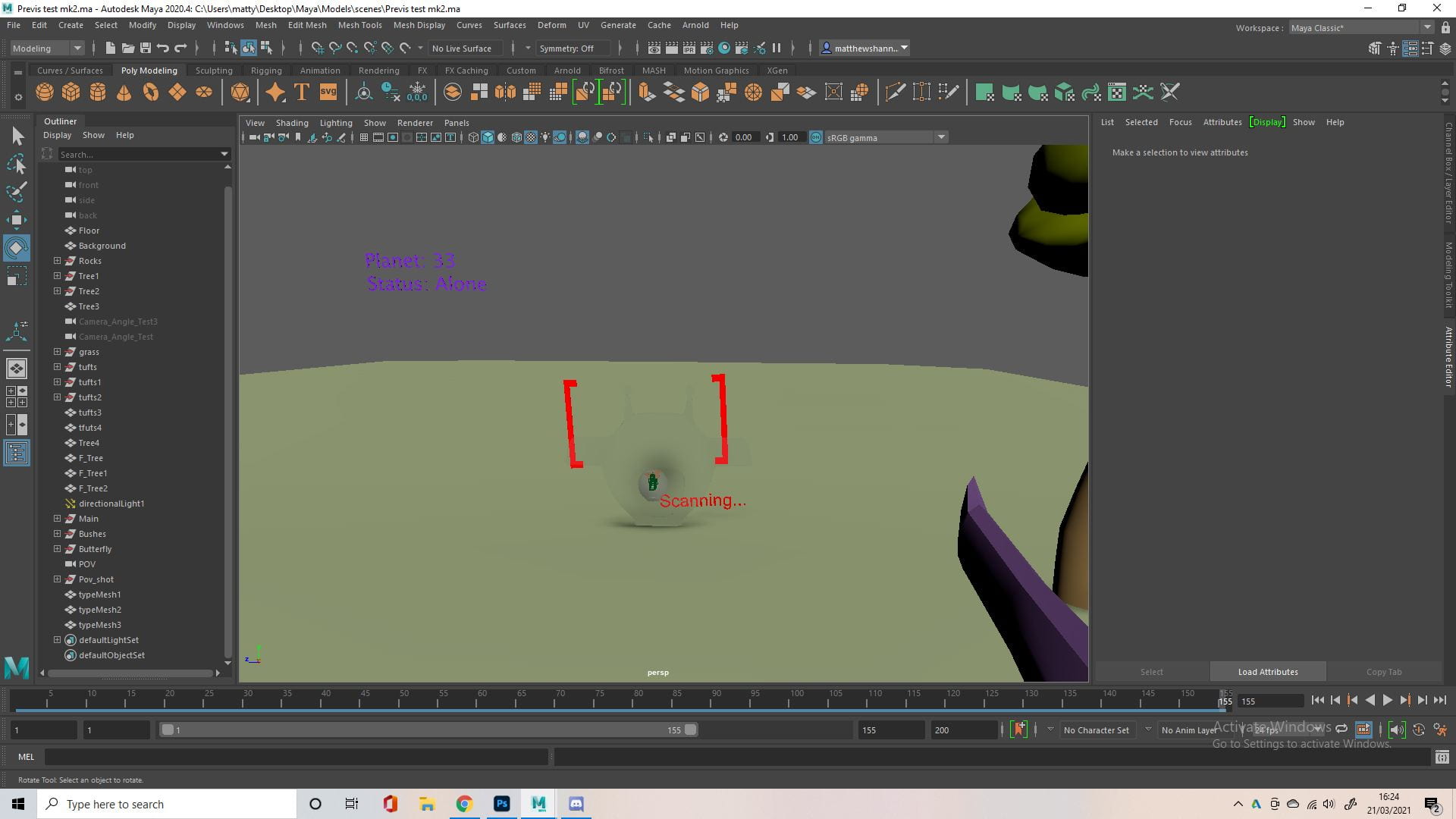


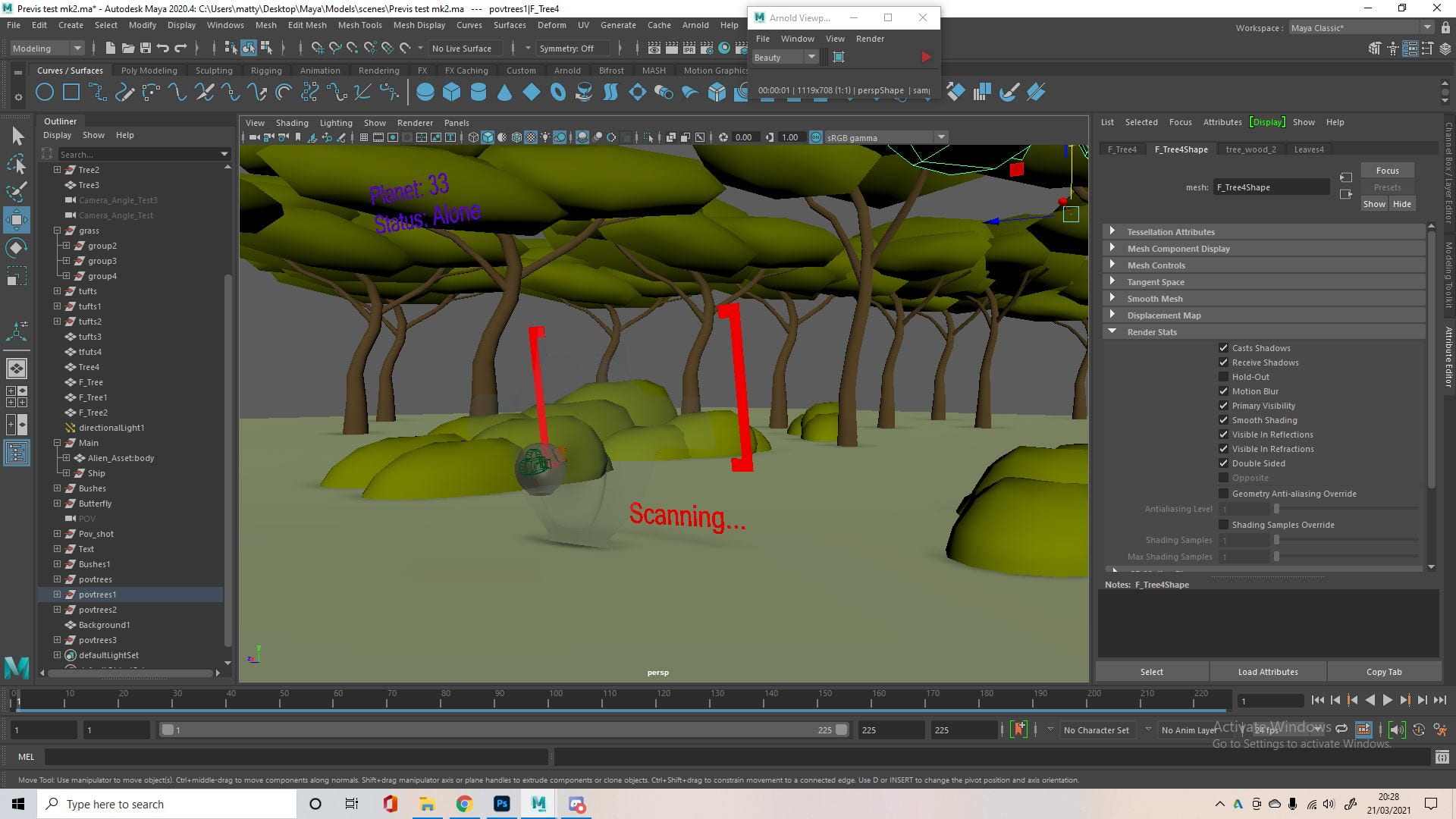


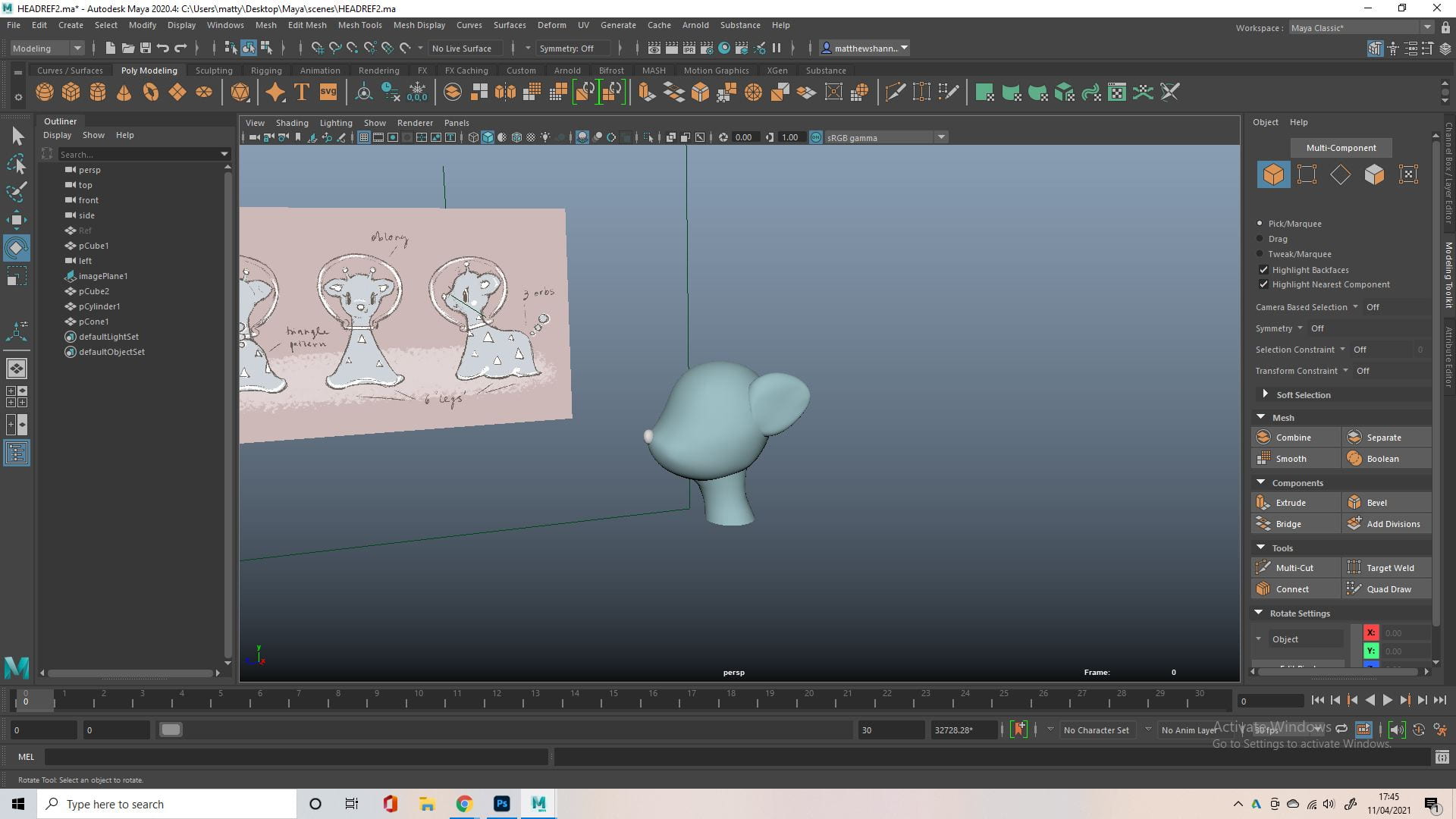


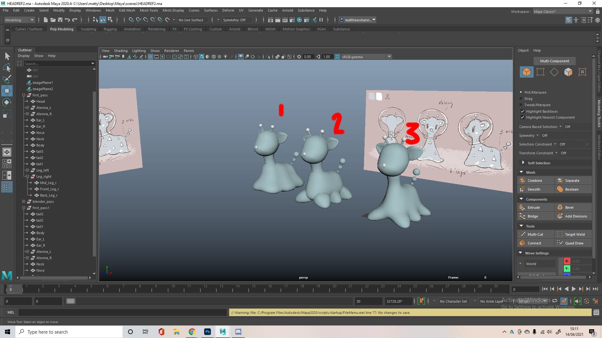
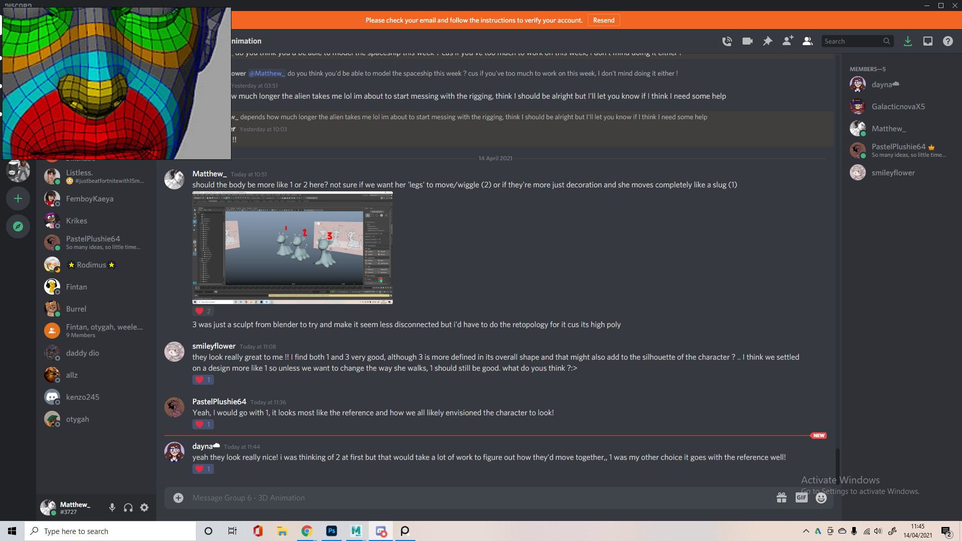


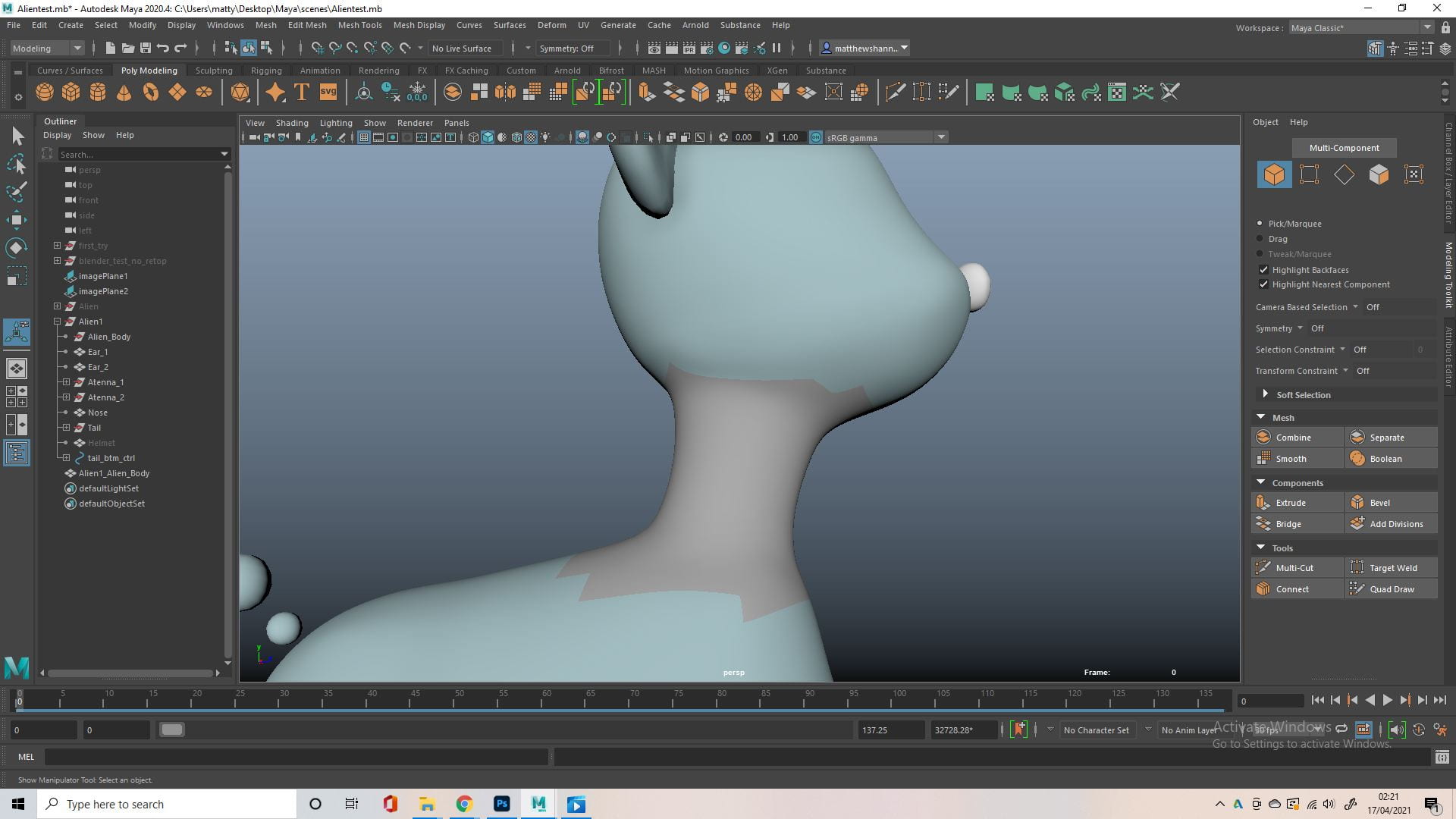


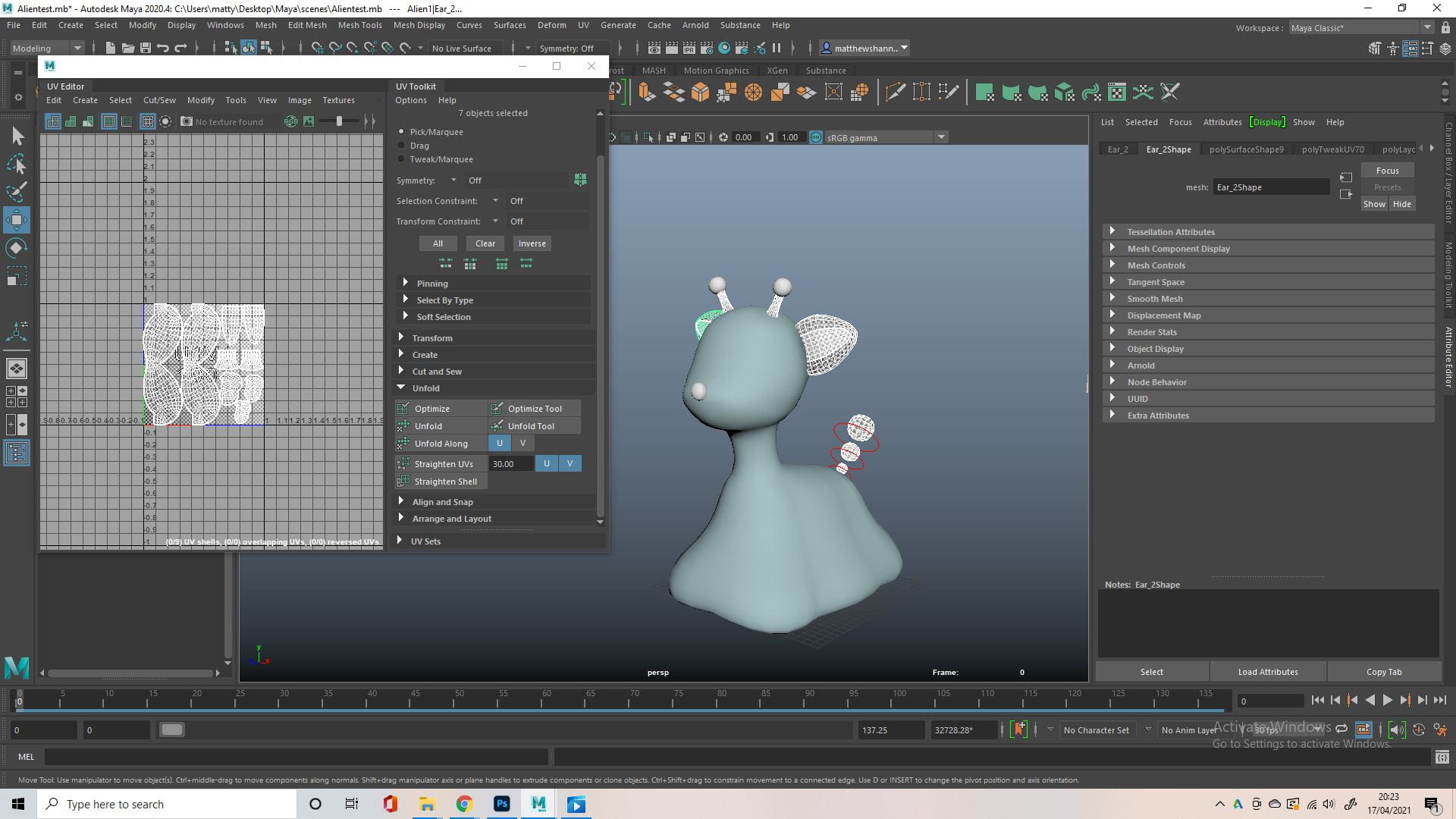


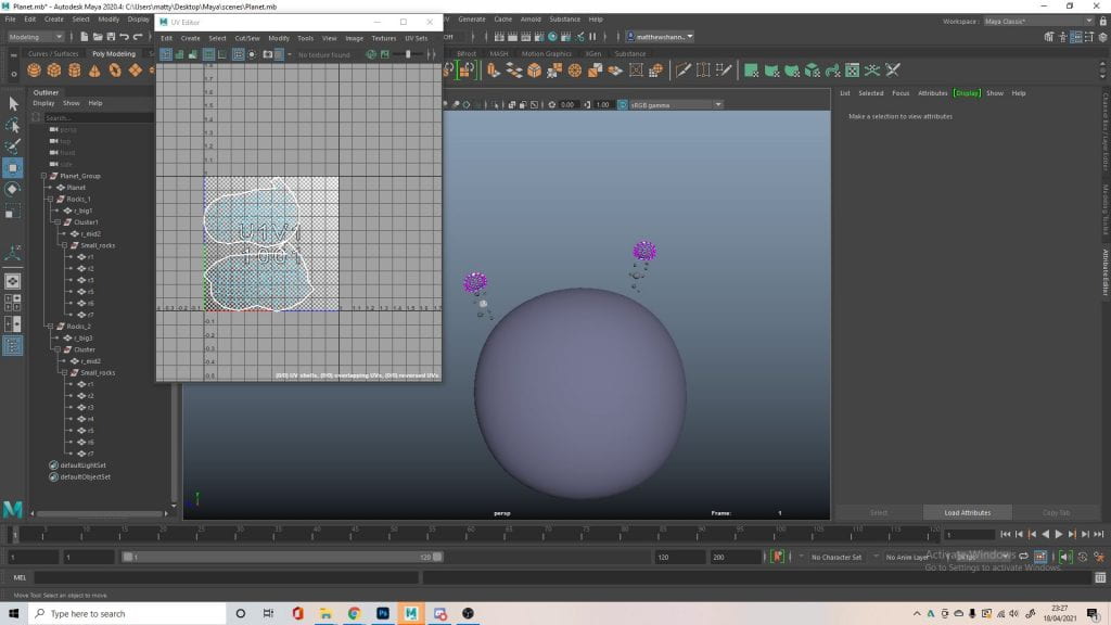


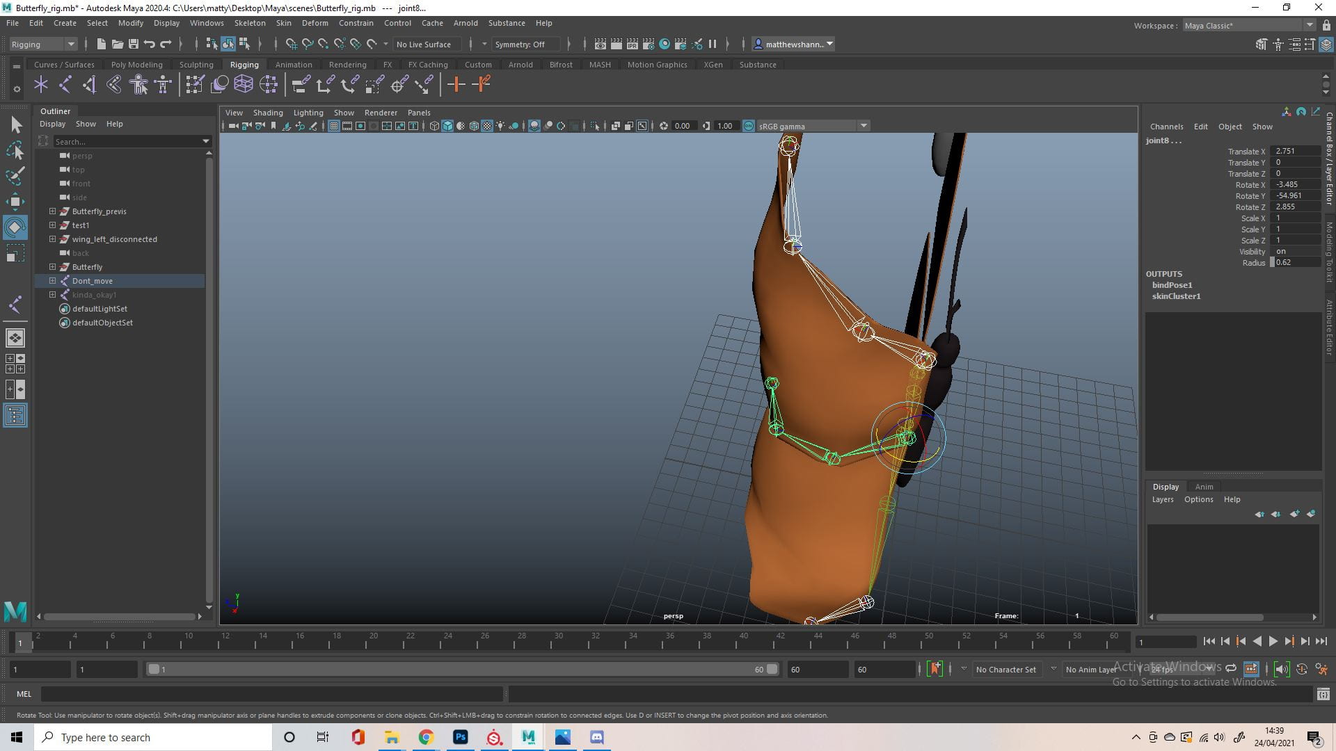


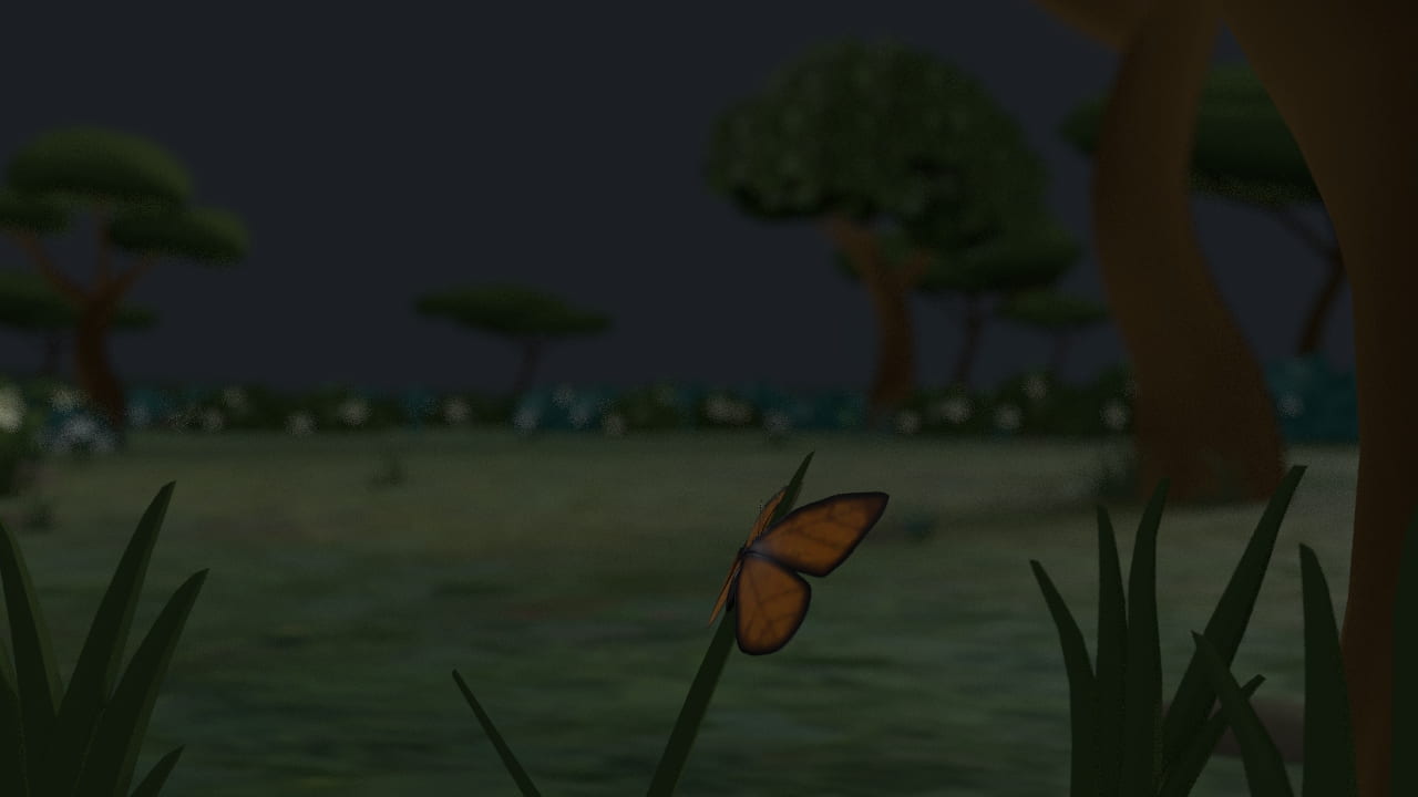


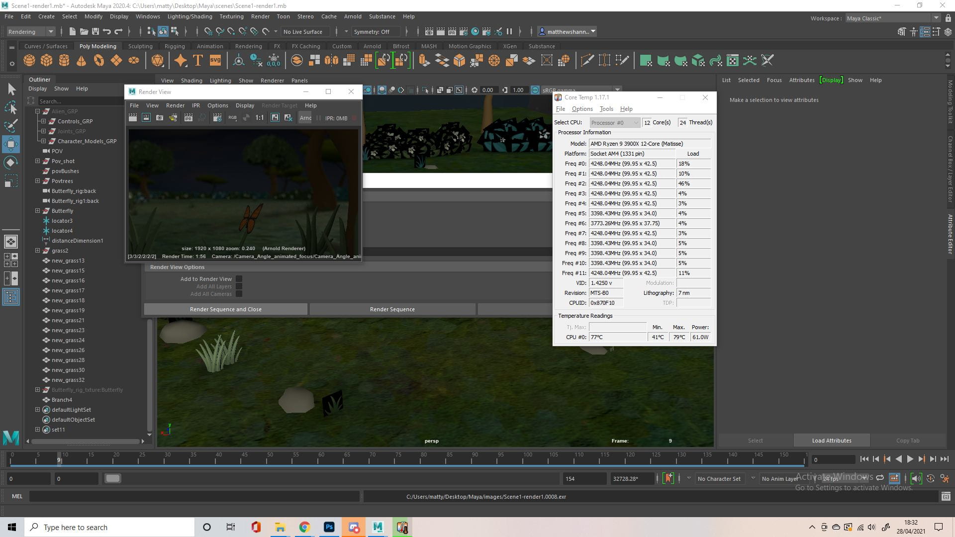


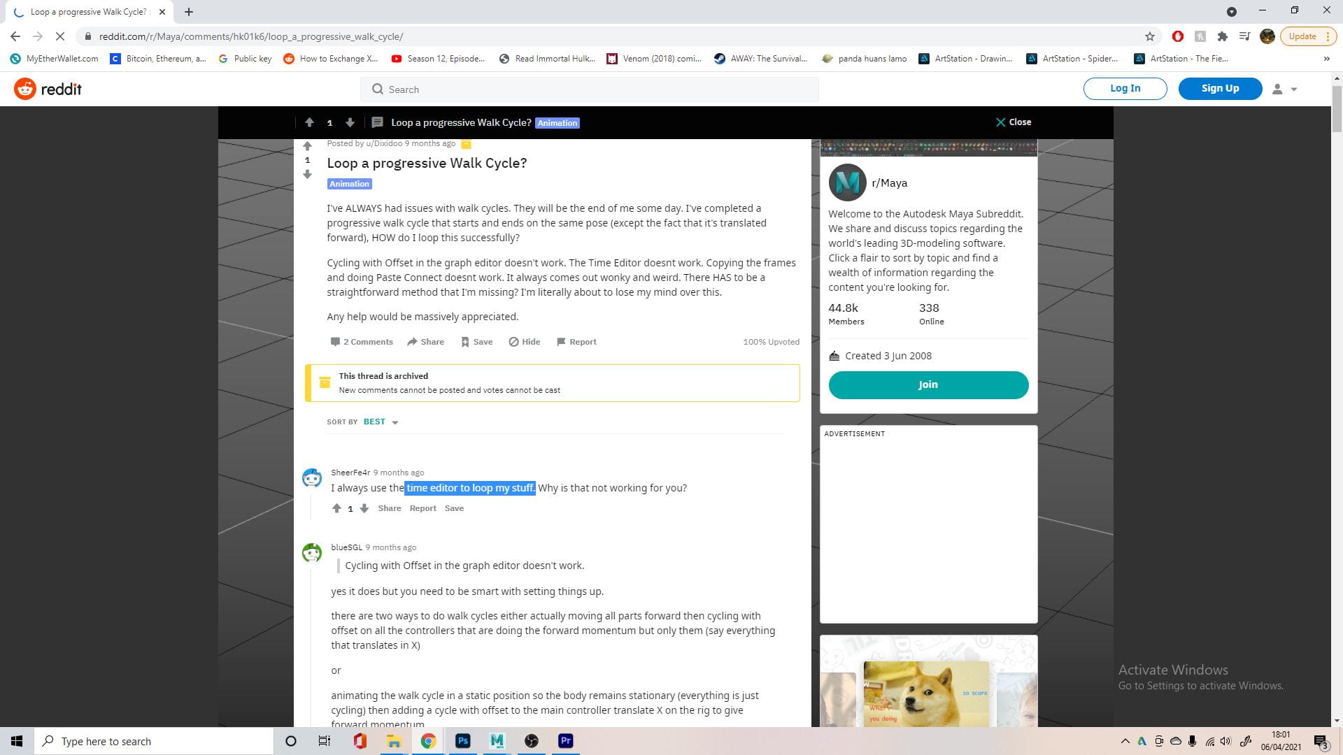
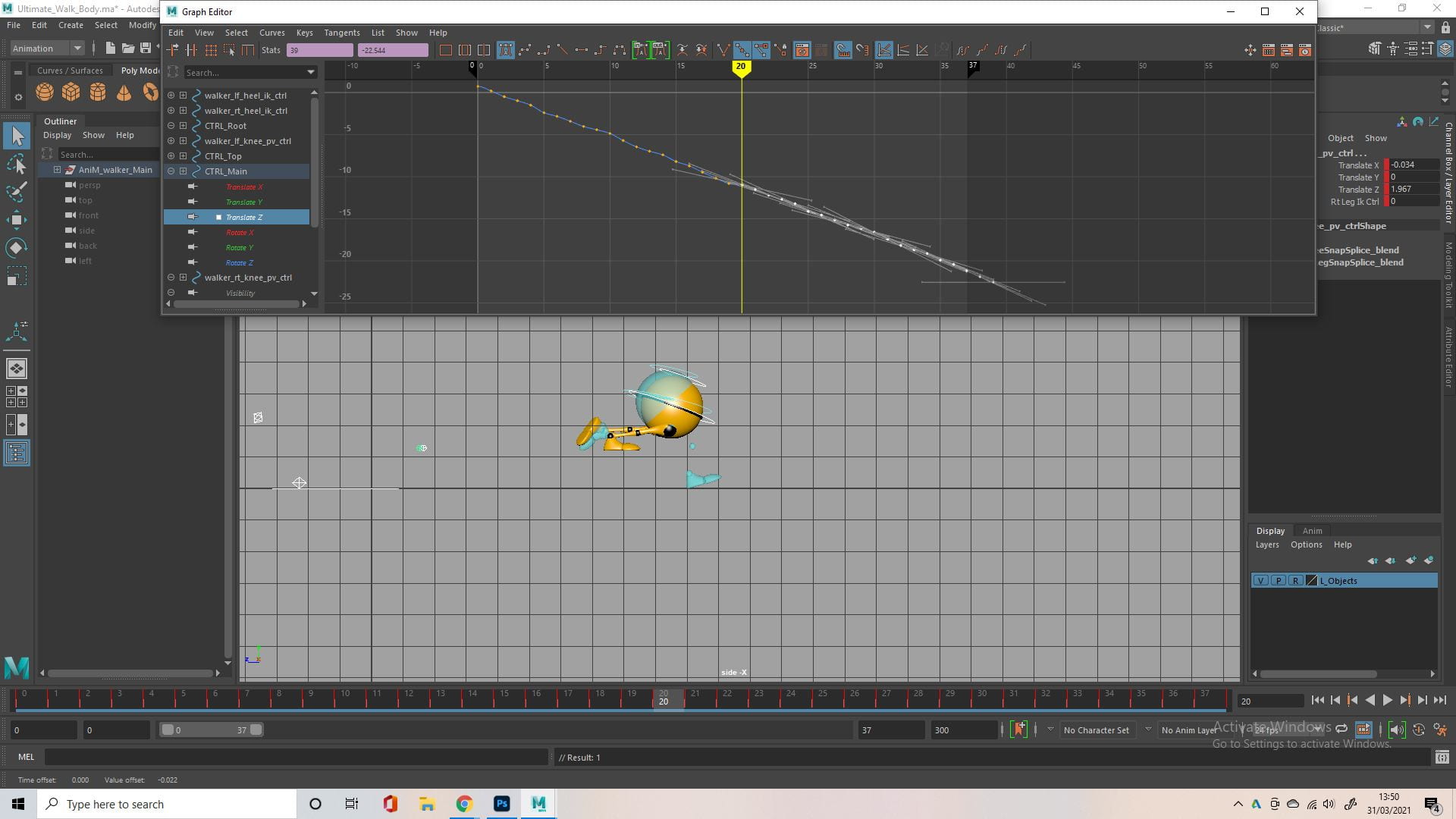


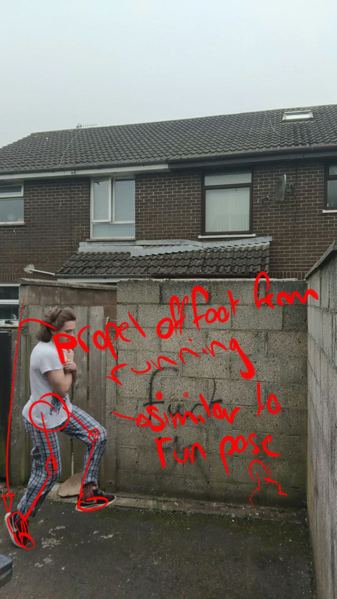


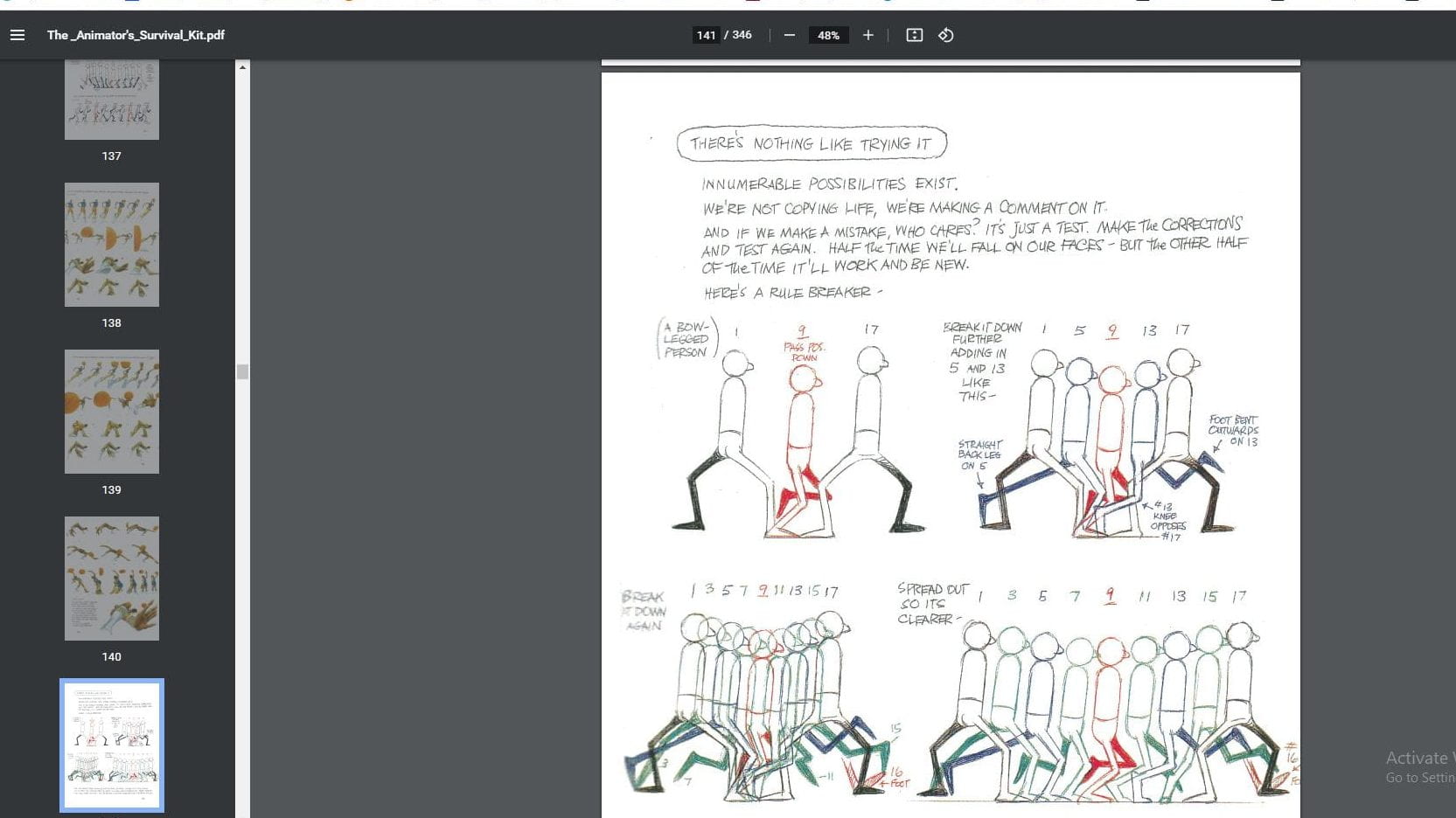


 There’s no point in repeating myself, I just did the same thing as the walk before for the walk off camera. I did attempt to copy and paste the values from the graph editor into the different direction (from z axis to x axis), but it didn’t really work. I just opened up an older version of the file that I could use as reference, and recreated each keyframe in the new file, going in a different direction.
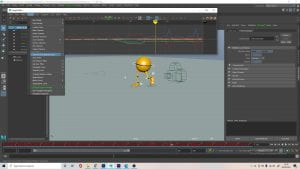 Finally I went in and really pushed the squash and stretch at certain points, something I didn’t do as exaggerated in the previous animation, I also finalised the camera animation, based on the Spider-Man clip.