MP Ideation
Ideation
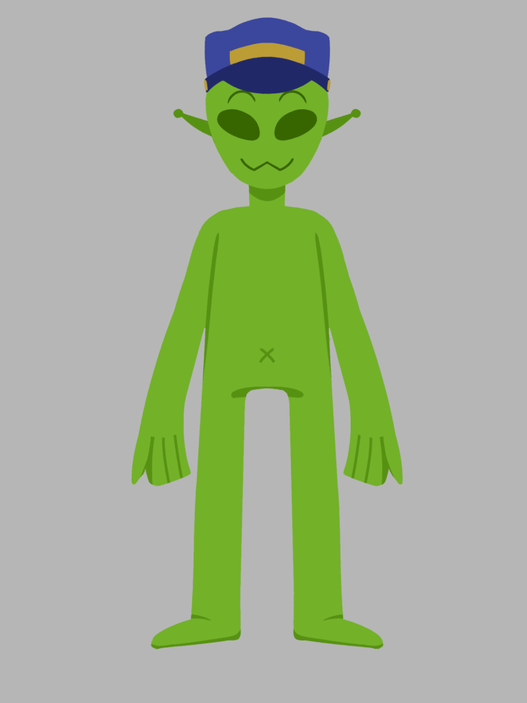
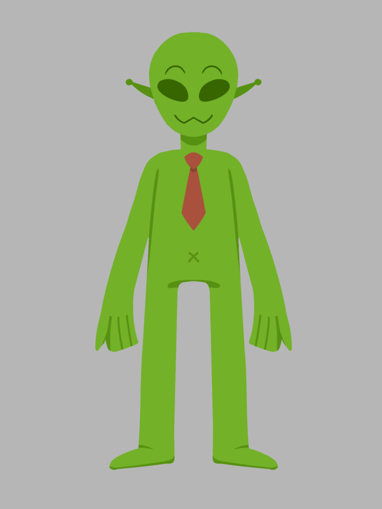
Over the summer I experimented with this simple but fun idea, about aliens that run a theme park. I thought of the prompt randomly while exploring story ideas. I started to sketch out thumbnails and first draft storyboards. I explored the characters, and what they might do, or look like.


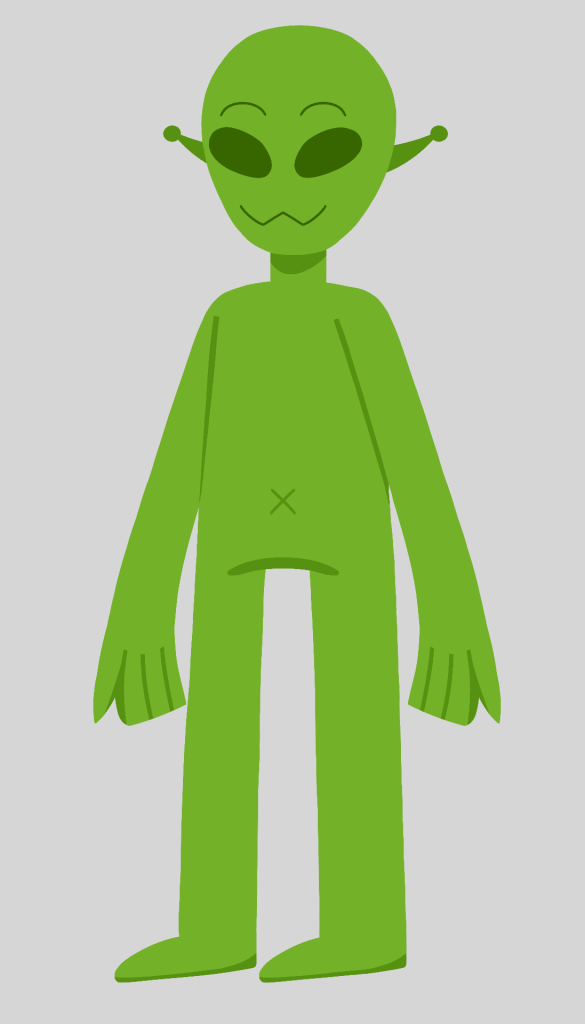
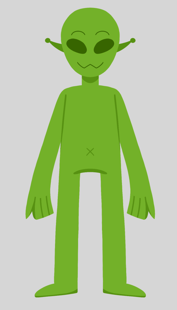
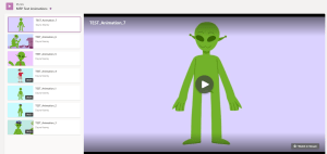
Once I had a rough visual of the alien design, I tested out the character building, character rigging, and animation process; to see if a similar production workflow I used in my placement year will work for this idea. I made 7 test animations, with three rig tests. With the knowledge I learnt in my placement year, I developed AE character rigs built on Photoshop.
This practice allowed me to explore the rig process that was still quite new to me, and therefore I was able to find what worked and what did not. What worked was using the AE tool nulls to attach the character together and using tools from the DUIK plugin to apply to the legs and head turn. What did not work was the character’s shape design, as it must be designed to allow full rotation of body parts and still look attached to the body. For example, the hands were shaped in a way that looked quite odd when rotated from the wrist.
Going through this process has prepared me for what to expect in the actual project workflow and further ideation on how I could improve my rigging process.
Link to the 7 test animations:
MFP Test Animations
When starting the module, I developed my brainstormed ideas. I gathered more inspiration, references and techniques that will aid the understanding of my story and how I will create the project.
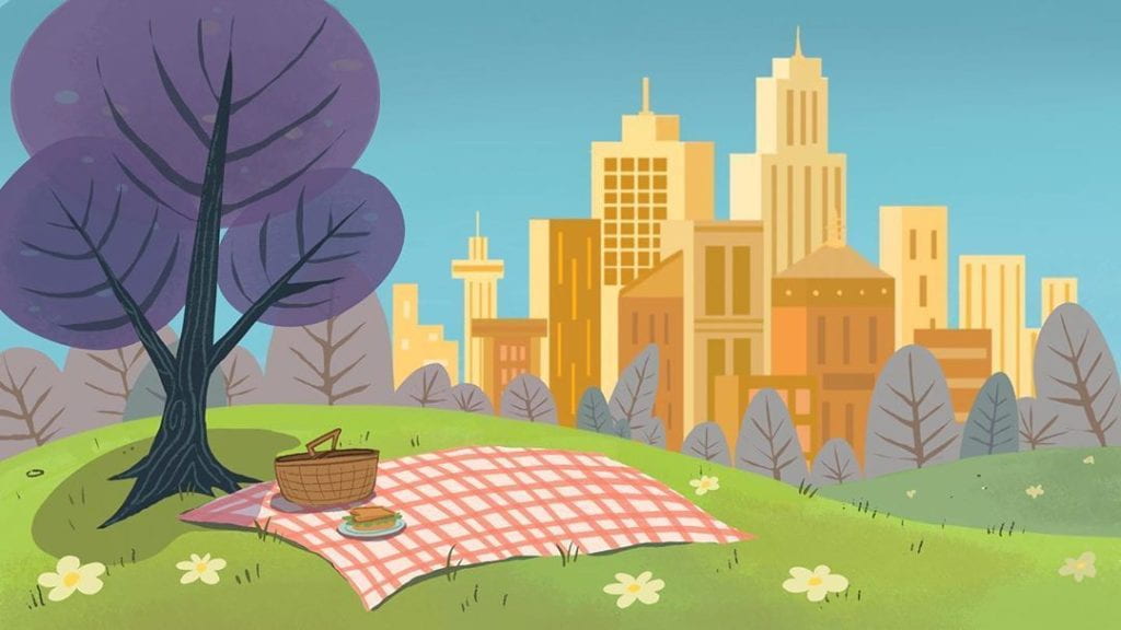
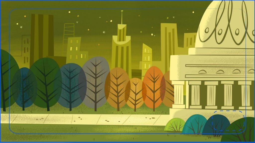
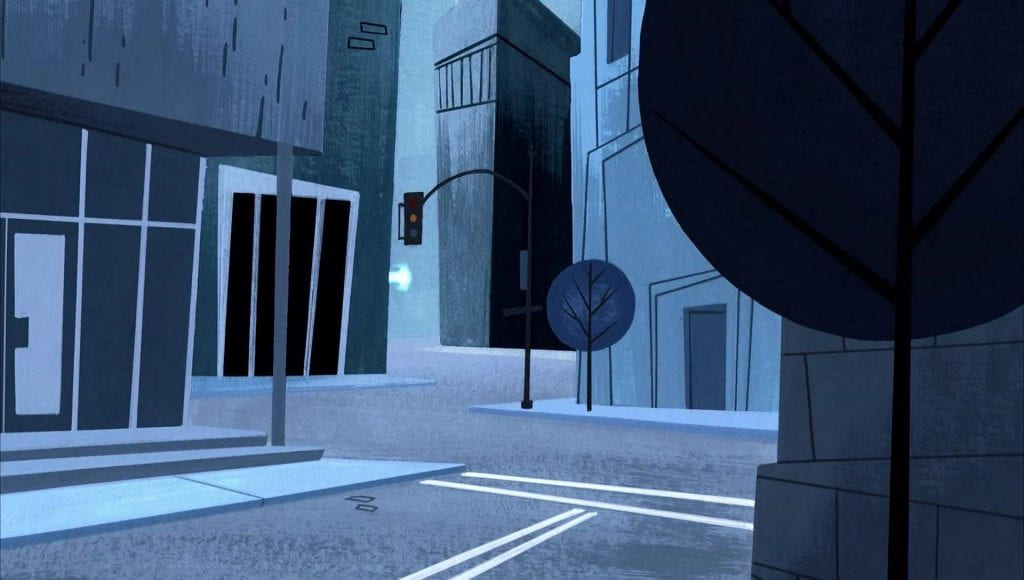
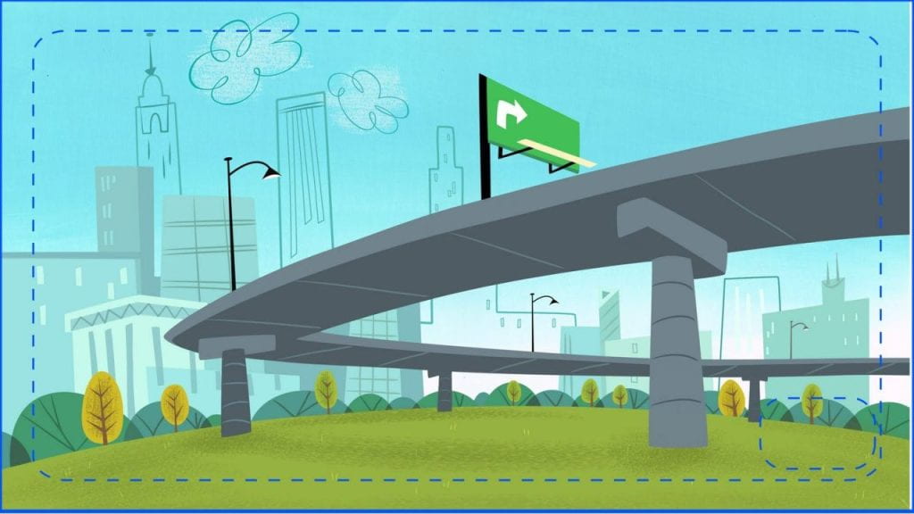
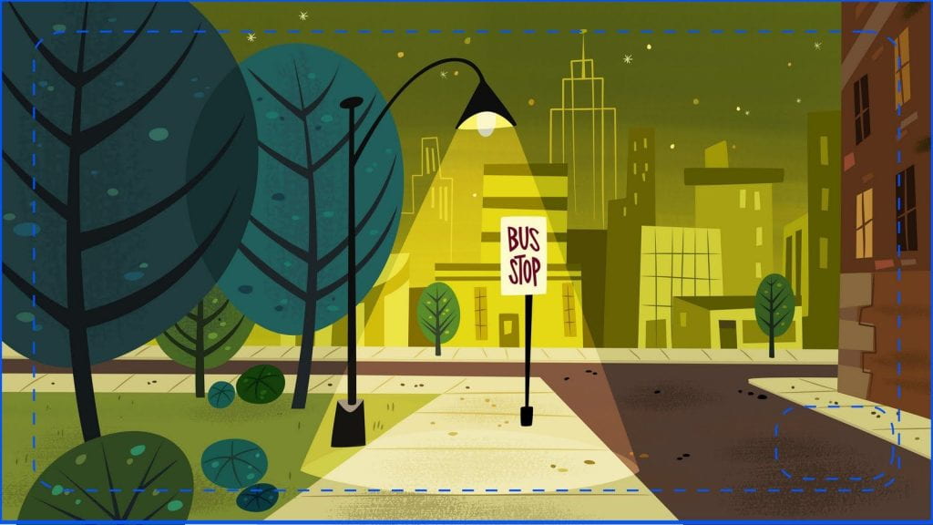
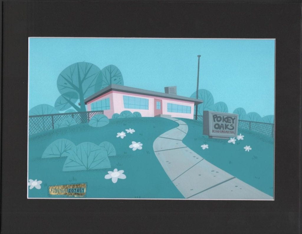
Background design from the original TV show ‘Powerpuff Girls’ is my main inspiration for how I could conceptualise my backgrounds. I analysed how these backgrounds have simple shaping in their objects, how foregrounds, mid grounds and backgrounds are easy to distinguish, and how farther away elements include less detail than closer elements.
The Powerpuff Girls (1998) Cartoon Network.
Source: https://pumpkinpuffgirls.tumblr.com/post/668681040029777920/lets-talk-about-some-background-and-production
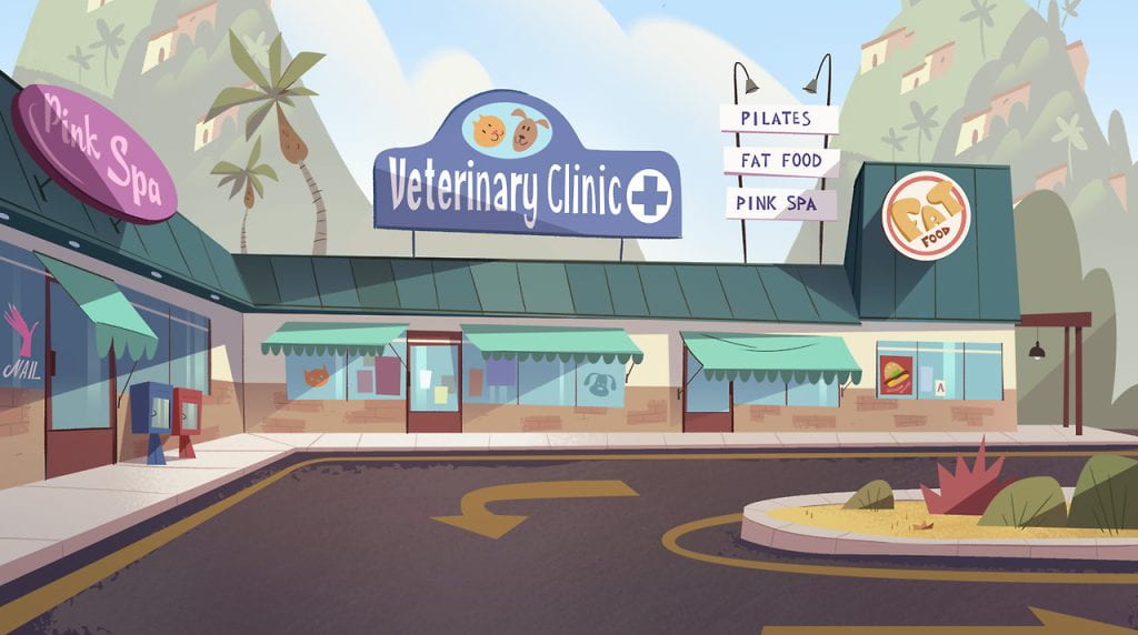
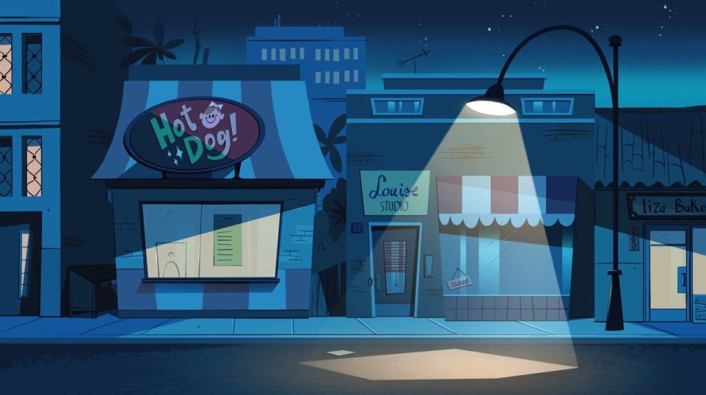
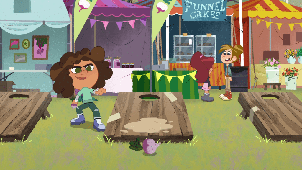
Again, for background design for ‘Star vs the Forces of Evil’, and ‘The Ghost & Molly McGee’, I gather the same points. I also find in these examples, elements that are the same thing (e.g. the festival tents) should each differ in style and condition.
Star Vs. the Forces of Evil (2015) Disney and The Ghost and Molly McGee (2021) Disney.
Source: https://pumml.tumblr.com/archive
These background designs for an advertisement look experimental – with the doodle details, the solid colour background elements, and interesting type design.
Time Warner: “Find Yourself” backgrounds (2014) by Kirsten Ulve.
Source: https://www.behance.net/gallery/20021257/Time-Warner-Find-Yourself-backgrounds
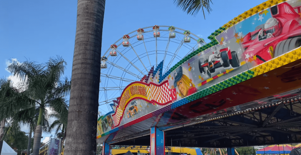
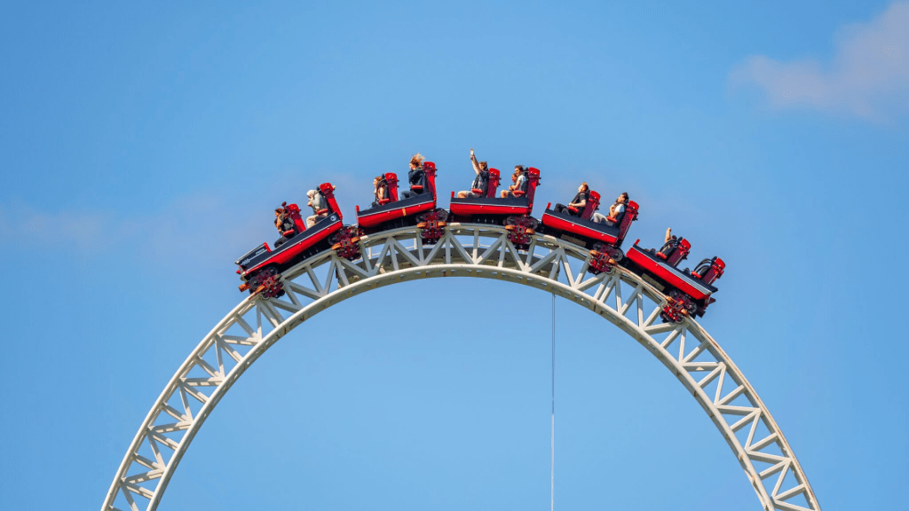
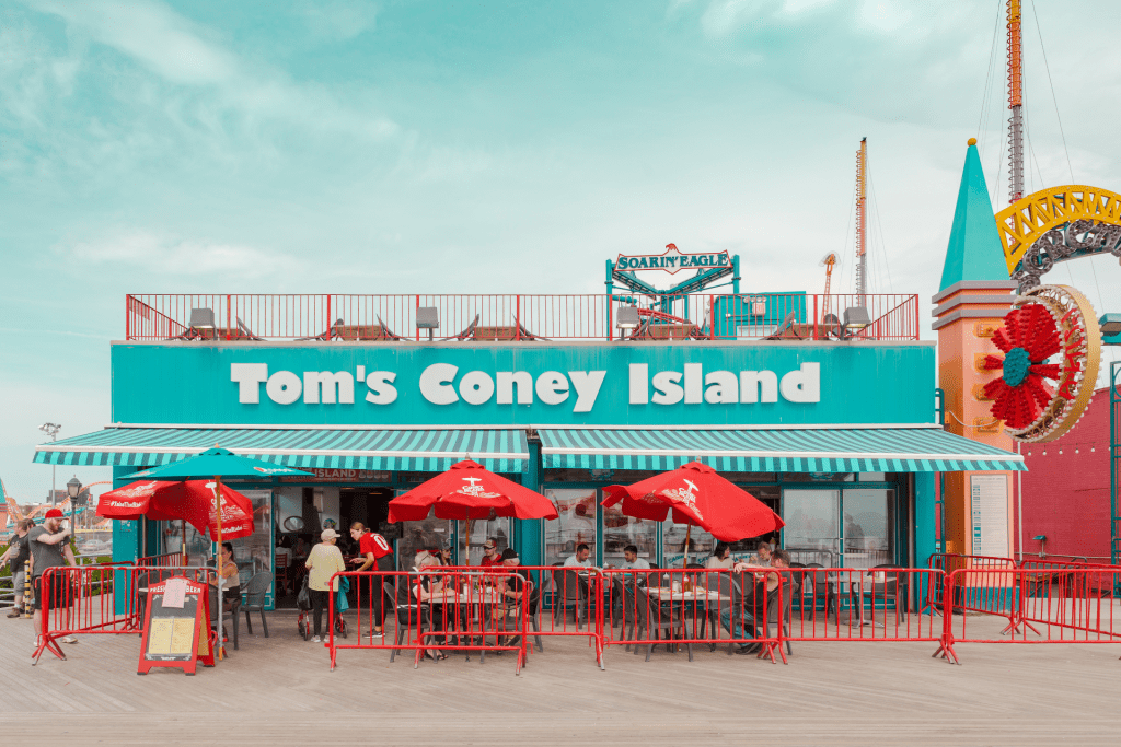
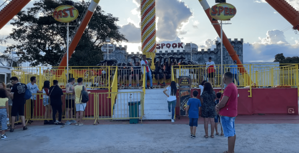
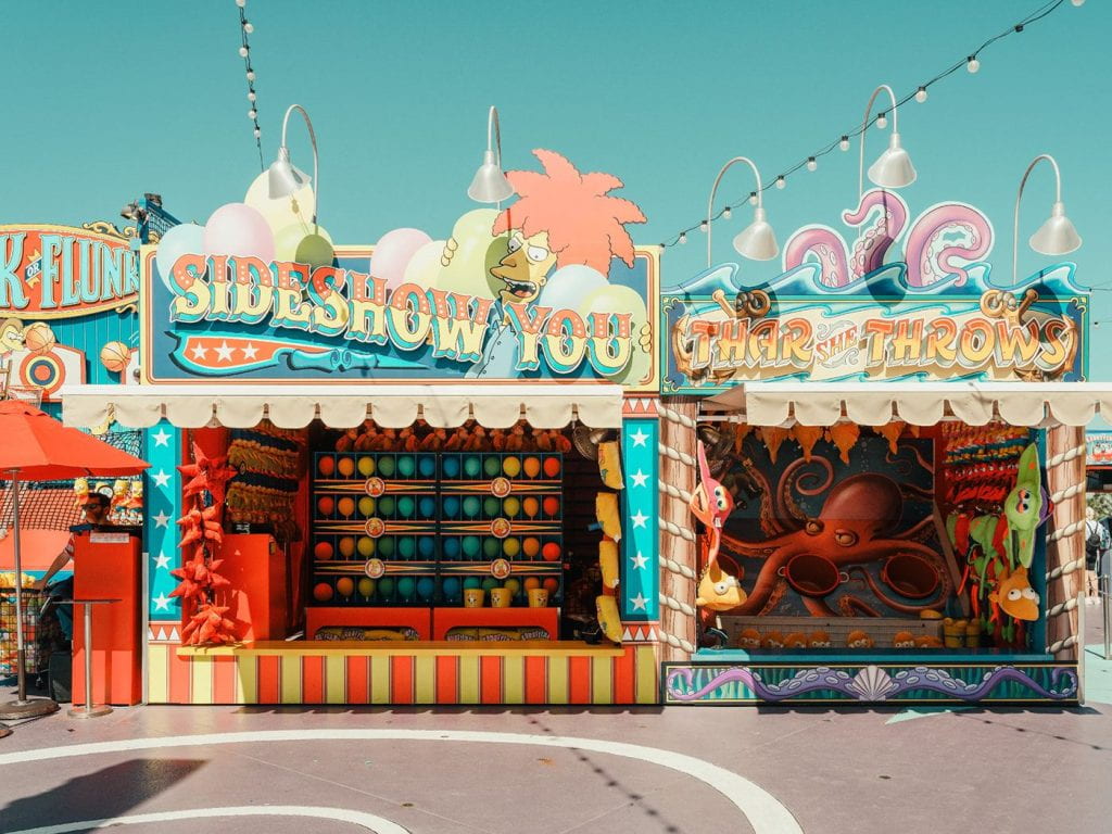
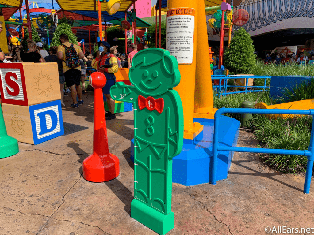
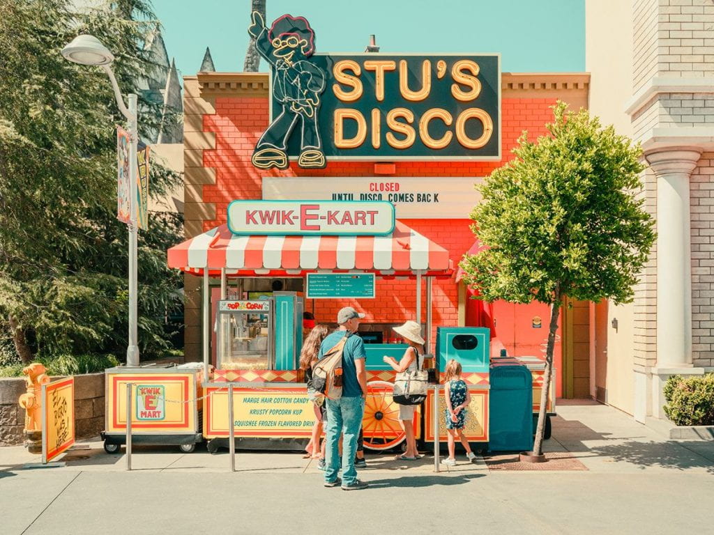
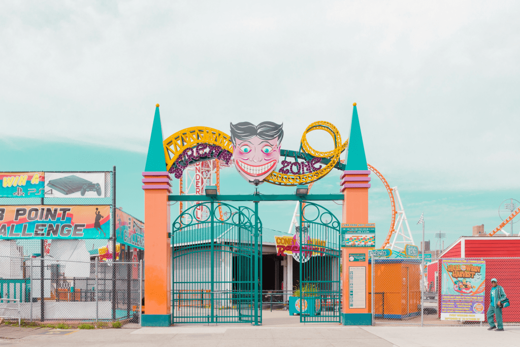
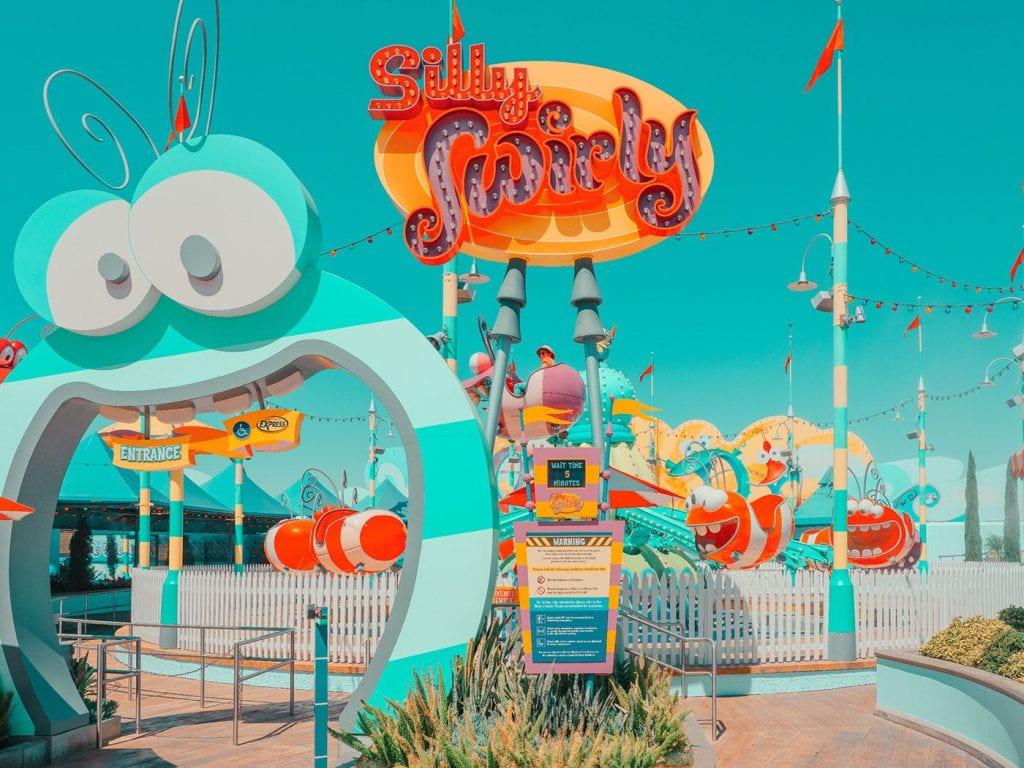
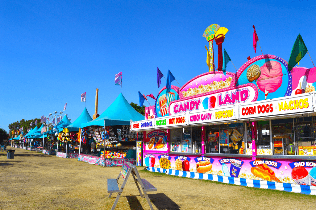
My location inspiration comes from the typical local town amusement park. Built in an empty gravel lot, with quirky illustrated signs, with amusement rides, and stalls for food and prizes.
Sources: https://www.behance.net/gallery/85658255/CALIFORNIA-AMUSEMENT-PARKS?tracking_source=for_you_feed_user_published
https://www.fubiz.net/2017/11/19/colourful-infused-impressions-of-coney-island/
For the visual art style of my project, shows like ‘Tangled the series’ and ‘Samuari Jack’ have good designs that I can learn from. This includes the almost line-less look, but lines emphasising the hair & clothing detail, Solid coloured shapes, and soft brush textures for shadows & dark areas. I have tried a style like this before with practice over the summer, so I can try replicate the same techniques for this project.
Tangled the Series (2017) Disney, and Samurai Jack (2001) Cartoon Network / Adult Swim.
These are animations that have inspired my story concepts, and character personalities.
Lifted (2007) Pixar
I am very influenced by this comedic short because of the dynamic between the Alien instructor and the Alien taking the test. They remind me of the kind of characters I imagine in my short, the instructor resembling ‘the Inspector’ that is emotionless and stern, and the alien taking the test as the Alien running the theme park, that is nervous and unpredictable.
Steven Universe S3 EP9 – Too short to ride (2016) Cartoon Network
I took good inspiration from this specific episode of Steven Universe where they visit Funland, a local amusement park. It was interesting to see how theme park aspects can translate into animation such as; park designs, props, and amusements the characters interact with.


