Constellation World – Week 2

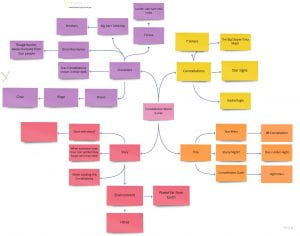
In the first group I was sorted into, we worked together to brainstorm ideas for a world to create. In this group we had myself, Dan, Wren, Darren and Nathan. We had many small ideas, and a few big ideas. We brought the big ideas into another brainstorm and figured what we could develop from them. We eliminated at few and chose the Constellation world idea.After choosing our idea, we discussed what we wanted this world to include and what story it should tell. The constellation world is based on a planet far from earth. Many civillians are born or equipped with the power and soul of a constellation. We created a few characters based on constellations such as Big Dipper, Corvus and Orion. These people try to protect their sacred soul while humans come from earth to try and take it away from them as they want more control and power. As soon as someone loses their constellation soul, they forget who they were. These people also have constellation tattoos or markings on their body to represent their power.

As part of our week 2 homework, we designed 12 thumbnails of composition studies based on our world theme. while doing this we could ideate how we wanted our world to look etc. landscapes, wildlife, environment and atmosphere. In addition we were to consider using one, two and three-point perspectives.


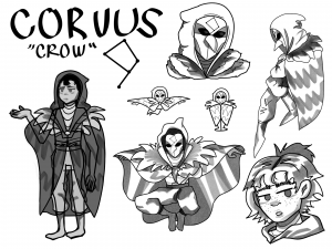
Between my group and I, we started designing our first few characters to achieve an overall look of the world theme. I chose to focus on the character Corvus. I researched a bit about the constellation and researched some ‘crow-like’ designs for this character.

I also made my own take on the other two characters designed by my teammates, Wren and Dan. They are called Big Dipper and Orion. Although we were fond of these designs, they are just our first drafts. Overtime I would say our designs may change up a little. Especially when the groups switch up. New people will come with new ideas and therefore more development blossoms.
Create a World – Week 1

Our first coursework assignment is to create a world. In teams we will be designing a world/universe that will be built on week after week. Each week a few of us will be switched to different groups to then jump into working on another world design. We will be exploring the core themes of animation: composition, character development, concept art, colour, cinematography, audio, time and timing. To complete this we can work on sketchbooks or make digital artwork, as-well as regularly discussing with our assorted teams and building this world with each one of us providing ideas and concepts. I will be documenting what I make for each world idea I work with and what they are about.


Week 2

In week 2 we looked at composition and perspective. Composition is the artistic arrangement of the parts of a picture, and perspective is the technique of creating an illusion of depth and space (three-dimensional) on a flat surface (two-dimensional). These aspects are very important in animation as it can make a scene more realistic and logically correct. I was given exercises to practice this fundamental before I continue with my homework. I was to take multiple photos with composition and perspective in mind. These include rule of thirds, symmetry, geometric views etc. Taking these photos had shown me that there is infinite perspectives around you and that there is composition in everything you see and use.

Source: Week 2, Lecture, Composition and Perspective, Lecture – composition and perspective part 1, 2.mp4

I made use of the rule of thirds grid to take my photos. This helped me compose them into different views, such as: my dog, Lexi on the right takes up majority of the bottom space of the image, making it the most noticeable object.

I took notice of symmetry and geometric views too. when taking images of my flat room, I noticed how its mostly made up of squares and rectangles – which represents an unnatural, manmade environment, or stability and strength. This realisation helps me understand the kind of views that are portrayed in movies – I can point out these views more easily now that I have acknowledged them.

Source: Exercise 1, 2, 3.mp4

For homework, we picked out three of our favourite animations, and drew one, two and three-point perspectives over the suitable screenshots.

I drew one-point perspective line-work over a shot from Moana. It’s easy to point out the view from the back of Moana in comparison to the view Moana sees of the sea. It’s also a nice visual of where Moana is right now, to where she wants to be.

I drew two-point perspective line-work over a shot from Spiderman-Into the Spider-verse. It was quite hard to get an idea of how this perspective worked as its shot from a low birds-eye view, though I managed to capture the building, path and road in the perspective lines. It’s a very quick shot in the movie but so much is happening in it. Etc. the crowds, the traffic, the lights.

I drew three-point perspective line-work over a shot from Kipo and the Age of Wonderbeasts. This was also difficult capturing in perspective but I managed to get an overall idea of it. It’s a really nice framed shot using all basic shapes. Circle for the moon, square for the lorry, triangle for the tower.

Week 1

In our first week of lectures we learnt about shape and form. Any kind of drawing starts with basic geometric shapes, then it develops into a life-like object with the help of shadows, lighting and contour lines to create form. Shape and form is important in animation as it is the most important fundamental to practice – it is how any kind of drawing comes to life. I was given exercises to practice this fundamental before I continue with my world project. I followed my tutors warm up exercises to bring us back to basics and improve our skills for our next tasks.

Source: Week 1, Lecture – Form and Shape, Form and Shape part 1, 2, 3, 4, 5, 6.mp4

I practiced some line strokes to see how stable my hand was when drawing, switching from looking at the screen vs looking at my drawing tablet to compare my results.

Similarly, I practiced with how I drew curved and ‘s’ lines. I moved on to the basic shapes and their developed forms. In addition, I drew in fitting faces.

I experimented more with freely drawing circles. To combine the basic shape of a circle and a rectangle, we can make the shape of a flour sack. I experimented with how a flour sack behaves relating to its weight.

For homework we were to practice studying and understanding underlying forms. I took three of my favourite cartoon characters and studied their forms. At first I traced over their constructive forms with my phone screen. I then found the characters overall shapes, whether it was circles, rectangles and triangles. Next, I brought in the shapes with contour lines and re-drew the body. This practice allowed me to familiarise myself with the character and draw them in multiple poses.

Here I have drawn Marcy from the show Amphibia. Her form consists of irregular, rounded shapes and proportions are very cartoon-like. Her shape can be described as round and bouncy.

Here I have drawn Eda from The Owl House. Her form consists of sharp, diagonal lines and her proportions are long and thin. Her shape can be described as realistic and fine.

Here I have drawn Amethyst from Steven Universe. Her form consists of regular, rounded shapes and wide-body proportions. Her shape can be described as a mix of a cartoonish and realistic form.

Back To Top
Skip to toolbar