Month: September 2023
MP Post-Production
Compositing
After my last animation fixes, it was time to move onto compositing. Before I started, I reviewed some YouTube videos on compositing on After effects and went back to my notes I gathered from Dan Wilson to brainstorm what compositing effects I may need for my project.
I had decided on a couple effects that I will use:
- Ground shadows on each character
- Body shadows – as limbs move past body – establishing depth
- Rim light (inner shadow) layer style in scenes with enhanced lighting
- Depth of field blur for foreground assets
In a similar process to reviewing fixes, I used Syncsketch to add notes to which shot needed which effect. I am still using my animation tracker to record my progress and what stage each scene is at.
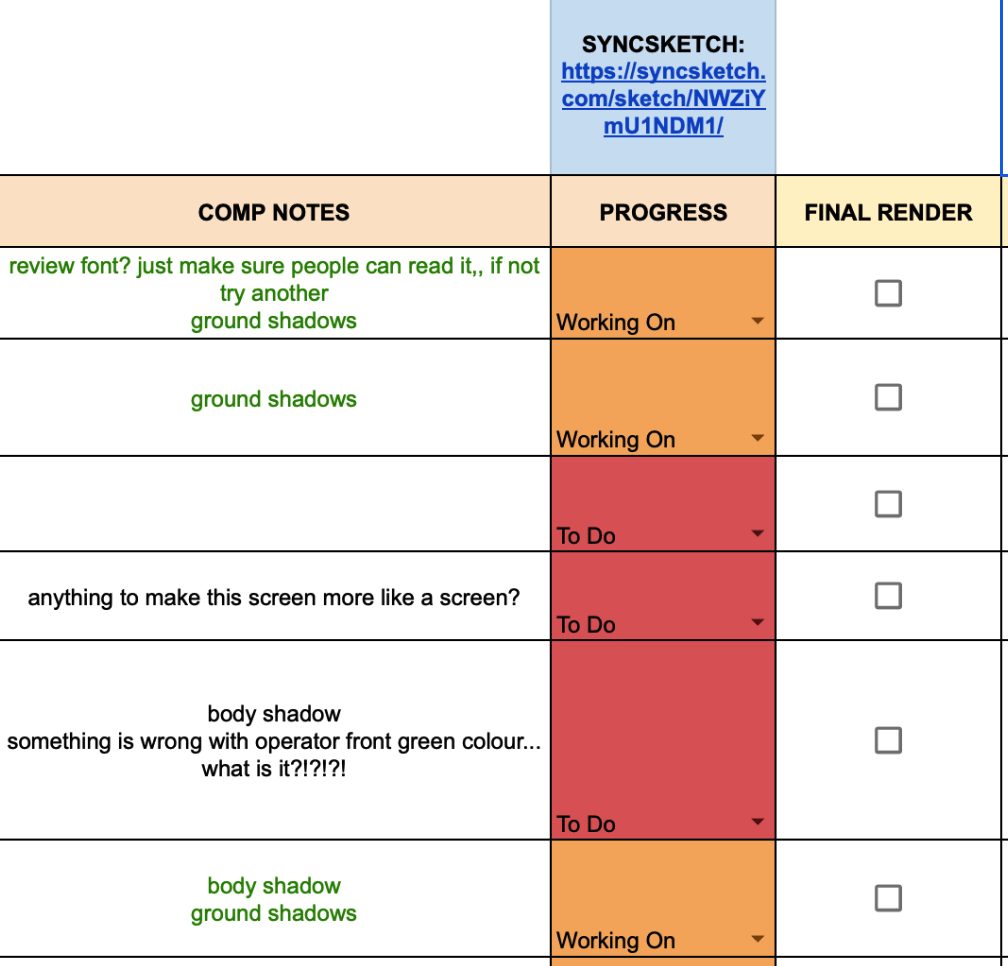
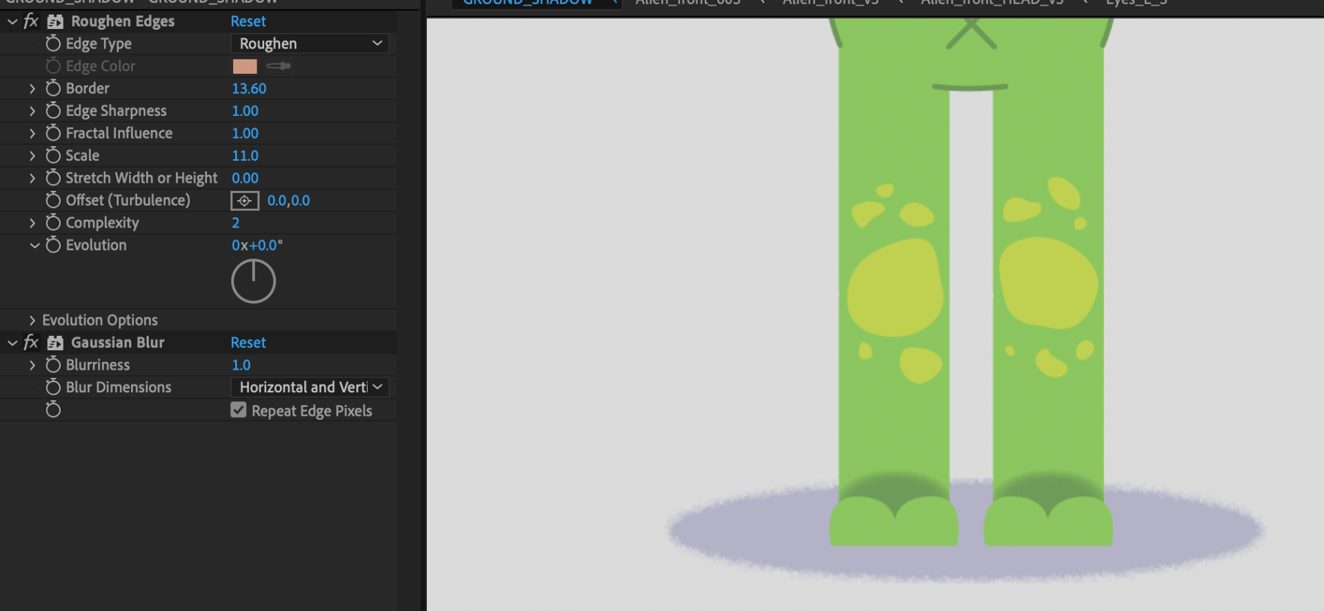
For the ground shadow, I use an oval shape with roughen edge, coloured the same as the darker parts of the floor from the BGs. To keep the shape consistent in each scene, I made it in its own file to the scale of an alien rig and imported it into every shot file.
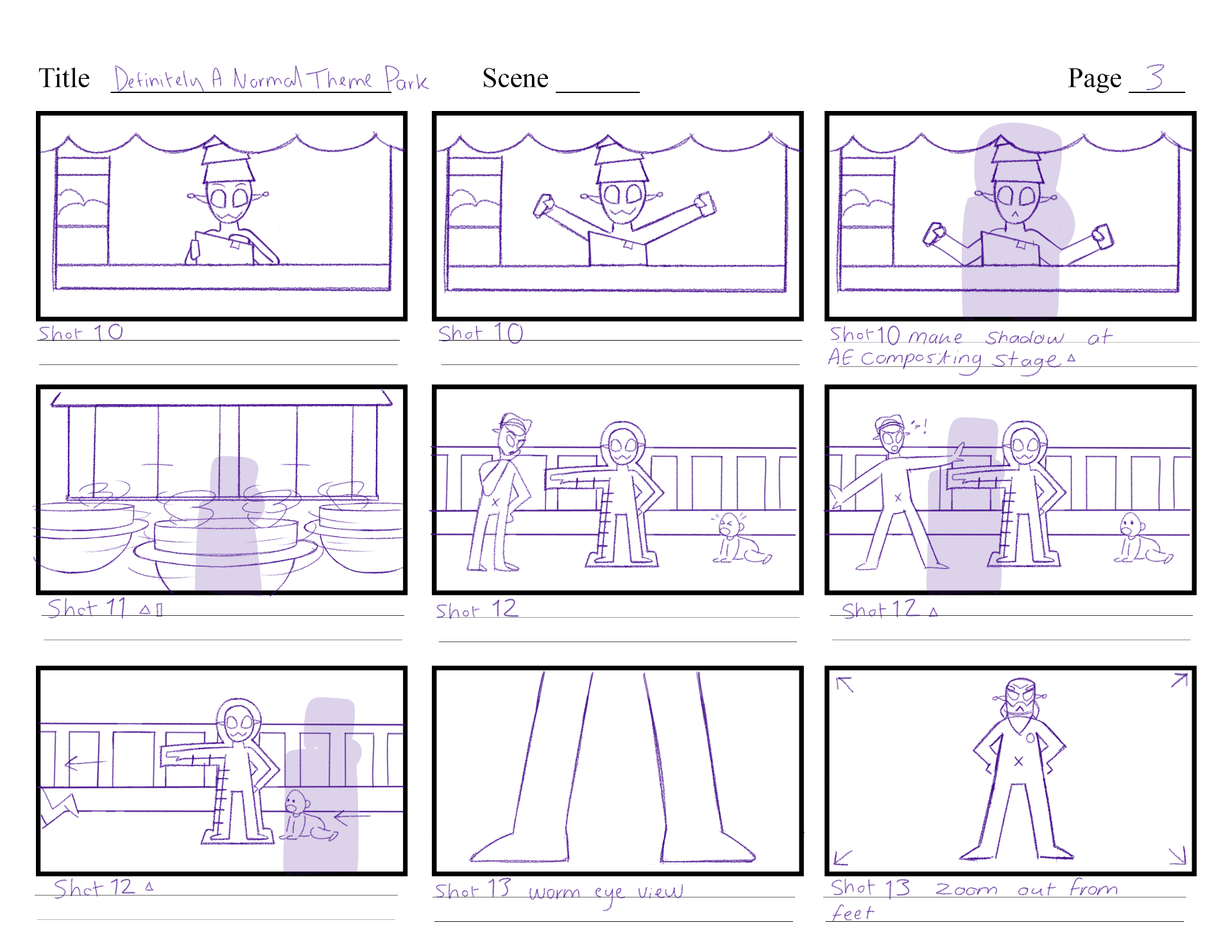
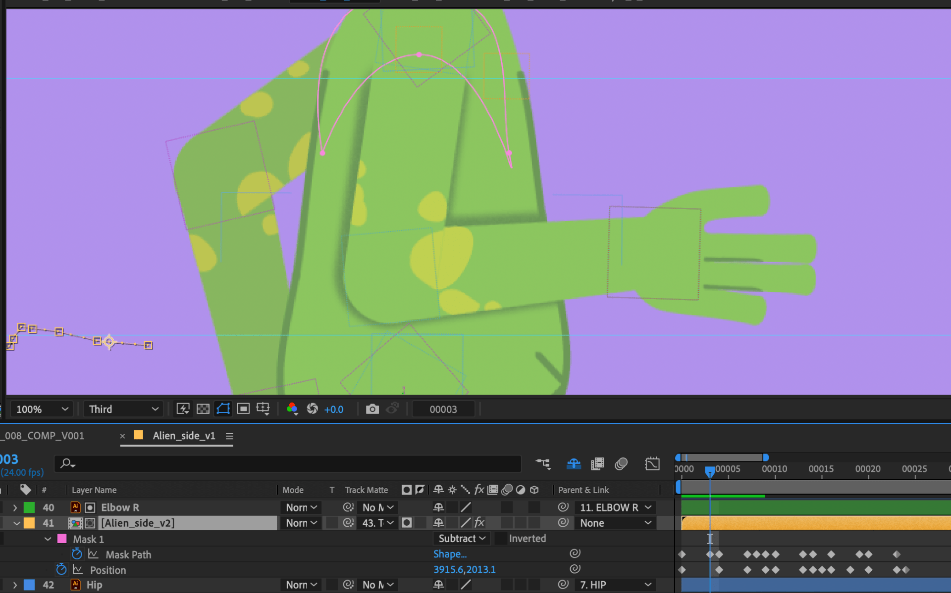
To get shadows on the bodies, I duplicate the main comp of the animated character, give it a fill, noise and blur effect. I hide or show the parts of the body that will create the shadows etc. hiding everything but the arms in this duplicate comp.
Then I place it in front of the area the shadow will show on etc. the torso, and track matte the comp to the torso. This will clip the shadow onto the torso layer so its only visible in this area. If I need more shadows placed elsewhere I use the same process, then track matte to other layers.
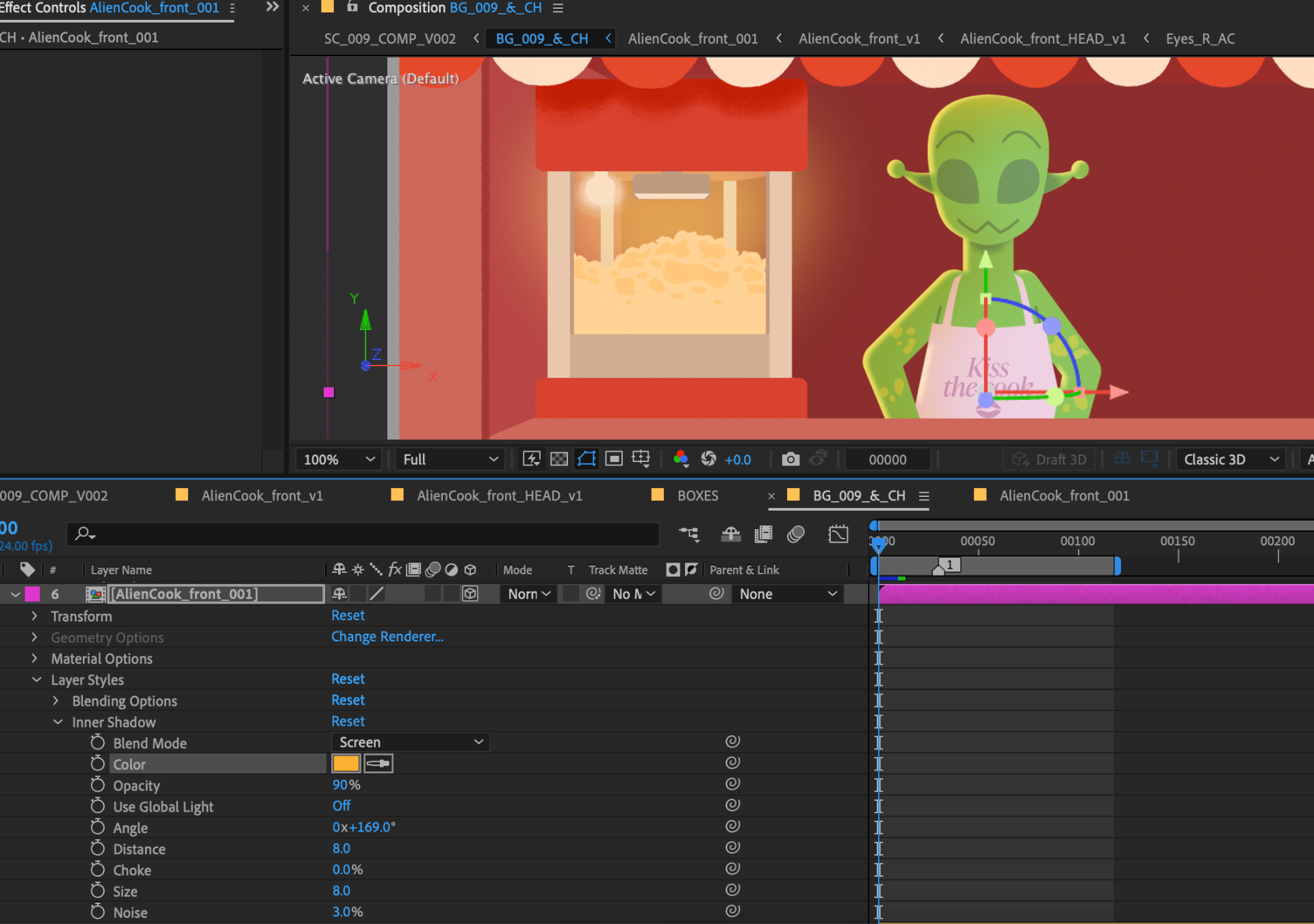
For scenes with more intense lighting, I experimented with layer styles on the characters to create lighting reflecting. Layer styles like inner shadow and gradient overlay help with this effect. I experimented with the settings, then keyframed their intensity/opacity if the source of lighting changed.
Other additions included placing confetti shapes on the ground as it fell, and animating a star shine shape to add importance to the star badge Alien Boss gets.
Comp pass 1
In the second comp pass, I fixed up lighting intensity and tones, keeping it more natural and believable. I also adjusted the text size in the first scene on the sign – now it can be read better.
Comp pass 2
Editing
Once I was happy with each scenes progress, I added all latest renders into a new Premiere Pro file, where I will be editing the film together. Here I will add in sound and music that Chris McCann has provided for me, and the credits video.

Sound & Music
I reached out and communicated with Composer & Sound Designer Chris McCann to create sound and music for my project. Chris sent over a brief for me to fill in details about what I am aiming for. An example of what I sent over was this YouTube playlist of soundtrack music that inspired me, including; ‘Ooblets’, ‘Miitopia’,‘Wii Party’, ‘Warioware‘ and ‘MySims Party’.
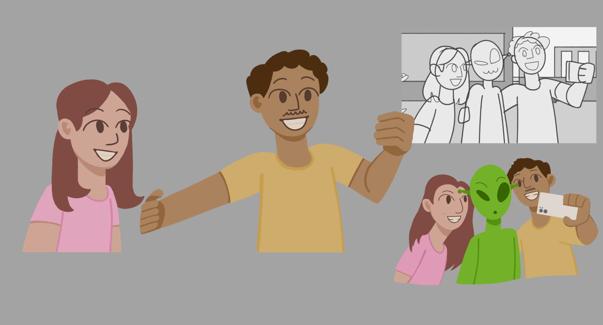
Chris used my versions of animation I sent over to work on the sound and music. His first pass includes the music, and majority of sound effects. I was incredibly happy with this first pass, but suggested to Chris some extra sound effects that will give better context to their scenes. I sent over these images to explain better where these sounds show.
Music and sound V1


The second pass included the details I requested, lengthened music and more. I am happy with this and plan to use it for submission. There are still polishes to make, so Chris and I decided to work more on this to prepare it nicely for the showcase.
Music and sound V2
Credits
I gathered a few references of credits from other films to help me visualise my own credits section. I like a simple and clear view for text, but a background that relates the environment of the story.
I had a vague idea to make a close up of a stall with toys, so I tried building a background of this using reference from my previous background builds.
In an AE file I placed text to credit myself and Chris, and a thank you (for watching). I had another idea while working, that I could add in an alien walking past for an interactive bit. I placed in an animated alien run and fixed it up to fit the scene. As they run past I masked each text to hide or show itself for a nice transition.
Exporting
With Chris’ music and sound, and my credits, I exported the video making it the final version for my major project.

DANTP_FINAL_V1
MP Production
Asset Building
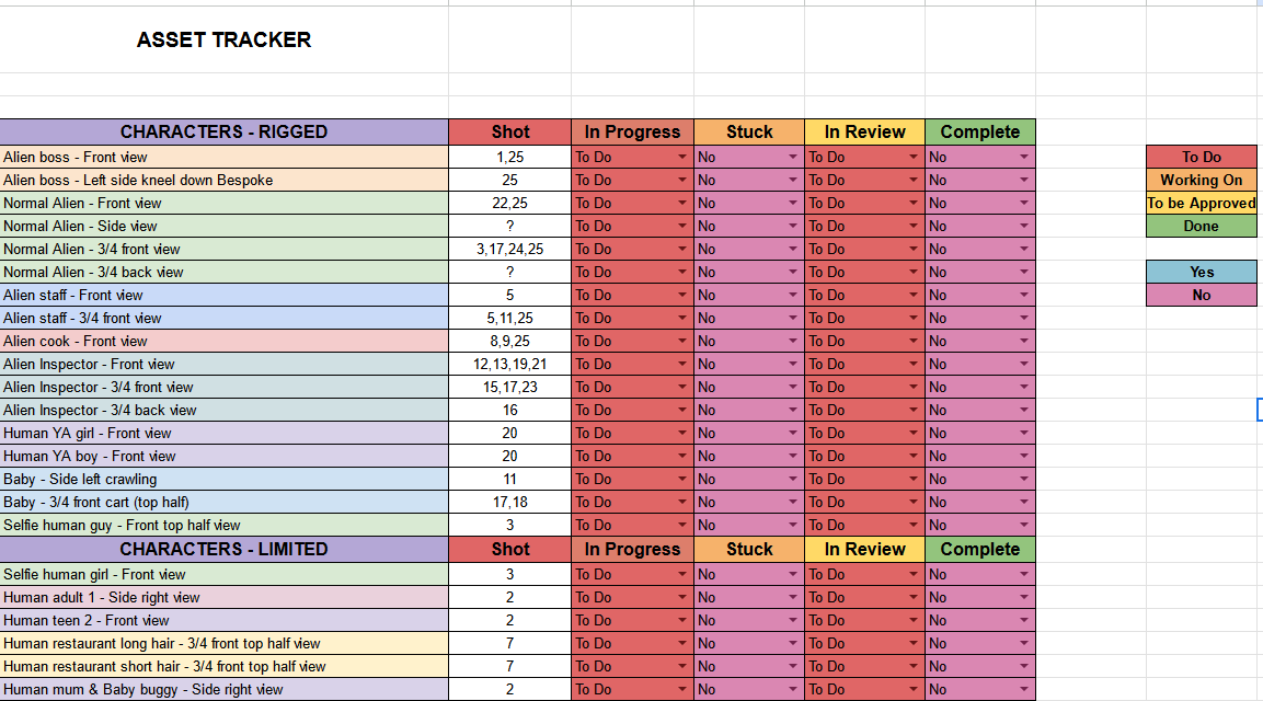
Before I started any major asset building, I set up an asset tracker to keep record of every asset I need, and what progress they are in. This helped me condense the amount of work I need to produce, taking out unnecessary assets, and adding other variants after reviewing the animatic.
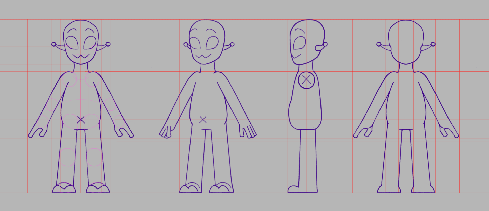
For the human characters of the film, they require key art to establish posing, colour schemes and finalised design. This will be useful when I bring the images into Illustrator to make either their static asset, or position to rig in AE.
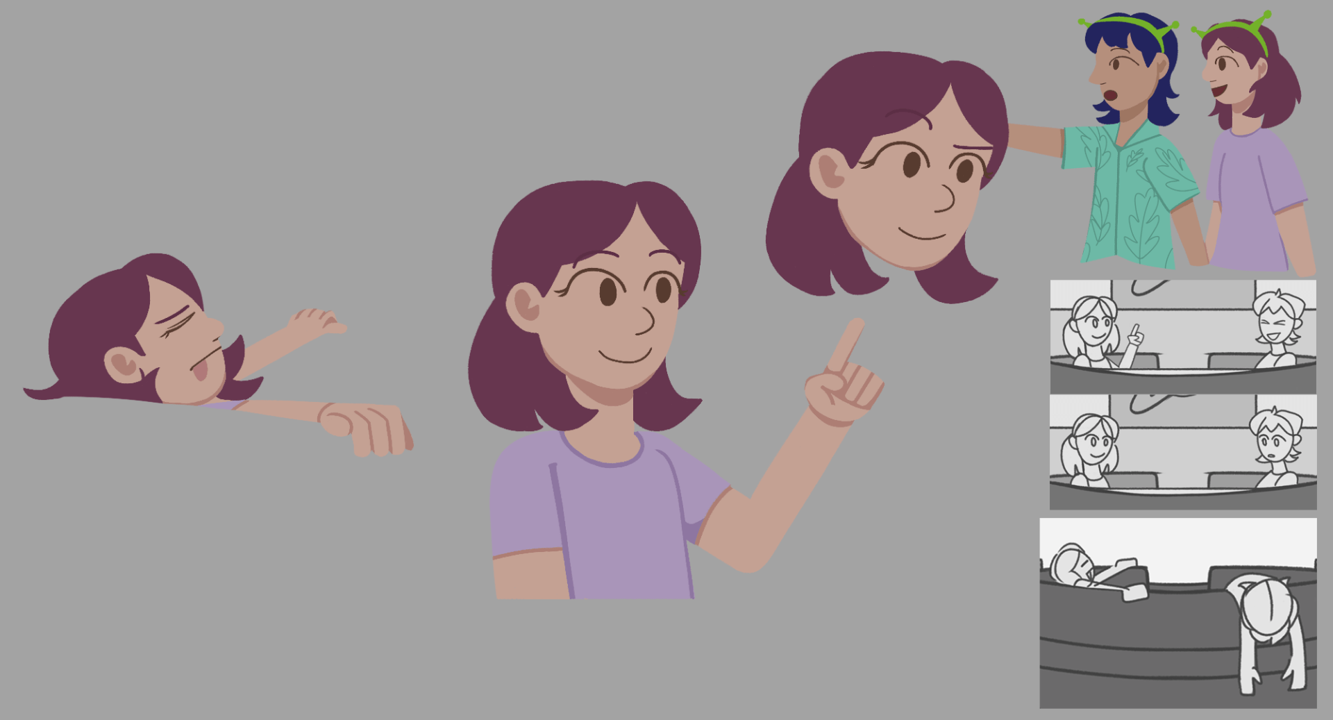
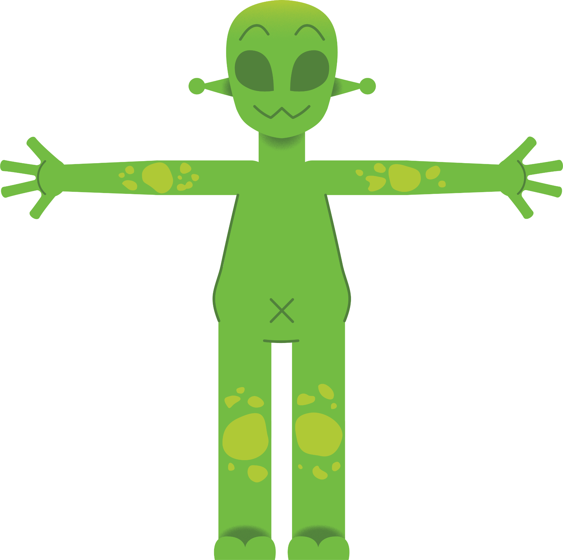

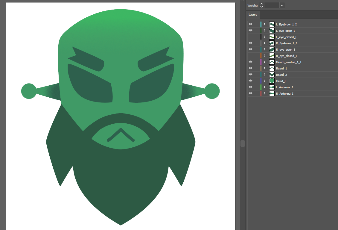
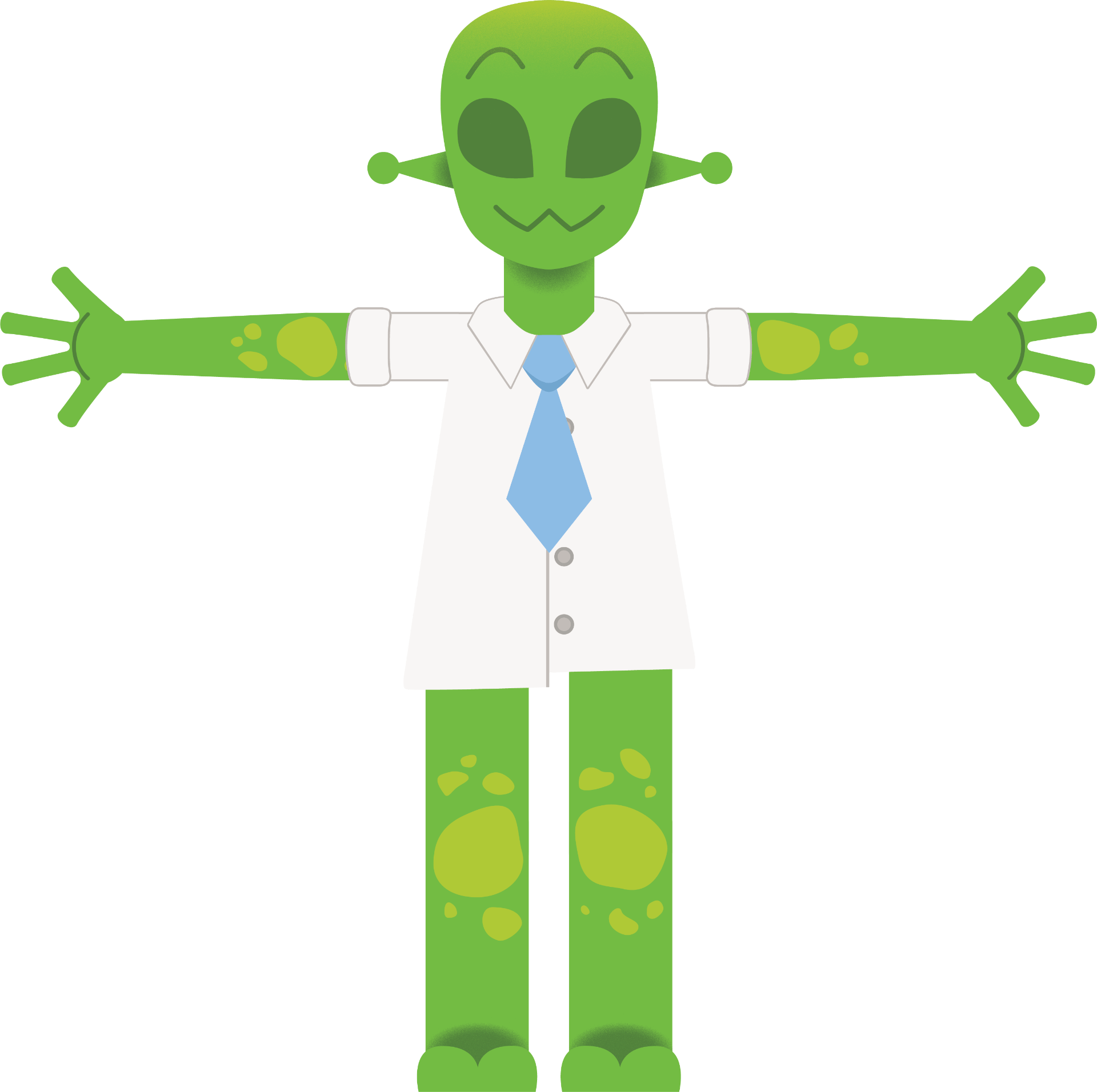
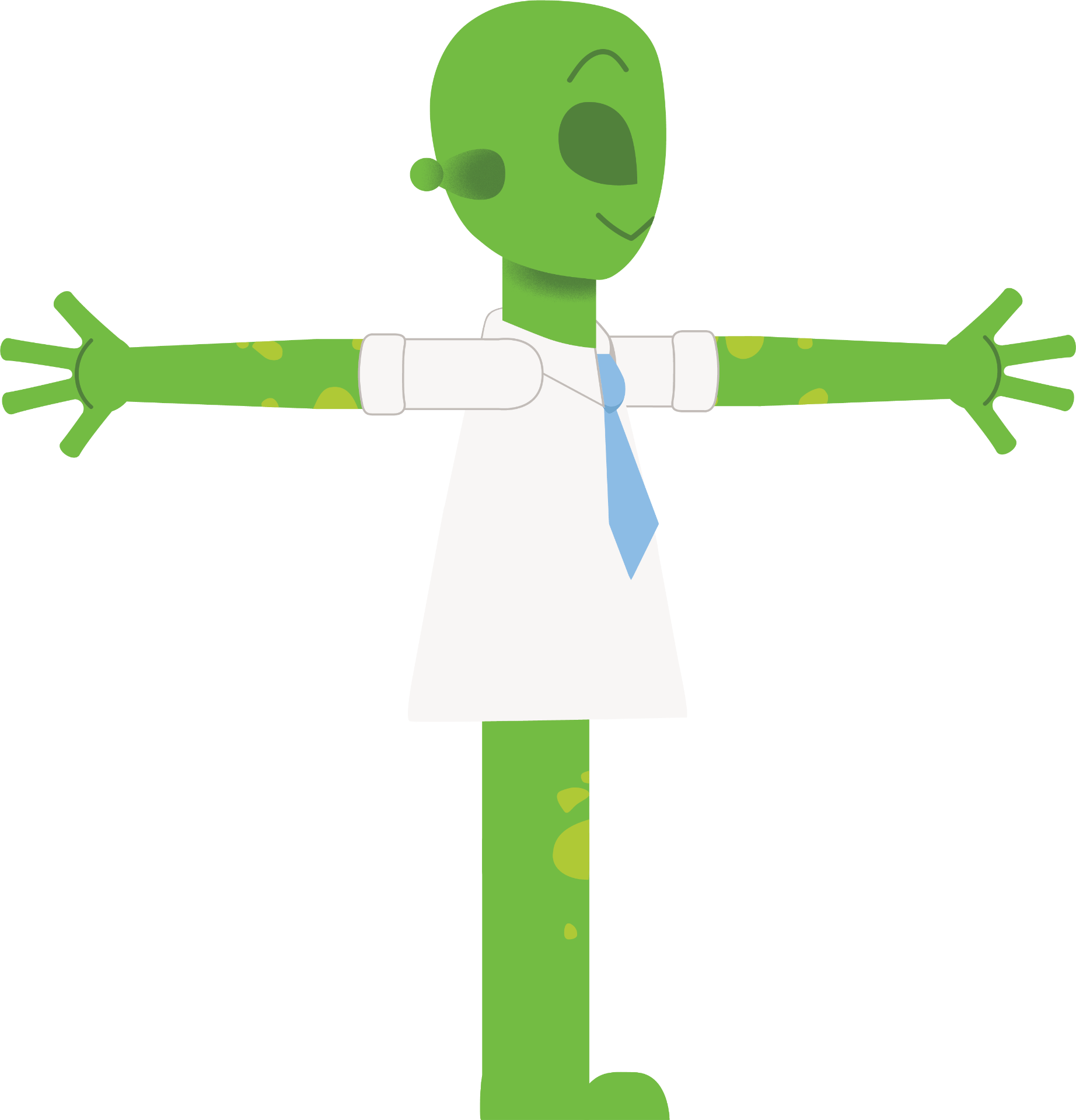
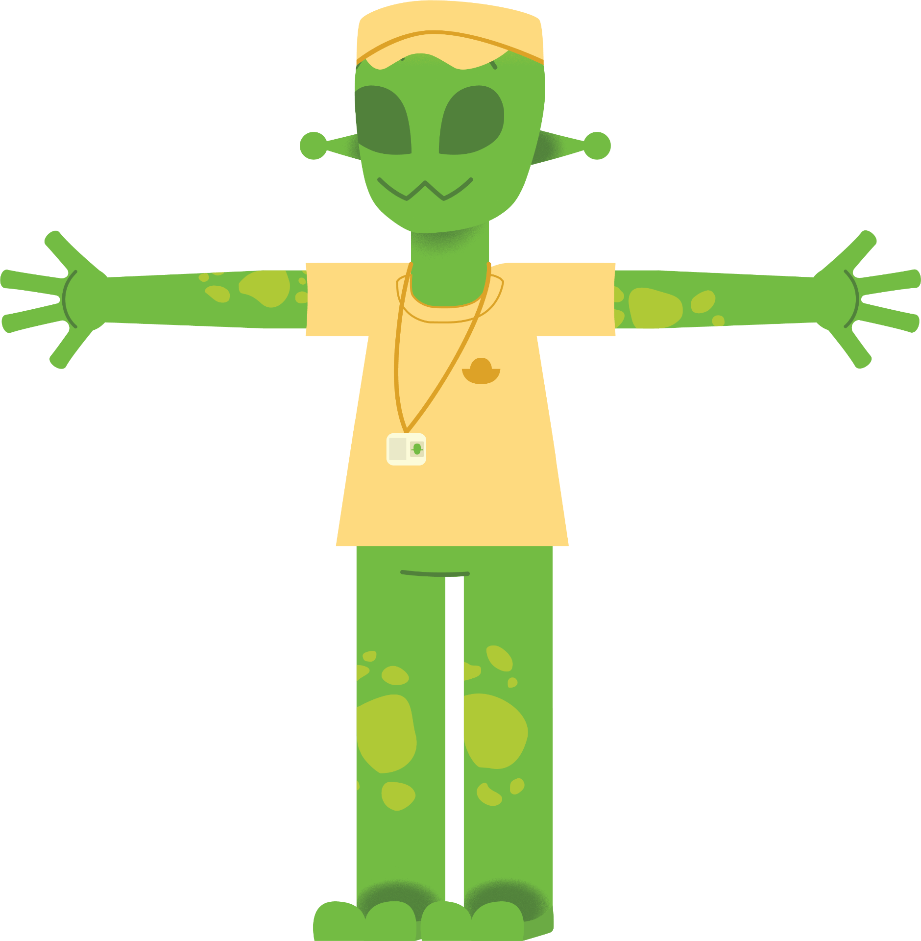
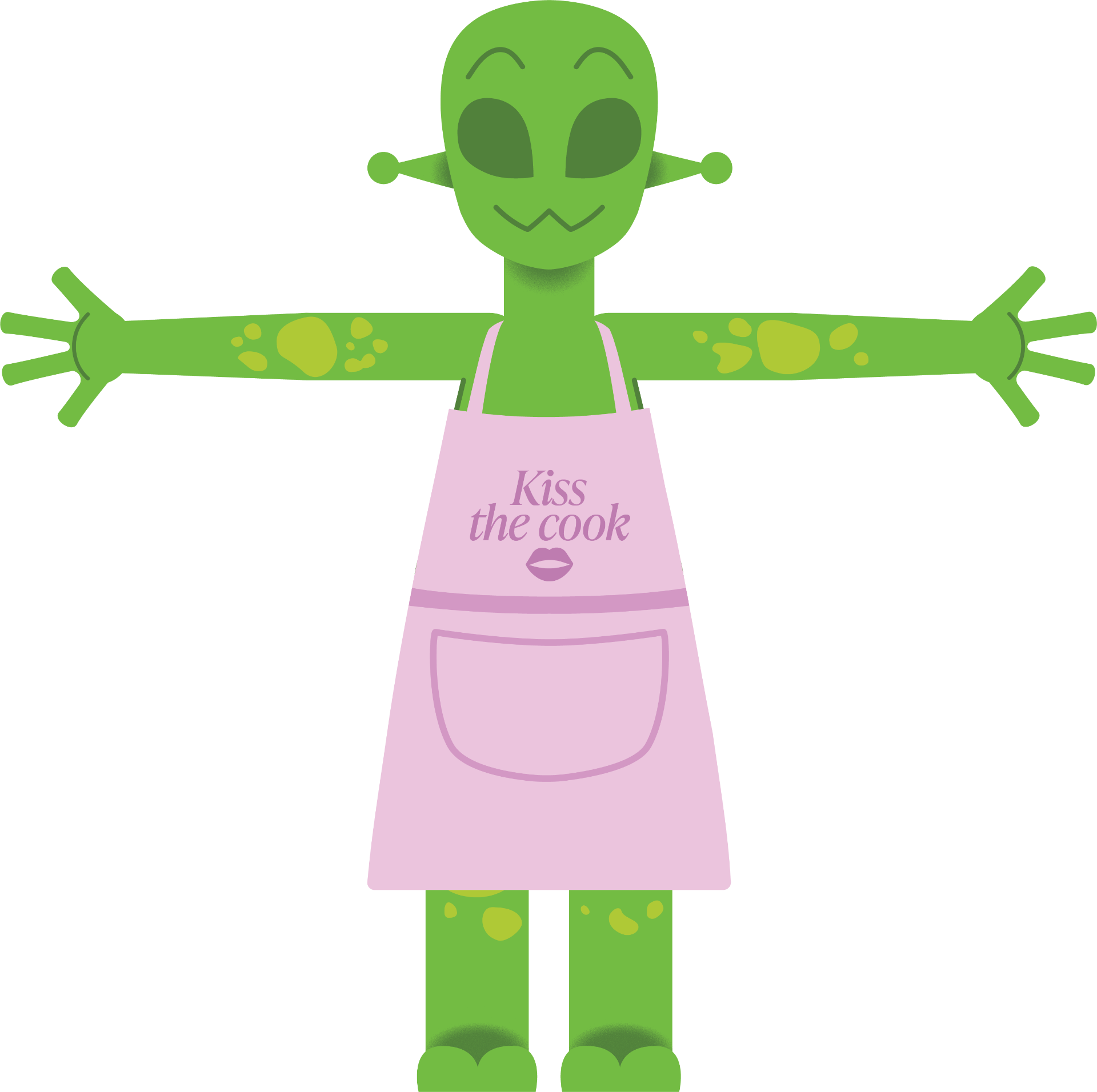
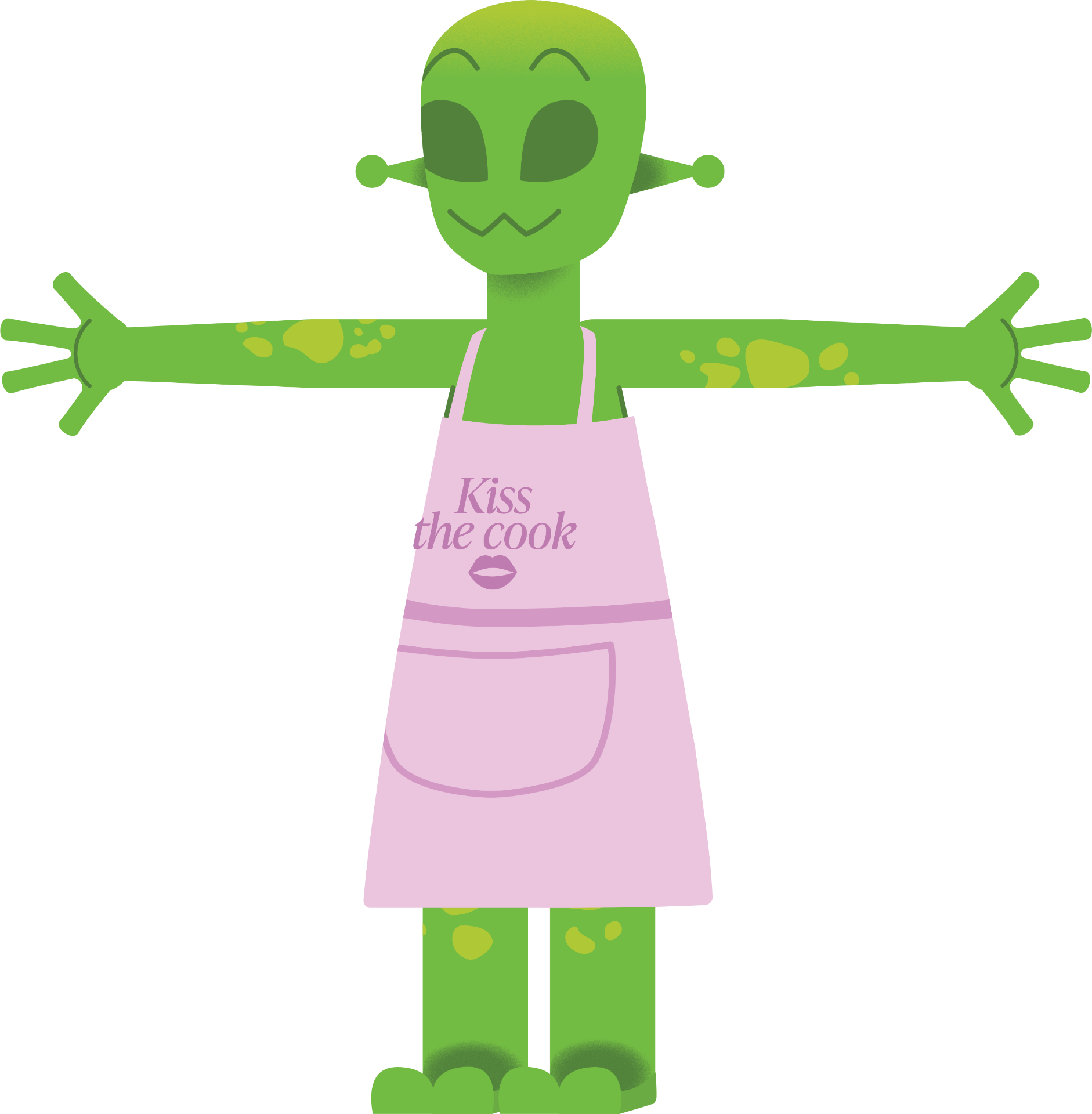
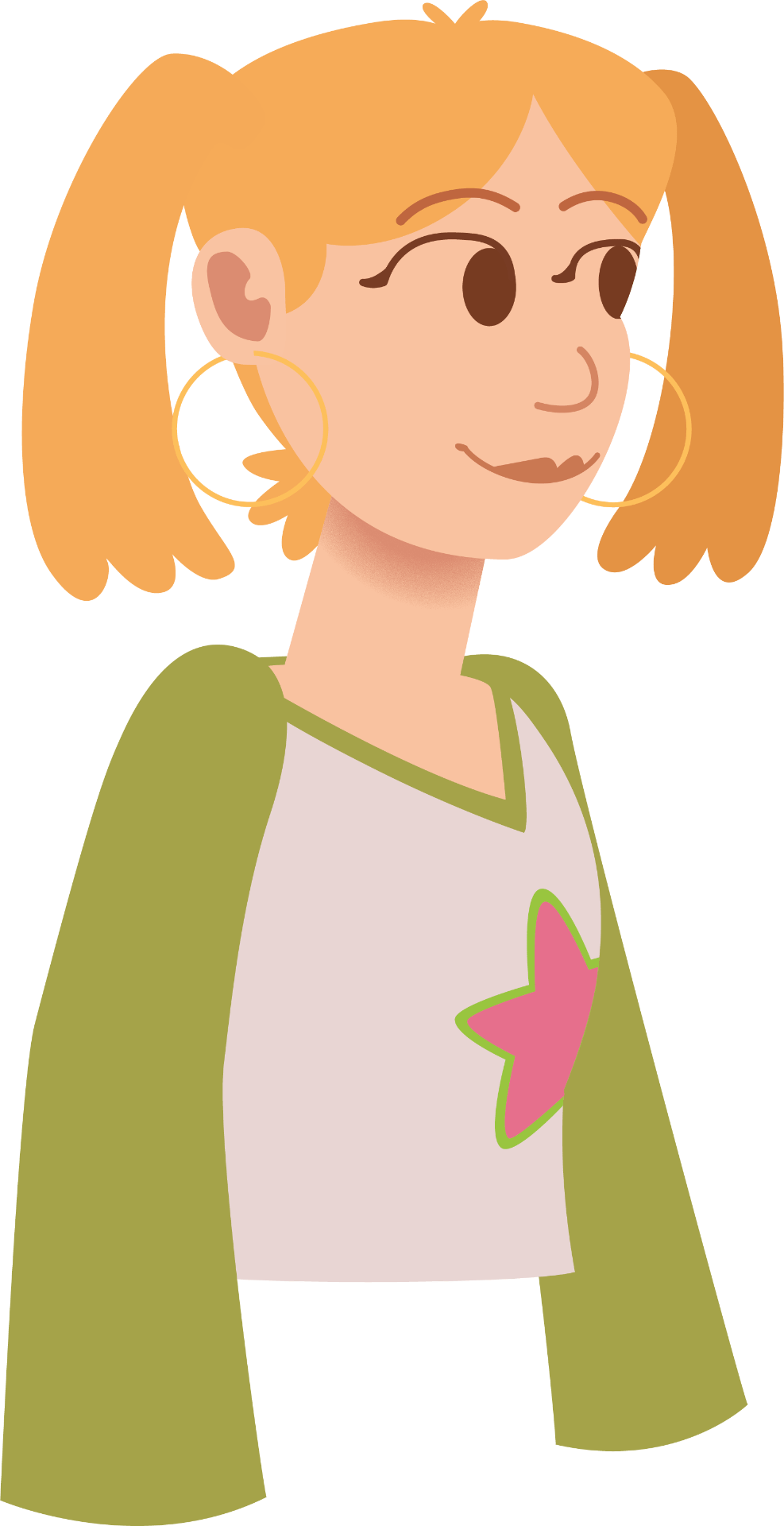
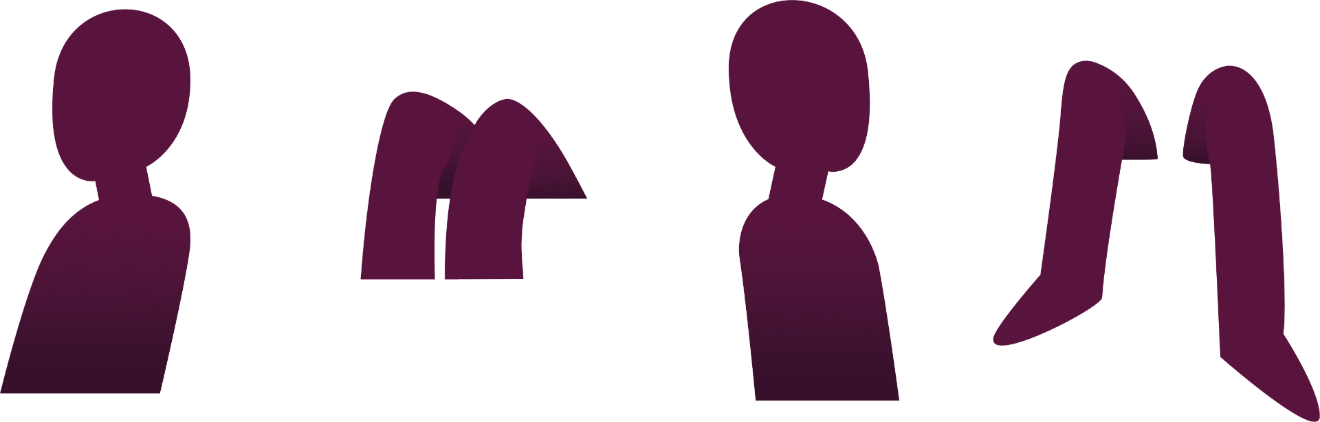
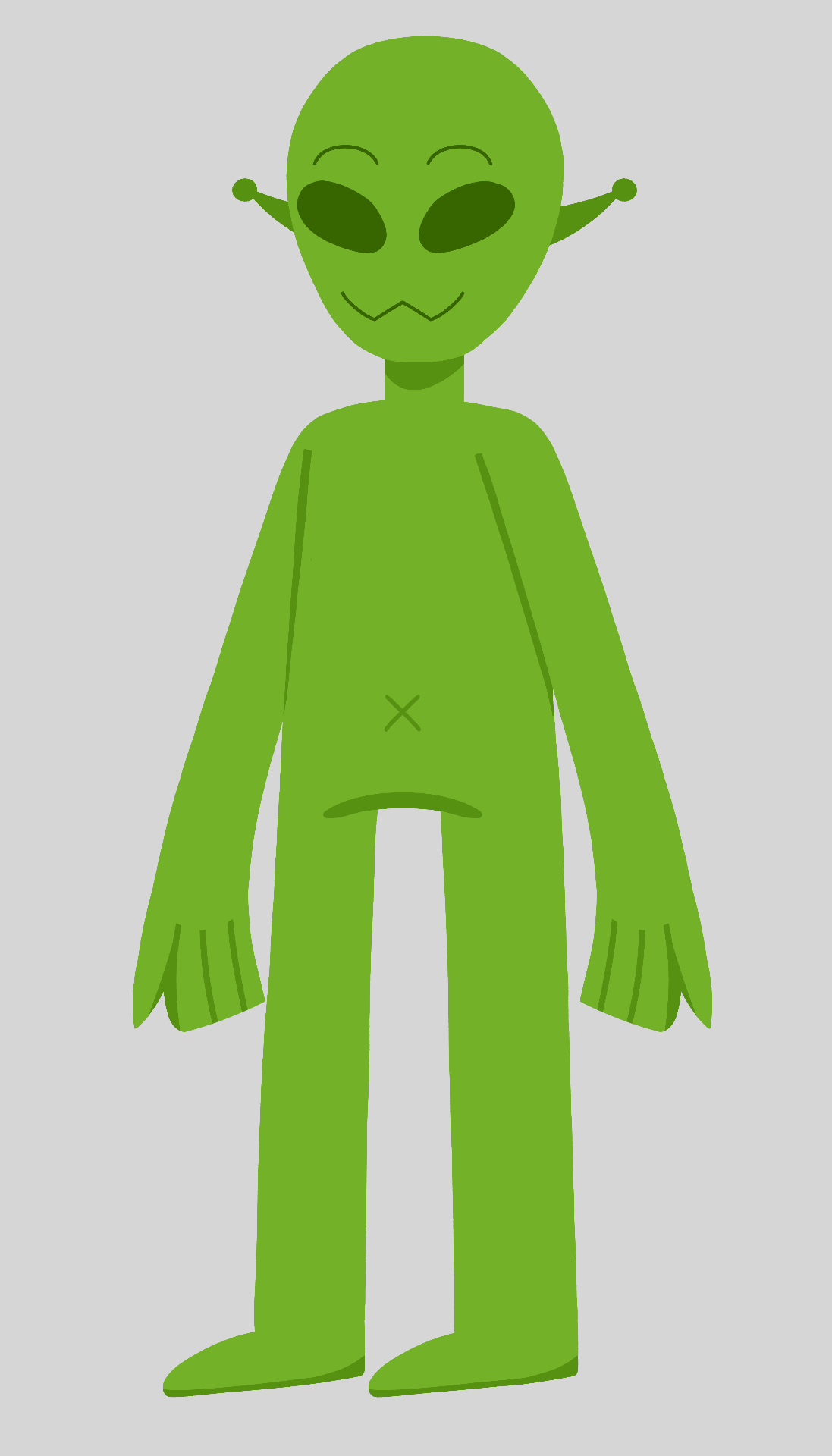
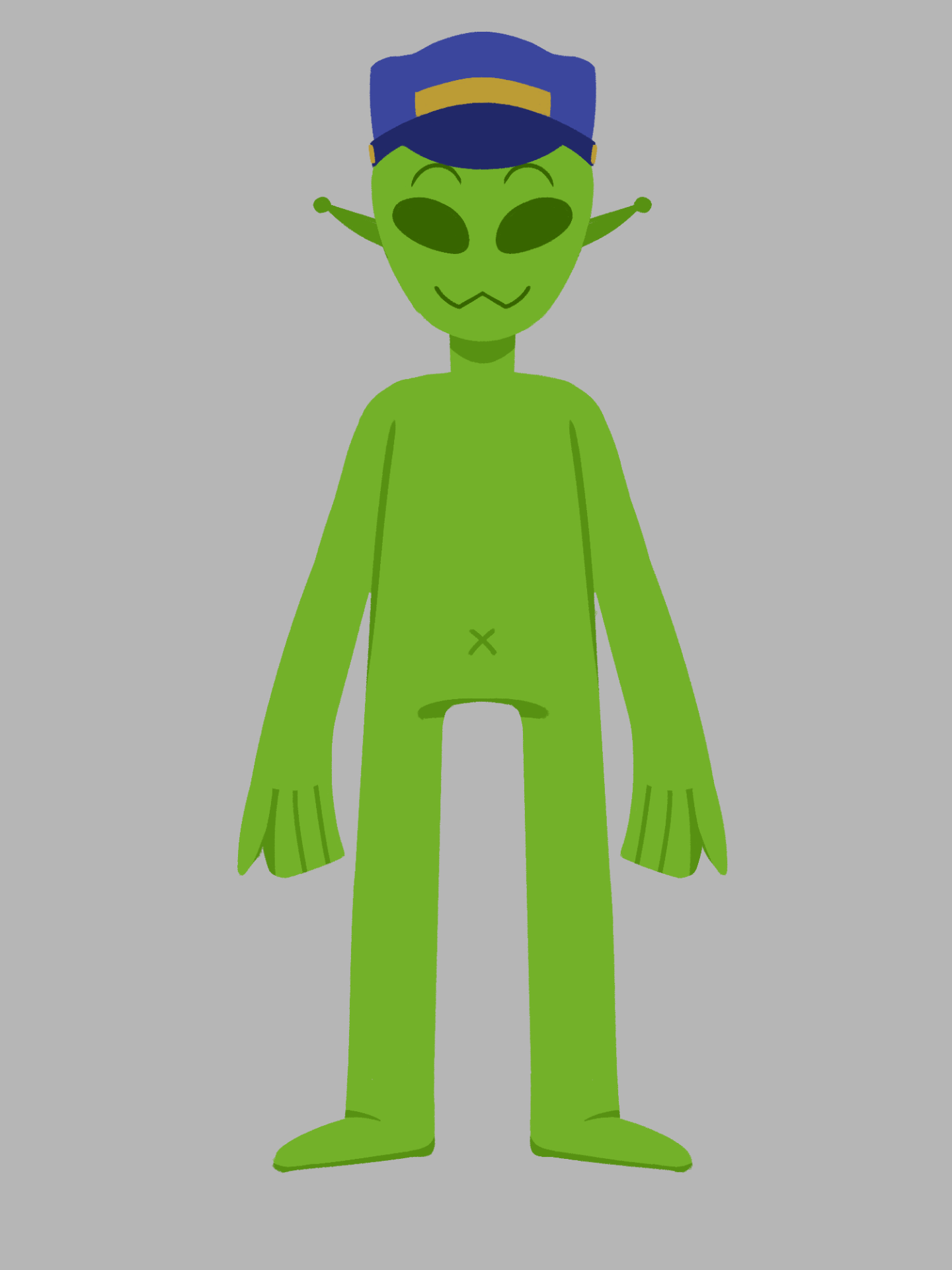
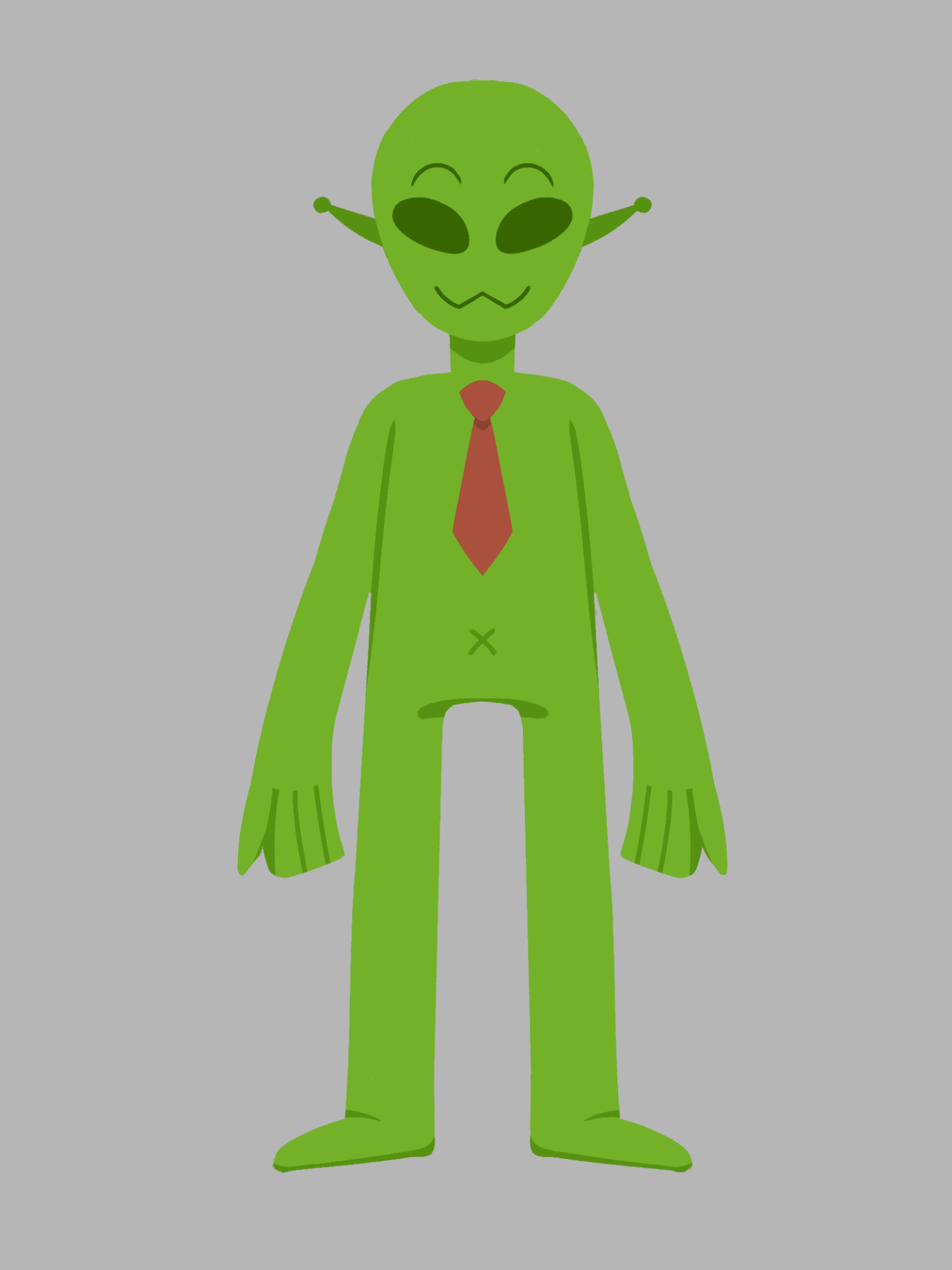
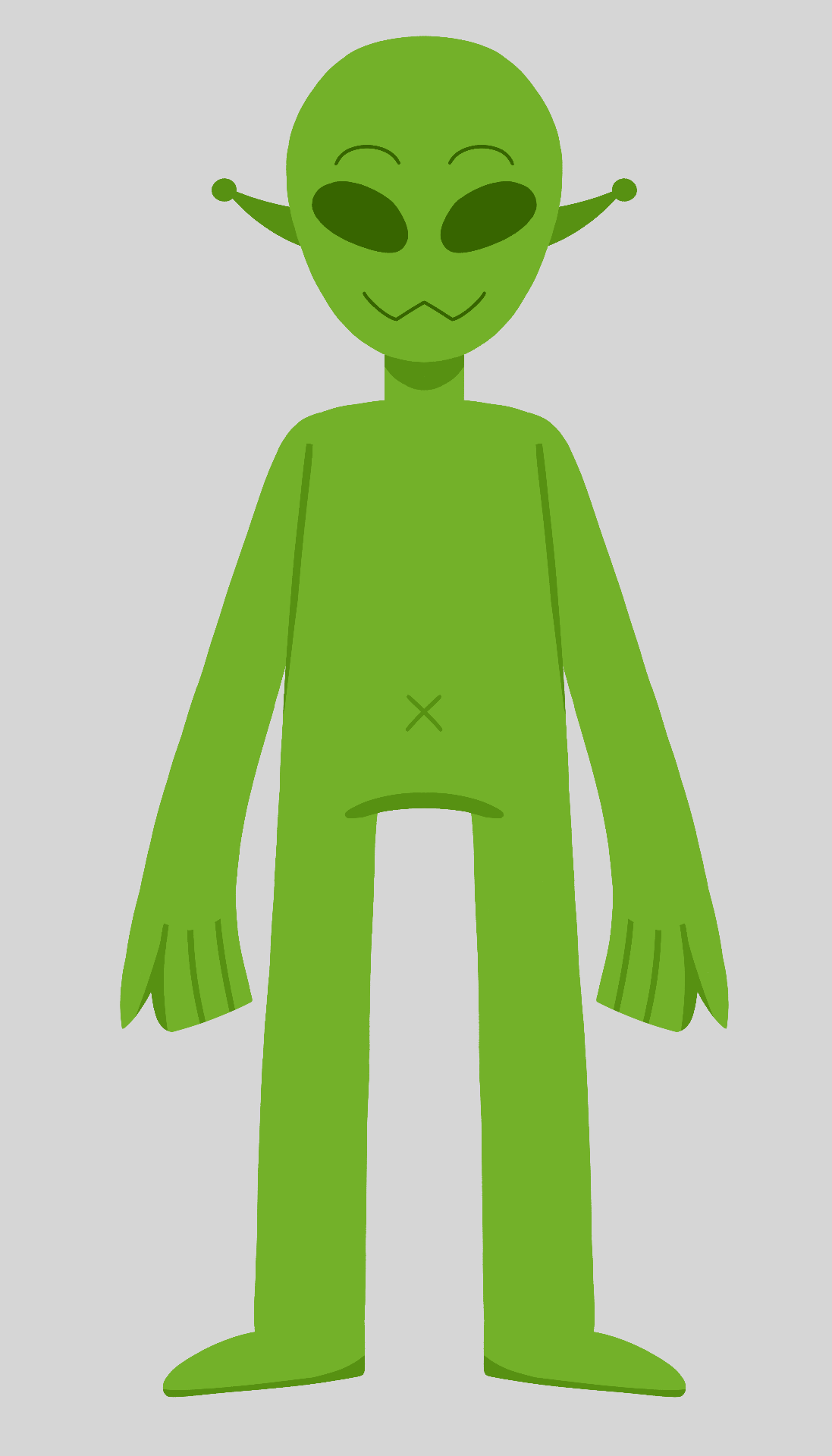
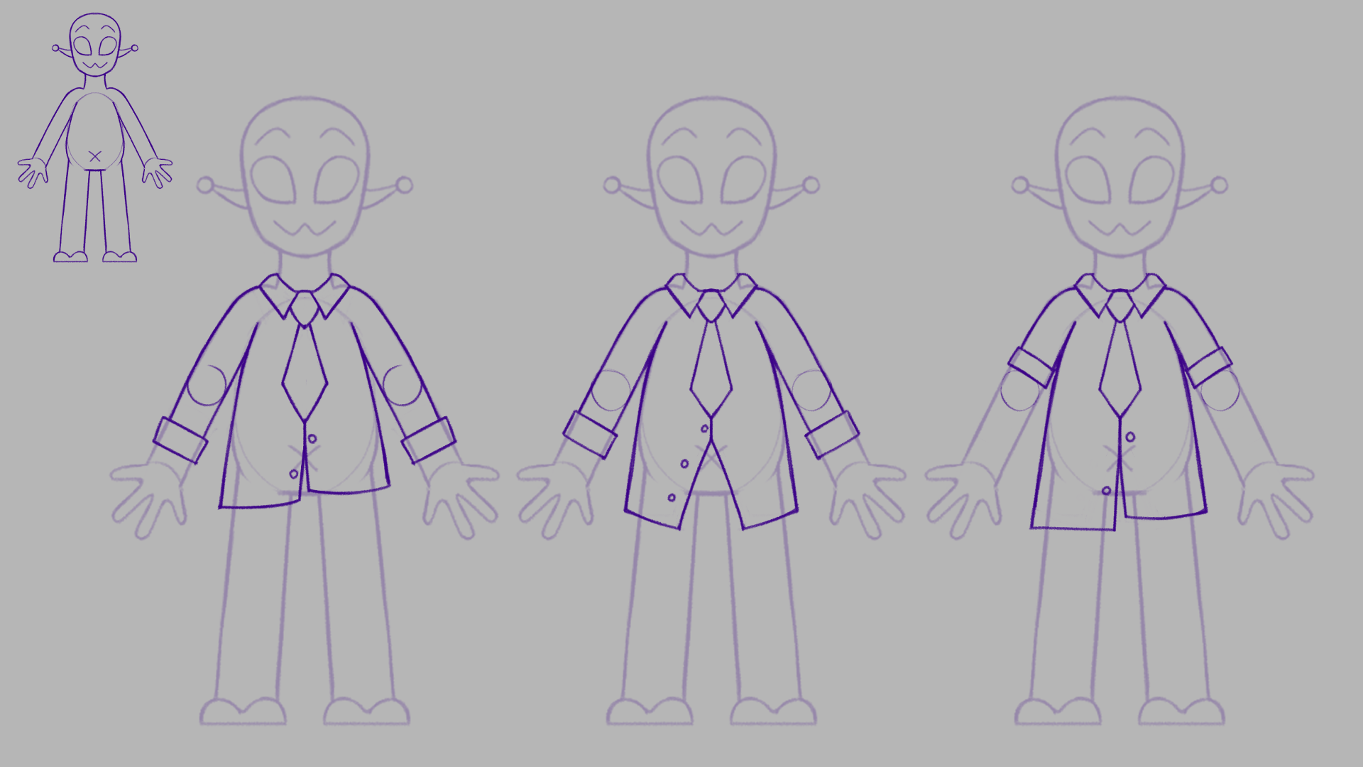
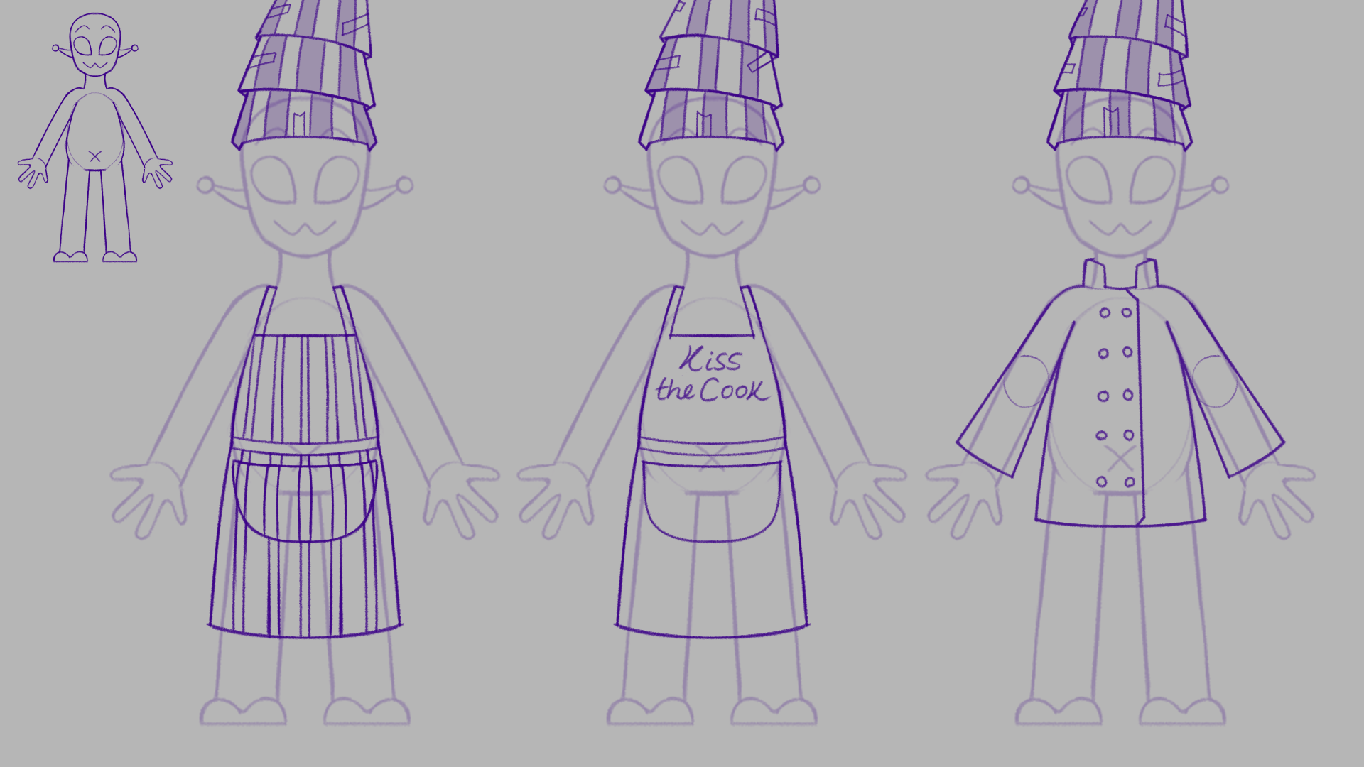
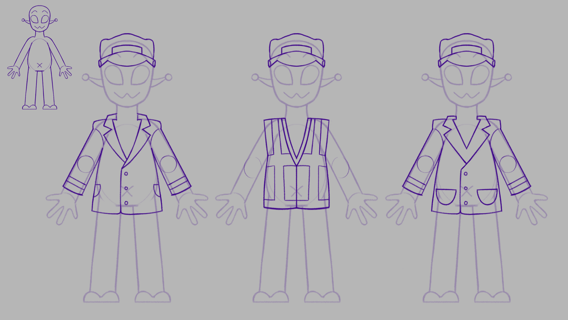
Here are the builds of the Normal Alien and Alien Inspector. I kept the alien mostly like the experiment apart from altering the layers, and the arm pattern, where I experimented with blobs of lighter colour in alternate shapes and sizes. This makes the alien visual a lot more interesting and differentiates them from the humans.
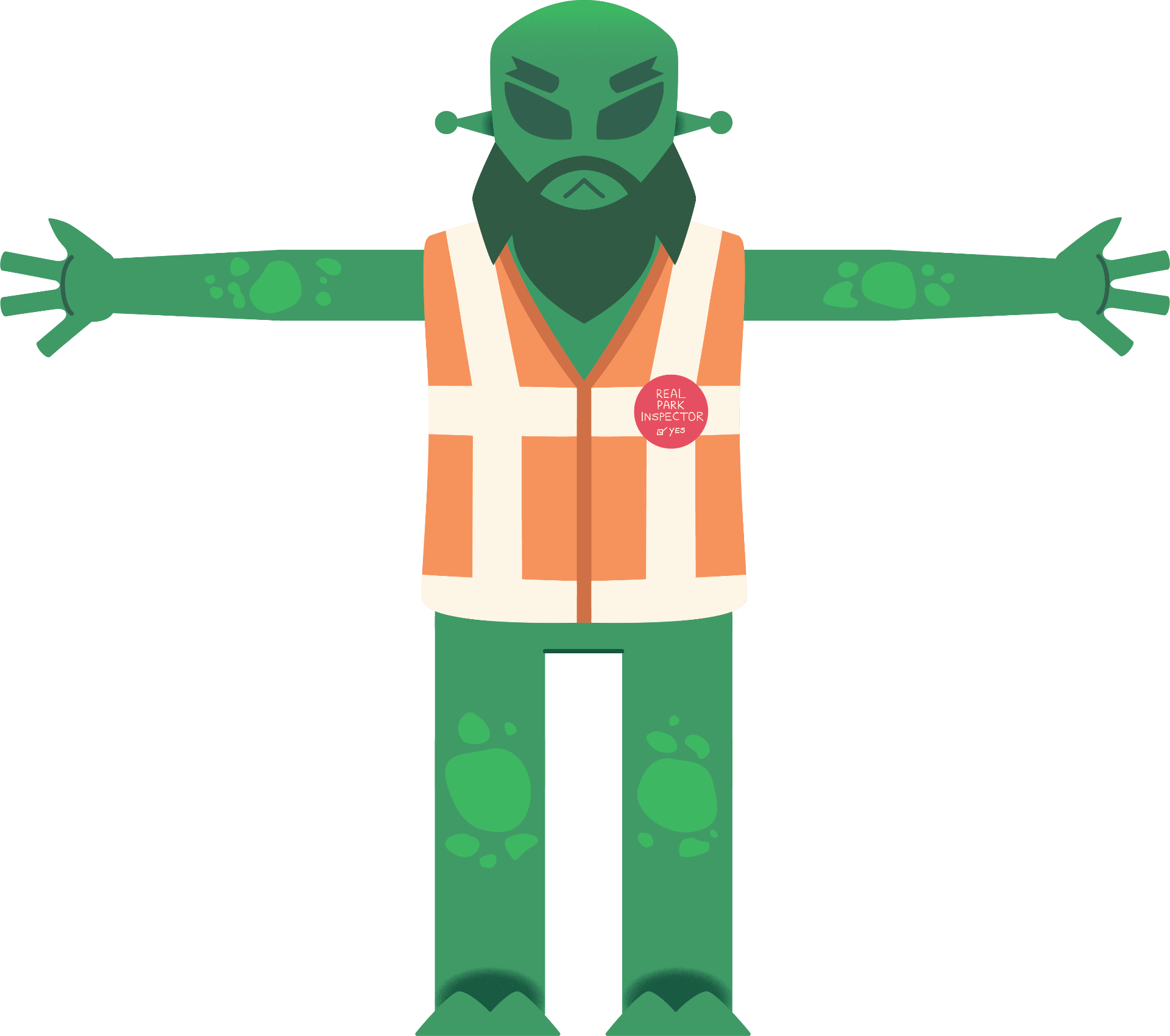
I applied the same visual to the inspector, though I added the vest, pin, beard, and alternate eyebrows to them. It’s good we can see that the inspector and aliens are the same species, but the inspector will stand out as a unique character with the alternate colouring, and sharper features.
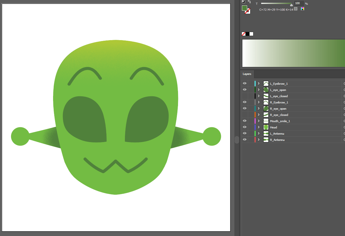
Overall, building characters in Illustrator was strange at first as I had to refresh myself with its tools and abilities. However, the process is going very well now. Building each part in vector shapes is much easier than painting each part like in photoshop, and the files import into AE seamlessly.
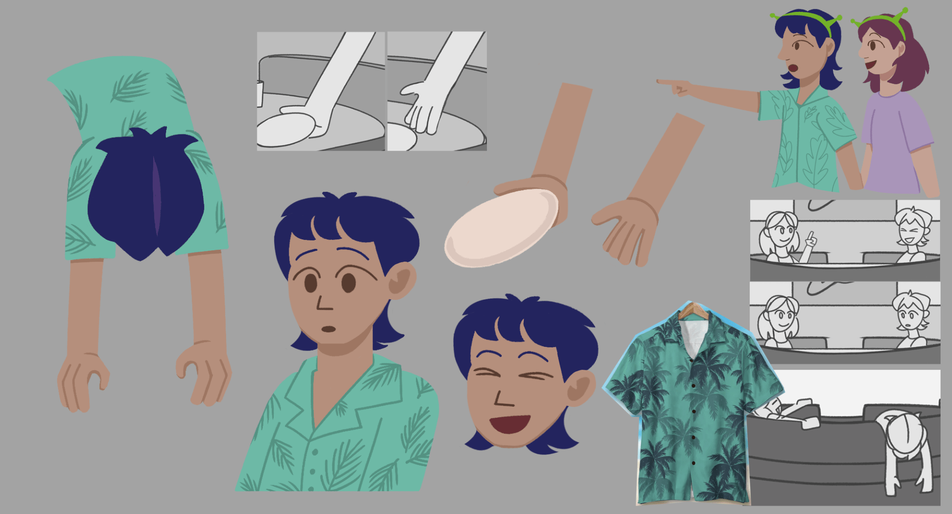
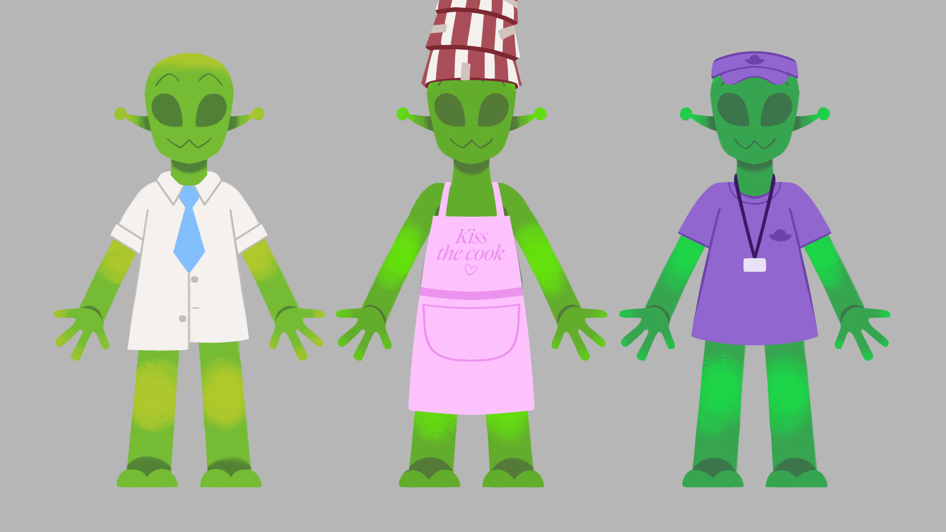
As for the aliens with clothing on, I added to the parts of the body already made, such as the torso, hip and arms, or made layers for additional pieces like collar, tie and hat. This process went smoothly, and I like how each piece of clothing contrasts with the alien’s skin colour.


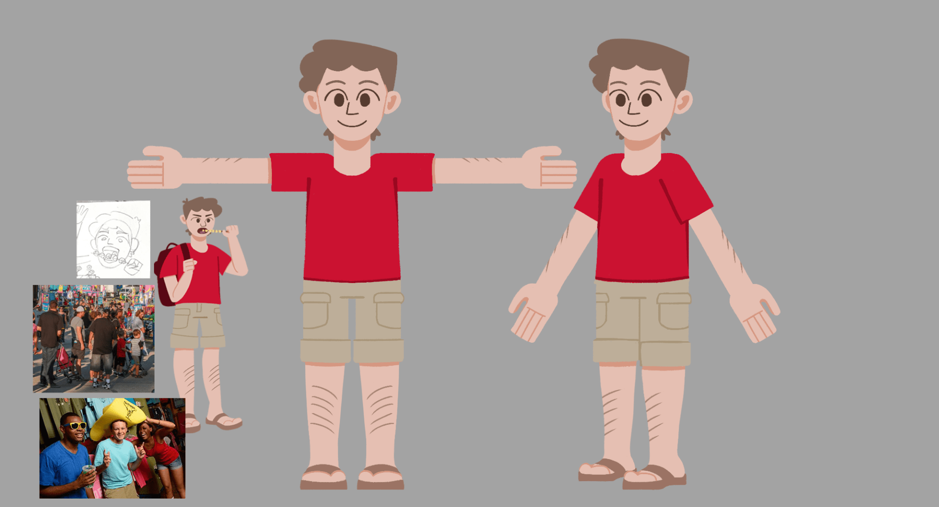
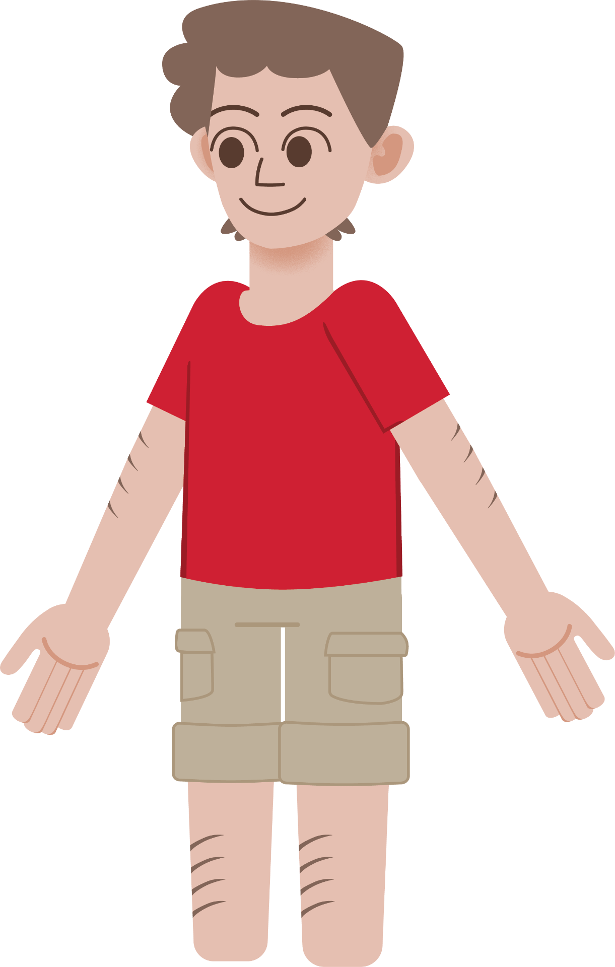
After building the aliens, next was to build the human/background characters on Illustrator. Those that will be rigged have most of their build in separate layers, and those that are static are in limited layers.


Props were also built on Illustrator. Using the pen tool, gradient effects, and clipping masks, I designed props to be on characters, held by characters, or in the background.
My major props include the laser gun, the alien phone, and the popcorn boxes, as they frequently appear in the film as props the characters use/hold. Props that are animated include the food trays / cups, balloons, and carts. The rest are standstill objects or appear on a character etc. the badges.


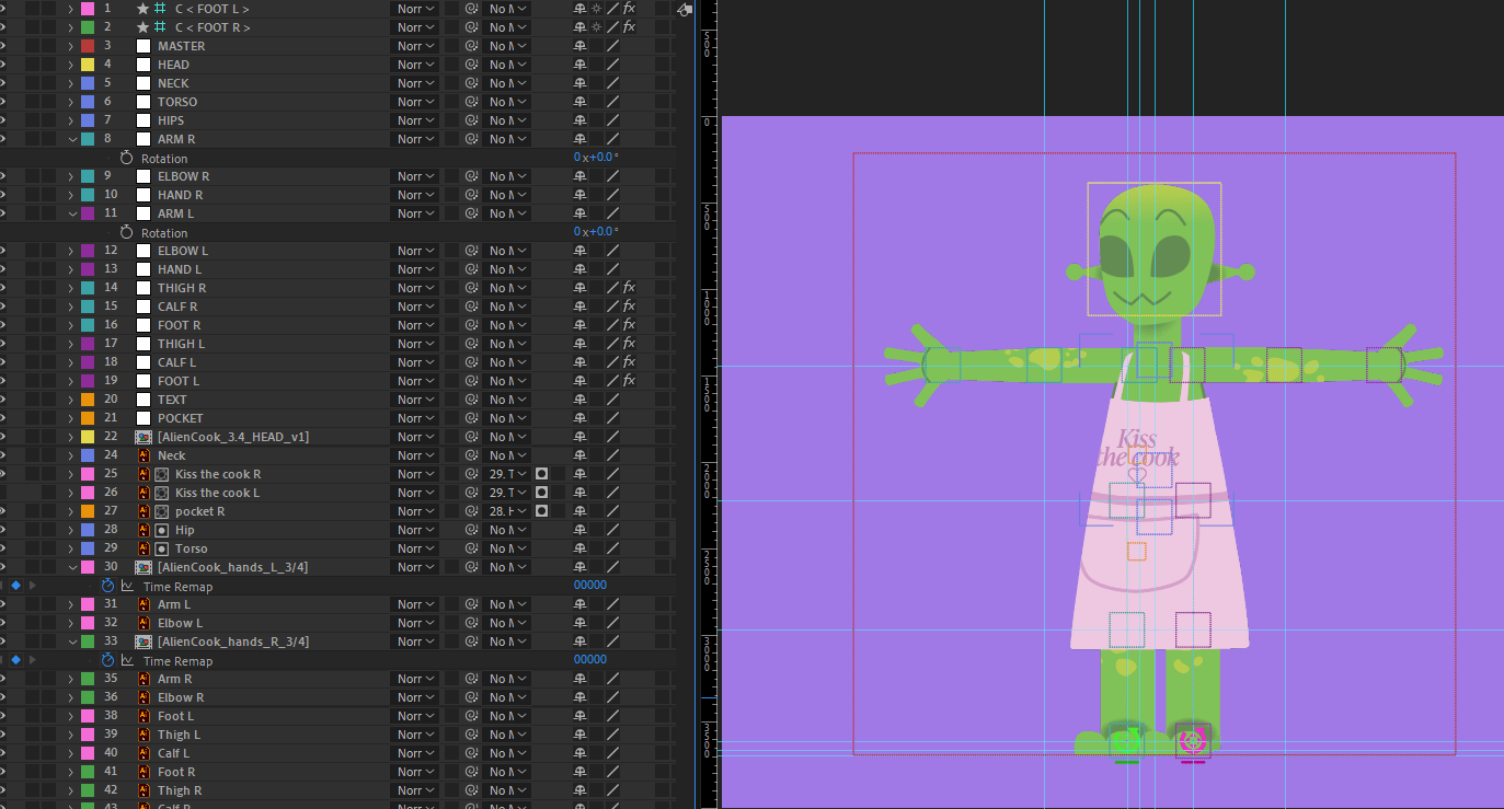
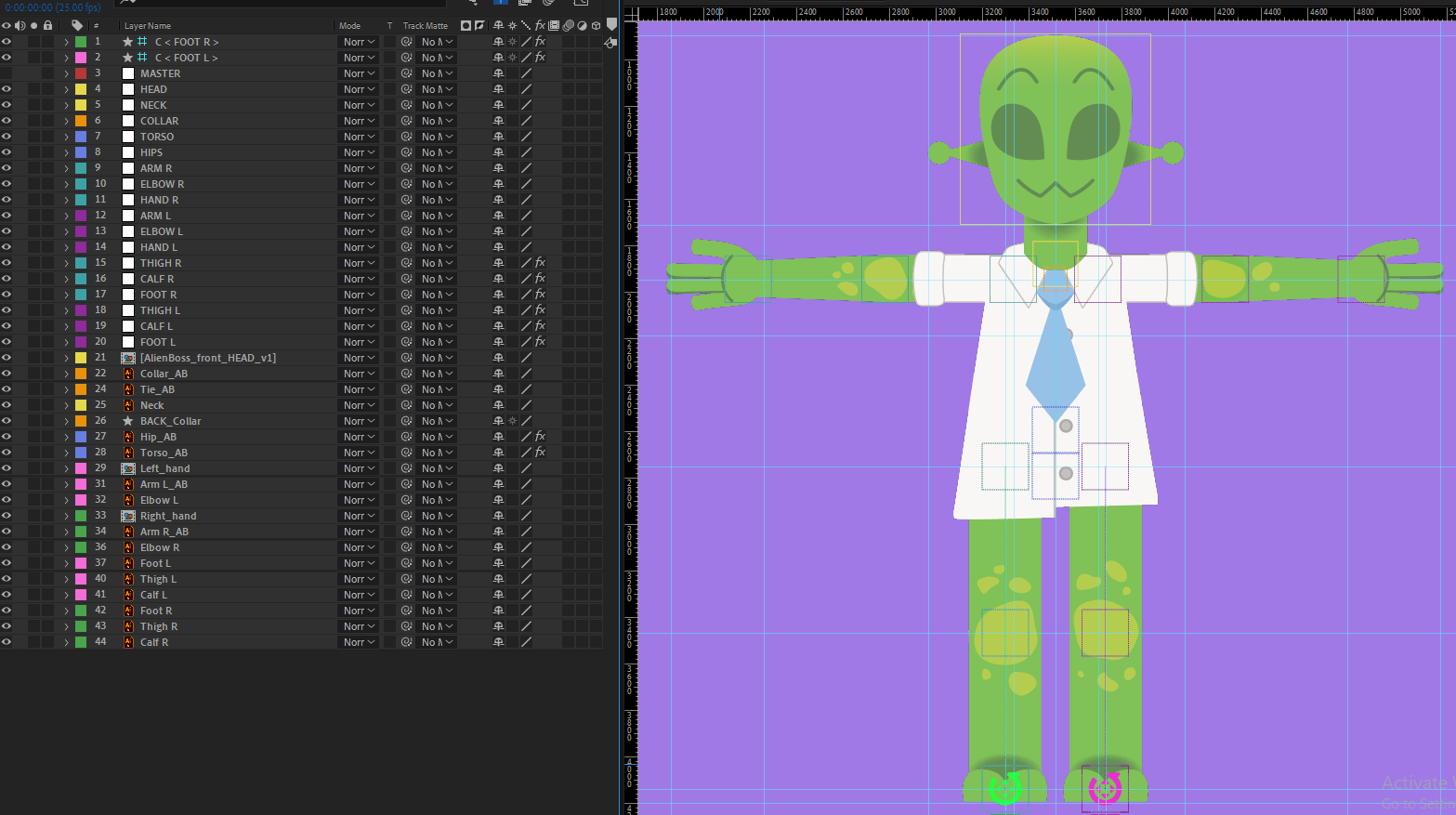
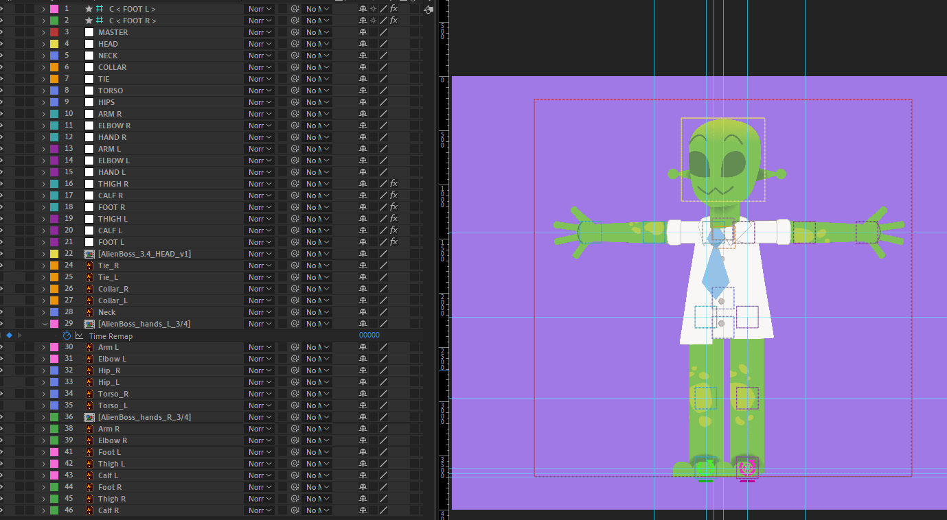
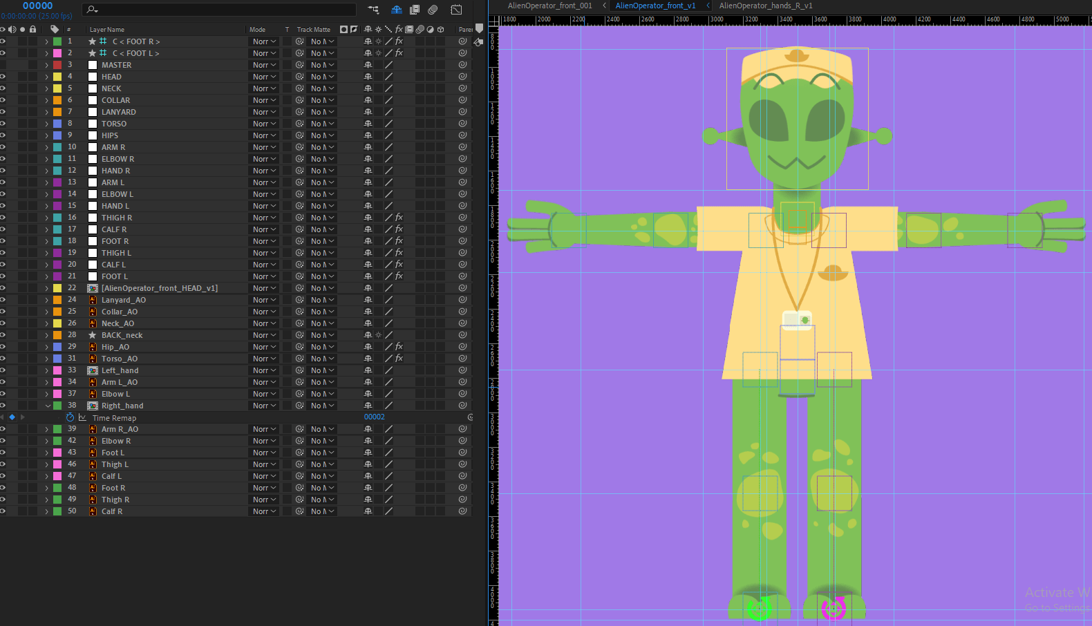
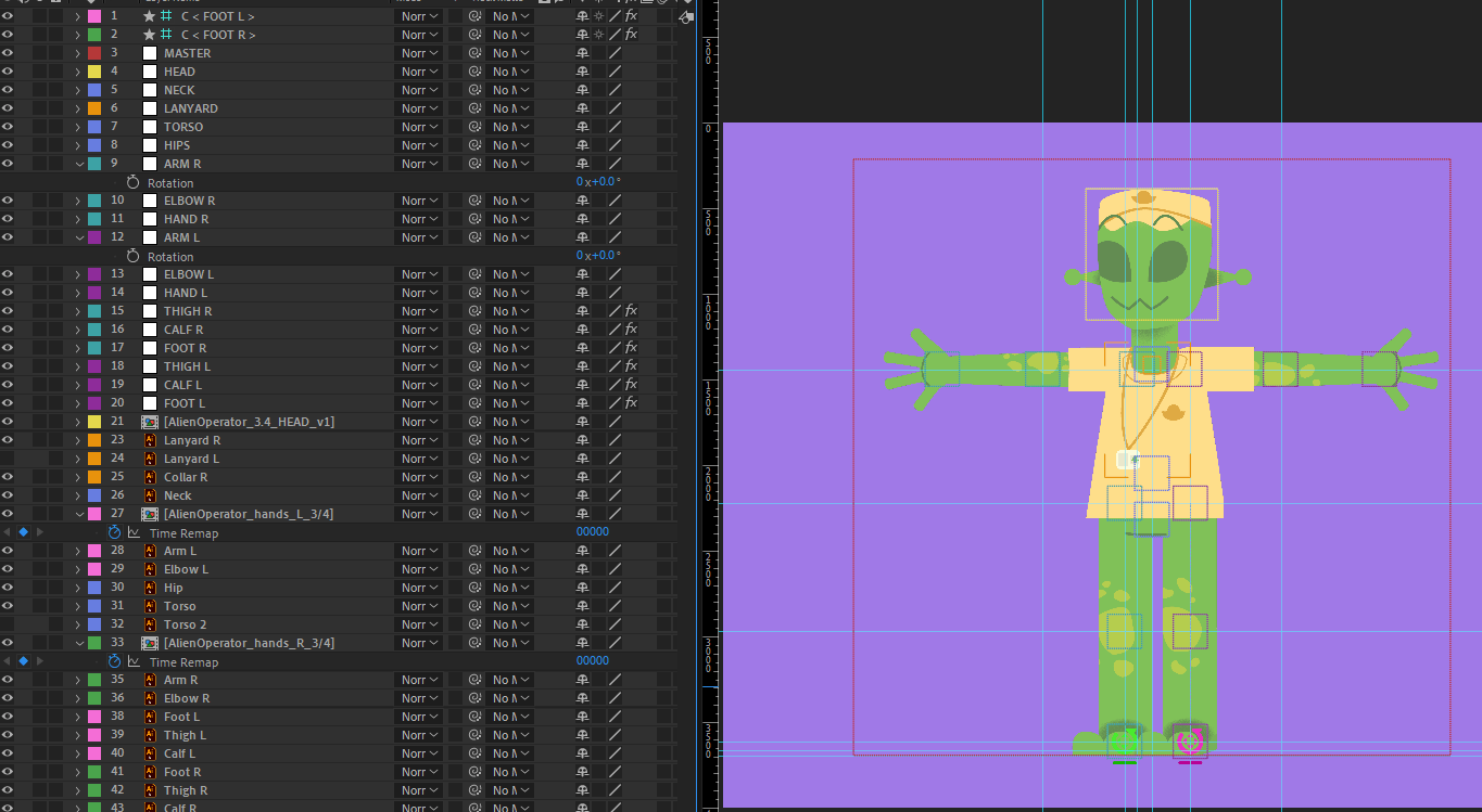
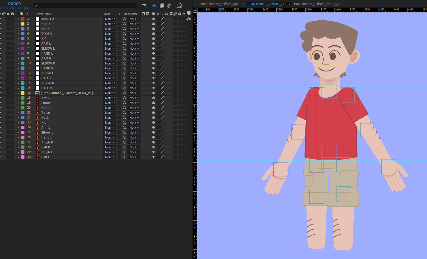
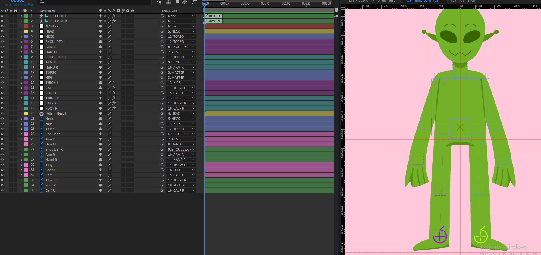
Rigging
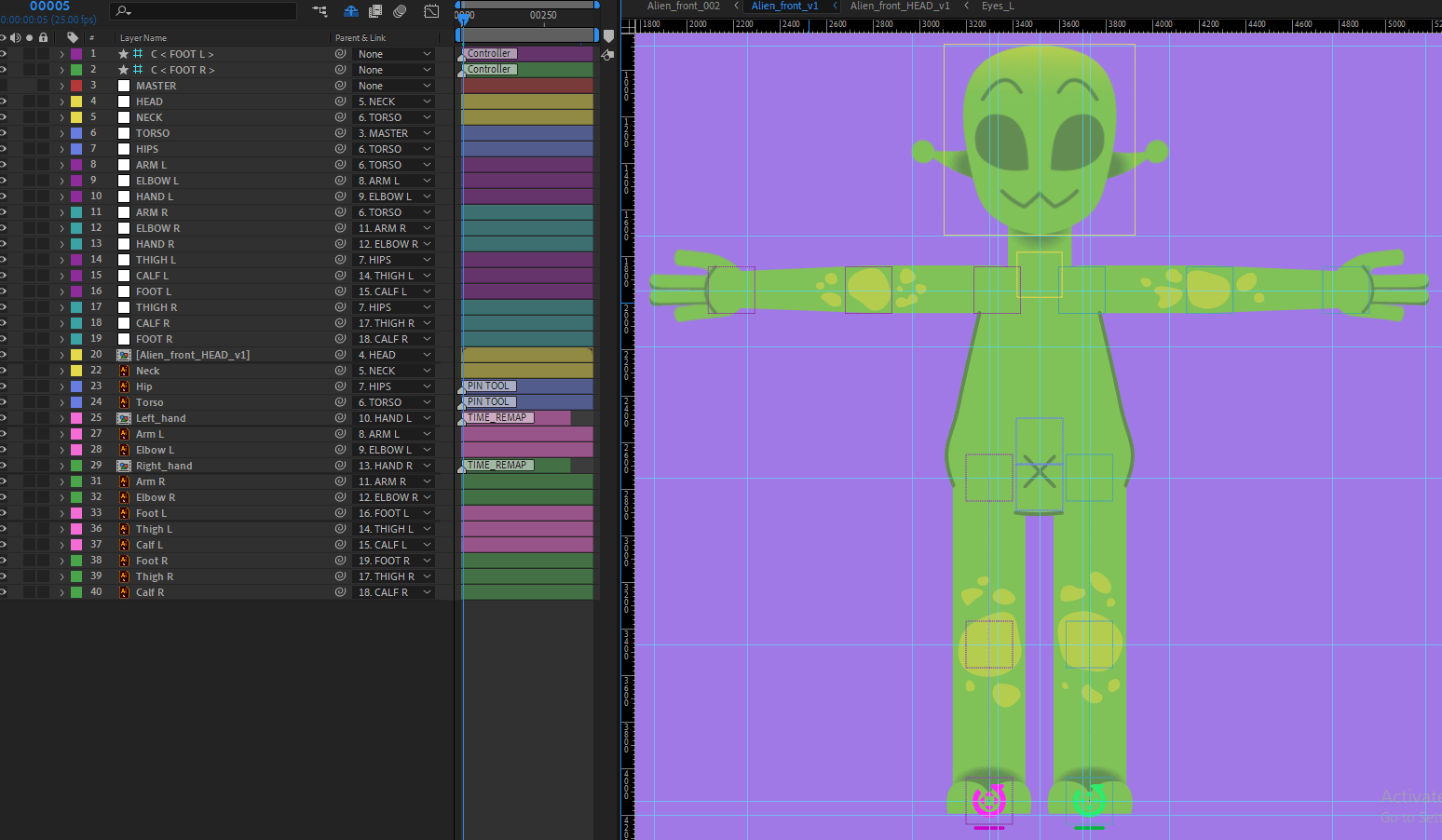

Rigging is a tedious process but an especially important part of my project. I will explain the process in order:
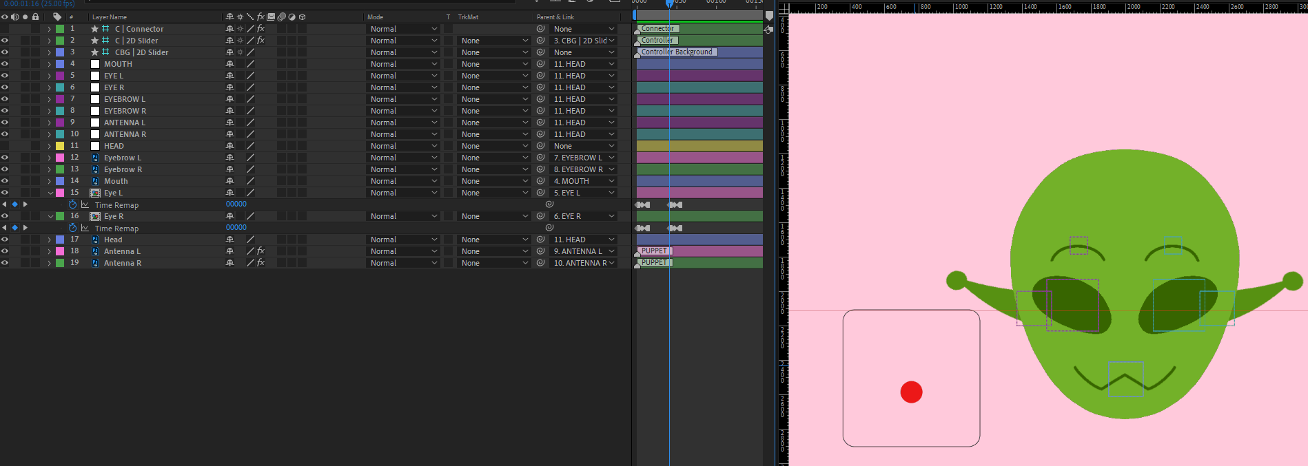
- I import the illustrator file into a new comp and set up the right size/ratio.
- I make sure each body part is masked to its size, and the anchor point is moved to where the main position of movement will be.
- I make nulls of each body part, labelling correctly, then placing the nulls to the anchor points of the layers.
- I parent the layers to their labelled null, and parent the nulls together based on hierarchy e.g. Hand to Elbow to Arm to Torso.
- I place an auto rig on the legs from the DUIK plugin. This helps keep the feet grounded to the floor, and it is easier to use for walking animations.
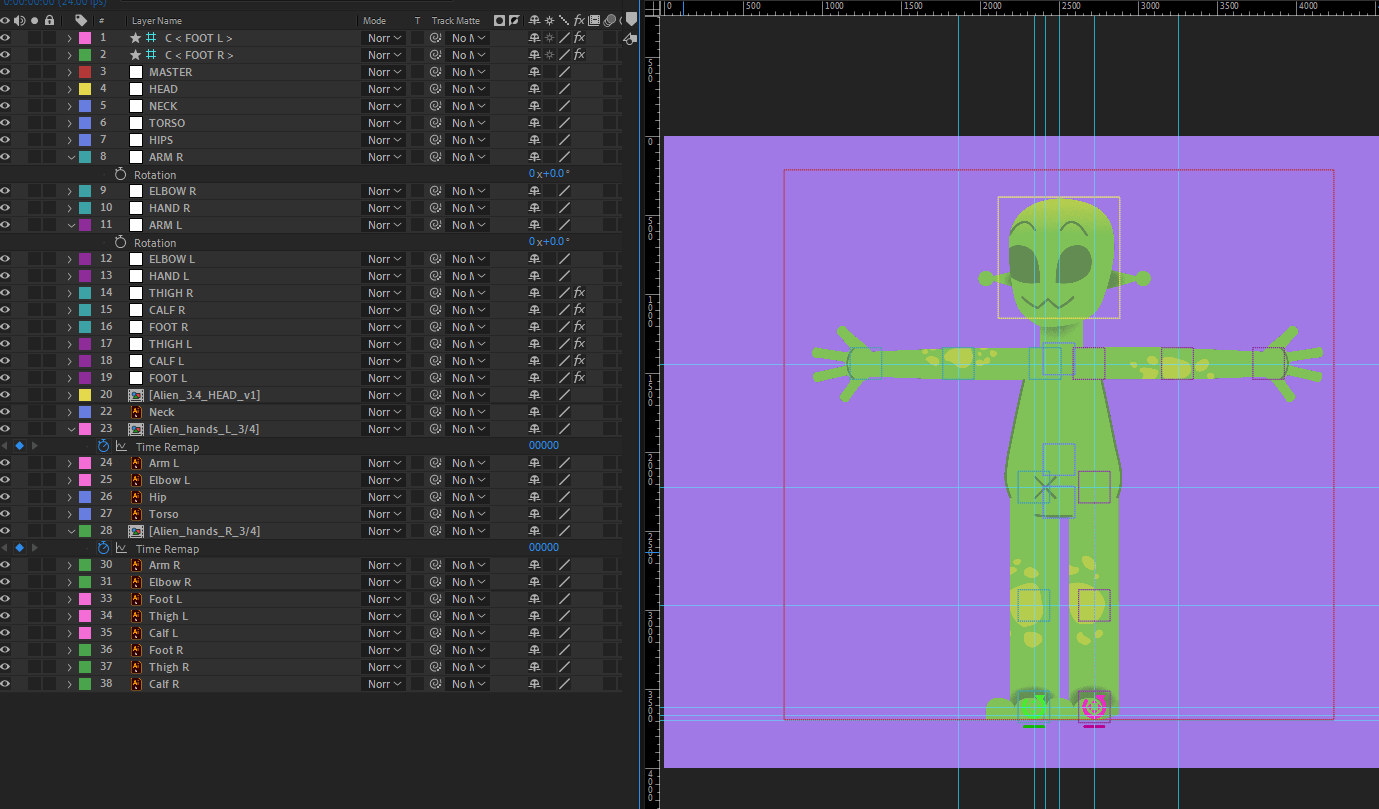
As for the head the same process applies, but more is included:
- To make a head turn I keyframe the up, down, left, and right position of each part of the face.
- I highlight my keyframes and add the properties to a 2D Connector from the DUIK plugin. This remote then allows me to move and keyframe the head position.
- I also apply a jaw turn for a better look when the face turns left and right.
- I apply a slider control effect for the eyebrows and mouth so that its multiple shapes can be swapped over for different expressions.
- Eyes are keyframed to blink with shape layers.
- I place pins on the antennas so they can warp to alternate positions.
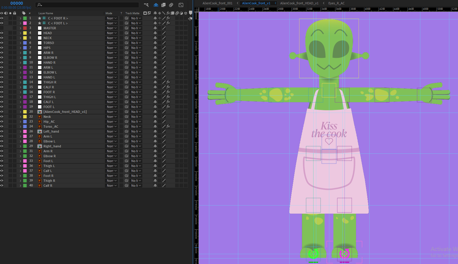
Since the front alien is rigged (and 3.4 view), I can copy this file add in the aliens different clothing, save them as separate files, then I get already rigged versions of Alien Boss, Alien Operator and Alien Cook, with just little amount of adjustment on each one. This helps speed up the process to move onto the next rigs.
The same process is done for the inspector; however, it required a bit more work on the head, especially the beard. I had asked Dan Wilson, who was teaching us an After Effects workshop, how I could go about this. He showed me the ‘Create Nulls from Paths’ plugin that I can use to make keyframes points on the beard and apply it to a connector in the same way as the head turn.

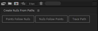
Once I made the beard layers into vector shapes, I had points on the shape that I could apply the ‘points follow nulls’ option to. I used these nulls positions to keyframe the left, right, up and down positions of the head turn as I would normally do. Once the x and y positions were connected to a 2D slider, I got the result below, which I am very happy with.
I thank Dan for giving us great tips during his AE workshops!

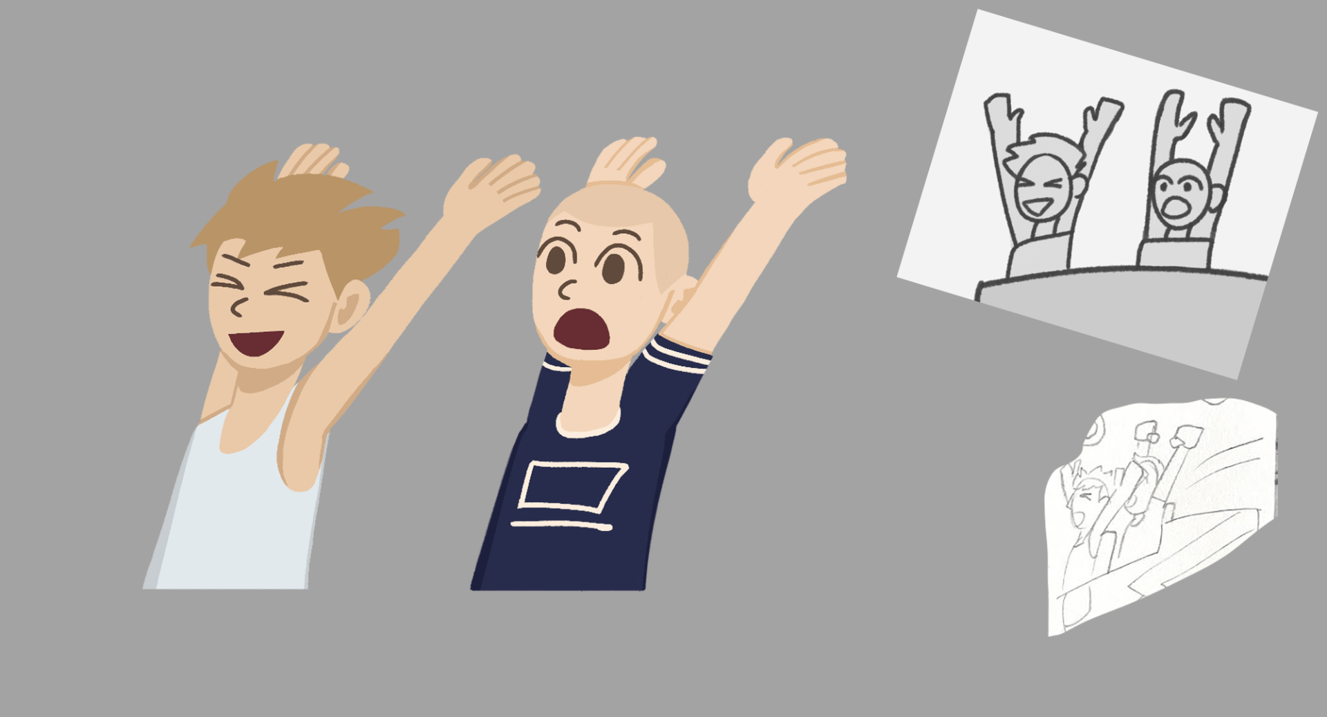
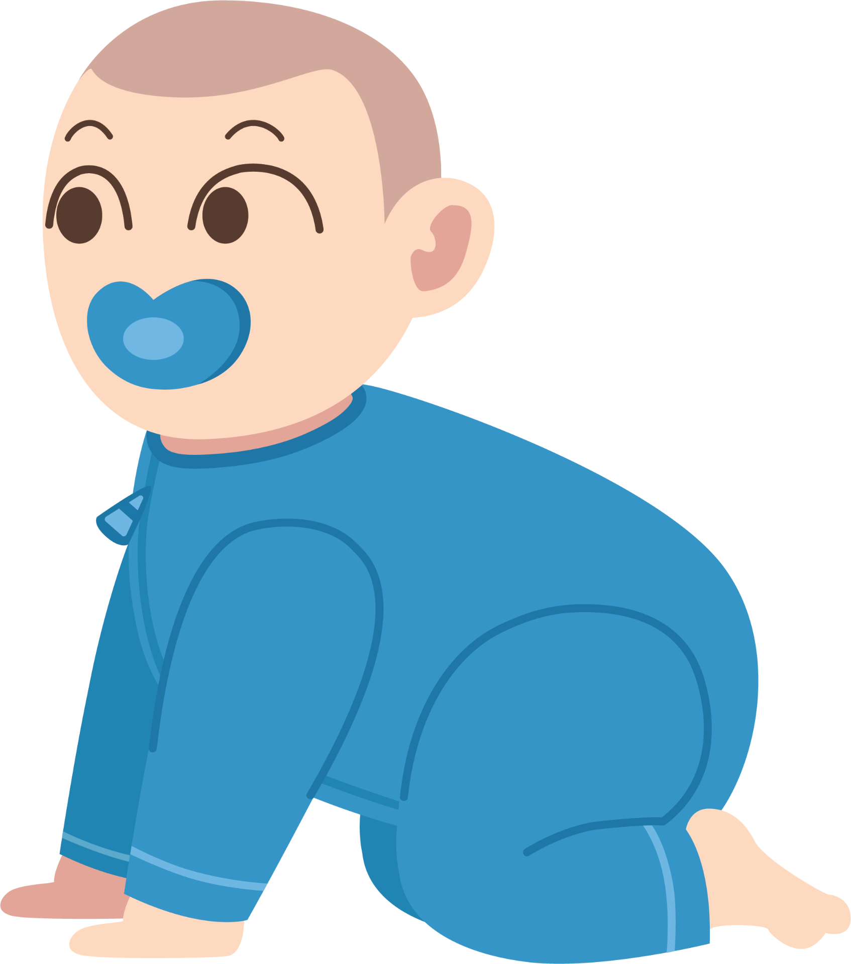
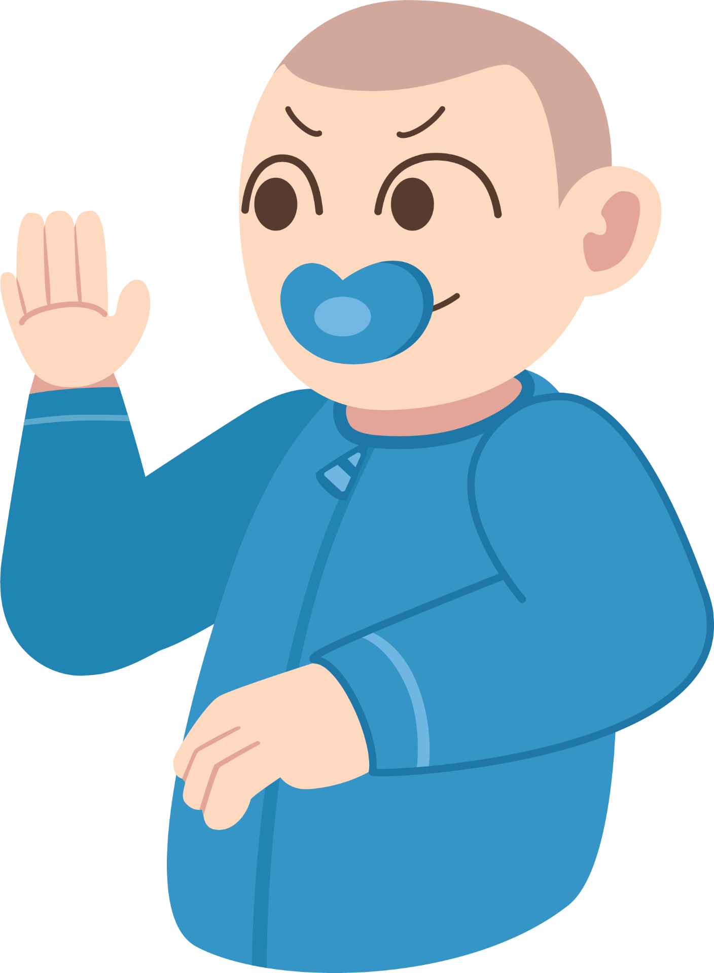
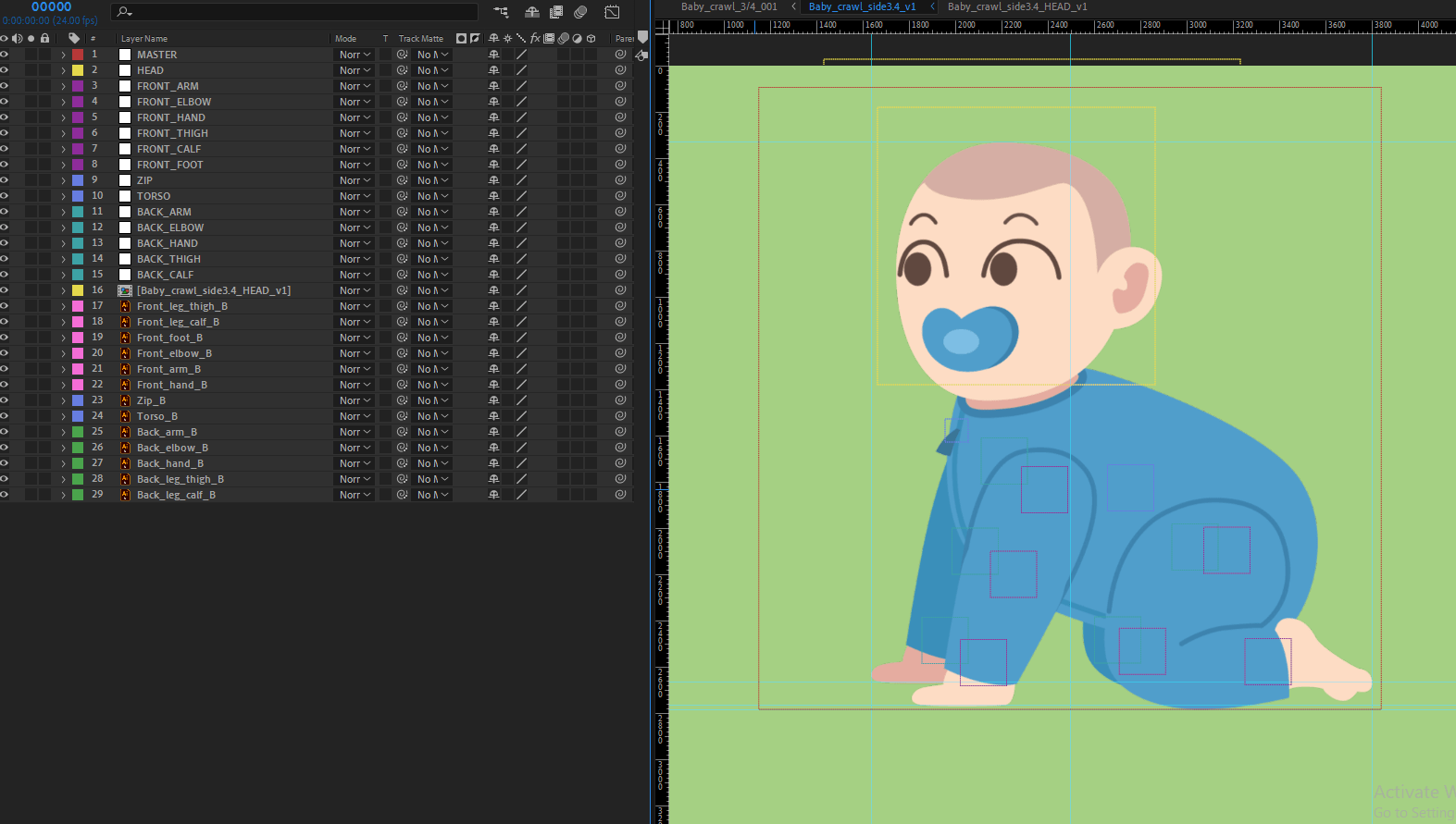
I moved onto the human characters that may need some rig abilities. The teacup customers, and the popcorn stall man have basic rig builds to be able to move their arms, head and face features. The baby character has a similar rig build, but in the form of quadruped. These simple rigs will help create the right actions and provide better animated results.

Building the rigs worked very well and was majorly a smooth process. The worst problem I came across was when I was halfway through building the inspector rig, and the file corrupted on me. Unfortunately, I could not find a workable solution to this problem, so restarted it. I feared this would set me behind schedule of producing work, however it didn’t take too long to build again.
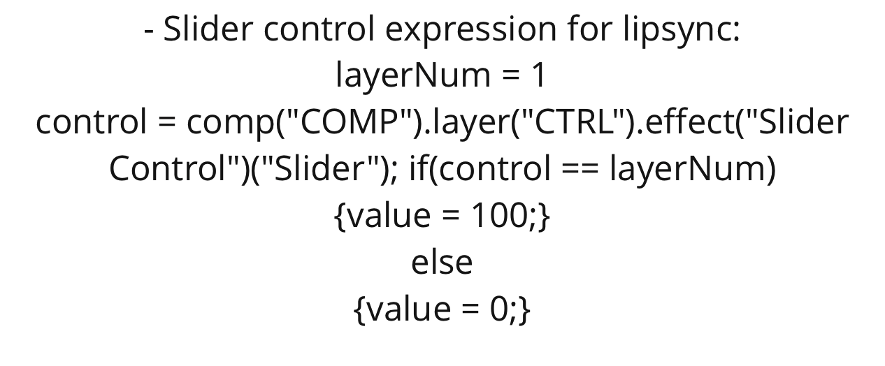
Another problem was I had to change the system that controls the hand shapes in each rig. Beforehand I had all shapes in one comp, and used time-remap to swap between them, but this did not work when I chose a new hand because it would not export correctly in the renders. The neutral hand would stay instead of another chosen hand.
I changed this to the same expression I use for the eyebrows and mouth in the head comps. This expression uses Slider control – it indicates which hand should appear from what number is set on the slider control – it is applied to the opacity section of each asset so it makes assets disappear if it is not chosen. This system can show the hands in the renders better than the last attempt.

Any other small problems were either with colour correction from Illustrator to AE, and to fix clothing clipping to limbs with masks, or shape layers.
Test rig animations
Before I started any animated scenes, I tested the abilities of my rigs by animating actions and expressions. This helps to discover how they look as they move, and what kind of style and speed of animation will suit best. I can experiment more like this if needed during the animation process, but these examples can work as reference for me.
Scene Prep
For scene prep, I set up a template AE file that applies the right settings I need for each animated scene.
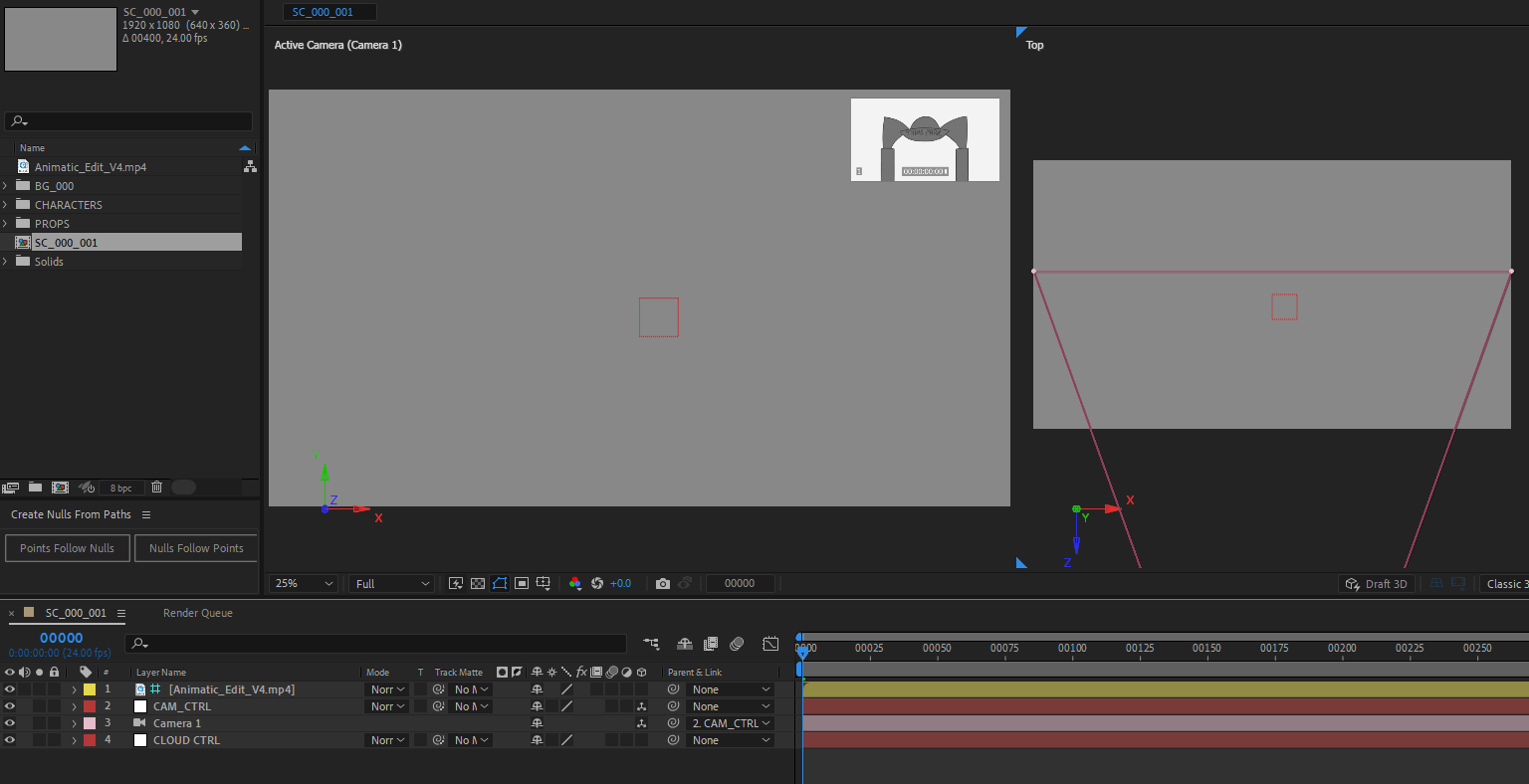
The template includes the latest animatic edit, a camera control null, the camera, and a control null for clouds. The main comp is labelled as the scene and version number, and set as 1920 x 1080, 24fps.

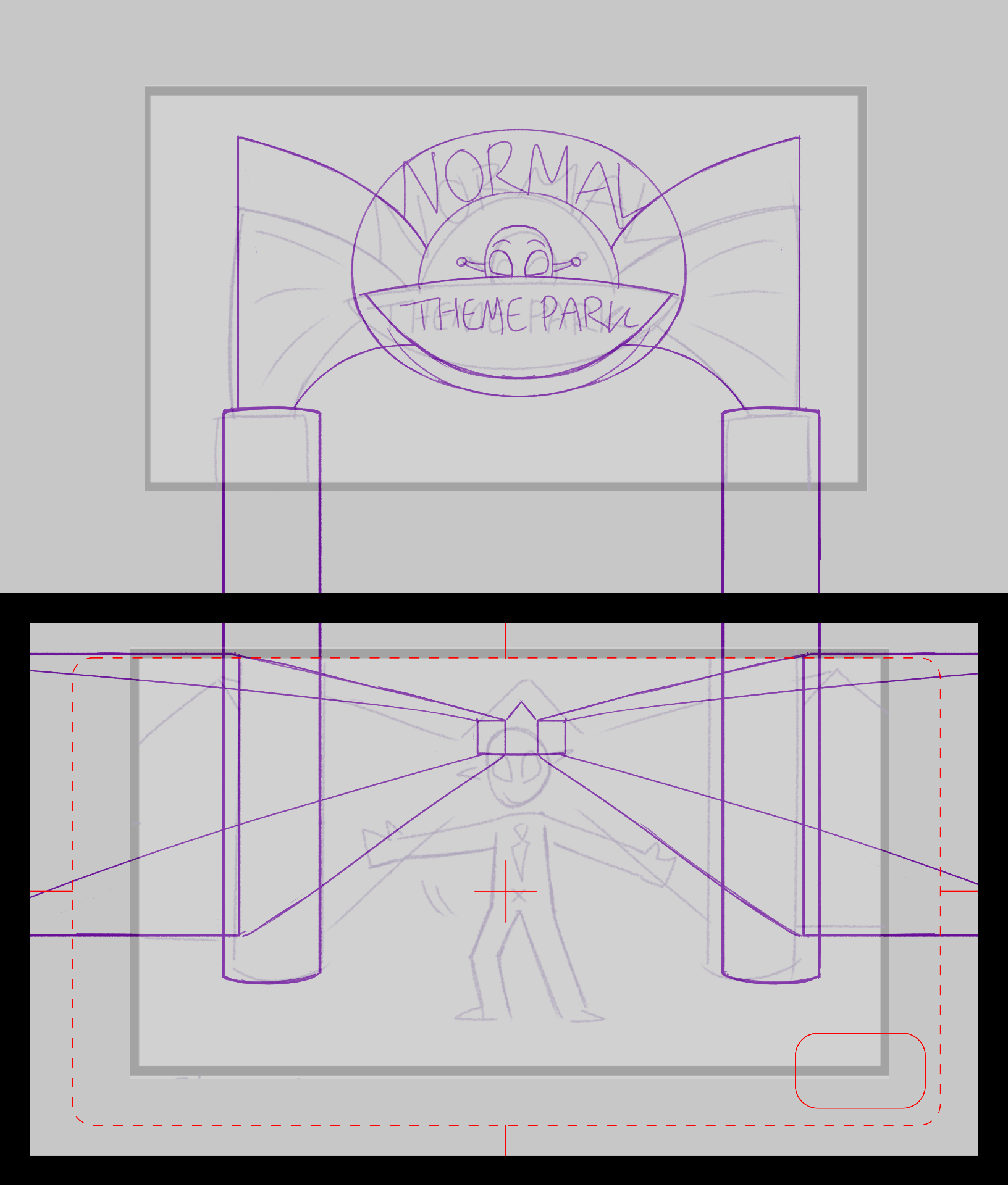
An example of a scene setup is tested below. Shot 2 has a left to right pan view, so I tested the camera and control null here. I will also add the animatic at the top right of each shot for clear viewing of layout and timing. It is set as a guide layer so once the scene is at rendering stage, it will not show.
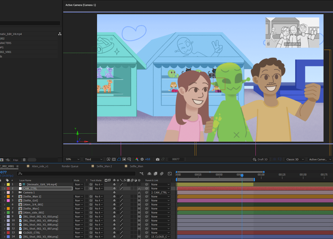
Now each scene is ready to animate, each starting on V001 (version 1). Once I go through more polished animating, I will save an updated version each time to prevent losing complete amounts of work, and it’s easy to get back to a past version.
Animation
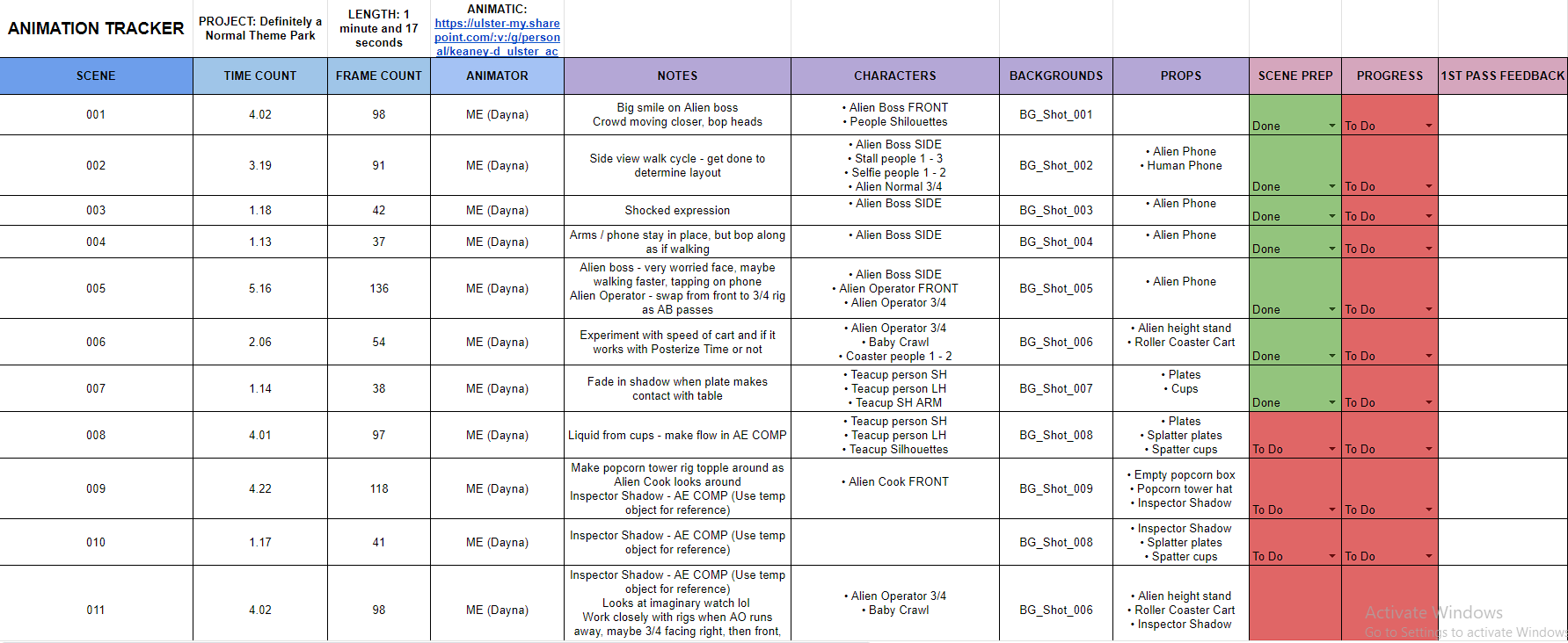
To record my animation progress, I prepared an animation tracker which includes time and frame count of each scene, informative notes before animating, and what characters, backgrounds and props are featured in each scene. I set up this tracker layout based on my placement year production’s tracker they used to keep progress of each episode. Implementing this into my workflow will help advise me throughout the animating stage, and structures how much work I must produce in the time I have.
From my animatic, I gathered all extra animation assets to produce, and worked through each one to achieve the right visuals.

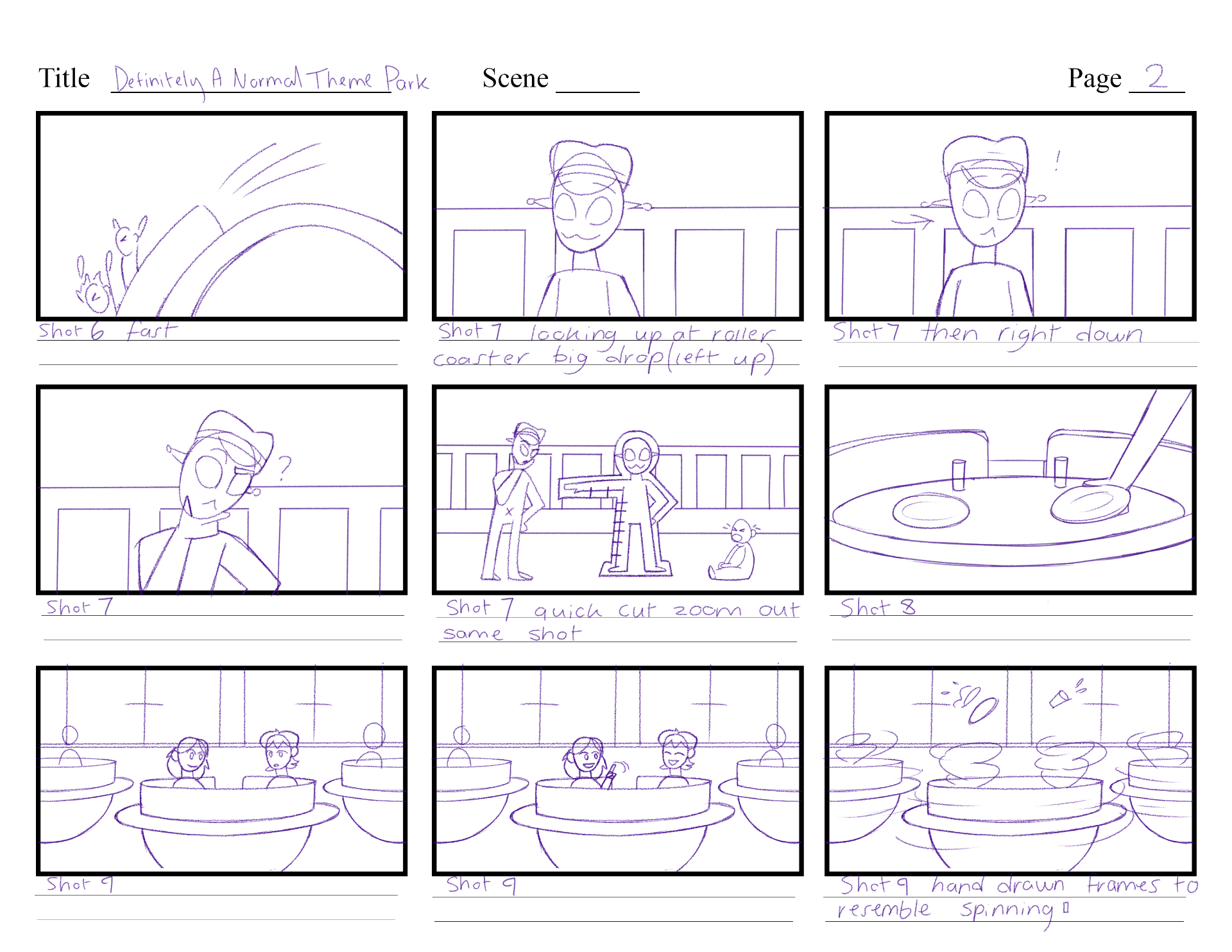
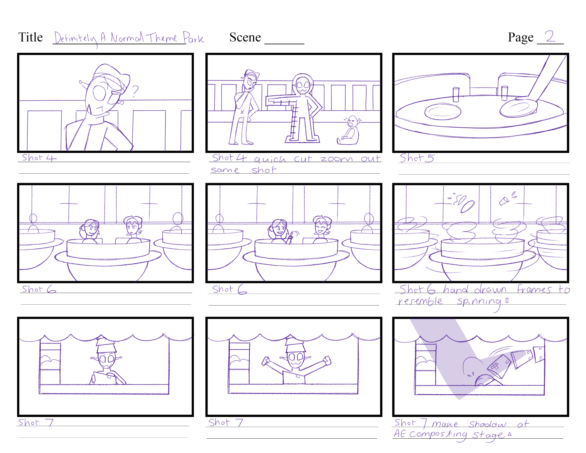
One asset was the spinning teacups. I first found two examples of spinning actions in ‘T.U.F.F. Puppy’ and ‘My Little Pony: Friendship is Magic’ to grasp the idea of how this idea is formed.
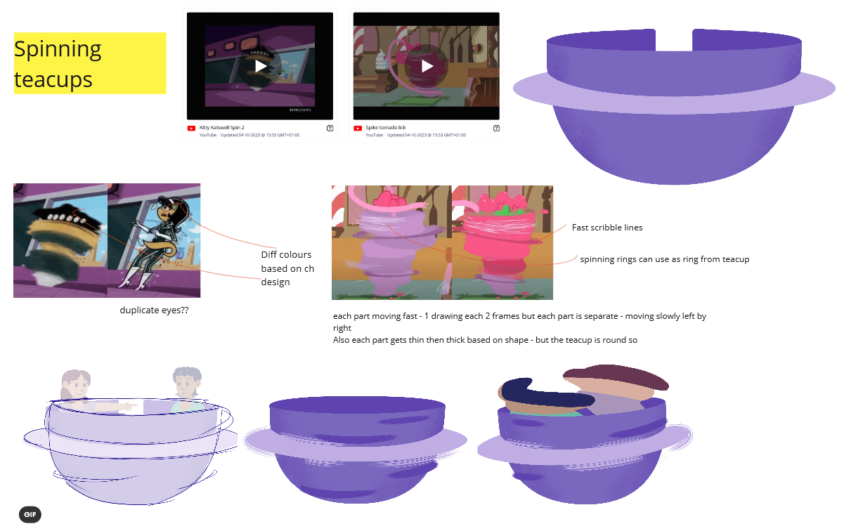
I roughed out a hand-drawn animation of how the teacup will spin. With this reference, I used Photoshop to build the teacup in, following the same design and textures as in the backgrounds. I tried out different ‘fast motion strokes’ before I was happy with the final concept.

Next, I added in people in the teacups. I made one attempt, then realised I made them spin in one spot, when really they should spin wider along the teacup. I made my next attempt, and I was much happier with the outcome, and happy that I caught this thought early on.
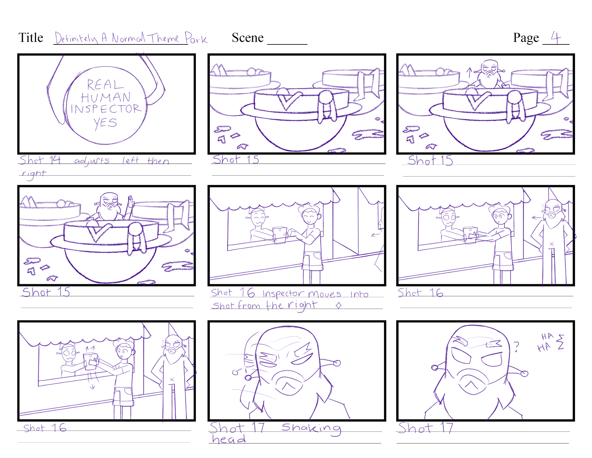
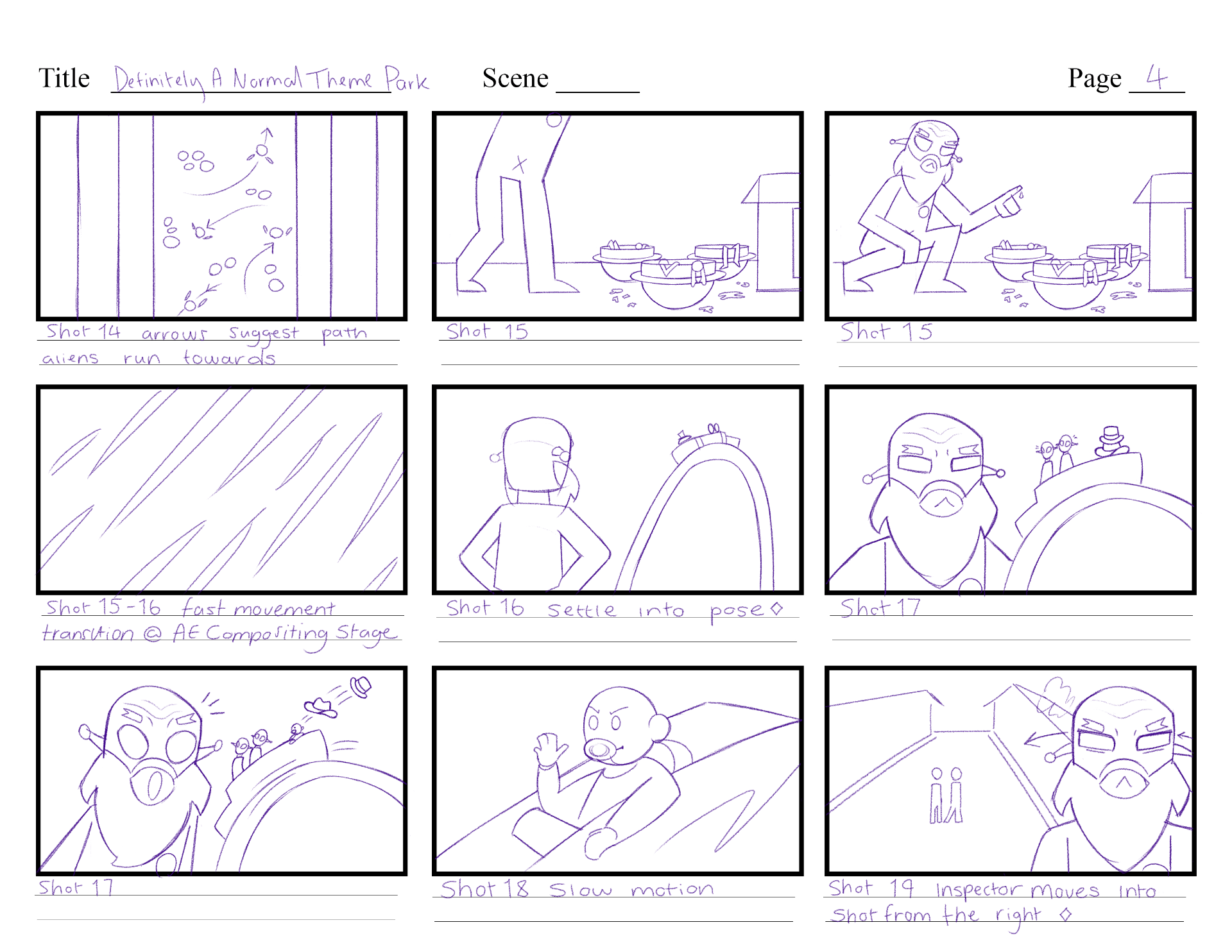
The next asset was laser ray visuals. In two scenes, the Inspector will shoot a ray gun that will target the Alien Boss, and ‘hit’ them to give them a badge. I researched TV shows that included visuals of lasers and shooting rays. ‘Ducktales,’ ‘Powerpuff Girls’ and ‘The Simpsons’ provided good examples I can reference. 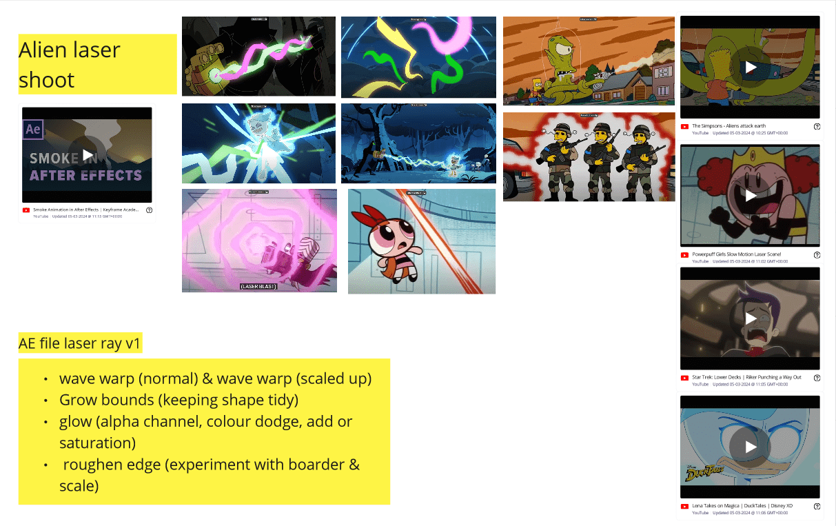
This After Effects tutorial on smoke motion is a helpful video which I have used once before, I’m aiming to use these tricks to give me the visual I am looking for.
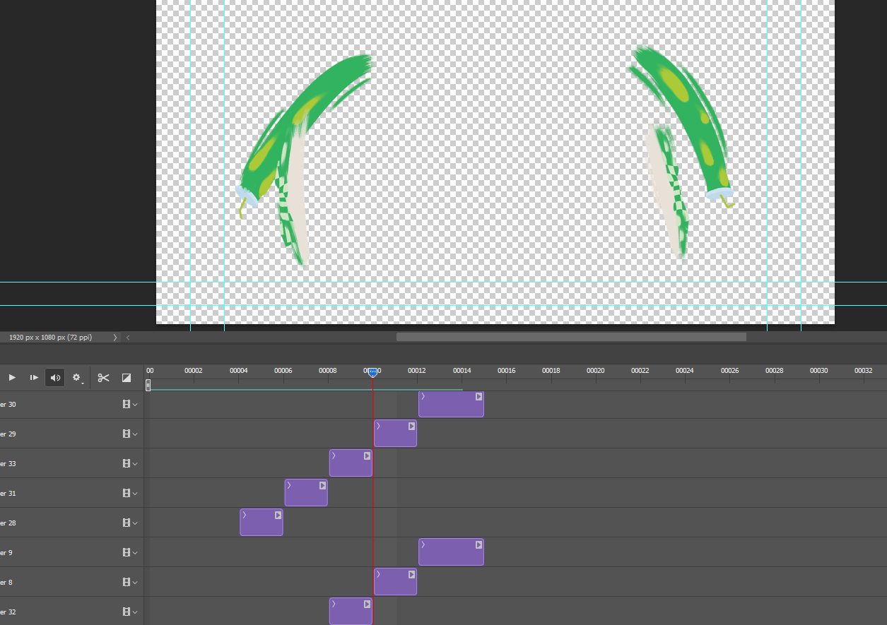
Effects like wave warp help in my experimentation below to give me an effective visual of lasers. I added in glow and roughen edge to each attempt and altered their settings to get different results.
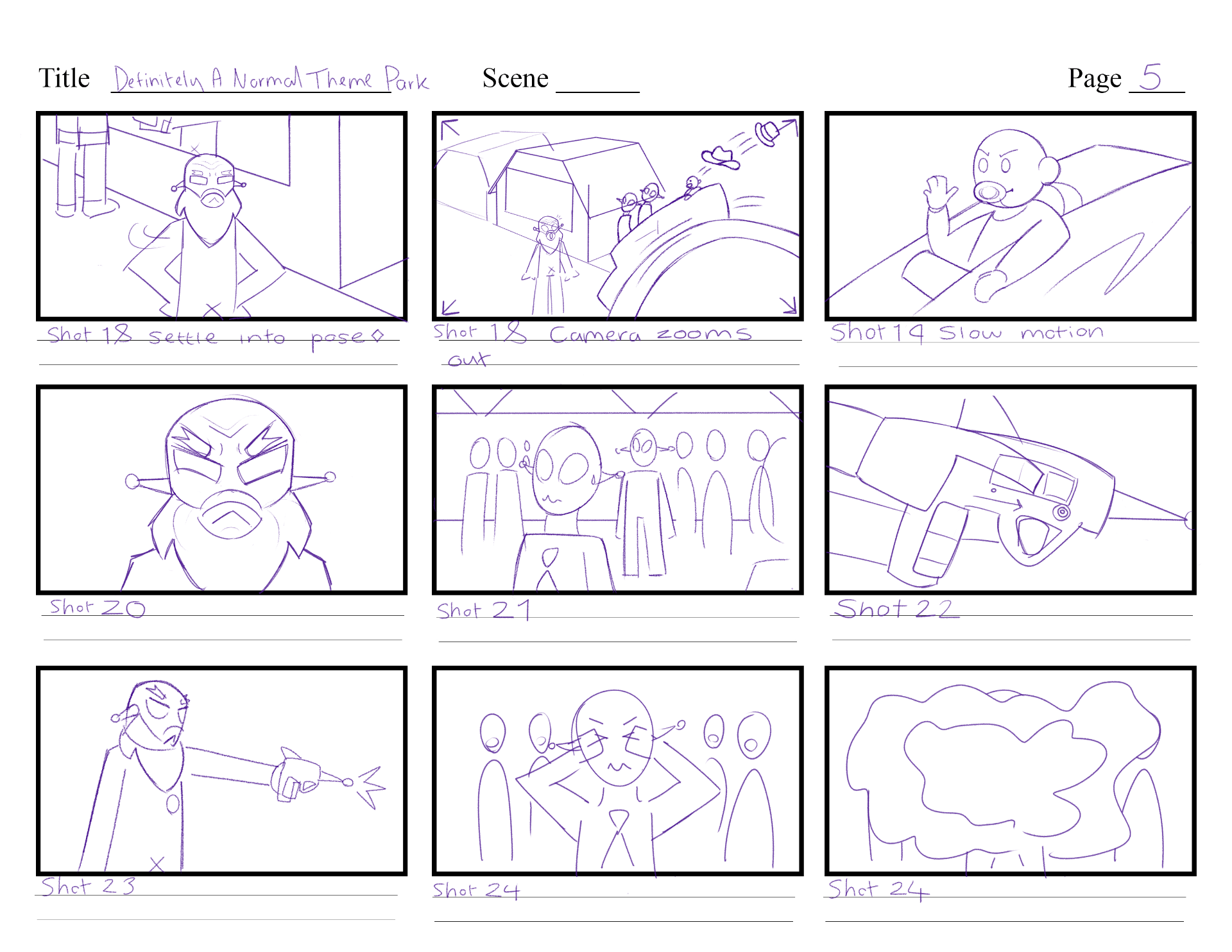
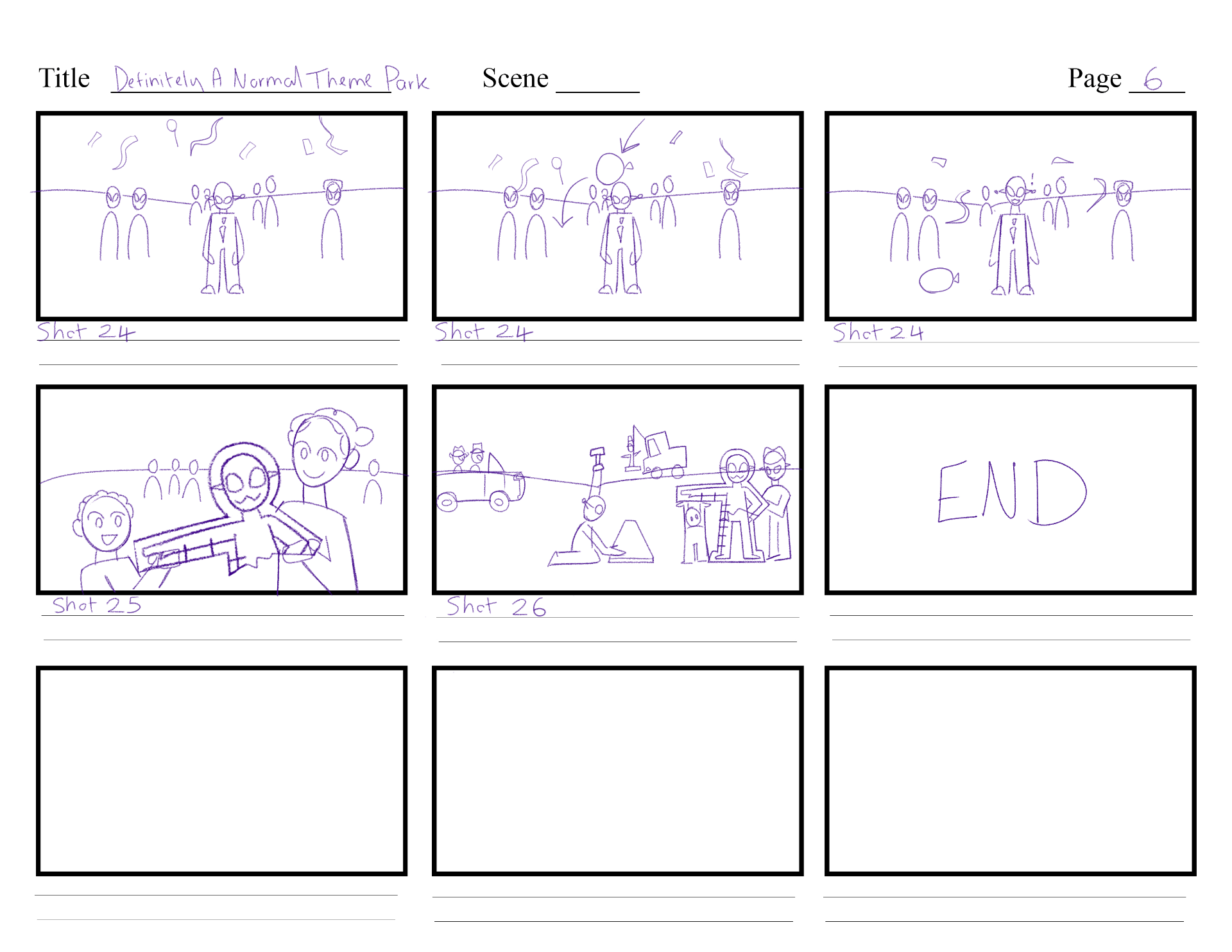
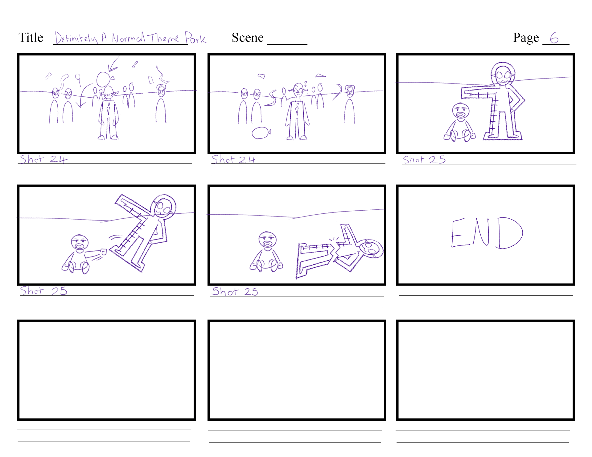
I then experimented with the visuals for shot 24, where the laser warps around Alien Boss. I used the same effects on a circle, which I animated scaling up, then down. I duplicated its comp three times and altered the wave warp evolution, so each part is flowing in different timing. The warp behind is set different in roughen edge to create smaller bubbly parts for an alien/space effect. I was recommended to lower the opacity too so you can slightly see through each part, and a secondary action to where the laser is shooting towards – the star badge that is put on the alien’s shirt.
Shot 23 will include the shot from the gun. I followed a similar process, but instead I used a trim path to guide the rectangle of laser from the left to the right. I used mesh warp to make it wobblier as it shoots through to the other side, then used trim path again to bring the effect back from the start to the end – indicating it is travelling far beyond the screen.
Next, I made food trays and cups flying out from the spinning teacups in Shot 8. I referenced a scene from ‘DC Super Hero Girls’ of a food fight scene, and screenshotted some frames that I could reference the motion of food thrown through the air.
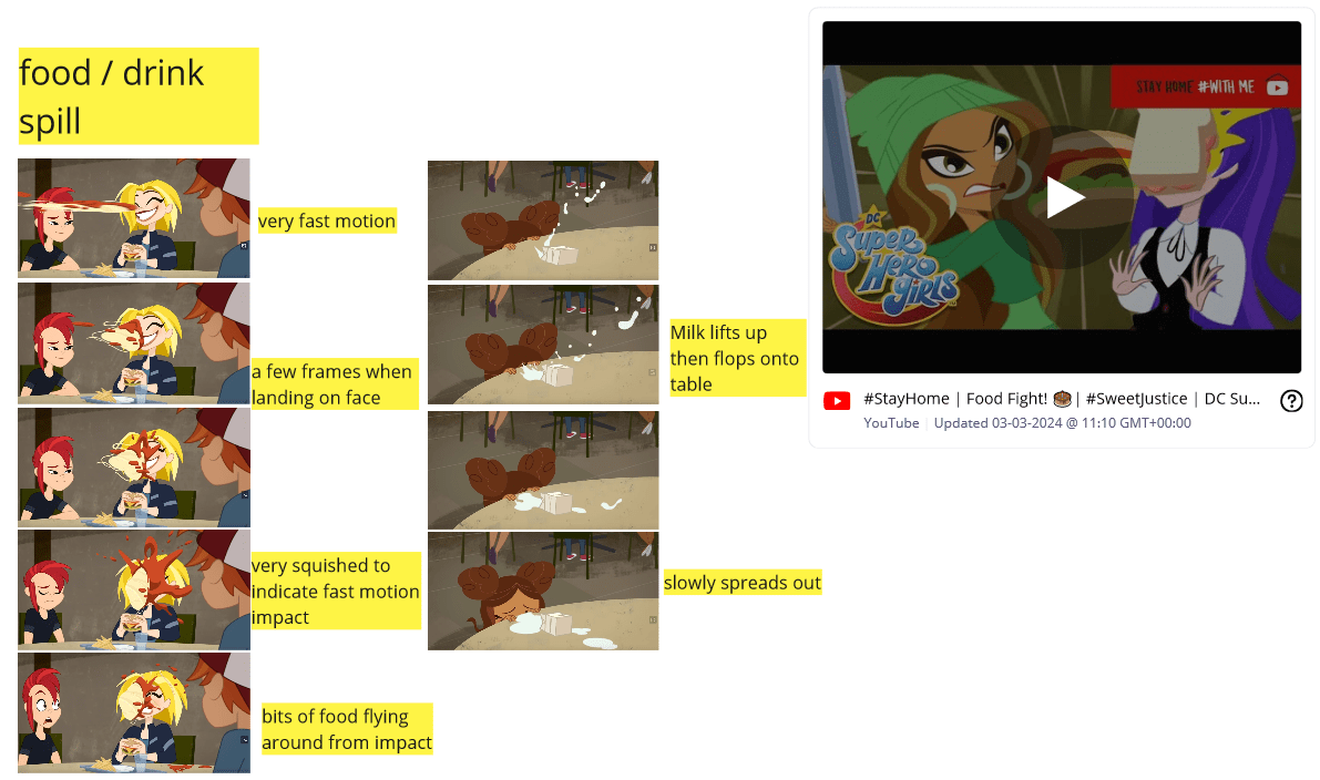
I decided to paint a few frames of this action on Photoshop again using the timeline. It took around 5 drawings to create the path from the top to landing on the ground. I used previous PNGs of the cups and food trays to reference their position, and to paint the smear frames from. Eventually I got an interesting animation of the cup and tray flying to the ground.
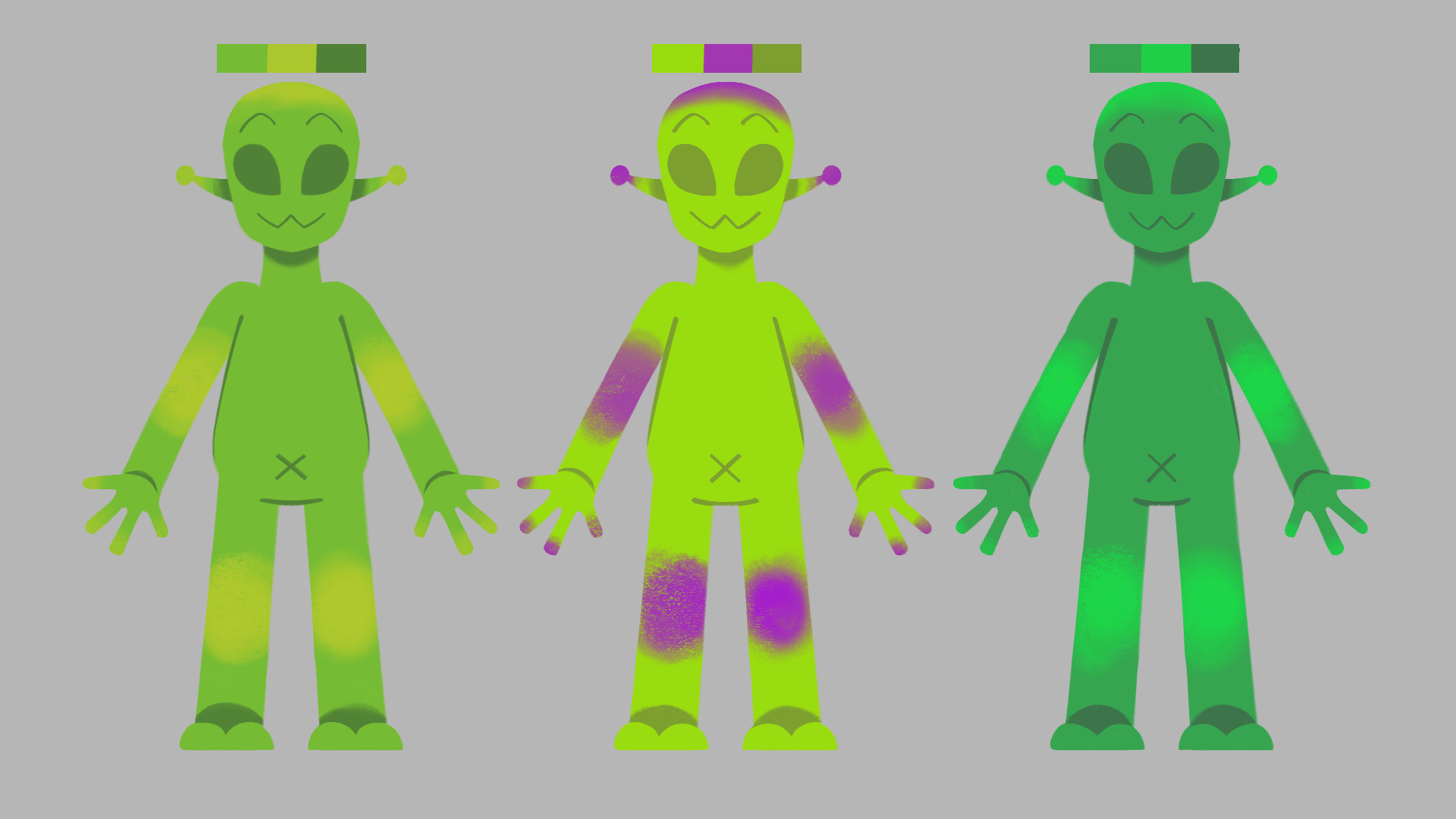
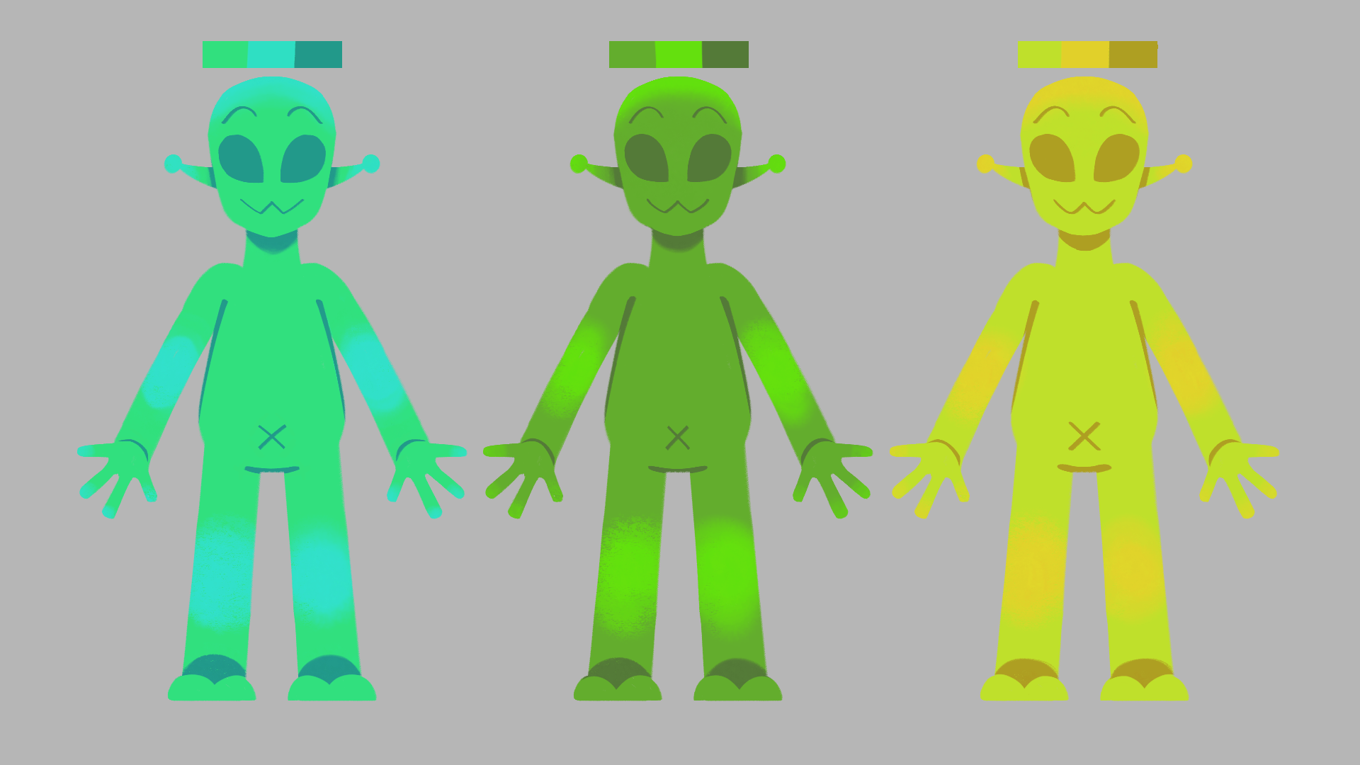
As mentioned in the pre-production blog I wanted to add colour alteration to the aliens in this stage. I did this by experimenting with the effects colour correction and levels. I saved these settings into my own animation presets so I could drag and drop this onto every alien in my shots. This provides differentiation to each alien, separating them apart if they are close together in shots.
First pass animation
I will be reviewing my animation passes using Syncsketch to detail what fixes need to be made, any changes to length, and what should be added / worked on next.
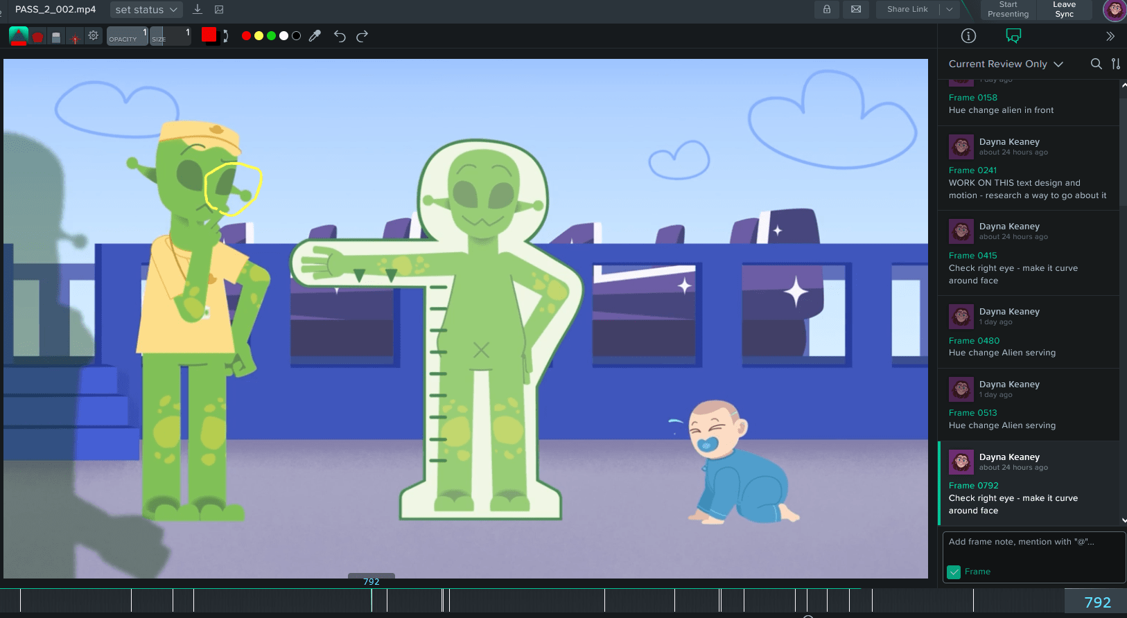
Pass 1, before any fixes.
In my first pass of animation, I focused on how each character is animated, what should change, and what should be added next. These are detailed through these notes:


I made notes on other smaller animation details to add, such as the baby tears, and the food flying from the spinning teacup – important details that would give better context to their scene.
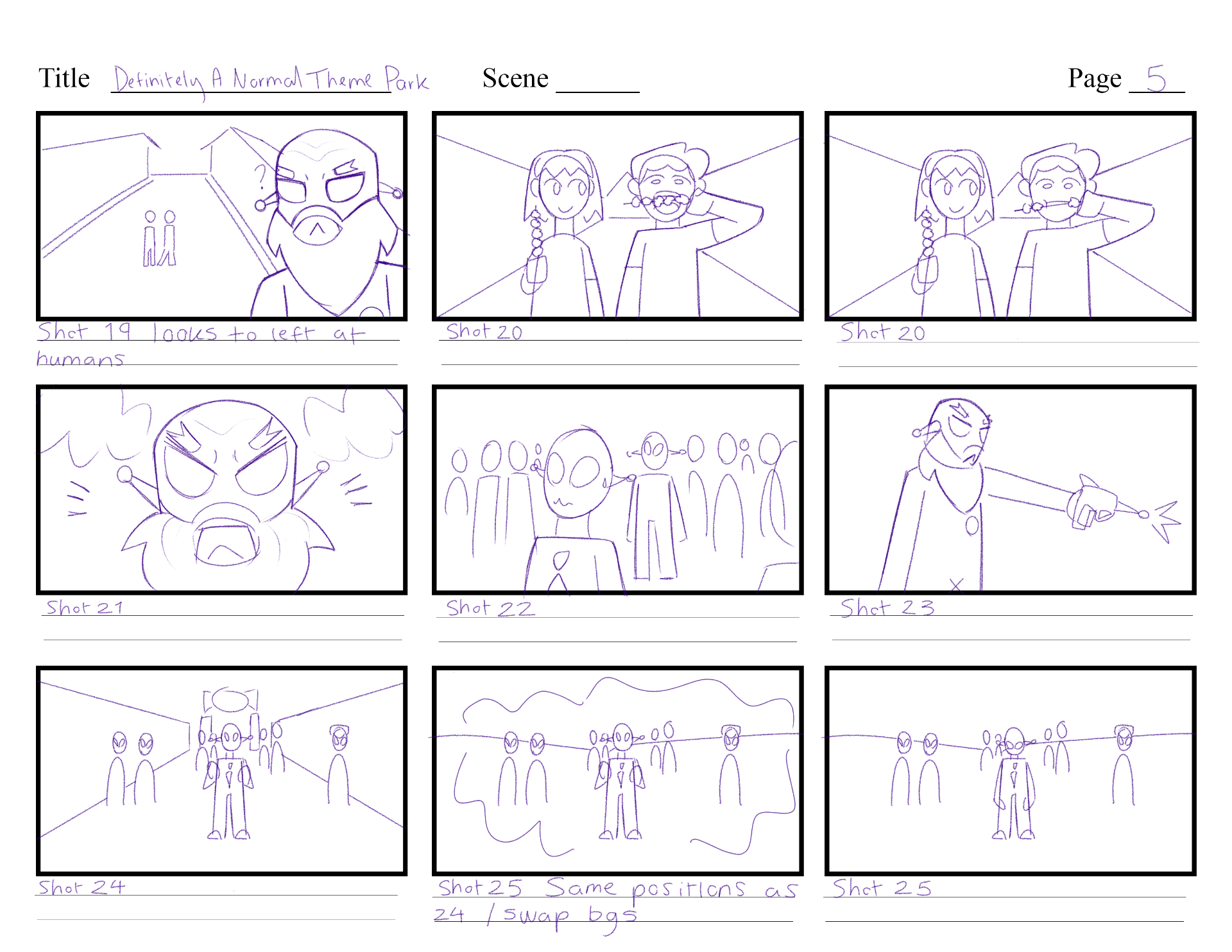
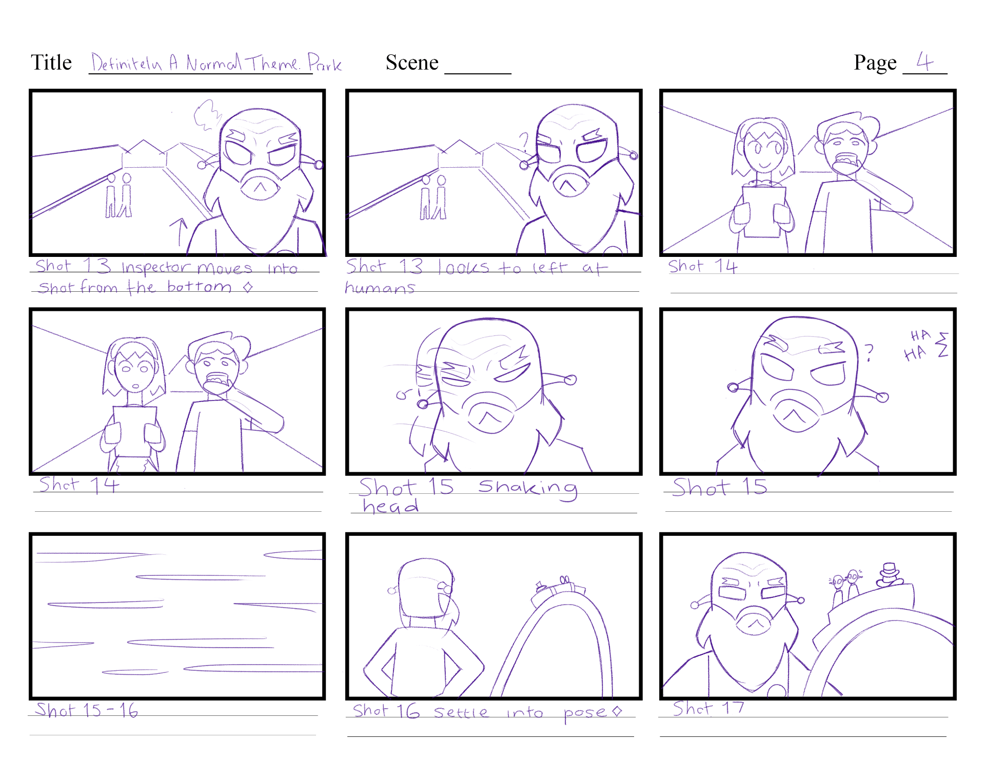
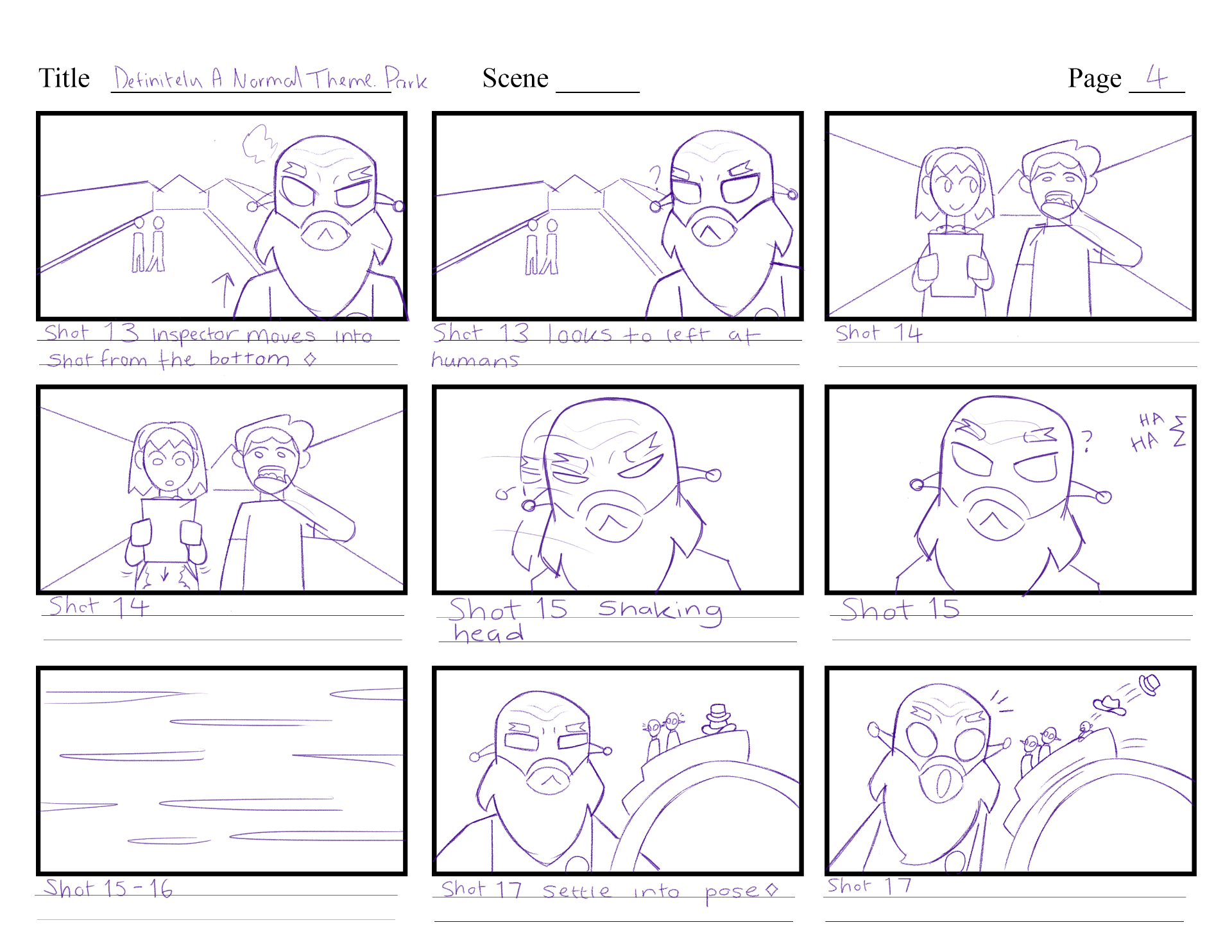
I focused on the flow of each character and adjusting their reactions / body positions, so they read better. For example, in shot 20, when the inspector is turning around angry, beforehand it was too slow and doesn’t read of judgement/anger.
First pass review fixes.
Second pass animation
In the second pass of animation, I focused on framing some shots better, colour correction and any more animation polishes / additions. These are detailed through these notes:


The biggest fixes to make here was colour correcting my Illustrator files. I realised that they all were set in CMYK mode instead of RGB. This meant I had to go back, change each file to RGB and check every scene has the updated colours. I had also been changing the colour scheme of the alien laser gun, as beforehand it blended too much with the background. The darker colours now allow it to stand out better in each scene.
Some further details include changing some side character aliens with a new colour scheme and lengthening 2 scenes which brought the running time to 1.18 minutes.
Second pass review fixes.
Third pass animation
In this pass I touched up on any intricate details I could find, any missing animations and additional details to the backgrounds. These are detailed through these notes:


The most prominent fix was for the neck shadows on the aliens, as they cropped weirdly when converted from CMYK to RGB. I finally added the text message and laser visuals to the scene once I was happy with the experimenting. I added more props to the stalls, and silhouettes to the backgrounds to give the idea there are more customers at the park.
Final pass, with third pass review fixes.
MP weekly blog
WEEK 1
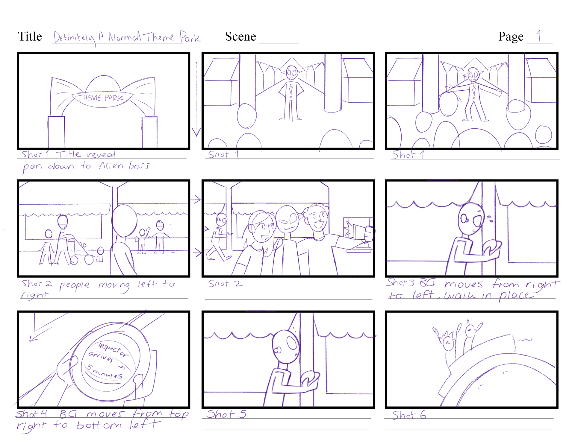
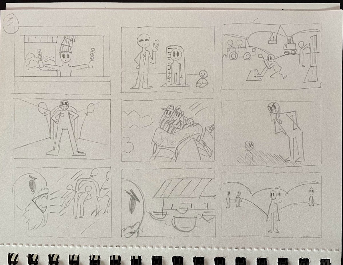
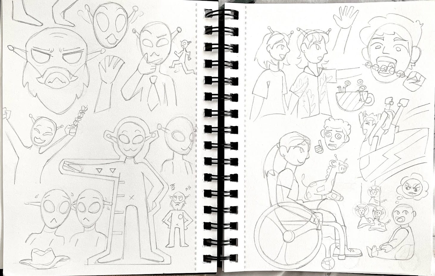
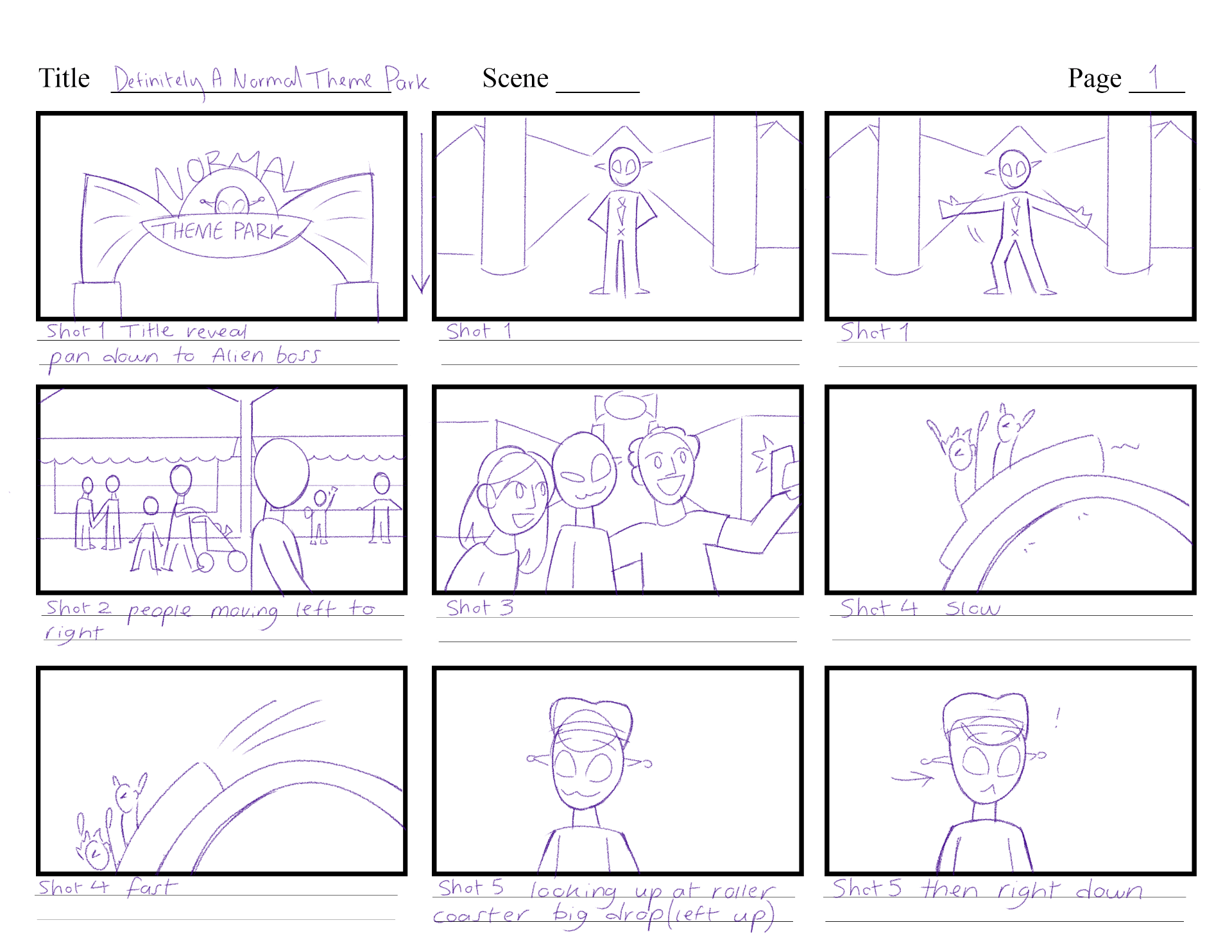
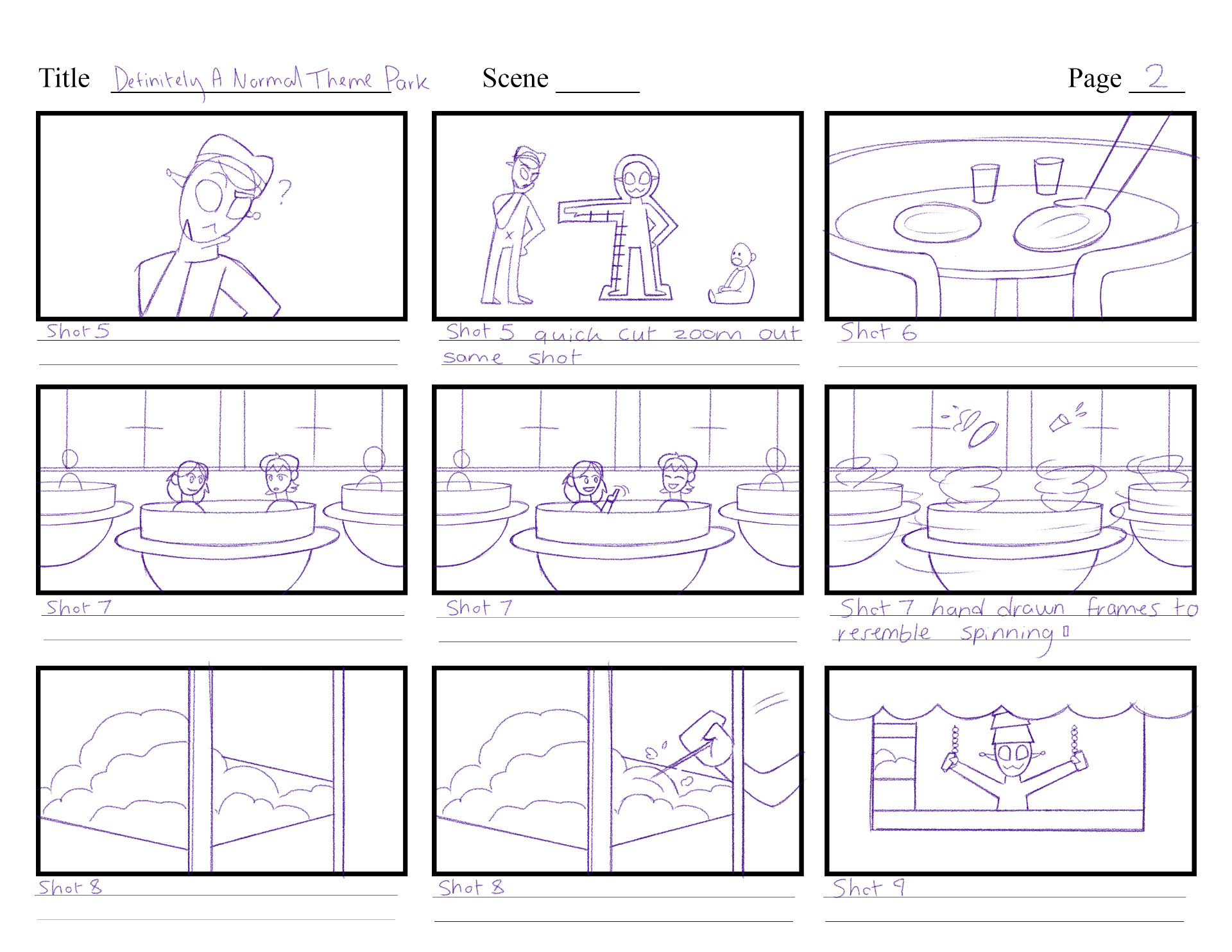
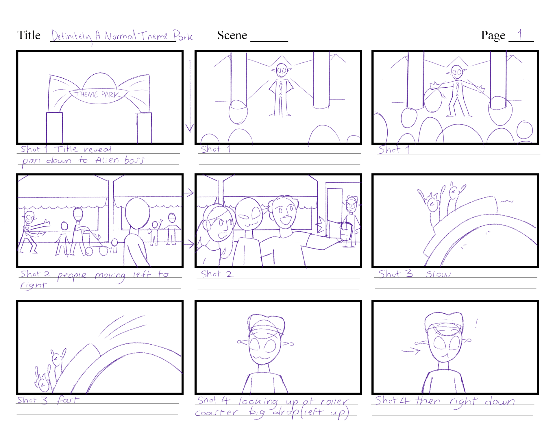
Over the summer I had been developing and experimenting with this simple but fun idea, about aliens that run a theme park. I thought of the prompt randomly while exploring story ideas in my own time. When I had decided to explore this idea, I started to sketch out first concepts of what the story will consist of, then started to play around with full storyboards of the sequence.
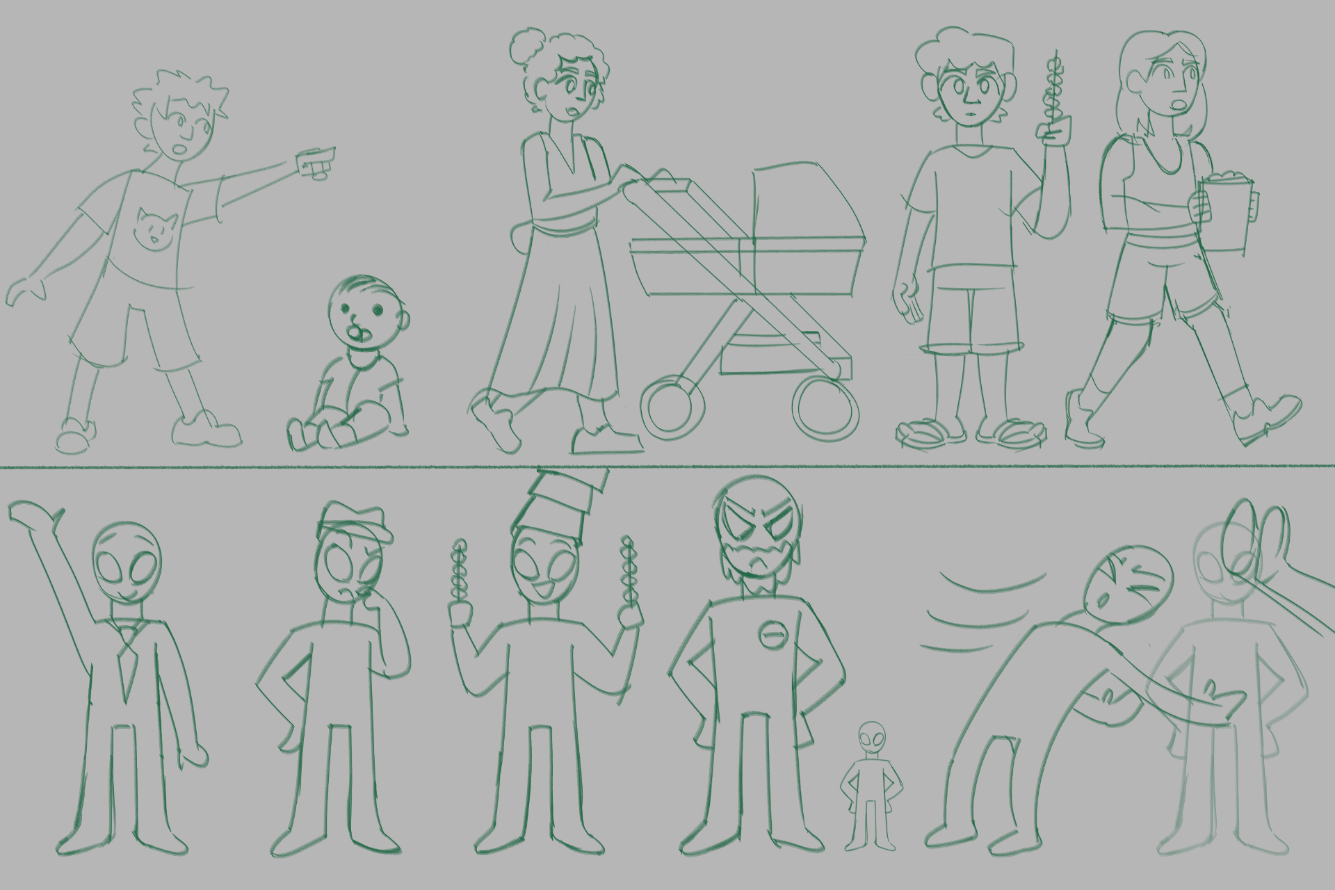
Later on I dipped in character design, to see how I can picture each alien worker, the inspector and human customers. I sketched in my notebooks, and painted digitally some other ideas.
Further on I started to build a rough design of a typical alien of the story. Once I drew and arranged each body part in seperate layers on a photoshop file, I could then use this built character to import into After Effects, and quickly rig the character.
I will be using After Effects’ tools, and DUIK’s tools to build my rigs during this project.
With this same process done on two other characters, I made a couple of animation tests, exploring the rig performance, character expression, and examples of how scenes could play out:
https://ulster-my.sharepoint.com/:l:/g/personal/keaney-d_ulster_ac_uk/FGP80wMUL3FOkpPVrpvp0ecBF9DxoxltKoXlHn2cgfnSNA?e=Xmxihf
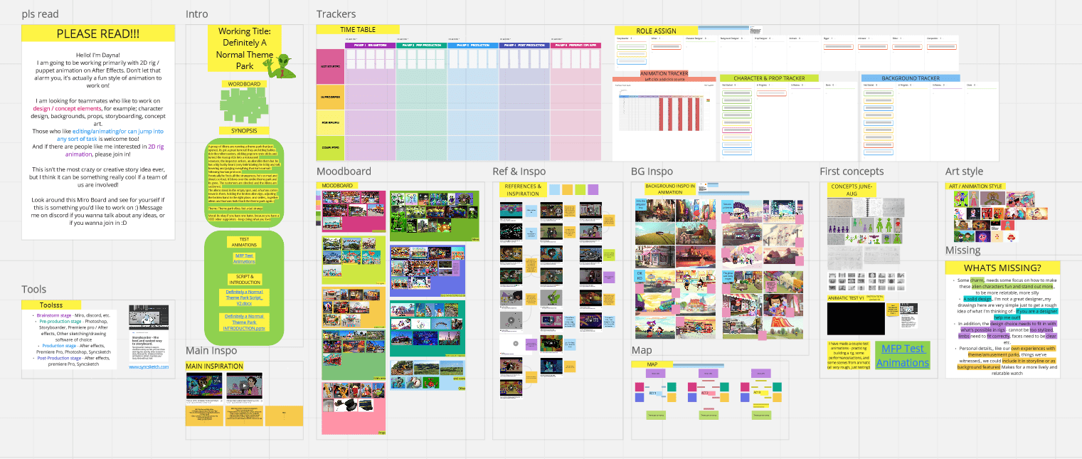
Lastly, I have put together a Miro board that includes all of my summer progress, some inspiration and reference gathered, and an overall idea of the story written down.
WEEK 2
During week 2 I have been developing the project to a better standard; finding my main inspiration and style, re-organising the miro board, developing the script and much more. In this time I was hoping to gain teammates to make this a group project, but I was not successful in this. This means I will be producing this project individually, and will continue to if it is suitable after the pitch presentation.
With this information I have been planning my workflow, schedule and workload that will work for me working individually etc. removing anything too ambitious or difficult.
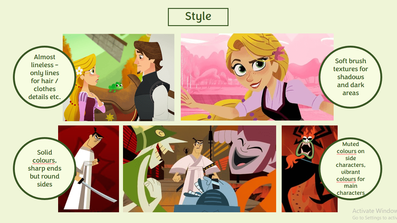
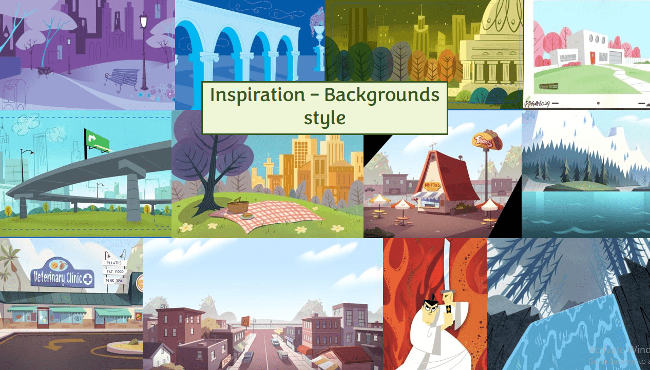
I have gathered a range of images for style and BG inspiration so I have a better visual idea for my story. For the style, shows like ‘Tangled the series’ and ‘Samuari Jack’ have good elements I may use in designing my project. This includes the lineless look, but lines to emphasise hair & clothing detail, Solid coloured shapes, and soft brush textures for shadows & dark areas.
As I am not as skilled in producing backgrounds, I would like to make it a bit easier on myself, and go for a very simplistic style with depth, that also replicates the techniques from my style inspiration. The images are from an advertisement, ‘Powerpuff Girls’, ‘Star vs the Forces of Evil’ and again ‘Samuari Jack’.
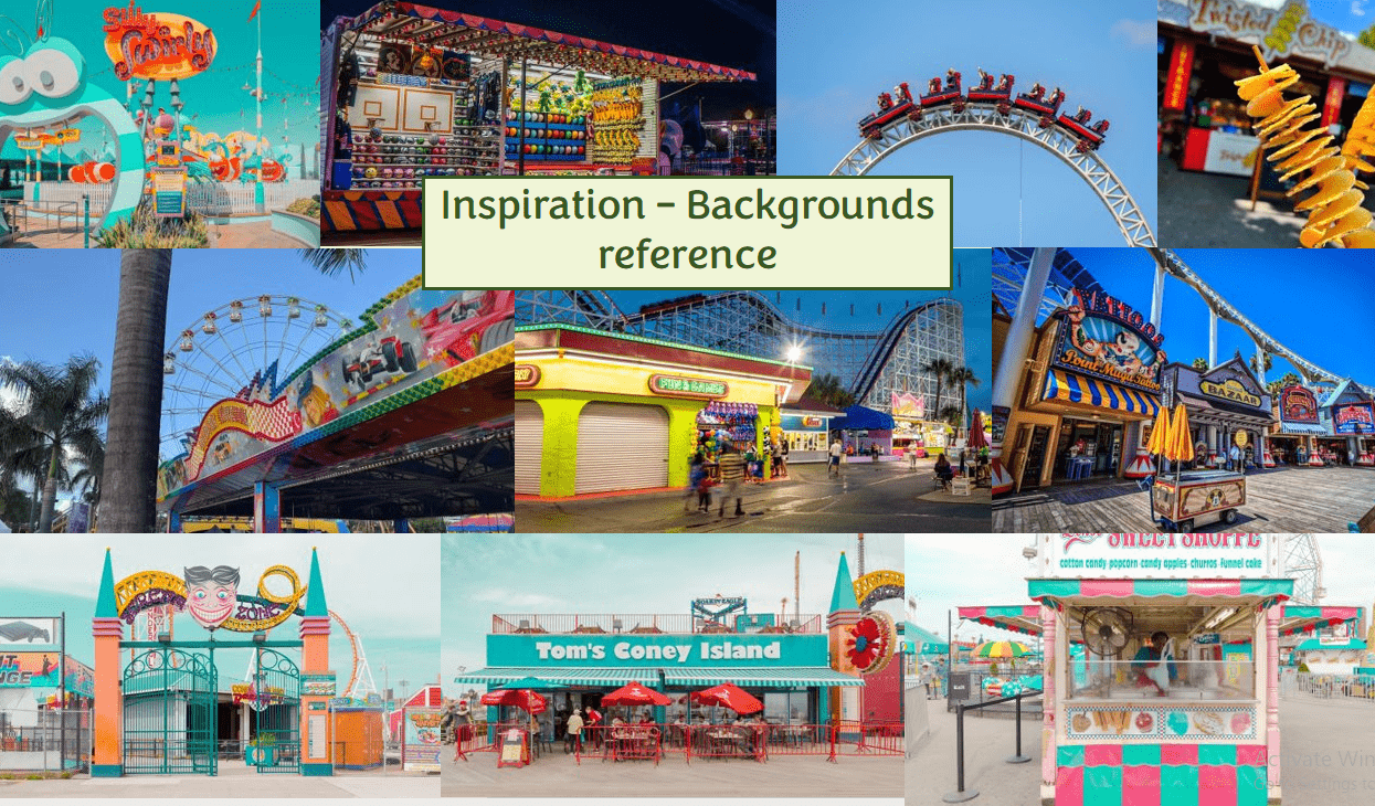
In addition, here are some real life inspiration of the type of amusement/theme park I would like this story to be set in. Not something big and vast like Disney world, but rather the typical, weird looking park that visits your local town, or one that stays in a small town.
With more consideration of my workload, and chatting to my tutors about the storyline, I revised my script for the story. The story is now more truthful and relatable to the moral I considered it to be – it applies a better vision that the human do love this park, and that the inspector is the only one who hates it.
I have attached a rough idea of sound effect descriptions in the places where I can imagine them being heard. This makes it easier for me in the production line to plan my sound design process, and collect only what I need to collect.
Definitely a Normal Theme Park Script_ V3
Based off the script, I am developing a better storyboard version. This storyboard is now considering the camera positions more clearly, how each character is positioned in shot, and a rough layout of backgrounds.

During this week I am preparing my pitch presentation for week 3. I am including the necessary details and concepts I need to show my tutors and class how my project will be made.
WEEK 3
In week 3 I presented my pitch presentation, and it went very well. I am happy with the way I presented my project, and I got good feedback to help me think more about development, and overall thoughts about my next steps.
The major point I am to think about is ensuring that my character and background designs will include a right amount of contrast, both in a colour sense, and depth sense. This is to make sure my backgrounds stay separate from my characters, and that my characters do not get lost in the background, and with each other. This gives me a better idea on how to approach my character and background designs, and ensure they have this contrast implemented as soon as I can, so I wont have to make major fixes further on in the project.
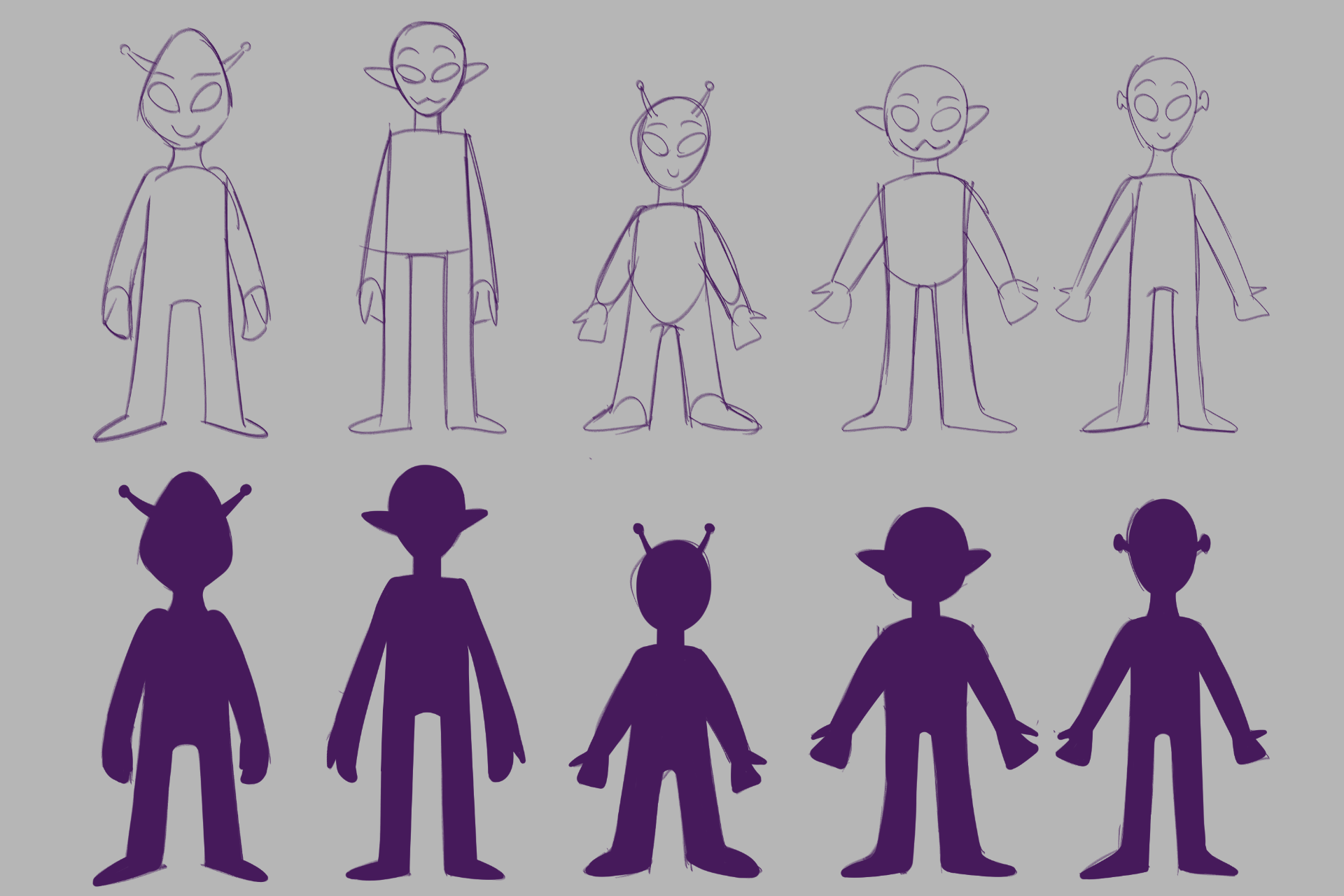
I started on designing the Aliens and Alien Inspector right after the presentation day. I also updated the Asset tracker with the kind of backgrounds, props, and other character builds I may need according to the current version of my storyboard.
I was recommended by my tutors that the Aliens should probably wear more clothing and accessories, so the main characters can be distinguished from each other, and so that with the idea that the aliens are all green, that the limbs wont get lost in the body if they were to move past each other. It also helps to let the audience have a better idea of what jobs the Aliens have, with more detail in their outfits that link to their job.
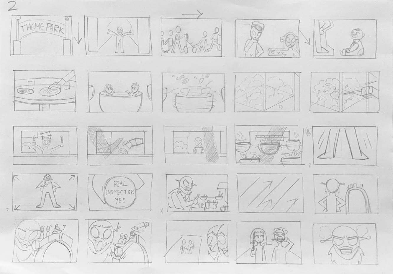
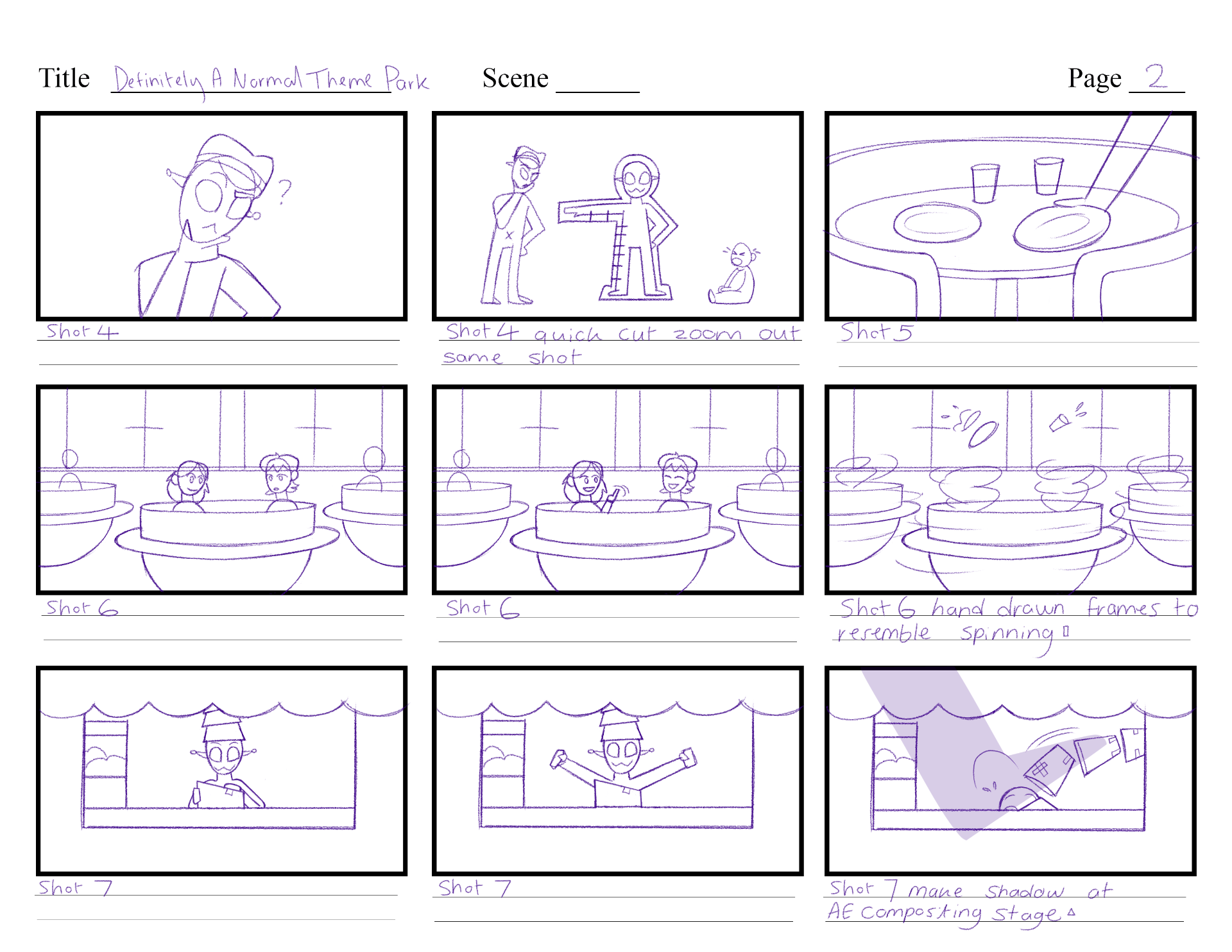
After Friday’s storyboarding class with Michael Bass, I figured that my current storyboard had a lot of cuts (just showing one scene after another with no explanation or connection) so with the notes I got from Michael, I went through my storyboard once more to create a new version. I combined some shots, for example: shot 2 and 3 in week 2 storyboard were different scenes, with different backgrounds. Now shot 2 and 3 are combined, and in a long pan shot, as they include similar scenarios and takes one less background to design.
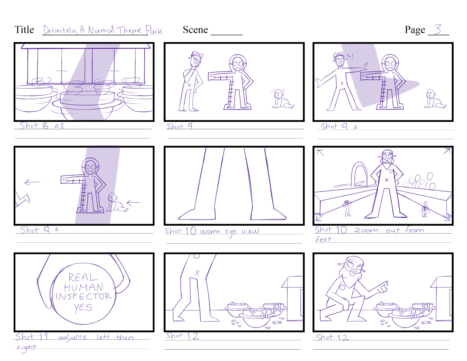
I adjusted some storyline elements etc. the Alien cook doesn’t sell popcorn on a stick anymore, but rather likes to tape boxes together with bad tape – therefore this will cause a more impactful problem later in the story. I will also include the baby more, and make sure its the last / the worst problem that the Alien Inspector witnesses, which causes their decision to get rid of the park. Also, I will make the Alien boss more important by making them more present during the start, interacting with the customers, and establishing that they own the park.
Overall I am much more happy with this storyboard layout, as it can cut down on producing backgrounds & quick lone shots, and it helps tell the story better. However, I am still unsure if I should still keep the last two shots into the story – where the humans come up to the aliens, offer to help build the park, and so the Aliens start building. I will take the next week to ask around for opinions, and finally decide on the ending of the story.

With this new storyboard version, I also updated the script, and the asset tracker again to make sure they included the right information that matches this story.
Definitely a Normal Theme Park Script_ V4
WEEK 4
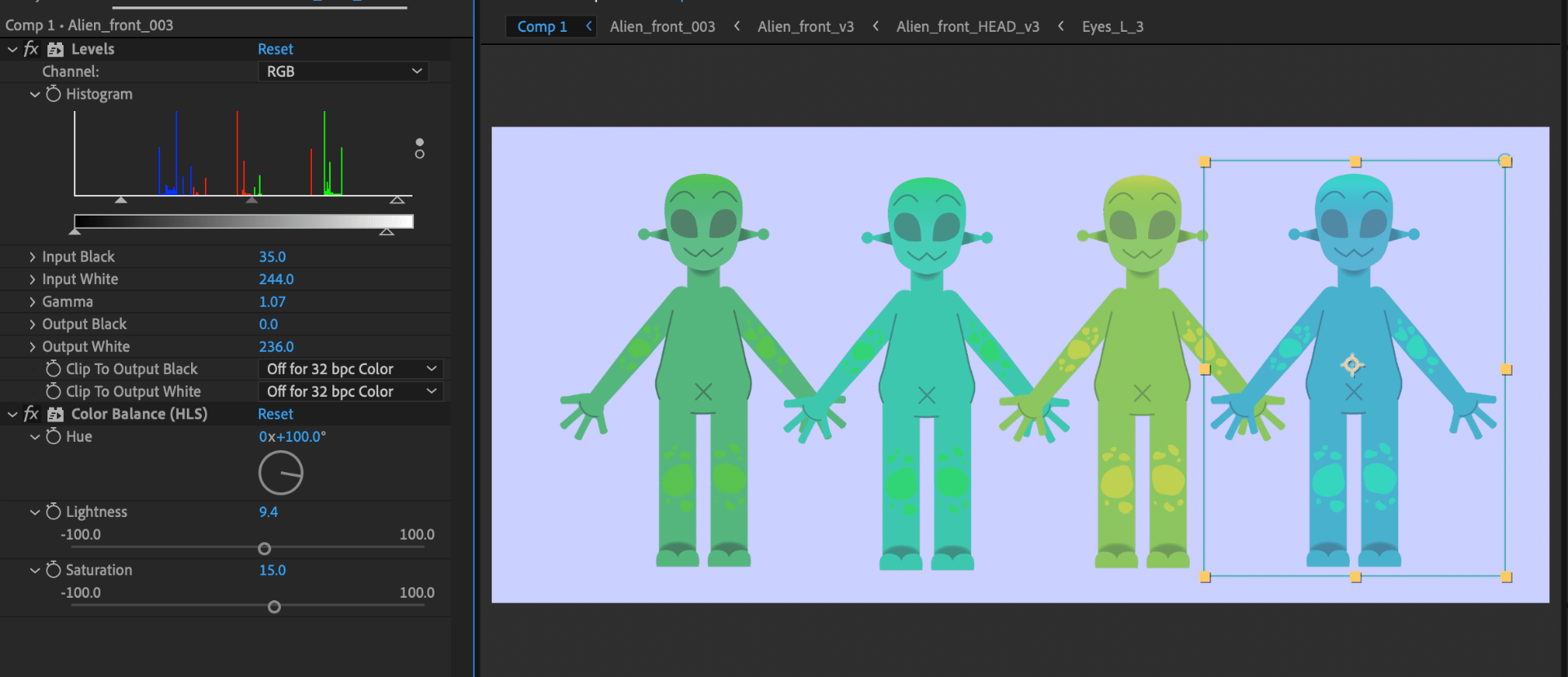
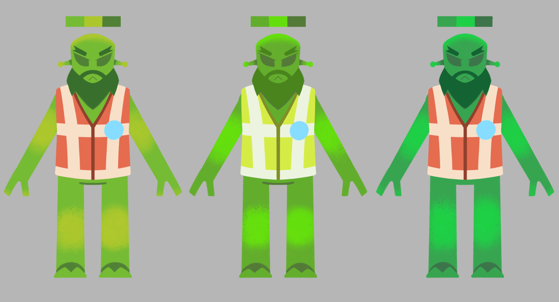
During week 4 I explored some colour design for the Alien, first of all thinking of the hues and saturations that the alien could have, and where different hues and textures can be placed. I got a good tip from Aodhan that I could save from making multiple alien rigs with different colours, and instead alter each aliens’ colours during the compositing stage – with use of adjustment layers, and adjusting the hue / saturation options. I will definitely make use of this, and therefore use these pages for reference of what to change the hues to.
During the Wednesday group tutorial, I got feedback from my tutor Aodhan in reference to what i’ve completed over the week. The main piece of feedback I was given was in relation to the end of my story, where I could either push for a more heartfelt and potent storyline for it to work, or I continue to make the storyline silly and full of jokes, continuing the vibe it already has. I will use this week to think about what I could do to tie the storyline together, and possibly make it the end on another joke.
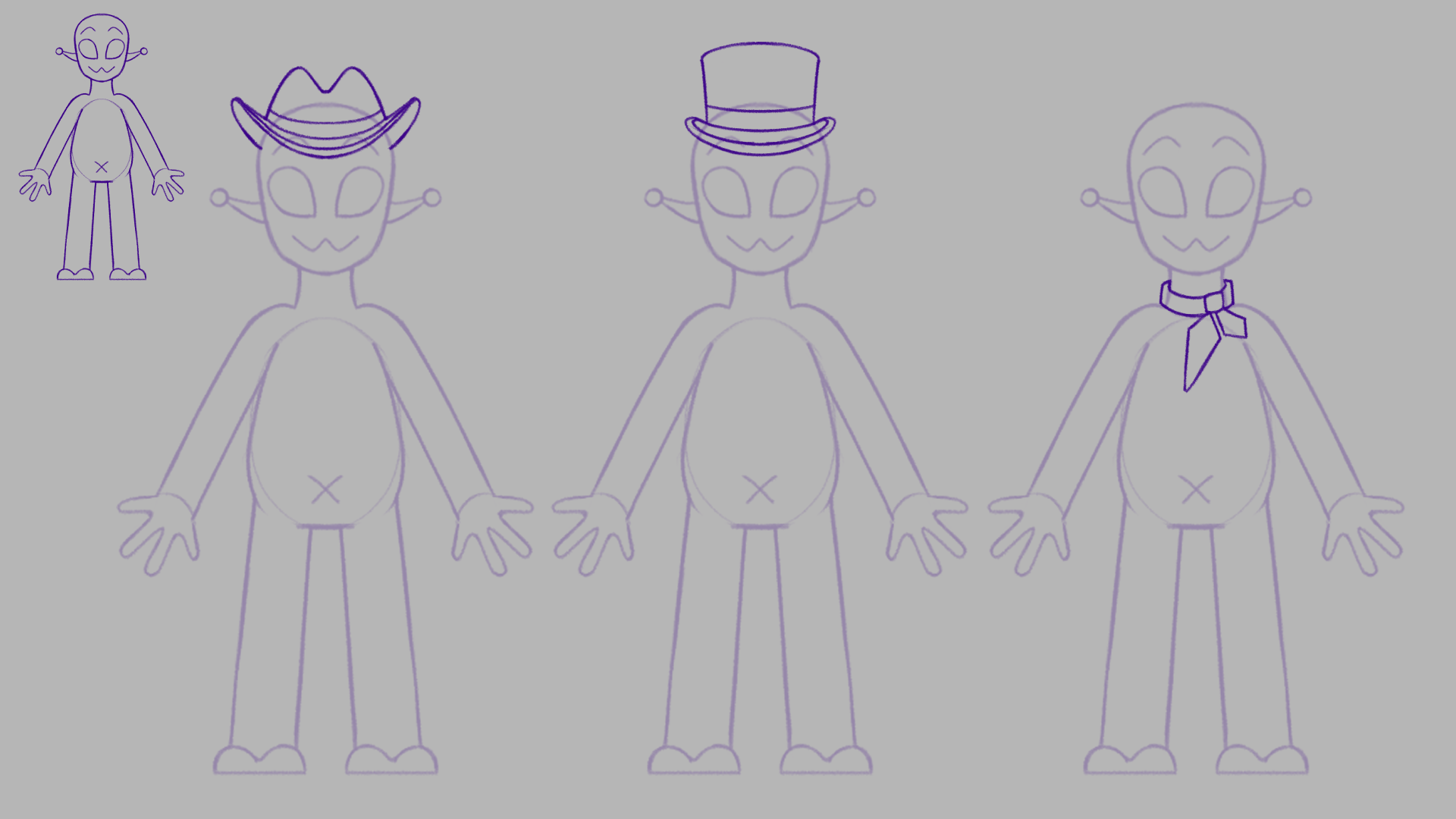
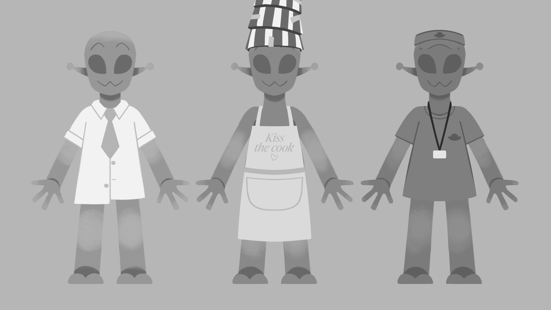
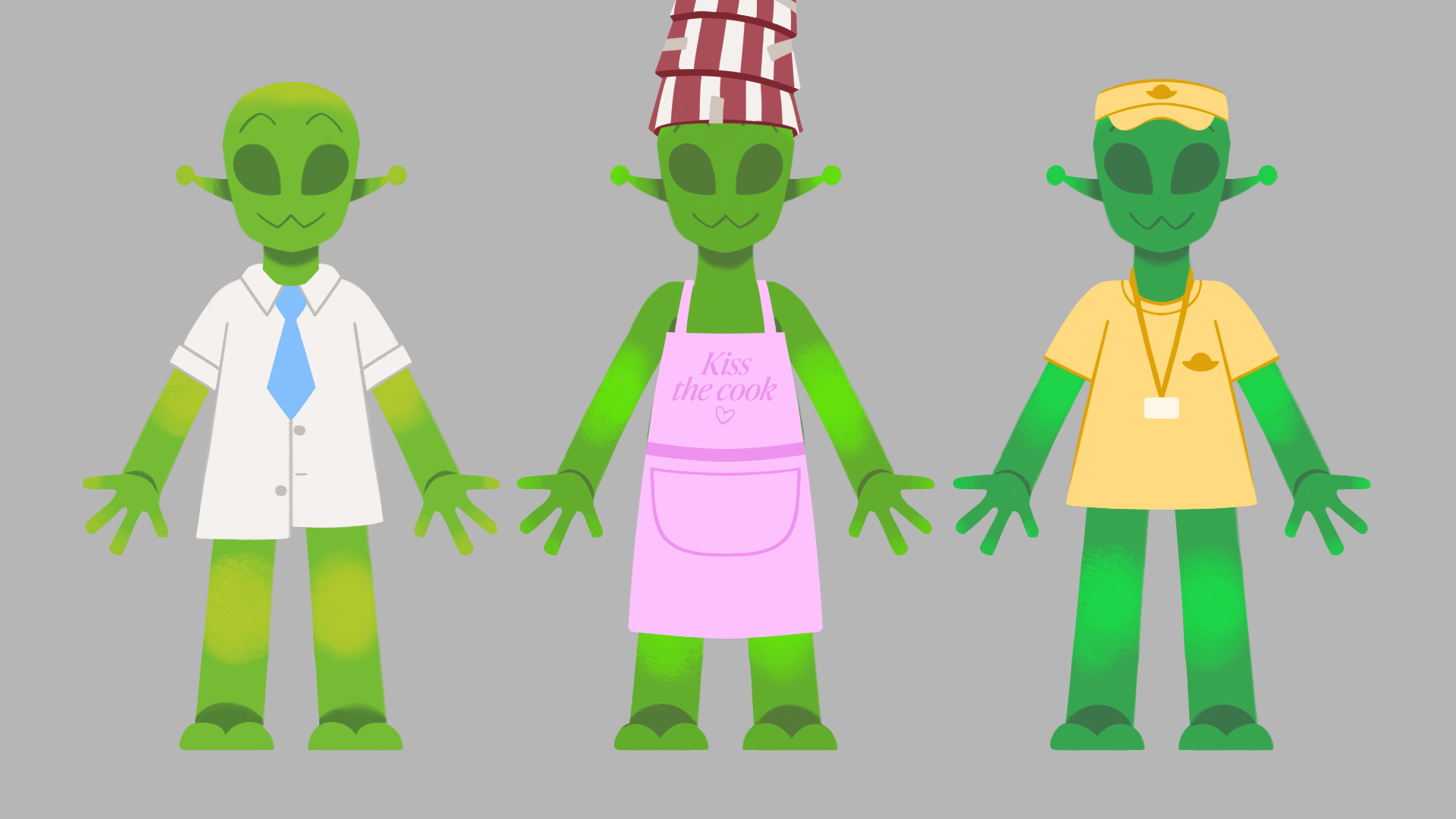
Next is a little revamp on the roller coaster alien worker, as in first glances they could be mistaken for the inspector with its uniform look. Instead of a train theme, I will go for the typical roller coaster operator. They can have accessories such as caps, ear microphones, shirts and lanyards.
With my reference above I applied the roller coaster operator look onto the alien, with variety in accessories. I am leaning towards the first design that includes a lanyard, as I have an idea of how it could be a moving secondary action prop. It can give the character a realistic and visually pleasing look.

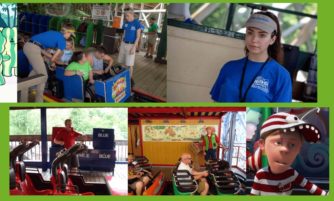
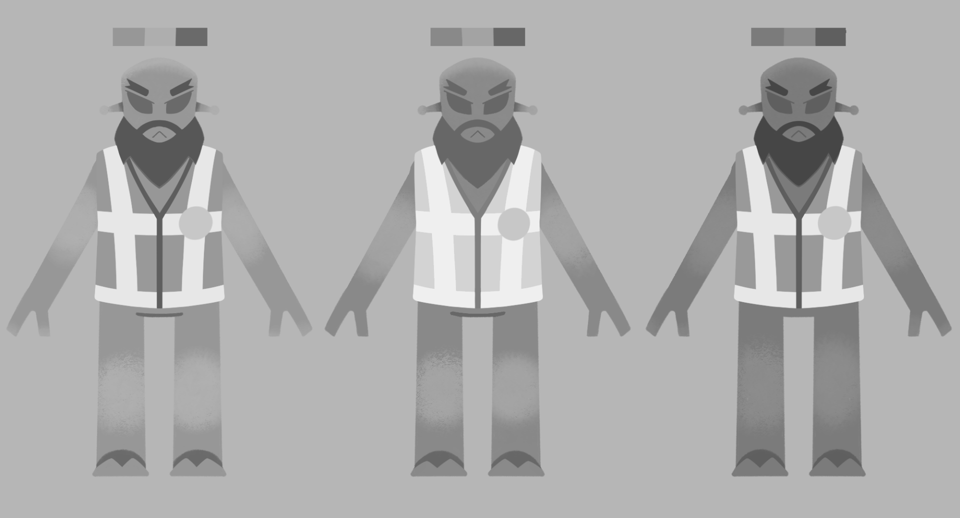
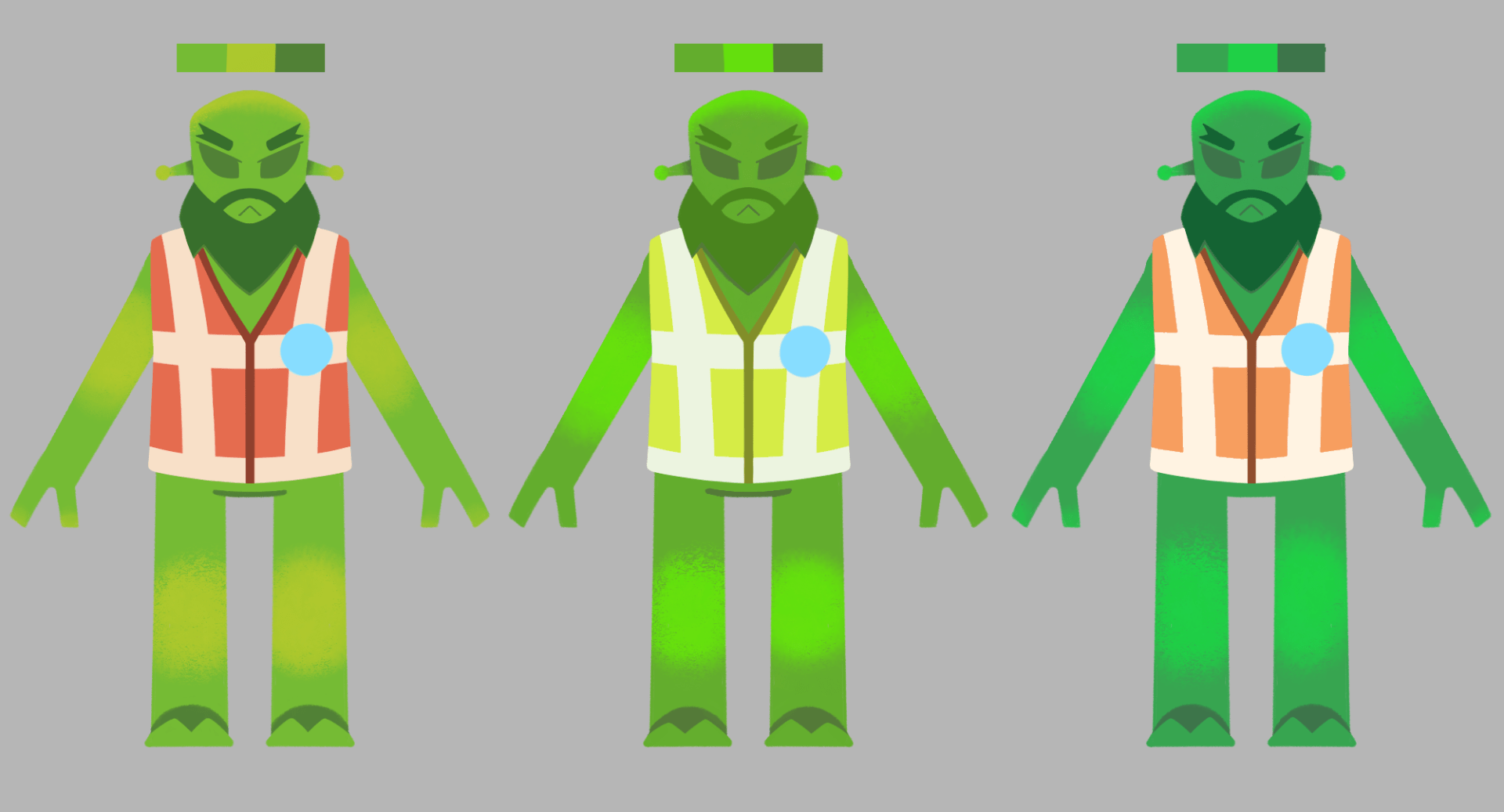
I also figured I should give the inspector a piece of clothing as well. Thinking back to the older Alien coaster operator design, I could bring back the hi-vis vest. Usually inspectors in their regular jobs wear these vests, based on the reference below.

I made sure to keep the inspector badge in with the design in a suitable place, where the hi-vis lines intersect, as it reads better. I am leaning towards the first outfit with no sleeves. This is because I think it looks much more sharp and intimidating than the other designs.

With more concepts for these characters, I developed more of my turnarounds, for better understanding of their shape, and for reference at the rig building stage. There are some alterations I will make possibly in the next week, but as of now this is how they are turning out.


This week I have also tested some colour on the aliens outfits, for the workers, and the inspector. It would be good to give them variation in colour so each can be recognisable for their outfit, and colour scheme of outfit.
Lastly, I have made a start on planning out my backgrounds. I wanted to start by sketching some greyscale thumbnails of the backgrounds I have conceptualised throughout the storyboarding stage, for better understanding of depth and foreground / mid ground / background elements. 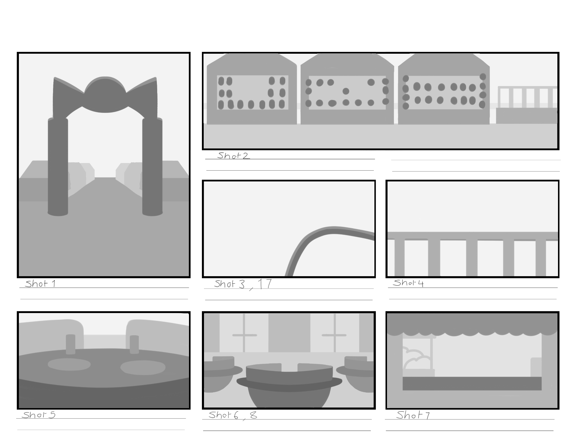
I also made a start on sketching on the PSD backgrounds files I have made, where the final backgrounds design will be made. So far I have only a couple sketched out, but during the next few weeks I will develop and alter these backgrounds to a good standard, all while following tips from my references.


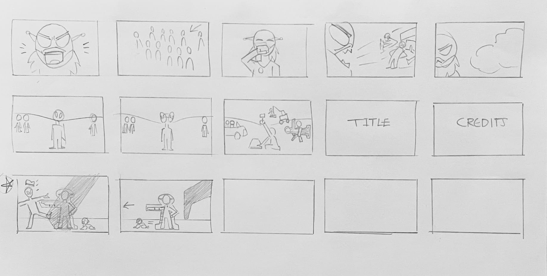
At the end of this week I finished up a third version of the storyboard with the newer ideas and changes made.


WEEK 5
I presented my work again during week 5’s group tutorial, and I have some things to consider, and alterations to make to my story layout. The story at the moment was not creating a significant punch for the end, making the story quite dull. I talked through the story with Aodhan and he gave me good points to think about and add to the story.
The most major point was to make it a little more wacky! To make it an enjoyable and fun watch, I need to keep making jokes throughout, and make each scenario something silly.
Next point was to focus more on the inspector. It would be good to let the audience know the Inspector is someone that will arrive at the start. It would also be interesting to make them scary/intimidating at the start, but actually gives the park a pass at the end with a smile – setting up a high tension moment only for it to end up okay.
One other point we discussed is that the inspector should probably stay the same size as the aliens; mainly for cutting down on strange BG design perspectives, and to cut down on uneccessary confusion.
Right after the tutorial I wrote down some new story points, and a newer layout of the story. During this week I will update and structure these points into a new script version, and try a new storyboard version too.
Apart from the story, we also discussed colours, and backgrounds. I showed Aodhan the colour studies I did in week 4, but with the black and white filter tip that Henry showed us that morning. I applied the filter settings to my studies and noticed some colours blended into each other etc. On the alien operator the purple shirt blends into the green skin. To avoid this I can turn up the brightness/hue of the purple shirt and / or change its colour. After class I went back into the colour studies and made subtle changes to the tones, so it looks better in the B&W filter.
As for the backgrounds I started sketching, Aodhan had recommended I keep in mind of the depth and perspective of the objects. I hadn’t noticed before but most of the background sketches had made the buildings and objects look very flat. So this week I am giving each background a bit more depth and thickness to it. I also need to be referring back to my main source of BG inspiration for sparking new ideas, such as the Powerpuff Girls BG designs I researched a few weeks ago.

WEEK 6
With the ideas and feedback from the lesson last week I made improvements to the fourth version of the storyboard. I presented this version in the group tutorial this week and everything looks good aart from small perspective views, and some shot cropping. This means I can continue on with my animatic development with this storyboard to guide me, and to make any smaller changes throughout the animatic if needed.