A CV is a vital piece of industry material that we must show to future employers. They provide necessary information about the experience a person has, and what they can provide for the job application. I will create a new CV to present myself and my skills in the form of an animation based job role.
I stated by finding inspiration for tailoring my CV and designing my CV. I mostly looked through the CV examples provided to us on blackboard. They were great to take inspiration from and to figure out a specific job role for my CV, as they had made before, for example 3D modeller, 2D animator, or generalist.
One example I liked was by Chloe Hughes. Chloe presented her CV in a clear and neat way with a pink colour scheme. I was interested in how she used software logos to represent what software she has experience with. Her CV is stylised around becoming a 3D artist, as she states her skills and roles within her projects. She also includes her experience and qualifications which enhance her professionalism and skills. I also like the layout of this CV, and how she designed her unique logo. It brings out a visual personality and makes her material well known for its look.
One more example I liked was by Rebecca Blair. Rebecca has a creative and cute looking CV with an effective layout design. In this CV and in Chloe’s as well, It is effective to add the longer parts of information in the middle of the CV and the smaller parts of information on one side or another of the CV. They both achieve this very well. Rebecca has a charming logo of a character waving outside its frame – it makes for a creative look. The duties that Rebecca lists on each of her work experience roles is informative and professional – it lets the employer understand what their role entailed, and what skills they learnt. Lastly, the list of soft skills enhances their presentation, as employers would want to find out if they contain those skills.
Source:
https://learning.ulster.ac.uk/webapps/blackboard/content/listContent.jsp?course_id=_323029_1&content_id=_6251896_1
I started writing up my CV content on a document first of all, so I could gather all the information I need and see which would be suitable to add. I had an older version of a CV from college that also helped in adding in my information – like my work experience, and my school attendance.


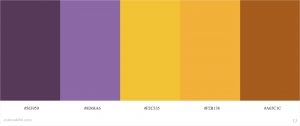
I visited the color.adobe.com website to find a suitable colour palette for my CV design. I associate my style with the colour purple, so I was hoping to add a few purple tones to the piece. I found these two settings above that inspired my progress with the palette I settled with. I mostly stuck to the template of the first palette, but later changed the colours around to more purple tones.


After I picked out my colours, I used one of the colours to help me design logos for software that I use. This included logos for Clip studio paint, Blender, Photoshop, After effects, Autodesk Maya, and Substance Painter. I used a painty brush on photoshop and drew out the logo of each software. I will present these on my CV to show that I have experience in the software.

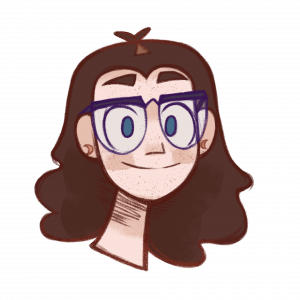
Next, I brought in my portrait illustration that I use on media accounts as my profile picture. I can use this to show how I look, but also my illustration style.

I experimented with a few font styles and combinations to see what I liked best. I downloaded a few new fonts from the web and tried them all out on a photoshop file.

Once I picked my fonts (that change later on) I added a few coloured rectangles from the colour palette I made. I made subtitle squares and titles for each topic that will be shown on my CV

I used the grid feature on photoshop to accurately align everything on the page to a suitable position.

This is my first draft of my CV. I had added my content into the CV in a suitable place, and my software logos at the bottom. There were still a few parts I needed to add such as the link to my showreel, adjustments to my profile paragraph, and more information for my experience.

In my second draft of my CV, I adjusted the profile paragraph so it works a little better. I added my job roles from the work experience I have, so its more clear what skills I learnt and how I took on my jobs. I also adjusted the text in the CV to containing more textboxes, rather than singular text layers. This helped to align each text in a better position e.g. In the ares soft / technical skills, each of the words were separate beforehand, but now they are all in a textbox.
This was the version I had shown my tutor in my tutorial. He suggested I could push to the right the job roles bullet points, as it is cluttered in this version, and hard to read. I also was encouraged to add my portrait illustration at the top left of the CV to add a bit of personality and personal touch.

Lastly, this is my final version of my CV. I added my portrait illustration at the top, added my showreel link as it was finally finished and posted, and right aligned the job roles. In addition I also adjusted the colours of the boarder as I thought before hand they were too dark for the CV. Now I believe everything works well in the CV and it accurately highlights my skills, what I have done and what I can offer.
Link to the PDF: CV_Dayna_Keaney