Planning Phase/Decision Making

I’ll try and keep this blog brief because normally they end up very long, hopefully I don’t miss anything. In teams of four or five, we were to create a animated short based on the theme of ‘Adventure’. Our group started with discussing ideas, we decided amongst ourselves to each bring a couple ideas to the next class and we could all discuss and decide on one then.
Most of us brought one or two decent ideas to the call, but I went a little overboard and brought in a list of about ten okay ideas which definitely slowed things down a little, I took from Aodhan’s class when he broke down the structure of a joke in a storytelling context for my ideas.


Everyone hopped into a call in discord and we ended up deciding that each member should write down the three story ideas they liked most, and have a go at making storyboards for two of them.


I chose two of my own ideas to go with, that I thought wouldn’t be too difficult for our first time animating. They were both structured similar to a joke, I thought comedy would be the easiest genre to do within such a small time frame.
The chicken crossing the road was a play on the common joke, I hoped to build some suspense and have the audience expect a headless chicken joke after he appears to be hit by a truck, but the actual ‘joke’ would be revealing why he crossed the road. My reveal was a little abstract, he never made it to the other side and somehow ended up back where he started, showing he’s stuck in a loop – continuously crossing the road but never making it to the other side.
The golf animation would be a little more generic, focused on character animation and facial expressions, and the punchline was that when it looks as if he is heading for a hole in one, he’s very determined as an epic soundtrack builds, then at the last second an alligator jumps out of the water and eats him.

The next week we shared storyboards, featuring a surprise storyboard from Alisa, based on a joke we made in passing about how cute a giraffe adopting an alien would be, as they both had antennae. We discussed each story, listing the the pros and cons. Then, to narrow it down to two, everyone voted against the stories they wouldn’t want to do. There was a lot of voting and discussions but we wanted to make sure everyone’s opinions were heard and we all worked on something we liked. Then we all did storyboards/concepts for the stories.

I worked on a storyboard for Dayna’s idea, following a dramatic alien abduction on a soldier, but the end revealed he was only abducted to fill in a missing spot in a game of poker. I thought this idea had a stronger narrative structure than the other option and I liked the setup and punchline structure.
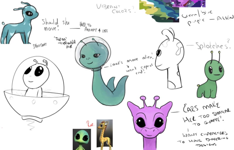
I worked on concepts for the alien and giraffe story, exploring different designs for the alien character. I leaned a lot more into the alien side of things, and tried to consider how this character would move/interact in animation.

I also worked on some concepts for the poker abduction story, exploring different designs for the soldier, from complex to very simplified (more animation friendly) as well as a ship design and an alien design. I thought we could avoid facial animation with the use of a helmet, and the aliens would only need to be animated from the waist up. For the giraffe alien story concepts. I looked at models on Sketchfab for reference. For this story, I used video game models, like from Among Us and Halo, for reference.

Most members tried to explore concepts and ideas in both stories, before coming to a final decision. During the next discord call we discussed each story as much as possible, asking questions about any aspect of the story which might prove challenging, seeing which story suited each members skill sets the best and most importantly which story was more fun to work on. After one long discussion and one final vote, we came to the decision to work on the Giraffe and Alien story.
Pre-Production
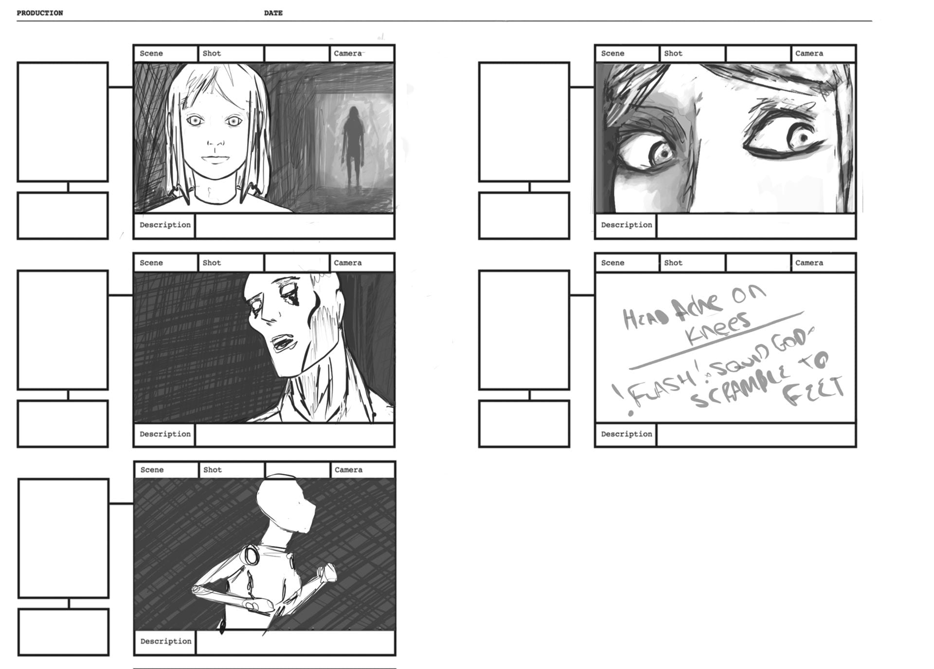
 One of the weaknesses of the story we chose was the narrative structure so we started by writing a script, which eventually turned into a place for general notes; assets, sounds, special effects etc. Then we made storyboards based on this. Each of us did our own storyboards and Alisa and Jennifer, who focused more on this story previously, attempted animatics. My storyboard was quite rough and just followed our script but I added a butterfly that wasn’t previously part of our story to mine, I thought it fit the theme and gave the alien reason to enter the spooky forest, as well as a reason for the helmet POV showing her objective.
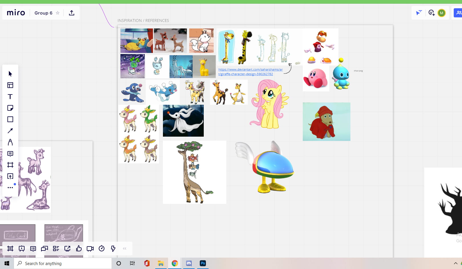
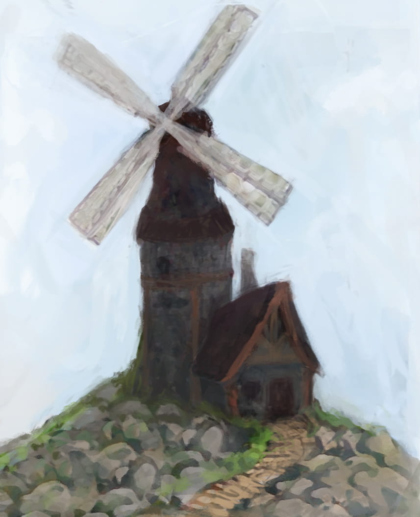
 We used Miro to collect research and references, as you can see we had a large variety of references for the alien character. I mostly used the environmental references during this week, from real African grasslands to Snow White.


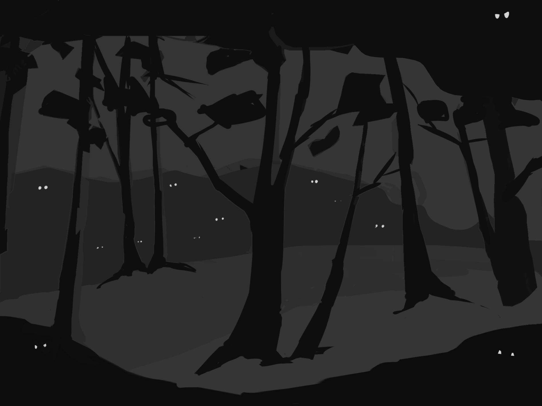
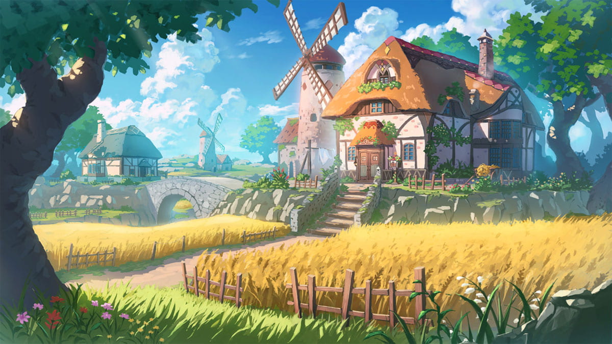
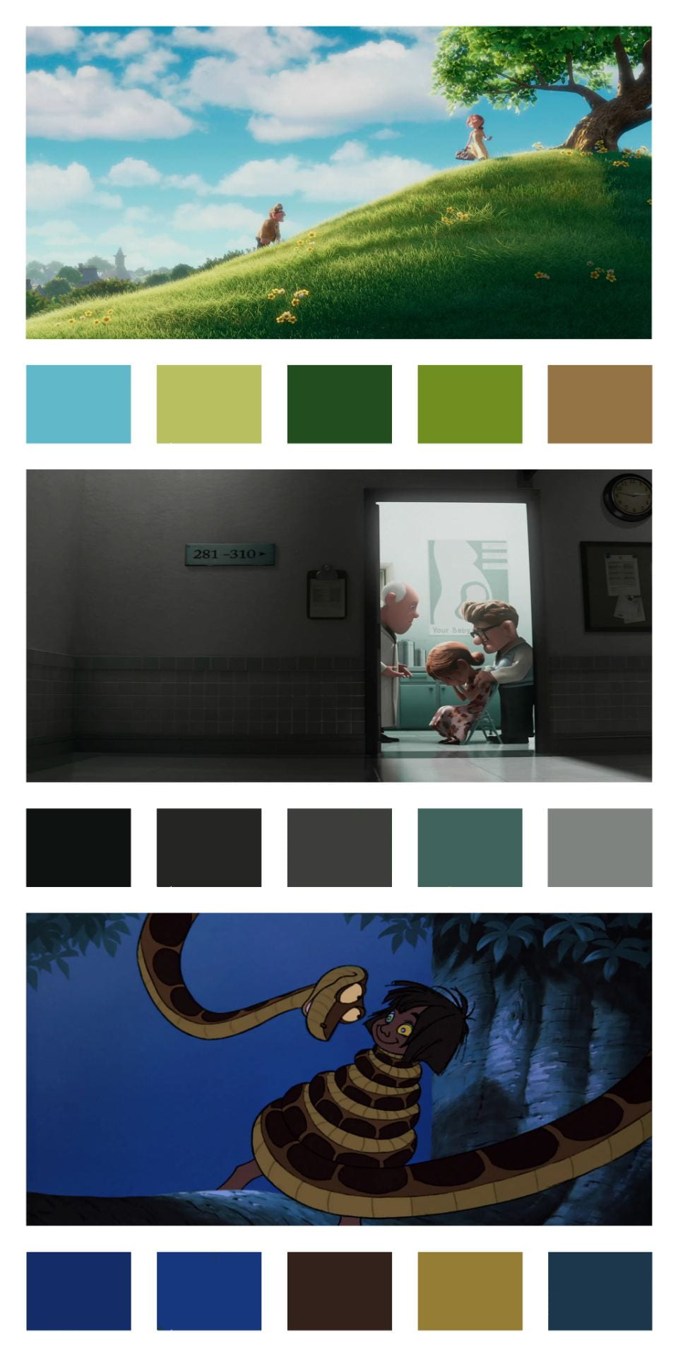
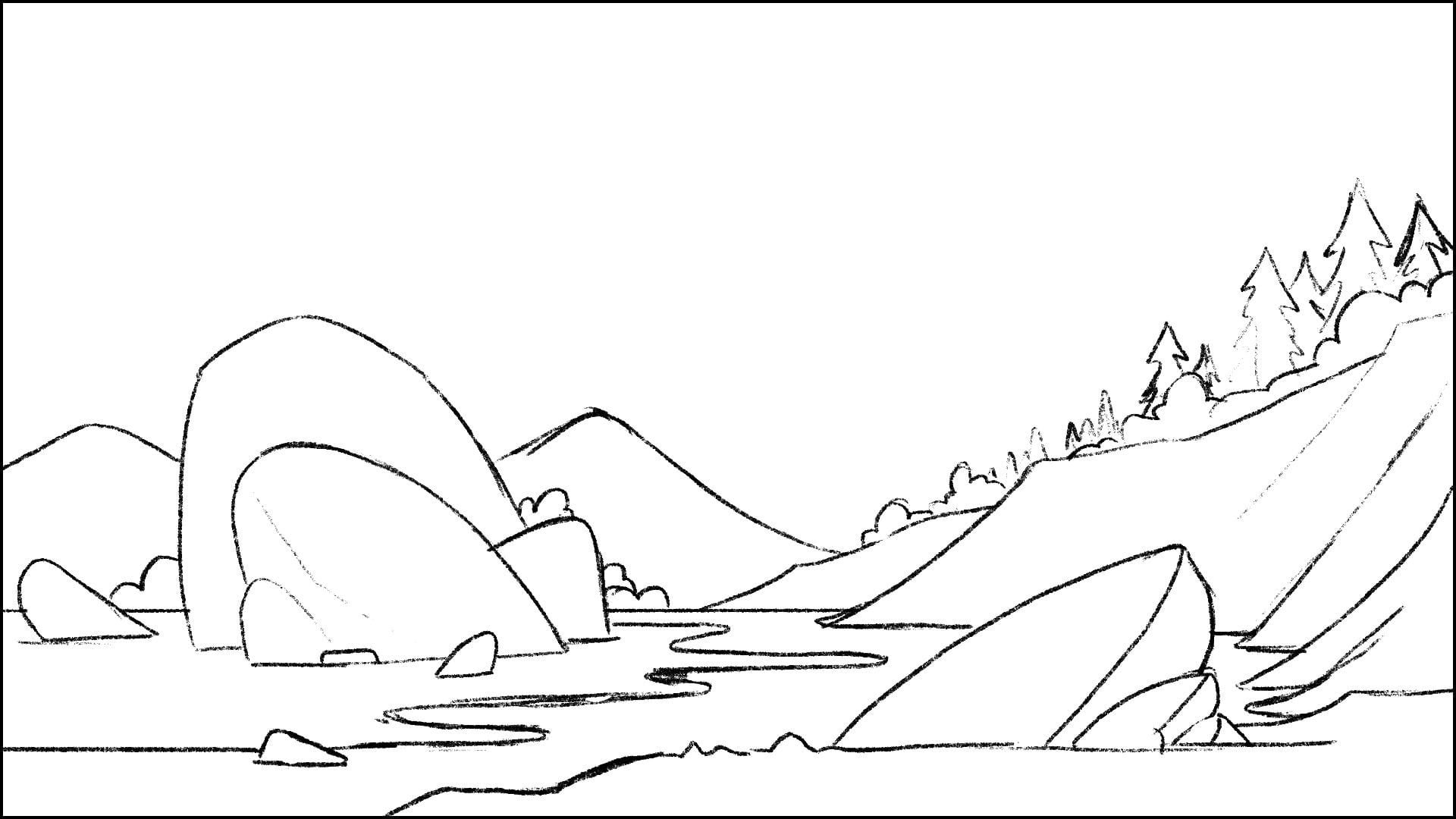
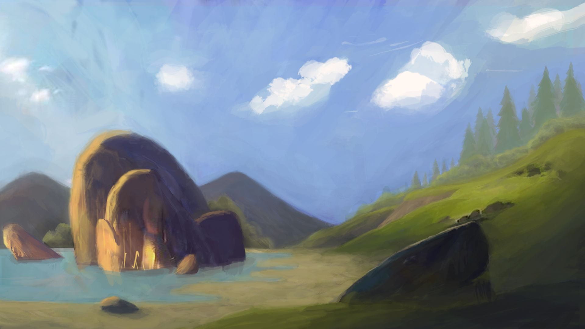
I tried to explore the environments and the colours the story would take place in, through the transition from the dense forest to the savannah. We were thinking of a low poly and cell shaded style, so I didn’t use a lot of different tones and tried larger shapes to see how it would look. I used mostly orange, pink and green hues, inspired by the colour scheme of The Lion King, since it also takes place in a Savannah. The forest scene was more of a thumbnail experimenting how the eyes in the forest might look.

In the next weekly Discord call we discussed everyone’s storyboards/animatics and identified what parts we like the most from each one. We combined everyone’s work into a sort of Frankensteined storyboard to give us direction for the previs. We also wrote any action/movement that happened in each scene as well as the type of shot/camera movement. We then split the scenes up, assigning people to work on certain scenes for the previs so the workload was split evenly.
Previs


Before we got started on any 3D work, we thought it would be a good idea to use Sketchfab collections to store any 3D research/ references. Alisa, Dayna and I made collections for this, and since we followed each other we could see when one of them got updated with new research. If you wanna see the specific models we collected throughout, I’ve added links on our names.


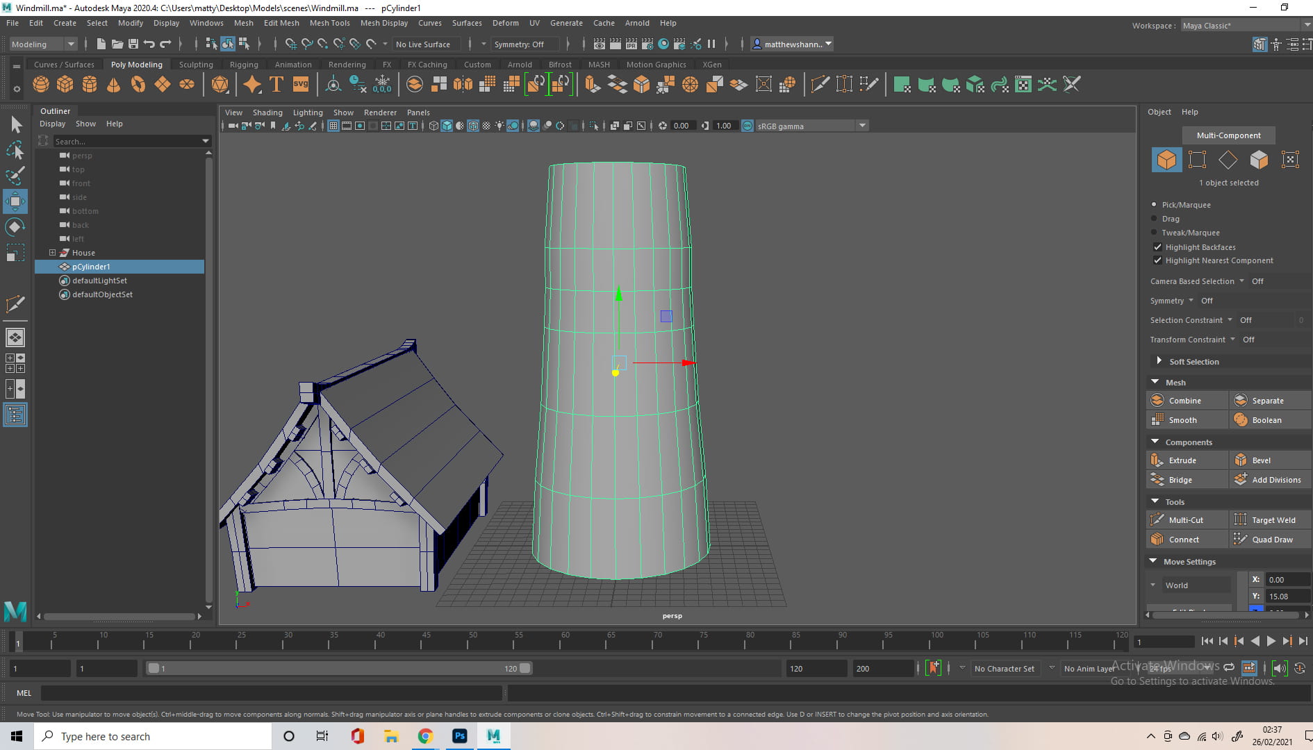
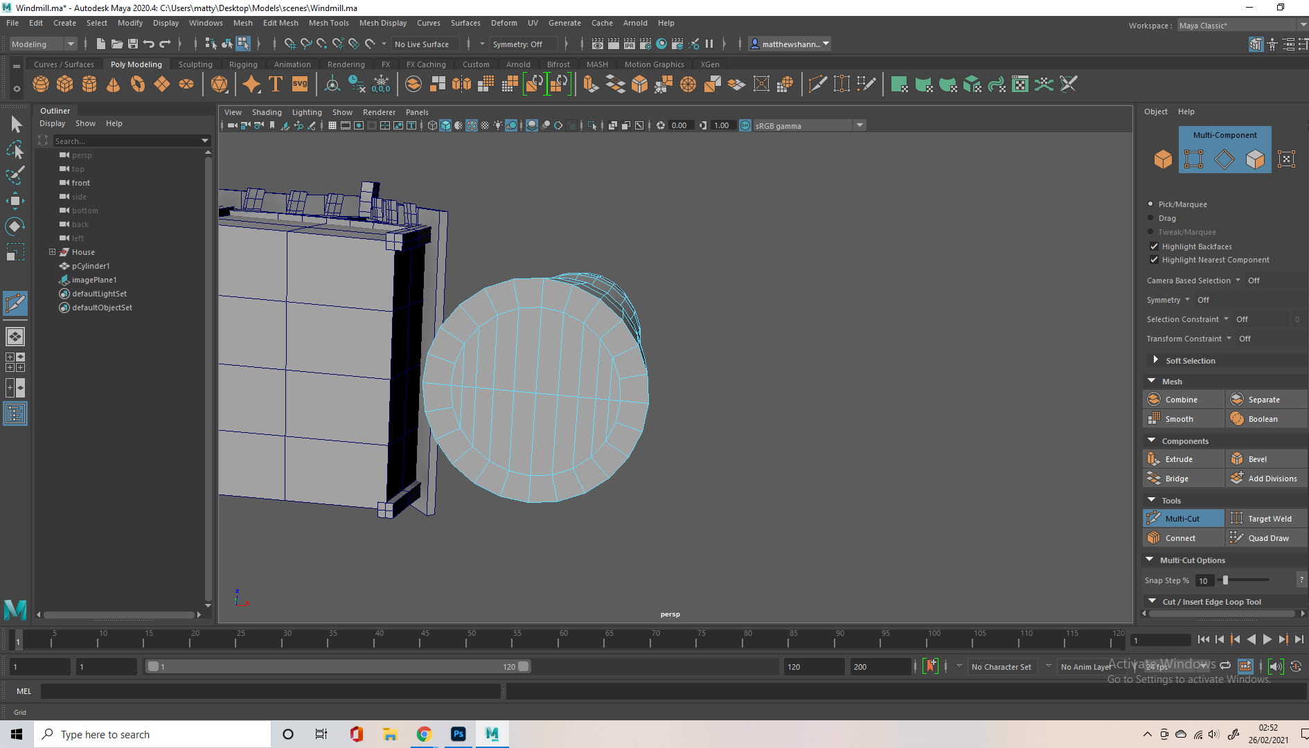
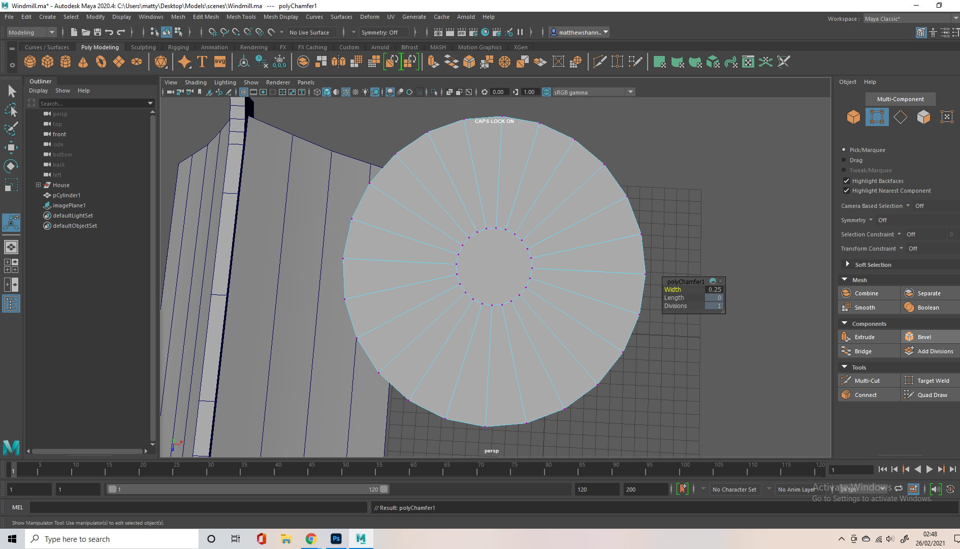
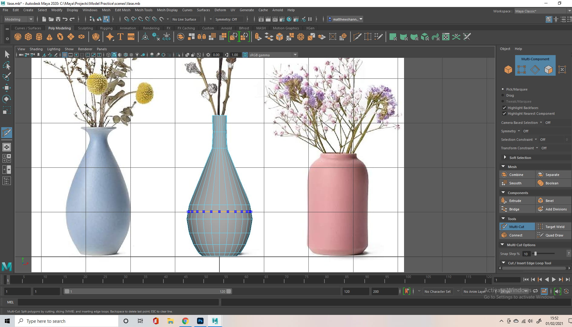
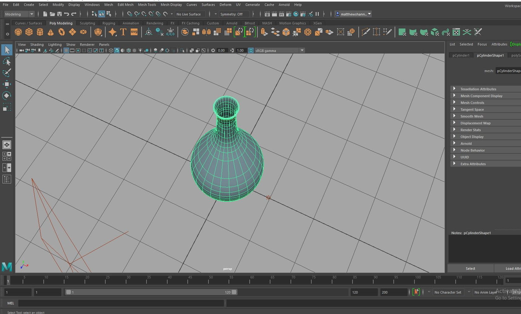
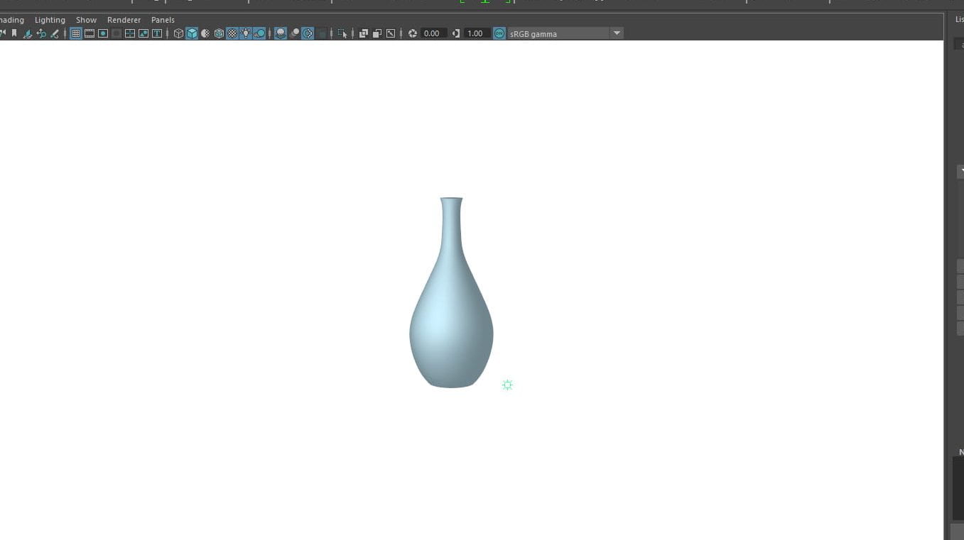
For the Previs I thought it would be good to test some potential assets too, so I started with a tree. I used a cylinder and tapered the top, then selected the horizontal divisions and moved them into an interesting shape, using the soft select tool to keep it looking organic. I then duplicated this once I was happy with the shape and added them extruding from the top, with different angles and rotations, as the branches of the tree. To make the rocks and leaves I used a smoothed cube and the soft selection tool to shape it.


I knew this wouldn’t be the final ship model so I wasn’t detailed but I did base it off Jennifer’s concept. I used similar methods to the rocks above to shape the main frame, then duplicated this for the engines. I selected the faces at the front and extracted them as their own object, so I could make the glass front. The antennae/wings of the ship were cylinders with decreased divisions, and I extruded the top to flick back. I also modelled some grass I knew would be close to the camera, based off the storyboard. Again I just used a cylinder and tapered the top, bending them with the soft selection tool. I also added planes for the ground and sky.


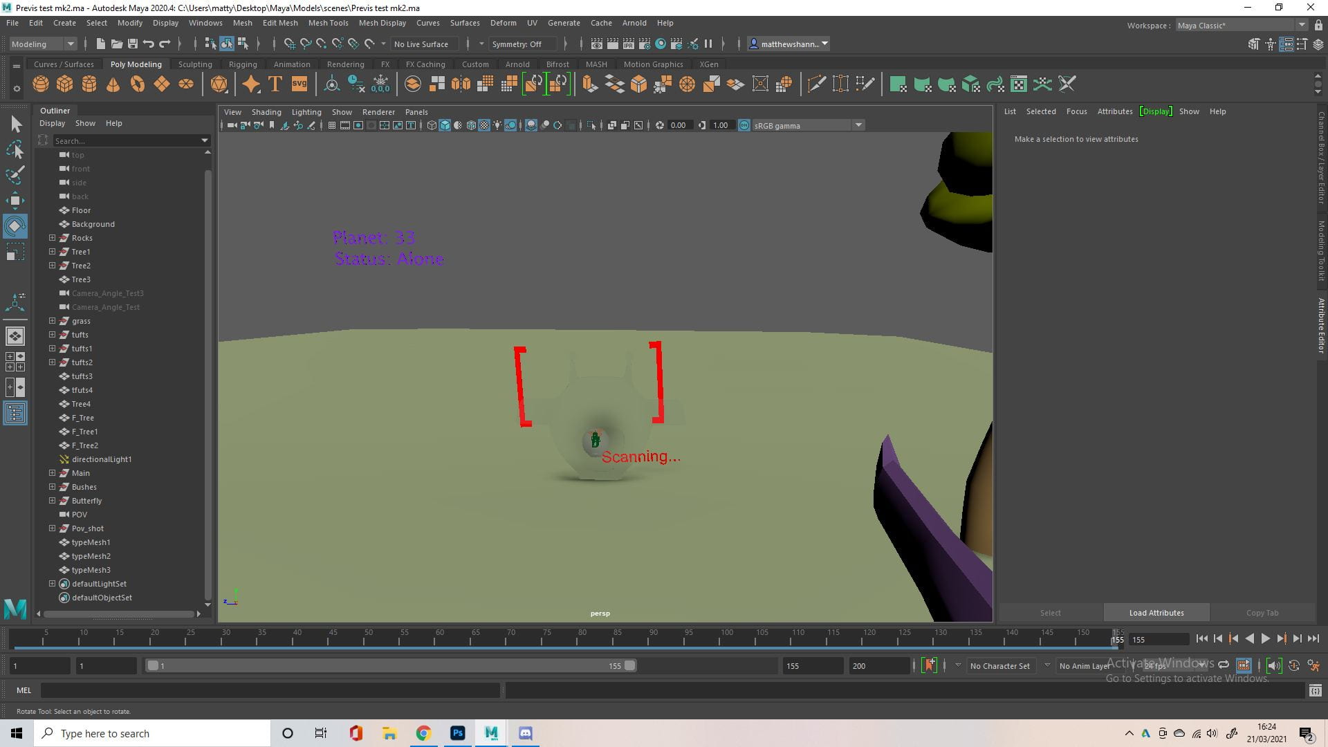
I used the curve tool to make another tree for variety. I knew the back of the ship had to be animated so I extracted a door for this and you can see in the next picture I added a walkway that extrudes. I also imported the previs alien model that Dayna worked on. The last picture was just adding a camera to the scene based on the establishing shot in Jennifer’s storyboard, something the group wanted as we thought it had strong composition and worked really well as the first scene on the planet. You can see the original if you scroll back to the Frankensteined storyboard.


I then modelled a quick butterfly, we knew this would be replaced so I just made it rough. I used cylinders for the body/antennae, a smoothed cube for the head and shaped planes for the wings, making sure to extrude the face on the back so it wasn’t black. I then added the wings ‘animation’ to the butterfly, I keyed in 3 frames which was just rotating the wings from a pivot point on the body, and looped this. You can see I also added bushes to the scene, which are just the leaves from the trees above, duplicated and scaled to different dimensions. These were also placeholders for the final bushes.


This montage of photos is me setting up our POV shot. I started by duplicating the scarier tree I made and building a forest scene. I reversed our helmet and added the camera inside of it, decreasing the focal range for a fisheye effect. I added physical text and brackets in front of the camera to represent what we would see in After Effects. I then ‘animated’ the butterfly again. Below is the finished previs for the two scenes I worked on.
I didn’t bother to document the ‘animation’ process because the previs is just the main movement and timing of the scene, so there wasn’t much to it. The timing of this all felt really good to me, as you can see I was pretty experimental with how the ship landed but I think it came out well and the tutors seemed think it was fun too. I also liked how I used the butterfly to guide the eye of the viewer to the entrance of the ship. We did notice some things I could improve on, like how the alien and her ship were a little far away. Below is how the final previs came together.
As you can see my scenes were in a different aspect ratio to the rest of the group, something to keep in mind for the final rendering. I think the scenes flowed surprisingly well into each other for being worked on individually, but there were definitely some areas to improve. The biggest area of concern from the tutors were the last couple scenes, the camera angles and movement confused them, caused by some difficulties Ben was having with his scenes. We had some small things we noticed too. We thought Jennifer’s scene would transition to mine better if we had my butterfly start in the middle of the screen (where your eyes end on her scene). We also thought me and Dayna’s scene could transition better, as the butterfly flew off screen on mine and was still on screen in hers. These small things all boiled down to communication on the end/start of everyone’s scenes, something we were much better at for the final animation.
Production
 We decided to use Trello to organise our project a little better since people might forget/miss things during our weekly calls. We hopped into a call and set everything up, making a big to do list for the assets we needed, making roles we needed filled, setting deadlines for when we had to complete certain tasks by, etc. We added our initials to what we wanted to work on.
We thought we would need four animators, and an editor. We did separate texturing and rigging etc. but we later found it easier for everyone to work on the whole of their own assets. My first job was to make the alien as soon as possible, as we all needed to use her in our scenes. Alisa did turnarounds for the characters so they had a consistent style and we had final designs, and I used this as reference. While I worked on this, Alisa worked on the Giraffe, Dayna was looking into the colour palette of our scenes as well as using image planes to dress our scenes and Jennifer was working on backgrounds.


Before getting too deep into modelling something, I looked into some organic modelling in Maya. More importantly I looked into modelling for animation and the most important thing I saw repeated throughout was to maximise quads, something Alec has often reiterated. This is also where I found the average vertices tool, which I used quite often.
Alien – modelling, uv, textures, rigging


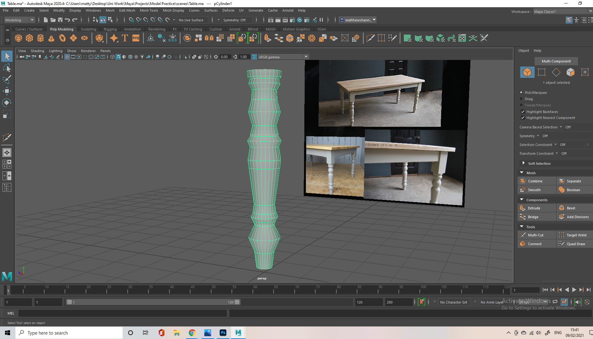
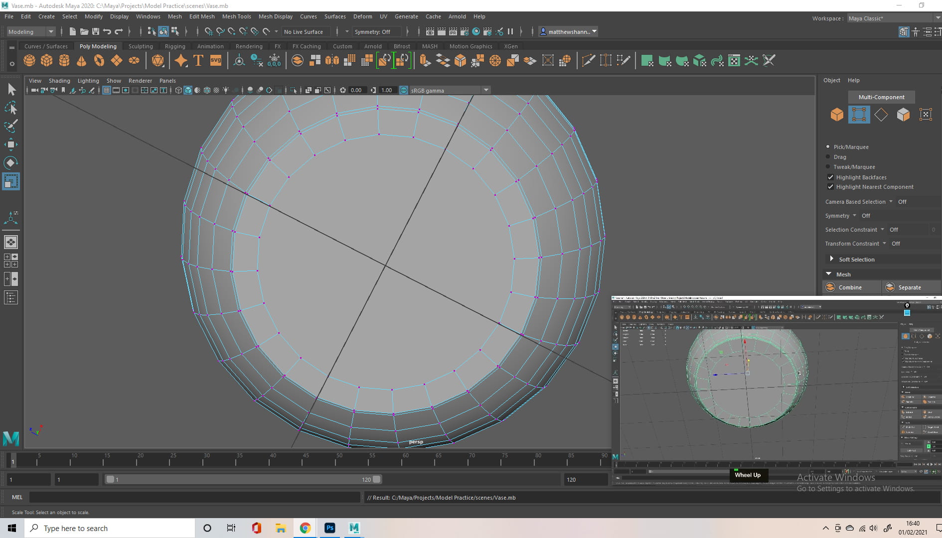
If I were to do this project again I would probably approach this model in Blender, after progressing in the organic modelling project, but I wasn’t that confident in Blender at this point. I started as I normally do, with a smoothed cube and the soft selection tool. I approached the whole model like this, piece by piece, using the soft selection tool and smoothed cubes or cylinders. I also used the symmetrize tool and averaging the vertices during this model which I never used before, which I found very useful. As you can see I was working from Alisa’s concept, shaping the mesh to match this, without this turnaround it would’ve been a lot more difficult.


I did actually take the model into Blender, as I found it hard to get that organic shape in Maya, but I was still very new to Blender and even more to retopology. I ended up bringing it back into Maya and approaching the body in some other ways, saving the blender sculpt as a back up (3).

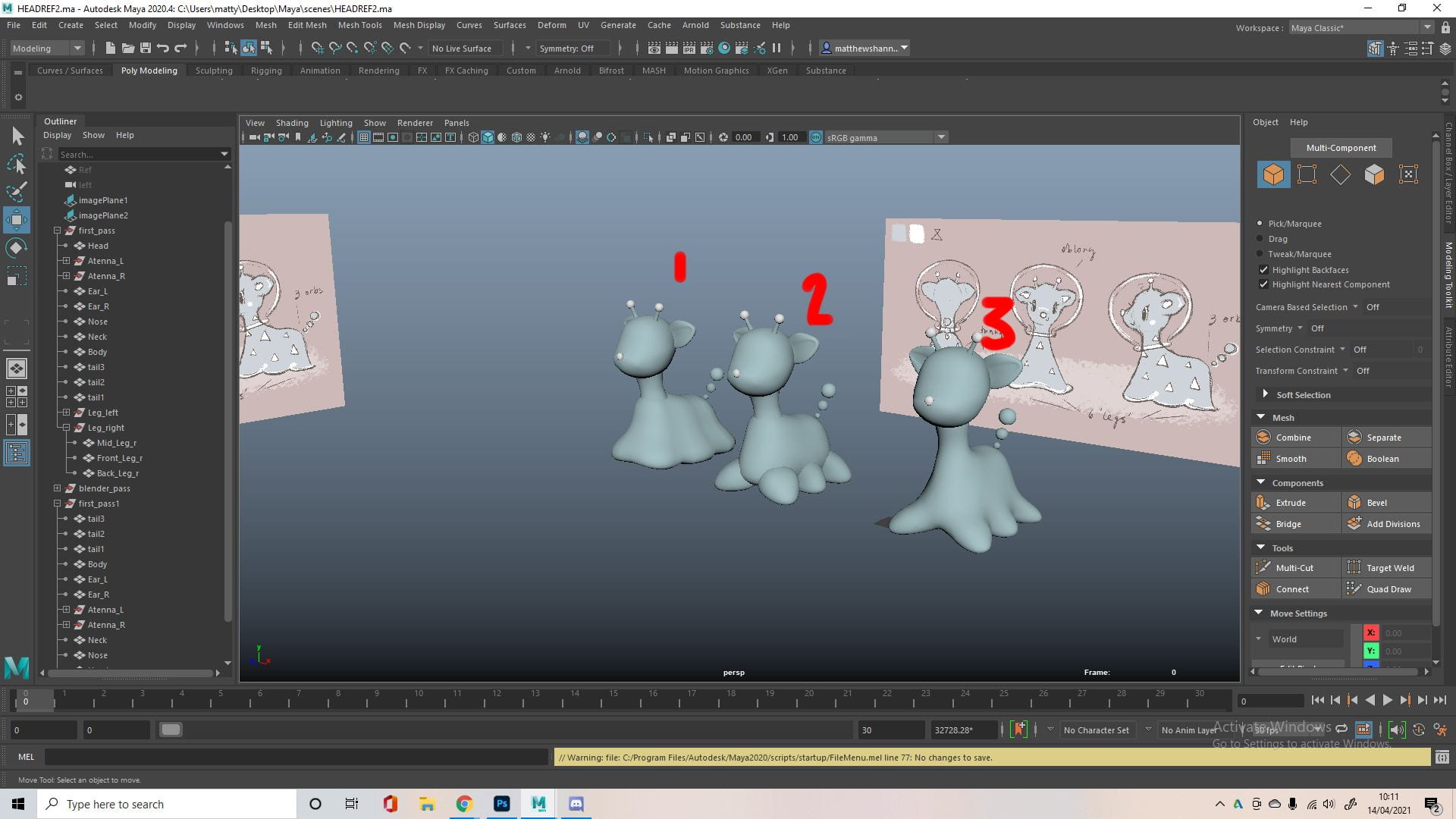
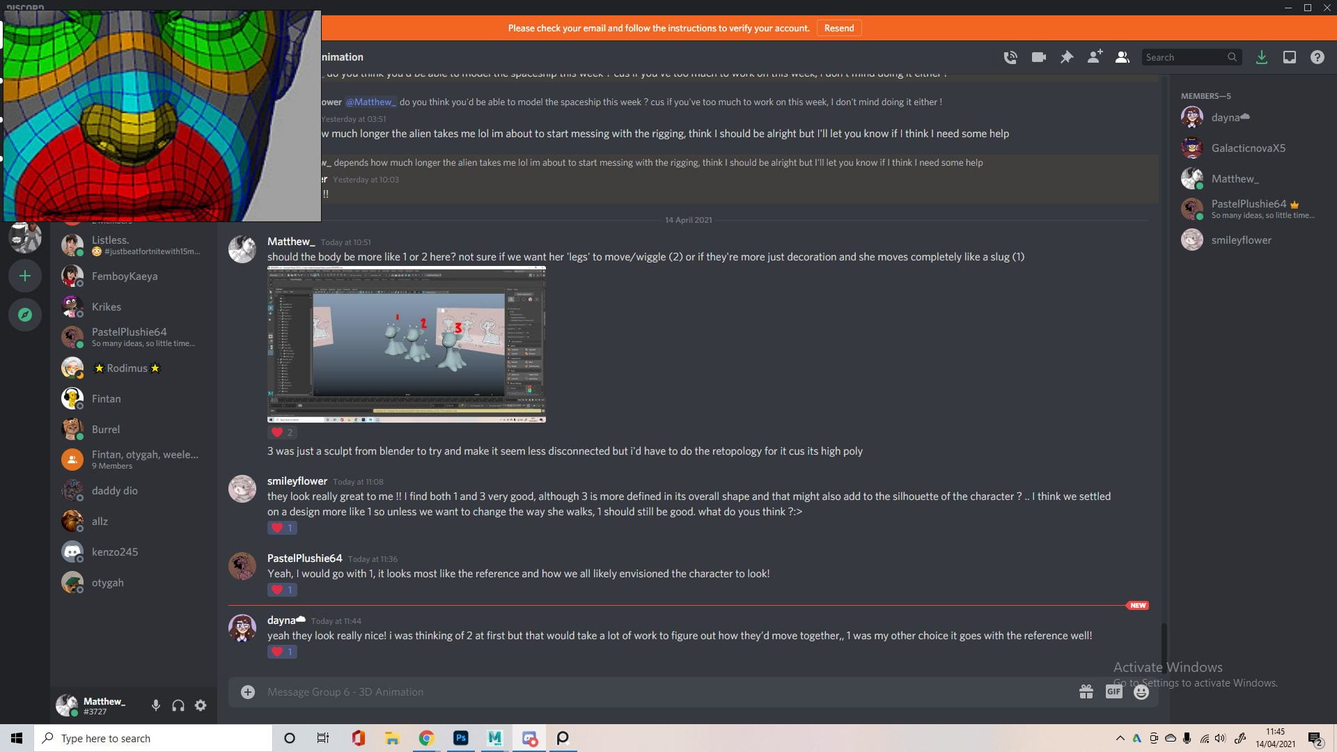
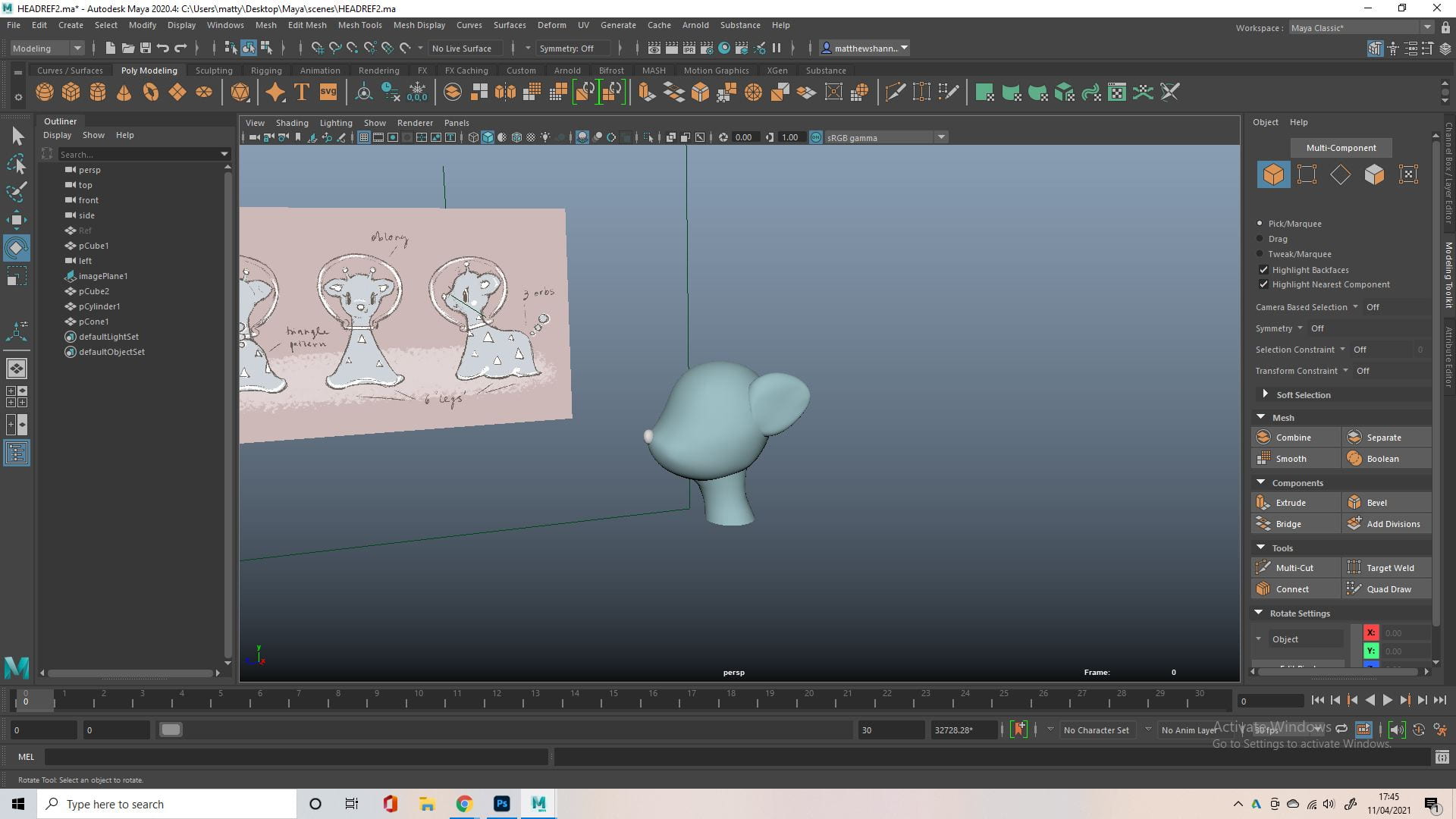
You can see I took another approach to the character, having 6 legs a little more separated to the character (2). I also took more time in Maya and tried to model the body to have the rough shape of legs, but still one shape, which was more similar to what we discussed as a group previously (1). I sent a photo of the 3 models I came up with to the group for feedback because I didn’t really know what to go for and I thought everyone should have a say on our main character, we decided on option 1.


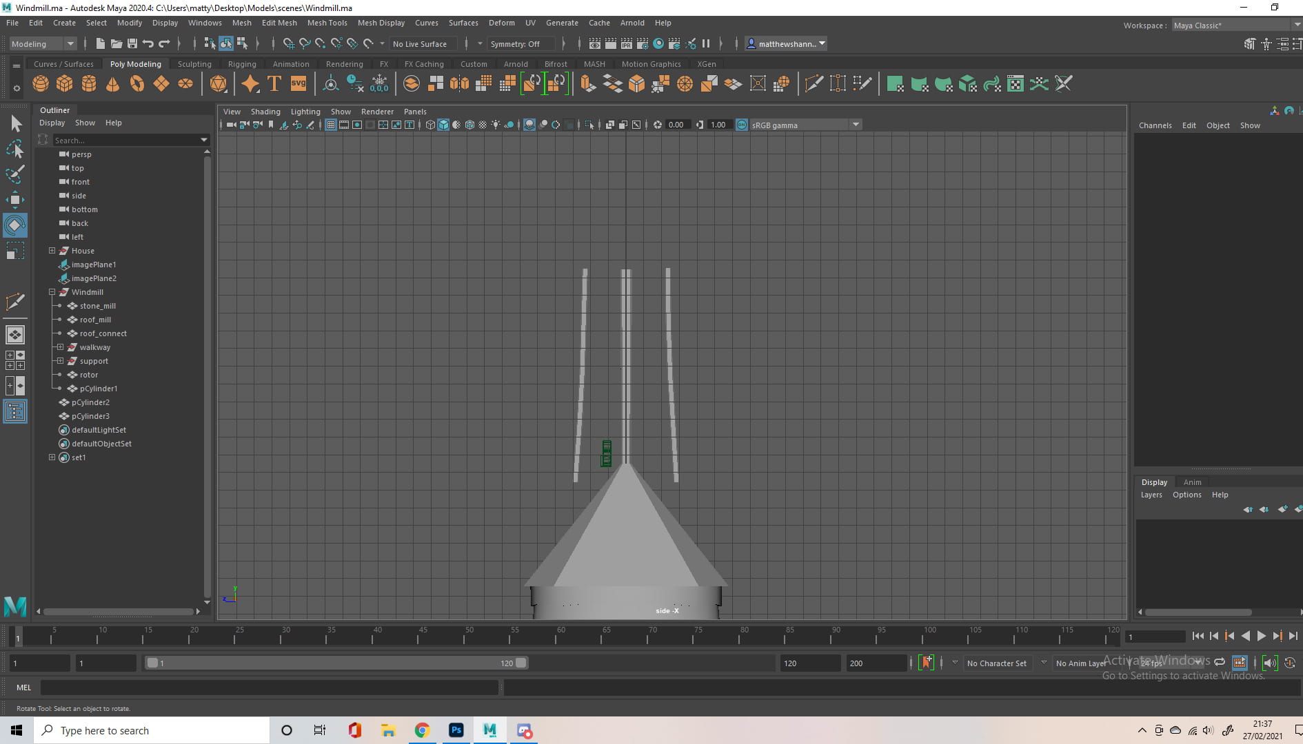
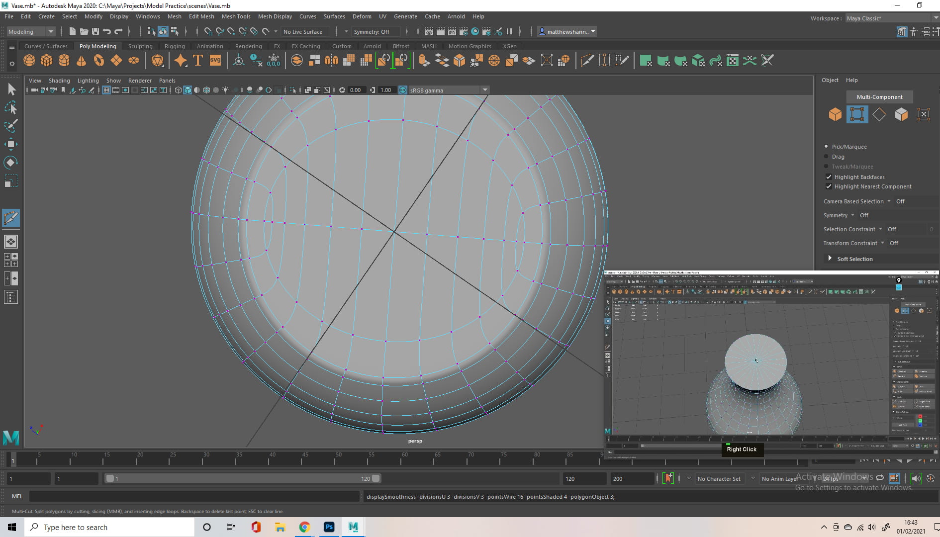
I then modelled the helmet. I went back to an old tutorial from Alec for some guidance, showing ‘junctions’ between polygons (transitioning from 2 to 1 etc. to replace triangles or n-gons). As I was having some issues with the helmet, since the bottom had to be a lot smoother than the top. I also looked at Dayna’s helmet on the previs model to see how she approached this.

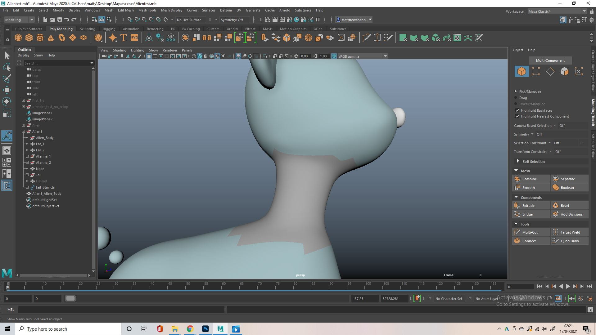


Following feedback from the tutors, I connected the body, neck and head. At this point we had a class from Henry on retopology so I was alright with giving this a go. I used the quad draw tool on the neck. I then had to go in with the multi cut tool where the neck connects to both the body and the head. There honestly not a lot to talk about here, beyond the photos above showing how I did this, as it was just a bit of trial and error. I’m happy I took the time to go back and attempt this because I think it came out really well.

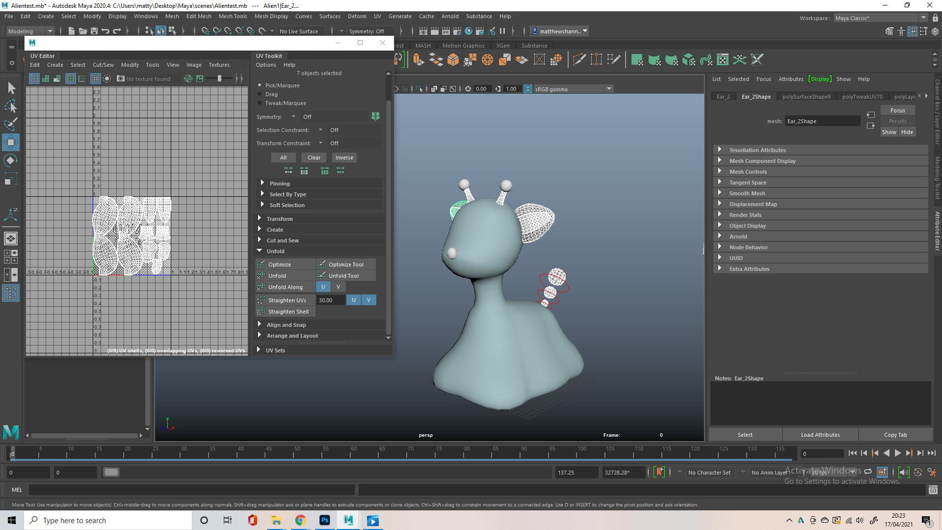

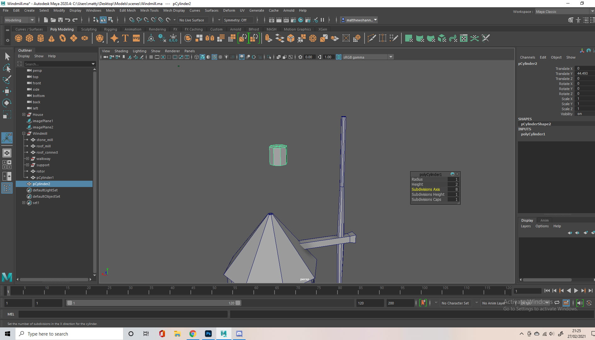
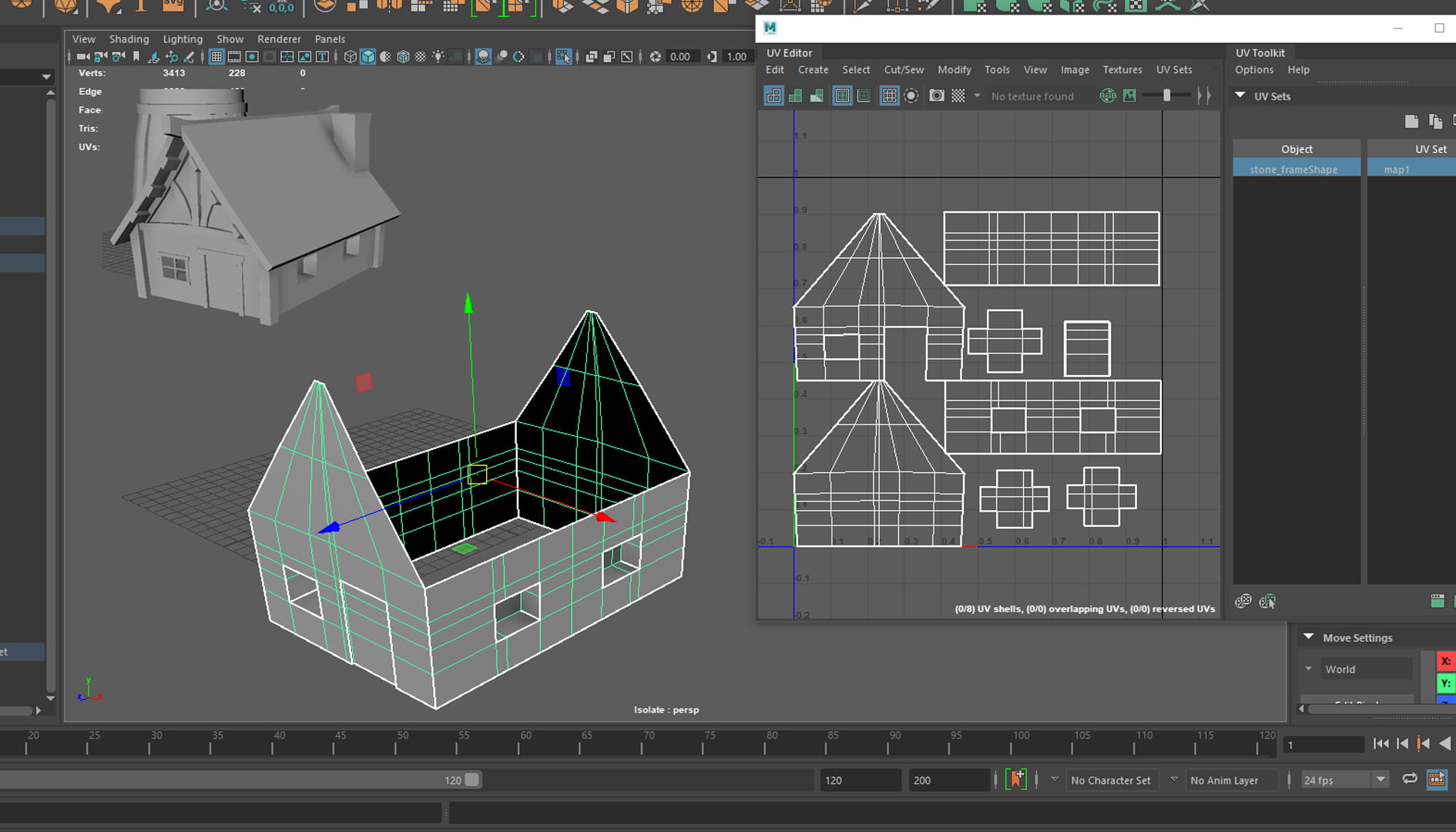
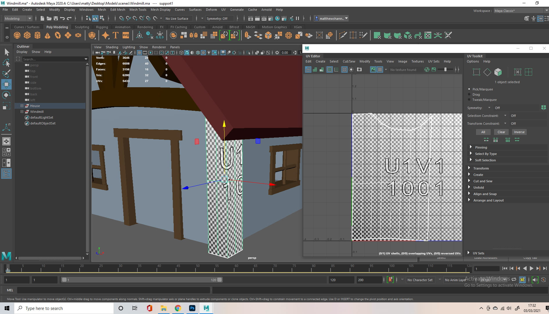
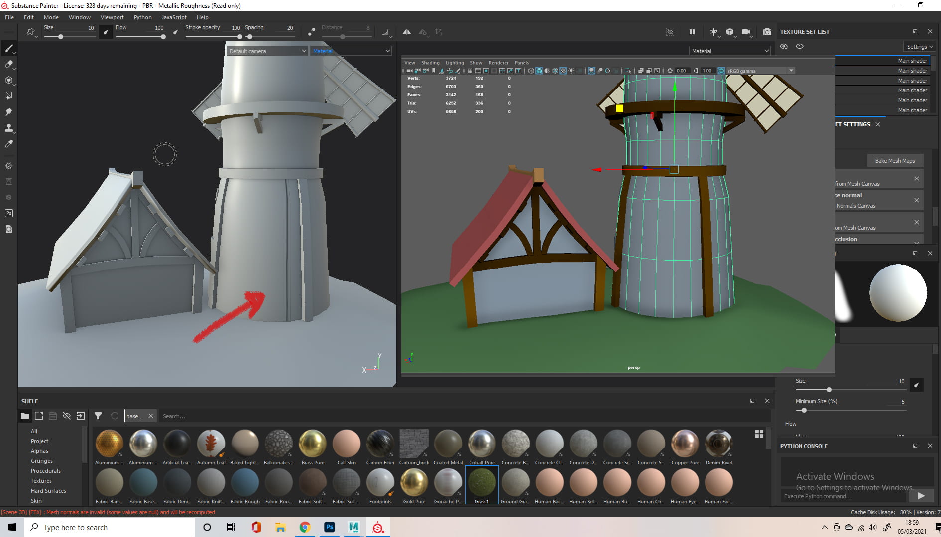
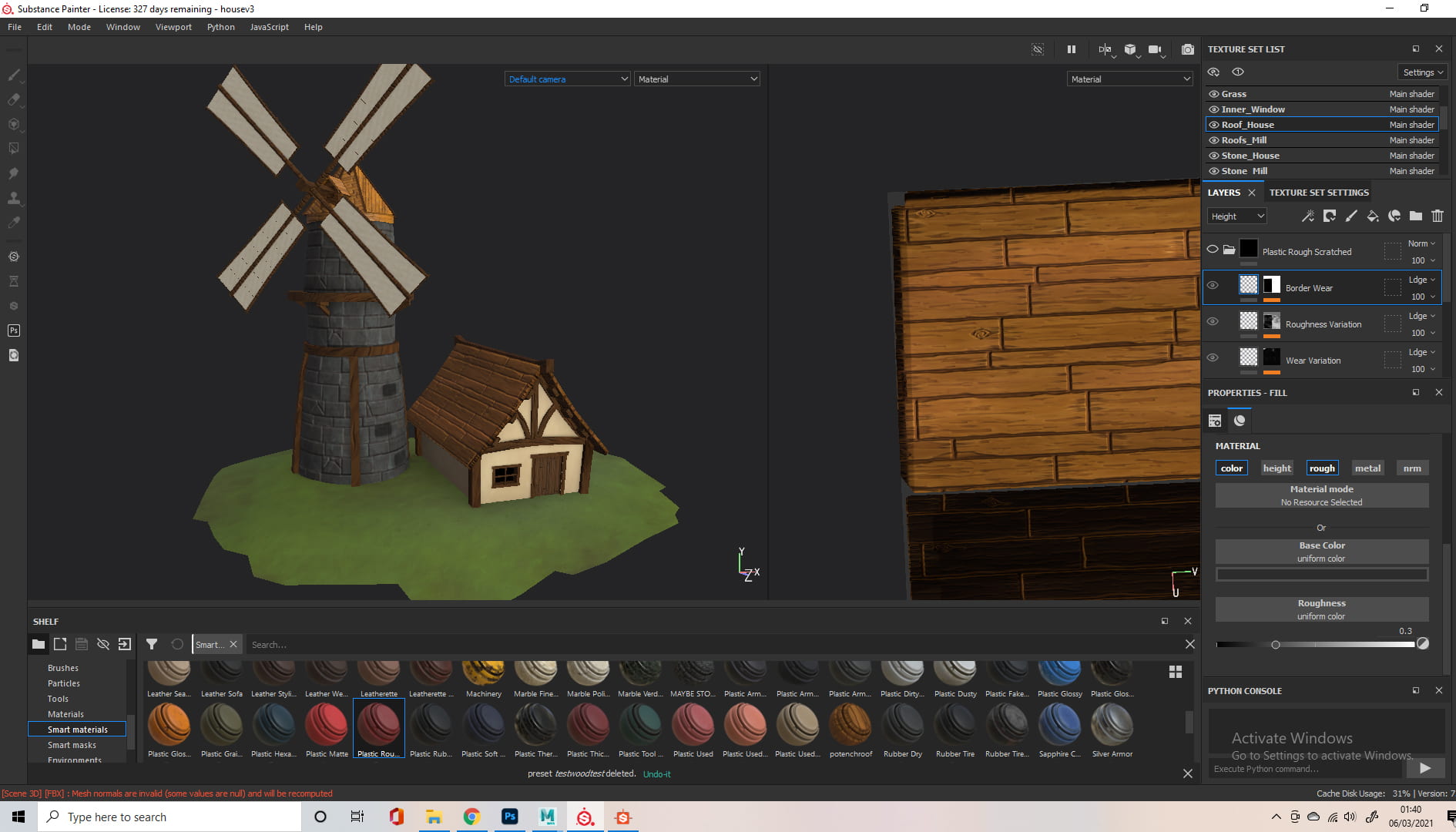
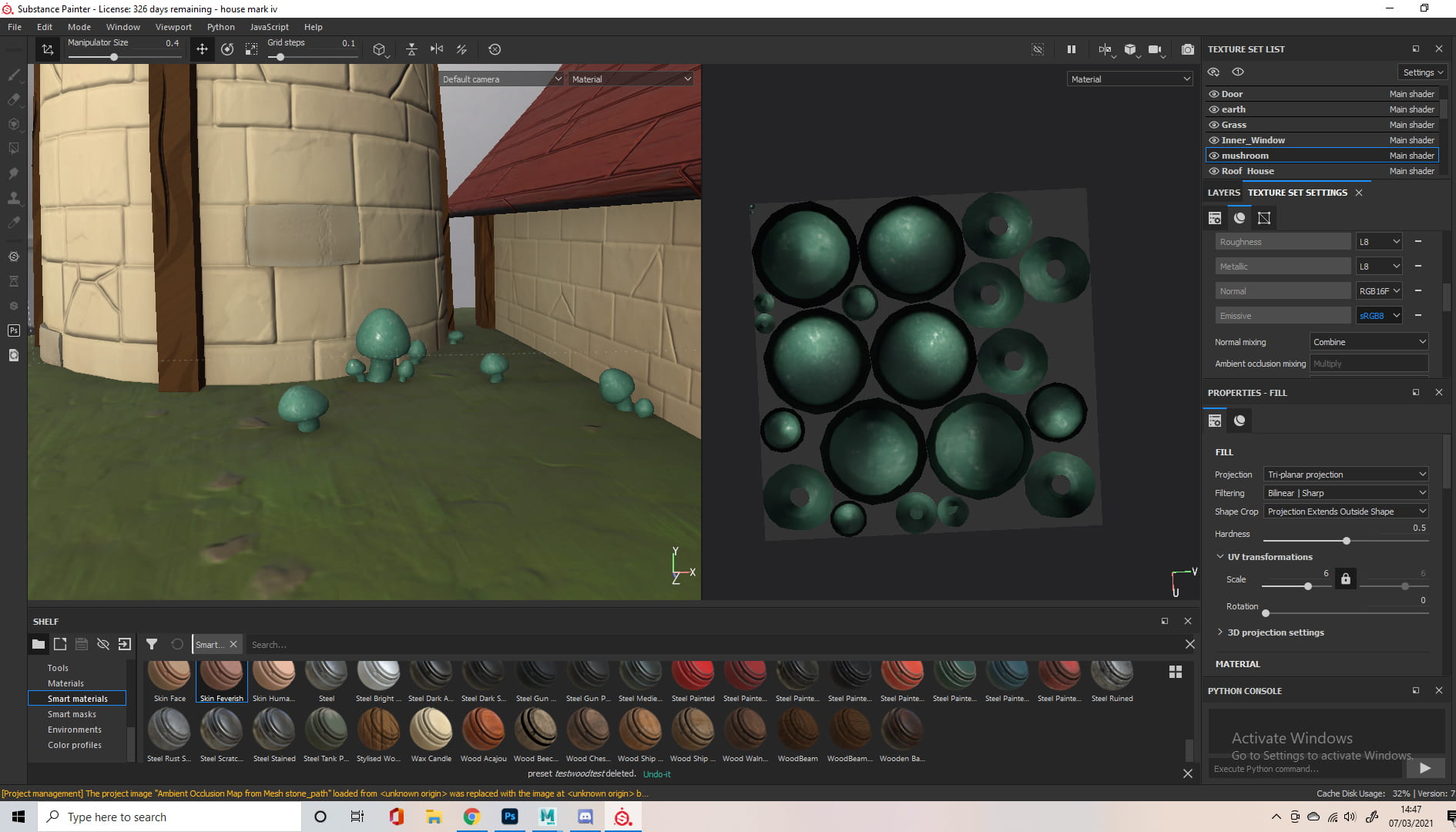
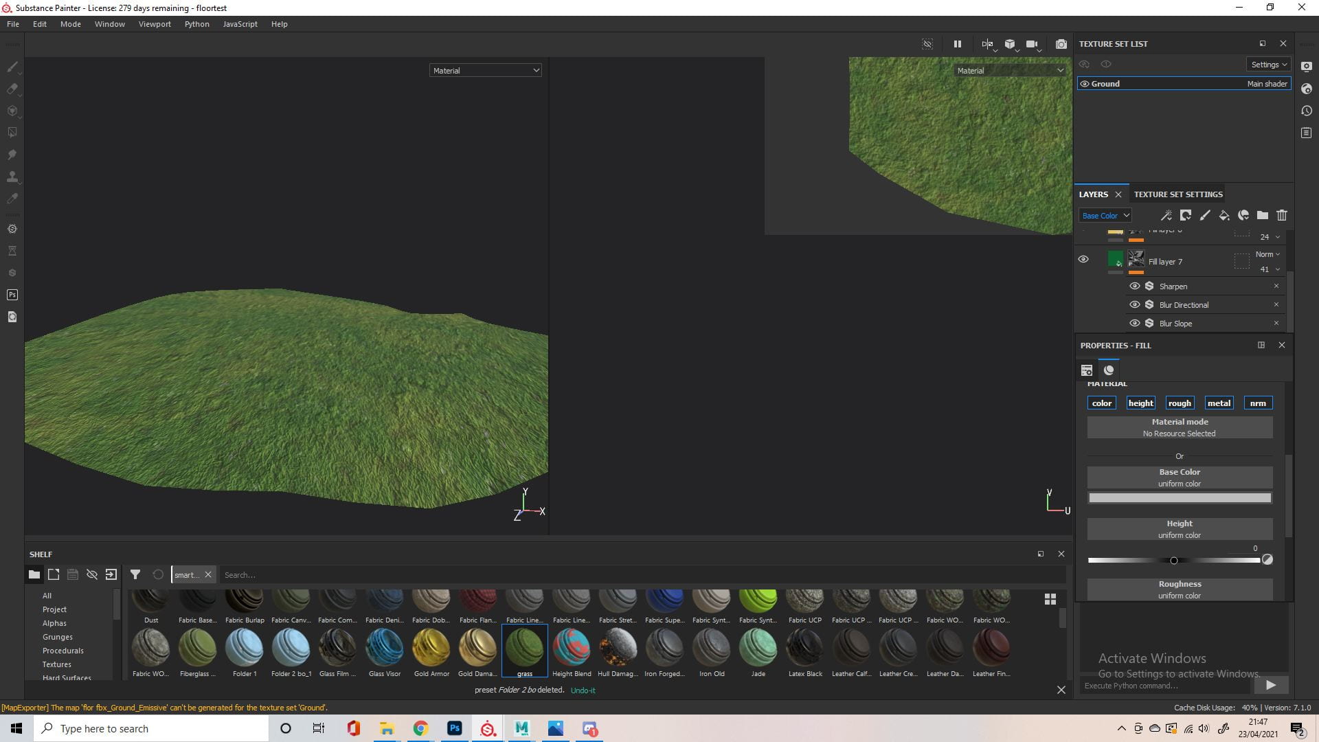
I did a little research into how UV maps normally look for animals, then did the UVs for our alien. I separated it into 3 materials/UV tiles so It would be easier to work with in Substance painter. The hardest part was the main body’s UV maps, I cut along the bottom which wouldn’t be visible, as well as along the back and the base of the neck, and the back of the head. The nose and top of antenna’s maps aren’t included because I just spherical projected them and cleaned up the cuts a little.


I started rigging before I applied any textures, so the group could have as much time as possible when it came to animating. Since the UV’s were done for the character, all they would have to do is apply the textures whenever I had them ready. Alec gave me some help on how to approach the rigging, recording a demonstration on an older version of the model that I sent him. Basically I set up a petty crude skeleton out of joints, then painted the skin weights to better match how I wanted the joints to influence the body. I set up blendshapes for the eyes, allowing a blink and a shocked expression. I then sent the rig to the group. along with a video explaining the rig and how to use it.


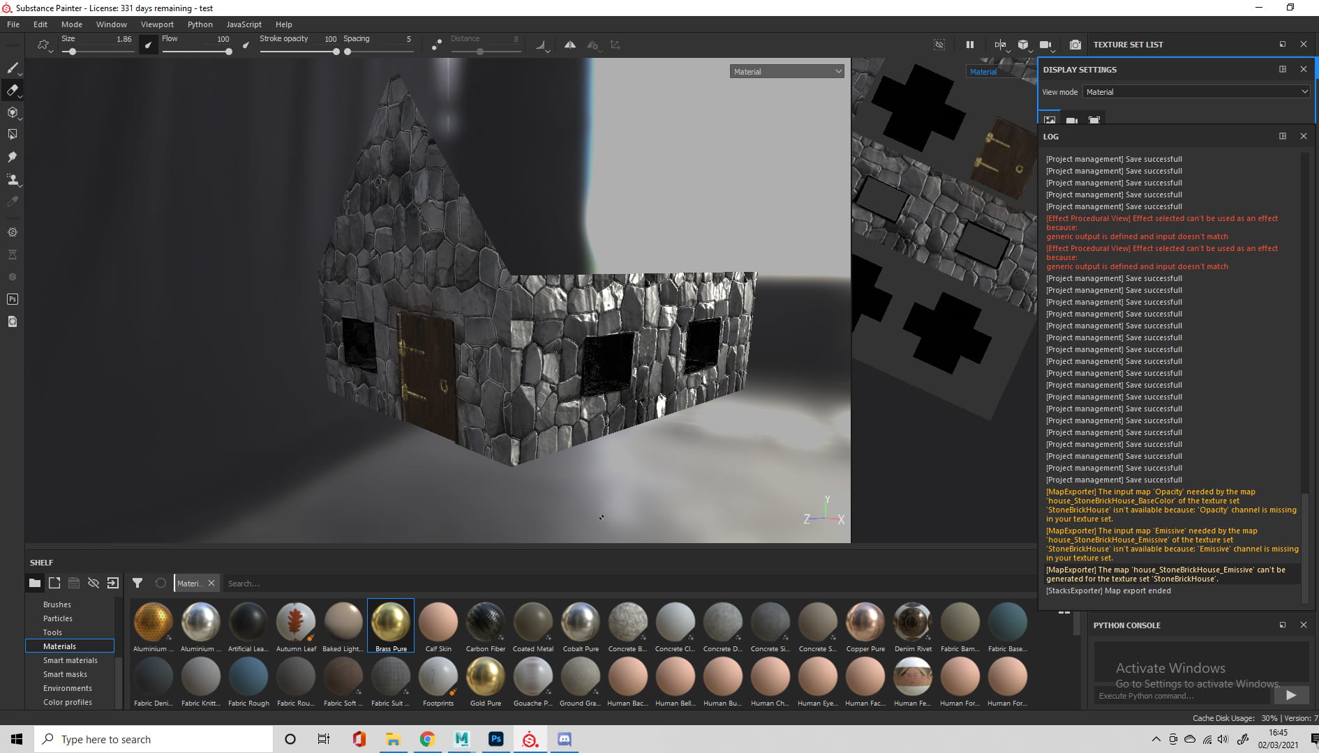
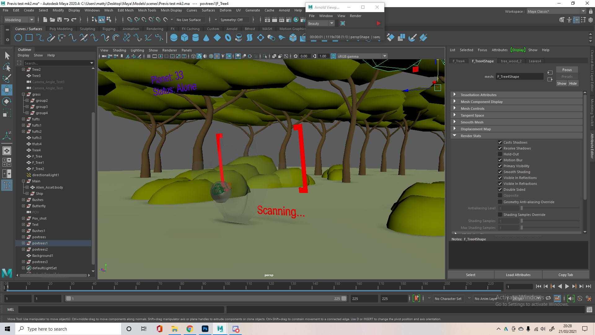
I did two variations for the textures and asked the group to decide which one they preferred. The first version was a flatter and more hand painted, storybook look and the second was meant to look slimier and more cartoony. The group preferred the second one. I was having some issues with figuring out the glass helmet in Arnold, but I figured it out after reading the forums and watching some YouTube videos on it. I actually ended up using the Maya lambert material as I thought it looked a lot better and was definitely faster when rendering.

I’m happy with how the alien came out, the rig was very easy to use and I think the model itself came out great. The rig was able to do everything the group planned and the ears and tail were very useful for expressing emotion. The blendshape eyes were also very useful for this, which was good because we weren’t sure on how to approach the eyes and were considering animated textures first. I made a very quick animation during class to test how the alien would look in motion when rendered, which turned out as a good way to showcase the model.
Planet – modelling, uv

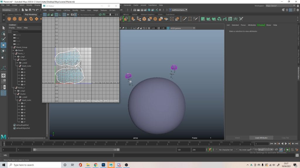

I modelled the planet and asteroids orbiting it for Jennifer’s scene and also did the UV maps. There’s no real point in breaking down the process as they are basically just smoothed cubes. I did move the vertices and faces around to make the asteroids a little bumpier, using the smooth selection tool again. I also set it up in groups, allowing all the asteroids to orbit the planet, and the smaller asteroids to rotate together, I thought this might help when it came to animating.
Butterfly – modelling, uv, textures, rigging


Modelling the butterfly wasn’t too difficult and there were a lot of great pictures to work from. I started with the body using a cylinder and the multi cut tool to shape it how I wanted. I actually just took the antennae I made for the previs and used them because I thought they were fine. For the wings I used a plane with a lot of divisions, and shaped it into the shape of wings I found online.


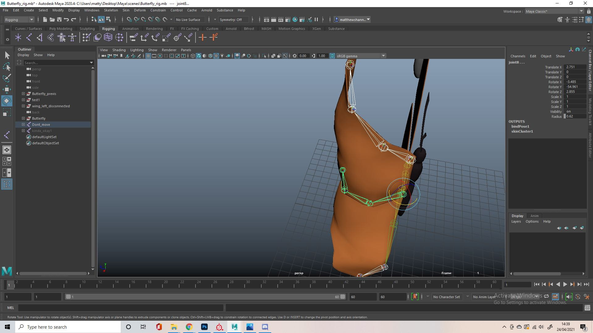
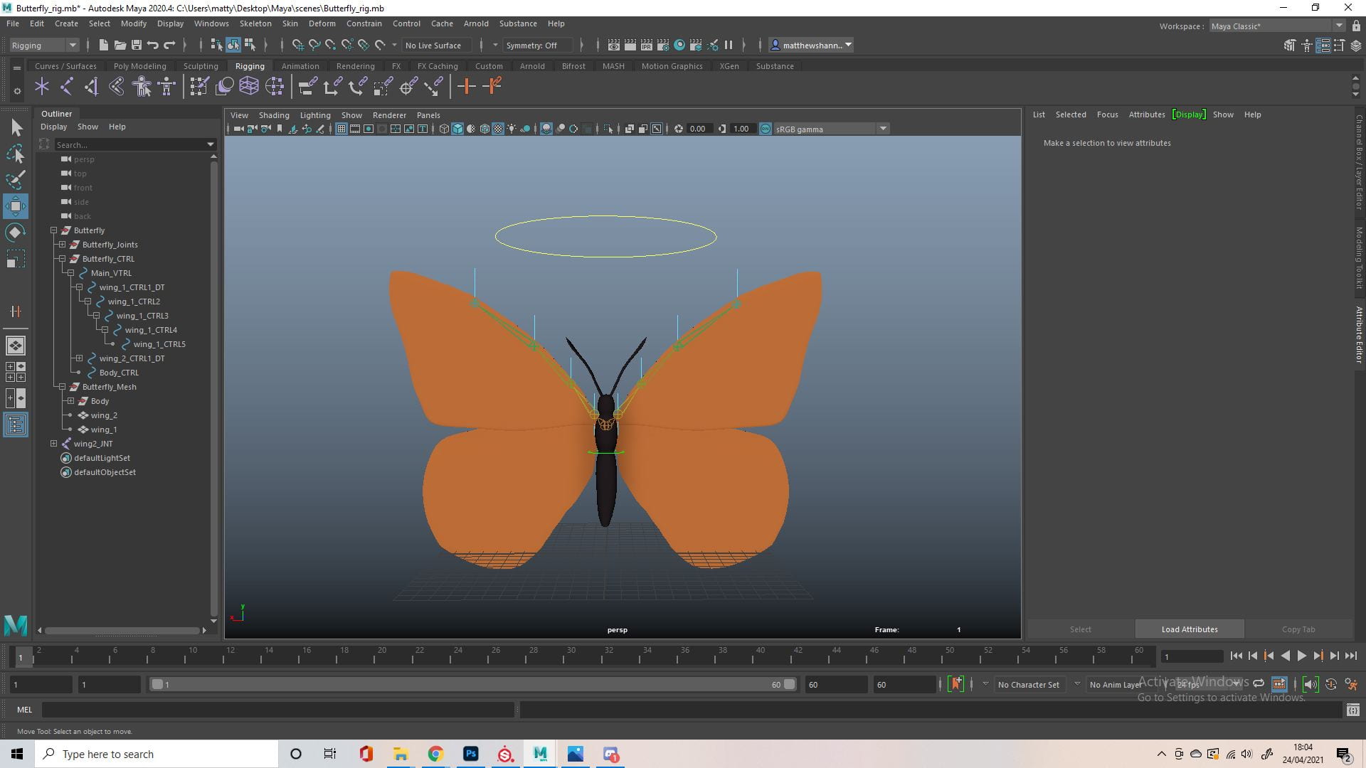
I did struggle with the rig for a while, trying out a lot of different positions for the joints. It took some experimenting with this as well as the skin weights to get it to look good, I wanted the top to move before the bottom because this is how it looked with real butterflies. It was hard to get the wings to bend smooth, it did look very good with a bend deformer but I couldn’t figure out how to rig a control for this so I went back to the joints. Eventually I got it to look how I wanted, and the finished rig I set up ended up pretty simple.


The Uvs were easy enough since its so flat. I textured it in substance, I added a black outline around the UVs and tried to keep it all pretty symmetrical, since butterflies are normally symmetrical.


I actually started animating before the UV and textures which was a mistake. I managed to fix this using the transfer attribute tool, transferring the UVs from an imported version of the new butterfly. There was a weird issue that made it look pixelated but I transferred the topology from the updated butterfly and it fixed it.
Animation


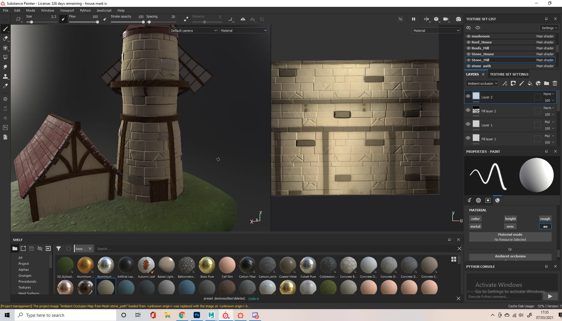
We split the scenes up among the group, with Jennifer taking less scenes as she would be doing the editing. The rest of us had 3 scenes to work on, which we split by the different sets/environments. I was responsible for the 2nd, 3rd and 4th scenes, which was kind of the entrance to the forest and landing area. Thankfully I had made trees, rocks and foliage for the previs which saved a lot of time in setting up the scenes. The first thing I did was make a texture for the ground, trying to emulate grass. I then added a sky dome for lighting, we used this website to download HDRIs.


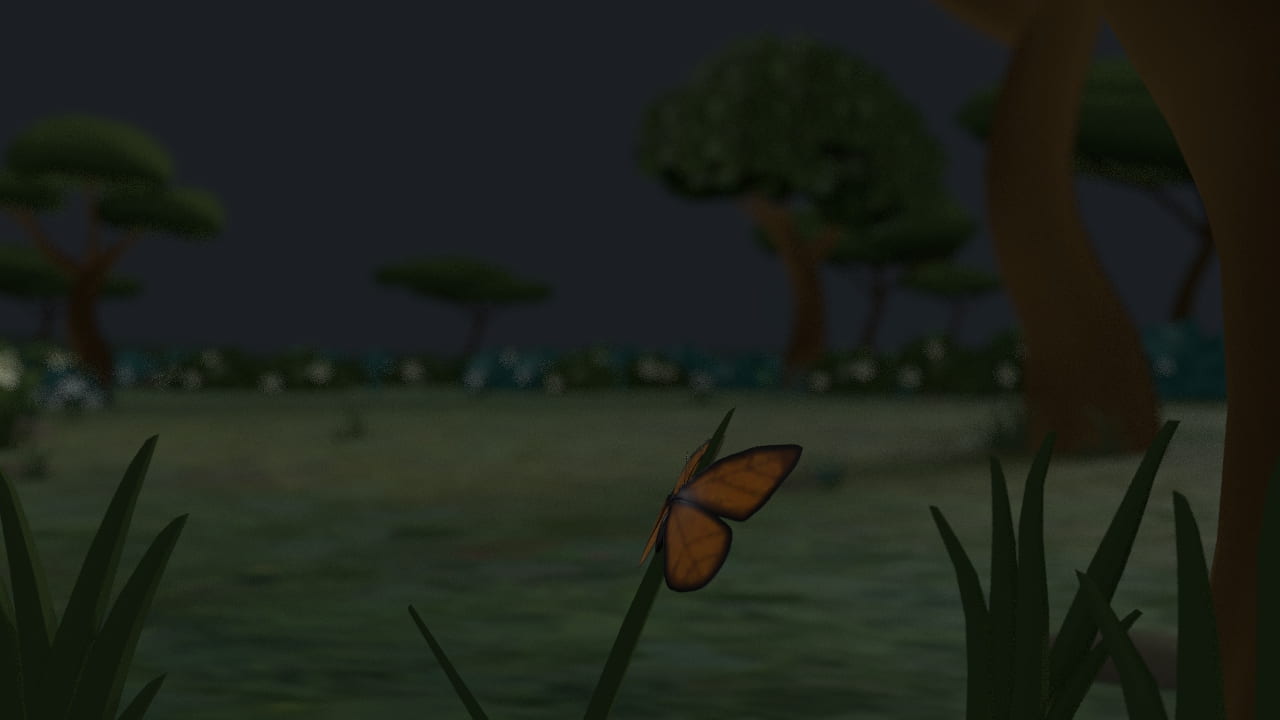
The first thing I worked on animating was the butterfly in my first scene, I wanted to make sure it was good since its the first thing we see on the planet. I moved the butterfly to the middle of the screen like we decided (after the previs) and started to look at how butterflies fly and especially take off. I found some good videos in slow motion on YouTube for this.
The take off was coming along well and I pathed out where the butterfly would fly. I also replaced the previs alien with the final alien coming out of the ship. I thought the force from the butterfly flapping her wings seemed like enough to take off, but I wanted to further exaggerate and emphasise this. I wasn’t sure how to do that yet, so I’d come back to it.


I started to look into the rest of the flying animation, I would only need to keyframe a couple positions and then repeat this so it wasn’t too difficult. I did some googling to see how frequent the wings would move and how much of a bend I should add. The animation itself didn’t require too much, I just rotated the controls, with the rotation gradually decreasing as I went further from the body.
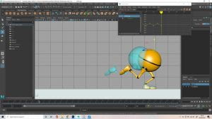
Next I animated a rough pass at the alien exiting the ship. I know this is all a fast sequence and quite far from the camera but I still wanted to make the most of the rig, so I animated her blinking and looking around wide eyed, as well as flinching when the butterfly lands. I took inspiration from cats when they get surprised, with the back arching up and I also made the ears rotate back, which looks like they’re trying to get as far from the butterfly as possible. The walking animation was still rough, but I based it off the render test I posted previously.


At this point I imported Alisa’s bushes and Dayna’s grass PNG’s seen in the first photo. The second photo shows me adding animation to the camera, rotation as the ship bounces to emphasis the weight. I was also simulating autofocus using the distance tool, depth of field and the connection editor. I wanted the camera to start focused on the butterfly, and transition to the ship as it enters. I found this YouTube tutorial very useful to figure out how to achieve this. The last photo was a render test to see how the focus looked, where you can also kind of see that I tried decorating one of my trees with the leaves from Alisa’s bushes.
This was as far as I went with this scene for now, I was waiting on the ship asset from Ben before I could do anymore animating, so I moved onto the next scene. You can see I figured out how to further emphasise the force off the wings flapping during lift off. I also animated the grass to react to her movement, which I thought was a nice touch.


I started the next scene but taking the scene I was just working on, and repositioning the assets. You can see I built the bushes up higher and added a lot more trees. I also removed the alien and ship assets since they wouldn’t be visible. Before I removed the alien I tried to do the same thing I did in the previs for this shot, to emulate the aliens reflection in the glass of her helmet, but it didn’t work the same when rendered so I scrapped this idea and thought we could do maybe try it in post production. So instead I just had the butterfly land in front of the camera. I decreased the focal length and also animated the camera to move, similar to what the alien would see while walking.
This scene didn’t take a whole lot of animating, since I already animated the butterfly flying and taking off previously, most of the time was spent trying to build up the environment. I found that to be the most difficult part, it seems quite hard to build a landscape/environment in Maya. Looking back I think the camera movement might be a little too obvious, and something more subtle might’ve been better, but other than that I was happy enough with this scene.
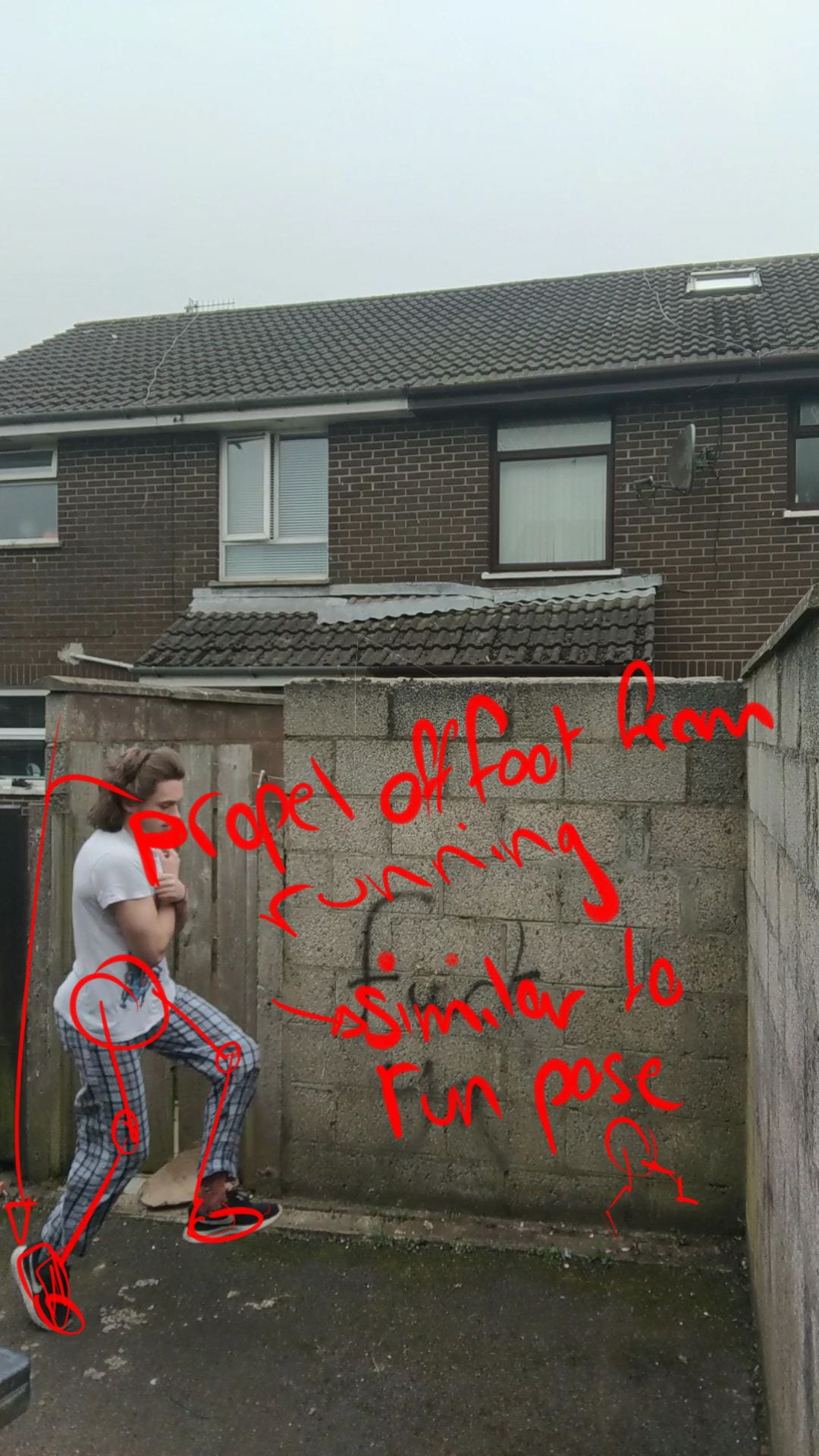
For the next scene I based the timing on Dayna’s previs, since she worked on this scene previously. The video above kinda shows the progression of the animation. I started with just blocking out the path, then I animated some ‘leg’ movement similar to what I did in the landing scene. I wanted this walk to be more similar to a trot, I thought the alien would be excited while chasing after the butterfly, and gradually less excited as she gets deeper into the dark forest. I was happy with the leg movement so I added some bounce, similar to squash and stretch, to the body. I later animated the head, ears and antenna to slightly bounce too.
This was the little trot I ended up with. As you can see I made the alien look around while running, with her tail wagging, looking for the butterfly. Towards the end she starts to slow and her tail also stops wagging and retreats closer to her body. Different to how Dayna did her camera, I opted for something a little closer to a 3/4 view but I kept the zoom since it was something the group liked previously. I wish this scene was longer with more animation but I wanted to stay true to the timing of the previs.
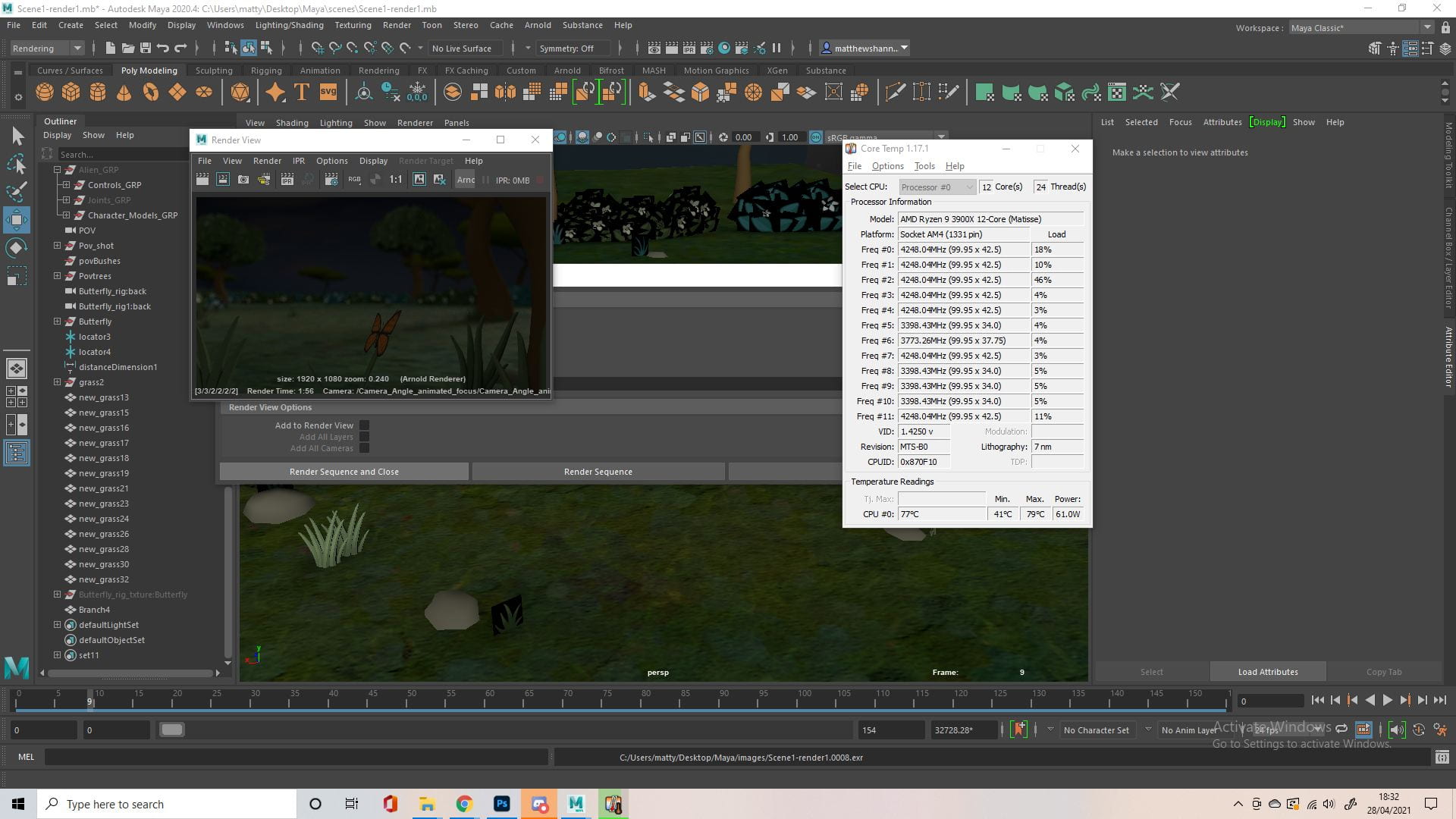 We had presentations every couple weeks showing our progress and the last one before the semester ended was coming up, so I started to render my scenes, after doing some test renders first to make sure it all looked good. This wouldn’t be the final product as we still didn’t have a final ship asset. Rendering was actually quite stressful and took a lot of time for us, so we opted for 720p halfway through to save time and even then we had to use some play blasts as it took a lot longer than expected and the toon shader we once hoped to use was messing up a bit in Dayna’s scenes.

This was what we showed in the presentation, as you can see its a mixture of play blasts and renders of different qualities but I still think it looked great for a work in progress. We also seemed to be working really well as a group, the class and the tutors both seemed impressed with what we had so far. There were some small things they pointed out to improve on, like some camera changes in Dayna’s scene, flipping around Alisa’s first scene etc. You can see I added Jennifer’s painted backgrounds into my scenes. For my scenes they suggested making the lights a little brighter.
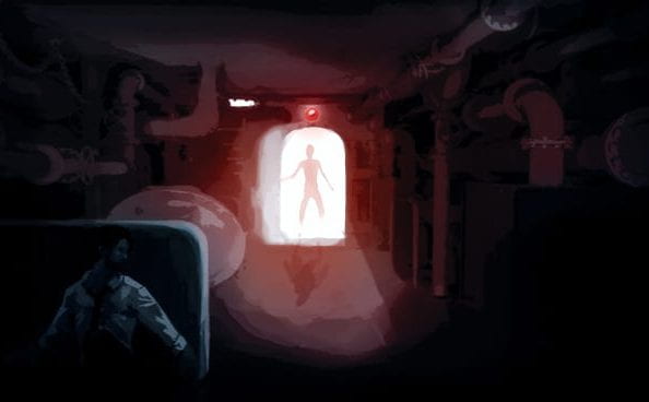
Hopefully Dayna mentions this in her blog, but after this class I also suggested we used a Home Alone scene (above) as reference for her scene when the alien’s startled by the ship, I thought it was a good example of how an inanimate object could appear scary.


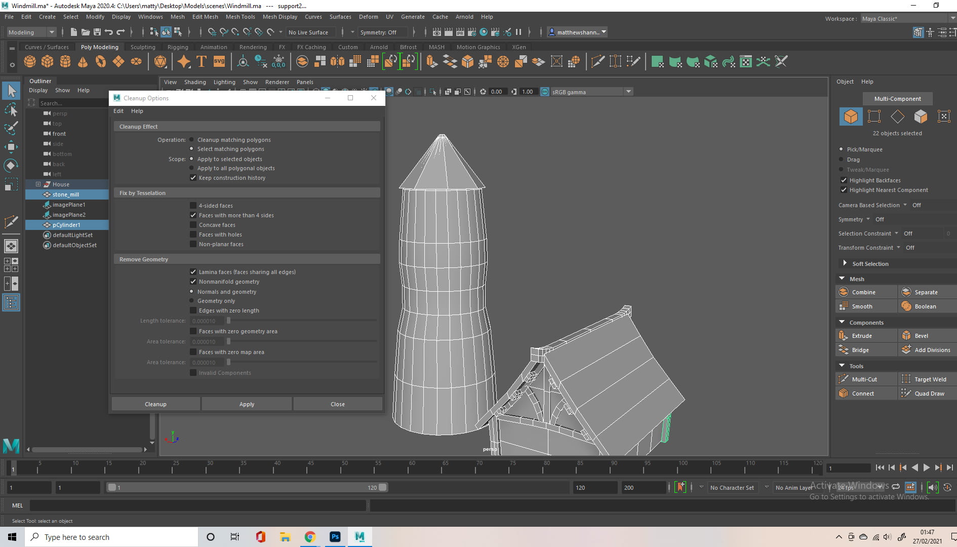
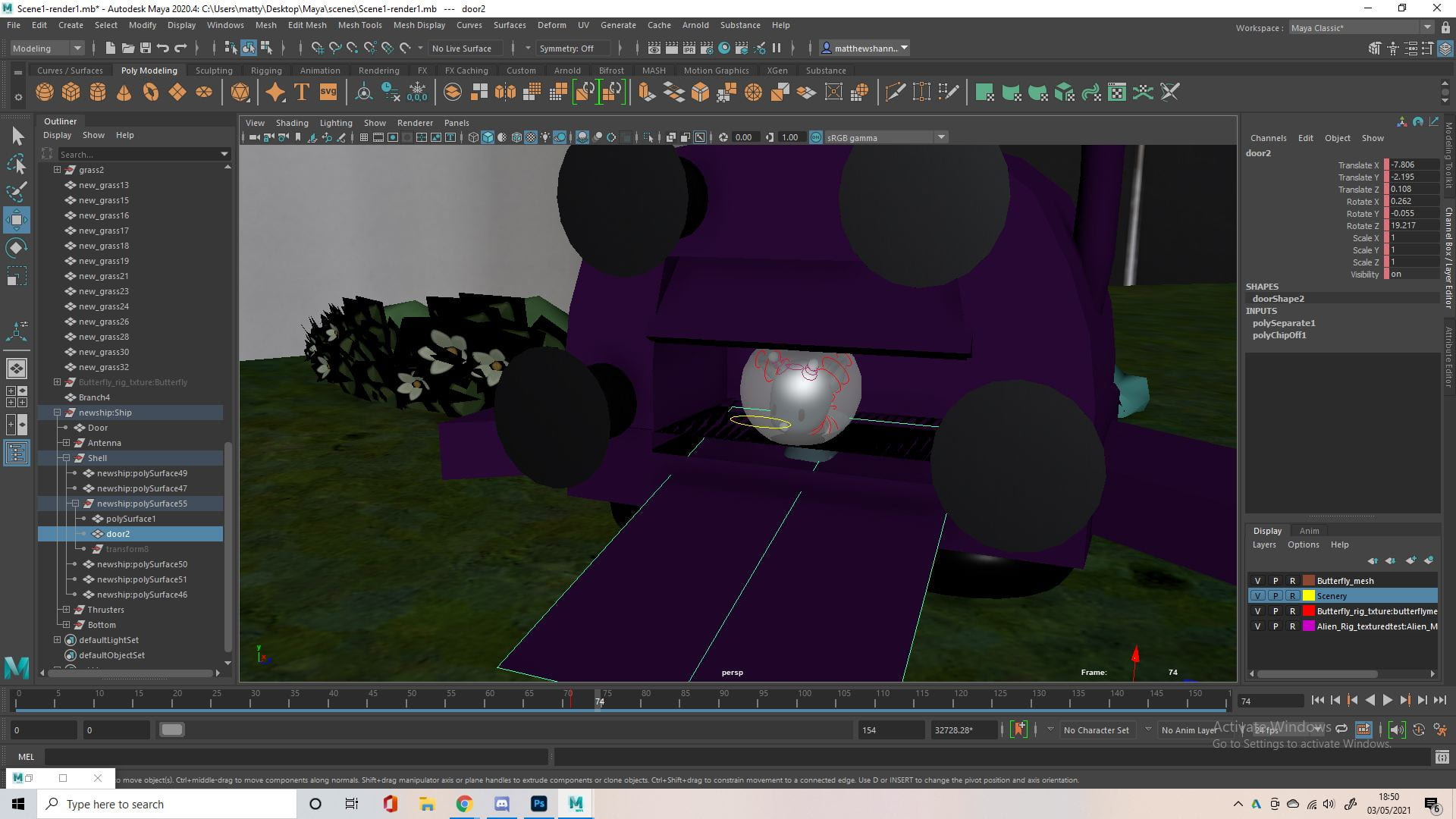
Just before we were about to start rendering, Ben sent us his ship model. It looked good but there were some changes the group wanted to better fit the story, also so Dayna’s later scene where we see the silhouette of the ship still made sense, as it was supposed to resemble a monster. You can how it ended up after I made some changes and additions to Ben’s ship. I basically just changed the proportions as the original ship was quite long, and I also added antenna. This made the ship a lot more similar to the concept art we agreed on. I also had to add a walkway that could extrude from the back, as well as a door that could open. I did this by extracting the faces from the back of Ben’s ship and modelling a few rectangular shapes.


It was a little annoying to receive the ship so late as it left me with a lot of last minute animating to figure out. Most of the time was spent on figuring out how best to animate the door and walkway coming out, but I also had to redo my animation on the alien character. The new ship’s exit was a lot taller and the walkway was longer than what I animated the character on previously, so it took some adjusting to get it to look good again. The third image shows how it looked rendered in my scene, this is when I noticed some noise in the front window.


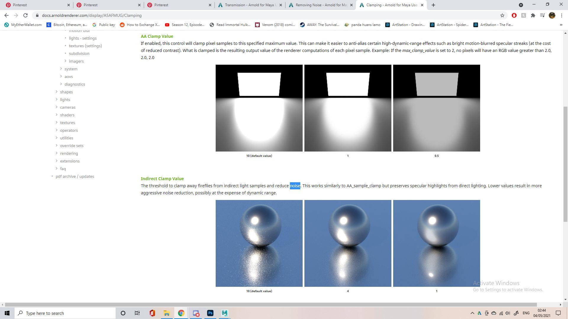
It was pretty stressful trying to find the cause of the noise, I didn’t really understand much about rendering beyond the basics. I turned on a bunch of AOVs to identify where it was coming from, and it seemed to only be in the transmission indirect aov. I did some research into this process and how to fix it, and I just had to increase the transmission samples by a lot. This made my render 3 times slower than it was previously, but thankfully we left a lot of time for rendering after learning from our first attempt.
Issues/problem solving
I thought it would be worth including this little extra section since I was just talking about an issue I faced. You run into a lot of problems working on a collaborative project from home and you also run into a lot of problems using new software, as well as when making a 3D animation. So I thought I should go a little into some of them and how we, as a group, dealt with them or avoided them. I did mention some stuff previously, like setting roles and deadlines with Trello or our weekly Discord calls updating each other on progress and making plans for the next week. These things helped us with staying on track, communication is a big factor in avoiding any issues.


Early on Alisa set up a Gdrive, which ended up being very useful. It was well organised into different sections of the pipeline, and within these folders it was further subdivided into concepts, assets, sounds, links, etc. I mentioned earlier recording a video for the group explaining our main rig and how to use it, well this kind of escalated into a common thing, which felt unique to this group because my previous groups never recorded tutorials for each other. I recorded videos helping with issues people were having with file paths and textures, how to approach certain animations we were having difficulty with, how to apply textures with Substance to Maya plugin, etc. Whatever issues came up that would normally be solved in person by just showing them, turned into video tutorials. Dayna also recorded videos on the Toon Shader as she spent some time researching that for us, and Alisa recorded a tutorial to help with the image sequences in after effects. Putting in this extra effort to help each other was great as it meant we often avoided conflict and any problems we faced were solved very quickly.

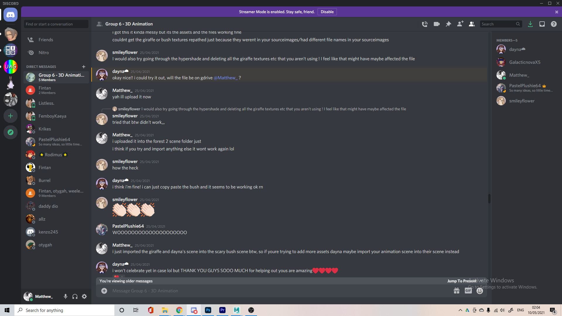

This is just a few examples because I probably shouldn’t leak our whole Discord. A lot of the time we would solve any issues (mostly technical) people were having as a group in the chat. Normally, if someone messaged, the other group members were quick to reply. The first photo shows a problem we encountered while sharing files, since we were all new to this we probably made a lot of mistakes but for some reason the textures wouldn’t come up on the objects. At the time we had know idea how to approach this, but you can see we figured it out as a group. One of the biggest or scariest issues we faced was when Dayna’s file would crash every time she tried to import anything, this was pretty bad because she was quite far into animating at this point and we needed the final assets in her scene. Dayna sent us her file and we all tried to import them for her, with no luck. We eventually figured out we could import her scene into the scene that had the final assets and, while it was a little messy, thankfully it worked. Then towards the end when Jennifer wanted to add the alien parented under ship, it would just disappear, again the group came together and figured this out quickly too.
I added this section just to show a little more on how we operated as a group. These things I mentioned might seem insignificant or unimportant now, but at the time they were huge issues for us. No matter how big the issue was though the group would often work together and figure it out, be it what letter in the logo a butterfly should land on or whether or not we should have an ‘e’ in our title, nothing was too small or ‘stupid’ to ask. This meant everyone would ask for help or feedback all the time, sending in designs/render tests to see if everyone liked them, sending YouTube tutorials that might help. All this communication is why working with this group was so easy, since everyone was so invested in the project/helping each other we didn’t really have any conflict and looking back, no matter how big the issues we faced seemed at the time, they didn’t cause any setbacks.
My finished scenes, before post production
This was the final renders I sent to the group for my 3 scenes, before any post production. I’m super happy with how they turned out, I love the butterfly animation at the start and how the grass reacts to her movement. I thought the animated focus was a great effect, and a good way to put more focus on the alien since she was so far from the camera. My second scene looked good too, but it needed the HUD effects to really sell the scene. I thought my third scene came out well to, the camera change from the previs definitely made it a little more dynamic/interesting and the animation of her following after the butterfly came out really well. I could see these scenes being a little dark, even though I did increase the lights like the tutors suggested, I found it difficult to make it look like it was night time while also showing off everything in the scene. I would personally like these scenes to be slower too, but I wanted to stick to the timing of the previs so the pacing felt alright.
Post-Production
At first I wasn’t planning on doing any post production stuff because Jennifer was doing the edit, but everyone ended up wanting to help out and do little parts of it. While Jennifer did most of the editing, Dayna, Alisa and I helped out with some effects for the POV shots.


I have pretty much no experience in editing beyond just cutting things together, so I had to do a lot of research first. I was planning to do the glass effect, to further emphasise it was a POV shot and we were looking through a helmet, using After Effects. In order to achieve this sort of effect most people seemed to play around with the blur filters and vignette. I also looked into overlaying an image on top of the footage for something I wanted to try later.


I opted for Premier Pro to do this effect, I didn’t feel confident in using After Effects because it’s a completely new software to me, and we had one day left. While the tutorials were useful in learning how this would be achieved in other software’s, there wasn’t a lot for Premier, so I kind of just improvised. I added an adjustment layer over the POV shots and then played around with the filters. I knew I wanted to add a vignette and a blur as this was common in most tutorials. I also added a slight blue tint, and a very subtle circular glow effect since the helmet is dome shaped, I also thought this could play into the HUD aspect a little. You can see all the filters and effects I added on the left of the photos. This effect was quite subtle and I wasn’t too sure if I liked it or not, but the group liked it which was reassuring.


Something I did in the previs was add a slight reflection of the character in the POV shot, using a flattened and transparent mesh of the character in front of the camera. I tried to achieve something similar in the post production. I rendered an image of our character in front of a green screen and removed this in Photoshop. I also used a spherize filter in photoshop to kind of distort the face in the reflection of the helmet. I then overlaid this image over the scenes, and turned the opacity down. I did end up scrapping this idea all together though, as it didn’t look as good as I hoped and we were running low on time. You can see in the last image it is very subtle, but if I increased the opacity even by a little it was way too obvious.
 I guess this is also post production. We thought it would be a cute idea to add sketches to the end in the credits and it kind of fit the theme of our story. This was the sketch I drew, I’m happy enough with it because it was just a quick and rough sketch. I wanted to add the chicken from the chicken crossing the road story because it was kind of a recurring joke with the group. The other members are very talented with drawing so their sketches turned out great too, I’m a little out of practice since I haven’t done much drawing in a while, other than for this course.
Final Group Animation: https://drive.google.com/file/d/1V499vN6mxQuWiDDgzBSO58CmG3CoP8V4/view
I recommend downloading to watch, appreciate it in full HD_1080p.


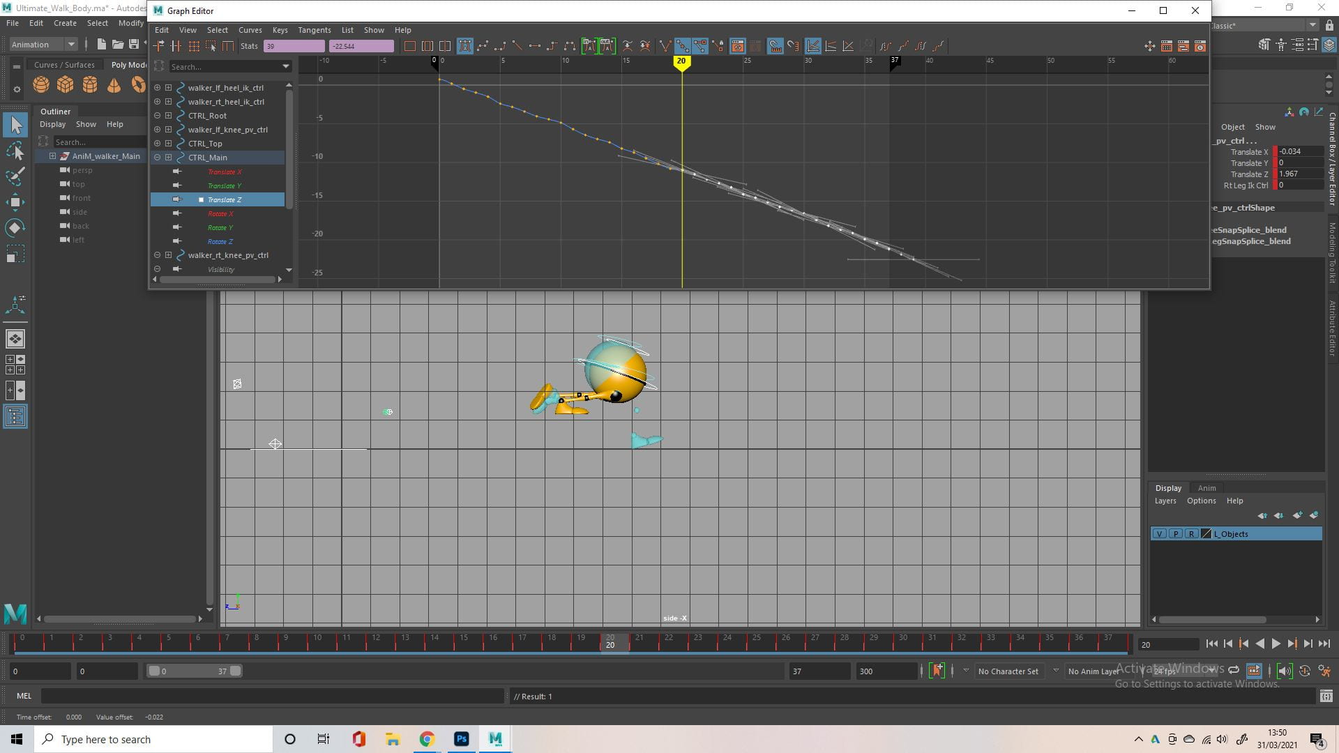


 There’s no point in repeating myself, I just did the same thing as the walk before for the walk off camera. I did attempt to copy and paste the values from the graph editor into the different direction (from z axis to x axis), but it didn’t really work. I just opened up an older version of the file that I could use as reference, and recreated each keyframe in the new file, going in a different direction.
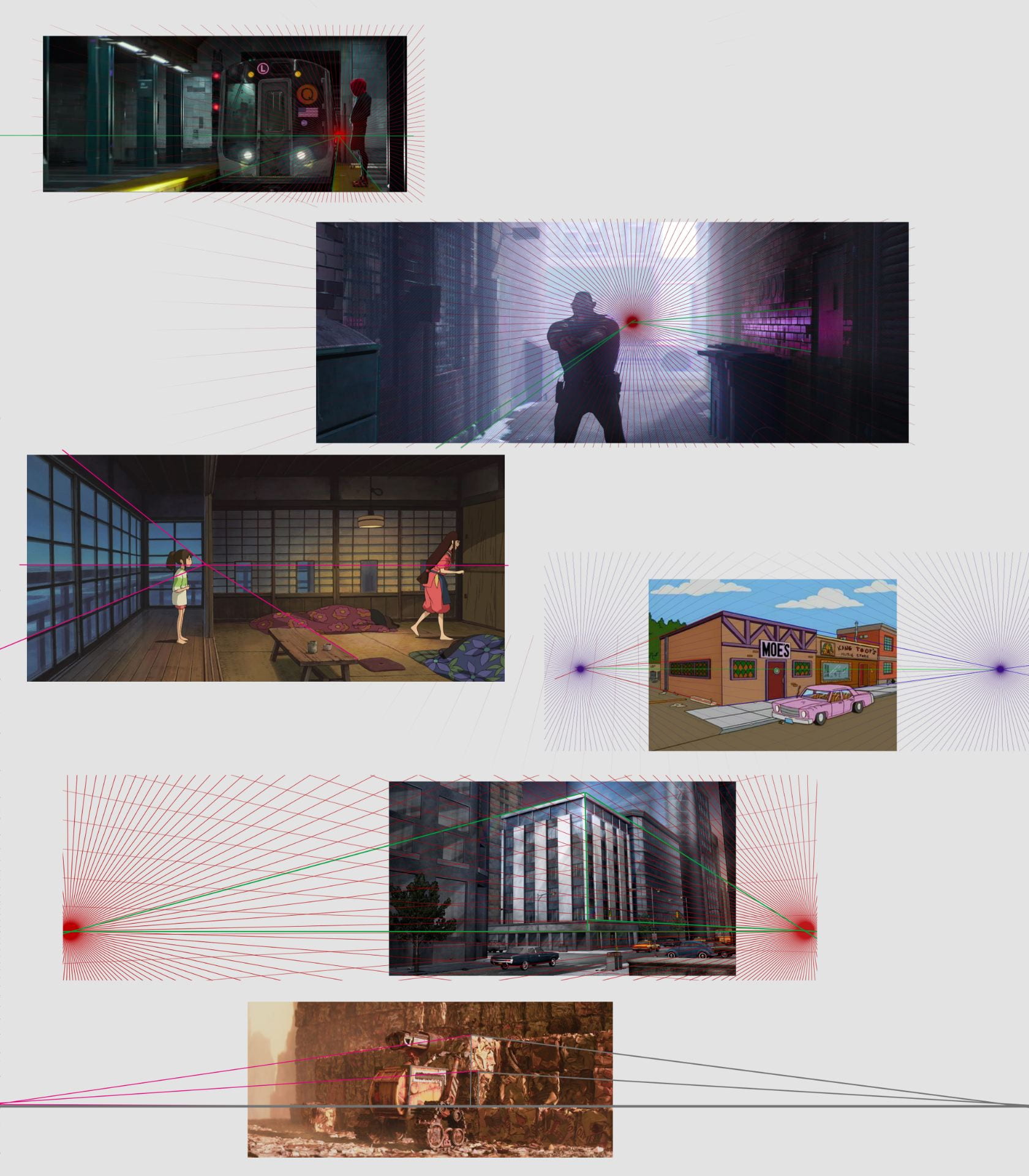
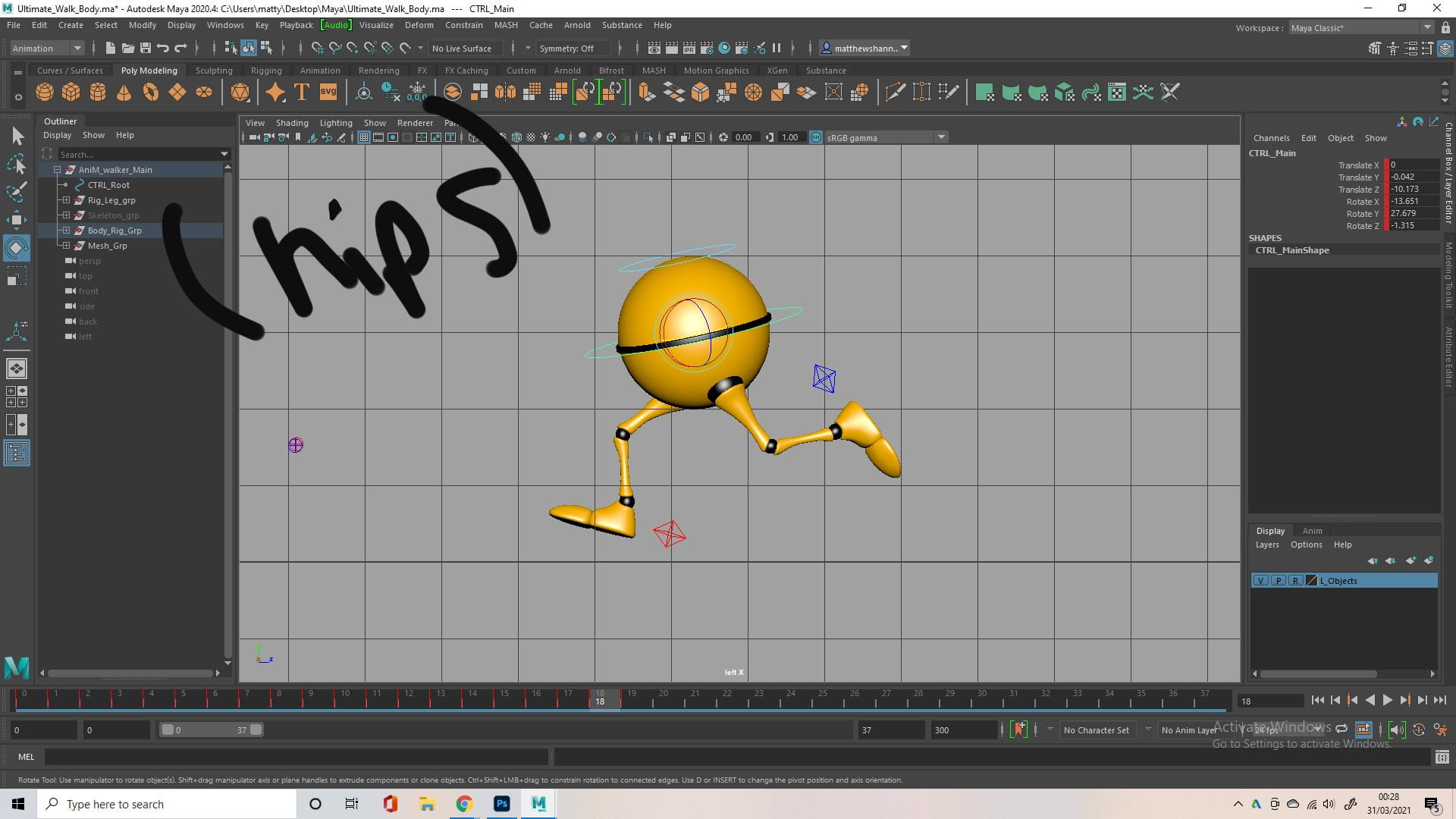
 Finally I went in and really pushed the squash and stretch at certain points, something I didn’t do as exaggerated in the previous animation, I also finalised the camera animation, based on the Spider-Man clip.