Wireframing
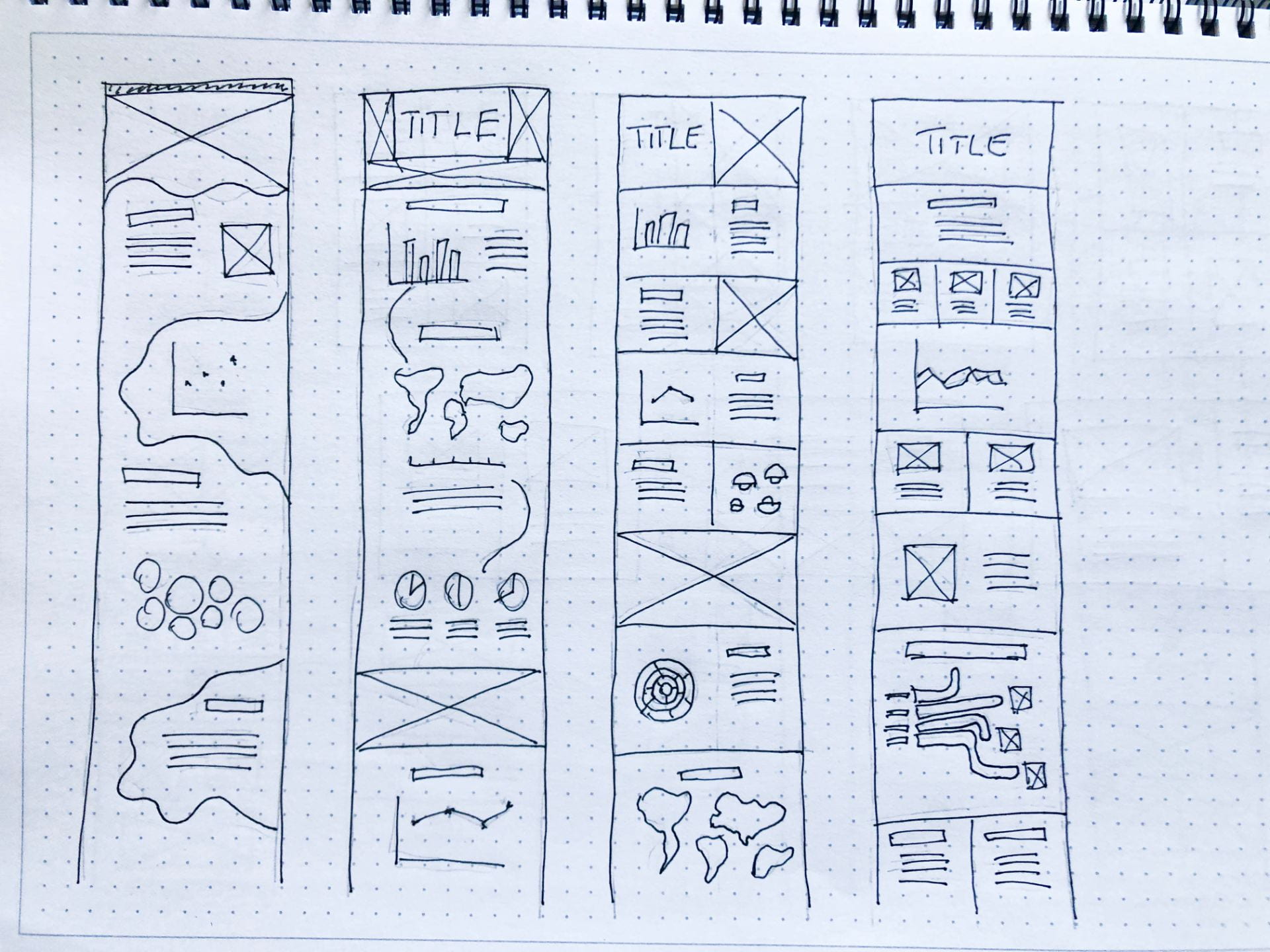
I began my wireframing process by focusing on layout and possible graphs I could include in my infographic. Above are my first four outcomes in which I considered how to section the data and how to use lines to guide people through the data.
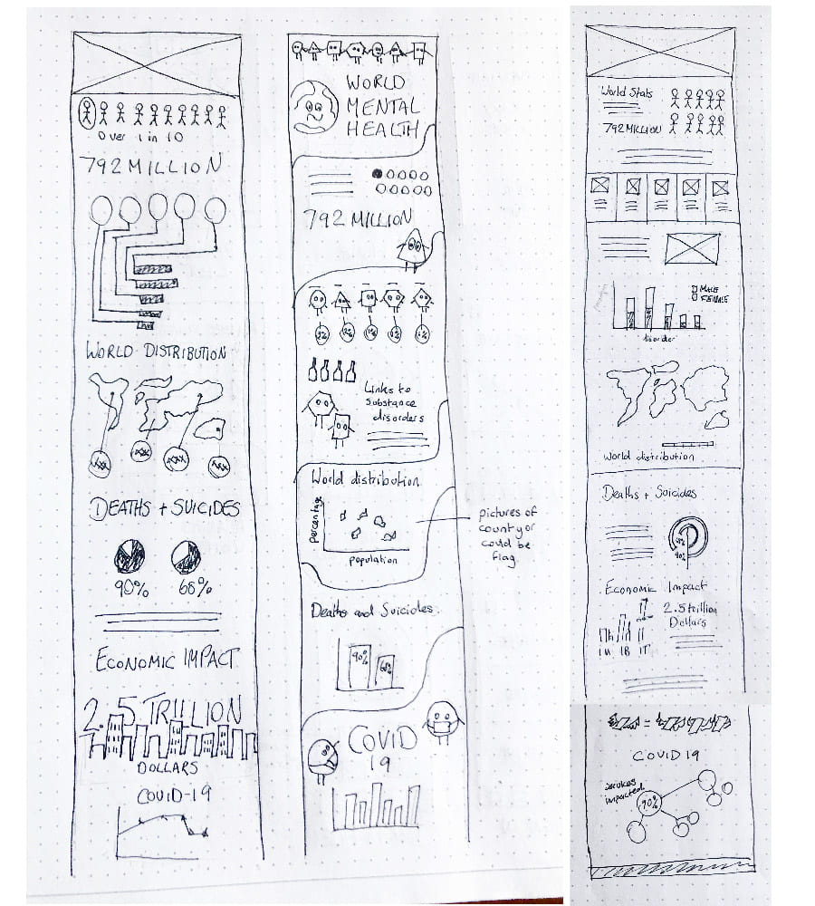
Following my initial wireframes, I drew up three more detailed content specific outcomes. From the above, I felt the third outcome was the strongest.
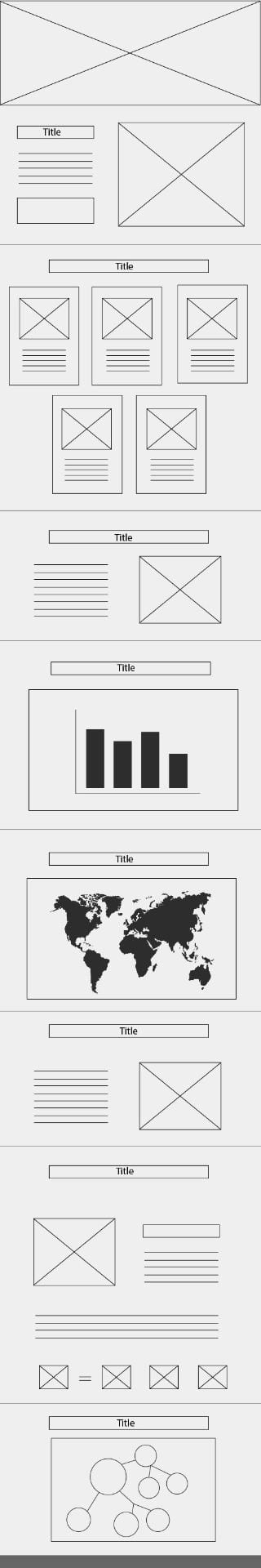
I then drew this outcome up in illustrator to practice digital wireframing. Originally I had included all diagrams as boxes and simply labelled them however I felt this was too abstract. I, therefore, included a png for the world and quickly drew up a bar chart and bubble chart to provide adequate context.
Storytelling
I chose the topic of World Mental Health as I feel this is an area of growing concern with recent COVID restrictions and the isolation that these restrictions have caused. Mental Health is a topic that I feel there is a growing awareness around which is brilliant however I still believe that at times mental health can be classified as a “1st world problem” when the statistics clearly demonstrate that this is not the case. Mental health disorders occur broadly throughout the world and are not specific to any one location. I wanted to also draw attention to the connection between mental health and substance use disorder as I feel this is an area that is not talked about as regularly and requires more awareness and attention. Finally, I wanted to drive home the seriousness of the topic by looking at related death statistics.
Originally I had wanted to also include statistics on the impact of mental health disorders on the economy and how by investing $1 into mental health services it is estimated that the economy should see a return of $4 from improved health. I wanted to include these statics to encourage people to see the importance of Mental Health Services, however, I struggled to find the right area to include the data and felt it disrupted the flow of the infographic. I could also only find information relating to US$ which I felt did not meet the needs of my UK based target audience. I, therefore, decided to leave this information out.
I also considered including stats around male and female mental health. However, in the end, I decided I didn’t want to make the distinction as male mental health is generally more underreported and mental health disorders are a problem for both genders. I, therefore, didn’t feel the comparison would necessarily improve the story that I was trying to tell through my infographic. In order to ensure that it was clear both genders were being represented in my infographic, I used gender-neutral icons and illustrations of both males and females.
Finally, I wanted to make sure that my target audience was aware of the disruptions to mental health service as a result of the COVID-19 pandemic to provide a context for the current problems faced by those with mental health disorders. I really would have liked to have ended my infographic with statistics on different types of mental health services and their effectiveness however I found this to be a very broad area lacking in specific statistics.
Overall the primary goal of my infographic is to display statistics on mental health as clearly as possible to encourage awareness of mental health disorders and substance used disorders as a global concern that has been increased as a result of COVID-19. I wanted to demonstrate the seriousness of the problem by showing statistics on related deaths through suicide and make sure also of the information was presented as clearly as possible so that it would be easily read and understood by anyone aged 16+.
Infographic Development
As discussed in an earlier blog I really wanted to make a statement with the title of the infographic as mental health can be a somewhat abstract concept and I was aware that I might have some difficulty presenting the topic in illustrative form. Therefore, I felt it was really important to draw the viewers attention to the text in this instance as seen above. I also included little interesting visual elements in the above piece such as the icons of the world on top of the ‘o’ in the word world. Further to this, I like that the little four teardrop pattern to the left looks a little like a flower as nature is a common visual theme when presenting health and I feel it adds a sense of optimism. I also wanted to reflect the idea of optimism through my choice of colour as discussed in more detail here. I am also pleased with my selection of the typeface Apercu Pro as I feel the slightly longer letter length increase readability and the amount of text that can be fitted into a particular space.

I used a pictoral fraction chart for the figure- over 1 in 10 people have lived with a mental health disorder globally as I felt this was a strong visual that would help the viewer relate to the data e.g. for every 10 people they know 1 is likely to be living with a mental health disorder. I think this was an effective visual representation of the data. I also use non-gender specific outcomes however now reviewing the outcome I wonder if I should have used a more gender-neutral colour as pink is often associated with females, however, in terms of the layout I felt pink was the most complementary colour choice.
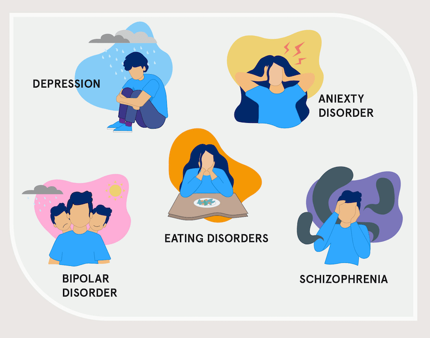
I have also posted on the above illustrations in more detail here. I wanted to present a mix of genders in my illustrations and I feel this has been achieved. I have included the above illustrations as I wanted to present the mental health disorders covered in the infographic at a glance. I also feel there is a general confusion top exactly what particularly bipolar disorder and schizophrenia are and wanted to clarify through my illustrations. Bipolar disorder generally leads to periods of euphoria and extreme highs which are then followed by periods of depression and extreme lows. Schizophrenia is generally linked to hallucinations and voices. I have covered this more in my topic research here. These were difficult disorders to represent particularly schizophrenia however I am pleased that the above outcomes present a general portrayal of the disorders. I also used the backgrounds to connects the illustrations to the stats below present in a bar chart.
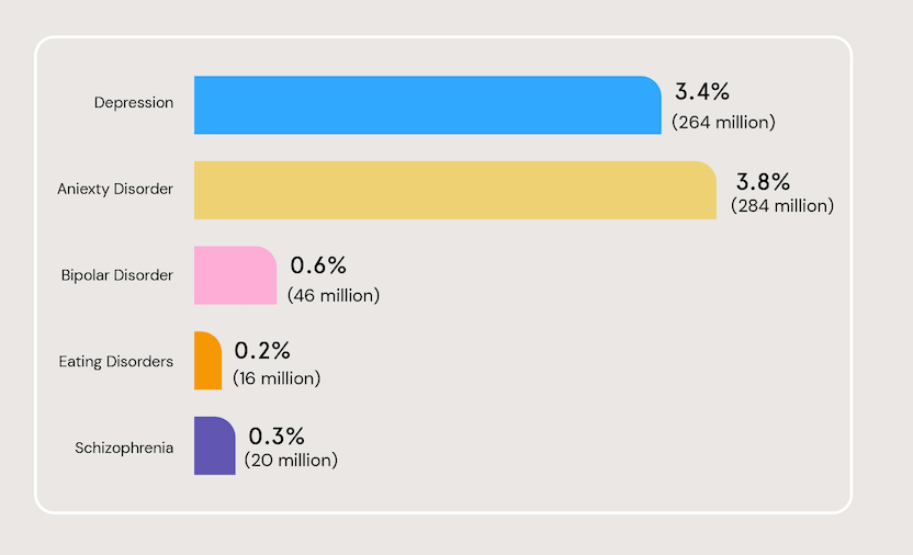
I wanted to use a bar chart to present the breakdown of the mental disorders as I wanted to provide a comparison between disorders, I had originally planned to present the above bar chart vertically however I found that when including the names of the disorder that I was struggling to make them fit. I, therefore, presented the outcome horizontal with little stylised elements like curves corners (all bevelled to 37px). I am pleased with the outcome and feel the horizontal presentation actually helps with the flow of information and made it easier for me to include percentages and the actual number of people. I was happy with this as I felt the percentages appeared quite low however when the context of how many people the percentages refer to is added the data has a much greater impact.
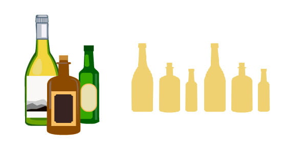
I was eager to include additional illustrative elements in my infographic and experiments with different styles of outcome. The detailed outcome I felt didn’t fit with the aesthetic of the overall infographic so instead, I decided to use silhouettes of the bottles I had created and filled them with yellow to provide visual reinforcement to the introduction of the topic of substance use disorder.
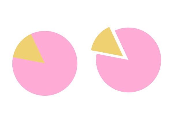
I also included a pie chart in this section however I found by sliding the yellow wedge out slightly (the portion I referred to in the text that followed) it really helped to highlight the information and also had the advantage of making the wedge look slightly larger even though it is the same size as the outcome shown above left.
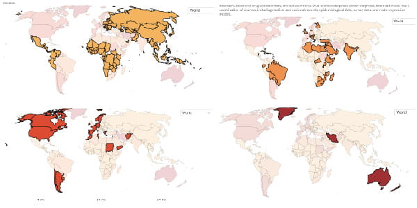
When creating my global distribution choropleth map I used the outcome presented in our world in data. This was a great resource as I was able to isolate the areas relating to a specific percentage and colour code them according to the above resulting in an accurate outcome.

My outcome can be seen above I colour coded my map for yellow to green as I felt this provided enough contrast without the colours clashing or competing for attention. I used a png download of the map to again ensure the outcome was accurate. This also has the advantage of each country being selectable making the colour coding process possible.
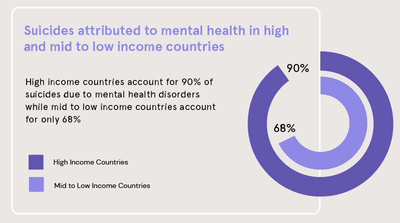
Above is the radial bar chart I used to preset suicides attributed to mental health. I wanted to deal with this topic delicately as the impact that suicides have on families is indescribable and I didn’t feel there was anything that would amount to an appropriate illustrative representation. I, therefore, wanted to add interest to my incorporation of the above radial bar chart by having it loop on top of a box that included a text outline of that data. Overall I am pleased with this outcome and feel the presents the data in a clear and appropriate way.

I created the above bubble chart on Excel and then moved the bubbles into illustrator to ensure the scaling was correct. The above chart displays the percentage of countries that reported disruptions to critical mental health services. I also grouped associated services by colour and connected them by lines. I was pleased with the use of a bubble chart for this outcome as I felt it provided a nice visual that would draw the viewers attention and encourage them to read the accompanying text.
Feedback

My original outcomes are shown above (to the left and top right) with figures scales slightly larger than text and different colours added. I was advised to make more of these figure by reducing the size of text such as million and % signs as well as reorganising arrangements to allow me to scale the numbers and grab the views attention. This was really effective and had a massive impact on the overall outcome particularly when scaled back as the figures grab the viewers attention and help draw them into the more detailed text.
I was also advised to make some of the colours slightly darker to improve contacts on the background which I did and again I feel this improved the overall aesthetic of the infographic and made the text clearer to read.
Overall I am really pleased with the outcome and feel it presents my topic clearly. I am happy that the viewer is guided through the information by the use of sections and colour coding. I am also pleased with the graphs and charts I have included as I feel they present the data effectively and capture the story I am trying to present. I think the bright pastel colour theme is really effective and am particularly pleased with the typographic element at the top of the outcome. I would however have liked the opportunity to include more illustrations in my outcome. While I feel the more minimalist approach is effective in achieving the information led outcome I was after I think if given the opportunity to work on an infographic again I would take a more illustrative route to see how I could develop and incorporate more interesting visuals into my final outcome.
To view my full infographic click here.
What have I learnt?
- It is really helpful to begin experimenting with multiple ideas at the wireframing stage.
- It’s important when making digital wireframes to add in some specifics such as graph types to actuarially represent the outcome you plan to create.
- By taking the time to consider the story you are presenting in a data visual or infographic you are gaining much-needed direction and in hindsight this is something I would have done before the wireframing stage.
- Sectioning and the use of clear space can be really helpful when presenting information.
- Using size and scale effectively in infographics is so important can have a massive impact on the final outcome.
How can I apply this to my work in future?
- I now feel I have a much greater understanding of data visualisation and will be able to consider what I have learned when presenting data in multiple contexts in future.
- When creating an infographic in future I think it will helpful for me to first consider the story is I’m trying to present and then move into the design phase rather than after producing wireframes and having to adjust the outcome afterwards.
- I will now make a conscious effort to consider scale in the context of infographics and my design work in general as when used correctly it can have a massive impact.