I wanted to make an impact in the heading portion of my infographic outcome so I took a little time to research a few different ways I could present my type.
I began by researching companies that worked in mental health and found Pentagrams rebrand for the National Ambulance Mental Health Group.
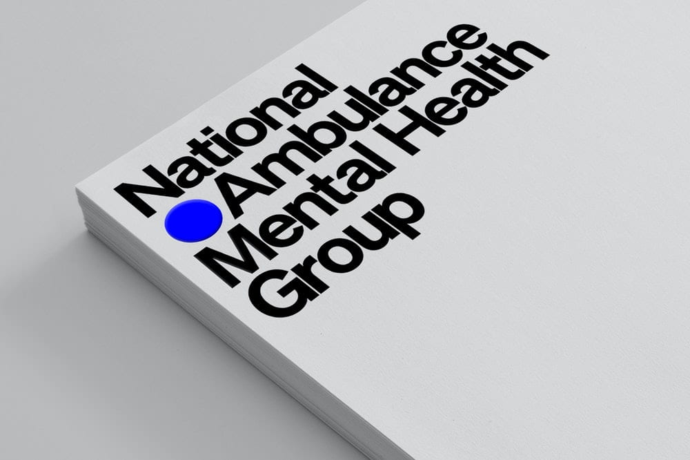
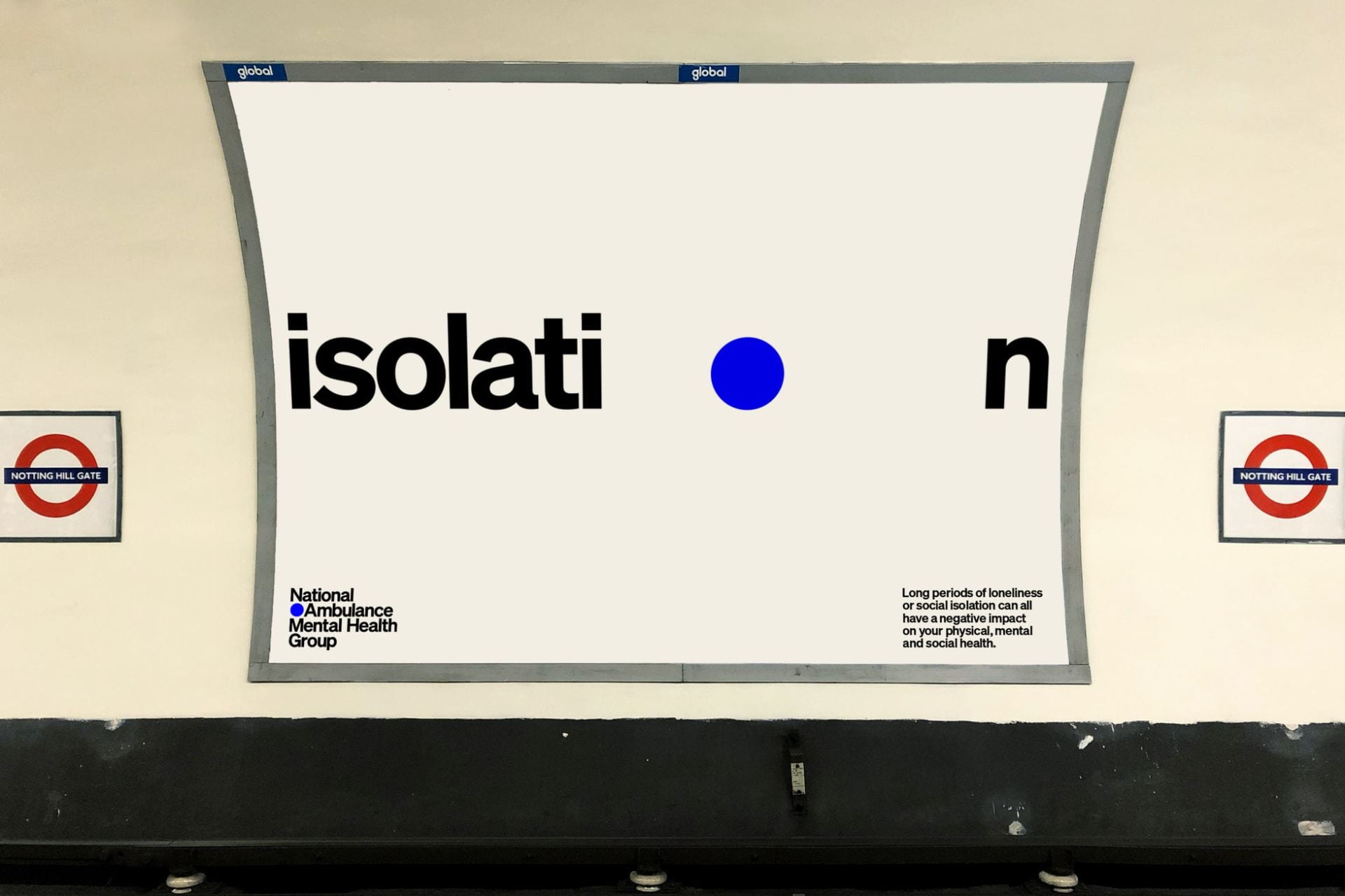
I really love the inclusion of the blue dot and how it has been relating to isolation as can be seen above. The blue dot is also used to house numbers and is presented as a repeated pattern. This pairs really nicely with the bold serif type. I would love to produce something with as much impact as the above however as it is a typographic piece and not a brand I feel I have room for a little more detail perhaps including a dot pattern or multiple colours in the outcomes.

I also drew inspiration from shapes and patterns such as those included above. This is a part of the permanent installation inspired by Thomas Mann’s ‘The Magic Mountain’ at a newly opened cancer care centre.
Again I love the health care ties as I want to keep on topic with my visuals and ensure there is a clear link to health and particularly mental health if possible.
I love the vibrant colours and can envision the shapes shown above mixing beautifully with type.
Further to the examples above, I have created a Pinterest board filled with lots of interesting and creating typographic pieces, branding and shape outcomes.
From here I moved onto sketching shapes, ideas and possible outcomes shown below.
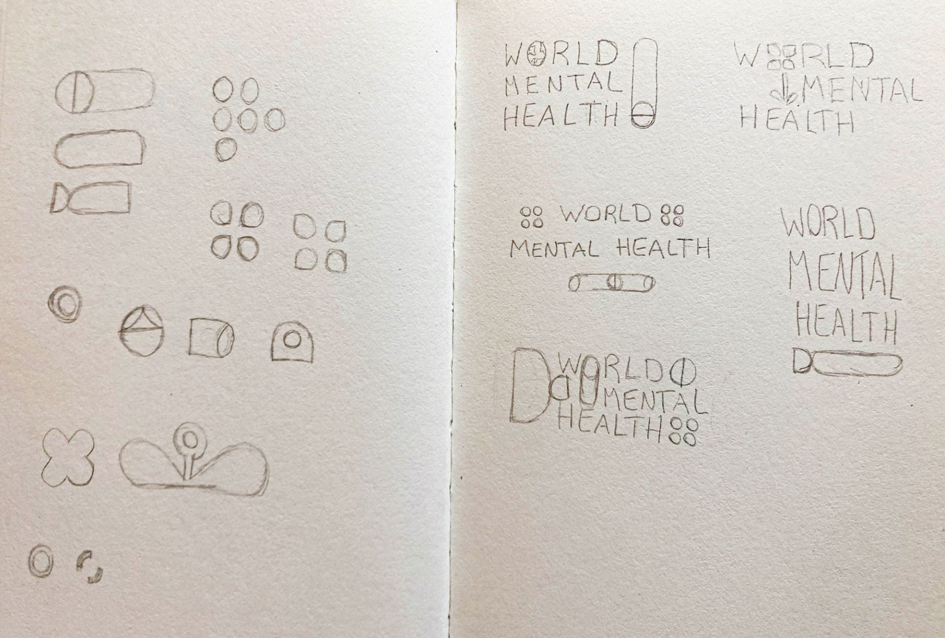
I wanted to get so ideas on shapes and text arrangements on paper as I am hopeful this outcome will set the tone for the rest of the infographic.
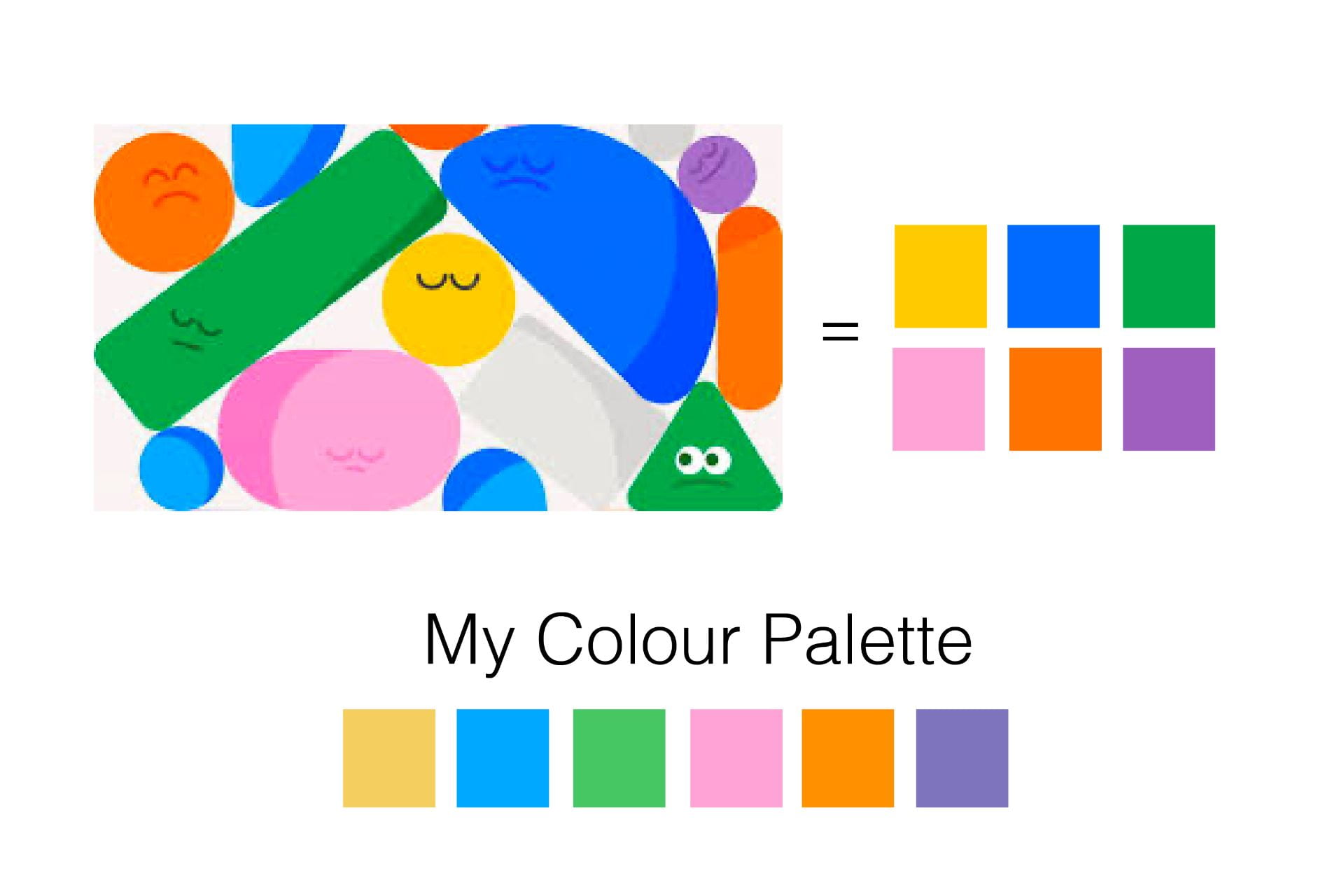
Before creating my outcome I wanted to select my colour palette. I knew I wanted to use light pastel colours to offset the seriousness of the topic. I drew inspiration from the above illustration. I loved the bright and friendly feel of the colours used however that the colours were a little too strong so I softened all slightly bar the pink, choosing slightly lighter shades to create a pastel colour palette.
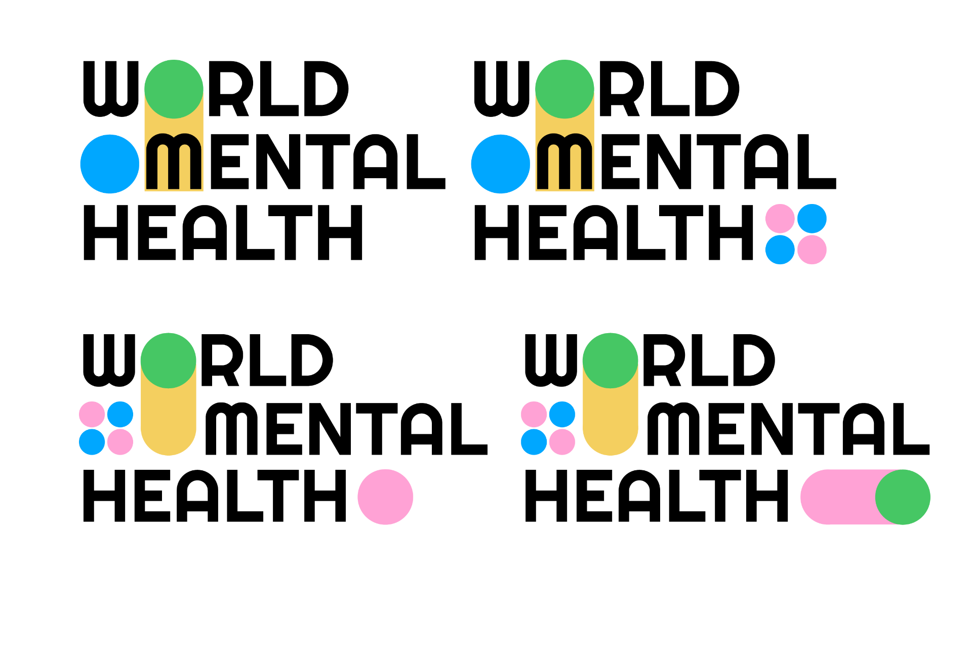
I began by working with circles and experimenting with placement and scale. I knew I wanted the ‘o’ in the world to be covered with a circle so this feature in all of the options created.
Once I found a combination that worked I then played about with different typeface and decided on the serif typeface Apercu Pro. I liked the simplicity of this typeface and felt it was slightly more elegant than Helvetica which I thought looked a little harsh and bulky in the arrangement (see above composition top left).
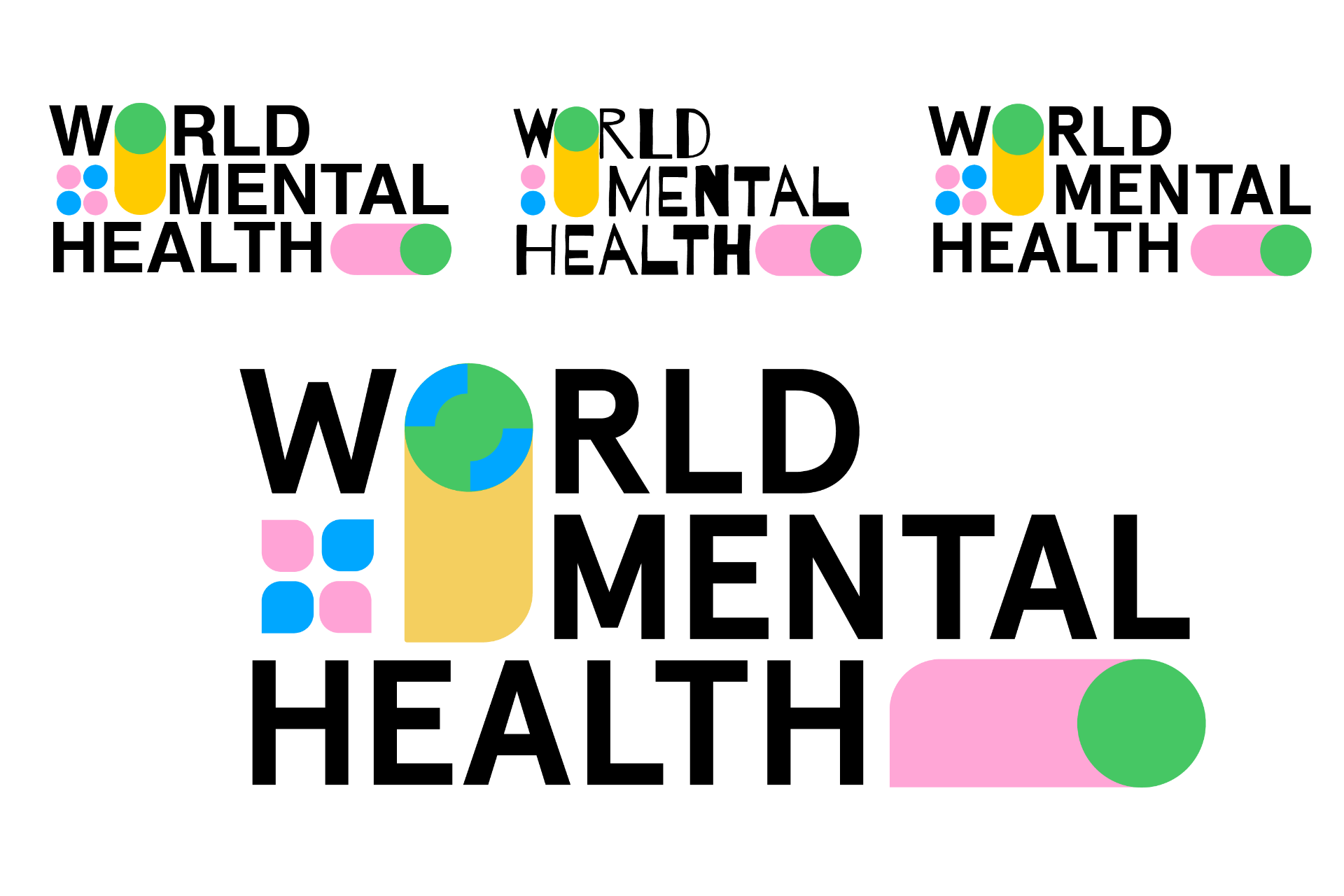
I then started playing with the shapes, adding corner and incorporating some of the ideas I had initially sketched out to make the outcome a little more interesting I also added blue quarter cut-outs to the top left and bottom right corner of the green circle covering the ‘o’ in the world to make the circle look like a world itself.
Overall I am really pleased with this outcome and happy with the incorporation of shapes along with the type and the effectiveness of the colour scheme.
What have I learnt?
- It can be really helpful to establish an abstract visual concept for a topic like mental health or health in general as accurate depictions in these instances can be hard to achieve or might be overly graphic.
- It is helpful to make colour and typographic choices when struggling to find a clear visual direction for an outcome.
- Combining shapes, colours, patterns and type can result in really interesting outcomes.
How can I apply this to my work in future?
- When working on design outcomes that don’t have clearly set visuals it is helpful to see how other companies and brand present the topic. Researching companies and projects of a similar thread is definitely something I will include in my research on future projects.
- Drawing inspiration from elementary shapes and patterns generally results in interesting outcomes and this an area I hope to develop in as I continue to work on new projects.