Homepage
I began my wireframing process following the steps set out by Dustin Senos in his article and as highlighted in our portfolio site lecture.
Multiple Small Wireframes
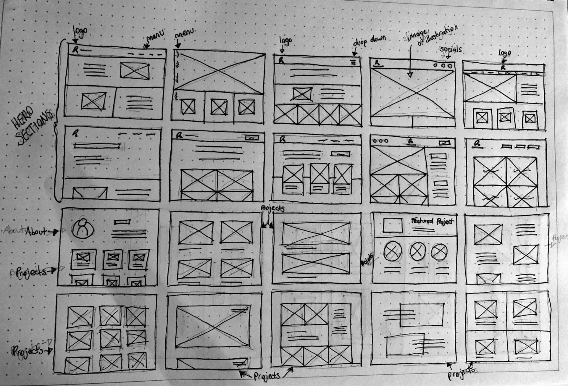
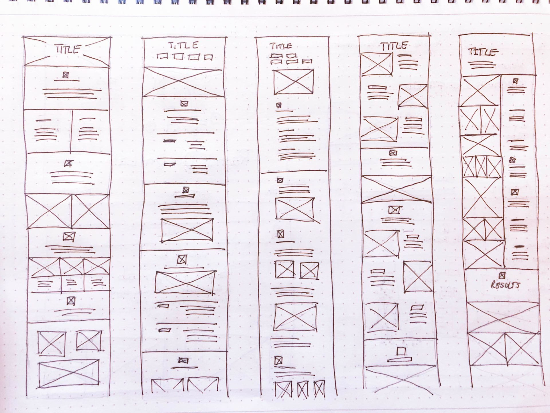
For my first step, I drew out 20 small wireframes for the home page of my website. I wanted to leave myself the option to run with a single page website so I have also looked at multiple ways of including projects and detail about projects on this page. I also generated some ideas with the idea of running with a very minimal home page and linking to project pages. The first 10 outcomes primarily deal with the layout and structure of the hero section of the home page while the bottom 10 deal more strongly with how to present projects.
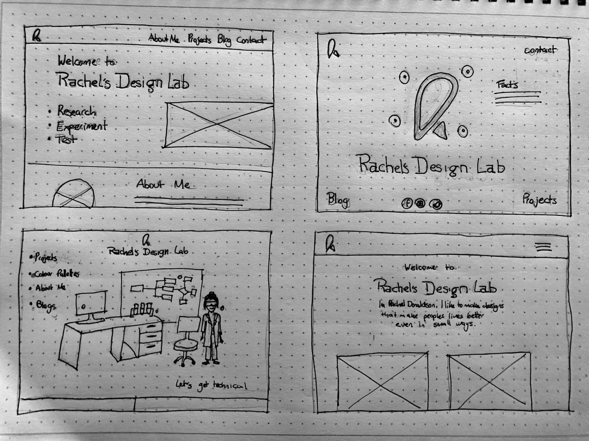
I then took 4 of the strongest ideas and drew them out larger. The first concept (top left) used a text left image right structure followed by an about me section. This would then run to projects and a contact section.
The second concept top left is a lot more ambitious and follows the idea of placing my logo in the centre of the screen and placing hover points across the screen that would relate to facts that would appear on the right-hand side. There would be no scroll option and links to home, contact, blog and projects would run at each corner of the screen with social media links placed at the bottom centre.
The third concept (bottom left) would include a large illustration of a lab with different areas of the illustration linking to different pages of the website e.g. the website would include pages like planning, experiments, typography, illustrations, branding etc. This is a more complex way to split the website rather than by project which may not work but I still felt it was an interesting concept to explore.
The fourth concept was based on a very minimal outcome with typography placed at the top followed by projects and all other items e.g. contact me, about, blogs appearing in a dropdown list at the right-hand side of the page.

Base on the above 4 concepts I picked my favourite (the first concept and drew out a more detailed wireframe including the entire page and also considering the elements included in my element collage. I was quite please with the above outcome and decided to move forward with the idea and made a digital wireframe of the outcome as shown below.
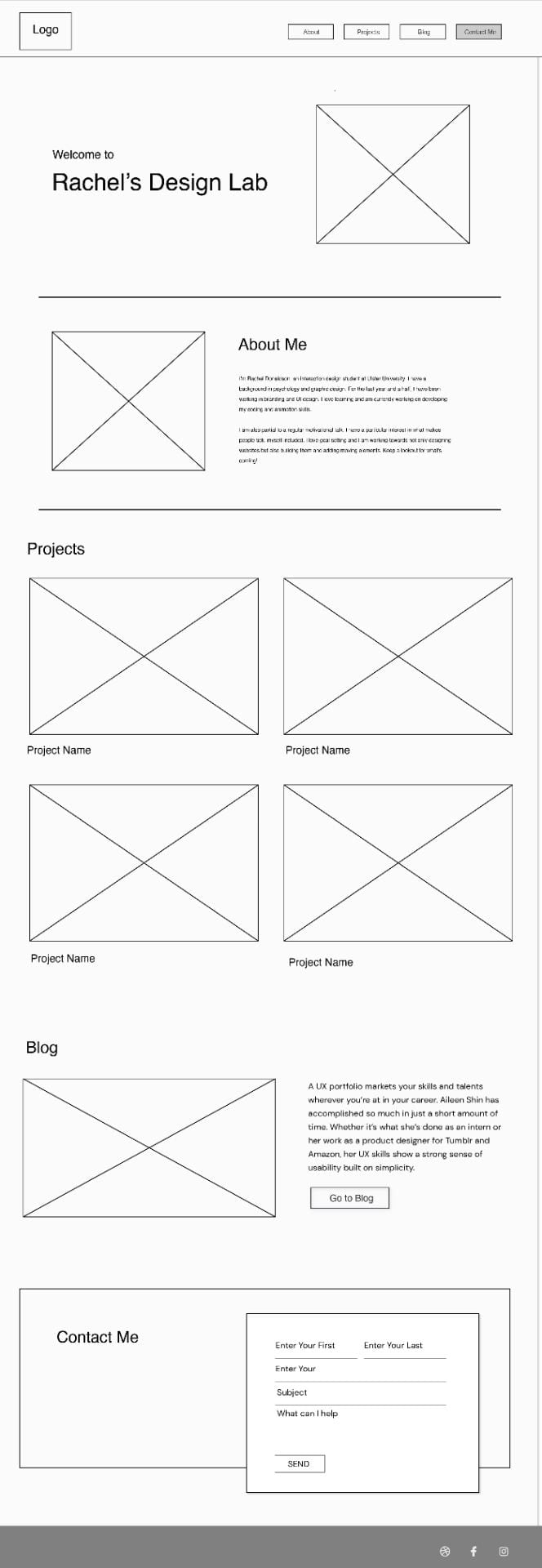
I found making a digital wireframe to be a great way to help me to start visualising the space. It was also helpful to start dropping in some text to get an idea of how much space there it would require.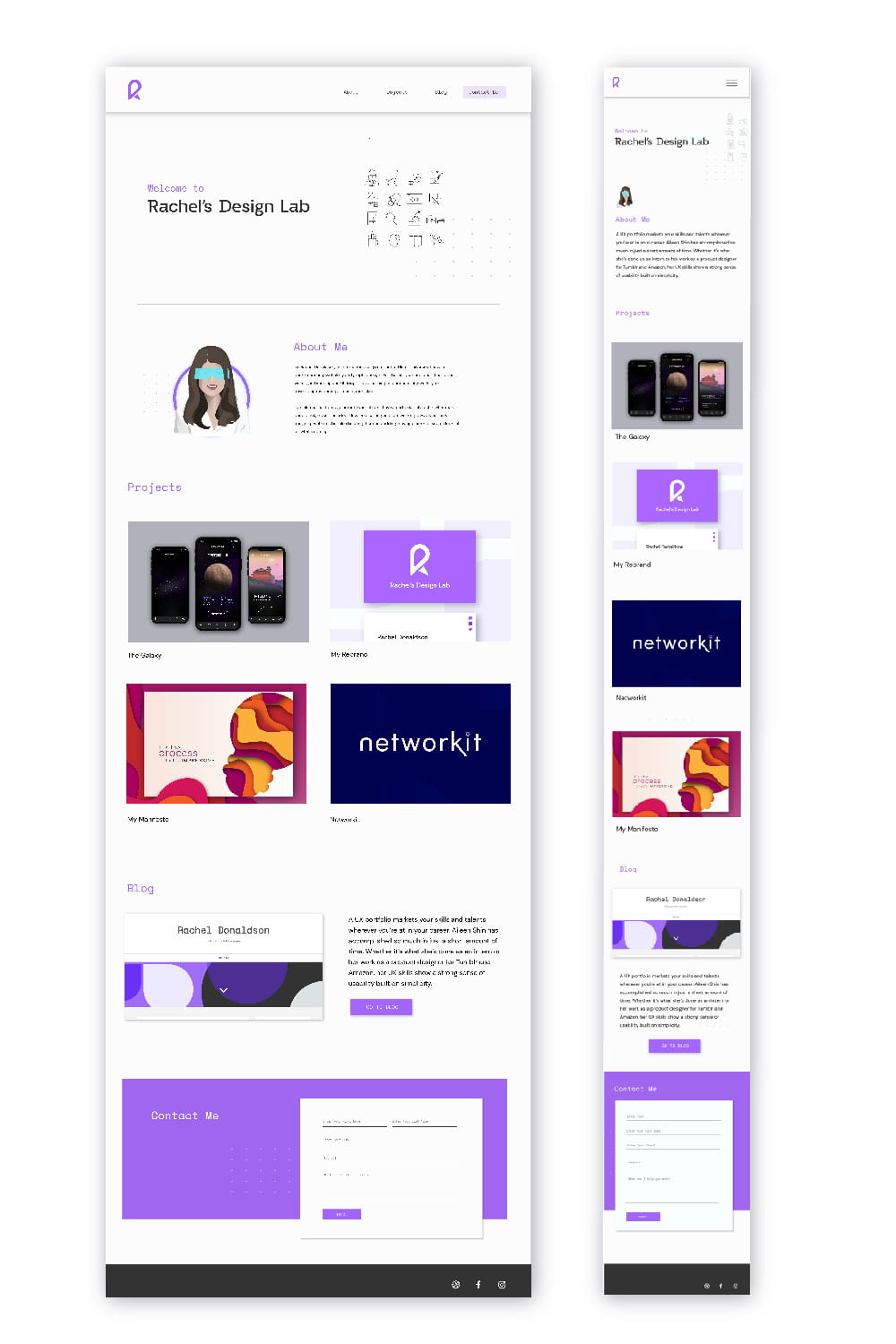
I then created a full mock-up from my digital wireframe and made sure to include actual projects that I intended to include on the page to get a clear sense of what the outcome would look like. Overall, I was please with outcome however I felt it lacked a really distinctive feel and that it could potentially be improved upon and decided to complete a S.C.A.M.P.E.R. diagram to help me come up with some solutions.
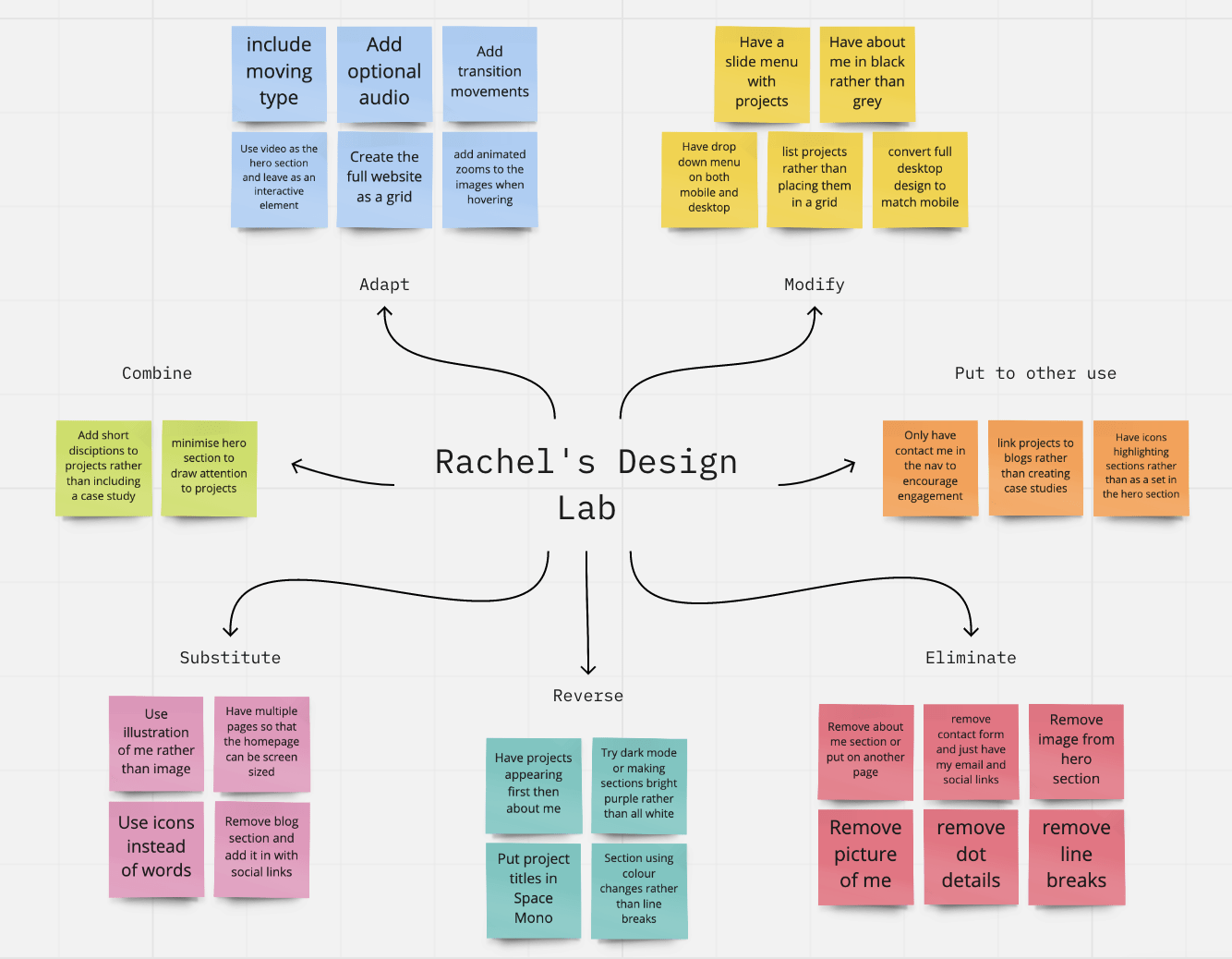
In hindsight, it would have probably been better to complete a S.C.A.M.P.E.R. diagram at the sketching phase of wireframing however I still found the exercise to be useful as it resulted in me producing a variation of the full comp mockup I had complete incorporating some of my new ideas and even returning to incorporate ideas in my second wireframe concept included above.
This was my final result which I feel resolved some of my problems. e.g. I wanted to love from the hero section straight to my projects as I felt these were most important. I returned to an image of myself rather than using the illustrative version I had created. Later I also decided the remove the project’s title and created a separate page for the about me section.
Project pages
Before creating my project page wireframes I created the copy and for one project and made the decision to divide projects into four main sections Overview, Research and Exploration, Experimentations and Development and Results. I also selected four icons to accompany the titles of these sections. I felt this structure should work well and be applicable to most projects as it left room for subheading to be included in each section.
I used the content I created for my The Galaxy App to create the above wireframes. As the content was quite lengthy I made the decision to only created 5 more detailed wireframes rather than multiple shorter wireframes as I didn’t feel they would capture the detail of the page as required in this instance.

I used the second wireframe to produce the above mock-up for The Galaxy project page. I tried to build from this as accurately as possible and used it as a guide for my other project pages. For the review of Aaron Duffy at OFFSET I kept my formatting very minimal and followed the title image structure at the top of the page.
What have I learnt?
- It’s really helpful to get your ideas on paper in the form of small low detailed wireframes
- Producing multiple wireframes in a higher level of detail rather than just one can be helpful with choosing the correct direction for a project and can also be useful to look back on if struggling with a chosen path.
- S.C.A.M.P.E.R. diagrams can be a great way to push ideas further and get the most out of every concept.
- It’s really important to have research and at least the bulk of your content including images created before creating a wireframe.
How can I apply this to my work in future?
- While I feel S.C.A.M.P.E.R. diagrams should be created at the hand-drawn wireframing stage and this is something I intend to do in future I also think that when stuck at the mockup stage that a S.C.A.M.P.E.R. diagram can be equally as helpful.
- It is important to set out a hierarchy of information and to make sure that it’s correct before moving to the wireframe and this something I intent to double-check when working on future projects.
- I think it’s good to get measurements and text size accurately presented at the mockup stage and this is something I would like to improve upon in future projects.