Navigation Bar
When building my navigation bar I ran into a few issues the first was that when reloaded my page my monogram would making sliding left movement from around the centre of the navbar. This was because I had originally set the padding-right at 30vw. So rather than adding padding to the right, I added style=”float: left” to the HTML5 image elements.
The next problem I encountered was that the list items in my nav were not centred to my monogram as shown below.

This took a little playing around but I finally found a helpful entry on stackoverflow which suggested adding the following CSS to my ul and logo:
Position: relative;
Top: 50%;
Transform: translateY(130%)
}
This did the trick and I played about with the top percentage on both to finally get everything aligned centrally. Resulting in the following outcome

I was also able to fix the nav to the top of the page and add a drop shadow using the following CSS:
nav {
box-shadow: 0em 0em 0.7em 0.2em rgba(0,0,0,0.05);
position: fixed;
z-index: 99;
}
I had an issue with nav appearing behind imaged after adding position: fixed and found adding z-index: 99 resolved this.
An annoying bug I did find was that on adding my website to my Instagram account I found that when first clicking on the link the nav stylings don’t transfer properly and the items sit below the bar and in 2 columns. However, this resolves itself when clicking on the link a second time. I found later that there appears to be an issue with adding a fixed nav on Instagram. I was able to swap my position from fixed to absolute on mobile and this appeared to resolve the problem.
However, before landing on this solution I attempted to add a drop-down menu using JavaScript however I struggled to get the outcome to work as I wanted it to so I have temporarily hidden the list-icon I added using display: none. I have also left the JavaScript in and intend to return to tackle this problem over the summer.
Hero Section
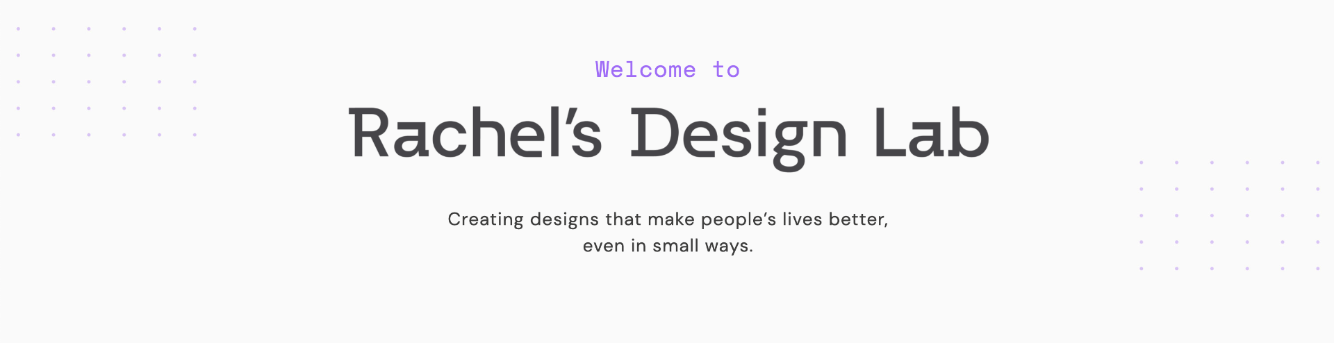
The hero section was created by placing a background image with the dot detail. The image was added to the style sheet as follows
background-image {
background: #fafafa url(‘../img/hero-background.jpg’);
background-repeat: no-repeat;
width: 100%;
}
I added the colour #fafafa to match with the rest of the site in case the image didn’t load. The rest of the type was added to the header section as H2 and H3 and text-align: centre was added to the div class.
Project Section
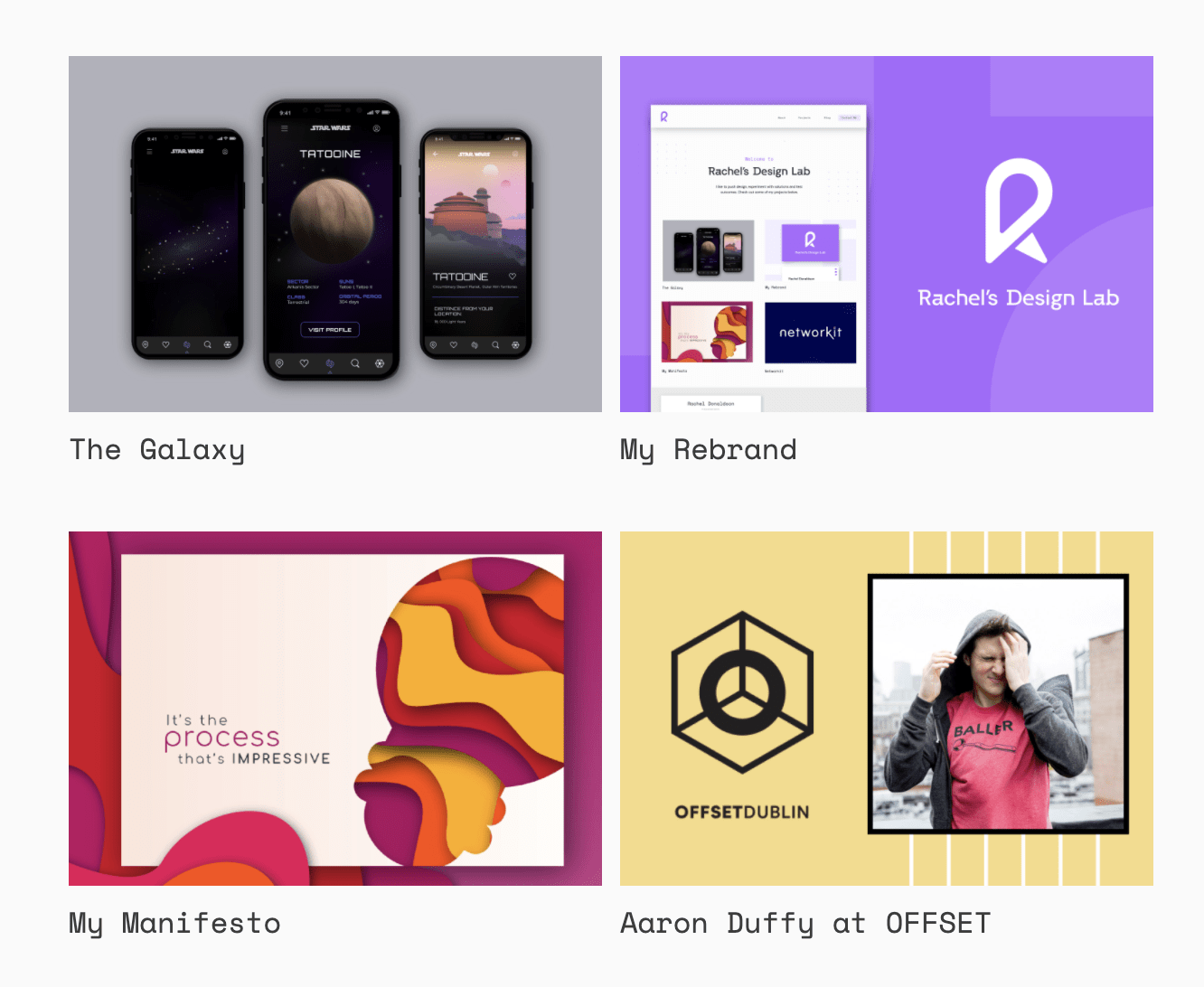
The project section was created using the following CSS
.grid-container{
max-width: 1200px;
margin: auto;
padding: 10px;
display: grid;
grid-gap: 20px;
grid-template-columns: repeat(auto-fit, minmax(400px, 1fr) ) ;}
I was able to control the number of images that displayed using minmax(400px) the larger the px the less images that displayed in a row. This also means that as the screen sized reduced and the images hit 400px they would automatically move to a 1 coloum grid layout.
Adding Hover Effects
As I am not overly confident with coding and I wanted to add some form of movement to the site I decided to add a simple hover effect to my project images in me style sheet:
.portfolio-img:hover {
box-shadow: 0em .0em .3em .1em rgba(0,0,0,0.2);
top:-10px;
}
This added a drop shadow to the images and caused them to move up 10px on hover. I was pleased with this outcome as I liked the idea of adding a more responsive feel to my desktop view. I also like that it encourages the user to click on the image.
Similarly, I also added a colour change hover effect to the project titles as these also link to the project pages I wanted to encourage users to click on these also.
Blog Section
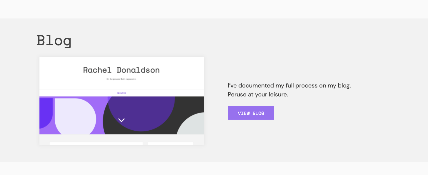
I wanted the blog section to state out and help divide up the page so I made the background slightly darker (#f2f2f2). This is a subtle colour change but I still very effective in helping to present the division of sections on my page. I used the same grid-template-columns styling elements to achieve the 2 column layout that swaps to 1 on mobile view. I also added a purple button that links to my blog and changes to black on hover.
Contact Section

In my contact section I have added a contact form. I was able to this finally after searching through several guides and tutorials by using the following tutorial: https://www.youtube.com/watch?v=Iv93yjdvkWI&list=RDCMUCkjoHfkLEy7ZT4bA2myJ8xA&start_radio=1&t=0
This tutorial set out the steps really clearly making it very simple to follow and add PHP to my site, a language I’ve never used before. However, it was only on uploading to GitHub that I realised the hosting service does not support PHP so I have left the form in for now with the plan to change my hosting service over the summer.
About Page
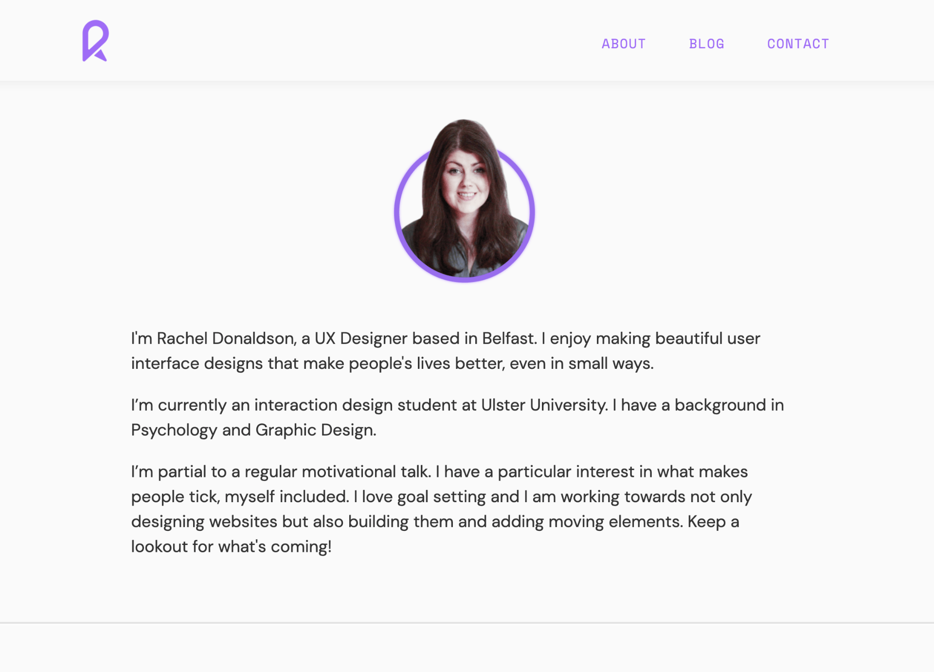
I kept my about page really simple by centre aligning the image I edited on illustrator and photoshop adding a little circular border. I also added a line rule to divide up my bio from my contact section. I wanted to include the context section on each page to encourage people to contact me.
Project Page
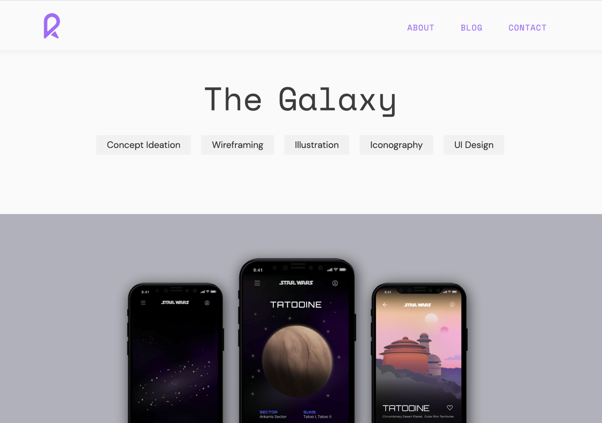
For each project page, I have centred my heading and added my roles in grey boxes at the top of the page highlighting my input and focus on the project. The top image is placed within a coloured background to match the image so that it appears the image spans the full with of the page. This has the benefit of when the screen size drops the image size can be increased and therefore the size can be maintained on mobile view.
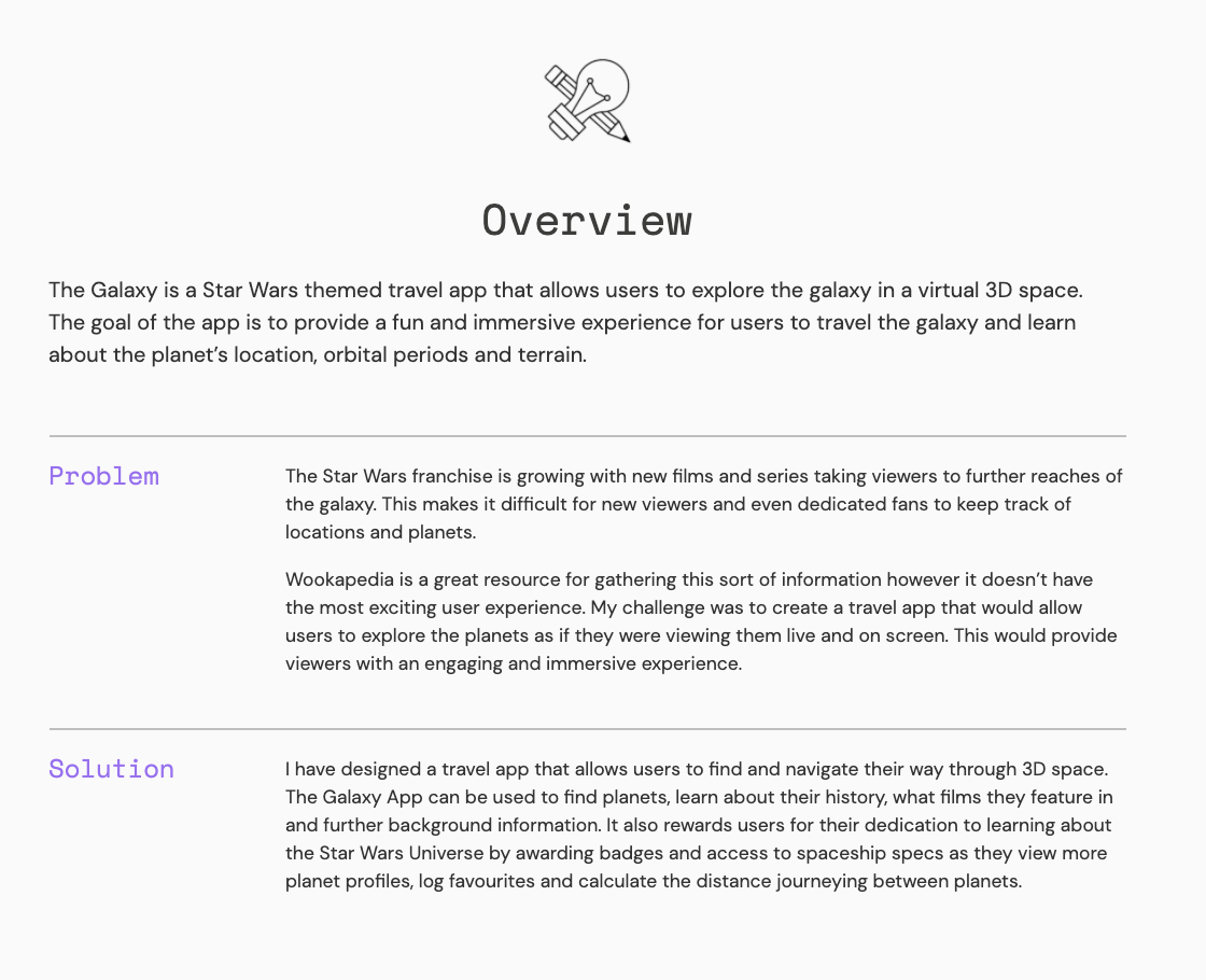
I sectioned up my text as seen in the above with an icon and section title spaning the page and subheadings and related text placed on two columns. This was done using the following styling:
.project-container {
display: grid;
grid-template-columns: auto auto auto;
padding-top: 1em;
padding-bottom: 0.25em;
}
@media only screen and (max-width: 610px) {
.project-container {
display: grid;
padding-top: 1em;
padding-bottom: 0.01em;
grid-template-areas:
“title”
“content”}
}
I found this really difficult to code as when trying to add flexbox and grid spans I found that the subheading column was shrinking when it shouldn’t or that the text column wasn’t wide enough. However, I was able to make the format work using the above styling and media queries.
Images throughout the project pages are styled in the same way as the image on the homepage using grid-template-columns.
Links
To check out my website got to rachelsdesignlab.com
To check out my coding go to https://github.com/RachelDonaldson/portfolio-website
Review
Overall I am really pleased with the outcome of my website and feel that it does meet my original goals of providing me with an online presence that will display my work, strengths and make me more contactable. I am particularly happy with how I have been able to present my process in my case studies(project pages) and am hopeful that my portfolio site will lead to increased exposure and will help me to build a solid reputation around my personal brand. I intend to help this along by adding and promoting my new website from my brand’s social media pages.
I am happy that I have been able to present my personality through my tone of voice, particularly in my homepage and bio. This is an area that may require a little more work on project pages however this something I am hoping to review over the summer as I feel at times my tone of voice may still be too formal. In terms of creating a page that is unique and memorable, I hopping my branding will help to promote my website in this way however I’m not sure that the actual structure of my website achieves this. I am however happy with the level of professionalism I have been able to achieve at this stage as I am new to coding.
Additional goals I had set myself included experimenting with JavaScript which I am happy I tried and while it didn’t make the final cut this is an area I am sure I can improve in as I progress. I also do feel more confident in working with CSS and creating grid structures however this is an area that will require continued attention. I feel learning better responsive design is still an area that requires work for me however I am relatively pleased with how my mobile view has turned out.
What have I learnt?
- How to create grid structures using grid-template-columns: repeat(auto-fit, minmax( xxx px, 1fr).
- How to make changes to grid-template-columns: repeat using media queries.
- How to create a form using PHP
- How to create a multi-page website
- How to add movement using hover effects.
How can I apply this to my work in future?
- I can now use the above mentioned coding items in any future sites.
- I hope to build on my coding knowledge and improve my website by cleaning up my coding and removing unnecessary items.
- I hope to improve my website by building on my attempts to add JavaScript and adding animated elements such as having items pop up on scroll.