Colour

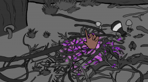
Colour is not a part of the syllabus so I knew that I didn’t have to include it in the project but I initially thought that it would be good to only add colour to the most important part of the scene. To do this, I initially only included colour in areas such as when Fern casts a magic spell, or with her eyes. For this scene I had the purple glowing getting stronger throughout the duration of the scene.

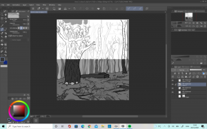
I intended to keep the backgrounds plain white to make the colours stand out but as I worked on the project I started to think that maybe adding a greyscale palette into the animation would help to create depth and emotion in the shots. I asked my lecturers about this and they agreed that adding in the greyscale helped to add depth into the animation. It also helped to make the different elements of the backgrounds stand out and it did not distract too much from the main animations colours.

The end result was a lot better in each shot as the background was a lot more interesting and only using colours for the important shots worked out well.

Check in presentation

For our group check in presentation, I edited together the animatics of all the people who sent me theirs in order to see how our story looked all together and to make sure there was cohesion. I was not really sure what to include in my section and having watched the other members and teams I wish I had gone into a little more detail about my work but it is listed on my blog so hopefully it is clear how my developments have progressed throughout the progress.

We got some very positive feedback about the animatic so far, and we were told that there was a good cohesion between the characters which was something we really wanted to achieve. It was also said that we had a good understanding on timing which was reassuring as it was something I had been worried about.

Development: Shot 12


Shot 12 was one which I enjoyed a lot. There was quite a lot of development in order to get it to where I wanted it to be. I started off by drawing my character on krita, using the original character design Cloe had created. Once I was happy I moved on to animating.

I liked the first shot I did but it was pointed out to me that the expression was a little stiff, with not enough movement. It was suggested that if I widen the eyes morel, start with the mouth open and move the jaw the motions would look a lot better and I agree- I found the final animation to be a lot more pleasing.

Lastly I had to add the colour and when it came to this I noticed some inconsistencies with how I had drawn the background compared to other shots and so I ended up having to fix this. I think that it worked out better this way however, and now there is more consistency across the animation.


Developments

My initial storyboard and animatic had this scene from the side, where Fern casts the spell. However, I quickly found that it was difficult to find a good reference for this. I decided I would try to change up the angle and see if I liked it better. I ended up finding a reference for a front view angle from Harry Potter which I thought worked better. I also thought that it would be easier for me to create emotion from the character if I did the shot face on.

I am much happier with this angle and the shot worked very well in the end.

I also decided that It would be better If I included some more camera work in my final animation as I thought it was lacking it a little. I am not very used to working with different effects to create different camera movements but I think that adding in the second shot where the camera pans down the forest was a good way to make the animation a bit more visually appealing. I ended up really liking this shot and it was a lot of fun to complete the detailed background.

References – Group members blogs

The other members of the team were also a great help for building up references and getting inspired for the project. We were able to share ideas and suggestions among each other, including films and tv shows we thought might be helpful as well as thoughts on shots and colour palettes.

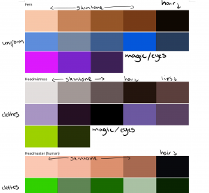
My groupmate Amy put together colour swatches for each of the scenes, after we had discussed in a group and looked at colours we thought would work. This was very helpful as it made it easy to colour drop from an image when it came to adding colour to my final animation.

Animation Studio – Magical Academia Animation

https://blogs.ulster.ac.uk/cloemalard/

https://blogs.ulster.ac.uk/b00835256/


References- Pinterest

I find Pinterest is a very good place to get lots of ideas from and so I always make sure to create boards at the start of a project and keep them updated as ideas develop. I have included a link to some of the boards I made for this project.

https://www.pinterest.co.uk/jazzy_121/magical-academia-world-building-references-outside/


https://www.pinterest.co.uk/jazzy_121/design-a-world-group-6/

https://www.pinterest.co.uk/jazzy_121/build-a-world-character-references/


Animation

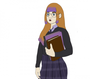
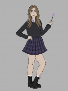
One of the ideas we had that would make our animation a little more fun was to have each of us guest as students at the school! It was very fun to create a character for yourself which Eimear was going to include in her scene as limited animation. I tried to keep the style of my character consistent with the style I drew Fern in and as close to Cloe’s original character design as possible. I was happy with how it turned out and I think you can see that my character is definitely from within the same world as Fern as there is consistency in the character design.

Colour References

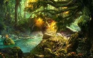
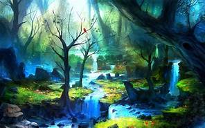
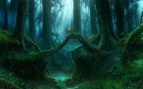
All of my scenes are set outside the building and so I wanted to keep a very mysterious colour palette, but also have it fit into nature. I looked up various different magical palettes from forests. I put together a collection of ones that I liked so that I could discuss it with the team and get their opinion on what they liked best.

After a discussion we all agreed that the bottom one would be good for the outdoor palette as it is still mystical but the greens and blues provide a sense of nature exactly like we wanted. We also discussed as a group what the inside palette should look like and one of the group members suggested owl house:

We all agreed that this palette would work well and it wouldn’t clash too much against the characters clothing.

Once we had decided the colour palettes our group member Amy made a helpful document containing palettes (By using the adobe colour picker software) which is helpful for us all to get the correct colours.


References


I used a couple of different references for movements, including both scenes from already existing media and scenes which I set up myself to photograph. This was helpful for scenes which I could not find any reference for as it allowed me to think about the composition and how to make the shots more accurate in terms of character placement and poses.

For the scene where Fern does the magic i used a reference from Harry Potter where Hermione casts a spell. I thought that this would be an accurate way to make it look like she was casting a spell with a full range of motion. I really wanted to capture anticipation in this shot, one of the 12 principle of animation so I think this was a good solid reference to use.

For these reference poses I set them up myself in order to fix the perspective which was a big issue in some of my shots. Particularly the shot above, where the hand goes out of the ground and reaches towards Fern as in my original animatic it was not immediately clear that the hand was in the foreground of the shot, and Fern was in the background- this made things look as if it was a giant hand next to a normal sized person. By posing these scenes with my teammates I was able to improve the shot a lot.

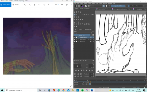
This shot was difficult to animate smoothly so I was luckily able to pose a family member to help me with animating the shot. I took a burst of shots and edited them together (See above) which was really helpful. Then I was able to look at the video and my timeline at once.


Development

For this scene I wanted to use as close a reference as I could find because I thought it would be tricky to get it accurate. I found a reference from ‘The Black Cauldron’  which shows a skeleton hand and not a zombie hand but I still liked the motion of the hand clenching and unclenching and I wanted to try to capture this. I had to change the angle which made things a little bit difficult but I think it went quite well. Next, I just have to fix up the line art of the animation and add in some tonal values to give the piece more depth. I will also add more detail into Fern but as she is far away and she will be done in limited animation this won’t be too difficult.