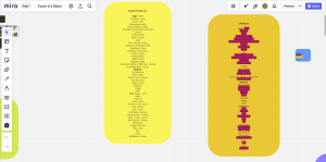
To start the project, the group created a collective Miro board where we could all apply our ideas and make lists of everything important. We had meetings with the Games students to decide which props we would need for the game. Once we had a first draft of what would be needed, I made a column on the Miro with the importance of each prop so everyone would know what to prioritize. We thought it would be best to allow each person to pick what they wanted to model as this would make it more enjoyable. I then looked at what was left and checked who would be happy to take on another prop.

In week 5, there was a bit of a breakdown of communication with the team as the narrative was running behind and the game was heavily narrative driven. Some of the hero props were also falling behind and due to problems with my character model, it wasn’t at the place we wanted it to be at either. It was suggested that we should make a schedule to keep everyone on track so I took on the role of making this and checking in to see if it was being followed.
I also made a master list of props with a column for each of the prop modellers so that we could see what had been modelled, textured, or both, which I updated regularly once everyone had finished their models.

We also had set meetings every Monday, Wednesday, and Sunday to help everyone keep on track. Unfortunately, not everyone was present at these meetings, nor did they let us know ahead of time when they could not make it which was frustrating. However, I kept notes from these meetings and was able to share with the others what had been missed. These meetings were crucial as they allowed us to iron out any problems we were having, as well as help us communicate with the sound designer.
Art Direction
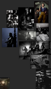
My role for the Vertical Slice project was Art Direction and Character Modeller, alongside Ciara. We met in the first week to get started on the style guide and work out what aesthetic and approach we wanted to take. As Ciara is a very talented 2D artist, we decided together that I would do the 3D character modelling and she would do the 2D sprites, as well as the bulk of the art guide. We had several meetings where we gathered research and inspiration for how we wanted the game to look. We eventually decided on using Professor Layton as a main influence, as well as Jazzpunk and The Stanley Parable. At our first presentation, we received feedback that the art guide wasn’t quite well-rounded enough and would not be easy for others to follow, so we had to go back and rework it. We discussed these changes together and Ciara was able to put together a very cohesive document to help others with the art style, as well as posting a list of instructions for texturing. The style guide can be found here: Knives Out Style guide – Google Docs


Character Models
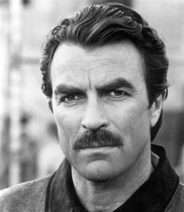
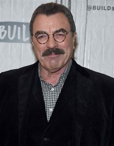
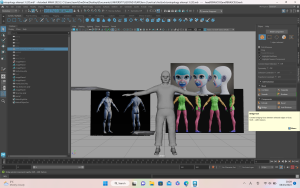
I was in charge of the 3D character models, and I got started right away to allow myself spare time if any unexpected problems occurred. I started with the boss character, using a character from Heavy Rain, Scott Shelby, as well as Tom Selleck for inspiration.

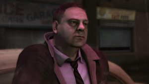
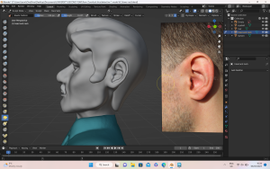
I didn’t have many problems with the sculpting of the facial features as I’ve had some experience with this in Blender, however, it was pointed out to me during the presentation that his ears didn’t look human so I was able to fix them after this. This was my first time sculpting a character for animation so I ran into a few problems. The first issue I had was that I modelled half of the body without the symmetry tool on. This caused a problem when I tried to duplicate the left side and flip it so that it was the right side. This was due to the pivot point in Blender being set to ‘world’ and not ‘object’ which made moving it and matching it up not work. After struggling with this, I found through research that I could change the pivot to the object origin, which made flipping it much easier. Once I combined the two sides as one mesh, there was a line down the middle so the character looked too wide. It was also obvious it had been flipped which looked awkward. I had to do a lot more work on sculpting the body to fix this, but discovering it in this character allowed me to make the second character much more efficiently. During feedback with the lecturers, it was said that the proportions of the body were not quite accurate to that of a biological male, as he had strong curves and a large chest. His trousers were also modelled very tightly to the body so it looked as if they were skintight. Taking this feedback, I amended the body shape and clothing fit which made the model look much better.


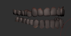


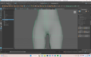
As I had modelled everything as one mesh this caused me trouble later on in the pipeline. Retopology was the area I had the most issues with. The first attempt at retopology was too condensed as I tried to retopologize every single part of the mesh at once. This meant the higher loop count applied to the areas that needed it was also applied to the areas that didn’t need it, resulting in a very strange topology. For the second attempt, I imported references into the Maya scene so that I could look at it as I worked, but I was still finding that it was too tight. I spoke to my lecturer who suggested I use the Azri rig as a direct reference. This helped immensely as I was able to select certain parts of the body at a time. Following on from the feedback about how it would have been easier to model each part separately, I decided to retopologise each part at a time. This helped me to compare each area to the Azri rig and ultimately have a much stronger topology.


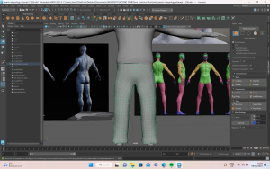


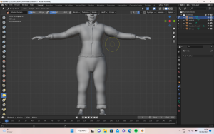
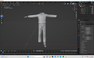
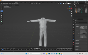
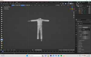
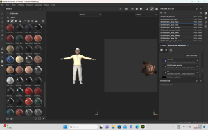
The group had decided the game would be 1st person, but we wanted the player to have full body awareness. I took my knowledge from the previous character to model each section individually. This was easier as I already had to practice modelling the boss character’s clothes. I made sure to model everything with the symmetry button on which was so helpful and I didn’t experience the same problems as the first model. Since the character was going to be 1st person, we decided it would save time to make it without a head.
As the character was better sculpted, it allowed for a much smoother retopology process, again using Azri as a reference. I paid close attention to the hands as I had some trouble with this on the boss character. I looked closely at how to do the retopology in between the fingers to allow them to bend as I knew this was important for the animations. This was much more successful and I was a lot happier with this retopology than the first one.


I then moved on to creating the UV maps. For this, I looked at where stitches are on clothes such as shirts and trousers. I found this helpful as I was able to make the UV cuts look like more realistic cloth seams. Overall, I didn’t have much trouble with the UVs as I’ve had quite a lot of practice, but I did struggle with the trousers for the boss character. Maya was crashing when I tried to unfold the UV cuts, despite me having frozen transformations and deleted the history. After doing some research and getting help from my lecturer, I discovered by running Maya Cleanup that there was some non-manifold geometry causing the issue. Once I got this fixed, the program worked again and I was able to make a clean layout of the UV maps for both characters. I applied lamberts and exported the models as FBXs, ready for Substance Painter.
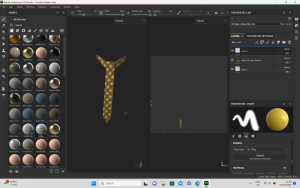
I started with the textures of the boss character, looking at the style guide to ensure consistency and accuracy to the era. In the style guide, we decided we would include a little texture in the clothes and material objects. For this, I uploaded my own corduroy and shirt textures and applied these as alphas to the body. When I tested in Unreal, I noticed that the skin tones didn’t completely match between the face and the hands, and the eyes and mouth were sharing the same lambert as the tie. The skin was also lacking depth so I added blue and red undertones. I found a helpful YouTube video that helped me to build the textures and achieve a result I was happy with. I was then able to apply this to the other areas of the skin and make sure everything matched.
(Stylized Character Face Texturing in Substance Painter | Timelaps X2 – YouTube)
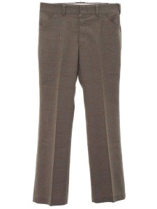
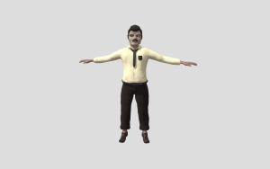
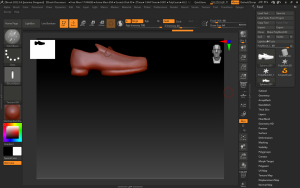
When texturing the player character, I wanted to have the colours brighter and more exciting to match the colour palette of the 1970s. I decided to add some flowers to the shirt, using an alpha of flowers in different colours to bring the shirt to life. As the character is undercover in the game, I thought it would help them to blend in by having them dress more causally. For the shoes, I used an alpha brush to create stitches on the shoes which worked well. Once I was happy with the textures, I added the lighting consistent with the art guide.


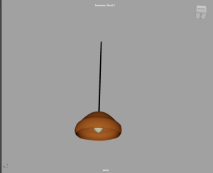
Props
Prop modelling was a secondary role of mine. I had two of the evidence props for the game and as they were the most important, I worked on them first. The gloves were the first prop I made. Since I had already modelled the hands for the characters, I was able to take the retopologized hand and extrude the thickness to make a good glove shape. Following the style guide, I textured them accordingly.

Next, I made the padlock which had to unlock in the game. Due to this, I needed to have all of the meshes separate so they would be functional in Unreal. Initially, I overcomplicated this mesh but once I ran cleanup and simplified it down it looked much better and I was able to get clean UV cuts without stretched textures. Another problem I discovered when I brought the FBX into Unreal was that it was extremely small, causing the mesh to warp when it was scaled up. This was strange as I had used the Unreal Man as a size reference, as well as setting my Maya file to meters ahead of time. Scaling up the meshes in Maya worked in the end. The other problem was that despite setting the pivot to the right place, baking the pivots, deleting history, and freezing transformations when I exported the FBXs into Unreal, the pivot was offset. Doing some research showed me that if you untick ‘Transform vertex to absolute’ and bake pivots in Unreal, it will fix this issue so I was able to share this with the team.

Similarly, the bathroom counters were too small in Unreal and when scaled up, the tap distorted strangely but thankfully scaling it up in Maya fixed the issue. For texturing the sinks, I kept the colour palette sheet Lauren had made. During the industry day, we got some feedback that the floors of the bathroom didn’t fit with the game but we still wanted a way to differentiate between the male and female bathrooms so I did two different colours of counters.


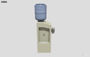
The level felt bare as there were not enough props to fill it, so the prop modellers had a meeting to come up with other items which could help bring the level to life, and alongside the lecturers’ feedback, we came up with a more extensive prop list. The water cooler was one of these. Originally, I made it quite basic, but after the lecturers pointed out that the offsetting of the props was not consistent, I reworked it to make it better. I also used the opportunity to put water inside the cooler as it was originally empty. When it came to texturing, I used the following tutorial to achieve the water look: How to Make Water in Substance Painter – YouTube
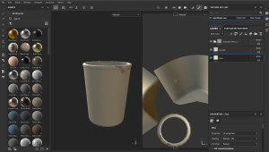
After this, I made styrofoam cups that could be placed around the office. It was fun to play with the vertices in Maya to create a crumpled look without going into sculpting. For the texturing, I kept it very simple but used an alpha to create a lipstick mark on one of the cups to bring some additional story to it.

I also created a vent which I found quite difficult initially as I had never done anything like it before. After some research, I was able to find this video which was perfect for the look I was trying to create: [sub] Lattice Fence, Tutorial, 3D Maya 2020 – YouTube

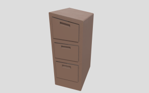
The hand dryer, filing cabinet, and carpet dividers were all pretty straightforward and I was able to apply the feedback of offsetting everything. The textures were kept simple as well, as per the style guide and colour palette, but I did add some scratches to the hand dryer as well as dust to the top of the filing cabinet to give a realistic worn look.


2D Art
I also helped do some 2D art to bring the story of the game to life. The decals were simple and made transparent so that they could be applied to the office floors to make them look walked over. I was asked to do a simple drawing of the crime scene which could be used for the introduction to the game at the start. After watching the feedback video with Brian, I noticed that the UI was very plain between the boss and the main player character so I decided to do some illustrations which would make the gameplay more engaging.


Animations
The animation part was the area where the team had the most trouble. There was a problem with the rig when we tried to bring it into Unreal, which meant we had to redo some of it. Unfortunately, this was after some people had completed their animations. As only my animations had been referenced it meant that everyone else had to transfer their animations over to the newly fixed rig. I had learned how to transfer keyframes between rigs so I was able to make a step-by-step video for the others to follow on their own.
I also transferred Ciara’s animations for her as she had already done a huge amount of work for the project.
The animations I made for the project were:
- The player characters walk cycle
- A blend shape animation of the boss character asking, “Are you sure?”
- A simple mouth open and close blend shape animation
- Idle animation 1
- Idle animation 2
- Idle animation 3
- Idle animation 4
- Idle animation 5
The animations I helped Ciara with were:
- Picking up the phone animation
- Wrong accusation
- Intrigued Animation
I also had the opportunity to explore some Mocap software which was very interesting. I was the one who wore the Mocap suit and it was cool to see my own movements captured on the rigs. I followed Alec’s tutorial on how to set up each rig and transfer the animations between. Unfortunately, our rig was not able to be used for my Mocap references, so I had to practice on the Azri rig instead. Despite this, it was still a great opportunity to practice and get familiar with Mocap technology.
Self-Reflection
Overall this project had both positives and negatives. There was some miscommunication between the Games and Animation courses which resulted in problems along the way. Thankfully, as we experienced these issues, we were also able to resolve them and this has helped with conflict resolution in future projects. In terms of the work I produced, I think some of it is of a good standard, but there are other areas I would like to improve on. The main character’s proportions are not 100% accurate and if I were to redo the project, I would make sure I checked every detail before passing it on for rigging. I also had a problem with overcomplicating the meshes on certain objects, but this project has helped me to step back and reevaluate when I realise a task isn’t going as smoothly as it should be. This lesson will make things easier for myself and my team in the future. One area I was pleased with in this project was that I stuck to the assigned style in terms of models and textures which helped improve the overall cohesion of the game. This was something I struggled with in my last project, so it was an accomplishment for me to achieve this here. I also think I was able to help my team out with anything they needed help with and contributed across a range of aspects of the game.
Unfortunately the majority of my assets were not included in the final game and my 2D images were not used at all. This was a shame as I worked very hard on getting everything put together for the game. I have included some screenshots of the assets which could be seen in the game below:


Links to Sketchfab: Jasmine_Sheppard – Sketchfab