All posts by sheppard-j2

Creative Futures

Poster Design

For the design aspect of the module, I created a PureRef board for movie posters that had a similar theme to what we were aiming for.

We thought about the underlying message and decided it was ultimately a story about overcoming grief. With this in mind, I thought the fox should be the main focus of the poster and drew up a few concepts to share with the group.

We discussed how the bottom left option was our favourite, but it would look better if there was a vignette framing the fox, the way Danielle had done hers. We also liked the idea of featuring the butterfly on the poster as it was a symbol of hope, something Alex had included in her first design. Taking this discussion on board, I further developed the bottom left and top right sketches.

I wanted to highlight the poses of the butterfly and the baby fox as they were cute and gave the clear impression of childhood innocence. I combined this with the den in the bottom right sketch as I thought it would be beneficial to include environmental work.

I got some feedback that the composition would be improved by finding a placement for the butterfly to enhanced the overall poster design which I did.

I then researched different fonts to see what style would look best. This included some of the examples talked about during our lectures and a variety of online examples.

Google font tests

Ultimately, we used a design similar to Alex’s original concept because the pose was dynamic and filled the space well. Our feedback was that it looked nice, but the font didn’t work. We went back to my reference board and agreed that we all liked the font of Ori and the Blind Forest. I suggested we handwrite the title using a paintbrush on Procreate so the font tied in with the painterly theme we had used for the textures in the project. We tried this and found that it looked much better and helped with the visual storytelling.

Ori and the blind forest poster reference

I also made some font mock-ups for variety, but they didn’t suit the poster as much as Alex’s so we went with hers.

My font tests for the poster

Business Cards

These are my initial business card designs. I got feedback that they didn’t match the group’s theme and as this was the logo for my Instagram it may be better to produce new ones.


For this version, I updated the front colours to match the logo, but still wasn’t right, so I created a second attempt with a forest theme.

Danielle and I started brainstorming and came up with a few ideas to work from that allowed our designs to blend together as a team.

I developed option 5 with a forest background and a fox in front. The idea to use the same image for cohesiveness so we could all include our own foxes to make each card unique.

The business card design we ended up choosing belonged to Danielle, who had made designs based on Alex’s poster. The models on the cards also highlighted our specialty, so I focused on topology as I want to be a character modeler.

It was a challenge to get the wireframe to show on the model without disappearing into the background, but by using a dark blue I managed to make it stand out against the green.

I tried a few different models to see which would look best.

CV

Research in 3d modeler and junior character artists

Danielle had also designed a CV template to match the business cards, so I followed her example to update a previous resume I had and shared my template with the group.

I combined the new elements with my existing CV. It looked nice and there was a good layout, but it ended up on two pages which is usually too long, so I decided to do another one. I looked up some job requirements to see what information would be most important when applying for jobs in the industry. I was able to match Danielle and Alex’s designs to make the project look professional while still highlighting the most important information.

I gathered the CVs and printed them, before using a guillotine to cut off the loose edges around the final design to keep them neat.

I uploaded several posts to my ArtStation showcasing the final render as well as progress shots of the project. This allowed me to display all the aspects I worked on throughout the pipeline.

For my showreel, I took an existing edit and updated it to include my new final year project animations. I also decided that as I have modelling portfolios on ArtStation, Sketchfab, and Google Websites, I would change my showreel to focus singularly on my animation.

Art Book

I decided it would be a good starting point to look at the work of previous students, as well as industry-grade pieces. I gathered a selection of renders of my assets and removed the backgrounds so they would fit seamlessly into the theme. The book ended up with a nice finish and an even balance of all of our work showcased.

Display Layout

We had an overall theme of nature, so I knew what kind of items to look for to add our display. I went to the park and collected an array of pinecones and leaves. I also brought in some synthetic ivy vines, flowers, and LED lights which I thought would enrich the display. I bought some faux grass and felt leaves from Hobbycraft which  matched the theme perfectly.

We set up a rough display using the elements we already had, to get an idea of what we could do with the space. We included a draft poster on the wall to get an idea of how big it would be and what to do with the area around it. This initial setup looked pretty, but we decided to add some larger stumps to tie the environment together.

We painted the wall behind our poster an eye-catching blue, keeping in some visible brush strokes to add texture and tie in with our painterly design. We also added wallpaper to the side wall, following the nature theme, to elevate the space further.

Originally, we planned for the ivy to hang down from the top but decided it would be better placed along the front to cover up the green cardboard at the front of the table. Alex and I set up the vines but as they were a little sparce we bought some additional leaves to incorporate with the ivy to give it a fuller and more vibrant look.

We initially dotted the leaves all along the back wall to look like they were falling from a tree. This wasn’t dynamic enough, so I suggested we aim for the impression of leaves blowing in the wind. For this, we started at the top right corner and arranged them in an S shape, but due to a lack of space, the movement didn’t look quite right. Henry suggested looking at the Line of Beauty by William Hogarth. In doing so, I was able to create a natural line that looks like leaves blowing in the wind by using the additional space provided by the side wall.


One of our monitors will play the final cut of the film, and the other will show a looping video of our showreels. To create this, I screen-recorded all three of our portfolios and edited them together in Premiere Pro.

Online Promotional Displays

For my professional branding, I started by being more active on LinkedIn to improve my reach and expand my network in the industry. I added professional contacts, engaged with, and reposted a range of content from my connections.

For any events I attended or was part of throughout the year, I followed the company involved and made a post about the event. This helped me reach a wider base of potential employers and shows that I am passionate about a career in the industry.

I decided to open a Google Website to market myself and created a page with my work on Forlorn, as well as an introduction page. I will keep this updated by adding future projects I work on.

I also set up an email address and Instagram account to promote our short film in terms of progress shots and final renders to allow industry experts to become familiar with the film, especially if we decide to enter it into festivals.

Fundraiser

I volunteered to find prizes for the pub quiz and raffle. I started looking at companies based in Northern Ireland, as I thought the community aspect would make them more likely to respond. I started a Google Doc for everyone to add the prizes they sourced.


I got replies from Boojum, Born and Bred, and Q-con who provided some great prizes. I also asked one of my classmates if he could get vouchers for Hjem, where he works, as a raffle prize which he did.

I helped find a venue by looking for free-to-hire event rooms and contacting the Pavilion in Belfast. We ultimately decided to go with CQ Social, as it is easier to get to. This meant more people were likely to attend so we had the opportunity to raise more money. I also bought the raffle book which was used for the quiz on the night.

I also made a round for the pub quiz, and shared it with the other organizers and they liked the questions but suggested maybe making the most difficult ones multiple choices to make it easier.

End-of-Year Showcase

I helped paint the wall to cover up drawings and create a more professional look. I set up a ‘room monitoring’ schedule, which allowed people to pick shifts that work for them so we would have cover for the entirety of the show. I will also be volunteering, but as I have more availability I decided to wait to put my name down until others have chosen.

Final Major Project Portfolio Blog

Final Assets and Rigs can be found at: MAJOR PROJECT SUBMISSION

Asset Masterfile avalible at: Jasmine_Sheppard – Sketchfab


Textures:

Final butterfly model
Dad fox model textures
Daisy textures
Pinecone textures
Mica mushroom original textures


Initial mica mushrooms
Mica mushroom 1 with new textures
Mica mushroom 2 with new textures
Mica Mushroom 3 with new textures
Deerhead mushroom texture 1
Deerhead mushroom texture 2
Deerhead mushroom texture 3
Initial mushroom texture

Bush with my hand drawn flower applied
Bush with no flowers
Grass stalk
Rock original textures
Final painting of rocks


Model by Danielle, textures by myself
Second iteration of rocks
Model by Danielle, textures by myself
Fern texture
Leaf texture
Tulip texture
Nut texture
Tree trunk texture
Fallen tree log texture
Plant textures
Spiny tree 1 texture
Spint tree 2 texture
Spiny tree 3 texture

Wireframes:

Daisy wireframe
Pinecone wireframe
Mica mushroom wireframe
Deerhead mushroom wireframe


toadstool wireframe
Bush Wireframe
Grass stalk wireframe
Rock wireframe
Fern wireframe
Leaf wireframe
Tulip wireframe


Nut wireframe
Tree trunk wireframe
Fallen tree wireframe
Plant wireframe


Spiny trees


Final wireframe of dad fox 2/2
Final wireframe of Dad fox 1/2
Final wireframe of butterfly

Rigs:

Butterfly final rig


Dad fox completed rig

Final animations:

Dad fox idle animation

Dad fox walk cycle 

Scene 2, shot 1- Squirrel final animation

Scene 2, shot 1- Baby fox and dad fox final animation

Scene 2, shot 3 animations

Scene 4, Shot 1, 2 and 3 animations

Scene 6, shot 5 animations

Scene 6, shot 1  baby and butterfly animations

Scene 6, shot 1 dad animations

Squirrel run animation

FINAL MAJOR PROJECT: Forlorn

Pre-Production

For this project, I joined Danielle and Alex who had an idea for a short film about foxes. It was hard to find an approach we all agreed on, especially as there was initial debate over whether the short needed a plot. I advocated for a more narrative-based story as things can easily get lost and unorganized if the only focus is aesthetics, so I produced a variety of scripts to get the ball rolling.

The full list of narratives can be found here.

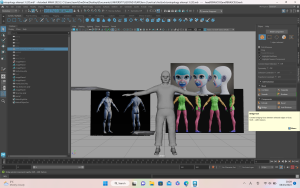
Once Alex came up with an idea she liked we went ahead with it. It incorporated some of my suggestions, such as playing with colour and contrast to portray emotions. She had drawn concept art which enabled us to begin thinking about the story. I started working on a first pass of a fox so that we could visualize the characters and story.

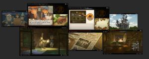
For the style, we were all in agreement on a hand-painted aesthetic. We knew this would be difficult to achieve but thought it would be possible with a clear vision. We considered having everything toon shading with simple flat colours, like the game Endling, but  decided it would be more visually appealing to stick with the painterly style and include sharper edges on props and characters. We had a range of initial references, including I Am a Pebble, as we thought the  painterly details and colouring would be nice to emulate and were fortunate to find a making-of video to use as a starting point.

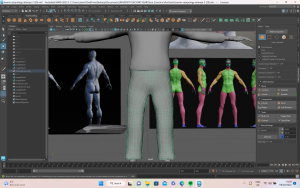
Henry also suggested a tutorial for painterly style in Maya using planes. I tested it out with a roughly modelled fox to see how it would look using the hypershade texture section with Arnold on Maya. The tutorial started with applying the colour and roughness maps, then connecting the correct nodes to build the look.

This also helped with texturing as it got me thinking about how I could use alpha brushes to create paintbrush strokes on the props and characters. I was familiar with the blur scope and thought it fit the style of our project, so I shared with the group how to play with the settings to make the effect as harsh or as soft as desired.

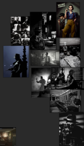
While in France I collected photographs of painterly art styles as inspiration for our textures, such as Monet’s Water Lilies, and shared these on OneDrive. Looking at the brush strokes and how the paint had been applied inspired style we wanted to pursue in our project.

Concept Art:

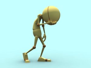
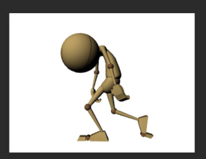
Initial concept art before we finalized the story and art style, to provide visualization and direction for the narrative.

One of the main inspirations we used was a Sketchfab model by Kevin Hays. They captured the painted look we were going for, so I reached out to see if they had any tips and they were kind enough to respond. The group agreed to follow this feedback as closely as possible to achieve the same lovely 2D look in 3D.

We also came across a social media account called Juniper Foxx, run by someone who rescues foxes so they can film footage which would be difficult to capture in the wild. This reference was perfect for our animation stage.

For the painterly style concept art, I included more stylized characters with sharper ribs and faces. Feedback from Henry and Aodhan was that the strong angles were better and less Disney-esque. They also advised upping the saturation to a brighter orange would stand out more. I applied these changes, but the group wasn’t fond of the sharper angles, so I ended up softening certain features and retaining the brighter colour palette.

I used my concept art for the dad as a base for the other foxes, particularly the baby as I wanted there to be a family resemblance. The mother was the most challenging as I wanted to balance actual female fox characteristics (smaller, sharper face) with the female characteristics normally recognized in animation (curved lines).

Research and Development:

Because we were going for a dreamlike effect, I thought it would be interesting to experiment with NeRF/Luma AI. I had seen videos where if you don’t let the scene render fully a painterly effect can be achieved. I took slow videos in a park which I uploaded to Luma AI to render a neural radiance fields file. Once downloaded I was able to bring it into an Unreal and create a scene that could be explored. The experiment was fascinating, but we all agreed it wasn’t the style we were going for, so I decided not to pursue it any further.

Next, I completed 3D Maya tests for the colour palette. I wanted bright orange against lush green as I thought it would make effective use of colour theory, but Alex thought it would look muddied and wanted a duller palette. I decided to do tests and gather film references to show that the brighter colour would stand out more. I downloaded the HDRI maps and a fox model, then created my own quick texture map, with levels and blue scope to get a basic idea and changed it to two colours: one bright orange and one duller.

I did Arnold lighting tests to see how the yellow/white lighting would affect the textures, but it did not make much difference.

Below are the colour palettes from films I found for testing. I also edited the colours to see how the orange fox would stand out against the greens in the shots.

We found turnaround models on Sketchfab and thought would be useful if we could make something similar for our project. I produced the textures for the turnaround so was able to experiment further with the alphas and painterly textures. I had the lighting set to flat which meant I was able to paint the lighting on myself and go quite dramatic with it. I wanted to include nice bright colours within the rock to give it the feeling of sundown. The turnaround worked nicely, and gave a good indication of what we needed to do.

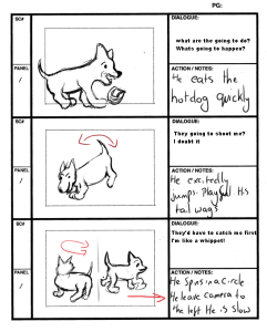
Alex said she was having difficulty with the narrative, so I drew out a full storyboard with timing and scene instruction which gave us a clear idea of what we needed to work on. Initially, Alex and Danielle wanted most of the shots to be filmed from one static cam for consistency. I thought not having any close-ups or different angles would mean losing out on fluidity and emotion, so we eventually decided to add more dynamic shots.

Production

Modelling:

First, I collected fox anatomy references so I could build the shapes from the skeleton upwards on my model of the dad fox.

Once I was happy with the blocking, I asked the group for feedback and was advised to make him slimmer and shorten the legs. After doing this, I built up the muscle groups, paying attention to what was the actual body and what was fur. To make him look less like a wolf, I flattened the head and elongated the body. I adjusted this a number of times until I was happy with it, but I enjoyed it as it is the area I wish to specialize in.

Development Images:

There was debate around how fluffy to make the fox, as we had initially discussed that the dad fox would look rougher and have more fur to bulk him up. To get the clumps looking right, I had to create VDM and IMM brushes to use in ZBrush. This sped up the modelling as I was able to essentially ‘paint on’ the fur textures.

Development of Model:

Next, I started work on the texturing, UV mapping, and retopology. I used to struggle with retopology, but found this time I was much more confident and could see my progress from the start of the course until now. The biggest problem I encountered was baking the high poly onto the low poly as I could not get the model to appear clean, instead, it had lines all over it. I eventually worked out that I had exported the wrong model, so the texture map was missing from the high poly and wasn’t baking properly as a result. This was a silly mistake, but thankfully easy to fix.

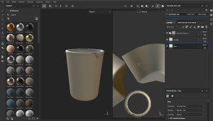
I had a good strategy for creating the painterly textures, thanks to my development with the lemon test. I used the sponge alphas to paint and create visible brush strokes on the model. Alex had a colour palette already, so I just darkened it a little to show the dad is more haggard than the baby and female foxes.

When we finished the textures, we compared them and noticed that as Alex and Danielle had painted theirs together there was a discrepancy between our models, so I had to change a few pieces to make them match. I redid the eyes, the lines on the face, and painted some more detail onto the feet, including claws which helped to bring the theme together.

However, I ran into a problem when it came to importing the textures to Unreal. I had done the initial map across only two UDIM tiles, not realizing that separate tiles are needed for each texture. This meant when the textures were applied in Unreal there was a patch on the tail where it did not apply correctly. I didn’t have time to fix this for submission, which is extremely disappointing especially as I had spent so much time on the textures to ensure my work matched the rest of the team, but I will redo the textures as one UDIM tile for the end-of-year show. As a positive, the advice I got from Kevin Haye was that he revised his textures multiple times before he was happy with them, so this setback has given me the opportunity to improve my model for the final edit. In the meantime, I thought about how to reposition the fox so that his tail would be seen as little as possible in the shots.

I also modelled the butterfly character. In the story, the butterfly represents innocence and I trued to evoke this in my model. I wanted it to look like a butterfly a child would draw to reflect the naivety of the baby fox. The team said they understood the idea but the look didn’t fit the theme and asked me to make it again, this time with a shorter body and two wings as opposed to four. I did this, but as they were still not completely satisfied I redid it again with a more angular body and rounded wings, as well as adding eyes for realism.

When it came to texturing the butterfly, I used yellow as a symbol of childish joy. However, in the initial paint there wasn’t enough contrast, so I decided to add more colours such as greens and oranges which looked more dynamic.

Rigging:

I am not a confident rigger, so I started this early to give myself enough time to make mistakes and fix them. Initially, I tried a YouTube video, but it was using advanced techniques and I wanted to master the basics first, so I went back to Mike’s tutorial on rigging a person and tried to adjust it for a quadruped. It was going okay initially, but I ran into an issue where translate and rotate made the skeleton move so I deleted all constraints, took each control separately, and zeroed them out. This fixed the problem, however, I was having issues adapting the biped rig for the back legs, so I contacted Alec and he sent me a full tutorial for rigging a quadruped. It went into detail about creating IK and FK’s as well as how to create a cluster for the bending of the spine of the character. The biggest struggle was the back legs as I couldn’t get the IK handle to work properly, and the legs were bending as if one of them was moving backward. I undid and redid this part of the rig many times before asking Andrew for help. He figured out there was an issue with the parenting which was causing the leg to malfunction and I was able to fix it from there.

Danielle didn’t think the foxes needed facial blend shapes, but I thought they would help bring depth of emotion to the characters. She agreed to let me create them but asked that they were not too cartoonish as she wanted to keep the realism.

I also added blend shapes to Danielle’s baby fox rig as I was doing most of his animation and wanted to bring more life to him.

Initially, I thought the butterfly rig was going well after I had struggled with the rig for the dad fox, but Henry pointed out it was too complicated for a butterfly.

He suggested using a bend deformer for the rig, but I wanted to try a more complex version as well to see If I could create subtle movements for closeups. Andrew suggested setting up a rig with additional attributes to enable the butterfly to move its wings both independently and together. I thought this was a good idea, but it took a couple of run-throughs before I was able to set up the controls properly. I then used the node editor to create the option of moving the wings at once and halving the numbers needed to make the wings move. This was a handy feature I will be able to use in future rigs as well.

I used Maya’s built-in weight painting for the butterfly as I felt it would be simple enough that it wouldn’t cause any issues. To allow the butterfly to move in a smooth bend motion, I painted each row of vertices with a lower affect percentage the closer they were to the body.

Environmental Assets:

I textured all my own assets, as well as the initial grass clumps and two large rocks that Danielle made. I paid particular attention to the props the others had made, as I wanted them my textures to be as consistent as possible.

  • Fern

  • Leaf

  • Mushrooms (toadstool, 3 deer head, 3 mica mushrooms)

  • Flowers (tulip, daisy)

  • Bush

  • Nut

  • Small spiny trees (x3)

  • Rock

  • Plant

  • Grass stalk

  • Fallen tree trunk

  • Tree trunk base

  • Pinecone

For the bush with flowers, I wanted to use my own alpha texture, so I drew flowers in Photoshop and used the  substance projection tool to paint them on as a new layer.

The pinecone was a scan I created using reality capture and exported as a 3D model. It required some clean up, which wasn’t too difficult, and I could then create a map and texture it in Substance.

I encountered problems with the some of the models, but as I have experience creating assets, I was able to fix any issues with UV maps and geometry quickly by myself.

We looked at the concept of Kiki and Bouba and wanted to experiment with using sharper assets in combination with more rounded shapes. I enjoyed the texturing process, as everything was hand painted in substance using various alpha brushes. I used a mixture of shapes, moss, sponge varieties, and paintbrushes to create the textures. I kept everything at the highest roughness setting as we wanted to make the project look as 2D in texture as possible. I experimented by using the height channel to apply moss to the fallen tree log, but I didn’t like how it turned out, so I deleted that channel and focused on base colour and roughness. I began painting on the base channel of the lighting, focusing on getting the light and shadow where it should be before switching to material. Working on both channels helped me improve my textures.

Originally, we had talked about doing an exaggerated painted look where we would add dramatic shadows into the textures. However, we decided this may make the lighting more difficult so decided not to do this. I had already textured the mushroom and rocks and so I went back to these and redid them with less harsh lighting.

I had already repainted the large rocks once, but as Alex had produced rocks with more anime style and I didn’t want the assets to look different, I reworked my textures to match hers, using a colour dropper to get the correct hue.

For the daisies, I used diverse levels and filters within Substance Painter to change the colours and saturation to create variety.

Previs Blockout:

We worked on the blackouts for the previs separately in Maya and Unreal Engine. This helped to give us an idea of the space and sizing of the worlds compared to the characters. I got feedback from Mike that the trees were too small and the environment didn’t fit quite right, so I decided to take another look at it.

For the blockout, Endling was an ideal reference because, although the world-building of a game is different from a cinematic, it displays such effective use of foreground space. We considered not having any objects in the foreground to focus solely on the fox, but Henry suggested this would look dull from a cinematic point of view, so we added in trees and bushes, which added more depth to the blockout.

Animations:

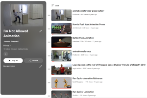
I had never tried a quadruped walk, so I first practiced with my rig by following a dog walk cycle from the Animator’s Survival Kit. I had trouble initially as the model was slipping while walking in one place.

Rachel gave me useful feedback and suggested I look at the dog run cycle of Preston Blair. This was a good reference as the motions were exaggerated. It took time to adjust to the movements of the extra controls in the feet such as flex, swivel, and toe tip, but with continuous practice I was able to get it working correctly.

I decided to follow a trot cycle instead of a walk cycle as foxes move quickly and on their toes. This worked well and I was able to adjust the poses much better. I also watched a YouTube video that went into detail about quadruped walks and the differences between digitigrades, unguligrades, and plantigrades. This explained the diverse ways in which mammals’ feet move and provided insight into how the pelvis moves. I learned that often when students animate quadrupeds they are stiff because they are not rotating on the y and x axis which I kept in mind for my animation.

To polish up the walk cycle, Rachel suggested doing one foot at a time and then copying the pose to the other foot. This helped keep the foot spacing the same and made it easier to move the body correctly. It looked much better this way and the tail had a nice follow-through, so I was able to show my knowledge of the principles of animation. I had rigged the tail in an IK setup, so I was able to select all the controls at once and then curl the tail, then I just had to adjust the timing of the frames.

I then did a second pass which helped me to clean things up further. During this pass, I counter-animated the movement of the head so that it didn’t swerve with the body and instead stayed still which is more like a fox.

I worked on an idle animation of the dad fox to familiarize myself with the rig movement. These animations came much easier to me, and I was able to play around with timing and spacing more. Initial feedback was that it was good, but he should turn his head a bit faster, with more follow-through, which I was able to implement.

For the scene with the dad and the baby hunting, I had to work without the baby, so it was hard to get the interaction to look right initially. I asked for feedback from one of my peers and they suggested that adding more weight into the step would make it more realistic.

The first pass of the squirrel animation went well. When I showed it to the team, they were pleased with it, in particular the subtle twitchy movements of the face. I initially had trouble with the tail as it was rigged in IK, and I couldn’t figure out how to get everything moving together. Danielle was able to show me how she had done it and together we got a nice fluid motion and arc through the tail.

I wanted to show the affectionate relationship of the baby and dad, so I chose to have them close together in the scene. Once the baby was animated it also helped me adjust the dad’s animation so the overall scene looked more natural.

The next animation was the baby pouncing at the squirrel. Continuity was important here as it followed immediately from the last scene. The first pass was a little difficult with the timing of the jump, as I wanted to get the motion of him pushing up off the floor right. Rachel suggested holding him down on the floor longer would help with this, as well as add anticipation to the motion.

The second pass was much smoother as holding the pose and having the body move up before the legs helped capture the weight I wanted. I also had to animate the nut in a way that looked like it was realistically falling out of his grip.

I collected pose references onto a pure ref board, including one by Preston Blair which was very useful. I also had a YouTube playlist with all the videos that I used for animating reference, including the ones I had passed onto the group.

When we showed the last version of our previs before submission, the feedback we got was that after the baby jumps, he should turn back to his dad so you can see some more of the interaction between them. I animated the baby turning his head round, with his ears falling to show his dismay and played about with the timing a bit, trying to get the turn slow enough.

The scene with the baby playing with the butterfly was quite difficult at first as the fox rig kept twisting unnaturally so I had to adjust it repeatedly. Rachel suggested moving the eyes a little quicker, working on 1’s instead to get the snappiness of eyes. She also suggested adding more follow-through when the baby snaps his jaw at the butterfly and exaggerating the movement a bit more. Once I had applied these changes, I was much happier with the animation as it was much smoother. I also fixed a timing issue where the baby’s head snapped up before the butterfly moved. I was able to use the animation of the walk cycle of the dad in the scene as he walks into the frame. Because I had taken the time to get the original walk cycle right, it was easy to import the animation into the scene and just adjust the position.

When we were editing together the previs, Alex suggested having the baby run off after the butterfly at the end of the shot, instead of standing shaking his head. I added this into the scene, but I did find it difficult to get his positioning right as he was at an angle from his previous jump. By working at it and starting the run cycle multiple times while looking at dog running references, I was able to get the run to a place where I was happy enough submitting it. However, with more time before the end of year show I would like to return to this shot and try to get it smoother.

The scene I worked on next was the emotional scene where the baby turns around and realizes that his dad has died. Adding the blend shapes really helped here I think because I was able to get emotion into his eyes and his body. Initially, he did not duck down so much, but I decided that t might make him look more vulnerable if he ducked down closer. I also chose to add him lifting a paw up because I thought it would make him look more scared based off observing my dog when she is scared.

Once I had a first pass completed I sent it to the group, to get some feedback. Danielle suggested having him turn his head more, to make it look more natural, as well as having his ears snap up at the start to create a match cut. She had not animated the previous scene yet but we decided for consistency I would have the ears snap up to start and then she would match the animation in her scene. Adding these changes in did make a big difference, as he looked smaller and more upset by curling in on himself more.


The last scene I was animated was where the baby runs off into the forest and the dad follows behind him slowly. When I showed Rachel for feedback, she was impressed and only suggested extra movements which could help such as keeping his head straighter with counter animation. Once the first pass was finished, Alex asked if I could add in the dad stopping and turning his head behind him, as if he hears a noise to foreshadow what is about to happen and explain how the baby goes off on his own. The rig had a little difficulty turning his head completely around without pulling too much at his body, so his head did not turn as much as I would have liked but it did still work in terms of getting the story.

Unreal Engine:

We had decided early on that we wanted to use real-time rendering and decided to go with Unreal Engine as we were most familiar with it. This mostly went according to plan, but there were issues importing the animations.

When importing the walk cycle animation for the dad fox into Unreal there was an issue where the mesh was wrong, and no bind pose was found, so I went to Reddit to see what could be done. After checking for problems in Unreal, I decided it was a problem in Maya. When checking the output log, it suggested it had no bind pose. Reddit suggested deleting non-deformer history, but the file would not allow me to do this. After doing a bit of research I realized I needed to open the original referenced rig, showed all in outliner, deleted bind poses, selected hierarchy, opened script editor, and type ‘dagPose-s-bp’. This fixed the issue of no bind pose in Maya.

However, once I got it into Unreal, it still did not work. I asked Alec for help, and it turned out it was a simple fix; the units just had to be changed to centimetres when exporting the file, so it did not show up too small in Unreal. This fixed the problem, but I made sure to keep the TO1 Bind pose option ticked to ensure the rig imported successfully.

Another issue was when importing the nut from Maya, the animations would not show up in Unreal. I checked the settings several times but could not see anything that could be causing the issue. The animations were fine in Maya, so the group decided that since this was a cinematic project and not a game, an alembic file would be a quick fix for this. By using this file type I was able to get the animations in successfully.

Once the animations had been imported to Unreal, I was able to start building the scenes based on my previs. I made sure to find a good balance where the shot was not too cluttered or too empty. When I set up the camera for scene 2 shot 1, it looked too bare, so I brought some background trees forward to fill the space. I thought about how to draw the audience’s eyes to the action, and I used the rule of thirds and golden spiral to achieve this.

The lighting in Unreal was the most challenging part of scene setup. As we were going for a painterly look, we did not want to have very realistic lighting. To combat this, I built the lighting up from scratch, using a mixture of exponential fog, spotlights, rectangle lights, and a post-process volume. We had an initial concept by Alex which had nice colours, so we wanted to use this to match the colours and atmosphere.

To start, I made the fog inscattering colour a nice teal and changed the sky atmosphere ambient colour to a lighter shade. For the other lights, I wanted to keep the warm tones from the picture but also include the purple midtones as much as possible. The lighting came down to extensive experimentation with the distinctive features, until I was able to get a look we were all happy with. As most of my scenes were flashbacks, they were supposed to be a warmer, more saturated colour than the darker scenes where the fox is alone in the forest. However, it was still important to have the background colours match Alex’s to maintain cohesion.

I experimented with LUT adjustments, by taking high-resolution screenshots in Photoshop and adjusting the layers before applying the saved LUT in Unreal under post-process volumes.

I was also able to use alpha channels and nodes to create mist in the scene. For the scene where the fox walks over the log, I wanted to add mist swirling within the background to add to the sense of loneliness and sadness of the scene. To do this, I painted a pattern in a Photoshop document on a black background, brought it into Unreal, and applied a node setup to allow the image to move along the plane like mist.

I also tried out making water for a scenic shot of rain falling on a puddle. I was following a YouTube tutorial that made a quick shader to allow for the opacity and movement of the water to be changed. However, Henry showed me a much better setup to allow the water to have more movement and a nicer quality to it. This allowed the water to move more naturally.

Post-Production:

Rendering the sequences and getting the cameras right took longer than I initially hoped, as there were some settings I needed to change. The sequence was not rendering the post-process settings, but Henry explained before that this was a new Unreal feature that needed adjusted, so I was able to find it. I have experience making compositions in After Effects, as well as doing light colour grading so I didn’t have much trouble with this.

Reflection:

Overall I am proud of the work I have put in this year. It has been difficult due to communication issues within the team which is a shame as I think we could have achieved a longer film with more complex animations if we had all been better at communicating with each other. It is a shame that we have to submit a not quite fully finished film, and instead have some small elements of storyboarding instead, but I am confident in our work ethic that we can fix all issues before the end of year show in June.

I believe that overall we have collective created a short film with a consistent style across the textures and assets. The biggest difficulty was definitely communication within the team, and it is a shame that it worked out the way it did. There are areas which I wish I could have improved upon, particularly within the character modelling as this is an area which I would like to pursue as a career. Ultimately the rigging of my dad fox was the area which gave me the most difficulty, and I know that it is not perfect which is a shame as it does hinder the movements a little for animation. However, I am proud that I managed to rig a quadruped and my confidence in this area has massively improved due to this project. I also believe that the textures worked out very well within our project and we managed to achieve the hand painted style that we initially set out to achieve.  I have made a list of the areas I would like to improve for the end of year show, so I am confident that I will be able to work on these things to help the short film be as good as it can.

I believe that we have created a good short film, with strong modelling and texturing as a group. There are of course some areas which I am not as happy with but I am proud of the work that I put in this year to achieve a strong final project.

Vertical Slice

Planning and Production

To start the project, the group created a collective Miro board where we could all apply our ideas and make lists of everything important. We had meetings with the Games students to decide which props we would need for the game. Once we had a first draft of what would be needed, I made a column on the Miro with the importance of each prop so everyone would know what to prioritize. We thought it would be best to allow each person to pick what they wanted to model as this would make it more enjoyable. I then looked at what was left and checked who would be happy to take on another prop.

In week 5, there was a bit of a breakdown of communication with the team as the narrative was running behind and the game was heavily narrative driven. Some of the hero props were also falling behind and due to problems with my character model, it wasn’t at the place we wanted it to be at either. It was suggested that we should make a schedule to keep everyone on track so I took on the role of making this and checking in to see if it was being followed.

I also made a master list of props with a column for each of the prop modellers so that we could see what had been modelled, textured, or both, which I updated regularly once everyone had finished their models.

We also had set meetings every Monday, Wednesday, and Sunday to help everyone keep on track. Unfortunately, not everyone was present at these meetings, nor did they let us know ahead of time when they could not make it which was frustrating. However, I kept notes from these meetings and was able to share with the others what had been missed. These meetings were crucial as they allowed us to iron out any problems we were having, as well as help us communicate with the sound designer.


Art Direction

My role for the Vertical Slice project was Art Direction and Character Modeller, alongside Ciara. We met in the first week to get started on the style guide and work out what aesthetic and approach we wanted to take. As Ciara is a very talented 2D artist, we decided together that I would do the 3D character modelling and she would do the 2D sprites, as well as the bulk of the art guide. We had several meetings where we gathered research and inspiration for how we wanted the game to look. We eventually decided on using Professor Layton as a main influence, as well as Jazzpunk and The Stanley Parable. At our first presentation, we received feedback that the art guide wasn’t quite well-rounded enough and would not be easy for others to follow, so we had to go back and rework it. We discussed these changes together and Ciara was able to put together a very cohesive document to help others with the art style, as well as posting a list of instructions for texturing. The style guide can be found here: Knives Out Style guide – Google Docs


Character Models

I was in charge of the 3D character models, and I got started right away to allow myself spare time if any unexpected problems occurred. I started with the boss character, using a character from Heavy Rain, Scott Shelby, as well as Tom Selleck for inspiration.

I didn’t have many problems with the sculpting of the facial features as I’ve had some experience with this in Blender, however, it was pointed out to me during the presentation that his ears didn’t look human so I was able to fix them after this. This was my first time sculpting a character for animation so I ran into a few problems. The first issue I had was that I modelled half of the body without the symmetry tool on. This caused a problem when I tried to duplicate the left side and flip it so that it was the right side. This was due to the pivot point in Blender being set to ‘world’ and not ‘object’ which made moving it and matching it up not work. After struggling with this, I found through research that I could change the pivot to the object origin, which made flipping it much easier. Once I combined the two sides as one mesh, there was a line down the middle so the character looked too wide. It was also obvious it had been flipped which looked awkward. I had to do a lot more work on sculpting the body to fix this, but discovering it in this character allowed me to make the second character much more efficiently. During feedback with the lecturers, it was said that the proportions of the body were not quite accurate to that of a biological male, as he had strong curves and a large chest. His trousers were also modelled very tightly to the body so it looked as if they were skintight. Taking this feedback, I amended the body shape and clothing fit which made the model look much better.


As I had modelled everything as one mesh this caused me trouble later on in the pipeline. Retopology was the area I had the most issues with. The first attempt at retopology was too condensed as I tried to retopologize every single part of the mesh at once. This meant the higher loop count applied to the areas that needed it was also applied to the areas that didn’t need it, resulting in a very strange topology. For the second attempt, I imported references into the Maya scene so that I could look at it as I worked, but I was still finding that it was too tight. I spoke to my lecturer who suggested I use the Azri rig as a direct reference. This helped immensely as I was able to select certain parts of the body at a time. Following on from the feedback about how it would have been easier to model each part separately, I decided to retopologise each part at a time. This helped me to compare each area to the Azri rig and ultimately have a much stronger topology.

The group had decided the game would be 1st person, but we wanted the player to have full body awareness. I took my knowledge from the previous character to model each section individually. This was easier as I already had to practice modelling the boss character’s clothes. I made sure to model everything with the symmetry button on which was so helpful and I didn’t experience the same problems as the first model. Since the character was going to be 1st person, we decided it would save time to make it without a head.

As the character was better sculpted, it allowed for a much smoother retopology process, again using Azri as a reference. I paid close attention to the hands as I had some trouble with this on the boss character. I looked closely at how to do the retopology in between the fingers to allow them to bend as I knew this was important for the animations. This was much more successful and I was a lot happier with this retopology than the first one.

I then moved on to creating the UV maps. For this, I looked at where stitches are on clothes such as shirts and trousers. I found this helpful as I was able to make the UV cuts look like more realistic cloth seams. Overall, I didn’t have much trouble with the UVs as I’ve had quite a lot of practice, but I did struggle with the trousers for the boss character. Maya was crashing when I tried to unfold the UV cuts, despite me having frozen transformations and deleted the history. After doing some research and getting help from my lecturer, I discovered by running Maya Cleanup that there was some non-manifold geometry causing the issue. Once I got this fixed, the program worked again and I was able to make a clean layout of the UV maps for both characters. I applied lamberts and exported the models as FBXs, ready for Substance Painter.

I started with the textures of the boss character, looking at the style guide to ensure consistency and accuracy to the era. In the style guide, we decided we would include a little texture in the clothes and material objects. For this, I uploaded my own corduroy and shirt textures and applied these as alphas to the body. When I tested in Unreal, I noticed that the skin tones didn’t completely match between the face and the hands, and the eyes and mouth were sharing the same lambert as the tie. The skin was also lacking depth so I added blue and red undertones. I found a helpful YouTube video that helped me to build the textures and achieve a result I was happy with. I was then able to apply this to the other areas of the skin and make sure everything matched.

(Stylized Character Face Texturing in Substance Painter | Timelaps X2 – YouTube)

When texturing the player character, I wanted to have the colours brighter and more exciting to match the colour palette of the 1970s. I decided to add some flowers to the shirt, using an alpha of flowers in different colours to bring the shirt to life. As the character is undercover in the game, I thought it would help them to blend in by having them dress more causally. For the shoes, I used an alpha brush to create stitches on the shoes which worked well. Once I was happy with the textures, I added the lighting consistent with the art guide.


Props

Prop modelling was a secondary role of mine. I had two of the evidence props for the game and as they were the most important, I worked on them first. The gloves were the first prop I made. Since I had already modelled the hands for the characters, I was able to take the retopologized hand and extrude the thickness to make a good glove shape. Following the style guide, I textured them accordingly.

Next, I made the padlock which had to unlock in the game. Due to this, I needed to have all of the meshes separate so they would be functional in Unreal. Initially, I overcomplicated this mesh but once I ran cleanup and simplified it down it looked much better and I was able to get clean UV cuts without stretched textures. Another problem I discovered when I brought the FBX into Unreal was that it was extremely small, causing the mesh to warp when it was scaled up. This was strange as I had used the Unreal Man as a size reference, as well as setting my Maya file to meters ahead of time. Scaling up the meshes in Maya worked in the end. The other problem was that despite setting the pivot to the right place, baking the pivots, deleting history, and freezing transformations when I exported the FBXs into Unreal, the pivot was offset. Doing some research showed me that if you untick ‘Transform vertex to absolute’ and bake pivots in Unreal, it will fix this issue so I was able to share this with the team.

Similarly, the bathroom counters were too small in Unreal and when scaled up, the tap distorted strangely but thankfully scaling it up in Maya fixed the issue. For texturing the sinks, I kept the colour palette sheet Lauren had made. During the industry day, we got some feedback that the floors of the bathroom didn’t fit with the game but we still wanted a way to differentiate between the male and female bathrooms so I did two different colours of counters.

The level felt bare as there were not enough props to fill it, so the prop modellers had a meeting to come up with other items which could help bring the level to life, and alongside the lecturers’ feedback, we came up with a more extensive prop list. The water cooler was one of these. Originally, I made it quite basic, but after the lecturers pointed out that the offsetting of the props was not consistent, I reworked it to make it better. I also used the opportunity to put water inside the cooler as it was originally empty. When it came to texturing, I used the following tutorial to achieve the water look: How to Make Water in Substance Painter – YouTube

After this, I made styrofoam cups that could be placed around the office. It was fun to play with the vertices in Maya to create a crumpled look without going into sculpting. For the texturing, I kept it very simple but used an alpha to create a lipstick mark on one of the cups to bring some additional story to it.

I also created a vent which I found quite difficult initially as I had never done anything like it before. After some research, I was able to find this video which was perfect for the look I was trying to create: [sub] Lattice Fence, Tutorial, 3D Maya 2020 – YouTube

The hand dryer, filing cabinet, and carpet dividers were all pretty straightforward and I was able to apply the feedback of offsetting everything. The textures were kept simple as well, as per the style guide and colour palette, but I did add some scratches to the hand dryer as well as dust to the top of the filing cabinet to give a realistic worn look.


2D Art

I also helped do some 2D art to bring the story of the game to life. The decals were simple and made transparent so that they could be applied to the office floors to make them look walked over. I was asked to do a simple drawing of the crime scene which could be used for the introduction to the game at the start. After watching the feedback video with Brian, I noticed that the UI was very plain between the boss and the main player character so I decided to do some illustrations which would make the gameplay more engaging.

Animations

The animation part was the area where the team had the most trouble. There was a problem with the rig when we tried to bring it into Unreal, which meant we had to redo some of it. Unfortunately, this was after some people had completed their animations. As only my animations had been referenced it meant that everyone else had to transfer their animations over to the newly fixed rig. I had learned how to transfer keyframes between rigs so I was able to make a step-by-step video for the others to follow on their own.

I also transferred Ciara’s animations for her as she had already done a huge amount of work for the project.

The animations I made for the project were:

  • The player characters walk cycle
  • A blend shape animation of the boss character asking, “Are you sure?”
  • A simple mouth open and close blend shape animation
  • Idle animation 1
  • Idle animation 2
  • Idle animation 3
  • Idle animation 4
  • Idle animation 5 

The animations I helped Ciara with were:

  • Picking up the phone animation
  • Wrong accusation
  • Intrigued Animation

I also had the opportunity to explore some Mocap software which was very interesting. I was the one who wore the Mocap suit and it was cool to see my own movements captured on the rigs. I followed Alec’s tutorial on how to set up each rig and transfer the animations between. Unfortunately, our rig was not able to be used for my Mocap references, so I had to practice on the Azri rig instead. Despite this, it was still a great opportunity to practice and get familiar with Mocap technology.

Self-Reflection

Overall this project had both positives and negatives. There was some miscommunication between the Games and Animation courses which resulted in problems along the way. Thankfully, as we experienced these issues, we were also able to resolve them and this has helped with conflict resolution in future projects. In terms of the work I produced, I think some of it is of a good standard, but there are other areas I would like to improve on. The main character’s proportions are not 100% accurate and if I were to redo the project, I would make sure I checked every detail before passing it on for rigging. I also had a problem with overcomplicating the meshes on certain objects, but this project has helped me to step back and reevaluate when I realise a task isn’t going as smoothly as it should be. This lesson will make things easier for myself and my team in the future. One area I was pleased with in this project was that I stuck to the assigned style in terms of models and textures which helped improve the overall cohesion of the game. This was something I struggled with in my last project, so it was an accomplishment for me to achieve this here. I also think I was able to help my team out with anything they needed help with and contributed across a range of aspects of the game.

Unfortunately the majority of my assets were not included in the final game and my 2D images were not used at all. This was a shame as I worked very hard on getting everything put together for the game. I have included some screenshots of the assets which could be seen in the game below:

Links to Sketchfab: Jasmine_Sheppard – Sketchfab

Assignment 2: Animation development project

Originally, I thought about animating a quadruped to really stretch my skills. I picked my sound and completed my storyboard and animatic for the project, as well as doing plenty of research on different studios and their unique styles. I looked specifically at the DreamWorks movie “The Secret Life of Pets” as the characters have very human personalities which I wanted to capture in my animation. I also looked at ‘The Queen’s Corgi’ by studio Nwave as I find real-life corgi dogs very distinctive and thought this would be interesting to animate. The movie was able to capture the nuances of corgi movements and personality quirks which was useful.

For my animation references, I took some videos of my own small dog to give me a starting point. Then to get a better understanding of the poses I wanted to recreate, I found a list of dog references on YouTube. For example, stealing food from a table and expressive walk cycles. The video ‘Animal Gaits for Animators’ by Jamie Capsola was particularly helpful.

When I was ready to animate I did a simple test on the rig to get used to the controls and see how it moved. However, I quickly realised that my skills are not yet strong enough to animate with a quadruped. So I decided to practice and become more confident working with bipeds before I move on to quadrupeds. Still, this initial research got me thinking about body shapes and muscle movements for my animation.


For my second attempt, I decided to use the same audio but change it to a human male rig. I thought this  would be a good opportunity to be expressive with body movements and hand gestures. I also enjoyed the humour of it and wanted to explore this in my animation as comedy is one of my favourite genres. I looked at some studios closer to home this time, particularly the work of Blue Zoo. The emotive characters and expressions, particularly in their Christmas ads, are comedy-heavy. Their children’s shows are also very expressive so I looked to these for inspiration. I also considered Italic Pig’s VR game ‘The Infinite Hotel’ where the hotel manager expresses a lot of emotions through his hands. These were particularly helpful references as they are both studios I would enjoy working for.

Again I filmed references for myself for both the body movements and the lipsync. I thought this would be the most helpful for my block out as I could try to match it frame for frame initially before adding my own spin later on. I also used the original video attached to the clip to see what distinct mouth shapes would be needed for the lipsync. Another source I looked at was ‘Dextor’s Laboratory’ as although it is a 2D animation the movements of DeeDee pressing the button is a perfect action reference for my scene. There was also a range of tips and reference videos on YouTube which helped me. I found that ‘Podborski’ makes great reference videos and the animation ‘button push animation’ was particularly relevant to my project. Finally, I accessed some content from my Berkeley college course as I found this extremely helpful in getting a solid grasp on basic techniques.

Before I started my blockout, I drew myself up a fresh storyboard for the new rig, as well as a new animatic. This animatic really helped me to think about the timing of the poses, as well as how I could bring life and character into the rig.

Before I started my block out I drew up a fresh storyboard and animatic for the new rig. This helped me to think about the timing of the poses, as well as how I could bring life and character into the rig.

Once I was happy with this, I was able to use it and the videos I recorded to get me started on the blocking for my animation. I made the mistake of starting with my lipsync before doing the character’s body animations which initially made it difficult to get the expressions correct. In my first pass at the lipsync, I noticed the mouth was trying to make too many syllables and therefore didn’t look like realistic speech. My tutor was also able to give me feedback that the action was a little too late compared to the sound, so everything should be moved back a few frames to make the movements look more natural.

At first, I struggled to keep the character’s movements contained within the workspace and there was some clicking on the joints, particularly the knees. I was able to fix this by lowering the body a little on certain frames and adjusting the rest of the body to match the balance. This was the longest animation I have completed to date, but I found that once I broke the sound down into sections it was a lot easier to not get overwhelmed and I was able to work more efficiently. This also helped me towards the end when I was doing my polishing pass as it allowed to me focus solely on each section and get the subtle nuances I wanted from the character.

After my initial block-out pass of the body and poses I wanted, I focused on making sure I was happy with how each limb was moving. I then went back to the lipsync and looked at the expressions of the character. The characters at Blue Zoo show a lot of emotions in their expressions and I wanted to capture this in my animation as this brings models to life. It was at this point I realized I wasn’t completely satisfied with the lipsync so I reworked it again. I wrote out the sounds of the clip phonetically and used a chart to see which shapes would be the most expressive. I also recorded another video of myself, this time saying the words slowly to see how the mouth shapes differentiated between words.

Overall I was happy with the final animation, as I feel it has a really strong sense of character which is what I hoped for from this animation. This assessment has definitely helped me to develop my skills as an animator. There are still some areas I need to improve upon, such as making sure the character’s body moves forward at a consistent pace to the legs, but I am confident that with practice I will be able to achieve this.
FINAL VIDEOS

Animation Strategies: 2nd Assignment, Animation

I was looking forward to this module as I enjoy the process of 3D animation. Over the last year, I have become more comfortable with 3D animation than 2D. However, I thought it would be better to experiment during the teaching weeks since we had a guest lecturer who was an expert with 2D and it would have been a waste to miss the opportunity to develop these skills. We also had a guest lecture from a previous student, Matthew Hamill, who taught us about body mechanics. I struggled with this initially, but with a bit of practice, it got easier.

To give me a starting point for my assignments and improve my understanding, I sourced several videos on walk cycles and body mechanics. The best clips I found included one demonstrating 100 different walks (https://www.youtube.com/watch?v=cVjIqr8CTtQ&feature=youtu.be), one exploring personality through movement (https://www.youtube.com/watch?v=8XDrUs5kMZI&feature=youtu.be), and a summary of some of the most common mistakes in walk cycle animation (https://www.youtube.com/watch?v=11CFCzoF0Uk&t=3s).

walk cycle

Niall suggested after I started the experiment above, that the angle would be very difficult as the movement was towards the camera. As per his advice, I adjusted it.


Run Cycle

I had difficulty with my run cycle during my initial practices so chose to keep it fairly simple for this project. I filmed myself doing a basic run which I then used as a reference.

I also used ‘The Animator’s Survival Guide’ to help with the initial timing and posing, as well as looking at a few straightforward running animations online.

My run cycle initially gave me some trouble as I found it hard to get the poses to match up properly, and there was some clicking in the joints as the character run looped. I was able to fix this by checking each frame to make sure there was not too much of a gap between each key so that the joints jumped less.

Once I was happy with the position of the limbs and body, I added secondary animation using the hair and fingers which helped to bring the character to life. I ensured everything was in a nice arc by checking the graph editor and then added the offset to make it look more natural. After that, I decided to include a blink which succeeded in making the character’s movements more realistic. My lecturer Chris suggested that this kind of movement can help bring your animations to life. I also changed the expression to a frown to give more intensity to the run.


Walk Cycle

I knew I wanted to do a catwalk-inspired variation for my walk cycle. After researching various model walks ((8) Top 10 Best Walks at the Victoria’s Secret Fashion Show OPENINGS – YouTube), I decided I liked Gisele Bündchen’s the best. She has an exaggerated hip sway and crosses her legs as she walks ((8) Gisele Bündchen | Best Runway Walk – YouTube). I picked the walk below to copy as it was the clearest example of this.

I also looked at some 3D models of catwalks to work out how to translate a real-life reference into a 3D rig ((8) Sims 4 Catwalk Animation. *TESTING* – YouTube) ((8) The Sims 4 Animation Pack Download: Runway Catwalk – YouTube) ((8) catwalk walking animation – YouTube).

Initially, I started with the blocking out poses to ensure they were right. I tried to do the legs and arms altogether, which caused me some confusion at the start as I kept mixing them up. After this, I started to work with one limb at a time to make things easier and improve the overall animation. I kept close to the reference but didn’t follow it exactly as I didn’t think I could effectively cross the legs using this rig. One important thing I noticed was that Giselle’s hips swayed up more on the down pose than the contact pose, so I made an effort to ensure I was recreating it properly.

Once I was happy with the animations, I moved on to follow through in the hair and arms. I learned about the importance of arcs in my Berkeley College course and was eager to put this into practice in my walk cycle.

I kept adjusting until I was happy with the follow through and how it worked with the animation.

Body Mechanics

For this, I watched various basketball clips and studied a range of game plays to pick a good pose with clear silhouettes. I decided a jump to the hoop would be ideal and found a YouTube video with a compilation of my favourite player’s best moves. From there, I selected a few shots that best matched my idea((6) Jaylen Brown BEST Plays Of The 2022 NBA Playoffs – YouTube). This was a good start, but I thought animated references might be more helpful. Animation reference “(6) MVP | Animation Short Film inspired by Kobe Bryant – YouTube” showed the contrasts between fast and slow movements in basketball. The step-backs particularly interested me, and I wanted to include this in my animation to demonstrate regaining balance after a jump. Since this animation was quite complex and I am still getting used to body mechanics, I decided to look for a simpler reference that I could use as well. Luckily I discovered one that used a very similar jack rig to the one I was using ((6) Slam Dunk – 3D Animation Basketball – YouTube).

I sourced a few more video references, but I didn’t find the animation to be particularly smooth or have the look I wanted, so I didn’t end up using them much in the final animation ((6) SLAM DUNK 3D Basketball – YouTube)(6) Basketball Reference- Animation Reference Videos – YouTube(6) Freestyle Street Basketball 2 Official Cinematic Trailer – YouTube).

I initially practiced a 2D animation for my basketball body mechanics project during our lecture with Niall Doherty but decided that I would be happier using 3D. For the 2D aspect, I looked at a basketball anime called ‘Kuroko’s Basketball’ and although I didn’t end up doing the project in 2D, this reference was still helpful. The animators really push the timing of movements in the anime by holding poses for a long time, and I was inspired to try this in my work (6) Kuroko’s Basketball – Kagami Epic Zone Moments – YouTube.

I used a website with a large collection of stills to collect references of body movements during different poses /kuroko no basket series | sakugabooru.

Ultimately it was good to have both 2D and 3D references because it gave me a better understanding of body mechanics. In the same way as the other projects, I started with block outs and posing out the frames to make things easier. I had screenshots of my chosen video that I could bring in as reference image planes to help me with the posing of each frame. Initially, some of the poses looked a little odd and too far apart, but I knew I would fix this later in spline so carried on. For my jump, I was able to reference an assignment I had done for my Berkeley course, which was a helpful starting point. The lecturer also highlighted the importance of having clear silhouettes in each frame which I kept in mind. On Alec’s advice, I started with the legs and ensured I was happy with their placement before moving on to the arms and then the head. Some adjustments needed to be made to the legs after I had finished the torso and head, but this approach made it less overwhelming as the changes were not as complex.

Next, I moved on to the block out of the arms. Although I knew I would have to move these once I added the basketball, this helped give a general sense of what the animation would look like. Finally, I adjusted the head positions so they matched up correctly.

Once I was happy with the block out, I fixed the shots between so that the positions were more natural and Maya was not auto-filling them, as this can sometimes have a strange effect. I didn’t have to change the poses much, and only a few required editing to give more clearly defined silhouettes.

Following that, I adjusted the timing. I knew I wanted to lengthen some of the poses, inspired by the basketball animation references I found. In particular, I wanted to hold the jump in the air for longer to really draw it out. I changed the timing so that it held for 4 frames, which gave off the feeling I wanted.

Next, I added the basketball. When I imported a rigged ball it would not allow me to scale it, so I ended up creating a sphere shape and animating it from there. I knew I wanted to have the character miss the basket as this allowed me to practice arcs and movements for a ball. It took some adjustments on the graph editor, but in the end, I was satisfied with the animation.

Once I had finished the main animation, I wanted to add a bit extra to the overall piece. I decided to have the character turn to see the basketball roll away and then become sad. I am glad I added this because it rounded the animation off well instead of stopping abruptly and gave personality to the character. Again I wanted to stretch the pose out further, so I moved the frames to hold the pause longer for more comedic timing.

Overall I was pleased with my animation as I can see the improvements between my first attempts and final cycles. My favourite cycle was the basketball body mechanics, as I think it was the most successful in playing with timing and character. I found the assignments enjoyable but also quite challenging to complete to a standard I was proud of. There are areas that I can improve in with time and practice, such as making sure the arm gaps between poses are more natural, particularly in my run and walk cycle. If I were to do the assignments again, I would like to try creating a run cycle with more personality. I liked the run I made, but pushing it further would have made the character more interesting. I would also have another go at constraining the basketball to move along with the hands, as I wasn’t able to achieve this in my animation this time.