Guest Lecture- Sorcha Cartoons


We had a lecture from Sorcha Cartoons, which I found was very helpful. She was able to explain how to break down character designs to fundamental shapes such as circles, squares and triangles and how this is helpful when beginning to design a character. By breaking everything down this way you’ll be able to create a character which will then be easier for a team to bring to animation from your sketches.

She got us to try an excercise of our own, where we designed some characters using the simple shapes.


I struggled a little with this at first, as I am still not used to creating characters from basic shapes. I found it difficult to find the balance of using the shapes e.g. triangle but not making everything in the design triangular. The square design characters also fell a little flat and 2 dimensional which I wasn’t happy with. I think I will need to experiment more with these basic shapes to become more comfortable with building characters from the ground up so to speak. The more circular shapes I feel worked a little better, and I was able to get some personality into the designs.

I think overall I need to think differently about initial sketches, and how they don’t have to be perfect- they can be something which is built upon and in fact they should be.


https://www.sorchacartoons.com/


Character Building- Clothing

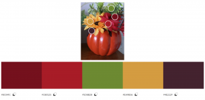
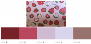
For this experiment I wanted to look at different clothing designs and think about what might be a good design for the character. I tried a variety of different colour schemes, including monochromatic, complimentary and triad.

For the first design I wanted to think about how a traditional school uniform would look, but add a magical element to it. I chose to add the blue socks in order to add a mystical element into the image.

For the second one I also focused on witchy colours, going for a monochromatic scheme. I think the colours work well because they’re muted and not too bright so the design of the character wouldn’t be overshadowed. I think that the design might be just a little too simple but I will discuss this with my group to get feedback.

I went much brighter for the third design, using a complimentary colour scheme. I like how bright the colours are, especially the green skirt as I think this would make the character stand out. I also added the witches hat as an accessory to help link the character to the world of magic. I think that the saturation of the colour might be a little too bright in this design.

For the 4th design I wanted to follow the same complimentary colour scheme but I adjusted the colours slightly so that the purple and the green were less vibrant. I think that this works much better because it still keeps the magical colours of purple and green but it isn’t so distracting. I think it might depend on the background design but without a background I prefer the 4th design to the 3rd one.

For the 5th design I went for something much softer, focusing on an analogous colour scheme of mainly pinks. I paired this design with a floral skirt because I thought the floaty nature of a skirt would suit the soft colour palette. I kept a little bit of the school uniform design by adding a shirt but on reflection perhaps a more loose fitting top would work better for the flowy nature of the design.

For design 5 I looked at another complimentary colour palette, this time thinking about the magical blue tones and how the yellow would work with this. I went with quite a simple outfit design of a hoody and shorts to show quite a casual character. I think however that this maybe strays a little too far from the school uniform theme and it might not be clear that the world is set in a school. I also think that while the colours work well together and they create a vibrant outfit they don’t really capture the mysterious vibes I was looking for. Perhaps more blue or different shades would improve this as opposed to most of the design being yellow.

The 7th design was following the monochromatic scheme again but this time I went with brighter shades of purple. I also chose to use workout clothes for the design of the character in order to show that there will be action in the scene and it would be a practical choice of clothing. I liked these colours a lot and I think they work together well in the outfit. They are bold but with the right background this might not be so much of a problem.

For the last design I chose something very different. I wanted to capture the witchy magical nature of the world so I thought a robe would be a good choice. It also seemed like a good way to explore the draping of the fabric. I’m not sure if the design of the robes if quite right, because I don’t think that is how they should fall. I think I need to revisit this and look at some more references to see how the layers should drape. I do think that the colours are good though, the little bit of red suggests a little danger, and the dark blue is quite mysterious but it is not so dark that you cannot see the lines.

Character Building for World- Sillouettes

These were the first silhouettes I tried. I wanted them to be very quick sketches just to see what I could come up with so each one was done in a minute or less. I think some of them worked well and provided a great starting point. I’m still trying to get used to working quickly and loosely for sketching and so I did find it a little challenging to leave the outlines the way they were.

These silhouettes took longer and were done with more thought behind them. I really wanted to try different shapes for the zombie mushrooms so I tried a few different types of mushrooms and bodies. I do prefer these designs which have been fully blacked out as I think they have better shape to them. The silhouette test is a method which I learned a lot about when we had a guest lecture by Sorcha Cartoons. Overall, I’m happy with the basic character designs I’ve created so far and I’m looking forward to developing them further.

Character Building

I drew some different mushrooms characters in my sketchbook too, to explore the different shapes and character designs. Some of them I like more than others but I will discuss each one individually.

I like this character design, because of the shape and the line thickness. I think the varying width of the lines helps to add to the personality and design of the character. I think the cross hatching works well for the shading of the character in this case as block colours might take away from the face and shape of the character.

I liked these group of mushroom characters and how they work together. I think that it helps to develop them as a block of characters, given that you can show their individual personalities. I like the purple colour but I think that the shade is too dark perhaps as it makes it difficult to make out the facial features. Also, perhaps having the smallest mushroom character at the front would allow you to see it better and get a better sense of the character.

I wasn’t so fond of these characters. I think there is personality in their faces but the colour of brown is too dark and so you cannot really see the faces, particularly for the younger character. I think perhaps if there was less patchy linework then it might be improved.

Again, I like the way these mushroom figures all work together with their own personality. The design was inspired partially by the designs of the animated Batman series. I find that even though the designs of the eyes are quite simple they are able to express a lot of emotion and I wanted to capture this with this character. I think the purple is a good choice for this mushroom, particularly when it’s only on the inside of the skin as it create a bit of contrast between the inside of the mushroom and the outside.

These two characters are my favourite of the designs. I like how they represent the trope your often see in cartoons with the two sidekicks- one being tall and skinny and the other being short and stout. I expressed this in both the stalk of the mushroom and with the rounded head. I do think though that I could maybe push this design even further, and extend the proportions to make the design more interesting. I think the colours are a good choice too because the deep purple looks almost poisonous, which reflects the nature that these characters are the ‘bad guys’.

Character Building

I started this design for one of the mushroom zombies. I thought since the zombies are humans who have been infected by fungus that it would make sense to have a human body proportions. I decided to add the vines around the body to reference the idea that the character has been lying underneath the ground for a long time and his almost become one with the ground. This is also why I added the long vines sprouting from the hands.

One of the other members of the group designed a slightly different looking fungal zombie which was much skinner and crooked. I really liked this design so I think I will be looking at that style of design for developing my characters further.

Character design practice

To help us with creating characters we were given the task to create cartoon versions of different people. I chose to do a few celebrities that I liked as well as creating sprites of myself. I was already making the sprites for my The World of Animation presentation but I thought it would be a good way to get used to creating characters and studying features to see how to get a likeness. This exercise was a lot of fun and it was also helpful. I have included a few images of how I developed characters from photographs.


Week 5- Character

BASIC STATISTICS

Name: Sejeong Park

Alias: SJ

Age: 17

Height: 5 ft 3

Sex: Female

Race: Human/ Witch

Eye Color: Brown

Hair Color: Purple

Nationality: South Korean/ American

Distinguishing Features: Purple hair, blunt fringe

Clothes: How does he/she dress? School uniform to show the setting. The world is a magical school for magical academia and so the uniform helps to set the scene. Purple necktie to add in some colour and fit with the colour pallette

Mannerisms: Feisty, Speaks her mind, Not afraid to call out those who are doing wrong

Hobbies:  Cooking , crocheting

Sound of Voice: Low voice, musical

Walking Style: Confident, balancing on aggressive

Character’s Greatest Flaw: Hot headed nature, can cause her to act without thinking

Character’s Best Quality: Strong willingness to fight against injustice in people or the world

SOCIAL CHARACTERISTICS

Hometown: Born in Gwangju,  moved to Boston at the age of 6 .  Her  parents moved due to work.

Current Residence: Glimmer institute of magic

Occupation: Student

Income: N/A, however family could not afford school fees so she is there on a scholarship

Talents/Skills: Witchcraft- potions and wand magic are best classes. Love of cooking comes from her father


World building for group 6

For this world building design I wanted to focus on quite a mystical colour palette. For this I chose to use a complimentary colour scheme as I know these colours work well together. I think they also suit the kind of world I was trying to create, which is one of magic and mystery.

One critique I have about the work is how I went into a lot of detail with the books and bottles on the shelf. This isn’t a problem in itself because it helps to bring character into the scene. But I do think that the rest of the scene is too simple now in comparison to this corner. More detail in the foreground of the image might help make it better.