I drew some different mushrooms characters in my sketchbook too, to explore the different shapes and character designs. Some of them I like more than others but I will discuss each one individually.

I like this character design, because of the shape and the line thickness. I think the varying width of the lines helps to add to the personality and design of the character. I think the cross hatching works well for the shading of the character in this case as block colours might take away from the face and shape of the character.

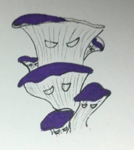
I liked these group of mushroom characters and how they work together. I think that it helps to develop them as a block of characters, given that you can show their individual personalities. I like the purple colour but I think that the shade is too dark perhaps as it makes it difficult to make out the facial features. Also, perhaps having the smallest mushroom character at the front would allow you to see it better and get a better sense of the character.

I wasn’t so fond of these characters. I think there is personality in their faces but the colour of brown is too dark and so you cannot really see the faces, particularly for the younger character. I think perhaps if there was less patchy linework then it might be improved.

Again, I like the way these mushroom figures all work together with their own personality. The design was inspired partially by the designs of the animated Batman series. I find that even though the designs of the eyes are quite simple they are able to express a lot of emotion and I wanted to capture this with this character. I think the purple is a good choice for this mushroom, particularly when it’s only on the inside of the skin as it create a bit of contrast between the inside of the mushroom and the outside.

These two characters are my favourite of the designs. I like how they represent the trope your often see in cartoons with the two sidekicks- one being tall and skinny and the other being short and stout. I expressed this in both the stalk of the mushroom and with the rounded head. I do think though that I could maybe push this design even further, and extend the proportions to make the design more interesting. I think the colours are a good choice too because the deep purple looks almost poisonous, which reflects the nature that these characters are the ‘bad guys’.