This project was definitely challenging in a lot of new ways. As I am still learning to develop my 3D production skills, it was a learning curve to go through the pipeline of creating the whole animation. However, I was very pleased with the outcome and I feel that you can see that a lot of effort went into the production.
One area which I would have liked to improve this project is to have been able to export the production in a higher quality. I will do this over the summer however, so that we can see the final project in better quality. Another area which I would like to change would be the sculpt of my skull. The eyes are not quite as perfectly sculpted as all of the other models in my group and I feel it would be beneficial for my character to match. I also would like to try experimenting with more dirt. I would like to try creating a character where the heads and necks meet in order to possibly stop the separation from the IK Spline rig.
The area which I was proudest of was the asset creating we did for the scene. I think that the animation setting looks perfect for the aesthetic we wanted to achieve from the production. The textures also helped to bring the animation to life and I am very glad we decided to use these textures instead of leaving it plain. I was also proud of how we managed to overcome the problems we faced along the way and get the animation finished to a standard which we could be proud of.
By completing this unit I have learned a lot about the animation pipeline and what goes into creating a film. There was a lot of elements which where unfamiliar to me before this unit, such as 3D Previs but now that I have practiced it a few times I understand the reason behind how important it is to create a previs to plan your shots. I am looking forward to improving the skills I have used through this unit both over the summer and as I continue my degree.
We initially formed our groups and began to broadly discuss ideas we could use for our 30 second animation. We wrote down each idea we had, so that we could begin to narrow down to our favorites. I initially suggested a could of ideas, such as the 4 elements which developed into a battle between them to decide who was the best. Another idea we liked was about a love story between the sun and the moon, but we thought it may be difficult to get enough animation into the scene. Another idea I had was a football stadium but the players and spectators were cacti. The story was
Beginning: Two teams of cacti are playing football. The ball is a tumbleweed.
Middle: A cactus star player avoids a defender, the crowd cheers. He lines up to take his shot.
End: The cactus scores, he celebrates and the crowd does a Mexican wave.
I did a concept sketch for one of my other ideas. In this idea, it was about a little rabbit who struggled to pull a carrot out of the ground. Eventually he managed to pull it free. This story was to explore the armature of how even if things seem tough, if you persevere you can succeed. For the design I kept the character quite simple, and took some inspiration from ‘Rayman’. His feet move with his body but they move with an almost bobbing motion and so they would not require a full walk cycle.
[My initial design and influence from Rayman]
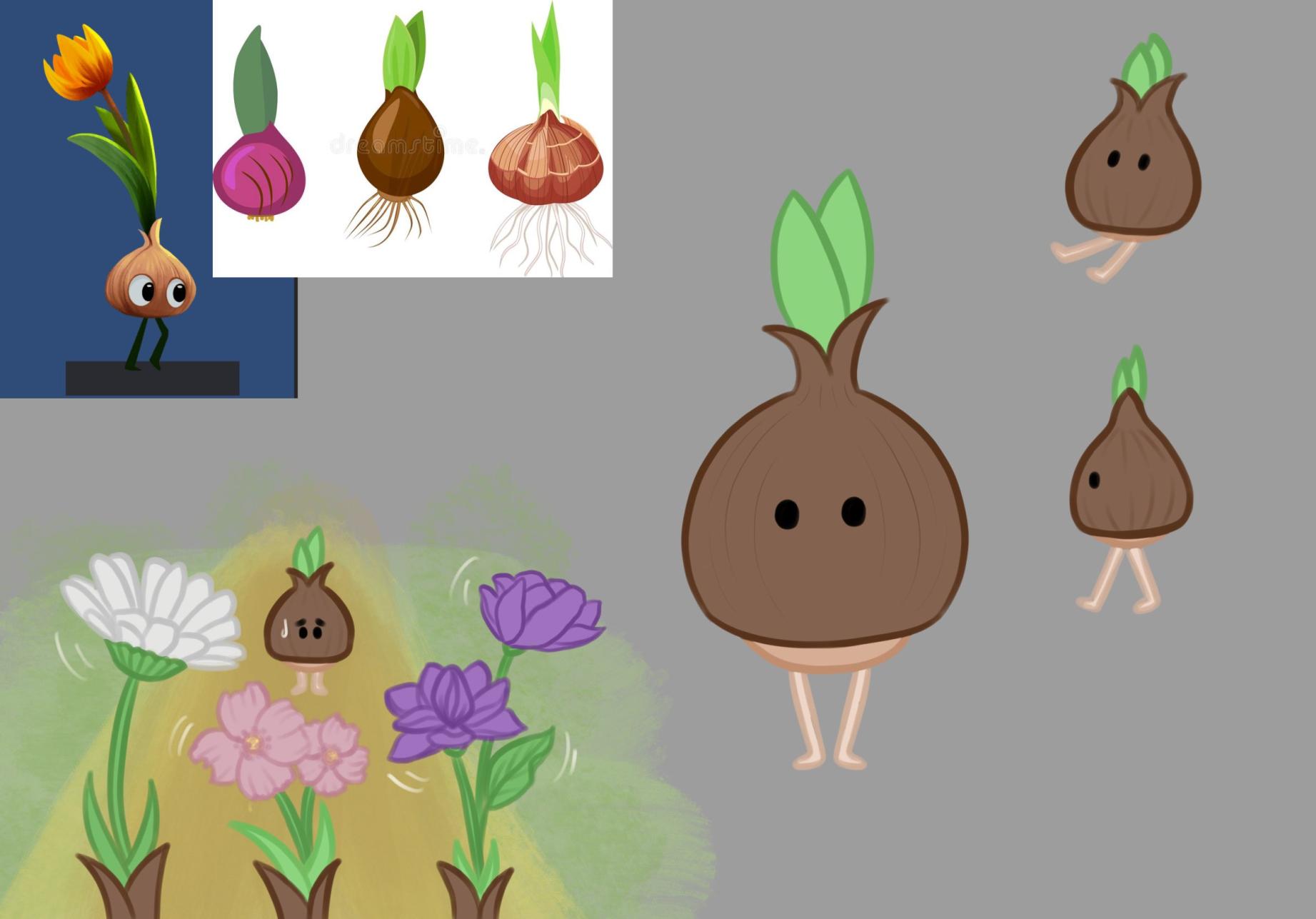
We decided that to be fair, we would all have three days to come up with our three favourite ideas and we would have a call to decide which one was the most popular. We discussed it and the majority of the group liked the armature of “you grow at your own pace, and that’s ok”. We had two different stories to develop the armature. The first was a cute little flower which had not bloomed and it was sad because all of it’s friends had. Then he gets his bulb and gets overjoyed. The second was graveyard plants and a small monster who could not scare. I preferred to go with the cute idea as the project we worked on last semester was scary and I thought it would be interesting to try something different. However, the rest of the group preferred the scarier creatures so we compromised and decided to go for a scary/ cute design.
Below are some of the concepts from my other group members. The graveyard plants by Cloe is what we ended up developing.
Initial Research
[A reference from “Legend of Zelda” as research for character designs]
I made a board with some initial ideas for all of the ideas we had discussed, including the elements and the bunny rabbit. In this board I also included some references which I thought could work well for the creepy cute concept, such as the Pokémon Duskull and Cubone and the characters from a variety of Tim Burton films.
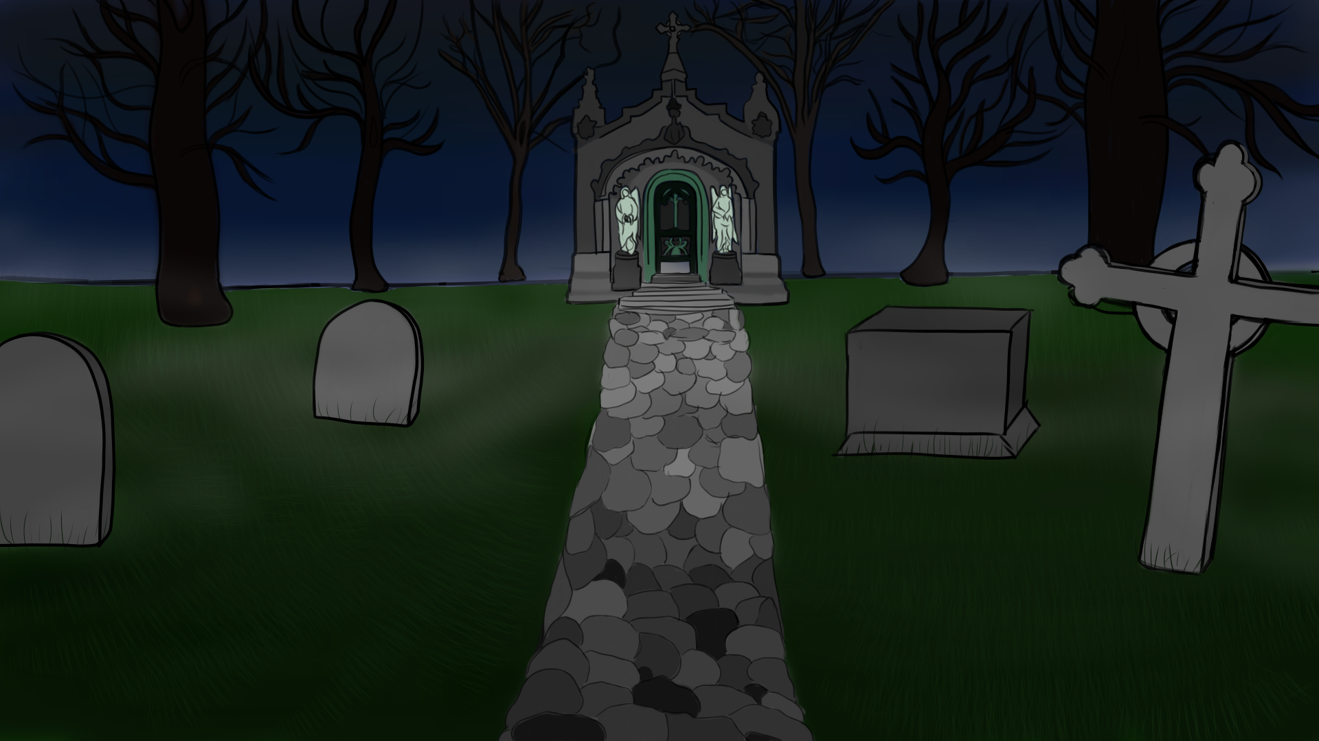
I also looked at a variety of background references, as backgrounds are an area which I really enjoy and I was looking forward to trying out a few. It was interesting as I’ve never really worked with 3D before and I thought it would be a really interesting challenge to bring a 2D background into a 3D asset. I looked at some photographs of real graveyards, as well as the Tim Burton films like “The Nightmare Before Christmas” and “Corpse Bride”. We really liked the strong shadows in these films and how they captured a night time appearance. Another reference which I fond that I thought would be really good was the Simpsons episode “The Girl Who Slept Too Little”. This scene has a very dark colour pallet, with lots of greens, greys and muted pinks and yellows. I thought the shadows from this episode would work really well for our project as we wanted to capture the dark spooky atmosphere of a graveyard, and this episode did it very well. We also liked the colour scheme so I tried to recreate it in my future design sketches.
Initial character designs
I did initial character designs for the worm creature, the small monster and three bigger monsters. We decided that it would be handy for everyone to do a design for each character so we could decide if there was any we felt strongly about designing. Amy felt like she would like to do the small monster and Lydia wanted to try the worm so I decided to do one of the bigger monsters. We all decided to try to incorporate skulls into our design somehow so that they would look consistent so I did a few designs which included these.
[Worm character]
[Small monster design]
[Large monster design 1]
This design followed the bulbus shape that I saw from the legend of Zelda game and it also looked similar to the ideas that Cloe and I discussed.
[Large monster design 2]
This design was based off a snap dragon seed pod, as they are flowers which already look like skulls and I thought it would be a nice way to bring them together.
[Large monster design 3]
For this design I used references of Randall from “Monsters INC.” , Futurama and Kaa from “The Jungle Book”. I also looked at venus fly traps, as they are plants which have a quite scary appearance with their spiky teeth and smile. This was the design I chose to develop further.
Background development
[Background design 1]
This was the first design I did for the scene. I looked closely at the same Simpsons episode, particularly with the shadows and the bumpiness of the terrain. I also looked at the same colour palette. I think that it worked well and it was a contender for our final design.
[Background design 2]
This design included a much more detailed path and building in the background. Again, I kept the colour palette close to the Simpsons episode. Though I liked this design, I felt like the building in the background was a little too complex and it would distract from the characters and story.
[Background design 3]
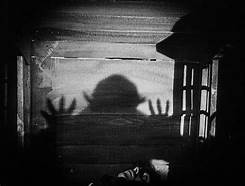
For this design I looked at films such as ‘Frankenweenie’ and ‘Corpse Bride’, which have a very curvy set design. I kept it black and white and used the heavy shadows, inspired by the German expressionism style of Tim Burtons films.
[ A Screengrab of ‘Nosferatu’: A German expressionism film]
Character Development
This was the second development I did for my character after I had decided which design to bring forward. We had decided to all incorporate a skull design into our characters for some consistency so I decided to have my monster breaking through a skull. I also added some legs as I thought they would be good for some extra animation.
For my final development of my character I decided to remove one of the heads and the legs. It was pointed out to me it would be harder to animate three heads as they would have to be done separately and work together in their movements so I thought two heads would still convey their two different personalities. I also removed the legs as part of the brief was that the characters could not have legs. I was happy with the final design as the monster fits in with the creepy cute design aesthetic we were aspiring to.
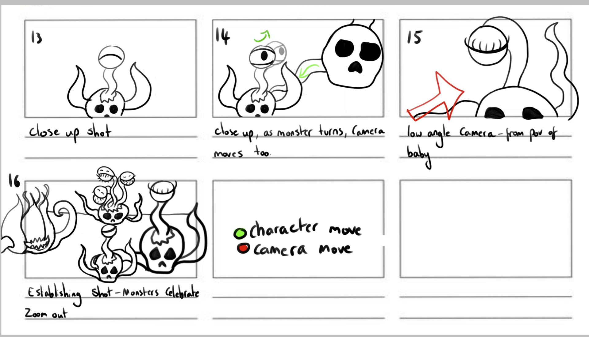
Storyboarding
[My initial storyboard draft]
I did one of the initial storyboard to try and get a grasp on the story for the group. Upon showing the lecturers the storyboard and getting some feedback it was pointed out that some tweaks were needed in the story to convey the point better.
To correct this, Jorja made a different version of the storyboard, which had been updated to reflect the changes to our storyboard. When showed to the lecturer, they said that it told the story better so we took this one forward.
Animatic
The animatic was a collaboration between myself and Amy using Krita. I took the first few scenes, but it was pointed out to me that I was going into too much detail with it and it was becoming too time consuming for no good reason. Because I had already spent a lot of time doing the first few scenes, Amy agreed to take over the rest of the shots and finish it for me so that I could concentrate on other parts of the assignment. Overall we were not too happy with the final animatic but due to time constraints we were satisfied that it got the story across.
3D Previs
Myself, Amy and Cloe did the first draft of the previs, each taking a few shots each. Amy did shot 1, I did shot 2, Cloe did shot 3 and I did shot 4, 5 6 and 7. This initial draft of the previs was changed slightly after one of the lecturers suggested that the small monster attempting the scare come before the big monsters successes. I found this draft of the previs to be quite lacking, particularly with how out of sync everything ended up due to different team members working on different things separately.
For this second draft of the previs, I updated my shots to fix the camera angles and movements in order to tell the story better, as well as changing the movement of some characters. Cloe also edited the length of her shot so that it would reflect the movements better. I found this to be a slight improvement on the first draft however a lot of work was still needed to get it up to scratch.
For the third pass at the previs I decided to scrap the original files and start from scratch. By this stage most of us had finished out models and so this made it easier to capture the expressions we wanted. It also allowed us to implement the feedback we got about how we should change the story order so that it went 1: The monsters having a successful scare, 2: The little monster looks on in awe, he tries to scare a worm but fails. He is saddened, but his friends come over to encourage him. 3: The little monster is able to scare the worm and he celebrates with his friends! This pass at the Previs was a lot cleaner and it was able to convey the story a lot better.
Moving to 3D modelling
Though we were advised to stick to hard surface modelling in Maya for this project, we really wanted our skulls to be quite detailed and done in blender. We discussed as a group which style we wanted for our skulls and we all agreed that the cute style that Jorja designed would fit the concept well.
[Jorja Skull model]
I used this model as the base for mine, and I really liked the idea I had done of having the monster heads breaking through the skull so I left a large hole at the top of the skull.
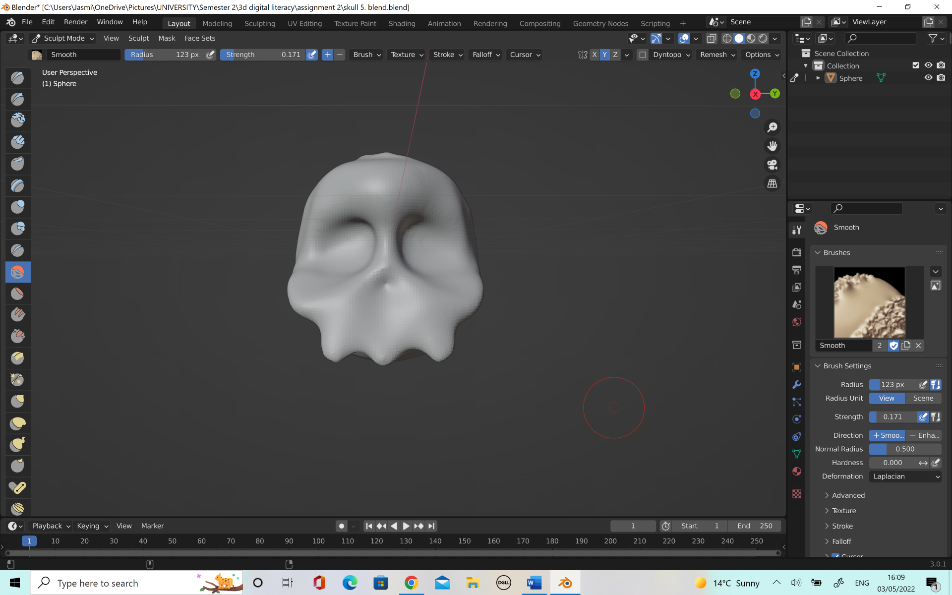
When I was done with the model on blender, I moved over to Maya to do the retopology. I struggled at first, as I had too many faces and everything was becoming far too squished. I was also losing some of the loops which I wanted to make a successful model.
I asked Alec for some advice and he told me that using the auto retopologize tool in Maya would be fine for this character as it is fairly simple. This allowed me to keep the loops I wanted and the retopology looked much better. It will also give me a good example to look at in future when I am practicing retopology in the future.
When I was happy with the skulls I moved onto modelling the rest of the character. I made the rest of him in Maya as I was sure I could achieve the shapes I wanted without having to go into soft surface modelling. I kept the two characters looking similar but I knew I wanted them to have different personalities so I changed a few things between them. I gave one a much longer, thinner neck to give him more of a gangling comic relief character and the shorter character I gave a thicker neck which was shorter to show him as the main plan maker of the group. I thought about how these types of characters are created in other media, particularly ‘Laurel and Hardy’, ‘Only Fools and Horses’ and ‘Monsters INC’. Monsters Inc worked really well as my character design already had influences from the character of ‘Randell’. While Sully is the bigger and more popular figure head of the duo, Mike is the mastermind and logical thinker behind all of there plans.
[Monsters INC.]
[Only Fools and Horses]
[Laurel and Hardy]
We wanted to have a scary/ cute look to our animation so I decided I would add sharp teeth to help the characters looks a little less on the goofy side and a little bit more spooky, but also to help capture the inspiration of the Venus fly trap plant. Once I was happy with the model, I was able to move on to unwrapping the UVs.
In my previous unit I did struggle with UV unwrapping as I have a tendency to over complicate things. It took me a few attempts at unwrapping certain areas, such as the skull but eventually I was able to unwrap all of the models well and have the checkerboard fit nicely with no stretch. I was happy with my improvement at this point and I was able to move onto texturing.
Texturing character
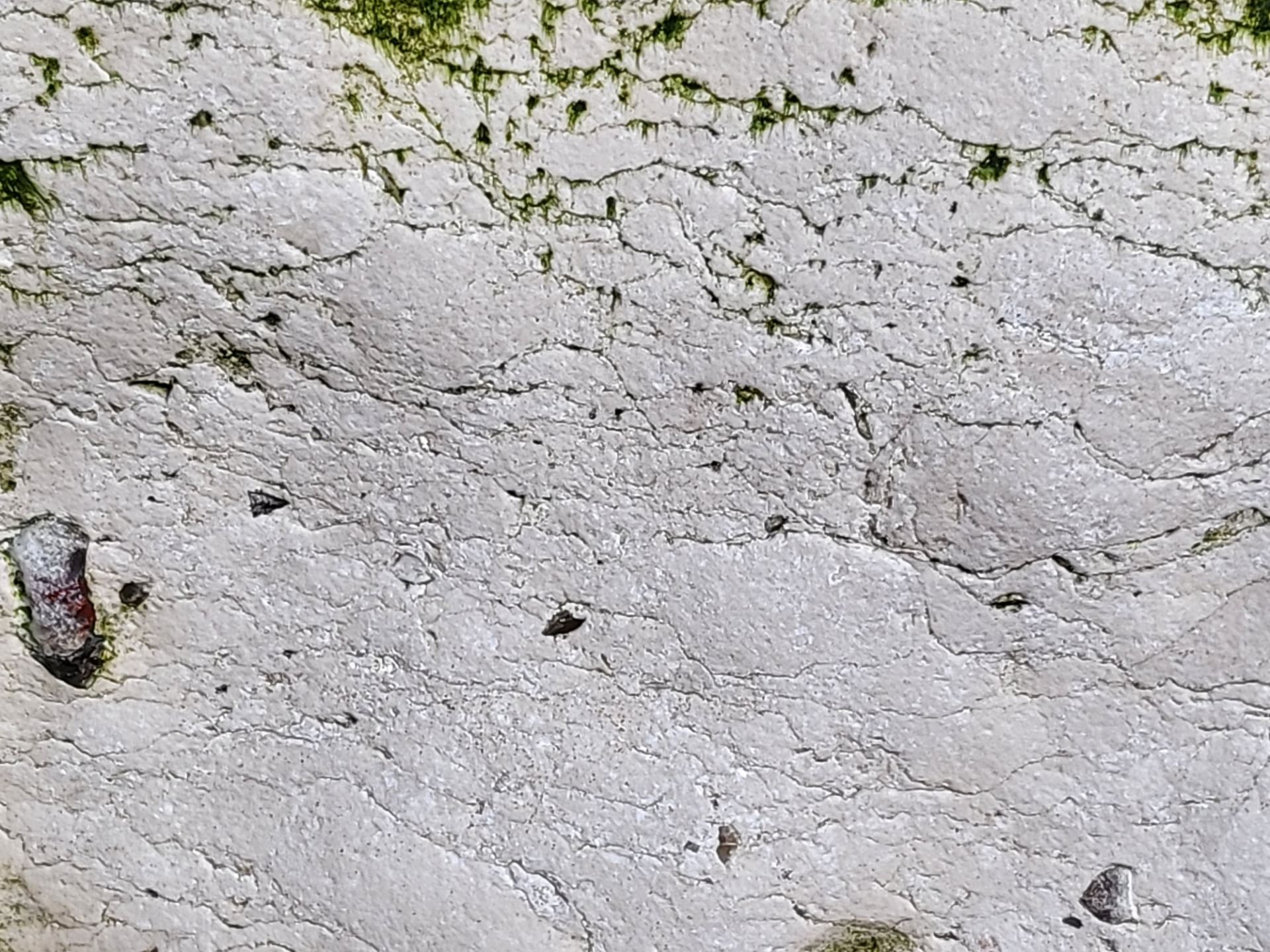
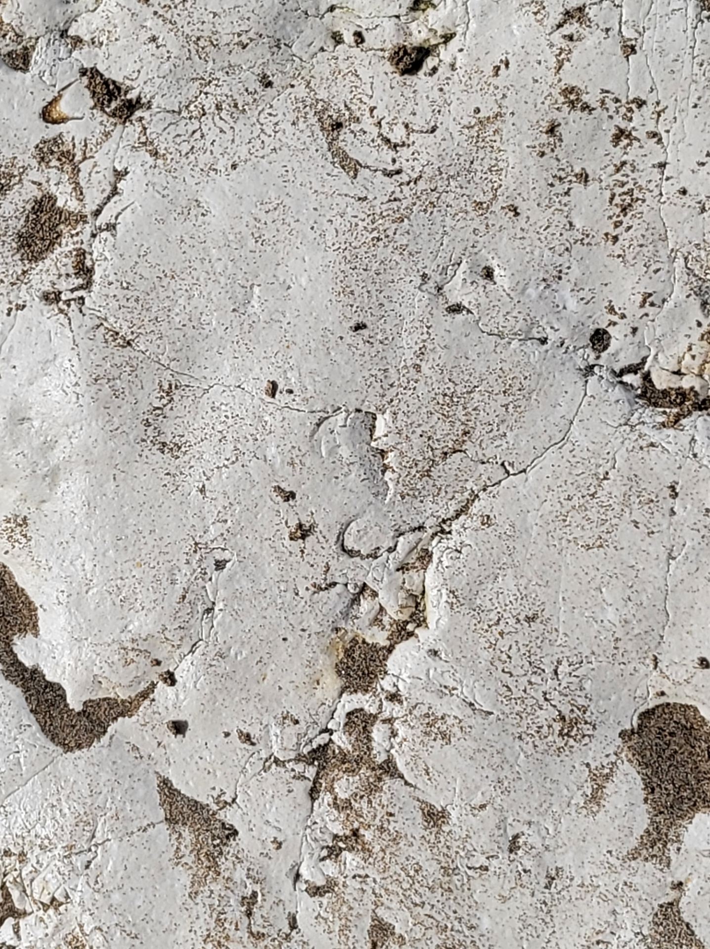
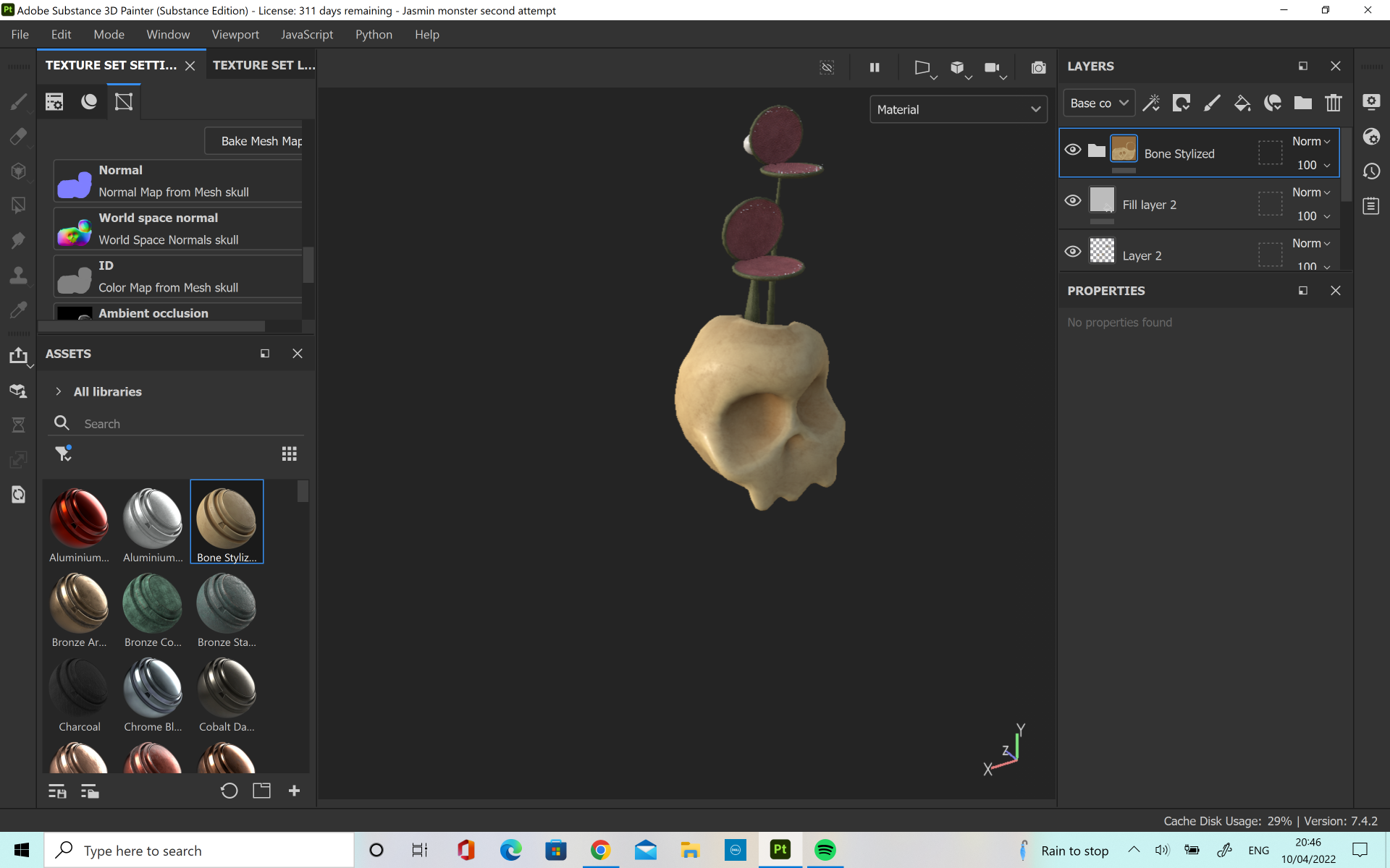
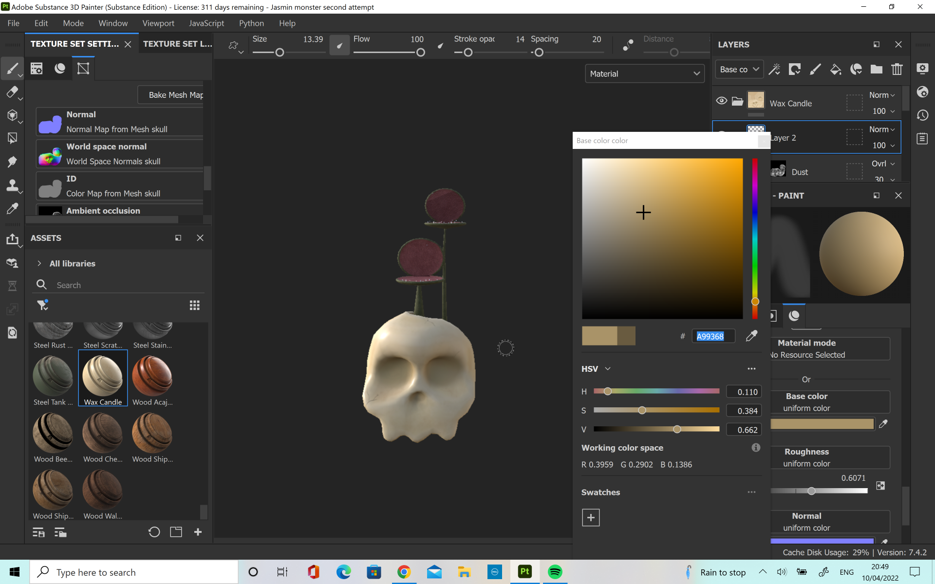
When I was at the beach, I found these rocks which I felt had quite a nice texture which could be used for skulls so I decided to take some pictures and suggest it. We decided ultimately however that it would be better to use one of the materials already in substance painter, and Cloe had suggested using the smart material ‘Wax Candle’. The group agreed that this would suit the design we wanted for the skulls so we all decided to use it on our models for consistency.
[Cloe Character design and colour scheme]
I started with the skin of the creatures, as I knew I wanted a reptilian type of material to fit with the snake like influence and so I used the ‘Lizard Scales’ material and played with the size until I found the right way I wanted the texture to appear on the skin. I also changed the colour so I could find the right colour of green. Cloe had done a colour palette for her initial character design and I loved the colours so I thought it would be good to match this as it would again create some consistency between the characters. I also used the same colour of pink that she was using for his mouth. This really helped to bring the Venus fly trap reference into the character. I used a mask to paint the pink of his mouth on by hand, so that I could use different shades together.
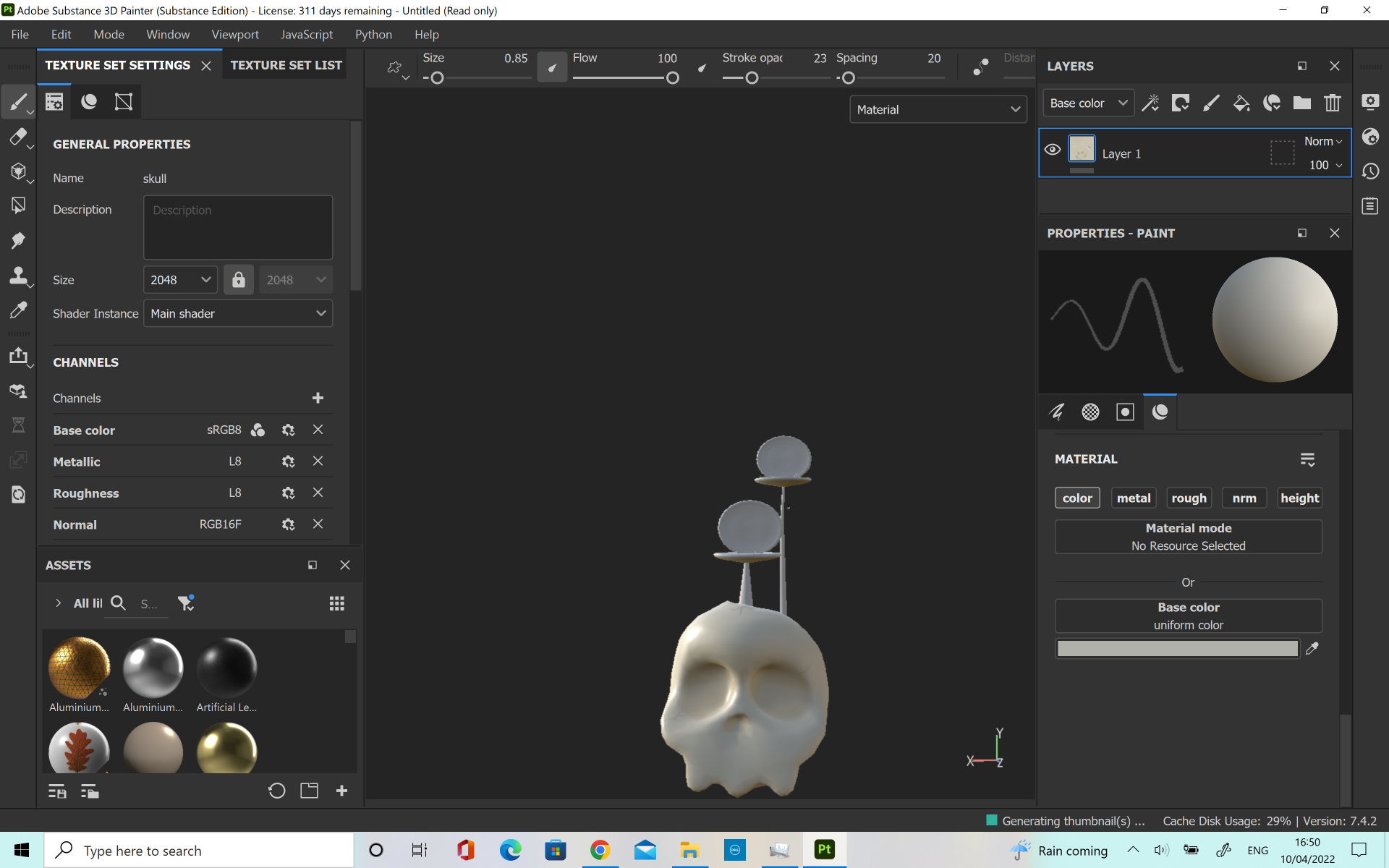
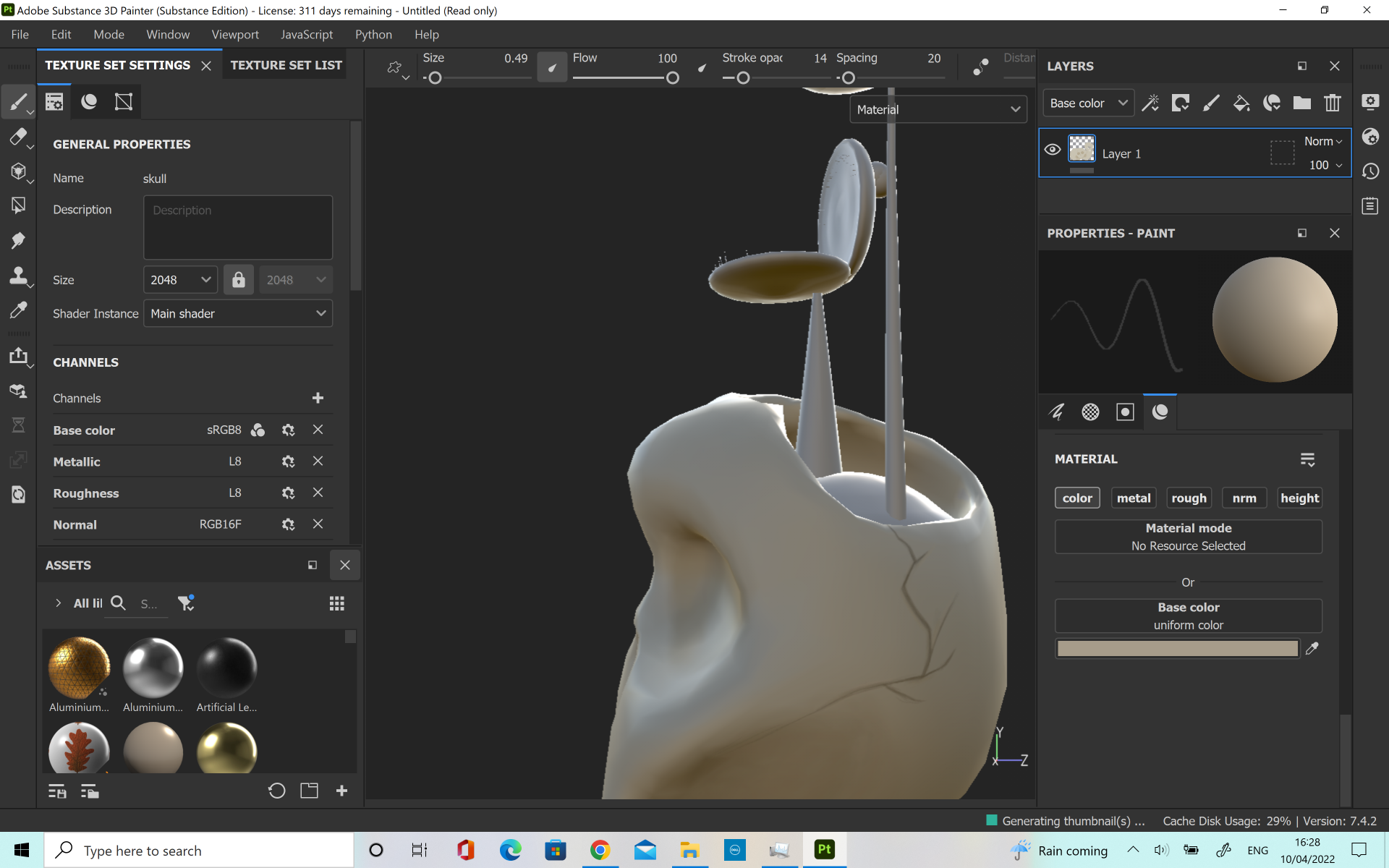
Next I moved onto the skull. The skull was a lot of fun to create in substance painter as I got to paint some little cracks onto the skull to bring it to life. I did one along the side, to show the hole cracked in it, as well as one at the front and another at the left cheekbone. I didn’t want to make them too dark, as I wanted them to look realistic and I was able to achieve this. However, it was a little hard to see them in the final animation due to the camera being too far away so I perhaps could have made them a little darker and stretched the realism aspect in favour of the aesthetic. I used the ‘Wax Candle’ smart material, just as we had discussed.
When I was finished with my textures I took them into Maya and applied them, so that I could get an idea of how I he was looking. I added a simple sky dome light so that I could get an idea of background and to allow the render view to show up as a light source is needed. I was happy with his appearance and I thought the colour worked well as I knew in our final animation the background would not be so busy and therefore you would be able to see his head better.
Rigging
Rigging is a process which I enjoy quite a lot but I am obviously still learning about it and I still need to develop my skills. Alec had recorded a video for Cloe to follow when making her character so it was helpful to be able to use this as a basic reference and adapt it for my character.
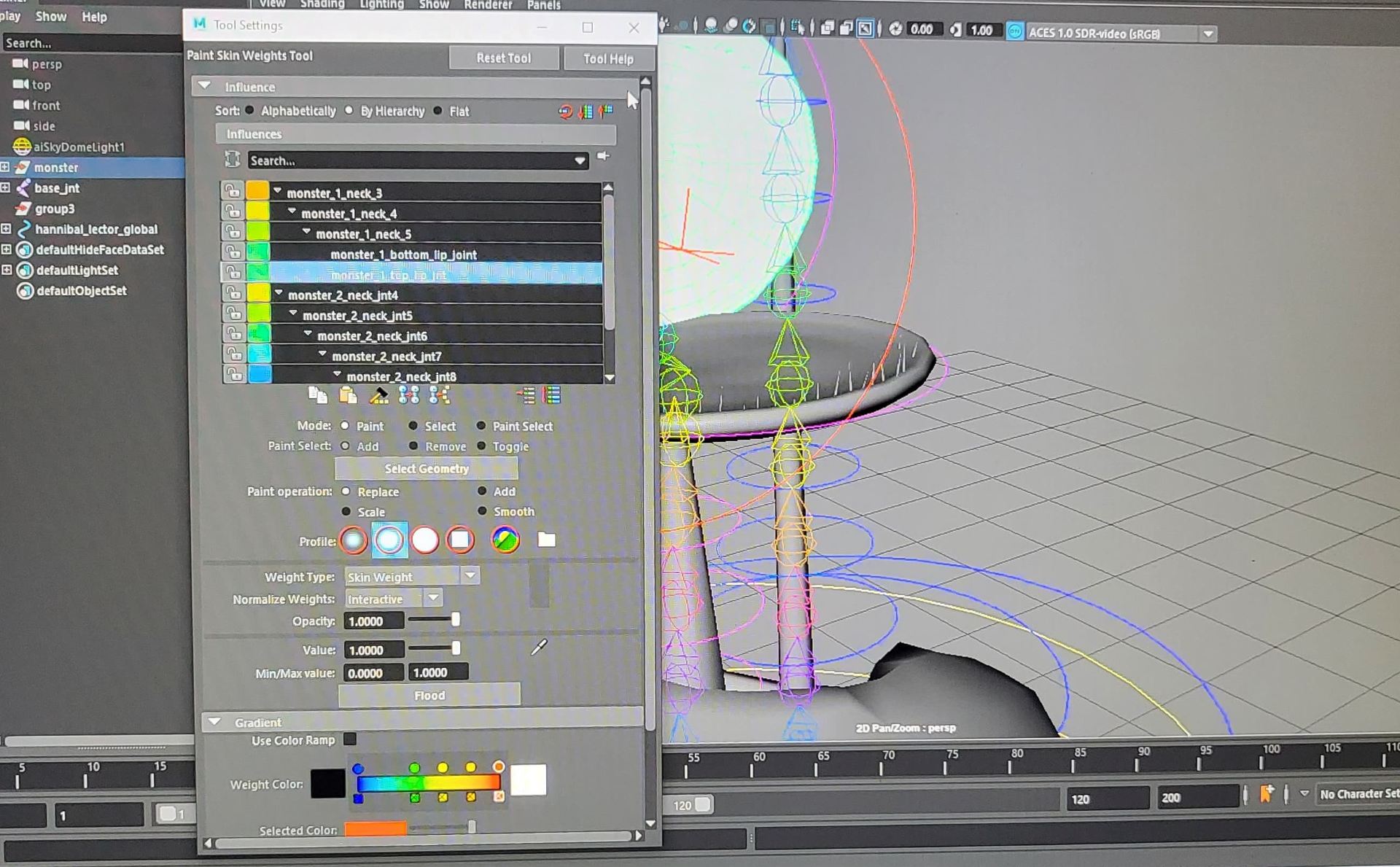
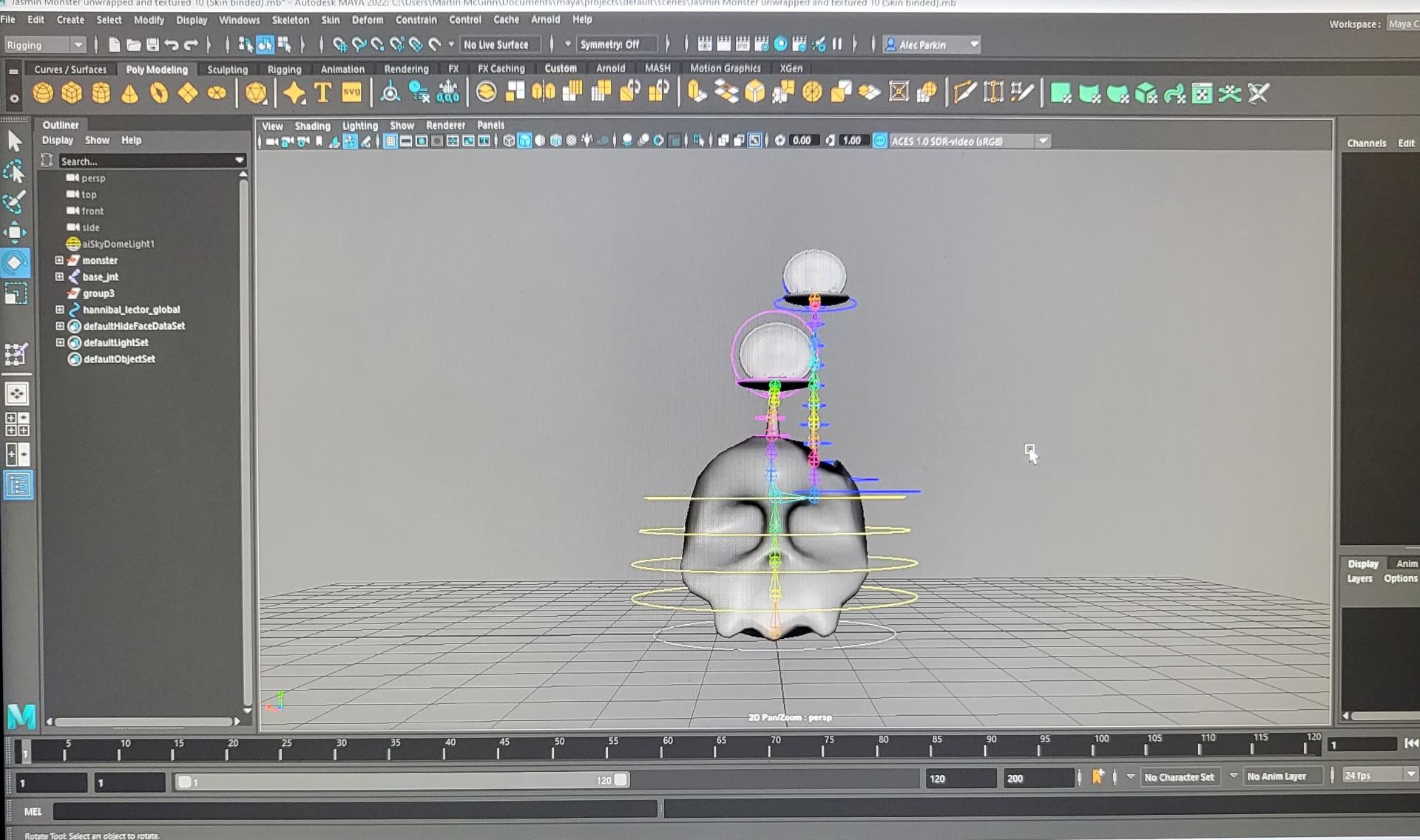
I started with the creating the joints, from the base up. I had few joints in the body as it was not going to move very much, and most of the animation would come from the necks and head. I added a lot of joints to the neck, probably too many but I made the mistake of not adding enough edge loops to match and so his neck would not move quite right at first. This first rig was a standard FK, as I thought it would be enough to capture the movement of the neck that I wanted. After I had added more edge loops and painted the skin weights it made the neck move the way I wanted so I was pleased with this.
I was also careful to add my controls at the right place and to parent them in the right order. This was a little confusing at first and I had managed to parent the longer head under the wrong control so it would not move properly but this was a simple fix. I only had to unparent the control and redo it in a different way.
When we presented our progress report only Cloe and myself had finished our rigs and were ready to animate. However, I was given the advice that my rig would not be good enough to great the movement I wanted. Henry also mentioned that improving the thickness of the necks would help make the character look more like my design and also help improve it’s overall appearance. Mike suggested changing the Rig and there was a few different options to try. One was to create a sweep mesh, making sure to use more than 4 points. Then add cluster points and controls to these points so that the neck will move in a much nicer way. I liked this but I found when I tried to follow the example mine would not move the same way so I asked for some advice and Alec suggested an IK spline handle. I did some looking into this and I found a YouTube video which explained it well (https://www.youtube.com/watch?v=Pj6TrmxhPew). I decided to do this as my new rig as it would capture the movement I was looking for. The only issue was that the neck wasn’t attached to the head and so if it moved too far away you could see the detachment but this was helped by camera angles and thinking about how we wanted shots to look in advance. I would like to redo the model and have the head and neck connected so that there wouldn’t be that disconnect and I will attempt this in future in order to keep improving the project.
Through this, I was able to create a much better rig, and I was also able to change the neck thickness just as Henry and Mike had suggested.
I also decided to add some blendshapes to my character, in order to bring some more emotion into the skull. I wanted to be able to narrow the eyes of the skull so that I could use it in the first scene when the monster are scaring down into the camera. I kept the blendshapes quite simple as most of the emotion came from the characters heard but I just thought adding a little bit would be beneficial. I also added a smile blendshapes to the shorter head as I thought it would be helpful for making him look more friendly in the scenes where he is encouraging the little one. However, it ended up looking scarier so I opted not to use it in the end.
When the new rig was ready, and my own character lights had been added and set right, I shared it with the others in the group so that we could begin animating.
Assets
The assets were a lot of fun to do for this project. It was mainly myself and Cloe who created them, with Amy creating some blades of grass to bring the scene to life, and Jorja creating some different twigs for us to have lying on the ground.
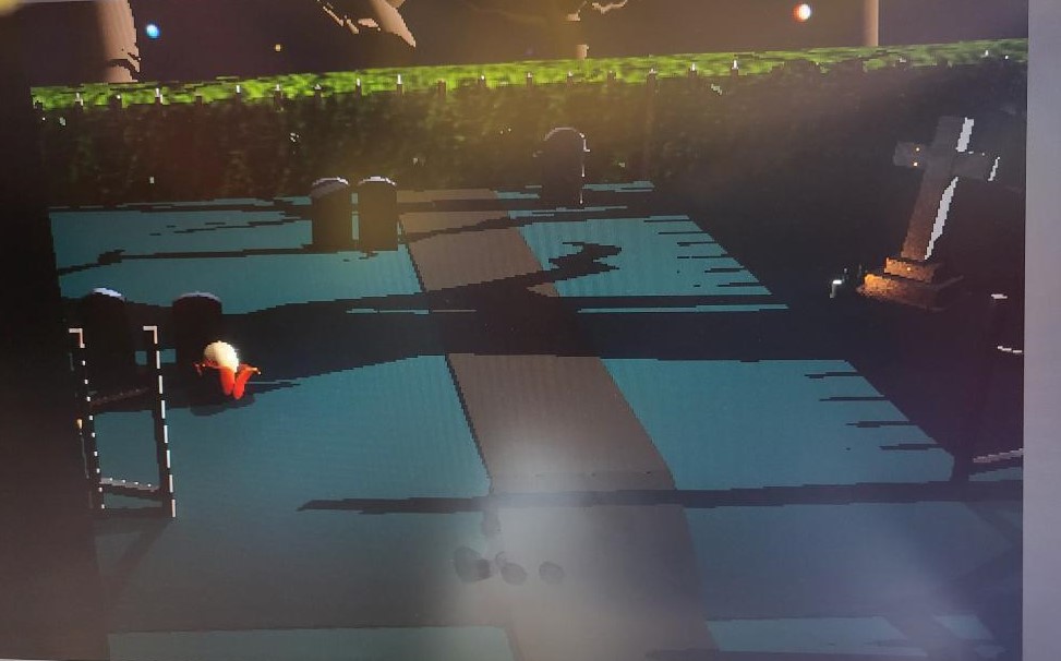
I started by creating the basic layout of the Graveyard. I wanted the design to have some contrast in the levels so I made a little slope in the middle of the scene. The lower section of the graveyard doesn’t have much action but it can be seen in the background which is nice. I made the poles for walls separately, so that the main poles and the long poles which connected everything were not joined. I thought this would be easier for making the UV maps as when I tried to do them all together, they would not fit in one square of the UV map.
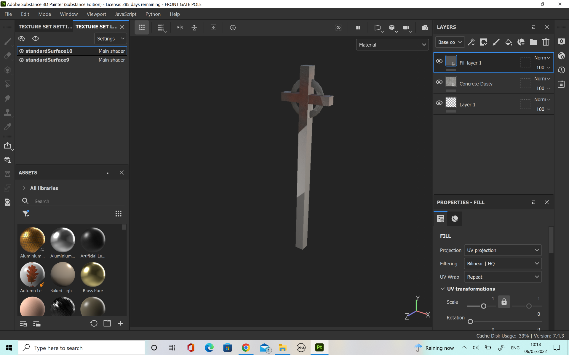
Once I was happy with the main poles and the basic ground, I made the front gate. This bit was a lot of fun and I was able to take reference from the simpsons episode ‘The Girl Who Slept Too Little’ which was a main influence for this project. I really liked how the front gate turned out, particularly the long cross which sits in the middle of the gate. I also made a hedge, but when I was extruding it, I was creating a lot of non manifold geometry. After two attempts I was able to create a hedge which was constructed correctly, however Cloe had also made one to see if we could find out what was wrong with my original attempts. We liked the one she had made better anyway so we just decided to use it.
the Gravestones were a collaboration between myself and Cloe, with her creating half and myself creating half. I made the large cross gravestone and it was my favourite one I made as I thought it really captured the feeling we were trying to create. Cloe made the trees for the animation. We really liked as a group the creepy, twisted branches with no leaves so we thought this would be really nice to incorporate into our animation and Cloe did a really amazing job at getting the trees just right.
Myself and Jorja made some twigs and pebbles which we thought would help with the scene. To help with the placement, I made a map of the scene and added dots where we would add each element.
Cloe also made some lovely candles, with a light included which provided a really nice glow on the gravestones. The candle was a simple lambert but it looked really nice and added to the scene.
[Front Gate OBJ file]
[Cross from front gate OBJ file]
[Final Hedge OBJ file]
[Long Connecting Poles OBJ]
[Elements Put Together in one OBJ File]
[Main Body Of Poles for Graveyard Wall OBJ File]
[Spikes on top of Graveyard wall OBJ File]
[Leaf For Scene]
Texturing Assets
I did the UV unwrapping and texturing for the Assets which were going to have more detail. Initially we thought about having simple lamberts for the backgrounds so that we could focus on the texture of the characters. However, it was suggested to us that it would look better if we added texture to the assets as it would look more finished so we decided to add these.
I really liked the idea of applying rust to the assets which were metal as I thought it would add to the spooky atmosphere. I particularly liked how the front gate turned out.
The hedge was a little tricky initially as I had some trouble with UV unwrapping it properly. The textures were being stretched and I didn’t look at all how I wanted. After I deleted the UV map I had done and created a new one however there was a really good improvement. I was able to import a hedge texture into Substance and paint it on freehand, without getting stretch on the hedge. The final hedge looked really good and it fitted in with the scene perfectly.
I had a lot of fun with doing the texturing and it also gave me a chance to learn about Hypershade when I was uploading the textures to Maya. I had watched Alecs’ video and the suggested video on applying the textures however I still did not quite understand it. Cloe was able to explain it to me in person though which was extremely helpful and I was able to pick up the process much better through an in person demonstration. I was able to get the textures applied but I could not see them on the render view which I found very confusing. Alec explained that it was a very quick fix, and I just had to reset the file paths as Maya needs to be told where to look for your texture maps. This was really interesting as I got to learn a little more about the processes behind how the software works as opposed to just taking everything as face value.
Lighting
We had decided to Use the lights Cloe had made for the scene but I wanted to try and practice it myself as well so that I could develop my skills. I liked how it looked, and I thought that it looked good and it worked well for the look we were trying to achieve. I also initially created an HDRI image for the sky dome, using dark purples and colours which I thought would match the graveyard but the group decided that since Cloe had already done the lights using her background, it wouldn’t make sense to redo them for a different colour scheme.
For the scaring scene we thought it would be good to have a green light which we could use for only the first scene. We thought this green light would help add to the spooky atmosphere. In our character models we had made our own light sets so we added the green lights in here.
Since Cloe had already done the environment lights in Maya, we all used the same base file for our animation.
Animation Tests
Before I started working on my animation I did a few tests to see how my character was moving and working. I was happy with how the heads and controls were working so I uploaded the files to the onedrive to give the rest of the team a bit of insight into how the character would move. I tried to make the character move a little bit like the light from the Pixar logo whenever he was jumping, however this animation was not in any of the scenes I was doing and Cloe suggested that he could walk like a wobbly vase when we was travelling which I liked the idea of.
Playblasts of Progress
For shot 1, myself and Cloe’s characters were ready a little bit before Jorja’s so I was able to make a start onto the animation, while still thinking about the placement for the camera. I initially had the camera freeze on the characters for a few seconds after they stopped moving to make it look almost like a freeze frame. However, I decided that I didn’t like this so much and I thought it would be better to have the frame still moving when it cut.
For this second one I increased the animation of the middle character to add some squash and stretch movement into the character. This looked much better but it cut at a strange moment with the blendshape motion.
For this third take I changed the animation so that the camera cut during the motion of the characters. I was also able to add Jorja’s character into the animation. We looked at the animation of Zoobat and Galbat and Jorja decided she liked the style of the wings moving in this way so we all decided to animate her character this way. I really liked the fluttering and erratic movement of the wings and character.
This pass was a lot better and I was able to capture the movement I wanted better. I used the graph editor to make the movement of my character more linear, particularly when he turns his head. I also added changed it so that Jorja’s monster flew towards the camera to appear larger and scarier. This worked a lot better, and I also added in blendshapes keyframes to have the mouth open wider. This really helped to make the shot look scarier.
This playblast was much better. I shortened the lengths of each clip so that they were snappier and made the shot more frightening as the clips weren’t hanging on too long. I also added some movement into the legs of Cloe’s model so that it looks a bit more alive. I was really happy with the changes that I made and it really helped improve the animation.
I wanted to capture a look of determination on the characters face and there is an expression called ‘Fighting’ which is used in Korean culture a lot. This is a way of expression ‘You can do it!’ and it is done by making a fist in front of you. I decided to try and capture this into the movement of the character.
I was also doing shot 4 so I got to work on this one as well. This first draft was a little too long and rushed in it’s animation. I also thought that the camera moved a little too slow. The blendshapes were also not at quite the right timing so I knew I had to fix these.
This second pass was a little bit better as the camera movement was better and the blendshapes were at a much better time in comparison to the movements of the characters petals and head.
In this third pass of this shot I was able to fix the timing of the blendshapes to be exactly the way I wanted and the movement of the petals and head looked the way I wanted.
As I was happy with these two shots, I applied all of the textures and made sure the light linking was set up and working well. As I had done all this I was ready to start rendering.
Problem Solving
This was where we really ran into problems. When I had exported scene 4 we realised that it was looking different from Cloe’s scene 3 render. We could not work out why this was happening as we had used the same environment lights and character lights. We also realised that Jorja’s animation lights looked different as well. We asked Alec about it and he said the best thing to do would be to would be to create one Masterfile and re-do all of the environment and character lights and import our keyframes and models from the individual shots we had done. Thankfully because we were prepared for problems and ready to render almost a week before the hand in date we were able to fix this however it was still disheartening and stressful. Since I was caught up to a good standard on both of my modules I volunteered to take on redoing the lights.
At first it was difficult as the area lights were not doing a very good job of lighting the whole scene, but rather only a strong spotlight effect.
Eventually I was able to get the lights to a place that looked spooky, but also not too distracting. I checked with the rest of the group and they liked them as well but suggested lightening the shadows a little bit so I did this and it looked better. I also moved the moon mesh light that Cloe had made so that it would look like the long shadows were being cast from the right place.
When I was redoing all of the camera keyframes I found that there was a lot of movement even though there was no keyframes in between. I fixed this by going to the graph editor and setting the key frames to linear. This worked perfectly and I was able to fix the camera work.
[When I was experimenting with lights, the intensity was too high at this stage]
Next I worked on doing the individual character lights to make sure the characters were well lit but not too blown out. This was a challenge, and I found that Amy’s character was hard to get the balance of the key light right. There was a dark patch the first time so I had to add another light in to eradicate this. This made the character look much better. I also add to add another area light onto my character as the taller head was not being lit enough. I initially tried a spotlight for my character and softened the area the light would hit so that it wouldn’t be too harsh. I changed the light linking so that the spotlight was not affecting the other characters or the environment but it still did not have the look that I wanted. I decided to change the light set up. Instead I used an area light and changed the intensity until I was happy. I was able to export the lights for each character. I had made groups for each scene so I was able to link the lights to the control of each character in each scene. This allowed the lights to move with the character, keeping them properly lit throughout the scene.
We had planned to do a final credits scene were a leaflet floated in from the frame and leaned against a gravestone. Cloe designed the leaflet and substance painted it with our names, and I did the animation. It was a bit of a struggle initially as we wanted it to look airless. We looked at the Disney animation ‘Paperman’ as well as a C4D dynamic floating tutorial on YouTube. This helped me in getting the motion right for the final shot.
Render
When I was happy with all of the lights and character lights I was able to render all of the shots. First I had to reapply the textures and set the file paths again as I had to use a different file but this process was familiar now and so it was not difficult, just time consuming.
The rendering took quite a long time, and we realised after we had done a couple of scenes that there was a little bit of grain showing up in the animation. We asked Alec about this and he said that it would not affect our grade for this project, it was just because of the setting. We had rendered in 1080, so we decided to go one level up and see if the quality would be worth the time sacrifice. However, we didn’t notice any real difference in the quality but each frame took a lot more time. We decided as a group that since it would take a lot more time and the result would be pretty much the same the trade off would not be worth it. However, we decided that we will re-render the project over the summer when we have the time so that we can improve the quality for our portfolios.
We rendered in layers, shot by shot so that maya would be able to handle it. This process worked really well for our project. One problem I ran into however was that the light linking of the characters had reset on shot 6 and so I ended up having to render twice.
Post- production
After I had rendered the shots I got started on the Post – production. I imported the shots one by one into after effects, before interpreting the footage to 24 fps. I created a new composition from selection. Next I made sure that adobe media encoder was open and sent the file to the media encoder to export. I changed the output to Youtube 1080HD and exported. Then I just repeated this process with all of the shots until I was finished. Cloe had made a really lovely design for the title credit and done it on a transparent background. This allowed me to take a frame with no characters, just the background and impose the two together. This ended up looking really good and the perfect introduction to our film. Next, I imported the clips into premier pro. I placed all of the clips onto the timeline, making sure to leave a gap between the title credit and the first shot. I also did a few effects to allow a black fade out for the title card and the credit shot.
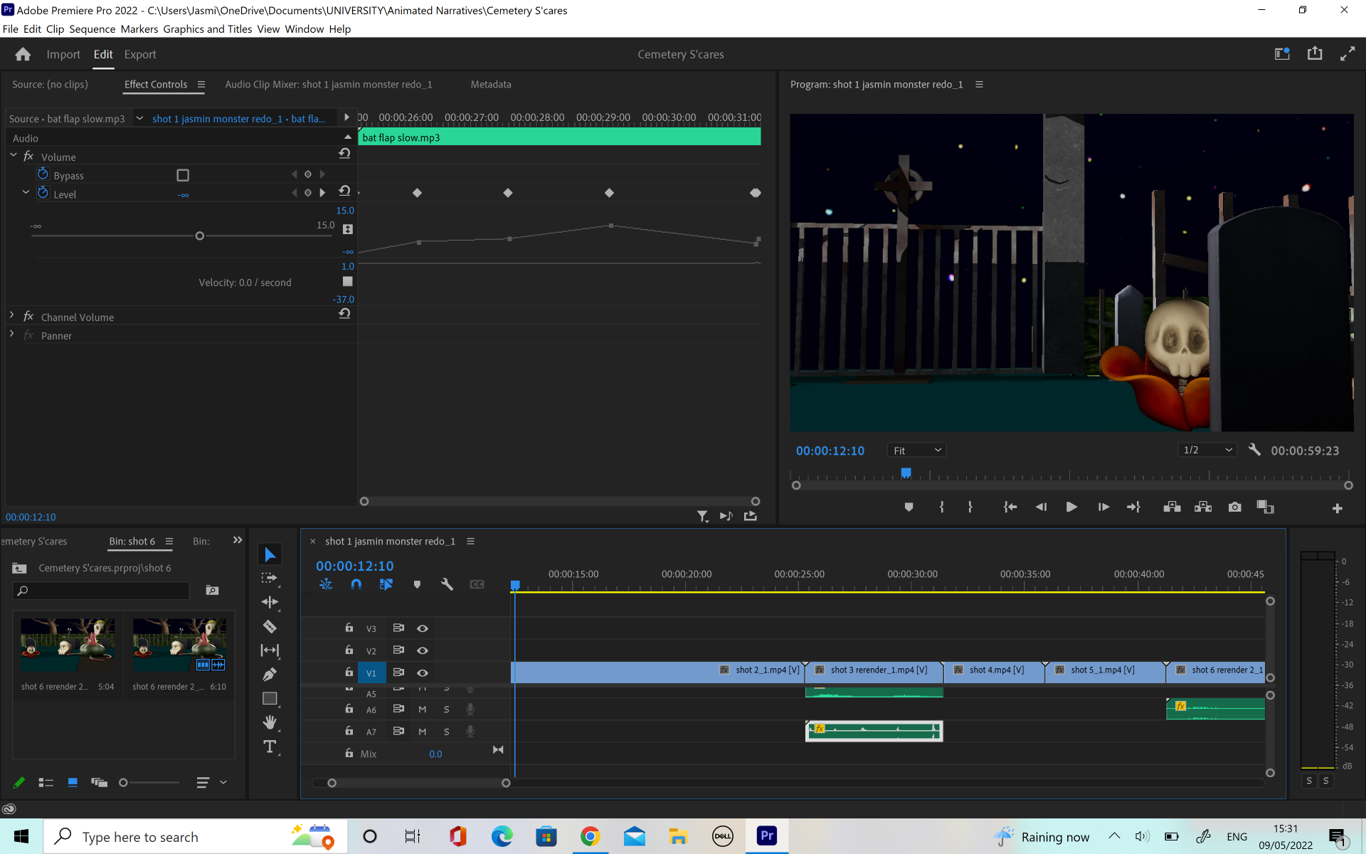
Next I moved onto the sound. We had a folder on our shared OneDrive where we had uploaded some sound effects. We discussed what sort of noises we wanted our individual characters to have. I chose a hiss as my character was like a snake, Cloe chose a monster growl and Jorja wanted the flapping of bat wings. As Amy’s character was the main character we gave him a voice so that he would be able to convey his emotions a little better. It was a little difficult to get the bat wings to match up with the animation but in the end it was quite successful.
I also got to layer a lot of different sounds together but this did mean that I had to change the volume to make sure the audio would not be too loud. I also did some experimentation with keyframing the audio. This was particularly helpful in one scene where the bat wing sounds were too quick but I could not change the timing of the animation so I keyframed the sound so that you would only hear every second wing flap. This worked much better.
Final Video
For the final video we decided to upload it to YouTube as it seemed like the most convenient place to be able to share the final video.
We worked really hard on this project and I think the final animation was to be proud of.
This module has been very fulfilling, as well as presenting interesting challenges I have had to overcome. To have gone from never having created a 3D soft surface model to creating the Whale Shark scene had a lot of learning curves but I believe I was able to overcome them well and develop my skills in modelling and problem solving. I particularly enjoyed the process of modelling in blender and creating organic shapes. I also found that through this module I was able to really develop my skills in substance painter as my project last semester was lacking in this area. I was also able to gain confidence in my UV mapping skills as I have struggled with this in the past.
The area I found most challenging in this module was the process of retopology. Due to my tendency to overthink and complicate things sometimes, this seemed to affect me when I was retopologising my models. I believe I have improved with the practice I have done in this module and I am looking forward to improving my skills over the summer break.
If I were to change one thing about the final upload, I would perhaps likes to experiment with a different base for the scene, or perhaps placing the scene into a fishbowl, using the glass technique I learned for substance painter.
Overall I was very pleased with my final result and I believe I was really able to improve my skills in both hard surface and soft surface modelling. The new skills which I have learned from this module will be crucial to my development in the animation field and so I cannot wait to explore further ways to improve.
Once I was happy with all of my scene, the last step before uploading it was to pose the characters. Because I had thought in advance about how I wanted the scene to look there wasn’t too much posing to do, but one thing that I knew I wanted to change was the placement of the Ray. At the start I placed him under the Whale Sharks tummy, swimming along underneath but after thinking about it I decided it would be better to have the Ray at the foreground of the scene, and turned slightly as if he had just swam forward. I did this to build motion into the scene as well as to build the excitement by having the Rays expression clearer instead of being hidden underneath his friend.
Once I was happy with these changes, I exported the scene as an FBX and uploaded it to sketchfab. Once there, I realised that I had not smoothed the mesh in Maya and so my low poly upload of my Whale Shark was not smooth like I wanted but rather blocky. This was an easy fix however, as I simply had to load the FBX into Maya and smooth it here before reuploading.
Next, I applied the textures. I was careful to export all of the different textures as Sketchfab format so this was not a problem. However, the mouth and eyes of the whale shark were showing up as one mesh as I had forgotten to apply separate lamberts to them in Maya so I unfortunately had to go back and fix this before exporting and uploading again.
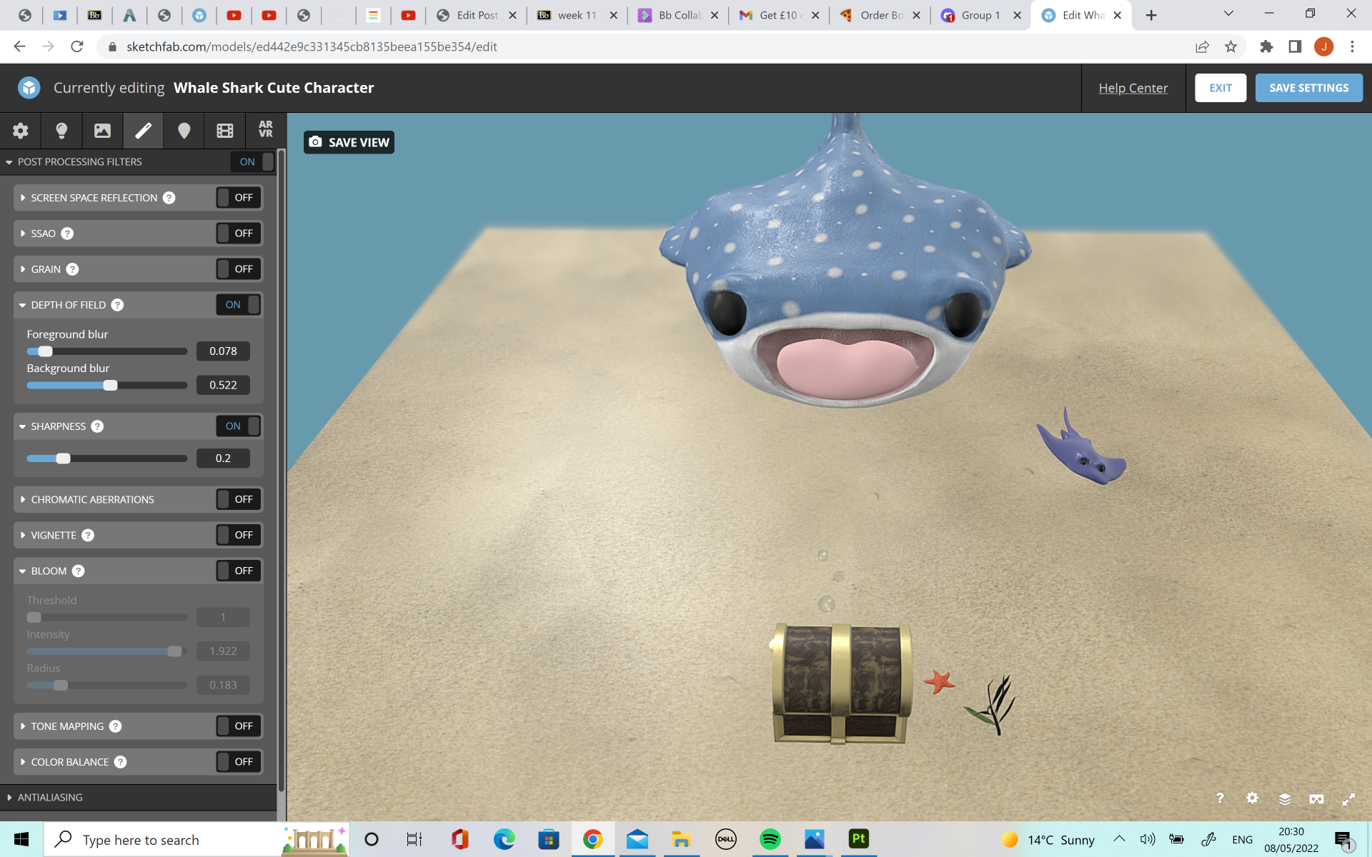
Thankfully, these changes were not too difficult and it will help me to remember the pipeline in future. The textures all applied to the model fine, allowing the baked high poly mesh details such as the gills and stripes to appear on the Whaleshark model. Lastly, I fixed the background and presentation elements of the upload. I tried different backgrounds, but I decided to go with a simple blue background to look like the sea. I wanted to make the coins and gold on the chest shine, so I upped the light intensity but I found that this made the sand look shiny and I did not want this so I changed it back. I also tried the bloom option but again, it affected the roughness of the sand and it looked better without. I did however adjust the background blur so that it softened the hard edge of the plane the scene is set on. This made it look less harsh and as if the sand line stopped suddenly. To combat the blurring of the characters from having the depth of field tab on, I turned the sharpness tab on which evened things out.
Once I was happy with the topology, placement and position of all the models in my scene, I was able to move on to the texturing. One major problem which I faced at this stage was that my original high poly model did not have a low enough voxel count and therefore the edges were not as smooth as I would have liked, particularly around the gills and the pinched lines of detail along the back. To fix this I brought the model back into blender and by using ‘Shift + R’ combined with the smooth tool I was able to get it much smoother and looking better. After I was happy with this, I had to reexport it as the high poly mesh before taking it back into maya.
this was before the smoothing was applied
Once it was back in Maya it was time to create a UV map. To start, I selected the whole model and created an automatic unwrap, which I then sewed back together. Then, using the workspace area I was able to select the edges where I wanted to cuts to be. I had a problem with other thinking the UV maps at this stage, and so instead of making simple cuts the first time I made too many pieces when they could have been connected and work fine.
I decided to redo it and only make cuts where needed, such as around the mouth and some of the fins. This made the UV map a lot cleaner and better to work with. It also allowed the checkerboard to show up as a much better fit, meaning the texture wouldn’t be stretched on the model. After this, I made the high poly surface live and conformed the low poly mesh to it. Then I exported both the meshes out using FBX.
Next I took the model to substance painter, where I loaded up the low poly mesh and went to texture set settings. Here, I clicked the ‘Bake Mesh Maps’ button but instead of using the use low poly as high poly mesh button we have been using previously, I imported my high poly FBX file into the high definition meshes tab. This will then bake the high poly mesh details into the low poly mesh meaning you can keep your detail without having an extremely high poly count slowing down your model or preventing you from uploading.
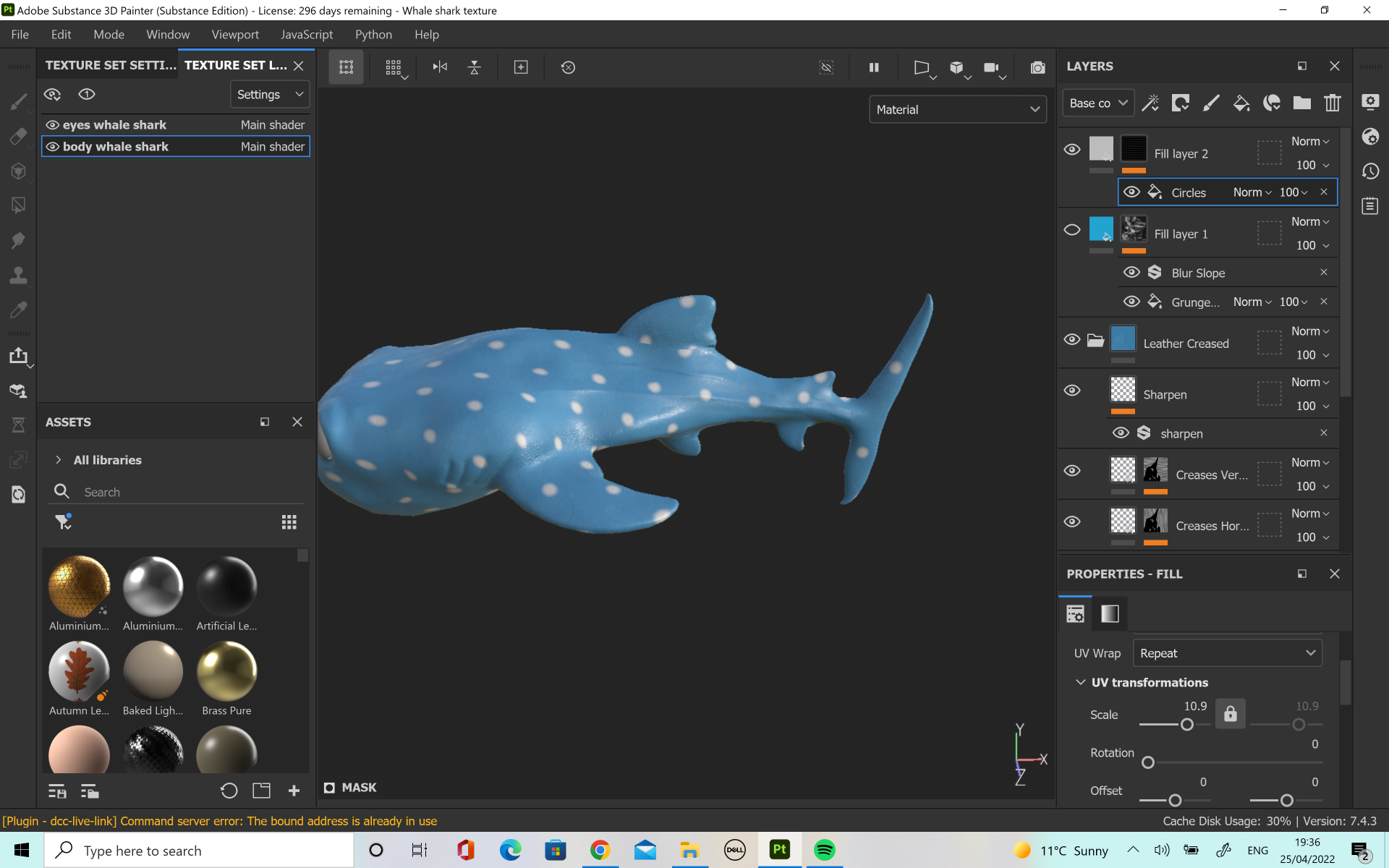
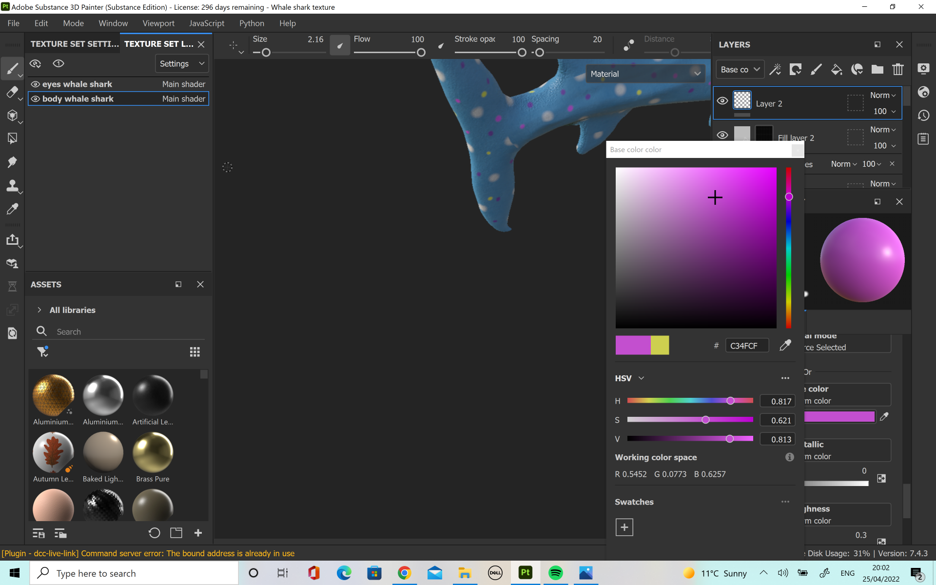
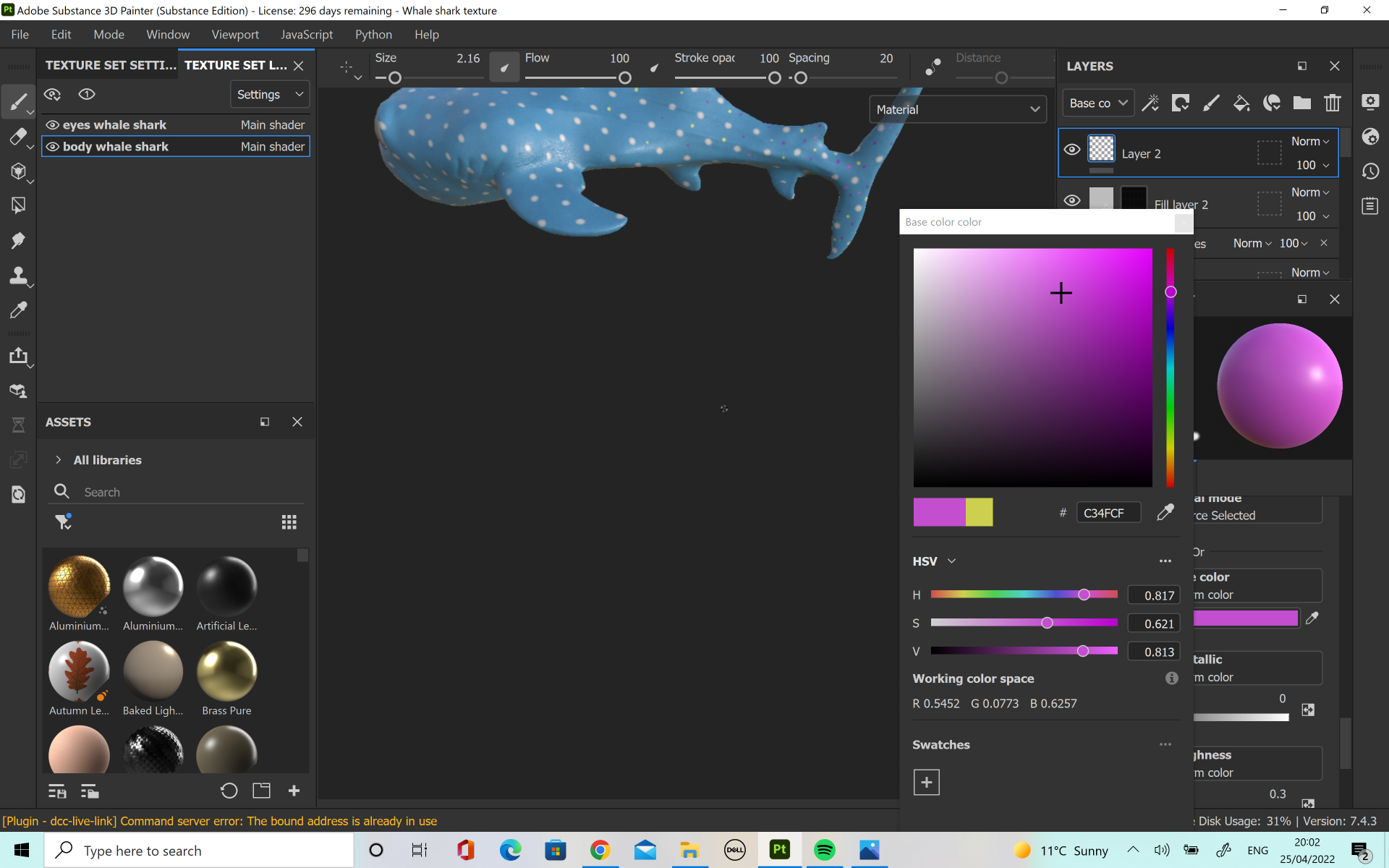
For my model I tried a few different types of materials but I thought leather was roughly the texture I wanted for his skin as I thought it would match a whale shark well. I also looked at different colorings, from lighter blues to darker blues but in the end I decided on quite a light colour as I thought it would make the character appear brighter and cuter. I used a spotted texture over the top, arranging it until I could the pattern and size of the spots to a size I wanted. This worked well but there was a couple of locations where the pattern was meeting the cuts of the UV map and looking a bit strange so to fix it I was able to hand-paint on the half circles which were missing from these areas.
I also thought that there was not quite enough spots on him as whale sharks quite a condensed group of spots along their back so I added a few more on. I originally tried a variety of colours, such as purples, dark blues and yellows to try and create an almost water colour painting effect however I thought that this was starting to take the design away from looking like a whale shark so I did not keep these changes. Finally for his body, I painted his tummy and chin white to look more like a whaleshark.
For his mouth, I decided to hand paint it pink, and then since I had modelled and UV unwrapped his tongue separately I was able to apply a human skin material to give his mouth a nice natural texture. I think this worked really well and it helped the model overall. For his eyes I tried two different versions. The first was a plain black, shiny plastic material which would reflect the light and for the second I painted the white marks on which would look like the reflection. In the end I decided to go with the first version as I thought it would be better to keep the reflection natural for this character.
After I had cut and unwrapped his UV’s, I moved onto the texture for the Ray.
In the case of the Ray I did not have to bake the high poly mesh into the low poly one so I simply used the ‘Use Low Poly as High Poly’ button when baking the texture maps. Again, I wanted him to have the nice leathery material so that he would have some nice rough texture to him. I went with a darker blue than the Whaleshark as this was more accurate to my references and also I wanted to have some contrast with the other character. For his tongue I went for a light pink so that there would be a nice contrast against the darker pink of his mouth.
When I was happy with the mouth eyes and skin I used a paint layer to hand paint on his cream coloured belly. This was a little difficult at places as I wanted to get the percentage of white/ blue the same on both sides of the model but in the end I was happy with the result.
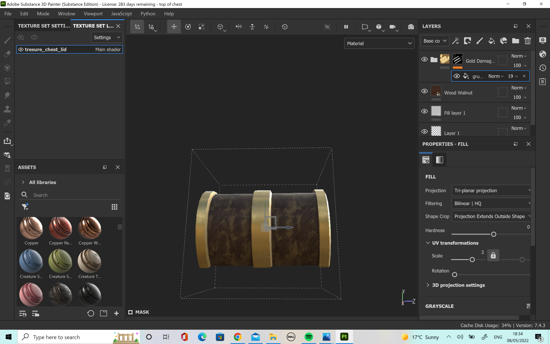
After the Ray, I textured the chest. I had a few different versions of the chest. For the first one, when I exported as an FBX there was a lot of different layers so the details were split up onto different layers. I fixed this by making sure there was only one lambert applied to each mesh in Maya and then using the polygon fill brush and masks on substance painter.
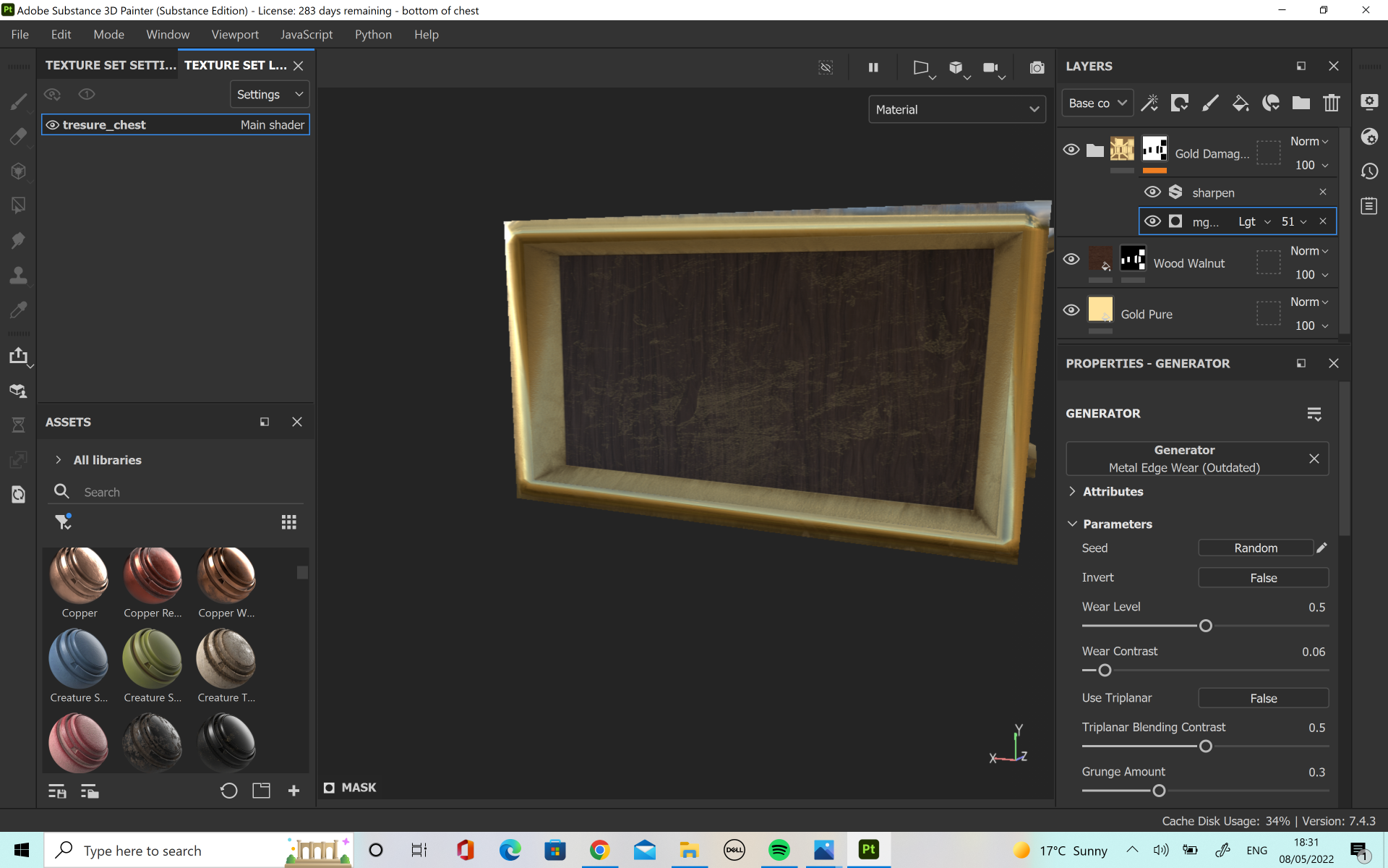
The first one was a dark coloured wood walnut material for the wooden panels, with pure gold for the trimmings of the treasure chest. I wanted it give it a bit more detail and texture so I tried the ‘Grunge Dirt Muddy’ texture map. I really liked how this looked on the pure gold. I also tried ‘Grunge Map 008’ but I thought the effect did not suit the style I wanted.
The second attempt was the same base as above however I wanted to try adding rust onto the chest as it was lying at the bottom of the ocean and water affects metal. I also added some more texture into the wood to make it a bit more realistic. I decided that whilst this one looked the most realistic, it didn’t give as much of a wonderous treasure vibe that I wanted to capture when the animals found the chest.
The third one is the one I ended up using. It was closer to the design of the first one but the damage which I had added helped to bring character. I also chose to use the smart material ‘Gold Damaged’ as I thought it looked better than the pure gold.
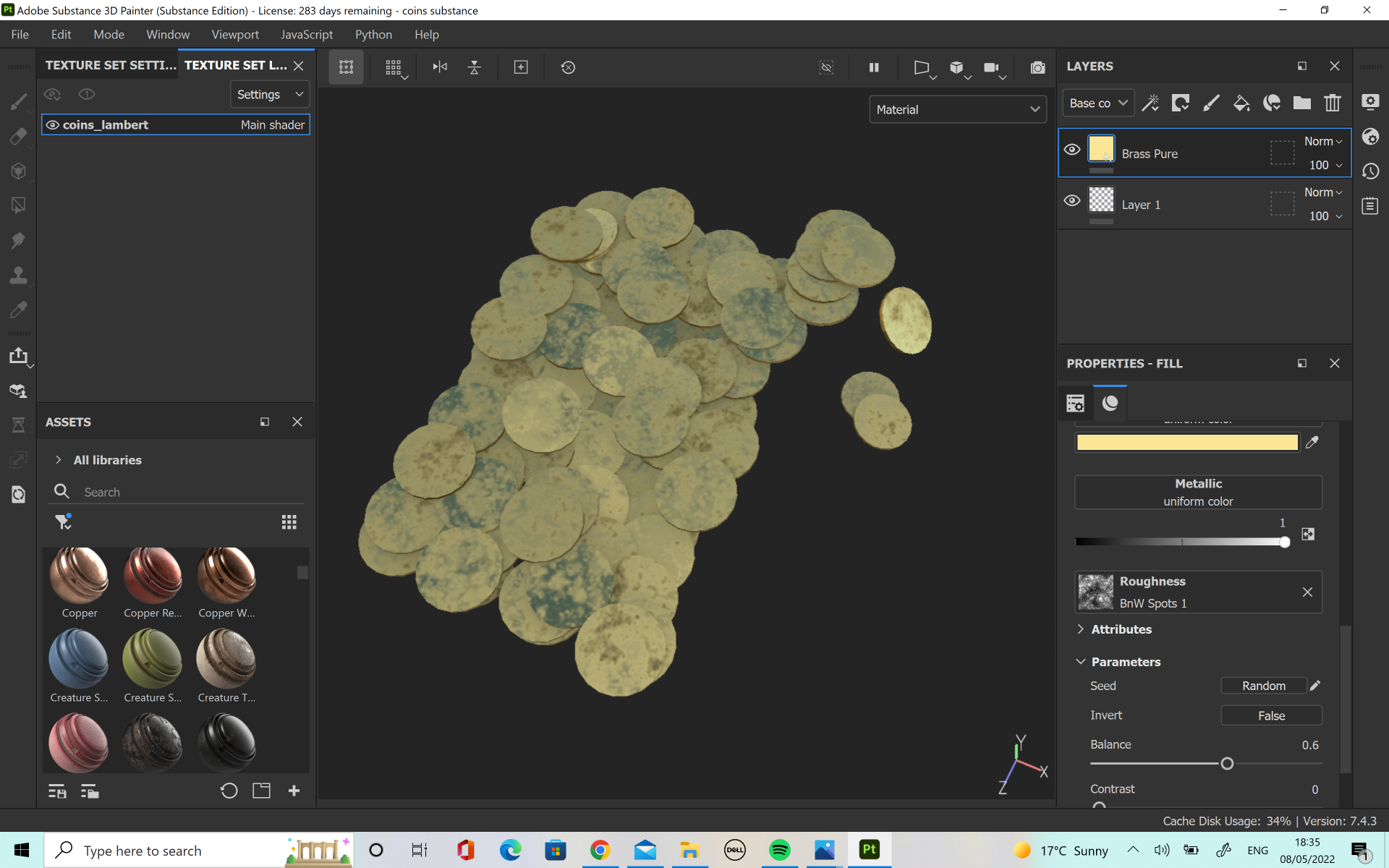
The coins were a lot of fun to texture. I knew I wanted them to be shiny and be reflective to light so that they could look shiny and impressive in the chest so I used the pure gold material for them. However, I thought that they were missing something so I added roughness map ‘BnW Spots 1’ so that they would look a little weathered. This texture was perfect for the look I wanted.
For the pearls I did something a little different. There was no pearl or texture in substance that I liked so I found a picture which had a slightly shiny, pearly look to it and imported it into the project. Then I used this texture to hand paint the pearl look onto the necklace. I was able to capture the nice shiny, pearlescent look I wanted.
For the starfish I wanted it to be a nice bright colour, as there was a lot of blue in the scene and I wanted to bring a new colour. I chose a nice bright orange, as a lot of the references I looked at had this colour and I thought it would work well with the blue. I started with a rough leather material as a base but I thought this was too plain on it’s own so I added the material ‘Plastic Grid Bumpy’ to give a bit more texture. This one worked really well with the little raises I had made on the original mesh. Overall, the starfish looked exactly how I wanted.
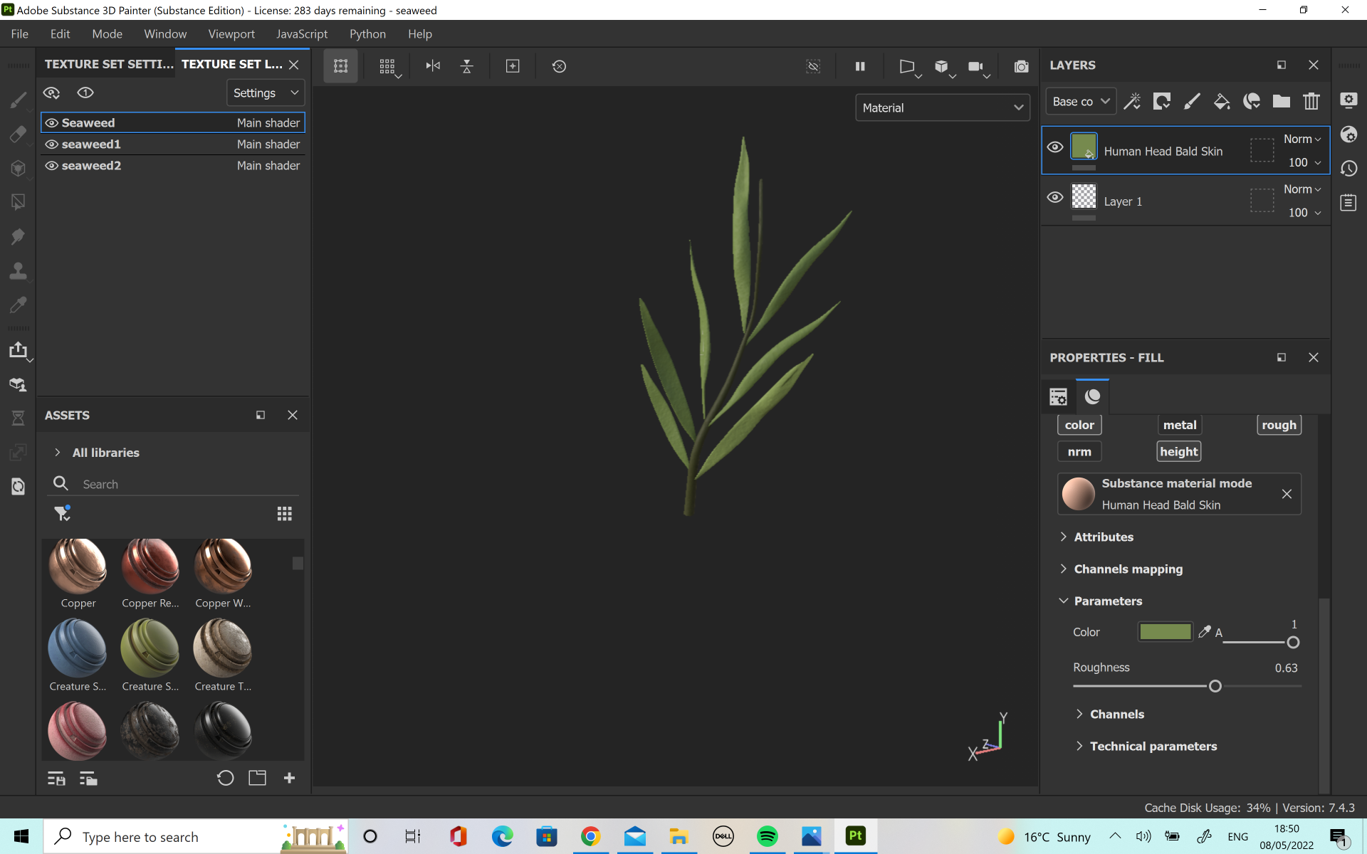
I kept the seaweed quite simple, but I chose to use a material called ‘human head bald skin’ which sounds strange for a seaweed texture but I liked how it added a little texture without being too overpowering.
For the sand texture I applied the same process as the pearls. I tried a few of the preexisting materials that substance offered but I could not find any which matched the look I wanted so I found my own image and imported it to create the sand texture on the plane. I thought this one worked really well as it was able to capture the little rivets of sand which settle on the ocean floor.
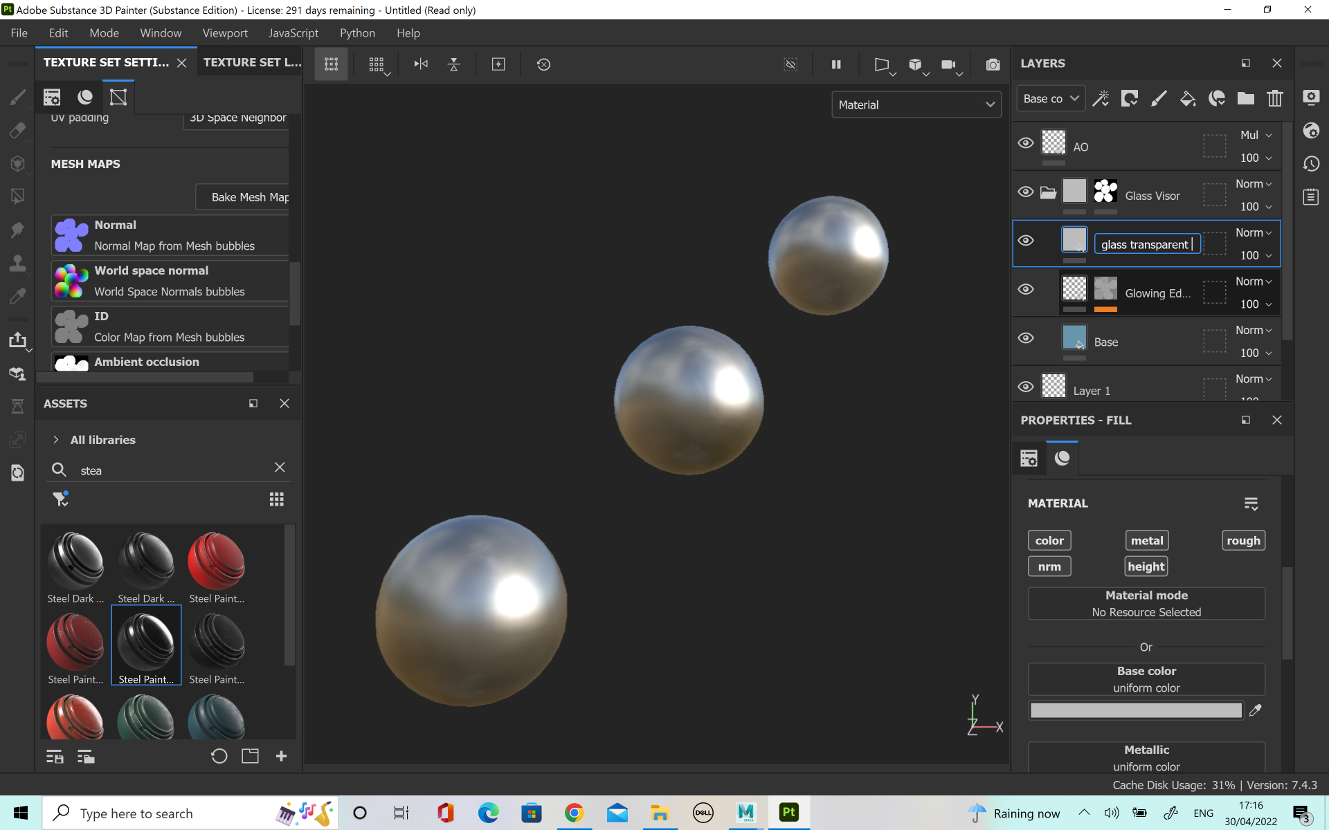
Finally, I did the textures for the bubbles. These were the most challenging, as I’ve never tried to do a see through texture on substance painter however it was a very fun challenge. I found this video extremely helpful (https://www.youtube.com/watch?v=5igvXjMM4Nc&t=1s) in creating the correct texture I wanted, although this was for glass so I had to edit a few elements, such as removing the dirt texture. I also played with the colour and changing the opacity until I achieved the look I wanted. There was quite a lot of steps to creating it. I started with the smart material ‘Glass Visor’ and then a fill layer for the AO. I selected just the colour channel and added the ambient occlusion to the base colour. I changed the normal setting to multiply and then opened the layers folder for the glass visor layer. There, I was able to change and edit the base colour. I added a fill layer just above the ‘glowing edges’ tab which was for the glass transparent. I was able to add the new channel of opacity in the texture set settings. This allowed me to select only this new channel and adjust the shader settings. Here I was able to change the ‘pbr-metal-rough’ to ‘pbr-metal-rough-with-alpha-blending’ so that the textures would be able to export properly. From here, I was able to adjust the opacity in the properties tab. I set my opacity value to 0.1429 as I liked that it was almost see through but still want completely clear, like a bubble.