Character Designs

I started with a quick design for the Chihuahua/ Cerberus character, showing the three heads. I wanted to show a different personality in each of the heads, as they all have their own brain. I played with the idea of having a pitchfork on the end of the tail, but I think I would need to explore this further. I wanted to capture the very large, spherical shapes of a chihuahua’s eyes and how they sometimes point in different directions. I think that the shape of the body needs to be looked at and edited a little so that the heads fit better together.

I also did a quick design for one of the demon characters. It was a quick 5 minute sketch, but I thought I would include it anyway so that I will have it recorded for if I want to develop it further, perhaps digitally. The proportions are not quite right, particularly with the mouth/ nose area but that’s just something I can work on.

Design a World- Week One

This week we were placed into teams which we will be working in for our assignment ‘Design a world’. Originally, we were placed in teams of teams of 10 and tasked with coming up with 100 ideas for worlds. The brainstorming went well, with everyone contributing and suggesting ideas which came into their head. The teams were then split in half, and divided into two groups of 5. This came as a bit of a shock but we were able to come up with 100 more ideas to work with. At the end of the session we agreed to each take our 5 top ideas and rank them from 1-5 so that we could decide with idea we all liked the best. I also posted in the discord channel all the information for one of our team members who had to leave early. We arranged our meeting place before we left class so that we could easily coordinate with everyone’s schedules.
Image

Image

When we met on Monday, we found that there was a few common world designs which everyone liked. The top 5 were:

  1. Hell as a convenience store
    2. Mirror gateway dimension
    3. Every human is secretly a monster
    4. Tattoos are sentient
    5. Tv dimension travel
    We discussed as a group a way to bring all of the top 5 ideas into one final concept for our world building. Ultimately, we decided on the concept of monsters who hide among humans, but can use secret portals inside tv screens to travel to a hell dimension. There, they are able to buy evil products from hell convenience stores.

    We decided to each work on mood-boards to brainstorm initial ideas for characters and settings and I set up a One Drive file for everyone to put their work in.

Week Two- Composition and Perspective- 13 Thumbnail drawings

After we were split into our teams, we got to work making 100 ideas. Our team had a group meeting on Monday to narrow down our ideas to a top 5, and then come up with 13 thumbnail sketches based on our ideas. I did 6 ideas all based on our groups final idea, but I decided to do 7 other thumbnails with different ideas so that I could practice some other perspectives. I found the task quite difficult as I’m not the most confident at drawing perspectives but I used the recommended tool of ‘caraspace’ which helped me in creating a good base to work on.  

In thumbnail 1 I liked how I worked with the low angle perspective to show the convenience store. I like the gradient of the flames in the window but I don’t think the tiles on the floor are the most accurate in terms of perspective. Also, I feel like more depth in the tones of the tiled floor would be a good way to add depth and form into my perspective drawings.

For thumbnail two I wanted to create something which looked like a hallway to a sketchy backroom. I wanted to try an angle which would look like a set of stairs descending downwards but I couldn’t get the perspective right so I changed the idea to show a low angle shot of a corridor, focusing on the sets of flames getting smaller to show the perspective of the thumbnail. I should have added gradient into the image, or perhaps made more use of the flames and how they could work with shadows on the floor and walls.

I liked how thumbnail 4 worked out, as I think it was one of the most successful ones in terms of perspective. I tried to work with incorporating the bright fluorescent tones of a typical convenience store inside the store and contrasting it with the darker values outside. I think this worked well but it could have been taken further.

For thumbnail 5 I think that because the image is quite simple I should really have worked on adding more tonal values into the image. The tonal values would provide more depth and form to the objects in the image. I kept it quite simple for because I’m still getting used to drawing perspectives but I think I still should have worked at bringing in more tonal values to improve the over all thumbnail.

For thumbnail 6, I again kept it quite simple in order to get a better grasp on perspective. I tried to capture a scene which was supposed to look like a backdoor auction house but I couldn’t get the angle of the room right so in the end I simplified it in order to make the perspective work better. I think I should have added some gradient in here in order to make the atmospheric perspective look better because at the minute the image falls a little flat. I do however, like the the composition of the large cage in the foreground and the smaller podium stand in the background.

For the next 7 thumbnails I experimented with some of the other ideas which we had discussed in our group and that I was thinking about. I thought that this would allow me to explore perspective a little bit more by working with other angles and shots which wouldn’t fit into the main idea. For thumbnail 7 I tried an extreme high angle shot, of a person reaching towards a mirror. I thought this would be a cool angle to try and work with perspective. When I saw showing my work, it was suggested that whilst it was an interesting angle, adding more tonal values in would be helpful in making the over all image look more interesting.

The feedback I got on my images was that whilst the perspectives were interesting and there was nice clean lines, there was not enough depth in the images. It was suggested that more variety in tone would help create more form and depth in the sketches. I think this is right and it is an area which I will work hard on improving in the future. Another more specific piece of advice I got was that the lines of perspective in shot 3 were not quite right. Sarah said not to change it though, but instead to take the comment and work on it in the future which I will do.

Week Two- Composition and Perspective- Trace Overs

After watching the lecture videos I had a go at drawing over my favourite animations in order to practice getting used to drawing perspective. It’s not an area which I feel I’m particularly confident in and so I did struggle quite a bit. I ended up doing a few extra practices in order to try and get myself used to noticing the different perspectives (i.e. One or Two point) as well as compositional elements.

Not all of the practices worked and I did find myself getting a little frustrated, but I decided to include all of the practices on my blog so that I can use them as a reference point later on to check my improvement.

For this draw over of ‘Fantasia’ I looked at composition and using the Phi grid. The flower is the smallest part of the image, and the shape of Mother Nature curls around the rest of the space. I found it hard to find perspective in the image, apart from the horizon line but I was pleased with the composition.


For this screenshot from ‘Howl’s Moving Castle’ I was looking at the symmetry and perspective. I remembered how perfect symmetry in an image can suggest a sense of unease. This scene shows the main character being chased by the shapes in the above image so it seems as if the shot was designed to give a sense of danger. Looking at the draw over now, I think that I got the horizon line wrong, which threw off the lines of the image.


This shot is from ‘Song Of The Sea’ and I thought it would be interesting to look at the angle of decent. The main character is going down the hill to find her true identity so the perspective of the scene is a decline. This shot was interesting because the whole animation is quite flat, with only certain areas having much depth or form but you can still see how the scene is darker in the foreground, getting lighter as it fades backward. There is also form created in the shadows given to the rocks.


The above screengrab is from a Japanese movie called ‘Summer Wars’. I thought that the composition of this piece was really interesting. I looked at it in terms of the phi grid and the golden composition rules. There is a nice balance between the bigger house in the background and the smaller entrance way in the middle of the image. I like how when you look at the smaller image, the eye travels over the mountain and leads your eye in a natural curved form.


I picked this scene because I thought it would be interesting to look at 2 point perspective. However, I really struggled with finding out the lines and how they would match up. I ended up retrying it twice and I still wasn’t happy. I think that since I’m quite new to perspective drawing, this scene was maybe a little overcrowded and I would have been better to pick something simpler to get started. I noticed in terms of composition that there is a good balance between the smaller character in the foreground and the adult characters in the background. This balance provides a stronger image than if everything in the image is weighted the same. If this occurs it can result in a static, boring image.

Overall, I think this was a helpful exercise in terms of learning about perspective and getting used to drawing the lines and grids needed for these scenes. I found the exercise difficult since I wasn’t used to it drawing perspectives so I did find myself getting a little frustrated when it didn’t work the way I wanted it to. I can see the areas where I struggled with, so I think by practicing more I will be able to develop these skills and improve my perspective work. It has definitely helped me with composition and how to lay out my thumbnails and work going forward.

Form and Shape- Practice

I was drawing for a little extra practice of building characters from different shapes. The character was simple, but I was really trying to focus on using simple shapes but taking them in a way which is not traditionally human, such as thin, stretched out arms. I was also looking at simplifying the shapes of the hands so that they’re very basic. I think that the shapes were interesting and it wasn’t bad for a practice but there is definitely areas which need work and improvement.

When I was drawing the basic forms of the hands, it reminded me of the character of Bender from Futurama. I realized that he is composed entirely of simple, basic shapes which I had never thought about before. I drew out a quick sketch on paper to see and decided I would draw out another version on the computer to look at the shapes in more detail.

Form and Shape- Extra Practice

After I had finished my three characters I noticed that I had picked three cute characters which were composed of many rounded shapes but I hadn’t really explored the shapes which humans are composed of. I decided to work on a little more practice using one of my favourite tv shows ‘Invincible’.

I looked at a variety of characters but there was some definite similarities I noticed. The girls where composed of softer, rounded forms- especially in the legs and hips. There was also a certain amount of rounded shapes when it came to the design of robot. Particularly around the joints, there was very rounded shapes which shows that he is not a human.

The men were composed of more squared forms, particularly in the chest and legs. I tried to look at the placement of the hips, shoulders and knees as these are where limbs join together and it is important to make sure these shapes look right. I noticed that with all of the characters there was a similar building of shapes but the women had slightly more of a curvature, in both the torso and the legs.

Overall, I actually found it easier to find the basic shapes within the more humanoid shapes as opposed to the rounded shapes I originally picked. Perhaps this is because I am more familiar with drawing people than originally shaped characters. I am glad I practiced both though because it gave me an opportunity to explore a range of different shapes and forms.

Week One- Form and Shape Practice

We were given the task of looking at characters and how they can all be broken down into simple shapes. This helps with learning about basic forms and character building. Animation is developed further by taking the shapes from 2D to 3D. When looking at characters you can start to see the collection of balls, pyramids, cylinders and cuboids.

To get us started we looked at basic shapes like Circles, squares and triangles to see how they could be transformed into 3D shapes to bring them more depth and character. When I was exploring making my shapes 3D I decided to add faces to them to bring them some more character. I found the curved angles a bit difficult at first, because I was not used to making the curvatures within shapes but I think that the practice was really fun and it did help me to learn a little bit about different poses and how they can bring a character to life.

The next exercise was to design a flour sack by combining the shapes of a cuboid and a sphere together. I tried to work on a variety of different poses, such as squashing it down and having the sack be upside down. I think this worked pretty well but I think with more practice I will be able to vary the poses even further and get a better grasp on form.

The homework task that was set was to pick three of our favourite characters and draw over them to work out the shapes which they’re composed of. I picked three characters who I really like, but I also wanted to pick characters which had interesting shapes which were not humanoid.

I picked Baymax because I thought it would be fun to analyze a character who is made up of very circular shapes. I started with the torso, and noticed how it was a very circular shape for his stomach and then a slightly cuboid shape for the top of his body. The arms have almost a stretched triangle shape to them but the top and bottom has been rounded to keep that very friendly, circular appearance of the character. I tried a couple of different angles to really get to know the shapes and composition.

I picked Pikachu because I thought that it would be interesting to look at the difference between the very rounded shapes of the body and ears, compared to the squared tail. I started with looking at the different shapes which Pikachu was composed of, so I drew out some circles, and rounded triangles. Then I started to trace over the shapes. I started with the torso and found that his shape is very rounded, especially with his rounded face. This makes him look cute and friendly, and even the ears have a rounded form, despite them ending in a point. For the tail, I noticed that the tail looked very flat and 2D so I thought I would try to make it a little more 3D and bring out the shape of the tail. It was interesting to think about how the character has been designed to be cute and cuddly (with the rounded forms), but who is also powerful (represented by the more linear, squared forms).

I picked Ponyo in her fish form because I thought it would be a fun to look at how she is designed with the idea of combining a human form and a fish form. Again, I started by drawing out the basic forms I could see. Then I started the outlines. I noticed that all of the components were very rounded and cute. The body is almost like a rounded cylinder and even the arms which are like triangles are rounded off to keep the cute appearance. I noticed that this was quite similar to Baymax in terms of shape. I tried a few different poses to get used to the idea of building characters using the basic shapes.


It was a very interesting activity and I found it a great way to practice looking at form and shape. Creating three dimensional characters has been a problem for me in the past so it was really good to start from the basics and have the process explained in a way that I could understand and practice.

Scavenger Hunt

Each group was given the task of taking photos related to a list of descriptions. We had to think outside the box and explore the area looking for interesting objects to fit the descriptions. This gave us the chance to get to know our classmates. Given the short amount of time we had, it was a challenge to find objects which matched the description but I think that we worked well together and were able to come up with a creative response to the brief.

The list was:

A Colourful Object

A Weird Shape

Animation

Something that looks cool

Something that made you laugh today

Mystery Item

Pets

Something that starts with U

Recreate a meme

Teamwork

A Colourful Object

For our colourful object we chose these hanging umbrella outside commercial court. The bright rainbow colours really stood out an lit up the street and there is something really nice about the bright colours of an umbrella lighting up against the rain which can be associated with a darkened mood and rain.

A Weird Shape

We went to the the MAC art gallery to see if there was any interesting exhibits which we could photograph. There we saw this chair which looks to me like clay on a pottery wheel. This is definitely not a shape you see every day so I think it definitely fits the brief! It is functional as a chair as well which makes it even more interesting.

Animation

It was tough to find an animation throughout the city in only 45 minutes. We thought about using a bus stop advert, as well as visiting Belfast Exposed to see if there was an animation exhibitions on today. There was an exhibition by Silvia Rosi and Theo Simpson but it was a photograph and video exhibition so we decided that this didn’t exactly fit the brief. We did however, take a photo of the word ‘animation’ written on the wall of the lab. We thought that this would be a little too boring however, so we decided to make it a little bit more interesting. Our group member Cloe did a short animation on procreate to bring some colour and life to the word animation which worked really well.

Something that looks cool

This was from the exhibition by Anne Tallentire. I thought that this was an interesting composition of shapes and colours and it was cool to visit an exhibition by a local artist.

Something that made you laugh today

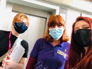
There was a tour guide working in the Mac who was able to tell us a little bit about the exhibition. We had a conversation about the art pieces and she was interested to learn about our ice breaker task. Since we had such a pleasant conversation that I asked her if I could take a photograph with her to represent ‘Something that made you laugh today’.

Mystery Item

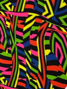
We found this chair which had a very funky pattern. We thought it could be applied to a few different categories, but I suggested that we could use it as a mystery item since it is a close up photograph and it is not immediately clear what the item is. (We also took another photograph to show the original item!)

Pets

For the topic of pets we decided to go with something a little bit out of the box. I have a tattoo of my dog Poppy, so we decided a photograph of her would fit the theme.

Something that starts with U

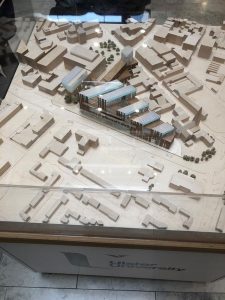
We struggled a little to think about what we could use to represent the letter U. Then we saw the model of the university of in the foyer of the building and we thought it would be a good example of the letter U without going for the ‘obvious’ choice of the university.

Recreate a meme

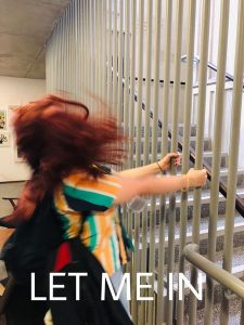
We had a couple of ideas about what to do for the meme, (including the Spider-man pointing meme) but decided on the Eric Andre ‘Let me in’ meme.

Teamwork!

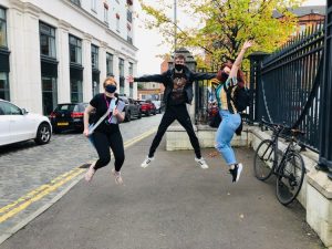
For our teamwork photo we decided to go with a stop frame jump. Unfortunately, we couldn’t get all of us in the photo because one of us had to take the photograph but we still had to work together to get the photograph.


Overall I think we did a pretty good job in responding to the scavenger hunt brief. We tried to be creative in our response and find some really out of the box photographs and I feel like we did a good job. We were able to learn a little bit about each other and practice working in a team and under time pressure.