After watching the lecture videos I had a go at drawing over my favourite animations in order to practice getting used to drawing perspective. It’s not an area which I feel I’m particularly confident in and so I did struggle quite a bit. I ended up doing a few extra practices in order to try and get myself used to noticing the different perspectives (i.e. One or Two point) as well as compositional elements.
Not all of the practices worked and I did find myself getting a little frustrated, but I decided to include all of the practices on my blog so that I can use them as a reference point later on to check my improvement.

For this draw over of ‘Fantasia’ I looked at composition and using the Phi grid. The flower is the smallest part of the image, and the shape of Mother Nature curls around the rest of the space. I found it hard to find perspective in the image, apart from the horizon line but I was pleased with the composition.
For this screenshot from ‘Howl’s Moving Castle’ I was looking at the symmetry and perspective. I remembered how perfect symmetry in an image can suggest a sense of unease. This scene shows the main character being chased by the shapes in the above image so it seems as if the shot was designed to give a sense of danger. Looking at the draw over now, I think that I got the horizon line wrong, which threw off the lines of the image.

This shot is from ‘Song Of The Sea’ and I thought it would be interesting to look at the angle of decent. The main character is going down the hill to find her true identity so the perspective of the scene is a decline. This shot was interesting because the whole animation is quite flat, with only certain areas having much depth or form but you can still see how the scene is darker in the foreground, getting lighter as it fades backward. There is also form created in the shadows given to the rocks.
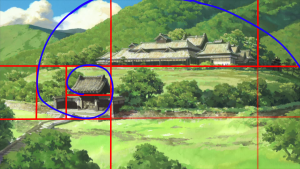
The above screengrab is from a Japanese movie called ‘Summer Wars’. I thought that the composition of this piece was really interesting. I looked at it in terms of the phi grid and the golden composition rules. There is a nice balance between the bigger house in the background and the smaller entrance way in the middle of the image. I like how when you look at the smaller image, the eye travels over the mountain and leads your eye in a natural curved form.

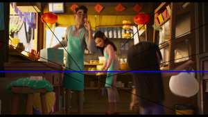
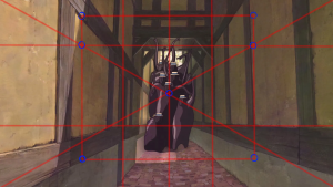
I picked this scene because I thought it would be interesting to look at 2 point perspective. However, I really struggled with finding out the lines and how they would match up. I ended up retrying it twice and I still wasn’t happy. I think that since I’m quite new to perspective drawing, this scene was maybe a little overcrowded and I would have been better to pick something simpler to get started. I noticed in terms of composition that there is a good balance between the smaller character in the foreground and the adult characters in the background. This balance provides a stronger image than if everything in the image is weighted the same. If this occurs it can result in a static, boring image.
Overall, I think this was a helpful exercise in terms of learning about perspective and getting used to drawing the lines and grids needed for these scenes. I found the exercise difficult since I wasn’t used to it drawing perspectives so I did find myself getting a little frustrated when it didn’t work the way I wanted it to. I can see the areas where I struggled with, so I think by practicing more I will be able to develop these skills and improve my perspective work. It has definitely helped me with composition and how to lay out my thumbnails and work going forward.