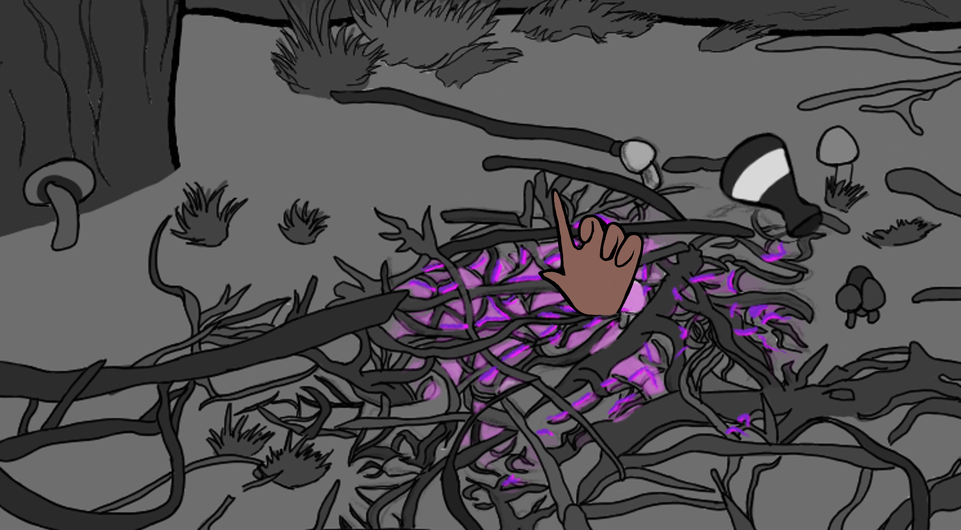
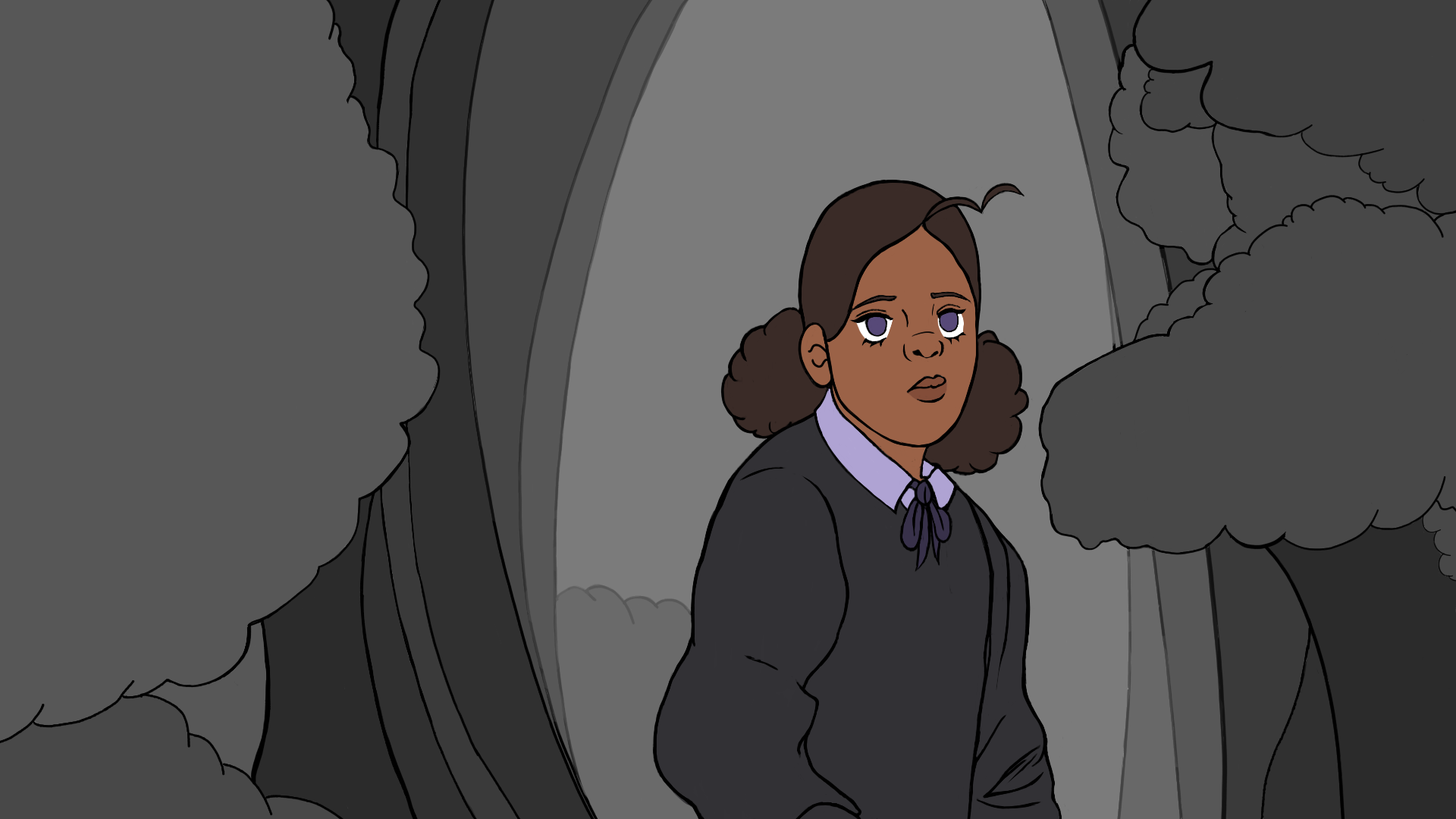
Colour is not a part of the syllabus so I knew that I didn’t have to include it in the project but I initially thought that it would be good to only add colour to the most important part of the scene. To do this, I initially only included colour in areas such as when Fern casts a magic spell, or with her eyes. For this scene I had the purple glowing getting stronger throughout the duration of the scene.

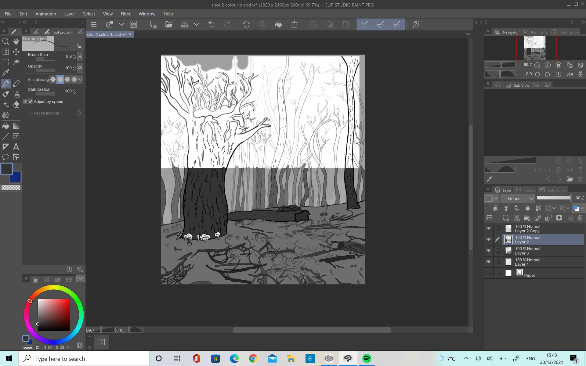
I intended to keep the backgrounds plain white to make the colours stand out but as I worked on the project I started to think that maybe adding a greyscale palette into the animation would help to create depth and emotion in the shots. I asked my lecturers about this and they agreed that adding in the greyscale helped to add depth into the animation. It also helped to make the different elements of the backgrounds stand out and it did not distract too much from the main animations colours.
The end result was a lot better in each shot as the background was a lot more interesting and only using colours for the important shots worked out well.