This week we looked at how to design a monogram along with important factors to consider when creating a monogram. These included attention value (does the mark grab your attention), application(does the mark work at different scales and in different contexts), competition (is it distinguishable against other trademarks), is it in keeping with the brand’s tone of voice and is the outcome timeless or is it a passing trend.
These are all great point to consider at the research stage as I feel that influences can creep in and impact your design choices. Therefore, it’s important to be careful that the designs I am drawing inspiration from meet these standards and achieve a similar visual language as what I am trying to achieve.
In relation to the process of creating a monogram, it was suggested that we begin with paper first, consider form before colour, take into account the possibilities around animation and research the area well with a particular emphasis on the work of established designers within the field e.g. Wim Crouwel and Armin and Hofmann.
I also took a little time to find out how others approach the process of creating a logo and found the following instructions presented by Sean Adam.
Sean Adams monogram development process
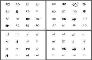
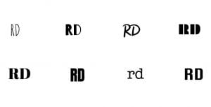
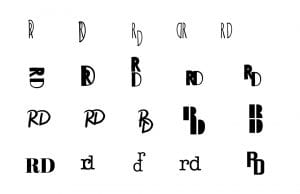
Monograms as highlighted by Sean Adams are “the initial of a company or single letter combined to create a logo.” There are a number of benefits to creating a monogram as part of a logo solution such as its a great way to work with a long name or help move a brand into new territory particularly if the name no longer applies to the direction of the company. A suggestion given by Adams in the creation process of a monogram included producing around 32 letter pairings in different typefaces using a tool such as Adobe Illustrator and then duplicating and changing their case. From there pick your favourite 8 and play with arrangements focusing on form and negative space. This sounds like an interesting approach and while I intend to follow the process of sketching and then digitalising my ideas from there I did, however, want to try this approach as well.
Above are my 64 outcomes in a selection of different typefaces and case sizes.
From there I selected the above 8 outcomes to play about with different arrangements.
And finally produced the above arrangements. This was an interesting task however I still think beginning on paper is less limiting and generates more creative outcomes as your not limited to typeface selection.
We were also directed to look at brand houses and case studies, I have selected 2 projects from Pentagram the LW Theatres and Gatwick Express outcomes, discussed below.
Pentagram
As one of the world’s largest independent design consultancies, I thought it would be great to take a little time to look at some of the approaches outcomes taken to see how best to approach creating monograms myself.
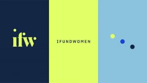
The first monogram that really grabbed my attention was the monogram created for I Fund Women. What I love is how the inclusion of the 3 dots has accentuated to form a straight diagonal line. This can then be pulled directly from the monogram to create a 5th element/ graphic motif which works effortlessly across the rest of the branded materials including the addition of motion.
I also love the vibrant colour palette and how the very bright active green is coupled with the cooler-toned blues resulting in a professional and eyecatching outcome.
It’s also interesting to note the process that took place to developed this brand which began with establishing the brand’s manifesto “We empower women to realize their vision” and then reflecting this in branding decision in what is described as confident, sophisticated and approachable. A fairly accurate description in my opinion.
It’s also interesting to read how certain decisions are explained such as changing the IFundWomen ‘i’ from lower to uppercase in the wordmark to reflect the brand’s industry leader and financial powerhouse status. Another design choice that linked to a specific intent is the inclusion of the three dots.
The monogram features three dots inspired by the trio of co-founders as well as the three pillars of IFW.
Overall I think this is a fantastic brand and would love to be able to present my own monogram and reasons for design choices in such a clear and intentional way.
The second monogram that caught my attention was the MAD monogram designed for the museum of arts and design. What really stands out to me on this outcome is the level of versatility the monogram lends itself to. The mark is described as reflecting the circles and squares presented in the building’s shape and location along with the building’s iconic “lollipop” columns.
What I find to most effective about the brand’s outcomes is its versatility and the potential for the monogram to be filled with different textures and patterns. Another interesting element is how the same style can be applied to other letters producing a beautifully stylised typeface in its own right.
Case Studies
I really enjoyed looking at the case studies on LW Theater and Gatwick Express and found the rationale behind the design decision to be interesting and relevant. I feel that developing a strong rationale is really important especially when pitching concepts to clients and this definitely something I would like to develop within my branding for my own monogram.
The LW Theatres monogram is supposed to represent a spotlight and a stage and I feel this works so well. While it is very subtle and unlikely to pick up automatically by the viewer when pointed out I do feel like the intent is made clear by the shaping of the ‘L’ giving perspective to the ‘stage’. I love the minimalist feel of this outcome and the elegance that is achieved with the use of negative space and monochromatic colour scheme.
Similarly, the Gatwick Express also present an upmarket and elegant feel matching the non-stops travel services pricepoint. The use of negative space once again works really well in presenting a high-end monogram which is further enhanced by the selection of a serif typeface with the missing lines highlighting the interesting shapes within the letterforms.
On reviewing the above case studies and the monograms created by Pentagram and how design decisions have been presented I now feel very strongly that developing a clear intent in what I want my brand to say will be a vital part of creating an effective logo.
Class Exercise
The above outcome shows my name displayed only using geometric shapes. This was a really helpful exercise as it really gets you to think about the basic structure and shapes found within lettering as well as how far this can be pushed and remain recognisable. I am quite pleased with the outcome and like the distinctive feel of the letters being filled, particularly the ‘a’. However, for me, the outcome is unbalanced by the ‘c’ which remains largely unchanged and consists of too much negative space. The challenge with this was that filling the ‘c’ may make the letter unrecognisable or mistaken for an ‘o’.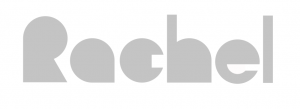
I decided to have another go at this and filled the circle used to produce the ‘c’ creating the above outcome this was a much more balanced outcome. I’m quite pleased with how effective this outcome is particularly as I have only used circles, squares and triangles. If I was to continue working on this I would probably look at reducing the amount of negative space in the ‘e’ also and increase the width of the ‘l’ and the stem of the ‘h’.
What have I learnt?
- Having tried jumping straight onto the digital stage of producing a monogram I found the process of sketching Ideas out first to be so important as beginning with digital typefaces in my opinion really limits the creative process.
- It’s possible to create a monogram with a 5th element embedded in the actual outcome.
- The correct colour choices can really add to the look and feel of a brand and monogram outcome.
- It’s good to consider how the letters can actually what the brand relates to as can be seen in the LW Theatres outcome
- It’s helpful to consider the formation of letters in relation to shapes these can be drawn out to create unique and interesting outcomes.
How can I apply this to my work in future?
- It’s always important to consider the reason for doing what your doing and this is something I should continually reflect on when creating a monogram or carrying out any design work for a brand project.
- When working on a monogram or logo I should always consider how the outcome will appear in context as this may impact design choices- this will also help in the process of developing a strong rationale.
- It’s important to consider letterforms and I should do this particularly at the sketching stage of any future projects.
