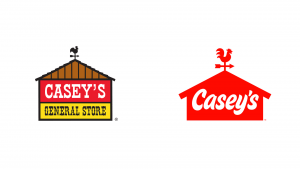
Casey’s General Store is the 4th largest convenience store in the United States with a large presence in mid-size and rural communities across the Midwest as well as being the 5th largest pizza chain in the U.S. This tied in well with our Pizzeria branding exercise! In the Brand News podcast, a number of areas in the rebranding are discussed including challenges in making changes to such a well-established brand, colour considerations and versatility when appearing in different formats.
It was really interesting to listen to how the designers at Interbrand working on the project actually began by getting out of the office and driving to a number of the stores in order to get a clear understanding of the experience and this proved very beneficial. Oliver Maltby explains how at the beginning ideas were thrown around such as getting rid of the barn to modernise the brand however through the exercise of driving to the stores it was noted that the barn shape in the signage actually made the store identifiable from farther away when driving. It was also highlighted by Maltby that the idea of moving away from red was also part of the discussion in order to stand out against competitors however, once again the colour red in signage was an identifier when driving that you were approaching a convenience store. Both of these really important elements have therefore remained in the final outcomes.
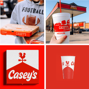
A big part of what prompted the rebrand was difficulties presenting the brand in a consistent manner across packaging due to the brand’s lack of versatility and it’s inflexibility in its usage as shown above. I feel that Interbrand have handled this really well in their revised outcomes particularly in the brand’s ability to be broken down and be partially shown on packaging while still remaining recognisable. I also love the updated wordmark and feel that the overall outcome remains strongly in keeping with the brands mid-west roots while maintaining the friendly personality of the previous logo as was highlighted in customer research as an important feature to maintain.
What I find particularly impressive about the brand outcome is how effectively the branding team were able to draw from the previous, very well established log, modernising it considerably and in my opinion, maintaining the integrity of the previous brand. This is a really difficult challenge for anyone working on a brand that is well established and loved. As spoken about by Maltby in the research carried out by Interbrand the general response was, somewhat unsurprisingly, that the original branding was preferred however the new branding was more greatly accepted by the younger generation. I believe for the most part this is unavoidable when making significant changes to a loved and established brand however I do believe particularly with the rebrands acceptances from younger customers that the updated outcome will be accepted and more greatly appreciated by customers with time.
I think the overall utility and flexibility of the rebrand is really impressive and for me, this update has struck a great balance between modernising the store’s image and maintaining the integrity of the stores previous branding.

