Wim Crouwel
Wim Crouwel is a Dutch graphic designer and is known for his vast contribution to the modernist movement. Throughout his work, there is a common theme of grid-based outcomes resulting in clean and functional outcomes. Below are typefaces New Alphabet and Gridnick designed by Crouwel.
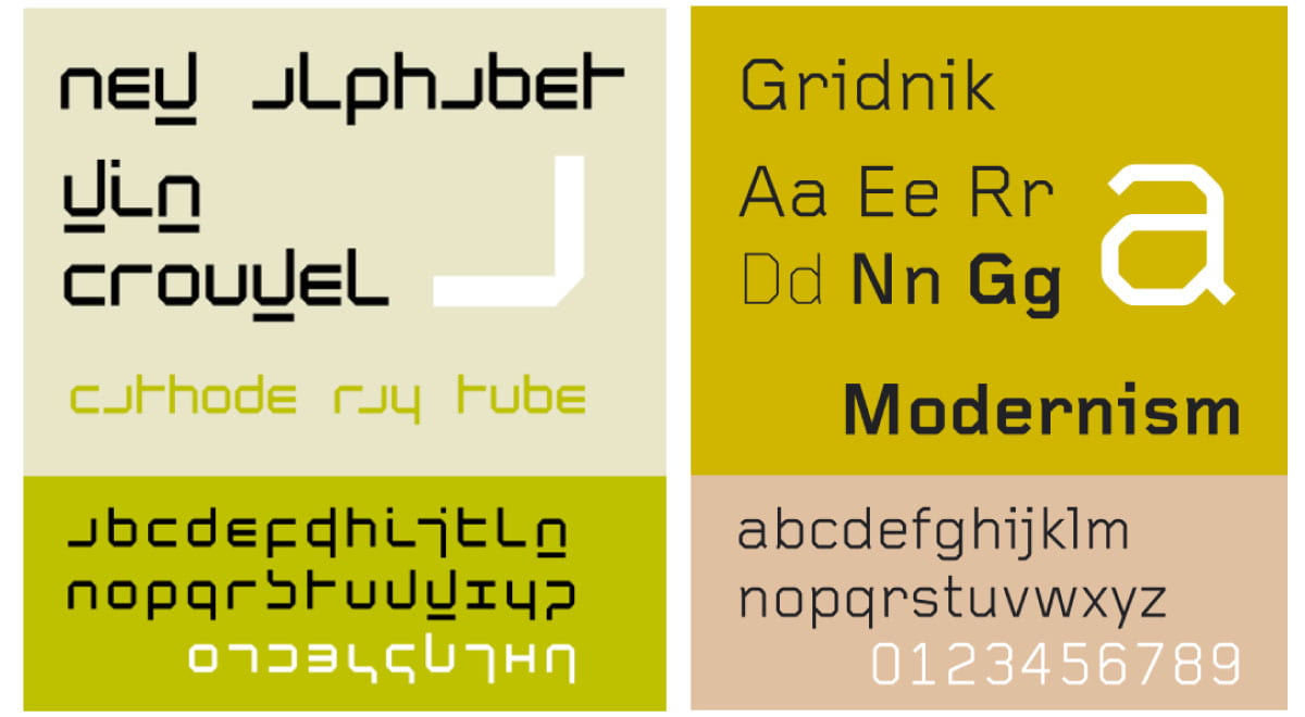
New Alphabet was an experimental project completed by Crouwel using the limitation of Cathode Ray Tube Technology i.e. Crouwel could only make use of horizontal and vertical stroke. I find this to be a really interesting technology and very futuristic in appearance. This is particularly impressive as it was designed in 1967. What I also find very interesting is how Crouwel almost makes up his own code within this alphabet e.g. if a letter is underlined it should be doubled, this makes n and u distinguishable between m and w. Gridnick is a geometrical typeface designed by Crouwel under commission from Olivetti for electronic typewriters before the technologies popularity declined. Here Crouwel is limited again with not being able to use curved lines and only using monoline stokes resulting in the creation of a strict grid-based outcome only using 45° corners producing an interesting and simplistic typeface that also feels current and in line with typeface design today. The impact of the limitations that were placed on these typefaces due to the technology they were being designed for at the time has resulted in 2 very different yet equally creative outcomes. This is something I want to experiment with in the creation of my monogram e.g only using straight lines, only using curved lines. This will be a really fun and interesting exercise particularly as my monograph does not have the same legibility restrictions as an actual typeface does.
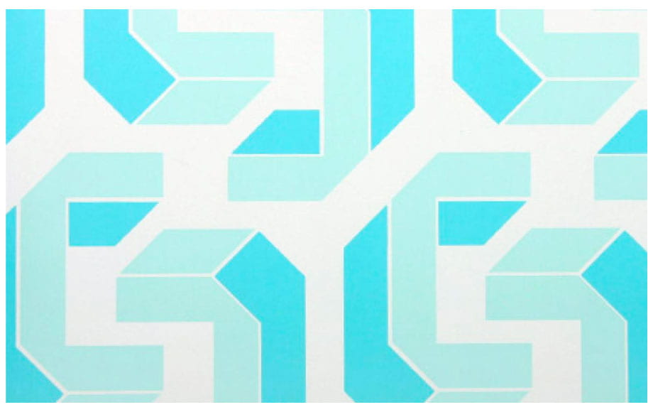
In a short video clip, Crouwel discusses typefaces particularly those integrated into the room around him including the typeface presented in the wallpaper designed by Tony Brook based on Crouwels early typefaces shown above. Crouwel describes how brook made the typeface 3D in order to achieve an atmosphere of space. This is a really interesting concept and something I want to consider in the development of my own monogram as I believe the space around the letters can be just as important as the letters themselves.
I then quickly reviewed some of my favourite works by Win Crouwel shown below.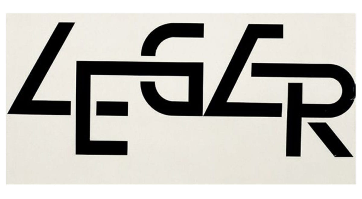 Above is my favourite typographic piece by Crouwel. I love the interconnectivity of the letter coupled with the cutout elements creating a nice balance of flow and space. I think this is such an interesting and well thought out outcome and would love to be able to establish a monogram with the same level of flow and purpose as shown above.

Above is another excellent piece of typography with line breaks and cut elements adding something very interesting to the piece as well as the use of symmetry and repetition in the repeated upside down r formation that appears 3 times in the above outcome. This I feel is very clever and I would love to experiment with symmetry in this way in my own work.
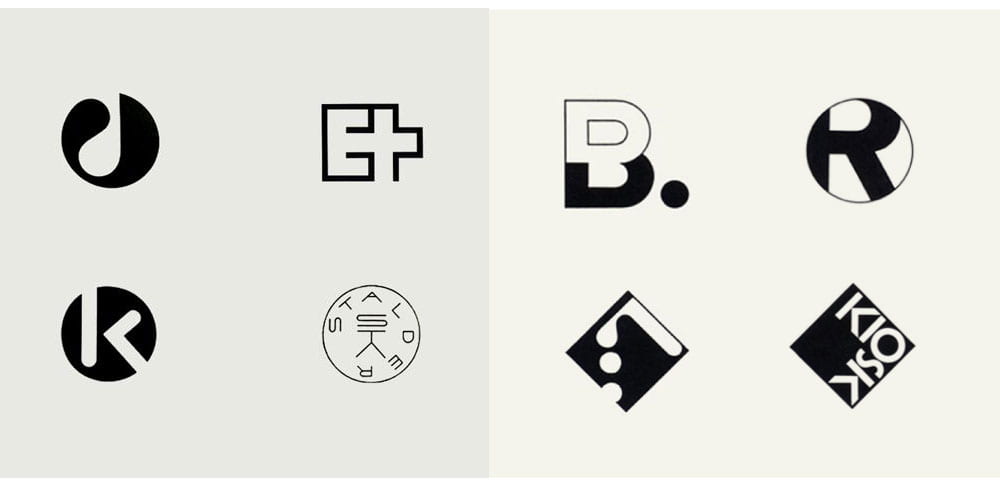
Finally, I wanted to look at how some of the above fundamentals that Crouwel has used to produce his typefaces can be seen in the logos and icons created by Crouwel. Below we can see the C that has been taken from Crouwels typeface inspired wallpaper and each of the bellow there is a recurring theme of geometric forms, pixel style outcomes and strong use of line and symmetry.
![]()
Above are a number of logos created by Crouwel each with its own simplistic and effective draw. My favourite outcomes taken from the above are probably the bottom row centre 2. I love the curved shape of the B and how a flow is created in the outcome. In the X shaped outcome beside it, I love the sense of pattern symmetry and the simplistic use of the square to create a memorable outcome. I also really link the auping outcome. It’s very simple and perhaps wouldn’t stand out enough in today’s design space where the use of a simple Helvetica style typeface can be seen in many brands including Panasonic and Jeep. However, when coupled with the line drawn above I think the outcome becomes more of a structure with none of the letterforms moving above the line creating an outcome that is simple but still maintains a level of interest.
For me, this really highlights how effective keeping design clean and simple can be and this is something I really want to experiment within my own work.
Armin Hoffman
![]()
Above are some of Armin Hoffman’s works with the left-hand outcomes being made using line and letters to create pattern like outcomes. I love how Hoffman plays with symmetry in these outcomes and creates interesting spiral effects almost adding a sense of motion to the final outcomes. To the right is a piece created by Hoffman composed of point, line, plane creating interesting glyph style outcomes. It could be interesting to play with this effect to see what letters can be produced.
I also looked at Hoffman’s logos and monograms. Above are some of my favourite outcomes. I love how effective these outcomes are and how he use curved lines in the top left outcome and bottom icon 3rd from the left. I also think the B is really interesting particularly in the way Hofman has split the letter with stroke and fill. The ET outcome is also really interesting. I really like how the letters are merged together using straight-line strokes and I hope to be able to generate this style of outcome in my own monogram.
Saul Bass
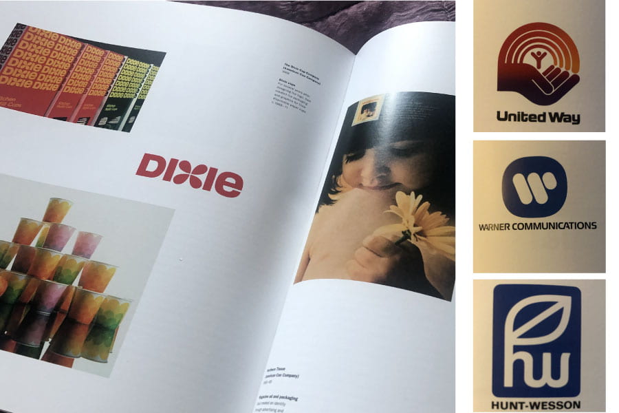
Above are some wordmarks, monograms and visual marks developed by Saul Bass. While Bass is more widely known for his input into movie title sequences he also developed some really strong monogram and brand outcomes shown above. What I like about Bass’ work is that it is less rigid than modernists such as Wim Crowel and has its own unique slightly softer feel. Of the above examples, the Dixie outcome is definitely my favourite with the inclusion of a subtle flower shape in place of the ‘x’ leading to a really effective am marketable outcome. It is also interesting to note that Bass has thrown in a lowercase ‘e’ that is made the same letter height as the rest of the capital letters, an inclusion I almost missed.
I also feel that it is clever how he as divided up the ‘W’ in the Warner Communications monogram and combined the ‘hw’ in the Hunt-Wesson monogram. Both resulting interesting and unique outcomes.
Animated logos
![]()

I also decided to spend a little time looking at animated logo’s (if you double click the above and below outcomes, the gifs will play). This was an interesting exercise as it demonstrates that mainstream brands such as Spotify are looking at adding movement to their logos. I love the above anime outcome and feel that it is particularly playful with bouncing elements and dot explosion. Again dots are used in the Spotify animation combining to create and fill the speaker icon and producing a nice responsive feel by having the icon zoom in and out as if it had been selected.
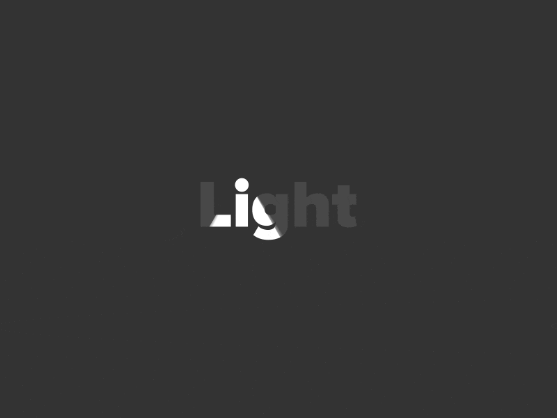
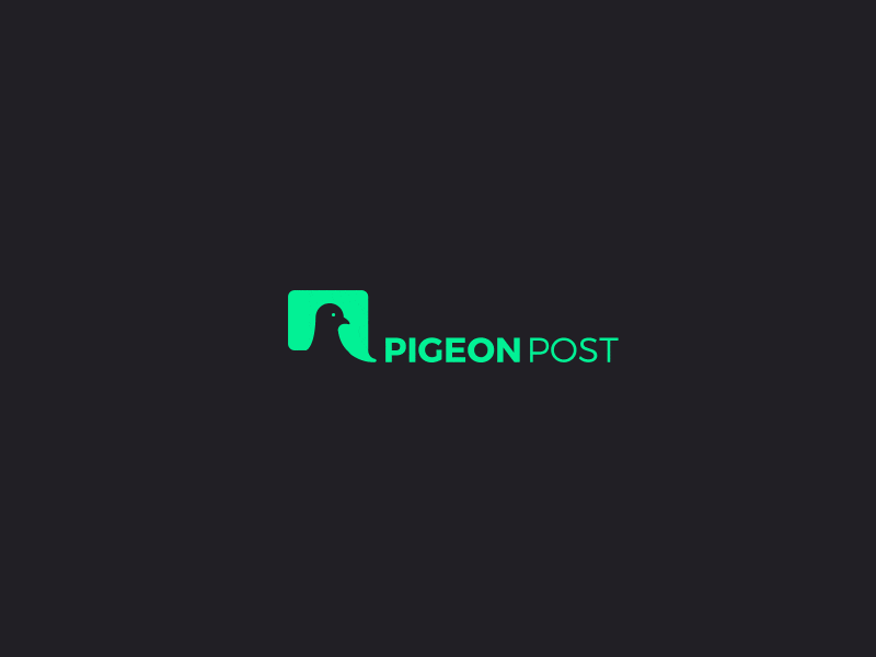
Above are two further examples of animated type and logos. I find the light outcome particularly effective as the colour movement mimics the light from a lighthouse. While Pigeon Post has a nice pop-up message feel as welling as incorporating the natural movements of a pigeon. Animating my logo is something I am very keen to experiment with and while I am sure my outcome will be more simplistic than those shown above as this will be my first attempt at animation I am hopeful that I will be able to produce an interesting and effective moving element in my brand.
What have I learnt?
- Clean modernist outcomes can be achieved in a monogram by working along a grid and taking away decorative elements and replacing them with smooth edges.
- It can be helpful to consider what can be taken away from the letterforms, how they can be combined and what can be created in the negative space.
- It can be helpful to add restrictions to your work, leading to potentially more creative and interesting solutions e.g. only using straight lines.
- It can be helpful to consider the symmetry that naturally appears in letters
How can I apply this to my work in future?
- I should always try to pull back my work and simplify as much as possible, if I go too far I can always add elements back in.
- It can be interesting to attempt replacing or adding additional shapes and forms to letters if there is a pattern or form that fits with the brand, this is something I how to experiment more with in future projects.
- Animations can really bring a brand to life I, therefore, want to consider this at the early stages of logo and monogram development so that I have a strategy in place as the brand progresses.