Font Pairing
Ruth Hamilton in her article 36 perfect font pairings proposes 3 tips for effectively pairings: Use font superfamilies, Pair contrasting typefaces and Pair type sub-categories.
Use font superfamilies
The term ‘super-family’ is used to describes a font with a variety of styles, weights and classifications designed to work together. An example of this can be found in the Lucida typefaces, see variations below.

Pair contrasting typefaces
Paring contrasting typefaces can be very effective if the contrasting typefaces are complimentary a common example of this is pairing serif and sans serif typefaces together. It is also highlighted that you should avoid conflicting typefaces which generally happens when the typefaces differ slightly but remain largely too similar e.g. paring Times New Roman with Playfair Display shown below.
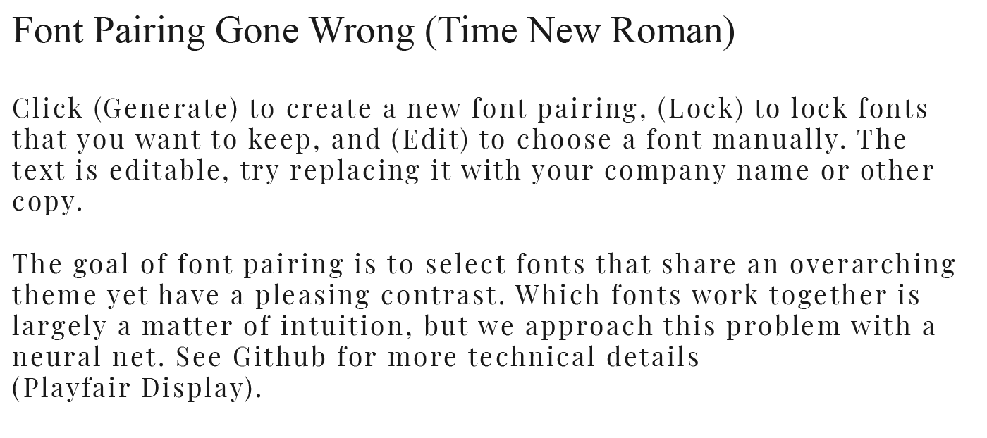
This is not an effective paring as the subtle contrast between the font does not establish a clear hierarchy and is also too similar in size and weight. The above pairing would also be more effective if the finer typeface Playfair Display were used for the heading and the slightly more coarse typeface Times were used for the paragraph.
Pair Typeface Sub-categories
Hamilton breaks down how to pair different types of serif and serif typefaces as the two categories are very broad. She suggests the below pairings:
Od Style Serifs + Humanist Sans Serifs
Transitional Serifs + Geometric Sans Serifs
Modern Serifs + Geometric Sans Serifs
Experimenting with Typeface Pairing
During a workshop, we experimented with typeface pairings in an attempt to convey two different genres; horror and sci-fi.

In my first attempt, I paired the display typeface Freckle Face with a sans serif typeface which I feel effectively contrasted one another however it did not effectively reflect a genre and created a childlike feel to the outcome. In the second outcome shown above, I chose the display typeface Ethnocentric for the title a paired with a sans serif typeface. I feel this was a really effective pairing and was also an accurate representation of the sci-fi genre.

I, therefore, experimented with a couple of additional font pairings for the Frankenstein piece. In the first outcome shown above, I used the display typeface Living Hell as I wanted to convey a hand-created feel to the type which I feel is achieved in this typeface with the inclusion of spatter effects and rough edges lining the letters. I paired this with the body typeface Times as I wanted to use a more formal typeface and I feel serif typefaces naturally fall into that category however I wanted to avoid anything romantic hoping to achieve an austere outcome adding to the unnerving text content. I am very happy with this pairing as I feel it demonstrates a clear hierarchy of information and creates a complementary contrast. In the second outcome I want to make a more subtle pairing using the display typeface Amarante Regular for the heading and the sans serif typeface Avenir Next Condensed for the body text. Again I am happy with the contrast that is created and am pleased with the slightly more rigid outcomes of Avenir Next Condensed in comparison to the more rounded Avenir Next, effectively portraying the cold feeling horror genre.
Universal Typography
Tim Brown talks about universal typography put a primary focus on finding the balance between measure, size and leading setting out the following equation:
size/leading x measure
Brown describes practising typography as “changing the values in this formula and judging the results.” In order to do this effectively we have to think about the context where will the type be displayed. The two examples Brown gives are choosing typefaces for newspapers (e.g. consider the measure and perhaps choose condensed typeface) and novels (e.g. consider what people are used to, generally serif typefaces).
Brown then goes on to talk about applying this to different elements within a layout e.h. headings, subheadings and paragraphs and how this should impact our choice of typeface. Adobe places such a strong emphasis on this that it has included buttons in its Typekit font browsing UI recommending different typefaces for paragraphs and headings.

Above is the typeface Minion in a variety of optical styles- the top outcome is in Minion Display which has very fine features and is designed for use at big sizes this is followed by Minion Subhead, Minion Regular and finally Minion Caption which has thicker features that work in courser environments. Brown explains that not every typeface is made for use in coarse resolution environments and therefore another measure has to be considered in selecting a typeface fine or coarse considering the context of low and high-resolution screens.
Breakpoints and Range Rules
Brown goes on to discuss a new problem we face as designers, multiple display views. We can no longer choose a specific size, leading and measure for 1 layout we have to consider how this will look on different screens and add breakpoints, adjust sizing and range rules.
Breakpoints e.g. media query breakpoints that present the viewer with a different display depending on the screen size. Range rules provide min and max-width which include a range of values generally applied as percentages e.g. no matter what size of screen a website is being viewed on if the line length of a paragraph is set at 60% it will adjust in size to only take up 60% of the screen it is being viewed on.
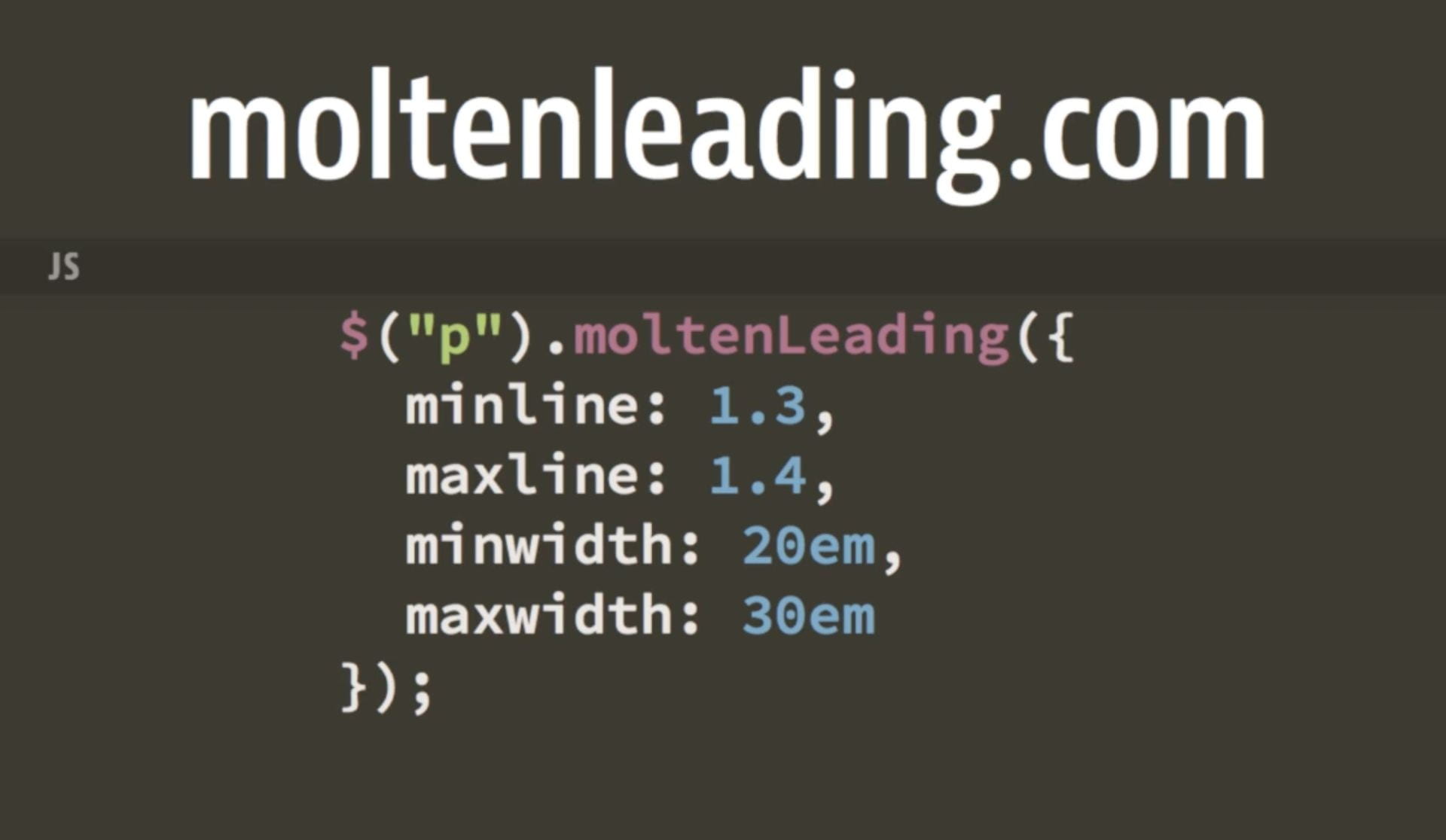
Therefore we have to consider how a typeface will adjust depending on the size of the screen it is being viewed on and how as size and measure adjusts how will this impact on the leading, in fact, JavaScript has been written to solve this problem by having the leading to adjust with the measure, see JavaScript below.
Working on web-based platforms is particularly challenging from this perspective and is an area that I will have to continue to apply myself to in order to generate effective typography that is adaptable to multiple screen views. However Brown has multiple videos and resources that are very helpful and will be great points of references and I continue to practice and apply myself to this area of design.
Variable Fonts
Adding variable fonts to HTML files allows you to work with a variety of weights within the one typeface without having to add each weight as separate typeface and slowing down the performance of your website. This is a brilliant feature and can be done through external resources such as google fonts making designing for multiple screens and demonstrating a clear hierarchy of information in webpages a viable option without slowing down the pages loading time and overall performance.
Variable fonts can be added to an HTML page by including the range you wish to include see example below of Quicksand which had been added with a weight range of 200 to 700.
![]()
This is a great way to add font’s to pages when multiple weights are required as it allows quick adjustments to be made when reviewing the page design using CSS.
What have I learnt?
- How to effectively pair fonts.
- How to reflect a particular tone or genre through typography.
- The importance of size, leading and measure to typography.
- How to effectively apply optical styles in typography.
- How to create effective typography for multiple platform’s using size, leading and measure and how this can be adjusted in code using breakpoints and range rules.
- How to add variable fonts to web pages.
How can I apply this to my work in future?
- I can employ typography in my design outcomes using appropriate font choices and parings along with the considered application of size, leading and measure to produce stronger design outcomes.
- I can incorporate breakpoints and range rules into my code in order to adjust my typography to multiple screen views.
- I can add variable fonts to my HTML to avoid slowing down loading times.