De Stijl
De Stijl otherwise known as “The Style” is a Dutch art movement founded of 1917 as a response to individualism and national egotism that was felt to be the cause of the war favouring a minimal, geometric abstract style unidentifiable to any country or individual. Founding members include Theo van Doesburg and Piet Mondrian. Theo van Doesburg was an artist, author and architect and was influenced by Vincent van Gogh until reading Wassily Kandinsky’s biography at which point van Dousburg began exploring techniques in the same reductive style as can be seen below in the 4 stages of abstraction in The Cow.

This a really interesting approach and helps to add meaning to the outcome therefore I thought it would be a fun exercise to experiment with myself. Below I have produced a sketch of a mother holding her child, I wanted to produce something that would evoke an emotional response in the viewer and see how this would be impacted by the reductive approach used by van Doesburg. I use van Doesburg’s abstraction stages as can be seen below.
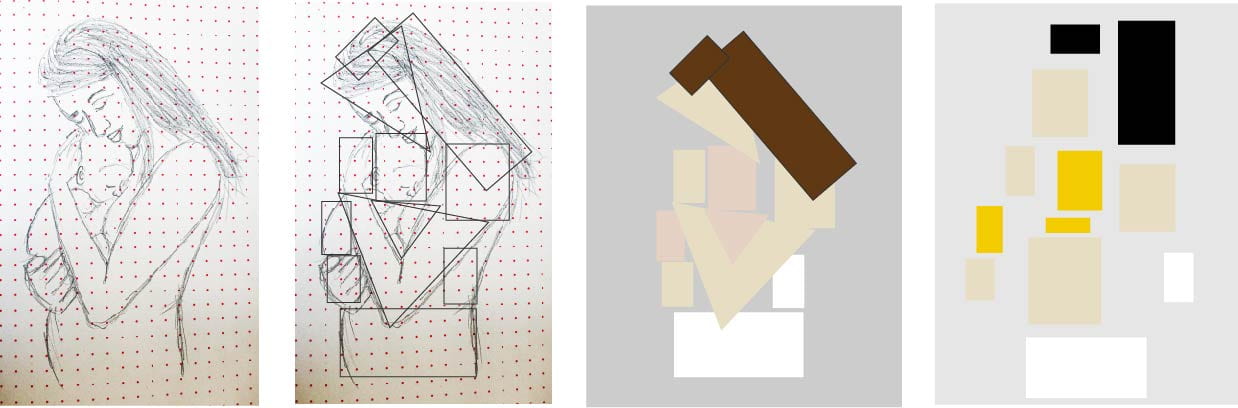
I was surprised at how effective I feel the outcome is, however, I find myself almost favouring the third outcome in both The Cow and my own creation, Mother and Child as the original illustration can still be found in the outcome while in the final outcome the original meaning of the outcome is almost lost altogether and difficult to interpret without the full abstraction process being displayed.
Likewise, Piet Mondrian also produced abstract paintings often using primary colours as evident in van Doesburg’s work as well. Below are Mondrian’s Composition with Yellow, Blue and Red and Composition (No. III) with Red, Yellow and Blue.

I love the grid-like structure of Mondrian’s work and the level of orderliness. While the De Stijl group never had more than 100 members and the movement disbanded after the death of van Doesburg it’s design principles are still evident in the basic design principles today in the use of elementary shapes, primary colours and asymmetric compositions. It is particularly interesting to note that evidence of the clarity in geometric forms that was strived for in De Stijl can be seen to have influenced user interfaces such as Pinterest, Google’s Material design and most notably Windows 10 as seen below.

Windows 10 very Cleary demonstrates the geometric forms found recurrently in De Stijl and therefore I thought it would interesting to see how I could use De Stijl and the work of Theo van Doesburg and Piet Mondrian to produce my own app design. I began by sketching out a geometric pattern and then applying to an app layout adding colour, however, I decided to go for a slightly more muted colour pallet producing the below outcome.

I really love this style and can definitely see its value in web and app design where, with so little space, it is important to segment and make clear boundaries in their design in order to optimise the space and make it easy to navigate
The Bauhaus
The Bauhaus is renowned for its minimalism approach and impact on the design principles still held and used today however the movement did not begin simply as a style but a revolutionary idea. The Bauhaus began in Germany following WWI and the disillusionment found in post-war Germany. Avant-garde artists sought to combat this by going back to basics in their simplistic and functional approach to design with a utopian view of arts and craftsmanship. With this intent, Walter Groupis created a new school in Weimar called The Bauhaus here students were encouraged to study across multiple disciplines including architecture, design, dance, carpentry, printmaking and lettering to name only a few.
Herbert Bayer was an Austrian artist trained in the Art Nouveau style before training at the Bauhaus for 4 years and being appointed head of the new printing and advertising workshop in Dessau. It is here that we discover how the political landscape can be impacted by the commercial. The effects of WWI had also caused national groups to join together in what would become the Nazi party, their right-wing ideology called for a return to traditional German values and this could be described as having been commercialised in the typeface Fraktur shown below.

Fraktur described at that time as the ‘true’ German font was based on a Gothic script that had connected with the German national identity for over 1800 years and for a time was used as part of Nazi ‘branding’.
However, in Dessau, Bayer promoted the elimination of capital letters and the replacement of the Gothic script alphabet with a modern cosmopolitan font comprised of strong geometric forms promoting functional design that met the requirements of mass production see Herbert Bayer’s Universal Typeface below.

By deviating from roman script style typefaces the Bauhaus could be seen to be rejecting the Germans nationalist position. This along with the Bauhaus’ progressive ideas and modern and unified approach to design was considered threatening and lead to the Nazi regime closing the Dessau school for its degenerate art in 1932 followed a year later by the closing of their Berlin outpost. This caused the group’s members to flee Germany and spreading the movement’s ideas around the world.
The Bauhaus teachings became incorporated in schools around the world, with not only students and scholars adopting the approach enthusiastically but also corporations. With the globalisation of democracy and capitalism after WWII came also the globalisation of Bauhaus design. The Bauhaus had obtained a very valuable attribute in its style, it was global and therefore as corporations began to sell across borders they found that advertising using new typography was effective across multiple countries. This lead to the typographers of the 20’s aiming to make their typography international.
Erik Spiekermann
Eric Spiekermann is a Berlin-based designer who works with students to revive Bauhaus type experiments producing font’s now licensed by Adobe that were based on drawings of fonts from unfinished Bauhaus designs. In 2018 Spiekermann in collaboration with Adobe, the Bauhaus Dessau foundation enlisted 5 typographic design students to complete the unfinished designs as a tribute to the schools 100 year anniversary.
To do this Spiekermann and his students sourced hand-drawn letter fragments often incomplete and featuring in posters and sketches. Trained in historical type exercises created by the Bauhaus masters the five students recreate the below 5 typefaces.

While designing digitally was quite a different approach to drawing with a circle and square set on graph paper that would have been used by the original creators Spiekermann described this as “the whole point” as he aimed to instil the Bauhaus approach of taking emotion out of the equation and adopting a more mechanical approach.
I think the above recreations are incredible and have added value in their admittedly marketed presentation of having been (almost) lost with the original Bauhaus schools. I also feel it is incredibly important to recognise the concept of art playing an important role in social issues and the political landscape and how this can have both a positive and negative impact in the culture we are building for future generations. While the impact of the Bauhaus is evident throughout modern design and commercial branding I feel it is important to remember that the movement was not just a style but it really was a revolutionary force.