Category Archives: 3D Digital Literacy

Week 2 Independent Practice

The first independent practice I tried this week was to create a snake on a branch. I started with the snake first of all, using the EP curve tool. I manipulated the points as much as I could but there was still a few points which did not have the smooth curve look. Next, I created the branch. To do this I used the same tool, followed by the sweep mesh to create the branch. I edited the size down until I was happy with the thickness. Once I had done this, the snake was nowhere near the branch so I tried to move the whole snake over using the ‘W’ button. However, I learned that this does not work and to move the snake you must manipulate the points on the sweep. I ended up deleting the first snake as I was not happy with it in the first place and I thought I could create a better one. I gave this one more points using the EP curve tool which meant it was easier to manipulate and get the smooth shape the snake. When it came to editing this snake I was more adventurous with the shape, giving it a long hanging down portion, as well as making sure it wrapped around the branch. I was much happier with this and I was able to get the curves a lot smoother and natural. Finally, I tapered the snakes tail so that it closed into a point and added a primitive of a sphere which I edited to look like a snakes head.

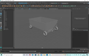
Next I tried to make a childrens pull cart as I thought that it would be a good way to practice extruding and also since it was the beginner level I thought it wouldn’t be too complex for me to complete. I started with a basic cube which I flattened and then extruded the sides upwards to form the walls. Next, I extruded the faces out to create a lip on the side of the cart, like in my reference photograph. Once I was happy with this, I started to break down the shapes which came together to form the mechanism under the cart. I noticed there was quite a few different sized rectangles on the front portion so I did my best to recreate these by deforming cube primitives’. For the back of wagon, I noticed there was two thin rectangles, connected by a long, thin sphere so I made these out of a cube primitive and a sphere primitive.

The wheels were the most interesting part to work on but there was also a bit of a challenge in getting everything to line up correctly. I started with a cube primitive which I smoothed and changed the dimensions to 2. Then, I duplicated it four times and tried to match one up at each point of the cart. To make the wheel shape, I used a torus primitive, which I resized and then maneuvered to cover the spheres I had placed. Once I had done this, and I checked the reference I realised that the wheels were not perfect torus’s and there was a second part which was visible inside the wheel. I decided to make my original torus shapes into this inside part and create a new torus for the outer wheel. To do this, I started with the original Torus primitive but I select the face at intervals along the face of the object and used the w button to pull them up. This created the exact texture and appearance I was looking for in the wheel. Once I was happy with the size, I duplicated them four times and placed one on each wheel. After doing this I realised that the wheel placements were not quite right so I had to go back and resize the under parts of the cart so that the wheels would be sitting out from underneath the body, but still be attached where needed. Once, I was happy with their placement I started on the handle.

The handle was the most difficult for me because I found it difficult to get the shape right. I started with a sphere primitive which I stretched out long and thin. Next, I put the object in vertex mode and used the multi-cut tool to add more dimensions along it so that it would bend easier. Once I was happy I selected only the top half of the objects vertex points and used the e button to bend it. Once I was happy with the angle, I had to use w to make the object line up again. When I was happy with this, I repeated the process lower down to create a second bend. After I was happy with this shape, I took the object and duplicated it, before turning it 180 degrees to make the other side of the handle. I matched the two up and created a thin, flat rectangle to join the two and create the final part of the handle.

One way in which I think the cart could be improved would be to maybe have a thicker handle, which might fit better with the other elements of the cart but overall I was happy with the cart design.

The rollerblade was definitely the most challenging model so far. I really struggled with it at first, because I couldn’t work out how to get the square object to have soft edges and so this was causing a lot of problems. I tried to use the ep curve to do the shoe laces but ultimately this did not work. I believe I did not have enough joins in it in order to make it flexible enough and so I could not bend it the way I wanted. After asking for some advice I have been shown how to do this a lot better and so when I try again I believe it will be better.

Finally, I tried to make the Vase, following the tutorial posted. This vase was a lot more successful than my first attempt as I am getting to be a lot more familiar with the software.


Week 2

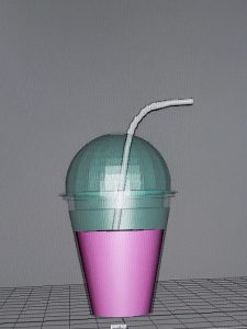
For our work in class for Week 2 we made a milkshake cup with a straw. This was a little bit of a challenge but I was still much more confident than I had been the week before which showed my improvement to myself. I do wish I had taken more photographs documenting my journey but I do at least have the final image.

I was following a lecture tutorial but I tried to make my own little adjustments to the piece to give it a little originality. I changed the colour or the milkshake and the opacity of the glass, as well as creating more dimensions on the lid of the cup to give more texture.

Originally I struggled with getting the shape correct, and then extruding the faces. Once I retried the steps I was able to complete it correctly which was good. The straw was also a little bit difficult as I have never used the tools before, including the sweep mesh. It was a little difficult to grasp at first, but eventually I was happy with the outcome. Finally, I used the multi-cut tool to create more divisions in the straw, which I extruded to make the ruffles on the straw.

Overall, I was very happy with the outcome of the milkshake glass. It took me a little longer than I would have liked but this will improve over time, the more practice I have.

Independent Practice 1

For my table and chairs practice I did a whimsical design of a frog, as I wanted to explore further than a basic table and chairs. I found it a little complicated to create the curves of the smile for the frogs mouth but I was happy with it in the end. I also added some uneven bars on the back of the chair to make it look a little more interesting.

For the vase, I originally started with two different sphere which I flattened the bottom.  However, I thought that it would be better to make the vase out of one primitive and then edit it so that there would not be an unnessicary join in the middle. I made the bottom half of the vase slightly bigger so that there would be more balance if the object was sitting on a real table. I decided to give it some texture so I twisted the sides so that it created a nice pattern all around the sides.

I wanted to make a flower to go inside the vase, so I used a sphere which i bent to create the stalk and then for the head of the flower I flattened a sphere. In order to create more texture and make it look more like a real flower head I put the object in vertex mode and I pulled each individual point inward to create a dimpled effect.

For the glasses I decided to make a wine glass with a textured bottom. To do this, I started with a sphere polygon which I put in vertex mode and then twisted until I was happy with the pattern. I wanted the middle of the glass to match so I got a cylinder which I lengthened and made skinnier. Finally, I twisted it so that it would match the bottom of the glass. For the cup part of the glass I got a sphere and cut it in half using edge mode. I really liked the way it ended up but it wasn’t completely even. While I liked this from an aesthetic point of view, I can’t help but feel like the practicality wouldn’t be accurate as the glass is not even around the sides and so it could possibly spill.

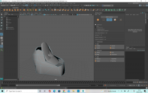
I also made a chair as practice. The chair was quite complicated as I had to bend the sides of the cushions and armrests. I found it quite difficult to get used to this at first, and It took me a bit of time until I was able to get the model to a place that I was happy with. For the cushions, I made them out of a sphere privatives which I flattened. Two of them I left as flattened spheres, but I wanted to try something new for the third one so I put it into vertex mode and manipulated the points so that I was able to create the shape of a heart.

Week One

This week we started getting more used to Maya and how to build items in the software. We started with a group tutorial of making a café, which went over the basics of maya e.g. how to copy, move, resize, move camera etc. This was helpful as I am new to the software and I had only used it for my Cactus so the refresher course was useful. For my café, I chose to try a space theme, based loosely off the Lego stars wars game cantina.

I decided to experiment with making this chair a little different from the others. I made it with just one leg, balanced in the middle, with a little tea tray coming off the side which you can put food on. I like the kind of space/ sci-fi design of this.

Finally, I added a conveyor belt type table for food to move along. I didn’t know how to add a lot of detail or texture as I’m still new to the software, but I was happy with this basic starting point.

Concepting for Final design

When looking at the assignment brief, I decided quite early on that I wanted to create a old well for my project. I thought it would be a good project to test my skills and that it would be something which would interest me.

I started by gathering a lot of photographs of well which I could use as a reference. I really liked the idea of having some branches of old trees curling up the side of the well. I also liked the idea of having different parts of the well made from different textures. These initial references were very helpful for me when it came to designing my own concept.

I had three quite different ideas to start with. One was a space themed well, based on a personal memory of mine which I liked the idea of. However, upon getting the advice of my lecturers and peers I concluded that the construction of this well would not be difficult enough and therefore it would not show off my developed skills very well. The second idea was a fairy well, based on the idea of a fairy living in the top part of the well as a house. I liked this idea, and through it I was able to incorporate the twisting trees which I really liked. There was also a few different elements which I thought would be good to explore and get more used to in Maya such as the sweep mesh tool. The third idea was a well based off the beach and the seaside. I thought it would be nice to create a variety of different seashells to use as pebbles around the well but I ultimately decided that the overall design of this concept was not as well developed as the others. In the end I decided to take forward my idea of the fairy well.