All posts by sheppard-j2

500 Word Reflective Essay

Reflective Essay

I had a lot of fun with this project, and although there were many things to learn, I have been able to develop a variety of skills and am proud of what I have achieved with my final animation. I have picked up new skills and used software that I had no previous experience with. This was a great opportunity to gain a better understanding of the fundamentals of animation.

One of the areas I think I was strongest in was the background design for my shots. This was quite a surprise to me as I had struggled with the perspective exercises at the start of the course. It has never been a strong point of mine and so I’m very happy that I have been able to develop my skills in an area that I would not have expected.

Another aspect I enjoyed was the process of keyframing the most important poses. It was a difficult task as some of the shots were from tricky angles, but I was able to use my references to create detailed and recognisable scenes. Once I had all the keyframes in place, it was easier to see what needed to be added to make the final animation successful.

For the final animation, I chose to animate on a mixture of ones and twos depending on how fast I wanted the shot to be. I think this worked well, as some shots, such as the last scene, were better suited to ones as I wanted the movement to be quick, whereas others, where the action was slower, looked better on twos.

I was extremely pleased with how the final animation came out and think it told the story well. Adding in sound effects helped with this, as when I showed it to my sister without them, she was confused about why the main character was shocked. However, once I added the ‘bang’ noise, she said it was now clear that it was an accident.

For the most part, I think our team had good communication. I discovered how vitally important it is to work with your team when creating an animation to complete the project in a timely and cohesive way. Even though I was a little disappointed that few of my design ideas were chosen by the team, I think we came up with a strong character and world design in the end. I am also happy with the effort I put into the project and how my work turned out.

If I were to do the project again, I would try to incorporate more camera movements into my animation as I think it was lacking slightly in this area. If I had done this a little more, especially now that I am more confident with the software, the animation would have been even more engaging. Further, we had an ambitious storyline for our animation that we could have simplified slightly to make it less stressful to complete within the timeframe. However, I do think that it was good that we were ambitious as it gave me a better grasp of the time and work required to produce animations in the real world.

Background development

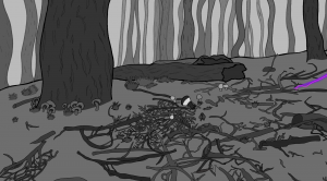
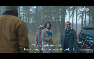
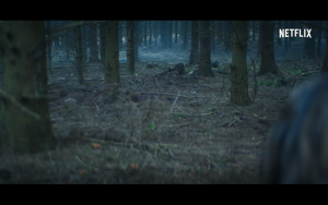
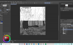
Creating the backgrounds for the animation was extremely fun and I think they went well. I really wanted to have a strong consistancy so that you could tell the scenes were set in the same place but I also wanted to put a fair bit of detail in which made it quite difficult to achieve. I used a lot of references of forests and the tv show ‘Nisser’.  (Nisser, 2021)

When I was changing the type of shot e.g. mid shot, low angle etc. of the character in the forest I made sure to check how I had done the shots to make sure there was a consistency between them. I did my best to make sure the lines matched up and you could see that it was the same setting.

I also tried to make sure there was a lot of depth in the shots so that they would feel more real and immersive to the viewer.

Overall, I was very pleased with how the backgrounds turned out. I think they match well and even though it was a lot of work I think it paid off.

Problem solving

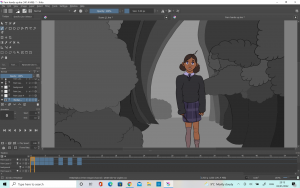
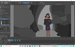
I used a mixture of Krita, After effects and photoshop to create my section of the animation. These software’s were all new to me and so it took a bit of time for me to get used. I encountered quite a few problems with various aspects of the animation so I had to find ways to work around.

The first problem I encountered was not using enough layers for the animations on Krita. This is not a problem I should have run into given that I am primarily a digital artist and so I am used to using different layers however, I think in the excitement of animating it didn’t occur to me to use the layers as much as I should have. This led to problems when I came to adding colour to the shots as I had to draw around the lines instead of just adding the colour behind. This led to a bit of a problem with consistency between each frame. I think I managed to get around this quite this well by relying on the onion skins a lot.

Another way in which I fixed this was by redrawing all of the lines again once I had completed the colour but this took even longer as I was essentially drawing everything twice. It did help to improve the consistency of each frame however.

If I had used the layers more efficiently I would have been to able to complete the animation a lot quicker and with more consistency in each frame.

I also had some trouble with After effects as I could not get the final file to export properly without shifting all of the lines to the side. It took me 3 different tries but eventually I was able to figure it out and export the file properly which was a relief.

Reference- ‘Nisser’

I was watching a Danish tv show on Netflix, which included some special effects and animation. It was very interesting and I really thought it was great how they animated and created the motion of the forest Elves. They were jumpy and quite static in their movement which added to the creepy feeling. I pointed this out to my teammates as a suggestion that they could maybe try this in their animation of our mushroom monsters but no- one seemed too fond of the idea. I was still able to look at the forest scenes and the way they created a very strong atmosphere.

Nisser, (2021). [Television Show] Netflix. 28 Nov.

Colour

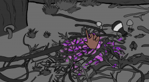
Colour is not a part of the syllabus so I knew that I didn’t have to include it in the project but I initially thought that it would be good to only add colour to the most important part of the scene. To do this, I initially only included colour in areas such as when Fern casts a magic spell, or with her eyes. For this scene I had the purple glowing getting stronger throughout the duration of the scene.

I intended to keep the backgrounds plain white to make the colours stand out but as I worked on the project I started to think that maybe adding a greyscale palette into the animation would help to create depth and emotion in the shots. I asked my lecturers about this and they agreed that adding in the greyscale helped to add depth into the animation. It also helped to make the different elements of the backgrounds stand out and it did not distract too much from the main animations colours.

The end result was a lot better in each shot as the background was a lot more interesting and only using colours for the important shots worked out well.

Check in presentation

For our group check in presentation, I edited together the animatics of all the people who sent me theirs in order to see how our story looked all together and to make sure there was cohesion. I was not really sure what to include in my section and having watched the other members and teams I wish I had gone into a little more detail about my work but it is listed on my blog so hopefully it is clear how my developments have progressed throughout the progress.

We got some very positive feedback about the animatic so far, and we were told that there was a good cohesion between the characters which was something we really wanted to achieve. It was also said that we had a good understanding on timing which was reassuring as it was something I had been worried about.

Development: Shot 12


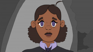
Shot 12 was one which I enjoyed a lot. There was quite a lot of development in order to get it to where I wanted it to be. I started off by drawing my character on krita, using the original character design Cloe had created. Once I was happy I moved on to animating.

I liked the first shot I did but it was pointed out to me that the expression was a little stiff, with not enough movement. It was suggested that if I widen the eyes morel, start with the mouth open and move the jaw the motions would look a lot better and I agree- I found the final animation to be a lot more pleasing.

Lastly I had to add the colour and when it came to this I noticed some inconsistencies with how I had drawn the background compared to other shots and so I ended up having to fix this. I think that it worked out better this way however, and now there is more consistency across the animation.